Melange Green SW 6710 by Sherwin Williams
Nature’s Harmony in Every Hue
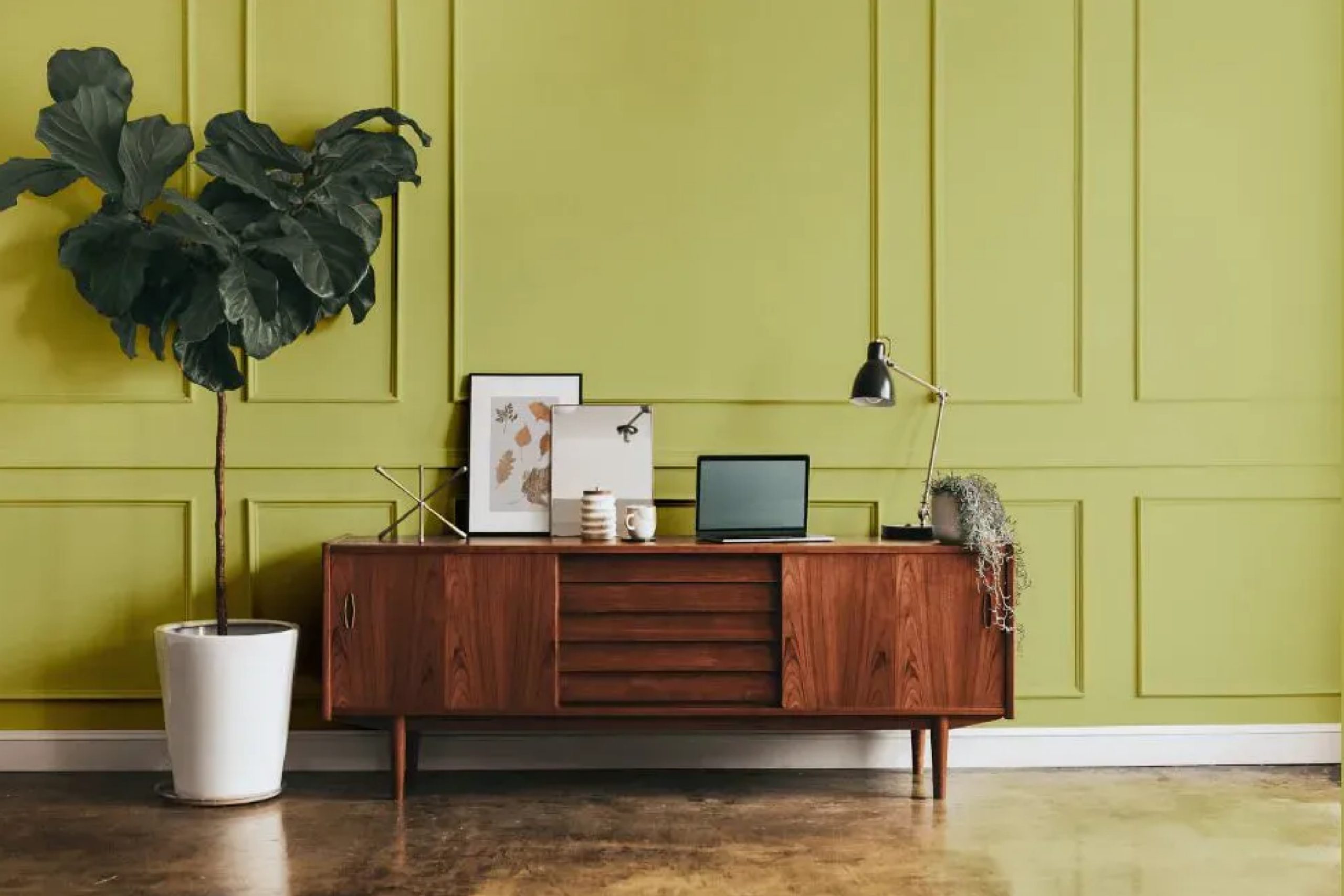
SW 6710 Melange Green by Sherwin Williams brings a fresh, calm feel to any room. It’s a soft green that makes your home feel relaxed and connected to nature. Simple, clean, and easy on the eyes—this shade adds a gentle touch without taking over.
Melange Green is a soft, muted green that offers a sense of serenity and balance. The gentle, natural tone can make a room feel open and fresh without overwhelming the senses. It’s perfect for those who appreciate subtlety and elegance in their decor.
This shade works wonderfully in a variety of settings. In living rooms, it can provide a relaxing backdrop for family gatherings. In a bedroom, it promotes a sense of peace and relaxation, ideal for winding down after a long day. Even in a home office, Melange Green can create a calming environment that helps you stay focused and productive.
Pair it with natural wood textures and white accents for a classic look. Or, try combining it with darker shades for a more sophisticated feel. Melange Green’s adaptability makes it suitable for both modern and traditional designs.
Choosing the right color can change how you feel in your home. With SW 6710 Melange Green, you can create a space that’s inviting, calm, and uniquely yours.
via plan-home.com
What Color Is Melange Green SW 6710 by Sherwin Williams?
Melange Green SW 6710 by Sherwin Williams is a soft, earthy green with a hint of gray, creating a subdued yet uplifting appearance. It has a versatile nature, making it suitable for various settings. This shade doesn’t overwhelm and provides a gentle backdrop that feels both modern and timeless.
In interior design, Melange Green works well with natural and traditional styles. It complements wood furnishings beautifully, enhancing the wood’s warm tones. This color fits perfectly in a rustic, farmhouse-style home, adding to the cozy, welcoming atmosphere.
It also shines in coastal designs, mirroring the soft greens found in nature, seamlessly blending indoor and outdoor elements.
Pair Melange Green with materials like natural wood, rattan, or bamboo for a harmonious look. These materials echo the earthy vibe of the color, enhancing the overall aesthetic.
Textures such as linen or cotton work well, offering tactile softness that pairs nicely with the color’s calming attributes. Accents in stone or ceramic can add interest, bringing out the gray undertones.
In a contemporary setting, Melange Green can balance cooler metals like brushed nickel or stainless steel, bringing warmth. It also serves as an excellent backdrop for art, allowing vibrant pieces to stand out without clashing.
housekeepingbay.com
Is Melange Green SW 6710 by Sherwin Williams Warm or Cool color?
Melange Green SW 6710 by Sherwin Williams is a gentle, welcoming shade of green that brings a sense of calm and balance to any space. This color combines hints of both warm and cool undertones, which makes it incredibly versatile for different rooms in a home.
In a living room, Melange Green can create an inviting atmosphere, making the space feel more grounded and serene. It pairs beautifully with neutral colors like beige or cream, adding a subtle yet noticeable pop of color without overwhelming the senses.
In a bedroom, this green can promote relaxation and restfulness, making it a perfect choice for a space meant for unwinding. It works well alongside soft textiles and natural materials, enhancing a cozy and comfortable vibe. In kitchens or bathrooms, Melange Green brings a fresh, clean feel, working well with white or light wood accents.
Overall, Melange Green is a flexible choice that enhances comfort and harmony in home settings.
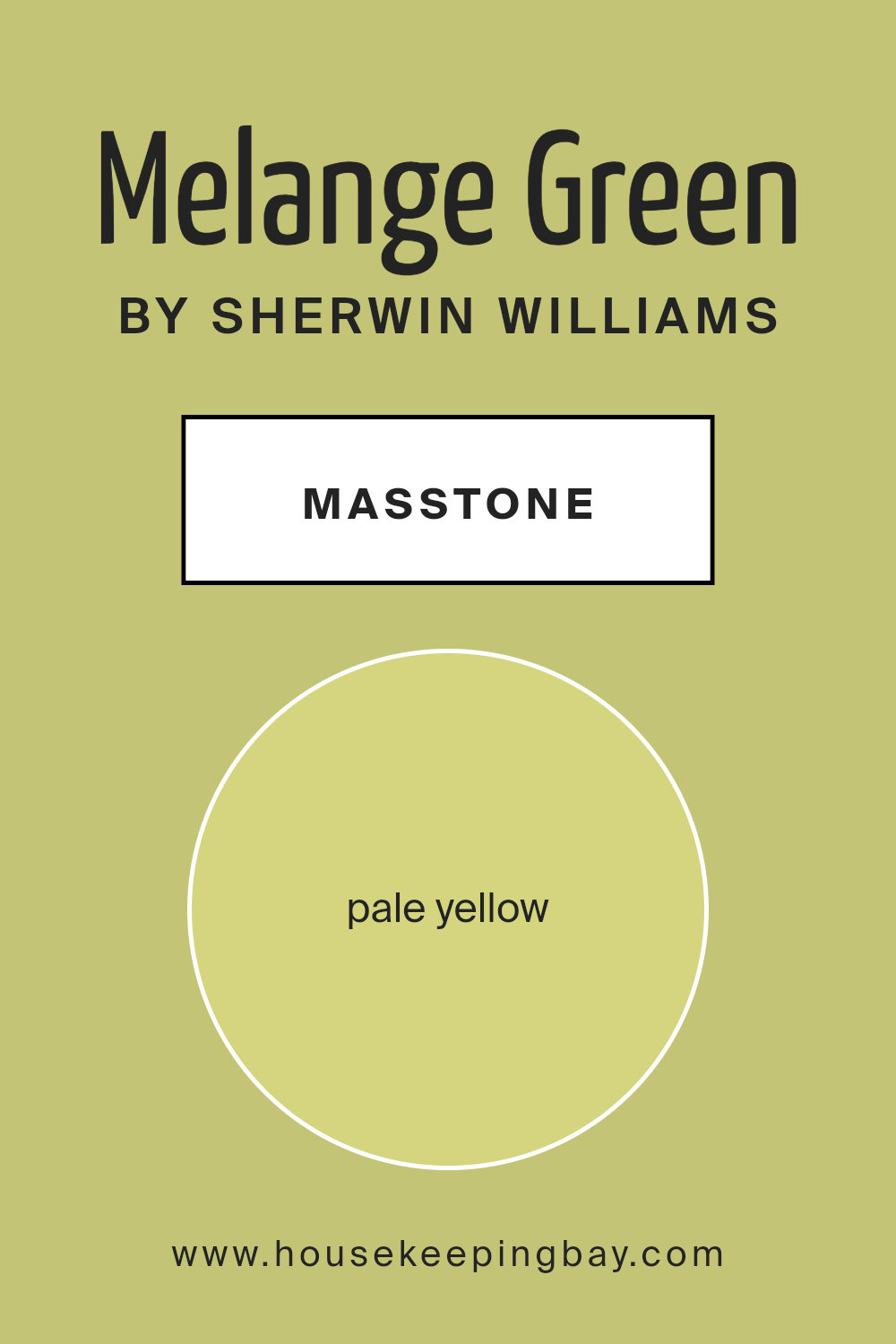
What is the Masstone of the Melange Green SW 6710 by Sherwin Williams?
Melange Green SW 6710 by Sherwin Williams features a delightful pale yellow masstone, which is represented by the color code #D5D580. This subtle yellow undertone gives the paint a unique warmth and plays a significant role in how the color feels in a room.
When used in homes, the pale yellow in Melange Green can create a cozy and inviting atmosphere. It reflects light beautifully, making spaces feel brighter and more open.
Walls painted with Melange Green can complement a variety of decor styles. The soft hint of yellow pairs well with natural wood tones and can bring a cheerful, sunny vibe to living rooms or bedrooms. In kitchens, this color might help create an appetizing, fresh look. The gentle warmth of the pale yellow masstone also provides a soothing backdrop for plants and earthy elements, enhancing the feeling of comfort and harmony within the home.
housekeepingbay.com
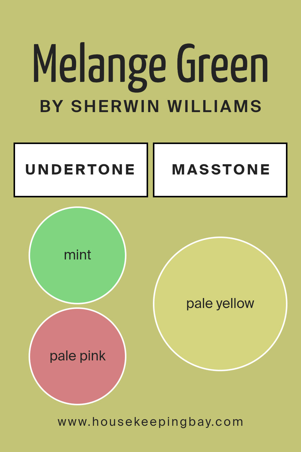
Undertones of Melange Green SW 6710 by Sherwin Williams
Melange Green SW 6710 by Sherwin Williams is a complex color with various undertones that influence its final appearance. These undertones, such as mint, pale pink, yellow, grey, light gray, light green, orange, light blue, light purple, olive, and lilac, affect how we perceive it on interior walls.
Undertones provide subtle hues that lie beneath the surface of the main color. They can alter the mood and feel of a room depending on lighting and surrounding elements.
In Melange Green, the mint undertone adds freshness, while pale pink offers a hint of warmth. Yellow provides brightness, enhancing the green’s vibrancy. Grey and light gray introduce a calming effect, adding balance. Light green complements the main green tone, reinforcing its natural essence.
Orange brings a touch of warmth and energy, contrasting softly with the coolness of light blue, which adds a serene vibe. Light purple and lilac introduce subtle sophistication, while olive grounds the color with an earthy feel.
On interior walls, these undertones create a dynamic backdrop. The color shifts with light changes, making spaces feel lively yet soothing. Melange Green can make a cozy, inviting atmosphere, perfect for living rooms or bedrooms needing freshness or tranquility through color depth.
housekeepingbay.com
Coordinating Colors of Melange Green SW 6710 by Sherwin Williams
Coordinating colors refer to hues that complement each other, bringing harmony and balance to a space. These colors can significantly affect the mood and feel of a room by enhancing each other’s beauty when used together.
Melange Green SW 6710 by Sherwin Williams is a versatile and soothing shade that blends nature-inspired tones with a hint of modernity. To create a cohesive look, you could pair it with colors like SW 7005 – Pure White, SW 7562 – Roman Column, and SW 7746 – Rushing River. Each of these colors contributes its unique character to the ensemble.
SW 7005 – Pure White is a crisp and clean color, offering a fresh backdrop that can brighten any room. Its simplicity allows other colors to stand out while still maintaining its own elegance. SW 7562 – Roman Column is a soft and warm off-white with subtle undertones, providing a gentle contrast to the coolness of Melange Green.
It adds a touch of warmth without overwhelming the space. SW 7746 – Rushing River is a muted green that carries a hint of earthiness, which ties in beautifully with Melange Green.
Together, these colors create a balanced and inviting environment in any home.
You can see recommended paint colors below:

housekeepingbay.com
How Does Lighting Affect Melange Green SW 6710 by Sherwin Williams?
Lighting can significantly change how a color appears in a space. Melange Green SW 6710 by Sherwin Williams is a color that can look different depending on the lighting conditions and which direction the windows face.
In natural light, Melange Green can show its full range. In a north-facing room, where light tends to be cooler and softer, this color might look a bit more muted or even slightly bluish. North light doesn’t bring out the full warmth in colors, so Melange Green might appear more subdued and gentle.
In a south-facing room, the light is warmer and brighter throughout the day. Here, Melange Green can look much brighter and more vibrant. The warm light can enhance the green tones, making the room feel lively and fresh.
In east-facing rooms, morning light is abundant, with a warm, yellowish tone. This can make Melange Green appear warm and inviting early in the day. As the sun moves, the light becomes cooler, which might make the green appear softer in the afternoon.
West-facing rooms have the opposite effect. In the morning, these rooms can feel a bit dim, which might make Melange Green look more muted. However, in the late afternoon and evening, the warm, golden light enhances the green hues, giving them a lively feel.
Under artificial lighting, the color can change again. With warm incandescent bulbs, Melange Green may look warmer and cozier. Cooler LED or fluorescent lights might make it appear crisper or more subdued. The type of artificial light influences how much of the yellow or blue undertones become visible.
In all these scenarios, Melange Green’s appearance is tied closely to the source and quality of light. Observing it at different times of the day and under various lighting conditions is key to understanding how it will truly look in any given room.
housekeepingbay.com
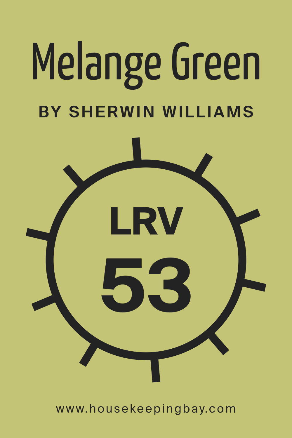
What is the LRV of Melange Green SW 6710 by Sherwin Williams?
LRV stands for Light Reflectance Value. It measures how much light a color reflects or absorbs. The scale goes from 0 to 100, where 0 means the color absorbs all light and is very dark, while 100 means the color reflects all light and is very bright, like white.
When you choose a paint color for your walls, the LRV is essential because it affects how light or dark the room feels. A high LRV means the color will make the room feel more open and bright because it reflects more light back into the room.
On the other hand, a low LRV will make the room feel cozier or more intimate because less light bounces off the walls.
Melange Green SW 6710 by Sherwin Williams has an LRV of 52.719.
This value is right in the middle of the scale, which means Melange Green is neither too light nor too dark. The color will reflect a moderate amount of light, making it a good balance for most rooms.
It won’t make a space too bright, nor will it make it feel too closed in. This neutral quality allows Melange Green to work well in various lighting conditions and spaces, adding a fresh yet calm feeling. If you want a paint color that feels soft and won’t overpower other elements in your room, an LRV of around 52 is a harmonious choice.
housekeepingbay.com
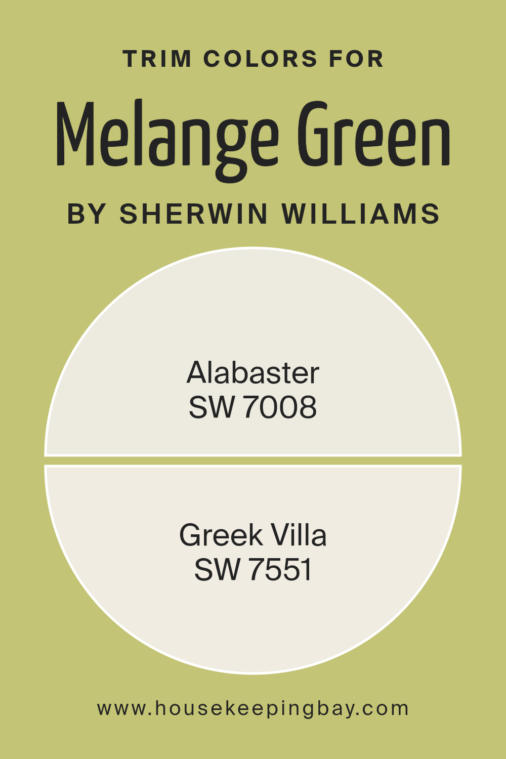
What are the Trim colors of Melange Green SW 6710 by Sherwin Williams?
Trim colors are the shades used to highlight and outline the edges of walls, ceilings, doors, and windows, playing a crucial role in enhancing the overall look of any room. In the case of Melange Green SW 6710 by Sherwin Williams, choosing the right trim colors is essential as they add depth and accentuate the main hue, making spaces feel more cohesive.
The trim colors serve as a subtle contrast, drawing attention to architectural details without overwhelming the eye. They provide a neat, finished look and can add elegance or freshness, depending on the chosen shades.
For Melange Green, excellent trim color options could be SW 7008 – Alabaster and SW 7551 – Greek Villa. Alabaster is a soft, creamy off-white that offers warmth without being too stark, creating a gentle transition between walls and trim.
Greek Villa is a warm white with a bit more brightness, adding a clean, airy feel that complements Melange Green’s earthy tones beautifully.
Together, these trim colors can help create an inviting and balanced ambiance, allowing the green to remain the focal point while the trims subtly frame and enhance the overall space.
You can see recommended paint colors below:
housekeepingbay.com
Colors Similar to Melange Green SW 6710 by Sherwin Williams
Colors create mood and bring life to spaces. Using similar colors adds harmony to any room and makes it feel more unified. Melange Green, a refreshing shade, has close relatives that can be used alongside it for a cohesive look. SW 6916 – Impetuous offers a warm yellow-green shade that sparks joy.
Primavera, SW 9031, brings an earthy, soft touch, perfect for calm spaces. Frolic, SW 6703, is vivid yet soft, ideal for playful areas. SW 6711 – Parakeet is a bright, lively green, adding energy to any space.
Moving on, SW 9030 – Limon Fresco is a gentle, zesty hue that brings freshness. Lime Rickey, SW 6717, is a fun, electric green, perfect for bold accents. Dancing Green, SW 6716, connects nature’s vibrancy indoors. SW 6709 – Gleeful is a softer green, offering a sense of happiness and balance.
Finally, SW 6917 – Nervy Hue is close to chartreuse, providing a daring splash. SW 0073 – Chartreuse, a vivid yellow-green, adds boldness and brightness.
These colors complement Melange Green beautifully, giving various options while maintaining harmony.
You can see recommended paint colors below:
- SW 6916 Impetuous
- SW 9031 Primavera
- SW 6703 Frolic
- SW 6711 Parakeet
- SW 9030 Limon Fresco
- SW 6717 Lime Rickey
- SW 6716 Dancing Green
- SW 6709 Gleeful
- SW 6917 Nervy Hue
- SW 0073 Chartreuse

housekeepingbay.com
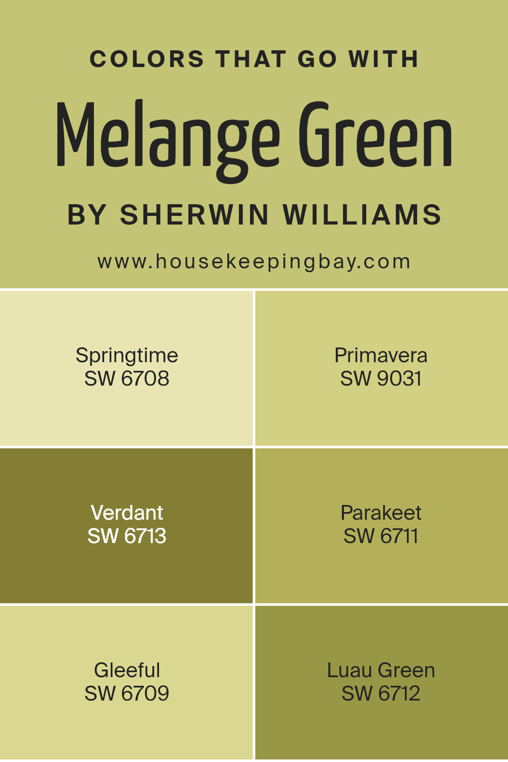
Colors that Go With Melange Green SW 6710 by Sherwin Williams
Melange Green SW 6710 by Sherwin Williams is a versatile shade that blends well with several harmonious colors. These complementary colors enhance Melange Green’s natural beauty, creating a coordinated and cohesive aesthetic. SW 6708 Springtime offers a bright, cheerful tone like new blooms, infusing spaces with a lively energy.
Its uplifting quality is perfect for refreshing atmospheres. SW 9031 Primavera provides a gentle, earthy hue, reminiscent of early growth in nature, bringing a natural warmth that complements Melange Green beautifully. This color grounds a space, adding a reassuring backdrop.
SW 6713 Verdant adds richness with its deep, leafy tone, reminiscent of lush gardens, granting depth and sophistication to a palette paired with Melange Green. The vibrant SW 6711 Parakeet adds vibrancy with its playful, bold twist on traditional green, which captivates attention and adds intrigue.
Meanwhile, SW 6709 Gleeful, light and fresh like a sunny morning, brings a sense of joy, making any room feel more open and airy.
SW 6712 Luau Green stands out with its vivid, tropical spirit, adding a lively splash to any décor that interacts with Melange Green, keeping spaces invigorated and balanced. These colors, when combined, provide endless possibilities for creating harmonious interiors.
You can see recommended paint colors below:
- SW 6708 Springtime
- SW 9031 Primavera
- SW 6713 Verdant
- SW 6711 Parakeet
- SW 6709 Gleeful
- SW 6712 Luau Green
housekeepingbay.com
How to Use Melange Green SW 6710 by Sherwin Williams In Your Home?
Melange Green SW 6710 by Sherwin Williams is a versatile and soothing color that brings a natural touch to any home. This gentle green has a soft, fresh appeal that makes it an excellent choice for various spaces. In living rooms, it creates a warm and welcoming atmosphere, pairing well with neutral furniture or light wood accents. In the kitchen, it adds a refreshing look, complementing white or cream cabinets.
For bedrooms, Melange Green provides a peaceful environment conducive to relaxation and rest. This color works beautifully with natural textures like jute rugs or bamboo decor, enhancing its earthy feel. Additionally, in a home office, it brings a touch of nature, promoting focus and calmness.
Overall, Melange Green SW 6710 is ideal for anyone looking to bring an element of nature into their home design, making spaces feel cozy and inviting without being overwhelming.
Melange Green SW 6710 by Sherwin Williams vs Frolic SW 6703 by Sherwin Williams
Melange Green SW 6710 and Frolic SW 6703 by Sherwin Williams offer two distinct vibes for any space. Melange Green is a soft, muted green with undertones of gray. It feels calming and blends effortlessly with nature-inspired themes, making it perfect for rooms where relaxation or reflection is key, like a bedroom or study.
Frolic SW 6703, however, is a lively, cheerful yellow-green. This color radiates energy and can brighten any space, which makes it ideal for areas where you want to boost mood and creativity, such as a kitchen or playroom. Its vibrant nature can add a sense of fun and playfulness.
While Melange Green offers a subdued, serene backdrop with its gentle tones, Frolic adds zest and enthusiasm with its bright, sunny personality. Choosing between these two depends on whether you’re aiming for a peaceful environment or an energetic atmosphere.
You can see recommended paint color below:
- SW 6703 Frolic

housekeepingbay.com
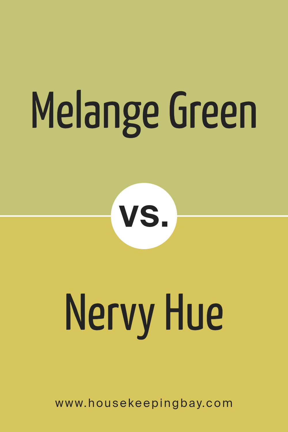
Melange Green SW 6710 by Sherwin Williams vs Nervy Hue SW 6917 by Sherwin Williams
Melange Green SW 6710 by Sherwin Williams is a soft, muted green with earthy undertones, often creating a calming and grounded atmosphere in a space. This shade can make a room feel fresh yet serene, offering a touch of nature indoors. It pairs well with neutral tones like whites and beiges, enhancing a natural look.
Nervy Hue SW 6917 is a brighter, more vibrant green-yellow color, injecting energy and liveliness into a room. This color can make a bold statement when used in accent walls or decorative pieces. It generally suits playful or modern settings and works well with other bold colors or against neutrals to prevent overwhelming a space.
Both colors bring green into a room, but Melange Green provides a more subdued and calming effect, while Nervy Hue offers a vivid and energetic ambiance. Choosing between them often depends on the desired mood and functionality of the space.
You can see recommended paint color below:
- SW 6917 Nervy Hue
housekeepingbay.com
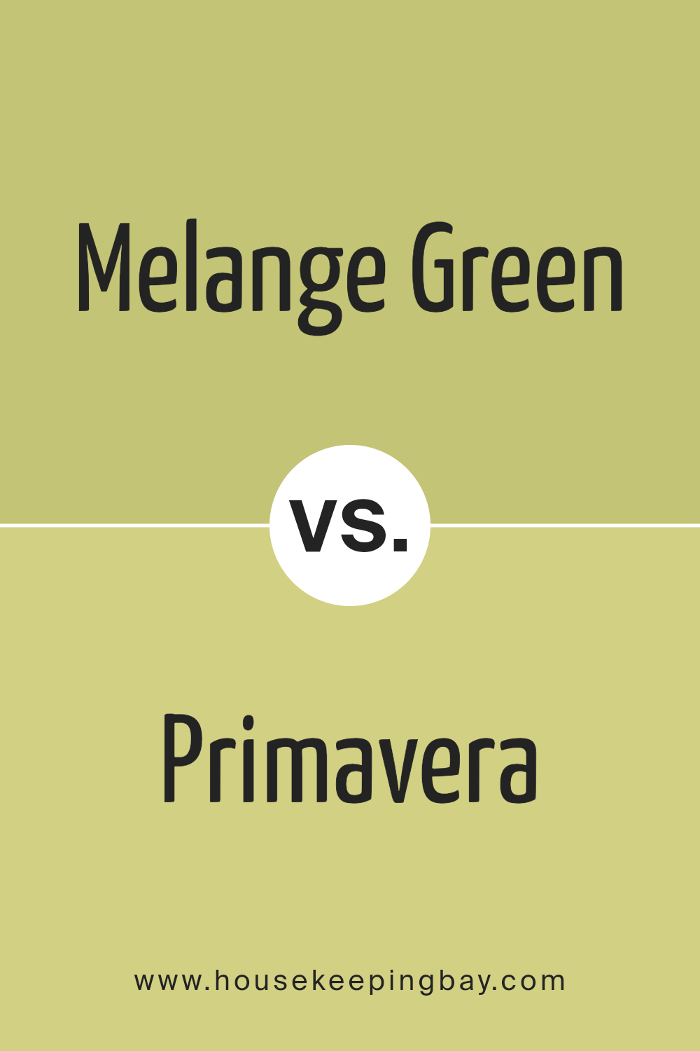
Melange Green SW 6710 by Sherwin Williams vs Primavera SW 9031 by Sherwin Williams
Melange Green SW 6710 and Primavera SW 9031, both by Sherwin Williams, offer two distinct shades of green for any space. Melange Green SW 6710 brings a soft, muted touch with a hint of gray. This shade creates an understated, calming atmosphere, making it ideal for bedrooms or living areas where a subtle ambiance is desired.
In contrast, Primavera SW 9031 is more vibrant and lively. It injects a brighter, more cheerful energy, perfect for spaces needing a pop of color or a refreshing zest, like kitchens or playrooms.
While both colors originate from the green family, Melange Green leans into a more earthy, subdued palette, whereas Primavera shines with boldness and enthusiasm.
Choosing between them depends on the mood you wish to evoke: subdued elegance with Melange Green or an invigorating spirit with Primavera. Both bring unique personalities but cater to different decor goals.
You can see recommended paint color below:
- SW 9031 Primavera
housekeepingbay.com
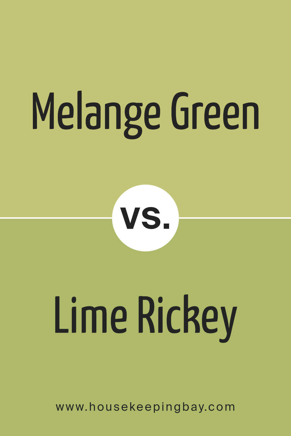
Melange Green SW 6710 by Sherwin Williams vs Lime Rickey SW 6717 by Sherwin Williams
Melange Green SW 6710 and Lime Rickey SW 6717 are both refreshing shades of green offered by Sherwin Williams, each with its own unique character. Melange Green presents a soft, nature-inspired look. It draws from earthy tones and offers a soothing balance between vibrancy and calmness. This shade can remind you of a peaceful garden setting or lush foliage, making it a perfect choice for those who appreciate subtle colors with a calming presence.
Lime Rickey, on the contrary, bursts with bright, lively energy. It’s more vibrant and attention-grabbing, offering a crisp and energetic feel. This shade leans towards a citrusy intensity, making it ideal for lively spaces that need a refreshing and cheerful atmosphere.
While both colors serve as dynamic greens, Melange Green leans towards understated elegance, while Lime Rickey is perfect for those seeking a bold, lively splash of color. Each shade brings its own charm, catering to different moods and settings.
You can see recommended paint color below:
- SW 6717 Lime Rickey
housekeepingbay.com
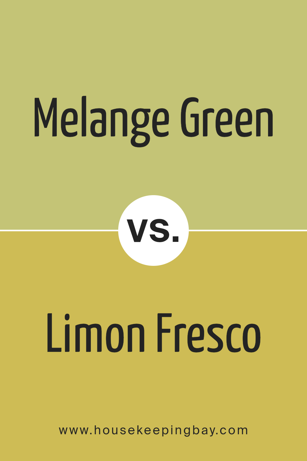
Melange Green SW 6710 by Sherwin Williams vs Limon Fresco SW 9030 by Sherwin Williams
Melange Green SW 6710 by Sherwin Williams is a soft, muted shade that brings a calming effect to spaces. It’s a versatile, nature-inspired green that works well in living rooms or bedrooms, offering a soothing touch that feels earthy and grounded. This color can make a room feel fresh and connected to the outdoors.
Limon Fresco SW 9030, also by Sherwin Williams, is a brighter, zesty green with yellow undertones. It brings energy and vitality to any space it decorates. This lively color is perfect for accent walls or smaller areas where you want to create a sense of cheerfulness and stimulation.
While Melange Green feels more subdued and calm, Limon Fresco adds a pop of brightness and enthusiasm. Both greens carry a natural vibe, but they offer different moods. Melange Green leans toward restful and peaceful, while Limon Fresco feels energetic and invigorating.
You can see recommended paint color below:
- SW 9030 Limon Fresco
housekeepingbay.com
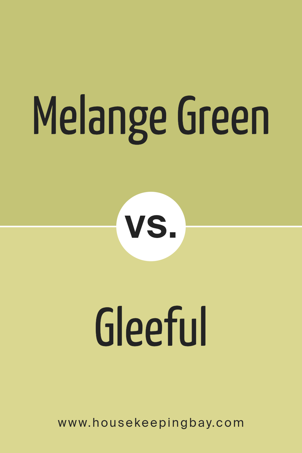
Melange Green SW 6710 by Sherwin Williams vs Gleeful SW 6709 by Sherwin Williams
Melange Green SW 6710 and Gleeful SW 6709, both by Sherwin Williams, are vibrant shades of green that bring different vibes to a space. Melange Green offers a softer, more muted appearance. It has a calm, earthy quality, creating a soothing and natural feel. This makes it a great choice for spaces aiming for relaxation and subtlety.
Gleeful, though, carries a brighter, more energetic tone. Its lively character exudes a cheerful and fresh atmosphere, perfect for areas looking to inject energy and brightness. The color stands out and can be used to highlight specific parts of a room or create an upbeat environment.
While Melange Green leans towards a gentle and understated presence, Gleeful bursts forth with vibrancy and pep. These differences make Melange Green a good fit for calm and subdued settings, while Gleeful suits spaces wanting a lively and bold touch.
You can see recommended paint color below:
- SW 6709 Gleeful
housekeepingbay.com
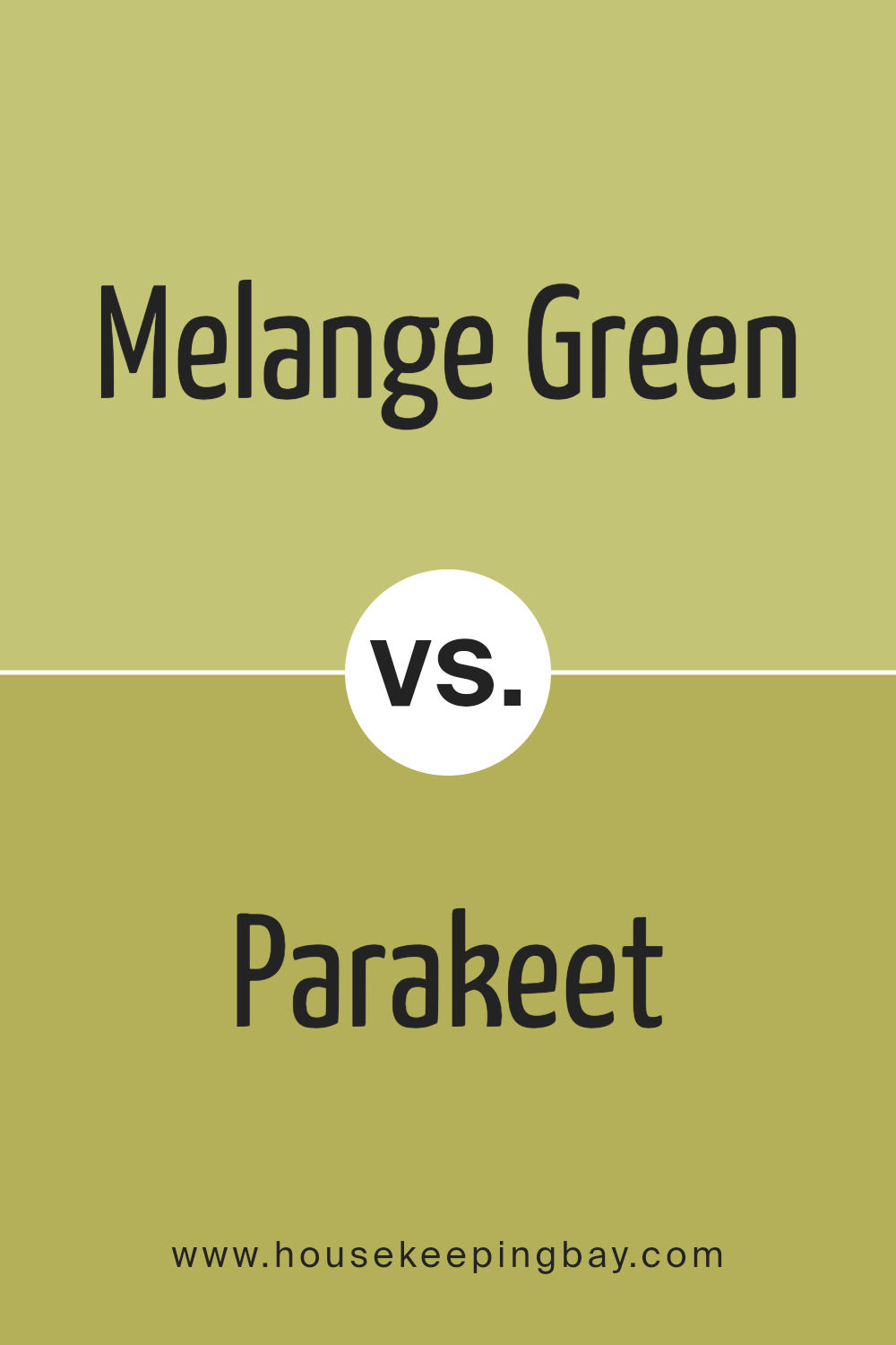
Melange Green SW 6710 by Sherwin Williams vs Parakeet SW 6711 by Sherwin Williams
Melange Green (SW 6710) and Parakeet (SW 6711) both belong to the same vibrant family of greens from Sherwin Williams but offer distinct vibes. Melange Green feels like a soft, subtle shade with a muted, calming presence. It carries a bit of gray, making it feel more relaxed and versatile. This color suits spaces that aim for understated elegance and a soothing atmosphere.
Parakeet, while still a green, turns up the intensity. It’s brighter, more vivid, and leans towards a lively lime shade. Parakeet brings energy and zest to a room, perfect for spaces needing a burst of character and cheerfulness. It grabs attention without overwhelming the senses.
Both colors share green’s freshness, yet Melange offers a laid-back mood, and Parakeet delivers a spirited punch. Together, they illustrate green’s versatility, offering options for both calm and energetic settings depending on your preference.
You can see recommended paint color below:
housekeepingbay.com
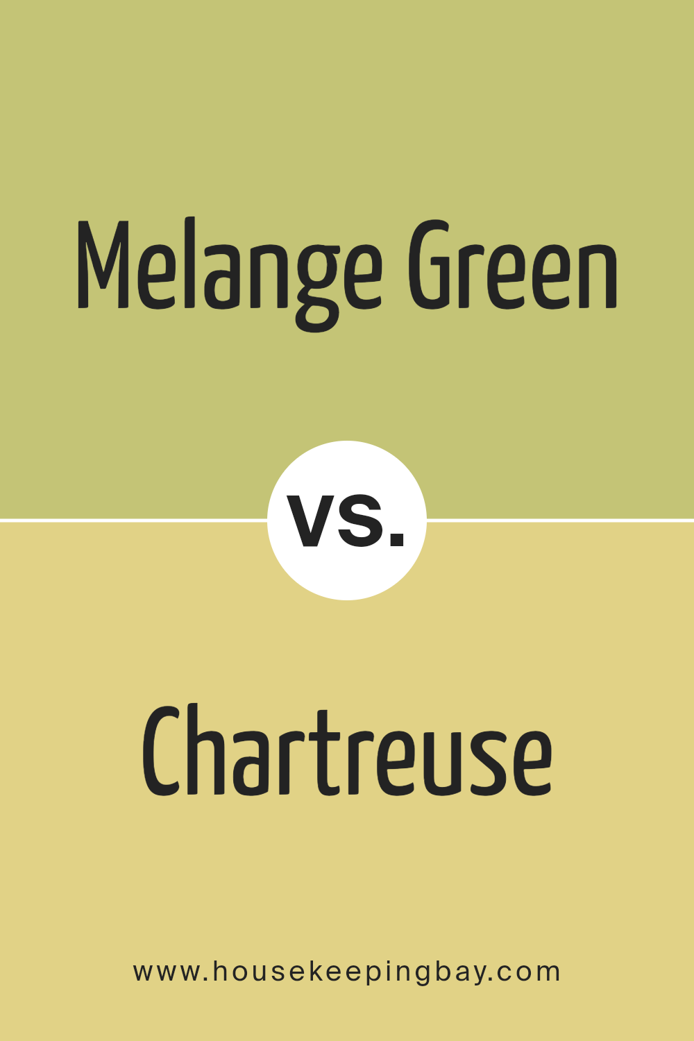
Melange Green SW 6710 by Sherwin Williams vs Chartreuse SW 0073 by Sherwin Williams
Melange Green SW 6710 and Chartreuse SW 0073, both by Sherwin Williams, offer unique green hues. Melange Green has a softer, muted tone. It feels earthy and calming, ideal for creating a peaceful atmosphere in a room. This color can work well in living spaces or bedrooms where a subtle touch of nature is desired.
Chartreuse, however, is a brighter, more vibrant shade of green. It brings energy and liveliness, making it a good choice for areas where you want a pop of color, like kitchens or creative spaces. This vibrant shade can add character and a cheerful mood wherever it is used.
When comparing the two, Melange Green provides a gentle, natural vibe, while Chartreuse stands out with its boldness and vivacity. Their different intensities mean they serve distinct purposes in design, from soothing environments to lively areas.
You can see recommended paint color below:
housekeepingbay.com
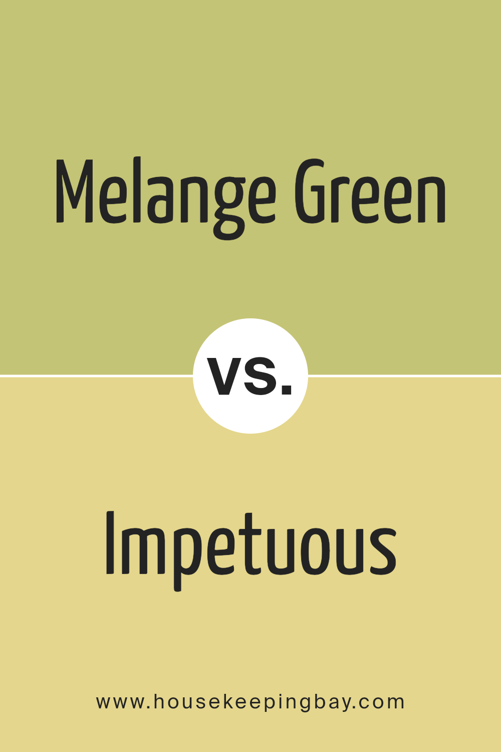
Melange Green SW 6710 by Sherwin Williams vs Impetuous SW 6916 by Sherwin Williams
Melange Green SW 6710 by Sherwin Williams is a gentle, muted green that brings a calming and earthy feel to spaces. This color has a soothing, natural tone which makes it perfect for creating relaxing environments, such as bedrooms or living areas where a peaceful atmosphere is desired. Its softness allows it to blend well with neutral colors or subtle accents, adding to its versatility.
In contrast, Impetuous SW 6916 is a vibrant, energetic yellow, exuding brightness and warmth. This lively shade can inject excitement into any room, making it ideal for spaces that aim to uplift and invigorate, such as kitchens or playrooms.
Impetuous is bold, making a strong impression, and can serve as a focal point in a room when used creatively.
While Melange Green offers a more subdued and serene vibe, Impetuous delivers a burst of energy and cheerfulness, showcasing the diverse ways color influences mood and style.
You can see recommended paint color below:
- SW 6916 Impetuous
housekeepingbay.com
Melange Green SW 6710 by Sherwin Williams vs Dancing Green SW 6716 by Sherwin Williams
Melange Green SW 6710 and Dancing Green SW 6716 by Sherwin Williams both bring a refreshing green vibe, but they each have their own character. Melange Green has a softer, muted tone. It feels earthy and calm, like a gentle walk in a park. It’s versatile, making it suitable for spaces where a relaxed atmosphere is desired. Think of it as a backdrop that quietly complements other colors and furnishings.
In contrast, Dancing Green is brighter and more energetic. It carries a lively and cheerful quality that can brighten up a room. This color is great for areas where you want to create a sense of liveliness and positivity. Picture it in a playroom or kitchen, where a little boost of energy is welcomed.
Both colors can work beautifully depending on the mood you want to create. Melange Green leans towards peaceful and understated, while Dancing Green adds a pop of vibrancy.
You can see recommended paint color below:
- SW 6716 Dancing Green
housekeepingbay.com
Conclusion
When I think about SW 6710 Melange Green by Sherwin Williams, I see more than just a color; I see a versatile option that can effortlessly bring a refreshing vibe to any space. Its natural tones have a way of adding warmth and depth, which makes it fitting for a wide range of design styles.
Whether used on an accent wall, in a cozy living room, or throughout an entire home, Melange Green offers a unique ability to complement both traditional and modern decor.
In this shade, there’s a subtle complexity that keeps it interesting without being overpowering. Its balanced mix of green with hints of gray helps create a calming background that work well with other colors and materials.
I find it especially useful in spaces where I want a touch of nature and serenity.
I also appreciate how Melange Green pairs well with various textures, whether it be wood, metal, or fabric, allowing me to experiment with different interiors while maintaining a cohesive look.
For me, SW 6710 Melange Green from Sherwin Williams is more than just a paint color; it’s a way to add a fresh and inviting atmosphere to any room, making it a favorite choice when I’m considering a stylish and timeless update.
housekeepingbay.com
Ever wished paint sampling was as easy as sticking a sticker? Guess what? Now it is! Discover Samplize's unique Peel & Stick samples. Get started now and say goodbye to the old messy way!
Get paint samples


