Chartreuse SW 0073 by Sherwin Williams
Reviving Interiors with Vibrant Green-centric Hues
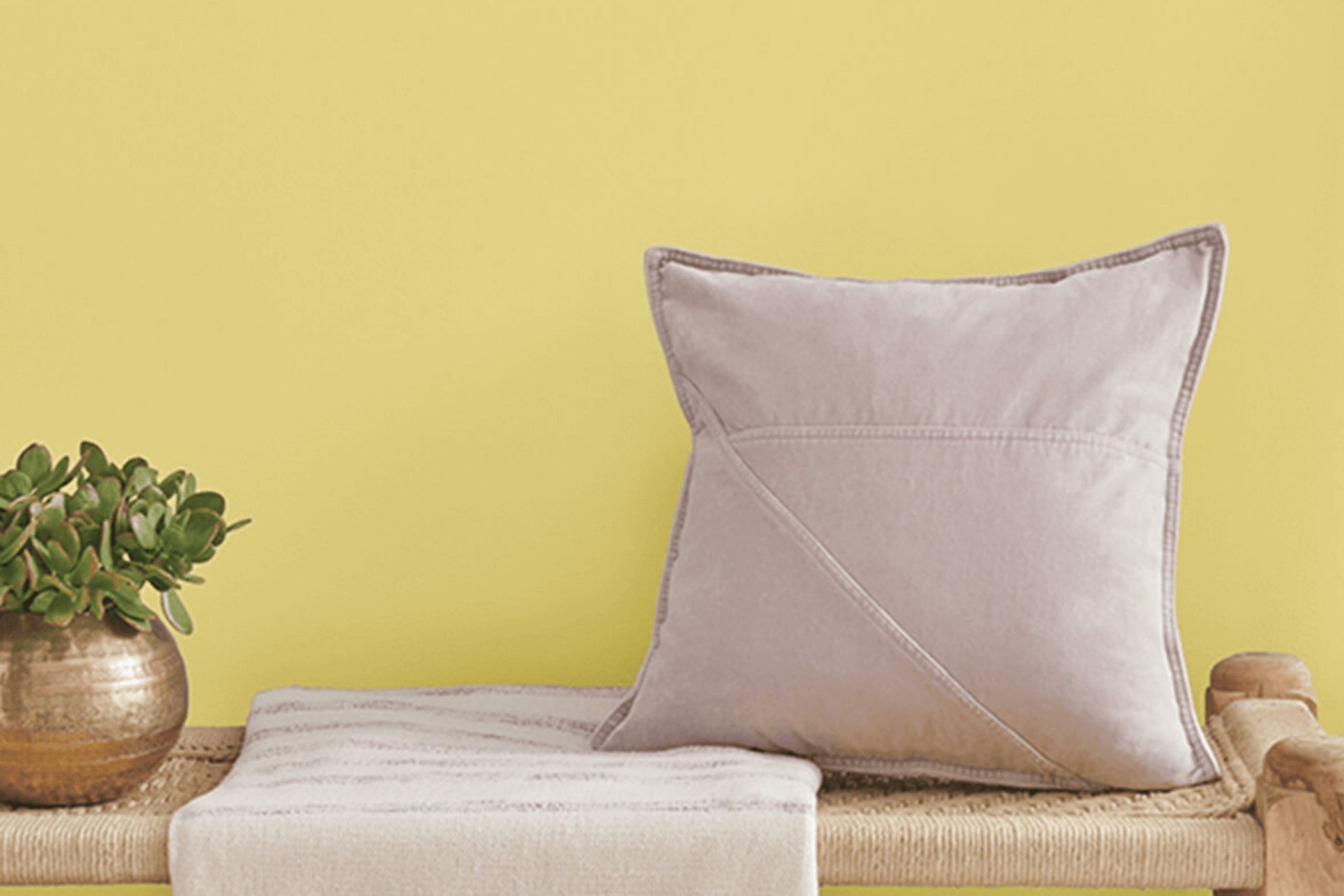
Boldly showing up in the color arena is SW 0073 Chartreuse by Sherwin Williams, a lively hue that’s as unique as its name. An unmistakable burst of yellowish-green, it reflects energy, creativity, and an adventurous spirit.
As a color enthusiast, you might find Chartreuse a pleasant surprise. It manages to walk the tightrope of being both grounding as a green and stimulating as a yellow. Walking into a room painted in Chartreuse may feel like waking up to a fresh spring morning, veritably alive and brimming with the potential of the day ahead.
Whether you choose to highlight a feature wall in your living room or brighten up your kitchen, this extraordinary shade helps you to create spaces full of life and personality. Whether it’s painting an entire room or just inserting exciting color pops, you’ll find this color to be quite versatile.
So why not lighten up your spaces, and possibly your mood, with SW 0073 Chartreuse by Sherwin Williams! This is not just a color but a statement of artistic flair, energy, and renewal. It’s about your personal taste making a bold, fun statement.
If you’re looking for that perfect blend of excitement and warmth, then Chartreuse maybe your ideal choice. Give it a shot and see the difference it can make in your home decor!
via sherwin-williams.com
What Color Is Chartreuse SW 0073 by Sherwin Williams?
Sherwin Williams’ Chartreuse SW 0073 is indeed a remarkable color. It’s a lively and vibrant shade, falling precisely between yellow and green, akin to the fresh dew on a spring leaf. The hue is unmissable, yet not overwhelming, creating a cheerful and dynamic atmosphere which catches the eye yet soothes it at the same time.
Its versatility is impressive, making it suitable for various interior styles. The color meshes beautifully in modern and contemporary designs, imparting a fresh, crisp touch. It also fits well in eclectic spaces as a distinct detail or in minimalist settings as a bold accent.
When it comes to materials, Chartreuse SW 0073 pairs favorably with light, natural woods as well as darker mahogany and walnut. It also complements metallic accents, particularly silver and muted gold. In terms of textures, rich fabrics like velvet or linen add depth to its vibrancy. It tends to work well with glossy finishes too, be it on ceramic or glass.
Yet, remember, subtlety is key. Overuse may lead to an overwhelming space. Careful placement creates a perfect balance, making your home feel lively, fresh, and inviting.
housekeepingbay.com
Is Chartreuse SW 0073 by Sherwin Williams Warm or Cool color?
ChartreuseSW 0073 by Sherwin Williams is a bright and lively color. This unique color gives any home a cheerful and energetic vibe. It’s bold and vibrant, and instantly livens up any room it’s used in.
When used in a home, it can make a small space appear larger. You can use it to highlight a particular area or piece of furniture. Additionally, Sherwin Williams’ ChartreuseSW 0073 is great to use as an accent color. It brings an exciting twist to a room when paired with neutral colors. Also, it can make your decor pop. This color has the power to make a room feel more inviting and fun.
Furthermore, it’s a lovely color for an accent wall or for accessories like cushions, lamps, or picture frames. Its versatility is a big plus. The versatility means that you can use it in any room, for any style. Hence, it’s a smart choice for any home looking to add a bit of flair. ChartreuseSW 0073 truly adds a unique charm to any home.
What is the Masstone of the Chartreuse SW 0073 by Sherwin Williams?
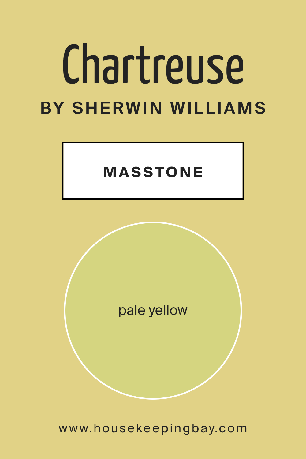
Sherwin Williams ChartreuseSW 0073 is a beautiful shade of pale yellow, just like a soft morning sunbeam. This color, with a code of #D5D580, can light up any room in your home, offering a warm and welcoming feel. It’s a color that can bring a sense of joy, as it’s often associated with fun and happiness.
In terms of home decor, this color is excellent for pretty much any room. You could use it in a living room, a kitchen, or a bedroom. Combined with darker furniture, it can create a comfy feel. Or, with lighter-tone furniture, it creates a more spacious appearance. It’s a flexible color that goes well with many others.
Even though it’s a bright color, it is soft enough to not be overpowering. This makes ChartreuseSW 0073 a great choice for those who want to add a pop of color to their homes without going overboard. It’s glowing, soothing, and sure to make your home feel even homier.
housekeepingbay.com
Undertones of Chartreuse SW 0073 by Sherwin Williams
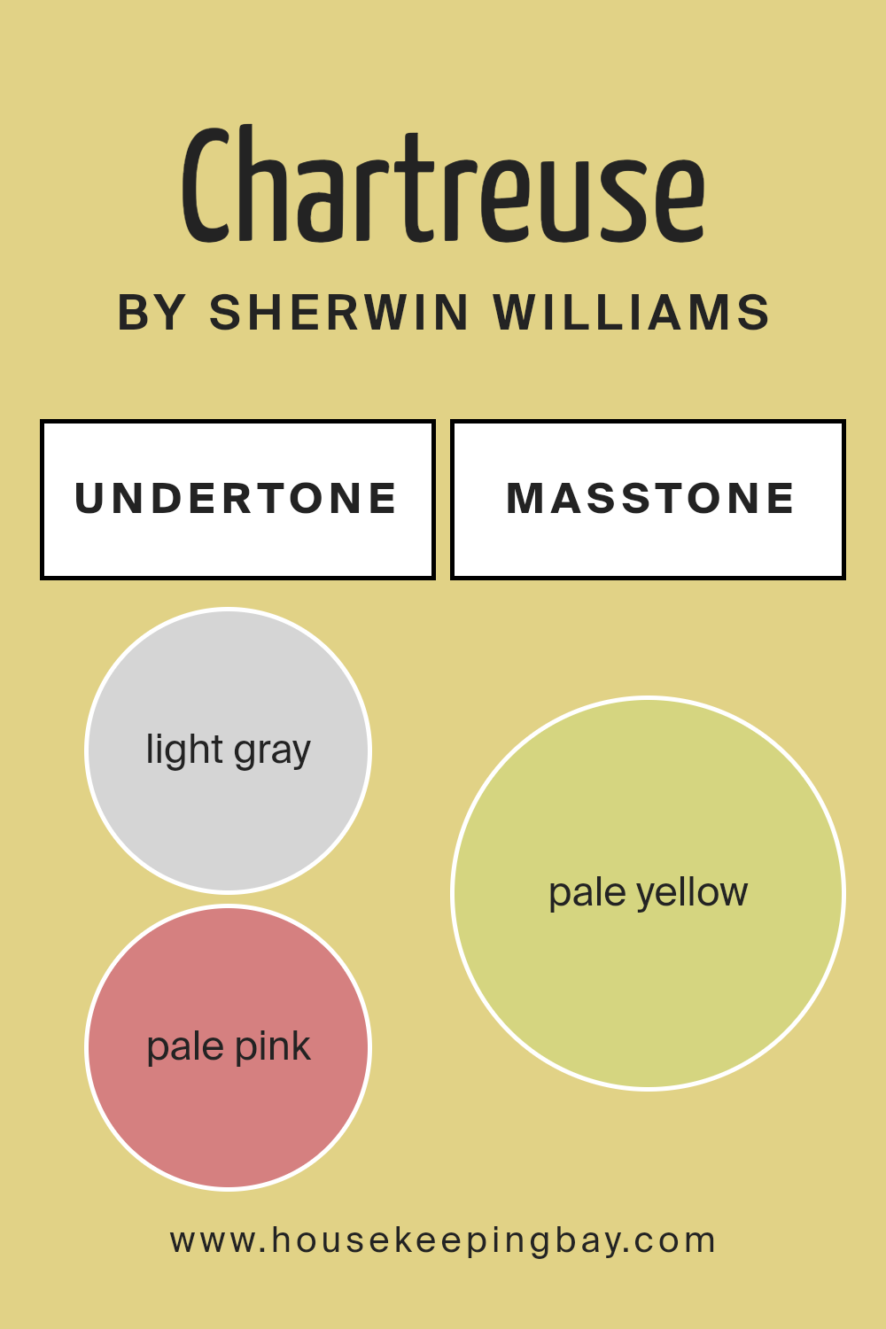
ChartreuseSW 0073 by Sherwin Williams is a unique color that carries multiple undertones. These subtle hues affect our overall perception of the color and how it interacts within an interior space.
One of the noticeable undertones in ChartreuseSW 0073 is light gray. This gentle undertone slightly dulls the vibrant chartreuse, giving the color a calming feel. A subtle hint of pale pink is also observed in this color mix, adding a bit of warmth to its overall tone.
The impact of yellow, mint, and light purple is also significant. These undertones contribute to the color’s vibrancy, making it more lively and eye-catching. Also, the shade of orange adds a little depth to the color, preventing it from becoming too overwhelming.
Light blue, on the other hand, cools down the overall shade, providing a soothing effect. This is balanced out by the undertones of grey and olive that add complexity to the color.
Finally, the light green and lilac undertones give ChartreuseSW 0073 a softer edge, making it perfect for interior walls where you want a sense of freshness but with a refined touch.
Basically, undertones play a key role in deciding how a color is perceived and hence how it affects an individual’s mood. Thus, while ChartreuseSW 0073 is vibrant and lively, its various undertones subtly influence its impact on a room’s ambiance, making it a versatile choice for multiple settings.
housekeepingbay.com
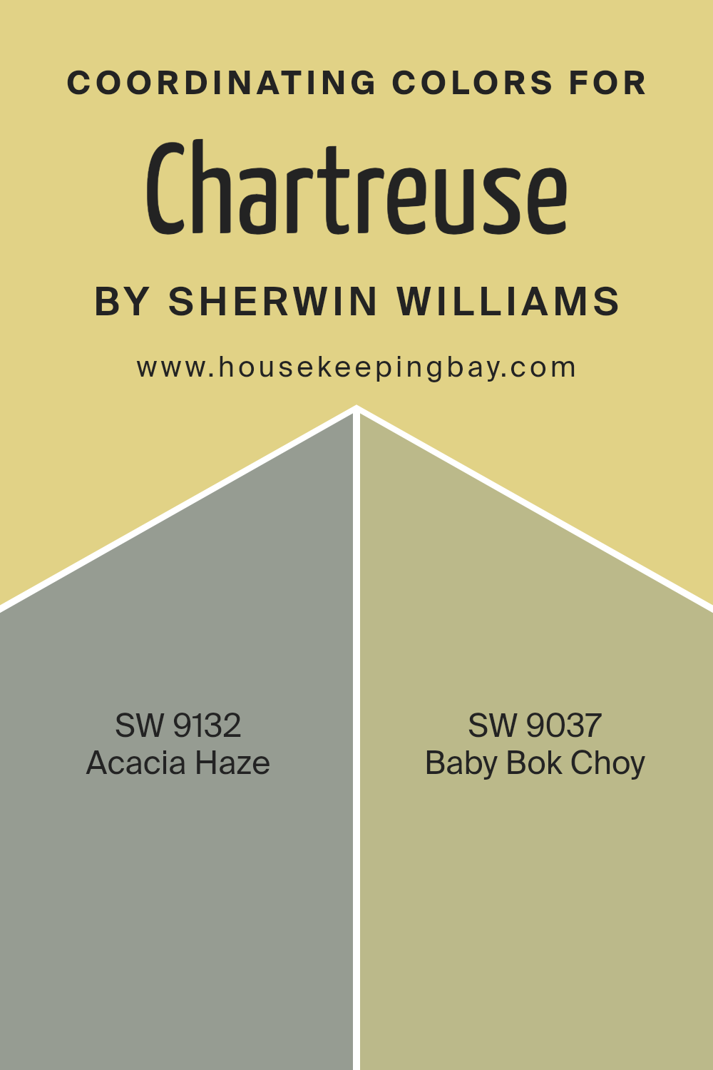
Coordinating Colors of Chartreuse SW 0073 by Sherwin Williams
Coordinating colors are tints that harmoniously work together to create a visually appealing and balanced ambiance. These colors enhance and complement each other, making any space look more polished, well-put-together, and inviting. Chartreuse SW 0073 by Sherwin Williams, a bright and vibrant shade of green, is a great example of a trend-forward base color that can be complemented by coordinating colors to add depth to its vibrancy.
A coordinating color for Chartreuse is Acacia Haze SW 9132. This muted hue with a hint of green in it adds subtle sophistication without overpowering the room. This color denotes a relaxed feel that perfectly balances the liveliness of Chartreuse.
Another coordinating color with Chartreuse is Baby Bok Choy SW 9037, a soothing pale color. This color is gentle on the eyes and creates a calming effect. It adds a light and airy feel to the boldness of Chartreuse, balancing out the overall color scheme.
Adding coordinating colors to a central color like Chartreuse can dial down its intensity, thus making a room more harmonious and pleasing to the eyes. Choosing the right coordinating colors can add complexity to your space while maintaining its aesthetic appeal.
You can see recommended paint colors below:
- SW 9132 Acacia Haze
- SW 9037 Baby Bok Choy
housekeepingbay.com
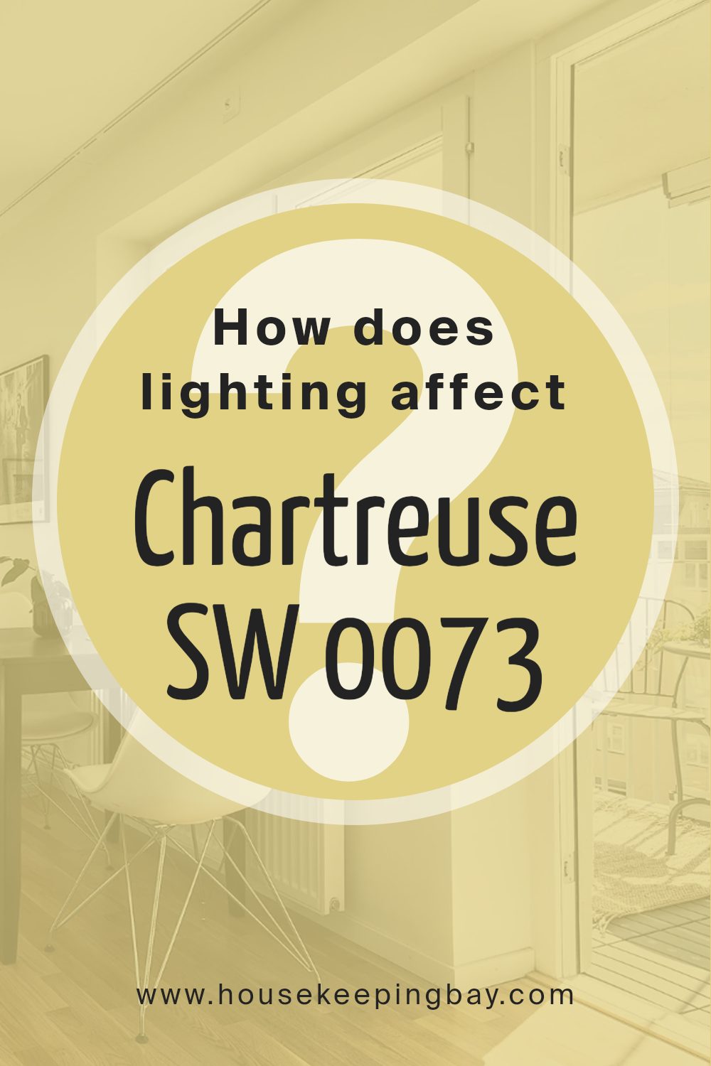
How Does Lighting Affect Chartreuse SW 0073 by Sherwin Williams?
Colors respond differently to various forms of light, and it’s key to note that lighting significantly impacts colors. The amount, type, and direction of light can alter a color’s shade, brightness, and tone. This can be clearly seen with Sherwin Williams’ ChartreuseSW 0073.
ChartreuseSW 0073 is a lively and eye-popping hue. Under artificial light, this color can appear vibrant and energetic. This is because artificial light often has a yellowish hue, increasing the warmth and intensity of ChartreuseSW 0073. Overhead lights and lamps can make it look bright and conspicuous. However, the color may appear softer or more muted under more subtle, dim artificial lighting.
Natural light, on the other hand, brings a more true-to-life look to ChartreuseSW 0073. Throughout the day, this color can take on different appearances. In the morning, this shade may seem fresh and bright, while at noon, it might appear hotter and sharper. As the sun sets, it can take on a more muted, calming tone.
Now, interpreting how ChartreuseSW 0073 works in rooms facing different directions is also of interest. North-facing rooms get cooler, indirect daylight. This light can slightly tone down ChartreuseSW 0073, making it less vibrant but still noticeable.
South-facing rooms, conversely, are filled with abundant warm light all day. This illuminates ChartreuseSW 0073, bringing out its full vibrancy and making it seem more intense. It remains lively throughout the day in this setting.
Rooms facing east get a hearty amount of morning light. ChartreuseSW 0073 appears fresh and invigorating in these spaces, really popping in a sunrise’s golden glow. As the day progresses, it maintains a pleasant brightness.
Lastly, west-facing rooms get a lot of strong afternoon light. ChartreuseSW 0073 will experience a lively transition from a daytime hue to an intense one in the evening. It offers a dynamic aesthetic experience in these rooms.
In all situations, ChartreuseSW 0073 is a versatile color that can adjust to different lighting situations, effectively setting the mood and tone of a space.
housekeepingbay.com
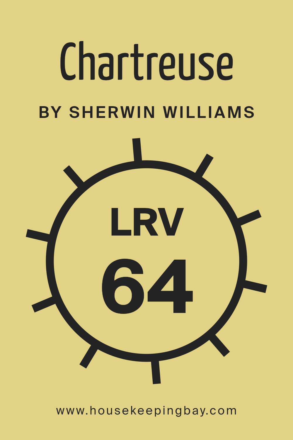
What is the LRV of Chartreuse SW 0073 by Sherwin Williams?
LRV is short for “Light Reflectance Value”. It’s a measurement that paints and colors use to show how much light they reflect. It’s given as a percentage, from 0% to 100%. If a color has a high LRV, it means it reflects a lot of light, making it look lighter. Likewise, a low LRV color will absorb more light and appear darker. It’s just as if we are talking about light and shade. It’s an important thing to think about because it can change how a color appears on your walls.
The LRV of Chartreuse SW 0073 by Sherwin Williams is 64.106. This is more than halfway up the LRV scale, showing that this color reflects a good amount of light. So, it’s a color that, just by itself, adds a fair amount of brightness to a room.
Using this color on your walls might make the room look brighter, even with the same amount of light. It’s just the color working its light reflectance magic. But, like all colors, how it looks can change with the amount of natural and artificial light in the room.
housekeepingbay.com
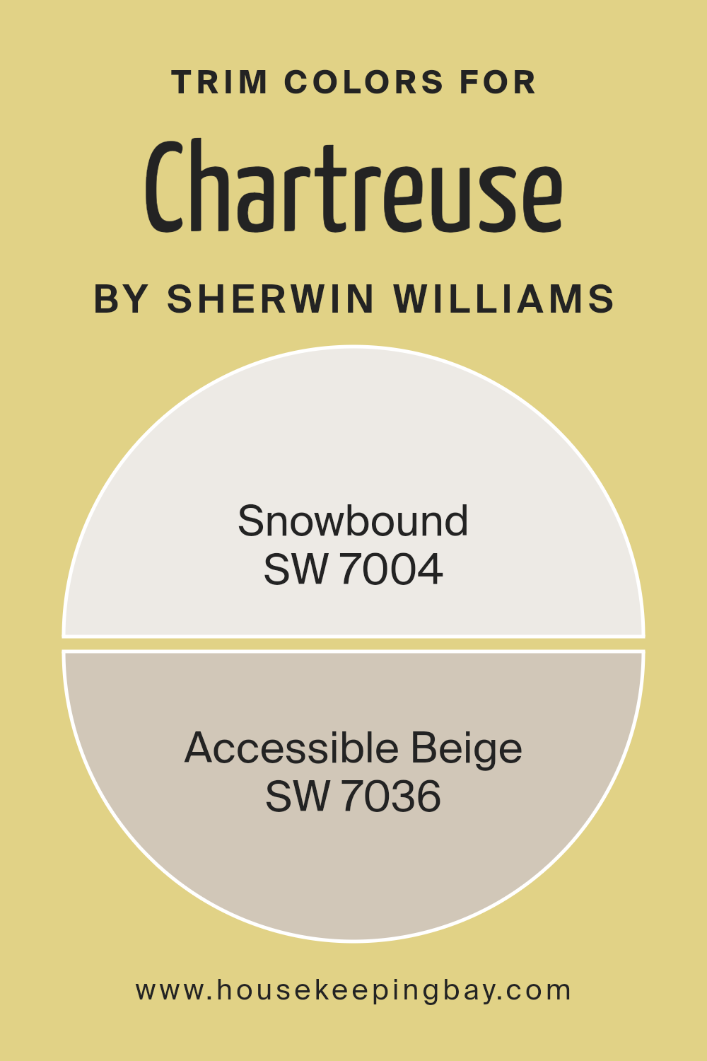
What are the Trim colors of Chartreuse SW 0073 by Sherwin Williams?
Trim colors are the hues used to accentuate the edges around doors, windows, ceilings, and baseboards in a room. For the ChartreuseSW 0073 by Sherwin Williams, a lively shade of light green-yellow, choosing the right trim colors can significantly improve your space’s overall appearance.
The trim colors serve as a frame, helping to define and enhance the primary paint color. Thus, they play a crucial role in the overall color palette within a living space.
Among the ideal trim colors for ChartreuseSW 0073, we have Sherwin Williams Snowbound (SW 7004) and Accessible Beige (SW 7036). Snowbound is a light and bright white with a touch of grey. It’s a versatile color that can add a clean and fresh look when used as a trim with chartreuse.
Meanwhile, Accessible Beige is a soft taupe-beige color that adds subtle contrast, warmth, and highlights a classy finish when paired with chartreuse. Making the correct color choice is key to creating a balanced and appealing color scheme, and both Snowbound and Accessible Beige provide excellent options for trim colors worth considering.
You can see recommended paint colors below:
housekeepingbay.com
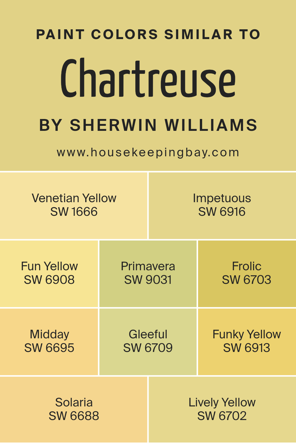
Colors Similar to Chartreuse SW 0073 by Sherwin Williams
The power of color plays a fundamental role in creating mood and enhancing appeal in any setting. An excellent example is seen in an assortment of colors akin to Chartreuse SW 0073 by Sherwin Williams. Having similar colors in your palette can evoke a harmonious feeling, giving the room a balanced look. They also work well together because they share a common hue, making alternation and combination easier.
Venetian Yellow, SW 1666, paints an atmosphere of mirth and vitality. It is a warm hue that brightens up spaces. Impetuous SW 6916, on the other hand, infuses a playful, yet intense touch, perfect for adding bold vitality.
Fun Yellow, SW 6908, brings a joyful vibe, and its brightness adds cheerfulness to any setting. Primavera, SW 9031 is akin to early spring, adding nature-inspired freshness to your space.
Frolic SW 6703 caters to those who fancy a lively and spirited atmosphere. It’s a perfect blend of joy and energy. Midday, SW 6695, mirrors the high-energy vibe of mid-day sun. Gleeful SW 6709 tells a story of overflowing joy and optimism, turning any room into a happy haven.
Funky Yellow, SW 6913, embraces an outgoing, bright, and free spirit. If uniqueness is your goal, look no further. Solaria, SW 6688 brings in the bright, sunny energy, perfect for lively interaction spaces. Lastly, Lively Yellow, SW 6702 ties the group together with its clean, energetic brightness that instantly revamps the vibe.
By choosing among these varying shades of yellow, you give yourself room to play with combinations and contrasts, creating a visually dynamic and harmonious space.
You can see recommended paint colors below:
- SW 1666 Venetian Yellow
- SW 6916 Impetuous
- SW 6908 Fun Yellow
- SW 9031 Primavera
- SW 6703 Frolic
- SW 6695 Midday
- SW 6709 Gleeful
- SW 6913 Funky Yellow
- SW 6688 Solaria
- SW 6702 Lively Yellow
housekeepingbay.com
How to Use Chartreuse SW 0073 by Sherwin Williams In Your Home?
Chartreuse SW 0073 by Sherwin Williams is a unique and vibrant color. It’s a brilliant blend of green and yellow hues. Its bold yet warm look can add a touch of cheerfulness to any room. It’s perfect if you want a light, happy feel in your space.
In your home, you could use Chartreuse in several ways. It’s great for a statement wall. One wall painted in Chartreuse in a room of neutral colors can grab attention. If you are a bit daring, you might paint an entire room with this color. It would light up the room and offer a lively mood to it.
Furniture painted in Chartreuse can also serve as a fun, visual interest. This bright tone can make a bookshelf or a chair catch the eye. You can even use it on kitchen cabinets for a fresh, playful vibe.
Regardless, Chartreuse SW 0073 by Sherwin Williams provides a fun and vibrant feel. It can freshen up and add a playful twist to your home.
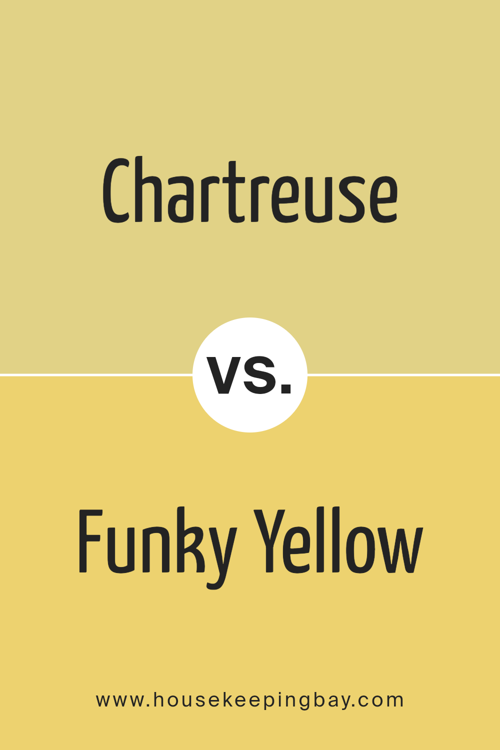
Chartreuse SW 0073 by Sherwin Williams vs Funky Yellow SW 6913 by Sherwin Williams
The Chartreuse SW 0073 by Sherwin Williams is a color that is quite vibrant yet mellow. It’s a happier and lighter shade of green, somewhere between lime and yellow. Looking at it calls to mind a fresh summer day or the first sprouts in spring, hence, it can powerfully bring a sense of natural freshness. It can brilliantly work in a space aiming for a lively, inviting aura.
The Funky Yellow SW 6913 from Sherwin Williams is a different story. It’s a sunny, bright color that’s hard to ignore. It’s like a happy, energetic boost for any room, acting like a splash of winking sunflowers or sassy lemons. As such, it could perfectly fit spaces needing creativity, warmth, and joy.
While they seem quite different – one being more relaxed and the other more energetic – when appropriately paired, these two could make any room burst with a fresh, happy balance. Chartreuse’s calming green tones could perfectly balance Funky Yellow’s dynamic character.
You can see recommended paint color below:
- SW 6913 Funky Yellow
housekeepingbay.com
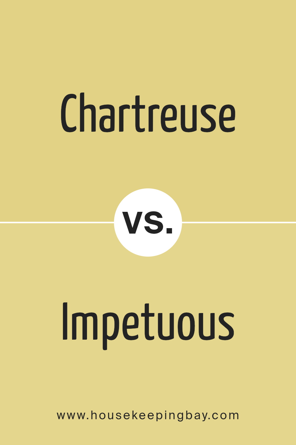
Chartreuse SW 0073 by Sherwin Williams vs Impetuous SW 6916 by Sherwin Williams
The Chartreuse color from Sherwin Williams can be thought of as a bright, lively hue. To the eye, it presents a greenish-yellow color that is quite appealing. It sparks joy and radiates an energetic vibe that is both cheerful and refreshing. If you’re longing for a light and bright color choice, Chartreuse is the perfect candidate.
Meanwhile, the Impetuous shade by Sherwin Williams is incredibly eye-catching. It’s an intense, vibrant pink color, projecting a bold and dynamic atmosphere. If you appreciate colors that are full of energy and personality, Impetuous would definitely capture your interest.
In terms of difference, Chartreuse is on the softer, lighter end of the spectrum providing a calm and soothing feeling whereas Impetuous is strong and impactful, it commands your attention. They both create different moods in a space, one more peaceful and the other more exciting.
Showing the range of Sherwin Williams, they cater to different tastes with these unique, yet equally beautiful color options.
You can see recommended paint color below:
- SW 6916 Impetuous
housekeepingbay.com
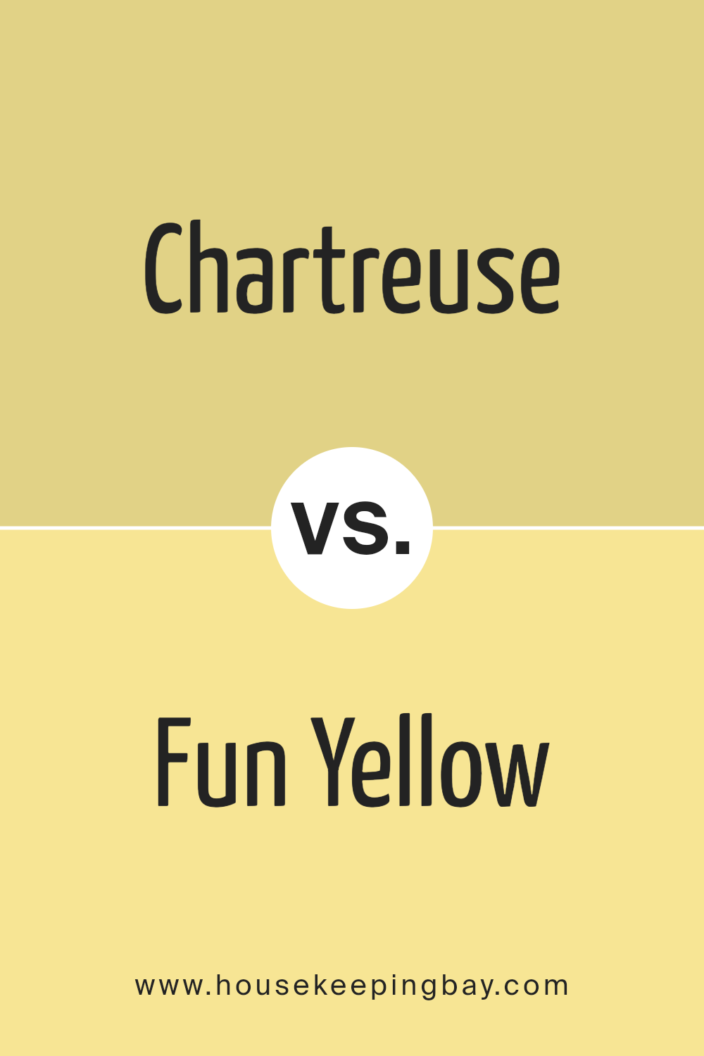
Chartreuse SW 0073 by Sherwin Williams vs Fun Yellow SW 6908 by Sherwin Williams
Sherwin Williams’ Chartreuse SW 0073 and Fun Yellow SW 6908 are both uniquely bright, but they offer different moods and tones. Chartreuse SW 0073 leans towards green with a vibrant, electric feel. It brings about an energetic and lively ambiance. This shade is ideal if you want to inject a dynamic, pop vibe.
Contrasting this, Fun Yellow SW 6908 is a pure, saturated yellow. It mirrors the brightness of the sun or the cheeriness of a blooming sunflower. Rooted in warmth and light, it’s a color that instantly boosts mood and spreads happiness. It’s perfect when aiming for a sunny and joyful background.
While both colors are brilliant and full of life, Chartreuse SW 0073 gives off a more invigorating, lively feel, and Fun Yellow SW 6908 offers a classic, more joyful setting. Both colors can turn any space into a cut above the usual by bringing joy, energy, and vibrance.
You can see recommended paint color below:
- SW 6908 Fun Yellow
housekeepingbay.com
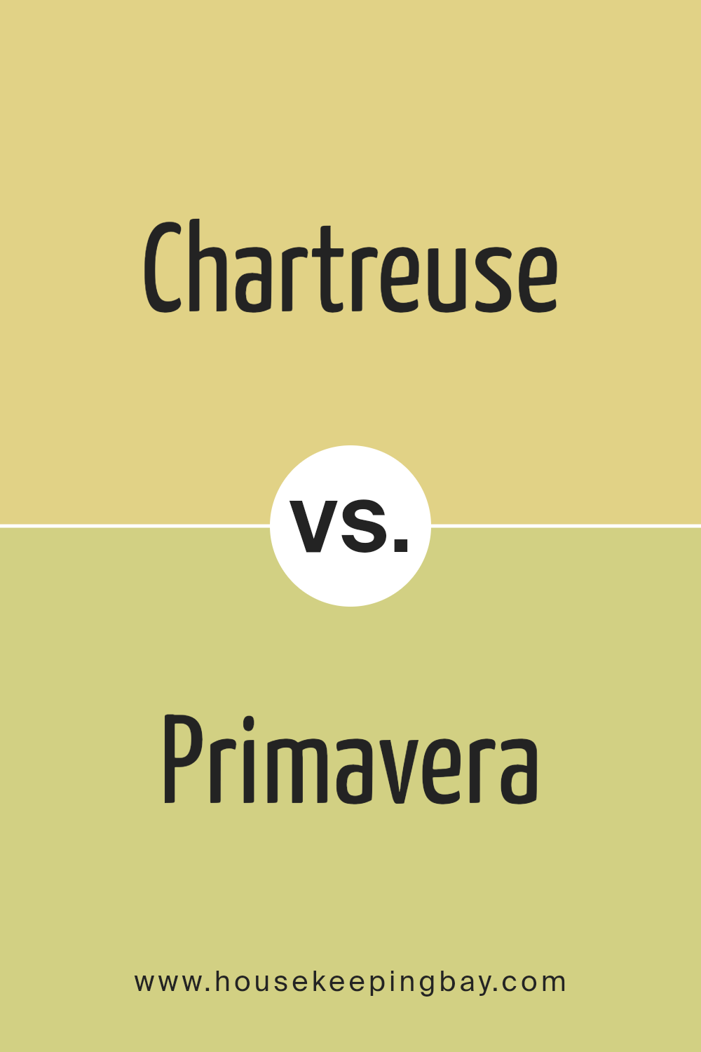
Chartreuse SW 0073 by Sherwin Williams vs Primavera SW 9031 by Sherwin Williams
Chartreuse SW 0073 and Primavera SW 9031 are two unique, eye-catching colors from Sherwin Williams. Chartreuse SW 0073 gives an artful, bold vibe due to its highly saturated yellow-green hue. It’s a versatile color that can add a playful yet refined allure to a space, making it an up-front attention grabber.
Contrarily, Primavera SW 9031 brings a softer touch to the spectrum. It’s a pastel green shade that infuses a sense of calm and peace into any interior setting. It’s subtle and quiet, providing a soothing, friendly ambiance. Therefore, it’s perfect for creating a relaxed, serene setting.
If you want a vibrant, lively feeling, Chartreuse SW 0073 would be a good fit. But if you’re after a calm, inviting look, the subdued appeal of Primavera SW 9031 could match perfectly. Both hues are equally stylish, but they deliver different energy levels, greatly affecting the mood they inspire. It’s less about ranking them and more about choosing according to the atmosphere you aim to create.
You can see recommended paint color below:
- SW 9031 Primavera
housekeepingbay.com
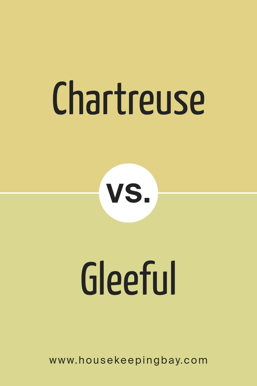
Chartreuse SW 0073 by Sherwin Williams vs Gleeful SW 6709 by Sherwin Williams
Chartreuse SW 0073 by Sherwin Williams is a bright, bold color that brings a lively feel. Think of springtime, when everything is fresh and new, that’s what this color represents. It’s a mix of warm yellow and cool green, making it balanced and invigorating.
Gleeful SW 6709, the second color from Sherwin Williams, is another bright, lively color. But it has a different warmth to it, because it’s a similar level of brightness, but on the cooler spectrum of color. It’s a vibrant blue-green, making it refreshing like a dip in a cool ocean on a hot day.
Looking at both, you see they are both happy and fresh, but in different ways. Chartreuse SW 0073 brings warmth and energy like a sunny day. Gleeful SW 6709 feels cool and refreshing like a splashing wave.
So, these colors are both ideal if you want a room that feels alive and joyful. Yet they give different feelings, one warm and renewing, the other cool and exhilarating. Use them wisely to set the perfect tone.
You can see recommended paint color below:
- SW 6709 Gleeful
housekeepingbay.com
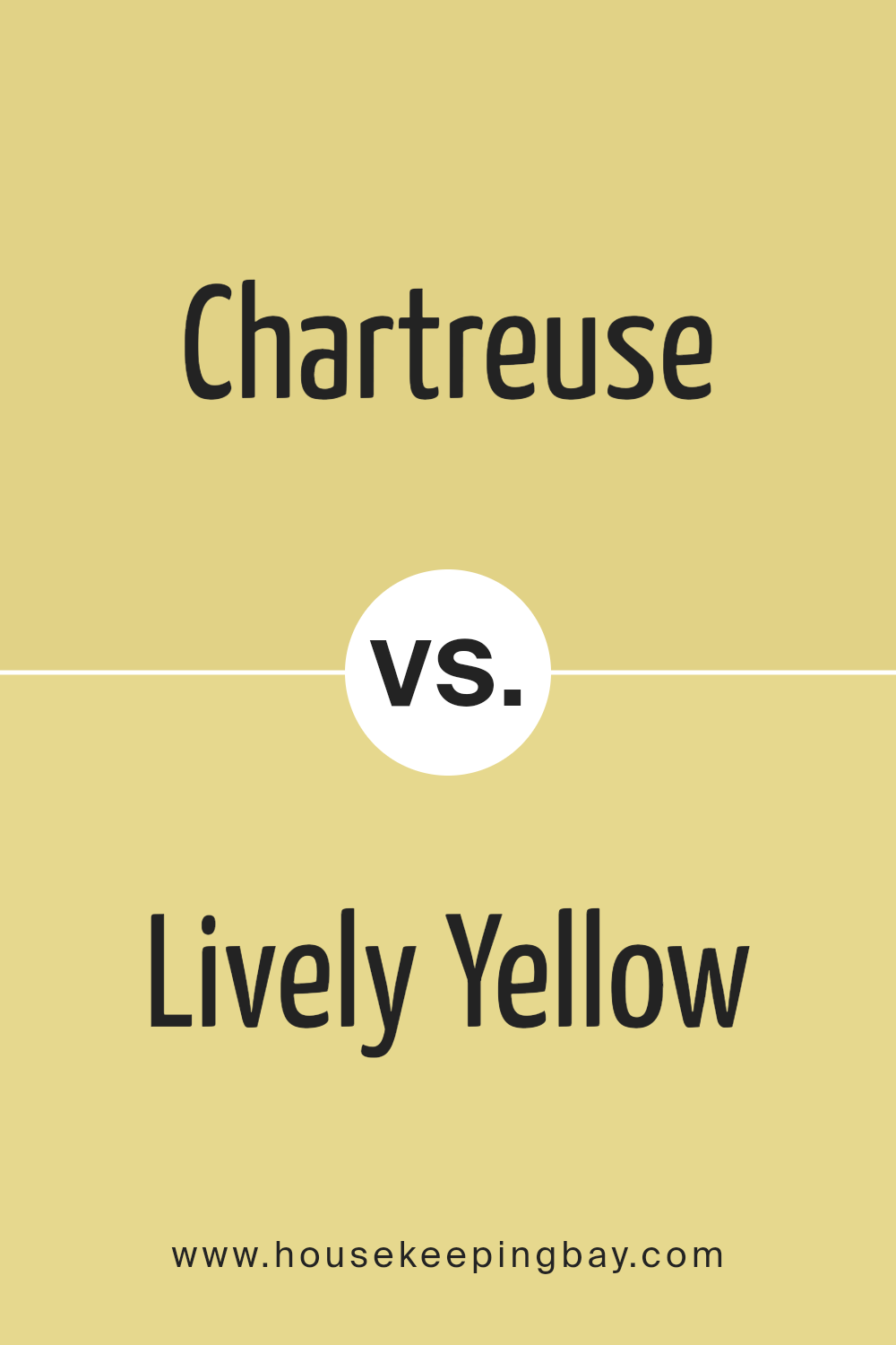
Chartreuse SW 0073 by Sherwin Williams vs Lively Yellow SW 6702 by Sherwin Williams
The Chartreuse SW 0073 from Sherwin Williams is a unique shade of color that can best be categorized as a medium-light shade of green-yellow. It takes its inspiration from nature, resembling the vibrant hues found in the foliage during spring. It offers a fresh and revitalizing appeal and exudes a lively, energetic vibe.
Contrastingly, Lively Yellow SW 6702, as its name suggests, is a full-bodied, rich yellow shade. It is reminiscent of bright sunny days, infused with energy and the warmth of sunshine. It is noticeably brighter than Chartreuse and tends to stand out more due to its radiant and lively undertone.
While both are bold and vibrant options in their own ways, Chartreuse leans more towards a cool, subtle sophistication. Its yellow-green notes make it a relaxing color option. Lively Yellow is a more pronounced, bold variant that attracts attention instantly due to its full-on sunny disposition. It can easily brighten up any space.
In summary, while Chartreuse suits subtle, calm styles, Lively Yellow is perfect for those liking bright, vibrant looks. They are both beautiful in their unique ways, making decisions a matter of personal preference.
You can see recommended paint color below:
- SW 6702 Lively Yellow
housekeepingbay.com
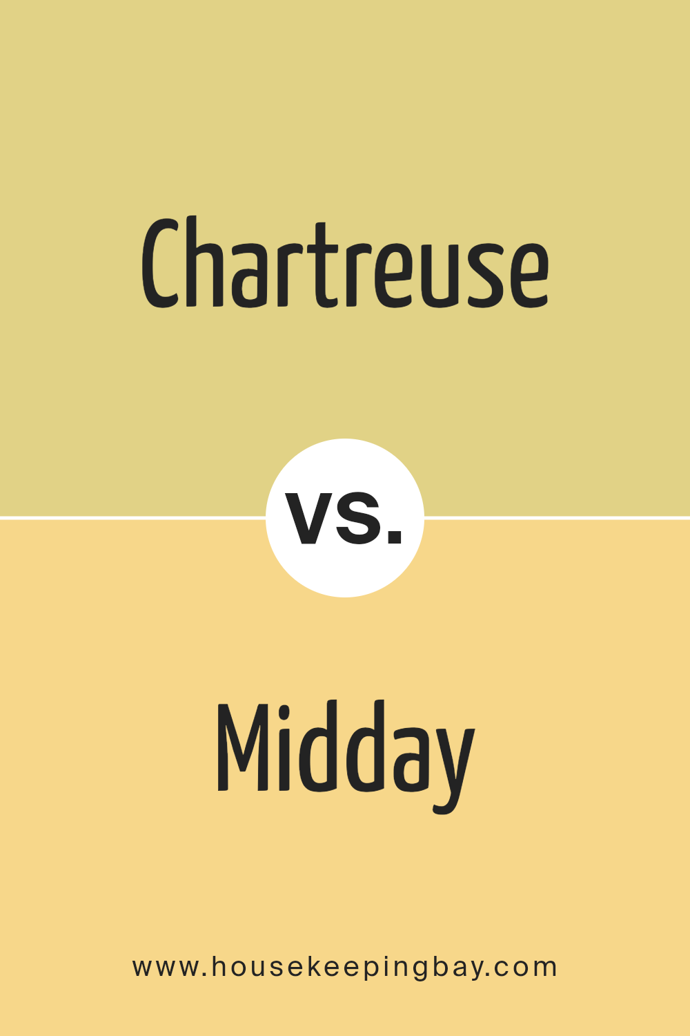
Chartreuse SW 0073 by Sherwin Williams vs Midday SW 6695 by Sherwin Williams
Sherwin-Williams’ Chartreuse SW 0073 and Midday SW 6695 are both lively colors that have their own unique personalities. Chartreuse is a lively green-yellow hue, a joyous color that stands out with its vibrancy. Its brightness adds a dose of playfulness and invigorating energy to any space. It’s vivacious and carries a hint of nature’s serenity and zest.
Midday, however, has a somewhat different character. It’s a strong, distinct blue with the cheerfulness of a sunny afternoon sky. This color effectively exudes a sense of calm and positive energy, much like a beautiful, clear day. The bolder blue shade is lively and charismatic, imbuing any room with a welcoming, upbeat ambiance.
Both colors have their own charm, with Chartreuse being more electric and dynamic, while Midday is calming and comforting. These colors could be chosen based on the mood one wants to create: Chartreuse for more liveliness or Midday for a soothing, calm feel. To sum up, Chartreuse is zesty and vigorous while Midday is calm and inviting.
You can see recommended paint color below:
- SW 6695 Midday
housekeepingbay.com
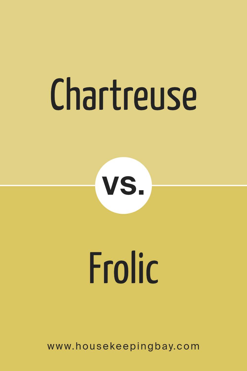
Chartreuse SW 0073 by Sherwin Williams vs Frolic SW 6703 by Sherwin Williams
Chartreuse SW 0073 and Frolic SW 6703 are two vibrant colors from Sherwin Williams. When you look at Chartreuse, it catches your attention on the spot. It is a bright, light green color that reminds you of fresh spring grass or new leaves. It is a very lively color. It’s really eye-catching and gives off a lot of energy. While being bright, it is not too intense and has a calm feeling to it.
Now, let’s consider Frolic SW 6703. It is a warm, gritty green shade. The festive vibe of Frolic is inspired by the joy and playfulness surrounding holiday decorations and festivities. This color has a personality of its own, it’s pretty outgoing and bold. Still, it is not aggressive, but rather energetic and friendly.
In summary, Chartreuse is bright but tranquil, while Frolic is bold but friendly. They both belong to the green family, yet each of them has a unique feeling to it. Therefore, they can easily fit different environments according to one’s taste.
You can see recommended paint color below:
- SW 6703 Frolic
housekeepingbay.com
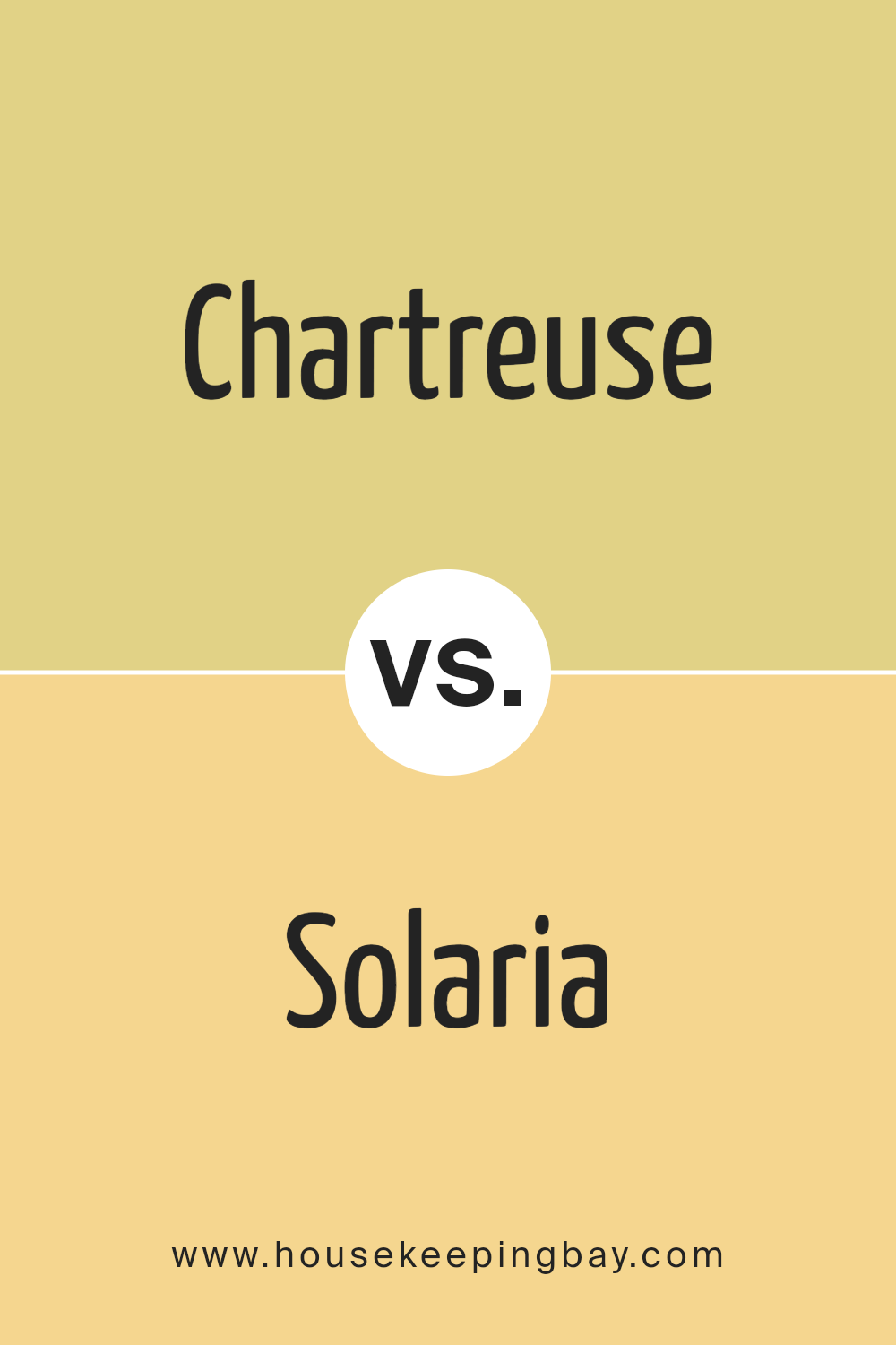
Chartreuse SW 0073 by Sherwin Williams vs Solaria SW 6688 by Sherwin Williams
Chartreuse SW 0073 and Solaria SW 6688 are both vibrant shades by Sherwin Williams. Chartreuse, a bright yellow-green, is a lively color. It adds excitement and is full of energy. This color gives a fresh look, reminding us of spring greenery. It brings a touch of nature to your room. It’s a daring choice but well suited to spaces where energy and creativity are needed. It also has a calming effect, like fresh leaves in a garden.
Solaria, a bright yellow, is more of a sunny color. It adds warmth and lights up a room easily making it feel cozy and inviting. It’s like a burst of sunshine, giving a happy vibe to any space. It’s a perfect choice if you want to add a cheerful touch to your room. It feels like the sun’s rays, bringing brightness and light to every corner.
Each color is unique and creates a different mood. While both are bright and can light up a room, Chartreuse is cooler, more calming while Solaria is warmer and more exciting. Both are perfect choices depending on the feel you want in your space.
You can see recommended paint color below:
- SW 6688 Solaria
housekeepingbay.com
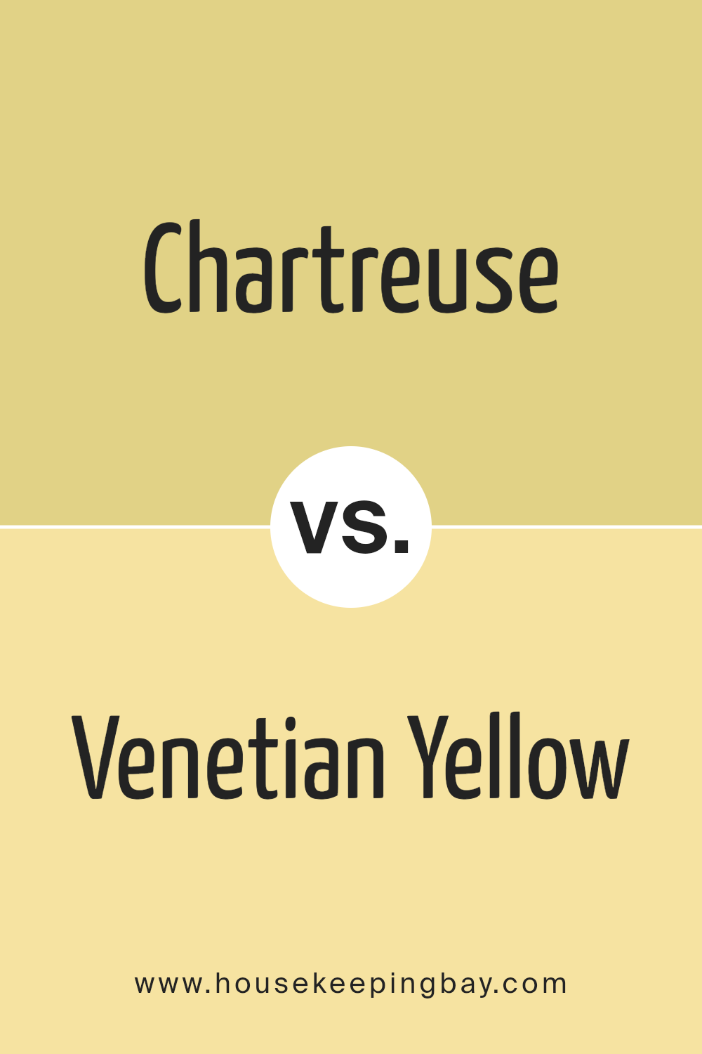
Chartreuse SW 0073 by Sherwin Williams vs Venetian Yellow SW 1666 by Sherwin Williams
Chartreuse SW 0073 by Sherwin Williams and Venetian Yellow SW 1666 by Sherwin Williams are both noteworthy colors, each having unique characteristics. Although they are from the same family of yellow-green hues, they are quite distinctive.
Chartreuse SW 0073 is refreshing and vibrant. It is energetic, providing a fresh, youthful feel. It could add a lively presence in any space, making it more invigorating. This hue, somewhat like a zesty lime, is perfect for creating a cheery atmosphere.
In contrast, Venetian Yellow SW 1666 is a subtle, soft shade. It exudes a sense of warmth and serenity, ideal for a cosy, comfortable setting. With a hint of orange, as seen in a sunset, this color has a relaxing allure. It invites calmness into a room, making it an excellent choice for those seeking solace and peace.
Both these colors offer unique moods and environments. Chartreuse SW 0073 is more suited for stimulating settings, and Venetian Yellow SW 1666 tends to support restful, soothing spaces. Each color, while unique, adds a different zest and character wherever it is applied.
You can see recommended paint color below:
- SW 1666 Venetian Yellow
housekeepingbay.com
Conclusion
In conclusion, SW 0073 Chartreuse by Sherwin Williams is indeed a unique and vibrant shade. It’s bold, lively, and a perfect color choice for those who want to inject a little fun and energy into their space.
It harmonically combines the freshness of yellow with the natural touch of green, making it versatile, appropriate for any room, and capable of setting various moods depending on its use. Besides, matching it with the right colors and decor can result in a striking outcome that would impress you.
This shade is not just about aesthetics. Sherwin Williams does an excellent job in the quality department as well, ensuring that this paint lasts long and stays vibrant even over time. You can expect the paint to apply smoothly and evenly. As a bonus, it possesses environmentally friendly properties.
In short, if you aim for a balanced mix of liveliness and sophistication in your space, SW 0073 Chartreuse is the color you should consider. You will enjoy the visual impact it creates and the fine quality it offers. Ultimately, it is your adventurous spirit that can help you create a space that’s a true reflection of you with this invigorating color.
housekeepingbay.com
