Kingdom Gold SW 6698 by Sherwin Williams
Embracing the Warmth of Regal Elegance
Welcome to your ultimate guide for everything you need to know about one of Sherwin Williams’ most unique and beautiful paint colors. Kingdom Gold is not just any shade; it’s a luxurious, rich hue that brings a touch of elegance and warmth to any room. This color can transform spaces, making them feel cozy yet sophisticated.
Whether you’re looking to refresh your living room, bedroom, or even add some flair to your kitchen, Kingdom Gold has the potential to uplift and add character to your home.
We’ll explore how Kingdom Gold stands out from other colors, its versatility in home decor, and why it might be the perfect choice for your next painting project. With so many options available, choosing the right paint color can be overwhelming.
That’s why we’ll also provide tips on color combinations and design ideas that work well with Kingdom Gold, making your decision process easier and more enjoyable.
If you’re thinking of giving your home a makeover or simply curious about what makes Kingdom Gold by Sherwin Williams so special, keep reading. This guide has everything you need to get familiar with this exquisite color and how to use it to its full potential in enhancing your home’s beauty.
via sherwin-williams.com
What Color Is Kingdom Gold SW 6698 by Sherwin Williams?
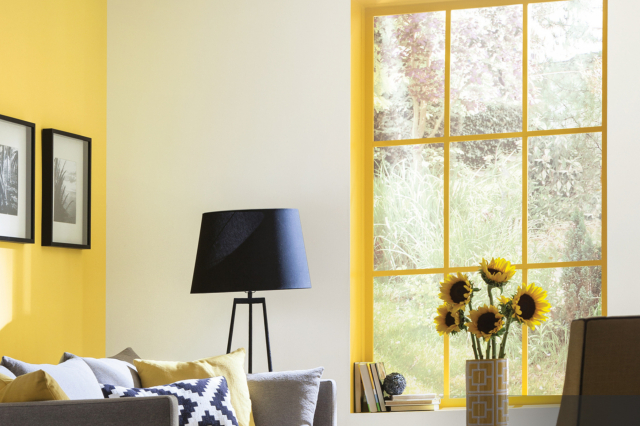
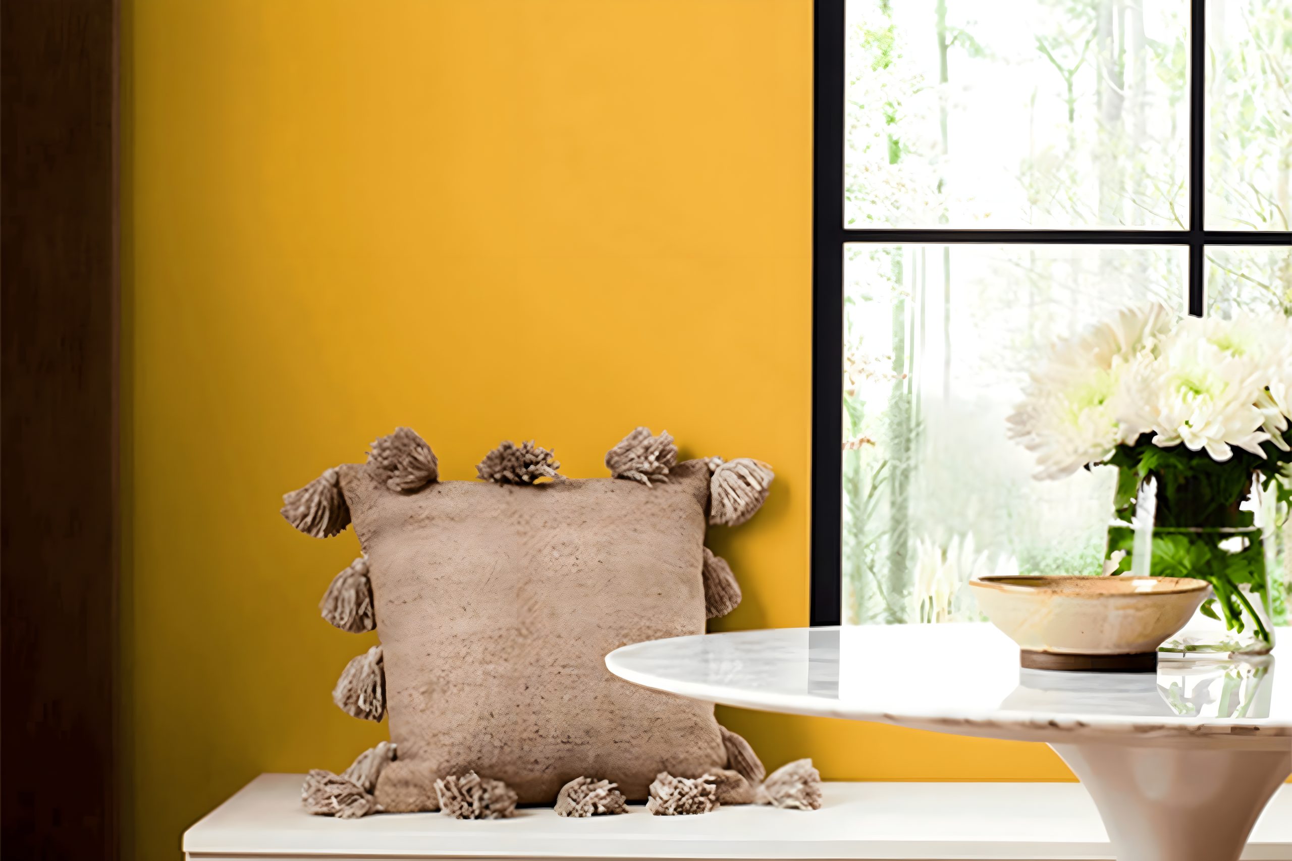
Kingdom Gold SW 6698 by Sherwin Williams is a rich, vibrant shade of gold that adds warmth and sophistication to any space. This color is like a touch of sunshine, brightening up rooms with its cheerful hue.
Kingdom Gold is bold yet not overwhelming, making it versatile for various decorating styles.
It works exceptionally well in classic and traditional interiors, where its elegance can shine alongside ornate details and structured furnishings.
Yet, it’s also a fantastic choice for more modern or eclectic spaces, adding a splash of warmth and personality that can complement contemporary designs.
Kingdom Gold pairs beautifully with a range of materials and textures. It looks stunning against dark, rich woods, bringing out their depth and adding to the room’s overall coziness.
With metals, particularly antique brass or bronze, this color creates a refined look, exuding luxury and timeless appeal. Fabrics in velvet or silk textures in complementary or contrasting colors can add layers of interest and comfort to the space.
Incorporating this color into your decor through paint, accessories, or fabrics can make the room feel more inviting and vibrant. It’s a color that truly enriches the space it occupies, making it feel more luxurious and well-curated.
housekeepingbay.com
Table of Contents
Is Kingdom Gold SW 6698 by Sherwin Williams Warm or Cool color?
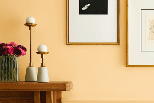
Kingdom GoldSW 6698 by Sherwin Williams is a rich, warm gold color that adds a cozy and inviting vibe to any room. This shade is like a warm hug, making spaces feel more welcoming and snug.
When you use Kingdom GoldSW 6698 in your home, it brings a cheerful brightness, especially in rooms that get a lot of sunlight, making the gold tones pop even more. This color works great in living areas, dining rooms, or even bedrooms, creating a comforting and stylish space.
Because Kingdom GoldSW 6698 has such a warm tone, it pairs nicely with lots of other colors. It looks beautiful with deep greens, blues, or even lighter, neutral shades, giving you plenty of options to style your space.
Whether you’re freshening up a single wall or transforming a whole room, this color sets a luxurious yet homely atmosphere. It’s perfect for anyone wanting to add a bit of warmth and personality to their space without overwhelming it.
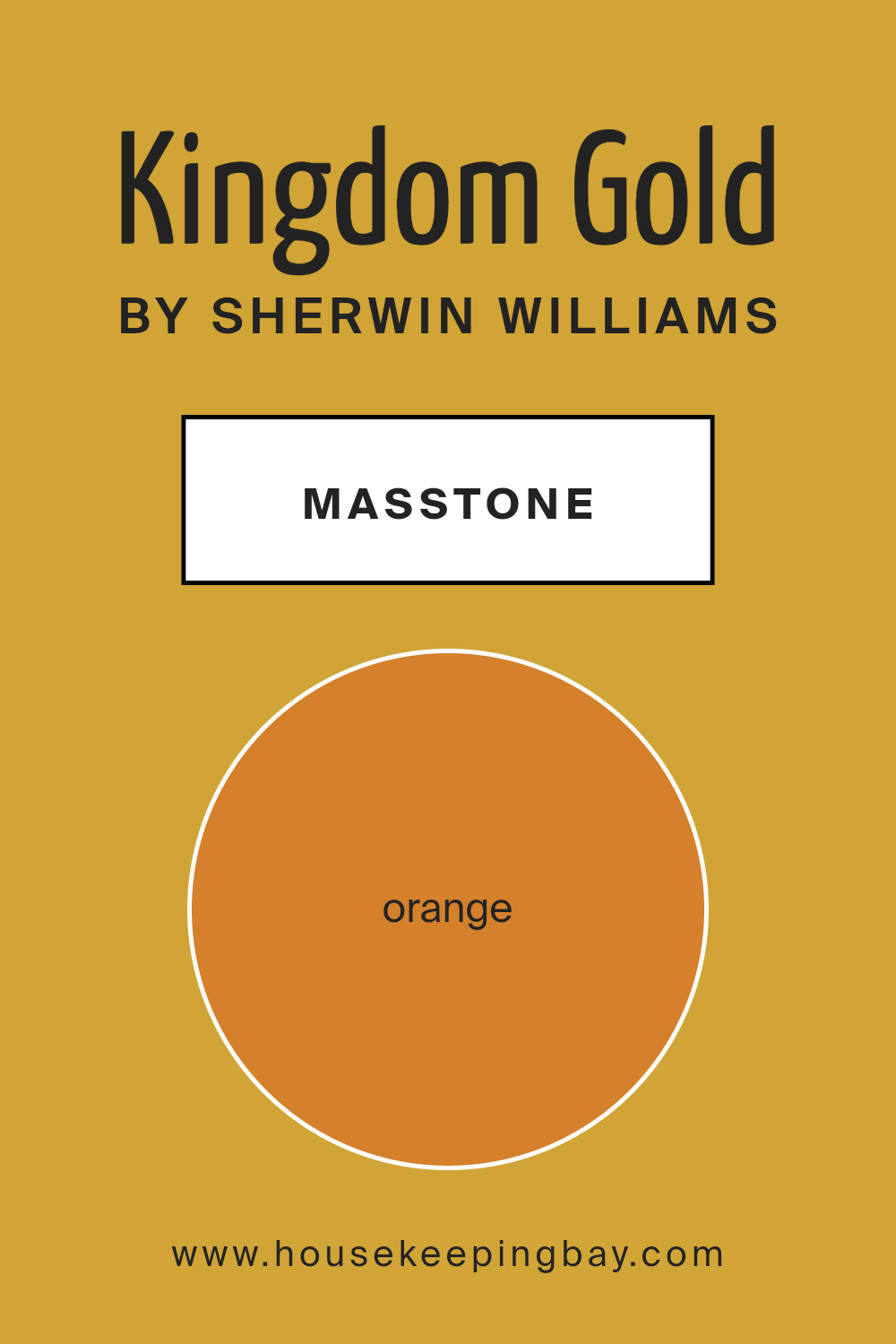
What is the Masstone of the Kingdom Gold SW 6698 by Sherwin Williams?
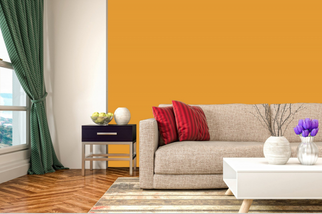
Kingdom Gold SW 6698 by Sherwin Williams is a beautiful paint color with a masstone, or main tone, of Orange, having the specific code #D5802B.
This orange tone is warm and welcoming, making it a fantastic choice for homes looking to add a cozy and inviting atmosphere. When used in a room, Kingdom Gold can bring in a sense of brightness and energy, which is perfect for living spaces where families gather or rooms that could use a boost in cheer.
Since this color is quite bold, it’s excellent for creating focus walls or for adding vibrant accents in spaces that are otherwise neutral. It works especially well in areas with plenty of natural light, as the sunlight enhances its warm tones, making the room feel even more welcoming.
In smaller doses, like for painting furniture or in home décor, Kingdom Gold can add a splash of personality without overwhelming the space. This versatility makes it a popular choice for adding character to homes in a way that’s both stylish and feels like a warm hug.
housekeepingbay.com
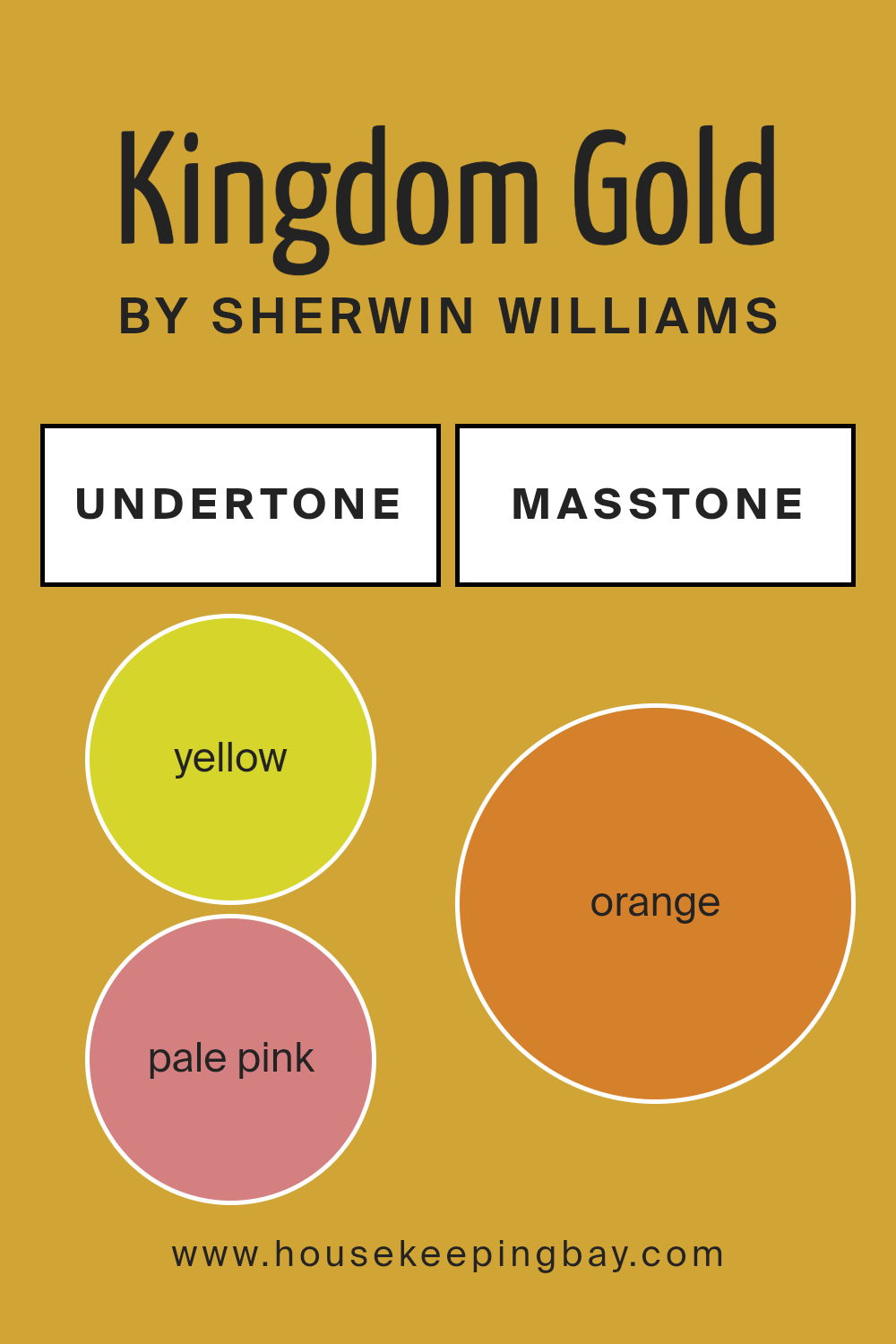
Undertones of Kingdom Gold SW 6698 by Sherwin Williams
Kingdom Gold SW 6698 by Sherwin Williams is a unique paint color that looks golden, but when you look closer, there’s more to it. This color has interesting undertones – yellow and pale pink. These undertones play a big role in how we see the color.
Imagine undertones like secret ingredients in a recipe. Just like a pinch of salt can change the taste of a dish, undertones can change how a color looks. Sometimes, you don’t even realize they’re there, but they make the color feel different.
The yellow undertone in Kingdom Gold makes it feel warm and sunny, like a bright day. This can make a room feel cozy and welcoming. It’s perfect for making a space feel bright without being too bold.
The pale pink undertone adds a soft, gentle vibe. It’s not very obvious, but it’s enough to make the color feel not just yellow. This makes Kingdom Gold versatile, because it’s not just one flat color. It can look slightly different depending on the light and what’s around it.
When you put Kingdom Gold on interior walls, these undertones help the room feel warm and inviting. The yellow brings energy and happiness, while the pale pink keeps it soft and not too overwhelming.
This means the color can work well in many rooms, from a kitchen that feels sunny to a bedroom that feels cozy but still light. These undertones help Kingdom Gold adapt to different lighting and styles, making it a friendly choice for many homes.
housekeepingbay.com
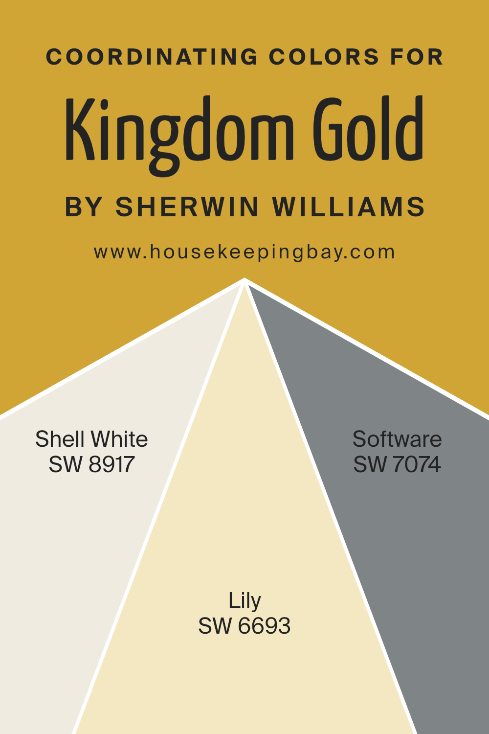
Coordinating Colors of Kingdom Gold SW 6698 by Sherwin Williams
Coordinating colors are a set of hues that work harmoniously together to enhance the aesthetic appeal of a space, often chosen to complement a primary color.
In the context of Kingdom Gold SW 6698 by Sherwin Williams, a rich and luxurious tone, there are specific colors that have been selected to coordinate beautifully with it.
These coordinating colors are designed to balance, contrast, or enhance the main hue, contributing to a cohesive and appealing look in any room.
SW 8917 – Shell White, is a soft and serene color that brings a sense of calm and lightness to the palette, making it perfect for creating a relaxed atmosphere when paired with the bolder Kingdom Gold.
The gentle essence of Shell White provides a subtle contrast that highlights the depth of Kingdom Gold without overwhelming the senses. SW 6693 – Lily, offers a cheerful splash of brightness, adding a dynamic layer to the overall palette.
This color has the unique ability to lift the spirits of a space, injecting a beam of sunshine that beautifully complements the warmth of Kingdom Gold.
Lastly, SW 7074 – Software, serves as a sophisticated and contemporary counterpart, introducing a cooler tone that grounds the palette. Software adds a modern twist to the combination, ensuring that the overall look remains balanced and fresh, especially when used alongside the opulent vibes of Kingdom Gold.
Together, these coordinating colors create a versatile and appealing palette that enhances the visual harmony in any space.
You can see recommended paint colors below:
- SW 8917 Shell White
- SW 6693 Lily
- SW 7074 Software
housekeepingbay.com
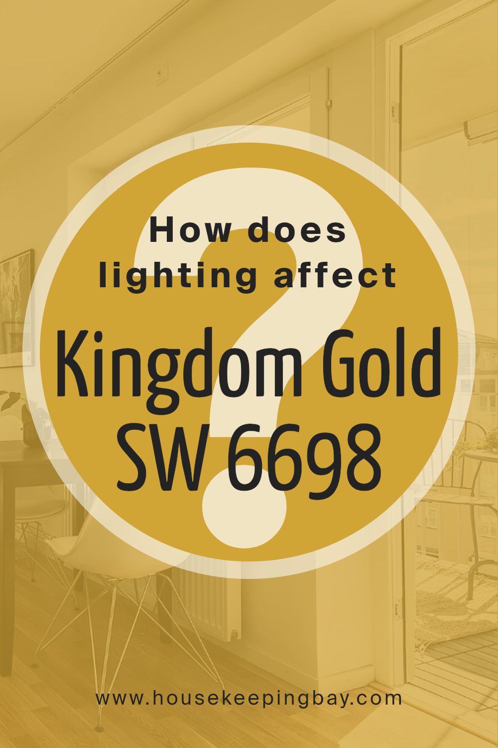
How Does Lighting Affect Kingdom Gold SW 6698 by Sherwin Williams?
Lighting plays a crucial role in how we see and experience colors. For example, Kingdom GoldSW 6698 by Sherwin Williams can look quite different under various lighting conditions.
This color, a lush and vibrant hue, has the potential to transform a space depending on the light it’s exposed to, whether natural or artificial.
In artificial light, Kingdom GoldSW 6698 can either become cozier and warmer or it might lose some of its vibrancy. The type of bulb matters: warm-toned bulbs enhance its richness, making the color appear deeper and more inviting, whereas cooler bulbs might make it look slightly muted, giving it a more subdued appearance.
Under natural light, the color unfolds in its full depth and complexity. Natural sunlight reveals the true character of Kingdom GoldSW 6698, showing off its bright and lively nature.
However, the direction your room faces significantly affects how this color is perceived:
- North-faced rooms – These rooms get less direct sunlight, which can make colors look cooler. Kingdom GoldSW 6698 might appear slightly more muted and less vibrant in a north-facing room, but it still brings warmth and brightness to the space.
- South-faced rooms – In contrast, south-facing rooms are bathed in bright light for most of the day. Here, Kingdom GoldSW 6698 will look exceptionally vibrant and dynamic, almost glowing with warmth and energy.
- East-faced rooms – These rooms enjoy bright morning light. Kingdom GoldSW 6698 will look particularly lively and warm in the morning but may become more subdued as the day progresses and the natural light dims.
- West-faced rooms – In these rooms, the color will have a softer glow in the morning and become brightly illuminated with a warm, golden hue in the late afternoon and evening as the sun sets.
In summary, the perception of Kingdom GoldSW 6698 by Sherwin Williams can significantly change depending on the lighting.
Whether it’s under the soft glow of artificial light or the varying conditions of natural light throughout the day, this color’s mood and atmosphere adapt, offering versatility and warmth to any room.
housekeepingbay.com
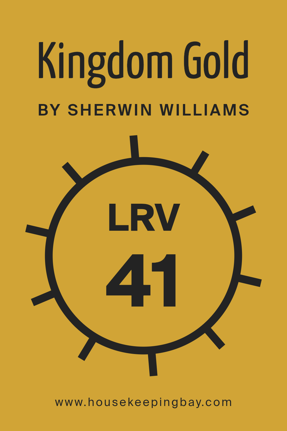
What is the LRV of Kingdom Gold SW 6698 by Sherwin Williams?
LRV stands for Light Reflectance Value. It’s a number that shows how much light a paint color reflects back into a room, compared with the total amount of light it gets hit with.
This value can range from 0 to 100, where 0 means it’s super dark and absorbs most of the light (like a black color would), and 100 means it’s very light and reflects almost all the light (like a pure white).
The LRV helps you understand how light or dark a color will look on your walls. It’s super handy when choosing paint colors because it gives you a clue about how the color will feel once it’s on your walls, under different lighting conditions throughout the day.
For Kingdom Gold SW 6698 by Sherwin Williams, which has an LRV of 40.65, it’s somewhere in the middle of the light-dark spectrum. This means it won’t reflect a ton of light, but it’s also not going to absorb all the light like darker colors do.
This particular LRV tells us that Kingdom Gold is a moderately light color – not too bright but not too moody either. It will add a cozy warmth to the room without making it feel too closed in or dark.
The way this color changes can depend a lot on the light sources in the room, shifting its appearance as the natural light changes from morning to evening or under artificial lights.
So, this LRV value helps predict that Kingdom Gold will offer a nice balance, making spaces feel inviting without overwhelming them with brightness or darkness.
housekeepingbay.com
What is LRV? Read It Before You Choose Your Ideal Paint Color
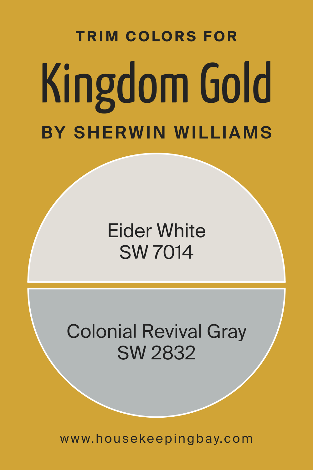
What are the Trim colors of Kingdom Gold SW 6698 by Sherwin Williams?
Trim colors are the shades chosen to paint the architectural details of a space, such as door frames, window frames, skirtings, and moldings.
In the case of Kingdom Gold SW 6698 by Sherwin Williams, selecting the right trim color is crucial because it can either subtly complement the boldness of Kingdom Gold, adding to the room’s overall harmony, or create a striking contrast that highlights the architectural features of the space.
This interplay between the primary color and the trim color enhances the aesthetic appeal and character of the room, making trim colors an important aspect of interior design.
When considering SW 7014 – Eider White as a trim color for Kingdom Gold SW 6698, its soft, delicate white offers a crisp yet gentle contrast, allowing the golden tones to shine brightly without overpowering the space.
It brings a sense of freshness and a light, airy feel to the room, making it an excellent choice for a sophisticated look. On the other hand, SW 2832 – Colonial Revival Gray provides a deeper, more defined framing for Kingdom Gold, adding a touch of historical elegance and depth to the space.
This medium gray with warm undertones can subtly balance the richness of Kingdom Gold, ensuring the environment remains inviting and grounded.
You can see recommended paint colors below:
- SW 7014 Eider White
- SW 2832 Colonial Revival Gray
housekeepingbay.com
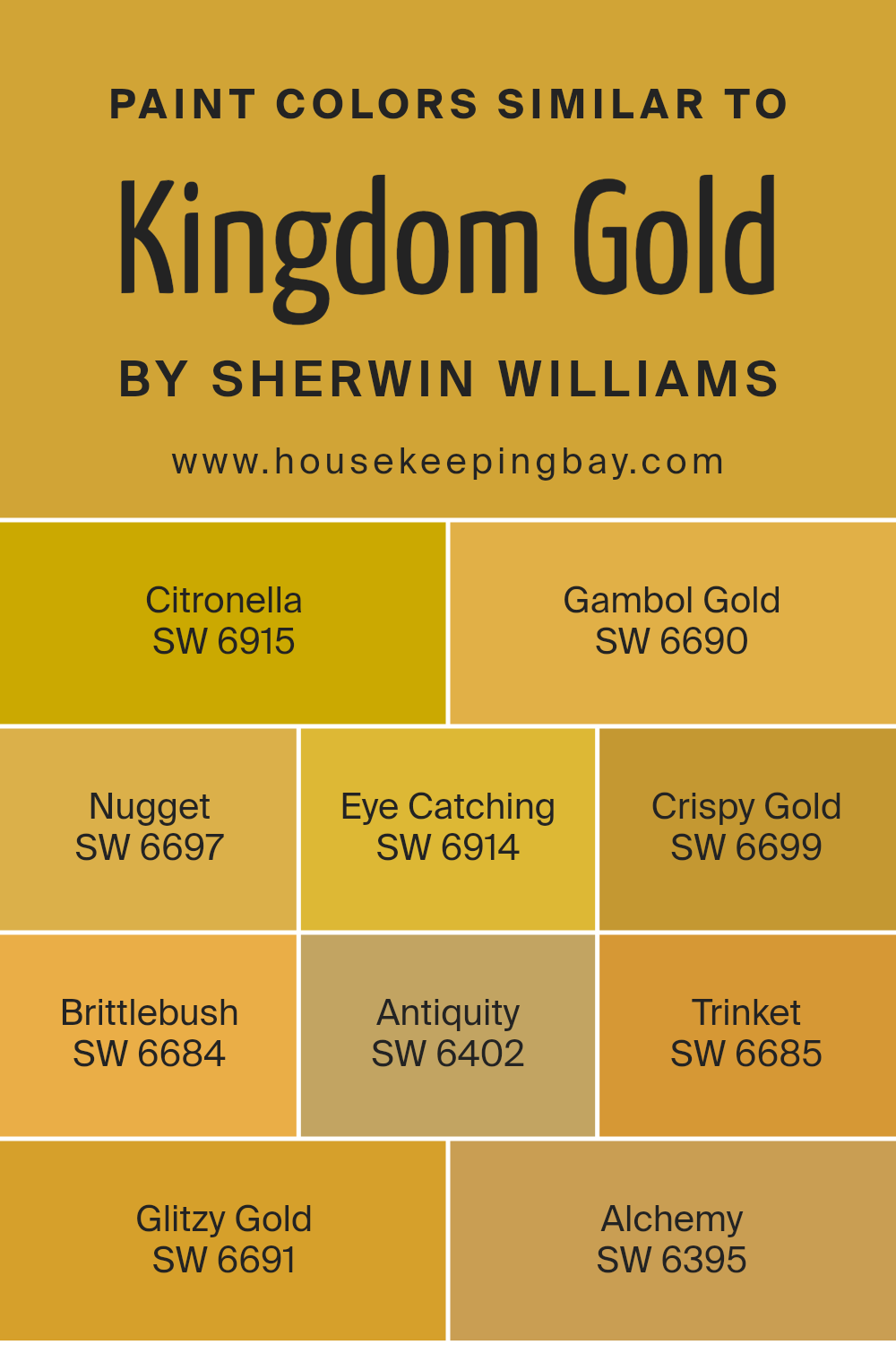
Colors Similar to Kingdom Gold SW 6698 by Sherwin Williams
In the world of interior design and home decor, similar colors create a harmonious and visually appealing space. They work by providing slight variations in hue and tone, offering depth and interest without the contrast being too jarring.
For example, similar colors to Kingdom Gold SW 6698 by Sherwin Williams include a spectrum of gold and yellow shades that complement each other beautifully, creating a cohesive yet dynamic atmosphere.
These colors range from bright and sunny to deep and antique, allowing for flexible design choices that can adapt to various styles and moods.
Citronella SW 6915 is a lively, zesty yellow that adds a pop of energy to any space, while Gambol Gold SW 6690 has a rich, warm hue that envelops rooms in a cozy glow.
Nugget SW 6697 offers a muted, earthy tone that brings a touch of nature indoors. Eye Catching SW 6914 is a vibrant, attention-grabbing yellow that lives up to its name, and Crispy Gold SW 6699 is a lighter, softer variation that brightens spaces with a gentle warmth.
Brittlebush SW 6684 leans towards a mustard tone, infusing rooms with a vintage charm, and Antiquity SW 6402 is a deeper, more subdued shade that adds sophistication.
Trinket SW 6685 is a playful, light-hearted gold that keeps the atmosphere fresh and inviting. Glitzy Gold SW 6691 sparkles with a subtle shimmer, perfect for adding a hint of luxury, and Alchemy SW 6395 rounds out the collection with its deep, transformative gold that anchors spaces with its rich intensity.
Together, these similar colors craft environments that are both inviting and stylish, proving the power of color in creating a desired ambiance.
You can see recommended paint colors below:
- SW 6915 Citronella
- SW 6690 Gambol Gold
- SW 6697 Nugget
- SW 6914 Eye Catching
- SW 6699 Crispy Gold
- SW 6684 Brittlebush
- SW 6402 Antiquity
- SW 6685 Trinket
- SW 6691 Glitzy Gold
- SW 6395 Alchemy
housekeepingbay.com
How to Use Kingdom Gold SW 6698 by Sherwin Williams In Your Home?
Kingdom Gold SW 6698 by Sherwin Williams is a paint color that brings a warm, rich vibe into any space. This unique shade of gold stands out for its ability to add a touch of elegance and sophistication to rooms.
Whether you’re looking to paint a whole room or just an accent wall, Kingdom Gold can complement various decor styles, from modern to classic.
If you’re thinking of using Kingdom Gold in your home, you might start by painting one wall in a living room or bedroom. This can create a striking focal point and bring warmth to the space.
For a more subtle approach, consider using it on trim or doors for a pop of color that is not too overwhelming. It also works well in areas with lots of natural light, as the sunlight enhances the golden tones, making the space feel cozy and welcoming.
In dining rooms, it adds an air of sophistication, making meals feel more special. Remember, a little goes a long way with such a vibrant color, so think about how it will fit with your existing decor and overall style.
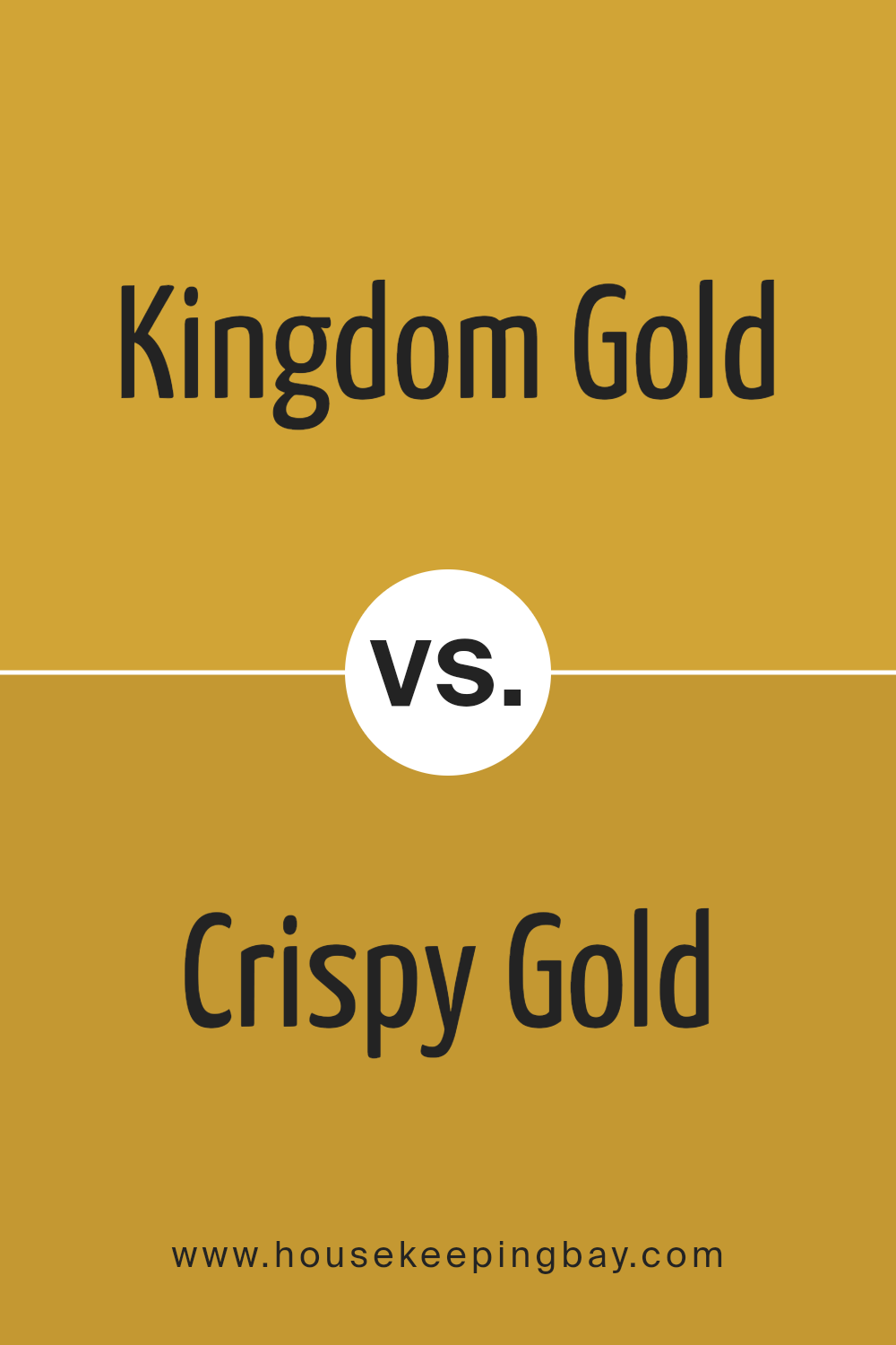
Kingdom Gold SW 6698 by Sherwin Williams vs Crispy Gold SW 6699 by Sherwin Williams
Kingdom Gold SW 6698 and Crispy Gold SW 6699, both by Sherwin Williams, are two distinct shades of gold that offer unique options for your space.
Kingdom Gold is a darker, richer shade that brings warmth and a feeling of luxury to a room. It’s the kind of gold that makes a strong statement, perfect for creating an elegant and sophisticated vibe.
On the other hand, Crispy Gold is a lighter, brighter gold. This color adds a cheerful and vibrant touch, making a space feel more open and airy.
It’s ideal for someone looking to brighten up a room without overwhelming it with too much intensity.
Both colors share the luxurious appeal of gold, but their different tones can significantly affect the mood and style of a space. Kingdom Gold leans towards a classic, timeless elegance, while Crispy Gold is more about freshness and energy.
Depending on what atmosphere you’re aiming for, either color can be a fantastic choice.
You can see recommended paint color below:
- SW 6699 Crispy Gold
housekeepingbay.com
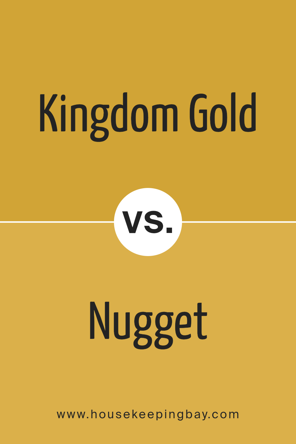
Kingdom Gold SW 6698 by Sherwin Williams vs Nugget SW 6697 by Sherwin Williams
Kingdom Gold SW 6698 and Nugget SW 6697 are two colors from Sherwin Williams. Kingdom Gold is a bit darker and richer, giving off a strong gold feel that stands out in a room.
It’s like the deeper hue you’d see in a treasure chest, making spaces feel cozy yet elegant. On the other hand, Nugget is lighter and softer, almost like the glow of morning sunlight.
It’s not as bold as Kingdom Gold, but it adds a gentle warmth to any area, making it welcoming and cheerful. Both colors bring warmth, but they do it differently. Kingdom Gold adds drama and luxury, while Nugget offers a calm and soothing vibe.
They could work well together for someone wanting to mix and match warmth levels in their home, using Kingdom Gold for statement areas and Nugget for a lighter, peaceful space.
You can see recommended paint color below:
- SW 6697 Nugget
housekeepingbay.com
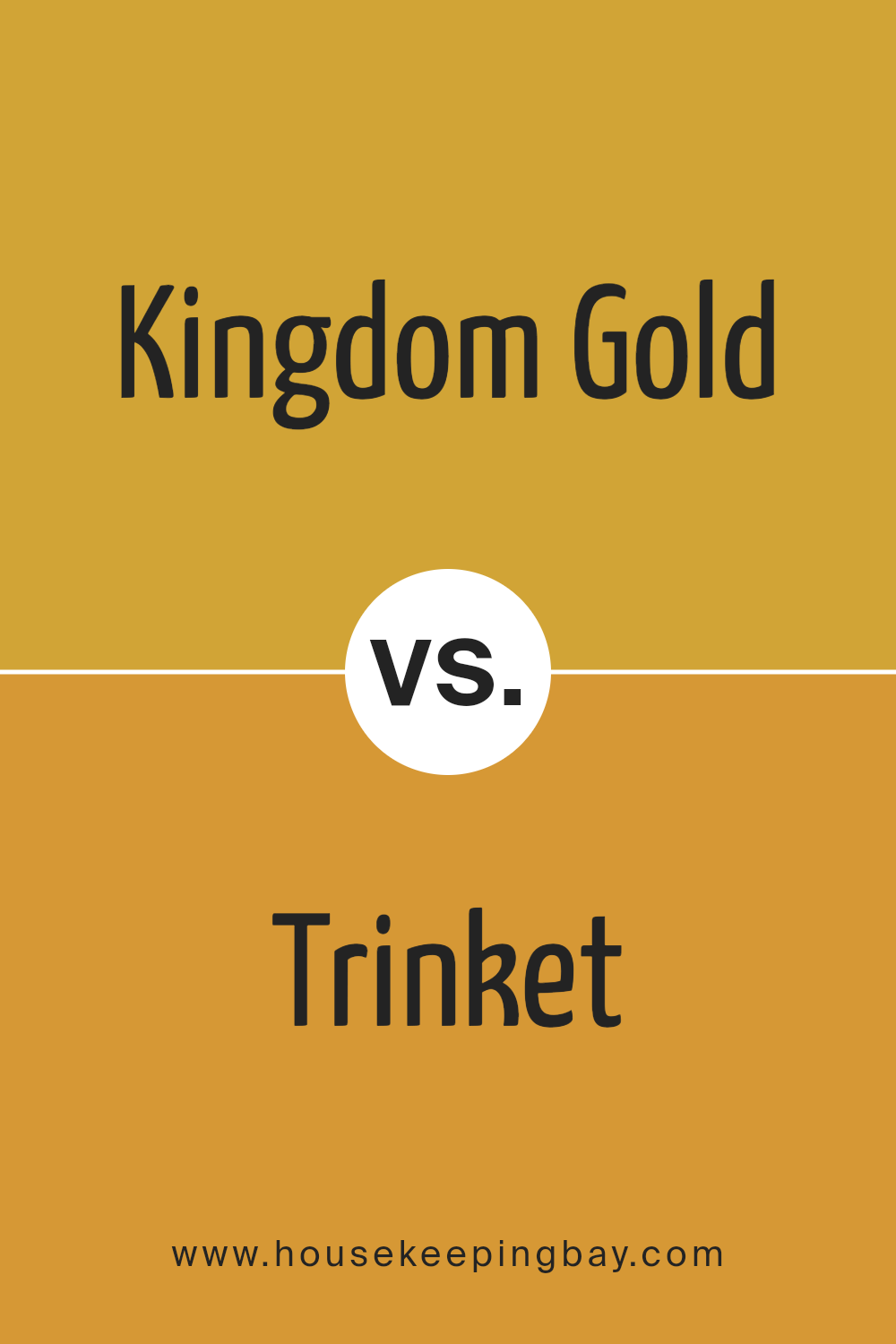
Kingdom Gold SW 6698 by Sherwin Williams vs Trinket SW 6685 by Sherwin Williams
Kingdom Gold SW 6698 by Sherwin Williams is a warm, rich gold color. It’s bold and stands out, giving a room a sunny and cheerful vibe. Trinket SW 6685, on the other hand, is a lighter, softer gold.
It’s not as bright as Kingdom Gold but still has a warmth that makes spaces feel cozy. Think of Kingdom Gold like a bright summer day, while Trinket is more like an early morning sunrise.
Both colors add warmth to a room, but Kingdom Gold makes a stronger statement. Trinket, being gentler, is easier to blend with other colors. If you’re looking to make a bold impact, Kingdom Gold is the way to go.
If you prefer something subtler that still brings warmth, Trinket would be a better choice. Each color has its unique charm, depending on the mood you want to create.
You can see recommended paint color below:
- SW 6685 Trinket
housekeepingbay.com
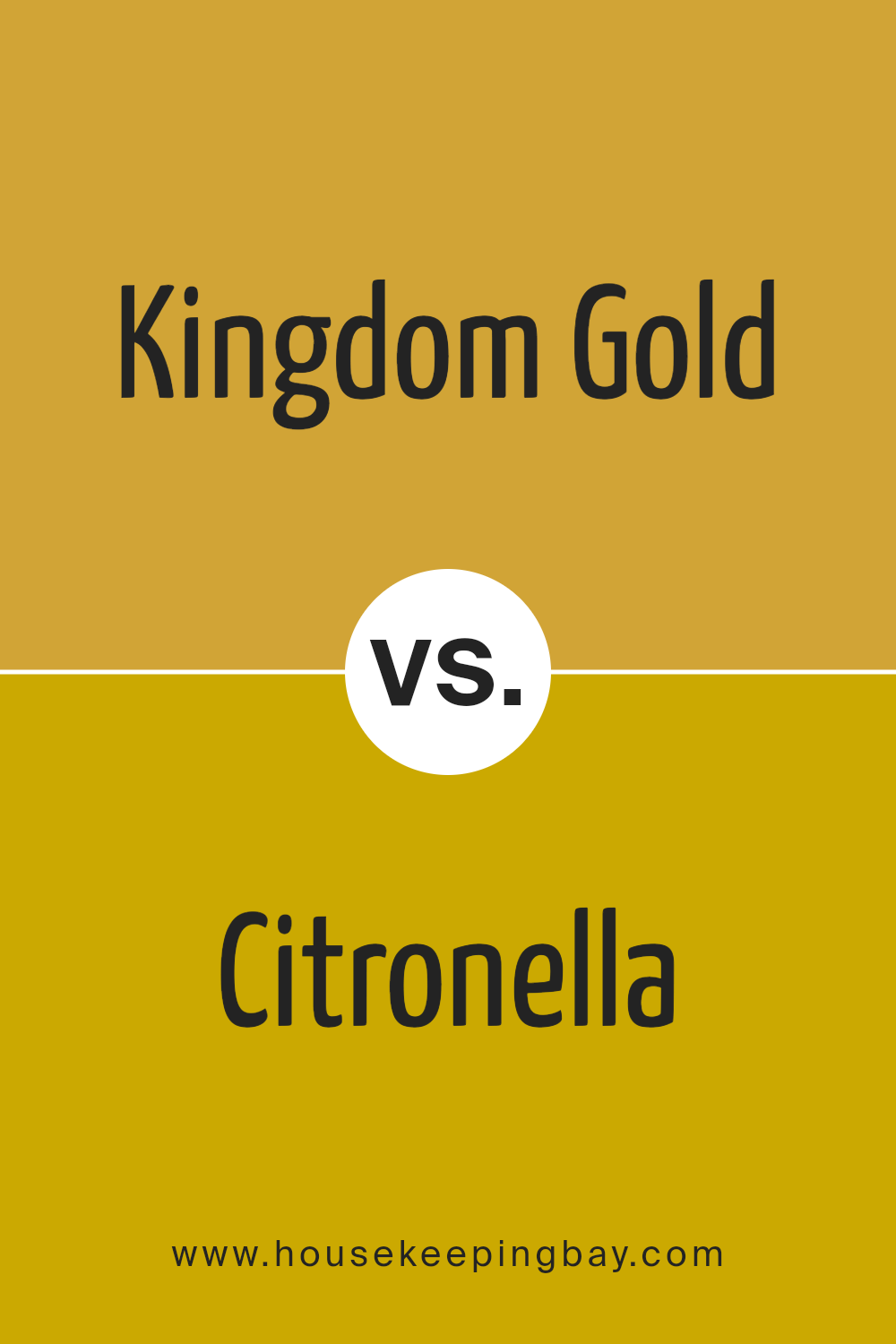
Kingdom Gold SW 6698 by Sherwin Williams vs Citronella SW 6915 by Sherwin Williams
Kingdom Gold SW 6698 and Citronella SW 6915 by Sherwin Williams are two unique shades that each bring their own vibe to a space. Kingdom Gold is a rich, deep yellow with a cozy warmth to it, like the glow of a late afternoon sun.
It’s the kind of color that makes a room feel welcoming and snug, perfect for creating a relaxed, homely atmosphere.
On the other hand, Citronella is a bright, zesty yellow-green, reminiscent of fresh lemon and lime zest. It’s a livelier color that can instantly lighten up and add energy to a space. Citronella is great for anyone looking to add a splash of vibrancy and cheerfulness to their home.
While both colors belong to the yellow family, Kingdom Gold offers a more traditional, golden warmth, and Citronella brings a fresh, tangy twist.
Whether you’re looking for the comforting embrace of a golden hue or the invigorating punch of citronella, both colors present exciting possibilities for home décor.
You can see recommended paint color below:
- SW 6915 Citronella
housekeepingbay.com
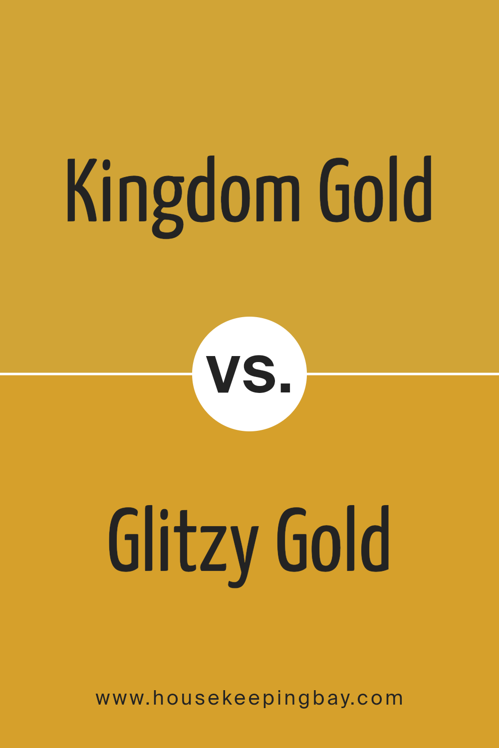
Kingdom Gold SW 6698 by Sherwin Williams vs Glitzy Gold SW 6691 by Sherwin Williams
Kingdom Gold SW 6698 and Glitzy Gold SW 6691 by Sherwin Williams are both beautiful gold tones, but they have their unique characteristics. Kingdom Gold is a deep, rich color that feels warm and cozy.
It’s like a comforting hug in a room, bringing a sense of sophistication and elegance. This color works well in spaces where you want a touch of luxury without going over the top.
On the other hand, Glitzy Gold SW 6691 is lighter and brighter. It has a radiant, cheerful vibe that can instantly lift the mood of a space. This shade is perfect for areas where you want to inject energy and vibrancy, making the room feel more lively and inviting.
While both colors share a gold base, Kingdom Gold offers depth and warmth, ideal for creating a refined look. Glitzy Gold, in contrast, adds sparkle and brightness, perfect for a fun and cheerful atmosphere.
Depending on what feeling you want to create, each color has its place in home decor.
You can see recommended paint color below:
- SW 6691 Glitzy Gold
housekeepingbay.com
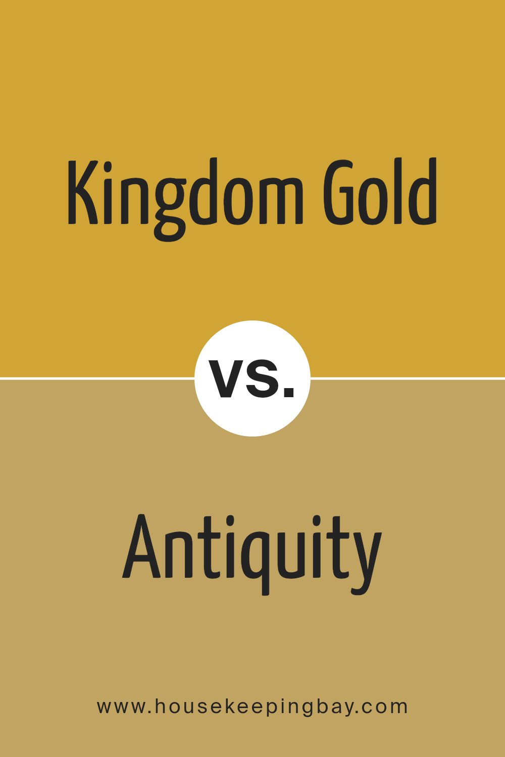
Kingdom Gold SW 6698 by Sherwin Williams vs Antiquity SW 6402 by Sherwin Williams
Kingdom Gold SW 6698 and Antiquity SW 6402, both from Sherwin Williams, are unique in their ways but carry distinct vibes. Kingdom Gold is like a bright, sunny day. It’s a strong, warm yellow that feels cheerful and energetic.
It lights up a room, making it feel more open and lively. This color could be perfect for spaces where you want to add brightness and a sense of joy.
On the other hand, Antiquity SW 6402 is a lot calmer. It’s a deep, muted green with hints of gray. This color brings a sense of peace and grounding.
It’s more reserved and sophisticated, making it ideal for areas where you want relaxation and a touch of elegance. Antiquity can make a space feel cozy and welcoming without being too bold.
While Kingdom Gold adds vibrancy and a happy glow, Antiquity offers a tranquil backdrop that’s soothing. Depending on what atmosphere you’re aiming for, either color could dramatically alter the mood of a room.
Whether you’re after the bright cheerfulness of Kingdom Gold or the serene calm of Antiquity, both colors offer something special for your space.
You can see recommended paint color below:
- SW 6402 Antiquity
housekeepingbay.com
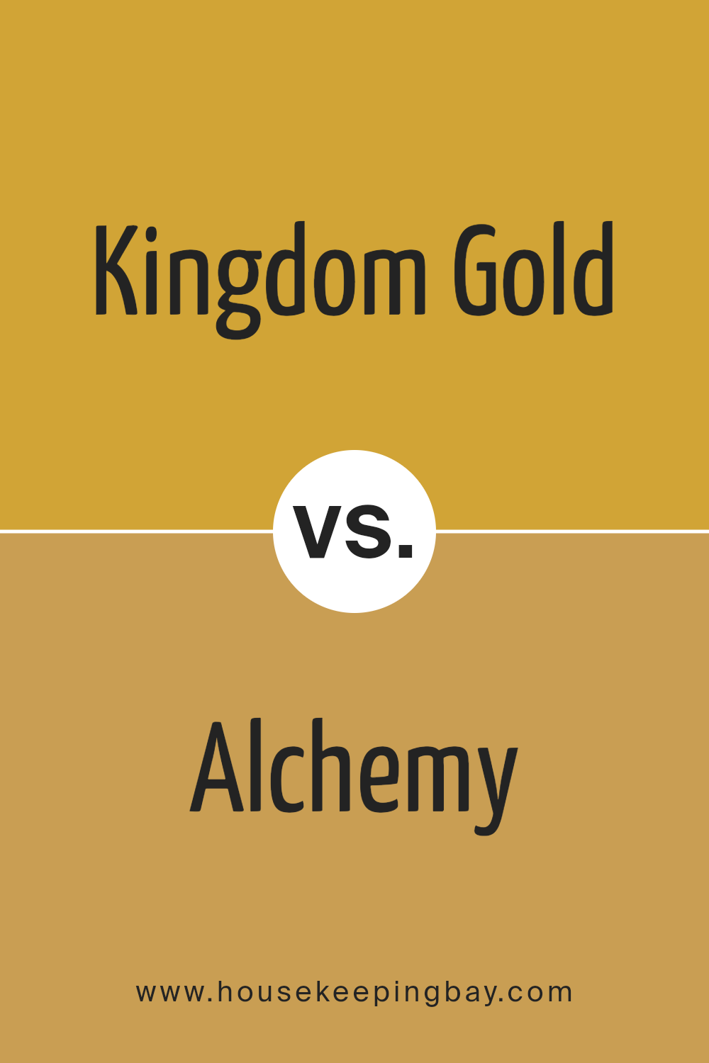
Kingdom Gold SW 6698 by Sherwin Williams vs Alchemy SW 6395 by Sherwin Williams
Kingdom Gold SW 6698 and Alchemy SW 6395, both by Sherwin Williams, offer a rich palette for anyone looking to add warmth and elegance to their space.
Kingdom Gold is a vibrant, true gold color that brings a cheerful and bright vibe to any room. It’s like the glow of sunshine indoors, perfect for making a space feel cozy and inviting.
On the other hand, Alchemy is a deeper, more muted gold with a subtle hint of mustard. This color adds a sophisticated touch, bringing depth and a sense of calmness to a room. It’s less about the sparkle and more about creating a refined, understated elegance.
While Kingdom Gold pops and stands out, making a bold statement in a space, Alchemy offers a softer, more grounded approach. Both colors are beautiful in their own right, but your choice between them would depend on the mood you’re aiming to create.
Kingdom Gold energizes a room, while Alchemy brings a warm serenity.
You can see recommended paint color below:
- SW 6395 Alchemy
housekeepingbay.com
Kingdom Gold SW 6698 by Sherwin Williams vs Brittlebush SW 6684 by Sherwin Williams
Main Color – Kingdom Gold SW 6698 by Sherwin Williams is a rich, bold golden hue that brings a warm and lively vibe to any space. Its depth adds a sense of luxury and coziness, making it perfect for creating a statement in a room.
This color shines in well-lit areas, where its golden tones can truly glow, adding a touch of elegance and warmth.
Second Color – Brittlebush SW 6684 by Sherwin Williams, on the other hand, is a lighter and softer yellow. It’s more subtle and airy, providing a fresh and welcoming feel to interiors.
This color works wonderfully in spaces aiming for a bright, cheerful atmosphere without the intensity of a deep gold. It’s like the gentle touch of sunlight in the morning, uplifting and soothing.
When comparing the two, Kingdom Gold has a more dramatic and luxurious feel, suited for spaces that aim to impress and envelop in warmth. Brittlebush offers a gentler approach, ideal for creating a light, cheerful environment.
Both colors serve different moods and settings but bring their own unique charm and vibrancy to a space.
You can see recommended paint color below:
housekeepingbay.com
Kingdom Gold SW 6698 by Sherwin Williams vs Eye Catching SW 6914 by Sherwin Williams
Kingdom Gold SW 6698 by Sherwin Williams and Eye Catching SW 6914 by Sherwin Williams are two unique colors that stand out for different reasons. Kingdom Gold is a warm, rich shade that reminds you of a cozy, sunny space.
It has a classic feel to it, making it perfect for places where you want a touch of elegance without going over the top. It feels like a soft blanket of warmth around you, with its golden tones bringing a comforting atmosphere to any room.
On the other hand, Eye Catching SW 6914 is a bright, lively color. It’s the kind of color that makes you look twice because of its vibrant energy.
If Kingdom Gold is a gentle hug, Eye Catching is a cheerful high five. It brings a pop of fun and brightness, perfect for spaces that need a bit of life or an energetic vibe.
While both colors bring their own charm to a space, Kingdom Gold offers a subdued, sophisticated warmth, and Eye Catching provides an upbeat, vibrant feel.
They’re great for different purposes—Kingdom Gold for a classic, warm look and Eye Catching for a bold, energetic space.
You can see recommended paint color below:
- SW 6914 Eye Catching
housekeepingbay.com
Kingdom Gold SW 6698 by Sherwin Williams vs Gambol Gold SW 6690 by Sherwin Williams
Kingdom Gold SW 6698 and Gambol Gold SW 6690 by Sherwin Williams are two gold tones that add warmth to any space, but they have their unique characteristics. Kingdom Gold is the richer and deeper of the two.
It’s like a bright, sunny day, bringing a strong, joyful presence into a room. This color is bold and can make spaces feel cozy yet vibrant, perfect for making a statement wall or adding a touch of elegance.
On the other hand, Gambol Gold is lighter and has a more subtle touch. It’s like the gentle glow of sunrise, creating a soft, inviting atmosphere.
This color is more understated, making it easier to use in various spaces without overwhelming the senses. It can blend seamlessly with other colors and decor, lending a fresh, cheerful vibe to the environment.
In short, Kingdom Gold is the go-to for a bold, warm impact, while Gambol Gold is ideal for a softer, light-hearted feel. Both bring the joy of gold into a space, but their effects are as different as dusk and dawn.
You can see recommended paint color below:
- SW 6690 Gambol Gold
housekeepingbay.com
Conclusion
In summary, Kingdom Gold SW 6698 by Sherwin Williams is a paint color that stands out for its warmth and richness. This shade offers a cozy and inviting atmosphere to any room it’s applied to, making it an excellent choice for those looking to add a touch of elegance and comfort to their space.
Its versatility allows it to be used in various settings, ranging from living rooms and bedrooms to dining areas, highlighting its adaptability to different decor styles and preferences.
Moreover, the shade Kingdom Gold SW 6698 is praised for its ability to blend well with a wide range of color palettes, furnishing options, and lighting conditions, further enhancing its appeal among homeowners and interior designers alike.
Its unique hue creates a serene and welcoming environment, proving it to be more than just a paint color but a transformative element for any interior space.
For individuals seeking to refresh their homes with a color that provides both beauty and warmth, Kingdom Gold SW 6698 emerges as a top contender in the vast collection offered by Sherwin Williams.
housekeepingbay.com
Ever wished paint sampling was as easy as sticking a sticker? Guess what? Now it is! Discover Samplize's unique Peel & Stick samples. Get started now and say goodbye to the old messy way!
Get paint samples