Interesting Aqua SW 6220 by Sherwin Williams
Revitalize Your Space with a Hint of Serene Blue
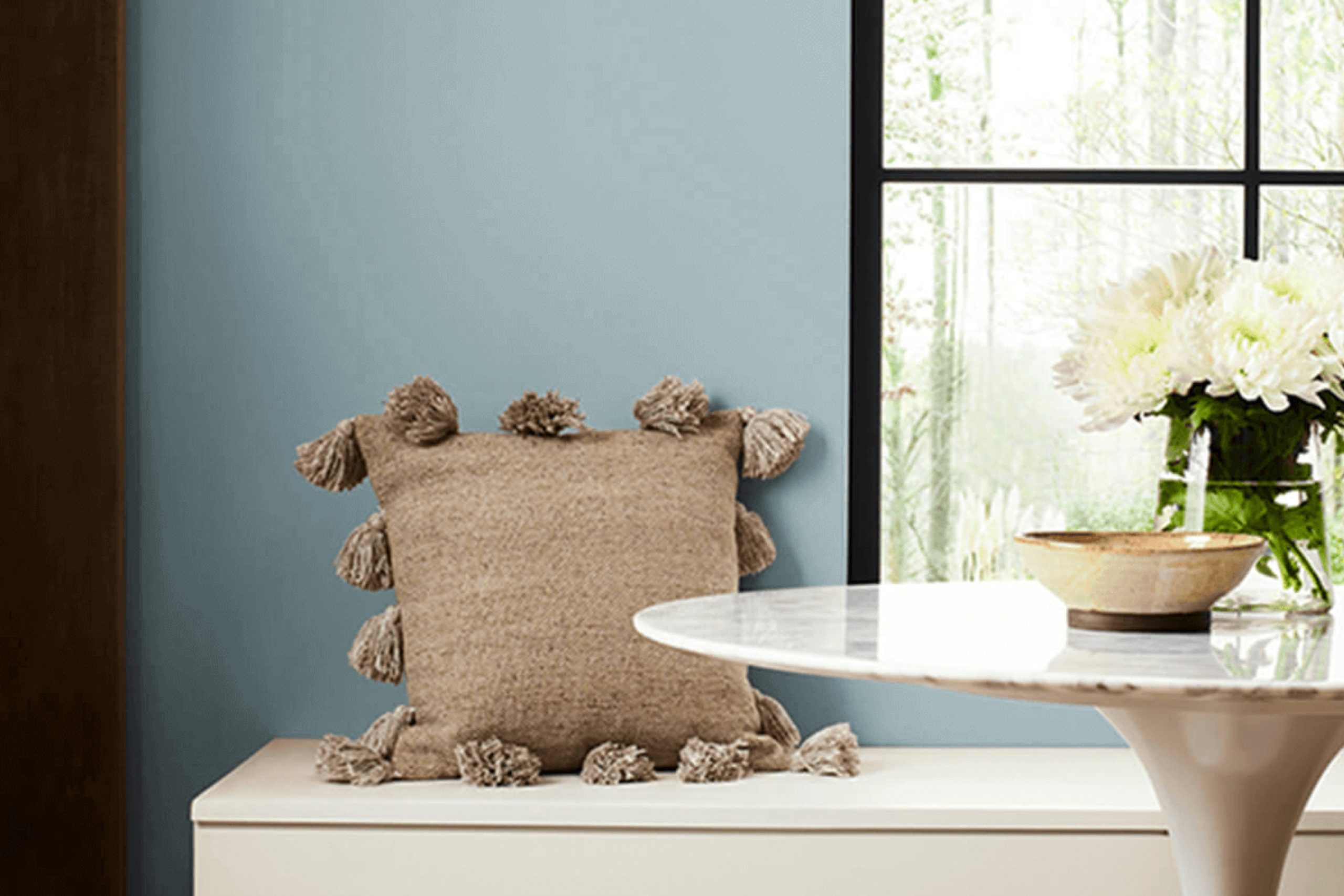
Choosing the right paint color can completely change the feel of a space, setting the tone for how you live and relax. There’s one shade that brings a feeling of freshness and calm: SW 6220 Interesting Aqua by Sherwin Williams. Imagine a color that blends blue with a hint of green, resulting in a soft, soothing hue. This color is perfect for those who appreciate a refined yet relaxed atmosphere in their homes.
Interesting Aqua works well in a variety of settings. You can use it in your living room to create a cozy area where you can unwind after a long day, or bring it into the bedroom for a peaceful night’s sleep.
It’s also a great choice for bathrooms and kitchens, adding a touch of elegance without overwhelming the space.
The beauty of Interesting Aqua lies in its ability to adapt to different lighting and surroundings. In natural light, it offers a refreshing, airy vibe, while in artificial light, it maintains warmth and softness.
Pairing it with whites and neutrals will highlight its calming nature and make your space feel open and inviting.
Get ready to experience a new level of comfort and style with SW 6220 Interesting Aqua, your new go-to color for a serene and sophisticated home.
via sherwin-williams.com
What Color Is Interesting Aqua SW 6220 by Sherwin Williams?
Interesting Aqua SW 6220 by Sherwin Williams is a refreshing color that sits between blue and green. It evokes feelings of calm and coolness, making it perfect for spaces where relaxation is key. Its subtle vibrancy can lighten a room, giving it an airy feel.
This shade works beautifully in coastal-themed interiors, where it can mimic the ocean’s gentle waves. It also fits well in modern and minimalist designs, adding a splash of color without overwhelming simplicity.
In a bohemian setting, Interesting Aqua can complement earthy tones and natural materials, creating a balanced and inviting environment.
Pair this color with neutral shades like soft whites and beiges for a serene effect. It also looks great alongside deeper blues and greens for a layered look. Materials like light wood, rattan, and wicker harmonize wonderfully with Interesting Aqua, enriching its natural appeal.
Textures such as linen or cotton in soft throws or cushions enhance its comfort aspect, while matte finishes maintain its understated elegance.
Metal accents, specifically in brushed nickel or chrome, can add a touch of sophistication. Whether used as a primary wall color or as an accent, Interesting Aqua is versatile and can bring a fresh, lively essence to any room.
housekeepingbay.com
Is Interesting Aqua SW 6220 by Sherwin Williams Warm or Cool color?
AquaSW 6220 by Sherwin Williams brings a fresh, calming feel to any space. Its soft blue tone has hints of green, reminiscent of clear ocean waters, making rooms feel open and serene. This color works well in creating a peaceful atmosphere, perfect for bedrooms or bathrooms where relaxation is key.
AquaSW 6220 pairs nicely with neutral shades like gray and beige, allowing it to pop without overwhelming the space. Its versatility shines in living rooms when combined with natural wood elements or white trim, adding a touch of elegance.
In kitchens, it can offer a refreshing and clean backdrop, especially when matched with stainless steel appliances or white cabinets. As a wall paint, it helps rooms look larger and more airy, brightening even small spaces. Its soothing properties make it an ideal choice for any household looking to add a touch of calm and elegance to their home decor.
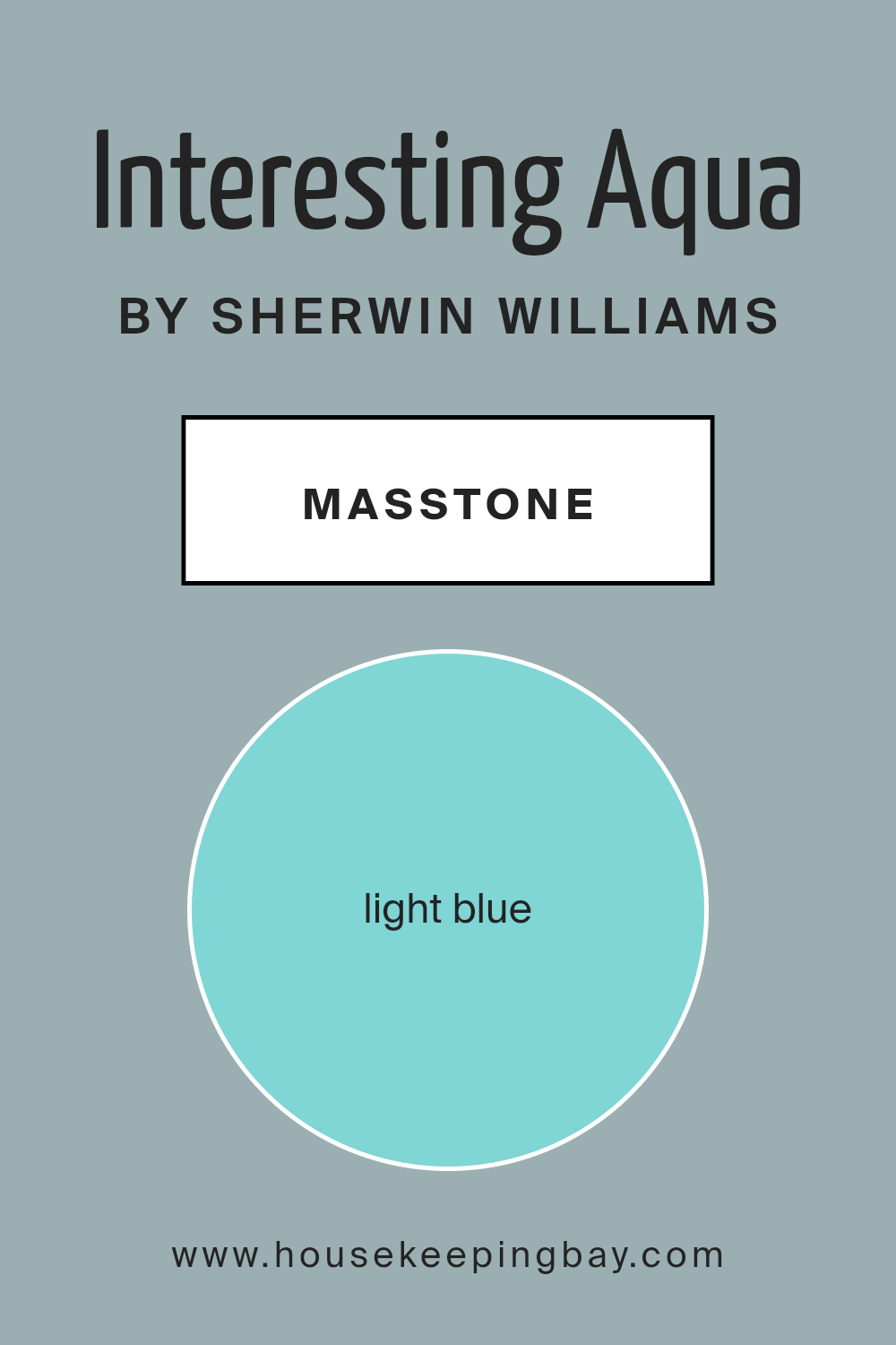
What is the Masstone of the Interesting Aqua SW 6220 by Sherwin Williams?
AquaSW 6220 by Sherwin Williams offers a light blue shade (#80D5D5) that brings a fresh and airy feel to any home. This color is reminiscent of a clear, serene sky or a calm ocean, which can make spaces feel open and calm.
Using this light blue on walls can brighten up rooms, especially those with lots of natural light. It’s a great option for bathrooms, as it complements white fixtures, giving a clean and crisp look. It also pairs well with sandy beige or soft gray, which can mimic a beach-like atmosphere.
In living spaces or bedrooms, this hue gives a soothing backdrop that promotes relaxation. Pairing it with white or neutral furniture and adding touches of greenery with plants can enhance its calming effect. AquaSW 6220 works well with various decor styles, making it versatile for modern or classic themes. It’s a gentle solution to creating a peaceful environment throughout your home.
housekeepingbay.com
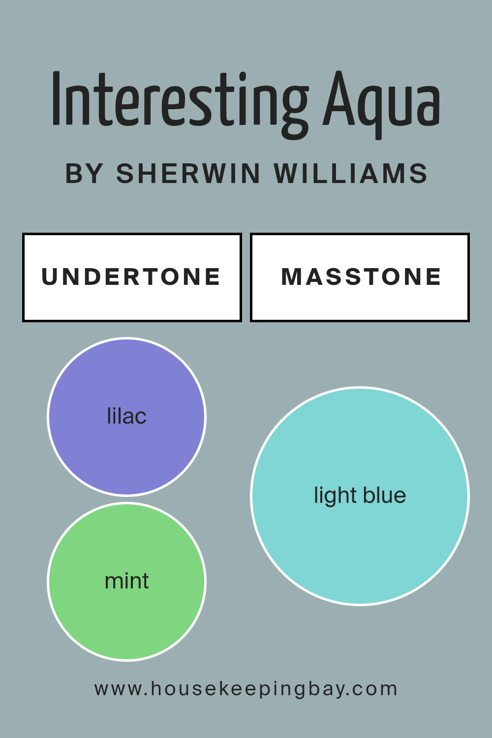
Undertones of Interesting Aqua SW 6220 by Sherwin Williams
Interesting Aqua SW 6220 by Sherwin Williams is an intriguing color because of its complex undertones. It mixes colors like lilac, mint, grey, light gray, light purple, pale yellow, pale pink, turquoise, blue, light turquoise, and dark turquoise. These undertones collectively affect how the main color appears in different environments.
Undertones subtly influence how we perceive a color. For instance, a paint may seem blue initially, yet undertones may add a hint of green or purple depending on the light and surrounding hues. This means that lighting, room orientation, and nearby colors can change the way a paint color looks.
With Interesting Aqua SW 6220, the diverse undertones balance each other. Mint and grey tend to cool the room, while pale yellow and pale pink add warmth and softness. Light grays and blues bring a sense of calm to a space. The hints of light purple and lilac can add elegance, while turquoise tones introduce a refreshing vibe.
This variety makes Interesting Aqua SW 6220 versatile for interiors. In a sunlit room, you might notice the mint and turquoise more strongly, creating a fresh, airy feel.
Meanwhile, in a dimly-lit room, the grey and lilac notes might dominate, giving a cozier, more sophisticated look.
housekeepingbay.com
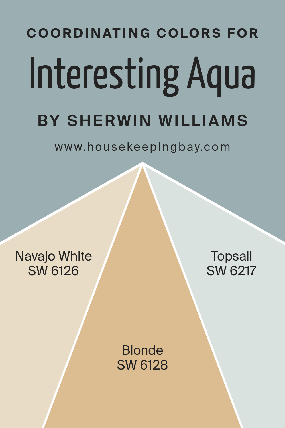
Coordinating Colors of Interesting Aqua SW 6220 by Sherwin Williams
Coordinating colors are different shades that work well together to create a balanced look in a space. They complement each other, enhancing the main color while adding depth and interest to a room. When planning room decor, picking coordinating colors is essential for achieving harmony in the design.
Interesting Aqua SW 6220 by Sherwin Williams is a calm and soft blue-green shade that can set a relaxed tone in any room. To enhance this color, you might choose SW 6126 – Navajo White, SW 6128 – Blonde, and SW 6217 – Topsail as coordinating shades.
Navajo White is a warm, creamy beige that adds a cozy feel without overwhelming the space with too much color. Its gentle warmth can soften the crispness of Interesting Aqua, creating a welcoming environment. Blonde, on the other hand, is a golden-hued beige that brings a touch of sunshine to the color palette.
It provides a cheerful contrast without clashing with the primary color. Lastly, Topsail is a light, airy blue that echoes the calming effect of Interesting Aqua while introducing a fresh, breezy element.
Together, these colors form a cohesive look that feels natural and inviting, perfect for creating a serene and pleasant atmosphere.
You can see recommended paint colors below:
- SW 6126 Navajo White
- SW 6128 Blonde
- SW 6217 Topsail
housekeepingbay.com
How Does Lighting Affect Interesting Aqua SW 6220 by Sherwin Williams?
Lighting greatly impacts how we perceive colors, and this holds true for paint colors like Interesting Aqua SW 6220 by Sherwin Williams. Understanding how lighting affects this particular shade can help you make informed decisions for your space.
In artificial light, Interesting Aqua can appear different depending on the type and warmth of the bulbs used. Under warm, incandescent light, this hue may take on a slightly muted feel, with its green undertones becoming more pronounced. Fluorescent lighting can make it appear cooler, highlighting its blue tint. LED lights can vary, so choosing a light with a neutral temperature helps keep the color balanced.
Natural light changes throughout the day and varies based on the direction of the room. In a north-facing room, which typically receives consistent but indirect light, Interesting Aqua might appear cooler and a bit more subdued. The lack of direct sunlight often enhances the bluer tones, giving the room a calming atmosphere.
In a south-facing room, with abundant natural light, this color can feel brighter and more vibrant. The warm sunlight in these rooms can bring out the slight warmth in the aqua, making it feel airy and inviting.
East-facing rooms receive warm morning sunlight and cooler light later in the day. In the morning, Interesting Aqua will feel lively and more yellowish-green, but in the afternoon, as the light cools, it may revert to a cooler blue.
West-facing rooms have the opposite effect, with softer light in the morning and warm, rich light in the afternoon. Here, the color might feel muted and soft during the morning but become richer and more dynamic as the day progresses.
Understanding these shifts can help you select complementary colors and decor, ensuring that Interesting Aqua meets your expectations regardless of the lighting conditions.
housekeepingbay.com
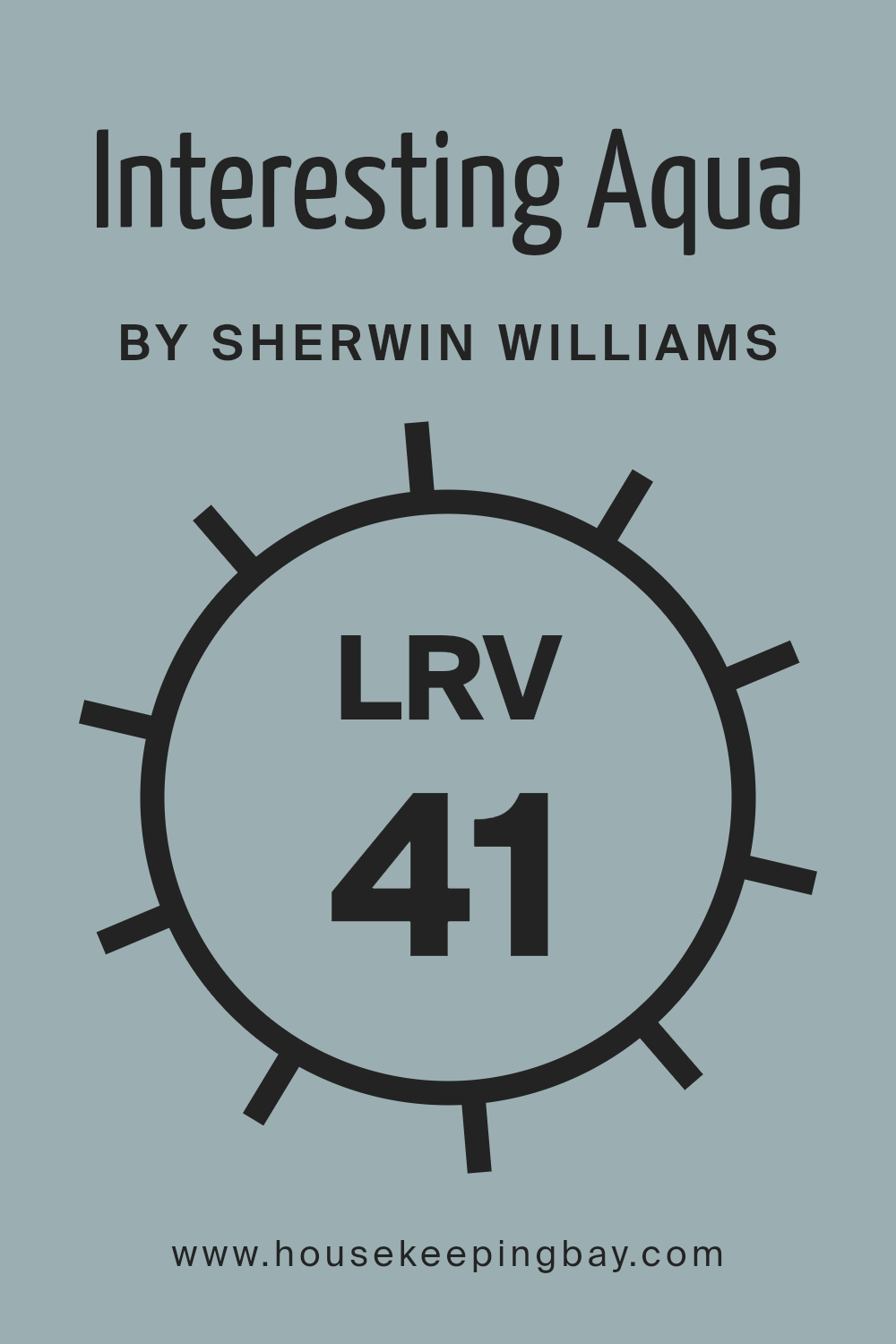
What is the LRV of Interesting Aqua SW 6220 by Sherwin Williams?
LRV stands for Light Reflectance Value, and it measures how much light a color reflects. The scale ranges from 0 to 100, where 0 means the color absorbs all light (like true black), and 100 means it reflects all light (like pure white). This value helps determine how bright or dark a color will appear in a space.
A higher LRV indicates a lighter color that reflects more light, which can make a room feel more open and airy. Conversely, a lower LRV suggests a darker color that absorbs more light, giving the room a cozier, more intimate feel.
With an LRV of 40.888, Interesting Aqua SW 6220 sits in the middle range. Since it reflects a moderate amount of light, it is a balanced color that won’t make the room too bright or too dark. This means it can add elegance without overwhelming the senses. The blue-green tone of Interesting Aqua retains enough vibrancy to energize a room while its LRV ensures it won’t make spaces feel cramped.
This makes it a versatile choice for varying room sizes and lighting conditions, providing a calm yet lively ambiance.
housekeepingbay.com
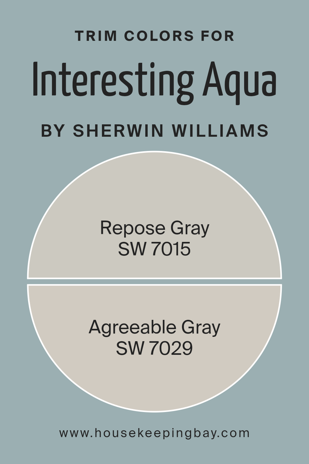
What are the Trim colors of Interesting Aqua SW 6220 by Sherwin Williams?
Trim colors are the shades used on a home’s edges and outlines, such as window frames, door frames, and baseboards. When paired with a richer wall color like Interesting Aqua SW 6220 by Sherwin Williams, trim colors help accentuate and highlight the overall design aesthetics, giving a clear distinction and framing effect to the space.
Interesting Aqua is a vibrant color that combines a blend of green and blue, offering a refreshing feel. By adding trim colors like SW 7015 – Repose Gray and SW 7029 – Agreeable Gray, you provide a neutral contrast that enhances and defines the boldness of Interesting Aqua.
This contrast also adds depth and can make colors feel more balanced, creating visual interest without overwhelming the senses.
SW 7015 – Repose Gray has a light, warm gray tone that feels perfectly calm and consistent. It serves as a subtle complement to bolder colors without competing for attention.
Meanwhile, SW 7029 – Agreeable Gray is a warmer beige-gray or “greige” that offers versatility and warmth.
It melds seamlessly with any surrounding shades, providing a soft, unassuming backdrop. Both Repose Gray and Agreeable Gray work well as trim colors because they have the ability to ground the vividness of Interesting Aqua while allowing it to be the focal point in a room.
They create a refined look that is harmonious and cohesive, making the entire space feel inviting and comfortable.
You can see recommended paint colors below:
- SW 7015 Repose Gray
- SW 7029 Agreeable Gray
housekeepingbay.com
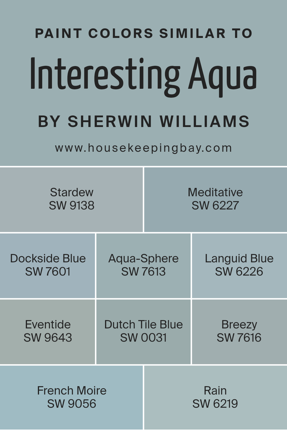
Colors Similar to Interesting Aqua SW 6220 by Sherwin Williams
Choosing colors that are similar to Interesting Aqua SW 6220 involves understanding the subtle nuances and harmony among shades. These colors work well together because they share underlying tones that connect them visually, creating a sense of unity and balance.
SW 9138 Stardew has a muted, dusky quality that lends a calm, soothing feel, while SW 6227 Meditative brings a gentle hint of softness, encouraging a peaceful atmosphere. SW 7601 Dockside Blue offers a deeper blue with gray undertones, evoking a sense of quiet serenity.
SW 7613 Aqua-Sphere adds an airy lightness, perfect for softer spaces, while SW 6226 Languid Blue imparts a calm elegance with its delicate blue tinge. SW 9643 Eventide pairs a charming, muted hue with a sense of reflection, and SW 0031 Dutch Tile Blue delivers a rich and timeless touch.
SW 7616 Breezy leans into a refreshing, light blue, capturing a calm breeze feel, while SW 9056 French Moire whispers elegance with a subtle silvery essence.
Lastly, SW 6219 Rain introduces a steady, cool tone reminiscent of fresh rain, completing the palette with its gentle, warming invitation. Together, these colors create a cohesive and harmonious environment, perfect for spaces that aspire for a unified yet varied aesthetic.
You can see recommended paint colors below:
- SW 9138 Stardew
- SW 6227 Meditative
- SW 7601 Dockside Blue
- SW 7613 Aqua-Sphere
- SW 6226 Languid Blue
- SW 9643 Eventide
- SW 0031 Dutch Tile Blue
- SW 7616 Breezy
- SW 9056 French Moire
- SW 6219 Rain
housekeepingbay.com
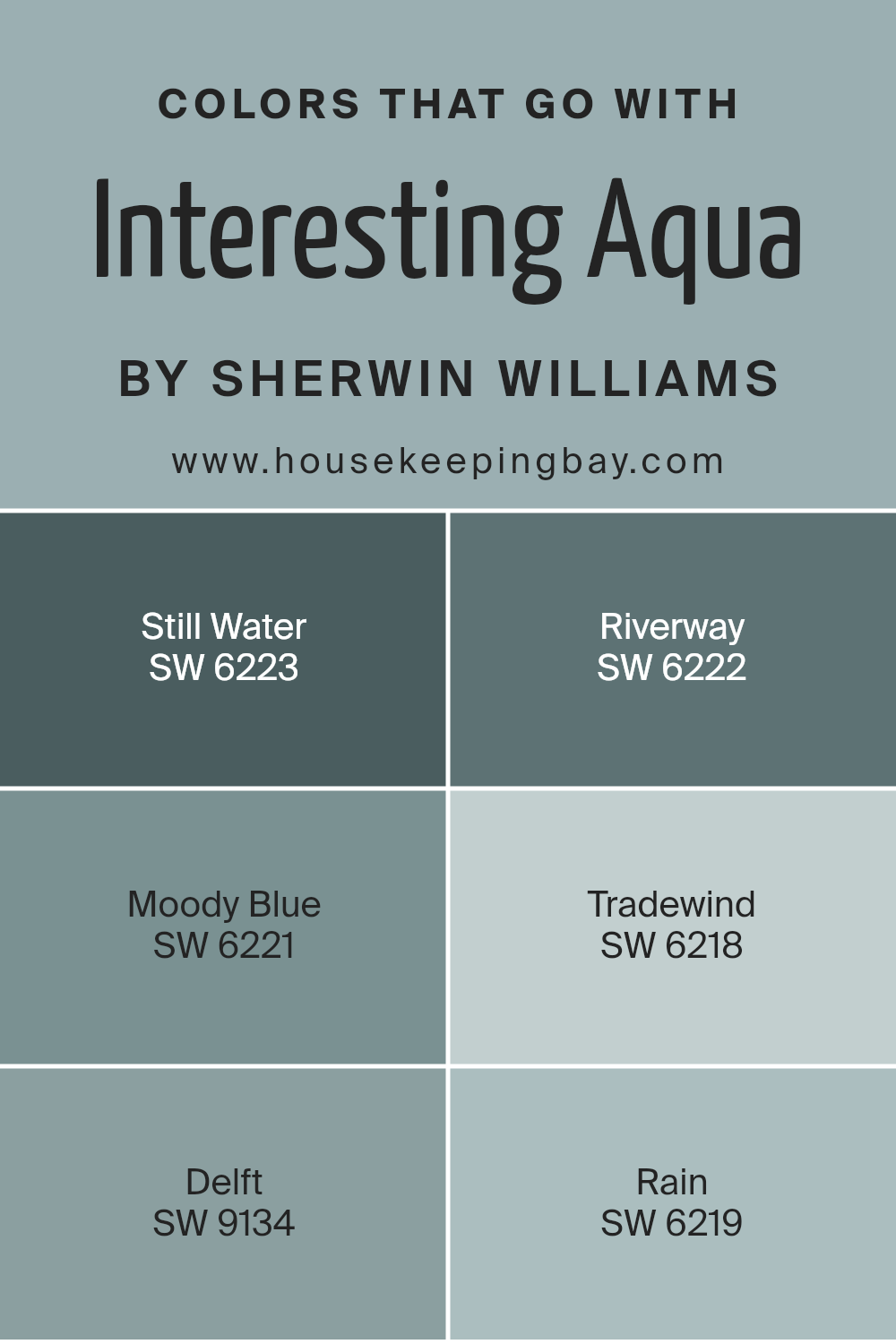
Colors that Go With Interesting Aqua SW 6220 by Sherwin Williams
Colors that complement Interesting Aqua SW 6220 by Sherwin Williams play a crucial role in setting a room’s mood and style. A well-coordinated color scheme creates a harmonious and relaxing space, allowing each hue to enhance the overall aesthetic.
Still Water SW 6223, a deep and soothing blue, pairs beautifully with Interesting Aqua, adding depth and warmth. Riverway SW 6222 offers a dark teal shade, bringing richness and a touch of sophistication.
Moody Blue SW 6221 introduces a muted, slightly grayish blue that adds elegance while maintaining calmness. These colors, when combined with Interesting Aqua, create a cohesive yet diverse palette.
Tradewind SW 6218 is a soft, breezy blue with a hint of gray, perfect for adding a light and airy feel. Delft SW 9134 provides a dark and dramatic navy blue, offering contrast and grounding other colors in the palette. Rain SW 6219 is a gentle, misty blue that complements Interesting Aqua’s vibrant undertones without overpowering them.
Together, these colors work in harmony to create rooms that are both inviting and visually balanced. Whether you’re aiming for a serene retreat or a sophisticated space, these colors provide a flexible and pleasing foundation.
You can see recommended paint colors below:
- SW 6223 Still Water
- SW 6222 Riverway
- SW 6221 Moody Blue
- SW 6218 Tradewind
- SW 9134 Delft
- SW 6219 Rain
housekeepingbay.com
How to Use Interesting Aqua SW 6220 by Sherwin Williams In Your Home?
Interesting Aqua SW 6220 by Sherwin Williams is a light blue-green color that adds a fresh and calming feel to any space. It works well in various areas of a home, making rooms feel open and inviting. In a living room, this color can brighten the space, complementing both modern and classic furniture styles.
When used in a bedroom, it creates a peaceful atmosphere for rest and relaxation, combining beautifully with soft white or gray accents.
In a bathroom, Interesting Aqua brings a clean and airy vibe, pairing nicely with white tiles and natural wood tones. For kitchens, it can add a pop of color to cabinets or walls, enhancing light and making the space feel more vibrant.
It also works wonderfully in children’s rooms, offering a playful yet serene backdrop. Overall, Interesting Aqua can subtly highlight architectural features and blend seamlessly with different materials and textures throughout a home.
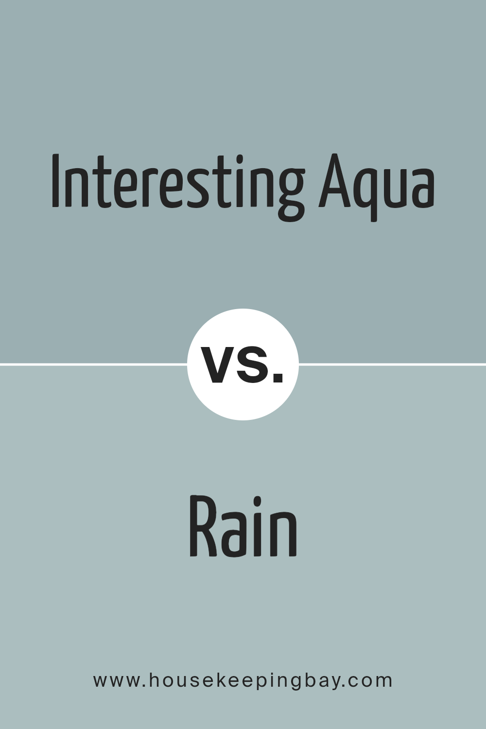
Interesting Aqua SW 6220 by Sherwin Williams vs Rain SW 6219 by Sherwin Williams
Interesting Aqua SW 6220 and Rain SW 6219 by Sherwin Williams are calm, soothing shades of blue, yet each brings its own vibe. Interesting Aqua combines blue with hints of green, offering a fresh, clear look that feels vibrant and lively. It’s great for adding a pop of energy to spaces, especially when paired with whites or grays.
Meanwhile, Rain presents a softer, more muted blue with a touch of gray. This makes it feel more passive and serene, perfect for creating relaxed, comforting atmospheres in bedrooms or living spaces. While Interesting Aqua brings a spark and lively feel, Rain settles things down with its gentle, calming presence.
Both colors work well as part of modern designs, yet they serve different moods—one invigorates, while the other soothes. In choosing between them, think about whether you want a space to feel fresh or tranquil.
You can see recommended paint color below:
- SW 6219 Rain
housekeepingbay.com
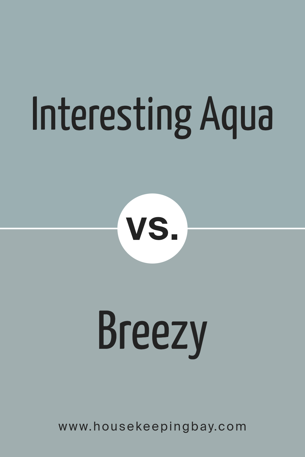
Interesting Aqua SW 6220 by Sherwin Williams vs Breezy SW 7616 by Sherwin Williams
Interesting Aqua SW 6220 and Breezy SW 7616 by Sherwin Williams are both soft, calming shades of blue-green that can bring a refreshing feel to any space. Interesting Aqua has a bit more green in its mix, making it resemble the serene colors often found in nature, like a quiet lake or a weathered sea glass. It’s a versatile shade that can create a tranquil and airy atmosphere in both modern and classic spaces.
Breezy SW 7616, while also in the blue-green family, leans slightly more towards blue. Its undertones give it a cooler feeling, reminiscent of a light summer sky.
This color can create a relaxed, comfortable mood, making it ideal for spaces like bedrooms or bathrooms where you want a calm environment.
Both colors work well with various other shades. Pairing them with whites or creamy neutrals highlights their softness while adding darker, deeper colors emphasizes a stylish contrast.
You can see recommended paint color below:
housekeepingbay.com
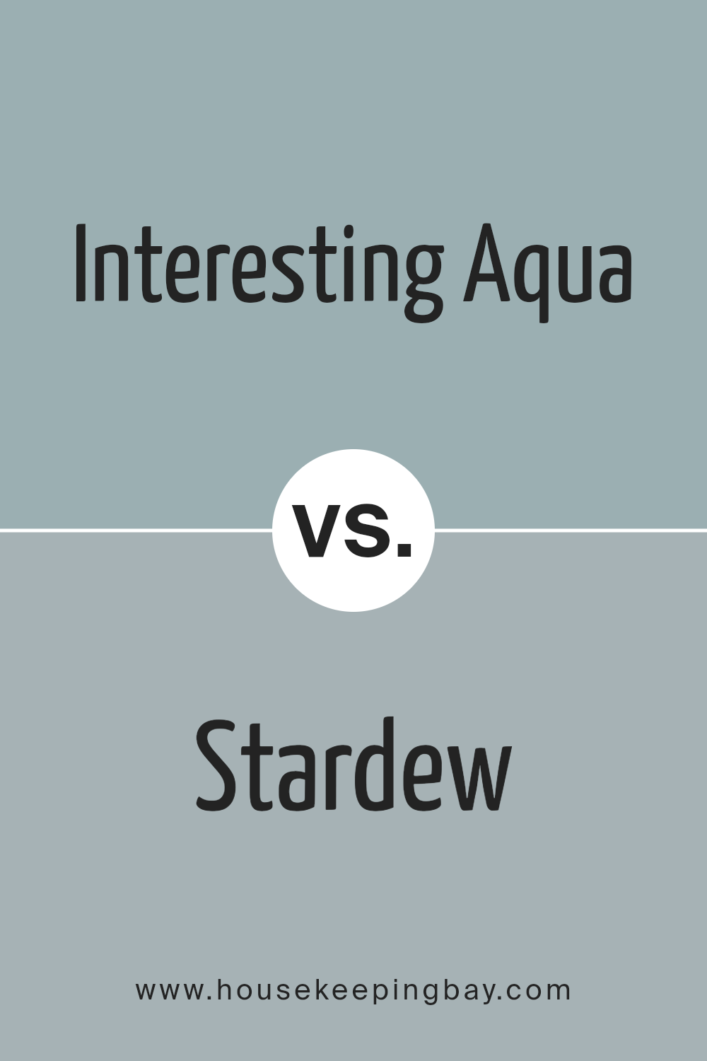
Interesting Aqua SW 6220 by Sherwin Williams vs Stardew SW 9138 by Sherwin Williams
Interesting Aqua SW 6220 by Sherwin Williams is a lively and refreshing shade. It combines blue and green tones, offering a cool, invigorating vibe. This color feels light and airy, much like tropical waters. It’s an excellent choice for creating an energizing environment, making it suitable for spaces where you want a boost of freshness and vitality.
Stardew SW 9138, also by Sherwin Williams, presents a more subdued, calming blue-gray hue. It feels more grounded and serene compared to the vibrant Interesting Aqua. This color resembles a gentle, cloudy sky, providing a soothing backdrop for relaxation.
It’s ideal for spaces aimed at comfort and peace, like bedrooms or quiet study areas.
While Interesting Aqua energizes with its bright and cheerful nature, Stardew rests in calmness with its muted elegance. Both colors carry their unique charm and purpose, offering versatile options for different moods and spaces.
You can see recommended paint color below:
housekeepingbay.com
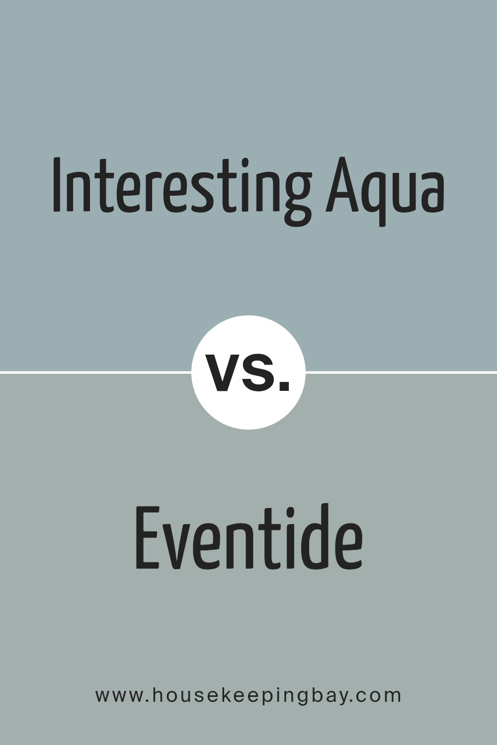
Interesting Aqua SW 6220 by Sherwin Williams vs Eventide SW 9643 by Sherwin Williams
Interesting Aqua SW 6220 by Sherwin Williams is a light, refreshing shade of blue-green that brings a soothing and airy feel to spaces. It works well in areas where a calming atmosphere is desired, such as bedrooms or bathrooms. The color radiates a sense of cleanliness and openness, reminiscent of clear ocean waters or tropical lagoons.
Eventide SW 9643, by contrast, is a deeper, more muted shade with a mix of gray and blue tones. This gives it a more subdued and sophisticated look, making it suitable for spaces that aim for a cozy, serene ambiance, such as living rooms or studies.
Eventide’s subtlety allows it to pair well with neutral tones, creating a harmonious environment.
While Interesting Aqua adds brightness and energy, Eventide offers depth and warmth. Both colors can enhance interiors beautifully when used according to the desired mood and style.
You can see recommended paint color below:
housekeepingbay.com
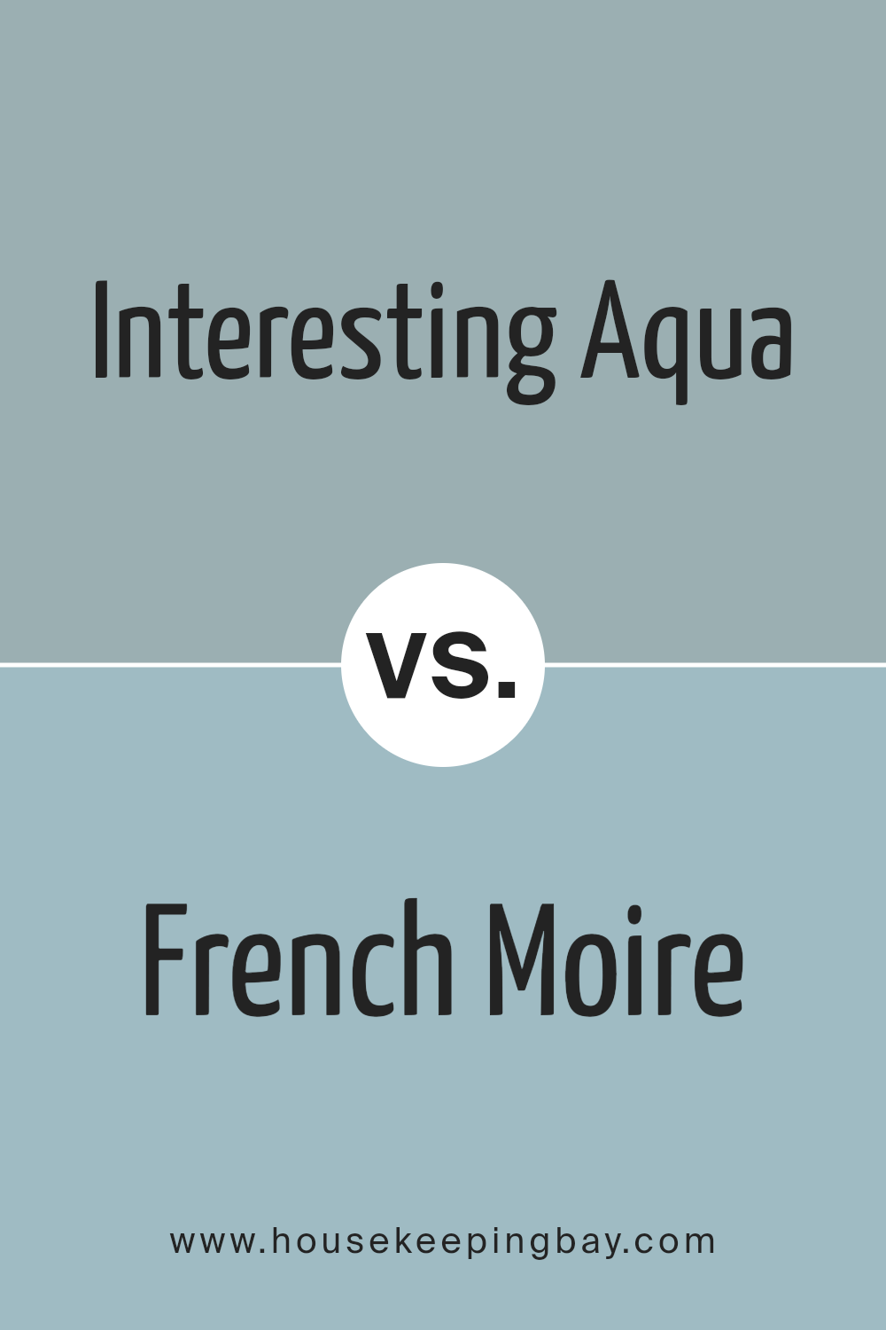
Interesting Aqua SW 6220 by Sherwin Williams vs French Moire SW 9056 by Sherwin Williams
Interesting Aqua SW 6220 by Sherwin Williams is a bright, refreshing shade. It combines elements of blue and green, creating an uplifting and lively atmosphere. This color is reminiscent of clear ocean waters or a crisp spring morning, often bringing a sense of energy and freshness to any space.
French Moire SW 9056 by Sherwin Williams, meanwhile, offers a deeper, more muted tone. It leans more heavily towards blue than green, evoking a sense of calm and stability. This shade has an elegant and sophisticated feel, like the gentle dusk of an evening sky.
These colors, though both belong to the blue-green family, offer contrasting vibes. Interesting Aqua feels invigorating and slightly playful, ideal for spaces where you want an energetic touch. French Moire stands out with a more serene presence, suitable for creating a relaxed, comforting environment. Both colors have their unique appeal, enhancing different moods and settings effectively.
You can see recommended paint color below:
- SW 9056 French Moire
housekeepingbay.com
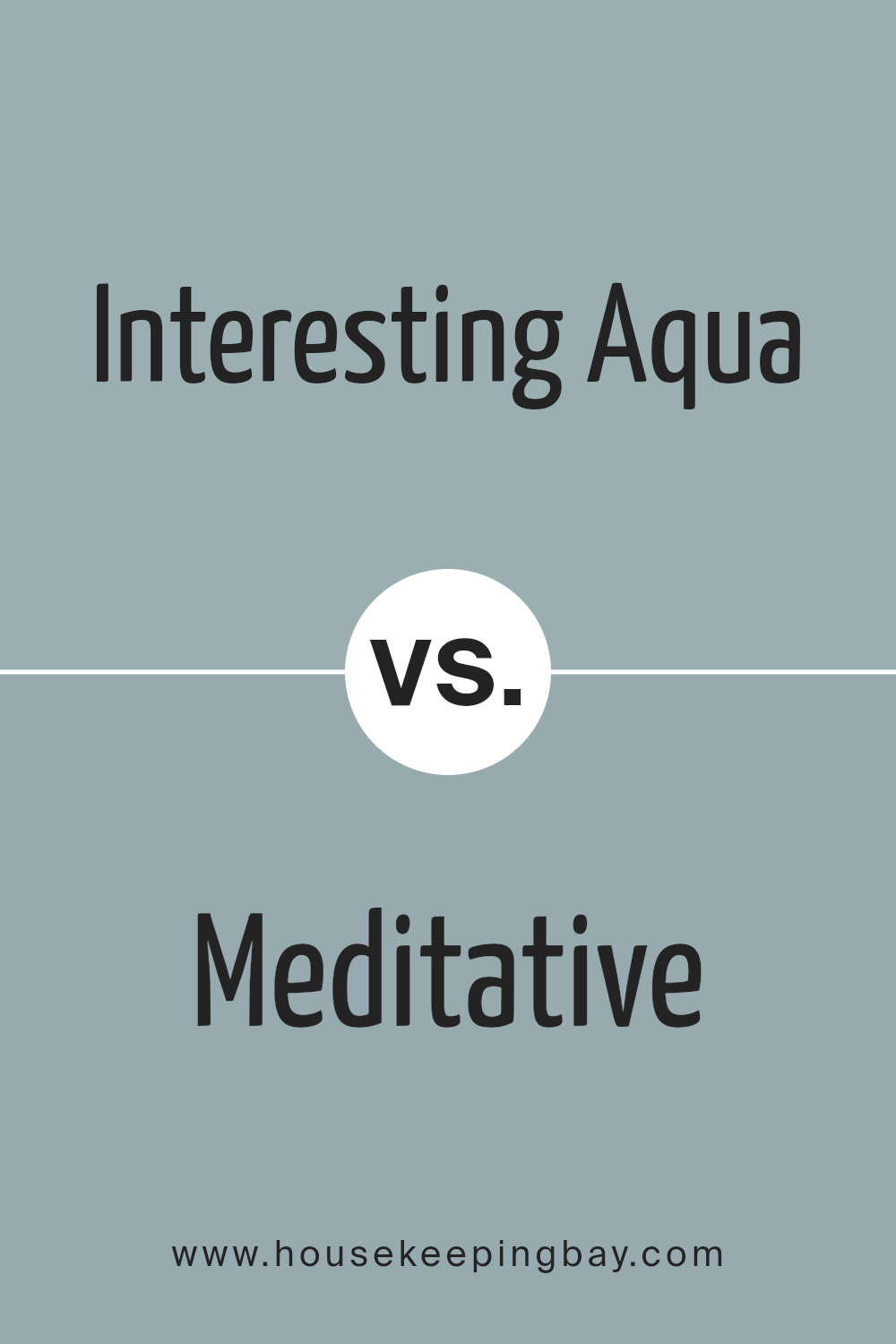
Interesting Aqua SW 6220 by Sherwin Williams vs Meditative SW 6227 by Sherwin Williams
Interesting Aqua SW 6220 and Meditative SW 6227, both by Sherwin Williams, are two shades of blue-green that offer different vibes for a space. Interesting Aqua is a lively, clean aqua color with a slightly more blue tone. It exudes freshness and can brighten up a room with its light, airy feel. It’s great for adding a touch of energy and positivity to any area.
Meditative SW 6227, in contrast, is a deeper, more muted blue with gray undertones. It offers a calming and soothing effect, creating a cozy, restful environment. Meditative is ideal for spaces where relaxation and comfort are priorities, like bedrooms or quiet reading nooks.
When paired, Interesting Aqua can be the accent, bringing a pop of vibrant color, while Meditative provides a balanced, serene backdrop. Both colors blend wonderfully with natural materials and neutral tones, each carrying its own unique charm without overwhelming the senses.
You can see recommended paint color below:
- SW 6227 Meditative
housekeepingbay.com
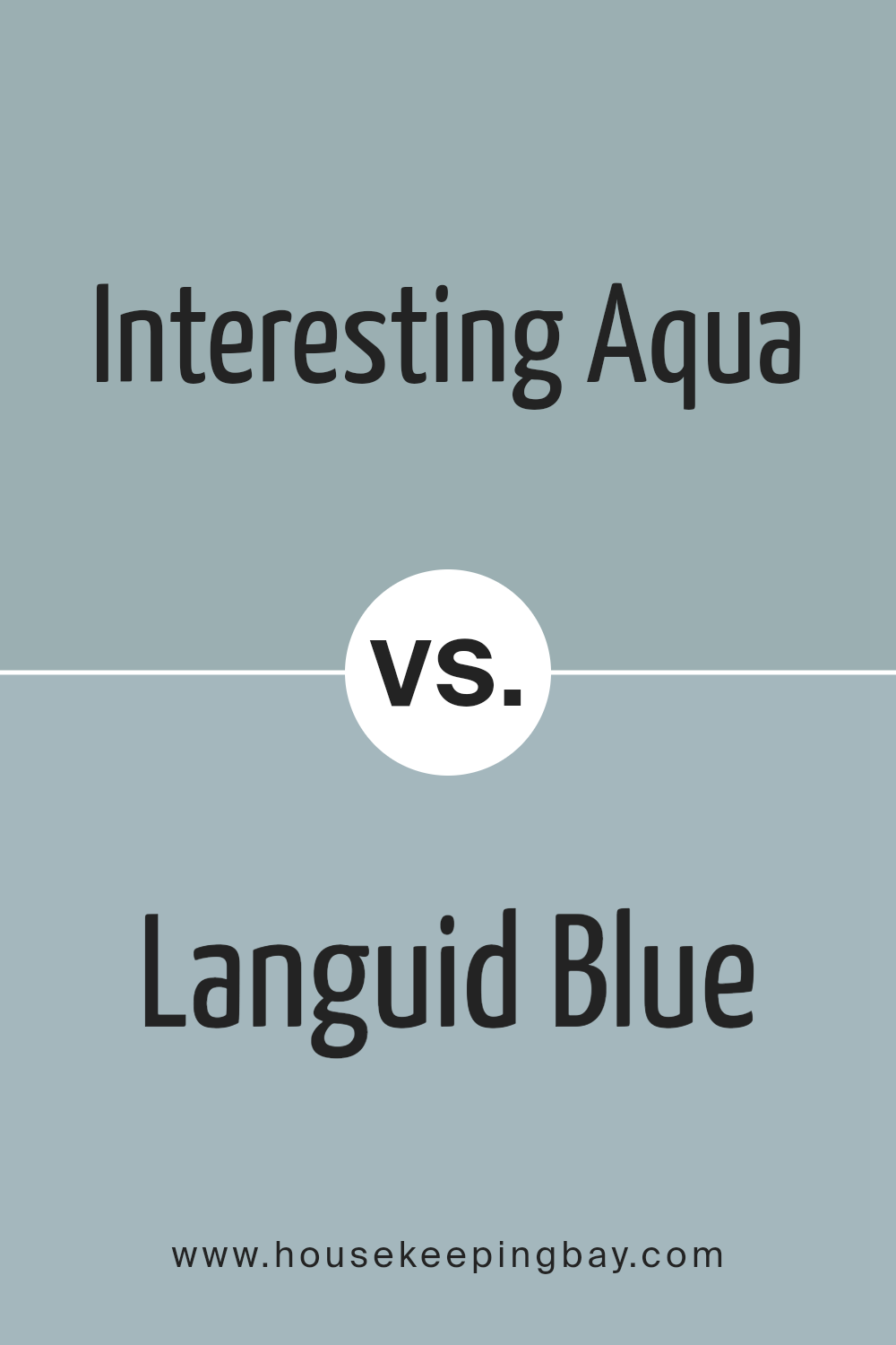
Interesting Aqua SW 6220 by Sherwin Williams vs Languid Blue SW 6226 by Sherwin Williams
Interesting Aqua and Languid Blue by Sherwin Williams offer two unique takes on blue-green hues. Interesting Aqua is a refreshing color that leans slightly more towards green, giving it an invigorating and lively feel. It’s reminiscent of clear ocean waters on a sunny day, bringing a sense of freshness and vibrancy to any space.
Languid Blue, true to its name, has a more muted and calming presence. With its soft blue tone slightly touched by gray, it offers a soothing, relaxed atmosphere, making it ideal for areas designed for relaxation. It feels like a gentle breeze or a calm sea, subtly filling a room with peace.
Interesting Aqua sparks energy and brightness, perfect for spaces that need a lively touch. Meanwhile, Languid Blue gently creates an environment of ease and comfort, suitable for spaces aiming for calmness and serenity. Both colors work well together or separately, depending on the desired mood.
You can see recommended paint color below:
- SW 6226 Languid Blue
housekeepingbay.com
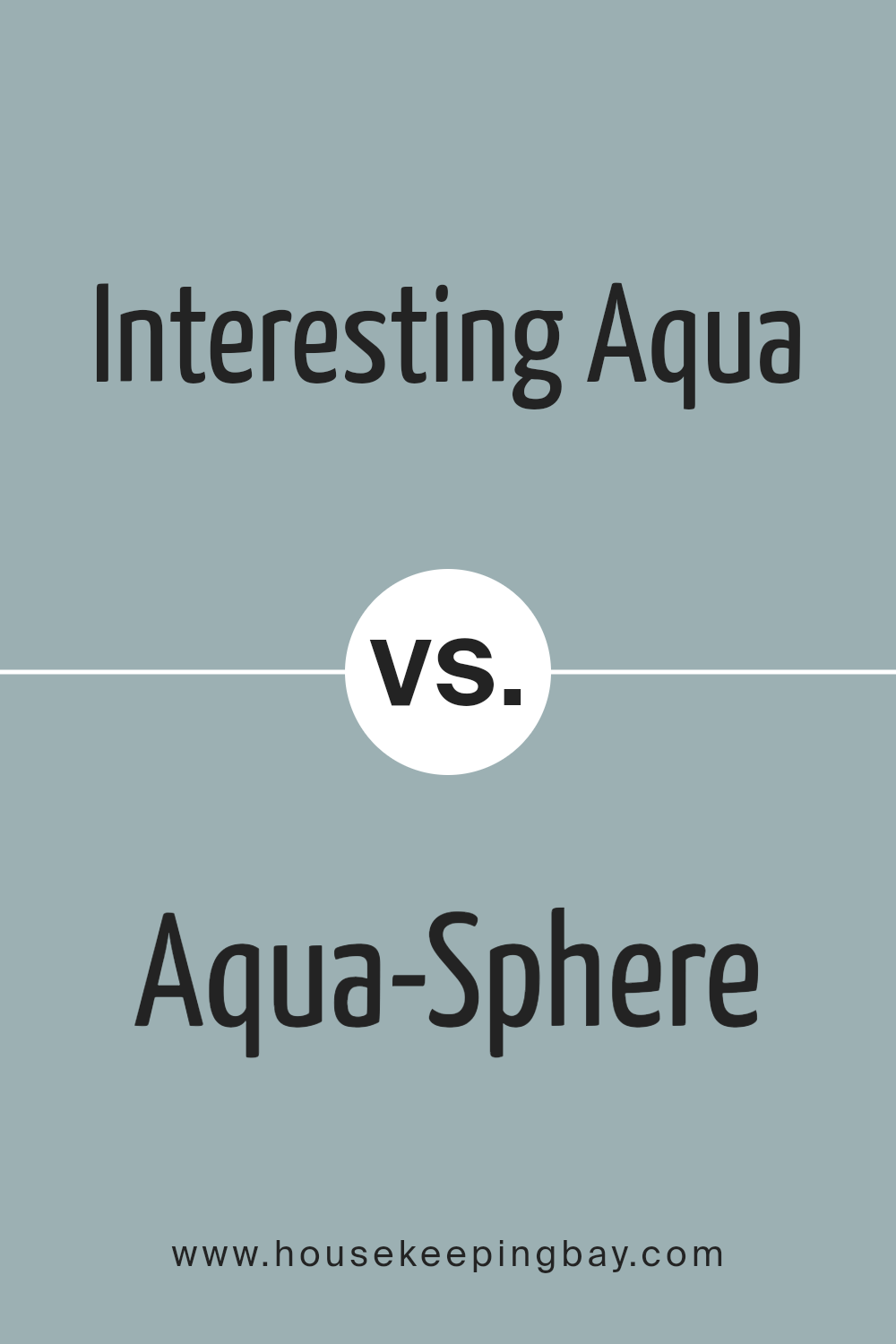
Interesting Aqua SW 6220 by Sherwin Williams vs Aqua-Sphere SW 7613 by Sherwin Williams
“Interesting Aqua” (SW 6220) by Sherwin Williams is a lively, refreshing shade that captures attention with its vibrant green-blue tones. It almost has a tropical vibe, reminiscent of clear waters in a sunlit lagoon. This color can brighten spaces, giving rooms an energetic and lively feel. It’s ideal for spaces where a playful, yet serene atmosphere is desired.
“Aqua-Sphere” (SW 7613), also from Sherwin Williams, presents a softer, more subdued tone compared to “Interesting Aqua.” It leans towards a calmer, more muted blue, evoking a sense of peace and relaxation, like the gentle hues of a morning sky or a calm sea.
“Aqua-Sphere” works well in spaces meant for winding down and can add a subtle, serene elegance to interiors without overwhelming the senses.
Both colors share aqua roots, yet each brings its unique personality to a room, offering different moods and aesthetics.
You can see recommended paint color below:
- SW 7613 Aqua-Sphere
housekeepingbay.com
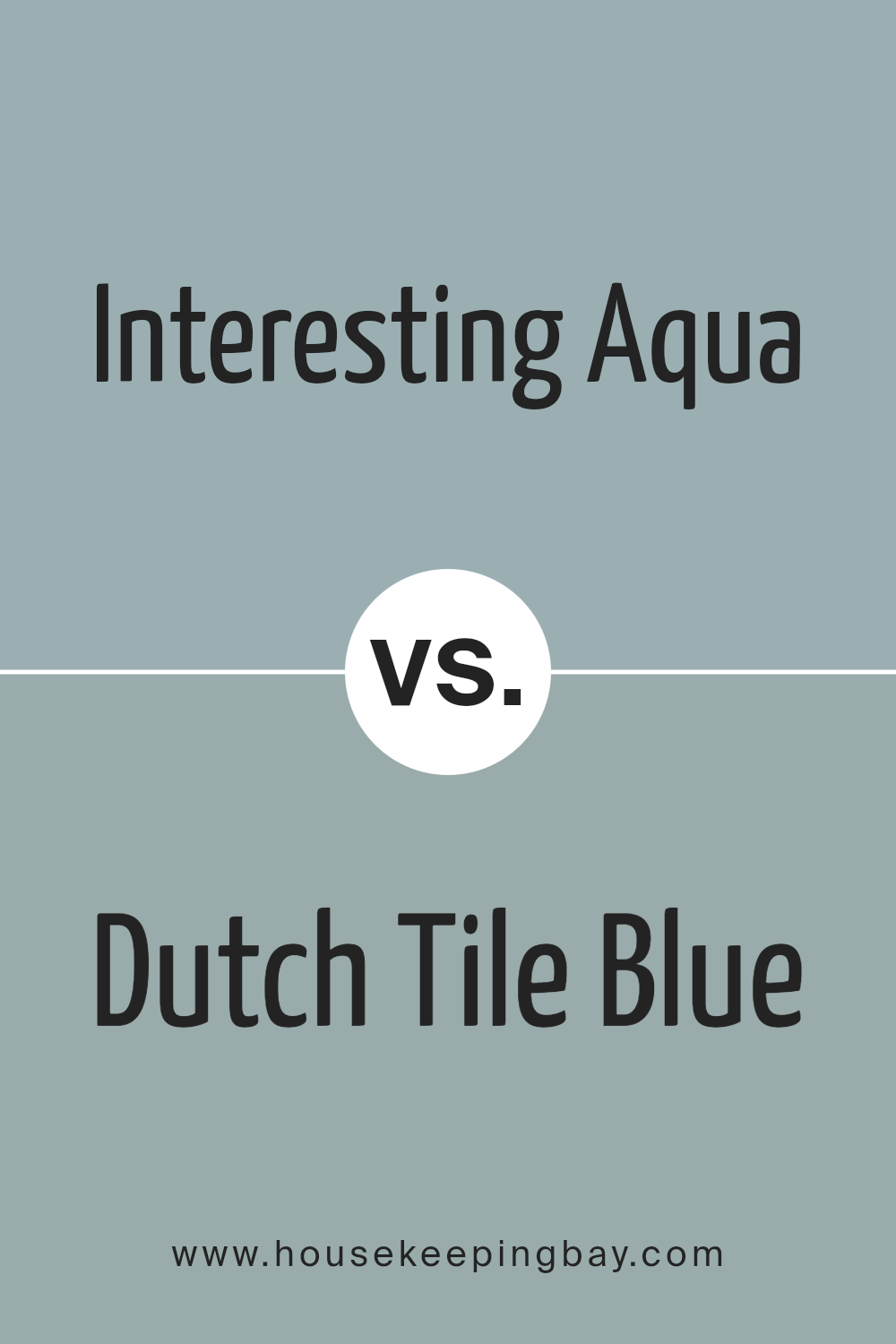
Interesting Aqua SW 6220 by Sherwin Williams vs Dutch Tile Blue SW 0031 by Sherwin Williams
Interesting Aqua SW 6220 and Dutch Tile Blue SW 0031 are both beautiful colors from Sherwin Williams that bring different vibes to a space. Interesting Aqua is a light, refreshing shade with green and blue tones, perfect for creating a calm and airy atmosphere.
It works well in spaces like bathrooms or kitchens, where a hint of coolness can enhance the overall feel. Its soft nature makes it versatile and easy to pair with a variety of colors.
Dutch Tile Blue, however, is richer and more muted, with deeper blue and gray undertones. It conveys a sense of coziness and depth, ideal for living rooms or bedrooms, where warmth and comfort are essential. This color adds a classic touch to any room, balancing boldness with elegance.
Choosing between these two depends on the mood you want in your space. Interesting Aqua suits those who prefer lightness, while Dutch Tile Blue fits those who appreciate warmth.
You can see recommended paint color below:
- SW 0031 Dutch Tile Blue
housekeepingbay.com
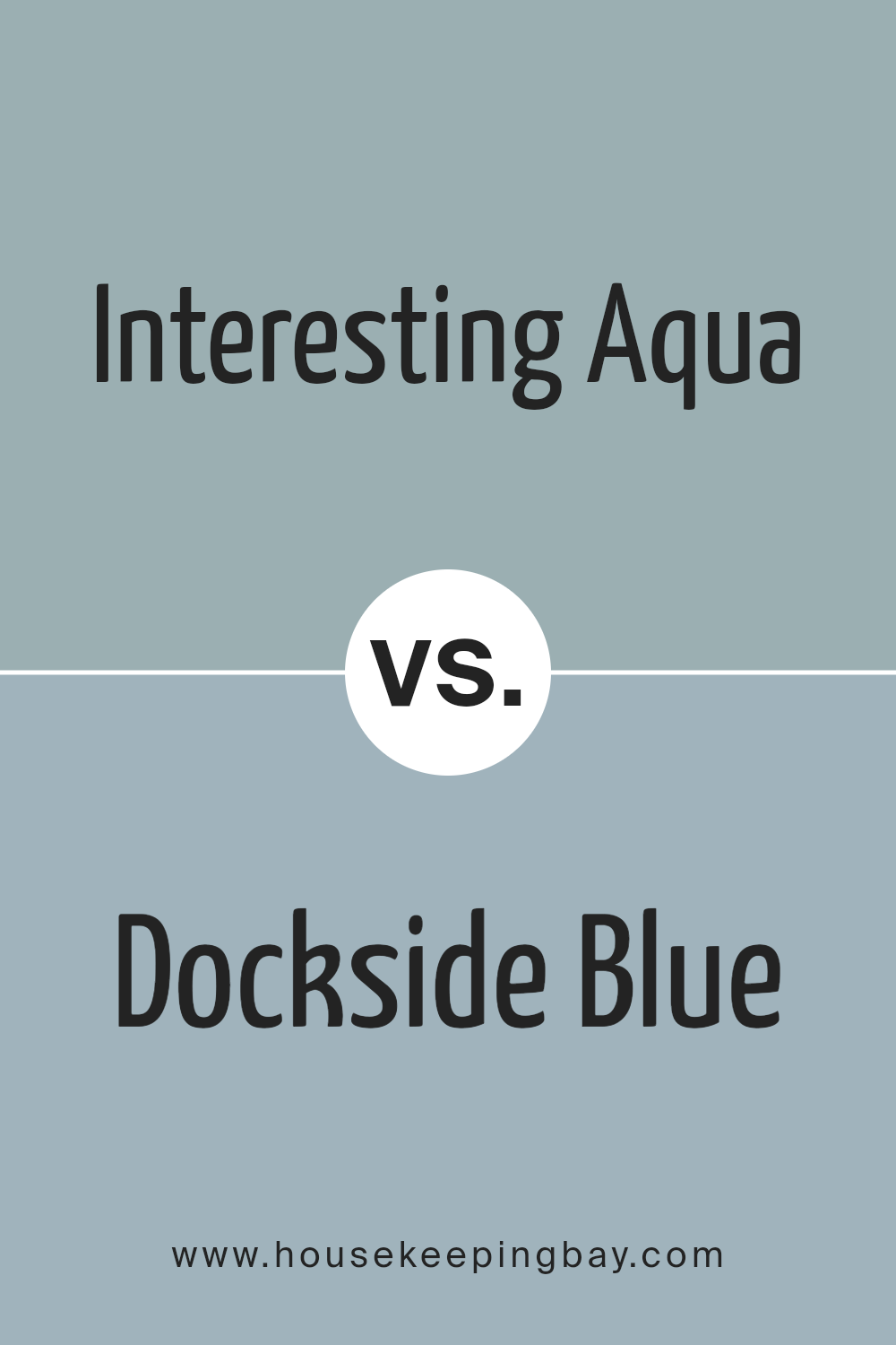
Interesting Aqua SW 6220 by Sherwin Williams vs Dockside Blue SW 7601 by Sherwin Williams
Interesting Aqua SW 6220 and Dockside Blue SW 7601, both from Sherwin Williams, offer different vibes, despite being in the blue-green spectrum. Interesting Aqua combines green and blue with a light, airy feel. It conjures up visions of calm coastal waters and adds a refreshing, spacious feel to any room. It’s versatile, working well in spaces desiring openness and an inviting atmosphere.
Dockside Blue, meanwhile, leans more towards a deeper, muted shade of blue. This color feels grounded and stable, giving spaces a cozy, intimate touch. It also has a nautical essence, which can evoke thoughts of serene harbors.
Suited for creating relaxing environments, this shade fits well in areas meant for unwinding, like bedrooms or living rooms.
Both colors bring a sense of peace, with Interesting Aqua being more energizing and lively, while Dockside Blue delivers a soothing, rich warmth.
You can see recommended paint color below:
- SW 7601 Dockside Blue
housekeepingbay.com
Conclusion
After spending time with SW 6220 Interesting Aqua by Sherwin Williams, I feel truly connected to the color’s charm and versatility. This hue strikes a perfect balance between blue and green, creating a unique atmosphere that’s both refreshing and calming.
Whether used in a bedroom, living room, or even a kitchen, Interesting Aqua brings a gentle energy and a touch of nature indoors.
While working with this paint, I noticed how it adapts beautifully to various lighting conditions, offering a light and airy presence during the day and a cozy, intimate feel in the evening. It pairs well with both neutral tones and bolder colors, making it a flexible choice for different styles and spaces.
In essence, SW 6220 Interesting Aqua feels like a breath of fresh air.
It’s more than just a paint color; it’s a way to create a soothing environment that feels both modern and timeless. I found it to be a fantastic choice for anyone looking to refresh their space with a touch of elegance.
housekeepingbay.com
Ever wished paint sampling was as easy as sticking a sticker? Guess what? Now it is! Discover Samplize's unique Peel & Stick samples. Get started now and say goodbye to the old messy way!
Get paint samples


