Hay Stack 317 by Benjamin Moore
Warm Hues for Cozy Spaces
When choosing a paint color that perfectly blends warmth and a soothing atmosphere, 317 Hay Stack by Benjamin Moore is a top pick. This shade offers a gentle, creamy yellow that feels cozy without being too vibrant.
It’s perfect for anyone wanting to add a touch of cheerfulness to any room without overwhelming the space with bright color. Whether you’re refreshing your living room, bedroom, or even the kitchen, 317 Hay Stack brings a soft, welcoming vibe to walls and blends beautifully with a variety of decor styles and colors.
This specific tone helps create a relaxed environment, which is great for places where you spend a lot of time or want to unwind.
Let’s unpack how 317 Hay Stack can refresh your space and why it might be the ideal choice for your next painting project.

via benjaminmoore.com
What Color Is Hay Stack 317 by Benjamin Moore?
Hay Stack 317 by Benjamin Moore is a warm, inviting yellow shade with a hint of mustard, offering a cozy and comforting atmosphere to any room. This color has a soft, natural feel, making it versatile and easy to integrate into various interior design styles.
Ideal for creating a sunny, cheerful vibe, Hay Stack 317 is particularly effective in styles such as rustic, farmhouse, and traditional. It can also brighten modern and minimalist spaces with its earthy, subtle tone.
When it comes to pairing materials with Hay Stack 317, natural wood works beautifully, enhancing the color’s warmth and grounding it in earthiness. Textures like linen, wool, and burlap also complement the rustic charm of this shade.
These materials help to promote a relaxed, welcoming environment. For those looking to incorporate a bit of elegance, pairing Hay Stack 317 with brushed brass or copper accents can introduce a refined touch without overpowering its inherent coziness.
Hay Stack 317 adapts well to spaces like living rooms, kitchens, and bedrooms where a gentle, pleasing palette is appreciated. It helps to soften and warm up the space, especially when used on walls or as an accent color. This paint color balances well with both light and dark hues, making it a versatile choice for various home decorating projects.
housekeepingbay.com
Is Hay Stack 317 by Benjamin Moore Warm or Cool color?
Hay Stack 317 by Benjamin Moore is a warm, inviting paint color that brings a cozy feeling to any room in a home. Its soft, muted yellow tone pairs well with various decor styles, from rustic to modern. This versatility allows homeowners to use it in different spaces, be it a sunny kitchen or a welcoming living room.
The lightness of Hay Stack 317 helps make smaller rooms appear larger and more open, while its warmth adds a comfortable, soothing ambiance, perfect for spaces where relaxation is key. Due to its subtle nature, this color works well as a background shade, complementing bolder colors and various textures without overwhelming the space.
In homes with natural light, Hay Stack 317 glows softly, enhancing the room’s overall feel-good vibe. It’s also easy to maintain, hiding minor wall imperfections and offering a lasting finish that keeps spaces looking fresh and well-kept.
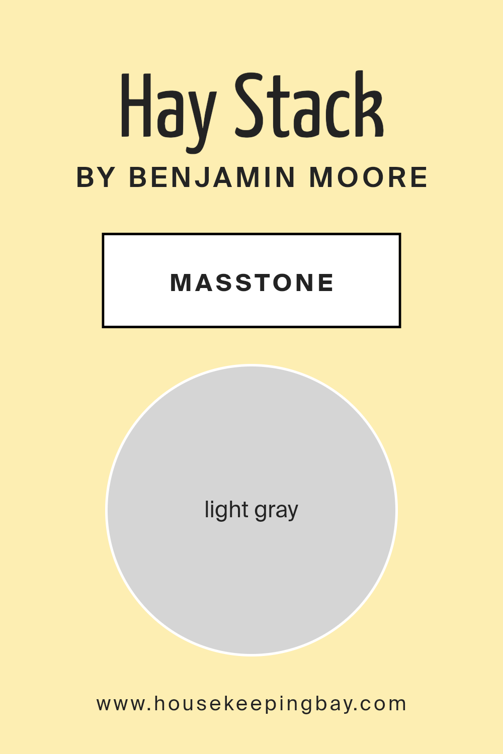
What is the Masstone of the Hay Stack 317 by Benjamin Moore?
Hay Stack317 by Benjamin Moore is a soothing light gray shade with a masstone that resembles the color code #D5D5D5. This neutral yet appealing color harmonizes with various interior styles, making it an excellent choice for homeowners looking to create a calming and versatile atmosphere. Its subtle hue ensures that it blends seamlessly with other colors, allowing for a wide range of decorating options from bold to pastel accents.
In living spaces, Hay Stack317 enhances the sense of space, reflects light beautifully, and offers a clean backdrop that makes rooms appear larger and more open. It is particularly effective in rooms that don’t receive ample natural sunlight, as it helps maximize the light available, making spaces feel airier and brighter.
This color’s adaptability extends to bedrooms, kitchens, and bathrooms alike, complementing wood finishes, metals, and textiles effortlessly. This makes it easy for homeowners to update their decor without having to repaint entirely. Moreover, its calming effect is ideal for bedrooms where a peaceful atmosphere is paramount.
housekeepingbay.com
Undertones of Hay Stack 317 by Benjamin Moore
Hay Stack 317 by Benjamin Moore is a nuanced color that displays various undertones affecting how it appears in different lighting conditions. It features a diverse palette of undertones, including pale yellow, light purple, pale pink, light blue, mint, lilac, and grey. These undertones contribute to the color’s flexibility and complexity, allowing it to adapt subtly to various interior settings and lighting environments.
When applied to interior walls, Hay Stack 317 offers a versatile backdrop that can shift in mood depending on the time of day and the type of light. Pale yellow undertones bring a gentle warmth to the space, making a room feel cozy and inviting. Light purple and lilac provide a hint of cool sophistication, which can help balance areas with plenty of natural light or soften rooms with cooler light fixtures.
Pale pink undertones add a soft, almost romantic quality to the color, ideal for bedrooms or sitting areas where a calm and gentle atmosphere is desirable. The light blue and mint undertones inject a fresh, airy feel, perfect for bathrooms or kitchens where a clean, fresh vibe is important.
Finally, the grey undertone in Hay Stack 317 ensures that despite its complexity, the color maintains a certain neutrality, making it an excellent choice for those seeking a versatile paint color that can support various decor styles and color schemes without overwhelming the space. This makes Hay Stack 317 by Benjamin Moore an effective choice for nearly any room, adapting fluidly as decor and lighting change.

housekeepingbay.com
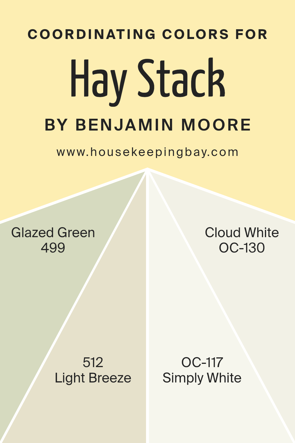
Coordinating Colors of Hay Stack 317 by Benjamin Moore
Coordinating colors are shades that complement each other and are often used together to create visually pleasing and harmonious spaces. When selected thoughtfully, these colors enhance the aesthetics of a room by balancing hues that either contrast or complement the primary color. For instance, coordinating colors for “Hay Stack 317” by Benjamin Moore include a selection of subtle and versatile shades that can help achieve a soothing and cohesive look.
“Glazed Green 499” is a soft, muted green that carries a hint of earthiness, making it perfect for spaces where a touch of nature is desired without overwhelming the senses. “Light Breeze 512” is a gentle off-white with a clean and airy feel, ideal for opening up smaller spaces or adding a refreshing lightness when used on trim or ceilings.
“Simply White OC-117” is a crisp, clean white that offers a fresh and revitalizing presence, great for creating a sense of newness and purity in any area of the home. Lastly, “Cloud White OC-130” provides a slightly warmer tone compared to Simply White, offering a cozy, comforting appeal that works well in more relaxed and informal settings. Together, these hues support a range of design styles, from the traditional to the modern, enhancing the primary color of Hay Stack 317 without overwhelming it.
You can see recommended paint colors below:
- 499 Glazed Green
- 512 Light Breeze
- OC-117 Simply White
- OC-130 Cloud White
housekeepingbay.com
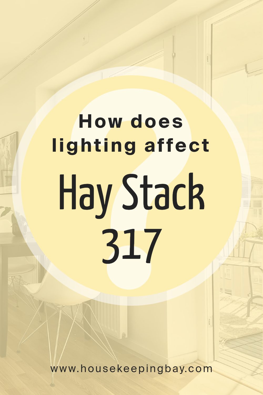
How Does Lighting Affect Hay Stack 317 by Benjamin Moore?
Lighting significantly influences how we perceive colors in a space. The color Hay Stack 317 by Benjamin Moore is a warm, neutral hue that reacts differently under various lighting conditions.
In artificial light, Hay Stack 317 tends to appear warmer, bringing out yellow and golden undertones. This makes it a cozy option for evening lighting, especially in spaces that use warm-toned bulbs. Rooms with LED or cooler bulbs might reflect a slightly paler version of this color, with less of the golden warmth and more of a beige appearance.
Under natural light, Hay Stack 317’s true character shows through vividly. In a room with ample daylight, the color can look vibrant and airy. Natural light tends to enhance the true undertones of the paint, making the room feel open and welcoming.
The orientation of the room also affects how Hay Stack 317 is perceived. In north-facing rooms, which receive less direct sunlight and tend to have cooler light, Hay Stack 317 might look more muted and less warm. It can sometimes seem slightly grayish, making the room feel a bit more enclosed.
In south-facing rooms, where light is abundant and warmer for the most part of the day, Hay Stack 317 shines brightly, enhancing its warm undertones and making the space feel lively and cheerful.
East-facing rooms see the most change with Hay Stack 317. In the morning, when the light is warm and soft, the color will appear brighter and more cheerful. As the day progresses and the natural light lessens, the color shifts more towards neutral beige by the evening.
West-facing rooms present a reverse cycle compared to east-facing rooms, with a neutral appearance during the morning, shifting to a warmer, brighter appearance in the late afternoon and evening as sunlight intensifies.
Overall, the perception of Hay Stack 317 is greatly shaped by the lighting environment, both artificial and natural, as well as the room’s orientation.
housekeepingbay.com
What is the LRV of Hay Stack 317 by Benjamin Moore?
LRV stands for Light Reflectance Value, which measures the percentage of light a paint color reflects back into a room. This value, given on a scale from 0 to 100, helps determine how light or dark a color will appear once applied to the walls. A higher LRV indicates that the color reflects more light, making it appear lighter and often making the room feel more open and airy.
Conversely, a lower LRV means the color absorbs more light, which can make a space appear cozier but smaller and darker.
Hay Stack 317 by Benjamin Moore has an LRV of 81.08, which means it’s quite light-reflective. This high LRV allows the color to brighten up a space significantly, making it an excellent choice for rooms that receive little natural light or are smaller in size. Since Hay Stack is a lighter shade, it can help make these spaces seem larger and more inviting. The lightness of this color also offers versatility, as it can easily complement various decor styles and color schemes without overpowering the space.

housekeepingbay.com
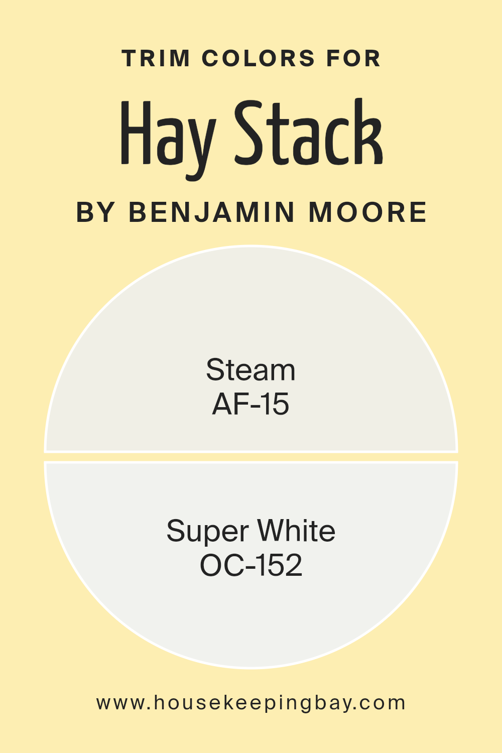
What are the Trim colors of Hay Stack 317 by Benjamin Moore?
Trim colors are typically used to highlight the architectural features of a room, such as doors, moldings, and window frames, setting them apart from the primary wall colors. In the case of Hay Stack 317 by Benjamin Moore, choosing the right trim color is essential to enhance the warm and inviting nature of this specific shade.
Trim colors like AF-15 – Steam and OC-152 – Super White are popular choices because they provide a crisp, clean contrast that can subtly detail the surroundings without overwhelming the main color, hence making the space feel more coherent and neatly defined.
AF-15 – Steam is a soft white that leans towards a warm tone, making it a perfect understory when paired with the deeper warmth of Hay Stack 317. This color’s subtle warmth ensures that transitions between the wall and trim are smooth and pleasing to the eye.
On the other hand, OC-152 – Super White offers a brighter and more neutral approach to whites, lending a sharper contrast that can make the mustard tones of Hay Stack 317 pop beautifully, providing a fresh and refined look to any space it adorns.
You can see recommended paint colors below:
- AF-15 Steam
- OC-152 Super White
housekeepingbay.com
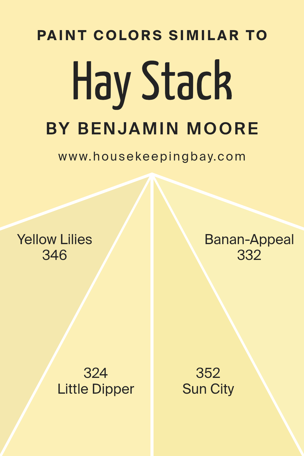
Colors Similar to Hay Stack 317 by Benjamin Moore
Using similar colors, like those akin to Hay Stack 317 from Benjamin Moore, can create a cohesive and harmonious atmosphere in any space. These colors, including Yellow Lilies 346, Little Dipper 324, Sun City 352, and Banan-Appeal 332, are variations of warm, peaceful tones that work seamlessly together to provide a balanced visual experience.
This curated spectrum leans heavily toward pleasant and bright hues, which can make any room feel welcoming and alive. Using similar shades allows for subtle differences that add depth and interest without creating too much contrast, which helps in achieving a consistent theme that is easy on the eyes.
Yellow Lilies 346 has a vibrant, cheerful glow that subtly brightens up spaces with a soft radiance. It pairs nicely with the slightly more subdued Little Dipper 324, which offers a calm and gentle feel, shifting away from the brightness into a more relaxed territory. Sun City 352 introduces a bolder, more energetic splash of color, reminiscent of sunny days and clear, open skies.
In contrast, Banan-Appeal 332 brings in a playful, spirited vibe with its lively yellow undertones, sparking joy and warmth wherever it is used. Together, these colors can blend marvelously to warm up any room while maintaining a soft, unified look.
You can see recommended paint colors below:
- 346 Yellow Lilies
- 324 Little Dipper
- 352 Sun City
- 332 Banan-Appeal
housekeepingbay.com
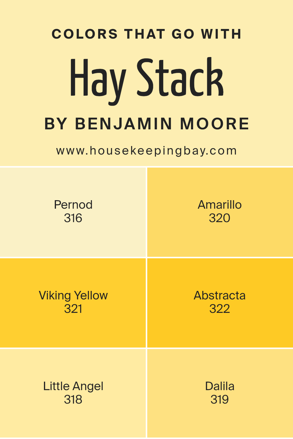
Colors that Go With Hay Stack 317 by Benjamin Moore
When decorating a space, choosing a complementary palette is crucial for creating a cohesive look, and for those using Hay Stack 317 by Benjamin Moore, pairing it with the right colors enhances its beauty and the overall vibe of the room. The colors that pair well with Hay Stack 317 have their unique tones yet harmonize beautifully with this distinct hue.
For instance, Pernod 316, a soft, muted yellow, adds a subtle vibrancy without overshadowing the warm, creamy texture of Hay Stack 317. Directly alongside it, Amarillo 320 offers a more saturated burst of yellow, injecting a lively energy into spaces that thrive on brightness and cheer.
Additionally, Viking Yellow 321, with its clear, almost golden quality, works excellently in spaces that seek to capture the essence of sunshine and happiness. Abstracta 322, slightly richer and deeper, provides a brilliant contrast that can make features in a room pop wonderfully against Hay Stack 317.
Moving slightly away from the yellows, Little Angel 318 offers a calmer, almost serene off-white that serves as a soft backdrop, enabling more vivid colors to stand out. Lastly, Dalila 319 brings a peachy warmth, offering a soothing yet vibrant complement to the creamy base of Hay Stack 317, perfect for creating a welcoming and cozy atmosphere.
Together, these colors enhance the room’s aesthetics by offering a range of possibilities from subtle elegance to cheerful vivacity.
You can see recommended paint colors below:
- 316 Pernod
- 320 Amarillo
- 321 Viking Yellow
- 322 Abstracta
- 318 Little Angel
- 319 Dalila
housekeepingbay.com
How to Use Hay Stack 317 by Benjamin Moore In Your Home?
Hay Stack 317 by Benjamin Moore is a versatile paint color that can add a warm and inviting touch to various spaces in your home. This shade is a soft, muted yellow with a sunny and cheerful feel. It works well in living rooms, kitchens, or even a nursery, creating a cozy and pleasant atmosphere.
Since it’s a lighter color, it can help make smaller spaces appear larger and more open.
You can use Hay Stack 317 on walls as a main color or as an accent to complement darker shades. It pairs nicely with whites, greys, and even soft blues, allowing for a variety of decor styles, from modern to rustic. If you’re looking to refresh your furniture, consider using Hay Stack 317 for painting cabinets or chairs. This color also works well with natural elements like wood and stone, enhancing the warmth and comfort of your home.
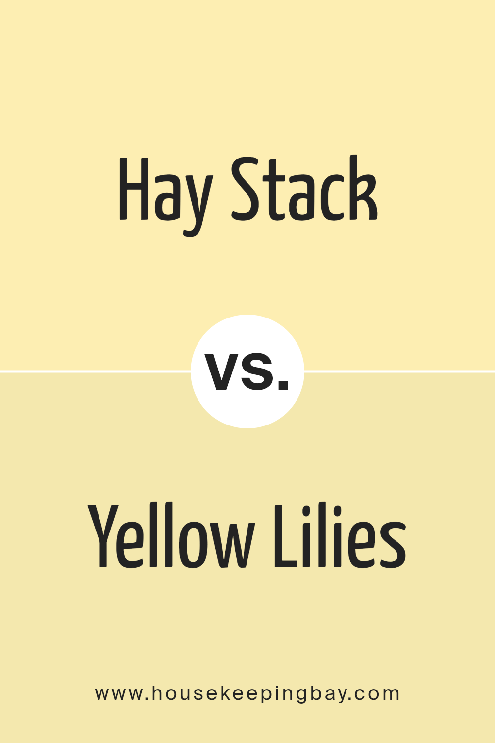
Hay Stack 317 by Benjamin Moore vs Yellow Lilies 346 by Benjamin Moore
Hay Stack 317 by Benjamin Moore is a warm, soft beige with a subtle yellow undertone, giving it a cozy and inviting feel. It’s ideal for spaces where you want a touch of warmth without overpowering the room with bright colors. This color works well in living areas, bedrooms, and even kitchens, adding a gentle, soothing atmosphere.
In contrast, Yellow Lilies 346 is a brighter, more vivid yellow. It’s cheerful and lively, perfect for energizing a space. This shade is great for children’s rooms, creative spaces, or anywhere you want to inject vibrancy and fun.
Both colors bring their unique traits to interior design. Hay Stack 317 is more understated and versatile, fitting easily into many decor styles. Yellow Lilies 346, with its bolder presence, makes a more definite statement and is suited for those looking to add a pop of color. Each can be paired with various hues, but their impact and mood-setting attributes differ significantly.
You can see recommended paint color below:
- 346 Yellow Lilies
housekeepingbay.com
Hay Stack 317 by Benjamin Moore vs Little Dipper 324 by Benjamin Moore
Hay Stack 317 and Little Dipper 324 by Benjamin Moore are both pleasing and neutral colors, but they differ distinctly in their tones and potential impact in a space. Hay Stack 317 is a warm beige that brings a comforting and cozy feel to any room. It is versatile and works well in various settings, offering a soothing backdrop that complements many decor styles and colors. It’s great for creating a relaxed and welcoming atmosphere.
In contrast, Little Dipper 324 is a soft, pale gray. This color is cooler, providing a fresh and airy feel. It’s suitable for those wanting to achieve a modern and minimalistic look in their space. The color can make small spaces appear larger and reflections of light brighter.
Both colors offer unique advantages depending on what ambiance you wish to create in your space, whether warm and cozy or cool and contemporary.
You can see recommended paint color below:
- 324 Little Dipper
housekeepingbay.com
Hay Stack 317 by Benjamin Moore vs Sun City 352 by Benjamin Moore
The two colors from Benjamin Moore, Hay Stack 317 and Sun City 352, both bring warmth but in distinctly different hues. Hay Stack 317 is a muted, soft yellow with a subtle, creamy tone, making it gentle and soothing for any space. It is versatile, fitting well not only in living areas but also in bedrooms due to its cozy vibe.
In contrast, Sun City 352 shines brighter and more vibrant. This color resembles a cheerful, sunny yellow. It’s bolder and tends to make a statement, ideal for spaces intended to have an energetic or uplifting feel. This makes it particularly effective in kitchens or playrooms where a lively atmosphere is desired.
While both shades can warm a room, Hay Stack 317 offers softness and tranquility, whereas Sun City 352 provides a more dynamic and lively zest. Therefore, your choice between them would depend on the mood and energy level you want to achieve in your room.
You can see recommended paint color below:
- 352 Sun City
housekeepingbay.com
Hay Stack 317 by Benjamin Moore vs Banan-Appeal 332 by Benjamin Moore
Hay Stack 317 by Benjamin Moore is a warm, soft beige with a hint of yellow, which brings a soothing and cozy feel to any space. It’s versatile and works well in rooms that aim for a natural, understated look. This color tends to blend seamlessly with furnishings and can also serve as a neutral backdrop for bolder decor elements.
Banan-Appeal 332 by Benjamin Moore, meanwhile, is a brighter and more vibrant yellow. It injects more energy and cheerfulness into a room compared to Hay Stack 317. Banan-Appeal is great for spaces where you want to add a splash of sunshine and positivity, such as kitchens and playrooms.
Both colors are from Benjamin Moore and offer high-quality coverage with a stylish finish, but they set quite different moods. Hay Stack is more muted and calming, while Banan-Appeal is lively and inviting, making them each ideal for different purposes and spaces.
You can see recommended paint color below:
- 332 Banan-Appeal
housekeepingbay.com
In concluding thoughts on Benjamin Moore’s 317 Hay Stack, I have acknowledged how this versatile color can significantly impact the mood and style of any space. Hay Stack is a soft, warm hue that brings a cozy, inviting feel to rooms, making it ideal for areas where comfort is key, such as living rooms and bedrooms. Its ability to blend well with various decor styles and colors adds to its attractiveness, ensuring it fits seamlessly into existing design schemes or serves as a gentle foundation for new ones.
From my experience and observations, the adaptability of Hay Stack can also be useful in enhancing the perception of space, making smaller rooms feel larger and more open without sacrificing warmth.
The subtle beauty of the color encourages creativity, as it pairs well with bold contrasts or complementary soft tones, offering numerous styling options. Furthermore, the quality and consistency of Benjamin Moore paints guarantee an aesthetically pleasing application, with lasting durability that maintains its appeal over time.
Overall, Hay Stack is much more than just a paint color; it’s a tool for creating serene and welcoming environments. Those looking to refresh their space would do well to consider the understated elegance it can offer, ensuring their home or office feels both refreshed and inviting.

housekeepingbay.com
