Amarillo 320 by Benjamin Moore
Brighten Your Day with a Splash of Sunshine
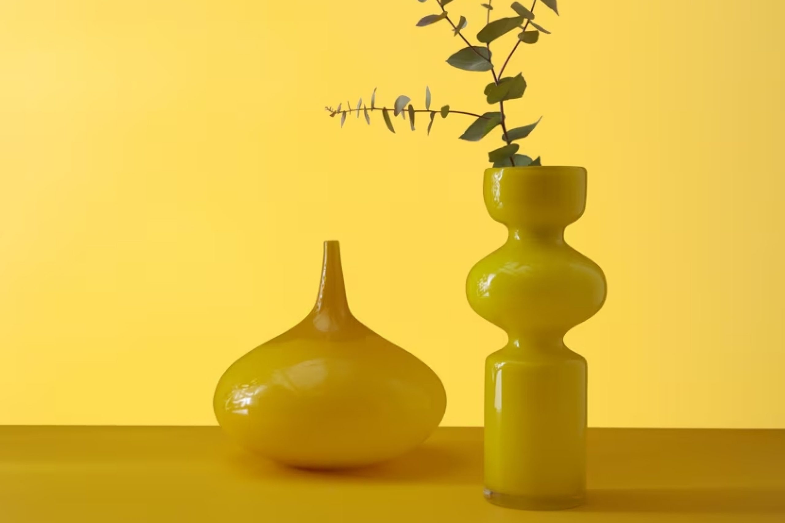
When you think of adding a splash of color to your space, 320 Amarillo by Benjamin Moore might just be the shade you need. Imagine a soft, warm yellow that brings a cheerful glow to any room without being overpowering. It’s like a gentle ray of sunshine that can brighten up your day every time you walk in.
You don’t need to be a design expert to appreciate how this color can change the feel of your home. Whether you want to update your living room, kitchen, or even a hallway, Amarillo offers a welcoming and cozy atmosphere.
The beauty of this shade lies in its simplicity; it’s not too bold yet far from dull.
You’ll find it pairs well with various palettes. Mixing it with soft grays or crisp whites can create a modern look, while combining it with earth tones offers a more traditional feel. You have the freedom to get creative without worrying about whether it will work.
Even if you’re not planning a big renovation, a small touch of Amarillo here and there—maybe a feature wall or some accents—can refresh your space. Give your home that little boost of happiness with a color that feels like a serene sunny day.
via benjaminmoore.com
What Color Is Amarillo 320 by Benjamin Moore?
Table of Contents
Amarillo320 by Benjamin Moore is a warm, golden yellow hue that exudes a cheerful and inviting atmosphere. Its sunny undertones can brighten any space, making it a fantastic choice for rooms that need a touch of warmth and optimism. This color works splendidly in kitchen spaces and dining areas, where it can create a lively and welcoming environment. It also adds a cozy feel to living rooms and hallways.
This color fits well with a variety of interior styles, offering versatility.
In a rustic or farmhouse setting, Amarillo320 pairs beautifully with wooden accents and vintage accessories, enhancing the cozy, homely feel. In a modern or minimalist setup, it adds a burst of color against clean lines and neutral tones, creating an interesting focal point.
When it comes to materials, Amarillo320 pairs excellently with natural textures like wood, wicker, and rattan, complementing their earthy tones.
It also contrasts nicely with sleek materials such as stainless steel or polished marble, adding a warm balance to the coolness of these surfaces. For fabrics, it harmonizes with soft linens, cotton in neutral shades, and vibrant patterns with hints of yellow or gold, thereby creating a cohesive and inviting look in any home.
housekeepingbay.com
Is Amarillo 320 by Benjamin Moore Warm or Cool color?
Amarillo320 by Benjamin Moore is a vibrant yellow color that brings warmth and cheer into any home. This energetic hue immediately lights up a room, making spaces feel lively and inviting. Yellow often evokes feelings of happiness and optimism, and Amarillo320 captures this essence beautifully.
It works particularly well in living rooms, kitchens, and other areas where families gather, creating a welcoming atmosphere.
When paired with neutral tones like whites or grays, Amarillo320 really stands out, adding a vivid pop of color without overwhelming the space. Its bright nature also complements natural light, enhancing the illumination in sunlit rooms. Additionally, combining it with other bold shades can create a playful and dynamic look.
This shade is versatile enough for various styles, from modern to traditional, contributing to a different sense of character to each. Overall, Amarillo320 is a great choice for energizing homes, making them feel warm and cheerful.
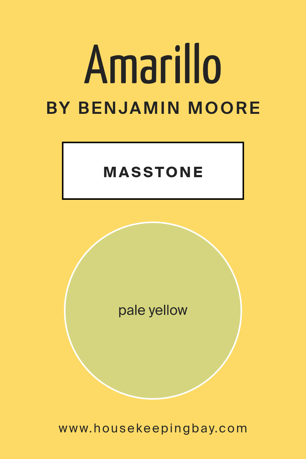
What is the Masstone of the Amarillo 320 by Benjamin Moore?
Amarillo320 by Benjamin Moore is a gentle pale yellow with a hex code of #D5D580. This soft color can brighten up any room without being overpowering. Its light, welcoming tone makes spaces feel larger and more open. When used in living areas or kitchens, it creates a warm, inviting atmosphere.
This pale yellow works well with many other colors, such as soft whites, light grays, or even muted blues. It adds a touch of warmth without drawing too much attention to itself. In a bedroom, Amarillo320 can bring a sense of calm and relaxation, while still providing a cheerful vibe when the sun rises.
For those who wish to have a bright yet soothing environment, this color is an excellent choice. It complements wooden furniture and natural textures, enhancing their appeal and tying together various elements in the home.
housekeepingbay.com
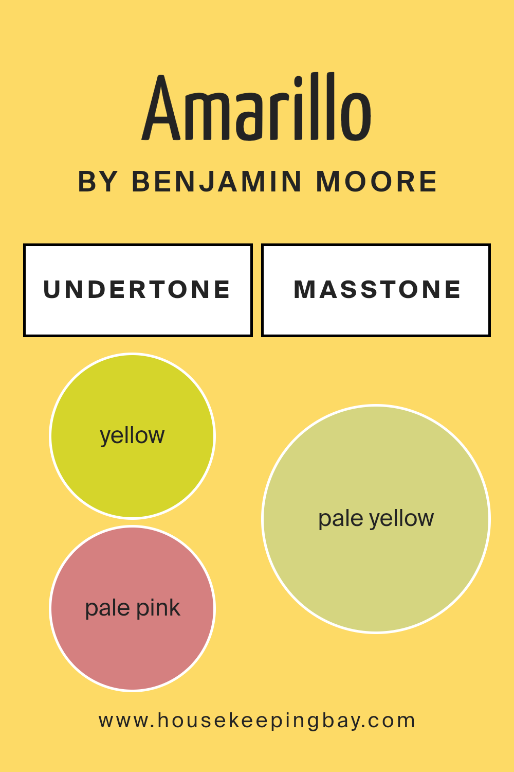
Undertones of Amarillo 320 by Benjamin Moore
Amarillo 320 by Benjamin Moore is a color that surprises with its mix of undertones. At its core, it appears bold and vibrant, rooted in yellow (#D5D52B). However, it carries a variety of other hues that affect its appearance in a space.
The pale pink (#D58080) undertone gives it a soft vibe, making it feel more approachable than a pure yellow. The orange (#D5802B) brings warmth, adding liveliness without overwhelming the eyes. Light gray (#D5D5D5) and gray (#808080) add a balance, making the color feel grounded and less intense.
Mint (#80D580) and light green (#80D52B) introduce a refreshing touch, suggesting a hint of nature. Meanwhile, light purple (#D580D5) and lilac (#8080D5) inject a subtle depth and elegance. Light blue (#80D5D5) provides a breezy undertone, enhancing relaxation.
These undertones change Amarillo 320’s impact on interior walls. Spaces painted with it feel bright and cheerful yet not overpowering.
The varied undertones prevent monotony, creating dynamic interactions with different lighting conditions and furniture. Depending on light sources, Amarillo 320 might appear more warm, soft, or lively, enhancing the room’s atmosphere effectively.
housekeepingbay.com
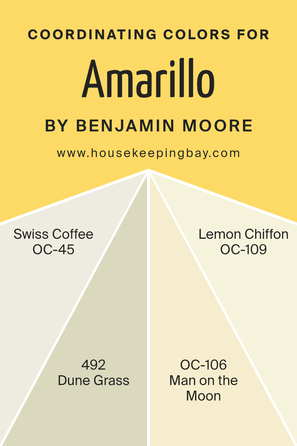
Coordinating Colors of Amarillo 320 by Benjamin Moore
Coordinating colors are hues that work together harmoniously in a space to create a balanced and pleasing visual experience. They complement each other and enhance the overall aesthetic of a room. For Amarillo320 by Benjamin Moore, a selection of coordinating colors can transform your living space into a warm and inviting haven.
OC-45 Swiss Coffee acts as a soft and creamy backdrop, effortlessly blending into both modern and classic interiors. It offers just the right amount of warmth while maintaining a neutral presence.
Dune Grass 492 introduces a gentle green into the palette, evoking a sense of calm and natural simplicity. This color can add a subtle touch of the outdoors, bringing fresh and breezy vibes inside. Meanwhile, OC-106 Man on the Moon injects a pale, understated yellow that brightens spaces, adding a touch of cheerful lightness without overwhelming the senses.
Finally, OC-109 Lemon Chiffon adds a playful hint of sunshine, harmonizing beautifully with the others while injecting a gentle energy into the room.
These colors together form a cohesive palette that works for various styles, ensuring that each room exudes a welcoming and vibrant atmosphere.
You can see recommended paint colors below:
- OC-45 Swiss Coffee
- 492 Dune Grass
- OC-106 Man on the Moon
- OC-109 Lemon Chiffon
housekeepingbay.com
How Does Lighting Affect Amarillo 320 by Benjamin Moore?
Lighting plays a significant role in how we perceive colors. Different types of light can change the appearance of a color, making it look warmer, cooler, darker, or brighter. Amarillo320 by Benjamin Moore is a vibrant, warm yellow that can look quite different depending on the lighting.
In artificial light, the color can take on a more intense or muted tone depending on the bulb type. Incandescent bulbs, which emit a warm, yellowish light, can make Amarillo320 appear even warmer and more golden. On the other hand, fluorescent lighting, which is cooler and sometimes slightly greenish, might make the color look less warm and slightly dulled.
Natural light shifts throughout the day, impacting how we see Amarillo320. In north-facing rooms, which receive less direct sunlight and have cooler light, this yellow can look more muted and less intense. This effect can make the space feel calmer, but it’s important to test the color in these conditions if you’re looking for vibrant warmth.
South-facing rooms enjoy plenty of sunlight, with warm and bright natural light streaming in most of the day. In these rooms, Amarillo320 will likely look closest to its true form, showing off its full brightness and warmth. It can make the space feel lively and welcoming.
East-facing rooms receive direct sunlight in the morning and cooler, indirect light later in the day. In the morning, Amarillo320 will glow warmly, enhancing its cheerful appeal. As the light cools in the afternoon, the yellow may lose some warmth, but remains engaging.
West-facing rooms catch the warm, golden afternoon and evening sun. This light enriches Amarillo320, adding depth as the day progresses. In these rooms, the color can create a cozy and inviting atmosphere, especially during late afternoon.
In all cases, it’s wise to test paint samples to see how they respond to your specific lighting conditions before deciding.
housekeepingbay.com
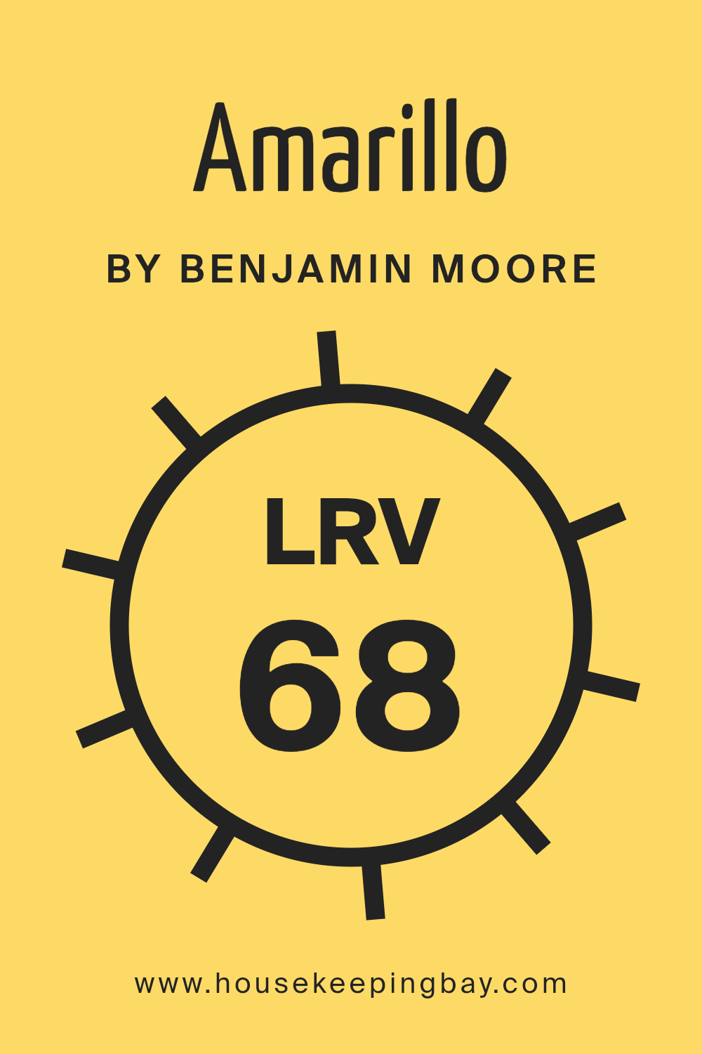
What is the LRV of Amarillo 320 by Benjamin Moore?
LRV, or Light Reflectance Value, is a measure that tells us how much light a color reflects. It uses a scale from 0 to 100, where 0 means the color doesn’t reflect any light and absorbs it all, like black, and 100 means the color reflects all the light, like pure white.
Basically, higher LRV numbers mean the color is lighter and reflects more light, helping to make a room feel brighter and possibly even larger. On the other hand, a lower LRV number indicates a darker color that absorbs more light, which may make a space feel cozier but sometimes also smaller or dimmer.
For Amarillo320 by Benjamin Moore, which has an LRV of 68.49, this means it is a fairly light color. It reflects a good amount of light, so it can add brightness and openness to a room. This light reflection can be particularly useful in smaller or darker spaces, as it might help make them appear more inviting and airy.
The relatively high LRV suggests that Amarillo320 will maintain its brightness during different times of day and with varying lighting conditions, which can keep a room looking consistently cheerful.
housekeepingbay.com
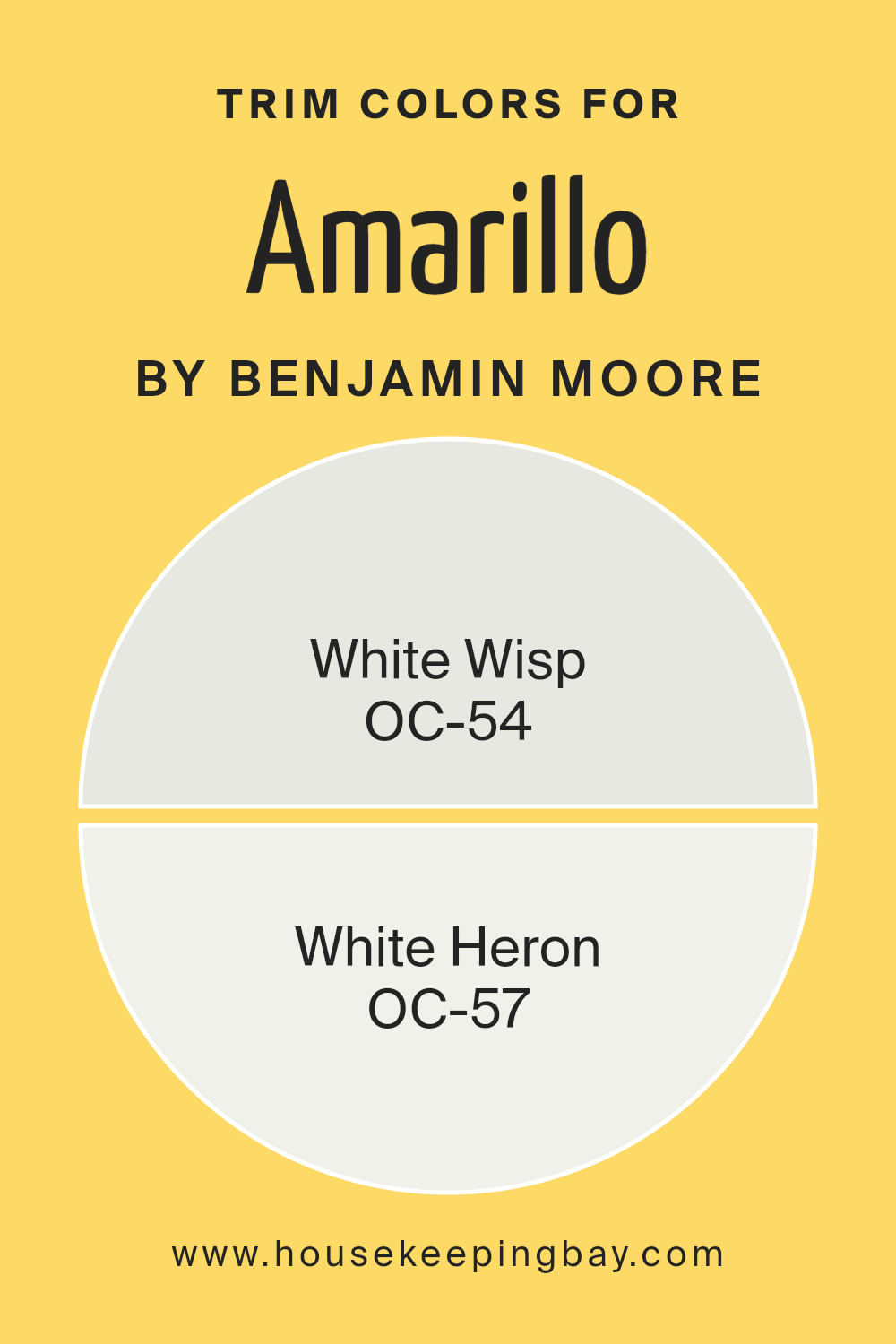
What are the Trim colors of Amarillo 320 by Benjamin Moore?
Trim colors are the finishing touches in a room’s color scheme, often used on baseboards, window frames, and moldings. They help define the architectural details and create contrast with the larger surfaces, like walls and ceilings. For Amarillo320 by Benjamin Moore, using trim colors like White Wisp (OC-54) and White Heron (OC-57) can significantly enhance the room’s appearance.
These colors offer a subtle contrast that highlights the brightness and warmth of Amarillo320 without overpowering it, resulting in a balanced and harmonious look. By choosing the right trim colors, you ensure that each part of the room’s design is cohesive and aesthetically pleasing.
White Wisp (OC-54) is a soft, cool-toned white that provides a gentle and calming backdrop, complementing vibrant colors like Amarillo320 by adding a touch of sophistication and serenity.
White Heron (OC-57), with its slightly warmer undertone, acts as a versatile and elegant option, tying in seamlessly with various design styles while maintaining a crisp and clean appearance.
Both of these trim colors from Benjamin Moore work well to accentuate the overall aesthetic without detracting from the primary color scheme. Their subtle nuances add depth to the space, making every detail count in crafting a cohesive and polished look.
You can see recommended paint colors below:
- OC-54 White Wisp
- OC-57 White Heron
housekeepingbay.com
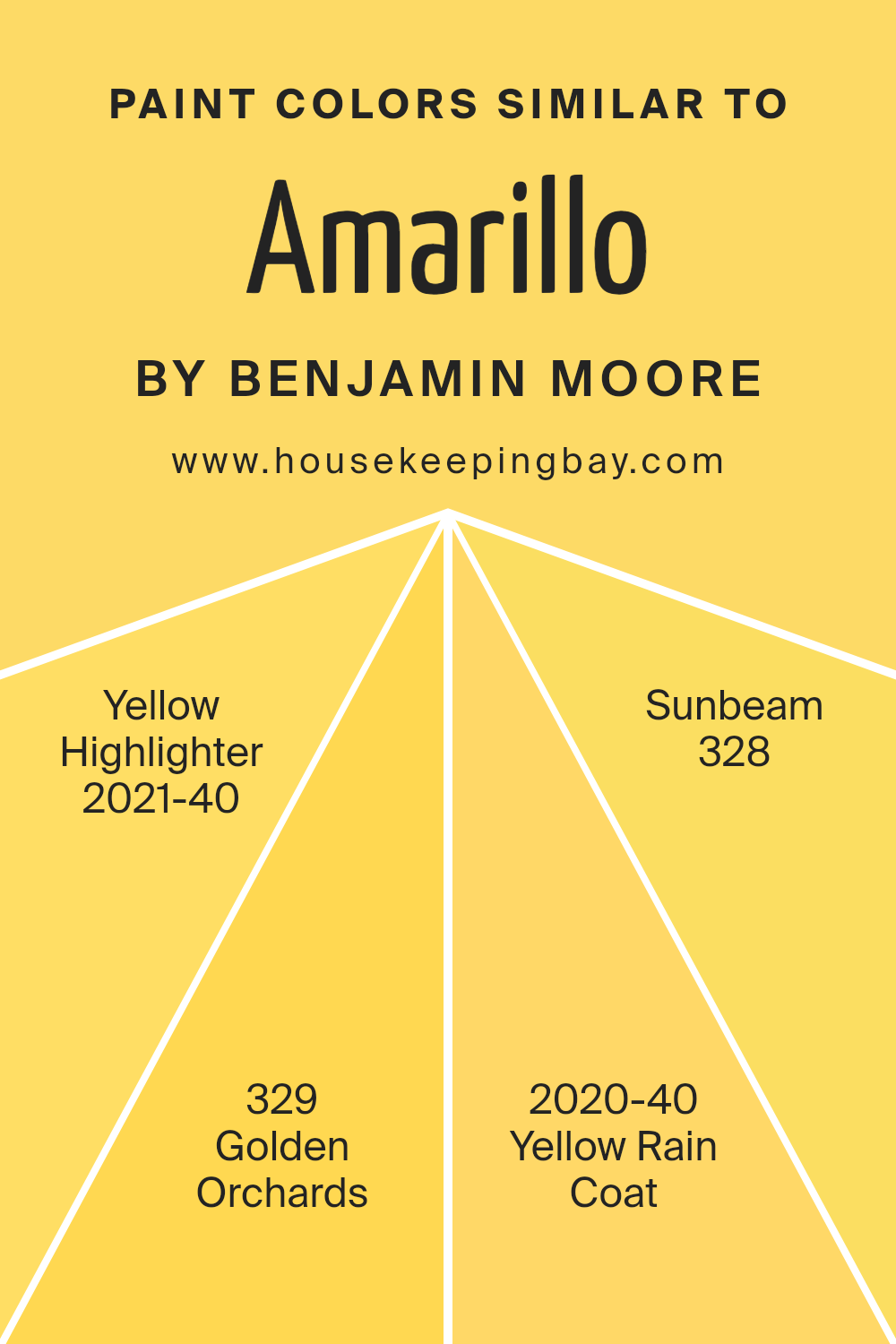
Colors Similar to Amarillo 320 by Benjamin Moore
Similar colors play a significant role in design and decoration, offering subtle harmony and continuity. For example, if you love Amarillo320 by Benjamin Moore, you’ll likely appreciate its neighboring shades. Yellow Highlighter, a vivid and energetic hue, injects life and positivity into a room, making it feel cheerful and engaging. This striking color can serve as a fun accent, bringing warmth without overwhelming your space.
Golden Orchards provides a more subdued alternative, with its gentle glow reminiscent of sunlit fields.
This shade is perfect for creating a cozy atmosphere in living areas or reading nooks, where comfort is key. Yellow Rain Coat echoes the vibrancy of fresh, sunny days after a rain shower, yet retains a sense of playfulness and optimism.
Finally, Sunbeam evokes a sense of sunny warmth with its light and slightly muted yellow tone, perfect for relaxing spaces such as bedrooms or serene reading corners.
By using colors similar to Amarillo320, you can create a well-coordinated space where each area feels connected and harmonious, yet distinct enough to stand on its own. This palette offers a balance of brightness and subtlety, ensuring your design feels both lively and inviting.
You can see recommended paint colors below:
- 2021-40 Yellow Highlighter
- 329 Golden Orchards
- 2020-40 Yellow Rain Coat
- 328 Sunbeam
housekeepingbay.com
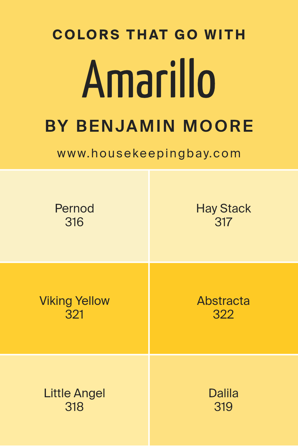
Colors that Go With Amarillo 320 by Benjamin Moore
When decorating with Amarillo 320 by Benjamin Moore, finding colors that complement it is key to creating a harmonious space. Colors like Pernod (316), Hay Stack (317), Viking Yellow (321), Abstracta (322), Little Angel (318), and Dalila (319) each add their own charm and energy.
Pernod, with its rich amber tone, brings warmth and sophistication, balancing Amarillo’s lively hue perfectly. Hay Stack, a soft and gentle yellow, adds a touch of sunshine and brightness, which pairs well with the zestful nature of Amarillo, giving spaces a cozy yet vibrant feel.
Viking Yellow, bolder and more pronounced, brings an element of fun and creativity, matching Amarillo’s exuberance while adding a bit of contrast.
Abstracta offers a muted background with its beige undertones, allowing Amarillo to stand out even more, making it an ideal choice for accent areas. Little Angel, with its pale buttery tone, introduces a delicate sweetness, providing softness to the palette.
Dalila brings in an earthy, muted ochre, grounding the vividness of Amarillo and enhancing the overall warmth. These color combinations allow for balancing intensity with subtlety, creating environments that are welcoming and lively yet cohesive and balanced. Each color complements Amarillo in its own unique way, contributing to a well-rounded and aesthetically pleasing space.
You can see recommended paint colors below:
- 316 Pernod
- 317 Hay Stack
- 321 Viking Yellow
- 322 Abstracta
- 318 Little Angel
- 319 Dalila
housekeepingbay.com
How to Use Amarillo 320 by Benjamin Moore In Your Home?
Amarillo 320 by Benjamin Moore is a warm, inviting yellow that can bring a cheerful atmosphere to any home. This paint color works beautifully in areas where you want to create a sunny, happy vibe. For instance, painting a kitchen or breakfast nook in Amarillo 320 can make the morning routine feel more uplifting. It’s also a great option for a playroom, providing a bright, energetic backdrop that can keep children energized and cheerful.
In a living room, Amarillo 320 pairs nicely with neutral furnishings and natural wood tones, creating a balanced, cozy space. It can also serve as an accent wall color, adding a pop of brightness without overwhelming the entire room.
Bedrooms can benefit too, as this yellow provides warmth that feels welcoming and soothing. When using Amarillo 320, consider combining it with whites or creams for a harmonious look. This shade can add a touch of sunshine to any home environment.
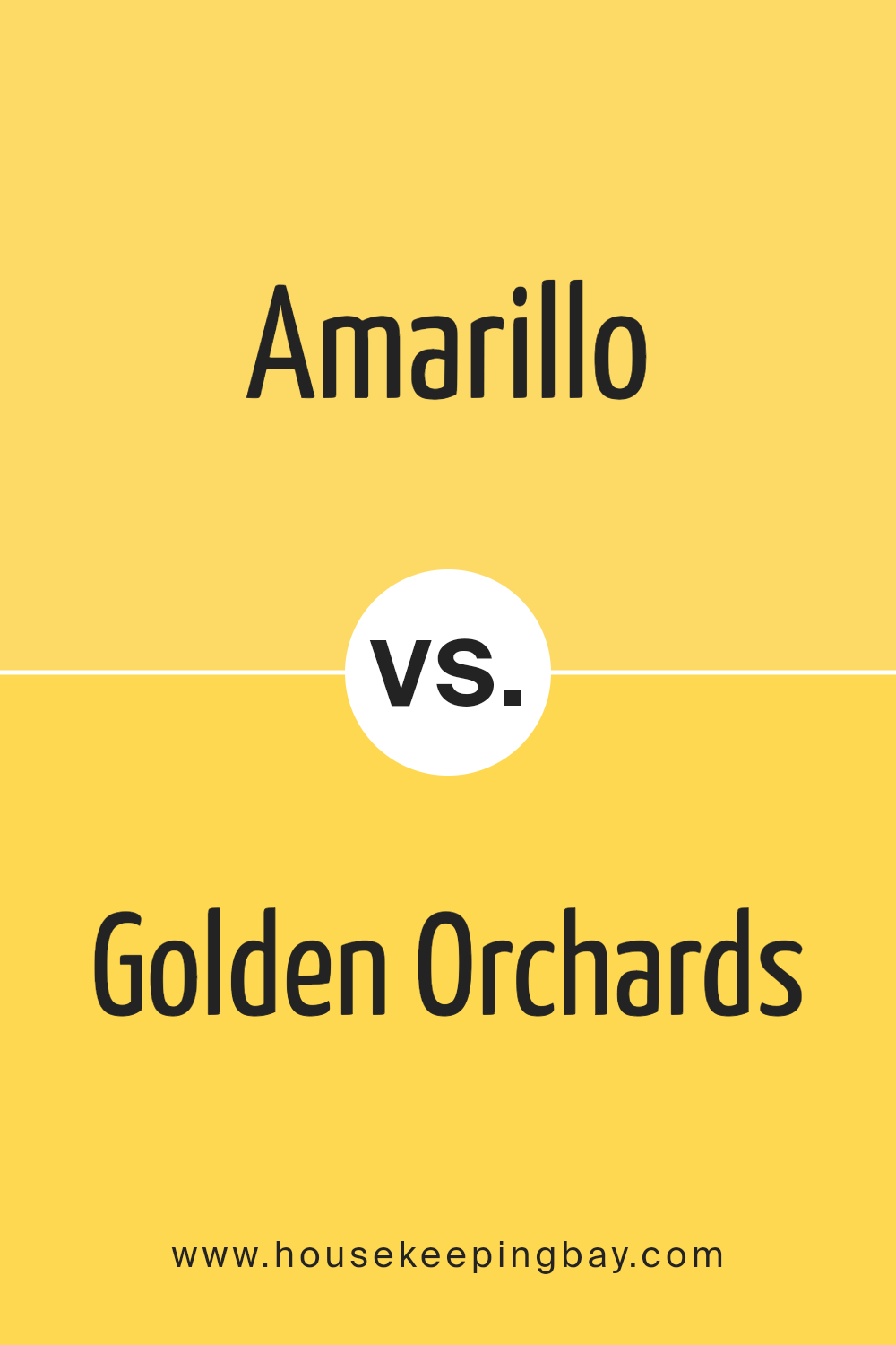
Amarillo 320 by Benjamin Moore vs Golden Orchards 329 by Benjamin Moore
Amarillo 320 by Benjamin Moore is a bright, cheerful yellow with a sunny disposition. It brings warmth, energy, and a sense of vibrancy to any space. This color can make a room feel lively and inviting, perfect for kitchen or living areas where you want to create a welcoming atmosphere.
Golden Orchards 329, also by Benjamin Moore, is a deeper, more muted shade of yellow. It carries an earthy, warm tone that feels rich and cozy. This color evokes comfort and is ideal for spaces where you wish to create a relaxed and homely setting, such as a bedroom or a reading nook.
While Amarillo 320 stands out with its brighter appeal, Golden Orchards 329 offers a subtler warmth. Both colors reflect the sunny side of yellow, but Amarillo 320 leans into bold and energetic, while Golden Orchards 329 offers a mellow and grounding feel. Each color has its own charm, enhancing spaces with its unique hue.
You can see recommended paint color below:
- 329 Golden Orchards
housekeepingbay.com
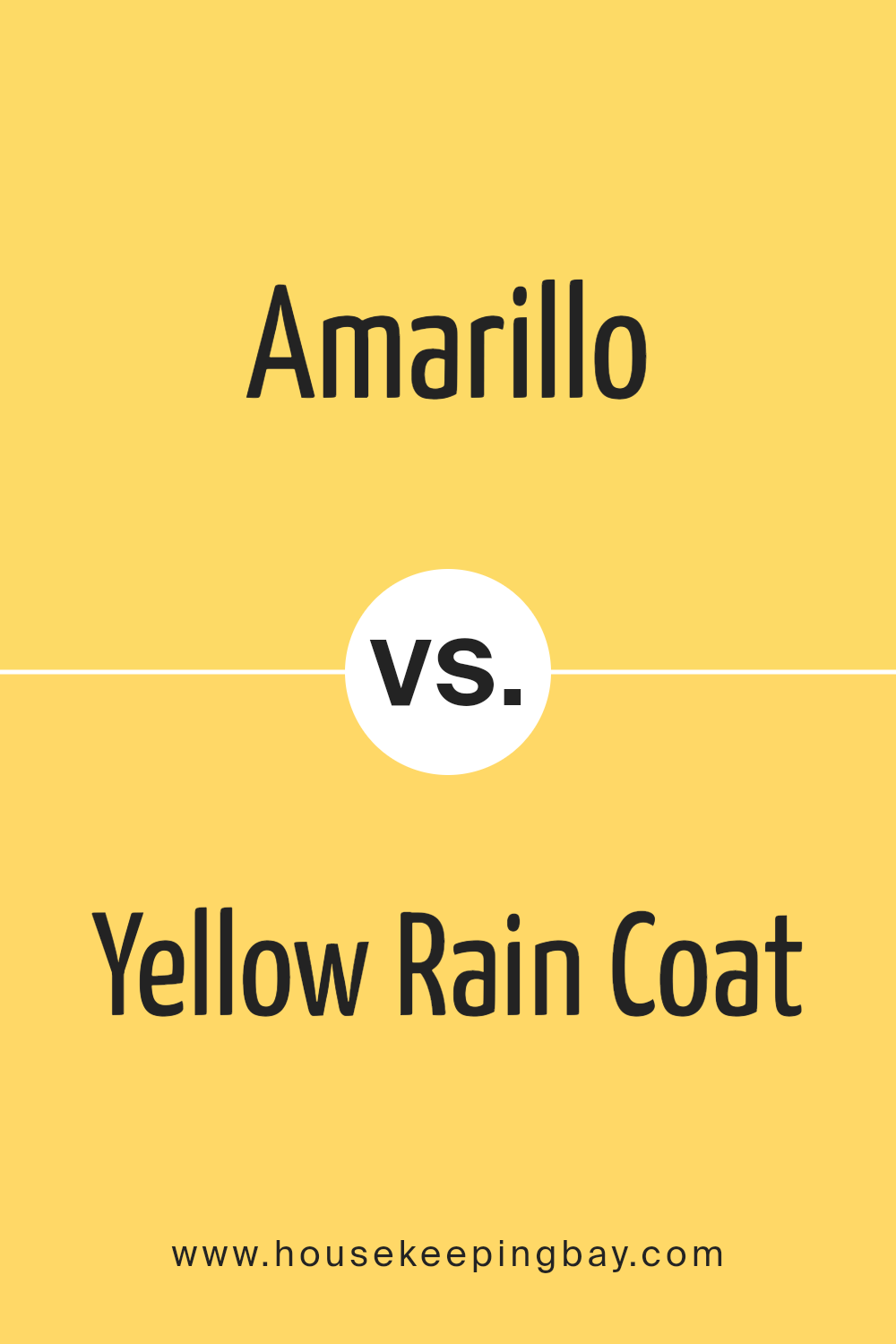
Amarillo 320 by Benjamin Moore vs Yellow Rain Coat 2020-40 by Benjamin Moore
Amarillo 320 by Benjamin Moore is a soft, muted yellow. It brings warmth and comfort. This shade has a subtle touch, making spaces feel cozy and inviting without being overpowering. Amarillo tends to blend well with neutral tones, offering a gentle brightness.
In contrast, Yellow Rain Coat 2020-40 by Benjamin Moore is a bold, vibrant yellow. It stands out with its lively and cheerful nature. This color injects energy and excitement into any area, acting as a focal point. It’s perfect for accentuating features or adding a splash of enthusiasm.
While Amarillo 320 creates a calming and welcoming atmosphere, Yellow Rain Coat 2020-40 adds a burst of zest and dynamism. Both yellows have their unique charm: Amarillo for subtleness and Yellow Rain Coat for bold expressiveness. Depending on the desired mood of a room, both colors have their place within design.
You can see recommended paint color below:
- 2020-40 Yellow Rain Coat
housekeepingbay.com
Amarillo 320 by Benjamin Moore vs Yellow Highlighter 2021-40 by Benjamin Moore
Amarillo 320 by Benjamin Moore and Yellow Highlighter 2021-40 are two vibrant yellow shades, yet they offer different vibes. Amarillo 320 is a warm, rich yellow with hints of gold, making it feel cozy and inviting. It’s a great choice when you want a sunny yet sophisticated touch to your space, providing a comforting glow.
Yellow Highlighter 2021-40, however, stands out as a bold and bright choice. It resembles the neon-like intensity of a highlighter pen, making it eye-catching and energetic. This color is perfect for creating a modern, lively atmosphere, ideal for playful and creative spaces.
While Amarillo 320 exudes warmth and classic appeal, Yellow Highlighter 2021-40 brings a punch of energy and modern flair. Depending on the mood you wish to set, one offers a soothing glow, while the other delivers a dynamic burst of brightness. Both have their unique charm and purpose.
You can see recommended paint color below:
- 2021-40 Yellow Highlighter
housekeepingbay.com
Amarillo 320 by Benjamin Moore vs Sunbeam 328 by Benjamin Moore
Amarillo 320 and Sunbeam 328, both by Benjamin Moore, provide bright, cheerful shades with unique personalities. Amarillo 320 appears as a vibrant yellow, exuding energy and warmth, similar to a sunflower basking in full sun. It brightens spaces by adding optimism and cheer. Its boldness makes it suitable for accent walls or lively areas where energy and enthusiasm are desired.
Sunbeam 328, another yellow, feels softer and more subtle. This hue suggests gentle warmth, akin to early morning light filtering through windows. It maintains brightness but with a comforting, welcoming tone. Sunbeam 328 works seamlessly in spaces aiming for a calm, inviting ambiance.
Both colors add sunshine to interiors, yet Amarillo 320 infuses a more intense energy, while Sunbeam 328 introduces a mellow glow. Choosing between them involves deciding between Amarillo’s liveliness and Sunbeam’s soft charm, ensuring each space feels uniquely vibrant or gently welcoming.
You can see recommended paint color below:
- 328 Sunbeam

housekeepingbay.com
After writing about all the nuances of 320 Amarillo by Benjamin Moore, I’ve noticed how this vibrant yellow hue brightens spaces with its cheerful energy. It captures an essence of warmth and positivity, making it a wonderful choice for areas where illumination and uplifting vibes are desired. When used strategically within a home, it can create an inviting and lively atmosphere.
Pairing it with complementary shades can further enhance its effect, allowing it to stand out without overwhelming the senses. Whether on an accent wall or in smaller decorative accents, Amarillo offers versatility that can suit various design styles.
Its ability to harmonize with natural light makes it even more appealing, altering subtly throughout the day as sunlight changes.
In essence, 320 Amarillo is more than just a paint color; it’s a mood-setter. Its presence can invigorate a room, leading to a more invigorated environment. Experimenting with different combinations and placements can yield delightful results, revitalizing spaces in refreshing ways.
Overall, this color promises to bring joy and positivity into any setting, making it a captivating choice for those wishing to enhance their surroundings with a touch of warmth and brightness.
housekeepingbay.com
Ever wished paint sampling was as easy as sticking a sticker? Guess what? Now it is! Discover Samplize's unique Peel & Stick samples. Get started now and say goodbye to the old messy way!
Get paint samples


