Viking Yellow 321 by Benjamin Moore
Brightening Spaces with a Splash of Sunshine
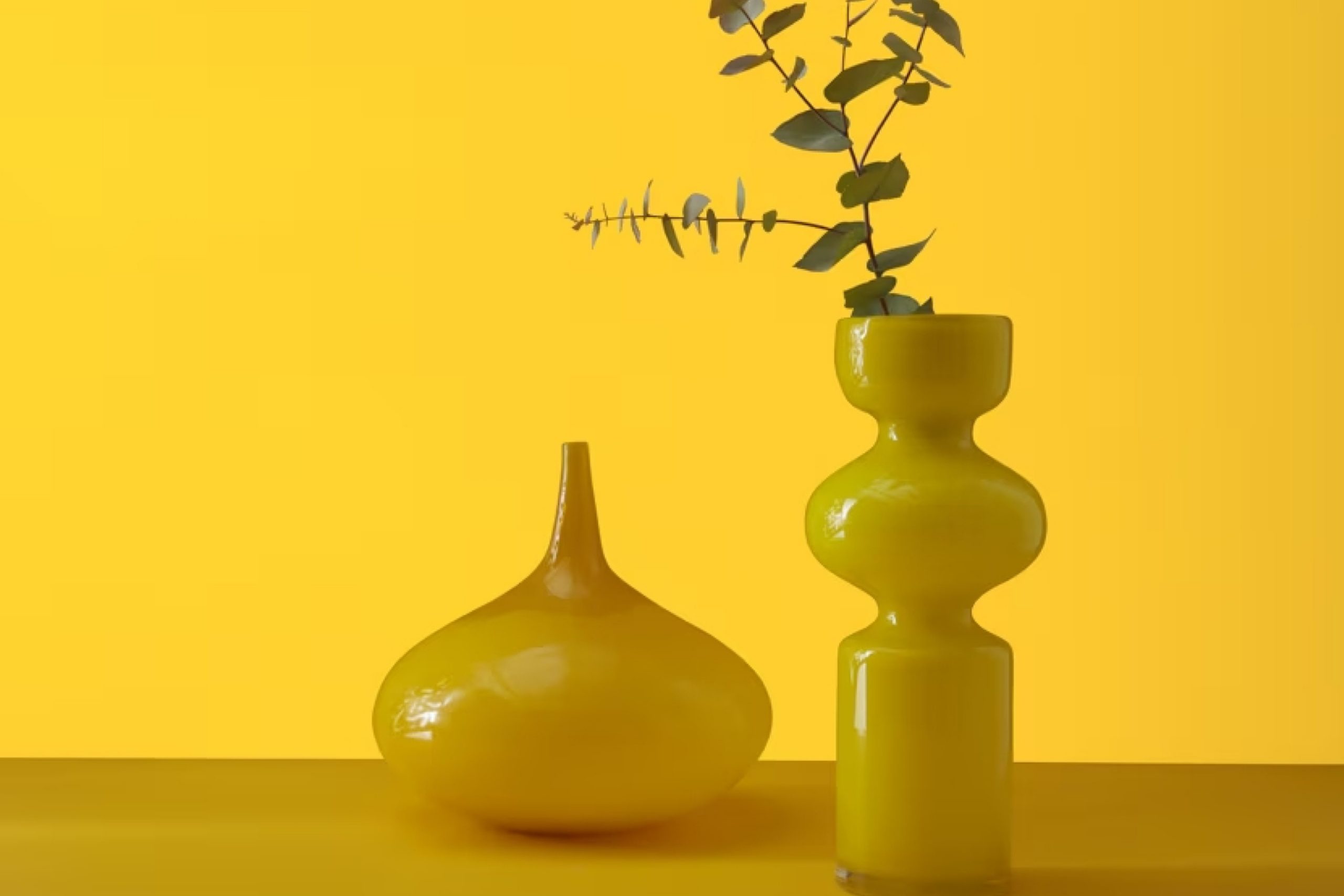
Are you thinking about giving your space a fresh pop of color? Check 321 Viking Yellow by Benjamin Moore. This vibrant shade of yellow adds a cheerful touch to any room, brightening your surroundings effortlessly. Whether you want to liven up your kitchen, create a welcoming entryway, or add some warmth to your living area, Viking Yellow might just be the perfect choice.
The color yellow is often associated with happiness and positivity, and Viking Yellow does an excellent job of bringing those feelings into a home. It pairs beautifully with various colors, whether you match it with soft neutrals or bold hues. You might be surprised at how this shade can transform a dull space into a lively and inviting area.
For those unsure about adding such a bold color to their walls, you could start small. Think about accent pieces like cushions, vases, or a single accent wall. Seeing how these smaller changes influence your space might give you the confidence to go bigger.
So, why not consider Benjamin Moore’s 321 Viking Yellow for your next decorating project? It could be the perfect way to brighten up your home and inject some cheerful vibes into your everyday environment.
via benjaminmoore.com
What Color Is Viking Yellow 321 by Benjamin Moore?
Viking Yellow 321 by Benjamin Moore is a vivid, cheerful shade of yellow that instantly brightens any space. This vibrant hue is full of energy and warmth, making it an excellent choice for creating lively, inviting environments. Viking Yellow finds its strengths in its high saturation, offering a bold statement that stands out without overwhelming a room when used wisely.
In terms of interior styles, Viking Yellow works exceptionally well in eclectic, modern, and contemporary designs. Its boldness pairs perfectly with minimalist décor, where it can serve as an accent color against neutral tones like grays and whites. It can also spark joy in a child’s room or play area, bringing a sense of sunshine and happiness. For those who prefer a more subdued environment, using Viking Yellow for smaller decor items or accent walls is advisable to maintain balance.
When it comes to materials, Viking Yellow pairs beautifully with natural elements such as light woods, which enhance its warmth. It also coordinates well with exposed brick, adding a modern twist to rustic textures. Metallic finishes like brushed nickel or stainless steel can complement the vibrancy of Viking Yellow, providing a sleek, clean look that contrasts with its warmth. In textiles, pairing this shade with soft fabrics like linen or cotton in monochromatic or complementary colors can create an engaging space that feels both cozy and stylish.
housekeepingbay.com
Is Viking Yellow 321 by Benjamin Moore Warm or Cool color?
Viking Yellow321 by Benjamin Moore is a vibrant and cheerful yellow paint color that radiates warmth and happiness. Its bright tone makes it perfect for lighting up any space, especially in rooms that need a little extra brightness. This color works well in kitchens and living rooms where a lively, inviting atmosphere is desired.
Viking Yellow321 has the power to make small spaces feel larger and more open because of its light-reflecting qualities. This is particularly useful in areas of the home that do not receive a lot of natural sunlight. Even on cloudy days, this yellow can give the illusion of sunshine, maintaining a cheerful mood throughout the home.
Moreover, Viking Yellow321 pairs nicely with various colors. It looks great alongside whites, which enhance its brightness, or with cool blues and greens, providing a pleasant contrast. This flexibility makes it an excellent choice for anyone looking to add a splash of color to their home without overwhelming the existing decor.
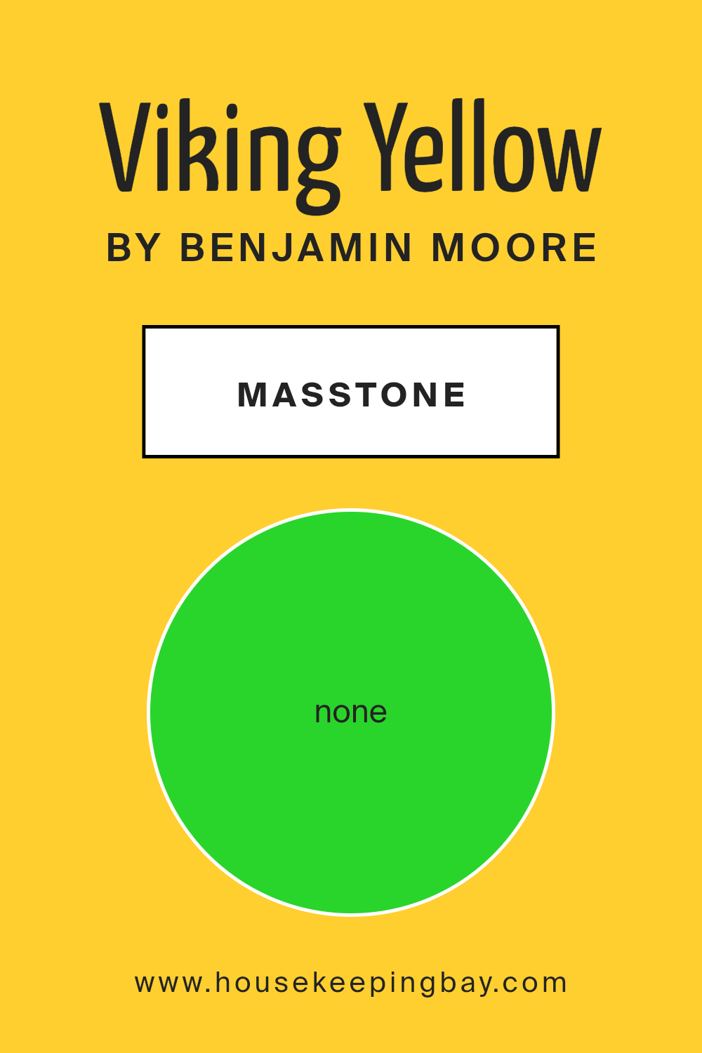
What is the Masstone of the Viking Yellow 321 by Benjamin Moore?
Viking Yellow321 by Benjamin Moore features a vibrant masstone of None (#2AD52B), a lively and vivid green shade. This unique color can bring a fresh burst of energy to any space, making it perfect for livening up rooms that might otherwise seem dim or tired.
When used in homes, this color’s rich green hue can create a feeling of freshness and vitality, which works wonders in areas like kitchens or playrooms where you want to promote an atmosphere of activity and cheerfulness.
Since it’s a bold color, Viking Yellow321 can also serve as a focal point in neutral settings. When paired with softer, earthy tones like whites or light woods, it helps in creating a balanced yet visually appealing environment. This makes it versatile for anyone looking to add a touch of nature-inspired vibrancy to their home without overwhelming the space.
housekeepingbay.com
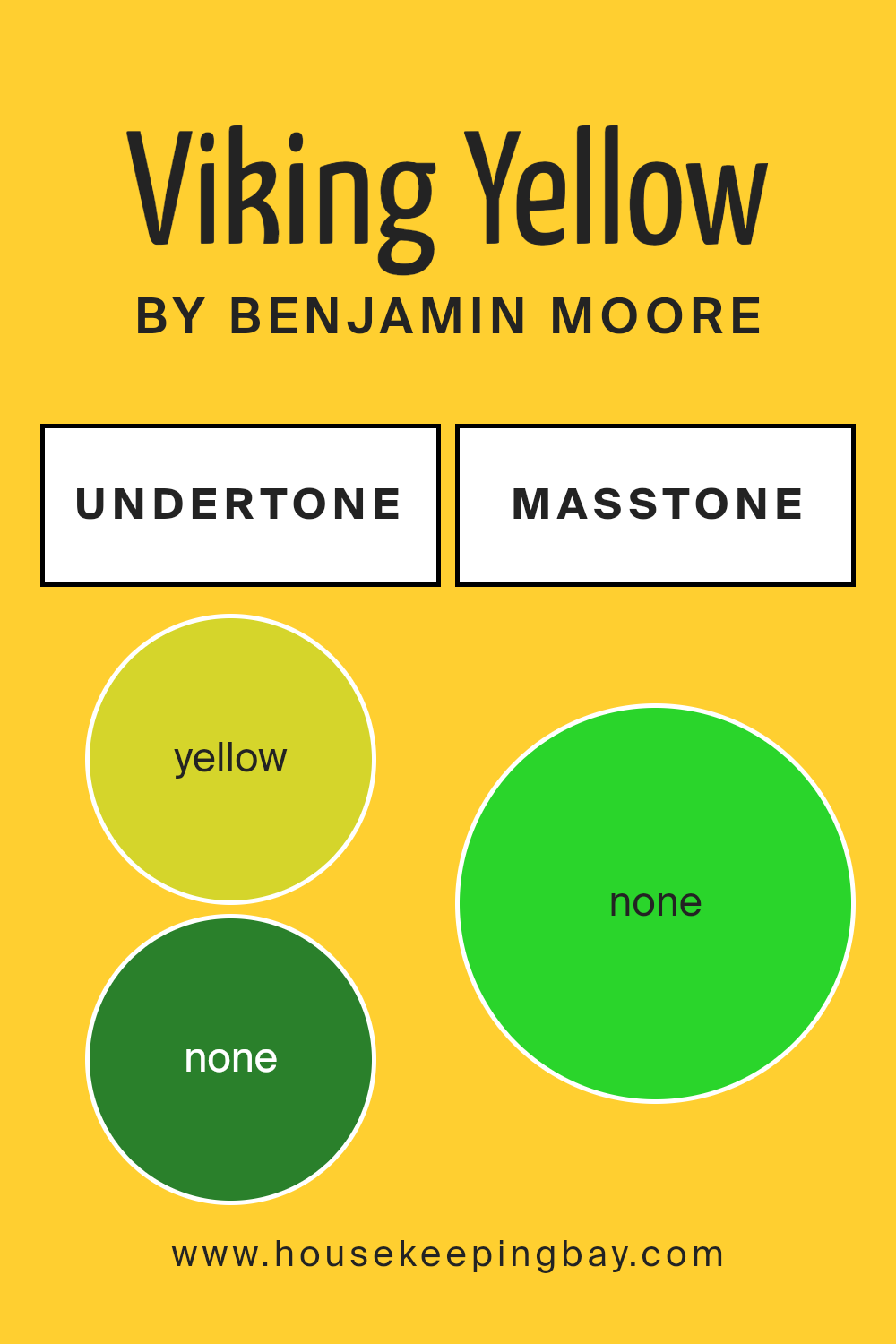
Undertones of Viking Yellow 321 by Benjamin Moore
Viking Yellow 321 by Benjamin Moore is a vibrant paint color with a range of diverse undertones, including yellow, orange, pale yellow, pale pink, and hints of green shades. These undertones are critical because they subtly influence how the color appears in various lighting conditions and can significantly affect the mood and style of a room.
The primary yellow undertone makes Viking Yellow 321 bright and cheerful, ideal for creating an inviting and energetic space. This pure yellow influence gives the paint a warm, sunny quality. The orange undertone adds a rich depth to the color, making it feel cozy and welcoming. It’s particularly noticeable in natural light, where it brings out a slightly more mature and sophisticated edge to the yellow.
Pale yellow and pale pink undertones soften the intensity of the color, lending a gentle, soothing vibe. These lighter undertones help the color adapt well in spaces that aim for a softer or more muted yellow, making it versatile for different decorative styles and preferences.
The green undertones, though subtle, can bring freshness and a natural feel to the color, enhancing its compatibility with wooden furnishings or plant-filled spaces. They help balance the warmth of yellow and orange, ensuring the color doesn’t feel too overpowering.
Overall, the undertones of Viking Yellow 321 contribute to its ability to adapt to various settings, enhancing everything from small accents to full walls. When used on interior walls, this color provides a dynamic yet cohesive atmosphere, adjusting its vibe as the daylight changes and interacting engagingly with other colors and decoration elements in the room.
housekeepingbay.com
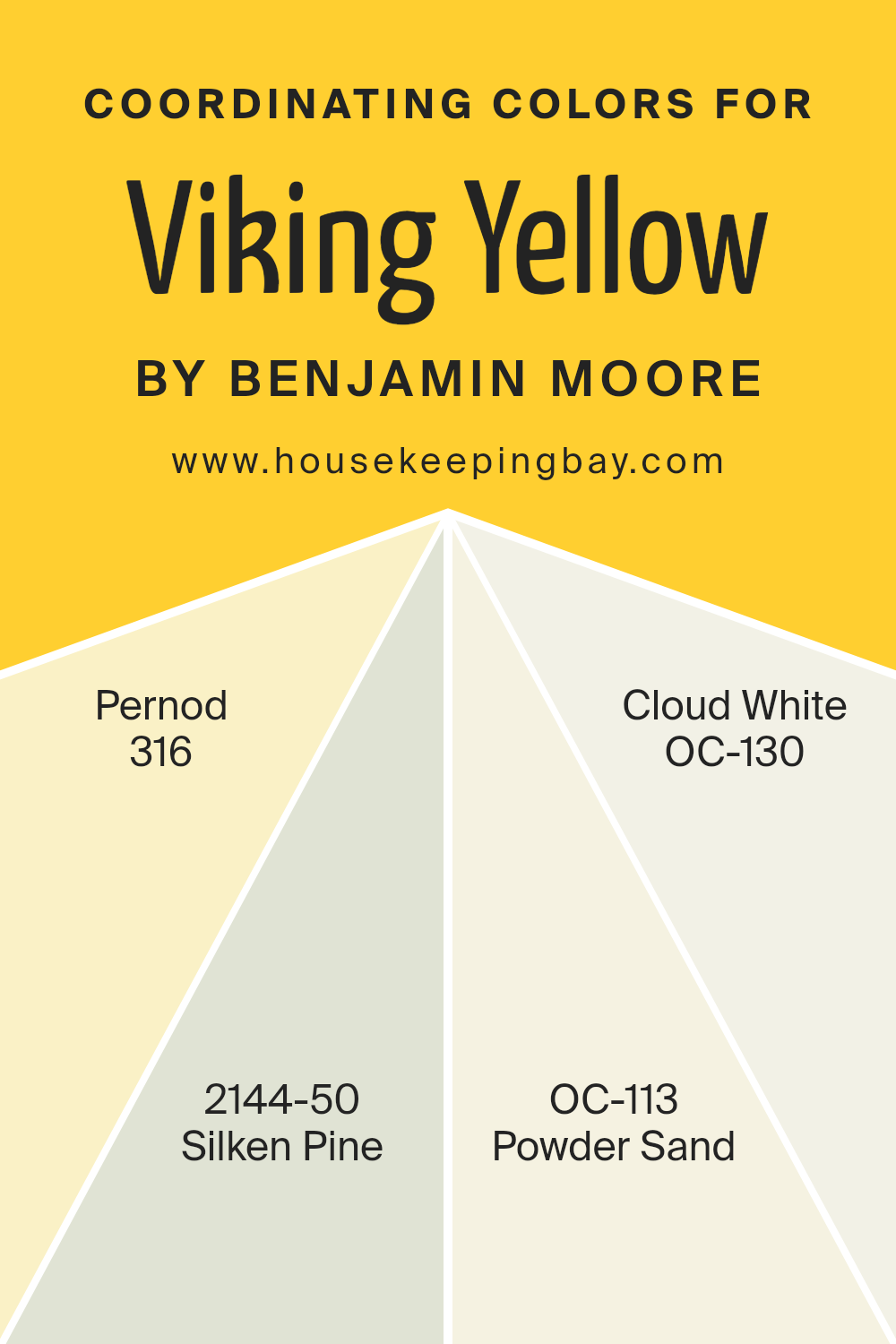
Coordinating Colors of Viking Yellow 321 by Benjamin Moore
Coordinating colors are selected to complement each other and create a harmonious palette when used together in design. These colors work by balancing visual appeal, enhancing each other’s beauty without clashing. When paired properly, they bring out the best aspects of each color, providing a room or design with a cohesive look. This selection of coordinating colors goes well with Viking Yellow 321 by Benjamin Moore because they offer contrast and variation while maintaining overall warmth and brightness.
Benjamin Moore’s Pernod 316 is a vibrant, slightly muted yellow-green shade that adds a lively yet soft touch to spaces needing a hint of color without overwhelming the senses. Silken Pine 2144-50, by contrast, is a gentle green that exudes a sense of calm and serenity, making it a wonderful backdrop for more saturated colors.
Powder Sand OC-113 brings a neutral, sandy hue that works beautifully to balance brighter tones, providing a subtle elegance to any room. Cloud White OC-130 offers a clean and fresh vibe, offering a perfect complement to both vibrant and subdued colors, thus completing this palette and ensuring that every element in the room contributes to a unified visual experience.
You can see recommended paint colors below:
- 316 Pernod
- 2144-50 Silken Pine
- OC-113 Powder Sand
- OC-130 Cloud White
housekeepingbay.com
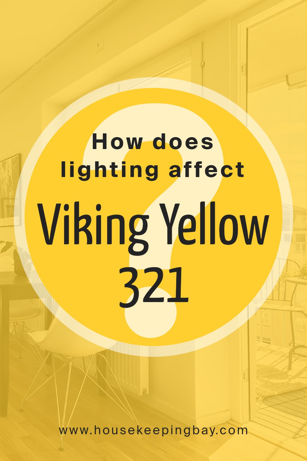
How Does Lighting Affect Viking Yellow 321 by Benjamin Moore?
Lighting plays a crucial role in how we perceive colors. The type of light and the direction it comes from can significantly impact the appearance of a color in a space. Viking Yellow321 by Benjamin Moore, a vivid and cheerful yellow, illustrates this effect vividly.
In artificial light, such as from LED or incandescent bulbs, Viking Yellow321 tends to appear warmer and more intense. Artificial lighting can enhance the yellow tones, making the room feel cozy and welcoming, especially during the evening. This is useful in living spaces and dining areas where a warm atmosphere is beneficial.
In natural light, the character of Viking Yellow321 shifts depending on the quality and amount of sunlight. Natural light reveals the truest form of the color, but variations occur throughout the day. Morning light is soft and can make Viking Yellow321 look bright and airy, while harsh midday light might wash out the color slightly, making it appear lighter than it actually is.
For rooms that face different directions:
– North-faced rooms get less direct sunlight, which can make Viking Yellow321 appear more muted and subtle. This cooler, softer light is great for creating a calm feeling in a room without the color overwhelming the space.
– South-faced rooms receive ample sunlight which can amplify the vibrancy of Viking Yellow321, making the walls seem lively and dynamic. This is ideal for spaces where you want a cheerful and energetic vibe.
– East-faced rooms are illuminated with warm morning light that can make Viking Yellow321 look extremely warm and welcoming in the morning, fading as the day progresses.
– West-faced rooms enjoy the late afternoon and evening light, which can cast a golden glow on Viking Yellow321, enhancing its warmth and making the room feel cozy at the end of the day.
Overall, Viking Yellow321’s perception not only varies with the light source but also dramatically with the quality and angle of lighting throughout the day and from room to room.
housekeepingbay.com
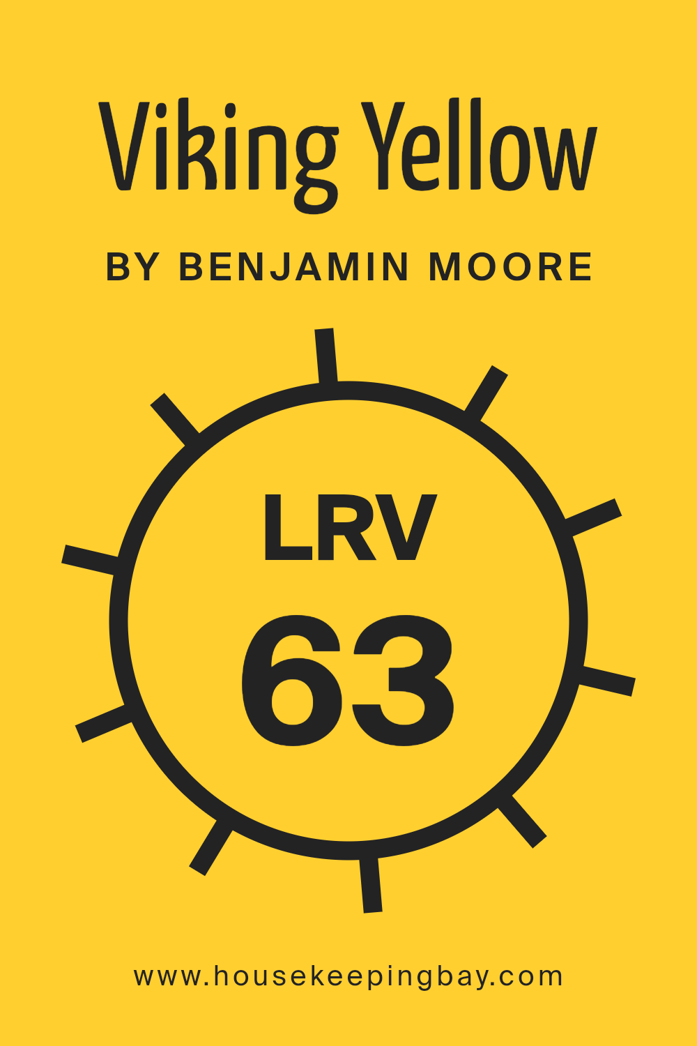
What is the LRV of Viking Yellow 321 by Benjamin Moore?
LRV stands for Light Reflectance Value, which measures the percentage of light a paint color reflects back into a room as opposed to absorbing. This scale runs from 0 to 100, where 0 absorbs all light (appears black) and 100 reflects all light (appears white).
Understanding LRV helps in choosing the right paint color for your space, especially in terms of brightness and mood. A higher LRV can make a room feel more airy and open by reflecting more light, while a lower LRV can create a cozier, more subdued environment by absorbing more light.
For Viking Yellow 321 by Benjamin Moore, with an LRV of 63.15, this color is on the brighter side, reflecting a decent amount of light back into the room. This characteristic makes Viking Yellow a good choice for darker rooms or spaces that could benefit from a more lively, cheerful ambiance without being overwhelming. The fairly high LRV means it will lighten up a space while offering a warm, soft glow that can make the area feel welcoming and comfortably illuminated.
housekeepingbay.com
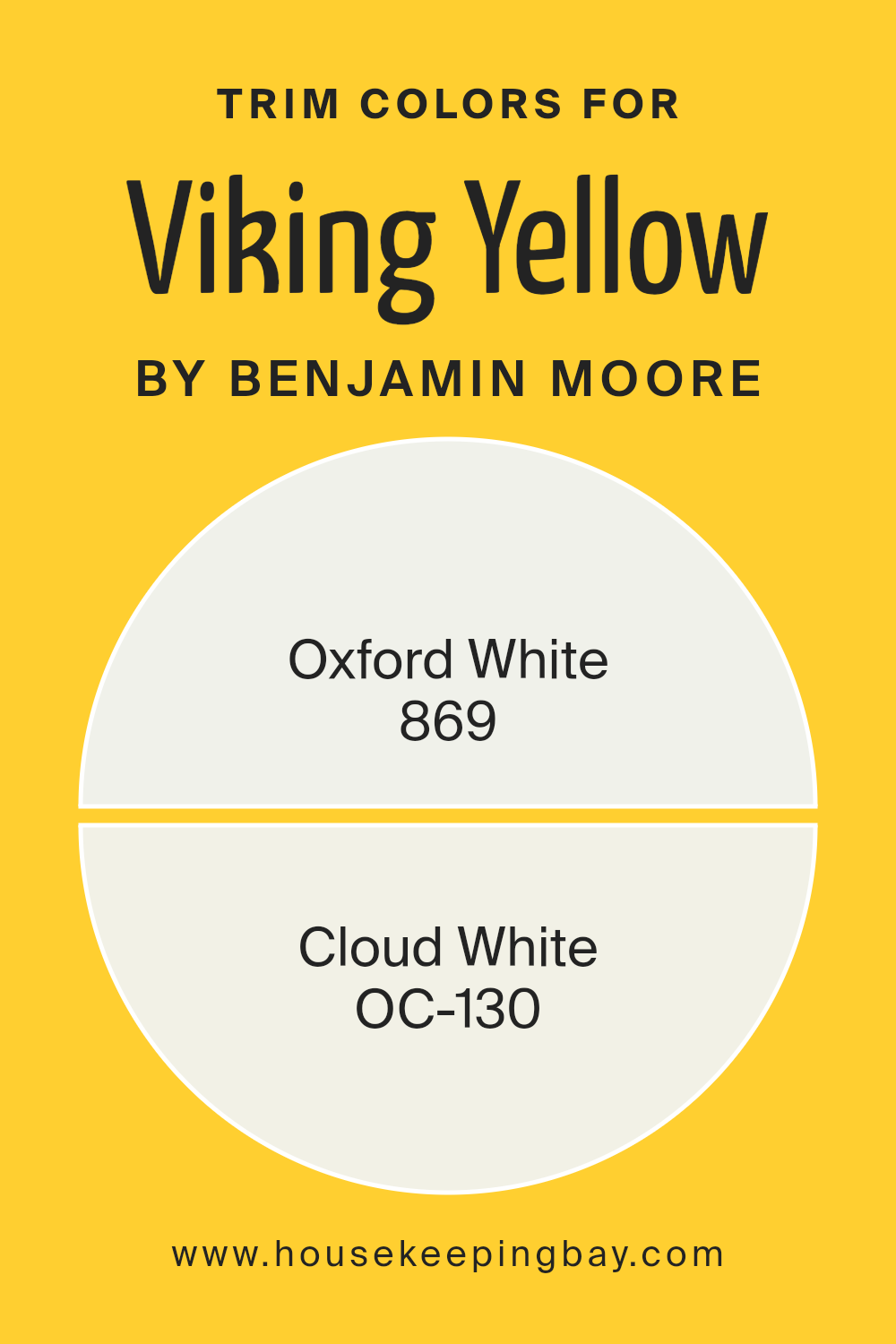
What are the Trim colors of Viking Yellow 321 by Benjamin Moore?
Trim colors are shades used to accentuate and define the edges, borders, and fine detail areas of a room or an exterior, such as door moldings, window frames, and skirting boards. Specifically, when painting a bold color like Viking Yellow 321 by Benjamin Moore, selecting complementary trim colors can greatly enhance visual appeal and create a clean, polished look. Appropriate trim colors can also affect how the main color is perceived, making it more coherent within the overall design scheme.
Oxford White 869 is a pristine, true white with a clear, unblemished finish that can make Viking Yellow 321 appear lively and vivid, offering a contrasting boundary that defines spaces crisply.
Meanwhile, Cloud White OC-130 offers a slightly creamier shade which subtly softens the intense hue of Viking Yellow, providing a gentle transition rather than stark contrast, which can help in creating a harmonious atmosphere while maintaining the freshness of the design. These shades are chosen to assist in achieving a balanced aesthetic, ensuring that the vibrant yellow stands out beautifully without overwhelming the senses.
You can see recommended paint colors below:
housekeepingbay.com
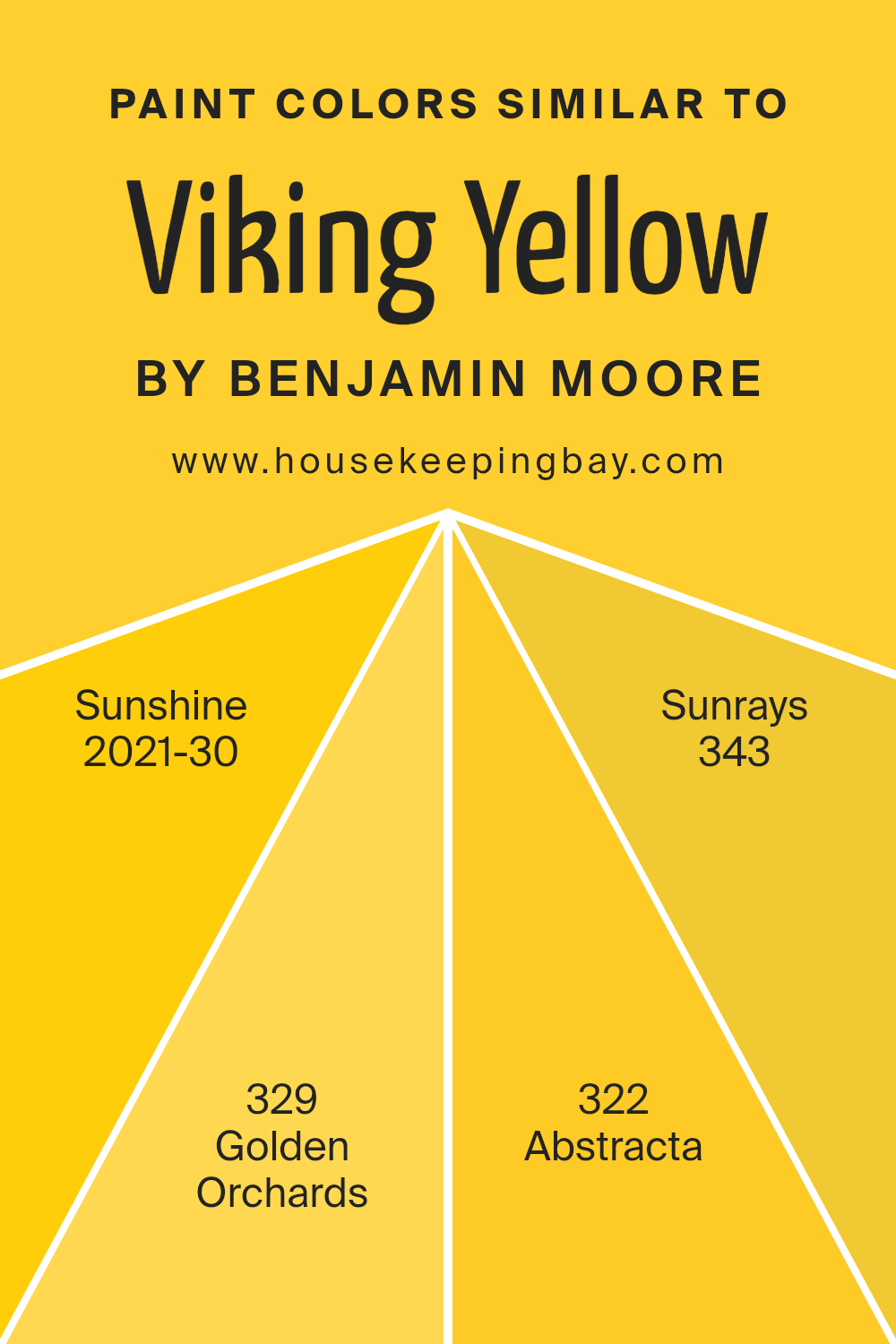
Colors Similar to Viking Yellow 321 by Benjamin Moore
Similar colors, such as those related to Viking Yellow 321 by Benjamin Moore, play a crucial role in creating a harmonious and unified aesthetic in design. By using shades like Sunshine, Golden Orchards, Abstracta, and Sunrays, designers can ensure a cohesive look that enhances the atmosphere without overwhelming the senses. Colors close in spectrum offer a subtle variation that can add depth and complexity to spaces, making them more visually appealing and gently dynamic.
Sunshine 2021-30 is a cheerful, bright yellow that injects a lively spark into any space, reminiscent of a sunny day. Golden Orchards 329 has a softer, more muted tone that suggests the gentle hues of autumn, ideal for creating a warm, inviting environment.
Abstracta 322, while still in the yellow family, leans towards a slightly earthy, mustard-like shade offering a vintage feel that works well in eclectic decors. Lastly, Sunrays 343 projects a vibrant, energetic yellow, perfect for spaces intended to stimulate energy and creativity, radiating positivity and warmth. These variations allow for flexibility in design while maintaining visual continuity.
You can see recommended paint colors below:
- 2021-30 Sunshine
- 329 Golden Orchards
- 322 Abstracta
- 343 Sunrays
housekeepingbay.com
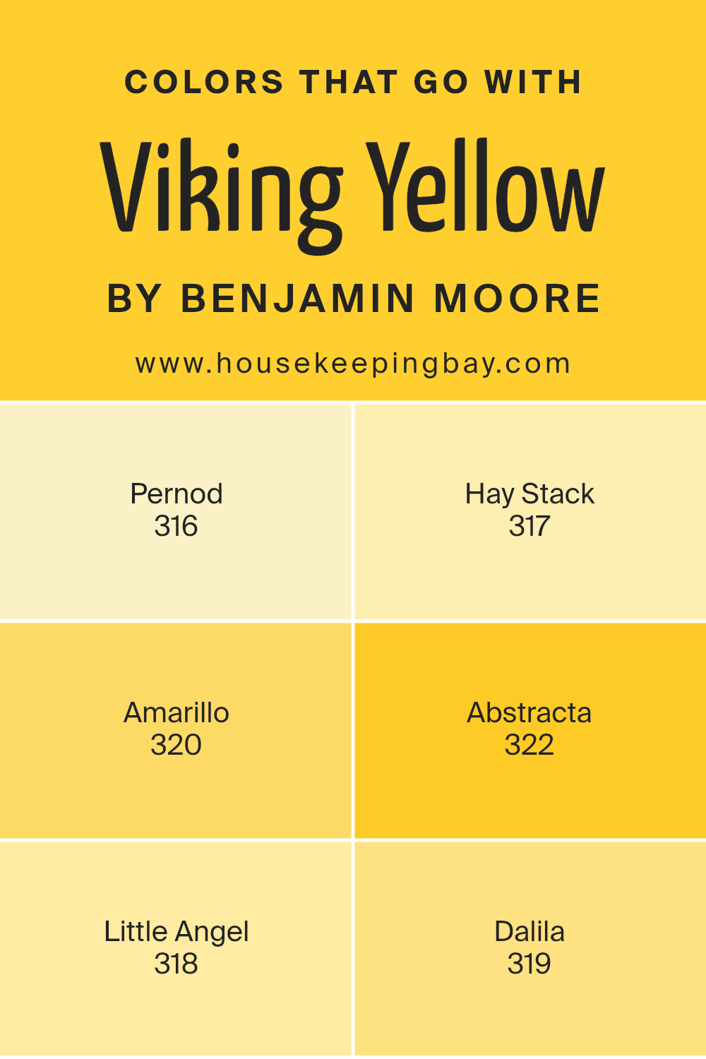
Colors that Go With Viking Yellow 321 by Benjamin Moore
Choosing colors that complement Viking Yellow 321 by Benjamin Moore is crucial in creating a cohesive, appealing aesthetic in any space. When you select colors like 316 Pernod, 317 Hay Stack, 320 Amarillo, 322 Abstracta, 318 Little Angel, and 319 Dalila, you ensure that Viking Yellow pops while maintaining a balanced visual flow. These complementary colors work by either contrasting with or enhancing the bright, cheerful hue of Viking Yellow, offering a variety of design choices that cater to different tastes and styles.
Pernod 316 is a subtle, soothing green that provides a natural feel when paired with the bolder Viking Yellow, creating a refreshing vibe. Hay Stack 317, on the other hand, is a deeper shade of yellow that matches warmth with Viking Yellow, perfect for a monochromatic scheme that feels sunny and welcoming.
Amarillo 320 brings in a rich, golden touch that adds luxury and depth to the combination. Abstracta 322 is a unique bluish-grey that cools down the warmth of Viking Yellow, ideal for modern settings. Little Angel 318 is a light, almost ethereal pale yellow, softening any space with its gentle presence. Finally, Dalila 319 introduces a playful, peachy tone, which injects a playful yet sophisticated element into interiors. Together, these colors provide flexibility in design, allowing for a room that feels harmonious yet lively, tailored to personal preferences.
You can see recommended paint colors below:
- 316 Pernod
- 317 Hay Stack
- 320 Amarillo
- 322 Abstracta
- 318 Little Angel
- 319 Dalila
housekeepingbay.com
How to Use Viking Yellow 321 by Benjamin Moore In Your Home?
Viking Yellow 321 by Benjamin Moore is a vibrant, warm yellow paint color that brings a sunny, cheerful vibe to any room. It’s perfect for creating a welcoming atmosphere in living spaces such as kitchens and living rooms, where families gather and spend time together. This shade of yellow is also ideal for adding a burst of energy to smaller, darker spaces, making them appear brighter and more open.
If you’re thinking about adding some life to your home, consider using Viking Yellow 321 on an accent wall. This approach allows the color to add personality without overwhelming the space. Alternatively, you could paint kitchen cabinets or a bathroom vanity for a refreshing pop of color.
For those who prefer subtle decor changes, incorporating Viking Yellow 321 through accent pieces like throw pillows, vases, or curtains can liven up a neutral room. Whatever way you choose to include it, Viking Yellow 321 can make your home feel more lively and inviting.
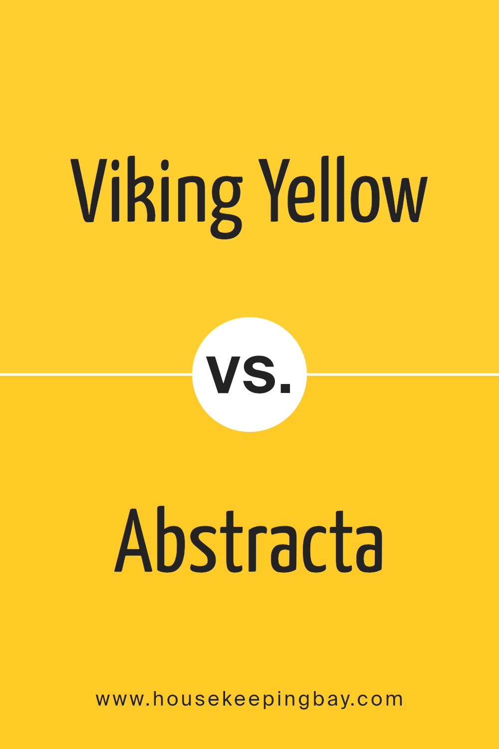
Viking Yellow 321 by Benjamin Moore vs Abstracta 322 by Benjamin Moore
Viking Yellow 321 by Benjamin Moore is a vibrant, energetic shade. It emits a cheerful vibe, making it perfect for spaces where you want to inject positivity and brightness. This yellow is bold without overpowering, working well in kitchens or creative spaces to inspire activity and happiness.
Abstracta 322, also by Benjamin Moore, presents a more subdued feeling. It’s a gray tone with hints of blue that give it a cool, soothing quality. This color is ideal for areas where calm and focus are needed, such as bedrooms or home offices. It pairs well with modern decor, providing a clean, minimalistic backdrop.
Comparing these two, Viking Yellow 321 reflects light and energy, making spaces feel alive and open. In contrast, Abstracta 322 offers a calming effect, encouraging relaxation and concentration. The selection between them depends on the atmosphere you aim to create in your room, with Viking Yellow offering stimulation and Abstracta leaning towards a serene ambience.
You can see recommended paint color below:
- 322 Abstracta
housekeepingbay.com
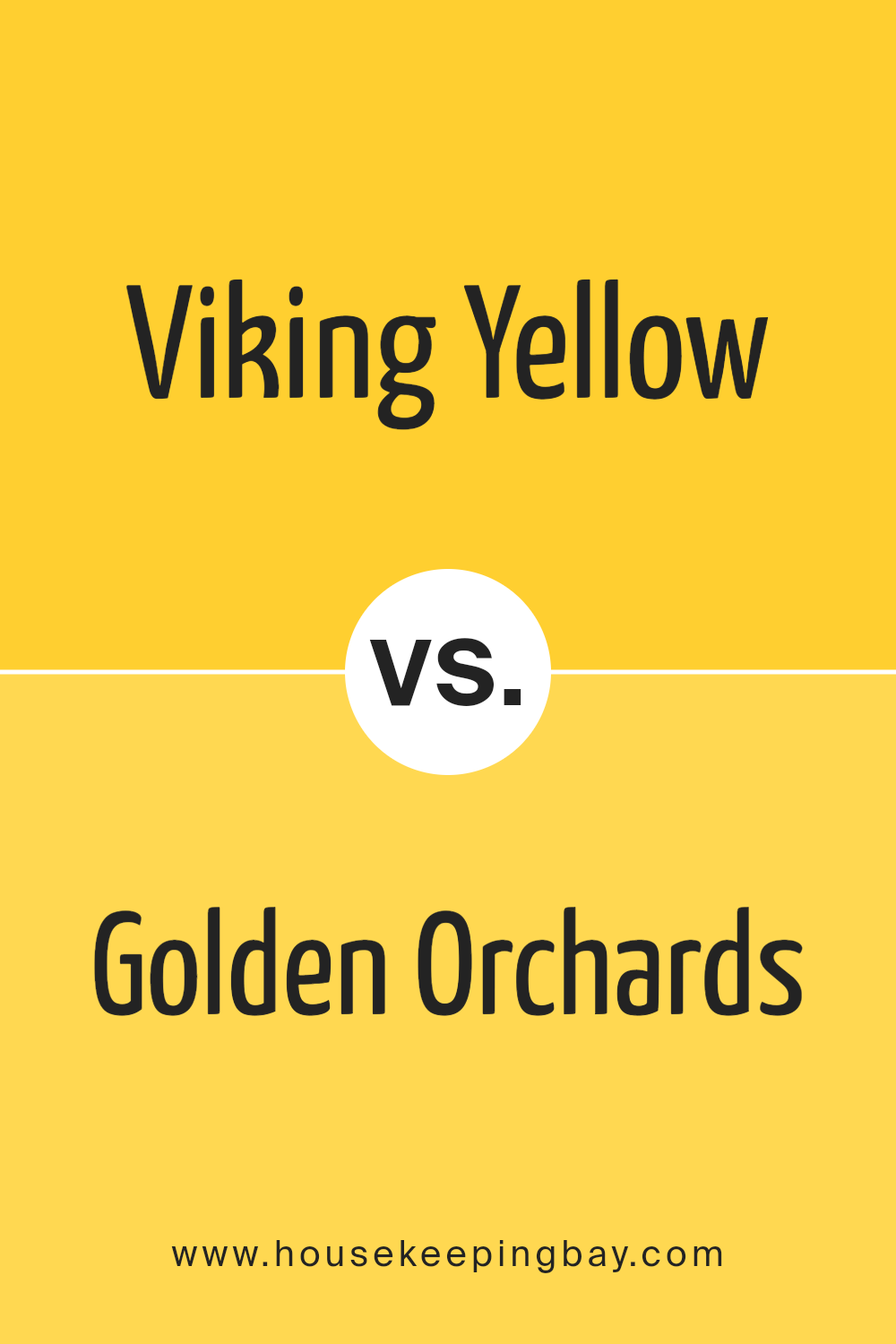
Viking Yellow 321 by Benjamin Moore vs Golden Orchards 329 by Benjamin Moore
“Viking Yellow 321” and “Golden Orchards 329,” both by Benjamin Moore, showcase unique shades of yellow with distinctive appeals. Viking Yellow 321 offers a vibrant, bright yellow hue that’s lively and energetic, making it ideal for spaces meant to stimulate activity and cheerfulness. It works well in kitchens or playrooms where you want a sunny, invigorating atmosphere.
In contrast, Golden Orchards 329 has a softer, subtler yellow with a hint of mustard, which imparts warmth and a cozy, comforting feel. This color is excellent for living rooms or dining areas where a calm and inviting environment is desired.
Both colors can brighten up a space, but Viking Yellow does so with a punch of intensity, while Golden Orchards achieves calmness with its muted, earthy quality. Depending on the room and the mood you wish to set, these colors can offer very different visual experiences.
You can see recommended paint color below:
- 329 Golden Orchards
housekeepingbay.com
Viking Yellow 321 by Benjamin Moore vs Sunshine 2021-30 by Benjamin Moore
Viking Yellow 321 from Benjamin Moore is a vibrant, intense shade of yellow that brings a lively and energetic feel to any space. It’s perfect for creating a bold statement, ideal for areas where you want to inject enthusiasm and cheer.
Sunshine 2021-30, also by Benjamin Moore, offers a brighter and lighter tone of yellow. This color is reminiscent of a sunny day and is perfect for making spaces feel warm and inviting. Unlike Viking Yellow, which is deeper and more saturated, Sunshine is softer and more subtle, offering a gentle radiance that can help to make small rooms appear larger and more open.
Both colors are excellent choices for adding a touch of joy and brightness to your home, but the choice between them depends on the intensity and mood you wish to achieve. Viking Yellow is more dramatic, while Sunshine provides a calmer, softer glow.
You can see recommended paint color below:
- 2021-30 Sunshine
housekeepingbay.com
Viking Yellow 321 by Benjamin Moore vs Sunrays 343 by Benjamin Moore
The Viking Yellow 321 by Benjamin Moore is a vibrant, bold shade that brings warmth and cheer to any space. This hue is saturated, making it ideal for a focal point in lively, energetic rooms. Think of it as a solid, sunny color that radiates positivity and warmth.
Contrastingly, Sunrays 343 is softer and less intense. It’s also a shade of yellow but has a muted, gentle quality compared to Viking Yellow. Sunrays 343 is more understated, making it versatile for larger areas or spaces where a calming yet bright atmosphere is desired.
Both colors share the inherent warmth and brightness typical of yellow hues, but Viking Yellow is punchier, suitable for accentuating features or making bold statements. Sunrays, meanwhile, works well as a soothing background or in spaces that seek a cheerful vibe without overwhelming brightness. They could complement each other in a space that utilizes energetic and calming elements.
You can see recommended paint color below:
- 343 Sunrays
housekeepingbay.com
Conclusion
Benjamin Moore’s 321 Viking Yellow truly impresses as a paint color that brings warmth and brightness to any room. In my experience, this particular shade has the power to illuminate spaces in a way that feels cozy yet lively, perfect for places where I spend a lot of time relaxing or hosting friends and family.
From the walls of a kitchen to the backdrop of a home office, I found that Viking Yellow adds a cheerful boost without overwhelming the senses. It pairs exceptionally well with both darker and lighter tones, giving me the flexibility to experiment with different decor styles and accessories. Plus, its smooth application and long-lasting finish make it a practical choice for busy areas.
Personally, Viking Yellow has refreshed my living space without any major renovations needed, proving itself as an effective and budget-friendly update. Its vibrant yet soothing hue ensures my home feels welcoming and full of zest. If you’re looking to create a lively yet cozy environment, Benjamin Moore’s 321 Viking Yellow might just be the ticket.
It’s a choice that I’ve come to appreciate every day as it consistently adds a cheerful splash of color to my daily life.
housekeepingbay.com
