Grapy SW 7629 by Sherwin Williams
Perfect Purple for Any Space
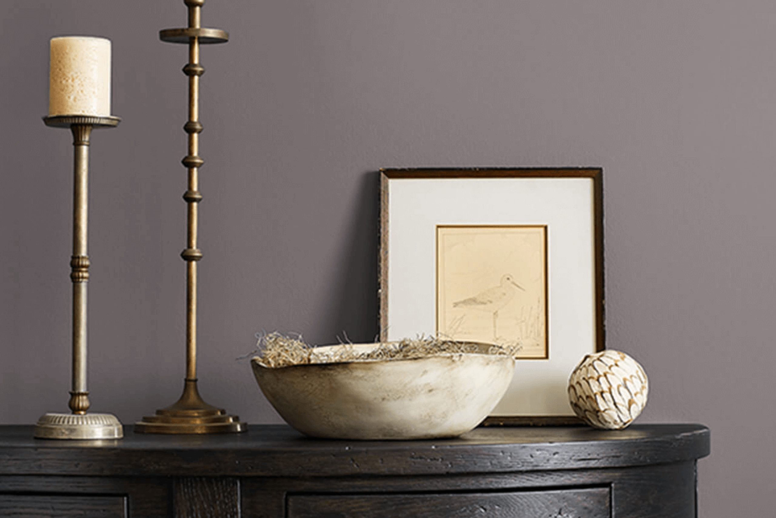
Have you ever considered the calming power of a perfectly chosen paint color? SW 7629 Grapy by Sherwin Williams could be the shade you didn’t know you needed. This deep, muted hue offers a sense of comfort and sophistication, perfect for transforming any room into a cozy retreat.
Picture a grayish-purple that exudes warmth without overwhelming your senses—a modern classic that speaks to simplicity.
Grapy is more than just a paint color; it’s like a gentle hug from the walls around you. Whether you’re planning to refresh your living room, create a peaceful bedroom oasis, or add depth to a hallway, this color adapts beautifully.
It pairs well with a variety of tones, including soft whites, warm browns, and earthy greens, allowing flexibility in your design choices.
When you invite Grapy into your home, you’ll notice how it subtly changes with different lighting throughout the day, adding an element of dynamic beauty to your spaces. It’s ideal for those who appreciate subtlety yet desire an atmosphere that feels intentional and welcoming.
Whether used on an accent wall or throughout an entire room, Grapy creates a backdrop that’s all about relaxation and style.
via sherwin-williams.com
What Color Is Grapy SW 7629 by Sherwin Williams?
Table of Contents
Grapy SW 7629 by Sherwin Williams is a rich, deep shade of purple with hints of gray. This color carries a sophisticated and moody vibe, ideal for creating an atmosphere that’s both cozy and elegant. Grapy can be a striking choice for a feature wall, adding depth and character to a room without overwhelming it.
This color works well in modern and contemporary interior styles, where clean lines and simple forms are prominent. It can also fit beautifully in more traditional or eclectic spaces, bringing a touch of classic richness.
Pairing Grapy with materials like wood and metal enhances its warmth and elegance. Wooden floors or furniture pieces add a natural element that softens the boldness of Grapy, while metals like brass or matte black create a chic, stylish contrast. For textiles, materials like velvet and linen can complement this color beautifully. Velvet enhances the luxurious feel, while linen offers a more earthy, relaxed look.
Texture plays an important role, too; rough-textured surfaces give Grapy a more rustic appeal, while smooth surfaces emphasize its modern aspects. Integrating these elements thoughtfully can create a harmonious space that feels both refined and inviting.
housekeepingbay.com
Is Grapy SW 7629 by Sherwin Williams Warm or Cool color?
Grapy SW 7629 by Sherwin Williams is a deep, sophisticated shade of purple. This rich color brings a sense of elegance and warmth, enhancing rooms with its dramatic appeal. As a bold choice, it serves well in spaces where contrast and depth are desired, like an accent wall in a living room or a cozy study.
It balances well with neutral tones such as whites, grays, or soft beiges, allowing it to pop without overwhelming.
In terms of light, Grapy can vary in appearance. In bright spaces, it may appear lighter, giving a cheerful touch, while in dimmer settings, it takes on a more intense, enveloping character. This versatility makes it suitable for both intimate spaces, like bedrooms, and more public ones, such as dining areas.
Grapy SW 7629 complements traditional decor as much as modern furnishings, providing a timeless and chic backdrop in any home.
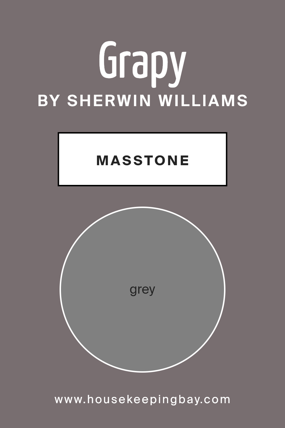
What is the Masstone of the Grapy SW 7629 by Sherwin Williams?
Grapy SW 7629 by Sherwin Williams is a shade rooted in a cool, neutral grey, specifically #808080. This color works wonderfully in homes due to its ability to provide a calm, balanced backdrop. Grey is known for its versatility. Grapy can blend seamlessly with various styles and furnishings, making it a popular choice for many homeowners.
In addition to its adaptability, grey helps create a sense of spaciousness. It can make rooms appear larger and brighter, especially when paired with natural light or lighter accents. This makes Grapy ideal for living rooms, bedrooms, or even kitchens where an airy feel is desired.
Moreover, grey has a timeless quality, ensuring your space remains classic and fresh over time. It pairs well with other colors, whether bold or muted, adding depth and interest without overwhelming. Grapy SW 7629 offers a simple yet sophisticated touch for any home setting.
housekeepingbay.com
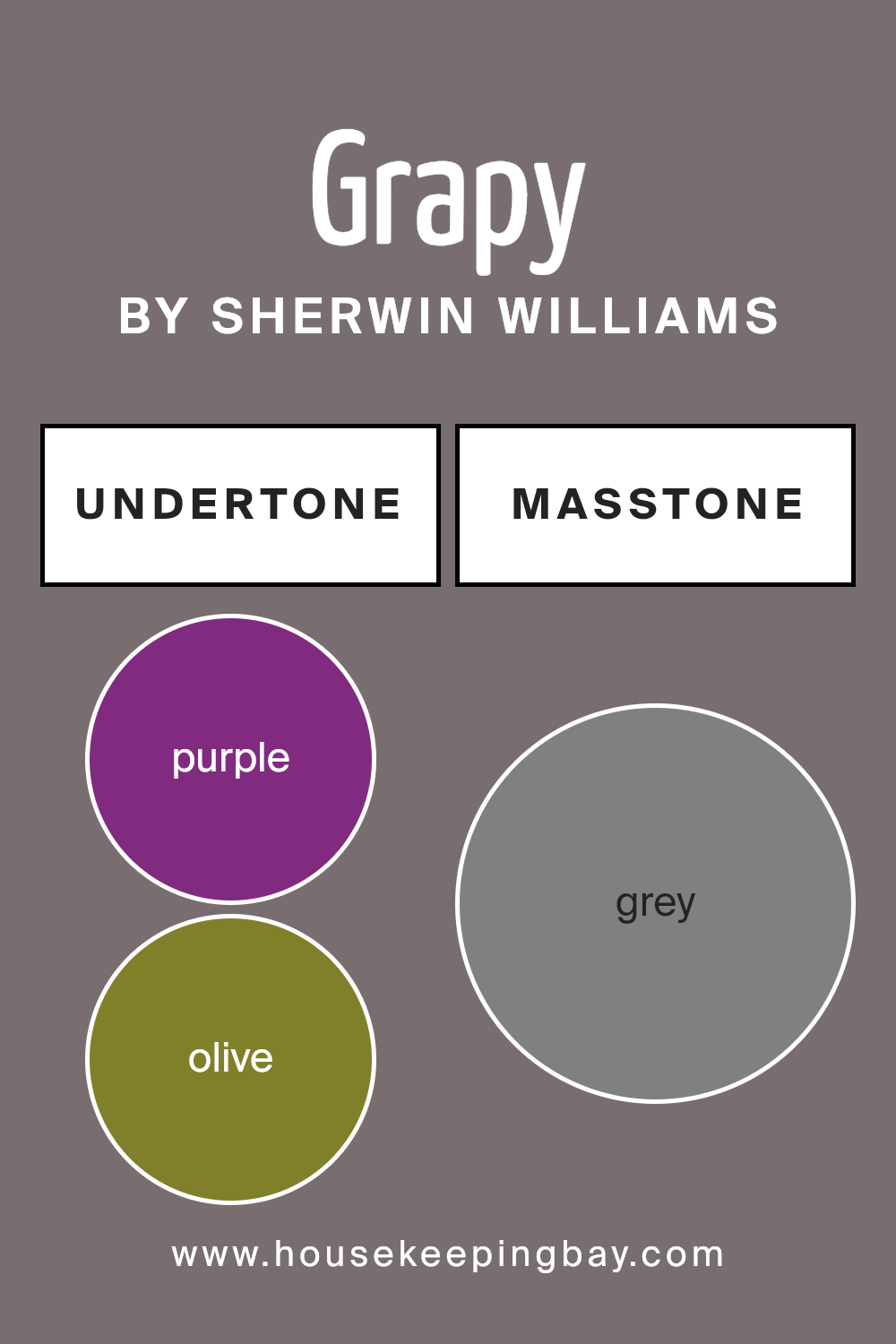
Undertones of Grapy SW 7629 by Sherwin Williams
Grapy SW 7629 by Sherwin Williams features a complex mixture of undertones, influencing how we perceive it on interior walls. These undertones consist of a rich palette, including purple, olive, dark turquoise, pale pink, brown, lilac, navy, mint, dark green, pink, orange, violet, dark grey, light green, blue, light turquoise, red, light purple, pale yellow, dark blue, light blue, green, fuchsia, yellow, and turquoise.
Undertones play a major role in determining a color’s overall vibe. While the main color of Grapy SW 7629 might appear as a certain shade, the undertones bring depth and variety. With purple and lilac, the color can appear slightly more vibrant and lively.
Olive and dark green lend an earthy note, creating a warmer feel. Navy and dark blue can add sophistication and calmness, while light blue and turquoise provide freshness.
On interior walls, these undertones can change based on lighting and surrounding decor.
In bright light, Grapy SW 7629 may show more of its blue and green undertones, providing a cooler look. In dimmer settings, the reds, browns, and darker shades may come forward, offering warmth and coziness. The mix provides versatility, making Grapy SW 7629 capable of complementing various styles and moods in a space.
housekeepingbay.com
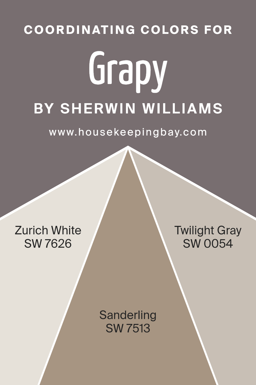
Coordinating Colors of Grapy SW 7629 by Sherwin Williams
Coordinating colors work together to create a pleasing visual harmony in a space. They are carefully selected to complement a main color, enhancing its impact while balancing the overall look. When you think of coordinating colors, imagine a team of shades that support the main hue, each bringing out the best in each other.
For example, when paired with Sherwin-Williams’ Grapy SW 7629, the coordinating colors help set a cohesive and inviting mood.
These shades do not compete but rather work in unison to make a space feel well-curated and balanced. Coordinating colors like SW 7626 Zurich White, SW 7513 Sanderling, and SW 0054 Twilight Gray can transform a room into a sophisticated palette.
Zurich White SW 7626 is a soft, neutral white with a hint of gray that exudes brightness without being too stark.
Its versatility makes it a gentle backdrop, allowing other colors to stand out while maintaining a sense of airiness. Sanderling SW 7513, on the other hand, offers a warm beige tone with an inviting earthy feel, adding warmth and depth.
Its subtle warmth makes a space feel cozy and grounded. Twilight Gray SW 0054 introduces a subtle gray with a hint of blue, perfect for adding depth and a subtle, calming contrast.
These shades, when used together with Grapy, create an environment that feels both stylish and harmonious.
You can see recommended paint colors below:
- SW 7626 Zurich White
- SW 7513 Sanderling
- SW 0054 Twilight Gray
housekeepingbay.com
How Does Lighting Affect Grapy SW 7629 by Sherwin Williams?
Lighting plays a crucial role in how we perceive colors. Natural and artificial lighting can change the appearance of a color, sometimes dramatically. This is particularly true for paint colors like Sherwin Williams’ Graysw SW 7629. Understanding these changes can help when choosing colors for different spaces.
In artificial light, Graysw 7629 tends to show its warmer undertones. Incandescent bulbs, which emit a warm yellowish light, can make the color appear cozier and more muted. On the other hand, LED lights or cool fluorescent lights, which have a bluish tint, might cause the color to seem cooler and slightly grayer.
Natural light varies by direction, affecting how colors look in a room. In north-facing rooms, which receive cool, less direct light, Graysw 7629 may appear cooler and more muted. The absence of warm sunlight makes the paint lean towards its gray undertones, which could result in a more subdued look.
In south-facing rooms, sunlight is more abundant and warmer. The color will look warmer and might reveal its subtle beige or taupe undertones. This direction tends to enhance the color, giving a cheerful and vibrant appearance.
East-facing rooms benefit from morning sunlight, which is softer and warmer. Here, Graysw 7629 may take on a slightly warmer tone during the morning but might appear cooler as the day progresses, with the loss of direct sunlight in the afternoon.
West-facing rooms receive the warm glow of the afternoon sun. In these spaces, Graysw 7629 will appear warmer and richer as the day goes on, especially as the setting sun introduces an orange-red hue into the room.
By considering the direction and type of lighting, one can predict how Graysw 7629 might alter its appearance, ensuring it matches the desired mood and style of a room.

housekeepingbay.com
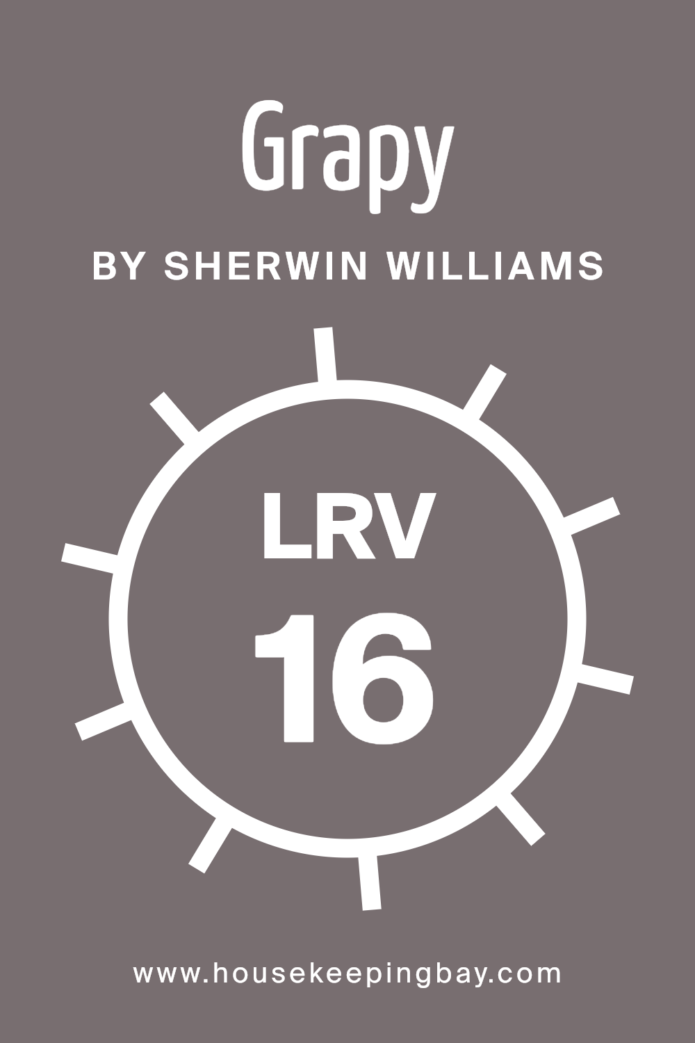
What is the LRV of Grapy SW 7629 by Sherwin Williams?
LRV, or Light Reflectance Value, measures how much light a color reflects. LRV is a scale from 0 to 100, with 0 being pure black, which absorbs all light, and 100 being pure white, which reflects all light. If a color has a low LRV, it will absorb a lot of light, making a space feel more intimate and cozy.
On the other hand, a color with a high LRV will reflect more light, which can make a room feel bigger and brighter. When choosing paint, LRV gives you an idea of how light or dark a color will appear once it’s on the walls.
Grapy SW 7629 by Sherwin Williams has an LRV of 16.399. This is a relatively low LRV, meaning Grapy will absorb more light, making it perfect for creating a warm, snug atmosphere. In a room with limited natural light, Grapy will appear even darker, intensifying its rich, deep look.
On the flip side, in a space with lots of sunlight, the color will still remain quite profound and moody, as it won’t reflect much light. This makes Grapy an excellent choice for rooms where you wish to add depth or create a cozy corner without overwhelming brightness.
housekeepingbay.com
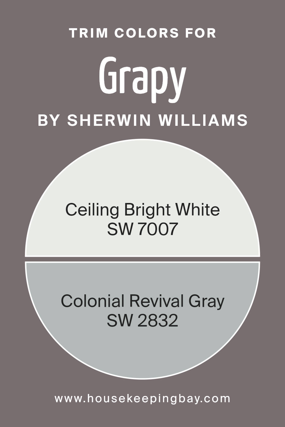
What are the Trim colors of Grapy SW 7629 by Sherwin Williams?
Trim colors refer to the shades used on moldings, baseboards, window frames, and other details that outline walls, ceilings, and floors. They play a vital role by defining spaces and highlighting architectural features. For the soft, warm hue of Grapy SW 7629 by Sherwin Williams, carefully chosen trim colors can enhance the room’s overall look.
SW 7007 – Ceiling Bright White is a great option for trims. This is a crisp, clean white that brightens and contrasts beautifully with darker shades like Grapy. By using it as a trim color, it helps to frame the room and create a fresh, airy feeling, giving a sense of spaciousness.
SW 2832 – Colonial Revival Gray is another excellent trim color choice that pairs well with Grapy SW 7629. This soft gray has historical charm, lending a subtle elegance to any space it borders. As a trim, Colonial Revival Gray adds depth and a timeless, sophisticated edge to the walls, acting as a neutral boundary that complements the main wall color.
Both these trim choices work to either quietly highlight architectural details or create striking visual lines, emphasizing the distinct character of the room.
Whether you prefer the bright, clean feel of Ceiling Bright White or the understated elegance of Colonial Revival Gray, these colors are crucial in shaping the finished appearance of a space painted with Grapy.
You can see recommended paint colors below:
housekeepingbay.com
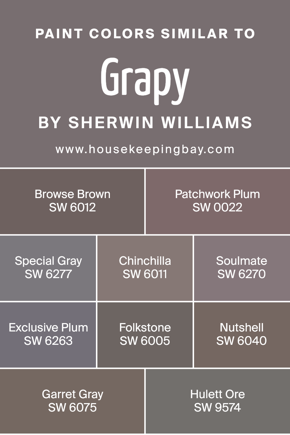
Colors Similar to Grapy SW 7629 by Sherwin Williams
Similar colors hold a unique importance in design as they create a harmonious and cohesive look. They blend effortlessly with one another, providing a balanced aesthetic that is pleasing to the eye. The colors related to Grampy SW 7629 by Sherwin Williams, such as SW 6012 – Browse Brown, emit a warm, earthy tone, giving a cozy feel.
SW 0022 – Patchwork Plum adds a rich, deep hue reminiscent of ripe fruit. SW 6277 – Special Gray offers a soft, gentle touch, making it versatile and neutral. SW 6011 – Chinchilla brings in a muted shade that feels calm and understated. SW 6270 – Soulmate has a warm, purple undertone that adds depth.
SW 6263 – Exclusive Plum delivers a deep, luxurious color perfect for accenting. SW 6005 – Folkstone provides a grayish-brown tone, creating a natural yet modern look. SW 6040 – Nutshell introduces a rich, brown tone that can ground any design.
SW 6075 – Garret Gray is a classic, soft gray, seamlessly tying other colors together. SW 9574 – Hulett Ore adds a touch of muted red, reminiscent of aged metal, bringing a hint of industrial charm.
Using these colors in combination enhances spaces by ensuring the elements work together, avoiding clashes while still allowing for individual expression through subtle variations.
You can see recommended paint colors below:
- SW 6012 Browse Brown
- SW 0022 Patchwork Plum
- SW 6277 Special Gray
- SW 6011 Chinchilla
- SW 6270 Soulmate
- SW 6263 Exclusive Plum
- SW 6005 Folkstone
- SW 6040 Nutshell
- SW 6075 Garret Gray
- SW 9574 Hulett Ore
housekeepingbay.com
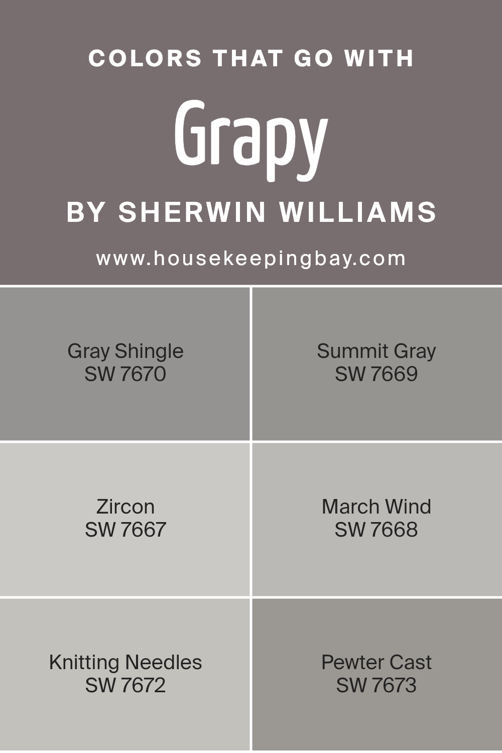
Colors that Go With Grapy SW 7629 by Sherwin Williams
Choosing colors that complement Grapy SW 7629 by Sherwin Williams enhances aesthetic appeal and creates a harmonious space. This muted deep shade benefits from pairing with versatile grey tones like SW 7670 – Gray Shingle, known for its rich and balanced hue that adds depth without overwhelming.
Similarly, SW 7669 – Summit Gray offers a warm, inviting feel, perfect for adding comfort to any room. SW 7667 – Zircon, with its light and airy nature, works well to balance darker tones, creating a soothing atmosphere.
Meanwhile, SW 7668 – March Wind provides a subtle contrast with its crisp, clean character that breathes freshness into a setting.
SW 7672 – Knitting Needles adds a sophisticated touch with its cool undertones, ensuring a modern look when paired with Grapy.
SW 7673 – Pewter Cast, known for its soft yet strong presence, ties the palette together with elegance, blending seamlessly across various settings. These shades not only enhance Grapy but also work together to bring out the best in each other, fostering an environment of cohesion and style. Using such complementary colors ensures an appealing and balanced aesthetic, making any space feel both dynamic and inviting.
You can see recommended paint colors below:
- SW 7670 Gray Shingle
- SW 7669 Summit Gray
- SW 7667 Zircon
- SW 7668 March Wind
- SW 7672 Knitting Needles
- SW 7673 Pewter Cast
housekeepingbay.com
How to Use Grapy SW 7629 by Sherwin Williams In Your Home?
Grapy SW 7629 by Sherwin Williams is a rich, versatile paint color. It is a deep gray with purple undertones, creating a cozy and sophisticated atmosphere. This shade is perfect for living rooms or bedrooms, bringing warmth and depth to the space. Because of its neutral undertones, it works well with various styles, from modern to traditional.
Grapy can be paired with lighter shades like whites or creams to brighten up the room and highlight its unique tone. It also complements metals like brass or silver in fixtures or frames, adding a touch of elegance. In a home office, Grapy can provide a calm and focused background, making it easier to concentrate.
For a more dramatic effect, use it on an accent wall to create a focal point. Grapy is both stylish and practical, making it a great choice for many different areas in a home.
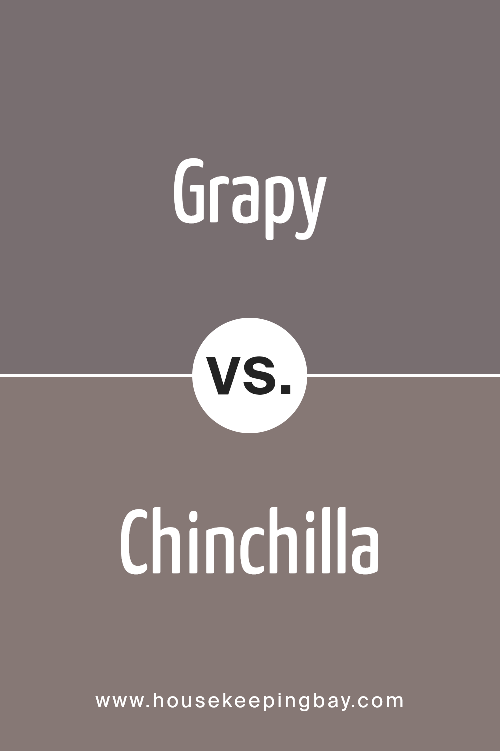
Grapy SW 7629 by Sherwin Williams vs Chinchilla SW 6011 by Sherwin Williams
Grapy SW 7629 is a rich, deep purple by Sherwin Williams. It has a bold presence and can add a striking touch to any space. This color tends to evoke feelings of warmth and coziness, making it suitable for areas like living rooms or bedrooms where you want a touch of elegance.
Chinchilla SW 6011 is also a Sherwin Williams color, but it’s quite different. It leans more towards a soft mauve with subtle gray undertones. This creates a calming and understated look, ideal for creating a relaxing environment in spaces like bedrooms or bathrooms.
While Grapy is darker and more intense, Chinchilla offers a lighter, more muted alternative. Grapy can add drama and sophistication through its boldness. Meanwhile, Chinchilla suggests a gentle, soothing atmosphere with its softer hue. Both colors have their place in design, meeting needs for boldness or subtlety in a space.
You can see recommended paint color below:
housekeepingbay.com
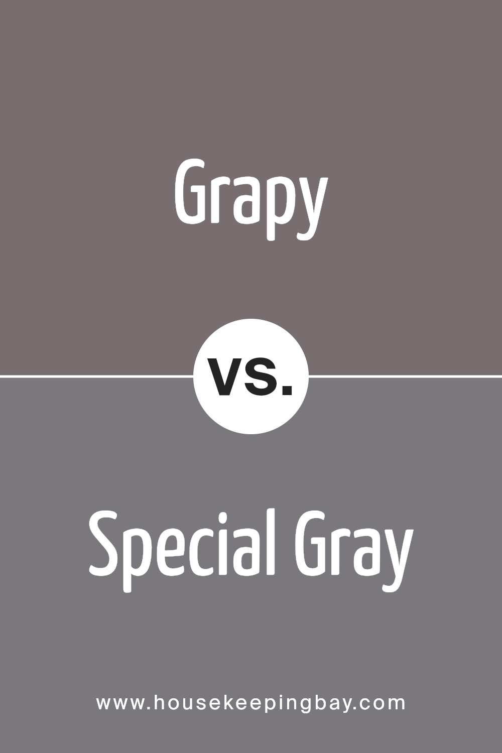
Grapy SW 7629 by Sherwin Williams vs Special Gray SW 6277 by Sherwin Williams
Grapy SW 7629 by Sherwin Williams is a bold and rich purple shade. It exudes depth and makes spaces feel both cozy and luxurious. A room painted in Grapy feels dramatic, making it ideal for creating statement walls or adding a touch of elegance to any space. Its dark undertones pair beautifully with softer neutrals and metallic accents, bringing out the color’s full character.
Special Gray SW 6277 by Sherwin Williams leans toward a muted, cool gray. This color offers a subtle and calming presence, perfect for creating relaxed and modern environments.
Special Gray works well as a versatile backdrop, allowing brighter accents to shine while maintaining its own understated charm.
When comparing both, Grapy presents a more vibrant and moody feel, while Special Gray offers a serene and subtle touch. Choosing between them depends on the mood one wishes to achieve — rich elegance or calming neutrality.
You can see recommended paint color below:
- SW 6277 Special Gray
housekeepingbay.com
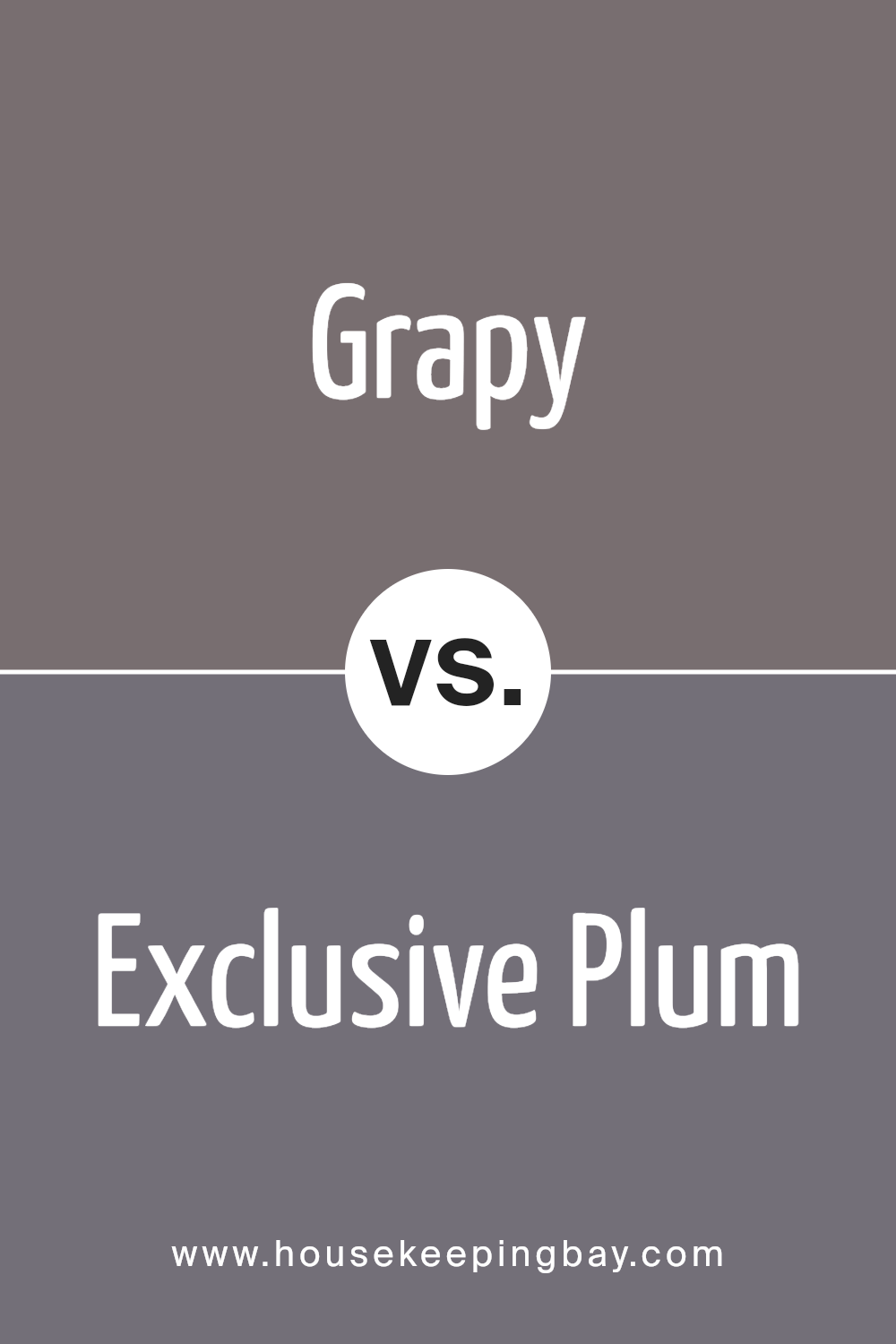
Grapy SW 7629 by Sherwin Williams vs Exclusive Plum SW 6263 by Sherwin Williams
Grapy SW 7629 by Sherwin Williams and Exclusive Plum SW 6263 offer rich, deep hues, but they differ in their undertones and mood. Grapy has a strong, deep purple character with a hint of gray, giving it a velvety, muted look. It feels cozy and can add a sense of calm and sophistication to a room. This makes it well-suited for spaces where relaxation is desired, like a bedroom or reading nook.
Exclusive Plum, meanwhile, presents a more pronounced, vibrant purple tone. It carries a touch of red, lending it a slightly warmer feel than Grapy.
This color can create a dramatic, bold atmosphere, perfect for making a statement or adding warmth to a living space or feature wall.
You can see recommended paint color below:
- SW 6263 Exclusive Plum
housekeepingbay.com
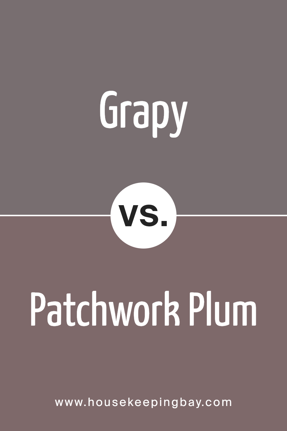
Grapy SW 7629 by Sherwin Williams vs Patchwork Plum SW 0022 by Sherwin Williams
Grapy SW 7629 by Sherwin Williams is a deep, moody purple with gray undertones. It feels sophisticated and calm, lending a contemporary yet cozy vibe to spaces. This color works well in living rooms or bedrooms where a touch of elegance is desired.
Patchwork Plum SW 0022, in contrast, offers a rich, warm plum hue with noticeable red undertones. This color has a traditional feel, adding warmth and richness to interiors. Ideal for dining rooms or libraries, it brings a sense of intimacy and comfort.
While Grapy leans more towards a cooler, muted look, Patchwork Plum suggests a warmer, bolder statement. When choosing between these, consider lighting and other decor elements – Grapy suits modern, sleek spaces, whereas Patchwork Plum complements more classic settings. Both colors provide a sense of depth, but they communicate different moods and align with distinct styles.
You can see recommended paint color below:
- SW 0022 Patchwork Plum
housekeepingbay.com
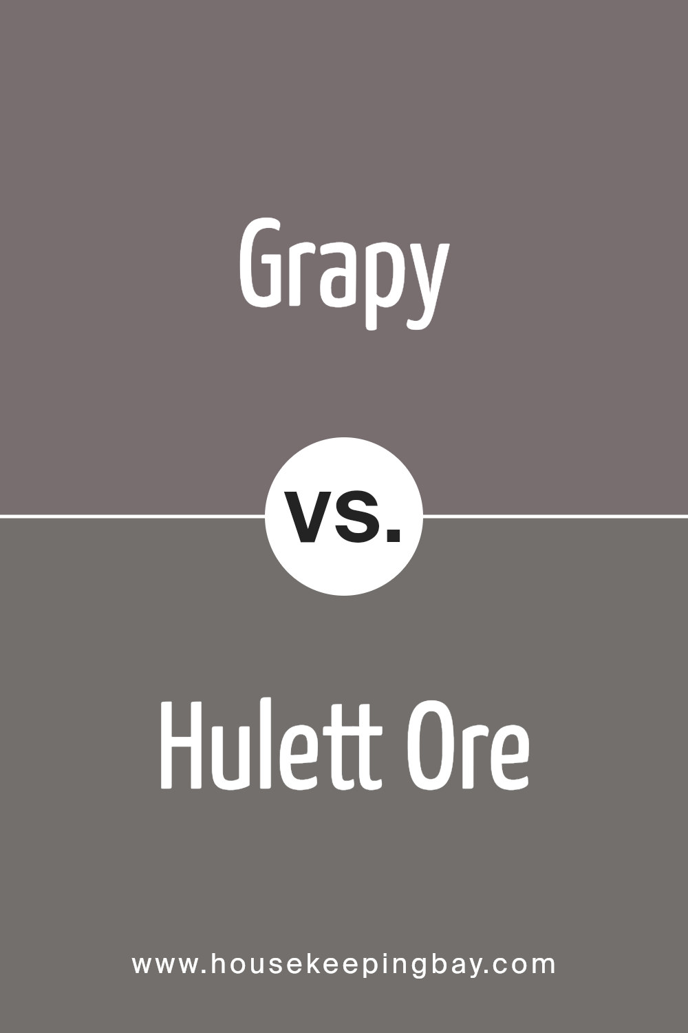
Grapy SW 7629 by Sherwin Williams vs Hulett Ore SW 9574 by Sherwin Williams
Grapy SW 7629 by Sherwin Williams offers a rich, elegant purple. It creates a cozy and sophisticated atmosphere. This deep hue works well in spaces where a touch of drama is desired. With its luxurious undertones, it pairs beautifully with lighter neutrals, adding a sense of depth without overwhelming the space.
Hulett Ore SW 9574 by Sherwin Williams, meanwhile, brings a warm, earthy brown to the table. This color has a grounding effect, making a room feel stable. It has a more rustic and organic vibe, perfect for creating a welcoming environment.
Its natural tone complements wood accents and can match well with greens and other earth shades.
While Grapy feels bold and rich, Hulett Ore provides a warm and organic feel. Both can enhance a room, but their impact differs. Grapy might suit a modern or luxury-themed space, while Hulett Ore fits comfortably in rustic or nature-inspired settings.
You can see recommended paint color below:
- SW 9574 Hulett Ore
housekeepingbay.com
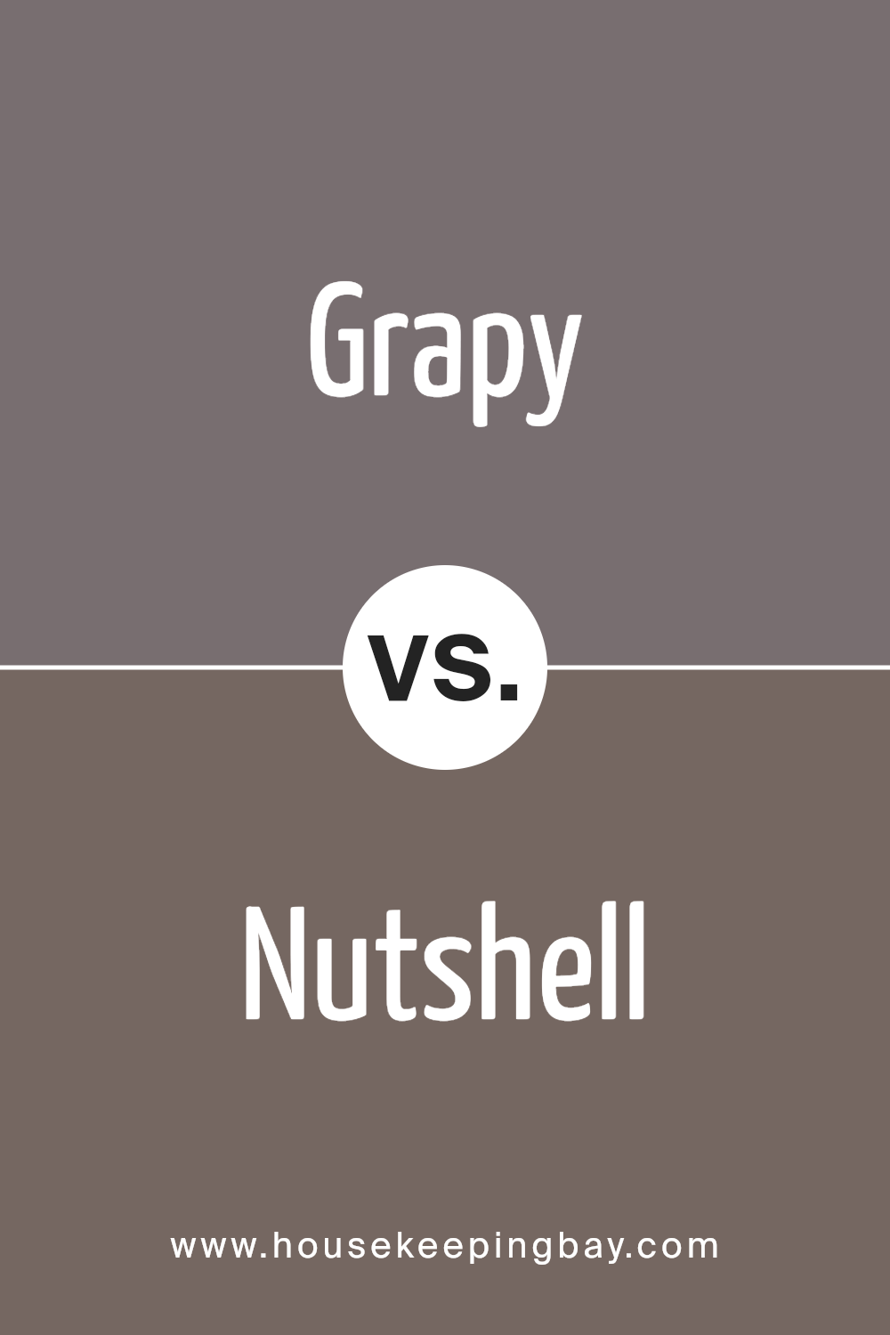
Grapy SW 7629 by Sherwin Williams vs Nutshell SW 6040 by Sherwin Williams
Grapy SW 7629 by Sherwin Williams is a deep, muted purple that conveys a sense of warmth and richness. This color brings a cozy yet sophisticated ambiance to any space. It’s a great choice for creating an inviting atmosphere in living rooms or dining areas. The color can complement both modern and classic furniture, adding a unique touch to interiors.
Nutshell SW 6040 by Sherwin Williams, contrastingly, is a warm, earthy brown. This hue offers a grounded, natural feel, lending a comforting and rustic vibe to spaces.
It’s versatile and pairs well with neutral tones or brighter accents, perfect for walls or furniture in any room seeking a cozy, organic look.
When comparing these two hues, Grapy’s rich purple lends drama and elegance, suitable for spaces looking for a bold statement.
In contrast, Nutshell provides warmth and earthy coziness, ideal for interiors seeking a gentle, inviting presence. Both can create unique impressions based on their application in different settings.
You can see recommended paint color below:
housekeepingbay.com
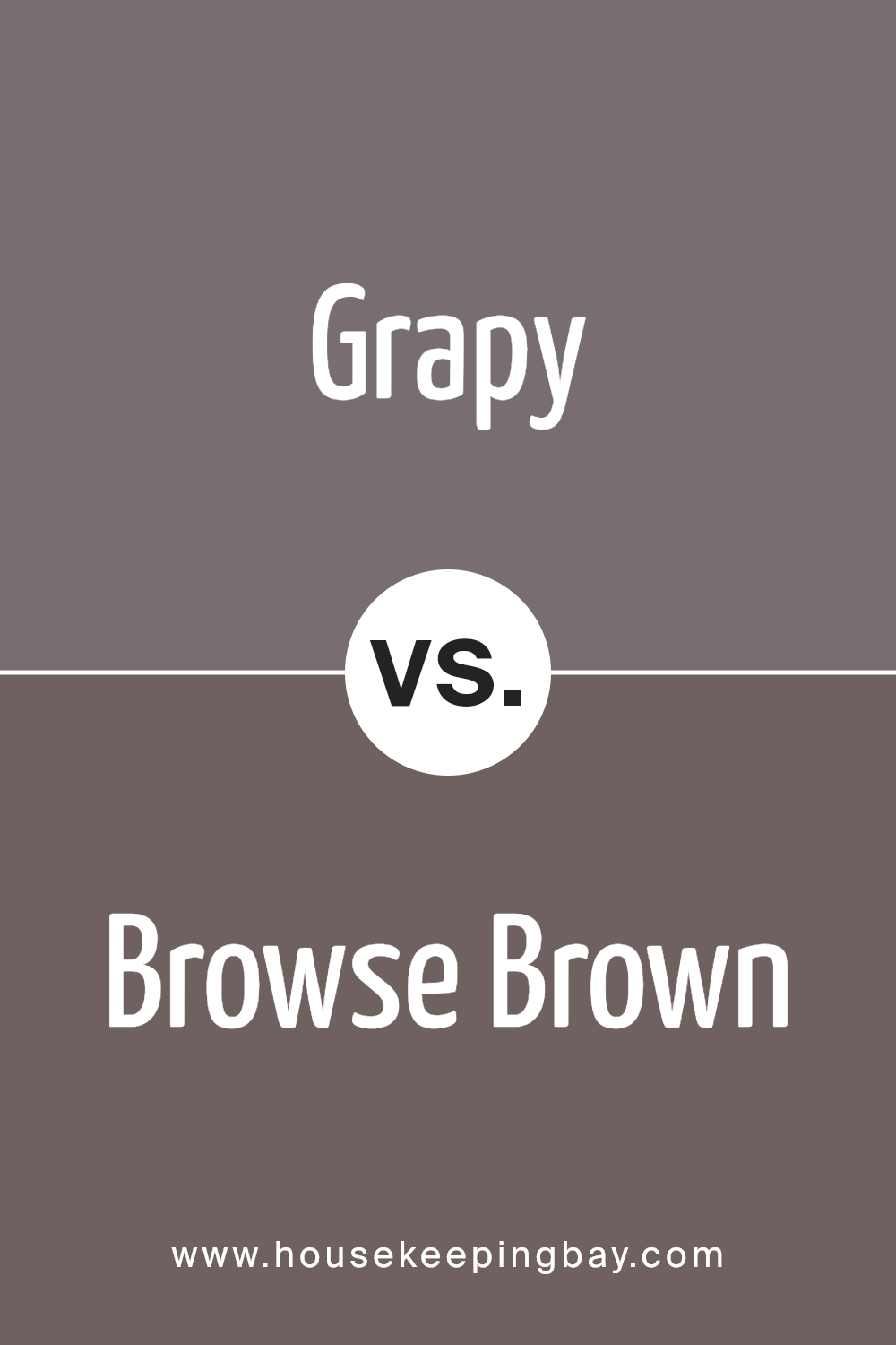
Grapy SW 7629 by Sherwin Williams vs Browse Brown SW 6012 by Sherwin Williams
Grapy SW 7629 and Browse Brown SW 6012, both by Sherwin Williams, offer unique color experiences. Grapy is a rich, deep purple with a sophisticated vibe. It brings warmth and a sense of luxury to any space. This color can create a cozy atmosphere, making it perfect for areas like bedrooms or living rooms where relaxation is key.
Browse Brown, however, provides an earthy, grounding effect. It’s a warm, chocolatey shade that feels inviting and stable. This color works well in spaces where a nurturing and comforting ambiance is desired, such as in dining rooms or libraries.
While Grapy adds a bold and regal touch, Browse Brown imparts a natural, soothing presence. Both colors can complement a range of styles and decor, yet each brings its own distinct character to a setting. Whether you prefer the richness of purple or the warmth of brown, these shades offer individual charm and personality.
You can see recommended paint color below:
- SW 6012 Browse Brown
housekeepingbay.com
Grapy SW 7629 by Sherwin Williams vs Soulmate SW 6270 by Sherwin Williams
Grapy SW 7629 and Soulmate SW 6270 are two rich colors from Sherwin Williams that offer distinct vibes. Grapy is a deep, muted purple with undertones that can sometimes appear grayish. It projects a calm and sophisticated atmosphere, making it ideal for spaces seeking a touch of elegance. Its subtle warmth adds depth without overwhelming the room.
Soulmate SW 6270, a darker shade of purple, leans more into the dramatic and moody spectrum. Its strong presence can create a cozy, intimate feeling in a space.
While both colors belong to the purple family, Soulmate is bolder, making it suitable for accent walls or smaller spaces where you want a more daring look.
In summary, Grapy provides a softer, more understated elegance, perfect for a serene environment, while Soulmate offers a striking, rich tone that adds drama and intimacy. Each color is unique, contributing its own character to interior spaces.
You can see recommended paint color below:
- SW 6270 Soulmate
housekeepingbay.com
Grapy SW 7629 by Sherwin Williams vs Garret Gray SW 6075 by Sherwin Williams
Grapy SW 7629 and Garret Gray SW 6075 by Sherwin Williams offer distinct personalities in design. Grapy is a rich, deep purple hue with a sophisticated and bold presence. It creates a dramatic backdrop, ideal for spaces seeking a touch of luxury or creativity. The color can make a strong statement in a room, often adding a sense of depth and interest.
Conversely, Garret Gray is warm and earthy. This neutral tone brings a sense of calm and coziness to a space. Its versatility makes it a great choice for various settings, from living areas to bedrooms.
Garret Gray’s subtle warmth helps it blend seamlessly with other colors, making it a reliable option for those who prefer understated elegance.
In summary, Grapy stands out with its vivid intensity, while Garret Gray offers warmth and versatility. Both have unique qualities, suitable for different atmospheres within a home.
You can see recommended paint color below:
housekeepingbay.com
Grapy SW 7629 by Sherwin Williams vs Folkstone SW 6005 by Sherwin Williams
Grapy SW 7629 by Sherwin Williams wears a rich, deep purple that brings a cozy and warm feeling to any space. Its boldness creates a striking appearance, making it a great choice for accent walls or dramatic, statement rooms. The color evokes a sense of sophistication and mystery, often adding depth and intensity to interiors.
Folkstone SW 6005 by Sherwin Williams presents a medium to dark gray with a slight warm undertone. It’s versatile and pairs well with numerous color schemes. Folkstone adds a neutral backdrop, providing balance and a soothing atmosphere.
It suits various styles, ranging from modern to traditional, without overpowering other elements.
When you pair Grapy with Folkstone, the two colors complement each other beautifully; Grapy’s vivid personality contrasts with Folkstone’s calm stability.
This combination can effectively highlight architectural details while offering a harmonious and balanced look. It makes for a dynamic yet grounded room design.
You can see recommended paint color below:
- SW 6005 Folkstone
housekeepingbay.com
Conclusion
This shade, with its rich and engaging hue, brings a sense of elegance wherever it’s used. Its unique character offers a balance between boldness and subtlety, allowing it to fit seamlessly into various spaces.
Whenever I see this color, I sense a comfortable warmth and a certain kind of mystery that creates a welcoming atmosphere. It’s not just about bringing in a color—it’s about adding personality and depth to a room.
Whether you choose it for an accent wall or paint an entire room, it evokes a sense of coziness while maintaining a stylish appeal.
I appreciate how versatile SW 7629 Grapy proves to be. It works well in different lighting, shifting its appearance subtly and keeping the space interesting. It pairs beautifully with neutrals and other complementary colors, making it easy to integrate with existing décor.
In choosing SW 7629 Grapy, I find a color that doesn’t overpower, but rather enhances and enriches a space. It provides an opportunity to bring a touch of sophisticated color into everyday surroundings, offering an appealing and timeless choice for any home.
housekeepingbay.com
Ever wished paint sampling was as easy as sticking a sticker? Guess what? Now it is! Discover Samplize's unique Peel & Stick samples. Get started now and say goodbye to the old messy way!
Get paint samples


