Chinchilla SW 6011 by Sherwin Williams
A Cozy Shade That Invites Warmth and Style
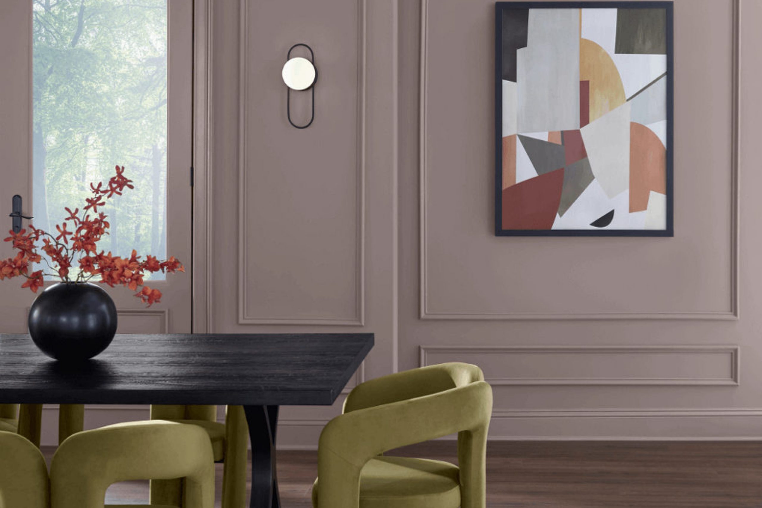
When I came across Sherwin Williams’ SW 6011 Chinchilla, I noticed its unique character. This color, a rich and gentle hue, caught my attention as something that can truly enhance a space. Chinchilla has a subtle depth that feels warm and inviting, making it an excellent choice for any room where comfort and style are key.
The beauty of Chinchilla lies in its ability to complement a wide range of styles. Whether you prefer modern, traditional, or something in between, this hue fits right in.
It has a natural way of calming a room without making it feel dull. The softness of the color can bring a serene atmosphere that’s perfect for a bedroom or living area.
One thing I like about Chinchilla is its ability to play well with other colors. Pair it with crisp whites or creamy off-whites to highlight its warmth. For a bolder look, consider deep greens or blues for a striking contrast.
Its versatility ensures that wherever you use it, it will add a touch of elegance and comfort that you’ll love to come home to.
via sherwin-williams.com
What Color Is Chinchilla SW 6011 by Sherwin Williams?
Table of Contents
Chinchilla SW 6011 by Sherwin Williams is a soft, muted gray with a hint of purple. This soothing shade brings a gentle, comforting atmosphere to any space. It creates a sense of coziness and subtle sophistication, making it suitable for a variety of interior styles.
In modern and contemporary settings, Chinchilla acts as a muted backdrop that complements sleek lines and minimalist decor. Its understated elegance is perfect for Scandinavian style, where it pairs beautifully with light woods and simple, functional furnishings.
In traditional interiors, Chinchilla offers a fresh alternative to classic neutrals, adding depth without overwhelming.
This color harmonizes well with various materials and textures. It complements natural textiles like cotton, linen, and wool, enhancing their softness and warmth. Metals such as brushed nickel or soft gold add a hint of elegance, while wood finishes—whether light oak or rich walnut—deepen the palette and bring out Chinchilla’s warm undertones.
Chinchilla’s calming quality makes it ideal for bedrooms and living rooms, where relaxation is key. It also works well in bathrooms, imparting a spa-like ambiance when paired with white or light marble accents. Overall, Chinchilla SW 6011 adapts well, offering a quiet, versatile backdrop for countless design possibilities.
housekeepingbay.com
Is Chinchilla SW 6011 by Sherwin Williams Warm or Cool color?
Chinchilla SW 6011 by Sherwin Williams is a beautiful color that adds warmth to any space. This shade, a soft and muted gray with a hint of purple, creates a cozy and inviting atmosphere. In living rooms, it provides a calming backdrop that pairs well with both modern and traditional furnishings. Its subtle undertones can make a room feel more sophisticated and put together.
In bedrooms, Chinchilla can help create a serene environment, perfect for relaxation and rest. It complements neutral bedding and works well with pops of color in accessories like pillows and artwork.
In kitchens or dining areas, this color can enhance cabinetry or walls, adding a touch of elegance without overpowering the space.
Chinchilla SW 6011 works well with natural light, highlighting its warm tones, yet also maintains its charm under artificial lighting. Overall, this color adds a touch of refinement and comfort to any home.
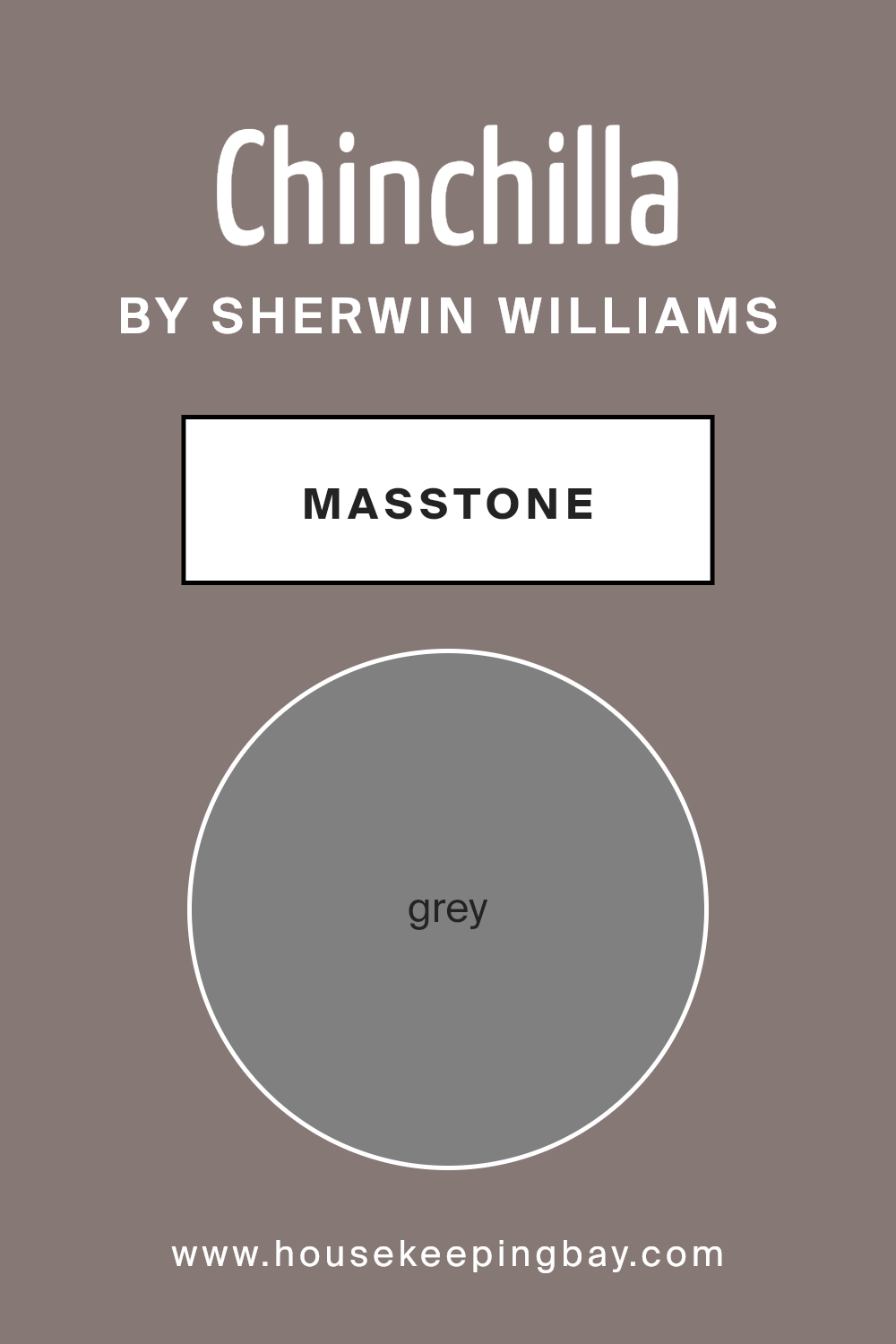
What is the Masstone of the Chinchilla SW 6011 by Sherwin Williams?
Chinchilla SW 6011 by Sherwin Williams is a gentle, calming grey shade from their color collection. This color, with a masstone of grey (#808080), offers great versatility in home design. Its neutral characteristic allows it to blend smoothly with various décor styles and color schemes.
In a living room, it creates a relaxed and inviting atmosphere, complementing both modern and traditional furniture. In bedrooms, it promotes restfulness, encouraging a serene environment for sleep. Grey’s neutral property means it can work as an excellent backdrop, allowing vibrant colors in art and furnishings to stand out.
When used in kitchens or bathrooms, it can lend a sense of cleanliness and order. Additionally, Chinchilla SW 6011’s subtle undertones make spaces seem brighter and more spacious without feeling too stark or cold. Overall, this color serves as an ideal choice for those looking to create a balanced, harmonious feel in their homes.
housekeepingbay.com
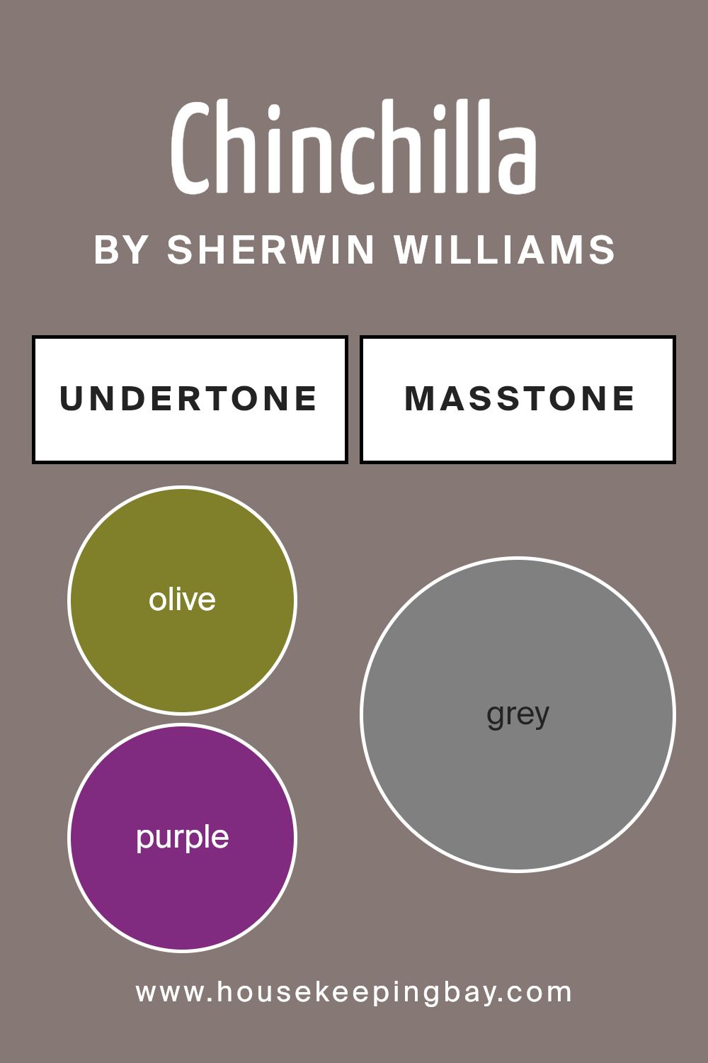
Undertones of Chinchilla SW 6011 by Sherwin Williams
Chinchilla SW 6011 by Sherwin Williams features a mix of complex undertones that change how people see this color. Undertones are the subtle colors underneath the main shade and can significantly alter how paint looks depending on lighting and surrounding colors. For Chinchilla SW 6011, these undertones include olive, purple, pale pink, dark turquoise, mint, and others like brown and dark grey. These hints can make Chinchilla SW 6011 look different in various settings.
In a room, the purple and lilac undertones might stand out, giving Chinchilla a soft, soothing feel. This can be calming in a bedroom or reading nook. The presence of dark green and navy undertones might help it work well in rooms with lots of natural light, creating a more grounded atmosphere.
On the other hand, pale yellow and light gray can brighten the color, making it look more uplifting and versatile.
Chinchilla’s rich combination of undertones makes it adaptable. In bright, natural light, some undertones like mint or turquoise might appear more vibrant.
In dim light or areas with limited sunlight, the paint could seem softer with hints of light purple or pale pink showing through. This versatile shade means it can suit many styles and moods in home interiors.
housekeepingbay.com
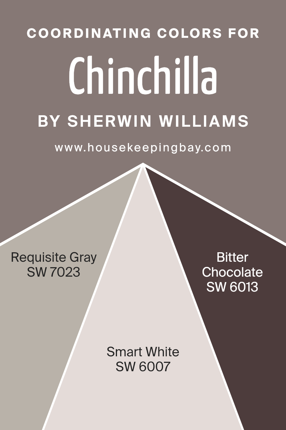
Coordinating Colors of Chinchilla SW 6011 by Sherwin Williams
Coordinating colors are hues that work well together, creating a harmonious and balanced look in a room. They complement each other and enhance the overall aesthetic of a space. When working with Chinchilla SW 6011 by Sherwin Williams, selecting coordinating colors involves choosing shades that blend seamlessly while adding depth and interest.
SW 7023, known as Requisite Gray, is a versatile, warm gray with a hint of beige. It works effortlessly as an anchor color, offering a neutral base that pairs beautifully with both light and dark colors.
SW 6007, Smart White, is a soft, clean white with subtle warmth, providing a crisp and fresh feel without appearing too stark. It adds brightness and clarity, making a room feel more open and airy. Lastly, SW 6013, Bitter Chocolate, offers a rich, deep brown with undertones of red, adding an element of depth and sophistication.
It creates a striking contrast when used with lighter shades, adding a sense of coziness and richness. Together, these coordinating colors form a cohesive palette that complements Chinchilla, allowing for a well-designed environment that feels both comfortable and stylish.
You can see recommended paint colors below:
- SW 7023 Requisite Gray
- SW 6007 Smart White
- SW 6013 Bitter Chocolate
housekeepingbay.com
How Does Lighting Affect Chinchilla SW 6011 by Sherwin Williams?
Lighting plays a significant role in how we perceive colors. Different light sources, whether natural or artificial, can alter the appearance of a paint color, making it look lighter, darker, warmer, or cooler. The paint color Chinchilla SW 6011 by Sherwin Williams is no exception. It’s a soft, muted gray with subtle browns or taupe undertones. How it looks can change based on the lighting conditions of a room.
In artificial light, such as incandescent or LED bulbs, Chinchilla may appear warmer or even a bit darker than in natural light. Incandescent bulbs, with their warm glow, might bring out the warm undertones in Chinchilla, making it feel cozier.
LED lighting can be cooler or more neutral, so they might highlight the gray aspect of the color.
In natural light, the color’s appearance can shift depending on the room’s orientation:
- 1. North-facing rooms tend to have a cooler, bluish light. This can make colors like Chinchilla seem cooler and possibly darker. The gray aspect of the color may become more pronounced in these conditions.
- 2. South-facing rooms receive a warm, golden light throughout the day. Chinchilla can appear lighter and warmer, emphasizing any taupe undertones, making the room feel bright and welcoming.
- 3. East-facing rooms have cooler light in the morning and warmer light in the afternoon. This means Chinchilla might look cooler early in the day and then warm up as the day progresses.
- 4. West-facing rooms experience the opposite, with warmer light later in the day. In the morning, Chinchilla might appear cooler and become warmer, with richer hues in the evening.
Overall, it’s essential to test the color in different lighting conditions to see how it fits the intended space. This ensures that the color meets expectations and complements the overall room design.

housekeepingbay.com
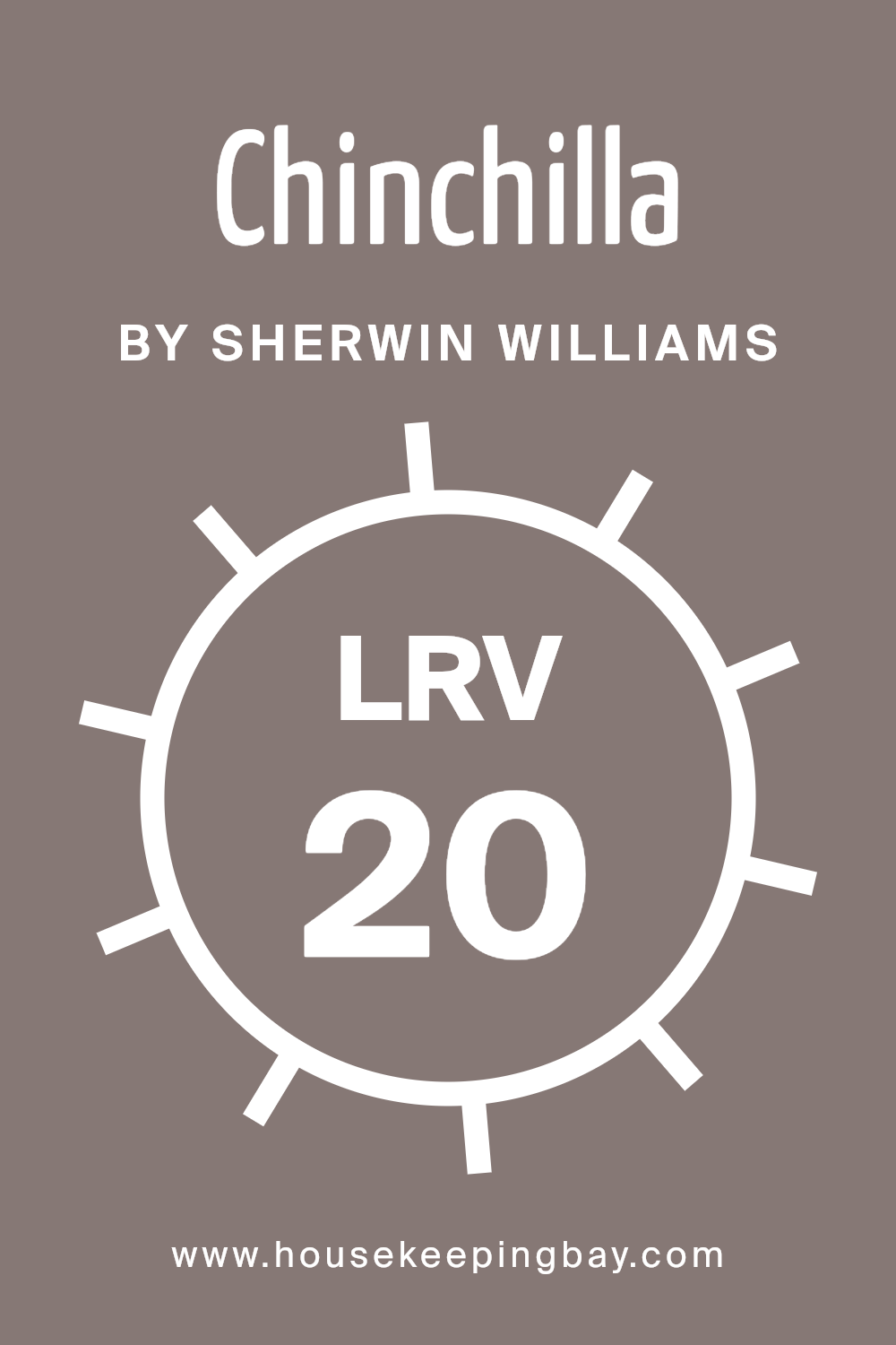
What is the LRV of Chinchilla SW 6011 by Sherwin Williams?
Light Reflectance Value (LRV) measures how much light a paint color reflects. On a scale of 0 to 100, pure black is 0, and pure white is 100. Higher LRV numbers mean more light reflection, making spaces feel brighter, while lower LRVs absorb light, making spaces feel cozier and sometimes smaller. High LRV colors can make a room feel expansive or airy, while low LRV colors might create a more intimate or moody atmosphere.
Sherwin Williams’ Chinchilla, with an LRV of 19.774, falls on the lower end of the scale. This means that Chinchilla will absorb more light than it reflects. On walls, this color might make a room feel cozy and enveloping. It won’t brighten a space but can add warmth and depth.
In a room with ample natural light, Chinchilla can provide a rich and inviting backdrop without overwhelming. In low-light areas, it may make the room appear darker and more intimate.
housekeepingbay.com
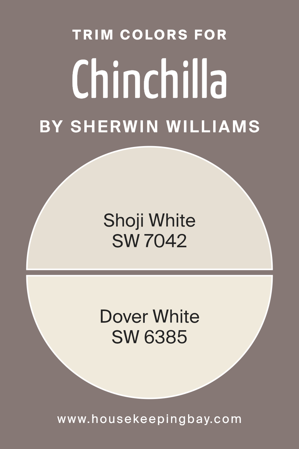
What are the Trim colors of Chinchilla SW 6011 by Sherwin Williams?
Trim colors are the shades used on doors, windows, and moldings that complement and highlight the main wall color, providing a neat and finished look. For a paint like Chinchilla SW 6011 by Sherwin Williams, choosing the right trim color helps in enhancing the warmth and richness of the main color while creating a balanced contrast.
Trim colors play a vital role in defining the style and mood of the space. They help in framing the room’s features, adding depth, and making the overall design more cohesive. By selecting appropriate trim colors, you ensure the main wall color like Chinchilla stands out beautifully while maintaining harmony within the room.
Shoji White SW 7042 is a soft, off-white hue with subtle warm undertones that provides a gentle and clean backdrop, perfect for enhancing the comforting tones of Chinchilla. It offers a crisp, seamless finish, making spaces look airy and bright.
Dover White SW 6385, on the other hand, contains a touch of cream, lending a cozy, welcoming feel to the trim. It complements Chinchilla by adding a touch of warmth, while still keeping the design elegant and inviting.
Together, these trim colors offer a perfect balance that uplifts the overall space without overpowering the main shade.
You can see recommended paint colors below:
housekeepingbay.com
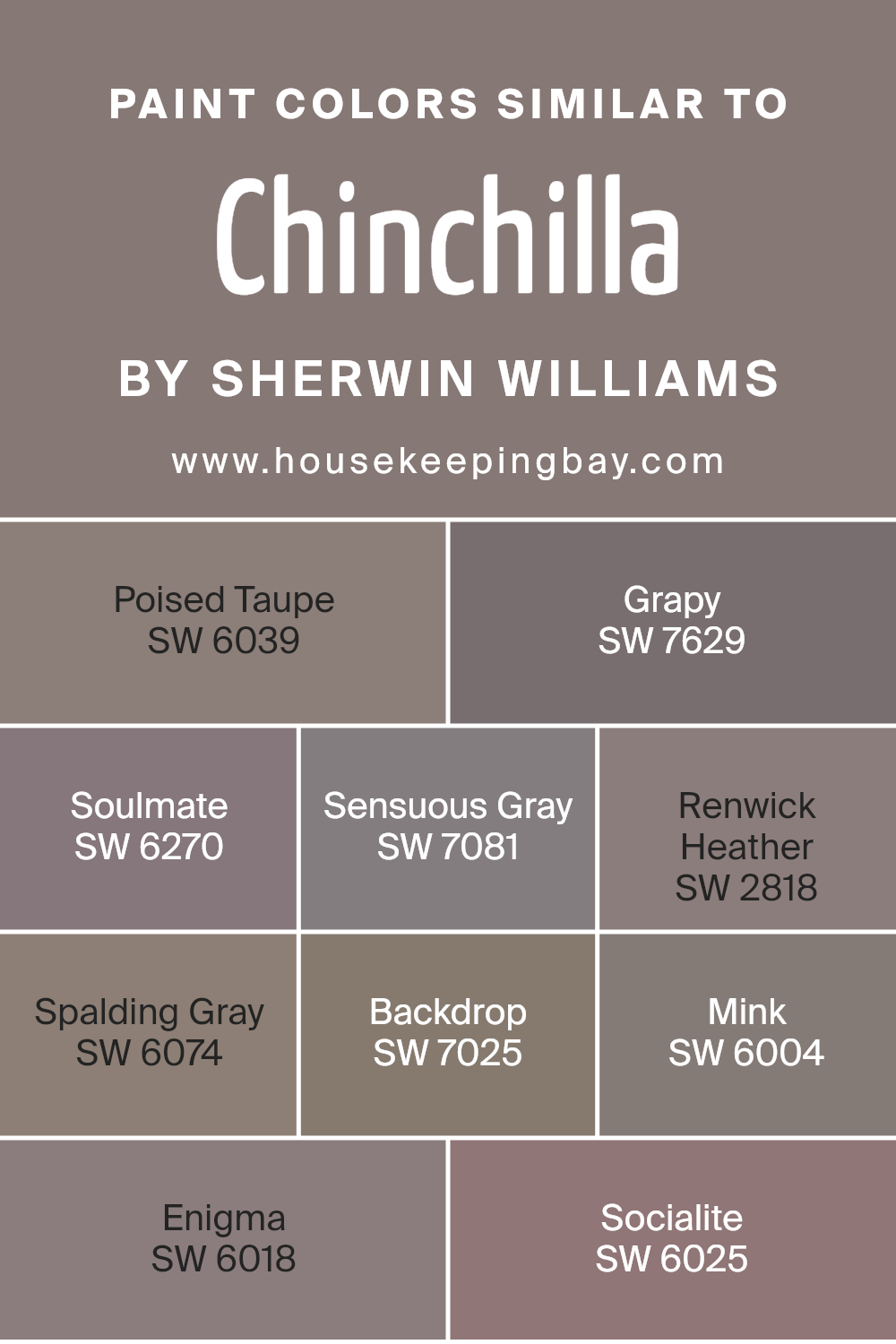
Colors Similar to Chinchilla SW 6011 by Sherwin Williams
Similar colors are important in design because they create harmony and cohesion within a space. By using hues that are similar to Chinchilla SW 6011 by Sherwin-Williams, you can smoothly connect different elements of a room, making it feel unified and balanced. Poised Taupe SW 6039 offers an earthy taupe with a hint of warmth, setting a cozy mood.
Grapy SW 7629 introduces a deep, muted purple that feels both rich and comforting. Soulmate SW 6270 wraps your space in a soft, romantic purple, perfect for adding a touch of elegance.
Sensuous Gray SW 7081 strikes a balance between cool and warm with its versatile gray, working well as a neutral backdrop. Renwick Heather SW 2818 gives an earthy brown with soft purple undertones, adding depth.
Spalding Gray SW 6074, with its muted gray tone, provides a subtle sophistication.
Backdrop SW 7025 is a reliable neutral with an understated warmth, great for grounding any room. Mink SW 6004 employs a deep, dark taupe that brings a sense of intimacy. Enigma SW 6018, with its profound blend of gray and purple, feels mysterious yet inviting.
Finally, Socialite SW 6025, an elegant mauve, introduces a gentle touch of color that feels effortless. These similar colors work together by maintaining a cohesive palette that is easy on the eyes.
They add subtle variety within a theme, ensuring a room feels both coordinated and interesting.
You can see recommended paint colors below:
- SW 6039 Poised Taupe
- SW 7629 Grapy
- SW 6270 Soulmate
- SW 7081 Sensuous Gray
- SW 2818 Renwick Heather
- SW 6074 Spalding Gray
- SW 7025 Backdrop
- SW 6004 Mink
- SW 6018 Enigma
- SW 6025 Socialite
housekeepingbay.com
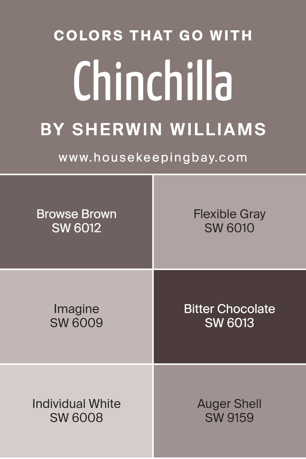
Colors that Go With Chinchilla SW 6011 by Sherwin Williams
Selecting colors that complement Chinchilla SW 6011 by Sherwin Williams enriches any space by creating harmony and balance in the design. Chinchilla’s soft, muted purple-gray tone serves as an elegant backdrop, making it essential to choose colors that enhance its subtle charm.
A good pair is SW 6012 – Browse Brown, offering a warm and earthy essence that grounds the room, creating a cozy atmosphere. SW 6010 – Flexible Gray acts as a versatile neutral that seamlessly integrates other colors, providing a sophisticated contrast without overwhelming the senses.
SW 6009 – Imagine brings a light-hearted, dreamy vibe to any setting. With its soft, creamy undertone, it harmonizes beautifully with Chinchilla by adding a touch of warmth. SW 6013 – Bitter Chocolate adds depth and richness, perfectly complementing Chinchilla’s quiet elegance with its darker, intense hue.
For a clean finish, SW 6008 – Individual White provides a crisp freshness that brightens the space, ensuring the other colors pop against its simplicity.
Lastly, SW 9159 – Auger Shell introduces a subtle, warm undertone, adding a cozy, inviting feeling. Together, these colors work in unison to create a balanced and comfortable environment, enhancing each other’s strengths while maintaining visual interest.
You can see recommended paint colors below:
- SW 6012 Browse Brown
- SW 6010 Flexible Gray
- SW 6009 Imagine
- SW 6013 Bitter Chocolate
- SW 6008 Individual White
- SW 9159 Auger Shell
housekeepingbay.com
How to Use Chinchilla SW 6011 by Sherwin Williams In Your Home?
Chinchilla SW 6011 by Sherwin Williams is a cozy, warm color with a subtle hint of gray and purple. It creates a comforting atmosphere, making it ideal for spaces where relaxation matters, like bedrooms or living rooms. This color pairs well with neutral shades like cream or beige, creating a balanced look.
For a welcoming hallway, use Chinchilla on the walls and add white trim for contrast. In the living room, it enhances wooden furniture and complements soft furnishings in muted tones. In the bedroom, it provides a backdrop for simple, elegant bedding and soft lighting.
Chinchilla also works nicely in a home office, offering a soft, calming background that promotes focus. Pair it with a darker accent color on one wall for character. Accessorize with metallic or glass elements to reflect light, adding brightness to the room. Chinchilla SW 6011 truly offers versatility for various home settings.
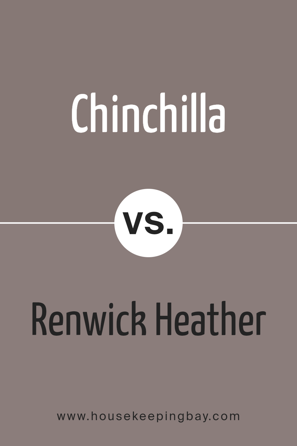
Chinchilla SW 6011 by Sherwin Williams vs Renwick Heather SW 2818 by Sherwin Williams
Chinchilla SW 6011 and Renwick Heather SW 2818, both by Sherwin Williams, offer distinct tones perfect for different styles. Chinchilla is a soft blend of gray and violet. It feels gentle and cozy, making it great for calming spaces like bedrooms or reading nooks. It balances well with both warm and cool colors, creating versatile design possibilities.
Renwick Heather has rich, deep tones with a mix of brown and purple. It feels warm and enveloping, adding a sense of elegance to rooms. This color works well in dining rooms or any space needing a touch of sophistication. It pairs beautifully with other warm, muted tones, enhancing its depth.
Together, these colors can create interesting contrasts. Use Chinchilla for a light, airy effect and Renwick Heather for depth and warmth. Both colors, with their unique vibes, contribute richness and variation to any home decor scheme.
You can see recommended paint color below:
- SW 2818 Renwick Heather
housekeepingbay.com
Chinchilla SW 6011 by Sherwin Williams vs Mink SW 6004 by Sherwin Williams
Chinchilla SW 6011 by Sherwin Williams is a soft, warm gray with hints of brown, creating a cozy and inviting feel. It’s a versatile color that can fit seamlessly into various designs, adding a touch of warmth to any room. Its gentle undertones make it suitable for living rooms or bedrooms, providing a sense of calm and comfort.
Mink SW 6004 by Sherwin Williams leans more towards a deeper, richer brown-gray. It exudes a sense of sophistication and elegance. This color works well in spaces where a more dramatic and moody atmosphere is desired. It can be an excellent choice for accent walls or areas that benefit from a touch of depth.
Comparing the two colors, Chinchilla brings a lighter, warmer energy, perfect for relaxed spaces. In contrast, Mink offers a deeper, more luxurious feel, ideal for making bold design statements. Both colors offer unique appeal with differing intensities.
You can see recommended paint color below:

housekeepingbay.com
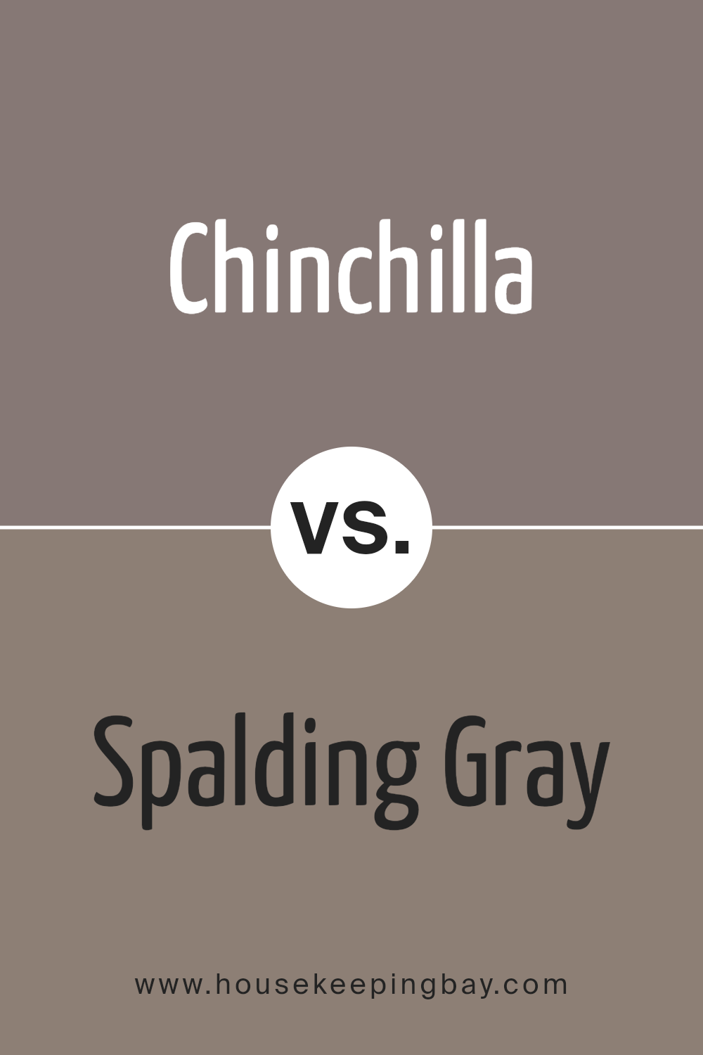
Chinchilla SW 6011 by Sherwin Williams vs Spalding Gray SW 6074 by Sherwin Williams
Chinchilla SW 6011 by Sherwin Williams is a warm, muted mauve with undertones of gray, delivering a cozy feel. This shade works well in spaces seeking a soft, inviting atmosphere. It’s ideal for creating a relaxing environment in areas like bedrooms or living rooms, as it adds a gentle touch without overwhelming a space.
Spalding Gray SW 6074, in contrast, leans more towards a warm greige, combining gray and beige elements. This color offers a neutral backdrop, making it versatile for various design styles.
It pairs well with both traditional and contemporary decor. This hue can add a sense of sophistication to any room, serving as a subtle, grounding backdrop for more vibrant accents.
Both Chinchilla and Spalding Gray provide warmth and subtlety, yet Chinchilla projects a slight color whisper of mauve, while Spalding Gray remains steadfast in its neutral stance.
Choosing between them depends on whether you prefer a touch of muted color or a classic neutral.
You can see recommended paint color below:
- SW 6074 Spalding Gray
housekeepingbay.com
Chinchilla SW 6011 by Sherwin Williams vs Soulmate SW 6270 by Sherwin Williams
Chinchilla SW 6011 by Sherwin Williams is a warm, muted, taupe-like shade with a subtle hint of gray. It offers a neutral base, providing a cozy feel to spaces, making it an excellent choice for creating a comforting atmosphere. It pairs well with both light and dark accents, offering great versatility for any room in the house.
Soulmate SW 6270, in contrast, presents a deeper, more dramatic shade. It’s a rich plum color, offering vibrancy and a sense of luxury. This color adds intensity to a room and can create a bold statement when used as a feature wall or in a smaller space.
Chinchilla is more understated and adaptable, suitable for larger areas or where a subtle background is desired. Soulmate adds more character and works well when aiming for a strong visual impact.
Both colors can enhance an interior but serve different purposes, with Chinchilla providing calm and Soulmate adding energy.
You can see recommended paint color below:
- SW 6270 Soulmate

housekeepingbay.com
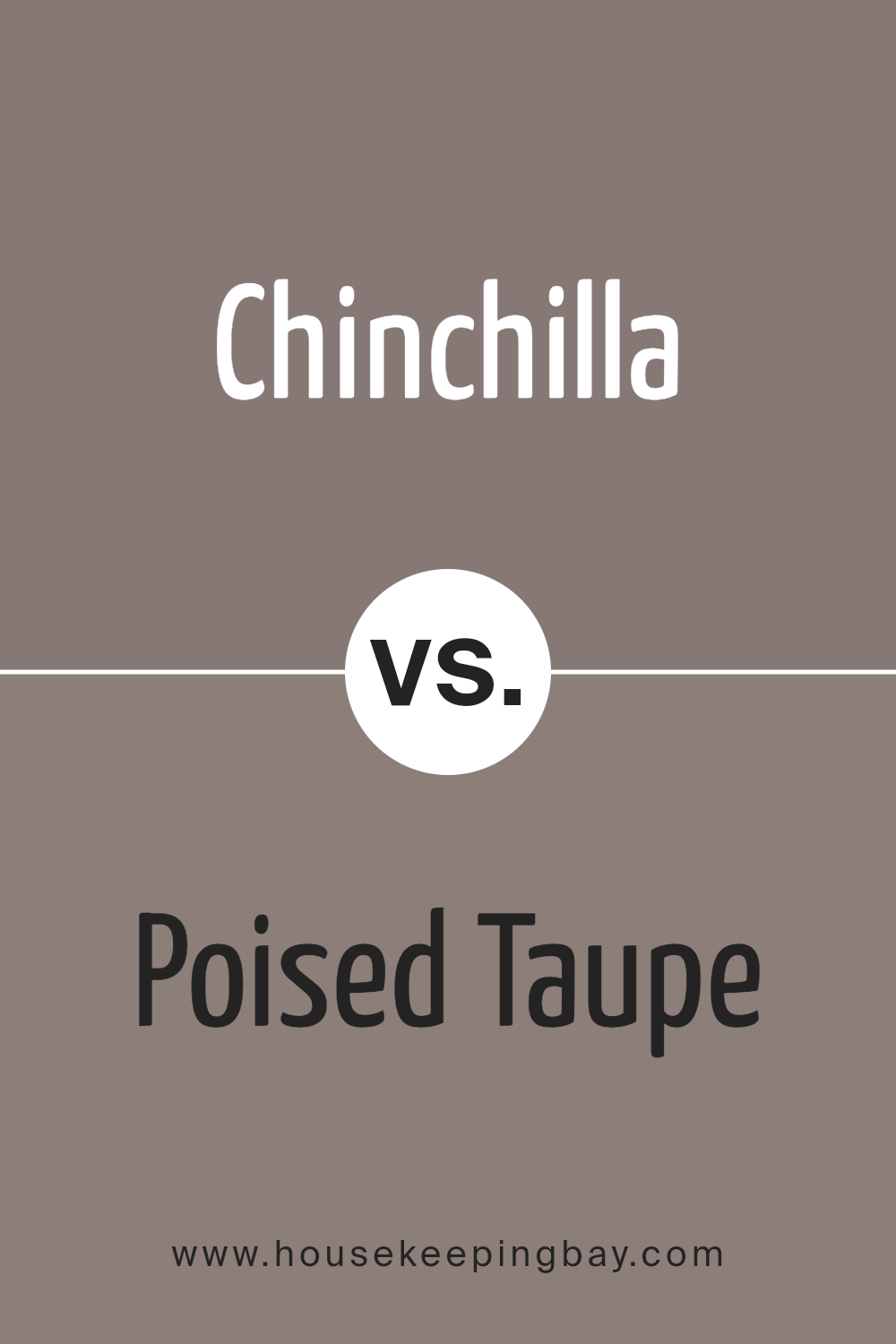
Chinchilla SW 6011 by Sherwin Williams vs Poised Taupe SW 6039 by Sherwin Williams
Chinchilla SW 6011 by Sherwin Williams presents a soft, muted gray with subtle brown undertones. It creates a cozy and warm atmosphere, making it ideal for bedrooms or living spaces that need a calming touch. This color pairs well with creams or pale blues, enhancing its soothing appeal. It’s versatile, fitting modern or traditional settings without being overpowering.
Poised Taupe SW 6039, however, leans closer to a rich blend of gray and brown, offering a deeper, more grounded hue. Warm yet bold, it carries a sense of earthy elegance, lending depth to spaces like living rooms or offices where sophistication is desired. It complements earthy tones like rust or deep greens beautifully.
Both hues provide timeless appeal with their neutral bases, yet Chinchilla feels lighter and more airy, while Poised Taupe brings stronger warmth and presence, letting it stand out more prominently in your design palette.
You can see recommended paint color below:
housekeepingbay.com
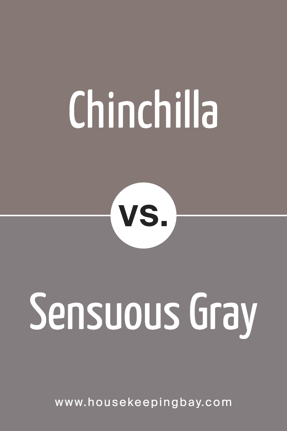
Chinchilla SW 6011 by Sherwin Williams vs Sensuous Gray SW 7081 by Sherwin Williams
Chinchilla SW 6011 by Sherwin Williams is a warm, muted taupe with a touch of gray. It adds coziness and comfort to spaces, making it ideal for living rooms or bedrooms where relaxation is essential. This color suits traditional and modern designs, offering versatility and warmth.
Sensuous Gray SW 7081 by Sherwin Williams, however, is a soft, cool gray with a hint of purple, lending a modern and sophisticated feel. This color works well in contemporary settings and pairs nicely with whites or deeper grays. Its subtle undertone adds depth, creating an elegant atmosphere.
While Chinchilla leans towards warmth and earthy tones, Sensuous Gray tends towards coolness and subtle sophistication. Both have their distinctive characters but serve different moods. Chinchilla gives a homey feel, making rooms feel intimate, whereas Sensuous Gray offers a more polished look, perfect for those seeking elegance. Each has its unique charm, suitable for various tastes and spaces.
You can see recommended paint color below:
- SW 7081 Sensuous Gray
housekeepingbay.com
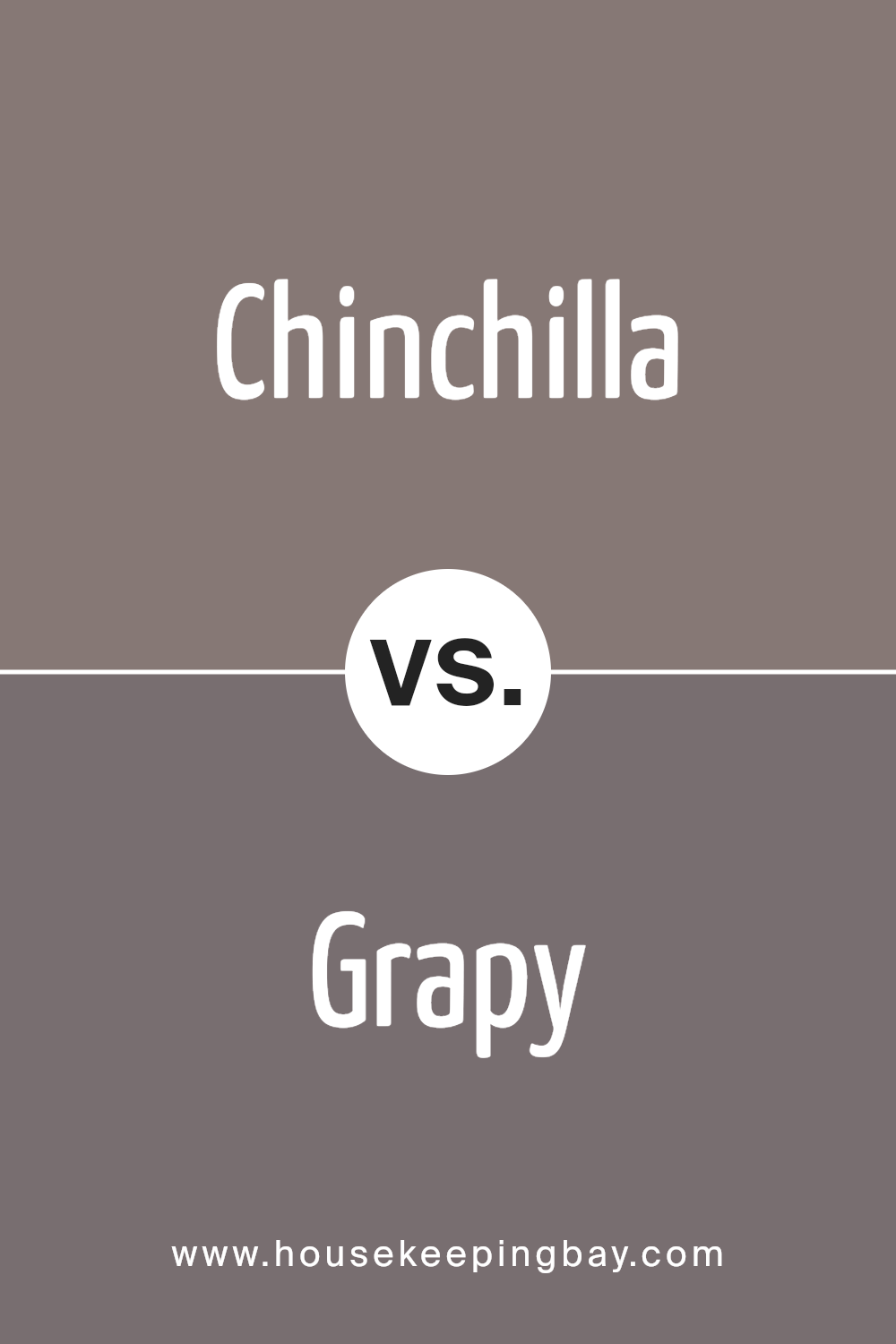
Chinchilla SW 6011 by Sherwin Williams vs Grapy SW 7629 by Sherwin Williams
Chinchilla SW 6011 is a soft, muted brown tone from Sherwin Williams. It is subtle and versatile, making it a great choice for creating a cozy and welcoming feel in any room. Its neutral quality allows it to pair well with many other shades and materials.
Grapy SW 7629, also by Sherwin Williams, presents a bold, deep purple hue. It carries a sense of richness and depth, offering a dramatic touch. This color can make a striking accent wall or add intensity when used more broadly in a space.
While Chinchilla delivers a calming and understated presence, Grapy adds vibrant energy and character. Using these two together could balance serenity with boldness, enhancing spaces by adding layers of interest.
Pairing Chinchilla with Grapy creates a dynamic yet harmonious look, with the subtle warmth of Chinchilla complementing the vivid depth of Grapy.
You can see recommended paint color below:
- SW 7629 Grapy
housekeepingbay.com
Chinchilla SW 6011 by Sherwin Williams vs Socialite SW 6025 by Sherwin Williams
Chinchilla SW 6011 and Socialite SW 6025, both by Sherwin Williams, present intriguing contrasts and complements. Chinchilla is a warm, earthy taupe with hints of gray and brown, creating a soothing backdrop that feels cozy and grounded. It works well in spaces where you want a subtle yet warm atmosphere, blending effortlessly with natural materials and muted tones.
Socialite SW 6025, in contrast, brings in a lively vibe with its slightly more vibrant shade, a rosy pink undertone that exudes energy and elegance. This color adds a touch of sophistication and playfulness, making it ideal for spaces where you wish to inject a sense of style and charisma.
When paired, Chinchilla’s neutrality allows Socialite’s warmth to pop, offering a perfect balance. Together, they create a dynamic visual interest without overpowering a room, making them an excellent choice for different moods and aesthetics.
You can see recommended paint color below:
- SW 6025 Socialite

housekeepingbay.com
Chinchilla SW 6011 by Sherwin Williams vs Enigma SW 6018 by Sherwin Williams
Chinchilla SW 6011 and Enigma SW 6018, both from Sherwin Williams, offer different experiences in color. Chinchilla SW 6011 presents a soft, neutral tone, blending gray and brown in a warm manner. This color works well in creating cozy and inviting spaces, offering a gentle backdrop that complements various home styles and decorations.
In contrast, Enigma SW 6018 provides a more dramatic and bold alternative. With its richer and darker hue, it introduces a sense of mystery and sophistication into any room. Enigma’s deep plum-like tones can make a strong statement and add depth, often suited for feature walls or rooms needing a bit more character.
Choosing between them depends on the desired mood and setting for the space. Chinchilla serves well for calm, everyday settings, offering subtlety and warmth, while Enigma suits those who prefer intensity and visual impact, perfect for an accent or focal point in a designed environment.
You can see recommended paint color below:

housekeepingbay.com
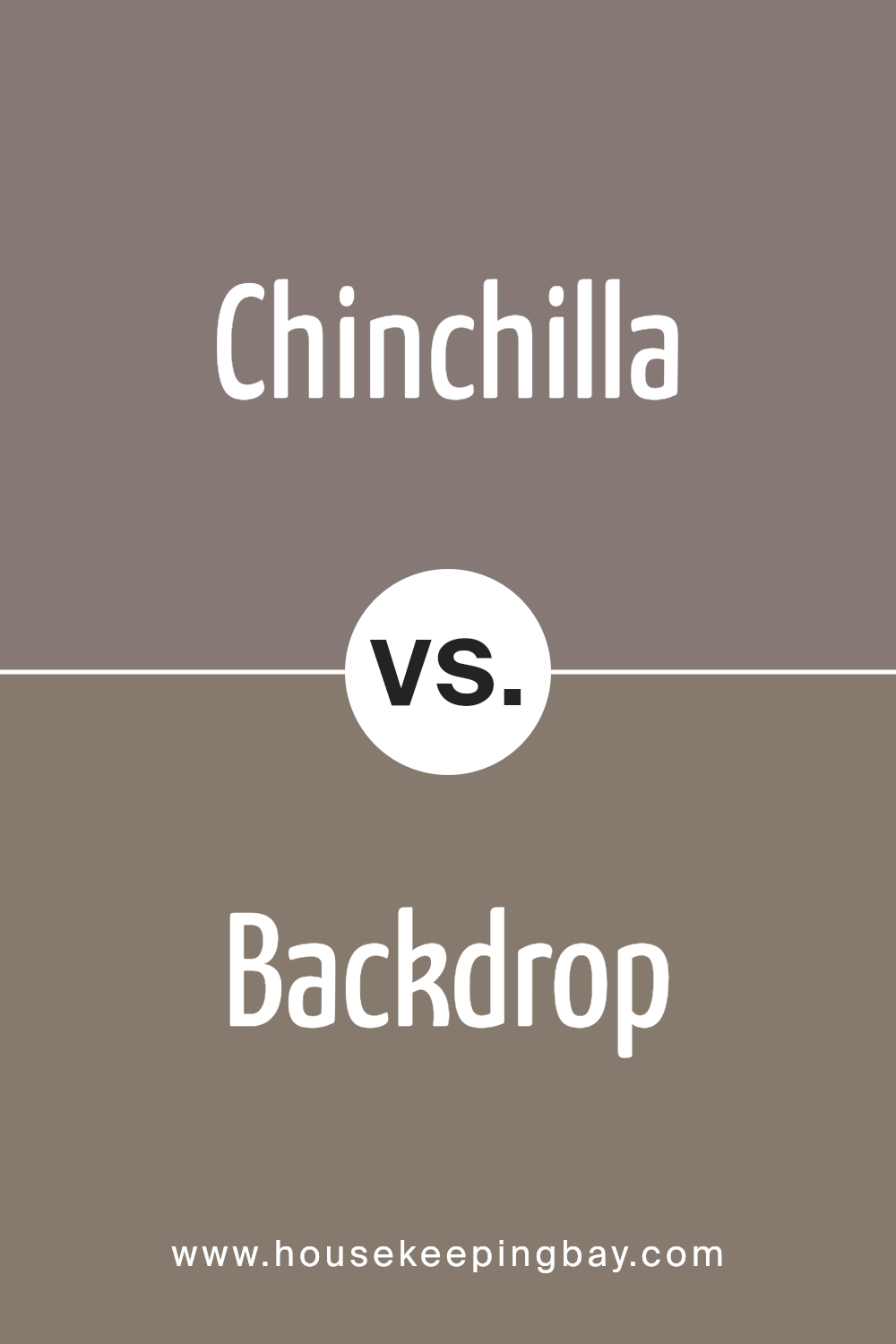
Chinchilla SW 6011 by Sherwin Williams vs Backdrop SW 7025 by Sherwin Williams
Chinchilla SW 6011, crafted by Sherwin Williams, is a warm and inviting gray with brown undertones. It feels cozy and works well in spaces aiming for a comfortable atmosphere. Its softness makes rooms feel more intimate, making it a great choice for living rooms or bedrooms where relaxation is key.
Backdrop SW 7025, also from Sherwin Williams, presents itself as a cooler, more traditional gray. This color leans towards a more neutral territory, making it versatile for different styles and settings. It’s especially suited for areas where calmness and a modern vibe are desired, like offices or kitchens.
Both colors bring out different moods. Chinchilla adds warmth and coziness, making it perfect for cozy spots. In contrast, Backdrop feels more neutral and balanced, fitting for more contemporary spaces that call for understated elegance. Both have their unique qualities, making them suitable for varied uses in a home.
You can see recommended paint color below:
housekeepingbay.com
Conclusion
SW 6011 Chinchilla by Sherwin Williams presents itself as a versatile and inviting color choice. I’ve found that it can seamlessly fit into a wide range of design styles, offering a cozy yet sophisticated ambiance. Its warm undertones make it ideal for creating a welcoming atmosphere, whether in a living room, bedroom, or even a hallway. The color’s neutrality allows it to pair beautifully with both bold and subtle accents, providing flexibility in design.
When I look at this shade, I notice its ability to adapt to different lighting conditions, which enhances its depth and appeal throughout the day. Whether under natural sunlight or soft artificial lighting, it maintains its charm and adds dimension to spaces.
In terms of pairing, I enjoy how Chinchilla complements both light and dark furnishings, thereby offering endless possibilities for interior decor. It’s a shade that encourages creativity without overwhelming the senses. Moreover, its calming nature lends itself to environments intended for relaxation and reflection.
Overall, SW 6011 Chinchilla embodies a gentle elegance that resonates with those seeking comfort and style in one cohesive package. It’s a color that isn’t just seen but felt, creating a lasting impression in any space it graces.
housekeepingbay.com
Ever wished paint sampling was as easy as sticking a sticker? Guess what? Now it is! Discover Samplize's unique Peel & Stick samples. Get started now and say goodbye to the old messy way!
Get paint samples


