Gotham CSP-385 Paint Color by Benjamin Moore
Selecting the perfect paint color is a pivotal decision in shaping the ambiance of your living spaces
Selecting the perfect paint color is a pivotal decision in shaping the ambiance of your living spaces. One shade that has captivated interior designers and homeowners alike is Gotham CSP-385. In this exploration, we delve into the essence of Gotham CSP-385, uncovering its specific attributes, discussing its compatibility with various interior styles, and revealing the secrets of its coordinating colors.
Understanding the nuances of this captivating hue will empower you to transform your home into a space that exudes sophistication and style.

via benjamin moore
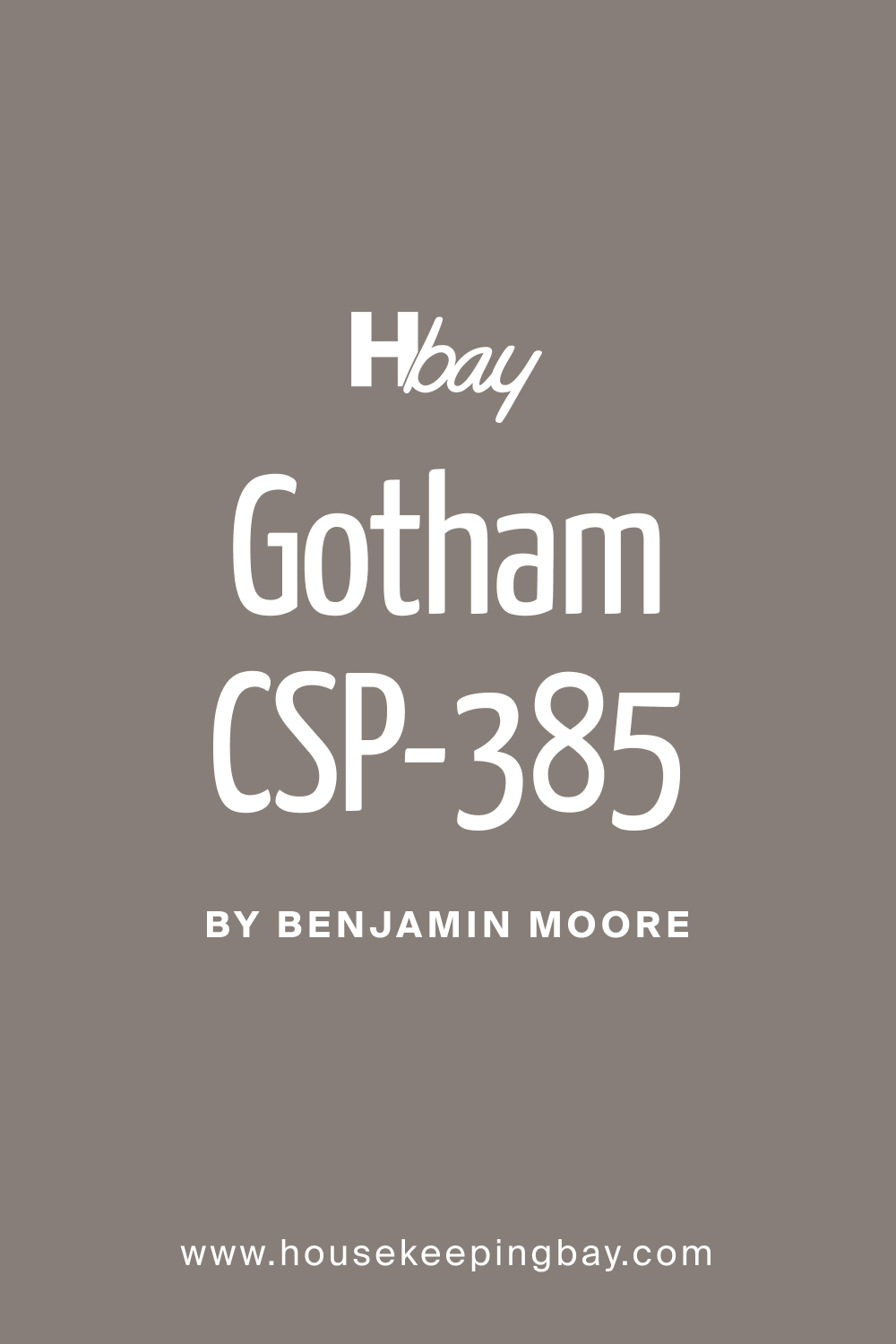
What Color Is Gotham CSP-385?
Gotham CSP-385 is a rich, deep charcoal gray that commands attention and adds an element of luxury to any room. Its depth and intensity make it a statement color, creating a sense of drama and modernity. This color works exceptionally well in contemporary interiors, lending a sleek and urban edge. Gotham pairs seamlessly with materials like polished metal, concrete, and glass, enhancing the overall modern aesthetic.
Textures such as faux fur, leather, and metallic finishes complement Gotham, adding layers of visual interest.
housekeepingbay.com
Table of Contents
Is It a Warm Or Cool Color?
Gotham CSP-385 leans towards the cooler side of the color spectrum. While it exudes sophistication and a certain coolness, it manages to maintain a sense of warmth, making it a versatile choice for various design schemes. In homes, this coolness can be balanced with warm-toned furnishings and accessories to create a harmonious and inviting atmosphere. The interplay between the cool and warm elements allows Gotham to adapt seamlessly to different interior styles, from minimalist to industrial.
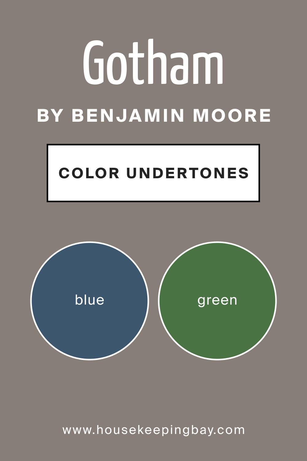
Undertones of Gotham CSP-385
The undertones of Gotham CSP-385 reveal subtle hints of blue and green, contributing to its overall cool demeanor. These undertones play a crucial role in how the color is perceived in different lighting conditions. In natural light, Gotham may appear slightly crisper, emphasizing its cooler undertones, while in artificial light, the depth of the color becomes more pronounced.
The undertones of Gotham CSP-385 enhance its versatility, allowing it to pair well with a variety of color schemes and design elements. When applied to interior walls, these undertones contribute to the color’s complexity, creating a dynamic and visually engaging backdrop.
housekeepingbay.com
Coordinating Colors of Gotham CSP-385
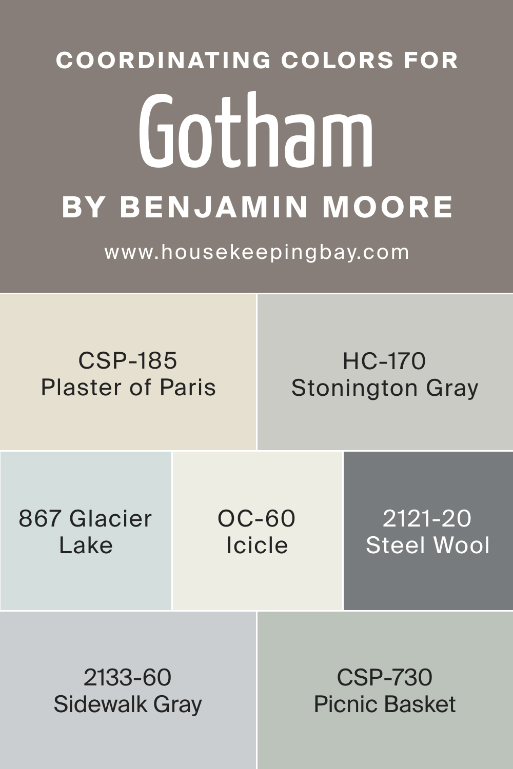
Coordinating colors are essential for creating a harmonious color palette in your home. Gotham CSP-385 pairs effortlessly with a selection of complementary hues, enhancing its allure.
- CSP-185 Plaster of Paris is a soft, warm gray that complements Gotham, providing a neutral contrast.
- OC-60 Icicle introduces a crisp and clean white, offering a fresh counterpoint to Gotham’s depth.
- CSP-730 Picnic Basket , a warm taupe, adds a touch of earthiness.
- BM 2133-60 Sidewalk Gray brings a lighter and softer gray, offering versatility in coordinating with Gotham.
These colors collectively create a sophisticated and balanced palette that can elevate the style of any space.
HC-170 Stonington Gray
A versatile gray with blue undertones that complements Gotham CSP-385, adding depth and sophistication to the color palette.
BM 867 Glacier Lake
A serene blue-gray that pairs well with Gotham, bringing a touch of tranquility to the overall scheme. Ideal for accent walls or furnishings.
BM 2121-20 Steel Wool
A deeper charcoal gray that echoes the richness of Gotham CSP-385, creating a cohesive and dramatic look in larger spaces.
Understanding the coordinating colors of Gotham CSP-385 allows for endless possibilities in creating a cohesive and visually pleasing interior.
housekeepingbay.com
How Does Lighting Affect Gotham CSP-385?
Lighting has a profound impact on how colors are perceived, and Gotham CSP-385 is no exception. In natural light, this deep charcoal gray may appear rich and intense, showcasing its cool undertones. The interplay of sunlight enhances the color’s complexity, revealing nuances that add depth and sophistication to the space. In artificial light, Gotham maintains its bold character but may appear slightly subdued.
The warmth or coolness of the lighting source influences how the color is experienced, creating dynamic shifts in the ambiance of a room.
In rooms with different orientations, Gotham CSP-385 adapts to its surroundings. In north-facing rooms, where light is cooler and indirect, Gotham may appear slightly crisper, emphasizing its cool undertones. In south-facing rooms, bathed in warm and direct sunlight, the color becomes more radiant, highlighting its depth.
East-facing rooms, with soft morning light, enhance the subtlety of Gotham, while west-facing rooms, with warmer afternoon light, intensify the richness of the color, creating a cozy ambiance.
housekeepingbay.com
LRV of Gotham CSP-385
Light Reflectance Value (LRV) measures how much light a color reflects or absorbs. With an LRV of 22, Gotham CSP-385 falls into the darker spectrum. Colors with lower LRVs absorb more light, creating a more dramatic and intense atmosphere. For Gotham, the lower LRV adds to its bold and sophisticated presence. It’s essential to consider this value when choosing the color for your walls, as it influences the overall mood of the space.
Gotham CSP-385, with its lower LRV, is ideal for creating a sense of coziness and drama, making it perfect for spaces where a bold aesthetic is desired.

housekeepingbay.com
What is LRV? Read It Before You Choose Your Ideal Paint Color
Trim Colors of Gotham CSP-385
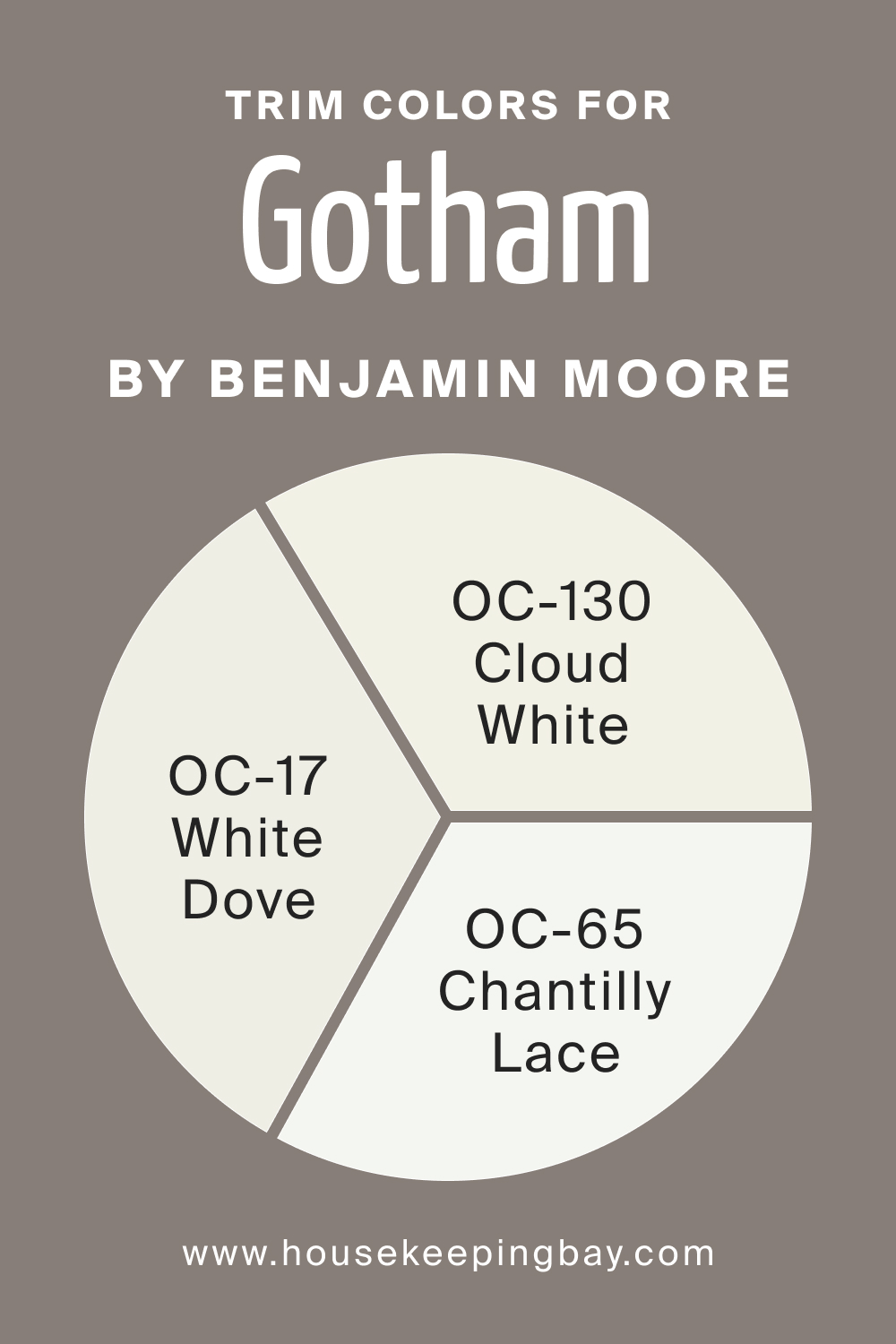
Trim colors play a vital role in defining the edges of a space and enhancing the overall design. For Gotham CSP-385, consider using shades of white from the same brand for a cohesive look. Benjamin Moore’s OC-17 White Dove provides a crisp contrast against Gotham, creating a clean and contemporary feel. Alternatively, OC-65 Chantilly Lace adds a touch of brightness, while OC-130 Cloud White introduces a subtle warmth.
The choice of trim color complements Gotham CSP-385, creating a seamless transition between walls and trim, enhancing the overall aesthetic.
housekeepingbay.com
Colors Similar to Gotham CSP-385
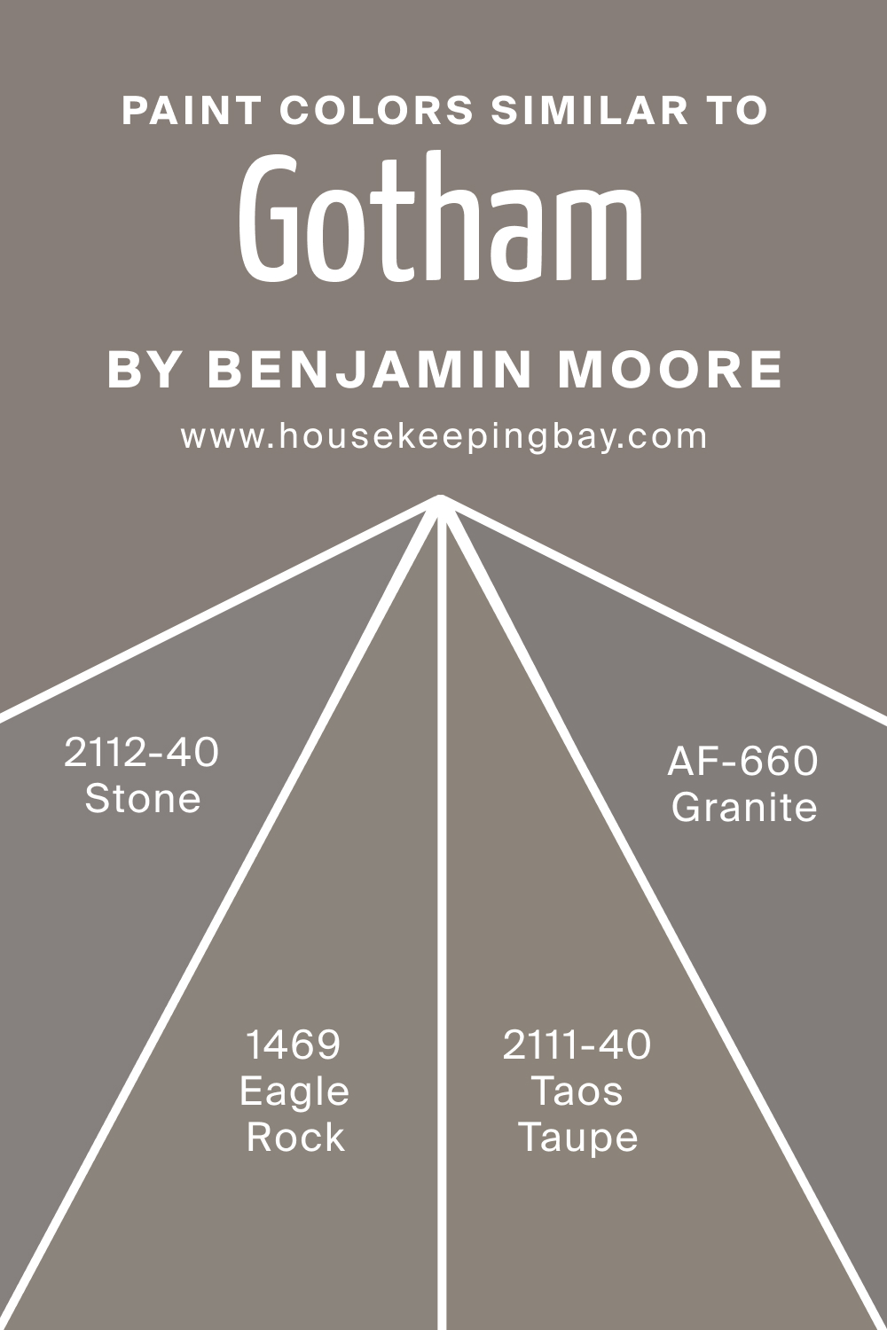
Knowing similar colors is crucial for creating a cohesive color scheme. BM 2112-40 Stone, BM 1469 Eagle Rock, AF-660 Granite, and BM 2111-40 Taos Taupe share similarities with Gotham CSP-385. Stone offers a softer gray with warm undertones, Eagle Rock introduces a muted green-gray, Granite adds a touch of deep sophistication, and Taos Taupe brings warmth with a taupe undertone. These colors provide alternatives that maintain the same bold and versatile appeal as Gotham CSP-385.
housekeepingbay.com
Colors That Go With Gotham CSP-385
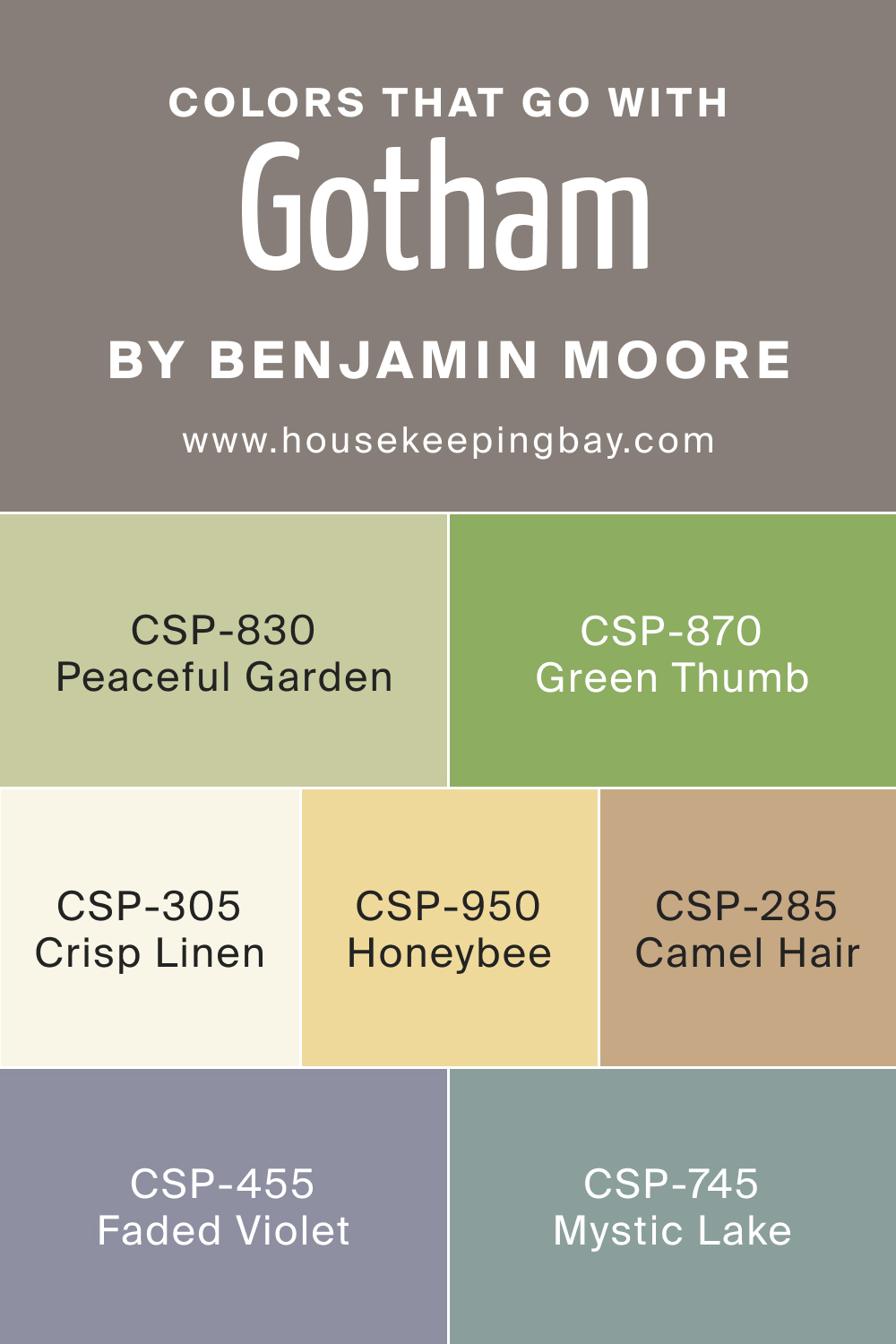
Creating a harmonious color palette in a room involves choosing colors that complement each other. CSP-830 Peaceful Garden, CSP-305 Crisp Linen, CSP-745 Mystic Lake, CSP-455 Faded Violet, CSP-950 Honeybee, CSP-870 Green Thumb, and CSP-285 Camel Hair are Benjamin Moore colors that pair well with Gotham CSP-385.
Peaceful Garden introduces a muted green, Crisp Linen adds a neutral warmth, Mystic Lake brings a deep and moody blue, Faded Violet offers a subtle pop of color, Honeybee introduces a warm yellow, Green Thumb adds an earthy touch, and Camel Hair provides a sophisticated neutral. Together, these colors create a balanced and visually pleasing palette that enhances the overall appeal of Gotham CSP-385 in a room.
housekeepingbay.com
How to Use Gotham CSP-385 In Your Home?
Gotham CSP-385 is a versatile and sophisticated color that can be seamlessly integrated into various rooms and design styles. This deep charcoal gray acts as a neutral backdrop, making it suitable for contemporary and classic interiors alike. Its dramatic presence can be utilized to create a sense of coziness or to make a bold statement, depending on the desired aesthetic.
How to Use Gotham CSP-385 in the Bedroom?
Transform your bedroom into a luxurious retreat with Gotham CSP-385. Apply it to all four walls for a cocooning effect, pairing it with plush bedding, metallic accents, and ambient lighting. This deep hue adds a touch of modern elegance, creating a serene and intimate atmosphere for restful nights.

housekeepingbay.com
How to Use Gotham CSP-385 in the Bathroom?
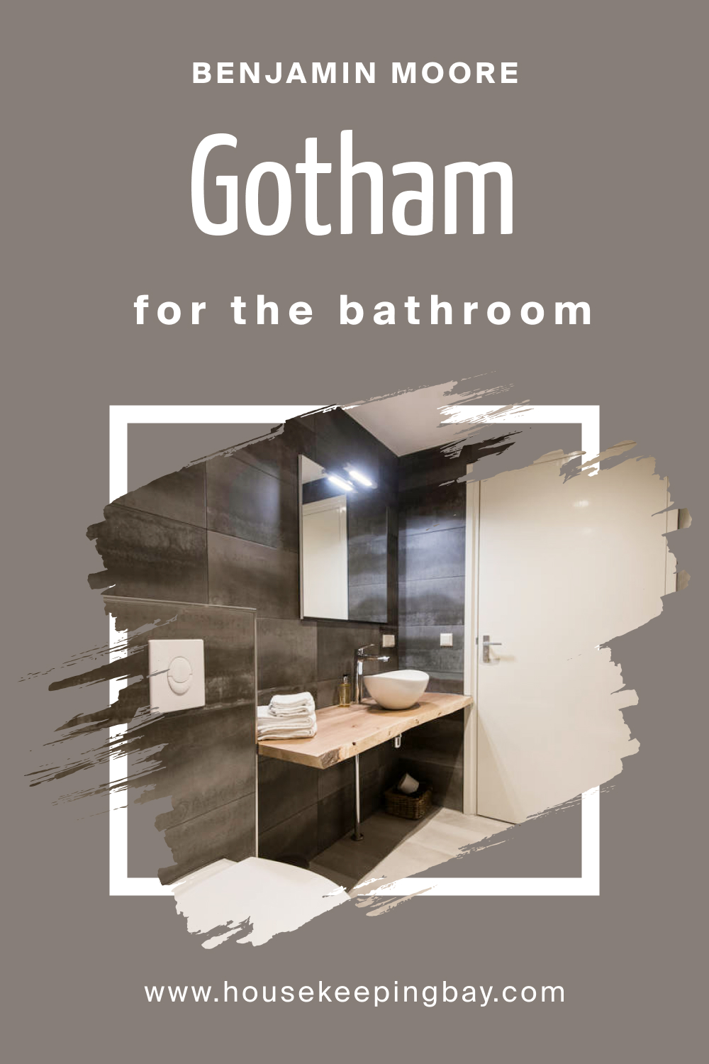
In the bathroom, Gotham CSP-385 introduces a sense of drama without compromising on sophistication. Apply it to accent walls or cabinets, complemented by crisp white fixtures and metallic accents. This color elevates the bathroom into a stylish and sleek space, perfect for a contemporary or urban design.
housekeepingbay.com
How to Use Gotham CSP-385 in the Living Room?
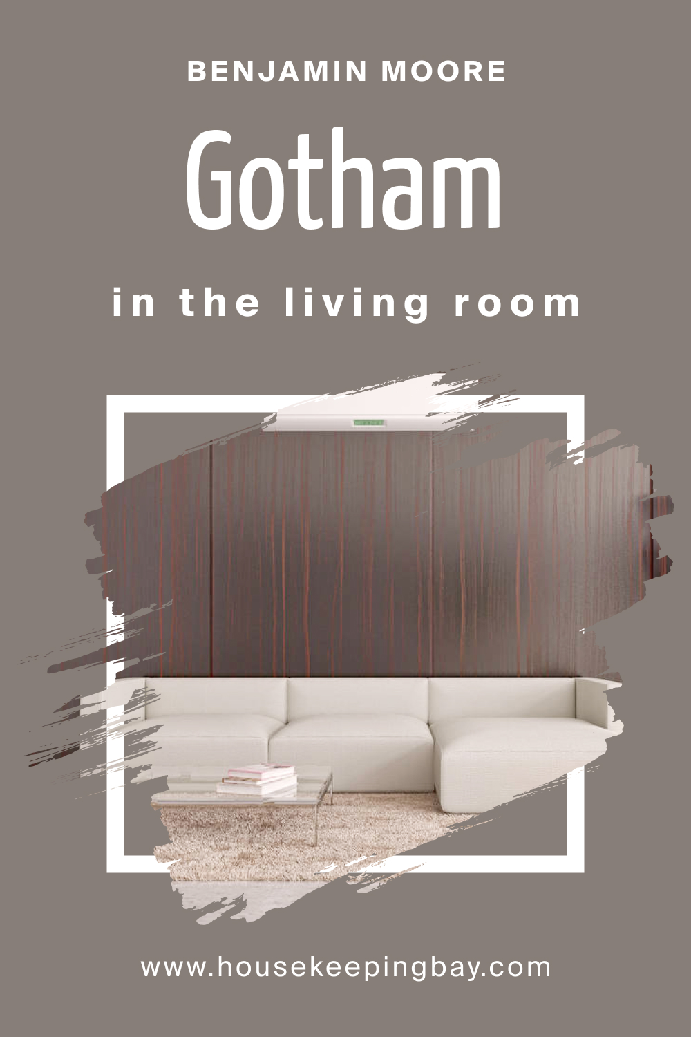
Make a statement in the living room by incorporating Gotham CSP-385 on an accent wall or throughout the space. Pair it with luxurious textures such as velvet and metallic finishes for a modern and glamorous look. This color adds depth and sophistication, creating a cozy yet refined ambiance for entertaining and relaxation.
housekeepingbay.com
How to Use Gotham CSP-385 for an Exterior?
For a bold and contemporary exterior, use Gotham CSP-385 on the siding or front door. Pair it with crisp white trim for a modern contrast, or introduce natural materials like stone for added texture. Gotham’s depth and intensity create a striking curb appeal, making a lasting impression on visitors.

housekeepingbay.com
How to Use Gotham CSP-385 in the Kitchen?
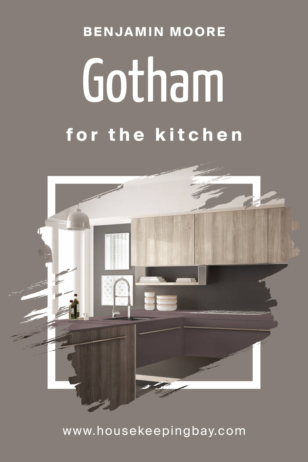
In the kitchen, Gotham CSP-385 can be applied to the walls to create a sleek and modern ambiance. Pair it with stainless steel appliances, white or light-colored cabinetry, and pendant lighting for a sophisticated and urban look. This color provides a neutral backdrop, allowing other elements in the kitchen to shine.
housekeepingbay.com
How to Use Gotham CSP-385 on the Kitchen Cabinets?
Gotham CSP-385 on kitchen cabinets brings a touch of contemporary elegance. Pair it with light-colored countertops and backsplashes to balance the depth of the color. This application creates a bold and cohesive look, making the kitchen cabinets a focal point while maintaining a sense of sophistication and warmth.

housekeepingbay.com
Comparing Gotham CSP-385 With Other Colors
Comparing colors is a crucial step in the process of choosing the right hue for your space. Each color has its unique characteristics and undertones that can significantly impact the overall look and feel of a room. By contrasting and comparing different colors, homeowners and designers can make informed decisions, ensuring the selected palette harmonizes with the desired atmosphere and aesthetic.
This careful consideration prevents potential clashes and guarantees a cohesive and visually pleasing result.
Gotham CSP-385 vs. CSP-490 Lilac Hush
Contrasting with the boldness of Gotham, Lilac Hush introduces a soft and muted lilac. While Gotham exudes sophistication and depth, Lilac Hush brings a subtle and delicate touch, making it suitable for spaces where a gentle and airy ambiance is desired.

housekeepingbay.com
Gotham CSP-385 vs. BM 1466 Smoke Embers
Smoke Embers leans towards a warmer gray compared to Gotham’s cool undertones. Gotham presents a deep and urban sophistication, while Smoke Embers introduces a cozier and more traditional feel. The choice between the two depends on the desired level of warmth in the space.

housekeepingbay.com
Gotham CSP-385 vs. BM 2112-50 Stormy Monday
Stormy Monday shares a similar depth with Gotham but introduces subtle blue undertones. Gotham remains a classic charcoal gray, while Stormy Monday brings a touch of coolness. Depending on the desired atmosphere, Gotham offers a bolder and more dramatic presence, while Stormy Monday leans towards a serene and cooler feel.

housekeepingbay.com
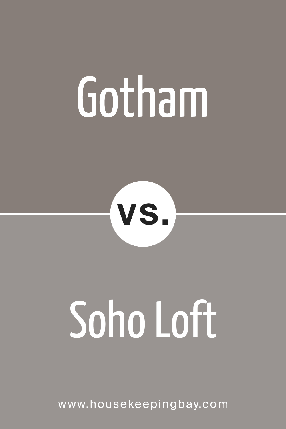
Gotham CSP-385 vs. CSP-10 Soho Loft
Soho Loft , a lighter gray with warm undertones, contrasts Gotham’s deep and cooler hue. While Gotham adds intensity and drama, Soho Loft offers a softer and more inviting appeal. The choice between the two depends on the desired level of contrast and warmth in the space.
housekeepingbay.com
Gotham CSP-385 vs. BM 1462 Gray Mountain
Gray Mountain introduces a warmer gray compared to Gotham’s cooler tones. Gotham maintains its urban sophistication, while Gray Mountain adds a touch of earthiness. The choice between the two depends on whether a more contemporary or grounded aesthetic is desired.

housekeepingbay.com
Gotham CSP-385 vs. CSP-90 Coachman’s Cape
Coachman’s Cape – the choice between the two depends on the desired level of warmth and timelessness in the space.

housekeepingbay.com
Conclusion
In the world of interior design, the choice of color is a powerful tool for creating the desired atmosphere. Gotham CSP-385, with its deep and urban sophistication, holds its own among various colors. Whether one seeks a bold and dramatic look, a soft and delicate ambiance, or a classic and grounded feel, the comparison with other colors allows for a nuanced understanding of how different hues interact and contribute to the desired aesthetic.
Ultimately, the thoughtful selection of colors ensures a cohesive and visually appealing design that resonates with the individual preferences and aspirations of the homeowner or designer.
housekeepingbay.com
Ever wished paint sampling was as easy as sticking a sticker? Guess what? Now it is! Discover Samplize's unique Peel & Stick samples. Get started now and say goodbye to the old messy way!
Get paint samples




Frequently Asked Questions
⭐Is Gotham CSP-385 suitable for small rooms?
Absolutely! Gotham CSP-385's deep charcoal hue can actually work wonders in smaller spaces by creating a cozy and intimate atmosphere. The key is to balance it with light-colored furnishings and accessories to prevent the room from feeling too enclosed.
⭐Can I use Gotham CSP-385 in a room with limited natural light?
Certainly! Gotham CSP-385 adapts well to different lighting conditions. In rooms with limited natural light, consider incorporating adequate artificial lighting and lighter-colored accents to enhance the color's richness without making the space feel too dim.
⭐Does Gotham CSP-385 pair well with bold accent colors?
Absolutely! Gotham CSP-385's deep charcoal provides an excellent backdrop for bold accent colors. Consider vibrant hues like emerald green, mustard yellow, or even a deep burgundy to add a pop of color and drama to your space.
⭐How does Gotham CSP-385 compare to other dark grays?
Gotham CSP-385 stands out with its cool undertones and urban sophistication. While it shares depth with other dark grays, its unique characteristics make it a distinctive and bold choice for those seeking a modern and sleek look.
⭐Can I use Gotham CSP-385 for an accent wall in a neutral room?
Absolutely! An accent wall in Gotham CSP-385 can transform a neutral room into a stylish and contemporary space. It adds a touch of drama without overwhelming the overall palette, creating a focal point that exudes sophistication.

