Fortitude SW 9562 by Sherwin Williams
The Bold Impact of Deep Neutrals
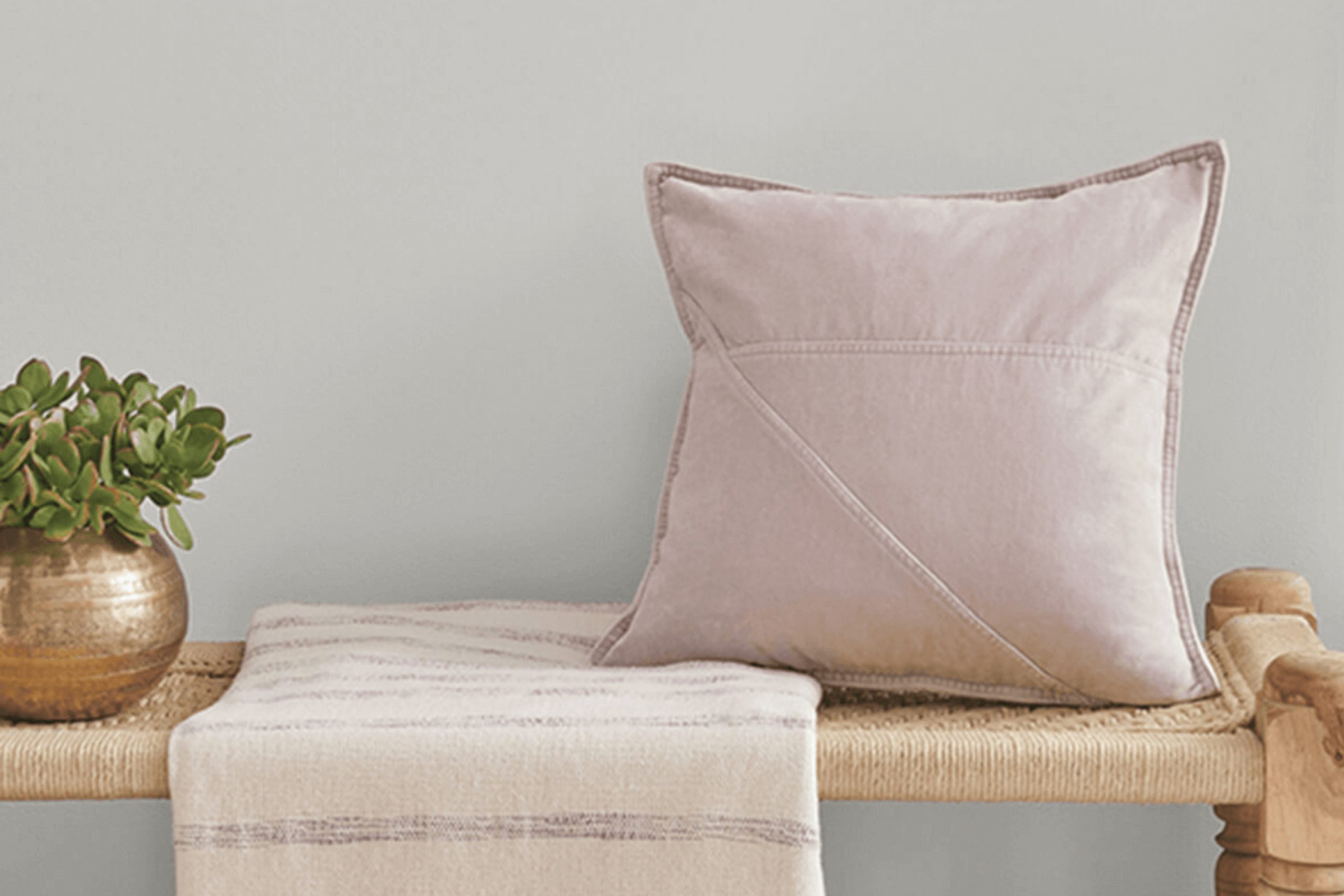
Sherwin Williams’ SW 9562 Fortitude is a paint color that reflects strength and calmness, making it a solid choice for anyone wanting to freshen up their space. You might find that its unique shade brings a soothing yet robust atmosphere to any room in your home.
It’s particularly great for creating a serene environment where you can unwind or focus. Whether you’re planning to refresh your living room, bedroom, or even your office space, SW 9562 Fortitude offers a dependable and calm backdrop.
This color pairs well with a variety of decor styles and complements both modern and traditional designs. If you’re thinking about updating your walls with a new coat of paint, consider how SW 9562 Fortitude could enhance your home’s aesthetic.
Its unique tone works well with natural light, adding depth and warmth to your space throughout the day.
via sherwin-williams.com
What Color Is Fortitude SW 9562 by Sherwin Williams?
Table of Contents
Fortitude SW 9562 by Sherwin Williams is a soothing, pale gray shade with subtle blue undertones. This color exhibits a serene and clean appearance, making it an excellent choice for creating a calm and collected atmosphere in any interior space. Fortitude SW 9562 pairs well with natural light, enhancing spaces to feel more open and airy.
This color is versatile, aligning well with various interior styles, particularly modern minimalist, Scandinavian, and coastal aesthetics. In modern minimalist interiors, Fortitude’s understated tone supports a sleek and uncluttered look.
For Scandinavian decor, it complements the style’s preference for soft hues and wood accents, enhancing the sense of warmth and light. In coastal settings, the blue undertones of Fortitude SW 9562 resonate with the palette of the sea and sky, promoting a light and breezy vibe.
Fortitude SW 9562 pairs effectively with natural materials like light woods, linen, and soft cotton, which help to maintain the overall feel of comfort and lightness. It also works well with stone textures and metallic finishes such as brushed silver or chrome, adding a touch of refinement without overpowering the room’s design.
Combining Fortitude SW 9562 with these materials can achieve a harmonious balance, creating a space that feels both welcoming and stylish.
housekeepingbay.com
Is Fortitude SW 9562 by Sherwin Williams Warm or Cool color?
FortitudeSW 9562 by Sherwin Williams is a versatile paint color that brings a calm and cozy feeling to any room. This soft gray shade has blue undertones, making it great for spaces where you want to relax, like bedrooms and living rooms. The color works well in homes because it serves as a neutral background.
It pairs nicely with a wide range of other colors, from bright and bold to soft and subtle, allowing you to mix and match decor pieces easily.
FortitudeSW 9562 also helps to make small rooms appear bigger and brighter because of its light-reflective qualities. It’s an excellent choice for anyone looking to freshen up their space without overwhelming it with a dark or vibrant color. Plus, it hides minor wall imperfections and creates a smooth visual transition between different areas of your home, maintaining a unified look throughout.
Whether you’re updating a single room or repainting the entire house, FortitudeSW 9562 can help achieve a fresh, modern feel.
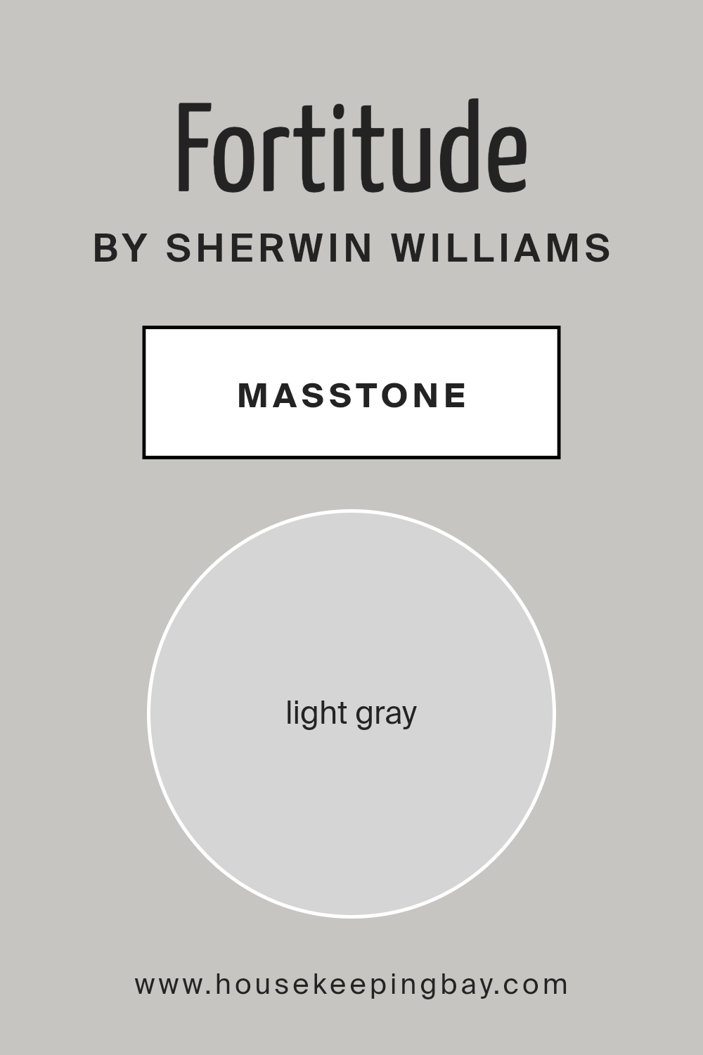
What is the Masstone of the Fortitude SW 9562 by Sherwin Williams?
FortitudeSW 9562 by Sherwin Williams has a masstone of light gray, categorized under the color code #D5D5D5. This shade of light gray is soft and subtle, creating a soothing atmosphere in any room. Its neutral tone makes it versatile, fitting well with various decorating styles and color schemes.
Light gray works as an excellent background color. It doesn’t clash with bolder hues; instead, it complements them, allowing furniture and artwork to stand out. In homes, this paint is practical for living rooms, bedrooms, and even kitchens, as it helps spaces appear larger and more open while providing a calm, cohesive look.
The neutrality of FortitudeSW 9562 ensures longevity in design choices, as it remains appealing even as trends change. Moreover, its light reflection properties can brighten rooms that lack natural light, enhancing the overall feel of the space without overwhelming with strong color statements.
housekeepingbay.com
Undertones of Fortitude SW 9562 by Sherwin Williams
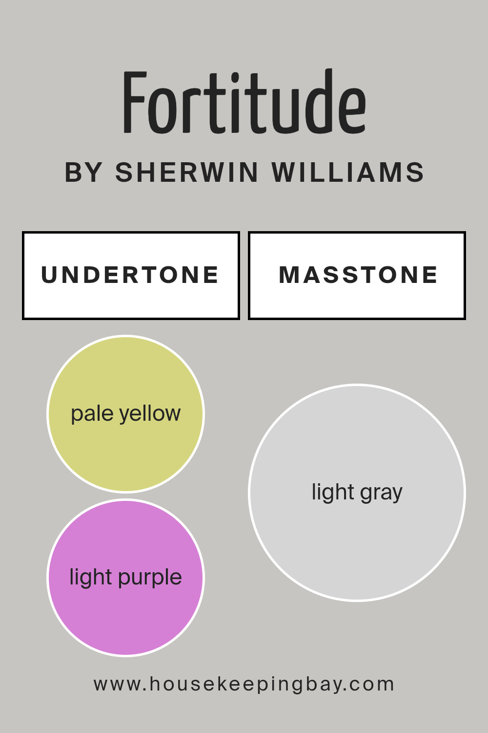
FortitudeSW 9562 by Sherwin Williams is a unique paint color with a complex blend of undertones that can subtly influence the appearance of the color in different lighting conditions and settings. The undertones of a color are secondary shades that lie beneath the primary surface color, affecting how it is perceived in various environments.
This particular color has undertones of pale yellow, light purple, light blue, pale pink, mint, lilac, and grey. Each of these undertones contributes to the overall hue of the paint in subtle yet significant ways.
Pale yellow adds a soft warmth that can make the space feel cozy and welcoming. Light purple and lilac introduce a hint of cool sophistication, adding depth and complexity. Light blue and mint undertones bring a fresh, airy feel, making the room appear more spacious.
Pale pink gives a gentle touch of vibrancy, enhancing the liveliness of the room. Lastly, the grey undertone helps in balancing the color, ensuring it remains neutral and versatile, fitting well with various decor styles.
When applied to interior walls, FortitudeSW 9562 can appear differently based on the room’s lighting and surrounding colors. The interplay of its undertones with natural and artificial light can make the walls look dynamic throughout the day. In bright light, the cooler undertones may become more pronounced, while in dimmer light, the warmer undertones might give the room a snugger feel.
This versatility makes FortitudeSW 9562 a popular choice for those looking to add sophistication and subtle dynamism to their living spaces.
housekeepingbay.com
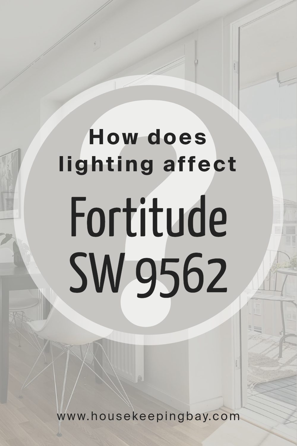
How Does Lighting Affect Fortitude SW 9562 by Sherwin Williams?
Lighting plays a significant role in how colors appear in a space. Light sources, whether natural or artificial, can change the perception of colors on walls, furnishings, and decor. The color FortitudeSW 9562 by Sherwin Williams is a soothing gray shade that reacts differently depending on the light conditions of the room.
In artificial light, FortitudeSW 9562 may appear slightly warmer or have a beige undercast, depending on the type of bulb used. Incandescent bulbs, which emit a yellowish light, can make this color look warmer. In contrast, fluorescent bulbs, which cast a cooler, bluish light, might make the color appear more muted and true to its cooler gray tones.
In natural light, FortitudeSW 9562 can look very different throughout the day. Natural daylight tends to show the truest color. In a north-faced room, which receives less direct sunlight, this shade of gray could appear a bit darker and cooler, giving the room a more reserved and subtle feel.
Southern exposure brings in the most light, especially during high sun hours, which can make FortitudeSW 9562 look lighter and slightly warm, enhancing the liveliness of the room.
East-facing rooms receive morning sunlight, which is warm and bright. Here, FortitudeSW 9562 will start the day with a soft, inviting look, and as the day progresses and natural light decreases, the color may shift to show more of its basic cool gray qualities. West-facing rooms experience the opposite, with minimal morning light but intense, warmer afternoon light. In these rooms, the color might look more neutral and steady in the morning but could become richer and warmer by the evening.
Understanding these interactions between light and color can help in making informed choices when decorating with colors like FortitudeSW 9562 by Sherwin Williams, ensuring the desired mood and atmosphere is achieved in each room.
housekeepingbay.com
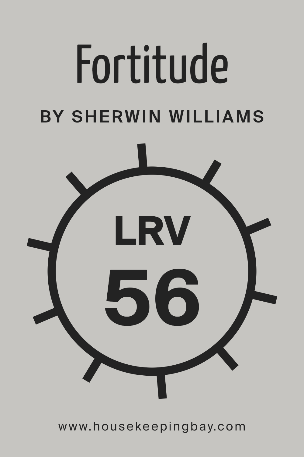
What is the LRV of Fortitude SW 9562 by Sherwin Williams?
LRV, or Light Reflectance Value, is a measure that indicates how much light a paint color reflects back into a room. It is scaled from 0 to 100, where 0 absorbs all light without reflecting any, making it pitch black, and 100 reflects all light, akin to a perfect white.
This value is crucial when choosing paint colors because it influences how light or dark a color will appear once applied to walls. Higher LRVs make spaces appear brighter as they bounce more light around, while lower LRVs create a cozier, more subdued ambiance by absorbing light.
FortitudeSW 9562 by Sherwin Williams has an LRV of 55.95, which puts it in the mid-range category. This means it neither reflects light as intensely as lighter shades nor absorbs it like darker tones. In practical terms, this moderate LRV makes FortitudeSW 9562 a versatile choice for various settings.
It can help maintain a balanced look that feels neither too bright nor too gloomy. This color will moderately reflect natural and artificial light, impacting the overall brightness and feel of the space while providing sufficient color depth to make a noticeable impact on the room’s aesthetics.
housekeepingbay.com
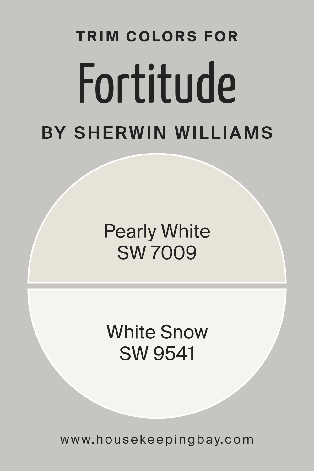
What are the Trim colors of Fortitude SW 9562 by Sherwin Williams?
Trim colors are specific shades used to enhance the architectural features of a room, such as baseboards, moldings, window casings, and doors, by providing a contrasting or complementary frame to the walls.
In the case of Fortitude SW 9562 by Sherwin Williams, a strong gray-blue, choosing the right trim colors is crucial to either subtly complement the bold wall color or softly define the boundaries within a space, creating a visually appealing and coherent color scheme.
For Fortitude SW 9562, trim colors like SW 7009 – Pearly White, can provide a soft, soothing contrast. Pearly White is a gentle off-white with a warm undertone that can soften the intensity of richer, darker colors with its light-reflective properties, giving a clean and inviting appearance.
Another excellent choice for trim is SW 9541 – White Snow. This is a crisp, pure white that offers a fresh and bright contrast, which can help in making the colors pop, especially in well-lit or natural light areas, lending a more defined and polished look to the space.
You can see recommended paint colors below:
housekeepingbay.com
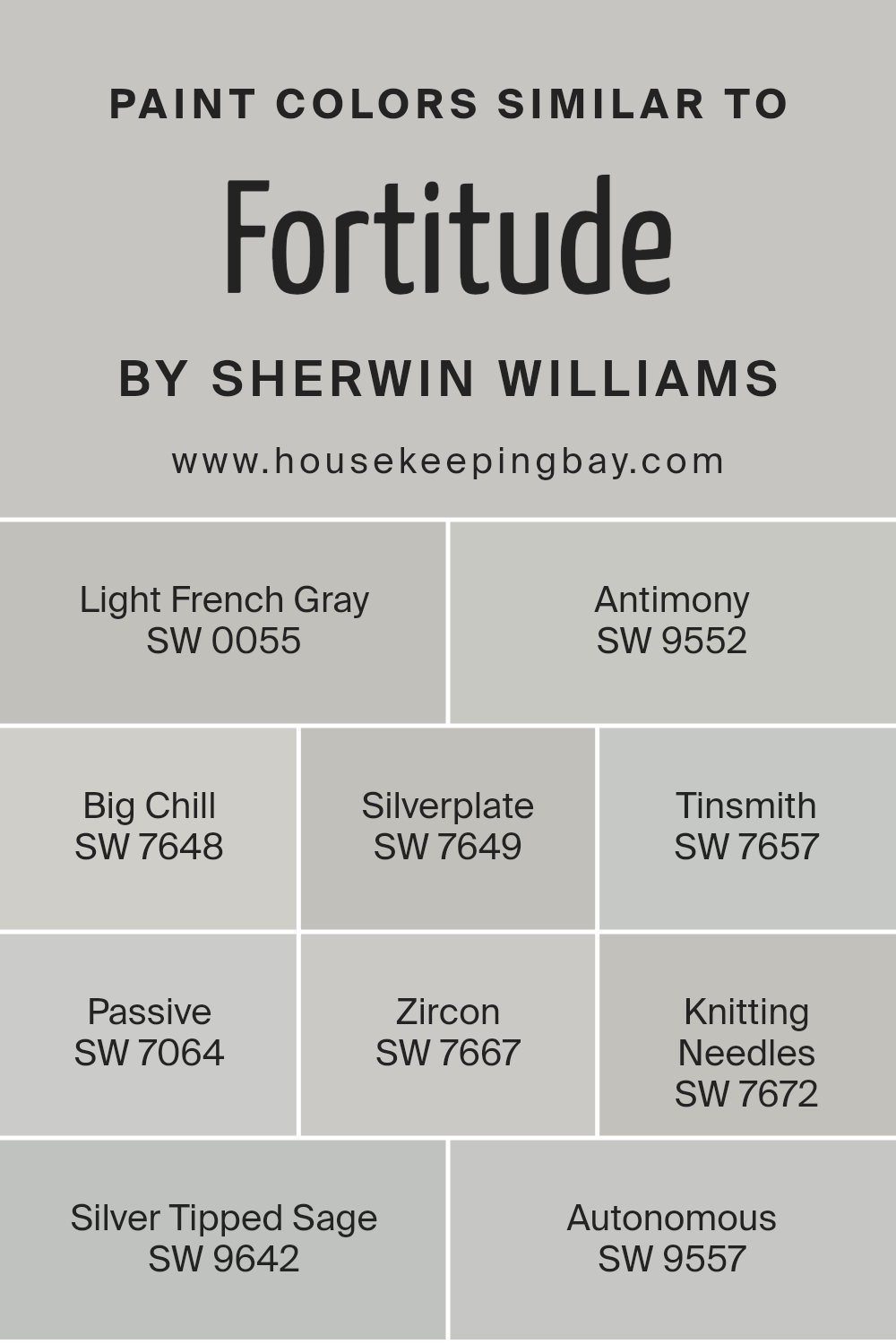
Colors Similar to Fortitude SW 9562 by Sherwin Williams
Similar colors are essential in design because they create harmony and balance. When colors resemble each other, like those similar to Sherwin Williams’ Fortitude SW 9562, they provide a subtle variation that can unify a space without causing visual interruption.
This continuity is particularly useful in creating a calming atmosphere where the colors gently flow from one to another, adding to the overall cohesiveness of the interior.
Starting with Light French Gray SW 0055, this shade offers a light, airy feel with a hint of gray that softly complements a variety of décor styles. Antimony SW 9552 follows as a muted gray with earthy undertones, lending a grounding effect. Big Chill SW 7648 elevates spaces with a cool gray that feels refreshing yet sophisticated.
Silverplate SW 7649 is another gray tone, but with a slightly deeper and edgier appearance. Tinsmith SW 7657 introduces a metallic hint, enhancing rooms with a touch of modernity. Passive SW 7064 uses a lighter, more understated approach to gray, providing a backdrop that supports all types of furnishings.
Zircon SW 7667 edges into the array with a very subtle, almost invisible warmth, making it an adaptable choice. Knitting Needles SW 7672 deepens the palette slightly, offering more definitive shading without overwhelming. Silver Tipped Sage SW 9642 brings a hint of green, offering a natural touch to the collection.
Finally, Autonomous SW 9557 stands out with its slightly taupe tone, bringing warmth into predominantly gray schemes.
You can see recommended paint colors below:
- SW 0055 Light French Gray
- SW 9552 Antimony
- SW 7648 Big Chill
- SW 7649 Silverplate
- SW 7657 Tinsmith
- SW 7064 Passive
- SW 7667 Zircon
- SW 7672 Knitting Needles
- SW 9642 Silver Tipped Sage
- SW 9557 Autonomous
housekeepingbay.com
SW 9562 Fortitude by Sherwin Williams is a paint color that packs a powerful punch with its deep, rich tones. Ideal for anyone looking to make a bold statement in their space, this color provides an intense yet warm backdrop that draws in the eye and sets a mood of strong presence and comfort.
It works wonderfully in a variety of settings, whether enhancing the elegant ambiance of a dining room or adding a cozy, inviting feel to a bedroom. My personal experience with this shade has been quite positive; it applies smoothly, delivers excellent coverage, and has remarkable durability.
I’ve noticed it particularly complements wooden fixtures and white trim, creating a beautifully balanced visual impact. Moreover, this color’s versatility in both contemporary and traditional spaces makes it a superb choice for anyone looking to update their home without committing to an overly trendy palette.
SW 9562 Fortitude, with its robust and earthy undertone, is a color that assures you of its quality and aesthetic appeal in any room it graces.
housekeepingbay.com
Ever wished paint sampling was as easy as sticking a sticker? Guess what? Now it is! Discover Samplize's unique Peel & Stick samples. Get started now and say goodbye to the old messy way!
Get paint samples


