Antimony SW 9552 by Sherwin Williams
Subtle Sophistication of This Unique Shade
Get ready to explore SW 9552 Antimony by Sherwin Williams, a paint color that’s all about breathing new life into your space. If you’re on the hunt for a shade that can transform your room into a cozy yet sophisticated haven, Antimony might just be what you need.
This color is a part of Sherwin Williams’ collection that aims to bring a modern twist to your home’s look, whether you’re thinking of sprucing up your living room, bedroom, or even your kitchen cabinets.
Choosing the right paint color can be a game-changer for your home decor, and Antimony offers a unique blend that’s not too overwhelming but still makes a statement. It’s perfect for those who want to add a touch of elegance without going over the top. This shade works wonders in a variety of lighting conditions, offering a serene backdrop for both your lazy afternoons and bustling dinner parties.
Incorporating SW 9552 Antimony into your home might just be the refresh you’re looking for. It pairs well with a wide range of colors and decor styles, making it a versatile choice for any room renovation project.
So, if you’re ready to give your space a chic, updated look, Antimony could be the way to go. Let’s get your home transformation started with this stylish, timeless shade.
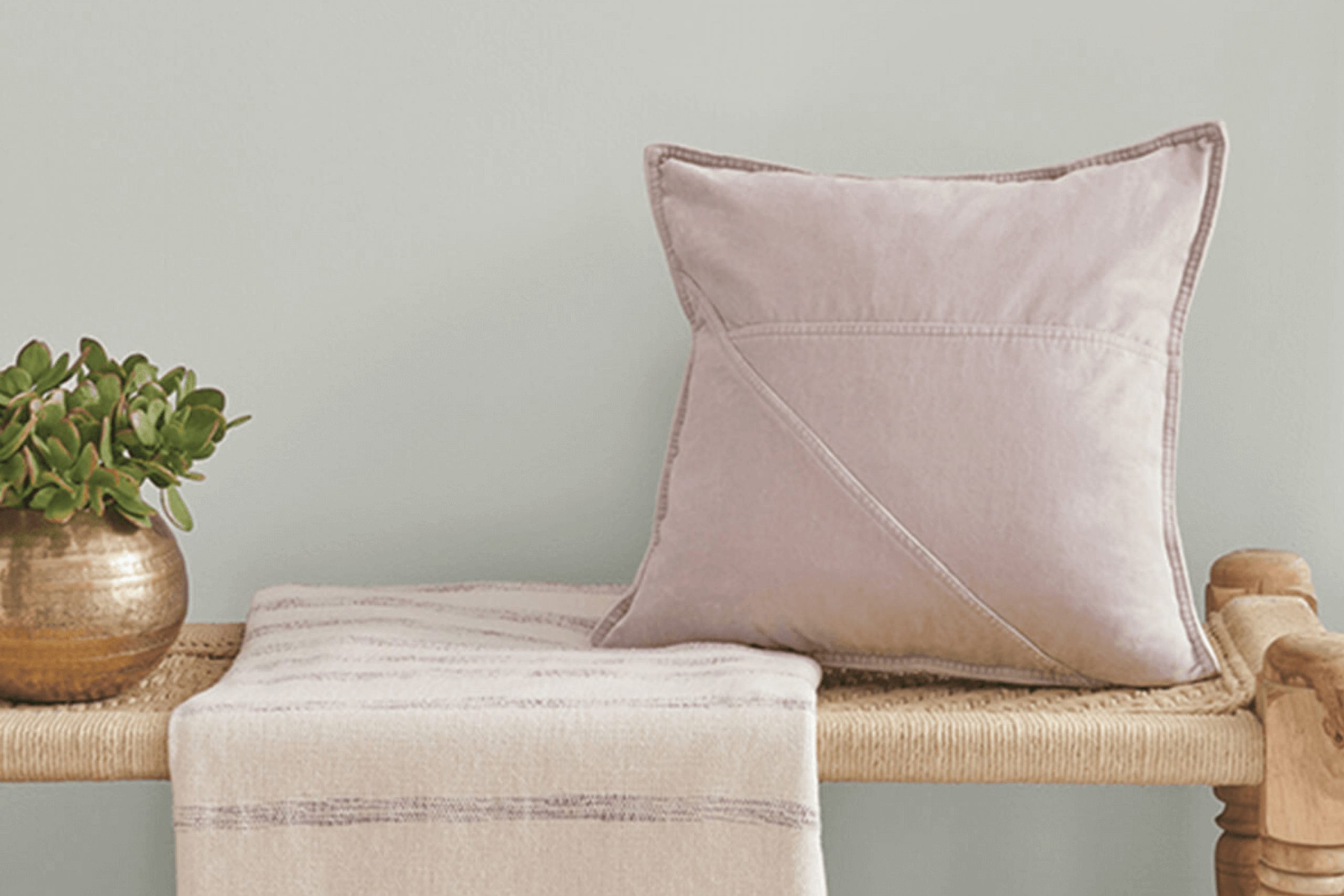
via sherwin-williams
What Color Is Antimony SW 9552 by Sherwin Williams?
Antimony SW 9552 by Sherwin Williams is a unique and versatile color. It carries a soft, muted quality that makes it exceptionally adaptable for various interior styles. With its subtle balance, Antimony leans towards a gentle gray with hints of lavender under certain lighting, giving spaces a serene and welcoming feel.
This color is particularly effective in creating a calm and collected ambiance, ideal for rooms meant for relaxation or concentration, such as bedrooms, home offices, or living spaces.
Antimony works beautifully in minimalist, Scandinavian, and modern interior styles. Its understated elegance compliments these designs’ emphasis on simplicity and functionality. It pairs wonderfully with materials such as light woods, adding warmth to the minimalist decor, and metals like silver or brushed nickel, enhancing modern interiors with a chic, contemporary edge.
Textures like soft linens or plush woolens in neutral shades also complement Antimony, promoting a sense of comfort and coziness within the space.
When considering this color for home decor, it’s flexible enough to act as a main wall color or as an accent, coordinating well with both lighter and darker tones. This adaptability allows homeowners to use Antimony to create a variety of moods, from tranquil and soothing to sophisticated and mature, without overwhelming a room’s overall aesthetic.
housekeepingbay.com
Is Antimony SW 9552 by Sherwin Williams Warm or Cool color?
AntimonySW 9552 by Sherwin Williams is a unique paint color that can really change the look and feel of a home. It has a delicate balance, being neither too bold nor too subtle, which makes it quite versatile for decorating. This color can add a hint of sophistication without overwhelming a space. Whether you’re painting a whole room or just an accent wall, AntimonySW 9552 can help bring a sense of calm and elegance.
In homes, this color works well because it acts as a neutral backdrop that can match with many types of furniture and decor. It’s great for living rooms, bedrooms, or even kitchens, providing a clean and inviting atmosphere. Plus, it reflects light in a way that can make small spaces appear larger and more open.
Homeowners appreciate AntimonySW 9552 because it’s both modern and timeless. It’s a color that won’t quickly go out of style, ensuring your home looks fresh and inviting for years to come. Whether you aim for a classic look or something more contemporary, AntimonySW 9552 offers a perfect starting point.
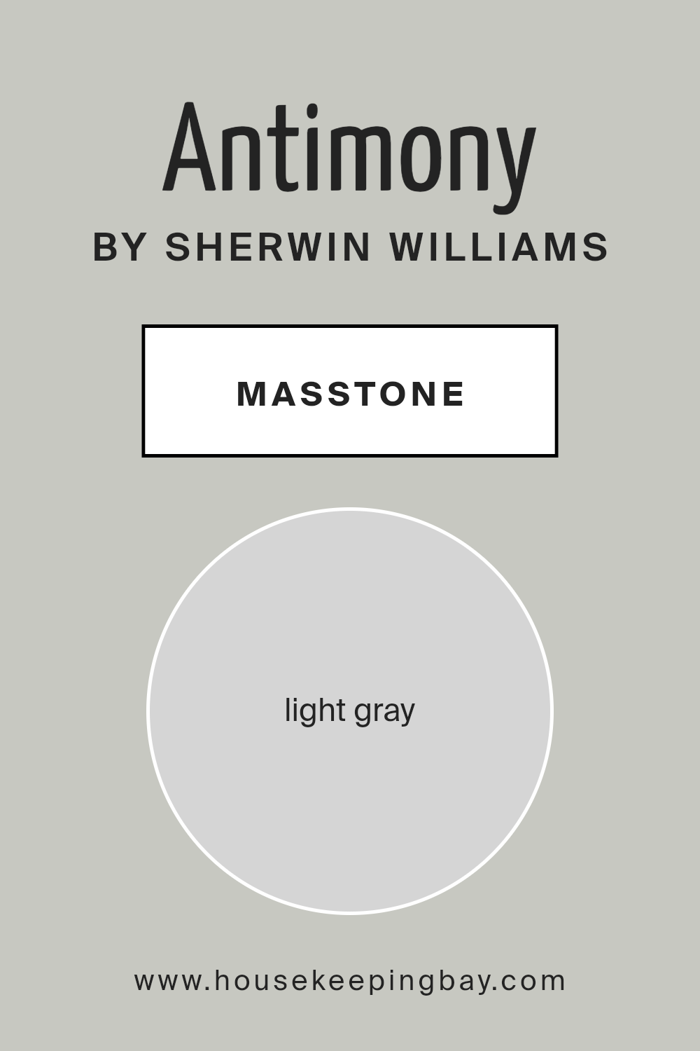
What is the Masstone of the Antimony SW 9552 by Sherwin Williams?
AntimonySW 9552 by Sherwin Williams is a charming light gray color with the specific shade of #D5D5D5. This gentle gray has a soft and welcoming feel, making it a perfect choice for homes. It works beautifully in any room, adding a touch of calm and sophistication without overwhelming the space.
Because of its light gray tone, AntimonySW 9552 is incredibly versatile. It pairs well with a wide range of other colors, from bright and bold shades to more subdued hues, allowing for endless decorating possibilities.
This color’s magic lies in its ability to make rooms feel more spacious and airy. It reflects natural light beautifully, enhancing the sense of openness and relaxation in the home. Whether used on walls, cabinetry, or as an accent, this soothing gray creates a peaceful backdrop for daily life.
It’s especially suited for areas where you want to promote a serene atmosphere such as bedrooms and living rooms. AntimonySW 9552 stands out as a choice that brings both calmness and modern style to any home setting.
housekeepingbay.com
Undertones of Antimony SW 9552 by Sherwin Williams
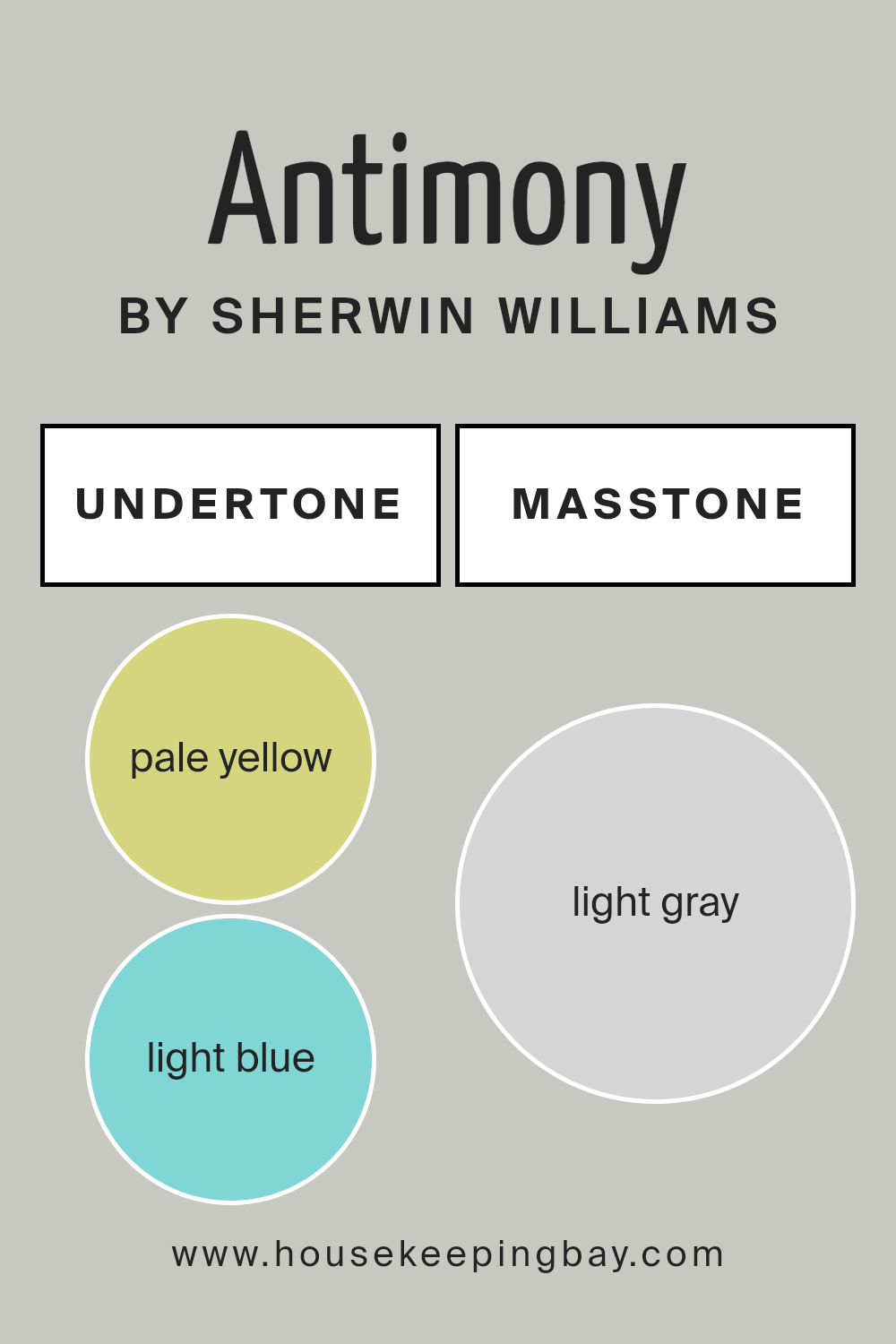
AntimonySW 9552 by Sherwin Williams is a unique color with a mix of subtle shades hidden beneath its surface. These undertones include pale yellow, light blue, light purple, mint, pale pink, lilac, and grey. Undertones are like secret ingredients in a recipe; they can change how we perceive the main color.
For example, pale yellow can make a color feel warmer, while light blue might give it a cooler, more calming vibe. These hidden colors can help the main color look different under various lighting conditions or when paired with other colors.
When we talk about how undertones affect our view of the color, it’s all about the mood and atmosphere they create. In a room, paint like AntimonySW 9552 with its many undertones can add depth and complexity. Depending on the light in the room—whether it’s bright daylight or softer lamp light—the paint can appear to change color slightly. This can make the room feel more dynamic and interesting.
For interior walls, the undertones in AntimonySW 9552 mean that the paint can play nicely with a wide range of decor colors. Furniture and decorations in complementary undertone colors can make the whole room come together in a visually striking way.
For example, using accessories in pale yellow or mint can highlight the warmer or cooler notes in the paint, respectively. The room’s lighting will also interact with the paint’s undertones, making the walls look slightly different at various times of the day. This versatility is what makes a color with multiple undertones not just beautiful, but also incredibly practical for interior design.
housekeepingbay.com
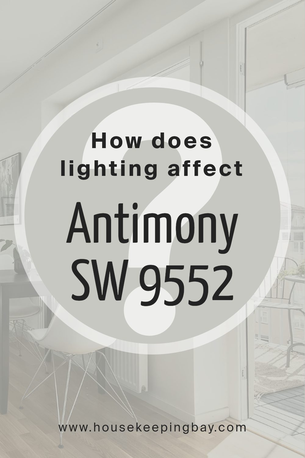
How Does Lighting Affect Antimony SW 9552 by Sherwin Williams?
Lighting plays a crucial role in how we perceive colors. The same color can look different depending on the light source. This is because light sources vary in color temperatures and intensities, influencing how a color appears in a space. When it comes to the color AntimonySW 9552 by Sherwin Williams, lighting conditions can change how it looks in a room.
In artificial light, the appearance of AntimonySW 9552 can shift based on the type of bulbs used. Warm light bulbs can make AntimonySW 9552 appear cozier and slightly more vibrant, adding a soft glow to the room. On the other hand, cool LED lights might give AntimonySW 9552 a sharper look, making the color feel cooler and more modern.
Natural light brings its own dynamics into play. The orientation of the room – north, south, east, or west – has a significant impact on how AntimonySW 9552 is perceived. In north-faced rooms, which get less direct sunlight, AntimonySW 9552 might look a bit muted and cooler, possibly showing its subtle undertones more clearly. This can create a calm and serene atmosphere, especially in spaces used for relaxation.
South-faced rooms receive plenty of bright, direct sunlight throughout the day, making AntimonySW 9552 look warmer and more vibrant. The natural brightness enhances the color, making the room feel more inviting and energetic. This is great for living spaces where a welcoming atmosphere is desired.
East-faced rooms are bathed in soft, warm light in the morning but become cooler as the day progresses. Here, AntimonySW 9552 can feel bright and cheerful in the morning, then transition to a more subdued tone by the afternoon, offering a versatile backdrop that adapts throughout the day.
In west-faced rooms, AntimonySW 9552 gets the opposite effect, with cooler morning light gradually shifting to warmer tones by the evening. This color can create a calm environment during the day, perfect for concentration and work, and transform into a warm and cozy space in the evening, ideal for relaxation.
Overall, the interplay of light and color means that AntimonySW 9552 can offer a range of atmospheres depending on the room’s orientation and the type of light it receives.
housekeepingbay.com
What is the LRV of Antimony SW 9552 by Sherwin Williams?
LRV is an important factor when choosing a paint color because it can significantly affect the brightness and atmosphere of your space. A higher LRV means the color will make the room feel brighter and more open, while a lower LRV can make a room feel cozier but potentially darker.
With an LRV of 57.23, Antimony (SW 9552) by Sherwin Williams sits a bit above the middle of the scale. This means it’s neither too dark nor too light, offering a balanced option that reflects a moderate amount of light. For this particular color, its LRV suggests it can add warmth to a room without making it feel too enclosed.
It will brighten up a space more than darker colors would, yet without the risk of making it feel stark or overly bright, as some near-white colors might. This makes Antimony a versatile choice that can work well in many different spaces and lighting conditions, enhancing the overall ambiance without dominating it.

housekeepingbay.com
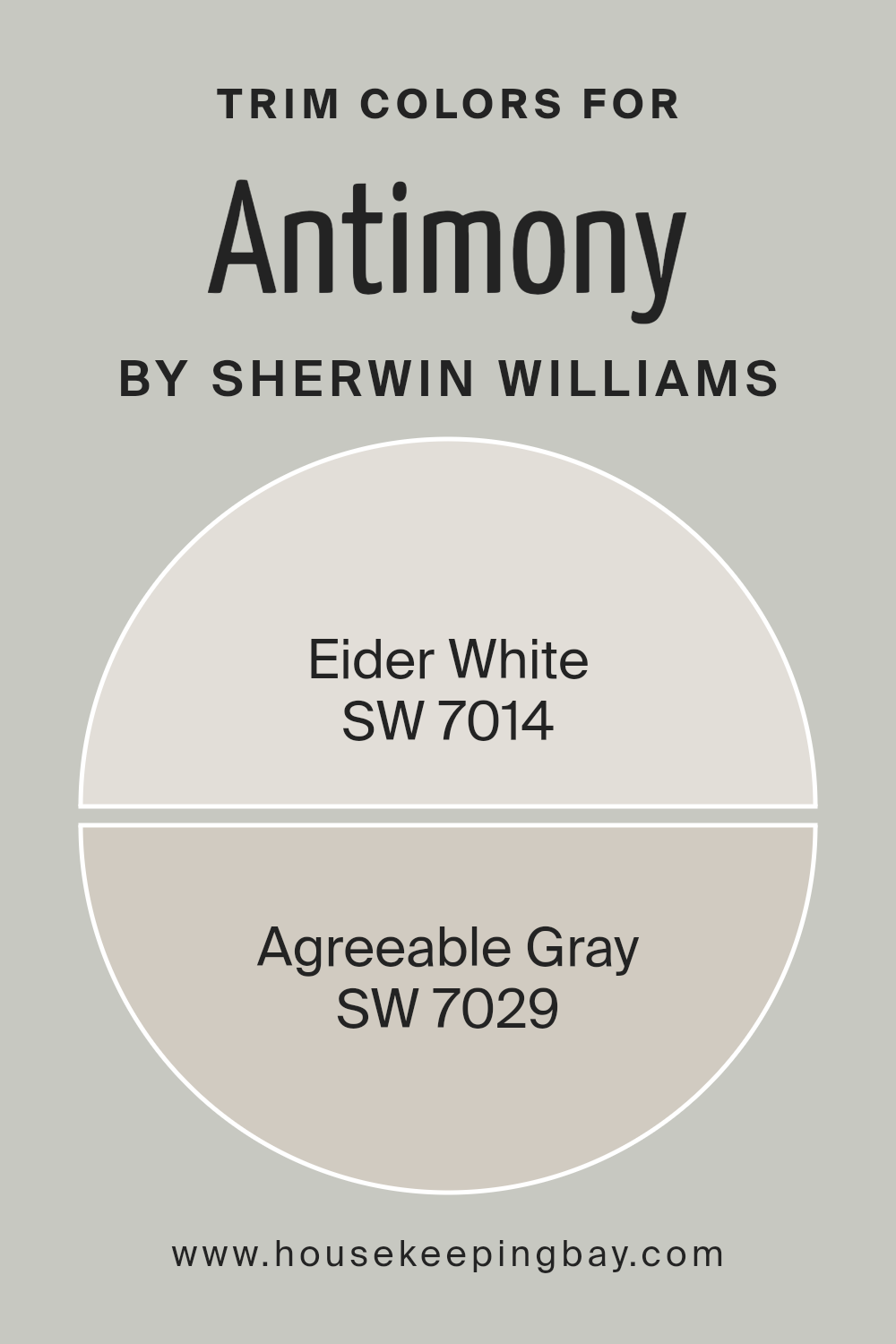
What are the Trim colors of Antimony SW 9552 by Sherwin Williams?
Trim colors, like those provided by Sherwin Williams, play a critical role in defining and accentuating the architectural features of a space. They are used on elements such as door frames, window sills, skirtings, and moldings, essentially highlighting the boundaries between different surfaces or materials.
The right trim color can enhance the main wall color, creating a cohesive and visually appealing aesthetic. For instance, when paired with a unique shade like AntimonySW 9552 by Sherwin Williams, choosing the right trim colors becomes even more crucial to either complement or subtly contrast the primary color, thereby elevating the overall design scheme of the room.
SW 7014 – Eider White, one of the recommended trim colors, is a soft, soothing off-white with subtle gray undertones. This color can bring a sense of calm and elegance to a space, working beautifully to soften the edges and make the transition between wall colors and trim smooth and appealing.
On the other hand, SW 7029 – Agreeable Gray, serves as a warmer, mid-tone gray that offers a versatile and neutral backdrop for AntimonySW 9552. This agreeable hue can help in creating a harmonious flow between rooms, ensuring the trim not only frames but also complements the walls and the overall design palette.
Both Eider White and Agreeable Gray stand as strategic choices to enhance the characteristic features of a room without overwhelming the primary color, ensuring a balanced and inviting environment.
You can see recommended paint colors below:
housekeepingbay.com
Colors Similar to Antimony SW 9552 by Sherwin Williams
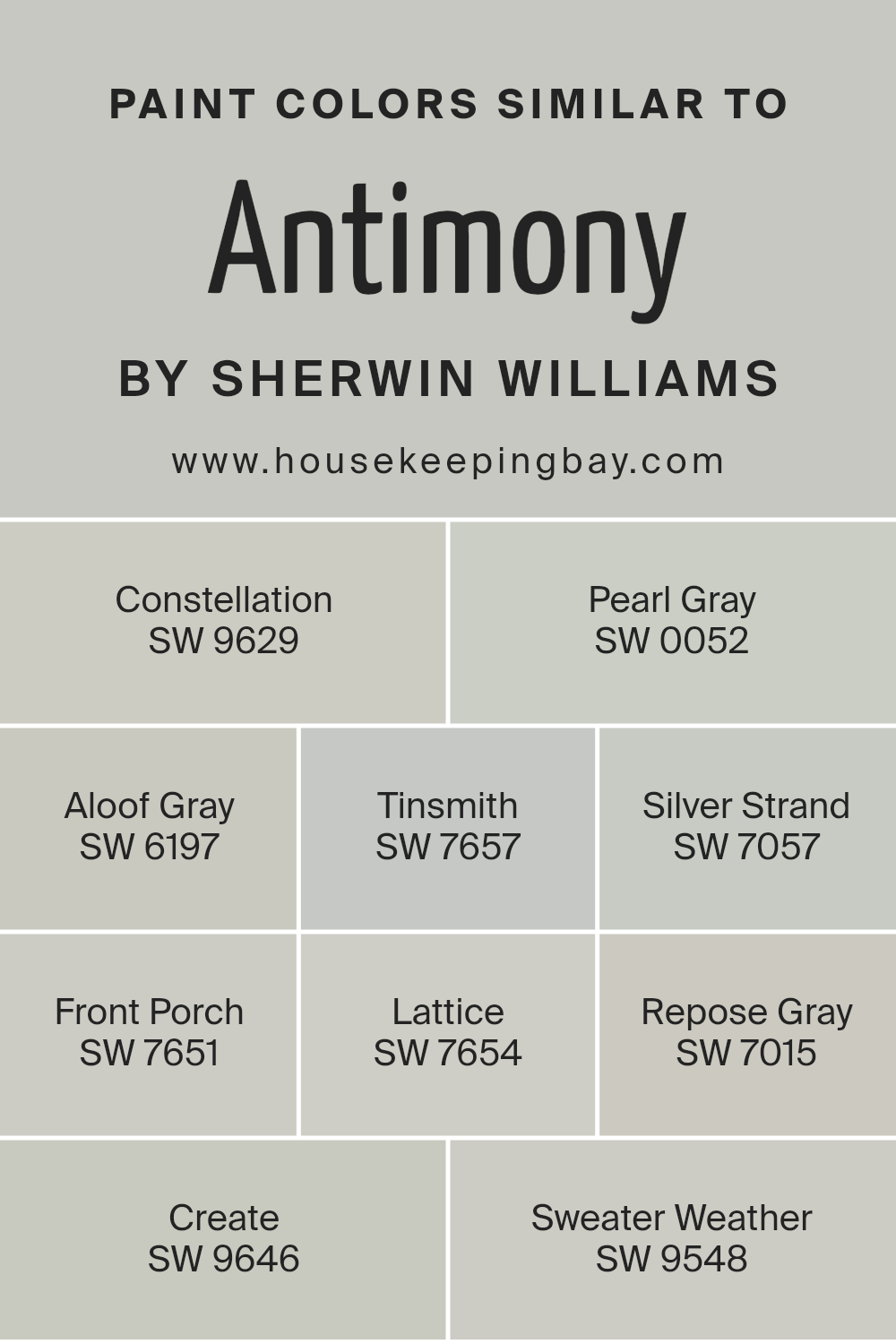
Understanding similar colors is crucial in design, particularly when considering variations like those around Antimony SW 9552 by Sherwin Williams. Such colors provide a harmonious palette that seamlessly blends together, creating a cohesive and visually appealing space.
Using similar colors, such as SW 9629 – Constellation, a soft, airy blue that brings to mind the tranquil expanse of the sky at dusk, or SW 0052 – Pearl Gray, a gentle gray with a hint of warmth, allows for subtle contrast and depth in a design scheme.
SW 6197 – Aloof Gray, with its understated elegance, works perfectly in spaces that aim for a serene and sophisticated atmosphere, while SW 7657 – Tinsmith offers a cooler gray tone, reminiscent of a misty morning.
The beauty of similar colors like SW 7057 – Silver Strand, which echoes the grayish tone of wet sand, and SW 7651 – Front Porch, a pale blue that evokes a breezy, open-air feel, lies in their ability to create a soothing and unified look. Similarly, SW 7654 – Lattice, a slightly deeper gray, adds a touch of gravity to a space without overwhelming it.
SW 7015 – Repose Gray stands out as a versatile neutral that complements a wide range of decor styles, ensuring a timeless backdrop. On the creative end, SW 9646 – Create introduces a vibrant yet soft blush, injecting a dash of playful energy.
Lastly, SW 9548 – Sweater Weather is like wrapping your room in the cozy warmth of a well-worn knit, making it ideal for inviting relaxation. These colors, with their interplay of hues, demonstrate the importance of similar colors in achieving a balanced and inviting aesthetic in any space.
You can see recommended paint colors below:
- SW 9629 Constellation
- SW 0052 Pearl Gray
- SW 6197 Aloof Gray
- SW 7657 Tinsmith
- SW 7057 Silver Strand
- SW 7651 Front Porch
- SW 7654 Lattice
- SW 7015 Repose Gray
- SW 9646 Create
- SW 9548 Sweater Weather
housekeepingbay.com
How to Use Antimony SW 9552 by Sherwin Williams In Your Home?
Antimony SW 9552 by Sherwin Williams is a unique and lovely color that can add a special touch to any room in your home. This color is a soft, subtle gray with hints of blue, making it perfect for creating a peaceful and calming environment. It’s versatile enough to work in various spaces, from the living room to the bedroom, and even in the bathroom or kitchen.
You can use Antimony SW 9552 to paint your walls, giving the room a fresh and modern look. It pairs really well with white trim or cabinets, highlighting the color’s gentle tone. If you’re not ready to commit to painting the entire room, consider using it for an accent wall or furniture piece.
This can add a pop of color and personality without overwhelming the space.
Antimony SW 9552 is also great for people looking to create a serene and inviting space. Its cool undertones can help make a small room feel more open and airy.
Whether you’re updating your home’s style or just looking for a change, this color can easily fit into your design plans, offering a refreshing new look to any area of your home.
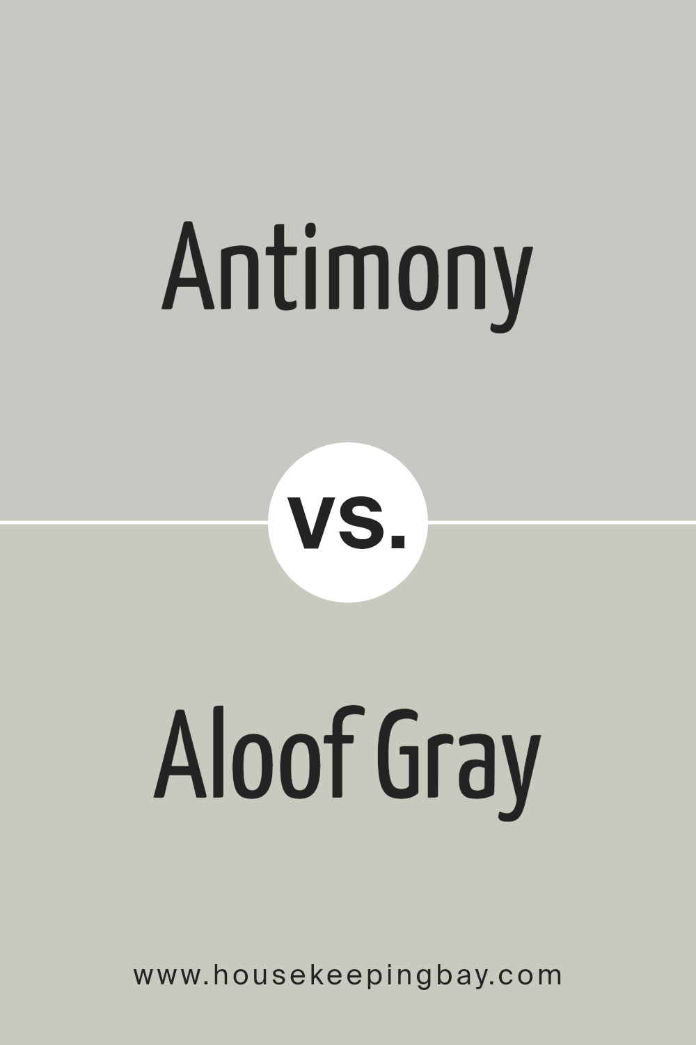
Antimony SW 9552 by Sherwin Williams vs Aloof Gray SW 6197 by Sherwin Williams
Antimony SW 9552 by Sherwin-Williams and Aloof Gray SW 6197 by Sherwin-Williams are two colors that bring their own unique vibes to a space. Antimony stands out with its rich, deep quality, somewhat resembling a charcoal but with hints of green. This color would make a statement in any room, bringing a touch of sophistication and depth. It’s perfect for someone looking to add a bit of drama or elegance to their surroundings.
Aloof Gray, in contrast, is much lighter and brings a soft, calming presence. It’s like a gentle whisper against Antimony’s bold statement. Aloof Gray has a versatile personality, fitting in seamlessly with various decor styles and spaces. It could brighten up a room while maintaining a neutral, classy backdrop that’s easy on the eyes.
Although both colors come from the same family, they serve different purposes. Antimony is for those who want to add a bold touch, while Aloof Gray is ideal for creating a soothing and relaxed space.
You can see recommended paint color below:
- SW 6197 Aloof Gray
housekeepingbay.com
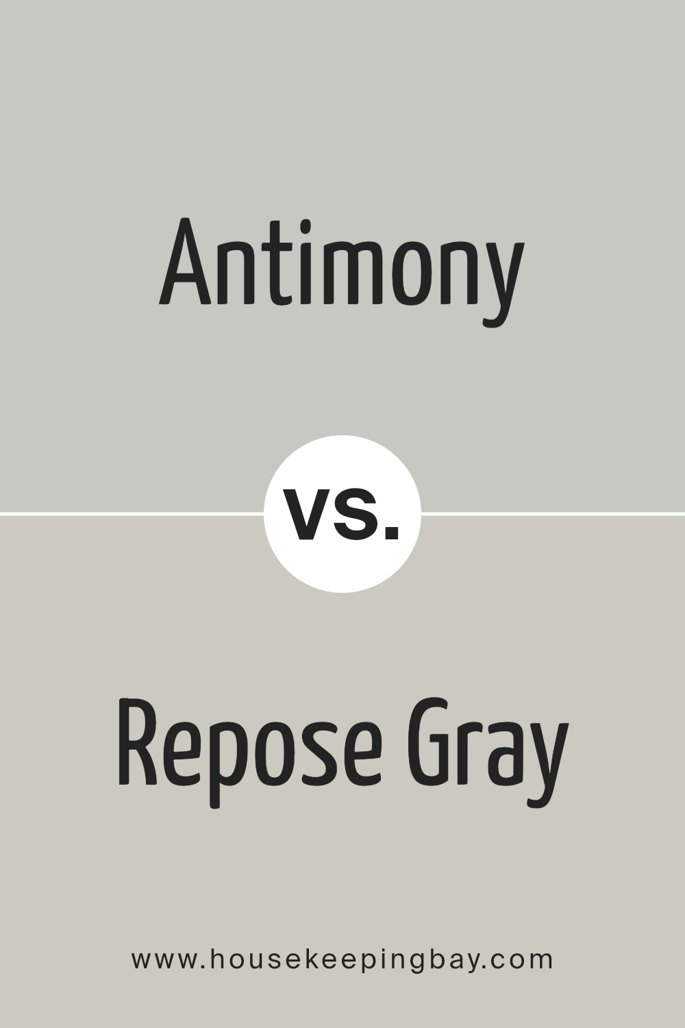
Antimony SW 9552 by Sherwin Williams vs Repose Gray SW 7015 by Sherwin Williams
Antimony SW 9552 by Sherwin Williams and Repose Gray SW 7015 are both popular colors, but they bring different vibes to a room. Antimony is a unique shade that mixes hints of gray with a soft, earthy brown, making it a cozy and warm choice for spaces. It has a certain richness that adds depth, perfect for creating a welcoming atmosphere in your home.
Repose Gray, in contrast, is a true gray that has gained a lot of fans for its versatility. This color is lighter than Antimony and leans towards a cool, neutral gray that works well in a variety of lighting conditions. It’s great for giving rooms a modern, airy feel, making spaces seem larger and more open.
While Antimony adds warmth and depth with its brown-gray tones, Repose Gray offers a cleaner, more straightforward gray that’s incredibly adaptable. Whether you’re going for a cozy, earthy vibe or a sleek, modern look, these colors offer lovely options.
You can see recommended paint color below:
- SW 7015 Repose Gray
housekeepingbay.com
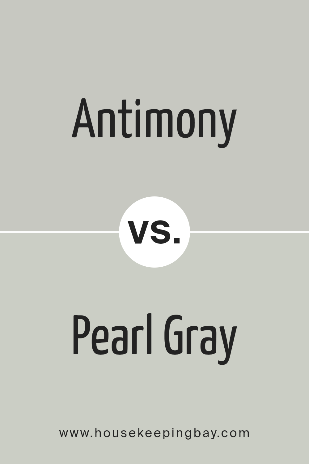
Antimony SW 9552 by Sherwin Williams vs Pearl Gray SW 0052 by Sherwin Williams
The colors Antimony SW 9552 and Pearl Gray SW 0052 by Sherwin Williams have their unique shades and vibes. Antimony is a warm, subtle gray with a hint of beige, making it cozy and inviting. It’s perfect for creating a soft, welcoming atmosphere in any room. This color has a certain richness that adds depth without overpowering a space.
On the contrary, Pearl Gray is cooler and lighter. It’s like a gentle whisper of gray that can brighten up spaces while maintaining a sleek, modern look. Pearl Gray brings in a fresh, airy feel, which can make small rooms appear larger and more open. It’s the kind of color that pairs well with almost anything, from bold colors to softer tones.
When comparing these two, Antimony offers a warmer, cozier feel, ideal for creating a snug, intimate environment. Pearl Gray, however, leans towards a cleaner, more minimalist vibe, perfect for those who prefer a crisp, contemporary look. Despite their differences, both colors provide a beautiful, understated backdrop that can complement a wide range of decor styles.
You can see recommended paint color below:
- SW 0052 Pearl Gray
housekeepingbay.com
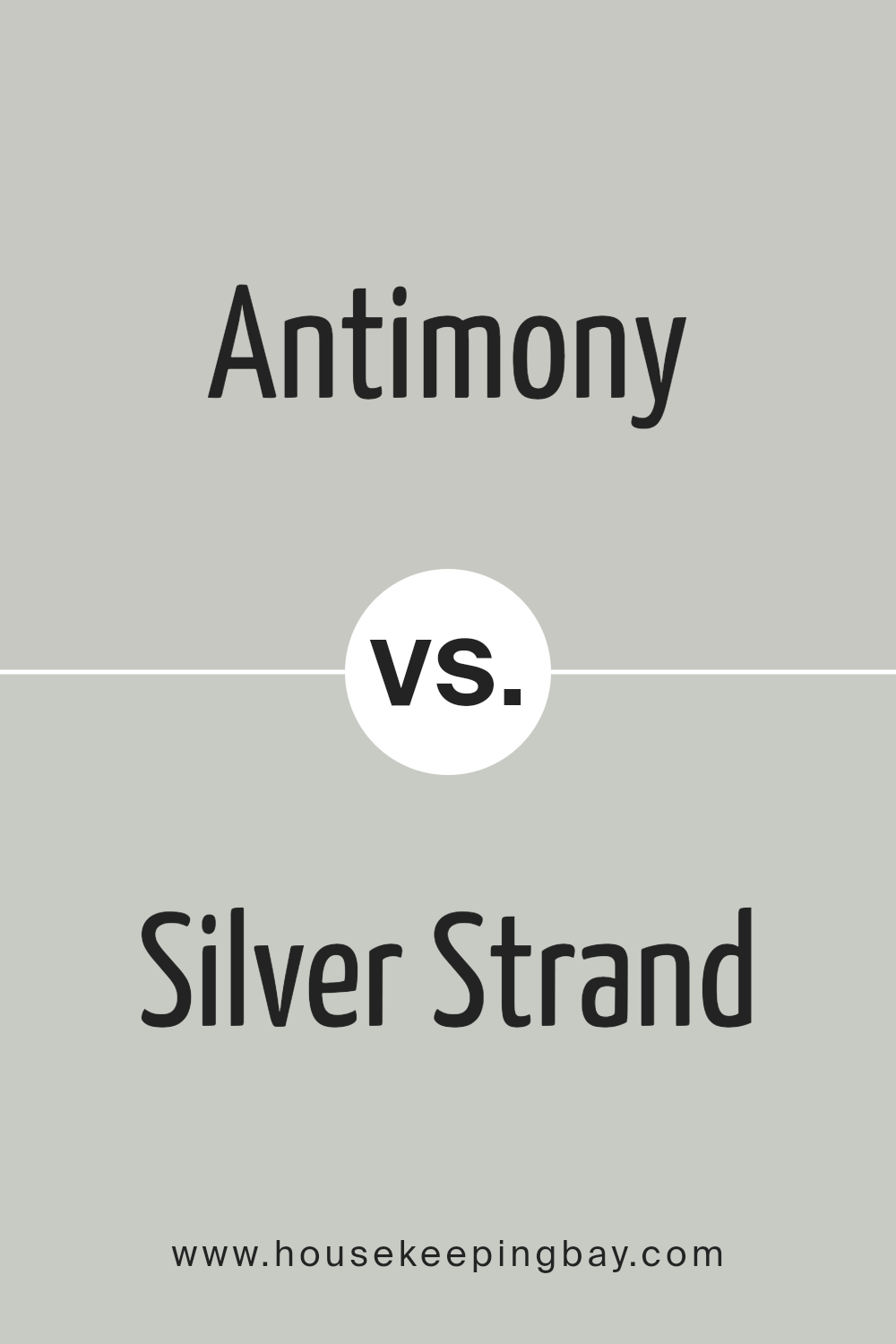
Antimony SW 9552 by Sherwin Williams vs Silver Strand SW 7057 by Sherwin Williams
Antimony SW 9552 by Sherwin Williams and Silver Strand SW 7057 are both unique in their way. Antimony has a deeper, more pronounced tone, leaning towards a rich, darker side. It’s like a quiet evening shade that brings a sense of depth and sophistication to a space. This color stands out for its ability to add drama and character, making rooms feel cozy and well-defined.
Silver Strand, however, is much lighter and carries a breezy, fresh feel. It’s like the morning sky, bright and welcoming, perfect for creating a calm, serene atmosphere. Its lighter touch can make small rooms feel bigger and brighter, offering a sense of spaciousness and peace.
While both colors share a cool undertone, Antimony presents a bold statement, ideal for accent walls or spaces needing depth. Silver Strand, conversely, works beautifully as a neutral backdrop, supporting a wide range of decor styles. Whether looking for drama or tranquility, these colors offer distinct vibes to match any mood or setting.
You can see recommended paint color below:
housekeepingbay.com
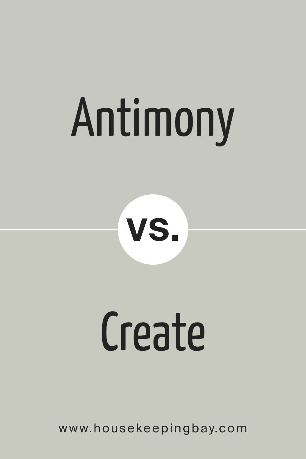
Antimony SW 9552 by Sherwin Williams vs Create SW 9646 by Sherwin Williams
Antimony SW 9552 by Sherwin Williams is a color that brings the gentle touch of nature into any space. Imagine the soft hues of early morning light filtering through the leaves; that’s the essence of Antimony. It’s a color that feels refreshing and calm, perfect for creating a serene and inviting environment.
Now, if we consider Create SW 9646 by Sherwin Williams, we’re stepping into a more vibrant, energetic scene. Create is like the burst of color you see in a garden full of flowers. It’s bolder and makes a statement, ideal for spaces that aim to inspire creativity and joy.
When comparing these two, it’s clear that each serves a distinct purpose. Antimony is all about tranquility and a connection to the natural world, while Create brings an energizing vibe, perfect for sparking imagination. Whether you prefer the quietude of Antimony or the lively spirit of Create depends on the atmosphere you want to achieve in your space.
You can see recommended paint color below:
- SW 9646 Create
housekeepingbay.com
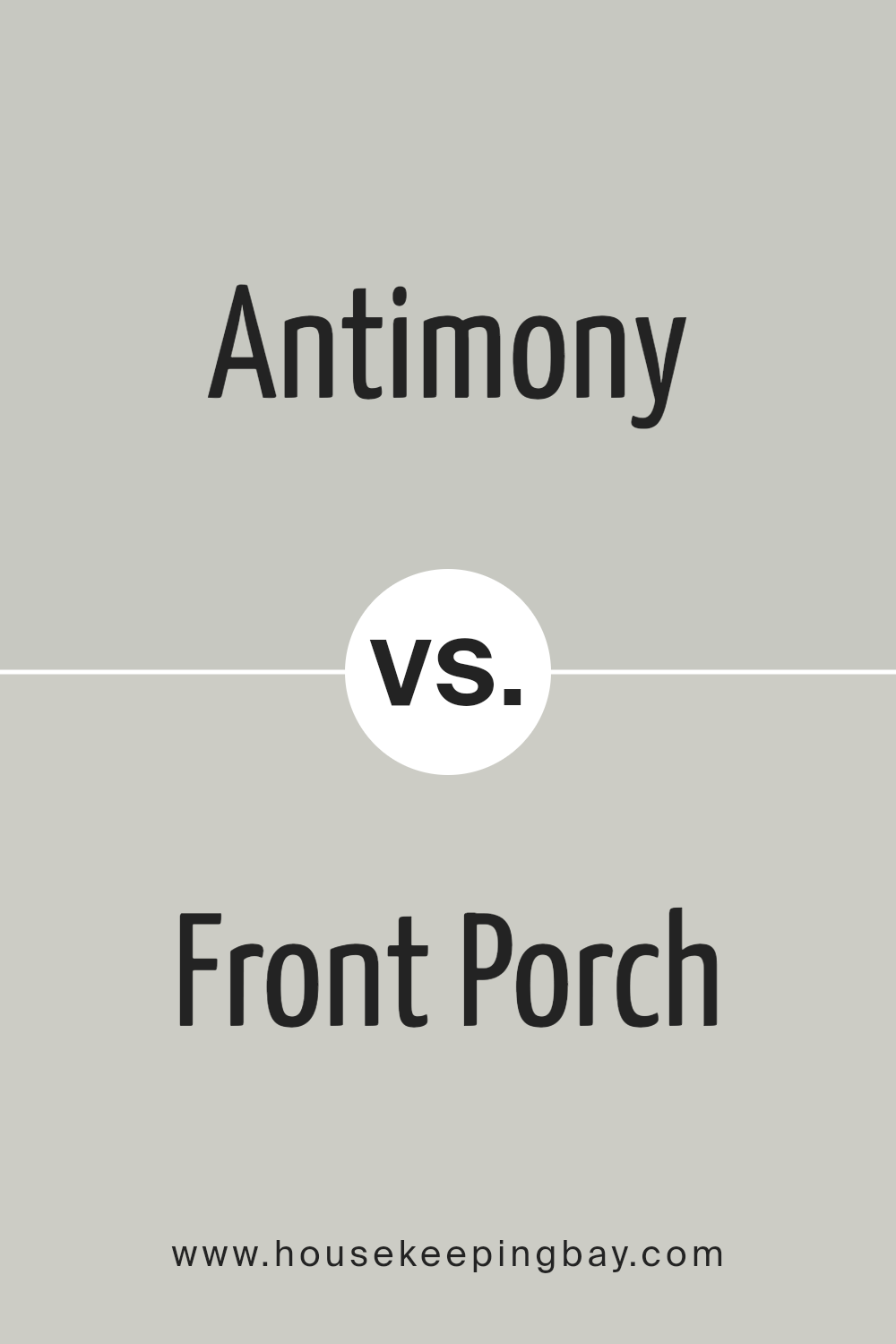
Antimony SW 9552 by Sherwin Williams vs Front Porch SW 7651 by Sherwin Williams
Antimony SW 9552 by Sherwin Williams is a unique shade, leaning towards a soft, dusky pink with warm undertones. This color feels cozy and welcoming, perfect for creating a gentle, inviting space in your home. It has a kind of muted vibrancy that offers both comfort and a touch of elegance, making it a great choice for living rooms or bedrooms where a calm, serene atmosphere is desired.
Front Porch SW 7651, in contrast, is a light, airy gray with cool undertones that give it a crisp, clean look. This color is very versatile, fitting well in many different spaces, from kitchens to bathrooms, or even as an exterior color. Its ability to reflect light beautifully makes any room look more spacious and open, promoting a feeling of tranquility and peace.
Although both colors come from Sherwin Williams and can create inviting spaces, Antimony’s warm, rosy hue provides a sense of warmth and coziness, whereas Front Porch offers a freshness and openness with its cool, light gray tone. Each can uniquely enhance a room depending on the ambiance you want to achieve.
You can see recommended paint color below:
- SW 7651 Front Porch
housekeepingbay.com
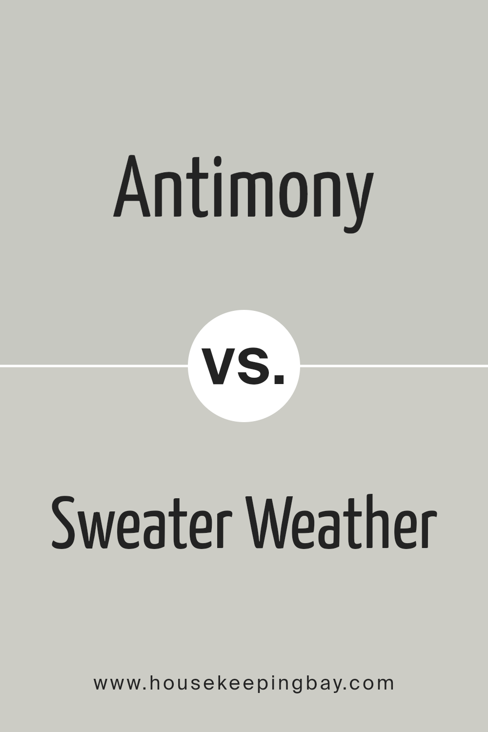
Antimony SW 9552 by Sherwin Williams vs Sweater Weather SW 9548 by Sherwin Williams
Antimony SW 9552 and Sweater Weather SW 9548 by Sherwin Williams are both unique colors, but they have different vibes. Antimony is a softer, lighter color. It’s like looking at the sky on a clear day. It feels open and airy, making your room look bigger and more welcoming. This color is perfect if you want a calm, peaceful feeling in your space.
Sweater Weather, however, is darker and cozier. It’s like the feeling you get when you wear your favorite sweater. This color adds warmth and a comforting feeling to any room, making it feel more inviting and snug. It’s great for creating a cozy corner or making a large space feel more intimate.
While Antimony opens up a room with its lightness, Sweater Weather brings an intimate warmth. Both colors are beautiful, but they serve different moods and spaces. Whether you’re going for a bright and airy feel or a cozy and warm atmosphere, these colors offer lovely options.
You can see recommended paint color below:
housekeepingbay.com
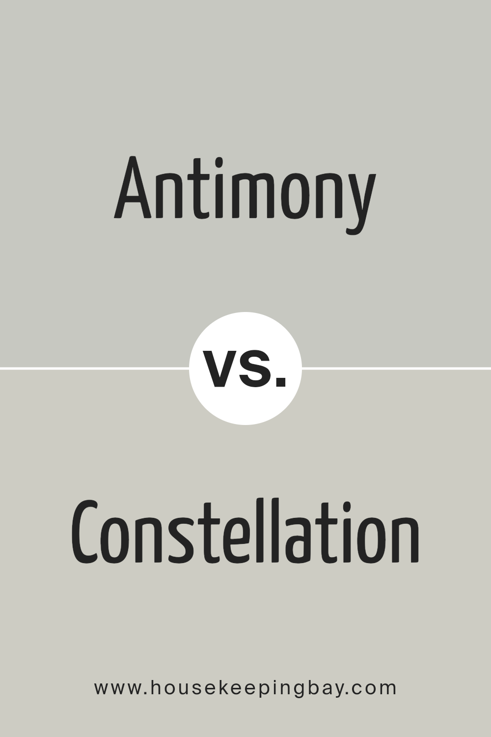
Antimony SW 9552 by Sherwin Williams vs Constellation SW 9629 by Sherwin Williams
The main color, Antimony SW 9552 by Sherwin Williams, is a unique shade with a personality that stands out. It’s a color that has a grounding effect, providing a strong basis for any space. It’s warm, inviting, and versatile, making it suitable for many different areas in a home or office. Its richness adds depth to spaces, making them feel cozy and well put together.
Constellation SW 9629, by contrast, offers a lighter and more subtle vibe. This color is airy and has a calming effect, perfect for creating a relaxed atmosphere. It’s excellent for spaces where you want to unwind and feel at peace. This color reflects light beautifully, making it a great choice for small rooms or areas that you want to appear more spacious and open.
Both colors have their unique charm and can be used to achieve different effects. Whether you’re looking for warmth and depth or lightness and calm, these colors provide options for creating distinct moods and enhancing the aesthetic of a space.
You can see recommended paint color below:
- SW 9629 Constellation
housekeepingbay.com
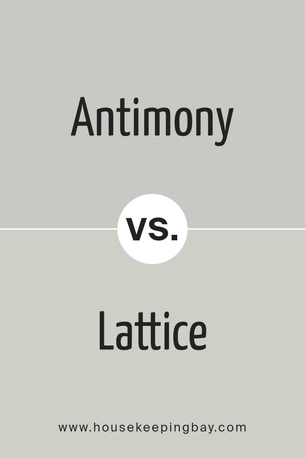
Antimony SW 9552 by Sherwin Williams vs Lattice SW 7654 by Sherwin Williams
Antimony SW 9552 and Lattice SW 7654 are two colors by Sherwin Williams, and each has its unique appeal. Antimony is a vibrant color with a deep, rich tone that brings warmth and energy to any space. It’s perfect for creating a bold statement or adding a pop of intensity to a room. Its lively character can make other elements in the room stand out, giving a lively atmosphere.
Lattice SW 7654, in contrast, is much softer and leans towards a neutral palette. This color is all about calmness and tranquility, making it ideal for spaces where you want to relax and unwind. It provides a light, airy feel that can make a small room look more spacious and inviting.
Lattice is versatile, working well with various decor styles and colors, adding a sophisticated touch without overwhelming the senses.
So, while Antimony brings a dynamic and robust energy, Lattice offers a gentle, serene vibe, showing how different colors can create distinct atmospheres in your home.
You can see recommended paint color below:
- SW 7654 Lattice
housekeepingbay.com
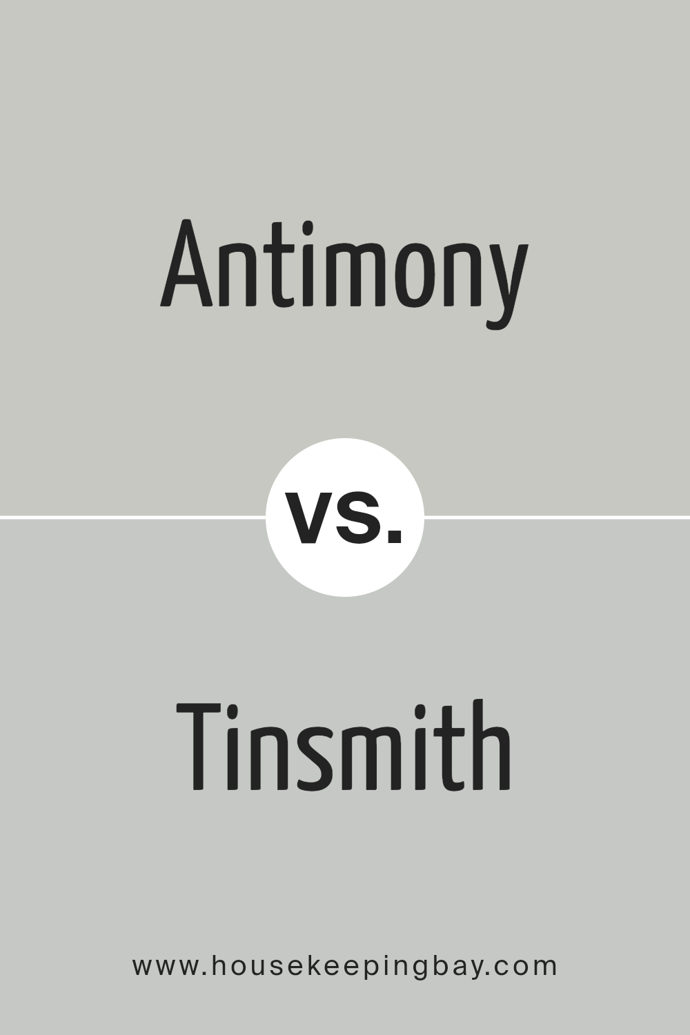
Antimony SW 9552 by Sherwin Williams vs Tinsmith SW 7657 by Sherwin Williams
When you look at Antimony SW 9552 and Tinsmith SW 7657 from Sherwin Williams, they both have their own unique vibe. Antimony is a lighter, more delicate gray that gives off a peaceful and airy feel. It’s perfect if you’re going for a soft and subtle look in a space. It’s like a breath of fresh air in any room, making things feel more open and relaxed.
Tinsmith SW 7657, however, steps things up a notch. It’s also a gray shade but comes with a bit more depth. This color adds a touch of sophistication and can really tie a room together, giving it a polished and refined look. It’s the kind of color that’s versatile enough to work well in many different spaces but brings a stronger presence than Antimony.
In comparing the two, Antimony is your go-to for creating a light and breezy atmosphere, while Tinsmith offers a deeper, more anchored feel. Each brings its own charm to the table, making them great choices for anyone looking to freshen up their space with shades of gray.
You can see recommended paint color below:
- SW 7657 Tinsmith
housekeepingbay.com
Conclusion
In conclusion, SW 9552, or Antimony by Sherwin Williams, stands out as a remarkable paint choice for anyone looking to refresh their space. This color offers a unique blend of warmth and sophistication, making it perfect for various rooms and settings.
Whether you’re aiming to add a cozy vibe to your living room or a hint of elegance to your bedroom, Antimony can achieve that goal with its versatile hue. Furthermore, its quality ensures durability and a lasting finish, allowing you to enjoy your newly transformed space without frequent touch-ups.
By choosing Antimony, you’re not just picking a paint color; you’re setting the foundation for a room that feels both welcoming and stylish. Remember, the right color can significantly impact the overall look and feel of your space, and with Antimony, you’re making a choice that combines beauty, quality, and versatility.
So, whether you’re updating a single room or your entire home, consider Antimony by Sherwin Williams for a change that brings a fresh and inviting atmosphere to your living environment.

housekeepingbay.com
Ever wished paint sampling was as easy as sticking a sticker? Guess what? Now it is! Discover Samplize's unique Peel & Stick samples. Get started now and say goodbye to the old messy way!
Get paint samples
