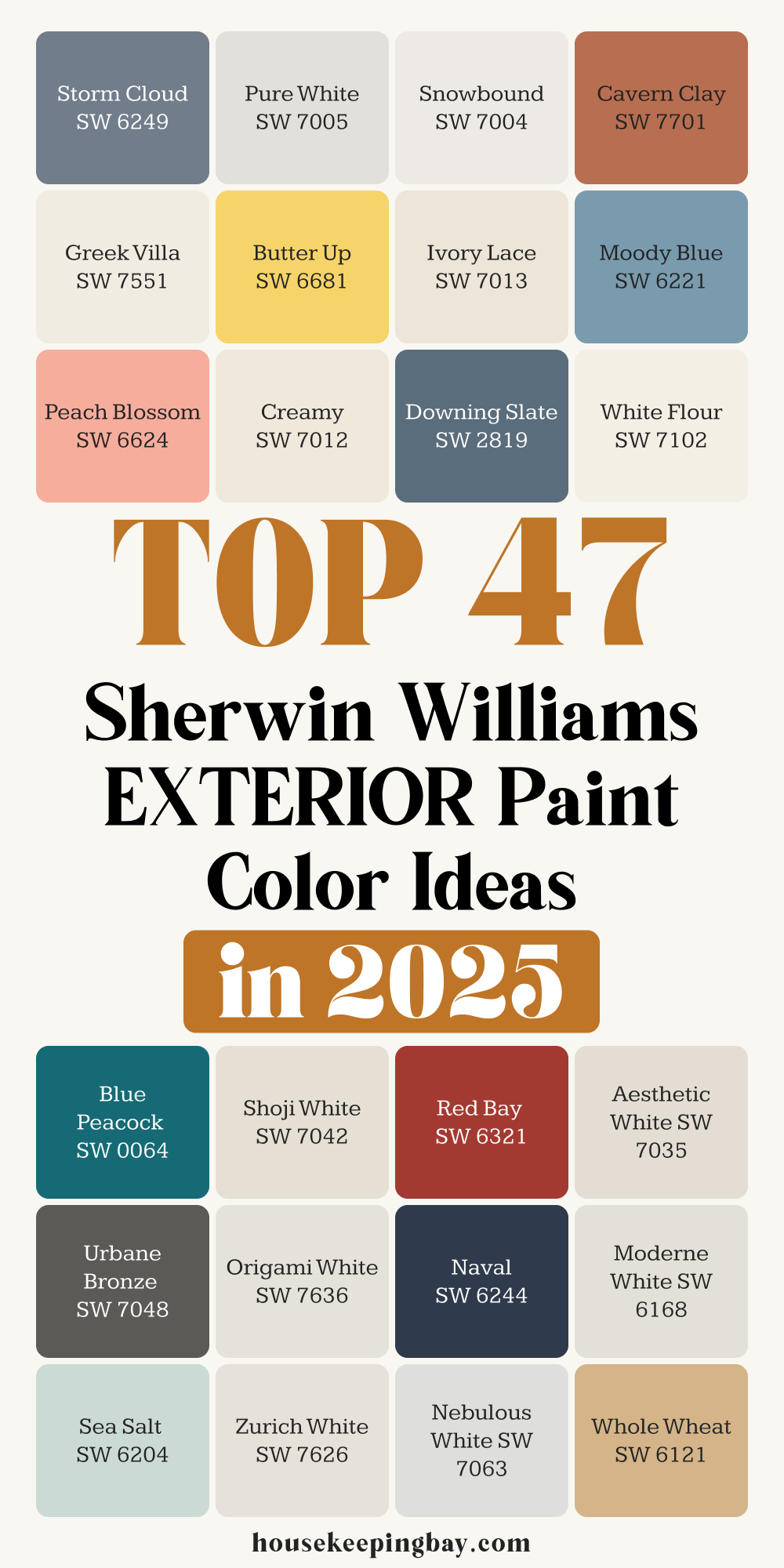
47 Exterior Paint Color Ideas by Sherwin Williams for 2025
Why the Right Paint Color Changes Everything
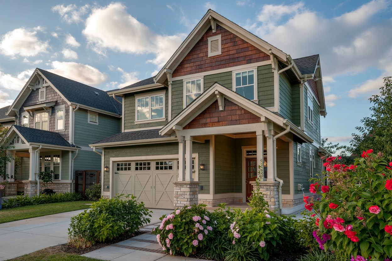
When I walk up to a house, the first thing I notice isn’t the size or the shape. It’s the feeling I get from the color. That split-second impression sets the tone for how we see everything else. I’ve worked with so many families who told me, “I don’t know why, but I just never liked walking up to my house.” And nine times out of ten—it came down to paint.
Picking the right exterior color isn’t just about what’s trendy. It’s about how you want your home to feel every single time you pull into the driveway. Warm and welcoming? Clean and classic? Bold and a little different?
That’s where Sherwin-Williams comes in. Their range of shades gives me the flexibility to match every personality and every style of home—without guessing.
I’ve used their colors on cozy cottages, modern farmhouses, beachy vacation homes, and even a few big city builds. And I’m always impressed by how the right color can shift the entire look and mood of a home. There’s a reason they’ve been a trusted name for over 150 years.
But I get it—47 colors might sound like a lot. So don’t worry. I’ve grouped them into easy categories, shared some of my own experiences, and added a few tips I always give clients who feel stuck.
Let’s start by getting a few things straight before you choose a single color.
housekeepingbay.com
Before You Pick a Color
You know what surprises most people? It’s not that choosing a paint color is hard—it’s that they don’t even realize what they need to think about before they pick one. I’ve seen folks fall in love with a color on Pinterest or Instagram, paint their house, and then call me weeks later saying, “Why doesn’t it look like I imagined?”
That’s because paint doesn’t live in a vacuum. It reacts to the world around it.
1. Look at Your Light
Natural sunlight changes everything. A soft gray in the store might look blue or even purple once it’s outside all day.
My rule? Always check your color in the morning, afternoon, and evening light. Paint doesn’t sleep, and your house looks different from 8am to 8pm.
2. Think About Your Roof, Brick, or Stone
You can’t paint your shingles or your brick (well, technically you can, but that’s a whole different project). So make sure your new color doesn’t clash with those fixed elements.
A warm-toned paint next to a cool gray roof? It’ll always feel off.
3. The Neighborhood Matters
I always say: You don’t have to match your neighbor’s house—but don’t fight with it either. If everyone around you is soft beige and taupe, a bright turquoise house might feel out of place (and not in a good way).
4. HOA Rules Are Real
Some neighborhoods are picky. I’ve had clients fall in love with a deep navy only to find it’s on the “do not use” list. Always check first if you have a homeowner’s association.
Quick Checklist Before Picking a Shade:
- What direction does your house face?
- What are your fixed elements (roof, stone, driveway)?
- What colors are your neighbors using?
- Any HOA restrictions or guidelines?
- Are you painting the trim, shutters, or front door too?
These questions help you see your house as a whole. Once you’ve looked at all of that, then we can talk color.
My Go-To Sherwin-Williams Colors by Style
Here’s how I’ve grouped these 47 colors to make it easier to choose. Think of it like picking a mood for your house.
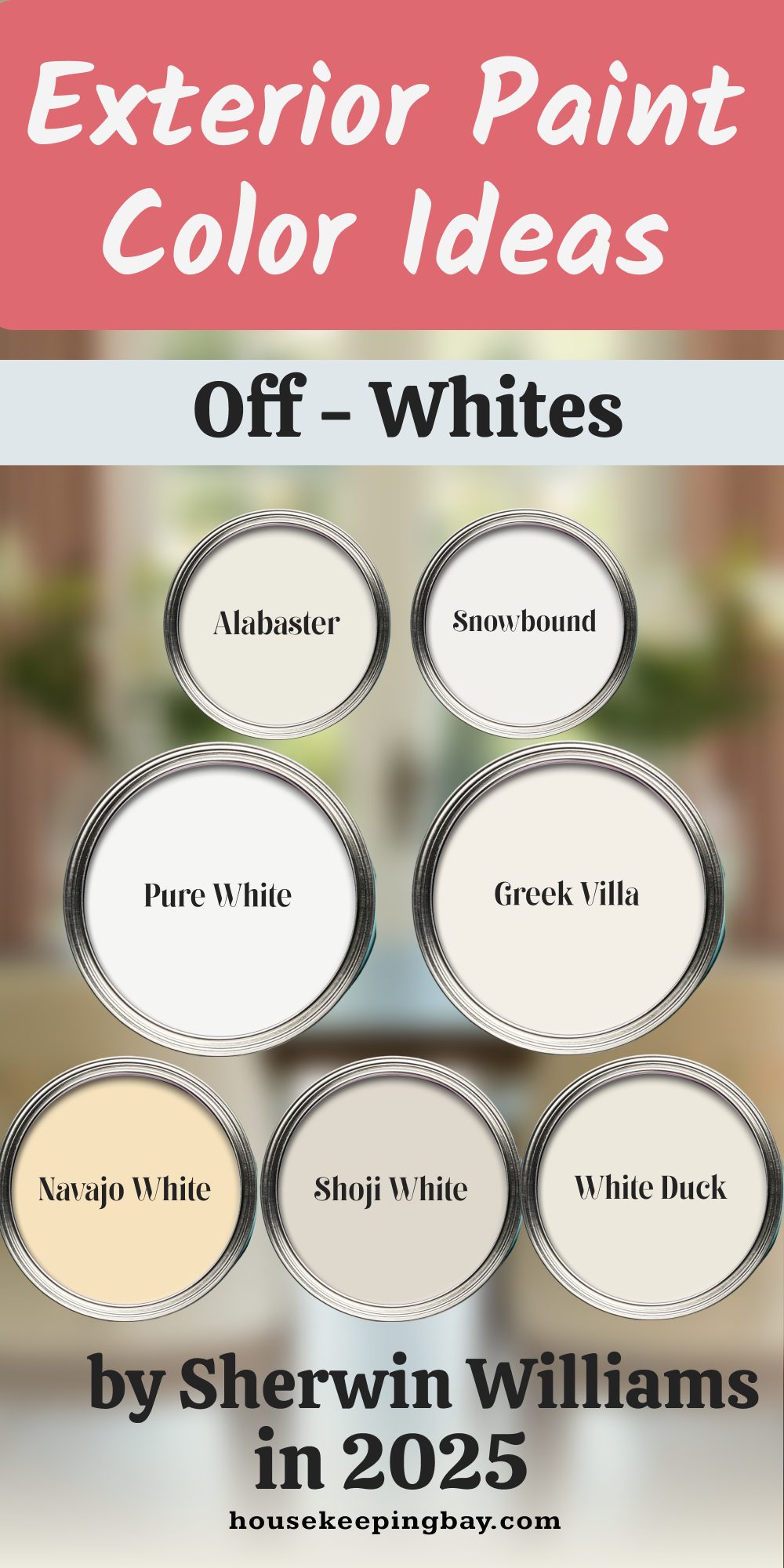
1. Classic Whites & Off-Whites
These are my safe choices when clients want something clean and timeless. They’re especially great for cottages, colonials, or newer builds with sharp trim.
- Alabaster (SW 7008) – Warm, soft, not too bright. Sherwin-Williams
- Snowbound (SW 7004) – A touch cooler than Alabaster, lovely with gray or black accents.
- Greek Villa (SW 7551) – Subtle creamy white, works well with tan or brown roofs.
- Pure White (SW 7005) – One of my favorites for trim or modern homes. Clean but not stark.
- Navajo White (SW 6126) – Slightly yellow-based, good for older homes or desert climates.
- Shoji White (SW 7042) – Beige undertone, soft and grounding.
- White Duck (SW 7010) – Somewhere between beige and cream—feels cozy and calm.
Fun fact: Sherwin-Williams named Alabaster their Color of the Year in 2016—and it’s still one of their most popular whites today.
housekeepingbay.com
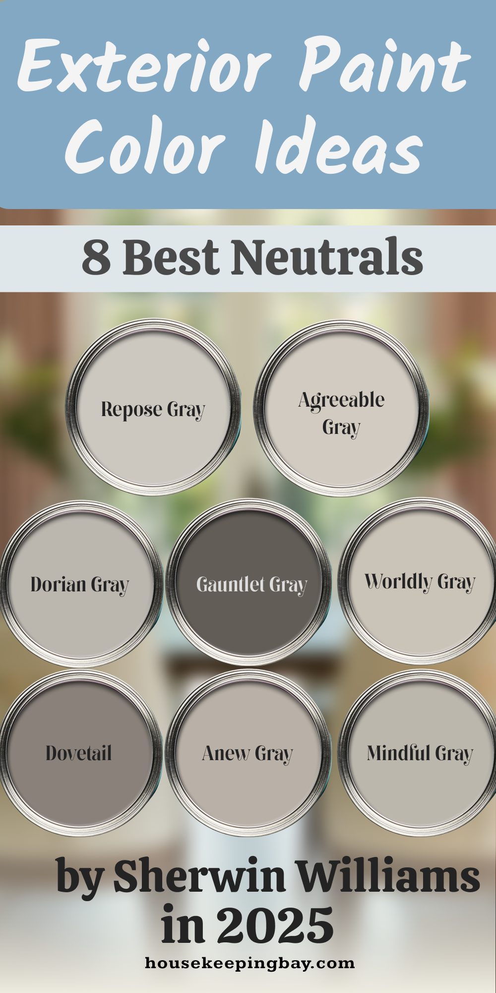
2. Modern Neutrals – Grays, Taupes, Greiges
These are the chameleons—changing depending on light, trim, and what’s around them. Very popular for flips, ranch homes, and clean lines.
- Agreeable Gray (SW 7029) – My go-to. Not too gray, not too beige. Just works.
- Repose Gray (SW 7015) – Slightly cooler than Agreeable. Perfect with white trim.
- Dorian Gray (SW 7017) – More grounded and moody. Great on bigger homes.
- Gauntlet Gray (SW 7019) – Dark, stormy, makes a statement.
- Worldly Gray (SW 7043) – Has a little green to it, works beautifully with stone.
- Anew Gray (SW 7030) – Soft and warm, beautiful for mid-century homes.
- Mindful Gray (SW 7016) – One of my top three—balanced and peaceful.
- Dovetail (SW 7018) – A deeper taupe-gray, feels rich without going dark.
TIP: Grays often pick up blue, green, or even purple undertones. Always test them in your real light.
housekeepingbay.com
3. Coastal-Inspired Blues & Greens
Whether you’re by the water or not, these colors bring a calm, breezy feel. I use these often for bungalows, vacation homes, or anything with porch railings.
- Sea Salt (SW 6204) – Soft, misty green-blue. Feels like a beach day.
- Rainwashed (SW 6211) – More green than blue, but still cool and fresh.
- Watery (SW 6478) – Slightly deeper, adds playfulness.
- Oyster Bay (SW 6206) – Earthy green-gray. Looks elegant with black trim.
- Naval (SW 6244) – Rich navy. Named Color of the Year in 2020.
- Storm Cloud (SW 6249) – Dusty and moody. Great on accents or smaller homes.
- Moody Blue (SW 6221) – Between gray and blue. A good modern coastal choice.

housekeepingbay.com
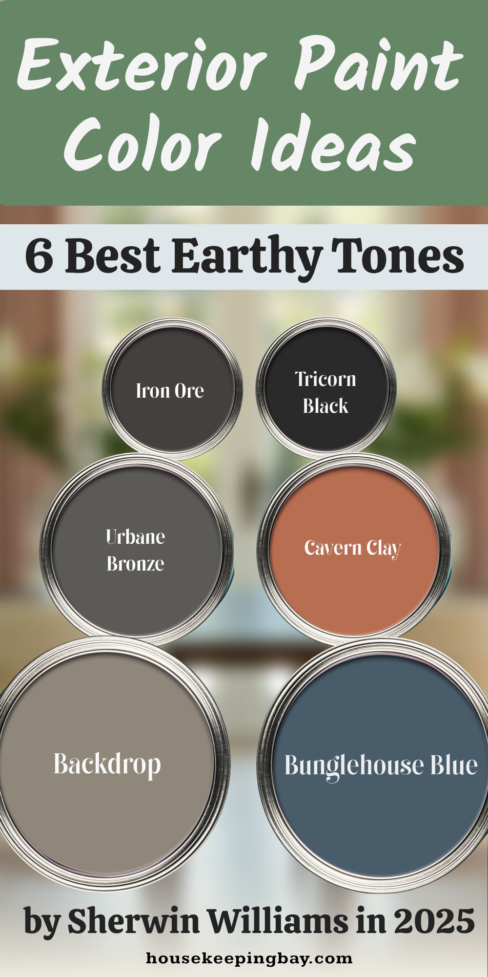
4. Bold and Earthy Choices
These are the brave ones. I use these when someone wants their home to stand out—but in a grounded way. Think mountain homes or homes with big wood beams.
- Iron Ore (SW 7069) – Almost black, but with softness.
- Tricorn Black (SW 6258) – True black, dramatic and strong.
- Urbane Bronze (SW 7048) – Earthy dark brown/gray, SW’s Color of the Year 2021.
- Cavern Clay (SW 7701) – Terracotta warmth, lovely in desert areas.
- Bunglehouse Blue (SW 0048) – Dark blue with vintage soul.
- Backdrop (SW 7025) – Brown-gray base, beautiful with brass or wood accents.
housekeepingbay.com
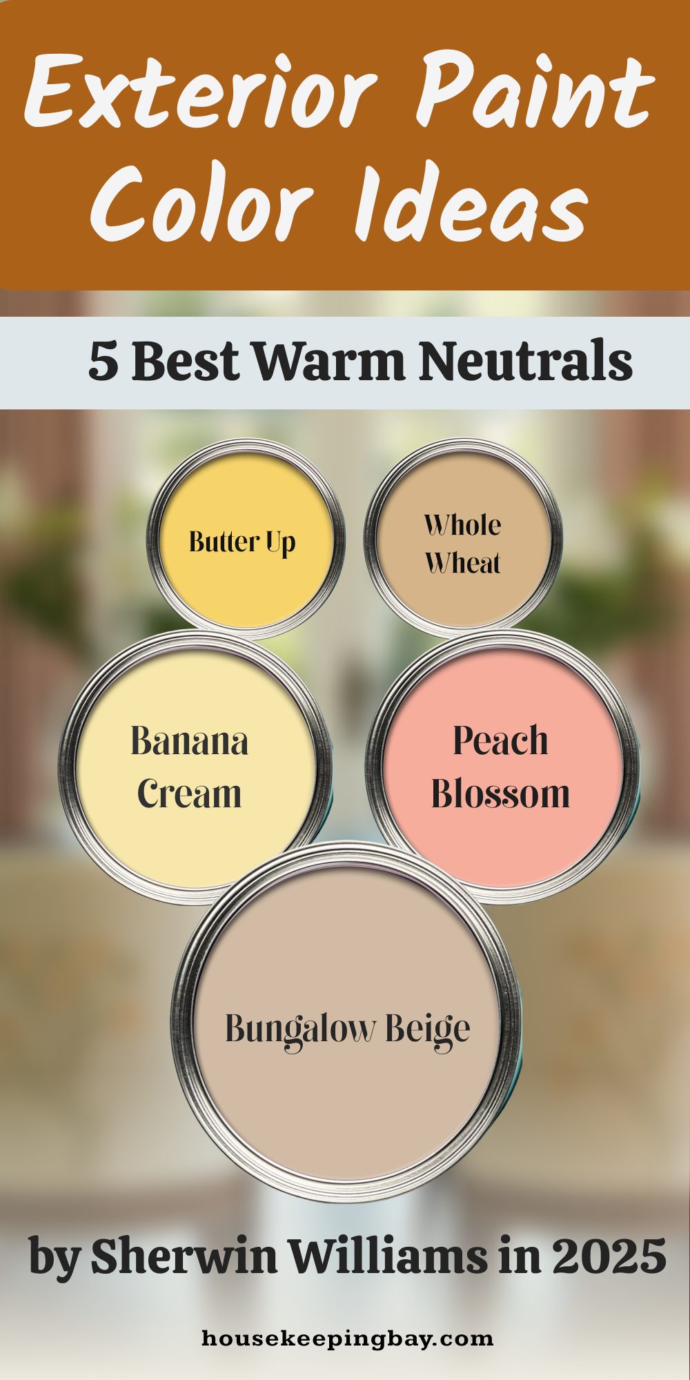
5. Warm and Inviting Tones
These give your house that “come in and have lemonade” kind of feeling. Especially great for farmhouses, ranch homes, and traditional family homes.
- Butter Up (SW 6681) – Happy yellow. A little goes a long way.
- Bungalow Beige (SW 7511) – Understated and classic.
- Whole Wheat (SW 6121) – Light tan with a cozy glow.
- Banana Cream (SW 6673) – Soft yellow, not cartoonish.
- Peach Blossom (SW 6624) – A cheerful peach, great for accents.
housekeepingbay.com
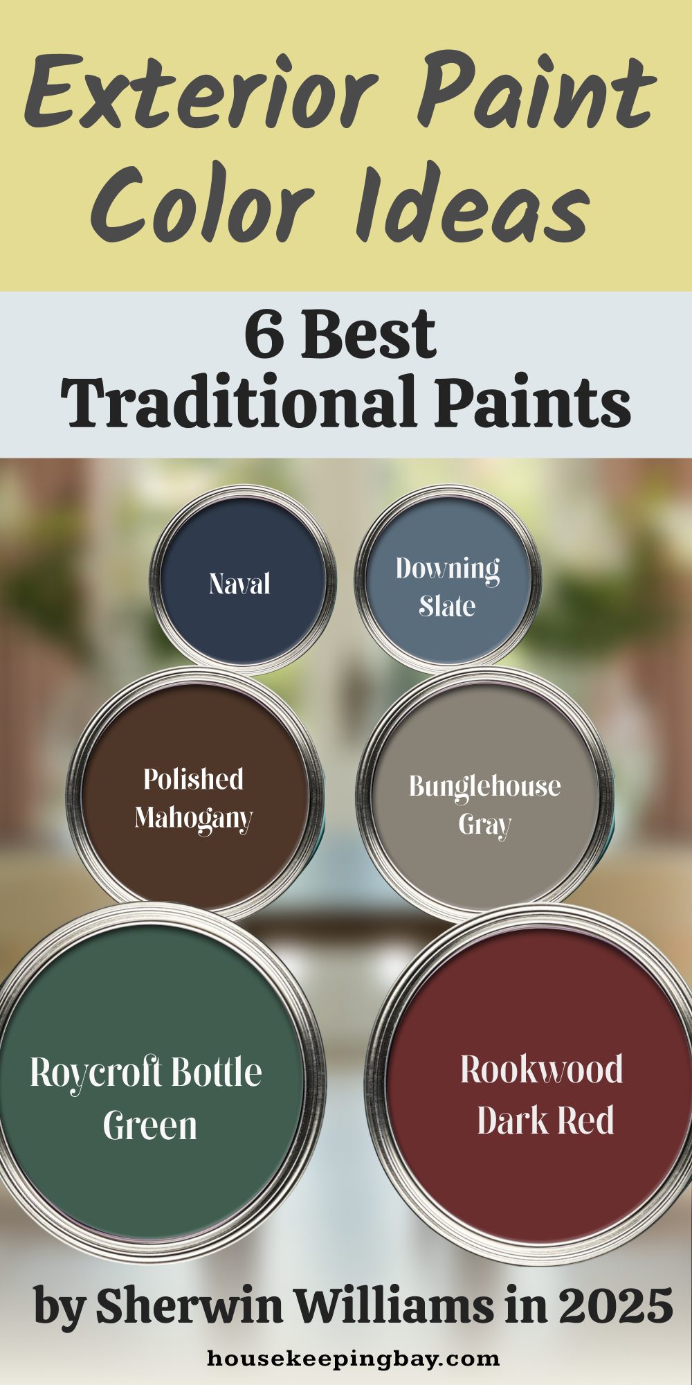
6. Traditional Historic Colors
These have roots in older American architecture. I suggest these for colonial homes, vintage styles, or anything with classic bones.
- Rookwood Dark Red (SW 2801) – Deep and rich, perfect with tan trim.
- Roycroft Bottle Green (SW 2847) – A bold evergreen.
- Naval (SW 6244) – Yes, again. It belongs in both categories.
- Polished Mahogany (SW 2838) – Deep brown-red, feels high-end.
- Bunglehouse Gray (SW 2845) – Cool-toned, with an antique finish.
- Downing Slate (SW 2819) – Dusty blue-gray, elegant with cream trim.
housekeepingbay.com
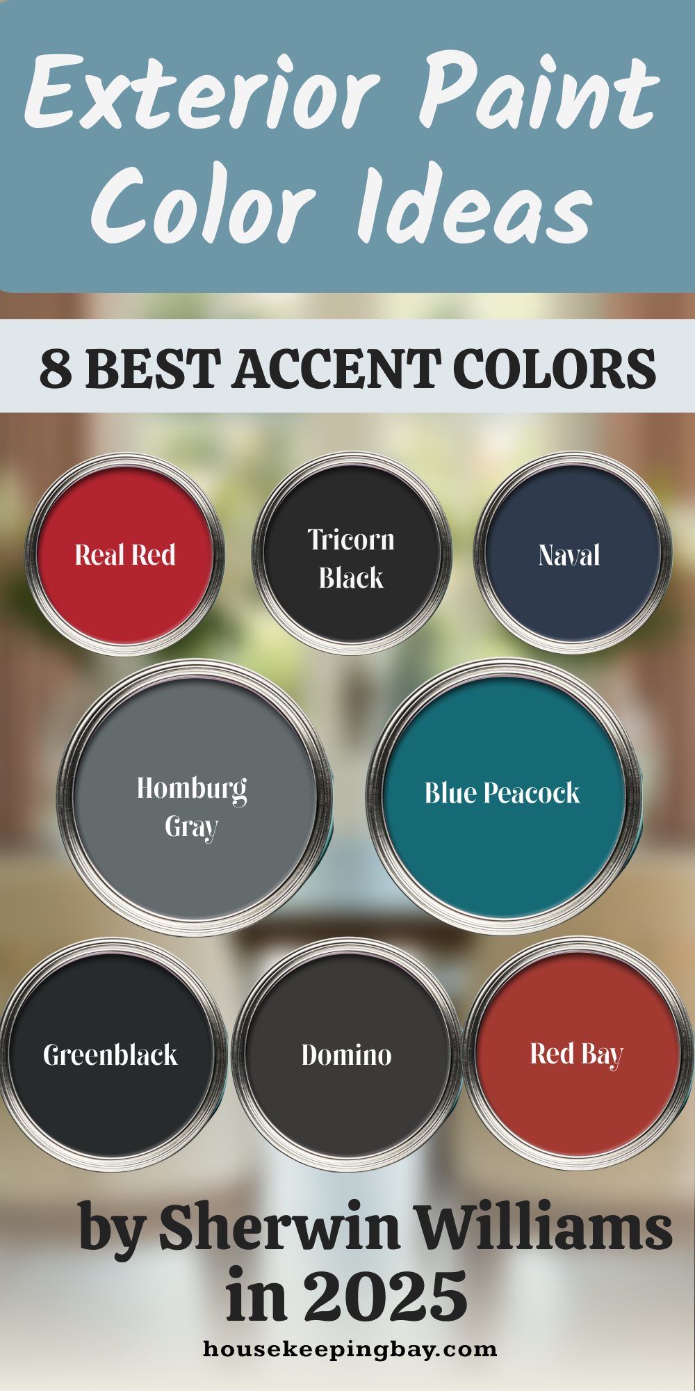
7. Accent Color Ideas – Doors, Shutters, Trim
These don’t go on the whole house—just the parts you want to pop.
- Real Red (SW 6868) – Bold, brave, fun front door.
- Tricorn Black (SW 6258) – Again, works great as a trim or shutter color.
- Naval (SW 6244) – Can’t stop using it. Great door color.
- Homburg Gray (SW 7622) – Dusty, old-world, good on shutters.
- Blue Peacock (SW 0064) – Bold teal that looks great with whites.
- Greenblack (SW 6994) – Almost black, with a hint of green.
- Domino (SW 6989) – Deep charcoal. Perfect for contrast.
- Red Bay (SW 6321) – Spicy red that warms up brick homes.
housekeepingbay.com
Quick Tips to Test Your Color First
I’ve had clients cry twice—once when they saw their color on a Pinterest board, and again when it looked totally different on their house. That’s why I’m such a stickler about testing paint the right way. Here’s what I always tell people:
Why Swatches Lie Sometimes
The tiny paint strip you see in the store? It’s printed ink, not real paint. And it’s small. Too small. It can’t show how light, shade, and surface texture will affect the color.
A light beige can suddenly look pink.
A gray can turn green.
A “white” might feel yellow next to your roof.
So please—never trust a swatch on its own.
Tricks I Use With Samples and Lighting
- Always buy a small test sample. Sherwin-Williams sells these in 1-quart sizes. Totally worth it.
- Paint it on a big piece of foam board (not directly on your house at first). This way, you can move it around.
- Check it at different times of day. Light from the east (morning) is cool. Afternoon light can be really warm and yellow.
- Stand back. You want to see the color from the street—not just 2 feet away.
- If your trim won’t change, test your main color next to it. Always test how they talk to each other.
My “3 Angles / 3 Days” Test Rule
This is my non-negotiable test. Every client hears it.
Pick 3 different spots on your house:
- One in full sun
- One in shade
- One near your fixed materials (like brick or roof)
And look at those spots at least 3 different times a day, for 3 days. Morning, midday, and evening. It’s the best way to avoid a big regret.
Let Me Say This Before You Go…
The color you choose is going to greet you every single day. It’s the first hello when you come home, and the last thing your guests see as they leave.
So make it feel like you.
Some people want fresh and bright. Others want deep and moody. There’s no wrong answer—only the one that feels right for your life, your house, and the feeling you want when you turn into your driveway.
My Top 3 “Safe” Picks If You’re Still Unsure
If you’re completely stuck and want zero risk, here are three I reach for over and over:
- Alabaster (SW 7008) – Soft white that never feels too cold or yellow.
- Agreeable Gray (SW 7029) – It’s not a trend. It’s a reliable, forgiving neutral.
- Sea Salt (SW 6204) – For something calm, pretty, and a little bit fun.
You’ve Got This
Choosing the right paint color doesn’t have to be stressful. It’s one of the fastest, most affordable ways to make your house feel loved and lived-in. And Sherwin-Williams has the range and quality to help you get it right.
So take a breath. Pick a few samples. Trust your gut. And if you’re still unsure, ask a neighbor what they see. Sometimes, a second set of eyes helps.
housekeepingbay.com
