Brandywine SW 7710 by Sherwin Williams
Warm Up Your Space with This Cozy Hue
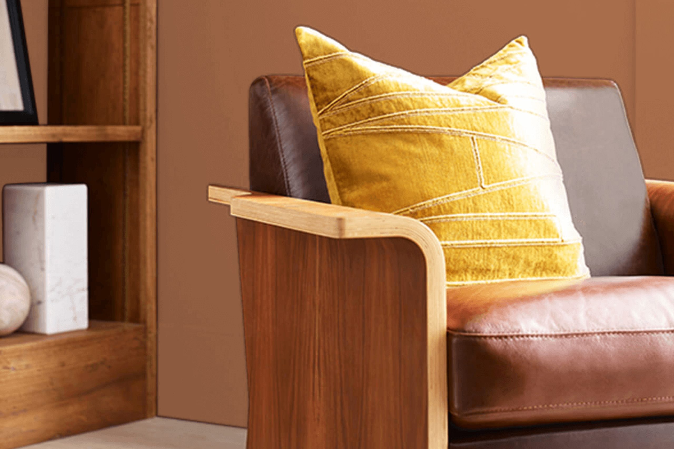
You might be wondering about finding the perfect paint color for your next home improvement project. I’m here to talk about SW 7710 Brandywine by Sherwin Williams, a rich, warm hue that could be just what you need. It’s a deep, red-toned color that adds a cozy and inviting touch to any room.
Brandywine works wonders in living areas and dining rooms, creating a welcoming atmosphere for guests and family dinners. It also pairs beautifully with natural wood elements, enhancing the traditional charm of your space. Whether you have a lot of natural light or rely more on artificial lighting, Brandywine maintains its warmth and depth under different lighting conditions.
If you’re considering adding a sense of warmth and richness to your space, Brandywine could be the paint color to do just that. Its deep hues provide a perfect backdrop for both modern and classic designs, allowing you to incorporate it into a variety of decorating styles.
Whether used as an accent wall or throughout a room, Brandywine has a way of making any space feel more homely and inviting.
via sherwin-williams.com
What Color Is Brandywine SW 7710 by Sherwin Williams?
Table of Contents
Brandywine SW 7710 by Sherwin Williams is a warm, inviting hue that lies between red and brown. This rich, robust color emits a cozy, comforting vibe, making it ideal for spaces where relaxation and warmth are priorities. The deep, saturated tone works beautifully in traditional interiors such as classical, rustic, or country styles, where it complements natural materials like wood, leather, and stone.
In a living room, Brandywine can create a focal point on a single accent wall or add depth as a complete wall color. It pairs exceptionally well with furnishings that have a vintage or antique feel. In kitchens, this color can enhance the warmth of wooden cabinets or contrast nicely with cream or beige tiles.
When matched with soft textures like plush throws, velvet cushions, or woolen rugs, Brandywine brings a touch of sophistication and a hint of luxury. Metals like brass, copper, and gold also work well with this shade, offering a gorgeous contrast that highlights its richness without overwhelming the senses.
Overall, Brandywine SW 7710 is versatile and dynamic, suitable for anyone wishing to add warmth and character to their interiors. Its ability to blend with various materials and textures offers multiple styling options, providing a welcoming atmosphere regardless of the setting.

housekeepingbay.com
Is Brandywine SW 7710 by Sherwin Williams Warm or Cool color?
Brandywine SW 7710 by Sherwin Williams is a warm, deep red paint color that adds a cozy and inviting atmosphere to rooms. This shade is perfect for creating a welcoming space in homes, particularly in living areas, dining rooms, or bedrooms. The rich, earthy tones of Brandywine make it versatile, complementing both traditional and modern decors. It pairs well with natural materials like wood, enhancing their textures and adding to the overall warmth of the space.
The intensity of Brandywine makes it a great choice for accent walls or for furniture pieces, where it can serve as a focal point. In rooms with plenty of natural light, Brandywine glows beautifully, but in dimly lit spaces, it can create a snug and intimate vibe, making it ideal for spaces where comfort is key.
Furthermore, by using Brandywine in a room, you can add a sense of sophistication and warmth, making your home feel more welcoming and stylish. The color’s rich hue works well with soft lighting, which can help bring out its depth and enhance the ambiance of any room.
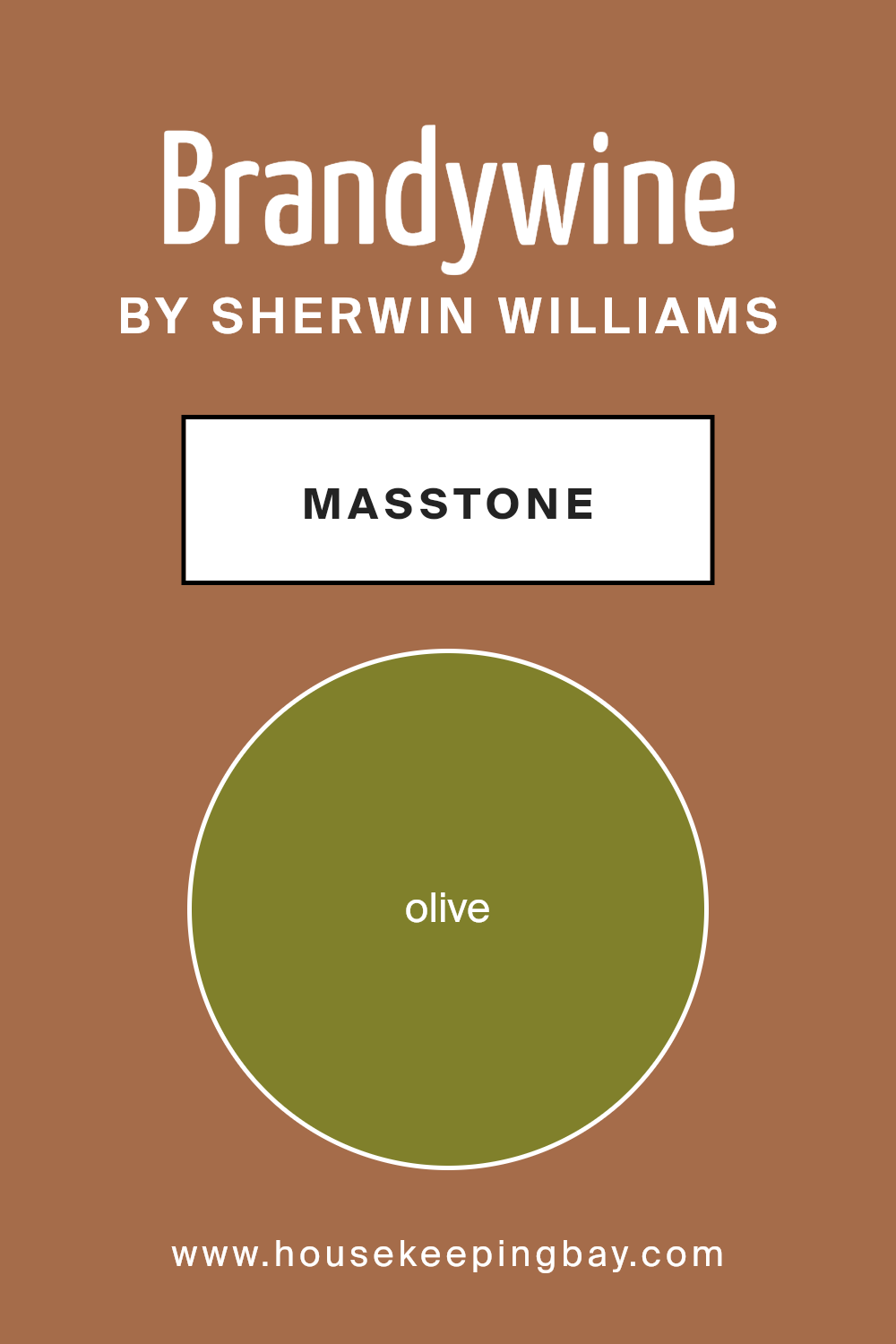
What is the Masstone of the Brandywine SW 7710 by Sherwin Williams?
Brandywine SW 7710 by Sherwin Williams has a masstone of Olive (#80802B), giving it a rich, deep greenish-brown hue. This unique color offers a grounded and earthy vibe, making it well-suited to areas where a comforting and serene atmosphere is desired.
In homes, this olive color works beautifully in spaces meant for relaxation and calm, such as living rooms or bedrooms. Its subdued, natural tone pairs nicely with natural materials like wood and stone, enhancing the cozy feel of a room. Being a darker color, Brandywine can also add depth and warmth to a space.
It’s particularly effective in larger rooms or rooms with plenty of natural light, where it won’t overwhelm but rather add a sophisticated touch. Additionally, this shade matches well with both neutral palettes and richer colors, allowing for versatile design options. It’s an excellent choice for creating a welcoming, grounded environment in any home.
housekeepingbay.com
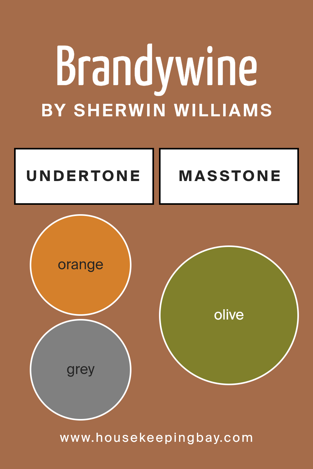
Undertones of Brandywine SW 7710 by Sherwin Williams
Brandywine SW 7710 by Sherwin Williams is a rich and versatile color that stands out due to its complex undertones. Undertones are subtle colors that influence the main hue, affecting how it looks under different lighting conditions and when paired with other colors. For Brandywine SW 7710, these undertones include Orange, Grey, Pale Pink, Brown, Red, Purple, Pink, Light Green, Yellow, Mint, Pale Yellow, Dark Green, Dark Turquoise, Dark Grey, Navy, Green, and Light Turquoise.
When used on interior walls, the undertones of Brandywine SW 7710 can either warm up or cool down the room, depending on the lighting and surrounding decor. For example, the orange and red undertones add warmth, making a room feel cozy and inviting. In contrast, the purple and dark turquoise can introduce a cooler, more subdued vibe.
These undertones also give decorators flexibility. Depending on the colors of furniture and accessories, Brandywine SW 7710 can lean more toward its orange and red undertones or its cooler purple and dark turquoise. This adaptability makes it a good choice for many styles and spaces.
For example, pairing this color with rich wood tones will enhance its brown and orange undertones, perfect for a traditional or rustic style. Conversely, modern decor with metallics or cooler-toned furnishings might bring out its grey and dark turquoise undertones, giving the space a more contemporary feel.
Overall, Brandywine SW 7710 is not a simple paint color; its array of undertones allows it to interact dynamically with various interior design elements. This interaction affects how the paint color is perceived and can significantly dictate the ambiance of a room.
housekeepingbay.com
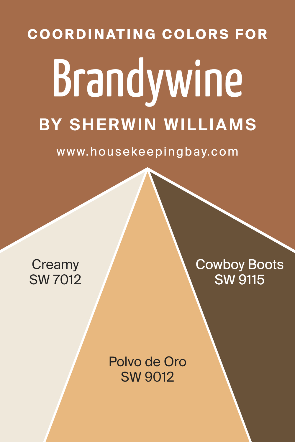
Coordinating Colors of Brandywine SW 7710 by Sherwin Williams
Coordinating colors are those that complement each other well when used together in design and decor, helping to create a cohesive look. For Brandywine SW 7710 by Sherwin-Williams, there are several coordinating colors including SW 7012 – Creamy, SW 9012 – Polvo de Oro, and SW 9115 – Cowboy Boots.
When these colors are used alongside Brandywine, they enhance the overall aesthetic, ensuring that the spaces feel harmonious and well balanced. SW 7012 – Creamy is a soft and warm off-white that offers a subtle contrast and works seamlessly with deeper, more pronounced colors to create a soothing backdrop.
Then there’s SW 9012 – Polvo de Oro, a gentle gold with an earthy undertone that adds a touch of sophistication and warmth, perfect for enriching a space without overwhelming it. Lastly, SW 9115 – Cowboy Boots is a dark, rich brown that provides depth and grounding, making it an excellent choice for accenting details or larger areas to anchor the lighter tones of the other coordinating colors.
You can see recommended paint colors below:
- SW 7012 Creamy
- SW 9012 Polvo de Oro
- SW 9115 Cowboy Boots
housekeepingbay.com
How Does Lighting Affect Brandywine SW 7710 by Sherwin Williams?
Lighting significantly influences how colors appear in different settings. The color Brandywine SW 7710 by Sherwin Williams is no exception. This deep, red-toned shade can change dramatically depending on the light it’s exposed to.
In artificial light, Brandywine SW 7710 tends to look warmer and more intense. This is because most artificial lighting gives off a yellowish hue, enhancing the red tones within the paint. This makes the color particularly cozy and inviting in the evenings or in rooms with limited natural light.
Under natural sunlight, this shade can reveal its full depth. Natural light tends to be more balanced, allowing the true color of Brandywine SW 7710 to shine. During midday when sunlight is brightest, the color can appear slightly less intense but still maintains its richness.
Room orientation also plays a crucial role in how Brandywine SW 7710 displays:
- North-faced rooms: Light in north-facing rooms is often cooler and can make colors appear slightly muted. Brandywine SW 7710 might look more subtle and less vibrant in these environments. It could even take on a somewhat purplish hue due to the cooler light.
- South-faced rooms: Here, the color will be at its richest during the day. Southern exposure provides abundant light that brightens and enhances the warm tones in Brandywine SW 7710, making the color lively and vivid.
- East-faced rooms: Morning light is warm and bright, perfect for highlighting the lively side of Brandywine SW 7710. In the morning, the paint will appear vibrant and rich but might calm down and become more shadowed as the day progresses.
- West-faced rooms: Evening light from the west can be especially warm, potentially making Brandywine SW 7710 appear even more intense and glowing as the sun sets.
The varying qualities of light through the day and different room orientations mean that Brandywine SW 7710 can show many sides, from soft and subdued to vibrant and warm, tailored by the surrounding lighting conditions.
housekeepingbay.com
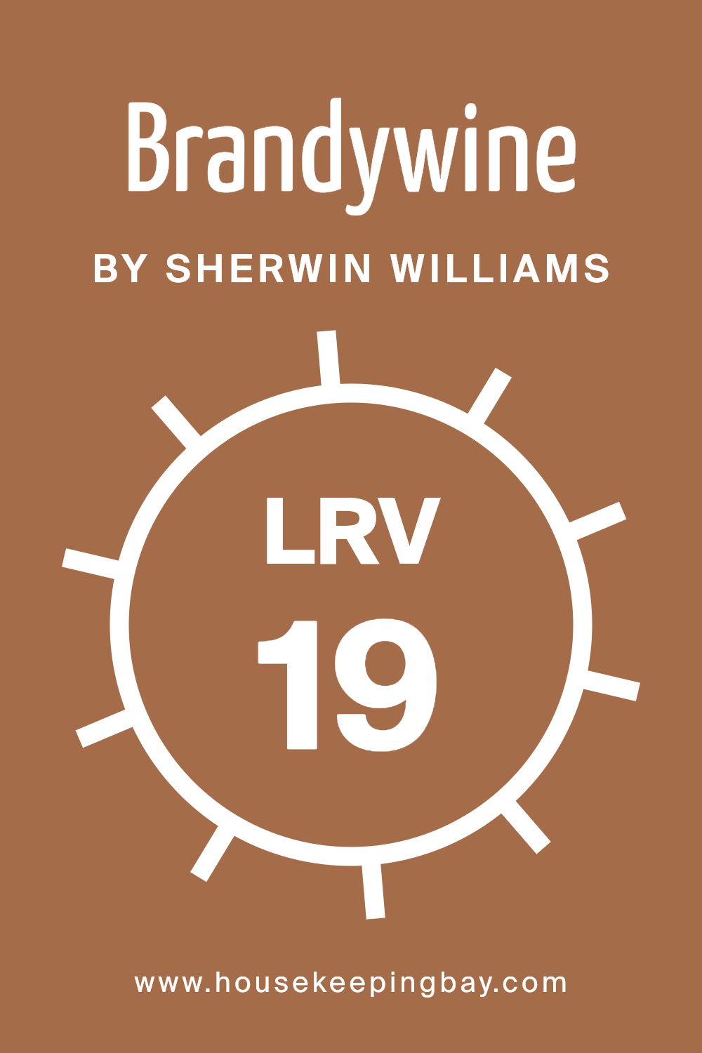
What is the LRV of Brandywine SW 7710 by Sherwin Williams?
LRV, or Light Reflectance Value, is a measurement that tells us how much light a paint color reflects back into a room as opposed to absorbing it. This value is calculated on a scale from 0 to 100, where 0 represents absolute black that absorbs all light and 100 represents pure white that reflects all light.
Understanding LRV can help you choose the right paint color, especially if you’re trying to make a room feel brighter or cozier. A higher LRV means the color is lighter and reflects more light, potentially making a space feel more open. In contrast, a lower LRV means the color is darker and can make a space feel smaller but more intimate.
With an LRV of 19.139, Brandywine SW 7710, provided by Sherwin Williams, is a fairly dark hue that absorbs a lot of light. This means that when used on walls, it can significantly darken a room, especially if the space doesn’t have sufficient lighting.
Rooms with ample natural light or strong artificial lighting might handle Brandywine better, maintaining a balance and avoiding a gloomy atmosphere. This color is ideal for creating a cozy, secluded feel in a space, making it perfect for areas where a sense of warmth and enclosure is desired, such as reading nooks or bedrooms. Opting for lighter colors for ceilings and trims can help counteract the darkening effect and add a pleasant contrast.
housekeepingbay.com
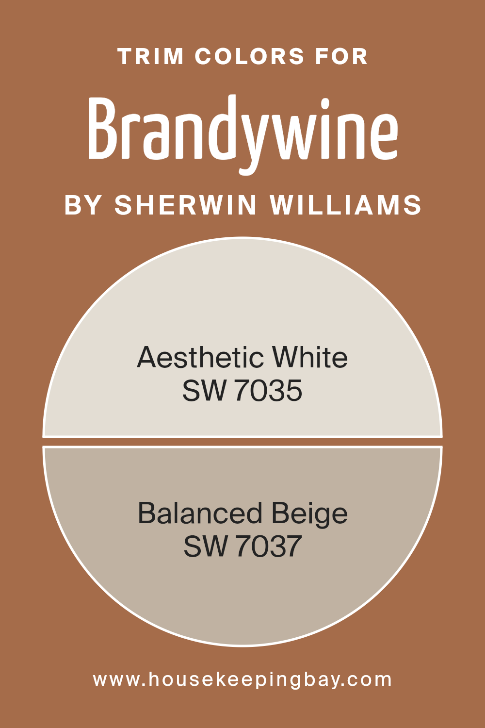
What are the Trim colors of Brandywine SW 7710 by Sherwin Williams?
Trim colors are those hues used for detailing in spaces, such as door frames, moldings, and skirting boards, which highlight and frame areas in a room. Choosing the right trim color can significantly enhance the overall appearance of a space, accentuating the main paint selection while contributing to a harmonious interior décor scheme.
For a rich, dark color like Brandywine SW 7710 by Sherwin Williams, which is a deep, warm burgundy, selecting trim colors like SW 7035 – Aesthetic White and SW 7037 – Balanced Beige is ideal as they offer a striking contrast that enhances and defines the strong character of the base wall color. This combination not only brightens the room but also infuses it with a sophisticated and cohesive look.
Aesthetic White SW 7035 is not a stark white, but rather has a soft, creamy tone that brings a subtle warmth to spaces, making it a versatile choice for trim that pairs beautifully with darker, richer wall colors like Brandywine. On the other hand, Balanced Beige SW 7037 emanates a more pronounced warmth with its light taupe base, providing depth and neutrality as a trim color. This shade is especially effective in balancing the deep tones of Brandywine, allowing for a smooth visual transition in rooms that command a polished aesthetic without the stark contrasts.
You can see recommended paint colors below:
housekeepingbay.com
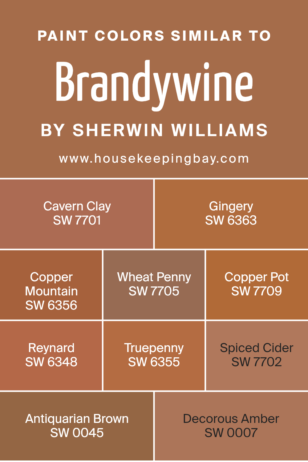
Colors Similar to Brandywine SW 7710 by Sherwin Williams
Similar colors play an important role in design because they create cohesion and flow, allowing the eye to move smoothly from one shade to the next. This is especially important in spaces where a sense of harmony and continuity is desired. Colors such as Brandywine SW 7710 by Sherwin Williams offer a rich, warm hue that sets a cozy atmosphere.
To complement this, colors like Cavern Clay SW 7701 and Gingery SW 6363 provide slightly different saturations that still resonate with the warm, earthy tones of Brandywine. These color nuances are key in achieving a layered, sophisticated palette.
For instance, Copper Mountain SW 6356 and Wheat Penny SW 7705 introduce subtle variations in depth, enhancing the character of a room without overwhelming it with contrast. Copper Pot SW 7709 and Reynard SW 6348 offer deeper, more intense versions of the base color, perfect for accent walls or decorative elements. On the other hand, Truepenny SW 6355 and Spiced Cider SW 7702 give a slightly lighter touch that can brighten spaces while remaining in harmony with the overall theme.
Antiquarian Brown SW 0045 provides a robust anchor, offering grounding depth, while Decorous Amber SW 0007 adds a hint of softness, perfect for creating a soothing yet coordinated environment. These similar colors work together to produce a pleasing aesthetic that is both comfortable and visually appealing.
You can see recommended paint colors below:
- SW 7701 Cavern Clay
- SW 6363 Gingery
- SW 6356 Copper Mountain
- SW 7705 Wheat Penny
- SW 7709 Copper Pot
- SW 6348 Reynard
- SW 6355 Truepenny
- SW 7702 Spiced Cider
- SW 0045 Antiquarian Brown
- SW 0007 Decorous Amber
housekeepingbay.com
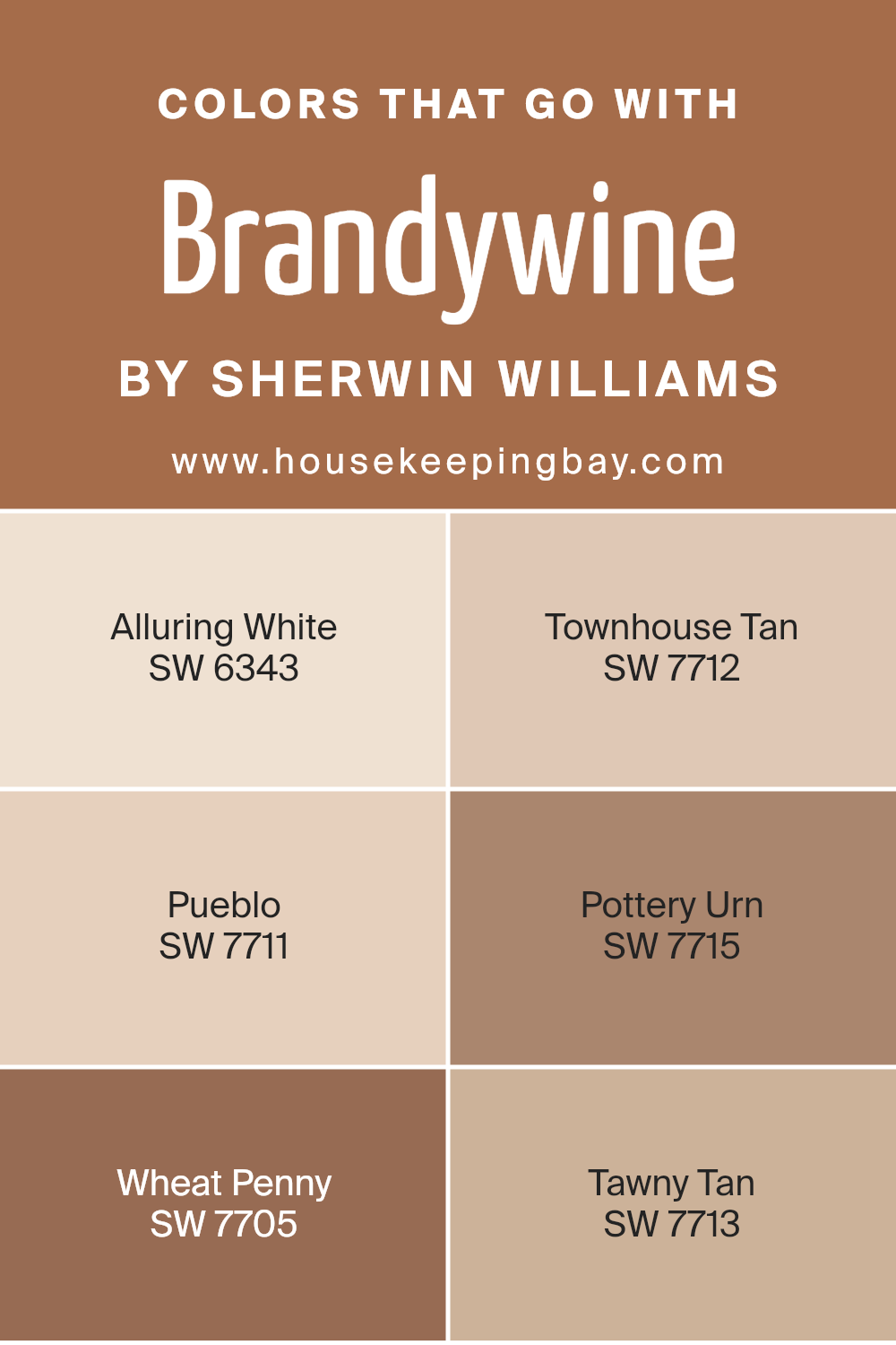
Colors that Go With Brandywine SW 7710 by Sherwin Williams
Selecting harmonious colors that pair well with Brandywine SW 7710 by Sherwin Williams is key to creating a cohesive and aesthetically pleasing space. Brandywine itself is a deep, rich red that can serve as a bold focal point or an accent in a room. The compatible colors, like Alluring White SW 6343, help to balance this intensity by providing a soft, creamy counterpoint that makes the red stand out without overwhelming the space. Alluring White is a gentle off-white, perfect for trim or ceiling to give a clean finish.
Townhouse Tan SW 7711 offers a warm, neutral backdrop that complements the richer tones of Brandywine without clashing, setting a welcoming tone in any room. Pueblo SW 7712 has a dusty terracotta shade that harmonizes with Brandywine’s earthy red, perfect for creating a cozy, grounded atmosphere.
Pottery Urn SW 7715 and Wheat Penny SW 7705 each add their own unique shades of deep orange and bronzed copper, respectively, enhancing the warmth of the space. Tawny Tan SW 7713, a soft, beige color with just a hint of warmth, blends seamlessly into settings that feature Brandywine, providing a subtle balance and uniting the richer hues with lighter tones in the decor. Together, these colors create a welcoming and cohesive palette that works wonderfully in many different spaces.
You can see recommended paint colors below:
- SW 6343 Alluring White
- SW 7712 Townhouse Tan
- SW 7711 Pueblo
- SW 7715 Pottery Urn
- SW 7705 Wheat Penny
- SW 7713 Tawny Tan
housekeepingbay.com
How to Use Brandywine SW 7710 by Sherwin Williams In Your Home?
Brandywine SW 7710 by Sherwin Williams is a rich, deep red paint color that can add warmth and sophistication to any room in your home. If you’re looking to create a cozy and inviting atmosphere, consider using Brandywine in your living room or dining area. This color works particularly well in spaces with ample natural light or well-placed artificial lighting, as it can appear darker in dimly lit rooms.
Brandywine also pairs beautifully with neutral tones such as beige, gray, and white, which can help balance its intensity. For a bold look, you could paint one accent wall in Brandywine and keep the other walls lighter. This technique adds a focal point without overwhelming the space.
In bedrooms, a Brandywine accent wall behind the bed can create a warm, enveloping feel, perfect for a relaxing retreat. Complement the walls with lighter bedding and curtains to maintain a balanced look.Lastly, this color can also enhance your home’s exterior appeal, especially on front doors or shutters, giving a welcoming vibe to visitors.
Brandywine SW 7710 by Sherwin Williams vs Copper Mountain SW 6356 by Sherwin Williams
Brandywine SW 7710 by Sherwin Williams is a rich, deep red with warm undertones, reminiscent of a fine wine. This color provides a cozy, inviting atmosphere and pairs well with neutrals and earth tones for a balanced look. It works well in living rooms, dining areas, or any space where a touch of sophistication is desired.
Copper Mountain SW 6356, another Sherwin Williams color, leans towards a warm, medium copper tone. This shade is lighter and brighter than Brandywine, offering a vibrant yet rustic appeal. It is particularly effective in spaces that benefit from a warm, sunny feel, such as kitchens and sunrooms.
While both colors are warm and have earthy qualities, Brandywine’s deeper shade lends itself to more traditional and elegant spaces, whereas Copper Mountain’s lighter, brighter feel is more casual and energizing. Both colors can significantly enhance a room, but the choice between them would depend on the desired mood and setting.
You can see recommended paint color below:
- SW 6356 Copper Mountain

housekeepingbay.com
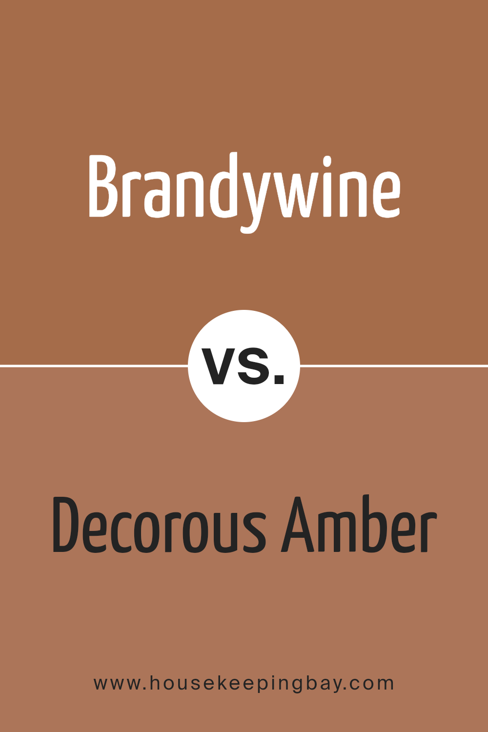
Brandywine SW 7710 by Sherwin Williams vs Decorous Amber SW 0007 by Sherwin Williams
The color Brandywine SW 7710 by Sherwin Williams has a rich, deep red hue that feels warm and inviting. It gives a cozy and intimate vibe to spaces, making it ideal for living areas or dining rooms where you want to create a welcoming atmosphere. This color can make a room feel a bit smaller because of its depth, but it pairs beautifully with lighter colors and wood finishes.
Decorous Amber SW 0007, also by Sherwin Williams, is a lighter, more muted color compared to Brandywine. It leans towards a soft tan or beige, providing a neutral backdrop that’s versatile for many settings. This color is excellent for spaces where you want to maintain an open, airy feel. It works well in larger areas or rooms with a lot of natural light.
Both colors offer unique possibilities: Brandywine for a bold, cozy feel, and Decorous Amber for a subtle and flexible base. Each can suit different styles and preferences depending on the mood you’re trying to achieve.
You can see recommended paint color below:
- SW 0007 Decorous Amber
housekeepingbay.com
Brandywine SW 7710 by Sherwin Williams vs Truepenny SW 6355 by Sherwin Williams
Brandywine SW 7710 from Sherwin Williams is a deep, rich red with a slightly burgundy tone, giving it a sophisticated vibe. This color tends to add a cozy and warm feeling to any space, making it ideal for living rooms or dining areas where a touch of elegance is desired. It works well with both traditional and modern decor, especially when paired with neutral shades like white or light gray.
Truepenny SW 6355, also by Sherwin Williams, is quite different. It’s a warm, mid-toned orange that brings a lively and cheerful energy to any room. Truepenny is perfect for spaces where you want to inject brightness and fun, such as kitchens, playrooms, or creative spaces. It pairs nicely with earth tones and can also serve as an appealing contrast to cool blues and greens.
Both Brandywine and Truepenny offer unique aesthetic appeals and can significantly influence the mood and style of a room based on their distinct hues.
You can see recommended paint color below:
- SW 6355 Truepenny

housekeepingbay.com
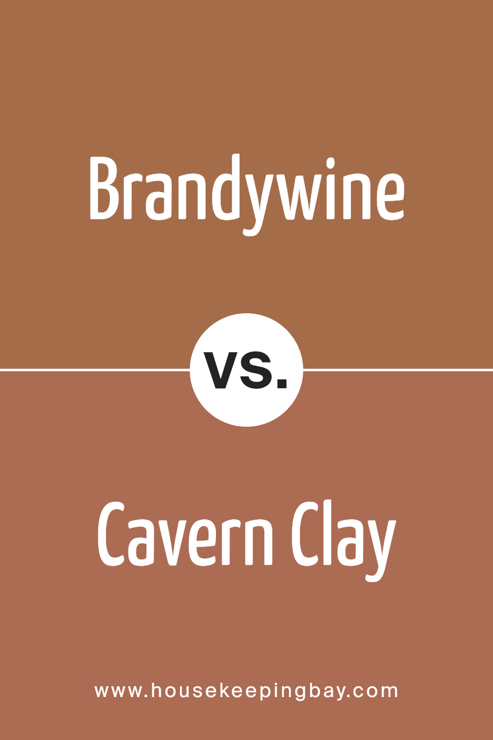
Brandywine SW 7710 by Sherwin Williams vs Cavern Clay SW 7701 by Sherwin Williams
Brandywine SW 7710 by Sherwin Williams is a rich, deep red with warm undertones, reminiscent of a fine aged wine. This color provides a cozy, inviting feel to any space, making it ideal for living areas or dining rooms where you want to create a welcoming atmosphere.
Cavern Clay SW 7701, also from Sherwin Williams, is a warm terracotta hue that mimics natural earth tones. It is perfect for those looking to add a touch of the outdoors to their interior. This shade works well in spaces that receive a lot of natural light and pairs beautifully with natural materials like wood or stone.
While both colors share a warmth that can enhance the aesthetic of a home, Brandywine leans towards a more traditional and sophisticated ambiance, whereas Cavern Clay offers a more rustic and grounded look. Each color serves distinct styles and preferences, providing warmth and character in unique ways.
You can see recommended paint color below:
housekeepingbay.com
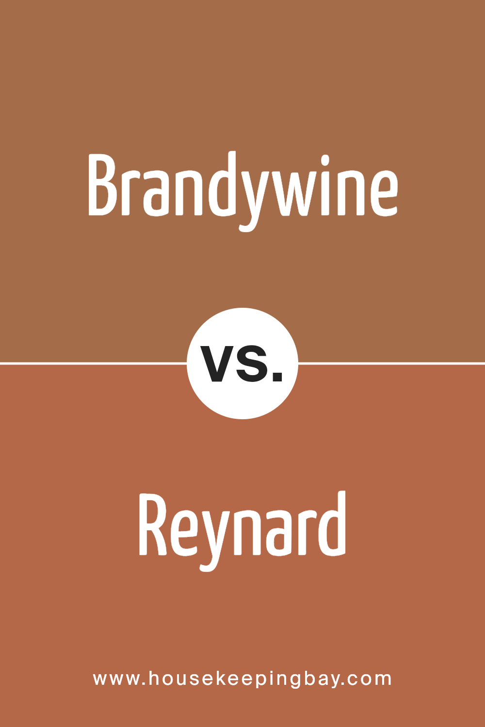
Brandywine SW 7710 by Sherwin Williams vs Reynard SW 6348 by Sherwin Williams
Brandywine SW 7710 by Sherwin Williams is a rich, warm red with deep, berry undertones that give a cozy and inviting feel to any space. It pairs well with both dark and light accents, making it versatile for various decor styles. This color is perfect for creating a statement wall or cozy nooks, imbuing rooms with a sense of warmth and comfort.
Reynard SW 6348, also by Sherwin Williams, is a bold terracotta orange. It has a vibrant, earthy tone that adds warmth and character to any space. Reynard is great for spaces that need a pop of color or for pairing with natural materials like wood or stone. It works well in lively areas like kitchens or dining rooms, bringing energy and a convivial atmosphere.
Both colors are strong but in different ways; Brandywine leans towards a subdued, classic feel, while Reynard offers a playful and dynamic vibe. Choosing between them depends on the desired mood and functional needs of the space.
You can see recommended paint color below:
housekeepingbay.com
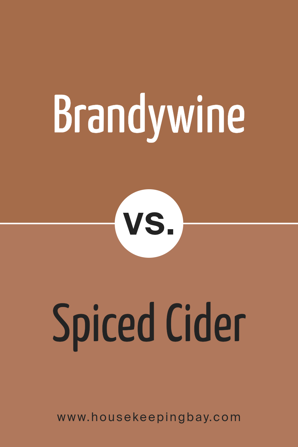
Brandywine SW 7710 by Sherwin Williams vs Spiced Cider SW 7702 by Sherwin Williams
Brandywine SW 7710 by Sherwin Williams is a rich, deep red with a hint of brown, giving it a warm, inviting feel reminiscent of a cozy, aged wine. This color suits traditional spaces well, lending a sense of sophistication and warmth. It pairs nicely with dark wood tones and can add a dramatic flair to living rooms or dining areas.
Spiced Cider SW 7702, also by Sherwin Williams, is lighter and leans more towards a muted cinnamon shade. This hue is warm yet slightly brighter than Brandywine. It creates a welcoming atmosphere that’s perfect for spaces where you want a touch of coziness without the heavier, darker tones of Brandywine. Spiced Cider works well in kitchens and family rooms, where its gentle warmth encourages relaxation and comfort.
Both colors inspire a sense of warmth but offer different depths and intensities, with Brandywine being the darker and Spiced Cider providing a lighter, softer option.
You can see recommended paint color below:
- SW 7702 Spiced Cider
housekeepingbay.com
Brandywine SW 7710 by Sherwin Williams vs Wheat Penny SW 7705 by Sherwin Williams
Brandywine SW 7710 by Sherwin Williams is a rich, deep red with a brown undertone, giving it a warm, cozy feel. This color is versatile and can add a sense of sophistication and warmth to spaces such as living rooms or dining areas. The intensity of Brandywine makes it ideal for creating a focal point in a room.
Wheat Penny SW 7705, also by Sherwin Williams, is a softer shade compared to Brandywine. It’s a warm, medium brown with hints of orange, resembling the color of an aged penny. This color is lighter and can brighten up a space while still adding warmth. Wheat Penny works well in areas where a cozy but lighter touch is desired, such as kitchens or hallways.
Though both colors share warm undertones, Brandywine’s darker, richer hue offers a more dramatic look, while Wheat Penny provides a gentler, welcoming atmosphere with its lighter, earthy tone. Both are excellent choices for adding warmth to a home, but the choice depends on the desired impact and room use.
You can see recommended paint color below:
- SW 7705 Wheat Penny

housekeepingbay.com
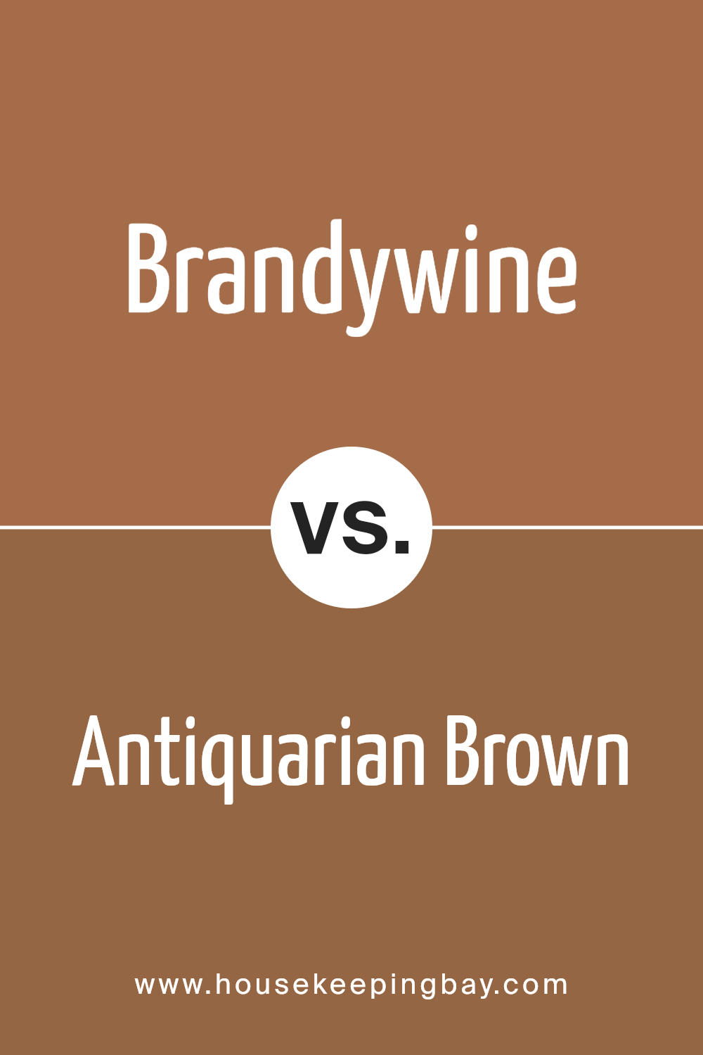
Brandywine SW 7710 by Sherwin Williams vs Antiquarian Brown SW 0045 by Sherwin Williams
Brandywine SW 7710 by Sherwin Williams is a rich, deep red hue with warm, earthy undertones, reminiscent of red wine. This color exudes a cozy, welcoming vibe making it perfect for spaces where comfort and warmth are desired, like living rooms or dining areas. It pairs well with neutral shades, adding a touch of sophistication and warmth.
In contrast, Antiquarian Brown SW 0045 by Sherwin Williams is a muted, dark brown shade that leans towards a more timeless and classic look. It provides a strong foundation, suitable for numerous design styles from traditional to modern. This versatile color works well in settings that aim for a more grounded, understated elegance and pairs beautifully with lighter creams or rich darker shades for a harmonious look.
Both colors offer distinct vibes – Brandywine leans more vibrant and inviting, while Antiquarian Brown offers subtlety and a grounding presence. Choosing between them depends largely on the mood and functionality you wish to achieve in your space.
You can see recommended paint color below:
housekeepingbay.com
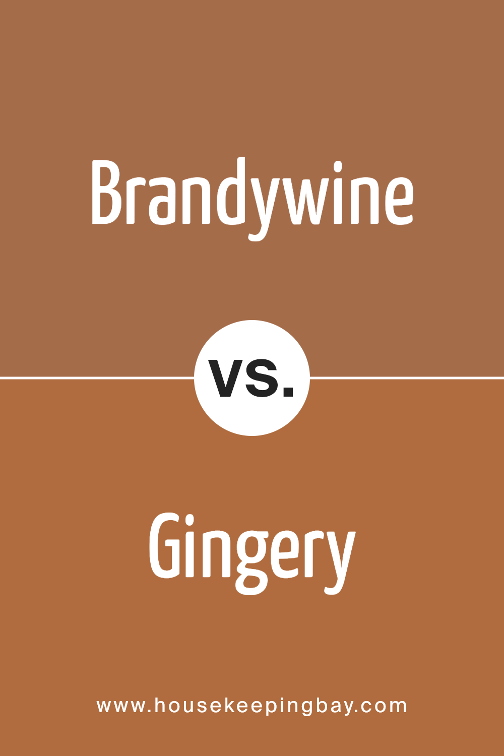
Brandywine SW 7710 by Sherwin Williams vs Gingery SW 6363 by Sherwin Williams
Brandywine SW 7710 and Gingery SW 6363, both by Sherwin Williams, present unique and contrasting tones suitable for different decorative needs. Brandywine is a deep, rich red with hints of maroon, evoking a sense of warmth and tradition.
It’s ideal for creating a cozy, inviting atmosphere in spaces like living rooms or dining areas. In contrast, Gingery SW 6363 is a vibrant ginger color that leans towards an earthy, warm orange. This color brings a cheerful and energetic vibe, perfect for kitchens, playrooms, or any space where you wish to add a sense of brightness.
While Brandywine lends itself to sophistication and depth, perfect for formal or intimate settings, Gingery offers a fresh, lively feel, suitable for more casual and stimulating environments. Depending on the mood you aim to set, Brandywine might be the choice for elegance and calm, whereas Gingery could be the go-to for a fun and dynamic touch.
You can see recommended paint color below:
housekeepingbay.com
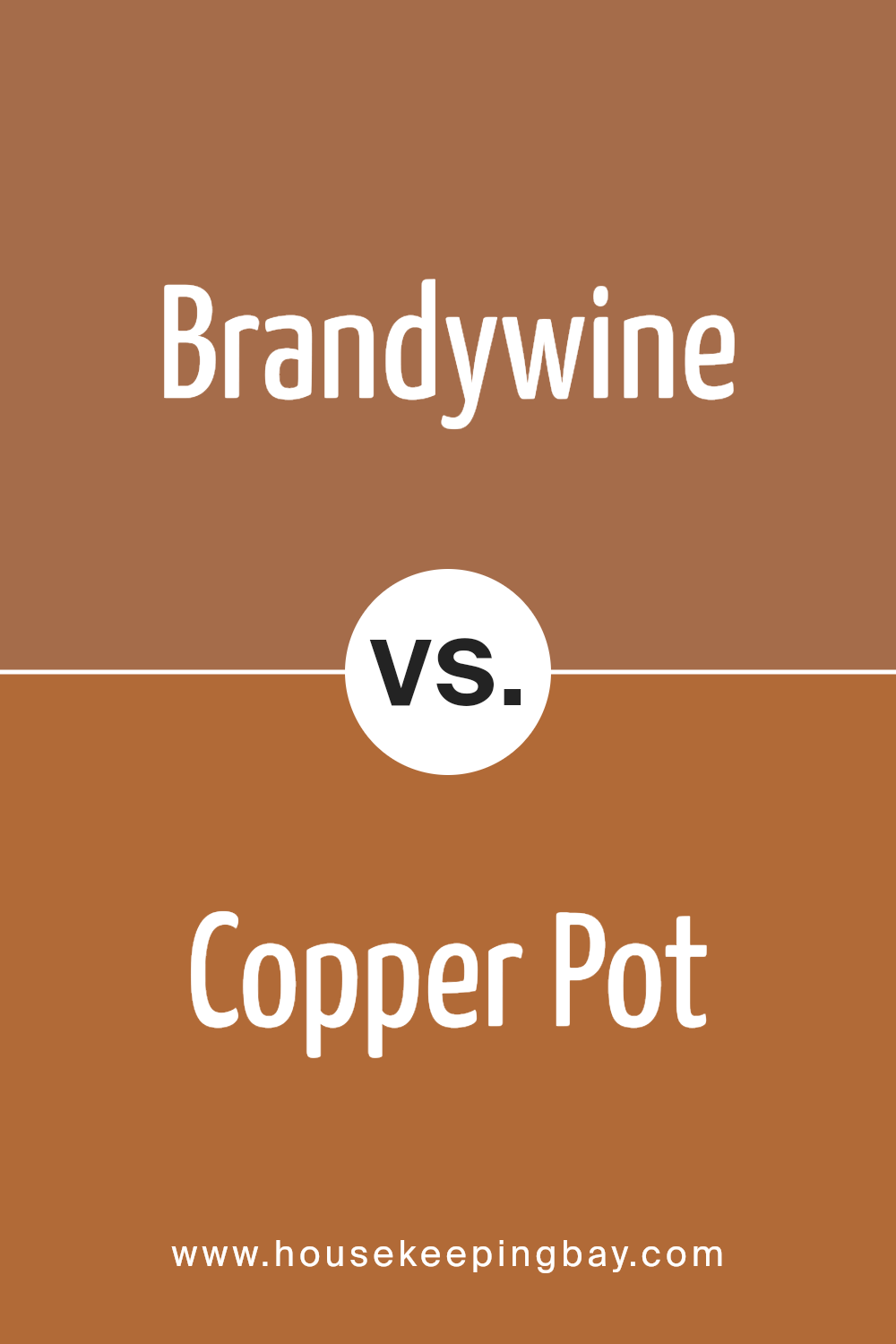
Brandywine SW 7710 by Sherwin Williams vs Copper Pot SW 7709 by Sherwin Williams
Brandywine SW 7710 and Copper Pot SW 7709, both by Sherwin Williams, offer rich, warm tones but differ subtly in their vibes. Brandywine presents as a deep, red wine color, giving a cozy and somewhat sophisticated feel. It is ideal for spaces where you want to create a snug and inviting atmosphere, like living rooms or bedrooms.
Copper Pot, a shade lighter than Brandywine, resembles the rustic color of a weathered copper. This hue imparts a more vibrant and welcoming quality, making it suitable for areas where lively conversations and activities occur, such as kitchens or dining rooms.
Both colors pair well with natural materials like wood and stone, enhancing the warmth of a space. While Brandywine leans towards a refined, classic look, Copper Pot feels more contemporary and energetic. Depending on the mood you aim to set, each color could serve as a compelling choice for bringing warmth to a home environment.
You can see recommended paint color below:
- SW 7709 Copper Pot
housekeepingbay.com
Concluding my thoughts on SW 7710 Brandywine by Sherwin Williams, this paint color presents a rich and versatile choice for anyone looking to add depth and warmth to their space. With its deep red hue, Brandywine offers a classic sophistication that can enhance various rooms, from cozy living areas to elegant dining spaces. This shade pairs well with both traditional and modern decor, making it a flexible option for various styling preferences.
What stands out about Brandywine is how it manages to create a cozy yet bold statement in a room. Whether used as an accent wall or enveloping the entire space, it provides a strong foundation that can be layered with different textures and colors for a dynamic interior. When it comes to lighting, Brandywine shifts beautifully from a vibrant tone in bright light to a more muted and intimate feel under softer lighting conditions, proving its adaptability.
For anyone considering a paint color that offers both character and versatility, SW 7710 Brandywine by Sherwin Williams is definitely worth considering. It provides a timeless appeal that won’t easily go out of style and works impressively across various rooms and lighting settings.
So if you’re in the process of picking a new paint color, give Brandywine a chance to make a lasting impression in your home.

housekeepingbay.com
