Gingery SW 6363 by Sherwin Williams
Warmth and Energy in Every Hue
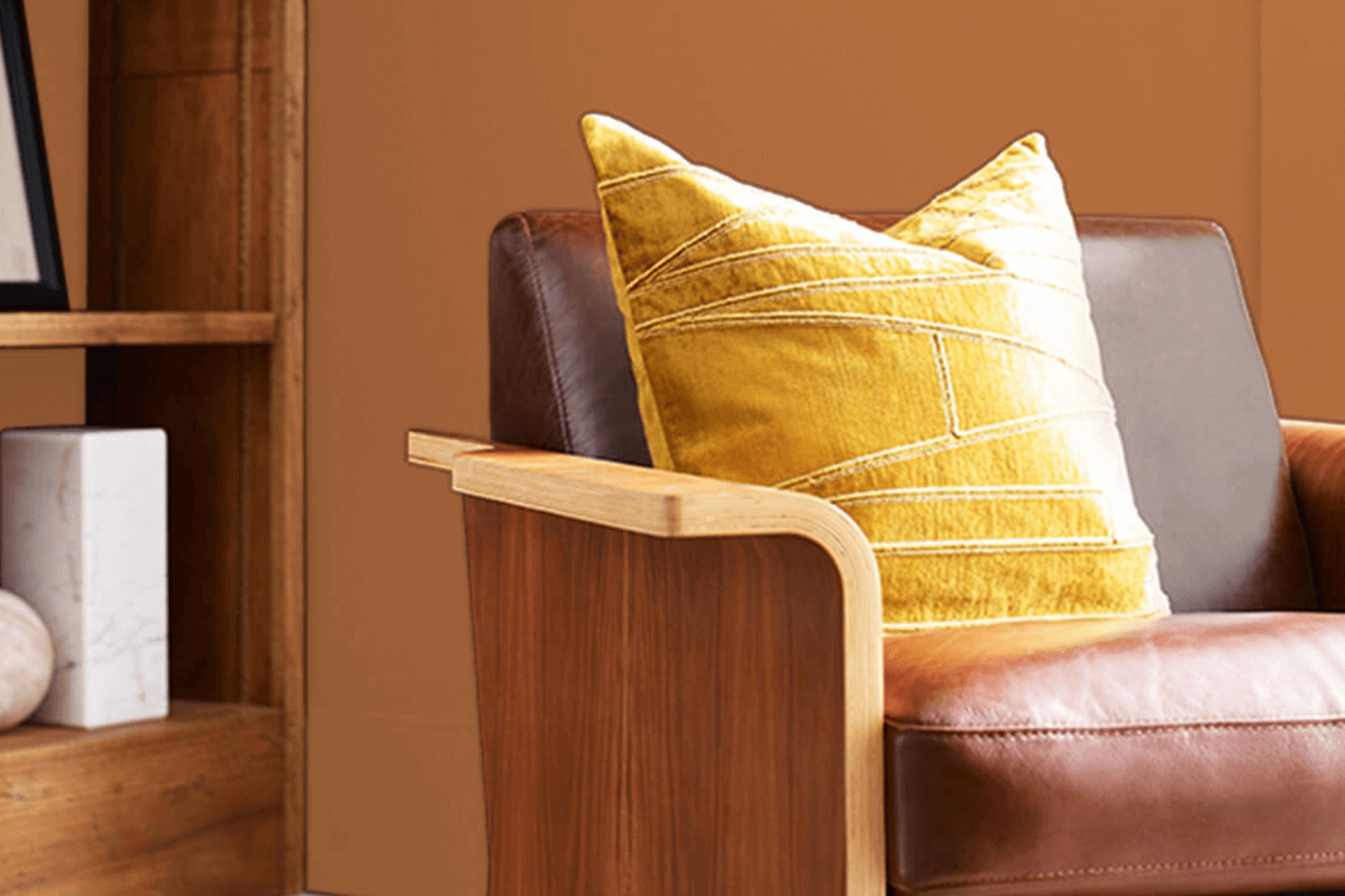
Choosing the perfect paint color can make a huge difference in any space, and SW 6363 Gingery by Sherwin Williams is a shade that demands attention. It has a warm, inviting quality, making any room feel cozy and welcoming. Imagine the soft glow from the sun setting, gently enveloping a room with its calming hue. That’s the effect Gingery can bring to your home.
When you want to create a warm and cheerful environment, Gingery might just be the answer. This color pairs beautifully with both light and dark accents, allowing you to play around with different styles and themes.
Whether you’re painting an entire room or just an accent wall, Gingery can help you personalize the space to reflect your taste and mood.
Its unique blend of warmth and earthiness makes it versatile enough for different rooms — from bedrooms to living spaces.
Gingery isn’t just a color; it’s an experience that can transform how you feel in your home. Whether you’re aiming for a lively atmosphere or a more subdued vibe, Gingery is a solid choice that can help you achieve your vision.
vis sherwin-williams.com
What Color Is Gingery SW 6363 by Sherwin Williams?
Table of Contents
Gingery SW 6363 by Sherwin Williams is a warm, inviting hue that brings coziness and comfort to any space. This color carries a rich, earthy tone and evokes images of autumn leaves or a cozy fireside. It’s a balanced blend of orange and brown with undertones that aren’t too bold, making it versatile for various interior design styles.
Gingery pairs wonderfully with rustic, farmhouse, and bohemian styles. It can add warmth to a modern space when used as an accent wall or with matching decor. This color can be a great choice for spaces meant for relaxation and conversation, like living rooms or dining areas.
In terms of materials, Gingery works well with natural elements like wood and leather. Imagine a room with wooden floors or exposed beams, where Gingery adds a spirited touch. It also complements textures like terracotta tiles, wool, or linen fabrics, enhancing its earthy vibe. Pair it with neutral tones like creamy whites or muted greys to balance its warmth.
Metals like copper or aged brass add an elegant contrast, making the overall look harmonious. When chosen as part of the decor palette, Gingery SW 6363 can create an atmosphere that feels both timeless and welcoming.
housekeepingbay.com
Is Gingery SW 6363 by Sherwin Williams Warm or Cool color?
Gingery SW 6363 by Sherwin Williams offers a warm, inviting color choice for home interiors. This shade of ginger creates a cozy atmosphere, making rooms feel like a pleasant retreat. Its earthy, orange-brown tone adds warmth without overwhelming spaces, working well in living rooms or kitchens where comfort is important. Gingery pairs nicely with neutral shades, such as creams or taupes, adding depth and giving balance to room designs.
When used on accent walls, Gingery brings personality and interest without dominating a space. It’s excellent for highlighting specific areas, like a fireplace or shelving. Because of its adaptable nature, Gingery fits into both traditional and modern settings with ease.
Lighting plays a key role in how Gingery appears. Under natural light, it exhibits a soft, welcoming glow, while artificial lighting can deepen its rich tones. This versatility makes it suitable for various styles and personal preferences in home decor.
What is the Masstone of the Gingery SW 6363 by Sherwin Williams?
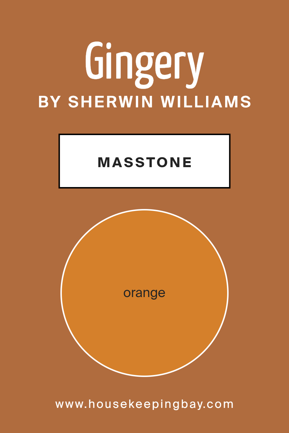
Sherwin Williams’ Gingery SW 6363, with its rich orange masstone (#D5802B), brings warmth and energy to any space. This particular shade of orange exudes a cozy, inviting feel. When used in living rooms, it can make the environment feel very comfortable and friendly, perfect for gatherings or family time. In kitchens, it can stimulate appetite and conversation, making mealtimes more enjoyable.
In darker rooms or spaces with limited natural light, Gingery SW 6363 can add brightness and cheer, making the area feel more lively and spirited. It’s also a great choice for accent walls, providing a vibrant contrast to neutral tones like grays or beiges.
Additionally, Gingery pairs well with natural materials like wood, creating an earthy and grounded atmosphere. Accessories in colors like teal or soft blue can complement this hue nicely, adding a playful and balanced touch to the overall decor.
housekeepingbay.com
Undertones of Gingery SW 6363 by Sherwin Williams
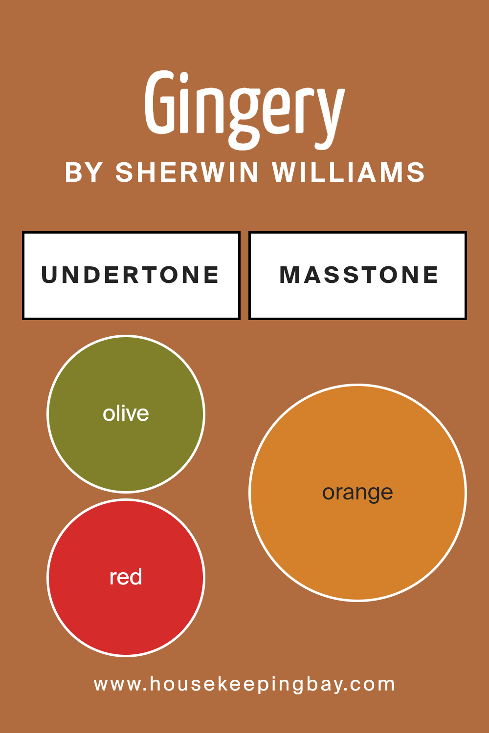
Gingery SW 6363 by Sherwin Williams brings a warm and inviting feel to any room. The undertones in this color include olive, red, pale pink, brown, grey, pink, purple, yellow, light green, pale yellow, and mint. These undertones affect how we perceive the color, adding complexity and depth.
Undertones play a significant role in how paint looks on walls. When light hits a surface, the underlying shades can slightly change what we see.
In the case of Gingery, the red and brown undertones add warmth and richness, making a space feel cozy and comfortable. This can be especially inviting in living rooms or bedrooms.
The pink and pale pink tones introduce a subtle softness, which brings a touch of elegance and gentleness. The inclusion of purple and mint offers a hint of coolness and freshness, balancing the warmth of the reds and browns. Meanwhile, the yellow undertones add brightness and energy, enhancing the overall mood of the room.
In general, when these undertones blend together, they give Gingery a dynamic quality. This makes it versatile for different lighting and decorating styles, whether aiming for a relaxed or vibrant atmosphere.
Undertones make Gingery more than just a color—it becomes a palette of moods depending on its surroundings.
housekeepingbay.com
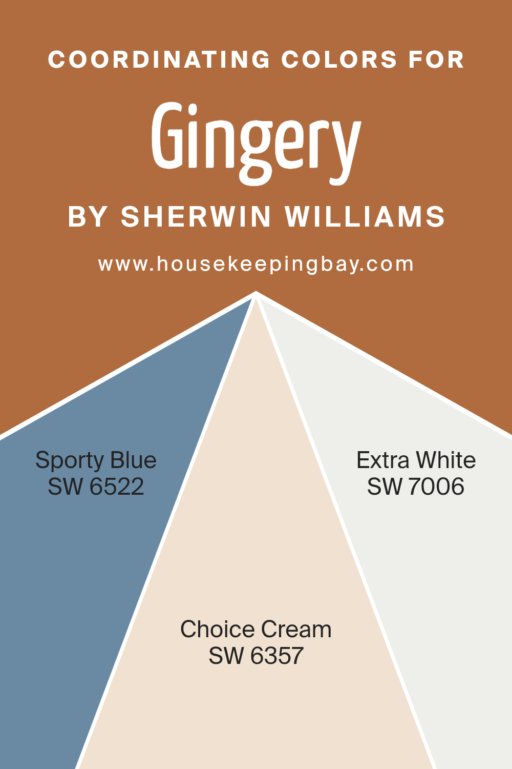
Coordinating Colors of Gingery SW 6363 by Sherwin Williams
Coordinating colors are shades that complement each other when used together, creating a harmonious look in a space. They work by enhancing the primary color—in this case, Gingery SW 6363 by Sherwin Williams—by either balancing, contrasting, or supporting it in various ways.
These colors can bring out different elements of the main color, making it feel more vibrant, warm, or calm, depending on the hues involved. When selecting coordinating colors, it’s essential to consider the overall mood and atmosphere you want to create in the room.
For Gingery, a warm, earthy tone, using colors like SW 6522 Sporty Blue, SW 6357 Choice Cream, and SW 7006 Extra White can provide a balanced and inviting palette.
Sporty Blue SW 6522 adds a fresh and cool contrast to the warmth of Gingery, introducing a soothing element reminiscent of a clear sky or serene waters.
Choice Cream SW 6357 is a soft, buttery hue that complements the warmth of Gingery, bringing a touch of coziness and comfort to the space.
Extra White SW 7006 offers a clean, crisp accent that can highlight architectural details or provide a fresh backdrop for the other colors, giving the room a bright, open feel.
Together, these shades create a balanced look that feels both relaxing and welcoming.
You can see recommended paint colors below:
- SW 6522 Sporty Blue
- SW 6357 Choice Cream
- SW 7006 Extra White
housekeepingbay.com
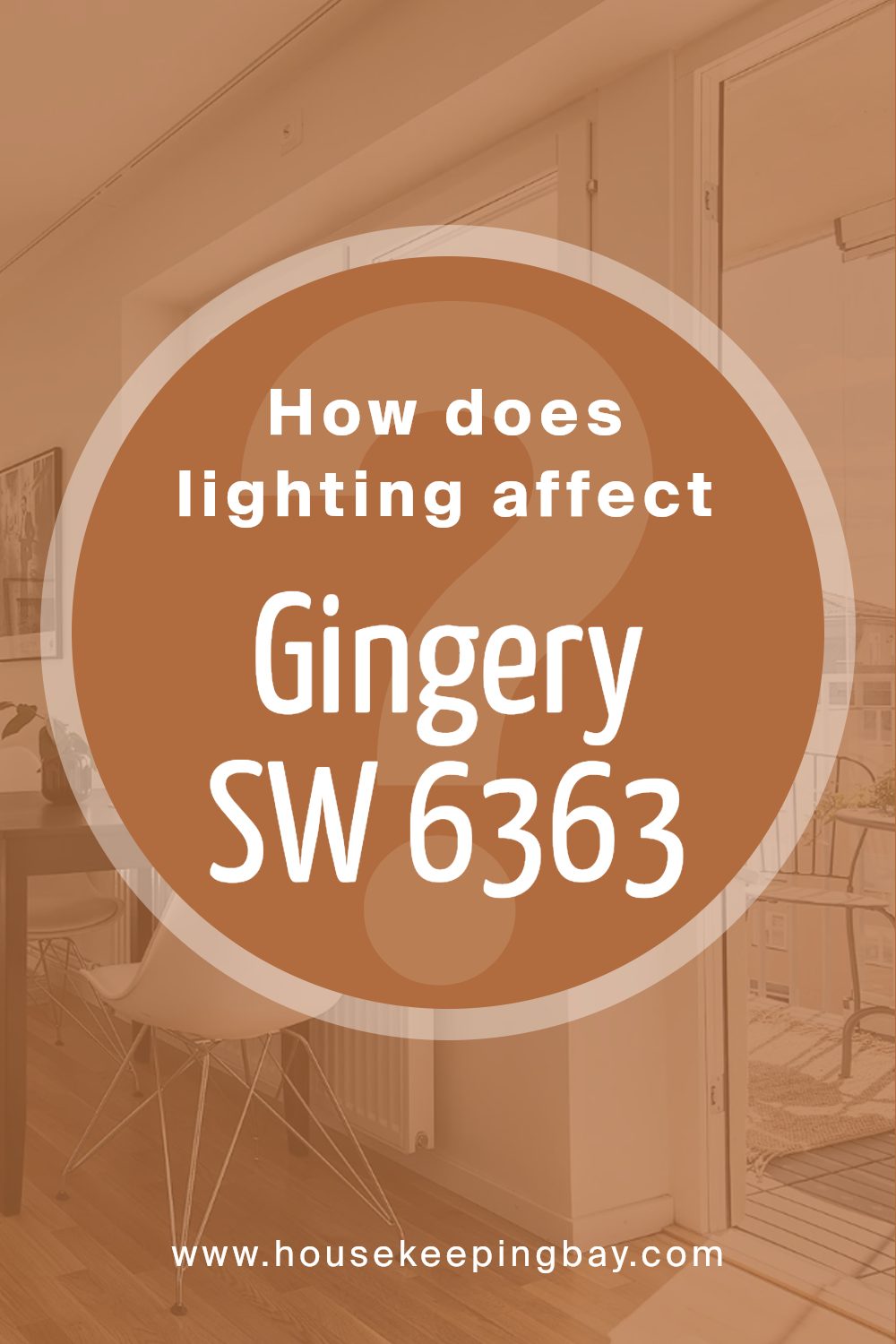
How Does Lighting Affect Gingery SW 6363 by Sherwin Williams?
Lighting plays a significant role in how we perceive color. Different types of light can change the way a color looks, either enhancing its brightness or muting its vibrancy. The color Gingery SW 6363 by Sherwin Williams is a warm, earthy tone with orange and red undertones. It can look quite different depending on the light.
In natural light, Gingery looks vibrant and cozy. Sunlight tends to bring out the warm undertones, making the color appear more lively.
In artificial light, especially under warm bulbs, Gingery maintains its warm feel but may look slightly muted compared to bright natural light. Cool fluorescent lights can make it look less inviting, as they might wash out some of the warmth.
In north-facing rooms, which receive cooler and less direct sunlight, Gingery can appear slightly toned down. The cool light can balance the warm undertones, providing a soft, gentle look. It may not look as vibrant but remains a subtle, cozy color.
In south-facing rooms, the abundant, direct sunlight can make Gingery stand out, highlighting its richness. The warmth of the color complements the natural light, creating a bright and welcoming space. This orientation is ideal for maintaining the vibrancy of Gingery throughout the day.
East-facing rooms receive morning light, which is warm and bright, making Gingery look lively in the early hours. As the day progresses, the light becomes cooler, so the color may seem softer or slightly muted in the afternoon and evening.
In west-facing rooms, Gingery benefits from warm evening light. The afternoon and evening sunlight enhances the deep tones in the paint, creating a rich and inviting environment. During the morning and early afternoon, when the light is cooler, the color might appear more subdued.
Overall, Gingery SW 6363’s rich, earthy tone adapts variably to different lighting conditions, with sunlight generally enhancing its warmth and depth.
housekeepingbay.com
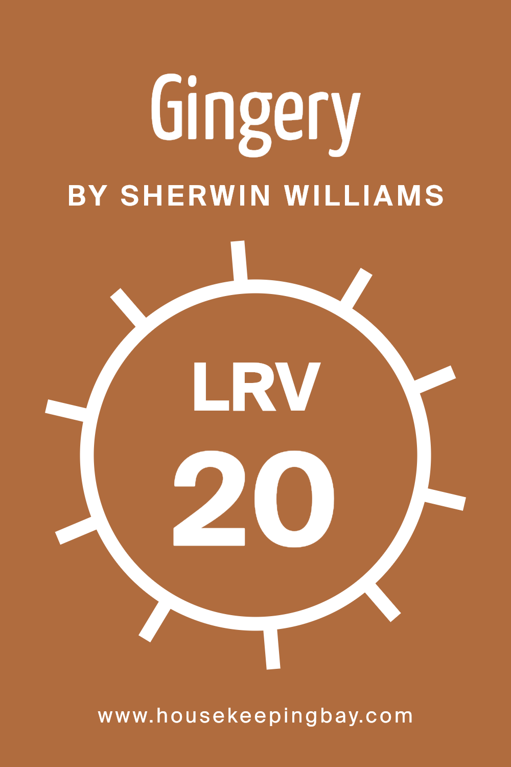
What is the LRV of Gingery SW 6363 by Sherwin Williams?
LRV, or Light Reflectance Value, is a measurement used by paint manufacturers to indicate how much light a color reflects. It’s expressed in a percentage from 0 to 100, with 0 being absolute black, reflecting no light, and 100 being pure white, reflecting all light.
The LRV of a color can significantly affect how a room feels. Colors with high LRV reflect more light, making spaces feel bigger and brighter, whereas colors with low LRV absorb more light, making spaces feel cozier and more intimate.
Knowing a color’s LRV helps you predict how it will behave in a room given the light conditions.
Gingery by Sherwin-Williams has an LRV of 20.271, meaning it’s quite a dark color that absorbs a lot of light.
With this value, Gingery will create a warm and cozy atmosphere, suitable for spaces where you want a sense of intimacy. It won’t make a room feel bright or spacious but will instead provide a rich, enveloping feel. It’s excellent for creating a focal point or adding depth to a room, especially if balanced with lighter or neutral hues. This rich warmth makes it an ideal choice for accent walls or to bring a sense of comfort to larger spaces.
housekeepingbay.com
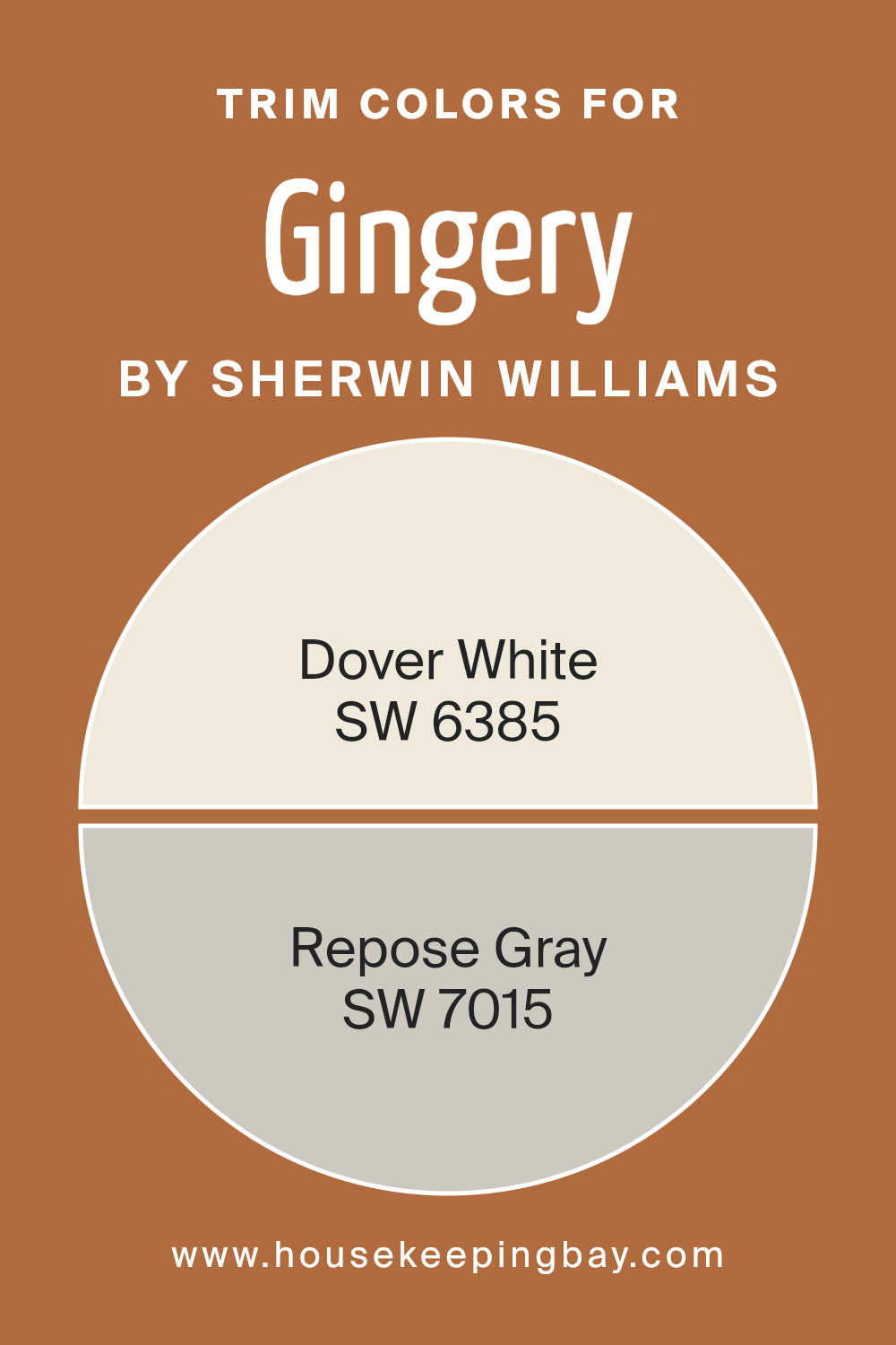
What are the Trim colors of Gingery SW 6363 by Sherwin Williams?
Trim colors are crucial in interior design as they enhance the main wall colors and give rooms a sense of harmony and definition. For the color Gingery (SW 6363) by Sherwin Williams, choosing the right trim can greatly affect the overall look of the space.
Trim colors like Dover White (SW 6385) and Repose Gray (SW 7015) can complement Gingery beautifully. Dover White offers a warm, creamy white shade that almost glows against darker hues, adding a soft and inviting contrast.
On the other hand, Repose Gray is a subtle and elegant option that provides a more understated, balanced look with its light gray tone, effortlessly blending with modern or classic styles.
In using these trim colors, rooms painted with Gingery can achieve different atmospheres depending on the choice.
Dover White, with its warm and welcoming quality, will create a cozy and grounded feel, ideal for spaces where comfort is a priority. Its neutral warmth pairs nicely with Gingery’s rich tones, adding brightness without overpowering. Meanwhile, Repose Gray offers a more muted yet chic contrast to Gingery.
Its versatility allows for a more sophisticated, contemporary feeling, fitting well in spaces where a touch of modern elegance is desired.
Both trim options highlight the unique characteristics of Gingery, offering distinct looks depending on the mood you wish to set in your home.
You can see recommended paint colors below:
- SW 6385 Dover White
- SW 7015 Repose Gray
housekeepingbay.com
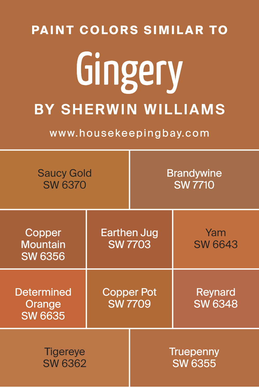
Colors Similar to Gingery SW 6363 by Sherwin Williams
Colors that are similar to Gingery SW 6363 by Sherwin-Williams play an important role in creating a harmonious and cohesive look, both in interior and exterior spaces. These colors, including SW 6370 – Saucy Gold and SW 7710 – Brandywine, complement each other well due to their warm undertones.
SW 6370 – Saucy Gold carries a rich yellow tone, bringing brightness and a welcoming feel to any room. SW 7710 – Brandywine offers a deep, earthy red that adds a sense of depth and warmth.
In addition, SW 6356 – Copper Mountain adds a subdued orange hue with a touch of softness, while SW 7703 – Earthen Jug provides a grounding, muted brown. SW 6643 – Yam is a vivid orange, energetic and vibrant in nature. SW 6635 – Determined Orange carries a confident, strong orange shade that enlivens a space.
SW 7709 – Copper Pot brings a rosy brown that ties hues together with an inviting feel. SW 6348 – Reynard offers a warm, burnt sienna quality, and SW 6362 – Tigereye stands out with its bold, rich amber color.
Lastly, SW 6355 – Truepenny rounds out the palette with a muted copper tone that exudes warmth, pulling together the similar colors into a seamless design.
You can see recommended paint colors below:
- SW 6370 Saucy Gold
- SW 7710 Brandywine
- SW 6356 Copper Mountain
- SW 7703 Earthen Jug
- SW 6643 Yam
- SW 6635 Determined Orange
- SW 7709 Copper Pot
- SW 6348 Reynard
- SW 6362 Tigereye
- SW 6355 Truepenny
housekeepingbay.com
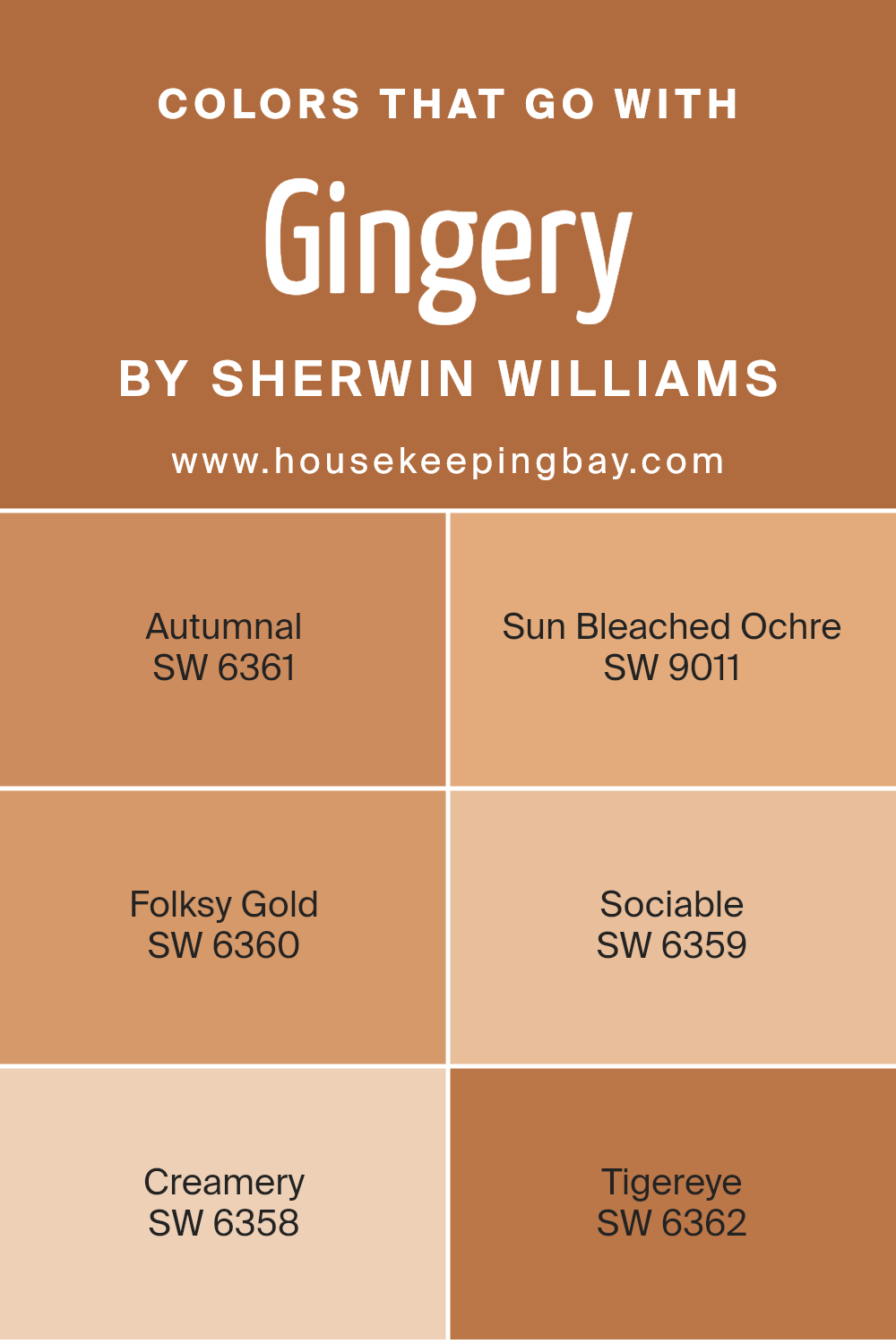
Colors that Go With Gingery SW 6363 by Sherwin Williams
Gingery SW 6363 by Sherwin-Williams is a warm and inviting hue that lies somewhere between orange and terracotta. It’s a rich color that brings a cozy and earthy feel to a room, making it a perfect backdrop or accent for various styles.
Choosing harmonious colors to go with Gingery is crucial as they either highlight its warmth or create a balanced contrast, complementing the space beautifully. SW 6361 – Autumnal pairs seamlessly with Gingery. This shade is reminiscent of fall leaves, with its deep orange-brown undertone, adding depth and a touch of nature indoors
. SW 9011 – Sun Bleached Ochre gives a muted yet warm touch, offering a weathered charm that softens the environment. Folksy Gold SW 6360 exudes a deep, rich golden-yellow, amplifying the cheerful aspect of Gingery.
On the lighter side, SW 6359 – Sociable adds brightness with its soft peach tone, ensuring the area feels lively and welcoming.
SW 6358 – Creamery, a creamy off-white, serves as a gentle counterbalance, creating an airy impression without overshadowing Gingery.
Finally, SW 6362 – Tigereye is a bold color, resembling the polished stone; it introduces a dramatic element, making a bold statement while complementing the earthy palette.
These colors work harmoniously, creating visual interest and a balanced aesthetic that invites a feeling of warmth and comfort.
You can see recommended paint colors below:
- SW 6361 Autumnal
- SW 9011 Sun Bleached Ochre
- SW 6360 Folksy Gold
- SW 6359 Sociable
- SW 6358 Creamery
- SW 6362 Tigereye
housekeepingbay.com
How to Use Gingery SW 6363 by Sherwin Williams In Your Home?
Gingery SW 6363 by Sherwin Williams is a warm, inviting color that adds coziness to any space. This shade works well in living rooms or dining areas, where it can create a welcoming atmosphere. Its earthy tones make it a perfect match for natural wood furniture or accents, enhancing the overall warmth.
If you want to make a room feel more intimate, apply Gingery on an accent wall. It pairs nicely with neutral shades like beige or cream, allowing other elements in the room to pop. This color is also a good fit for kitchen spaces, adding a touch of color without being overwhelming.
For a balanced look, combine Gingery with white or light gray trim. This offers a clean finish that highlights architectural details.
Whether in a traditional or modern home, Gingery brings an inviting aura, making spaces feel comfortable and aesthetically pleasing.
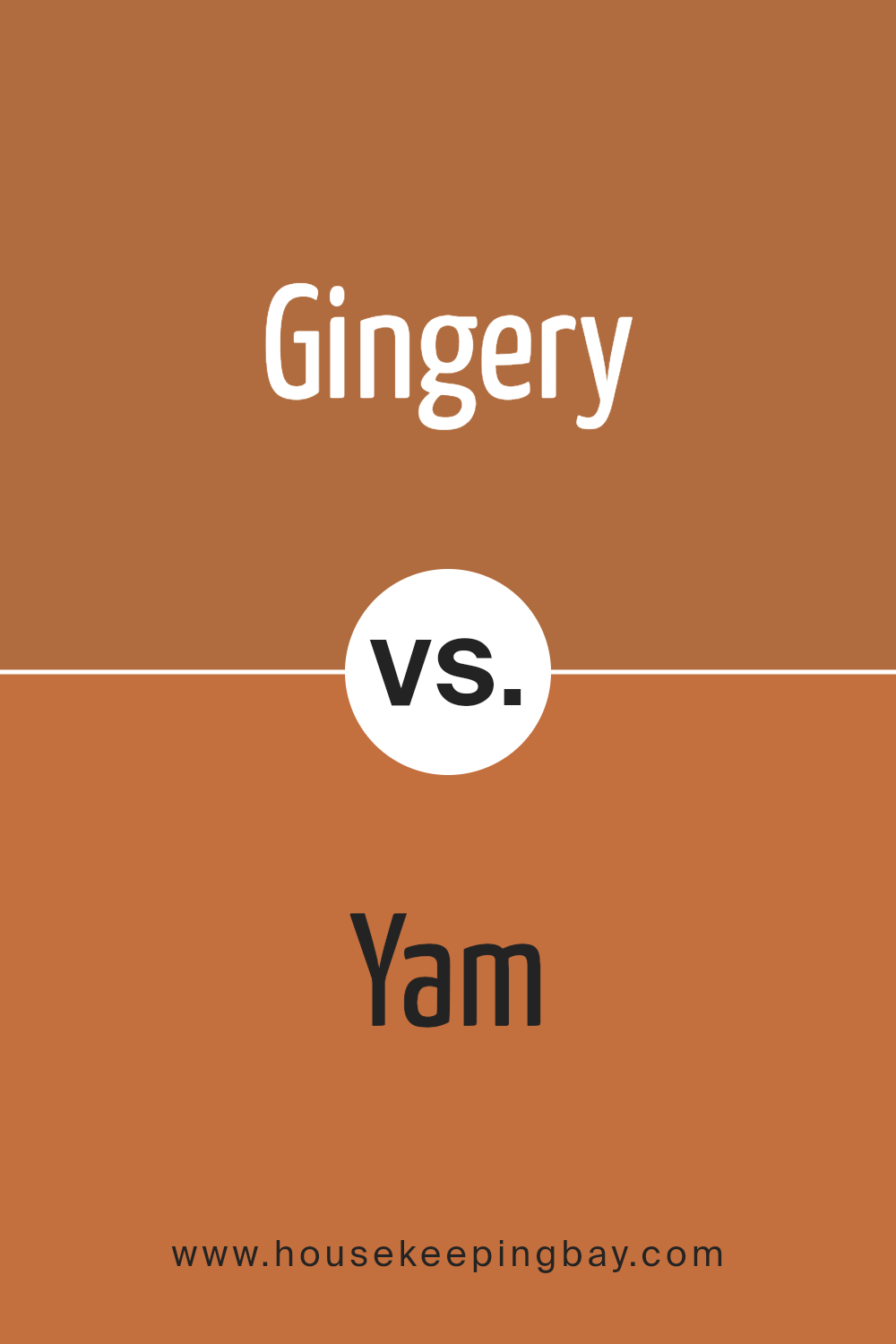
Gingery SW 6363 by Sherwin Williams vs Yam SW 6643 by Sherwin Williams
Gingery SW 6363 by Sherwin Williams is a warm, earthy shade. It brings to mind the cozy hues of spices with a hint of orange. It’s inviting, creating a welcoming atmosphere. This color works well in living spaces, adding a touch of comfort and warmth without overwhelming the room.
Yam SW 6643 leans more towards a lively orange. It’s vibrant and energetic, making it a great choice for areas where you want to inspire activity and conversation. This shade can add a cheerful pop to kitchens or dining rooms, offering a lively ambiance.
Both colors belong to the same warm family, yet they serve different purposes. Gingery is subtle and soothing, perfect for spaces meant for relaxation. Yam’s brightness, in contrast, is ideal when you want to add vibrancy. Choosing between them depends on whether you’re seeking calm coziness or a lively, energetic vibe.
You can see recommended paint color below:
- SW 6643 Yam
housekeepingbay.com
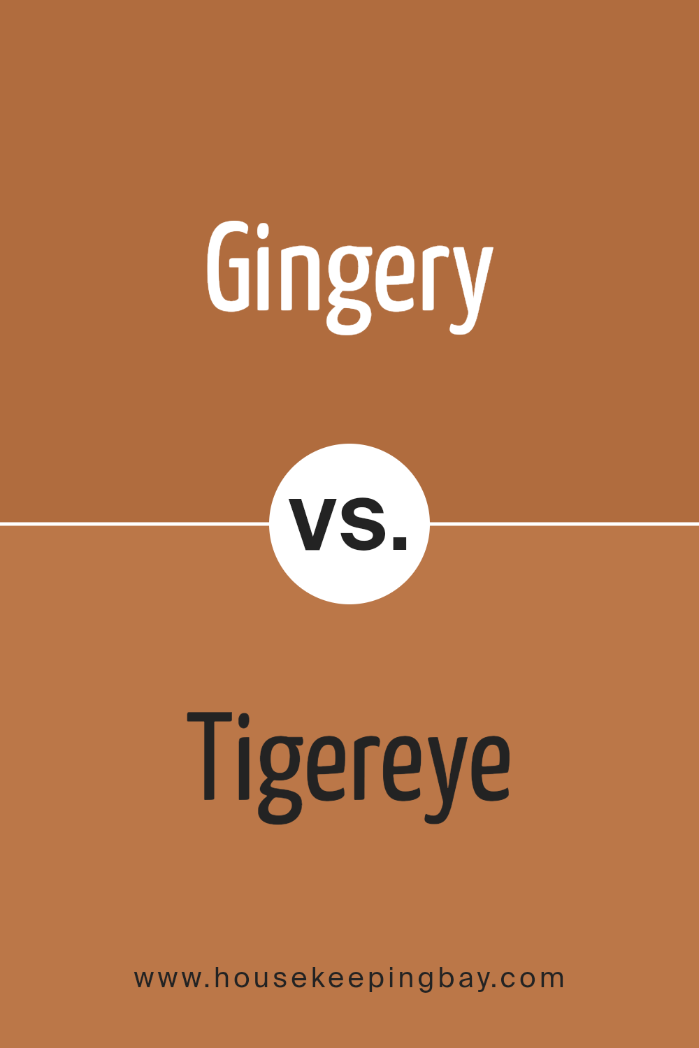
Gingery SW 6363 by Sherwin Williams vs Tigereye SW 6362 by Sherwin Williams
Gingery SW 6363 and Tigereye SW 6362 by Sherwin Williams both belong to the warm, earthy color family. Gingery SW 6363 exudes a rich orange-brown hue, bringing to mind the warm color of ginger root. It creates a cozy and inviting atmosphere, perfect for spaces where you want a touch of warmth. Its tone is slightly muted, making it versatile for various settings, whether a living room or a dining room.
Tigereye SW 6362, meanwhile, is a deeper, more intense color. It carries a bolder, darker amber tone, reminiscent of a tiger’s eye gemstone. This color can add dramatic flair to any space, making it an excellent choice for accent walls or feature areas.
While both colors bring warmth and richness to a room, Gingery offers a softer ambiance, whereas Tigereye provides a more pronounced, bold statement. Using them together can create layers of warmth and sophistication in any interior space.
You can see recommended paint color below:
- SW 6362 Tigereye
housekeepingbay.com
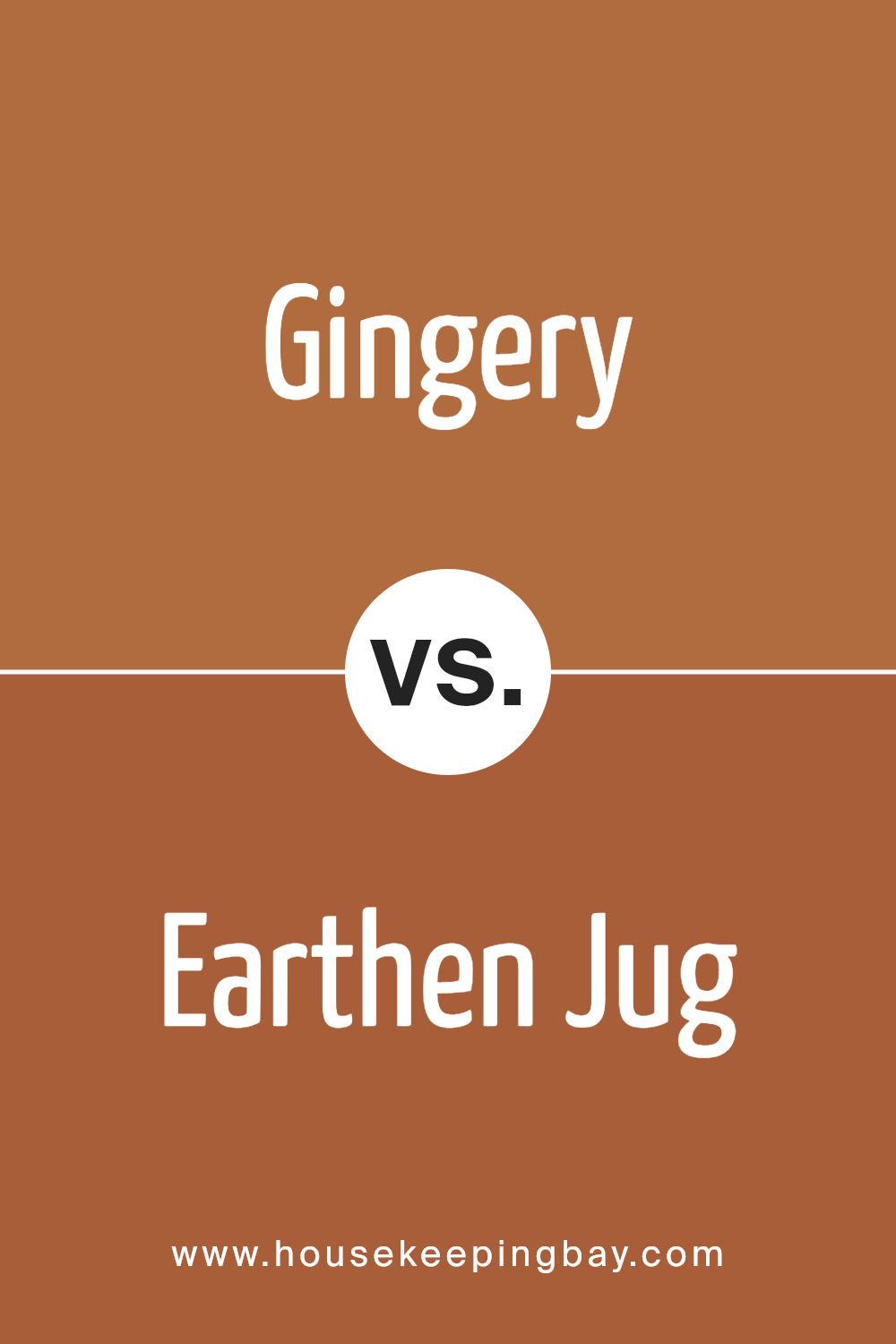
Gingery SW 6363 by Sherwin Williams vs Earthen Jug SW 7703 by Sherwin Williams
Gingery SW 6363 and Earthen Jug SW 7703 by Sherwin Williams showcase two warm, earthy tones that provide different aesthetic feels. Gingery is a vibrant burnt orange shade. It brings warmth and energy, evoking a sense of coziness and liveliness. It works well to add a bold accent in any space, providing a pop of color without being overwhelming.
Earthen Jug SW 7703, however, leans toward a deep, rich brown with hints of terracotta. This color exudes warmth and strength, ideal for creating a grounded, welcoming environment. It offers a sense of depth, complementing wood textures and natural materials beautifully.
While both colors share a warm undertone, Gingery serves as a lively focal point, suitable for accent walls or lively spaces. Earthen Jug, with its subdued richness, suits areas that require a touch of elegance and depth, promoting comfort and timelessness in any room.
You can see recommended paint color below:
- SW 7703 Earthen Jug
housekeepingbay.com
Gingery SW 6363 by Sherwin Williams vs Truepenny SW 6355 by Sherwin Williams
Gingery SW 6363 and Truepenny SW 6355 by Sherwin Williams offer distinct yet complementary earthy tones. Gingery SW 6363 presents a warm, spicy hue that brings to mind the root it shares its name with. It’s a vibrant, golden-orange color, ideal for creating lively and welcoming spaces. This color can brighten rooms, adding an energetic and uplifting atmosphere.
Truepenny SW 6355, in contrast, features a more subdued, coppery tone. It’s quieter and richer, with a more rustic feel compared to Gingery. This color works well in creating cozy, inviting environments, perfect for areas where you want to relax and unwind.
When paired, these colors can produce a harmonious palette. Gingery can serve as a bold accent, while Truepenny offers a more grounded backdrop. Together, they create a balanced, warm setting, suitable for various decorating styles and preferences.
You can see recommended paint color below:
- SW 6355 Truepenny

housekeepingbay.com
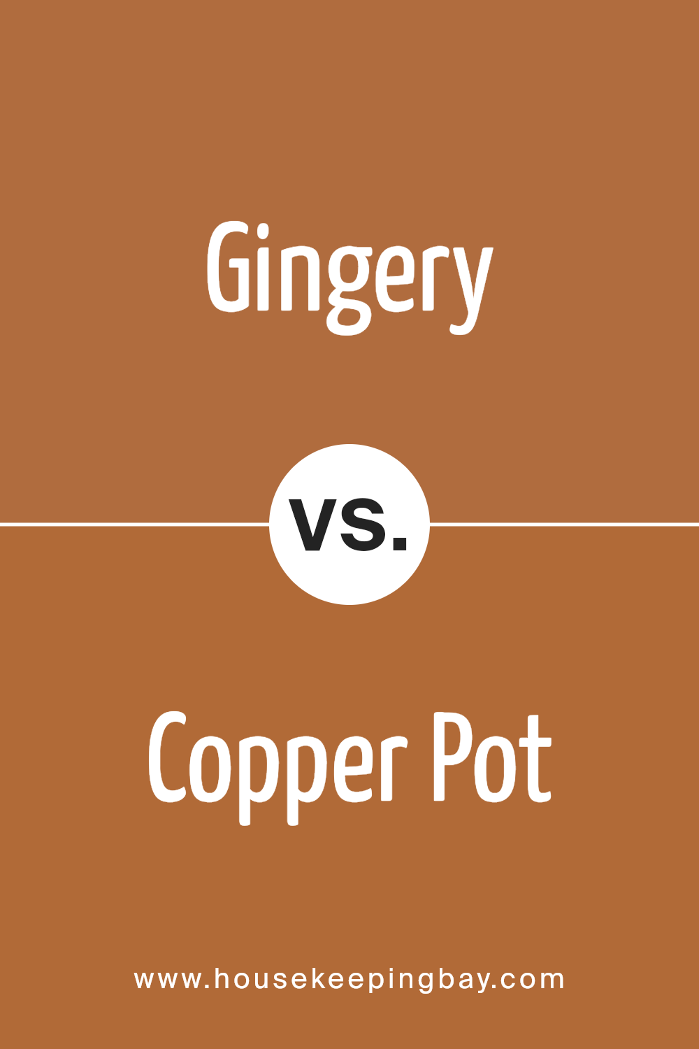
Gingery SW 6363 by Sherwin Williams vs Copper Pot SW 7709 by Sherwin Williams
Gingery SW 6363 by Sherwin Williams offers a warm, inviting tone with a hint of brightness. It’s a soft, rich shade that brings a cozy vibe to any space. Its lightness makes it versatile, suitable for living rooms, kitchens, or any area needing a touch of warmth and comfort. The color resembles a gingerbread cookie, with its natural and earthy undertones creating a pleasant atmosphere.
Copper Pot SW 7709, however, is much darker. It provides a deep, intense blend of red and brown. This color exudes sophistication.
The richness of Copper Pot lends itself well to more formal spaces, such as dining rooms or studies, where a bold statement is desired. Its darker shade can accent certain features, like fireplaces or feature walls, giving an elegant touch.
Both these colors, while warm and grounded, differ in intensity and setting suitability, creating distinct moods within a home.
You can see recommended paint color below:
- SW 7709 Copper Pot
housekeepingbay.com
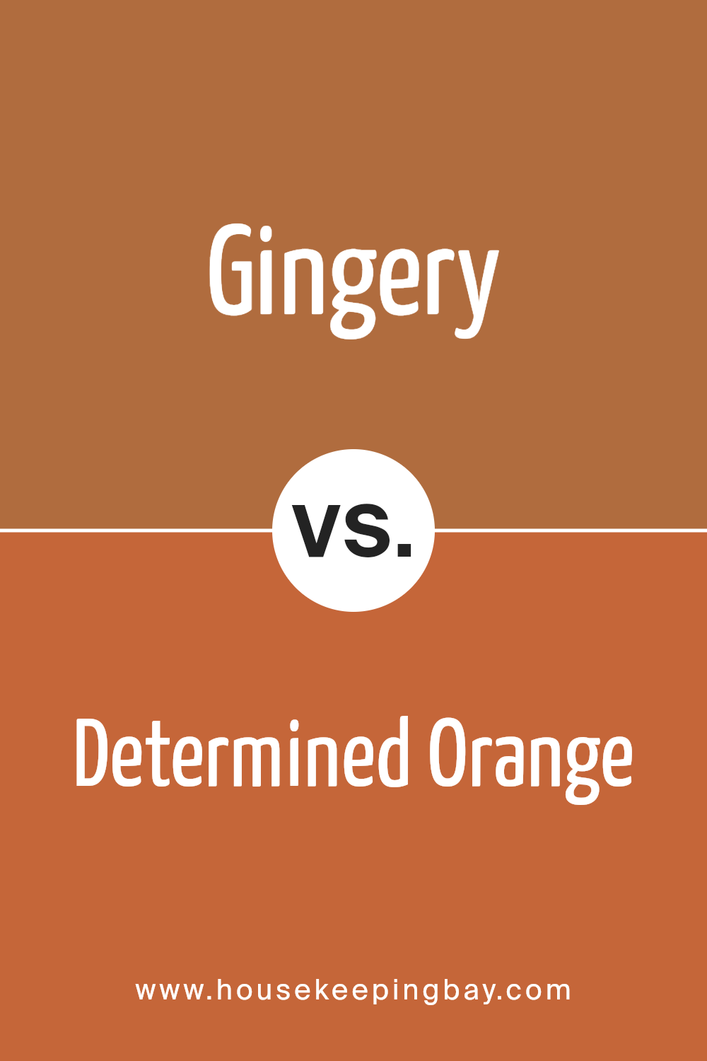
Gingery SW 6363 by Sherwin Williams vs Determined Orange SW 6635 by Sherwin Williams
Gingery SW 6363 and Determined Orange SW 6635, both by Sherwin Williams, are warm, inviting colors that exude energy and comfort. Gingery SW 6363 is a medium, reddish-brown hue with subtle orange undertones, evoking a cozy and earthy feel. It’s a color that can bring warmth to any room, making spaces feel grounded and inviting.
In contrast, Determined Orange SW 6635 is a vibrant, bold orange. With its lively and energetic nature, Determined Orange demands attention and can instantly brighten up any space. It’s an ideal choice for accent walls or areas where you want to inspire creativity and promote enthusiasm.
While Gingery offers a more subdued and classic appeal suitable for relaxed settings, Determined Orange infuses spaces with dynamic energy and is perfect for making a statement.
Both colors can coexist beautifully when used thoughtfully, creating balance and vibrancy in home decor.
You can see recommended paint color below:
- SW 6635 Determined Orange
housekeepingbay.com
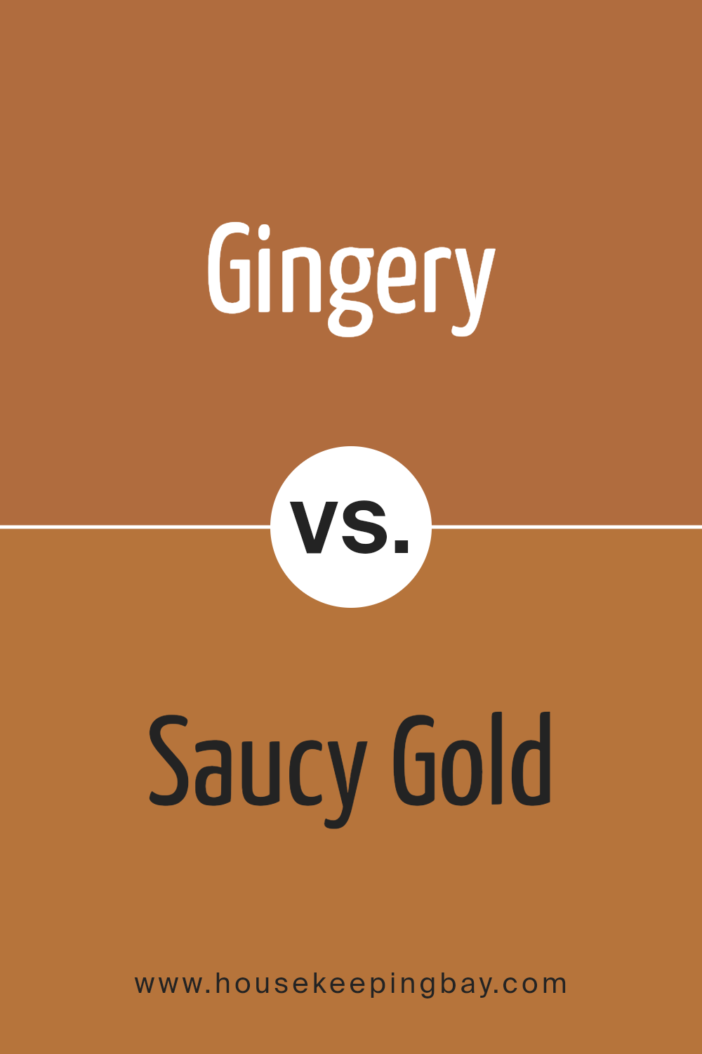
Gingery SW 6363 by Sherwin Williams vs Saucy Gold SW 6370 by Sherwin Williams
Gingery SW 6363 and Saucy Gold SW 6370 by Sherwin Williams both bring warmth and energy but present subtle contrasts. Gingery SW 6363 offers a lighter, peachier hue, which feels inviting and soft. It emits a glow that brightens spaces without overwhelming. Gingery also has a versatility that pairs well with neutrals, making it ideal for cozy living rooms or kitchens seeking a touch of charm.
Saucy Gold SW 6370, in contrast, leans more toward a deeper, richer gold. It carries a boldness that commands attention. This shade introduces a sense of sophistication and can add depth to any room.
Saucy Gold suits spaces where you want more drama, like an accent wall or dining room, creating a warm and elegant backdrop.
While both colors share an inviting warmth, Gingery leans light and approachable, whereas Saucy Gold offers a more pronounced and confident presence.
You can see recommended paint color below:
- SW 6370 Saucy Gold
housekeepingbay.com
Gingery SW 6363 by Sherwin Williams vs Copper Mountain SW 6356 by Sherwin Williams
Gingery SW 6363 and Copper Mountain SW 6356 are warm, earthy colors by Sherwin Williams, each with its own character. Gingery is a vibrant hue, reminiscent of golden spices. It brings a sense of warmth and coziness to a room. This color creates an inviting atmosphere, perfect for social spaces like living rooms or kitchens. It can add energy and a cheerful mood to any setting.
Copper Mountain SW 6356, meanwhile, carries richer, deeper tones. With its strong resemblance to earthy copper, it gives spaces a grounded feel. It’s robust yet elegant, lending sophistication to a room. Copper Mountain is ideal for areas seeking a comforting, intimate vibe, like dining rooms or bedrooms.
In summary, Gingery infuses spaces with lively warmth, while Copper Mountain offers a more subdued, refined presence. Both colors enhance interiors, but Gingery’s vibrancy contrasts with Copper Mountain’s richness, allowing each to suit different moods and areas effectively.
You can see recommended paint color below:
- SW 6356 Copper Mountain
housekeepingbay.com
Gingery SW 6363 by Sherwin Williams vs Reynard SW 6348 by Sherwin Williams
Gingery SW 6363 and Reynard SW 6348 by Sherwin Williams present warm, earthy tones, but each offers a unique feel. Gingery SW 6363 is a rich, warm orange with hints of spice, creating a cozy, inviting atmosphere. It feels vibrant yet grounded, making it ideal for spaces needing warmth and energy.
Reynard SW 6348, however, leans towards a darker, red-brown hue. It exudes a sense of depth and sophistication, providing a more muted, calming vibe. Reynard’s deeper tone makes it suitable for creating a snug, intimate setting or adding elegance to a room.
While both colors belong to the warm spectrum, Gingery is brighter and livelier, bringing a sense of cheerfulness and zest. Reynard, with its darker and subdued appearance, feels more robust and classic. Choosing between them depends on whether one seeks the vibrant energy of Gingery or the rich, comforting embrace of Reynard.
You can see recommended paint color below:
housekeepingbay.com
Gingery SW 6363 by Sherwin Williams vs Brandywine SW 7710 by Sherwin Williams
Gingery SW 6363 and Brandywine SW 7710, both by Sherwin Williams, are warm, inviting colors, yet they present distinct personalities. Gingery SW 6363 radiates a warm orange tone reminiscent of spicy ginger root, inspiring feelings of energy and excitement.
It is vibrant, making spaces feel cozy and lively. Brandywine SW 7710 presents a deeper, richer hue with reddish undertones, bringing to mind the warmth of fine aged wine or autumn leaves. This color can create an elegant, sophisticated ambiance while maintaining warmth.
When Gingery is used in a room, it adds a cheerful, sunny disposition, perfect for energizing spaces like kitchens or living rooms.
Brandywine, with its deeper undertone, often finds a home in dining areas or studies, where it adds a touch of elegance and depth.
Both colors invite warmth, yet Gingery leans more towards playful and bright, while Brandywine suggests a mature, cozy refinement.
You can see recommended paint color below:
- SW 7710 Brandywine
housekeepingbay.com
With its rich, earthy tones, Gingery brings a sense of comfort and coziness, making it an ideal choice for those looking to create a welcoming environment.
Whether used in a living room, bedroom, or kitchen, this color can enhance a room’s personality without overwhelming it.
The versatility of Gingery allows it to complement a wide range of styles, from traditional to modern. Pairing it with neutral shades can provide a balanced and harmonious look, while combining it with bold accents can add a lively touch.
Its adaptability means I can easily incorporate it into my existing decor or use it as a starting point for a whole new aesthetic.
Overall, SW 6363 Gingery by Sherwin Williams proves itself as a timeless option that can suit various tastes and preferences.
It offers both warmth and depth, making it a wonderful choice for those seeking to create meaningful and inviting spaces in their home.
housekeepingbay.com
Ever wished paint sampling was as easy as sticking a sticker? Guess what? Now it is! Discover Samplize's unique Peel & Stick samples. Get started now and say goodbye to the old messy way!
Get paint samples


