Reynard SW 6348 by Sherwin Williams
The Ultimate Red Hue for Cozy Interiors
This paint color is like a hidden gem that can really bring a warm and welcoming vibe to any room in your home. Reynard isn’t just any ordinary paint color; it has a unique charm that can transform your space, making it cozy and inviting. Whether you’re planning to refresh your living room, bedroom, or any part of your home, SW 6348 Reynard offers that perfect blend of warmth and style.
Choosing the right paint color can be a bit overwhelming with so many options out there, but Reynard stands out for its versatility and rich tone. It’s amazing how a single coat of paint can change the feel of a room, and that’s exactly what you get with this choice.
So, if you’re looking for a paint color that adds character and depth to your space without overwhelming it, SW 6348 Reynard by Sherwin Williams could be the one for you. It’s time to transform your home into the cozy, stylish haven you’ve always wanted, and Reynard is a great place to start.
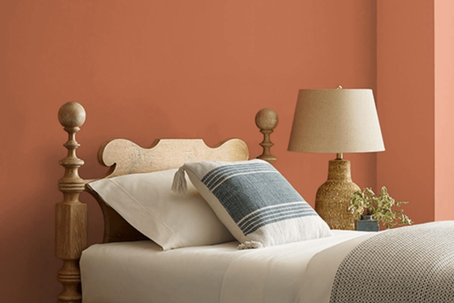
by sherwin williams
What Color Is Reynard SW 6348 by Sherwin Williams?
Reynard SW 6348 by Sherwin Williams is a warm, rich shade that sits somewhere between a cozy brown and a welcoming terracotta. This earthy hue carries a sense of comfort and grounded energy, making it an excellent choice for creating inviting spaces within a home or office. Its versatility is one of its standout traits, as it can add warmth to a room without overwhelming the space with too bold of a statement.
In terms of interior styles, Reynard SW 6348 shines in environments that favor natural elements and a touch of rustic charm. It works beautifully in farmhouse-style interiors, bohemian spaces, and even in more contemporary settings that aim to incorporate organic warmth. This color pairs exceptionally well with materials that echo its natural vibe, such as wooden furnishings, leather accents, and woven textures. These combinations can enhance the coziness of a living room, add depth to a bedroom, or bring a welcoming atmosphere to a dining area.
Fabrics that work well with Reynard SW 6348 include soft cotton, linen, and chunky knits, which all contribute to a layered, tactile experience. Incorporating elements like ceramic or terracotta pottery, as well as plants, can also complement this color’s earthy essence, creating a serene and balanced space that feels both grounded and stylish.
housekeepingbay.com
Is Reynard SW 6348 by Sherwin Williams Warm or Cool color?
Reynard (SW 6348) by Sherwin Williams is a unique shade that brings warmth and depth into any home. This color has a rich, deep tone that makes spaces look cozy and inviting. It’s not just any ordinary brown; Reynard has hints of red that add a special touch, making rooms feel more intimate and comfortable. Because of its warmth, this color works really well in living rooms or bedrooms where you want to create a peaceful and snug atmosphere.
When used on walls, Reynard can make big rooms feel more connected and smaller spaces appear luxurious. It pairs nicely with soft, light colors like creamy whites or soft grays, which can help balance out its depth. This is great for anyone looking to create a sophisticated, yet welcoming space. Furniture and decor in natural wood tones or light fabrics also go well with Reynard, making it a versatile choice that can suit different styles, from traditional to more modern looks. It’s a color that adds personality and warmth, transforming houses into homes.
What is the Masstone of the Reynard SW 6348 by Sherwin Williams?
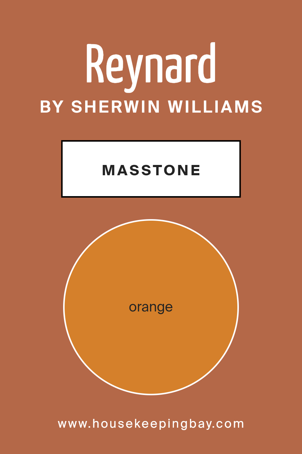
ReynardSW 6348 by Sherwin Williams has a masstone that’s orange, with an official code of #D5802B. This vibrant shade brings a warm and inviting energy into any room. When used in homes, this color can make spaces feel cozier and more welcoming. It’s perfect for creating an accent wall in the living room or adding a splash of color to a kitchen to make it more lively.
Due to its orange masstone, ReynardSW 6348 works really well with natural light, glowing beautifully during sunrise or sunset. This can make your rooms look stunning at these times. However, because it’s a bold color, it’s a good idea to balance it with neutral colors like white, grey, or light wood tones to avoid overwhelming the space.
In addition, this color can inspire feelings of happiness and energy, making it a great choice for areas where you spend a lot of time with family or friends. Whether it’s through a full wall of color or just some decorative elements, ReynardSW 6348 can make your home feel more lively and joyful.
housekeepingbay.com
Undertones of Reynard SW 6348 by Sherwin Williams
ReynardSW 6348 by Sherwin Williams is a complex color with various undertones that can change how it looks depending on the light and surroundings. Undertones are like secret ingredients in a color recipe. They can be subtle, but they really influence the color’s vibe and how we perceive it.
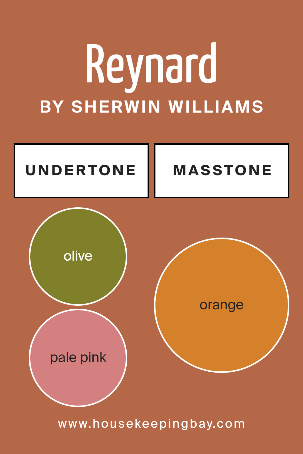
This color has undertones of olive, pale pink, red, grey, brown, pink, purple, yellow, light green, pale yellow, and mint. That’s a lot! Imagine these undertones as different spices. Depending on which ones stand out, the color can lean towards cool or warm, changing the atmosphere of a room.
When ReynardSW 6348 is used on interior walls, the room’s lighting plays a big role. In natural light, you might notice the color’s warm undertones, like yellow or light green, making the room feel cozy and inviting. In artificial light, cooler undertones, like grey or purple, might stand out, giving the space a more sophisticated vibe.
The surrounding colors and decor can also influence which undertones pop. Next to dark wood, the brown undertones might become more apparent, enhancing a rich, warm feel. Paired with light fabrics, the pale pink or pale yellow might stand out, softening the look.
Understanding the undertones of ReynardSW 6348 is key to predicting how it will behave in your space. It’s not just about the color on the swatch – it’s about how it interacts with everything around it, creating a unique atmosphere in your home.
housekeepingbay.com
Coordinating Colors of Reynard SW 6348 by Sherwin Williams
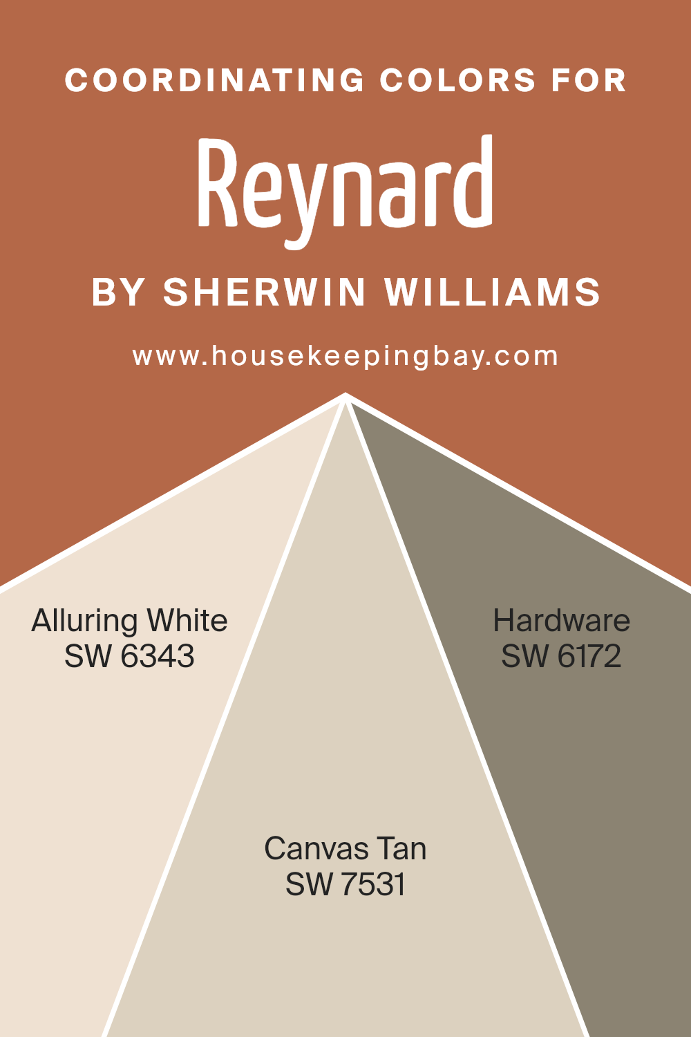
Coordinating colors are a set of hues that complement each other well when used together in design and decor. They create a visually appealing palette that enhances the overall aesthetic of a space. When we look at ReynardSW 6348 by Sherwin Williams, it has its own unique charm that acts as a focal point. However, its beauty is amplified when paired with its coordinating colors. These coordinating colors have been chosen carefully to complement without overshadowing, ensuring a harmonious blend throughout the space.
The color SW 6343, known as Alluring White, is a soft and subtle hue that brings a sense of calm and brightness to any room. It acts as a perfect backdrop, making it versatile for various decor styles and spaces. On the other hand, SW 7531, named Canvas Tan, is a warm neutral that adds a cozy and inviting layer to the interior, enhancing the depth and warmth in combination with other colors. Then, there’s SW 6172, Hardware, a deeper shade that grounds the palette with its rich, sophisticated tone. It offers a stunning contrast to the lighter hues, creating an engaging and dynamic space. Together, these coordinating colors work in harmony to create a cohesive look that’s both appealing and functional.
You can see recommended paint colors below:
- SW 6343 Alluring White
- SW 7531 Canvas Tan
- SW 6172 Hardware
housekeepingbay.com
How Does Lighting Affect Reynard SW 6348 by Sherwin Williams?
Lighting plays a crucial role in how we perceive colors; it can change how a color looks depending on the type and direction of light. The color Reynard SW 6348 by Sherwin Williams is no exception. This particular shade behaves differently under artificial light compared to natural light and varies in appearance based on the room’s orientation—whether it faces north, south, east, or west.
- Under artificial light, Reynard SW 6348 tends to look warmer and more inviting. This is because most artificial lights, like incandescent bulbs, emit a yellowish hue, enhancing the cozy and warm tones of Reynard. If LED lights are used, especially those that mimic daylight, Reynard will appear closer to how it looks in natural light, though it may still lean slightly warmer.
- In natural light, Reynard’s true color is more apparent, but the direction of the light can change its appearance. In north-facing rooms, which receive cooler, indirect light, Reynard can look more muted and subdued. The cooler light can make it appear slightly darker and less vibrant.
- South-facing rooms get plenty of warm, direct sunlight throughout the day, making Reynard appear brighter and more lively. The warmth of the sun enhances the color’s natural vibrancy, making it stand out more.
- East-facing rooms receive bright, warm light in the morning and cooler light as the day progresses. Reynard will likely appear most vibrant and warm in the morning, slowly becoming softer and more muted as the day goes on.
- West-facing rooms have the opposite effect; they’re filled with cooler light in the morning and warm, intense light in the afternoon and evening. Here, Reynard will start the day looking more subdued and gradually become warmer and more striking towards the evening.
Understanding how lighting affects Reynard SW 6348 can help you decide which room to use it in, ensuring you get the desired effect at different times of the day.
housekeepingbay.com
What is the LRV of Reynard SW 6348 by Sherwin Williams?
Regarding the color Reynard (SW 6348) by Sherwin Williams, which has an LRV of 20.173, we’re looking at a paint that falls on the darker side of the LRV scale. This means it will absorb a lot of light rather than reflecting it. In practice, on your walls, Reynard will present as a deep, rich color that can add a significant amount of character and mood to a space.
However, because of its lower LRV, it’s important to consider the room’s lighting when using this color. In well-lit spaces or spaces with plenty of natural light, Reynard could create a warm and inviting atmosphere. In darker rooms, though, it might make the space feel a bit more enclosed. So, it’s always a good idea to think about the lighting conditions in your room when you’re planning to use colors with low LRVs like Reynard.

housekeepingbay.com
What are the Trim colors of Reynard SW 6348 by Sherwin Williams?
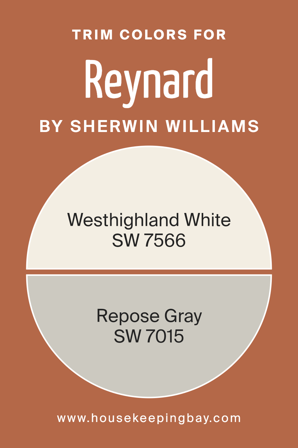
Trim colors are essential accents in painting and decorating that outline and define the edges of walls, door frames, windows, and mouldings, adding depth and character to a space. In the case of ReynardSW 6348 by Sherwin Williams, selecting the right trim color can elevate the overall appearance, creating a harmonious or striking contrast that enhances the room’s ambiance. Using trim colors like SW 7566 – Westhighland White and SW 7015 – Repose Gray can play a significant role in achieving an aesthetically pleasing balance. These colors can act as a subtle frame to the vibrant ReynardSW 6348, providing a polished and sophisticated finish.
SW 7566 – Westhighland White is a clean and bright shade that brings a fresh and airy feel to any room, ideal for creating a crisp border that can make the ReynardSW 6348 stand out more vividly. It illuminates spaces, offering a contrast that is both understated and impactful. On the other hand, SW 7015 – Repose Gray offers a contemporary neutral option with its warm, gray tones, delivering a sleek and modern trim choice that complements the deeper hues of Reynard SW 6348.
Repose Gray works wonders in adding a subtle depth and definition, enhancing the space with its versatility and timeless appeal. Together, these trim colors provide options for creating either a bright and expansive effect or a cozy and grounded atmosphere, depending on the desired outcome.
You can see recommended paint colors below:
- SW 7566 Westhighland White
- SW 7015 Repose Gray
housekeepingbay.com
Colors Similar to Reynard SW 6348 by Sherwin Williams
Similar colors in a palette, like the ones derived from Reynard by Sherwin Williams, play a critical role in creating a cohesive look in any space. These colors work together because they share common hues, making it easier to blend and layer them for a nuanced visual effect. For instance, when you use colors like Red Cent or Cavern Clay, you’re able to introduce warmth into a room without overwhelming it with intensity.
These shades carry a subdued earthiness, reminiscent of terracotta pots baking in the sun, lending an inviting atmosphere. Similarly, hues such as Brandywine and Gingery add a rich, spicy undertone that works well with natural materials, enhancing textures such as wood or leather.
Moving towards the more vibrant elements of the palette, Copper Mountain and Earthen Jug bring a dynamic burst of color that retains an organic feel. While Copper Mountain resembles the gleam of a sunset, Earthen Jug has the deep, comforting quality of clay soil. Husky Orange and Determined Orange veer into more playful territory, introducing a freshness that can illuminate spaces with a cheerful light. Robust Orange boasts a boldness that stands out, perfect for accent details, whereas Truepenny offers a balanced warmth that can easily tie together different elements of a room. Together, these colors form a harmonious blend, allowing for creativity in design while maintaining a unified aesthetic.
You can see recommended paint colors below:
- SW 6341 Red Cent
- SW 7701 Cavern Clay
- SW 7710 Brandywine
- SW 6363 Gingery
- SW 6356 Copper Mountain
- SW 7703 Earthen Jug
- SW 6636 Husky Orange
- SW 6635 Determined Orange
- SW 6628 Robust Orange
- SW 6355 Truepenny

housekeepingbay.com
Colors that Go With Reynard SW 6348 by Sherwin Williams
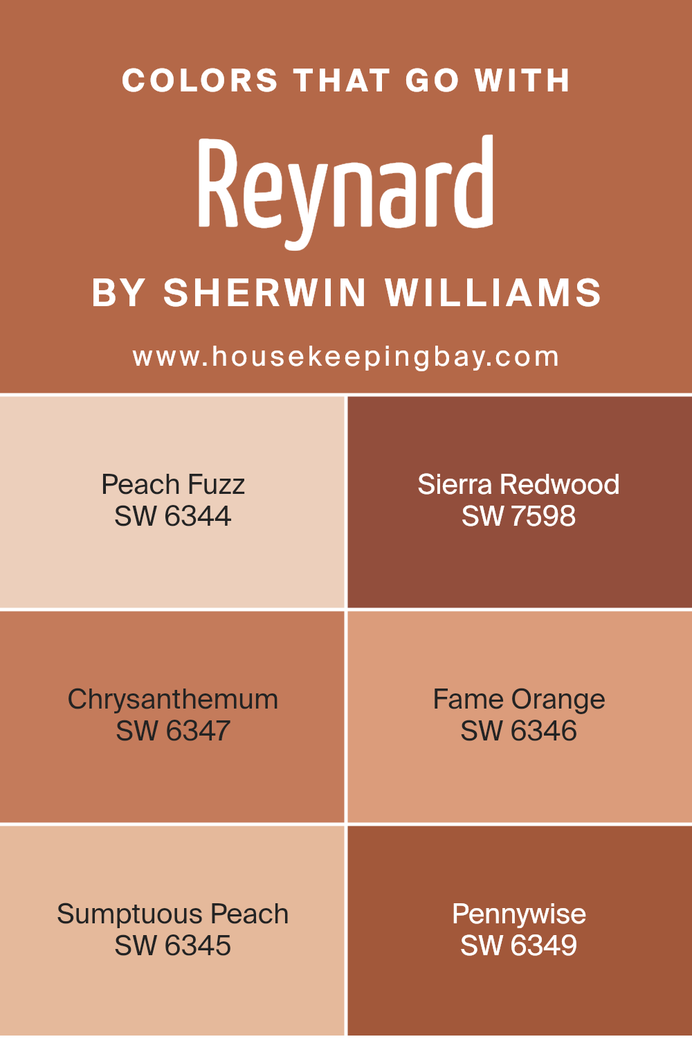
Selecting colors that pair well with Reynard SW 6348 by Sherwin Williams is essential because it ensures a cohesive and appealing aesthetic in any space. These complementary colors, like Peach Fuzz, Sierra Redwood, Chrysanthemum, Fame Orange, Sumptuous Peach, and Pennywise, work together by balancing warmth and creating a visually satisfying environment.
These pairs can enhance the mood of a room, influencing how it feels to spend time within it. Whether used for accent walls, furniture, or decor pieces, choosing the right complementary colors can transform a space, making it feel more inviting and put together.
- Peach Fuzz is a soft, welcoming peach that brings a gentle brightness to spaces, pairing nicely with Reynard for a sunlit, cheerful vibe. Sierra Redwood offers a deep, rich contrast that grounds the lightness of Reynard, adding an earthy, robust feel to any decor.
- Chrysanthemum, with its floral-inspired warmth, creates a harmonious blend with Reynard, offering a touch of elegance and sophistication.
- Fame Orange has a vibrant energy that injects liveliness when paired with Reynard, making spaces feel more dynamic and alive.
- Sumptuous Peach elevates the warmth in Reynard, creating a cozy, comforting atmosphere perfect for spaces meant for relaxation.
Lastly, Pennywise, a subtle and refined shade, complements Reynard by adding depth and interest without overwhelming, perfect for creating a nuanced and detailed aesthetic. Together, these colors work with Reynard to enhance the beauty and functionality of interior spaces.
You can see recommended paint colors below:
- SW 6344 Peach Fuzz
- SW 7598 Sierra Redwood
- SW 6347 Chrysanthemum
- SW 6346 Fame Orange
- SW 6345 Sumptuous Peach
- SW 6349 Pennywise
housekeepingbay.com
How to Use Reynard SW 6348 by Sherwin Williams In Your Home?
Reynard SW 6348 by Sherwin Williams is a rich and versatile paint color that can add a touch of elegance and warmth to any room in your home. This color is a deep, warm, reddish-brown that looks cozy and inviting. You can use Reynard SW 6348 in various ways around your house. It’s perfect for creating a focal point in a living room or dining area when applied to one wall as an accent.
In bedrooms, it can make the space feel more intimate and cozy, especially when combined with soft lighting and complementary colors in your bedding and decorations. In smaller spaces like a powder room or an entryway, painting all the walls in this color can make a bold statement and give a welcoming vibe. To balance its richness, pair it with lighter colors for trim and ceiling, like creamy whites or soft beiges, allowing Reynard SW 6348 to really stand out. For a harmonious look, add furniture and accessories in natural wood tones or muted colors.
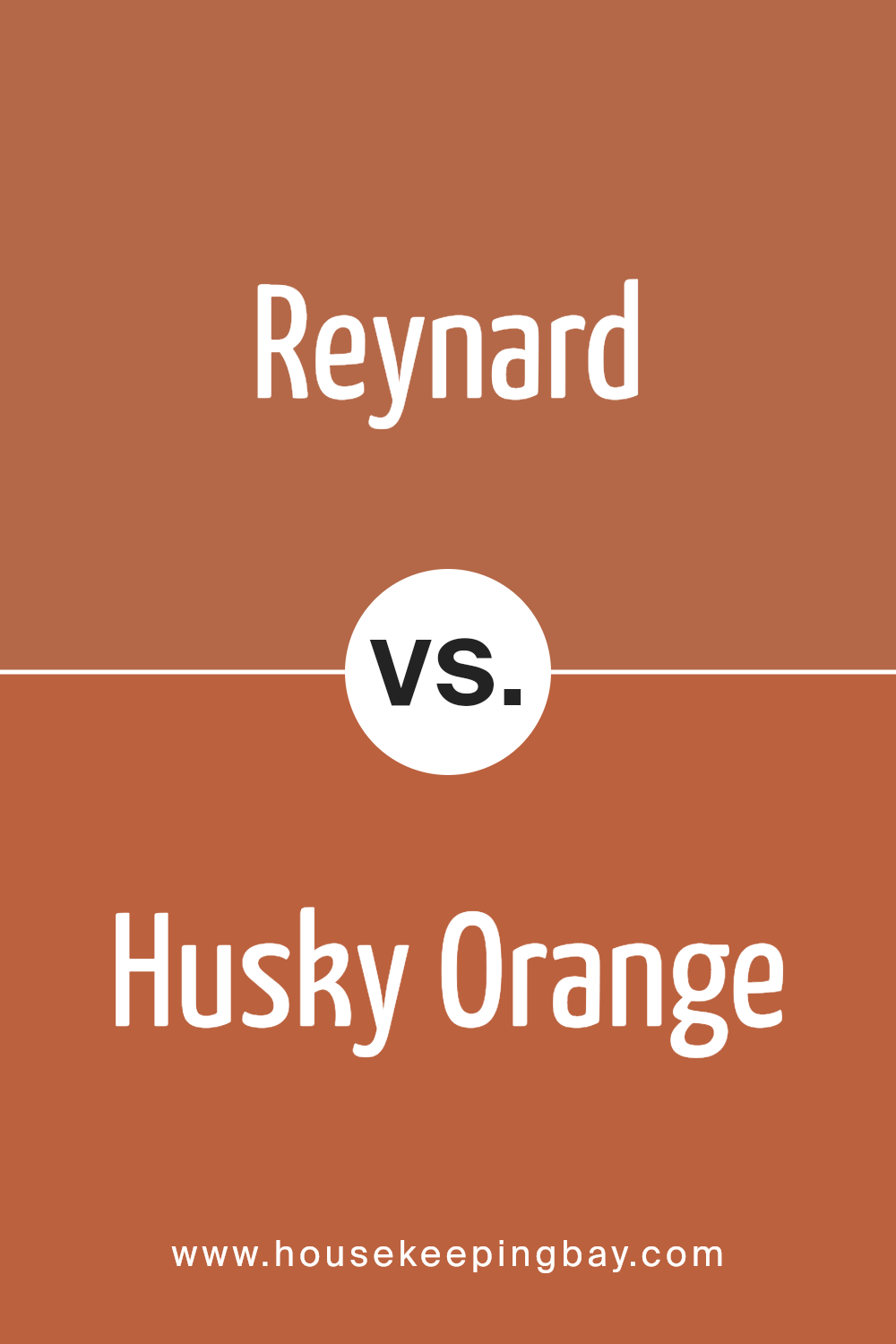
Reynard SW 6348 by Sherwin Williams vs Husky Orange SW 6636 by Sherwin Williams
The colors Reynard SW 6348 and Husky Orange SW 6636 by Sherwin Williams have their unique qualities. Reynard is a deep, warm orange that leans towards a more subdued and earthy tone. It’s the kind of color you might pick if you want a space that feels cozy and welcoming but not too bright or overwhelming.
On the other hand, Husky Orange is a much livelier and vibrant shade. It’s a bold, cheerful orange that packs a punch and brings a lot of energy to a room. It’s the kind of color that would make a statement and draw attention in a space. While Reynard offers a softer, more grounded atmosphere, Husky Orange is all about brightness and fun. Both colors are great in their ways, but your choice between them would depend on the mood you’re aiming to create in your space.
You can see recommended paint color below:
- SW 6636 Husky Orange
housekeepingbay.com
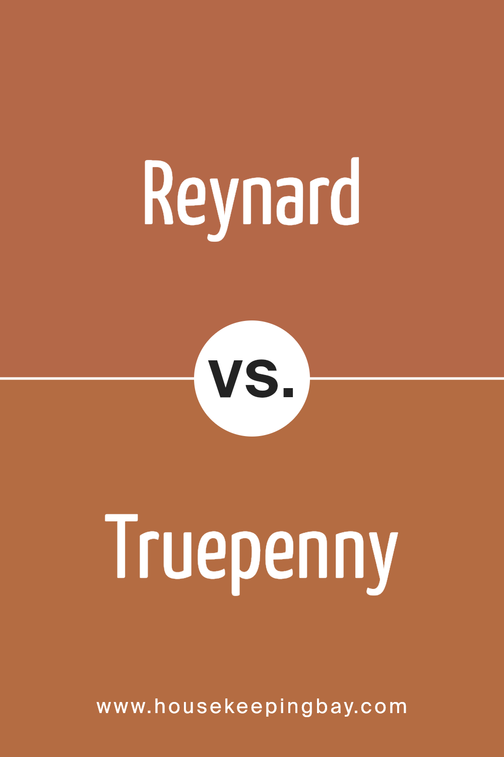
Reynard SW 6348 by Sherwin Williams vs Truepenny SW 6355 by Sherwin Williams
Reynard SW 6348 by Sherwin Williams is a rich, deep orange color that reminds you of a cozy autumn day or a warm, inviting fireplace. It has a strong presence, perfect for making a bold statement in a room. On the other hand, Truepenny SW 6355 is also from Sherwin Williams and shares a similar vibe because it’s in the orange family.
However, Truepenny is lighter and has a bit of a coppery tone, making it feel especially welcoming and warm. It’s less intense than Reynard, which means it can be used more flexibly across larger spaces or in rooms that you want to keep light and airy but still infused with warmth. Both colors offer a sense of comfort and coziness but in slightly different ways. Reynard commands attention with its deeper hue, while Truepenny offers a gentler touch, perfect for creating a friendly and inviting space.
You can see recommended paint color below:
- SW 6355 Truepenny
housekeepingbay.com
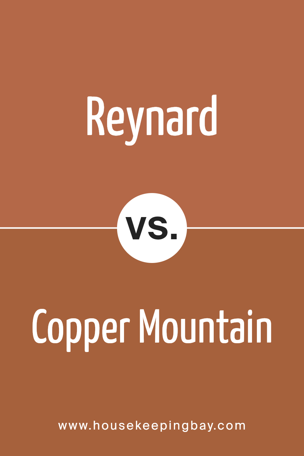
Reynard SW 6348 by Sherwin Williams vs Copper Mountain SW 6356 by Sherwin Williams
Reynard SW 6348 by Sherwin Williams is a unique, lively orange color that adds warmth and cheerfulness to any space. Its vibrant tone is perfect for creating a cozy and inviting atmosphere in your home, making rooms feel more welcoming and energetic.
On the other hand, Copper Mountain SW 6356 by Sherwin Williams is a richer, deeper shade of orange-brown. This color has a more grounded, earthy feel compared to Reynard. Copper Mountain is ideal for those who prefer a more subtle, sophisticated look but still want to add a touch of warmth to their interiors.
While both colors share an orange base, Reynard is brighter and more vivid, bringing a burst of energy to spaces. In contrast, Copper Mountain offers a more muted, refined vibe, ideal for creating a relaxed, comforting environment. Depending on your preference for vibrancy or subtlety, each color has its unique charm, perfectly suited for different tastes and room settings.
You can see recommended paint color below:
- SW 6356 Copper Mountain
housekeepingbay.com
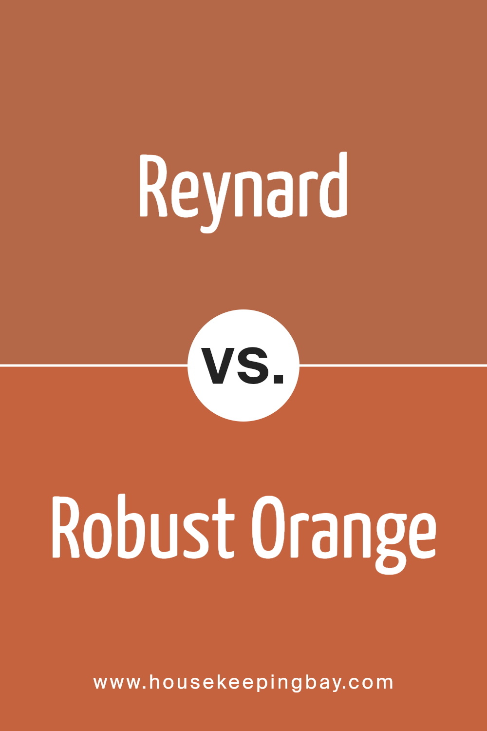
Reynard SW 6348 by Sherwin Williams vs Robust Orange SW 6628 by Sherwin Williams
Reynard SW 6348 by Sherwin Williams and Robust Orange SW 6628 by Sherwin Williams are both vibrant, full of life colors but have their distinct tones and atmospheres. Reynard is a rich, deep color, kind of like the beautiful, reddish-brown fur of a fox. It’s warm and cozy, making spaces feel welcoming and snug.
This color fits well in areas where you want to add a sense of sophistication without going too dark. On the other hand, Robust Orange is brighter and more energetic. It’s like the color of autumn leaves under a clear blue sky or a stunning sunset. This shade is perfect for bringing a punch of vibrancy and cheer into a room. It’s great for spaces where you want to boost creativity and liveliness. While both colors share an orange base, Reynard leans towards a more muted, earthy feel, whereas Robust Orange is all about making a bold, lively statement.
You can see recommended paint color below:
- SW 6628 Robust Orange
housekeepingbay.com
Reynard SW 6348 by Sherwin Williams vs Brandywine SW 7710 by Sherwin Williams
Reynard SW 6348 by Sherwin Williams is a unique color. At its heart, it feels warm, reminding you of the rich, reddish-brown fur of a fox. This color is cozy, inviting, and has a natural vibe to it. It’s perfect for creating a space that feels welcoming and snug.
On the other hand, Brandywine SW 7710 is also a warm color but takes a different direction. It leans closer to a deep, robust red with hints of earthiness. It’s a shade that feels like it’s holding stories of old, noble, classic environments. This color adds a touch of sophistication and depth to a room, making it ideal for spaces you want to fill with elegance and a timeless appeal.
Both Reynard and Brandywine bring warmth to any space but in different ways. While Reynard is more about capturing the essence of nature and coziness, Brandywine adds a layer of classic beauty and richness. Depending on what vibe you’re going for, each color has its unique charm to transform your space.
You can see recommended paint color below:
- SW 7710 Brandywine

housekeepingbay.com
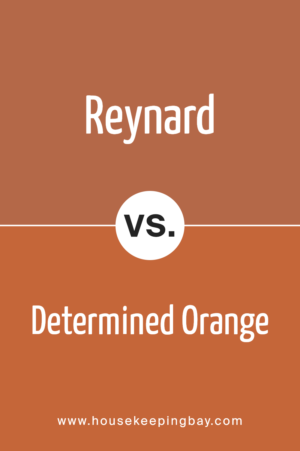
Reynard SW 6348 by Sherwin Williams vs Determined Orange SW 6635 by Sherwin Williams
Reynard SW 6348 by Sherwin Williams is a rich, earthy color that has a strong presence of deep, warm orange tones. It’s like looking at the color of a fox, full of warmth and depth. This color brings a cozy and inviting feel to any space, making it feel more welcoming and homely. It’s a great choice if you’re looking to create a space that feels grounded and comfortable.
On the other hand, Determined Orange SW 6635 by Sherwin Williams is a brighter, more vibrant shade of orange. It’s a color that really stands out, adding a lively and energetic vibe to any room. Unlike Reynard, which has a more subdued and natural look, Determined Orange is all about making a bold statement. It’s perfect for adding a pop of color and excitement to a space, making things feel more dynamic and fun.
In summary, Reynard offers a more subtle and earthy tone, ideal for a cozy atmosphere, while Determined Orange provides a vivid and bold look, great for injecting a bit of energy and fun into a room.
You can see recommended paint color below:
- SW 6635 Determined Orange
housekeepingbay.com
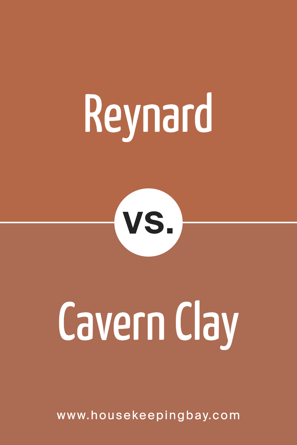
Reynard SW 6348 by Sherwin Williams vs Cavern Clay SW 7701 by Sherwin Williams
Reynard SW 6348 by Sherwin Williams and Cavern Clay SW 7701 are both warm, inviting shades that can really cozy up a space. Reynard is like a rich, deep red with hints of brown. It’s a bold color that adds a lot of character wherever it’s used. On the other hand, Cavern Clay has a more earthy feel to it. It’s a soft, welcoming terracotta color that blends red and orange tones beautifully.
When you put them side by side, Reynard feels deeper and more intense, while Cavern Clay is lighter and more natural. Reynard might be the choice for someone looking to make a strong statement in their space, like painting a feature wall or adding pop to a room. Cavern Clay, though, is great for creating a warm, inviting atmosphere.
It’s perfect for someone wanting to add a touch of coziness without overwhelming the space. Both colors are beautiful and can add a lot of warmth and personality to a home.
You can see recommended paint color below:
- SW 7701 Cavern Clay
housekeepingbay.com
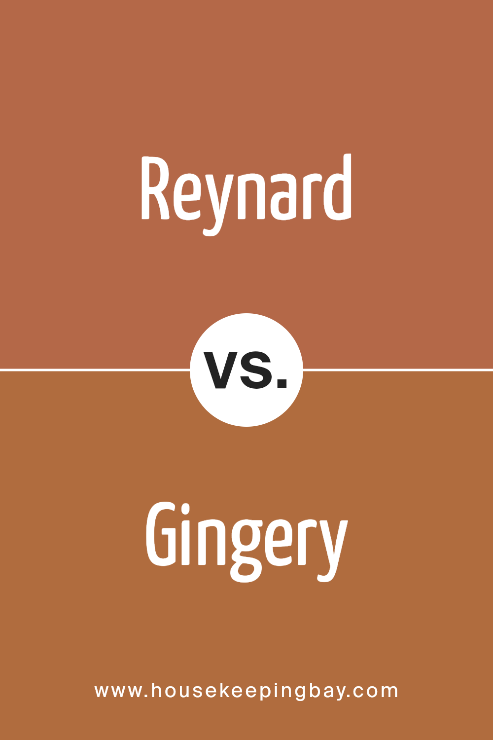
Reynard SW 6348 by Sherwin Williams vs Gingery SW 6363 by Sherwin Williams
Reynard SW 6348 by Sherwin Williams is a dark, rich color that brings to mind the fur of a fox. It’s a color that stands out, with a deep and warm feeling, perfect for creating a cozy atmosphere in a room. On the other hand, Gingery SW 6363, also by Sherwin Williams, is lighter and leans toward a spicy, warm tone.
This color is more like the warm glow of sunset, offering a bright and inviting feel. When comparing Reynard and Gingery, it’s like looking at the deep shadows of the evening against the last light of dusk. Reynard is the darker, more intense option, while Gingery offers a softer, welcoming glow. Both colors can add warmth to a space, but Reynard adds depth and richness, whereas Gingery brings a light, uplifting ambiance. They can work beautifully together, with Reynard providing a strong base and Gingery adding highlights and warmth.
You can see recommended paint color below:
- SW 6363 Gingery
housekeepingbay.com
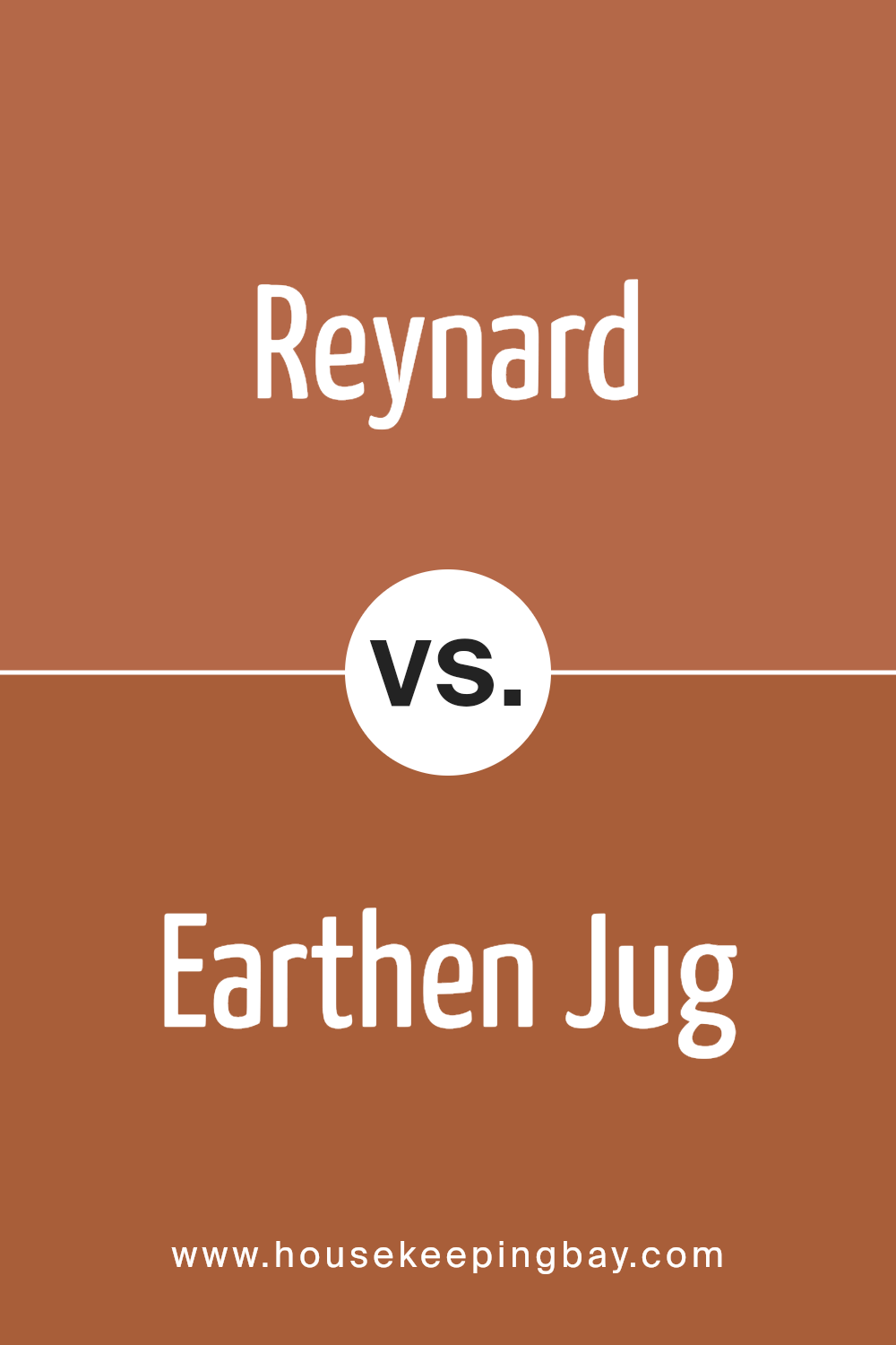
Reynard SW 6348 by Sherwin Williams vs Earthen Jug SW 7703 by Sherwin Williams
Reynard SW 6348 and Earthen Jug SW 7703, both by Sherwin Williams, offer unique shades that stand out on their own. Reynard is a deep, rich color that leans towards the orange family. It’s lively and has a strong presence, making it a great choice for spaces that need a pop of warmth and personality.
On the other hand, Earthen Jug SW 7703 has a more subdued, earthy tone. It’s not as bold as Reynard but carries a solid, comforting warmth, reminiscent of terracotta pots basking in the sun. While Reynard shouts for attention with its vibrant hue, Earthen Jug speaks in a softer tone, offering a calming and grounded vibe. Both colors are versatile in their own right, Reynard being the choice for those wanting to add a dynamic and cheerful touch, and Earthen Jug for those aiming for a cozy, welcoming atmosphere. Whether used together or separately, they can bring life and character to any space.
You can see recommended paint color below:
- SW 7703 Earthen Jug
housekeepingbay.com
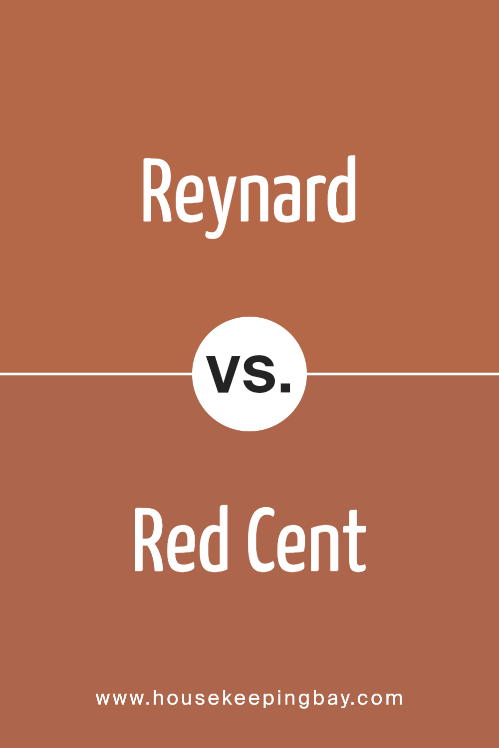
Reynard SW 6348 by Sherwin Williams vs Red Cent SW 6341 by Sherwin Williams
Reynard SW 6348 by Sherwin Williams is a rich, deep color that reminds you of orange mixed with a hint of brown. It’s warm and has a cozy vibe, perfect for a space where you want to feel snug and comfortable. On the other hand, Red Cent SW 6341 is also a warm hue, but it leans more towards a reddish tone, with a slight orange undertone. It’s vibrant and can add a splash of warmth to any area, making it lively.
When you compare Reynard and Red Cent, you notice that Reynard carries more brown in its mix, which makes it a bit darker and more subdued. Red Cent, however, has a brighter feel because of its closer link to red, giving it a slightly more energetic look. You could use Reynard in a room where you want a cozy and inviting atmosphere, while Red Cent could be perfect where you’re looking to add a touch of warmth without overwhelming the space with too much brightness. Both colors offer a warm and cozy feel, but Reynard leans towards a more muted earthiness, while Red Cent offers a pop of warmth.
You can see recommended paint color below:
- SW 6341 Red Cent
housekeepingbay.com
Conclusion
In summary, SW 6348 Reynard by Sherwin Williams is a choice you won’t regret when you’re looking to freshen up your space. This vibrant and cozy shade of red has the unique ability to invigorate any room, adding warmth and personality. Whether you’re planning to paint an accent wall, a whole room, or even outdoor features, Reynard offers versatility and style.
Choosing colors for your home can sometimes feel overwhelming, but Reynard simplifies that decision with its appealing charm and adaptability. It can match various decor styles, from modern minimalist to rustic or traditional, ensuring your space feels both inviting and lively. Plus, its high-quality formula ensures long-lasting beauty and durability, making your investment worthwhile.
Incorporating Reynard into your home is more than just updating your walls; it’s about creating a space that reflects your personality and style. Its rich, welcoming hue encourages comfort and conversations, making your home the heart of memories. So, whether you’re refreshing a single room or transforming your entire home, Reynard is a color that brings your space to life with its unique warmth and flair.
housekeepingbay.com
Ever wished paint sampling was as easy as sticking a sticker? Guess what? Now it is! Discover Samplize's unique Peel & Stick samples. Get started now and say goodbye to the old messy way!
Get paint samples
