Berry Cream SW 9075 by Sherwin Williams
A Warm and Cozy Addition to Any Space
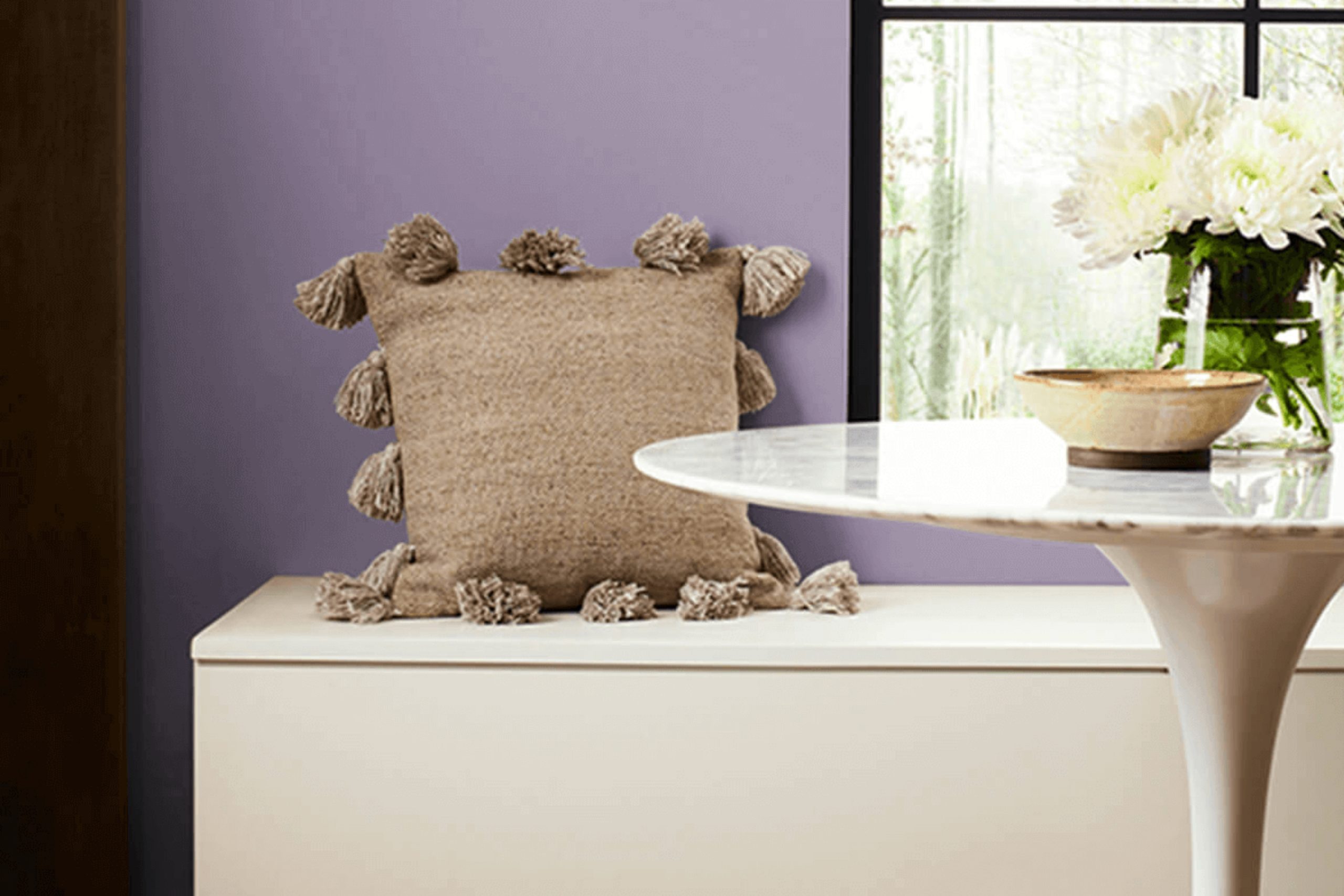
When choosing the right paint color, getting the perfect shade can influence the entire feel of a space. SW 9075 Berry Cream by Sherwin Williams offers a warm, inviting hue that can enrich any room. The color has a soft, earthy tone that feels both comforting and stylish, making it an ideal choice for living areas, bedrooms, or kitchens.
Picture yourself in a room painted with Berry Cream. The gentle warmth of the color creates a cozy and welcoming atmosphere. Whether you are spending time with family or relaxing on your own, the color enhances your space’s comfort.
Its natural undertones speak to those who prefer a subtle, yet impactful change in their home decor.
Berry Cream isn’t just about aesthetics. It allows you to mix and match with various other shades and textures. Whether you prefer wooden accents, metallic touches, or both, this color gives you the freedom to express your personal style.
It pairs effortlessly with whites and greys, and it can work as a backdrop for bolder, vibrant colors if you enjoy a pop of contrast.
Choosing SW 9075 Berry Cream means selecting a color that feels like home, suits your style, and allows you to create a space that reflects who you are. Enjoy the warmth and comfort this shade brings, and let it be the cornerstone of your interior design.
via sherwin-williams.com
What Color Is Berry Cream SW 9075 by Sherwin Williams?
Table of Contents
Berry Cream SW 9075 by Sherwin Williams is a warm, inviting shade that blends hints of soft pink and creamy beige. This color evokes a sense of comfort and coziness, making it a perfect choice for those looking to create a welcoming atmosphere in their home. The gentle hue works beautifully in a variety of interior styles, from modern farmhouse to classic and even bohemian themes.
In modern farmhouse settings, Berry Cream adds warmth to the neutral tones often used in this style, complementing materials such as reclaimed wood and matte black metals.
In classic interiors, this color pairs wonderfully with rich, dark woods like mahogany or walnut, lending a touch of sophistication and warmth without overwhelming the space.
For bohemian interiors, Berry Cream harmonizes with vibrant textiles, colorful patterns, and natural elements like bamboo and rattan, creating a laid-back yet stylish environment.
This color works well with various textures too. It looks elegant alongside velvet or silk for a touch of luxury, and equally pleasing with linen or cotton for a more relaxed feel. Whether you use it for walls, furniture, or accents, Berry Cream creates a soft, cohesive backdrop for any room.
housekeepingbay.com
Is Berry Cream SW 9075 by Sherwin Williams Warm or Cool color?
Berry Cream SW 9075 by Sherwin Williams is a warm, inviting color that can add a cozy feel to any room. Its soft, muted tone combines pink and beige, making it a versatile choice for various styles. When used on walls, Berry Cream can brighten up smaller spaces, giving them a more open and airy feel without feeling overwhelming.
In living rooms or bedrooms, it adds warmth and comfort, making these spaces feel more welcoming and calm. This color pairs well with natural materials like wood and stone, enhancing a soothing atmosphere. It also complements darker colors, like deep browns or charcoals, providing a balanced contrast.
In kitchens, Berry Cream can offer a splash of warmth, making the space feel more inviting and homely. Overall, Berry Cream SW 9075 is a versatile, gentle hue that can subtly enhance home interiors with its warmth and charm.
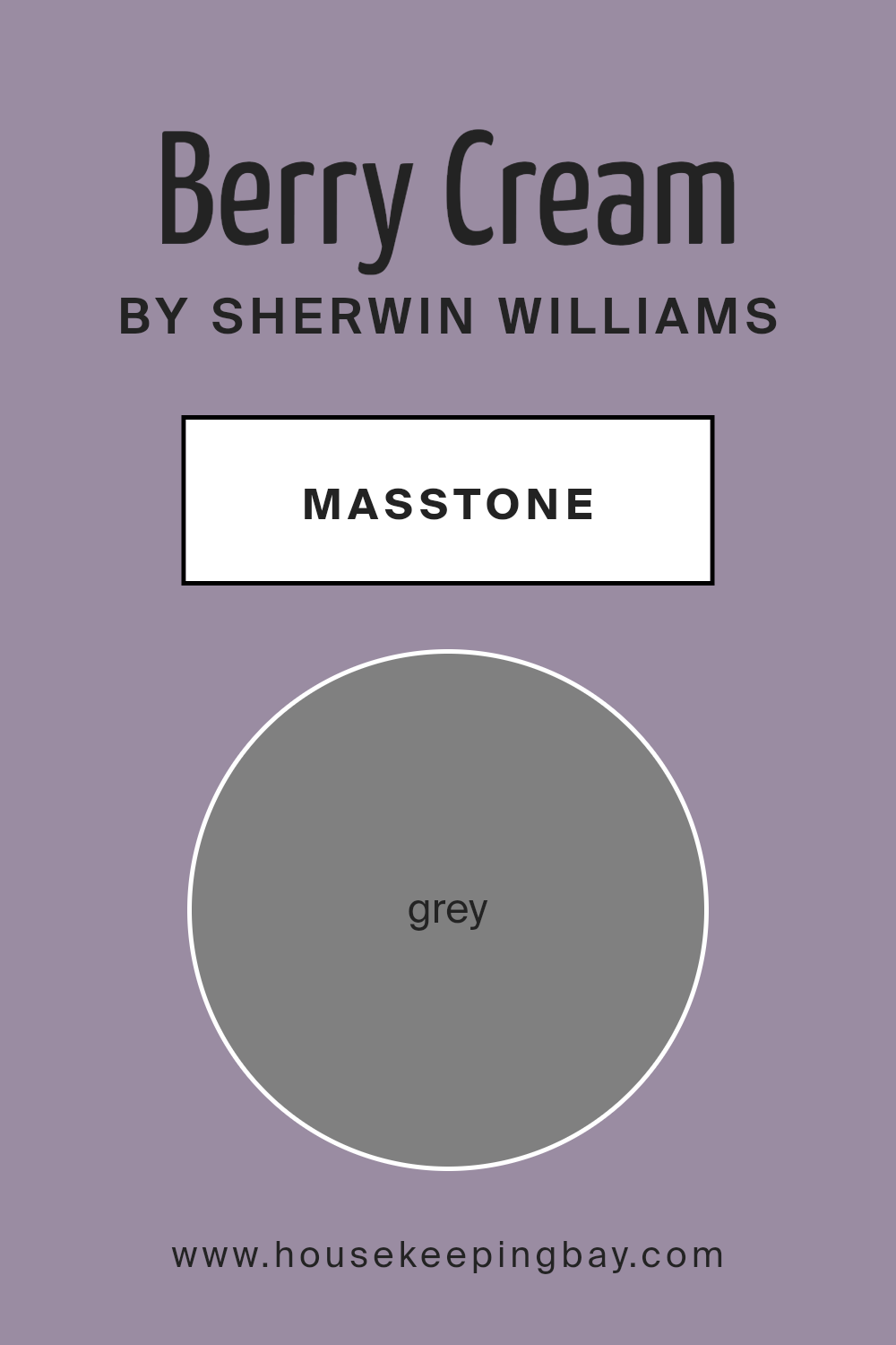
What is the Masstone of the Berry Cream SW 9075 by Sherwin Williams?
Berry Cream SW 9075 by Sherwin Williams is a warm and inviting paint color. While the masstone, or base color, is a neutral grey (#808080), Berry Cream has layers that give it a soft, almost creamy tone. This makes it a versatile choice in homes, as it can adapt to a variety of styles.
The grey undertones bring a balanced, calming effect that can help create a peaceful environment. In living spaces, it works well with both modern and traditional decor, providing a subtle background that doesn’t overwhelm other elements.
The gentle, neutral shade allows furniture and artwork to stand out.
In bedrooms, Berry Cream can contribute to a cozy, welcoming feel, helping to make the space a restful retreat. When used in kitchens, it pairs nicely with wood tones and stainless steel, creating a cohesive look.
Its adaptability makes Berry Cream a versatile choice for many homeowners seeking a warm yet neutral backdrop.
housekeepingbay.com
Undertones of Berry Cream SW 9075 by Sherwin Williams
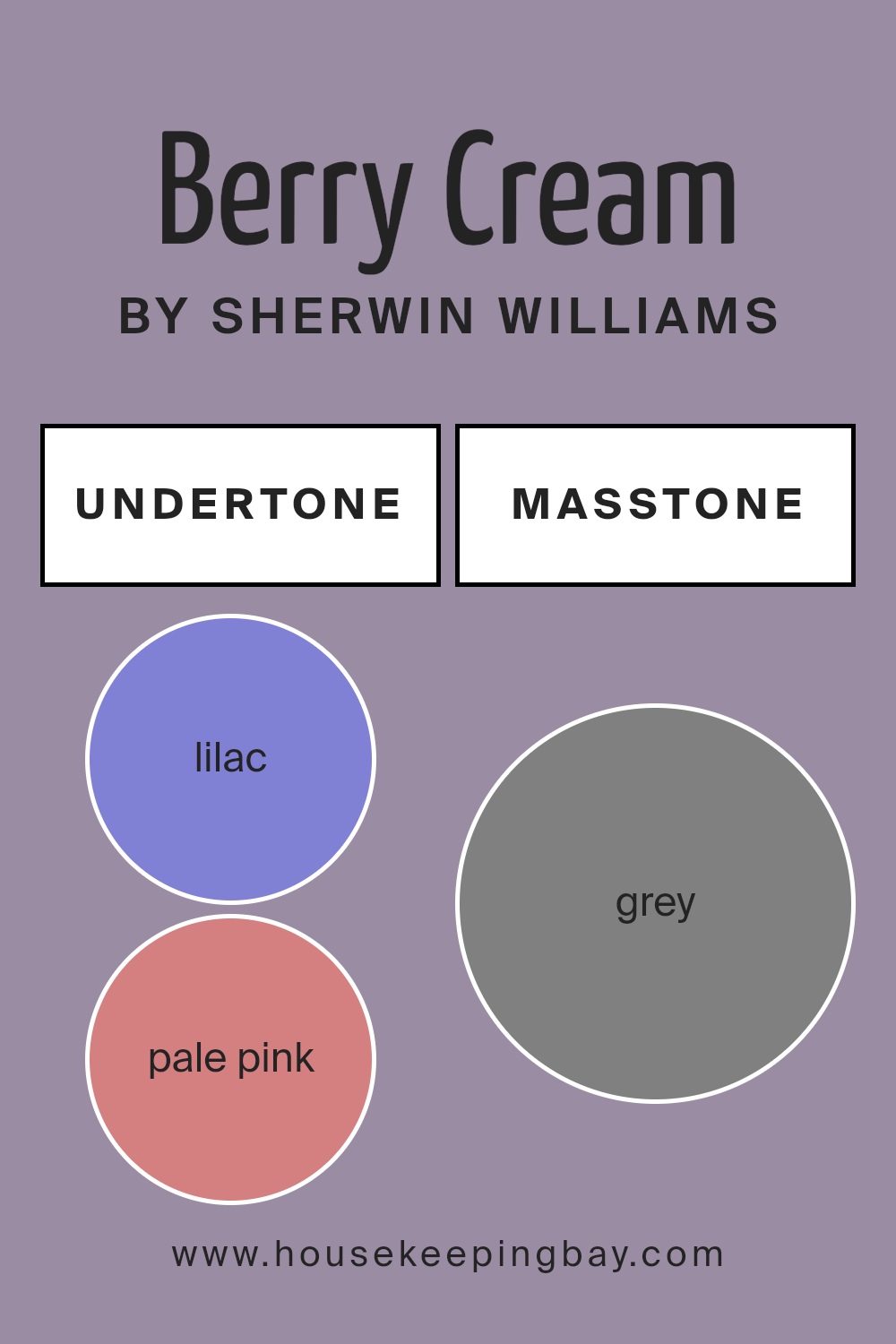
Berry Cream SW 9075 by Sherwin Williams comes with a rich tapestry of undertones that can change how the color feels in a room. The main undertones include lilac, pale pink, light purple, mint, light blue, and many others. These undertones influence whether the color appears warm or cool, soft or bright.
The lilac and light purple undertones add a hint of softness and elegance, infusing a gentle vibe. Pale pink can introduce warmth and a slight romantic feel, making the space cozier.
Meanwhile, mint and light blue undertones provide a refreshing and calming effect, which can make a room feel airy and spacious.
Light gray, brown, and dark gray undertones bring a touch of neutrality and balance, ensuring the color doesn’t feel too overwhelming. Meanwhile, vibrant undertones such as red, fuchsia, and orange inject energy and liveliness into the surroundings.
These undertones collectively affect the overall ambiance of a space when Berry Cream SW 9075 is on the walls. In a well-lit room, cooler undertones might stand out, making the space feel serene. In contrast, warmer undertones might be more noticeable in dim lighting, providing a cozy and inviting atmosphere. Understanding these nuances can help in creating the desired mood in any room.
housekeepingbay.com
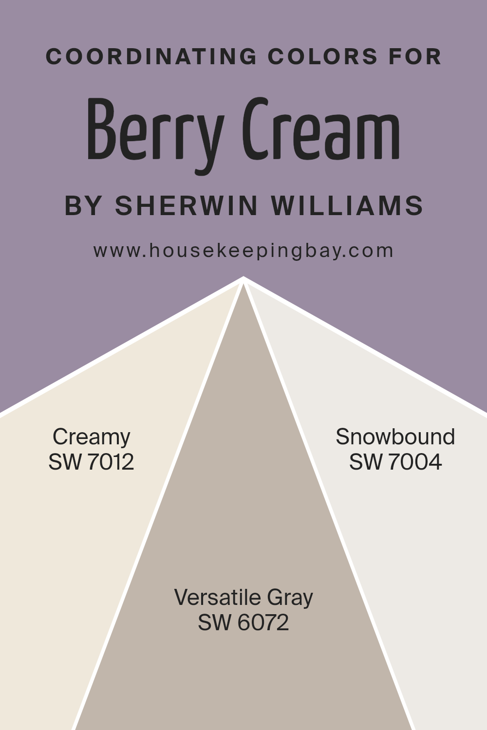
Coordinating Colors of Berry Cream SW 9075 by Sherwin Williams
Coordinating colors are shades that work well together to create a pleasing and harmonious look in a space. People often pick them to make rooms feel balanced and connected. When you team these colors with Berry Cream SW 9075 by Sherwin Williams, they complement its warm, soft tones.
Coordinating colors can bring out the best in each other, making the overall color scheme feel complete. Creamy SW 7012 is a soft, warm white that pairs beautifully with Berry Cream. Its gentle undertones offer a bright, welcoming feel without overshadowing other colors.
Versatile Gray SW 6072 is a perfect partner in this palette, offering a neutral tone that adds depth and sophistication. It neither competes with nor detracts from Berry Cream, but rather supports it, making for a well-rounded ensemble. Snowbound SW 7004 rounds off the group with its crisp, clean white tone.
It provides a fresh and airy counterpoint to the richness of Berry Cream. Together, these colors create a cohesive look that’s both inviting and elegant.
By choosing colors that work well together, you can make any room look stylish and put-together without too much effort or complexity.
You can see recommended paint colors below:
housekeepingbay.com
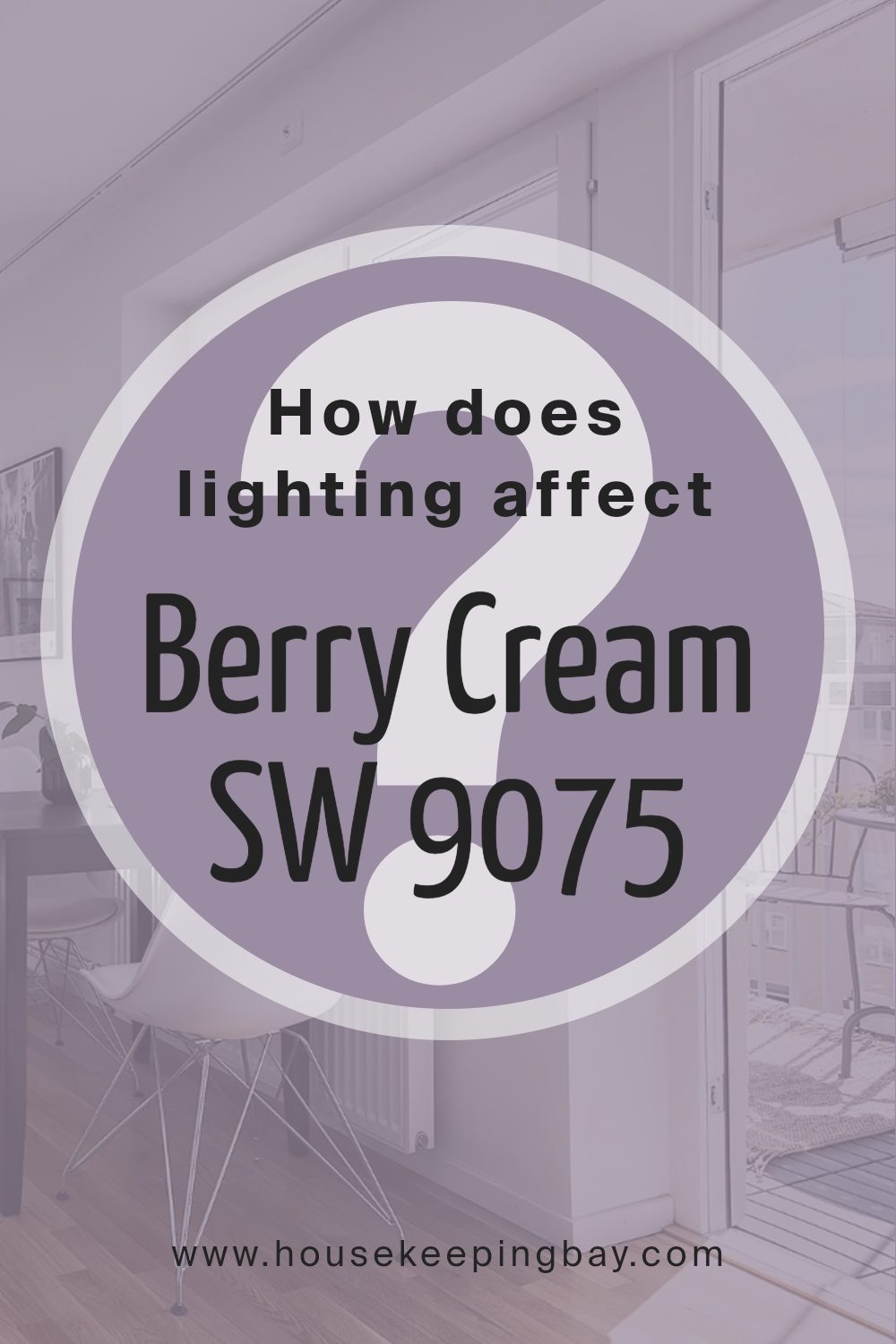
How Does Lighting Affect Berry Cream SW 9075 by Sherwin Williams?
Lighting plays a key role in how we perceive colors, including paint colors like Sherwin Williams’ Berry Cream SW 9075. This color can change dramatically depending on the light it receives.
In artificial light, Berry Cream may appear warmer or cooler depending on the bulb used. Incandescent lights can emphasize its warm, rosy undertones, giving it a cozy glow. Fluorescent bulbs, however, might cast a slightly cooler or more muted shade upon it, which could make it look less vibrant.
Natural light changes throughout the day and affects colors differently based on the room’s orientation. In north-facing rooms, where light tends to be cooler and more consistent, Berry Cream might appear more muted and perhaps a bit grayer. This light can tone down the warmth of Berry Cream, giving it a soft, subtle appearance.
In south-facing rooms, abundant sunlight allows Berry Cream to shine warmly. These rooms often get strong light throughout the day, which can highlight the richness of Berry Cream, making it feel cozy and inviting.
East-facing rooms receive bright, warm light in the morning, which might enhance Berry Cream’s warm undertones early in the day. However, as the day progresses, the room might feel cooler, with Berry Cream taking on a softer hue.
West-facing rooms have warm light in the late afternoon and evening. Here, Berry Cream could look more vibrant and warm during these times, while appearing more subdued earlier in the day.
By understanding how lighting affects Berry Cream SW 9075, homeowners can better predict how it will look in different rooms.
Whether in the warmth of afternoon sun or the coolness of morning light, Berry Cream transforms, adding charm and character to different spaces.
housekeepingbay.com
What is the LRV of Berry Cream SW 9075 by Sherwin Williams?
LRV stands for Light Reflectance Value. It’s a scale from 0 to 100 that measures how much light a color reflects. A lower LRV means the color absorbs more light and appears darker, while a higher LRV means the color reflects more light and looks lighter.
When you choose paint for your walls, the LRV can help predict how bright or dark the room will feel. A room with lots of natural light might make a low LRV color feel less dark, while that same color in a room with little light can make the room feel smaller or cozier.
Berry Cream by Sherwin Williams has an LRV of 28.206, which means it’s on the darker side of the spectrum.
This particular color will absorb more light than it reflects, giving rooms a warm, cozy ambiance. In well-lit spaces, Berry Cream can add richness without making the room feel too dark.
However, in dimly lit areas, it could make the space feel more intimate and snug, as its warmth wraps around the walls. Understanding these effects can help in deciding where to use this color, whether for accent walls or full-room applications.

housekeepingbay.com
What are the Trim colors of Berry Cream SW 9075 by Sherwin Williams?
When choosing paint colors for a room, trim colors play an important role in defining the space and highlighting its features. Trim refers to the moldings, baseboards, door and window frames, and other architectural features.
Selecting the right trim color can enhance the main wall color and give the room a polished look. For Berry Cream SW 9075 by Sherwin Williams, a soft and warm color, choosing complementary trim colors can be crucial to creating harmony.
It offers a smooth, calming vibe, and trims in shades like Creamy SW 7012 or Aesthetic White SW 7035 can enhance the warmth and crispness of Berry Cream. These colors add an elegant yet understated frame around the walls, making the room feel well-coordinated and thoughtfully designed.
Creamy SW 7012 by Sherwin Williams is a warm, off-white color with a hint of yellow.
It brings a soft, inviting feel to a room without being too stark or cold. Aesthetic White SW 7035, on the other hand, is a light, neutral color with a hint of gray. It makes spaces feel airy and open. Both colors provide a subtle contrast to Berry Cream, helping it stand out while offering a clean and fresh look. By using these gentle shades for the trim, they let the warmth of Berry Cream shine, adding depth and interest to your room’s design.
You can see recommended paint colors below:

housekeepingbay.com
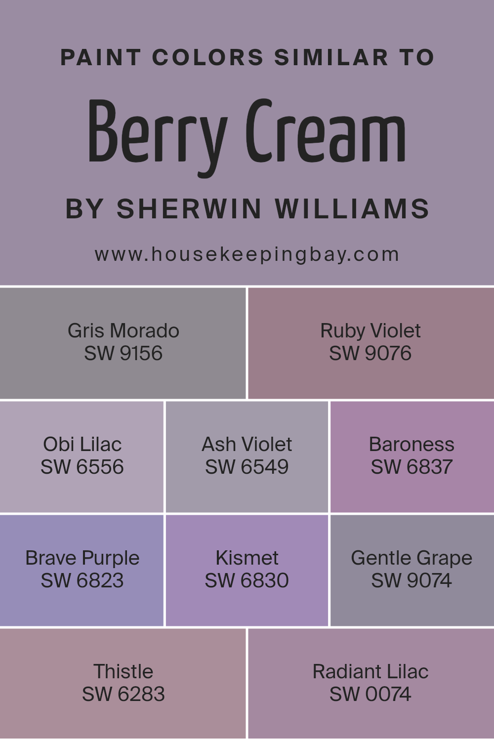
Colors Similar to Berry Cream SW 9075 by Sherwin Williams
Similar colors are crucial in design because they create harmony and a sense of cohesion. They help to maintain a consistent theme and mood by using colors that share undertones. When you look at colors similar to Berry Cream SW 9075, like Gris Morado SW 9156, you find a soft, muted purple with subtle gray undertones, adding a calming touch to a space.
Ruby Violet SW 9076 stands as a deeper, more enchanting purple that adds depth and richness. Obi Lilac SW 6556 offers a delicate, gentle shade of lilac, ideal for serene and airy spaces.
Ash Violet SW 6549 brings in a dusky quality, perfect for creating a cozy atmosphere. Baroness SW 6837 is a bold, regal purple that commands attention, while Brave Purple SW 6823 brings an energetic, lively vibe with its vivid hue.
Kismet SW 6830 leans toward a lighter purple, offering a fresh look. Gentle Grape SW 9074, as the name suggests, is a soft purple with a hint of sweetness, providing comfort and warmth. Thistle SW 6283 is understated and elegant, ideal for creating subtle sophistication.
Finally, Radiant Lilac SW 0074 provides a cheerful, light touch of lilac, bringing a hint of freshness and brightness. Each color contributes a unique character, yet they all work together harmoniously.
You can see recommended paint colors below:
- SW 9156 Gris Morado
- SW 9076 Ruby Violet
- SW 6556 Obi Lilac
- SW 6549 Ash Violet
- SW 6837 Baroness
- SW 6823 Brave Purple
- SW 6830 Kismet
- SW 9074 Gentle Grape
- SW 6283 Thistle
- SW 0074 Radiant Lilac
housekeepingbay.com
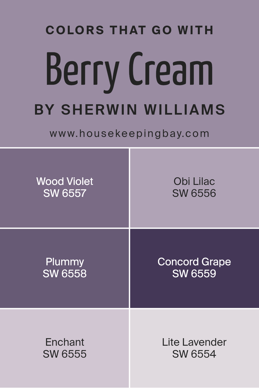
Colors that Go With Berry Cream SW 9075 by Sherwin Williams
Berry Cream SW 9075 by Sherwin Williams is a versatile color, making it essential to choose complementary shades that enhance its warmth. Colors like SW 6557 – Wood Violet, a deep and rich hue, add a sense of elegance and depth, complementing the warmth of Berry Cream.
SW 6556 – Obi Lilac is softer and more delicate, providing a gentle contrast that adds a touch of sophistication. The velvety tone of SW 6558 – Plummy works well alongside Berry Cream, creating a cozy atmosphere that feels both welcoming and intimate.
For a lively pairing, SW 6559 – Concord Grape introduces a bold and vibrant energy that perfectly balances with the subtleness of Berry Cream.
Meanwhile, SW 6555 – Enchant, with its soft pink undertones, brings a playful yet refined look to the palette.
SW 6554 – Lite Lavender offers a light, airy feel, acting as a calming complement to the richness of Berry Cream. Together, these colors create a harmonious palette that highlights the versatility and warmth of Berry Cream, suitable for any space that seeks an inviting and sophisticated charm.
Each color enhances the other, making the ambiance pleasing and balanced.
You can see recommended paint colors below:
- SW 6557 Wood Violet
- SW 6556 Obi Lilac
- SW 6558 Plummy
- SW 6559 Concord Grape
- SW 6555 Enchant
- SW 6554 Lite Lavender
housekeepingbay.com
How to Use Berry Cream SW 9075 by Sherwin Williams In Your Home?
Berry Cream SW 9075 by Sherwin Williams is a warm, inviting color that blends soft pinks with creamy undertones. It’s perfect for creating a cozy and welcoming atmosphere in any room. In the living room, Berry Cream can add a touch of warmth to the walls, making the space feel more inviting and relaxing.
Pair it with neutral furniture and soft-textured accents for a balanced look. In the bedroom, this color can create a soothing environment, perfect for unwinding after a long day.
Use soft bedding and warm lighting to complement the gentle tones. For a playful touch, consider using Berry Cream in a child’s room or nursery. Combine it with pastel-colored decorations and toys to create a fun yet gentle setting.
In the kitchen or dining area, Berry Cream pairs well with wooden accents, bringing a touch of charm and coziness to the heart of the home.
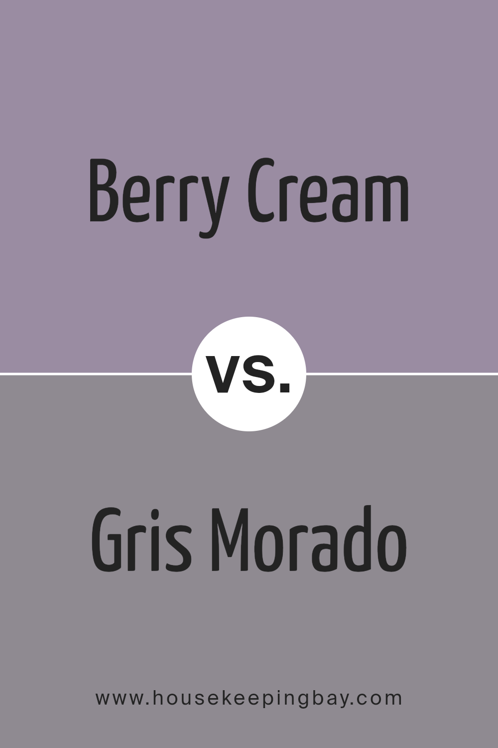
Berry Cream SW 9075 by Sherwin Williams vs Gris Morado SW 9156 by Sherwin Williams
Berry Cream SW 9075 and Gris Morado SW 9156 by Sherwin Williams offer distinct color choices. Berry Cream presents a soft pink hue with warm, creamy undertones, creating a cozy and welcoming atmosphere. It works well in spaces seeking warmth and subtle color, often enhancing areas like bedrooms or living rooms.
Gris Morado, by contrast, delivers a deeper, muted gray-purple shade, offering sophistication and calmness. This color suits spaces aiming for a modern touch, and complements contemporary furniture well.
When pairing these colors, Berry Cream adds warmth and light, while Gris Morado introduces depth and richness. Both work nicely together, with Berry Cream balancing the dark appeal of Gris Morado. These colors allow for creative interplay in home design, whether you want a gentle ambiance or a more refined, modern look.
You can see recommended paint color below:
- SW 9156 Gris Morado
housekeepingbay.com
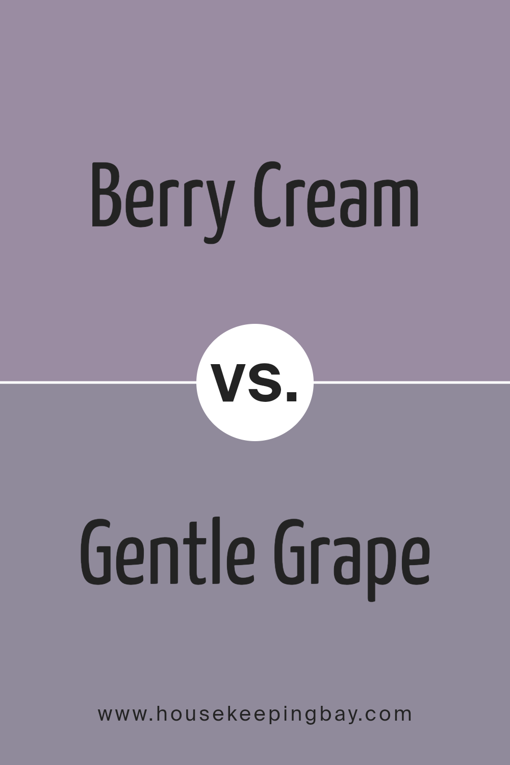
Berry Cream SW 9075 by Sherwin Williams vs Gentle Grape SW 9074 by Sherwin Williams
Berry Cream SW 9075 and Gentle Grape SW 9074 by Sherwin Williams both belong to the same color family, yet they create different moods. Berry Cream is a soft, warm shade featuring undertones of pink and cream. It gives a cozy, inviting vibe, like a comforting hug. This color can make any room feel warm and welcoming, adding a sense of intimacy.
Gentle Grape, close on the color chart, presents a slightly cooler and more muted tone. It incorporates subtle hints of purple, providing a calm and relaxed ambiance. This shade feels more reserved, offering a serene and quiet setting, perfect for areas meant for unwinding.
Both colors complement each other due to their shared warmth and subtlety. While Berry Cream suits spaces needing warmth and comfort, Gentle Grape fits areas where peace and calmness are desired. Choosing between them depends on whether you want a cozy or serene atmosphere.
You can see recommended paint color below:
- SW 9074 Gentle Grape
housekeepingbay.com
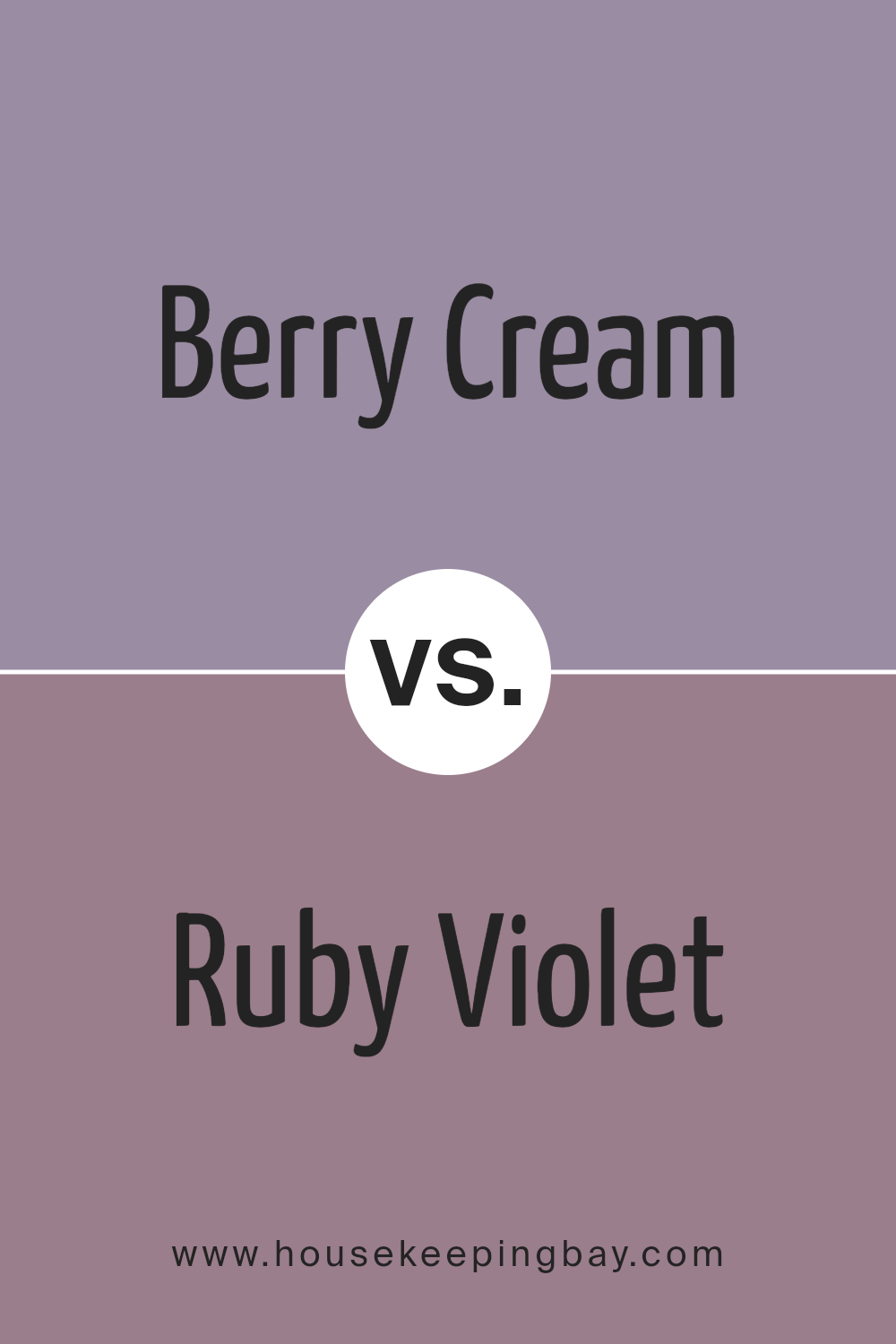
Berry Cream SW 9075 by Sherwin Williams vs Ruby Violet SW 9076 by Sherwin Williams
Berry Cream SW 9075 by Sherwin Williams is a soft, muted shade of pink with warm undertones. This color gives off a cozy and inviting feeling, making it a suitable choice for spaces where comfort is a priority, like bedrooms or living rooms. It pairs well with neutral colors and adds a gentle touch to any decor.
Ruby Violet SW 9076, in contrast, presents a deeper, richer purple hue. This color is more vibrant and has a strong presence. Ruby Violet can add drama and sophistication to a room, making it a bold choice for accent walls or to create focal points in a space.
Together, Berry Cream and Ruby Violet can create a balanced palette, combining warmth and intensity. Use Berry Cream to soften areas and Ruby Violet to introduce depth and interest, allowing these colors to complement each other beautifully while maintaining distinct identities.
You can see recommended paint color below:
housekeepingbay.com
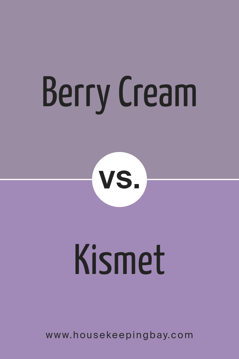
Berry Cream SW 9075 by Sherwin Williams vs Kismet SW 6830 by Sherwin Williams
Berry Cream SW 9075 by Sherwin Williams brings a gentle pink hue that is both soft and warm. It feels cozy and inviting, perfect for spaces where you want a calming and relaxed atmosphere. The color fits well in rooms that need a touch of warmth without being too bold or overwhelming.
Kismet SW 6830 offers a vibrant pink, full of energy and brightness. This color stands out, adding a lively and playful touch to any room. It’s great for areas that need a pop of color and a cheerful vibe. The vivid nature of Kismet makes it suitable for feature walls or areas where you want to make a bold statement.
In essence, Berry Cream gives a subtle touch of color with its warm tones, while Kismet energizes with its vivid, lively pink. Choosing between these depends on whether you aim for calmness or a burst of energy in your space.
You can see recommended paint color below:
- SW 6830 Kismet
housekeepingbay.com
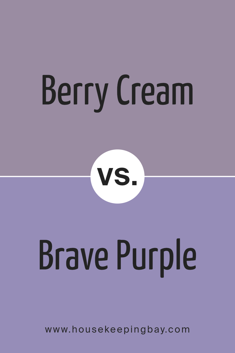
Berry Cream SW 9075 by Sherwin Williams vs Brave Purple SW 6823 by Sherwin Williams
Berry Cream SW 9075 and Brave Purple SW 6823 by Sherwin Williams are two very distinct colors from the same brand. Berry Cream is a soft, muted shade. It’s a light color with a hint of warmth and coziness, perfect for spaces that need a gentle touch. It can make rooms feel airy and open while offering a calm yet inviting atmosphere.
In contrast, Brave Purple is a bold, rich shade. This purple is deep, vibrant, and full of life. It adds a sense of energy and drama to a room, making it an excellent choice for those who want a more adventurous color. The depth of Brave Purple can make it a striking feature in any space.
Choosing between these colors depends on the feel you want. Berry Cream is perfect for subtlety and comfort, while Brave Purple offers energy and boldness. Both colors have their unique charm.
You can see recommended paint color below:
housekeepingbay.com
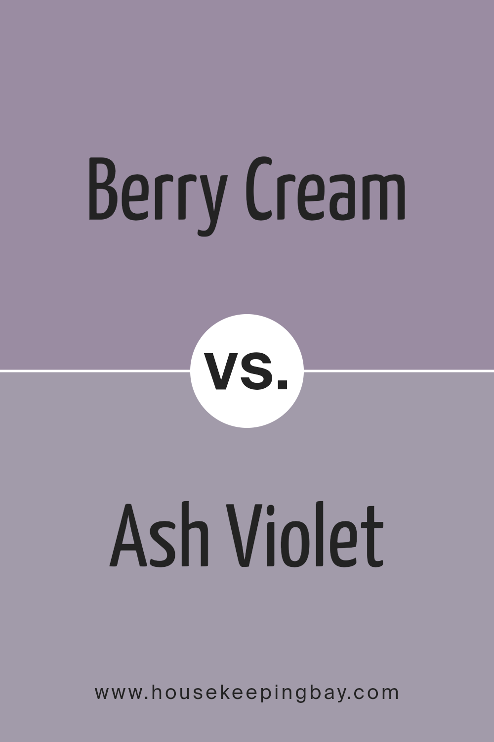
Berry Cream SW 9075 by Sherwin Williams vs Ash Violet SW 6549 by Sherwin Williams
Berry Cream SW 9075 and Ash Violet SW 6549 by Sherwin Williams offer distinct vibes, making each one special. Berry Cream is a soft, warm, pinkish hue with subtle undertones of cream. It exudes a welcoming and cozy feel, suitable for spaces that aim for warmth and comfort. This color suits living rooms or bedrooms, creating an inviting ambiance.
Ash Violet, in contrast, is a cooler, muted purple with gray tones. It carries a sophisticated and calming presence, ideal for adding a touch of elegance without being overpowering. Ash Violet works well in spaces like bathrooms or study areas where a serene environment is desired.
Both colors can be paired with neutral shades to enhance their unique qualities. While Berry Cream brightens and adds warmth, Ash Violet provides a cool, stylish touch. Choosing between them depends largely on the mood and atmosphere one wants to create in a space.
You can see recommended paint color below:
- SW 6549 Ash Violet
housekeepingbay.com
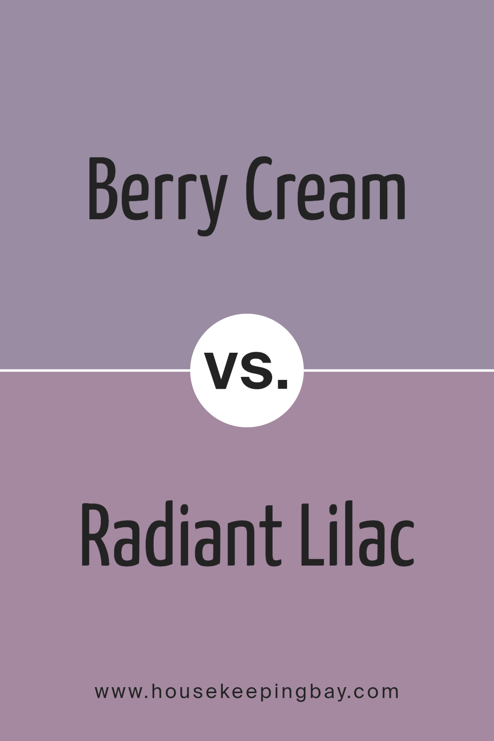
Berry Cream SW 9075 by Sherwin Williams vs Radiant Lilac SW 0074 by Sherwin Williams
Berry Cream SW 9075 and Radiant Lilac SW 0074 by Sherwin Williams each bring their unique character. Berry Cream offers a soft, muted mix of pink and beige, creating a warm, cozy vibe. It’s easy on the eyes, making spaces feel comfortable and inviting. This color can blend well with other neutrals or warm tones, making it versatile for different rooms.
Radiant Lilac, however, is lively and uplifting. It’s a light purple shade that adds a playful, cheerful touch to any room. This color can bring energy and a sense of fun, especially in children’s rooms or creative spaces.
While Berry Cream provides warmth and comfort, Radiant Lilac adds brightness and joy. Both colors can enhance your space differently: one with a gentle, calming influence, the other with a vibrant, joyful feel. Your choice depends on the mood you wish to create—comfort or playfulness.
You can see recommended paint color below:
- SW 0074 Radiant Lilac
housekeepingbay.com
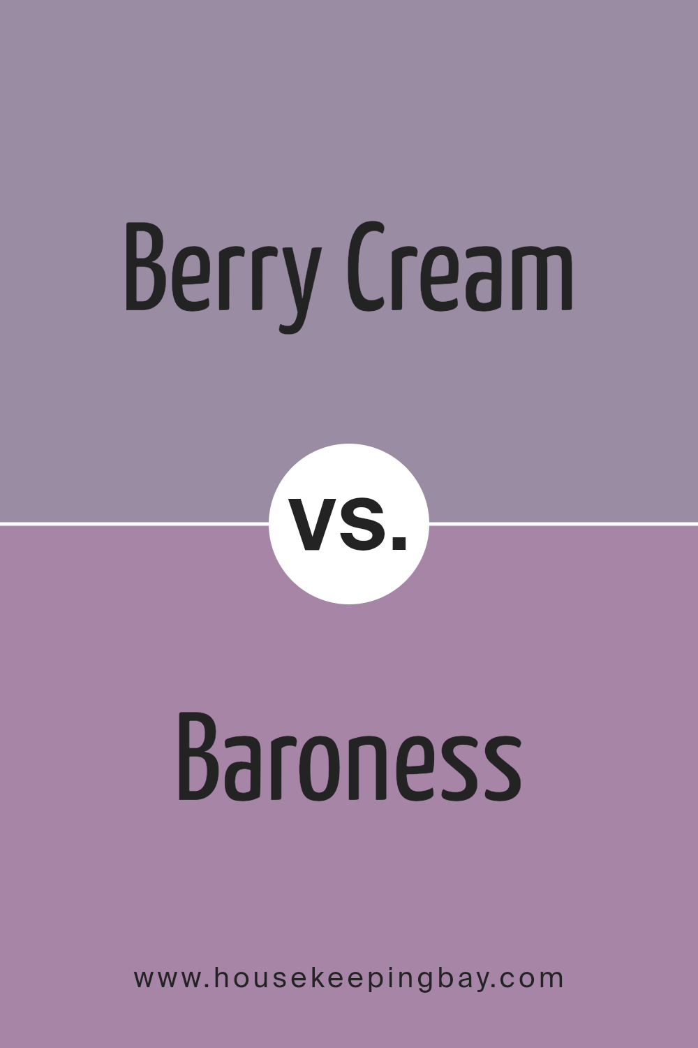
Berry Cream SW 9075 by Sherwin Williams vs Baroness SW 6837 by Sherwin Williams
Berry Cream SW 9075 and Baroness SW 6837 by Sherwin Williams offer distinct styles. Berry Cream is a soft, muted pink with a creamy undertone, creating a cozy and warm atmosphere. Its subtle hue makes it versatile, suitable for living rooms, bedrooms, or spaces where a gentle touch is desired. It pairs nicely with whites and other pastel tones, enhancing a feeling of comfort.
Baroness SW 6837, however, is a vibrant, bold magenta. This color adds energy and a lively feeling to any space. Baroness works well as an accent wall or in areas where a pop of color is needed, such as a powder room or a playful bedroom.
It pairs effectively with neutral colors like grays or soft beiges, helping it stand out while maintaining balance.
Both colors bring their unique warmth: Berry Cream soothes with its gentle presence, while Baroness enlivens with its strong, dynamic vibe.
You can see recommended paint color below:
- SW 6837 Baroness
housekeepingbay.com
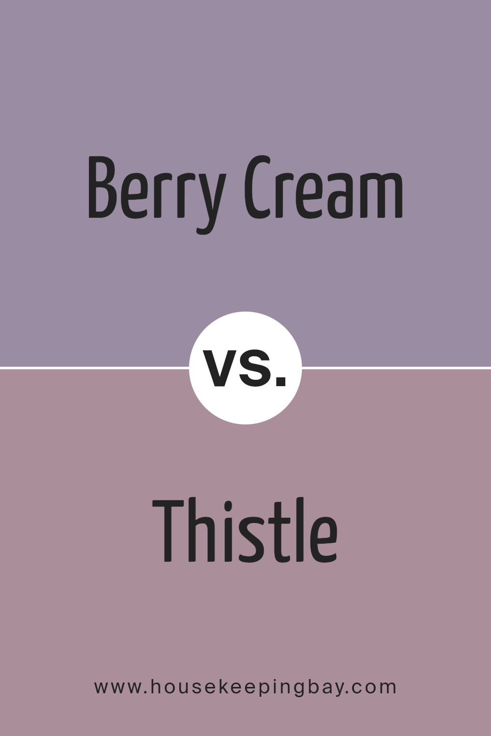
Berry Cream SW 9075 by Sherwin Williams vs Thistle SW 6283 by Sherwin Williams
Berry Cream SW 9075 by Sherwin Williams presents a soft, muted pink with a warm undertone, creating a cozy and inviting atmosphere. It feels gentle and soothing, perfect for spaces aiming for a welcoming touch. This color works well in living rooms or bedrooms, offering a comforting backdrop that complements various decor styles.
Thistle SW 6283, however, is a soft, slightly cooler shade of purple with hints of gray. It delivers a subtle sophistication, adding a touch of elegance without overpowering a room. Thistle is great for areas where you want a bit of a modern vibe, such as dining rooms or home offices, providing a calm, refined environment.
While both colors bring their unique charm to a space, Berry Cream leans more towards warmth and coziness, whereas Thistle offers a hint of cool elegance. Depending on the mood and style you desire, these colors can serve to enhance different aspects of your home decor.
You can see recommended paint color below:
- SW 6283 Thistle
housekeepingbay.com
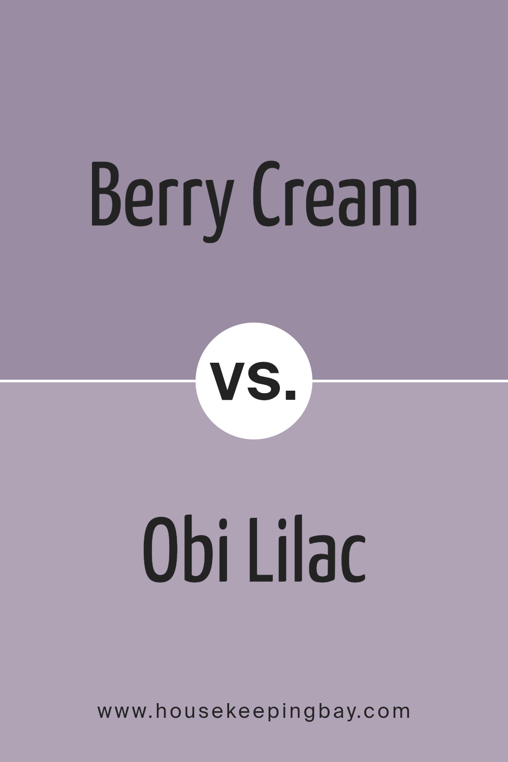
Berry Cream SW 9075 by Sherwin Williams vs Obi Lilac SW 6556 by Sherwin Williams
Berry Cream SW 9075 and Obi Lilac SW 6556, both Sherwin Williams shades, bring different vibes to a space. Berry Cream is a soft, warm pink with creamy undertones. It evokes a cozy and inviting atmosphere, making it great for areas where comfort is key. Its subtlety allows it to blend in and work as a neutral base or a gentle accent.
Obi Lilac, however, is a light purple that adds a touch of elegance and whimsical charm. It’s cooler than Berry Cream, offering a refreshing feel. This shade works well in spaces where you want to infuse a sense of calm and creativity.
While Berry Cream leans towards warmth and softness, Obi Lilac provides a delicate, yet refreshing pop of color. Both can complement each other in a design scheme but serve individual purposes if used separately.
You can see recommended paint color below:
- SW 6556 Obi Lilac
housekeepingbay.com
In summary, SW 9075 Berry Cream by Sherwin Williams stands out as a versatile and warm shade. It marries the softness of a light pink with undertones of creamy beige, creating a cozy and inviting atmosphere. Personally, I find that this color works well in both modern and traditional settings, offering a touch of elegance and warmth without overwhelming a space.
One of its strengths lies in its adaptability; it complements a variety of other colors, from muted grays to rich browns. This makes it a good choice for those looking to harmonize different elements in a room.
Moreover, Berry Cream brings a soothing quality to any space. Whether used in a bedroom to promote relaxation or a living room to foster intimate conversations, the color can significantly enhance the mood of a room. It also reflects natural light beautifully, adding a sense of brightness and openness.
Overall, I believe Berry Cream offers both practicality and aesthetic appeal, making it an excellent choice for anyone seeking a fresh yet timeless look for their home.
housekeepingbay.com
Ever wished paint sampling was as easy as sticking a sticker? Guess what? Now it is! Discover Samplize's unique Peel & Stick samples. Get started now and say goodbye to the old messy way!
Get paint samples


