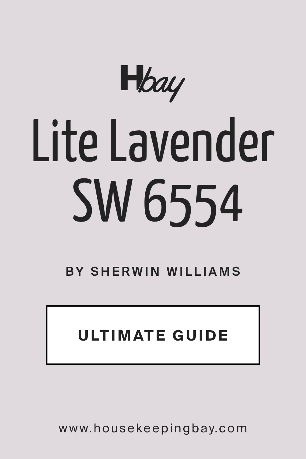
Lite Lavender SW 6554 by Sherwin Williams
Soothing Purple Hues: A Fresh Perspective
Diving into the world of colors, we find ourselves looking at SW 6554 Lite Lavender by Sherwin Williams, a paint color that offers something quite unique for your space. Picture a calm, soothing lavender hue that brings a soft, gentle touch to any room it graces.
This isn’t your bold, in-your-face kind of color. No, Lite Lavender is all about adding a whisper of color, a light breath of freshness that can make your space feel just a bit more special.
Choosing Lite Lavender means you’re going for a look that’s both inviting and relaxing. Imagine coming home after a long day to a room that feels light, airy, and just effortlessly serene. That’s the kind of vibe Lite Lavender brings.
It’s a fantastic choice if you’re looking to give your walls a touch of personality without overwhelming the senses. Whether it’s the bedroom, bathroom, or even a cozy reading nook, this color has a way of fitting in just right.
What really sets Lite Lavender apart is its versatility. It pairs beautifully with a wide range of decor styles and colors, from the crisp whites that enhance its purity to deeper hues that contrast its lightness. It’s all about how you use it to make your space feel more like you.
So, as you think about giving your home a little refresh, consider how Lite Lavender can help create that soothing atmosphere you’re after.
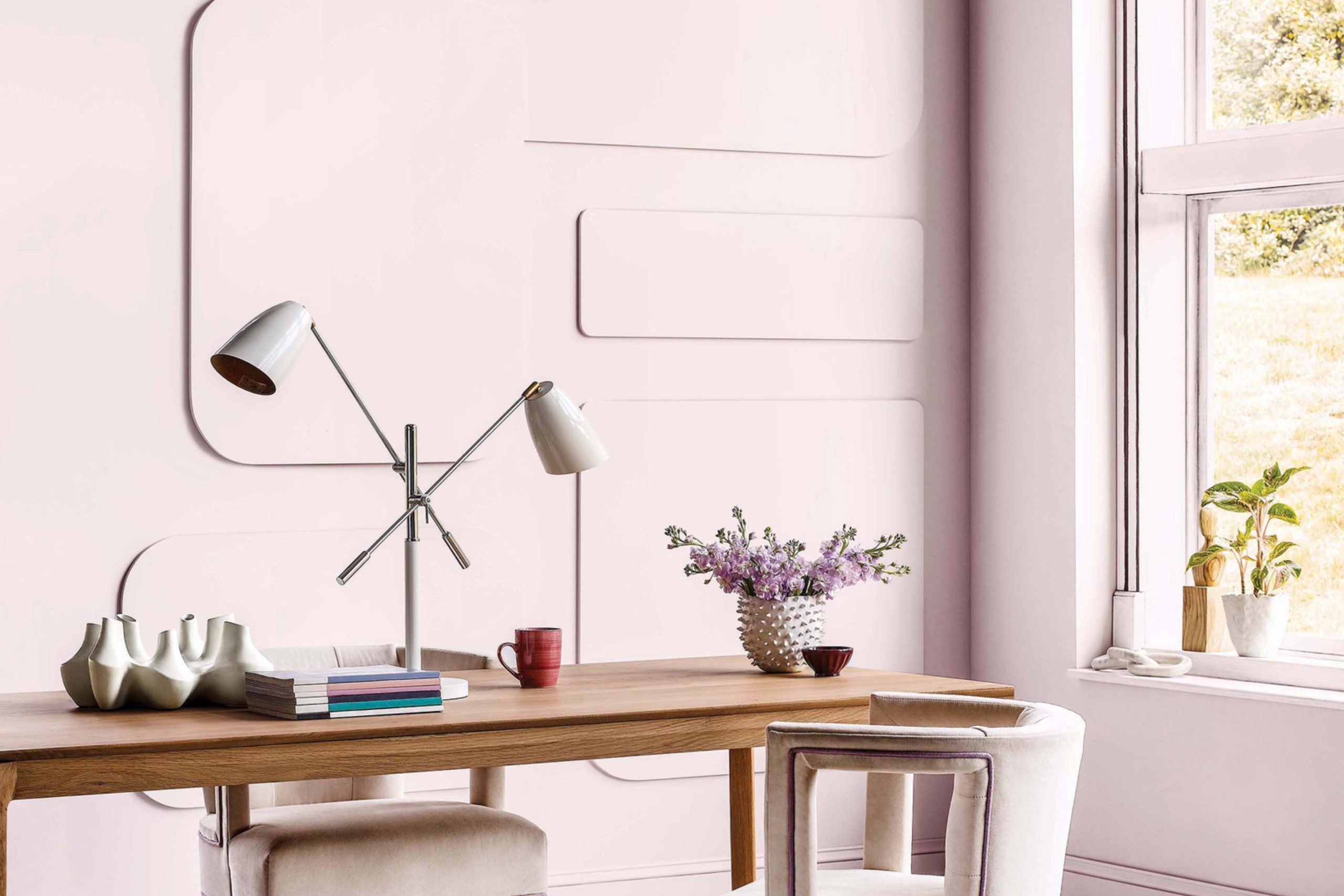
via floorcoveringweekly.com
What Color Is Lite Lavender SW 6554 by Sherwin Williams?
Table of Contents
Lite Lavender SW 6554 by Sherwin Williams is a soft, gentle hue that brings a touch of calmness to any space. This color is a muted blend of purple with hints of gray, making it a versatile choice for various interior styles. It works especially well in minimalist designs, where its subtle presence adds depth without overwhelming the senses.
In Scandinavian themes, Lite Lavender introduces a playful yet serene element, contrasting beautifully with natural woods and clean lines.
This color pairs wonderfully with a range of materials and textures. For a cozy feel, combine it with soft textiles like velvet or wool in neutral tones. To keep the look fresh and airy, match Lite Lavender walls with furniture in light woods such as oak or birch. Accents in silver or glass introduce a modern twist and add a visual interest to the space.
Lite Lavender is perfect for bedrooms, bathrooms, or any area meant for relaxation. Its understated elegance supports a peaceful retreat from the outside world, making it ideal for settings where comfort and calm are key. When used in children’s rooms, it can create a soothing backdrop that’s both playful and restful.
housekeepingbay.com
Is Lite Lavender SW 6554 by Sherwin Williams Warm or Cool color?
Lite Lavender SW 6554 by Sherwin Williams is a soft, gentle color that brings a sense of calm to any home. This pale purple hue has a light, airy feel, making rooms look brighter and more spacious. It’s versatile, working well in bedrooms to create a relaxing atmosphere or in living areas to add a touch of warmth without overpowering the space.
Using Lite Lavender in your home can make it feel cozy and inviting. This color pairs beautifully with whites and creams for a clean, minimalist look, or with darker shades like charcoal or navy for a bit of contrast. Accessories in gold or silver add a touch of elegance to the serene backdrop that Lite Lavender provides.
Because of its subtle nature, Lite Lavender is great for people wanting a hint of color without committing to something bold or overwhelming. It works in various styles, whether you’re going for a modern, classic, or rustic vibe, making your home feel fresh and up-to-date.
What is the Masstone of the Lite Lavender SW 6554 by Sherwin Williams?
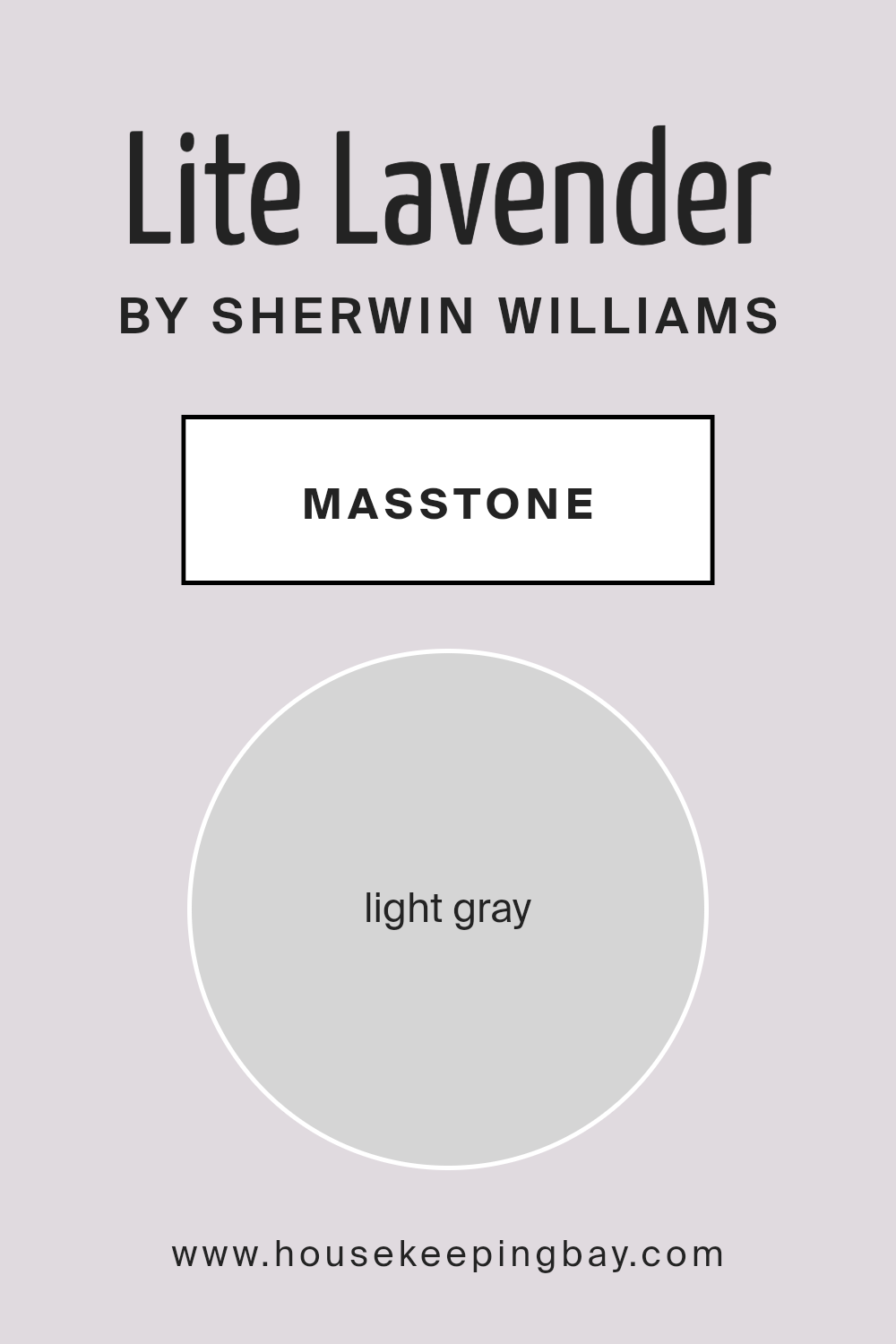
Lite Lavender SW 6554, by Sherwin Williams, carries a masstone of light gray, marked by the color code #D5D5D5. This unique shade makes it a versatile option for homes. The light gray quality means it can blend smoothly with various decor styles and color schemes.
Whether you have a modern, minimalist space or a cozy, traditional setting, Lite Lavender can fit in without clashing. Its light base allows it to reflect natural light, making rooms feel more spacious and airy. This can be particularly beneficial in smaller spaces or rooms that don’t get a lot of sunlight.
Since it’s not a stark color, it provides a soft backdrop that can highlight furnishings and artwork without overpowering them. As a result, Lite Lavender offers a subtle way to freshen up your home’s look while maintaining a calm and soothing atmosphere.
Its adaptability and gentle presence make it a go-to choice for those looking to enhance their living spaces with a touch of class and sophistication.
housekeepingbay.com
Undertones of Lite Lavender SW 6554 by Sherwin Williams
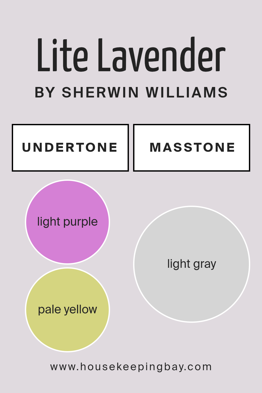
Lite Lavender SW 6554 by Sherwin Williams is a unique color with a mix of undertones that give it a special charm. These include light purple, pale yellow, light blue, pale pink, lilac, mint, and grey.
The presence of these undertones means Lite Lavender doesn’t just appear as a simple lavender shade. Instead, its perception can change under different lighting conditions and when placed next to other colors.
For example, the light purple and lilac undertones add a soft, floral quality to the color, making it feel cozy and inviting in a room. The pale yellow and mint bring in a fresh, airy vibe, which can make a space feel more open and light. Light blue and pale pink undertones contribute to a calming effect, ideal for bedrooms or bathrooms where relaxation is key.
Meanwhile, grey helps ground the color, preventing it from feeling too whimsical and ensuring it remains sophisticated.
When applied to interior walls, Lite Lavender SW 6554’s variety of undertones allows it to adapt to various decor styles and themes. It can pair well with both bold and subdued accent colors, making it incredibly versatile. In natural light, the color might lean towards its cooler undertones like blue and lilac, creating a serene atmosphere. In artificial light, the warmer tones, like pale yellow and pink, might become more prominent, adding warmth to the room.
This ability to change subtly with its surroundings makes Lite Lavender a fascinating choice for any interior, adding depth and interest to the walls without overwhelming the senses.
housekeepingbay.com
Coordinating Colors of Lite Lavender SW 6554 by Sherwin Williams
Coordinating colors are those that complement each other when used together in design and decor. They work by creating a balanced and visually appealing look. This concept is utilized to achieve a harmonious atmosphere in any space, making it essential in choosing paint colors, furniture, and accessories.
For Lite Lavender SW 6554 by Sherwin Williams, an enchanting light purple shade, there are specific coordinating colors that can enhance its gentle vibe.
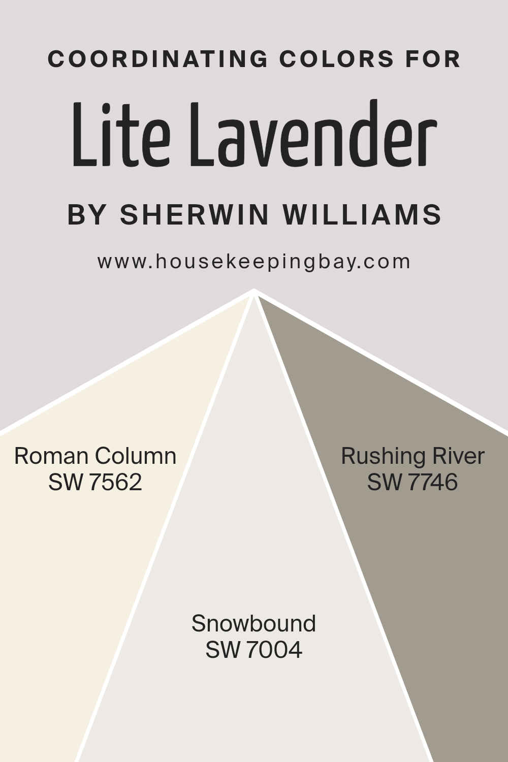
SW 7562 – Roman Column, a soft and neutral off-white, provides a subtle backdrop that allows Lite Lavender to stand out without overwhelming the senses. It’s ideal for creating a serene and inviting space, through its understated elegance. Then there’s SW 7004 – Snowbound, a bright, clean white with a hint of cool undertones.
This color is perfect for adding a crisp contrast that highlights the softness of Lite Lavender, making the room feel fresh and airy.
Lastly, SW 7746 – Rushing River offers a deeper, more dramatic contrast. This gray with a hint of blue adds a sophisticated touch, grounding the lighter shades and bringing depth to the overall palette. Together, these coordinating colors work seamlessly to enhance the beauty of Lite Lavender, offering a range of options to create a harmonious look that’s both versatile and visually pleasing.
You can see recommended paint colors below:
- SW 7562 Roman Column
- SW 7004 Snowbound
- SW 7746 Rushing River
housekeepingbay.com
How Does Lighting Affect Lite Lavender SW 6554 by Sherwin Williams?
Lighting plays a crucial role in how we see and experience colors. The color Lite Lavender SW 6554 by Sherwin Williams is no exception. Depending on the light source, this soft, subtle shade can change in appearance, affecting the mood and feel of a room.
In artificial light, Lite Lavender may appear slightly more muted. Depending on the type of bulbs used (warm or cool), the color can lean towards a warmer, cozier lavender or a cooler, more serene hue. This flexibility makes it a versatile choice for spaces lit mostly by lamps or overhead fixtures, offering a calm and gentle ambiance.
Natural light, on the other hand, brings out the true beauty of Lite Lavender, showcasing its depth and complexity. Under the sun’s rays, Lite Lavender radiates a fresh and airy feel. The quality and angle of natural light, however, play a significant role.
Rooms facing north receive less direct sunlight, causing Lite Lavender to display a cooler, more consistent shade throughout the day. This consistency can help create a peaceful and stable environment.
South-facing rooms are bathed in abundant light, making Lite Lavender glow warmly and invitingly. This exposure tends to enhance the color’s vibrancy, making the room feel lively yet still soft.
In east-facing rooms, morning light can make Lite Lavender look bright and cheerful, perfect for spaces used predominantly in the morning. As the day progresses, the color may lose some of its brightness but retains its soothing quality.
West-facing rooms offer a different experience. Here, Lite Lavender may appear softer during the morning and early afternoon. But as the sun sets, the color can come alive, turning richer and more dynamic under the warm, golden light.
Understanding these nuances helps in planning how and where to use Lite Lavender SW 6554 effectively, ensuring that its unique charm enhances any space, regardless of the light it receives.
housekeepingbay.com
What is the LRV of Lite Lavender SW 6554 by Sherwin Williams?
Knowing the LRV of a paint color helps in understanding how light or dark a color will look once it’s on your walls, and it can significantly impact the feel of a room. Lighter colors with higher LRV values make spaces look more open and brighter because they reflect more light back into the room.
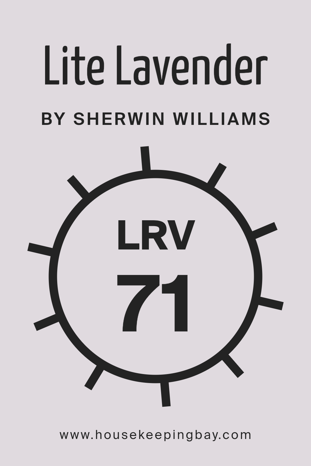
The LRV of Lite Lavender by Sherwin Williams is 71.398, which is quite high. This means it’s a light color that will reflect a good deal of light, making spaces feel airier and more spacious. For this particular color, its high LRV suggests it would be great in areas where you want to enhance natural light or make a small room feel larger.
However, it’s also worth noting that such a light color might appear washed out if used in a very brightly lit room, or it could lose some of its delicate lavender hue. So, it’s important to consider the amount of natural and artificial light in your space when thinking about using lighter hues like Lite Lavender.
housekeepingbay.com
What are the Trim colors of Lite Lavender SW 6554 by Sherwin Williams?
Trim colors are essentially the accent colors used on the architectural features of a room, such as door frames, window sills, baseboards, and crown moldings. When paired with the main wall color, in this case, Lite Lavender SW 6554 by Sherwin Williams, trim colors can significantly enhance the overall aesthetic of a room.
They create a visual frame that can either subtly complement or boldly contrast with the main wall color, adding depth and dimension to the space. Choosing the right trim color is crucial as it helps to define the room’s edges and can influence the perceived size and brightness of the space.
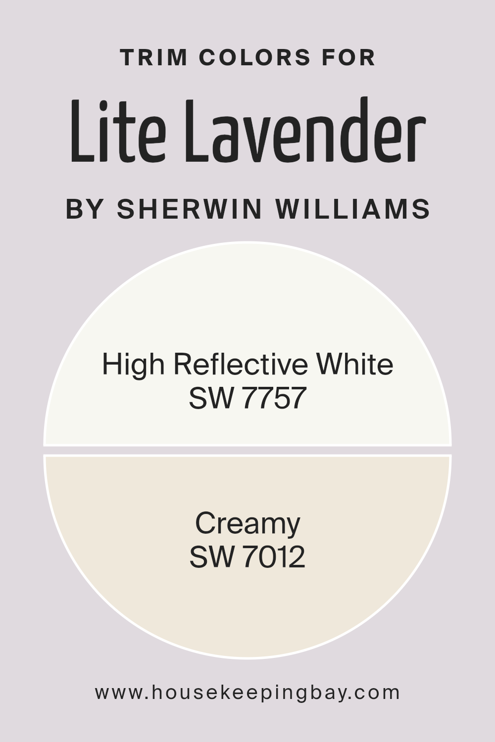
For Lite Lavender SW 6554, two excellent choices for trim colors are SW 7757 – High Reflective White and SW 7012 – Creamy. High Reflective White is a very bright white with a hint of coolness, making it a great choice to make the lavender pop while keeping the atmosphere light and airy.
It can make the space feel more open and bigger, an ideal choice for smaller rooms or spaces that don’t get much natural light. On the other hand, Creamy is a soft, warm white with a buttery tone that offers a gentle contrast to the coolness of Lite Lavender, creating a cozy and welcoming atmosphere.
This color can add a subtle warmth to the room, making it feel homely and comfortable without overpowering the delicate hue of Lite Lavender.
You can see recommended paint colors below:
housekeepingbay.com
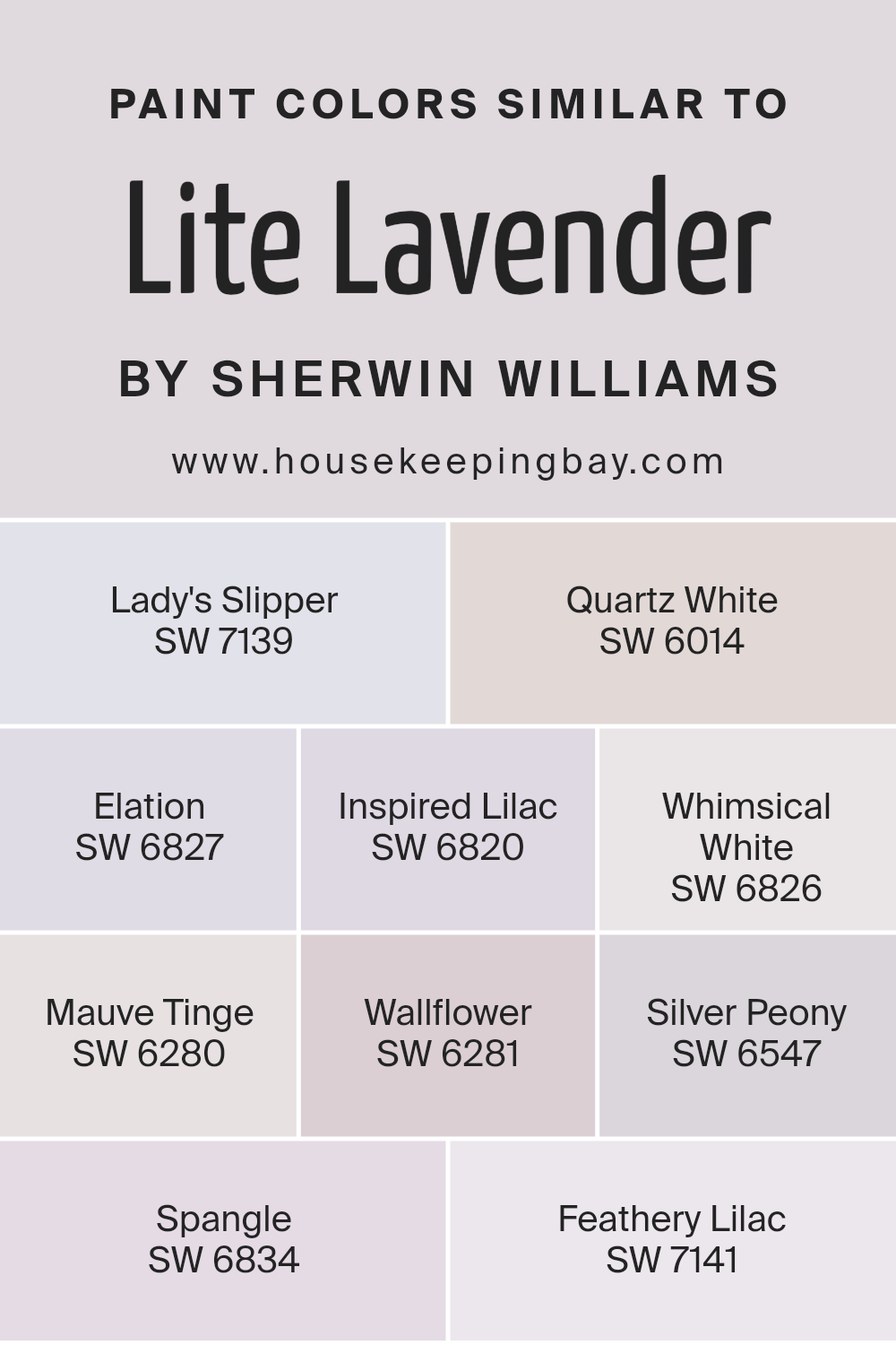
Colors Similar to Lite Lavender SW 6554 by Sherwin Williams
Using similar colors can be incredibly effective when you want to create a cohesive look in a space without it becoming monotonous. Colors like Lite Lavender SW 6554 by Sherwin Williams and its counterparts provide a subtle variety while maintaining a unified theme.
These shades are particularly useful in achieving a gentle and soothing ambience, perfect for spaces where rest or focus is essential. They work because they share underlying tones, making it easy to mix and match them across walls, trim, and accents without clash.
For instance, Lady’s Slipper SW 7139 brings a soft, delicate pink that whispers of serenity, while Quartz White SW 6014 offers a hint of lavender in a predominantly white base, providing a light and airy feel. Elation SW 6827 leans into a more pronounced lavender, enlivening spaces without overwhelming them. Inspired Lilac SW 6820 introduces a more grounded, earthy tone of purple, adding depth. Whimsical White SW 6826 is almost ethereal, with just a touch of pastel lavender.
Mauve Tinge SW 6280 and Wallflower SW 6281 introduce muted pink and purple hues respectively, offering a subtle nod to vintage elegance. Silver Peony SW 6547 fuses gray with soft pink, creating a neutral with warmth. Spangle SW 6834 has a playful lightness, akin to the inside of a seashell.
Lastly, Feathery Lilac SW 7141 evokes the gentle transition of colors at dawn, serene and inviting. These shades, while distinct, share a harmonious essence, making it easy to create a layered look that is both interesting and comforting.
You can see recommended paint colors below:
- SW 7139 Lady’s Slipper
- SW 6014 Quartz White
- SW 6827 Elation
- SW 6820 Inspired Lilac
- SW 6826 Whimsical White
- SW 6280 Mauve Tinge
- SW 6281 Wallflower
- SW 6547 Silver Peony
- SW 6834 Spangle
- SW 7141 Feathery Lilac
housekeepingbay.com
Colors that Go With Lite Lavender SW 6554 by Sherwin Williams
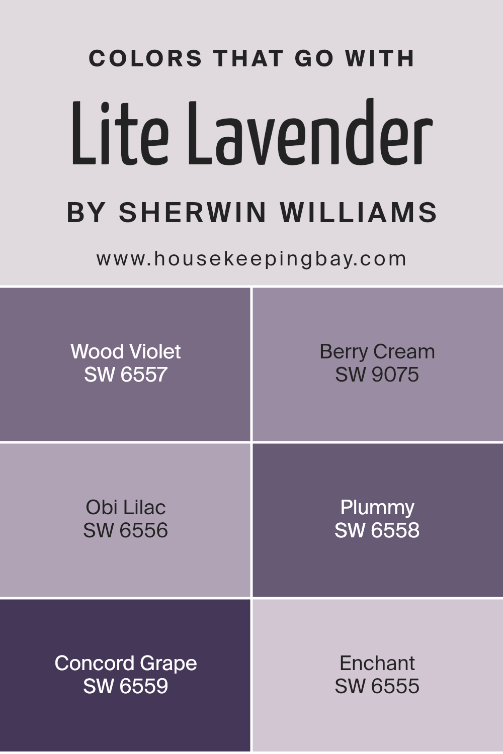
Colors that complement Lite Lavender SW 6554 by Sherwin Williams play a crucial role in creating harmonious and visually appealing spaces. When paired correctly, these colors can enhance the soothing and soft nature of Lite Lavender, providing a balanced and cohesive look.
For instance, colors like Wood Violet, Berry Cream, Obi Lilac, Plummy, Concord Grape, and Enchant are perfect companions for Lite Lavender, each adding its unique touch while maintaining a seamless aesthetic flow.
Wood Violet SW 6557 offers a deeper, more profound hue that contrasts nicely with the lightness of Lite Lavender, grounding spaces without overwhelming them. It’s like a shadow that softly underlines the main color. Berry Cream SW 9075, on the other hand, introduces a gentle whisper of pink, softening the overall palette and adding a creamy, dreamy texture to the mix.
Obi Lilac SW 6556 leans closely to Lite Lavender but with a tad more saturation, allowing for a subtle differentiation that adds depth and interest.
Plummy SW 6558 brings a rich, luxurious vibe, its deep tone providing a solid anchor for the lighter lavender, creating a sophisticated feel. Concord Grape SW 6559 goes even bolder, adding a dramatic flair that makes the room pop, perfect for accent details. Finally, Enchant SW 6555 wraps this color collection with a nearly ethereal quality, a light, airy counterpart to Lite Lavender, ensuring the space feels open and full of light. Together, these colors complement and enhance the beauty of Lite Lavender, allowing for versatile design choices that can fit various tastes and styles.
You can see recommended paint colors below:
- SW 6557 Wood Violet
- SW 9075 Berry Cream
- SW 6556 Obi Lilac
- SW 6558 Plummy
- SW 6559 Concord Grape
- SW 6555 Enchant
housekeepingbay.com
How to Use Lite Lavender SW 6554 by Sherwin Williams In Your Home?
Lite Lavender SW 6554 by Sherwin Williams is a gentle, soft shade of purple that brings a light and airy feel to any room. It’s perfect for those wanting to add a touch of calmness to their home without overwhelming the space. This color works well in bedrooms, creating a peaceful and restful environment.
It’s also great for bathrooms, where it can make the space feel clean and refreshing. For a cozy, inviting living space, consider painting an accent wall in Lite Lavender to add a subtle pop of color. This shade pairs beautifully with white trim or furniture, giving a room a fresh and modern look.
Additionally, Lite Lavender can be used in small spaces, like a reading nook or home office, to make the area seem bigger and brighter. By adding this color, you can make your home feel more comfortable and relaxing.
Lite Lavender SW 6554 by Sherwin Williams vs Whimsical White SW 6826 by Sherwin Williams
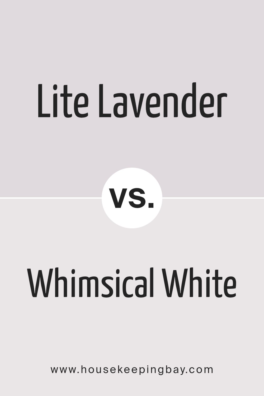
Lite Lavender SW 6554 by Sherwin Williams is a gentle, soft color that reminds one of serene lavender fields. It has a calming effect and brings a light, airy feel to any space. This color is perfect for creating a soothing environment, ideal for bedrooms or bathrooms where relaxation is key.
Whimsical White SW 6826 by Sherwin Williams, however, is a bright, clean shade of white with a hint of whimsy. It offers a fresh and inviting look, making rooms appear more spacious and open. This color works well in any part of the home, from kitchens to living areas, adding a touch of brightness and making other colors in the room pop.
While Lite Lavender adds a subtle touch of color and serenity, Whimsical White provides a crisp, neutral backdrop that is versatile and timeless. Both colors have their unique appeal, depending on the atmosphere you want to create in your space.
You can see recommended paint color below:
- SW 6826 Whimsical White
housekeepingbay.com
Lite Lavender SW 6554 by Sherwin Williams vs Feathery Lilac SW 7141 by Sherwin Williams
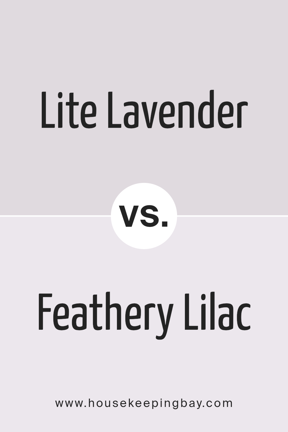
Lite Lavender SW 6554 by Sherwin Williams is a soft, pale purple that brings a gentle, soothing vibe to any space. Its lightness delivers a nearly ethereal feel, perfect for creating a peaceful and calm environment. This color is great for bedrooms or quiet areas where relaxation is key. It pairs well with whites or soft greys, adding a delicate touch of color without overwhelming the senses.
Feathery Lilac SW 7141 by Sherwin Williams, in comparison, carries a bit more depth and warmth. While still in the purple family, this hue leans slightly towards a warmer tone, offering a cozy feel. This makes it ideal for spaces where a welcoming, comforting ambiance is desired, such as living rooms or reading nooks.
It works beautifully with cream or light brown accents, enhancing the warmth of the environment.
Both colors share a purple base but present unique vibes – Lite Lavender offering a lighter, airier feel and Feathery Lilac bringing warmth and coziness to the table.
You can see recommended paint color below:
- SW 7141 Feathery Lilac
housekeepingbay.com
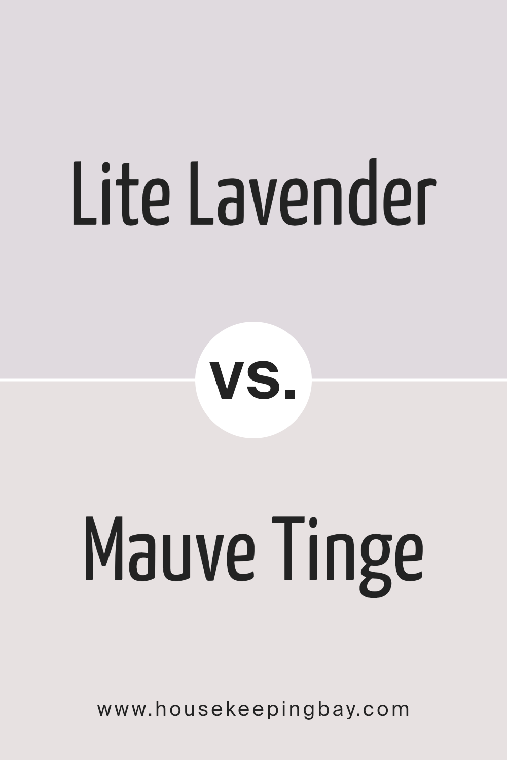
Lite Lavender SW 6554 by Sherwin Williams vs Mauve Tinge SW 6280 by Sherwin Williams
Lite Lavender SW 6554 by Sherwin-Williams is a soft, pale purple with a hint of gray, offering a gentle and calming feeling to any space. Its lightness makes it perfect for creating a peaceful and serene atmosphere, ideal for bedrooms or bathrooms where relaxation is key. This color reflects more light, making rooms feel more spacious and airy.
Mauve Tinge SW 6280, also from Sherwin-Williams, leans more towards a muted, dusky pink-purple hue. It’s a bit warmer and more subdued compared to Lite Lavender, providing a cozy and sophisticated vibe.
This color works well in spaces that aim for a bit more richness and depth without overwhelming with too much brightness. It’s particularly suited for living rooms or dining areas where a touch of elegance is desired.
Both colors offer a unique take on purple, with Lite Lavender being cooler and brighter, making spaces feel open and light, while Mauve Tinge brings warmth and a more refined, plush look.
You can see recommended paint color below:
- SW 6280 Mauve Tinge
housekeepingbay.com
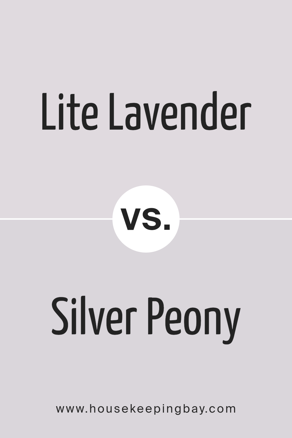
Lite Lavender SW 6554 by Sherwin Williams vs Silver Peony SW 6547 by Sherwin Williams
Lite Lavender SW 6554 by Sherwin Williams is a soft, subtle shade that hints at the gentle hues of lavender flowers. It’s a color that brings a light, airy feel to spaces, making rooms feel more spacious and inviting. Its understated elegance allows for versatility in decorating, working well with both bold and muted color palettes.
Silver Peony SW 6547, also by Sherwin Williams, leans more towards a delicate, silvery pink tone. This color adds a touch of warmth and softness, creating cozy and inviting environments. It’s particularly effective in spaces that aim for a serene and nurturing atmosphere, pairing beautifully with both light neutrals and deeper shades for contrast.
While both colors share a softness and subtlety, Lite Lavender adds a cool, serene vibe, perfect for creating a calming retreat. Silver Peony, with its warmer undertones, infuses spaces with a gentle, welcoming glow. Each color can refresh and softly enliven interiors, depending on the desired mood and aesthetic.
You can see recommended paint color below:
- SW 6547 Silver Peony
housekeepingbay.com
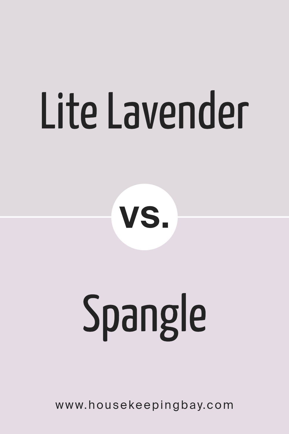
Lite Lavender SW 6554 by Sherwin Williams vs Spangle SW 6834 by Sherwin Williams
Lite Lavender SW 6554 by Sherwin Williams is a soft, gentle color that brings a peaceful and calm vibe to any space. It has a subtle hint of purple that’s not too overpowering, making it ideal for creating a serene environment. This shade works well in bedrooms or other areas where a touch of soothing comfort is desired.
In contrast, Spangle SW 6834 is a lively and light-hearted color. It’s a bit more playful and vibrant, adding a spark of energy and brightness to wherever it’s applied. Spangle can instantly lift the mood of a room, making it a great choice for spaces meant for fun and activity, like a kitchen or playroom.
Both colors offer their unique appeal. Lite Lavender leans more towards creating a restful retreat, while Spangle aims to inject joy and vitality. Depending on what feeling you want to generate in your space, either color can be a great pick.
You can see recommended paint color below:
- SW 6834 Spangle
housekeepingbay.com
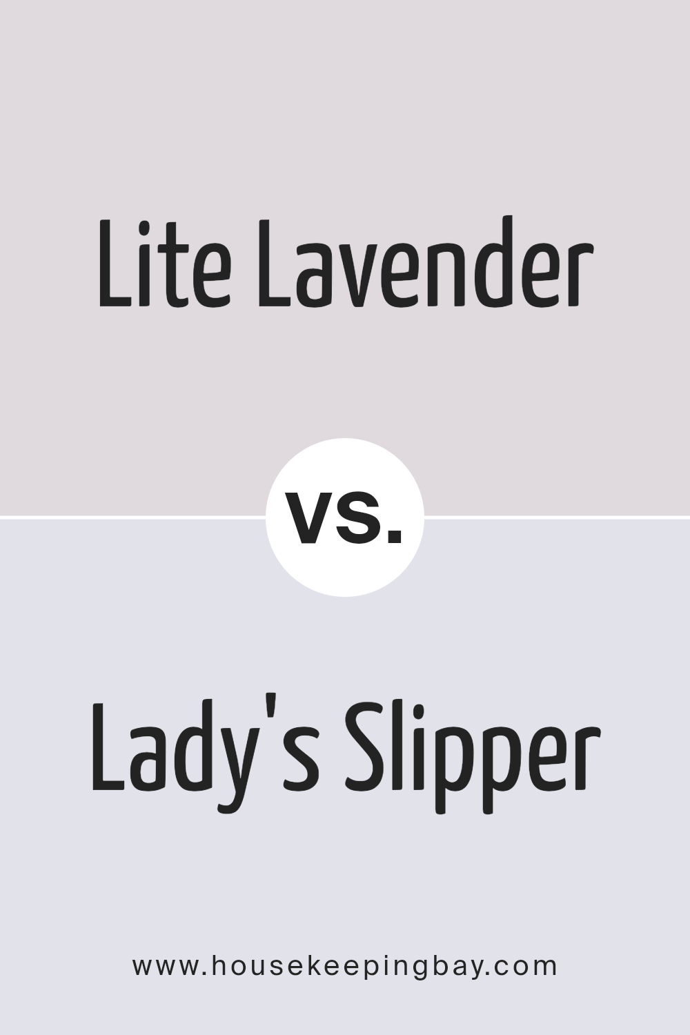
Lite Lavender SW 6554 by Sherwin Williams vs Lady’s Slipper SW 7139 by Sherwin Williams
Lite Lavender SW 6554 by Sherwin Williams is a gentle, soothing shade of purple with a light, airy vibe. It brings a calm, peaceful feel to any space, making it perfect for bedrooms or areas where you want to relax. It’s soft and subtle, not too bright or overwhelming.
Lady’s Slipper SW 7139, also by Sherwin Williams, is a warmer tone of purple, leaning towards a muted, dusky pink. It offers a cozy, inviting atmosphere, ideal for creating a comfortable, nurturing environment. This color works well in living rooms or areas where you want a hint of warmth and sophistication.
Despite both being in the purple family, Lite Lavender is cooler and lighter, suggesting openness and serenity. Lady’s Slipper, with its warmer undertones, suggests comfort and coziness. Both colors add a unique character to interiors but serve different moods – one is more about creating a tranquil retreat, while the other aims for a snug, welcoming space.
You can see recommended paint color below:
- SW 7139 Lady’s Slipper
housekeepingbay.com
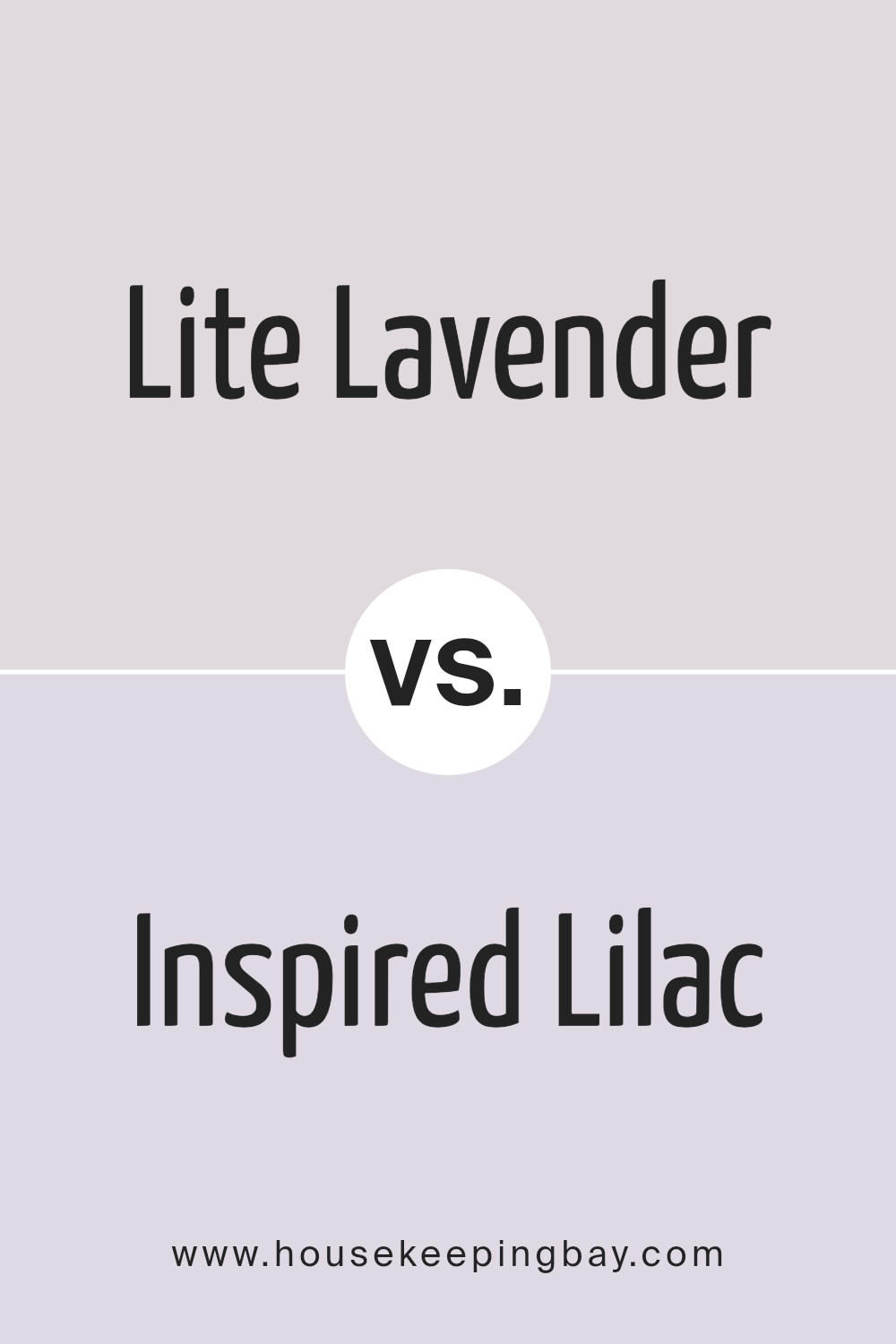
Lite Lavender SW 6554 by Sherwin Williams vs Inspired Lilac SW 6820 by Sherwin Williams
Lite Lavender SW 6554 by Sherwin Williams is a soft, subtle shade that offers a gentle touch of color. Its lightness brings a sense of calm and can make small spaces appear larger and more inviting. This hue is great for creating a peaceful and restful environment, ideal for bedrooms or bathrooms where relaxation is key.
Inspired Lilac SW 6820, from Sherwin Williams, is a bolder color. It packs more punch than Lite Lavender, making a statement wherever it’s used. This shade can add vibrancy and energy to a room, perfect for spaces that could use a lively boost. Inspired Lilac works well in creative spaces or any area meant to inspire joy and activity.
Although both colors come from the purple family, their impact and use in spaces differ greatly. Lite Lavender leans towards creating a serene atmosphere, while Inspired Lilac aims to invigorate and brighten any area with its more pronounced presence.
You can see recommended paint color below:
- SW 6820 Inspired Lilac
housekeepingbay.com
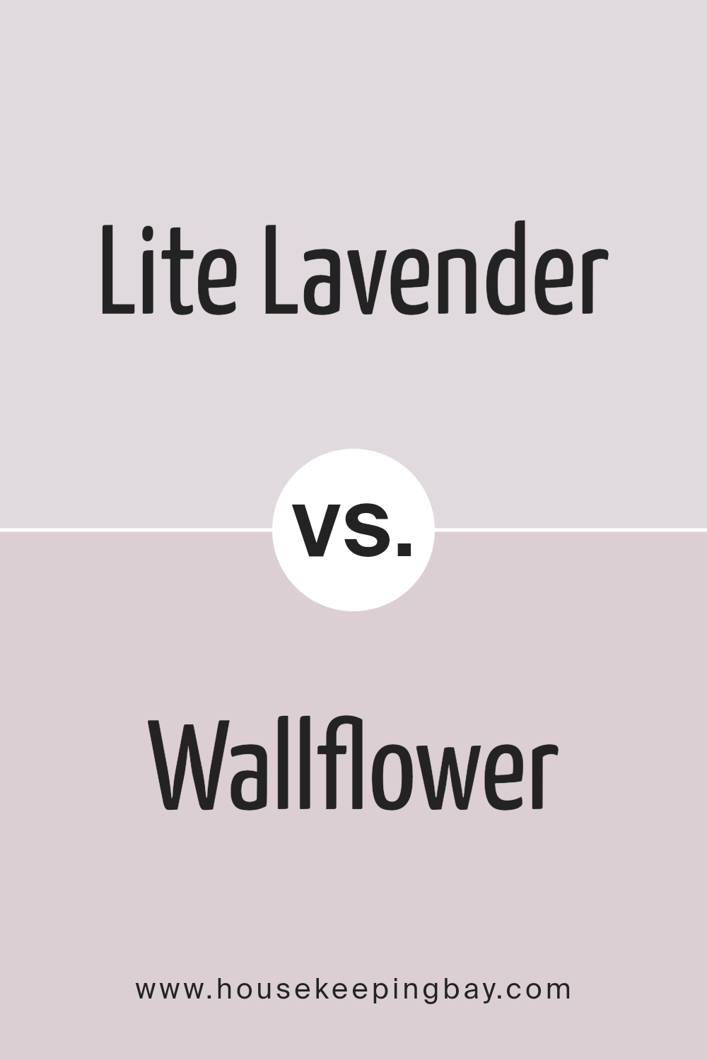
Lite Lavender SW 6554 by Sherwin Williams vs Wallflower SW 6281 by Sherwin Williams
Lite Lavender SW 6554 by Sherwin Williams is a soft, gentle hue that gives off a light, airy feel, perfect for creating a peaceful space. Its subtle lavender tones can brighten a room while adding a touch of warmth. This color works great in bedrooms or any area meant for relaxation, as it brings a serene atmosphere.
Wallflower SW 6281 by Sherwin Williams, in contrast, offers a deeper, more saturated look. It carries a richer, more pronounced purple shade, leaning towards a cozy, comforting vibe. This color suits spaces that aim for a bit more drama or depth without overwhelming the senses. It’s ideal for accent walls or rooms that benefit from a stronger color presence.
Both colors share a purple base, but their lightness and saturation levels differ significantly. While Lite Lavender casts a lighter, more pastel look, Wallflower presents a bolder statement, making each suited to different design needs. Whether seeking a light, refreshing feel or a cozy, enveloping ambiance, these colors provide unique options.
You can see recommended paint color below:
- SW 6281 Wallflower
housekeepingbay.com
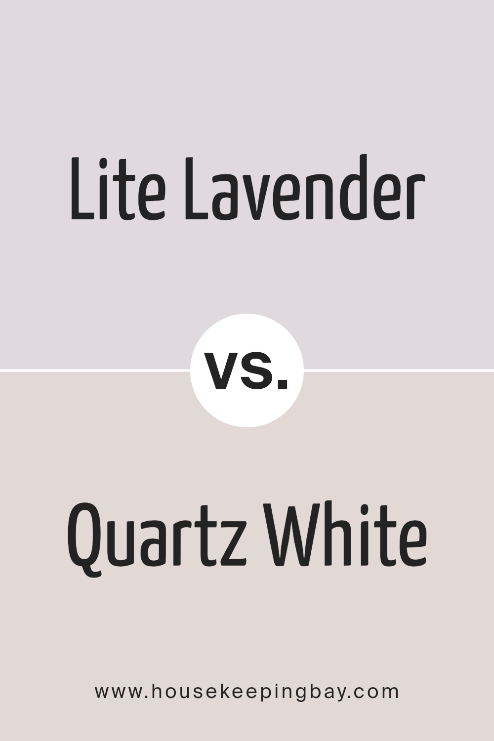
Lite Lavender SW 6554 by Sherwin Williams vs Quartz White SW 6014 by Sherwin Williams
Lite Lavender SW 6554 by Sherwin Williams is a gentle, soft purple with a breezy, light-hearted vibe. It’s perfect for creating a soothing atmosphere in any room, offering a sense of calm and relaxation. This color leans towards the cooler side of the spectrum, making it a great choice for spaces where you want to unwind and get comfortable.
Quartz White SW 6014, by contrast, is a warm and inviting shade of white with a subtle touch of beige. It’s versatile and can make spaces feel larger and more open. This color works well in areas that need a bright and airy feel, providing a neutral backdrop that pairs well with almost any decor style.
While Lite Lavender brings a splash of color and a hint of whimsy, Quartz White offers a clean, classic look. Both colors have their unique appeal, allowing for creativity and personal expression in home design. Lite Lavender might suit those looking for a bit more color and personality, whereas Quartz White is ideal for creating a timeless and sophisticated space.
You can see recommended paint color below:
- SW 6014 Quartz White
housekeepingbay.com
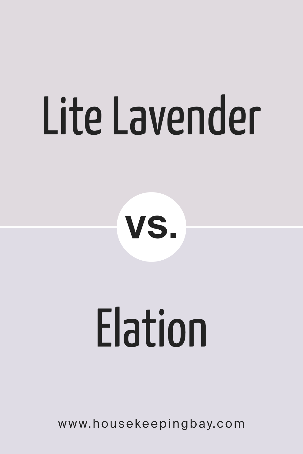
Lite Lavender SW 6554 by Sherwin Williams vs Elation SW 6827 by Sherwin Williams
Lite Lavender SW 6554 by Sherwin Williams is a soft, muted purple with a calming presence, perfect for creating a soothing atmosphere in any space. Its gentle hue brings a sense of serenity, making it ideal for bedrooms or areas meant for relaxation. It pairs well with light neutrals and can add a touch of elegance without overwhelming the senses.
Elation SW 6827, another offering from Sherwin Williams, veers towards a lighter, more ethereal side of the color spectrum. This color is almost like a whisper of pink, providing a very subtle hint of warmth and cheerfulness to a room. It’s excellent for spaces that aim to have a bright, airy feel, and works beautifully in sunlit rooms, enhancing the natural light.
While both colors share a lightness and softness, Lite Lavender introduces a cooler, more contemplative vibe, whereas Elation leans into a warmer, softer approach, promoting a feeling of airy openness. Each brings its own unique mood to a space, allowing for personal preference to guide the choice between a whisper of lavender or a touch of the softest pink.
You can see recommended paint color below:
housekeepingbay.com
Conclusion
SW 6554 Lite Lavender by Sherwin Williams offers you a unique opportunity to transform your space into a zone of peace and tranquility. When you decide to use this shade, you’re not just painting your walls; you’re bringing in a vibe that elevates your home’s aesthetic appeal.
Lite Lavender is not just a color; it’s a gentle nudge towards creating a haven for relaxation and rejuvenation in your busy life. Whether you’re looking to refresh your living room, bedroom, or even your office space, this soothing hue encourages a stress-free environment.
It pairs wonderfully with a variety of decor styles, ensuring you have the flexibility to express your personal taste while maintaining an inviting atmosphere. As you embark on your decorating journey, consider how Lite Lavender can breathe new life into your surroundings.
It’s an opportunity to transform your space with a color that’s both sophisticated and versatile. Let Lite Lavender guide you towards creating a home that reflects a sense of calm and serenity, welcoming everyone who enters with its understated elegance.
housekeepingbay.com
Ever wished paint sampling was as easy as sticking a sticker? Guess what? Now it is! Discover Samplize's unique Peel & Stick samples. Get started now and say goodbye to the old messy way!
Get paint samples
