August Moon SW 7687 by Sherwin Williams
A Soft Glow That Warms Any Space
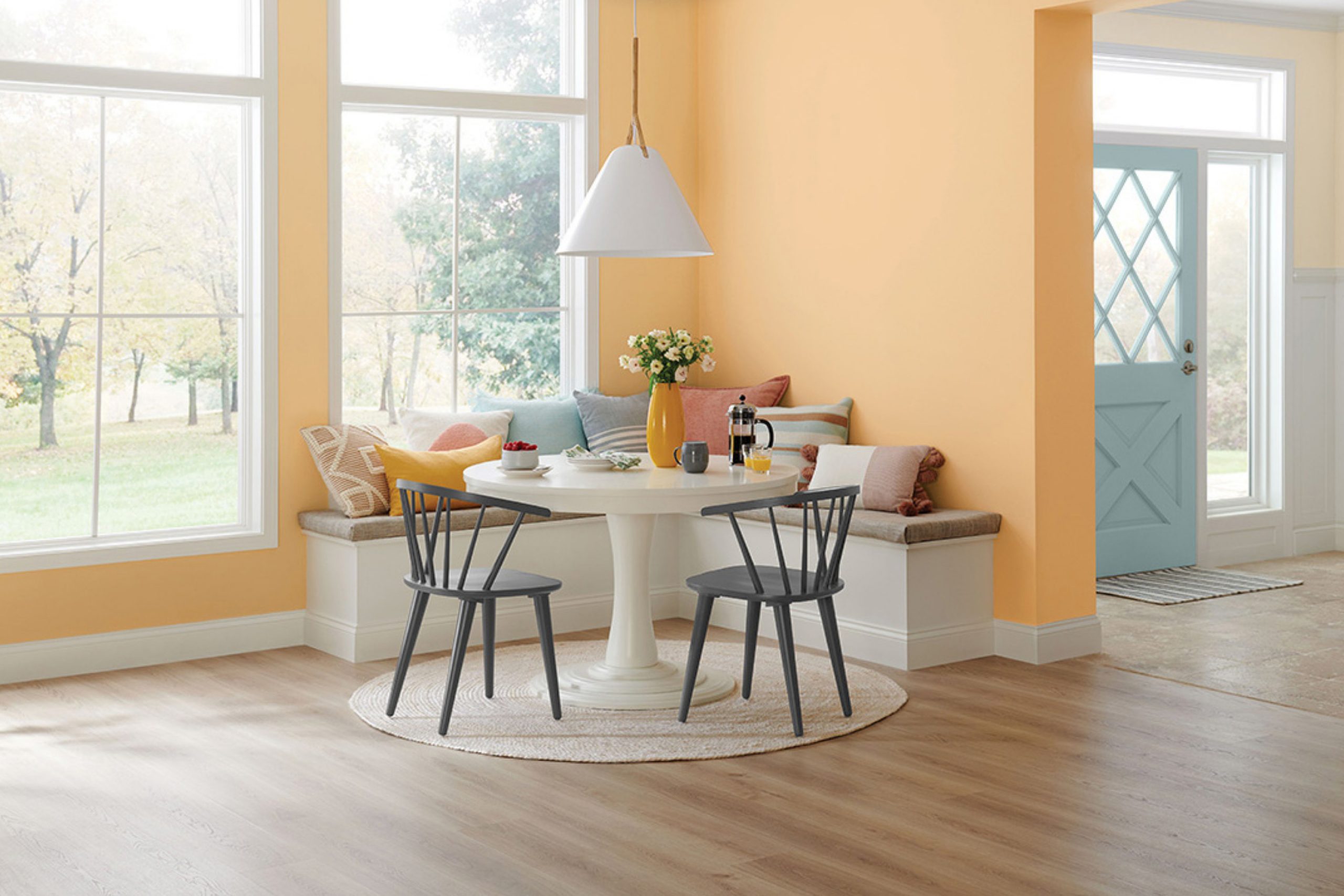
Welcome to the world of SW 7687 August Moon by Sherwin Williams. Here, you find a soothing hue that can bring a sense of calm and warmth to any room in your home. August Moon is a delightful shade that evokes the gentle light of a late summer evening, offering a soft yellow tone that feels both refreshing and comforting.
You might be interested in how August Moon can work with different styles and settings. Whether your space leans towards the traditional, modern, or a mix of both, this color blends in smoothly, offering a serene backdrop that can enhance your surroundings.
Imagine how August Moon can brighten up a living room, giving it a cheerful yet relaxing vibe. You can also apply it in a kitchen or dining room where the warm undertones encourage a welcoming atmosphere. And don’t forget about spaces like bedrooms or reading nooks, where this calming color can create a peaceful retreat.
So why not think about how August Moon might fit into your next décor project?
With its mellow and inviting character, it offers a lovely option for creating a space where you love to spend time.
via milled.com
What Color Is August Moon SW 7687 by Sherwin Williams?
Table of Contents
August Moon SW 7687 by Sherwin Williams is a warm, inviting shade. It combines soft beige with a hint of yellow, providing a cozy, comforting feel. This color works well in spaces where you want to create a calming and soothing atmosphere.
In terms of interior styles, August Moon fits perfectly with traditional, rustic, and farmhouse designs. It also complements modern interiors that use earthy tones. This color adds warmth to living rooms, bedrooms, and dining areas, making them more welcoming.
When it comes to pairing with materials, August Moon looks good alongside natural wood. It enhances the beauty of oak, maple, or walnut furnishings. For a classic touch, consider incorporating leather elements, such as sofas or chairs. Textured fabrics like linen or cotton in neutral shades complement this hue.
For accessories, metals like brushed gold or bronze add an elegant touch. Light fixtures or frames in these finishes harmonize beautifully. Additionally, August Moon pairs well with natural stone elements, like travertine or sandstone, adding depth and interest.
Overall, August Moon SW 7687 is versatile and creates a harmonious look. It bridges different styles and materials, making any room feel more cohesive and grounded.
housekeepingbay.com
Is August Moon SW 7687 by Sherwin Williams Warm or Cool color?
August Moon SW 7687 by Sherwin Williams is a soft, warm beige that creates a cozy and inviting atmosphere in homes. This color works well in living rooms, bedrooms, and hallways by providing a neutral backdrop that enhances other design elements.
Its warm undertones bring a sense of comfort and relaxation, making spaces feel welcoming and calm. August Moon pairs beautifully with white trim and can complement various styles, from traditional to modern.
When used on walls, it subtly reflects light, adding a gentle glow to rooms without overpowering other colors. This hue allows homeowners to easily switch up accent pieces, as its neutrality blends seamlessly with different colors and patterns in furniture, artwork, and decor.
Additionally, August Moon works well for open floor plans, tying spaces together with a cohesive and harmonious look. This warm beige is a versatile choice that adds charm and warmth to any interior space.
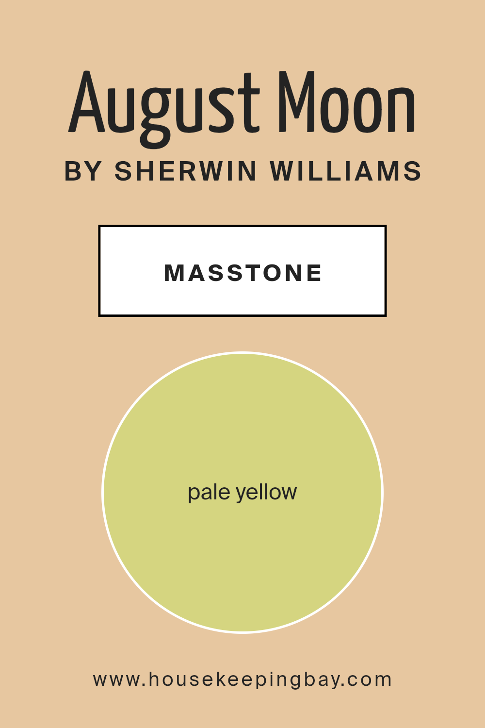
What is the Masstone of the August Moon SW 7687 by Sherwin Williams?
August Moon SW 7687 by Sherwin Williams is a pale yellow color with the hex code #D5D580. This shade brings a gentle and warm feeling to a room. Its soft yellow hue creates a welcoming and cheerful atmosphere, making it ideal for living spaces like kitchens or dining rooms where people gather and socialize.
The light tone of August Moon helps to brighten up areas, especially those with little natural light. It reflects light well, which can make a room appear larger and more open. This makes it a popular choice for small spaces or rooms that feel cramped.
Additionally, pale yellow like August Moon pairs nicely with neutral tones such as whites, grays, or beiges. It also goes well with light blues and soft greens, completing a calm and harmonious palette. Overall, August Moon is versatile and can enhance the comfort and coziness of any home.
housekeepingbay.com
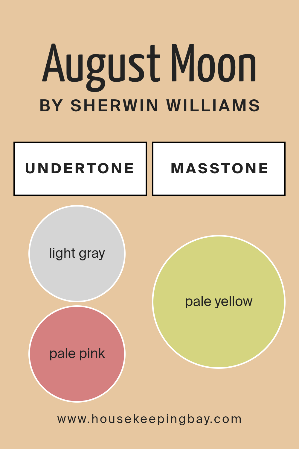
Undertones of August Moon SW 7687 by Sherwin Williams
August Moon SW 7687 by Sherwin Williams is a soft and versatile color. It blends gentle shades and brings a calming feel to spaces. The undertones of this color include light gray, pale pink, light purple, mint, light blue, yellow, gray, lilac, orange, light green, and olive. These undertones influence how we perceive the main color.
Undertones are the subtle underlying colors that affect the main hue. They can make a paint color look warmer or cooler, more vibrant, or muted. The undertones define how the color looks in different lighting conditions and against other colors.
For August Moon, the light gray and gray undertones add a grounded feel, balancing its brightness. The pale pink, light purple, and lilac bring a slight warmth, making the walls feel more inviting. Mint and light blue add a refreshing quality, hinting at a breezy environment. Meanwhile, yellow and orange give a cozy glow. The light green and olive suggest a hint of nature.
On interior walls, August Moon’s blend of undertones can make a room feel both serene and lively. It works well in living rooms and bedrooms, where soft, comforting tones enhance relaxation. The color adapts to different styles, offering a pleasing backdrop for various designs.
housekeepingbay.com
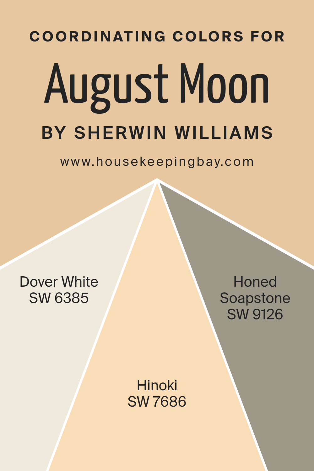
Coordinating Colors of August Moon SW 7687 by Sherwin Williams
Coordinating colors are shades that complement each other, creating harmony and balance in a room. When you choose paint colors, you select coordinating hues to ensure the space feels connected and pleasant. For August Moon SW 7687 by Sherwin Williams, several colors pair beautifully.
SW 6385, also known as Dover White, is a warm, inviting white with a creamy undertone that adds brightness without being stark. It works well as a neutral backdrop, softening the overall ambiance.
SW 7686, or Hinoki, is a gentle, earthy tone with subtle woodsy undertones, lending warmth and an organic feel to the space. Hinoki complements August Moon by adding a cozy depth without overpowering it.
Another great coordinating color is SW 9126, Honed Soapstone. This shade is a sophisticated gray with soft green hints, providing a cool contrast to the warmth of August Moon.
It enriches the color palette with a touch of elegance and modernity. Together, these colors form a cohesive and inviting environment.
Balancing warm and cool tones creates a versatile and visually appealing setting, perfect for various styles and moods. Using coordinating colors can help make your space feel more thoughtfully designed and visually balanced.
You can see recommended paint colors below:
- SW 6385 Dover White
- SW 7686 Hinoki
- SW 9126 Honed Soapstone
housekeepingbay.com
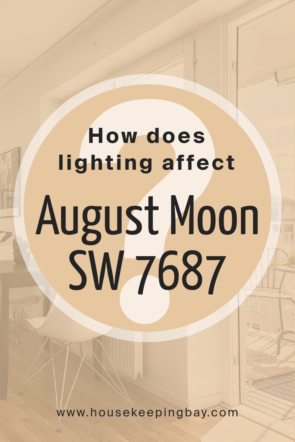
How Does Lighting Affect August Moon SW 7687 by Sherwin Williams?
Lighting plays a crucial role in how we perceive colors. The way a color appears can change dramatically under different lighting conditions. For example, natural and artificial lighting have distinct effects on color.
August Moon SW 7687 by Sherwin Williams is a warm, muted beige with slight undertones. In natural light, such as daylight streaming through a window, this color may show its true, balanced hues more clearly. However, in artificial light, like incandescent or LED bulbs, the color might appear slightly different.
Incandescent lighting, which is often warmer, can make August Moon look even cozier and more yellow. In contrast, cooler LED lights may give it a softer or more subdued appearance.
In north-facing rooms, the light is consistent but cooler. August Moon may appear slightly more muted or grayish because cooler light tends to make colors look less vibrant. It can also make the room feel a bit cooler in color temperature, even though August Moon is inherently warm.
In south-facing rooms, the light is warmer and more direct throughout the day. Here, August Moon will likely seem brighter and more vibrant. Its warm qualities will be enhanced, making the room feel inviting and cozy.
In east-facing spaces, morning light is clear and bright but becomes softer later in the day. August Moon will look fresh and lively in the morning light, but as the day progresses, it might take on a gentler tone.
West-facing rooms receive warm light in the late afternoon and evening. August Moon will look warm yet soft, picking up the day’s fading sunlight hues. Later in the day, the color can appear cozy, enhancing the room’s ambiance as the sun sets.
Overall, lighting can subtly or significantly affect the perception of August Moon, altering its warmth, depth, and vibrancy in different rooms.
housekeepingbay.com
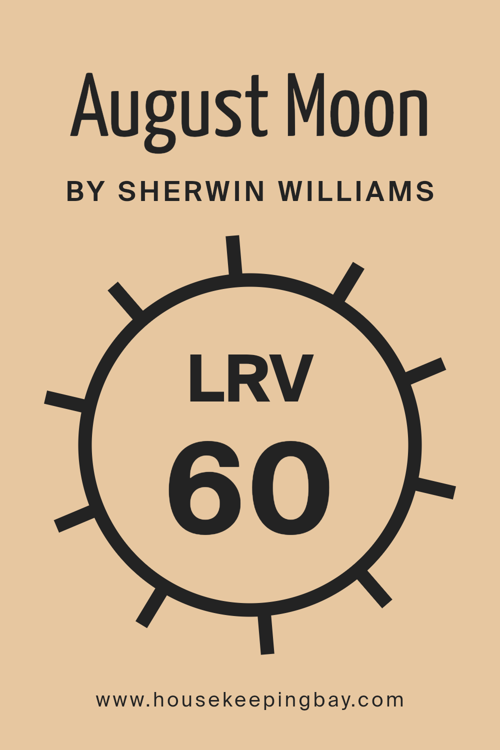
What is the LRV of August Moon SW 7687 by Sherwin Williams?
LRV stands for Light Reflectance Value. It’s a measure of how much light a color reflects. On a scale from 0 to 100, 0 means the color absorbs all light (like black), and 100 means it reflects all light (like white). So, LRV helps you understand how bright or dark a paint color may look in a room.
If you choose a paint color with a high LRV, it will reflect more light, making the room feel brighter and more spacious. On the other hand, colors with lower LRV absorb more light, which can make a room feel cozy but also dimmer.
Understanding LRV can help you pick the right paint color based on how much natural or artificial light your space gets.
The color August Moon by Sherwin-Williams has an LRV of 60.373, placing it in the middle range of reflectance.
This means it reflects a fair amount of light but not as much as lighter colors. August Moon will likely make a room feel warm and inviting while still being bright enough to prevent it from feeling small or closed in. The color is versatile because it’s light enough to open up a space but not so light that it lacks character. In rooms with plenty of natural light, this color can enhance that brightness. In darker spaces, it will help to reflect the available light, creating a balanced and pleasant atmosphere.
housekeepingbay.com
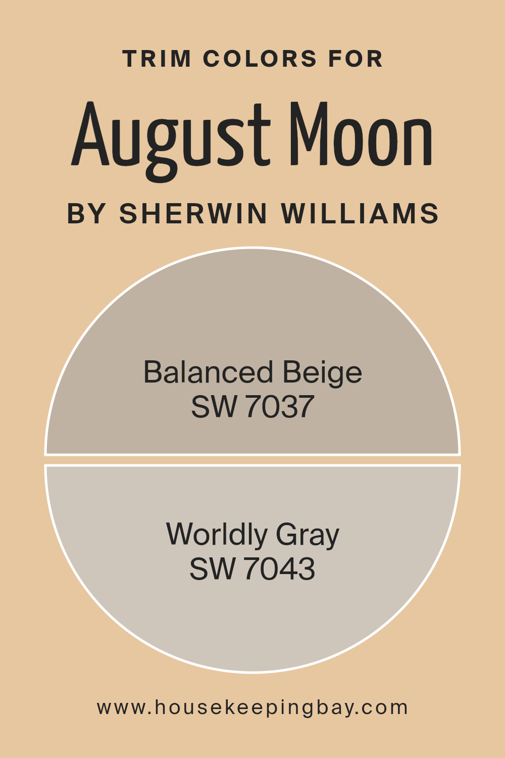
What are the Trim colors of August Moon SW 7687 by Sherwin Williams?
Trim colors refer to the hues used to paint the moldings, frames, baseboards, and other accent features in a room. Trim colors frame the main wall color, providing contrast or harmony, and they help define architectural details. For the paint August Moon SW 7687 by Sherwin-Williams, selecting the right trim color can significantly affect the overall atmosphere and style of a space.
Balanced Beige SW 7037 and Worldly Gray SW 7043 are excellent choices for trim when working with August Moon.
Balanced Beige is a warm, earthy color that projects a cozy, inviting feel, complementing August Moon’s soft, subtle tones.
Worldly Gray, on the other hand, offers a more neutral and sophisticated look. Slightly cool, Worldly Gray adds a gentle contrast without overpowering, helping maintain a unified appearance.
These trim colors enhance August Moon by adding depth and interest to a room’s aesthetic.
You can see recommended paint colors below:
housekeepingbay.com
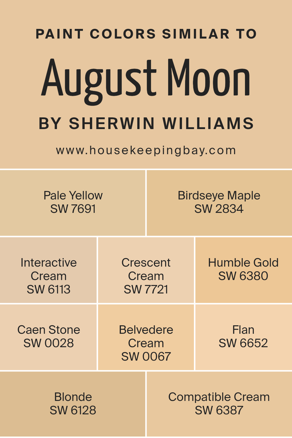
Colors Similar to August Moon SW 7687 by Sherwin Williams
Similar colors are important as they create a harmonious and cohesive look in any space. They can enhance the overall aesthetic by ensuring that different elements in a room work well together, providing a sense of unity.
For example, the colors similar to August Moon, like SW 7691 Pale Yellow, offer a soft brightness that subtly illuminates a space.
SW 2834 Birdseye Maple introduces a warm, inviting tone that feels like a gentle hug. SW 6113 Interactive Cream combines warmth with versatility, making it a staple choice for various settings. These colors work well together because they share an underlying warmth and softness, promoting a comfortable and inviting atmosphere.
SW 7721 Crescent Cream adds a touch of lightness and airiness, while SW 6380 Humble Gold brings a deeper, more grounded feel. SW 0028 Caen Stone offers an earthy quality that complements the creamy tones.
SW 0067 Belvedere Cream provides a smooth, gentle contrast. Meanwhile, SW 6652 Flan is a rich, warm tone that adds depth. SW 6128 Blonde and SW 6387 Compatible Cream round out the palette with their classic, mellow vibes. Together, these colors create a seamless blend, enhancing each other and bringing a room together in a balanced and coherent way.
You can see recommended paint colors below:
- SW 7691 Pale Yellow
- SW 2834 Birdseye Maple
- SW 6113 Interactive Cream
- SW 7721 Crescent Cream
- SW 6380 Humble Gold
- SW 0028 Caen Stone
- SW 0067 Belvedere Cream
- SW 6652 Flan
- SW 6128 Blonde
- SW 6387 Compatible Cream
housekeepingbay.com
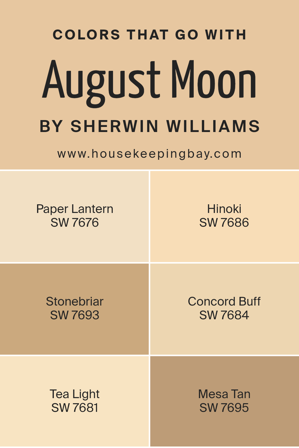
Colors that Go With August Moon SW 7687 by Sherwin Williams
Colors that go with August Moon SW 7687 by Sherwin Williams play a crucial role in creating a balanced and harmonious space. These colors complement the warm, inviting tone of August Moon, making any room feel welcoming and cozy.
August Moon, with its soft, golden hue, pairs beautifully with colors like SW 7676 Paper Lantern and SW 7686 Hinoki.
Paper Lantern offers a light, airy feel, enhancing the warmth of August Moon without overpowering it. Hinoki, with its elegant and muted tone, adds depth and sophistication, providing an excellent backdrop that enhances the overall warmth.
Other colors that pair well include SW 7693 Stonebriar, SW 7684 Concord Buff, SW 7681 Tea Light, and SW 7695 Mesa Tan.
Stonebriar introduces a subtle earthy note, bringing a gentle contrast that grounds the space. Concord Buff delivers a rich, warm foundation, adding a layer of comfort and inviting serenity. Tea Light, with its soft, creamy tint, brightens and opens up the space, creating an airy atmosphere.
Lastly, Mesa Tan adds a hint of natural warmth and subtle depth, offering a more pronounced contrast without clashing.
Together, these colors create a beautiful palette that enhances the charm and warmth of any room painted with August Moon.
You can see recommended paint colors below:
- SW 7676 Paper Lantern
- SW 7686 Hinoki
- SW 7693 Stonebriar
- SW 7684 Concord Buff
- SW 7681 Tea Light
- SW 7695 Mesa Tan
housekeepingbay.com
How to Use August Moon SW 7687 by Sherwin Williams In Your Home?
August Moon SW 7687 by Sherwin Williams offers a warm, inviting shade of yellow. This color works well in spaces needing a boost of energy or light. It suits living rooms, kitchens, or any area where people gather, creating a cheerful atmosphere. Pair it with neutral furniture and white accents for a fresh, balanced look. For those wanting to add character, it blends well with darker woods or deep blues, adding contrast without overpowering.
In a child’s room, August Moon can spark creativity and playfulness. Pair it with fun patterns or soft pastels for a balanced, lively space. In contrast, using it in a home office might increase motivation and focus, keeping the mind active and alert.
Overall, August Moon lends warmth and positivity to any room. It complements various styles, making it a versatile choice for enhancing home environments with a touch of cheerfulness and warmth.
August Moon SW 7687 by Sherwin Williams vs Interactive Cream SW 6113 by Sherwin Williams
August Moon (SW 7687) by Sherwin Williams is a soft, muted color with a warm, earthy tone. It leans towards a pale yellow with subtle beige influences, creating a cozy and inviting atmosphere. This color can bring a sense of calmness and is often associated with comfort and simplicity. It works beautifully in spaces where a relaxed and peaceful vibe is desired.
Interactive Cream (SW 6113) also from Sherwin Williams, is slightly warmer and richer compared to August Moon. It holds more of a buttery undertone, offering a bit more energy and warmth. This cream color adds a touch of vibrancy to a space without being too bold, making it versatile for various settings.
In comparison, August Moon feels more understated and subtle, perfect for those who prefer a gentle ambiance. Interactive Cream, with its stronger presence, can brighten a room and add a welcoming touch. Both colors excel in creating warm, inviting spaces.
You can see recommended paint color below:
- SW 6113 Interactive Cream

housekeepingbay.com
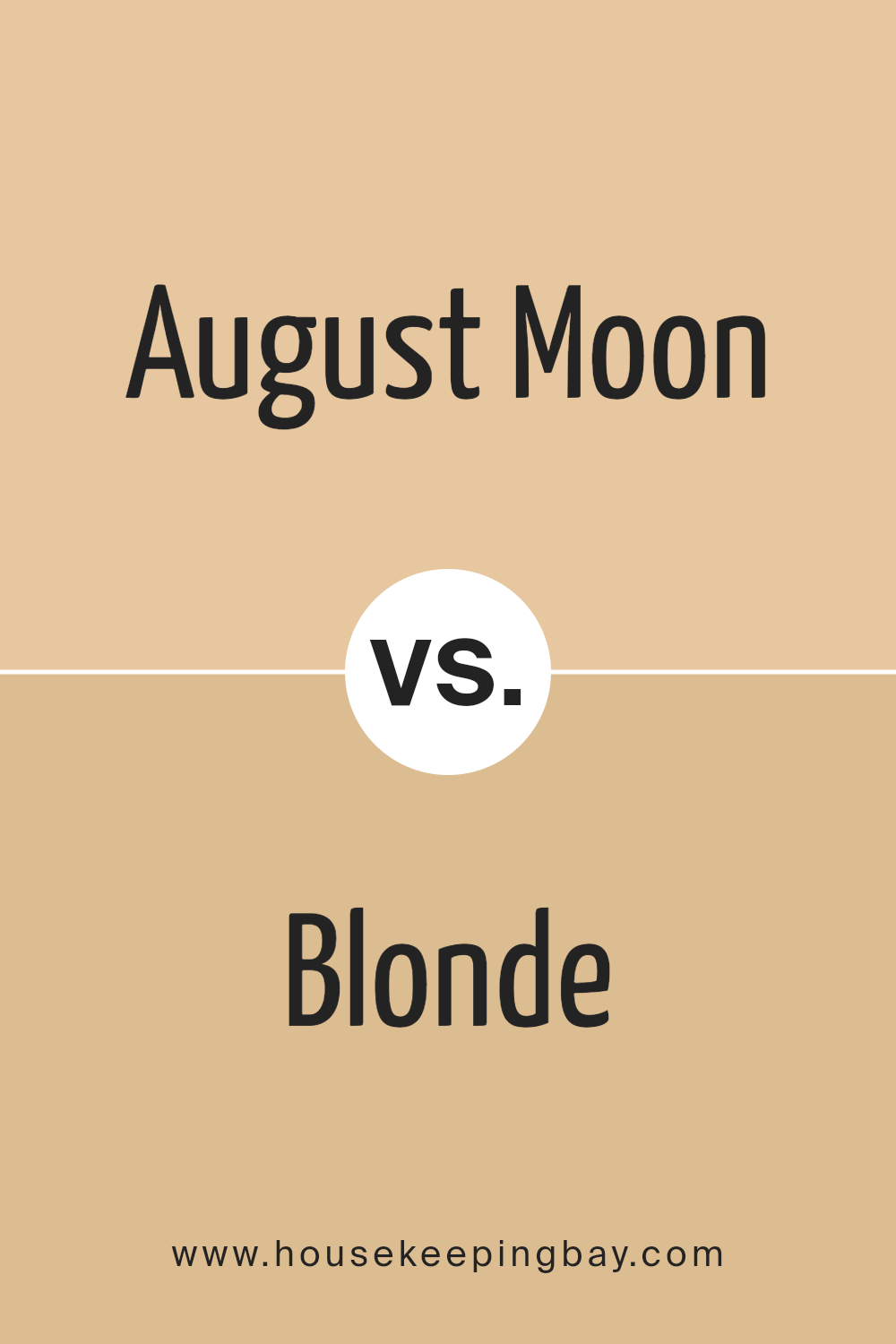
August Moon SW 7687 by Sherwin Williams vs Blonde SW 6128 by Sherwin Williams
August Moon SW 7687 by Sherwin Williams is a soft, muted shade that brings a sense of warmth and subtlety to a space. It has an earthy tone with a hint of grey that makes it versatile and calming. This color works well as a backdrop for various design styles, lending itself to both traditional and modern aesthetics. It pairs nicely with natural materials and earthy textures.
Blonde SW 6128, also from Sherwin Williams, is brighter and more lively. It’s a warm, golden shade that adds a cheerful touch to a room. It’s more vibrant than August Moon, making it a good choice for spaces where you want to inject energy and brightness.
Blonde can serve as a focal point or an accent, easily complementing wood tones and other warm colors.
Overall, August Moon is subtle and soothing, while Blonde is vivid and energizing, offering distinct moods for different settings.
You can see recommended paint color below:
- SW 6128 Blonde
housekeepingbay.com
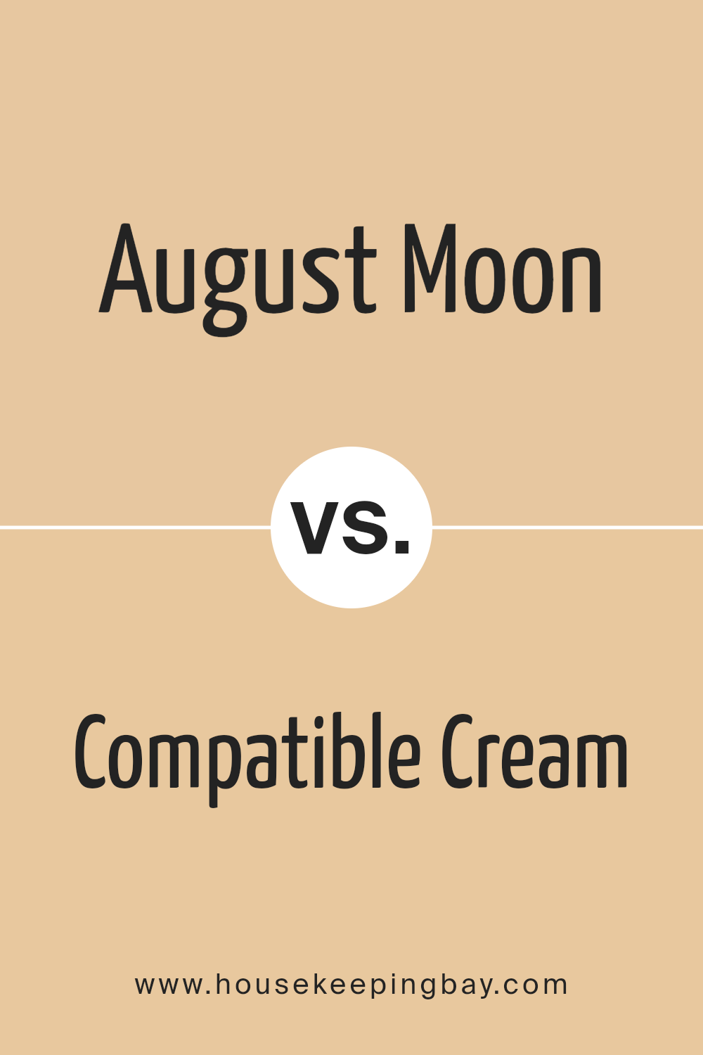
August Moon SW 7687 by Sherwin Williams vs Compatible Cream SW 6387 by Sherwin Williams
August Moon SW 7687 and Compatible Cream SW 6387 by Sherwin Williams are two unique colors that create different moods. August Moon is a soft, muted green that feels calm and natural, evoking the serenity of new leaves or a gentle breeze. It works well in spaces where you seek to create a peaceful and grounded atmosphere.
Compatible Cream, however, is a warm, light yellow that brings a sense of warmth and cheerfulness. It reflects more light, brightening spaces and adding a sense of coziness.
While August Moon leans cooler with its green undertones, Compatible Cream offers a sunnier, more inviting feel. Both are versatile and can complement a variety of other colors, but their main difference lies in their undertones and the emotional response they bring. August Moon feels more soothing, whereas Compatible Cream radiates warmth and comfort.
You can see recommended paint color below:
housekeepingbay.com
August Moon SW 7687 by Sherwin Williams vs Belvedere Cream SW 0067 by Sherwin Williams
August Moon SW 7687 and Belvedere Cream SW 0067 from Sherwin Williams offer distinct yet complementary vibes. August Moon presents as a warm, muted yellow with subtle earthy undertones, creating a cozy and inviting atmosphere. This color can add warmth and a sense of comfort to any space, making it great for living rooms or bedrooms.
Belvedere Cream, however, leans more towards a soft, creamy white with hints of yellow. It is lighter and brings a serene, airy feel. Its versatility makes it suitable for spaces like kitchens and bathrooms, where brightness complements functionality.
When used together, August Moon provides depth, while Belvedere Cream adds lightness and balance. Both colors can seamlessly blend in any room to create a harmonious environment. Whether you seek a warm, cozy feel or a light, gentle space, these colors offer flexibility to match different styles and preferences.
You can see recommended paint color below:
- SW 0067 Belvedere Cream
housekeepingbay.com
August Moon SW 7687 by Sherwin Williams vs Flan SW 6652 by Sherwin Williams
August Moon SW 7687 and Flan SW 6652 by Sherwin Williams are warm, welcoming shades, yet each has a distinct character. August Moon is a soft, muted yellow with a touch of creaminess, offering a gentle and inviting feel. It can brighten a space without being overpowering, making it suitable for living rooms or bedrooms.
Flan, on the other hand, is a richer, deeper golden hue that carries more warmth and intensity. It has a slightly darker tone compared to August Moon, giving it a cozy and comforting vibe. Flan is great for creating an intimate atmosphere in dining areas or sitting rooms.
While both colors share a warm palette, August Moon is lighter and softer, making it versatile for various interiors. Flan’s deeper tone adds more depth and richness, ideal for spaces where a bold, warm presence is desired. These differences allow each color to complement different design styles and moods.
You can see recommended paint color below:
housekeepingbay.com
August Moon SW 7687 by Sherwin Williams vs Crescent Cream SW 7721 by Sherwin Williams
August Moon SW 7687 by Sherwin Williams is a warm, muted yellow. It creates a subtle, soft ambiance, adding warmth to a room without being overpowering. It works well in spaces where you want a cozy feel, offering a gentle backdrop that pairs nicely with earthy tones and natural elements.
Crescent Cream SW 7721, also by Sherwin Williams, is another warm hue but with a lighter, creamier tone. This color feels fresh and airy, making spaces feel more open and bright. It’s ideal for rooms where you want a sense of openness and lightness.
Both colors share warmth but have distinct impacts: August Moon adds richness and coziness, while Crescent Cream provides a lighter touch with a clean, inviting feel. They can be used together for a harmonious look, with August Moon adding depth and Crescent Cream brightening and enlarging the space.
You can see recommended paint color below:
- SW 7721 Crescent Cream
housekeepingbay.com
August Moon SW 7687 by Sherwin Williams vs Birdseye Maple SW 2834 by Sherwin Williams
August Moon SW 7687 by Sherwin Williams is a soft, warm yellow that brings a sunny and cheerful feel to spaces. It’s like a gentle beam of sunlight that can brighten up a room. This color works well in kitchens or living rooms where a touch of warmth is desired. It pairs nicely with whites and light woods, enhancing a cozy and inviting environment.
Birdseye Maple SW 2834, by contrast, leans toward a muted beige tone, offering a more subtle and neutral backdrop. It’s versatile and works beautifully in areas requiring a calm, understated palette.
This color suits a range of decor styles and pairs well with both dark and light accents, making it adaptable to various settings.
While August Moon is lively and radiant, Birdseye Maple provides a more grounded and soothing atmosphere. Each color adds its unique character to a room, fitting different moods and styles.
You can see recommended paint color below:
- SW 2834 Birdseye Maple
housekeepingbay.com
August Moon SW 7687 by Sherwin Williams vs Humble Gold SW 6380 by Sherwin Williams
August Moon SW 7687 by Sherwin Williams presents a soft, muted yellow with hints of gray, creating a very calm and understated look. It’s a versatile shade, lending a sense of warmth without overwhelming brightness. August Moon suits spaces that aim for a serene atmosphere, offering a gentle backdrop that complements various decor styles.
Humble Gold SW 6380 also resides within the yellow spectrum but brings more intensity and energy to the table. It showcases a richer, more vibrant golden hue, making a bold statement. This color adds warmth and cheer, ideal for spaces where you want to encourage creativity and warmth.
Comparing the two, August Moon feels more subdued and relaxing, perfect for bedrooms or living rooms where calm is essential. Humble Gold, with its bold character, can brighten up dining areas or hallways, providing an inviting and lively aura. Both colors offer unique attributes for different settings.
You can see recommended paint color below:
- SW 6380 Humble Gold
housekeepingbay.com
August Moon SW 7687 by Sherwin Williams vs Caen Stone SW 0028 by Sherwin Williams
August Moon SW 7687 and Caen Stone SW 0028 by Sherwin Williams are two colors that each bring their unique personality to a space. August Moon is a warm, golden hue with earthy undertones. It can create a cozy and inviting atmosphere, suitable for living rooms or bedrooms. Its warmth can make rooms feel more intimate and welcoming.
Caen Stone, however, is a more neutral, beige tone with subtle warmth. This color has a timeless quality, offering versatility that suits various interior styles.
It works well as a background to accentuate colors or furniture and fits perfectly in hallways, kitchens, or bathrooms where a neutral palette works best.
While August Moon adds a sense of warmth and coziness, Caen Stone provides classic neutrality and flexibility. Both colors can enhance a room’s aesthetic appeal, though they differ in their ways of contributing to a room’s overall ambiance and vibe.
You can see recommended paint color below:
- SW 0028 Caen Stone
housekeepingbay.com
August Moon SW 7687 by Sherwin Williams vs Pale Yellow SW 7691 by Sherwin Williams
August Moon SW 7687 and Pale Yellow SW 7691 by Sherwin-Williams each bring unique qualities to a space. August Moon is a soft, muted yellow that leans towards a beige tone, ideal for creating a warm and inviting atmosphere. It works well with earthy or neutral colors, bringing a sense of coziness and comfort in any room.
Pale Yellow, meanwhile, is a lighter and more vibrant hue. It adds a cheerful and sunny feel, perfect for brightening up spaces. This color can make smaller rooms feel more open and airy. It’s a great choice for those looking to add a splash of light without overwhelming the senses.
Both colors serve as excellent backgrounds, but August Moon offers a more subdued appearance, while Pale Yellow delivers a brighter, more playful touch. Depending on the desired mood and energy of a room, these choices allow versatility in design and decoration.
You can see recommended paint color below:
- SW 7691 Pale Yellow
housekeepingbay.com
Conclusion
SW 7687 August Moon by Sherwin Williams gives rooms a warm and inviting feel. In my opinion, this color blends softness with a gentle glow, making spaces look peaceful and cozy. I noticed how August Moon can work well in various settings. It adapts, whether in a living room, bedroom, or kitchen, and pairs nicely with both bold and neutral tones.
The color has a calming presence, suitable for those who like a soothing atmosphere. It helps to create an environment that feels balanced and harmonious. I think it adds a subtle touch of elegance without overwhelming the senses.
Using August Moon, I’ve seen spaces come together beautifully, as it complements both modern and traditional styles. Walls painted in this hue seem to invite relaxation and comfort, encouraging me to spend more time enjoying the surroundings. This makes it a great choice for anyone looking to refresh their home with a color that brings a sense of serenity and warmth.
In summary, SW 7687 August Moon is a versatile color that enhances the overall ambiance of a room by adding warmth and comfort. It’s an excellent choice for those seeking a gentle, inviting, and cozy atmosphere in their living spaces.
housekeepingbay.com
Ever wished paint sampling was as easy as sticking a sticker? Guess what? Now it is! Discover Samplize's unique Peel & Stick samples. Get started now and say goodbye to the old messy way!
Get paint samples


