Flan SW 6652 by Sherwin Williams
Warmth and Elegance Redefined
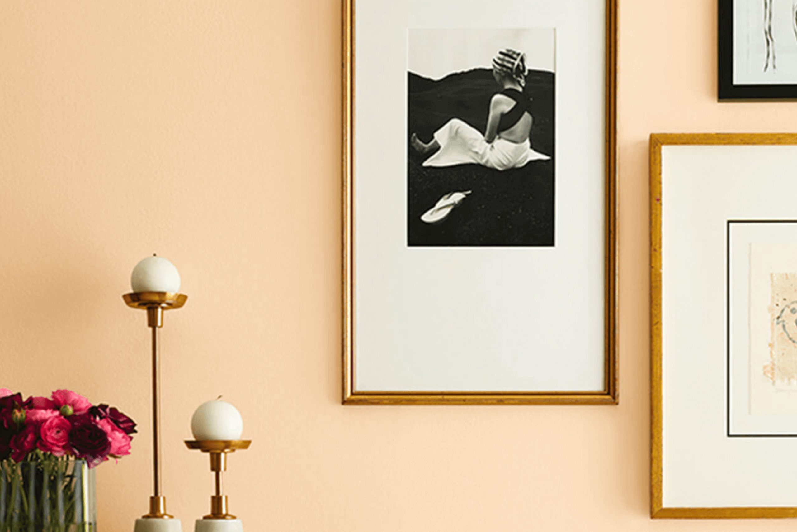
When considering paint colors for your home, one shade that stands out is SW 6652 Flan by Sherwin Williams. This color offers warmth and a touch of sophistication, perfect for adding a cozy feel to any room. Picture a soft, inviting hue that resembles the comfort of a freshly baked dessert, warming up spaces in an understated yet effective way.
Flan is a versatile shade that adapts well to different lighting conditions, ensuring that it maintains its charm throughout the day. Whether you’re repainting a living room, kitchen, or even an accent wall, this hue can seamlessly integrate into your space while creating a welcoming atmosphere.
Perhaps you’re in search of a color that can complement a variety of decor styles, from modern to rustic. SW 6652 Flan can be paired with neutrals, rich browns, or even deep blues for a balanced look. Its natural warmth provides an excellent backdrop for both minimalistic and eclectic interiors.
Choosing the right paint color can significantly affect the mood of your home, and with Flan, you can achieve a unique blend of comfort and style. This color brings a sense of subtle elegance and coziness that is hard to match.
Consider how this beautiful, warm shade could transform your living space into a haven of comfort and charm.
via sherwin-williams.com/
What Color Is Flan SW 6652 by Sherwin Williams?
Flan SW 6652 by Sherwin Williams is a warm, inviting color with a soft, creamy tone reminiscent of a rich custard dessert. This hue evokes comfort and hominess, making it perfect for creating a cozy atmosphere. Flan is versatile, working well in various interior styles such as traditional, cottage, farmhouse, and even some modern spaces when paired with the right accents.
In a traditional setting, Flan can serve as a robust backdrop for darker wood tones and classic furniture pieces. In a cottage or farmhouse style, it pairs wonderfully with distressed wood and light, airy fabrics, enhancing its warm undertones.
For a more contemporary look, consider combining it with sleek metals or glass elements to balance its softness.
This color pairs beautifully with materials like natural woods, rattan, and linen, enhancing a space with their textures. It also complements earthy pottery and woven baskets, adding layers of interest. Furthermore, Flan harmonizes with warm whites and deep browns, creating a balanced and grounded palette.
Green plants also complement this shade beautifully, adding life and freshness to any room. Overall, Flan SW 6652 is a delightful choice for anyone wanting to craft a welcoming and cozy environment at home.
housekeepingbay.com
Is Flan SW 6652 by Sherwin Williams Warm or Cool color?
Flan SW 6652 by Sherwin-Williams is a warm, inviting color that enhances cozy atmospheres in homes. Its soft, creamy shade creates an atmosphere of comfort and relaxation. This hue pairs well with natural materials like wood and stone, making it versatile for various design styles, from rustic to modern.
In living rooms, Flan SW 6652 can make the space feel welcoming and spacious, complementing neutral furniture and décor. In kitchens, it adds warmth, highlighting natural light and making the area feel sunny and bright.
Using this color in bedrooms can promote a sense of calm, making it ideal for winding down after a long day.
Flan SW 6652 also works well as an accent color, bringing depth to walls without overpowering other design elements. Its adaptability and warmth allow Flan SW 6652 to fit seamlessly into various rooms, enhancing comfort and harmony within the home.
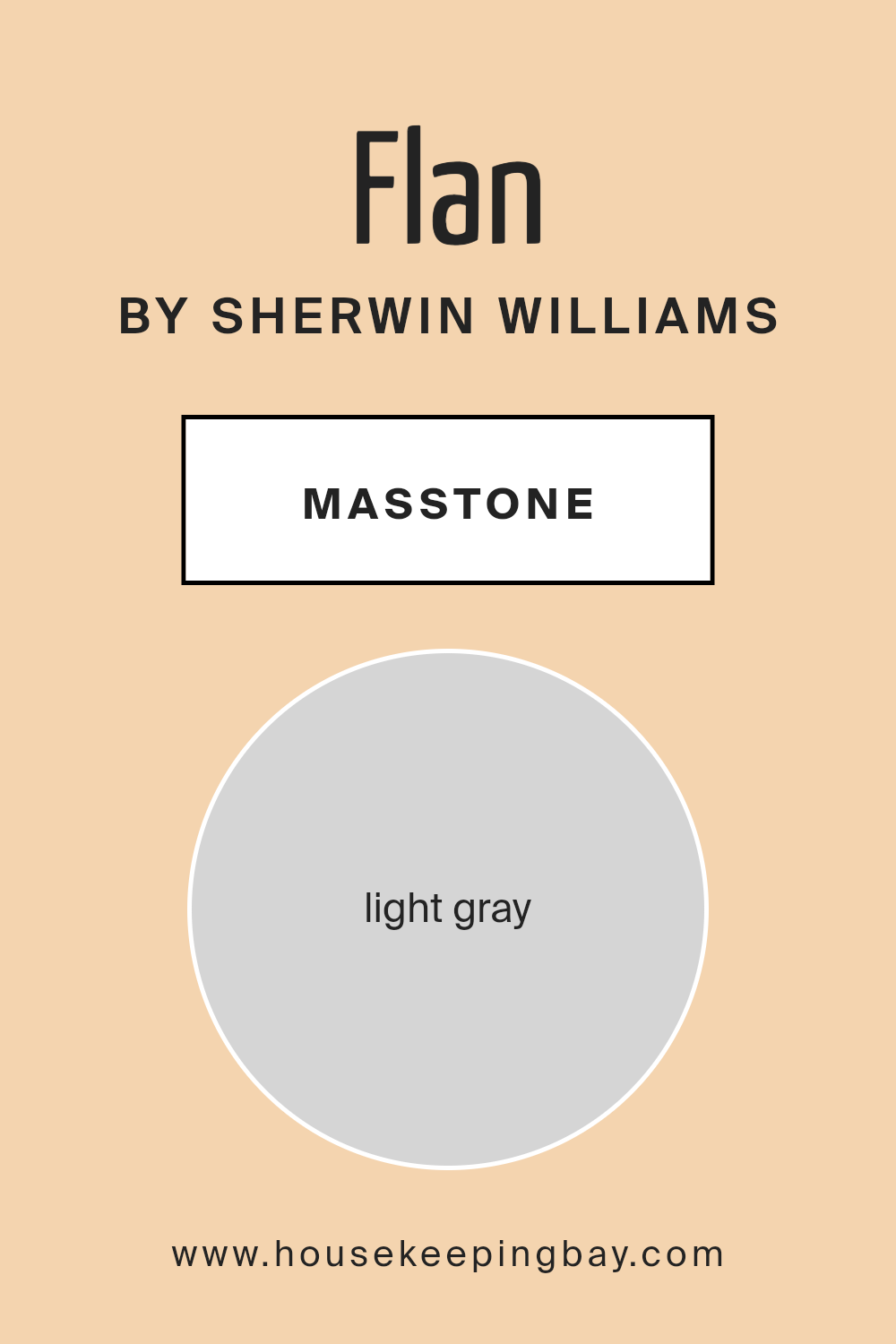
What is the Masstone of the Flan SW 6652 by Sherwin Williams?
FlanSW 6652 by Sherwin Williams features a light gray masstone, which is #D5D5D5. This color has a gentle and soothing presence in homes. Light gray colors like this one offer a neutral base that can match many design styles and color schemes.
In rooms, this light gray can make spaces feel open and airy. It helps in reflecting light, making rooms appear brighter and more inviting. Because it is neutral, it complements both warm and cool colors. You can pair it easily with white or darker shades for contrast.
This color also works well in various parts of the home, from living rooms to bedrooms. Its calming nature contributes to a peaceful atmosphere. Furniture and decor with bolder colors can stand out against the subtle gray backdrop. Additionally, it can provide a seamless look in open-plan areas, unifying different spaces without overpowering them.
housekeepingbay.com
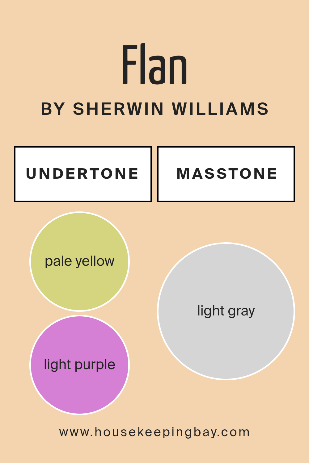
Undertones of Flan SW 6652 by Sherwin Williams
Flan SW 6652 by Sherwin Williams presents a blend of subtle undertones that add depth and complexity. The primary color appears as a soft, warm beige, but the undertones subtly alter how this color is perceived. These undertones include hints of pale yellow, light purple, pale pink, light blue, mint, lilac, and grey.
Under different lighting conditions, these undertones can shift the appearance of the paint. For example, in a room with lots of natural light, the pale yellow might become more pronounced, giving the walls a sunnier feel.
In contrast, under artificial lighting, the grey or light purple and lilac undertones might come forward, creating a cooler, more sophisticated ambiance.
When this paint is used on interior walls, these undertones affect the room’s mood. The pale pink and mint bring warmth and comfort, while the light blue and grey add a hint of calmness. Together, they create a balanced environment that feels both inviting and airy.
Understanding these undertones helps in choosing complementary decor and furniture, ensuring a harmonious interior. The dynamic nature of these undertones adds richness, allowing the paint to adapt beautifully to various settings within a home.
housekeepingbay.com
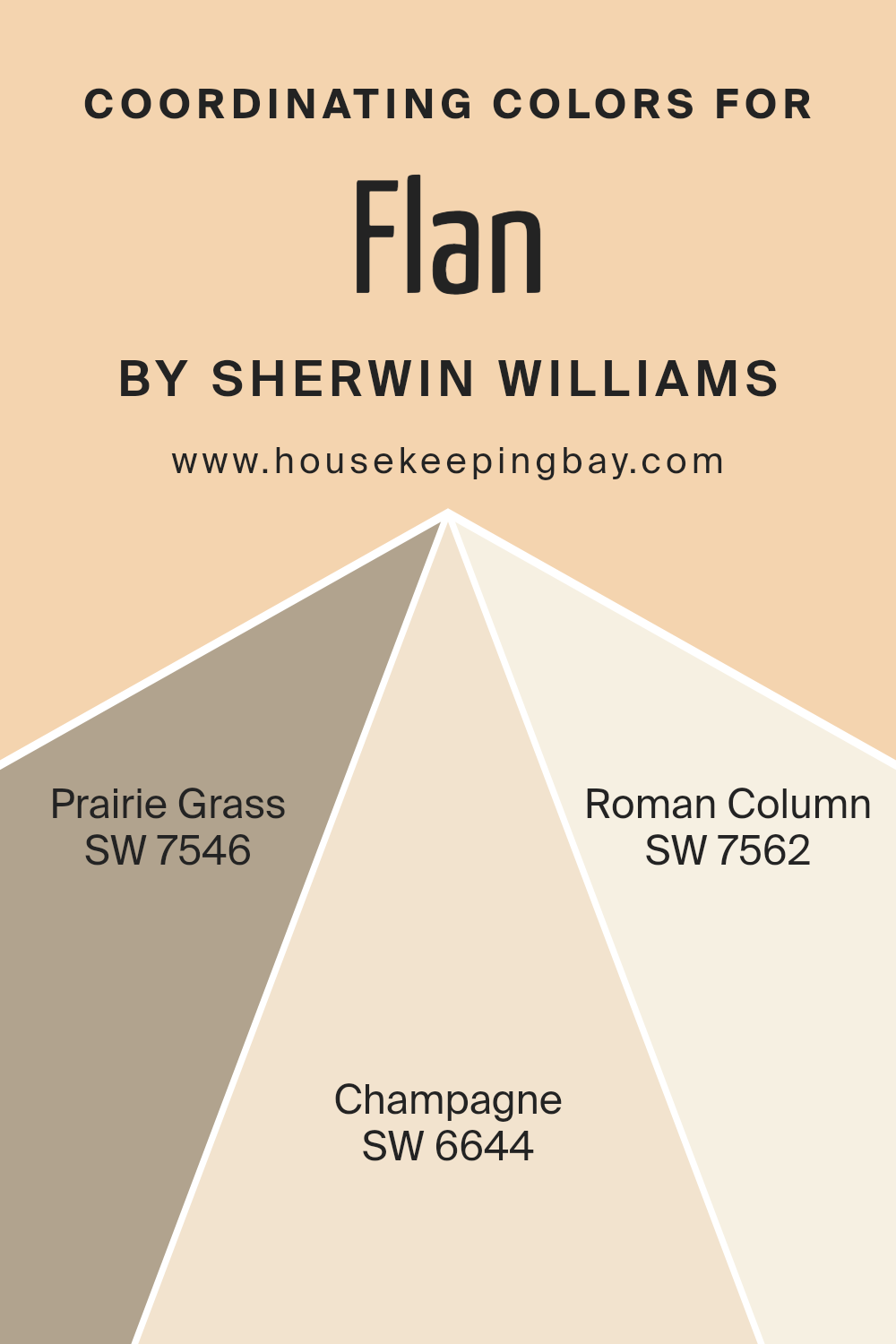
Coordinating Colors of Flan SW 6652 by Sherwin Williams
Coordinating colors are hues that work naturally together, creating a balanced and visually appealing palette. They complement each other, highlighting different aspects of a primary color. When using coordinating colors, like those that complement Sherwin Williams’ Flan SW 6652, you create a harmonious environment that is both cohesive and inviting.
The key to effectively coordinating colors lies in choosing shades that share similar undertones or contrasting tones that still maintain balance. Coordinating colors can be used in various ways, such as wall paint, furniture, and decor, to ensure continuity throughout a space.
SW 7546 – Prairie Grass offers a warm, earthy tone that brings a grounding effect, enhancing the coziness of a room. It pairs beautifully with other neutral and pastel shades. SW 6644 – Champagne presents a soft, creamy yellow that brightens spaces with its gentle warmth, ideal for creating a welcoming atmosphere.
On the other hand, SW 7562 – Roman Column is an elegant, light off-white that adds a touch of sophistication.
This color provides a perfect backdrop that allows other colors to shine while still bringing a sense of calmness. Together, these colors create a palette that is balanced and harmonious, ensuring a pleasant and cohesive visual appeal.
You can see recommended paint colors below:
- SW 7546 Prairie Grass
- SW 6644 Champagne
- SW 7562 Roman Column
housekeepingbay.com
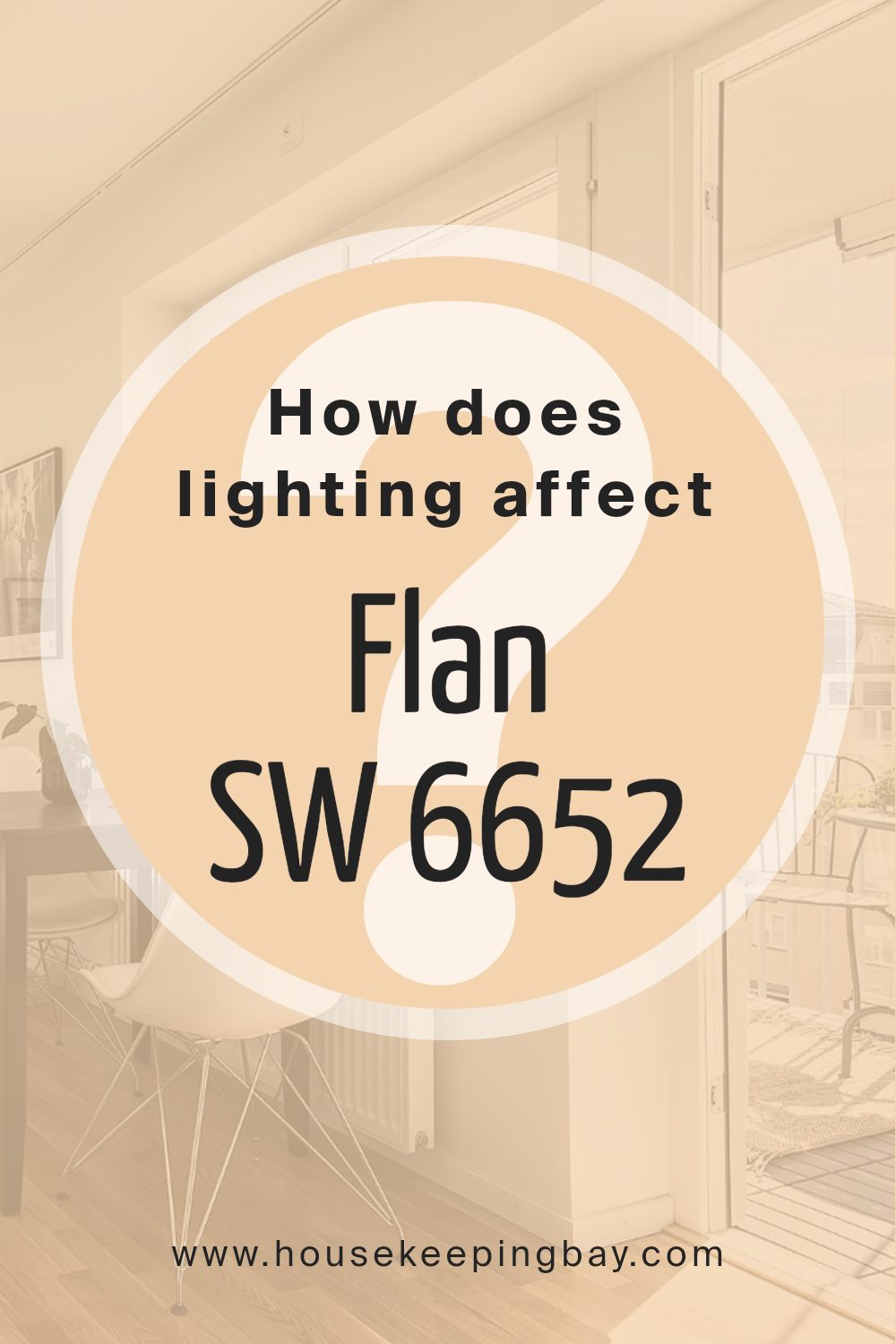
How Does Lighting Affect Flan SW 6652 by Sherwin Williams?
Lighting plays a crucial role in how we perceive colors. Colors can look different under various lighting conditions due to the way light interacts with the paint. Sherwin Williams FlanSW 6652 is a warm, neutral shade that can vary in appearance based on the type and direction of lighting.
In natural light, FlanSW 6652 generally appears more true to its sample. However, in artificial lighting, its tone can shift considerably. Under cool LED or fluorescent lights, it might appear slightly duller or even take on a grayish hue.
Warm incandescent or halogen lights can make it look richer and cozier, bringing out its warmer undertones.
When used in north-facing rooms, FlanSW 6652 can appear cooler and somewhat subdued. North-facing rooms receive consistent, indirect natural light, often with a bluer tint. This can make the shade appear more muted, emphasizing any gray undertones.
In contrast, south-facing rooms receive more direct sunlight throughout the day. This light is warmer and more intense, enhancing the warm qualities of FlanSW 6652. In these rooms, the shade can appear more vibrant and warm, giving a cozy feeling.
East-facing rooms get bright, yellow-toned light in the morning, and FlanSW 6652 can appear warm and inviting during these hours. However, as the day progresses and the light shifts, the color may look more subdued.
West-facing rooms receive softer, warmer light in the late afternoon and evening. Throughout the day, FlanSW 6652 can appear relatively neutral, but as evening approaches and the light becomes warmer, the shade’s depth and warmth will become more pronounced.
Understanding how lighting affects FlanSW 6652 can help you decide how and where to use it in your home, ensuring that it complements the natural and artificial lighting in your space.
housekeepingbay.com
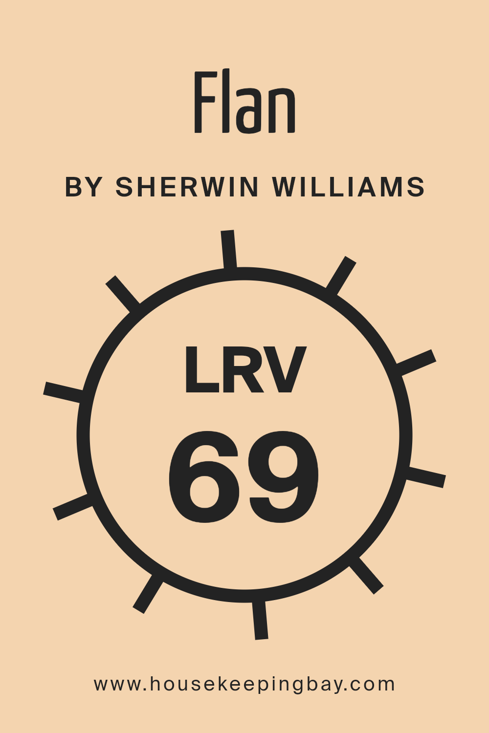
What is the LRV of Flan SW 6652 by Sherwin Williams?
Light Reflectance Value (LRV) measures how much light a color reflects. It’s on a scale of 0 to 100, where 0 means the color absorbs all light (pure black), and 100 means it reflects all light (pure white). When a paint color has a higher LRV, it reflects more light, making a space feel brighter and more open.
On the other hand, colors with a lower LRV absorb more light, which can make a room feel cozier or more intimate. Understanding a color’s LRV helps in deciding how it will look under different lighting conditions and how it interacts with other elements in a room.
The color Flan SW 6652 by Sherwin Williams has an LRV of 69.462. This value indicates that it is a relatively light color. It reflects a significant amount of light, which can help rooms feel airy and spacious. In bright rooms, this color maintains a vibrant appearance without overwhelming the space. In dimmer spaces, it helps bounce available light around, preventing the room from feeling too dark or heavy.
Its higher LRV makes Flan SW 6652 versatile for various settings, allowing it to brighten rooms and enhance the sense of space.
housekeepingbay.com
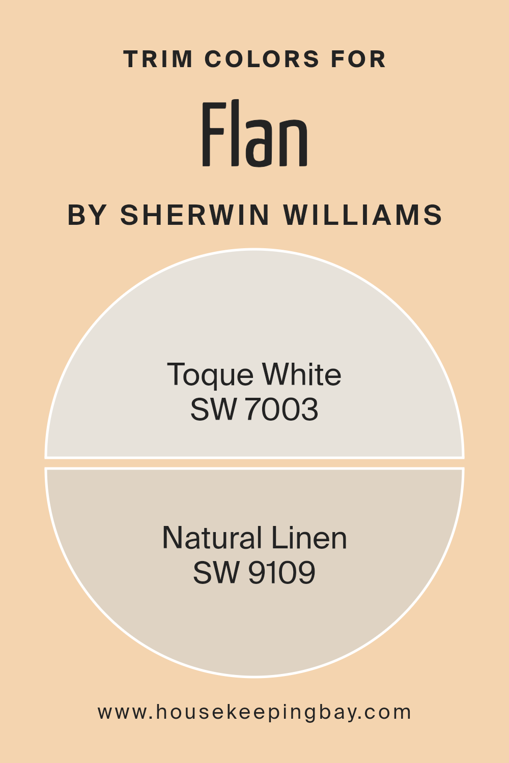
What are the Trim colors of Flan SW 6652 by Sherwin Williams?
Trim colors play a significant role in the overall look and feel of a room by defining the edges and highlighting architectural features such as doors, windows, and baseboards. In the case of FlanSW 6652 by Sherwin Williams, choosing the right trim color helps create contrast and depth, turning an otherwise flat color into a visually interesting space.
Trim colors can frame the main wall color and make it pop or help the entire room blend seamlessly together. By using Toque White (SW 7003) as a trim color, you introduce a clean, soft white with subtle warmth, which complements FlanSW 6652 perfectly without overpowering it.
Toque White’s gentle tone adds clarity and brightness to the room, enhancing the natural light and making spaces feel more open and airy.
On the other hand, using Natural Linen (SW 9109) as a trim color lends an understated elegance to FlanSW 6652. Natural Linen carries a calm, neutral vibe with warm undertones that bring a sense of coziness and comfort to the room.
Its ability to harmonize with different styles makes it a versatile choice, providing a seamless transition from the wall color to other decor elements.
These colors not only help emphasize the beauty of FlanSW 6652 but also interact well with various materials and furnishings, ensuring a balanced and cohesive interior. With carefully selected trim colors like Toque White and Natural Linen, any room can achieve a polished and inviting look.
You can see recommended paint colors below:
housekeepingbay.com
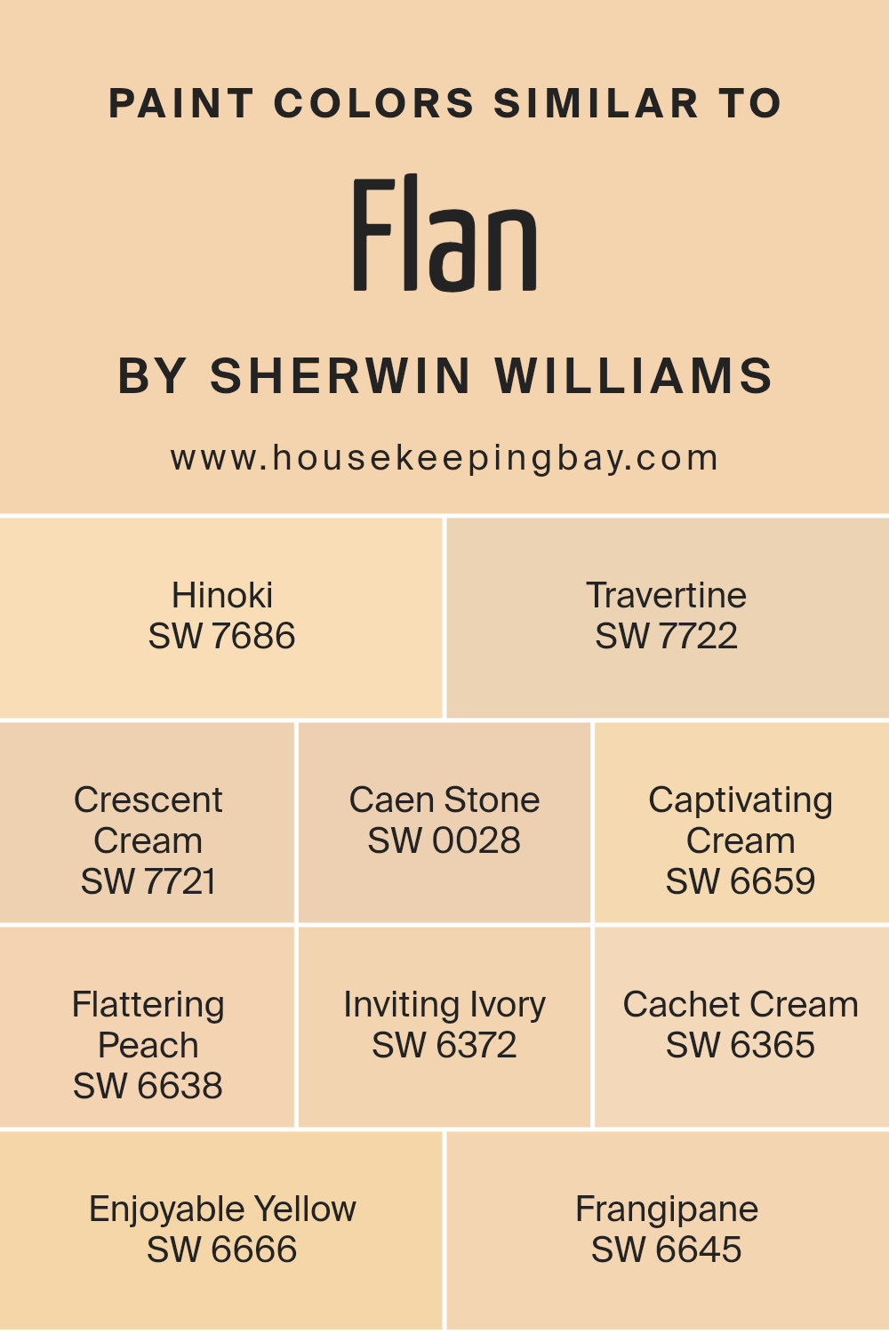
Colors Similar to Flan SW 6652 by Sherwin Williams
Similar colors are important in design because they create harmony and balance within a space. When you use colors that are close in tone or hue, like those similar to Flan SW 6652 by Sherwin Williams, they blend easily and provide a smooth transition between different surfaces or areas.
This helps in making a room feel cohesive and pleasing to the eye, avoiding any harsh or jarring contrasts that might be unsettling. Moreover, similar colors can subtly highlight various elements in a room by creating layers of depth without overwhelming the senses.
Hinoki SW 7686 has a warm, golden beige tone reminiscent of natural wood, providing a cozy and rustic feel. Travertine SW 7722 offers a soft, sandy beige that evokes the soothing nature of stone. Crescent Cream SW 7721 dips into the light buttery spectrum, adding a gentle warmth to any room.
Caen Stone SW 0028 carries an earthy richness, perfect for grounding a space. Captivating Cream SW 6659 adds a touch of creamy lightness, gently brightening surroundings.
Flattering Peach SW 6638 introduces a hint of soft pink, creating a welcoming and cheerful atmosphere. Inviting Ivory SW 6372 provides a neutral backdrop with its gentle off-white hue. Cachet Cream SW 6365 radiates a subtle elegance with its light beige shade. Enjoyable Yellow SW 6666 brings a cheerful, sunny tone, lifting spirits naturally. Lastly, Frangipane SW 6645 wraps a room in a warm, peachy glow, adding a touch of warmth and comfort.
You can see recommended paint colors below:
- SW 7686 Hinoki
- SW 7722 Travertine
- SW 7721 Crescent Cream
- SW 0028 Caen Stone
- SW 6659 Captivating Cream
- SW 6638 Flattering Peach
- SW 6372 Inviting Ivory
- SW 6365 Cachet Cream
- SW 6666 Enjoyable Yellow
- SW 6645 Frangipane
housekeepingbay.com
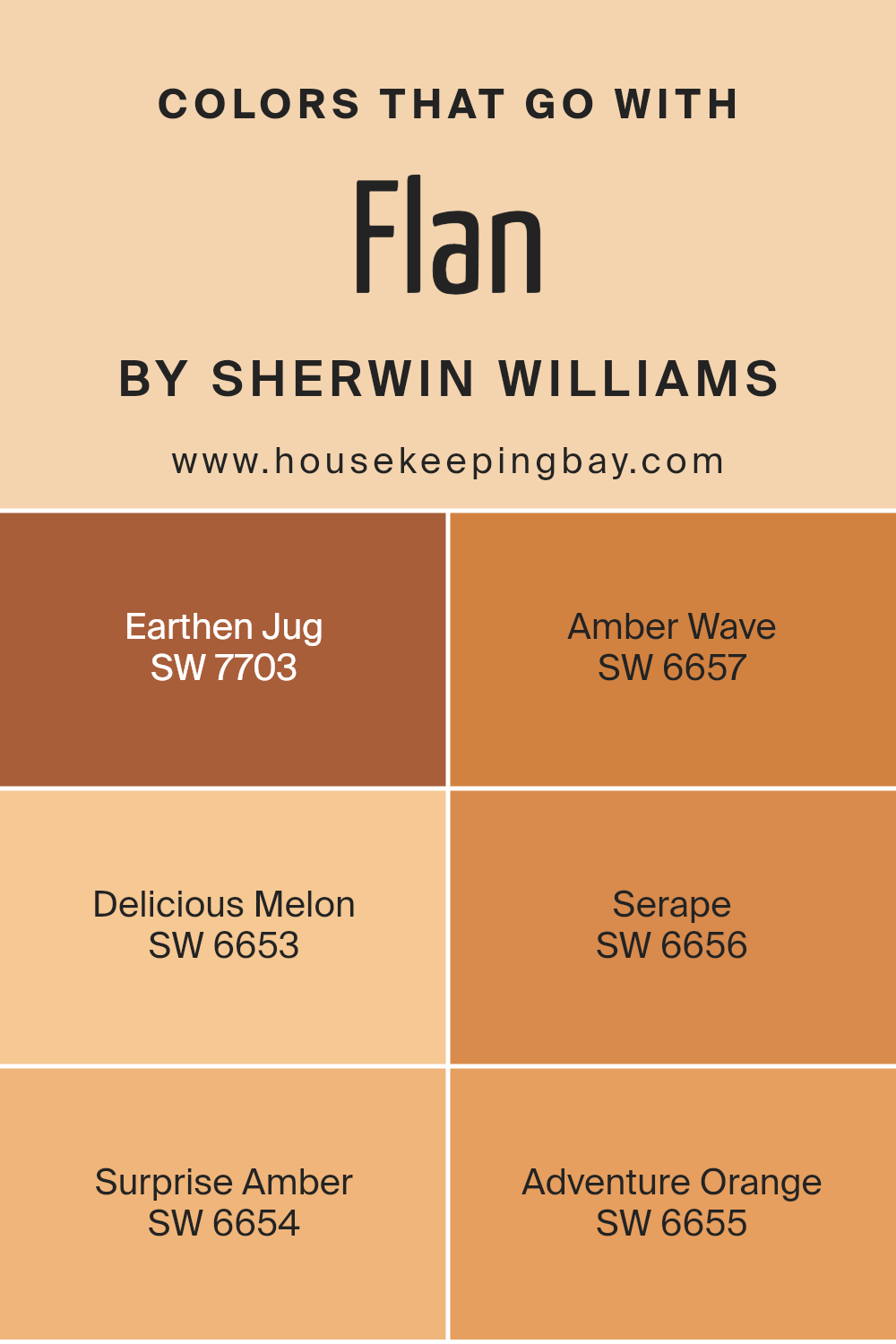
Colors that Go With Flan SW 6652 by Sherwin Williams
Selecting colors that complement Flan SW 6652 by Sherwin Williams is crucial when crafting a harmonious space. Colors such as SW 7703 – Earthen Jug pair well due to its rich, earthy tone. Earthen Jug brings warmth with its grounded, terracotta-like shade.
SW 6657 – Amber Wave’s golden hue accents Flan with a vibrant touch, creating an inviting atmosphere. Delicious Melon SW 6653 adds a soft, peachy note, enhancing a room’s warmth without overpowering. When paired, they create a cozy yet lively atmosphere that feels welcoming.
Colors like SW 6656 – Serape and SW 6654 – Surprise Amber extend the palette with their varied orange notes. Serape introduces a burnt orange that deepens the palette with its rustic feel. Surprise Amber complements with a lighter, cheerful hue that adds brightness to the space.
Adventure Orange SW 6655, with its lively and energetic color, seamlessly merges with Flan, providing a bold focal point.
Together, these colors enhance the overall appeal of the space by balancing warmth and energy, enriching any room’s aesthetic while maintaining cohesion and visual interest.
You can see recommended paint colors below:
- SW 7703 Earthen Jug
- SW 6657 Amber Wave
- SW 6653 Delicious Melon
- SW 6656 Serape
- SW 6654 Surprise Amber
- SW 6655 Adventure Orange
housekeepingbay.com
How to Use Flan SW 6652 by Sherwin Williams In Your Home?
Flan SW 6652 by Sherwin Williams is a warm, inviting color with rich, earthy undertones of yellow and beige. It creates a cozy atmosphere, making it an excellent choice for a variety of home spaces. In the living room, Flan can make the area feel comfortable and welcoming, perfect for gathering with family and friends.
Its warm tone pairs well with wood finishes or natural textures, enhancing the room’s warmth.
In the kitchen, this color works beautifully as an accent wall or for cabinetry, providing a bright yet soft backdrop that complements both modern and traditional styles. Flan also suits bedrooms, offering a restful environment that promotes relaxation. For a balanced look, pair it with whites or creams to enhance its warmth without making the space feel overwhelming.
This versatile color can also be used in bathrooms or hallways, adding a touch of sophistication and comfort without being overly bold.
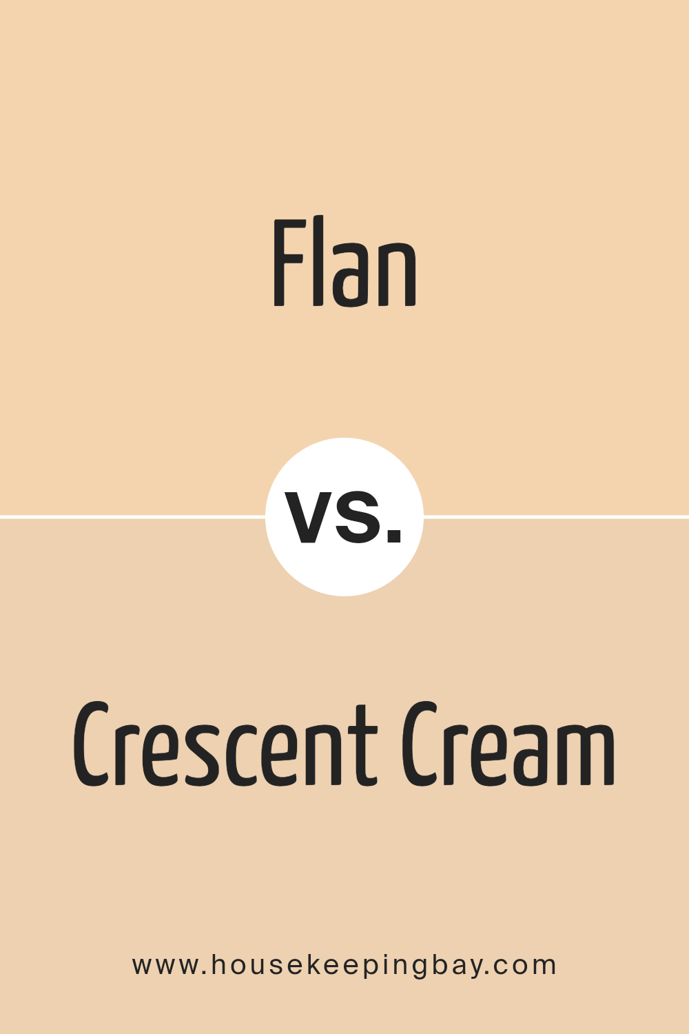
Flan SW 6652 by Sherwin Williams vs Crescent Cream SW 7721 by Sherwin Williams
Flan SW 6652 by Sherwin Williams is a warm and inviting shade, notable for its rich golden-yellow tone. It evokes feelings of comfort and coziness, making spaces feel welcoming and pleasant. This color is perfect for spaces where you want to feel warmth and brightness, such as kitchens or living rooms.
Crescent Cream SW 7721, also by Sherwin Williams, is a softer, lighter shade compared to Flan. It leans more towards a creamy beige with a touch of warmth, offering a subtle and gentle vibe. Crescent Cream works well in areas where you want a light, neutral background that doesn’t overpower the room.
It’s a great choice for creating a peaceful and airy atmosphere, suitable for bedrooms or hallways.
While Flan brings a vibrant, energetic feel, Crescent Cream’s understated presence promotes serenity and sophistication. Both colors enhance spaces in unique ways, providing different moods based on the desired atmosphere.
You can see recommended paint color below:
- SW 7721 Crescent Cream
housekeepingbay.com
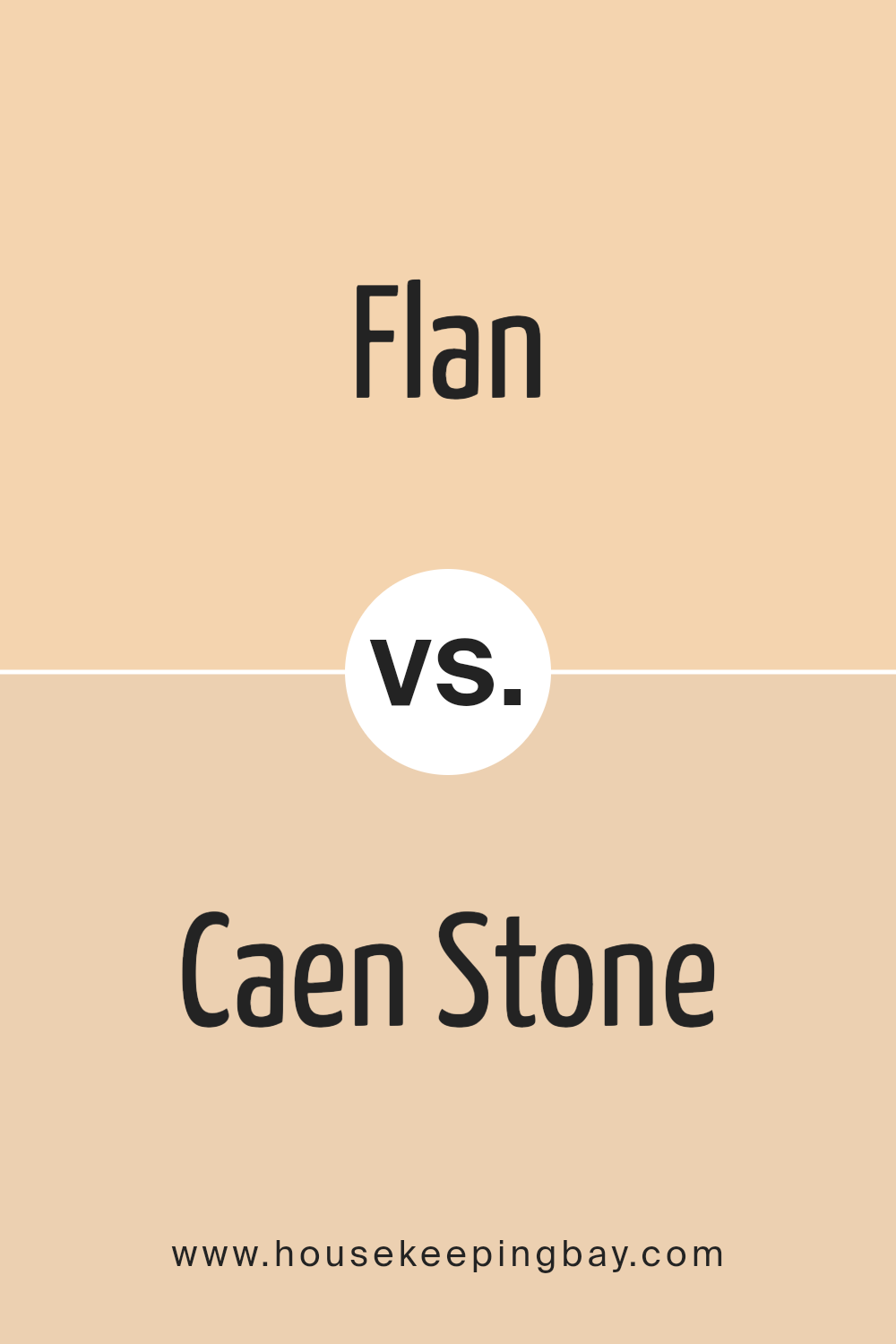
Flan SW 6652 by Sherwin Williams vs Caen Stone SW 0028 by Sherwin Williams
Flan SW 6652 by Sherwin Williams is a warm, golden yellow. It brings cheerful energy and adds a friendly touch to spaces, making rooms feel cozy and inviting. This color works well in kitchens or dining areas where a vibrant and uplifting atmosphere is desired.
Caen Stone SW 0028 is a soft, muted beige with subtle gray undertones. It’s a versatile neutral, perfect for creating a calm and elegant environment. This color pairs well with various palettes and fits beautifully in living rooms or bedrooms where a soothing backdrop is preferred.
When comparing Flan and Caen Stone, Flan radiates warmth and liveliness, making it ideal for active spaces. Caen Stone, though, offers a more understated and classic elegance, suitable for areas where relaxation is key. Flan draws attention with its sunny disposition, while Caen Stone provides a harmonious and easy-going feel, adapting well to different styles and decors.
You can see recommended paint color below:
- SW 0028 Caen Stone
housekeepingbay.com
Flan SW 6652 by Sherwin Williams vs Travertine SW 7722 by Sherwin Williams
Flan SW 6652 by Sherwin Williams is a warm, rich yellow-orange shade. It brings a sunny and cheerful feel to spaces, creating a welcoming atmosphere. This color works well in areas where warmth and brightness are desired, such as kitchens or living rooms. Its vibrant tone can inject energy into a room.
Travertine SW 7722, also by Sherwin Williams, is a very different hue. It is a soft, muted beige with subtle undertones, reminiscent of natural stone. Travertine has a calming and neutral quality, making it an excellent backdrop for various design styles.
It complements other colors without overpowering them, offering versatility and sophistication.
Flan injects warmth and energy, while Travertine provides a mellow and adaptable base.
Flan can stand out as a statement color, while Travertine serves as a neutral canvas that accommodates diverse accents. Both can enhance rooms, yet each carries unique character traits.
You can see recommended paint color below:
- SW 7722 Travertine
housekeepingbay.com
Flan SW 6652 by Sherwin Williams vs Inviting Ivory SW 6372 by Sherwin Williams
Flan SW 6652 and Inviting Ivory SW 6372, both by Sherwin Williams, offer warm and welcoming color choices with distinct character. Flan is a warm, sunny hue with a blend of soft yellow and a hint of orange, creating a cheerful and lively atmosphere. It brings energy and warmth to a space, making it great for kitchens or living areas where you want a bit of brightness.
Inviting Ivory, meanwhile, is a softer, creamier shade with a touch of beige. It provides a subtle, cozy backdrop and offers a sense of calm and comfort. This color works well in spaces where a relaxed, soothing environment is desired, such as bedrooms or reading nooks.
When used together, Flan can serve as an accent, adding pops of vibrant warmth against the gentle, neutral canvas of Inviting Ivory. Both colors are versatile, complementing a range of home styles, from modern to traditional.
You can see recommended paint color below:
- SW 6372 Inviting Ivory
housekeepingbay.com
Flan SW 6652 by Sherwin Williams vs Hinoki SW 7686 by Sherwin Williams
Flan SW 6652 and Hinoki SW 7686, both by Sherwin Williams, offer different vibes for any space. Flan SW 6652 is a warm, rich yellow that feels lively and cheerful. It can brighten a room, adding a sunny and positive atmosphere. This color works well in spaces where you want energy and warmth, like kitchens or living rooms.
In contrast, Hinoki SW 7686 presents a more subdued, soft taupe color. It feels calm and soothing, creating a relaxing environment. This makes it perfect for bedrooms or spaces where you want a neutral, comforting backdrop.
The color has a hint of warmth, making it feel inviting without being too bold.
Both colors have their strengths, with Flan SW 6652 bringing vitality and Hinoki SW 7686 offering understated elegance. Depending on the mood you desire, each can suit different needs, from vibrant to calm settings.
You can see recommended paint color below:
- SW 7686 Hinoki
housekeepingbay.com
Flan SW 6652 by Sherwin Williams vs Frangipane SW 6645 by Sherwin Williams
Flan SW 6652 and Frangipane SW 6645, both from Sherwin Williams, exhibit warm, inviting vibes but with distinct personalities. Flan presents as a cheerful yellow-orange, reminiscent of golden desserts and sunlit mornings. It’s bright, full of character, and can bring a sense of energy to a space. Perfect for kitchens or dining areas, Flan adds a sunny demeanor that feels uplifting.
Frangipane, which is slightly more subdued, leans towards a soft, buttery yellow. It’s less intense than Flan, providing a gentle warmth that subtly enhances a room without overpowering it. Frangipane tends to suit spaces where a more mellow and calming aura is preferred, such as bedrooms or living areas.
Both colors have an inviting warmth, yet while Flan energizes with its boldness, Frangipane gently cossets with its softness. Choosing between them depends on whether one seeks vibrant stimulation or a gentle, comforting glow.
You can see recommended paint color below:
- SW 6645 Frangipane
housekeepingbay.com
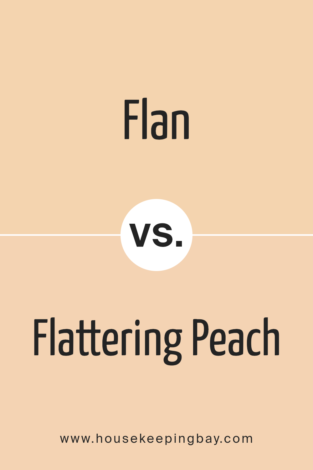
Flan SW 6652 by Sherwin Williams vs Flattering Peach SW 6638 by Sherwin Williams
Flan SW 6652 by Sherwin Williams is a warm, neutral beige with hints of yellow, giving it a cozy, inviting vibe. It’s versatile, acting as a great backdrop in rooms wanting warmth without overwhelming. This color works well in living spaces, providing a comforting atmosphere, and pairs excellently with other earth tones or even bold colors for a balanced look.
Flattering Peach SW 6638, also by Sherwin Williams, brings a soft, cheerful peach hue to the forefront. It’s more vibrant and colorful than Flan, ideal for spaces needing uplift and energy.
Flattering Peach can brighten a room while still feeling warm, making it great for bedrooms or kitchens.
In comparison, Flan is more subdued and classic, ideal for creating a neutral background, while Flattering Peach adds more personality and flair to a room. Both colors can enhance a space, with Flan being more understated and Flattering Peach offering more pop.
You can see recommended paint color below:
- SW 6638 Flattering Peach
housekeepingbay.com
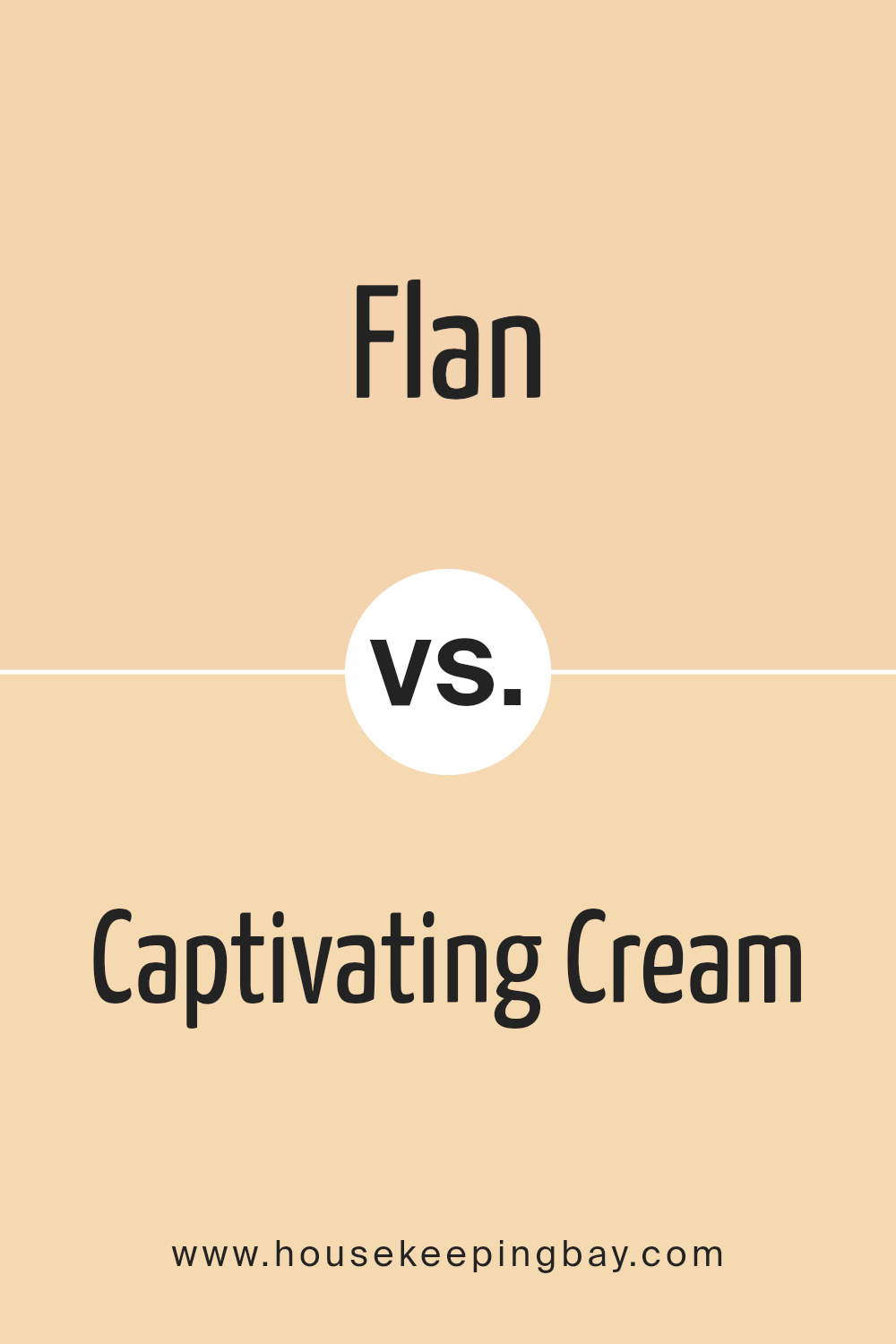
Flan SW 6652 by Sherwin Williams vs Captivating Cream SW 6659 by Sherwin Williams
Flan SW 6652 and Captivating Cream SW 6659 by Sherwin Williams are both warm tones, but they each bring unique qualities to a space. Flan SW 6652 is a rich, golden hue with a lively, cheerful feel. It can add a cozy, welcoming atmosphere to any room, making it great for living areas or kitchens. Its depth gives it a bold character without being overwhelming.
Captivating Cream SW 6659, in contrast, is a lighter, softer color. This creamy shade tends to brighten up spaces, offering a gentle warmth without the intensity of Flan. It feels soothing and works well in areas where a calm, airy vibe is desired, such as bedrooms or bathrooms.
While both colors are inviting, Flan offers a more energetic presence, whereas Captivating Cream provides a subtle, elegant touch. Choosing between them depends on the desired mood and function of a room.
You can see recommended paint color below:
- SW 6659 Captivating Cream
housekeepingbay.com
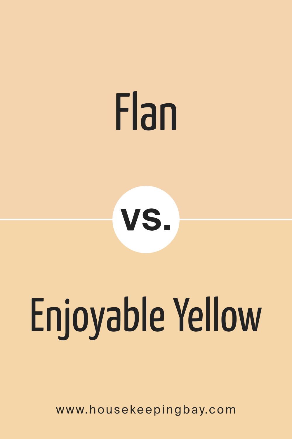
Flan SW 6652 by Sherwin Williams vs Enjoyable Yellow SW 6666 by Sherwin Williams
Flan SW 6652 by Sherwin Williams and Enjoyable Yellow SW 6666 both bring warmth to a space, but they offer different vibes. Flan SW 6652 is a creamy yellow with a hint of orange, creating a cozy and inviting atmosphere. It feels rich and comforting, making it a great choice for kitchens or living rooms where you want a warm touch.
Enjoyable Yellow SW 6666, in contrast, is a brighter and lighter shade of yellow. It brings energy and cheerfulness to a room, ideal for spaces needing a lively boost. Think of sunny, happy days when you see this color—it’s perfect for playrooms or any area you want to feel more vibrant.
Both colors can uplift a room, but their effects differ. Flan offers a more subdued, warm glow, while Enjoyable Yellow provides a burst of brightness. Choose Flan for a cozy feel, or Enjoyable Yellow for a lively, energetic space.
You can see recommended paint color below:
- SW 6666 Enjoyable Yellow
housekeepingbay.com
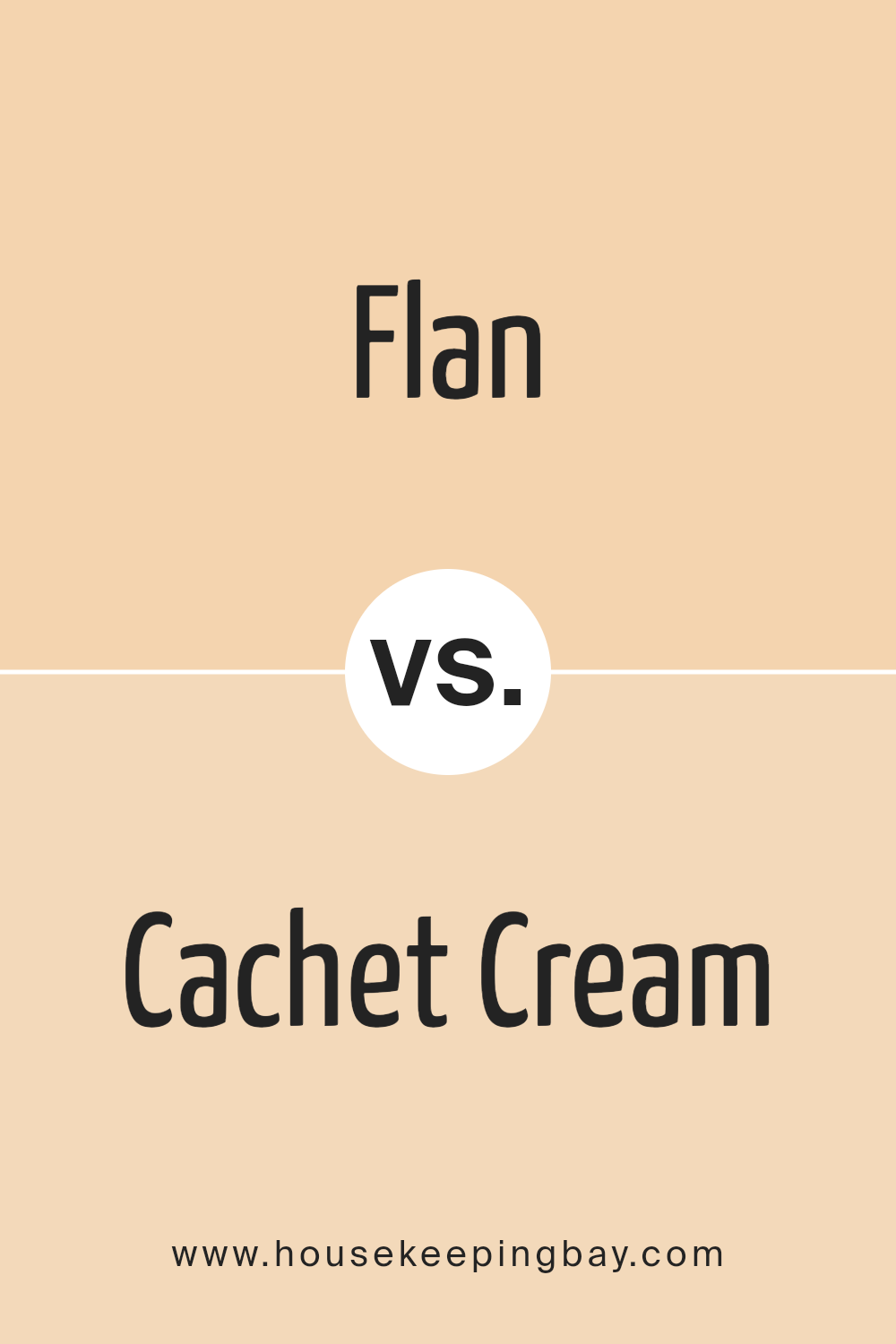
Flan SW 6652 by Sherwin Williams vs Cachet Cream SW 6365 by Sherwin Williams
Flan SW 6652 by Sherwin Williams is a warm, inviting color with a soft, cheerful energy. It’s a rich, golden hue that feels cozy and welcoming, like a comforting bowl of warm pudding. Flan’s brightness makes it a good choice for spaces that need a little liveliness and vibrancy without being too bold or overwhelming.
Cachet Cream SW 6365, in contrast, is a lighter, more subdued shade. It has a creamy, soft yellow tone that feels elegant and versatile. Cachet Cream adds a gentle warmth to rooms, creating a sense of quiet comfort.
It acts as a perfect backdrop, allowing other colors in the space to shine.
While Flan brings a lively and friendly atmosphere, Cachet Cream offers a calm and understated elegance. Flan attracts attention and adds personality, while Cachet Cream serves as a neutral, soothing base.
Both colors can change the mood of a space by introducing different levels of warmth and character.
You can see recommended paint color below:
- SW 6365 Cachet Cream
housekeepingbay.com
This shade of yellow exudes a gentle warmth, perfect for creating a cozy ambiance in living rooms, kitchens, or bedrooms.
It manages to be vibrant without overwhelming, striking a balance that adds character while allowing other design elements to shine.
When I compare Flan with other yellows, its creamy undertone stands out, providing a subtle elegance. It complements a variety of palettes, working well with both earthy tones and bolder colors. Whether used as an accent or a primary wall color, SW 6652 Flan offers versatility, blending seamlessly with contemporary or traditional styles.
I am particularly impressed by how it changes under different lighting conditions. Its adaptability makes it a reliable choice for those looking to refresh their home with a subtle yet distinct charm.
Overall, SW 6652 Flan is an excellent option for anyone wanting to add warmth and sophistication to their environment. This color doesn’t overpower; instead, it enhances and enriches a space, making it feel more inviting.
I find it a delightful choice for bringing a touch of elegance to any room, tying together various design elements with grace.
housekeepingbay.com
Ever wished paint sampling was as easy as sticking a sticker? Guess what? Now it is! Discover Samplize's unique Peel & Stick samples. Get started now and say goodbye to the old messy way!
Get paint samples


