Ash Violet SW 6549 by Sherwin Williams
A Fresh Take on Classic Purple
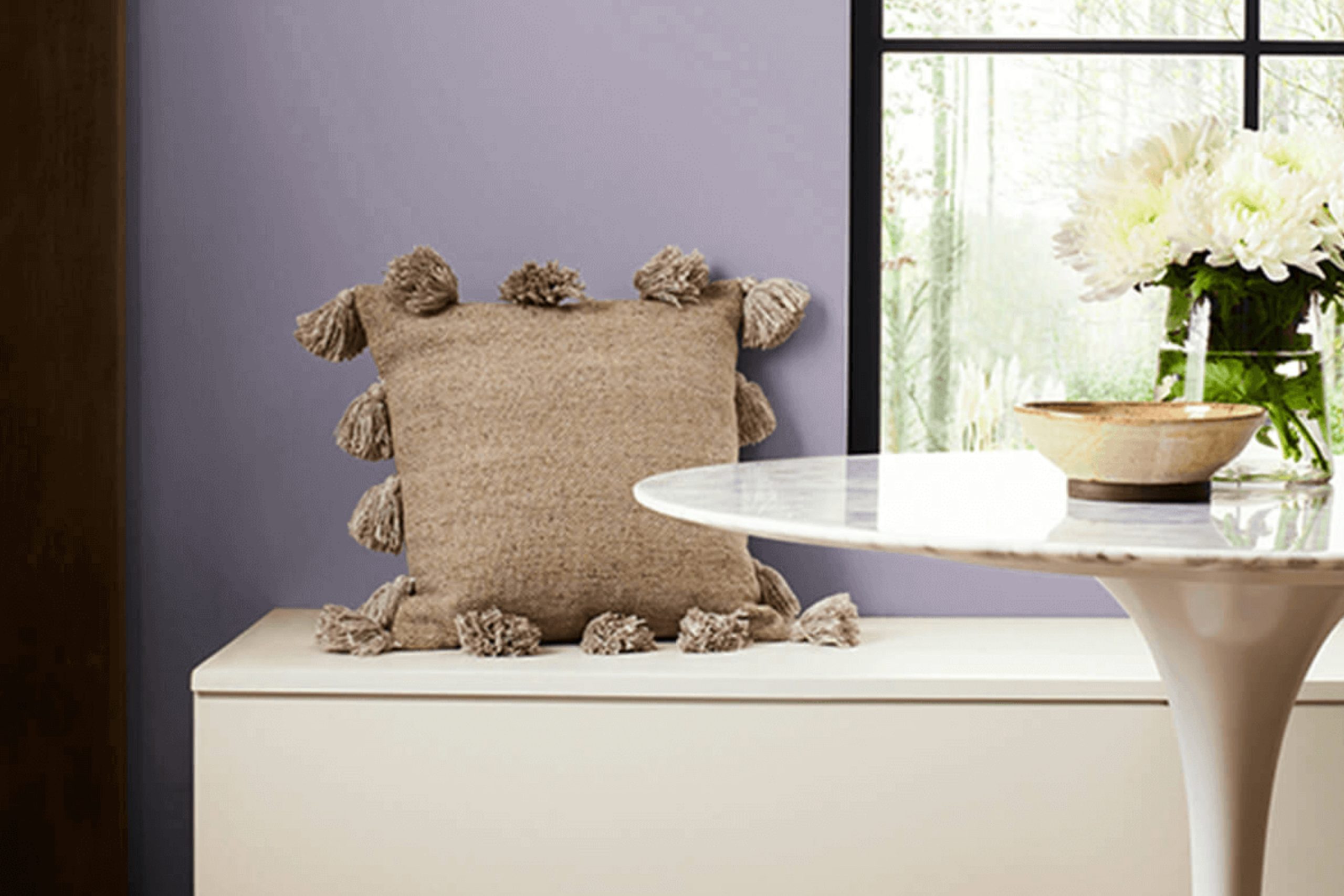
Are you considering a fresh paint color for your space? Let me introduce you to SW 6549 Ash Violet by Sherwin Williams. This unique shade beautifully balances gray and violet tones, offering a subtle twist on more traditional neutrals.
If you’re after a color that adds a hint of personality without overwhelming your room, Ash Violet might just be the perfect pick. Perfect for various settings, from bedrooms to living rooms, Ash Violet pairs well with both modern and traditional decor.
It’s muted enough to act as a base for brighter colors or rich textures, yet distinctive enough to stand alone for a quiet yet powerful impact.
Whether you’re refreshing an old space or starting a new design project, you’ll find that Ash Violet brings a soothing yet sophisticated vibe to your environment.
via sherwin-williams.com
What Color Is Ash Violet SW 6549 by Sherwin Williams?
Table of Contents
Ash Violet SW 6549 by Sherwin Williams is a unique and muted shade of violet with hints of gray that give it a sophisticated and versatile appearance. This color offers a serene vibe, making it perfect for creating a calming atmosphere in any room. Its understated elegance allows it to blend beautifully with various interior design styles, particularly modern, minimalist, and Scandinavian decors.
Ash Violet works well in spaces where you desire a gentle, yet distinct touch of color without overwhelming the senses. It is especially suited for bedrooms, living rooms, and bathrooms, where its soothing qualities can be most appreciated.
When it comes to pairing materials and textures with Ash Violet, consider soft, natural fabrics like linen and cotton to maintain a light and airy feel. Wood, especially lighter tones like beech and oak, complements the softness of the violet shade, enhancing the overall warmth of the space. For a more contemporary look, incorporating metals such as brushed silver or matte black can create a sophisticated contrast.
This color also pairs well with neutral tones, such as soft whites, grays, and even subdued blues, which help to balance the coolness of the violet, creating a harmonious and inviting space.
housekeepingbay.com
Is Ash Violet SW 6549 by Sherwin Williams Warm or Cool color?
Ash Violet SW 6549 by Sherwin Williams is a unique shade that brings a subtle touch of color to any space. This color is a soft blend, lying somewhere between light purple and gray, making it versatile for various home settings. As a muted color, Ash Violet can serve as a soothing background in bedrooms, enhancing a restful atmosphere.
It is also elegant enough for living areas, adding a hint of sophistication without overwhelming the space with intense color. When used in well-lit areas, Ash Violet can appear more vibrant, making the room feel fresh and airy. In contrast, in spaces with less natural light, it can add depth and warmth, proving to be adaptable in different lighting conditions.
Whether you’re aiming for a modern, minimalistic look or a cozy, traditional feel, Ash Violet can be paired effectively with whites, deep blues, or even metallic accents for a complete, harmonious interior. Thus, it’s ideal for anyone looking to introduce a soft yet rich hue into their home decor.
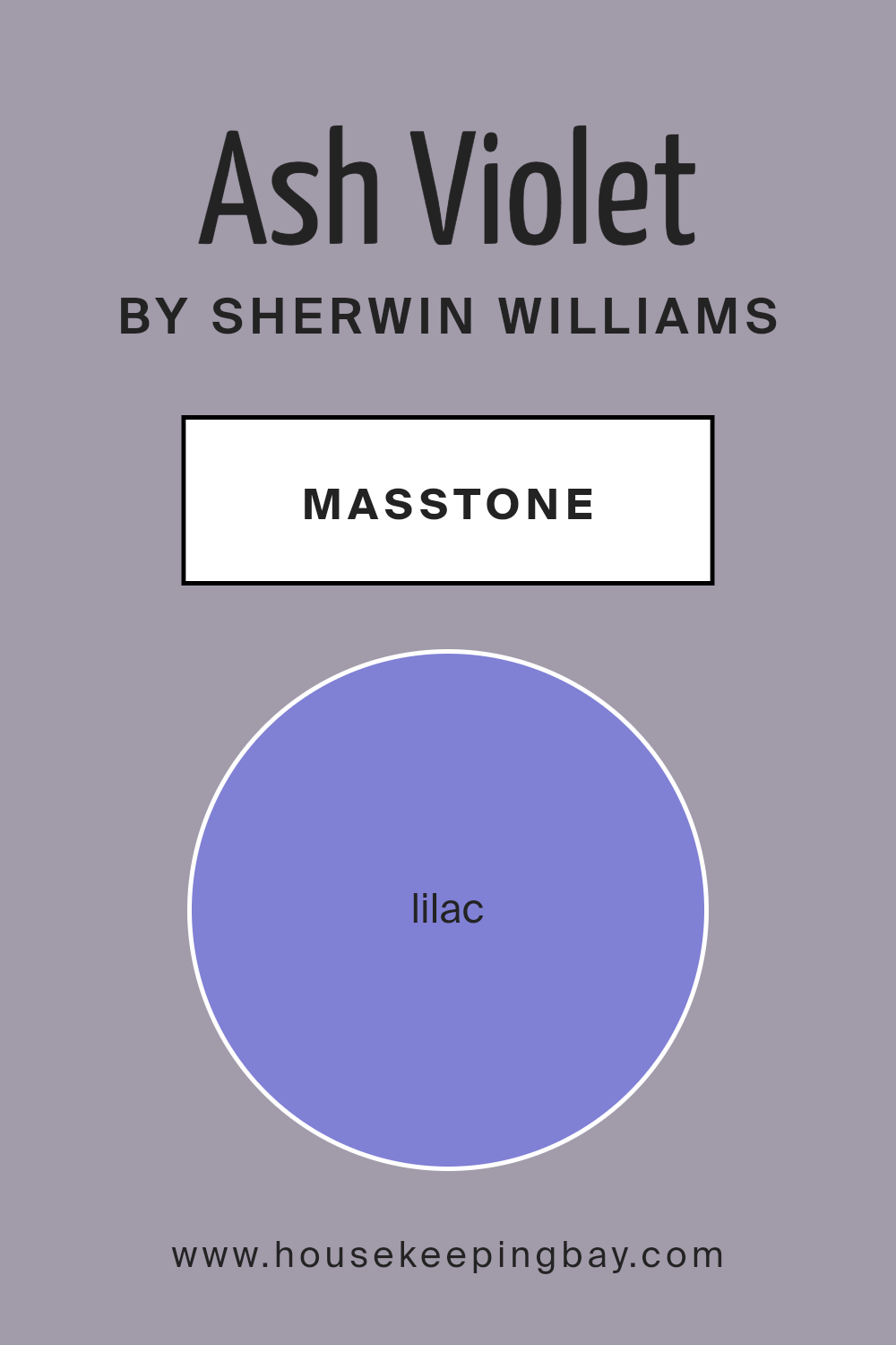
What is the Masstone of the Ash Violet SW 6549 by Sherwin Williams?
Ash Violet SW 6549 by Sherwin Williams, with a masstone of Lilac (#8080D5), offers a soothing presence with its soft, muted purple hue. This color, resembling a gentle lavender, exudes warmth and comfort.
The subtle strength of Ash Violet allows it to blend beautifully in various areas of a home, working especially well in bedrooms or living spaces where a calming atmosphere is desired. Its lilac undertone provides a restful quality without overpowering the room’s decor. Ash Violet adapts nicely with natural light, appearing more vibrant during the day and cozier at night.
You can pair it with light neutrals like creams or grays to maintain a light, airy feel. For those seeking a bit of contrast, darker shades like deep blues or rich greens can complement its purple tones. Ash Violet offers a versatile backdrop that enhances the aesthetics of any room while maintaining a soothing vibe. It’s especially suitable for creating a peaceful sanctuary in your home.
housekeepingbay.com
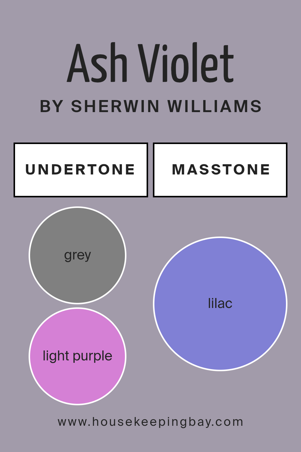
Undertones of Ash Violet SW 6549 by Sherwin Williams
Ash Violet SW 6549 by Sherwin Williams is a complex hue packed with diverse undertones that significantly influence its appearance in various lighting and settings. This color’s undertones range from grays to purples and blues, giving it a versatile and dynamic nature. Grey undertones provide a stable, neutral base that can make the color appear more subdued and calming. Light purple and pale pink undertones add a soft, gentle touch, making the color warmer and more inviting.
When Ash Violet is used on interior walls, these undertones play a crucial role in how the color interacts with light and other elements in the room. For instance, in a space with plenty of natural light, the light purple and pale pink undertones might become more pronounced, giving the room a subtle warmth and softness. Conversely, in a room with limited natural light, the grey undertones might dominate, making the color appear cooler and more muted.
The addition of light blue and mint undertones infuses a hint of freshness and can help in creating a soothing atmosphere. These cool undertones can counterbalance warmer furnishings or wood accents, creating a harmonious look. The complexity of the undertones means that Ash Violet can look slightly different depending on the colors it is paired with and the type of lighting, making it a versatile choice for interior walls.
In summary, the undertones of Ash Violet SW 6549 affect not only how the color looks but also how it feels within a space, impacting the overall mood and aesthetic of a room.
housekeepingbay.com
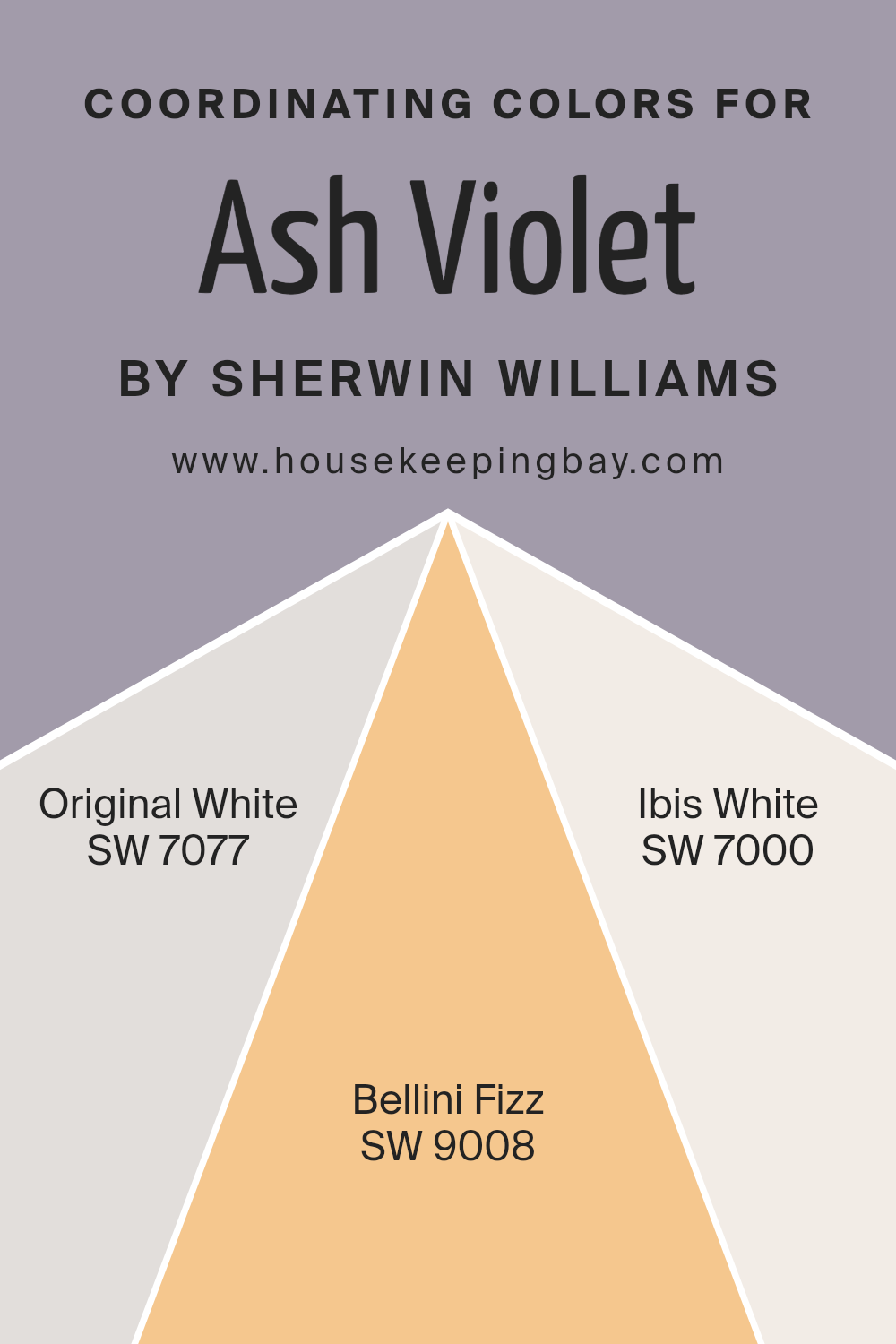
Coordinating Colors of Ash Violet SW 6549 by Sherwin Williams
Coordinating colors are chosen to complement a primary color, enhancing the overall aesthetic of a space. When working with a base shade like Ash Violet SW 6549 by Sherwin Williams, picking the right coordinating colors helps to create a balanced and harmonious look. For Ash Violet, a deep and subtle hue, coordinating colors such as Original White SW 7077, Bellini Fizz SW 9008, and Ibis White SW 7000 have been suggested to effectively highlight its unique tone.
Original White SW 7077 is a clean and neutral white that acts as a perfect backdrop, allowing Ash Violet to stand out without overwhelming the senses. It provides a calm and unobtrusive foundation that works well in any lighting.
Bellini Fizz SW 9008 offers a gentle contrast with its light, creamy peach tone, lending a soft warmth that pairs beautifully with the cooler undertones of Ash Violet. Ibis White SW 7000 is another white, but with a subtle hint of pink that adds a touch of sophistication and depth when used alongside bolder colors like Ash Violet. This selection ensures that the space feels cohesive yet dynamic, making it easy to achieve a professional-looking interior design.
You can see recommended paint colors below:
- SW 7077 Original White
- SW 9008 Bellini Fizz
- SW 7000 Ibis White
housekeepingbay.com
How Does Lighting Affect Ash Violet SW 6549 by Sherwin Williams?
Lighting has a significant impact on how we perceive colors. The quality and type of light in a room can change how a color looks on the walls. For instance, Ash Violet SW 6549 by Sherwin Williams may appear differently under various lighting conditions.
In natural light, colors can look more vibrant and true to their hue. Ash Violet, a muted shade with both gray and purple undertones, can reflect these subtleties beautifully under natural sunlight. Rooms that face south typically receive the most sunlight throughout the day. In these rooms, Ash Violet will likely appear lighter and more vivid, showcasing its purple hue prominently. The effect can be soothing and pleasant.
In contrast, north-facing rooms get less direct sunlight and have a cooler light, which can make colors appear slightly darker and more subdued. In these conditions, Ash Violet might lean more towards its gray undertones, giving off a more reserved and subtle appearance.
East-facing rooms see bright light in the morning, followed by softer light as the day progresses. In the morning light, Ash Violet will present more of its purple tones but will transition towards a softer, gray look in the afternoon and evening. This shift can make the room feel differently energized at various times of the day.
West-facing rooms experience the opposite lighting pattern. Morning light in these rooms is less intense, making Ash Violet look softer and more shadowy in the early hours. As the sun sets, the color can warm up and become vibrant due to the golden hues of the sunlight, highlighting the richer purple undertones of Ash Violet.
Artificial lighting, like LED or incandescent bulbs, also affects how colors are seen. LED lights may enhance the cooler undertones in Ash Violet, whereas incandescent lighting can warm it up, pulling out the purple shades and softening the gray.
Overall, Ash Violet’s appearance can vary greatly depending on the type of light it is under, making it a versatile choice for different rooms and settings.
housekeepingbay.com
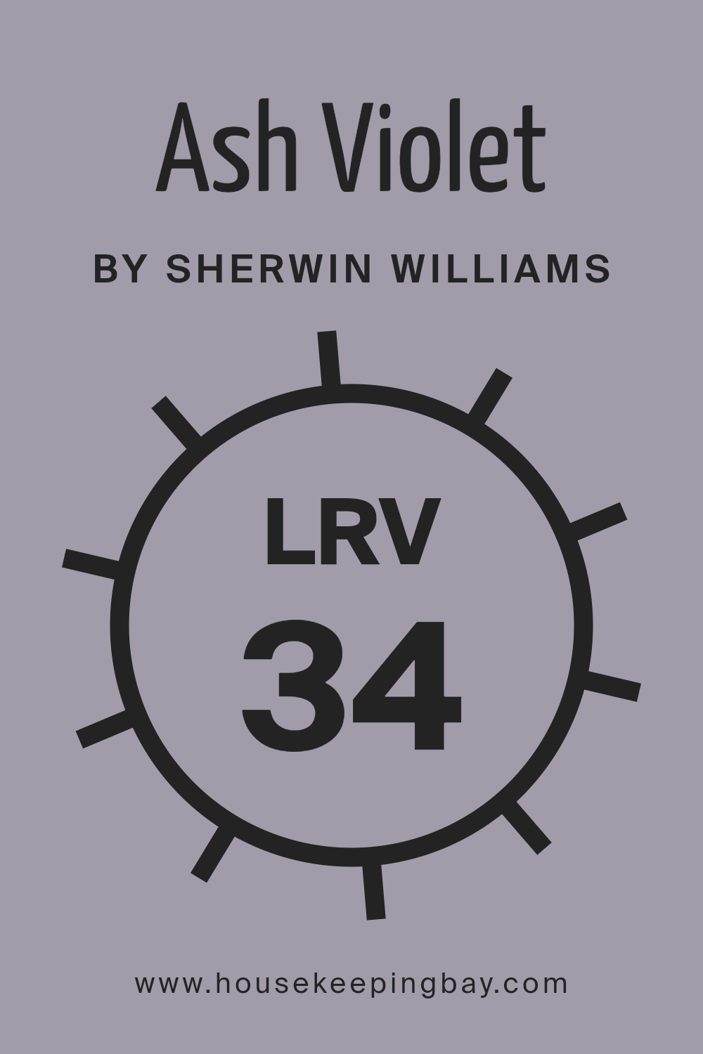
What is the LRV of Ash Violet SW 6549 by Sherwin Williams?
Light Reflectance Value (LRV) measures the percentage of light a paint color reflects from or absorbs into a painted surface. LRV scales range from 0 to 100, with 0 absorbing all light (think black) and 100 reflecting all light (think white).
This value helps you predict how light or dark a color will look on a wall and can be crucial for creating the desired mood or atmosphere in a room. Choosing a paint with a suitable LRV ensures that a space will use light effectively, appearing neither too bright nor too gloomy, based on the amount of natural or artificial lighting available.
Given that the LRV of Ash Violet SW 6549 by Sherwin Williams is 34.14, it is considered a medium-range color, absorbing more light than it reflects. This means it will look richer and darker, making it ideal for spaces that you wish to feel cozier and slightly more introspective. In rooms with limited natural light, this color might appear even darker, emphasizing a subdued, sophisticated tone. Conversely, in well-lit rooms, the subtle violet hues can become more prominent, offering a gentle, soothing visual impact.
housekeepingbay.com
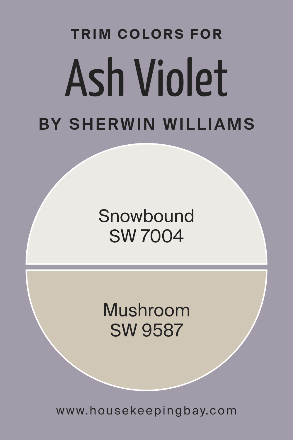
What are the Trim colors of Ash Violet SW 6549 by Sherwin Williams?
Trim colors are selected to complement or accentuate the main color used on walls, and choosing the right ones can greatly improve the overall appearance of a room. For Ash Violet SW 6549 by Sherwin Williams, an elegant, soothing bluish-purple hue, pairing with strategic trim colors like SW 7004 – Snowbound and SW 9587 – Mushroom can enhance the sophistication of the space.
Snowbound offers a clean, crisp white with subtle gray undertones, which helps in creating a sharp contrast that can make the walls pop, offering a fresh and refined look. Meanwhile, Mushroom serves as a warm neutral with earthy undertones, softening the transitions between the vivid Ash Violet and the trim, delivering a more seamless and harmonious connection.
Snowbound SW 7004 by Sherwin Williams is a bright yet soft white that contains a hint of gray. Its soothing quality makes it a popular choice for creating a clarified and neat boundary that highlights the richness of darker shades like Ash Violet.
On the other hand, Mushroom SW 9587 brings a gentle warmth to the room, a medium gray-brown that pairs effortlessly with a variety of colors, lending a subtle and grounding effect that complements deeper tones. These choices allow for a versatile approach to decorating, facilitating either a bold or understated frame for the vibrant walls, depending on the desired outcome.
You can see recommended paint colors below:
housekeepingbay.com
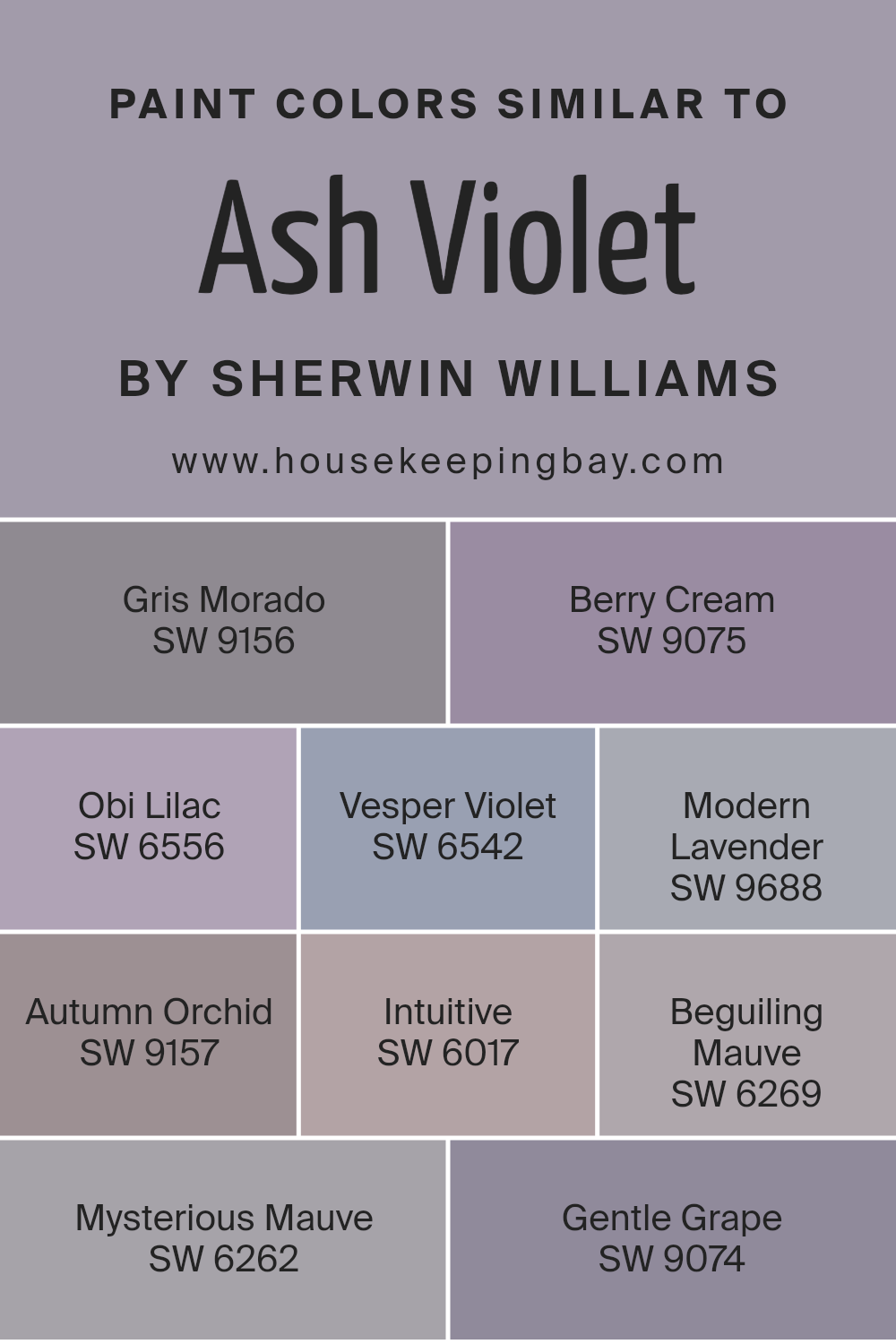
Colors Similar to Ash Violet SW 6549 by Sherwin Williams
Similar colors play a vital role in design by creating a harmonious environment that is pleasing to the eye. They work effectively together because they share common hues, which allows for a smooth visual flow. For instance, colors similar to Sherwin Williams’ Ash Violet (SW 6549) enhance the aesthetic cohesion in a space, providing a seamless transition from one shade to another. This gentle gradation of colors can make small rooms appear larger and give a calming effect to the atmosphere.
Sherwin Williams has a palette of colors that are closely related to Ash Violet. Gris Morado (SW 9156) has a subtle gray tone with a touch of purple, providing a sophisticated yet muted backdrop that pairs well with more vibrant colors.
Berry Cream (SW 9075) offers a soft, creamy pink that adds a light, airy feel to any room. Obi Lilac (SW 6556) is a delicate purple with a hint of gray, ideal for creating a serene space. Vesper Violet (SW 6542) is deeper and richer, making it perfect for accent walls or furniture. Modern Lavender (SW 9688) brings a contemporary twist with its vibrant, yet soft purple hue.
Autumn Orchid (SW 9157) combines gray with warm purple, providing a cozy yet refined look. Intuitive (SW 6017) is a gentle mauve that works beautifully in peaceful, restful areas. Beguiling Mauve (SW 6269) has a dusky lavender shade that adds depth and intrigue to interiors.
Mysterious Mauve (SW 6262) is darker, offering a touch of mystery and sophistication. Lastly, Gentle Grape (SW 9074) features a muted purple, perfect for creating a soothing and inviting environment. These similar colors ensure design elements flow together seamlessly, making decorating simpler and more cohesive.
You can see recommended paint colors below:
- SW 9156 Gris Morado
- SW 9075 Berry Cream
- SW 6556 Obi Lilac
- SW 6542 Vesper Violet
- SW 9688 Modern Lavender
- SW 9157 Autumn Orchid
- SW 6017 Intuitive
- SW 6269 Beguiling Mauve
- SW 6262 Mysterious Mauve
- SW 9074 Gentle Grape
housekeepingbay.com
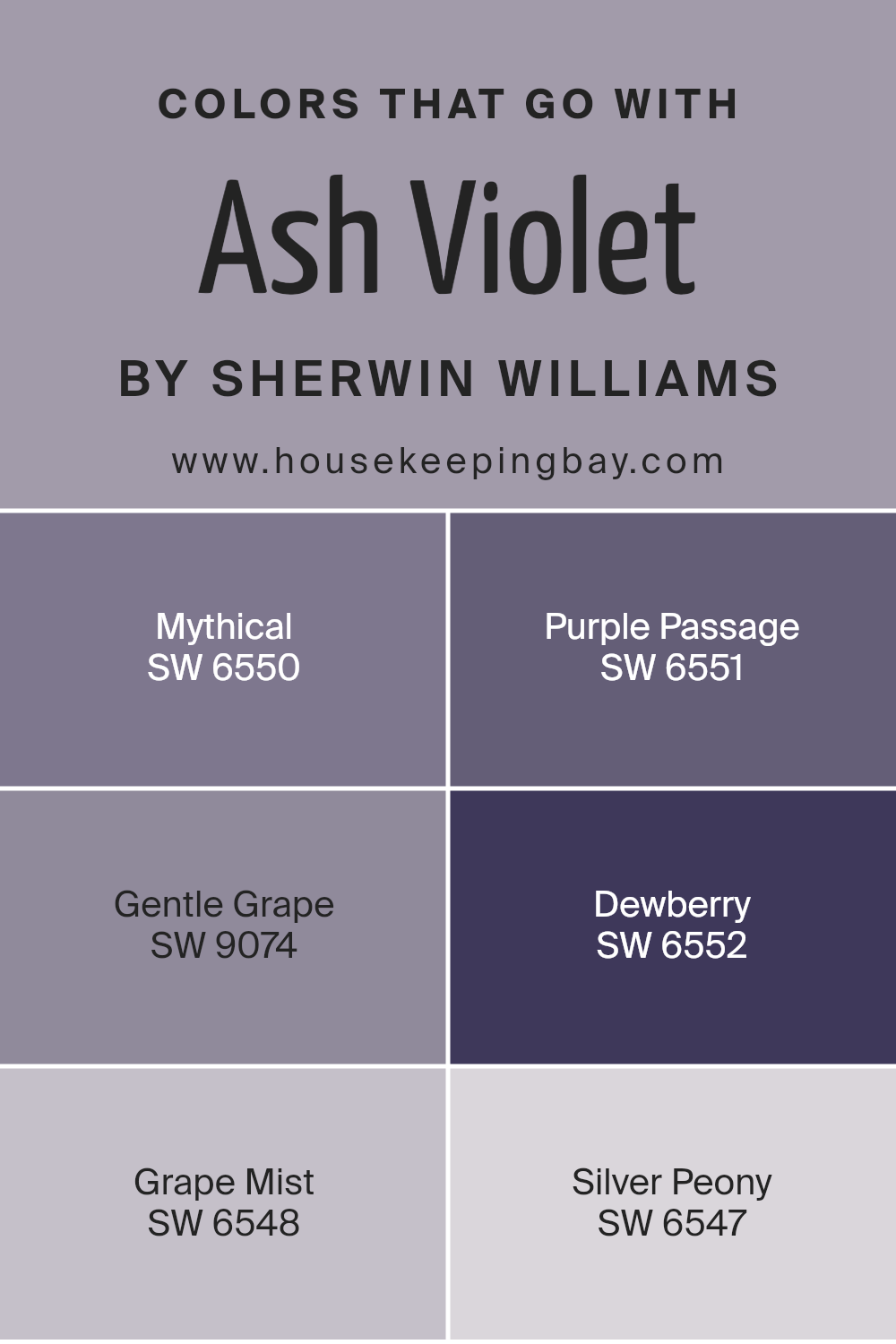
Colors that Go With Ash Violet SW 6549 by Sherwin Williams
Choosing the right colors to pair with Ash Violet SW 6549 by Sherwin Williams is essential because they can significantly affect the mood and aesthetic appeal of a space. Complementary colors can enhance Ash Violet’s unique shade, creating a balanced and visually appealing look.
For example, Mythical SW 6550, a deep and vibrant purple, adds a bold contrast that highlights Ash Violet’s softer tones, enriching the overall feel of the room. It’s akin to adding a layer of sophistication and depth. Similarly, Purple Passage SW 6551 provides a slightly lighter purple shade, which softens the look for a more refined atmosphere, lending a touch of gentle elegance.
Gentle Grape SW 9074, with its muted lavender hue, softly pairs with Ash Violet for a serene and harmonious environment, ideal for promoting a calming effect. Dewberry SW 6552, which offers a richer and darker purple, works to create a regal and luxurious vibe when used alongside Ash Violet.
Grape Mist SW 6548 is a lighter and more subtle option that can open up the space, making it feel airy and more spacious, and Silver Peony SW 6547 provides a fairly neutral option with a hint of soft lilac, perfect for creating a light and thoughtful space where every element gently complements each other. These color combinations provide flexible options depending on the desired impact, whether looking for contrast, harmony, or soft enhancement.
You can see recommended paint colors below:
- SW 6550 Mythical
- SW 6551 Purple Passage
- SW 9074 Gentle Grape
- SW 6552 Dewberry
- SW 6548 Grape Mist
- SW 6547 Silver Peony
housekeepingbay.com
How to Use Ash Violet SW 6549 by Sherwin Williams In Your Home?
Ash Violet SW 6549 by Sherwin Williams is a unique, versatile shade of paint that adds a soft and subtle touch of color to any space. Its muted purple hue with gray undertones makes it an excellent choice for those looking to add a bit of personality to their home without overwhelming the senses.
This color works well in bedrooms, creating a soothing atmosphere that’s perfect for relaxing. It can also bring a fresh feel to living rooms or bathrooms, pairing nicely with whites, grays, and even bolder colors like navy or emerald green for a more dynamic look.
When using Ash Violet, consider applying it on an accent wall to serve as a gentle backdrop for artwork or furniture. In smaller spaces like a powder room, painting all the walls this color can create a cohesive, sophisticated look. For a modern twist, combine it with metallic accents, such as in frames or light fixtures, to make the space feel elegant and well-coordinated.
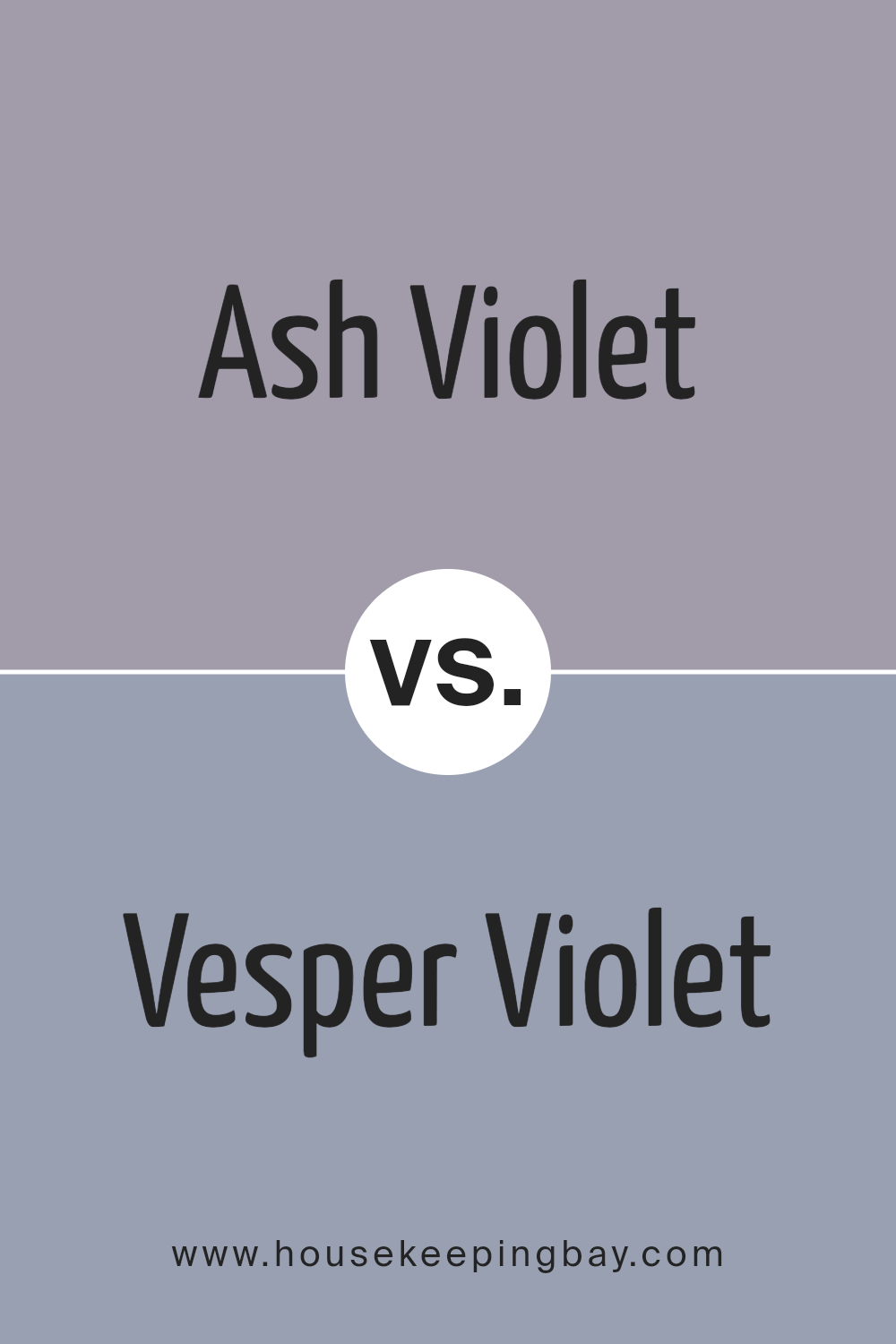
Ash Violet SW 6549 by Sherwin Williams vs Vesper Violet SW 6542 by Sherwin Williams
Ash Violet SW 6549 and Vesper Violet SW 6542 from Sherwin Williams are both shades of violet, but they present unique tones. Ash Violet has a muted, soft quality, adding a subtle hint of elegance to any space. It works well in areas where you want a calm and soothing atmosphere without a very vibrant hue. This color pairs nicely with light grays and whites for a serene palette.
In contrast, Vesper Violet is darker and richer, providing a bit more drama and sophistication. This shade is perfect if you’re looking to make a bolder statement in a room. It pairs well with dark charcoals or deep greens, creating a more luxurious and enveloping feel.
Both colors offer versatility and can be used in various decor styles, whether modern or traditional, depending on how they are matched with other colors and accessories.
You can see recommended paint color below:
- SW 6542 Vesper Violet
housekeepingbay.com
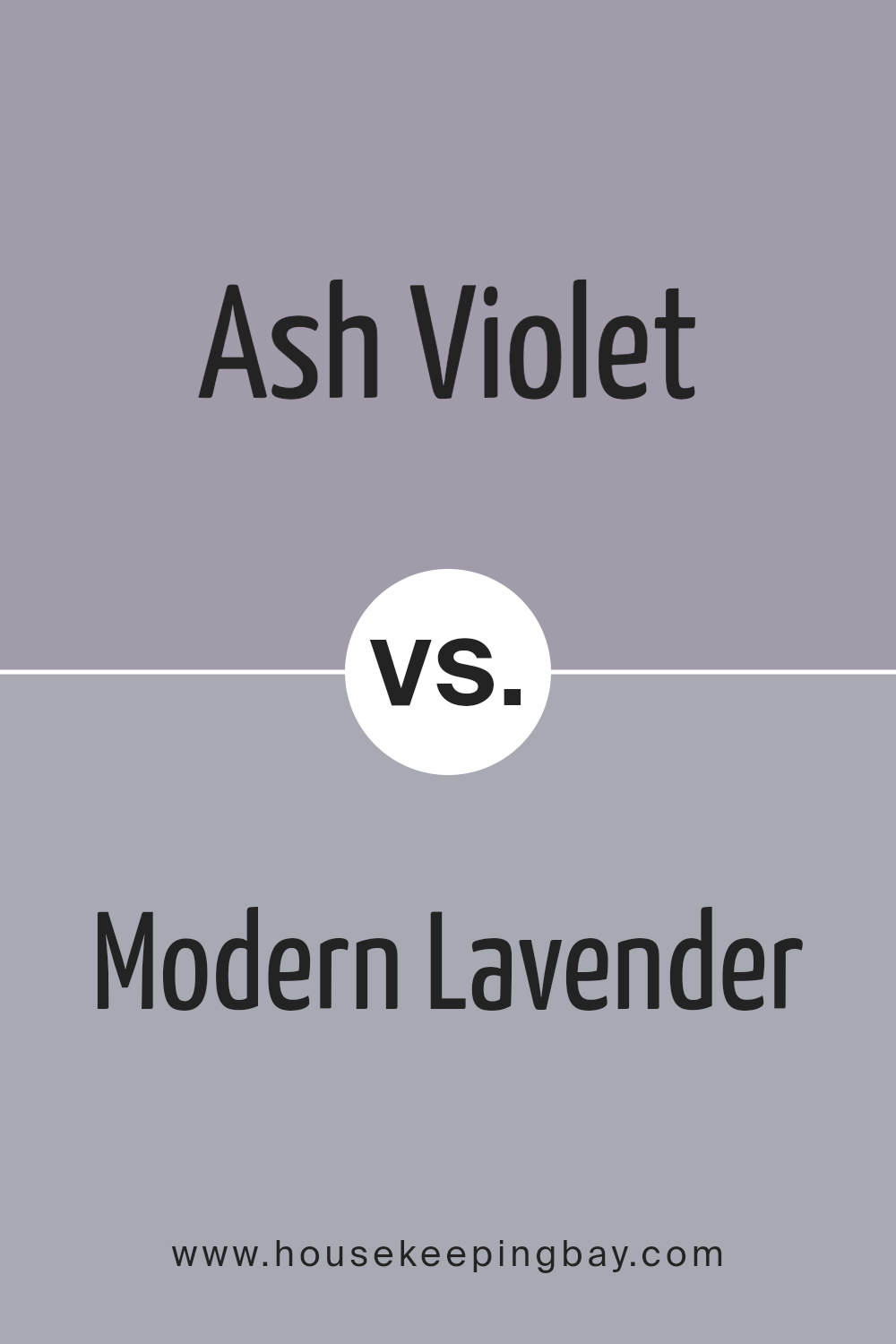
Ash Violet SW 6549 by Sherwin Williams vs Modern Lavender SW 9688 by Sherwin Williams
Ash Violet SW 6549 and Modern Lavender SW 9688, both by Sherwin Williams, present unique shades of purple. Ash Violet is a muted purple with smoky undertones that give it a subtle, sophisticated vibe. It works well in spaces where a touch of color is needed without overwhelming the area. It’s versatile, fitting nicely in bedrooms or living areas for a soothing atmosphere.
Modern Lavender, in contrast, is lighter and more vivid. This color has a fresh, airy quality that can brighten a room and give it a more playful, youthful look. It’s perfect for uplifting spaces like children’s rooms or creative spaces where you want to inspire energy and creativity.
Both colors offer their distinct personalities and can change the feel of a room considerably. While Ash Violet leans towards a reserved elegance, Modern Lavender brings an energetic vibrance. Whether you choose one over the other depends on the mood and function you want for your space.
You can see recommended paint color below:
- SW 9688 Modern Lavender
housekeepingbay.com
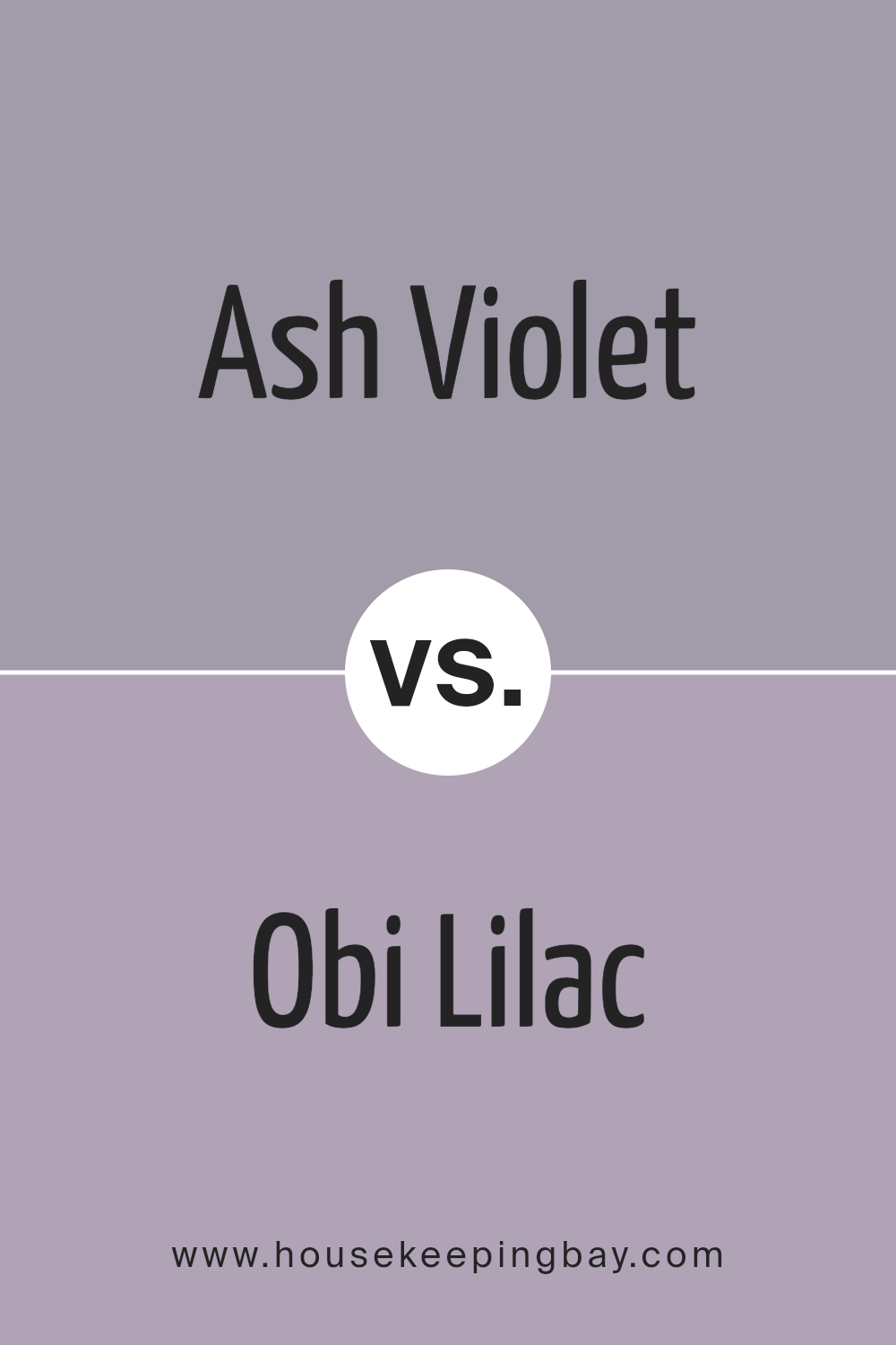
Ash Violet SW 6549 by Sherwin Williams vs Obi Lilac SW 6556 by Sherwin Williams
Ash Violet SW 6549 by Sherwin Williams is a muted hue with grey undertones giving it a subdued yet sophisticated appearance. This color can easily complement a variety of decor styles, acting as a versatile backdrop in any room. It’s particularly suited for spaces where a calm and subtle aesthetic is desired.
Obi Lilac SW 6556, in contrast, carries a slightly brighter tone. It’s infused with more purple, making it vibrant yet still soft enough not to overwhelm a space. This color works well in areas that could use a gentle pop of color, adding a touch of cheerfulness without being too bold.
Both colors offer unique qualities: Ash Violet brings an elegant neutrality, perfect for those seeking a less pronounced color scheme, while Obi Lilac adds a lively yet delicate touch to any interior. Each can create a distinct mood and atmosphere, depending on what you aim to achieve in your decorating project.
You can see recommended paint color below:
housekeepingbay.com
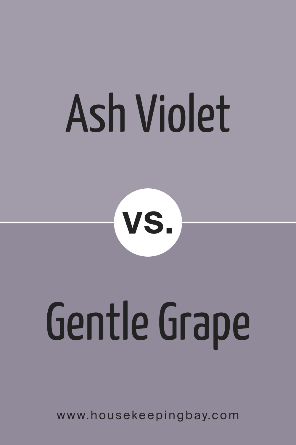
Ash Violet SW 6549 by Sherwin Williams vs Gentle Grape SW 9074 by Sherwin Williams
Ash Violet SW 6549 and Gentle Grape SW 9074, both by Sherwin Williams, are subtle yet distinct colors. Ash Violet is a muted hue, blending gray with soft violet, creating a soothing atmosphere in any space. It favors a more understated, classic appearance that makes it versatile for various decorating styles, from modern to traditional. This color works well in bedrooms or living areas, providing a quiet backdrop that complements a range of accent colors and decor.
Gentle Grape, in contrast, leans towards a deeper, more pronounced violet tone. It offers a richer and slightly warmer presence, adding depth and interest to a room. This shade is excellent for creating focal points, whether it’s on a feature wall or in a smaller space like a powder room.
Gentle Grape can pair beautifully with creamy neutrals or even contrasting warm tones, making it adaptable yet noticeable. Both colors offer unique vibes but serve different purposes depending on the desired impact and room usage.
You can see recommended paint color below:
- SW 9074 Gentle Grape
housekeepingbay.com
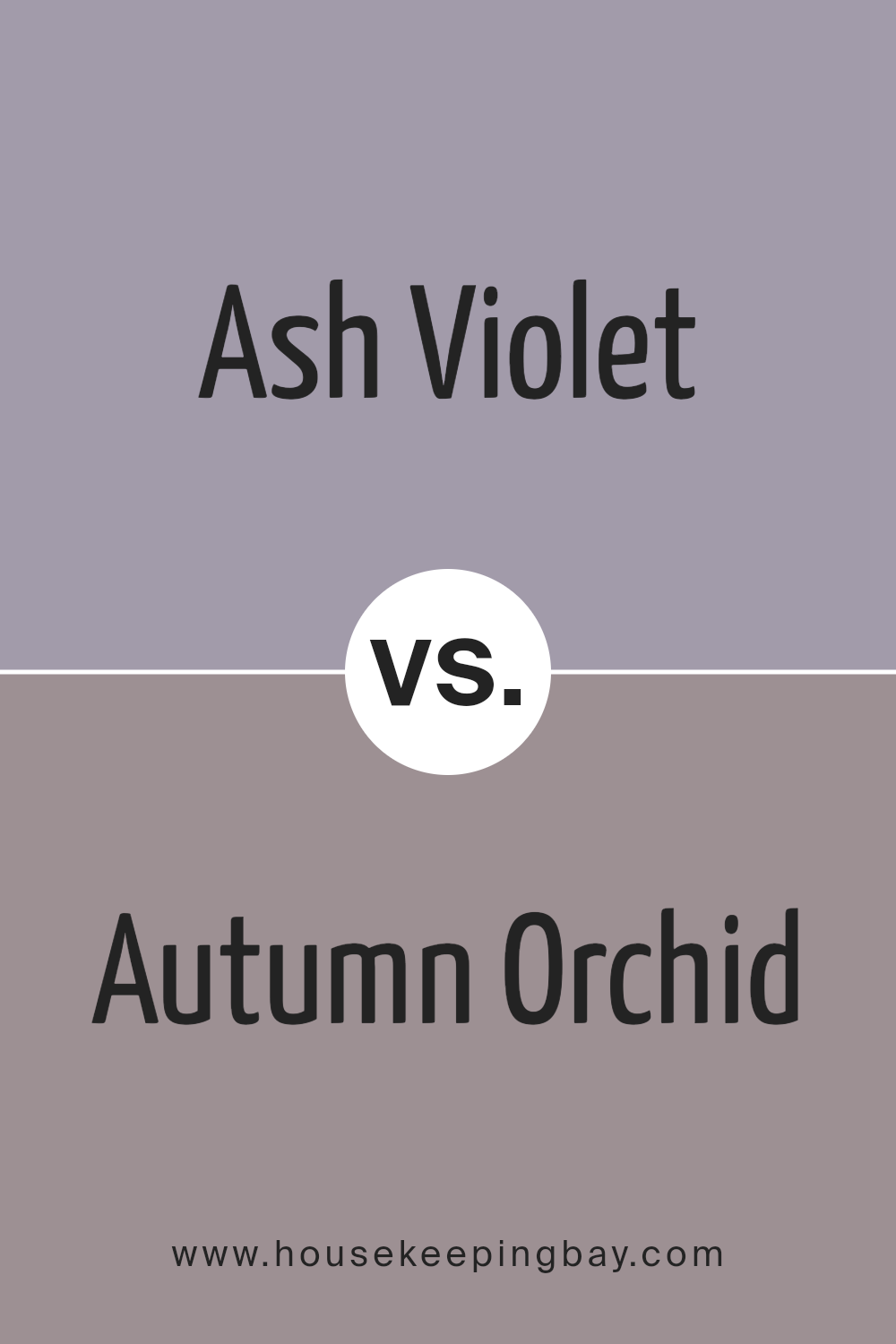
Ash Violet SW 6549 by Sherwin Williams vs Autumn Orchid SW 9157 by Sherwin Williams
Ash Violet SW 6549 by Sherwin Williams is a subtle, soft violet shade that offers a gentle hint of color to any space. It is muted and almost neutral, making it versatile and easy to pair with various decor styles. The color exudes a quiet sophistication, perfect for creating a serene and inviting atmosphere in rooms like bedrooms or living areas.
Autumn Orchid SW 9157, in contrast, is a deeper, richer hue that leans towards a pinkish-purple. It is more vibrant and can add a touch of warmth to your walls. This color is ideal for those wanting to introduce a more dynamic yet still soothing element into their home. It works well in spaces that benefit from a cozy and somewhat more dramatic feel.
Both colors reflect elegance but in different tones and intensities. Ash Violet is cooler and understated, while Autumn Orchid is warmer and more expressive.
You can see recommended paint color below:
- SW 9157 Autumn Orchid
housekeepingbay.com
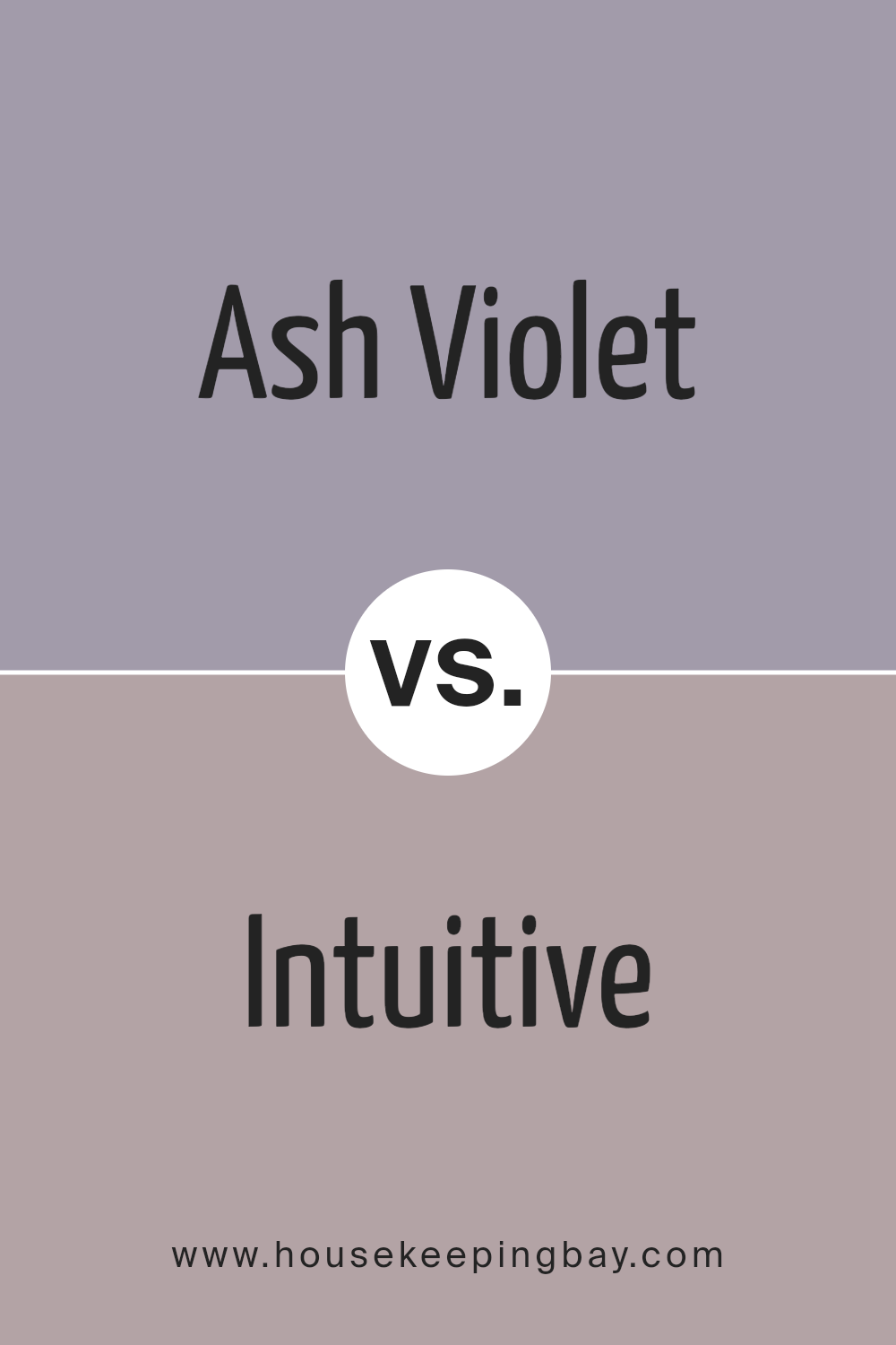
Ash Violet SW 6549 by Sherwin Williams vs Intuitive SW 6017 by Sherwin Williams
Ash Violet SW 6549 by Sherwin Williams is a unique blend of gray with a subtle hint of violet, lending it a cool, sophisticated air ideal for creating a serene ambiance. This color works well in spaces designed for relaxation and focus, like bedrooms or home offices, due to its soothing undertones.
Intuitive SW 6017, by contrast, is a soft, muted green with a touch of gray. This color suggests a natural, calming environment and is versatile enough for various settings, from kitchens to living rooms.
While Ash Violet provides a refreshing, contemporary feel, Intuitive offers a gentle, organic vibe. Both colors promote a peaceful setting but achieve this with distinctly different visual impacts—Ash Violet leans towards a modern aesthetic, whereas Intuitive leans towards an earthy, grounded atmosphere.
You can see recommended paint color below:
- SW 6017 Intuitive
housekeepingbay.com
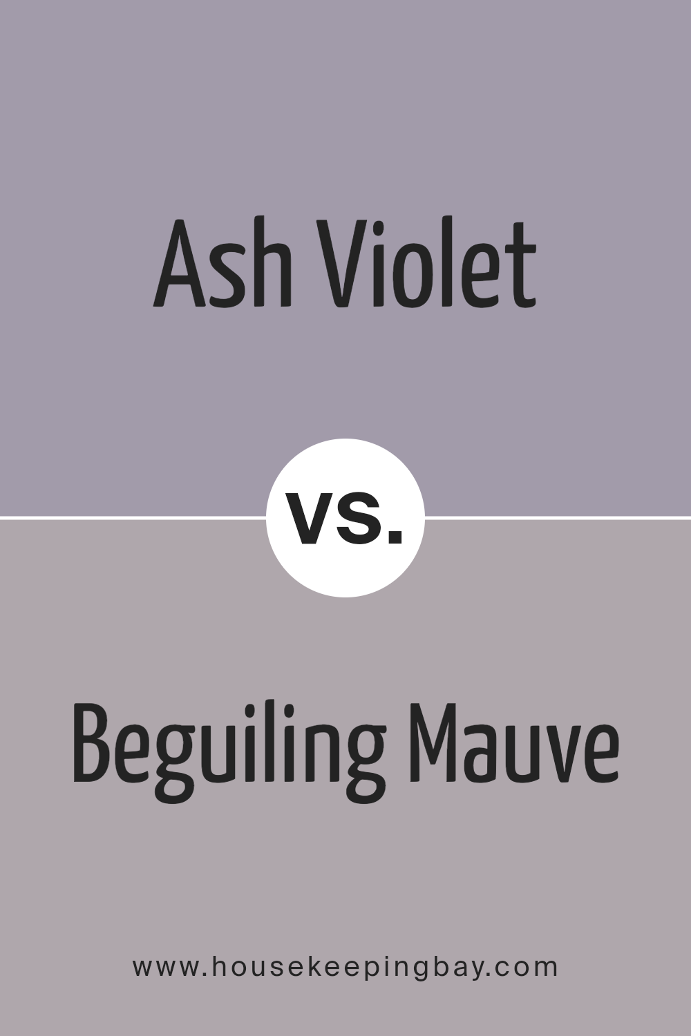
Ash Violet SW 6549 by Sherwin Williams vs Beguiling Mauve SW 6269 by Sherwin Williams
Ash Violet SW 6549 by Sherwin Williams is a unique shade that closely resembles a soft, muted blend of gray and lavender. This color offers a subtle yet distinct touch to spaces, making it ideal for creating a calm, serene environment without overwhelming the senses. It works well in bedrooms or living areas where a gentle, soothing backdrop is desired.
On the flip side, Beguiling Mauve SW 6269 from Sherwin Williams has a richer, deeper tone that combines elements of rose with gray. This color provides a warmer feel compared to Ash Violet, making it excellent for adding a cozy, inviting atmosphere. It suits areas like dining rooms or entryways where a welcoming vibe is favorable.
Both colors share a base of gray, which ensures they maintain a neutral versatility. However, Ash Violet leans more towards a cooler spectrum with its bluish-lavender undertones, while Beguiling Mauve offers a warmer palette due to its rosy hues.
You can see recommended paint color below:
- SW 6269 Beguiling Mauve
housekeepingbay.com
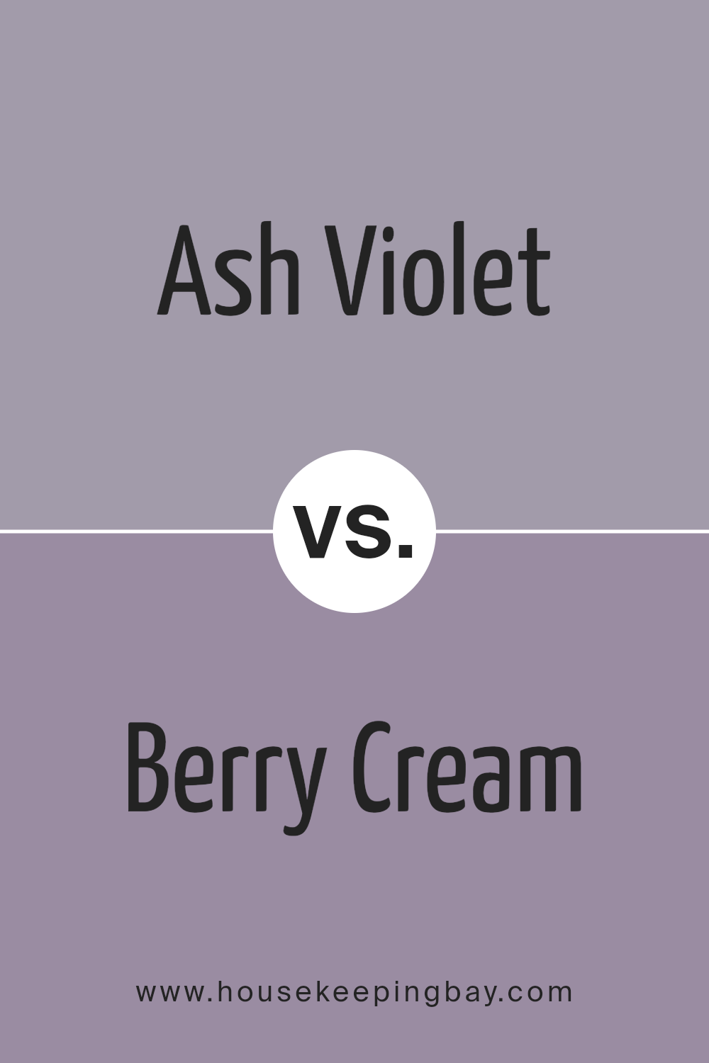
Ash Violet SW 6549 by Sherwin Williams vs Berry Cream SW 9075 by Sherwin Williams
Ash Violet SW 6549 by Sherwin Williams is a subtle, soothing shade that blends hints of grey with soft violet tones. It results in a cool, understated color that works well in spaces meant for relaxation, such as bedrooms and living areas. Its muted quality allows it to serve as a versatile backdrop that can complement various decors, enhancing the overall calm of an environment.
Berry Cream SW 9075, contrastingly, brings warmth to a room with its rich, creamy pink hue. This color adds a gentle cheerfulness to spaces, making it ideal for lively common areas or creating a cozy, inviting atmosphere in a dining room or kitchen. The inviting nature of Berry Cream can help make a room feel more welcoming and brighter.
Both colors have their unique ways of influencing the mood and style of a room. Ash Violet lends a cooler, serene feel, while Berry Cream offers warmth and softness, each contributing differently but harmoniously to home environments.
You can see recommended paint color below:
housekeepingbay.com
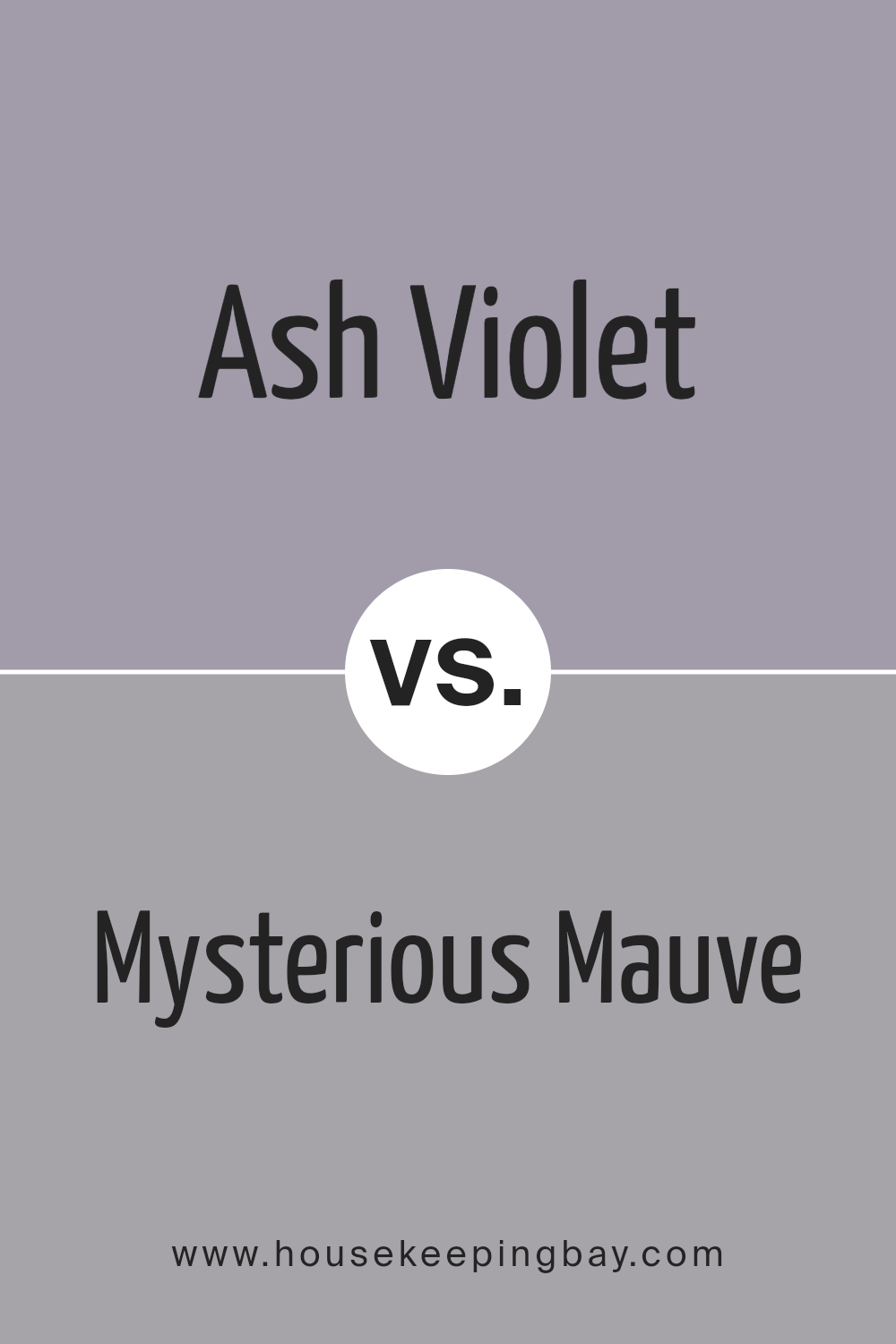
Ash Violet SW 6549 by Sherwin Williams vs Mysterious Mauve SW 6262 by Sherwin Williams
Ash Violet SW 6549 by Sherwin Williams is a unique color, blending grey with hints of lavender, creating a cool and soothing tone. It lends a subtle, modern touch to spaces, ideal for those looking to achieve a serene yet contemporary ambiance. Its muted quality allows for easy pairing with bolder or brighter decor, providing a flexible backdrop for various interior styles.
Mysterious Mauve SW 6262, another offering from Sherwin Williams, leans more towards a softer, warmer hue. This color embodies the richness of mauve with undertones that impart a comforting, cozy feel to any room. It’s perfect for creating a more inviting and intimate environment, especially suitable in bedrooms and living areas where warmth is desirable.
Both colors offer distinct vibes: Ash Violet introduces a cooler, more understated elegance, while Mysterious Mauve brings warmth and richness to interiors. They cater to different aesthetic preferences and can be chosen based on the atmosphere one wishes to foster in their space.
You can see recommended paint color below:
- SW 6262 Mysterious Mauve
housekeepingbay.com
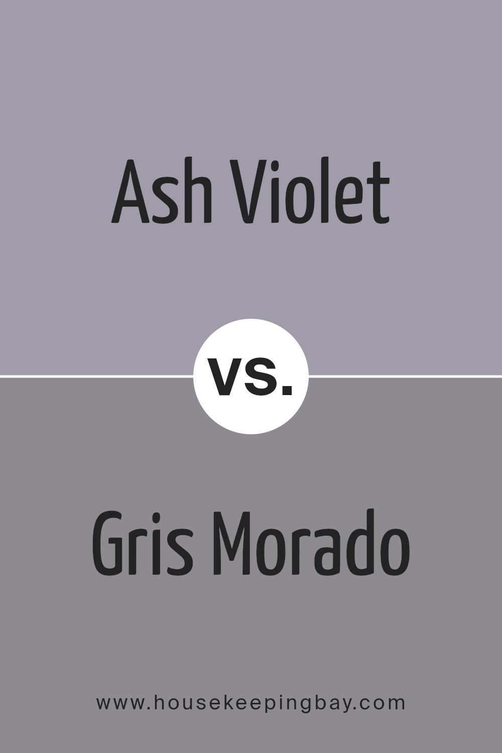
Ash Violet SW 6549 by Sherwin Williams vs Gris Morado SW 9156 by Sherwin Williams
Ash Violet SW 6549 and Gris Morado SW 9156 are both unique colors by Sherwin Williams that carry distinct tones and atmospheres. Ash Violet has a subtle, soft purple hue, giving it a gentle and calming presence. This color works well in spaces where a light touch of color is desired without overwhelming the room. It’s perfect for creating a serene and inviting atmosphere.
Gris Morado, in contrast, presents a darker, more muted purple shade with hints of gray. This color provides a stronger visual impact and brings a sense of sophistication and depth to spaces. It’s ideal for areas where a bolder statement is preferred, yet it retains an air of elegance.
In applications, Ash Violet is suited for bedrooms or living areas where the aim is a light, airy feel, while Gris Morado fits well in formal spaces or accent walls where more dramatic effect is beneficial. Each color holds its own charm and can significantly enhance interior aesthetics depending on the desired final look.
You can see recommended paint color below:
- SW 9156 Gris Morado
housekeepingbay.com
Conclusion
After reviewing SW 6549 Ash Violet by Sherwin Williams, I’ve found that this color brings a subtle sophistication to any space. Its unique blend of gray and violet tones offers a versatile backdrop that pairs well with a wide range of decor styles, from modern minimalism to cozy traditionalist aesthetics. I appreciate how it manages to balance warmth and coolness, making it an excellent choice for rooms aiming for a serene atmosphere.
The understated elegance of Ash Violet allows it to seamlessly integrate into various parts of a home, whether it’s a bedroom seeking calmness or a living room needing a touch of refined color. For those looking to refresh their walls with a hue that strays from everyday neutrals without overwhelming the senses, Ash Violet serves as an ideal pick.
Moreover, the quality of Sherwin Williams paints ensures that this color not only looks beautiful but also lasts, maintaining its integrity over time. Overall, my experience with SW 6549 Ash Violet has been incredibly positive.
It is clearly a paint color that can enhance the aesthetic appeal of a space while providing a soothing presence that many homeowners look for in their color choices.
housekeepingbay.com
