Yellow Iris 373 by Benjamin Moore
Brightening Your World with a Splash of Sunshine
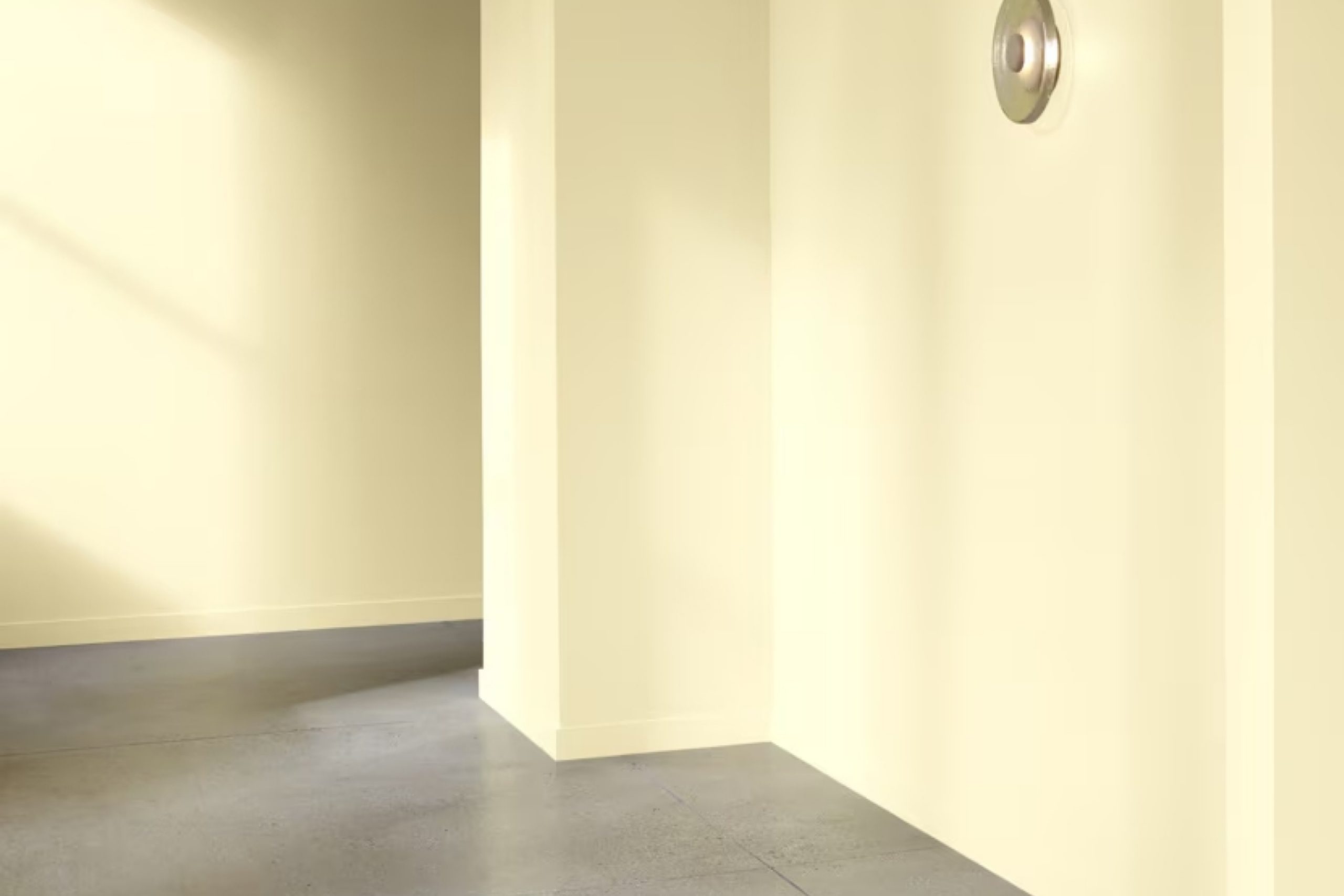
You might find yourself drawn to the vibrant and cheerful shade of 373 Yellow Iris by Benjamin Moore when you think about refreshing a room or adding a splash of color to your home decor. This bright yellow paint can instantly make any space feel more welcoming and lively.
It can especially stand out when used in areas that could use a bit of cheer, like a kitchen or a bathroom, or even as an accent wall in your living room. The color is bold enough to make a statement but has a softness that keeps it from overwhelming the space.
Whether you want to paint your entire room with 373 Yellow Iris or just add a few touches here and there, this shade could be just what you need to liven up your home.
With the right decor items to complement it, such as white linens or rustic wooden furniture, this color can really make your room look fresh and inviting.
via benjaminmoore.com
What Color Is Yellow Iris 373 by Benjamin Moore?
Table of Contents
Yellow Iris 373 by Benjamin Moore is a vibrant, cheerful shade that brings a burst of sunlight into any space. This mid-tone yellow has a warm, welcoming feel, making it perfect for adding a cozy, uplifting touch to interiors. It offers just the right balance of brightness without overwhelming the senses, making it an excellent choice for both small and large rooms.
This particular shade of yellow works beautifully in a variety of interior styles. In country or cottage-style homes, it pairs wonderfully with natural wood textures, soft linens, and rustic accents, creating a charming, homey atmosphere. For modern and contemporary spaces, Yellow Iris 373 can be used to add a pop of color against minimalist, clean lines and stark white or gray backgrounds, contrasting smoothly with metallic finishes like stainless steel or chrome.
Fabrics and materials that go well with Yellow Iris 373 include light woods such as pine or birch, which enhance its warmth. Soft textiles like cotton, wool, or velvet in neutral colors help balance its vibrancy, particularly in plush cushions, drapery, or upholstery.
Additionally, ceramics or decorative glassware in complementary shades of blue or green can set off Yellow Iris 373 beautifully, providing a refreshing visual palette.
housekeepingbay.com
Is Yellow Iris 373 by Benjamin Moore Warm or Cool color?
Yellow Iris 373 by Benjamin Moore is a soft, warm yellow paint color that brings a cozy and inviting vibe to any room. This shade is light enough to make small spaces feel larger and airy. It works well in living rooms, kitchens, or even bedrooms, where a touch of cheerfulness is desired without overwhelming the senses.
Yellow Iris 373 can be easily paired with various decor styles, from traditional to modern, making it a versatile choice for many homes. When used on walls, it provides a subtle backdrop that enhances the look of furniture and artwork. In well-lit areas, this color glows softly, creating a pleasant ambiance.
However, in rooms with less natural light, it maintains its warmth, brightening the space effectively. Overall, Yellow Iris 373 by Benjamin Moore is a great choice for adding a gentle splash of color that makes homes feel more welcoming and lively.
What is the Masstone of the Yellow Iris 373 by Benjamin Moore?
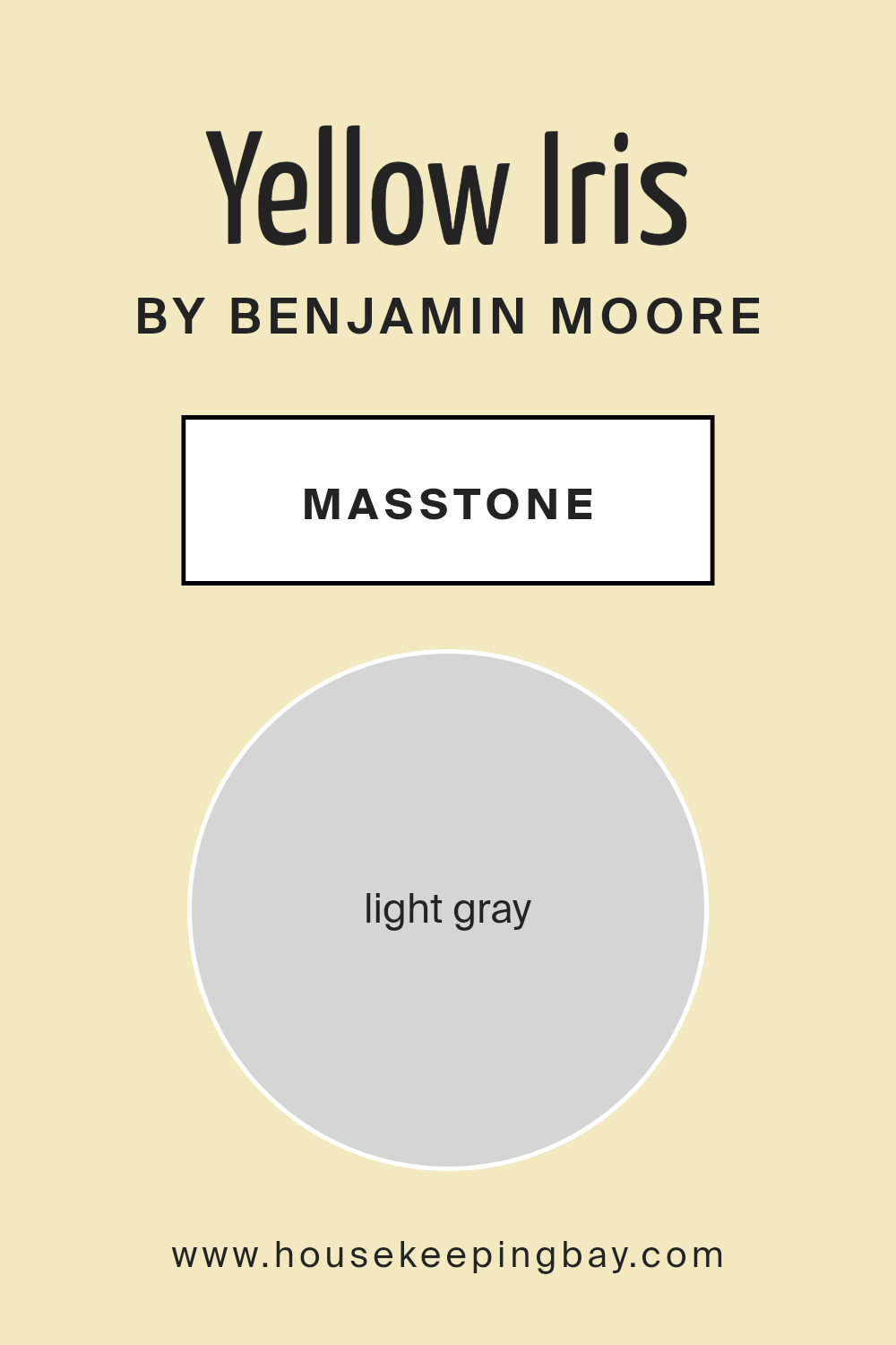
The color Yellow Iris373 by Benjamin Moore has a masstone of Light Gray, identified by its specific shade code #D5D5D5. This particular gray is soft and understated, making it highly versatile for home decoration. Its neutral tone provides a calm and gentle backdrop, allowing it to seamlessly blend with other colors and design elements in a room.
This adaptability makes Light Gray an excellent choice for walls, as it can pair well with both bright and muted furnishings, bringing a cohesive look to any space.
In homes, Yellow Iris373 helps maintain a feeling of openness and light. Even in smaller or darker rooms, this light gray helps to reflect natural light, making spaces appear larger and more airy. Homeowners can use this color in various rooms such as bedrooms, living rooms, and even bathrooms, for a subtle yet effective refresh that doesn’t overpower the senses. Its soothing nature also makes it a great base for adding personal touches through art, textiles, and decor.
housekeepingbay.com
Undertones of Yellow Iris 373 by Benjamin Moore
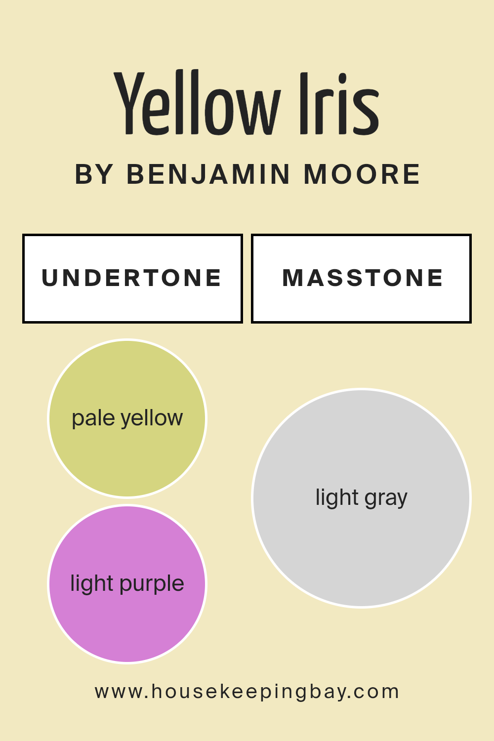
Yellow Iris 373 by Benjamin Moore is a complex color with a range of subtle undertones that can significantly impact its appearance in different environments. These undertones include pale yellow, light purple, light blue, pale pink, mint, lilac, and grey.
Each undertone brings a different feel and can influence the color’s perception depending on the lighting and surrounding colors. For example, pale yellow undertones add a warm glow, making the space feel cozy and welcoming. Light blue and mint undertones offer a fresh, airy quality, which can make a room feel more spacious and open.
Light purple and lilac undertones introduce a slight coolness, which can help balance a south-facing room that receives a lot of warm, natural light. Pale pink undertones give a gentle, soothing touch, ideal for creating a soft, relaxing atmosphere. The grey undertone in Yellow Iris 373 can help ground the color, preventing it from becoming too bright, especially in well-lit areas, and adds a modern, sophisticated edge.
When applied to interior walls, the multifaceted nature of Yellow Iris 373 means that it can adapt subtly to different settings. This adaptability makes it an excellent choice for living rooms, bedrooms, and even kitchens, where the interplay of light and color can be fully appreciated. Understanding these undertones can help in selecting complementary decor elements such as furniture and artwork, ensuring the space achieves a harmonious look.
housekeepingbay.com
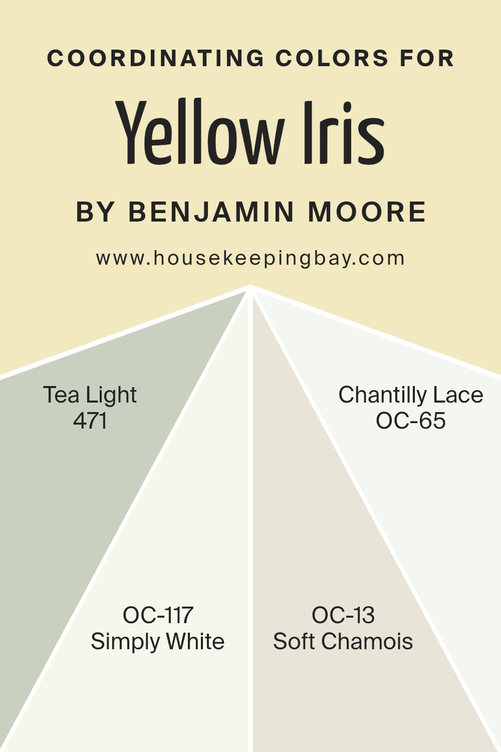
Coordinating Colors of Yellow Iris 373 by Benjamin Moore
Coordinating colors are hues that complement a base color and enhance the overall aesthetic of a space by creating balance and harmony. When choosing coordinating colors, one typically selects shades that pair well with the main color, in this case, Yellow Iris 373 by Benjamin Moore, to achieve a coherent look. These coordinating colors can be used to highlight architectural features, provide visual transitions between rooms, or simply add layers of visual interest to the design.
Yellow Iris 373 by Benjamin Moore pairs well with several other softer tones for a harmonious palette. Tea Light, also known as 471, is a gentle, subdued yellow that brings a warm, soothing glow similar to candlelight, ideal for creating a cozy atmosphere.
Simply White, or OC-117, offers a crisp and clean look, providing a fresh and airy feeling to any space, making it appear larger and more inviting. Soft Chamois, denoted as OC-13, is a light, creamy beige that lends a subtle touch of warmth, perfect for spaces where a hint of color is desired without overwhelming the senses. Lastly, Chantilly Lace, or OC-65, is a pure white that acts as a versatile backdrop, allowing other colors to shine while maintaining a sleek and sophisticated environment.
You can see recommended paint colors below:
- 471 Tea Light
- OC-117 Simply White
- OC-13 Soft Chamois
- OC-65 Chantilly Lace
housekeepingbay.com
How Does Lighting Affect Yellow Iris 373 by Benjamin Moore?
Lighting plays a crucial role in how we perceive colors, as it can dramatically alter their appearance. The color Yellow Iris 373 by Benjamin Moore is an excellent example of this phenomenon. Depending on the type of light—artificial or natural—the color can look different.
In artificial light, Yellow Iris 373 tends to take on a warmer, more golden hue. This is because most indoor lighting emits a yellow or orange light, enhancing the yellow tones of the paint.
As a result, rooms painted with Yellow Iris 373 feel cozier and more inviting under artificial lighting, especially with incandescent bulbs.
In natural light, the color will appear truer to its original shade. Natural light, which is full-spectrum, shows Yellow Iris 373 in its purest form, making the space feel lively and bright.
However, the exact effect depends on the direction the room faces:
- 1. North-faced rooms: These rooms get less direct sunlight, which can make Yellow Iris 373 appear slightly muted and cooler. The shade may seem more subdued but still provides a soft, gentle background.
- 2. South-faced rooms: These rooms enjoy ample sunlight, making Yellow Iris 373 look vibrant and energetic. The bright, natural light accentuates the warm tones of the color, making the room feel sunny and cheerful even without any lights on.
- 3. East-faced rooms: In these rooms, Yellow Iris 373 benefits from the morning light, which is bright and warm. Early in the day, the color will look very lively and welcoming. As the day progresses, it might lose some of its brightness but still maintain a soft warmth.
- 4. West-faced rooms: Here, the afternoon and evening light can make Yellow Iris 373 glow warmly. The setting sun brings out the richness of the color, creating a cozy atmosphere towards the end of the day.
Understanding these nuances can help in deciding the best use of this color in various rooms based on their orientation and the type of lighting available.
housekeepingbay.com
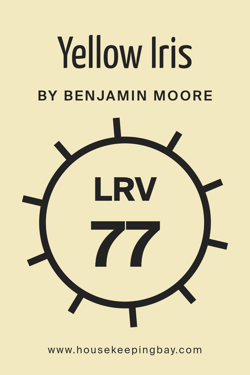
What is the LRV of Yellow Iris 373 by Benjamin Moore?
LRV stands for Light Reflectance Value, a measure used to describe the percentage of visible and usable light that a color reflects from or absorbs into a painted surface. This measurement ranges from 0 to 100, with 0 being completely black, absorbing all light, and 100 being pure white, reflecting all light.
The LRV helps determine how light or dark a color will look once applied to a wall and how it will affect the lighting of a room. A higher LRV means a color will generally appear lighter and make a space feel more open and brighter, while a lower LRV can make a space seem cozier and more enclosed.
The LRV of Yellow Iris 373 by Benjamin Moore is 77.43, making it a fairly light color. This high LRV suggests that Yellow Iris 373 will reflect a significant amount of light, making it a good choice for spaces that need to feel more airy and spacious. When applied to walls, this light yellow hue will not only brighten up the room but also make it appear larger.
It’s particularly effective in spaces that may lack natural lighting, as it maximizes the impact of available light, enhancing the overall ambiance of the room with a gentle, soothing presence.
housekeepingbay.com
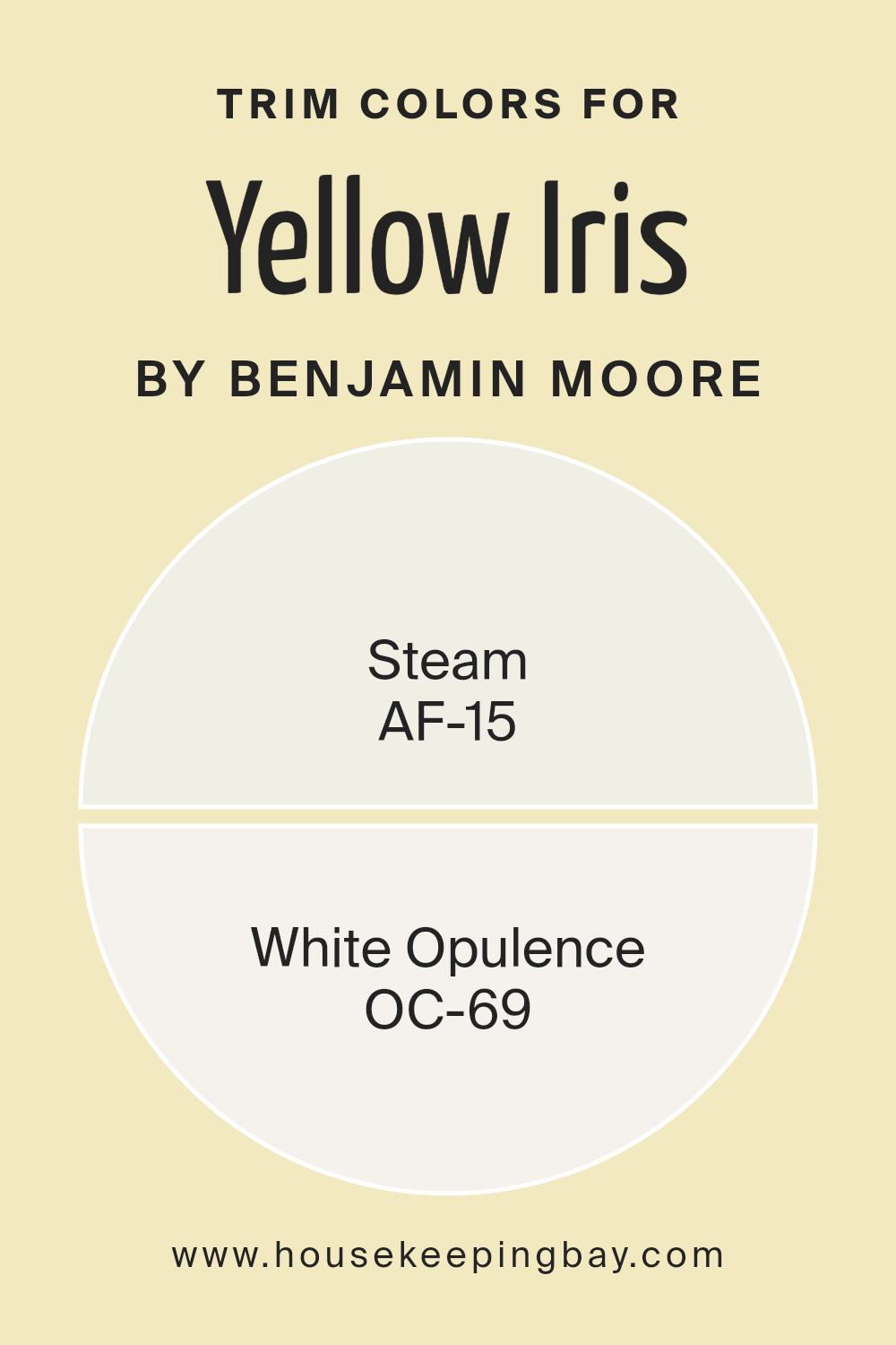
What are the Trim colors of Yellow Iris 373 by Benjamin Moore?
Trim colors are specific shades used to define the edges around door frames, baseboards, window frames, and moldings in a room, adding contrast and detail to the spaces. When paired with a vibrant main color like Yellow Iris 373 by Benjamin Moore, trim colors play a crucial role in enhancing the overall look by providing a crisp, clean boundary that highlights the primary hue.
For Yellow Iris 373, trim colors such as AF-15 – Steam and OC-69 – White Opulence are optimal choices. These lighter shades contrast nicely against the bold yellow, ensuring that the room feels bright and well-coordinated.
AF-15 – Steam is a soft, muted white with a slight undertone of gray, providing a subtle contrast that complements more vivid wall colors without overwhelming the senses. It’s perfect for a trim color as it brings a gentle, soothing touch to the room while still maintaining a fresh and clean look. On the other hand, OC-69 – White Opulence is a brighter, crisper white with a more pronounced vibrancy. This color is excellent for trims, as it draws the eye to architectural details, creating distinct visual lines that give a space a more structured and polished appearance.
You can see recommended paint colors below:
housekeepingbay.com
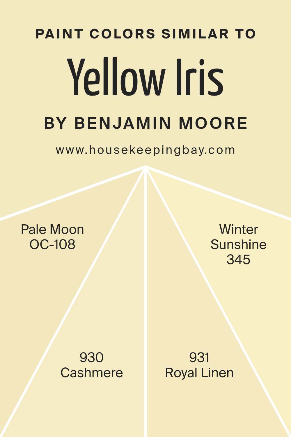
Colors Similar to Yellow Iris 373 by Benjamin Moore
Similar colors in the palette create visual harmony and help maintain a cohesive look in any design or decorating scheme. For instance, Yellow Iris 373 by Benjamin Moore pairs well with shades like Pale Moon, Cashmere, Royal Linen, and Winter Sunshine, each offering subtle variations of the main color.
This approach is useful as it provides options that are easy on the eyes while allowing for small degrees of contrast and interest. By keeping within the same color family, one can achieve a serene and unified atmosphere that feels both welcoming and put together.
Pale Moon OC-108 is a gentle yellow with a hint of cream, providing a soft backdrop that reflects light beautifully in spacious or well-lit rooms. Cashmere 930 offers a slightly richer tone that resembles the warm, comforting feel of its namesake fabric, making it ideal for cozy spaces. Royal Linen 931 has an understated elegance, with its very light, almost neutral yellow serving well in areas that aim for a chic yet inviting ambiance. Meanwhile, Winter Sunshine 345 is vibrant enough to add a slight burst of cheerfulness without overwhelming, perfect for adding a lively touch to a subdued decor scheme.
You can see recommended paint colors below:
- OC-108 Pale Moon
- 930 Cashmere
- 931 Royal Linen
- 345 Winter Sunshine
housekeepingbay.com
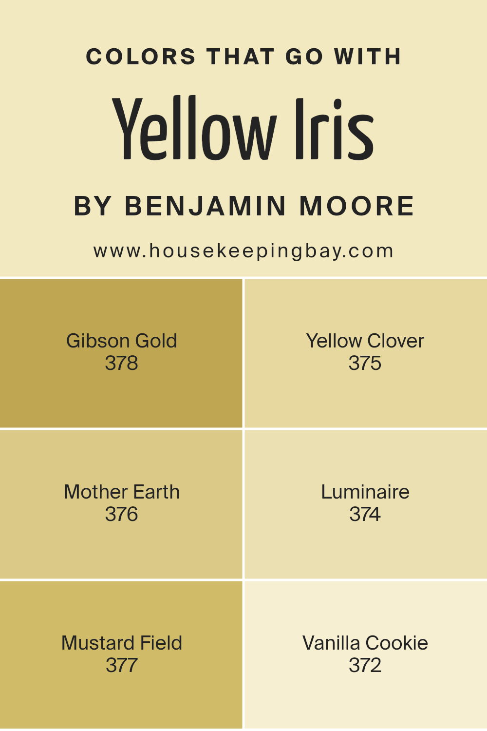
Colors that Go With Yellow Iris 373 by Benjamin Moore
Colors that pair with Yellow Iris 373 by Benjamin Moore play a critical role in creating a cohesive and appealing color palette for any space. When designing a room or an entire home, it’s important to consider how color combinations will affect the overall atmosphere and visual balance. Yellow Iris 373 is a lively shade that brings warmth and brightness to spaces, but choosing the right accompanying colors is key to ensuring the yellow doesn’t overwhelm.
Gibson Gold 378 adds a robust, earthy tone that harmonizes with Yellow Iris 373 by offering a deeper, golden hue that rounds out the vibrancy of the yellow with its rich warmth. Yellow Clover 375 provides a light, almost pastel counterpart that softens the intensity of Yellow Iris for a gentle and soothing effect.
For a touch of natural, grounding influence, Mother Earth 376 brings a subtle green hue that complements the yellow, reminiscent of foliage pairing with sunlight. Meanwhile, Luminaire 374 grants a more neutral, lighter approach that helps in balancing the brightness of Yellow Iris 373 with its calm and soft presence. Mustard Field 377 introduces a dynamic, bold yellow that intensifies the scheme with its strong presence, making it ideal for accents that need to stand out.
Lastly, Vanilla Cookie 372 offers a creamy, soft vanilla tone that acts as a perfect backdrop, making the yellow tones pop without competing with them. Each of these colors works together to provide a balanced, harmonious look that enhances the beauty and energy of Yellow Iris 373.
You can see recommended paint colors below:
- 378 Gibson Gold
- 375 Yellow Clover
- 376 Mother Earth
- 374 Luminaire
- 377 Mustard Field
- 372 Vanilla Cookie
housekeepingbay.com
How to Use Yellow Iris 373 by Benjamin Moore In Your Home?
Yellow Iris 373 by Benjamin Moore is a warm, cheerful yellow paint color that can brighten up any room in your home. This shade is perfect if you want to add a splash of sunshine to spaces like kitchens or breakfast nooks, where it can create a welcoming, cozy atmosphere for family meals. It’s also great in a home office or study area, as the lively color can help keep you motivated and focused.
In living rooms, pairing Yellow Iris 373 with soft whites or grays can balance its brightness and make the space feel light and airy. For those willing to try a bold look, this yellow can also work well with blues or greens, providing a lively contrast that adds character and energy to a room.
Accessorizing rooms with this yellow paint can be fun too. Use decor in shades of navy, dark wood, or rich burgundy for a beautiful color pop that complements the cheerful yellow walls. Yellow Iris 373 is versatile, working well in many lighting situations, and can instantly make your home feel more inviting and lively.
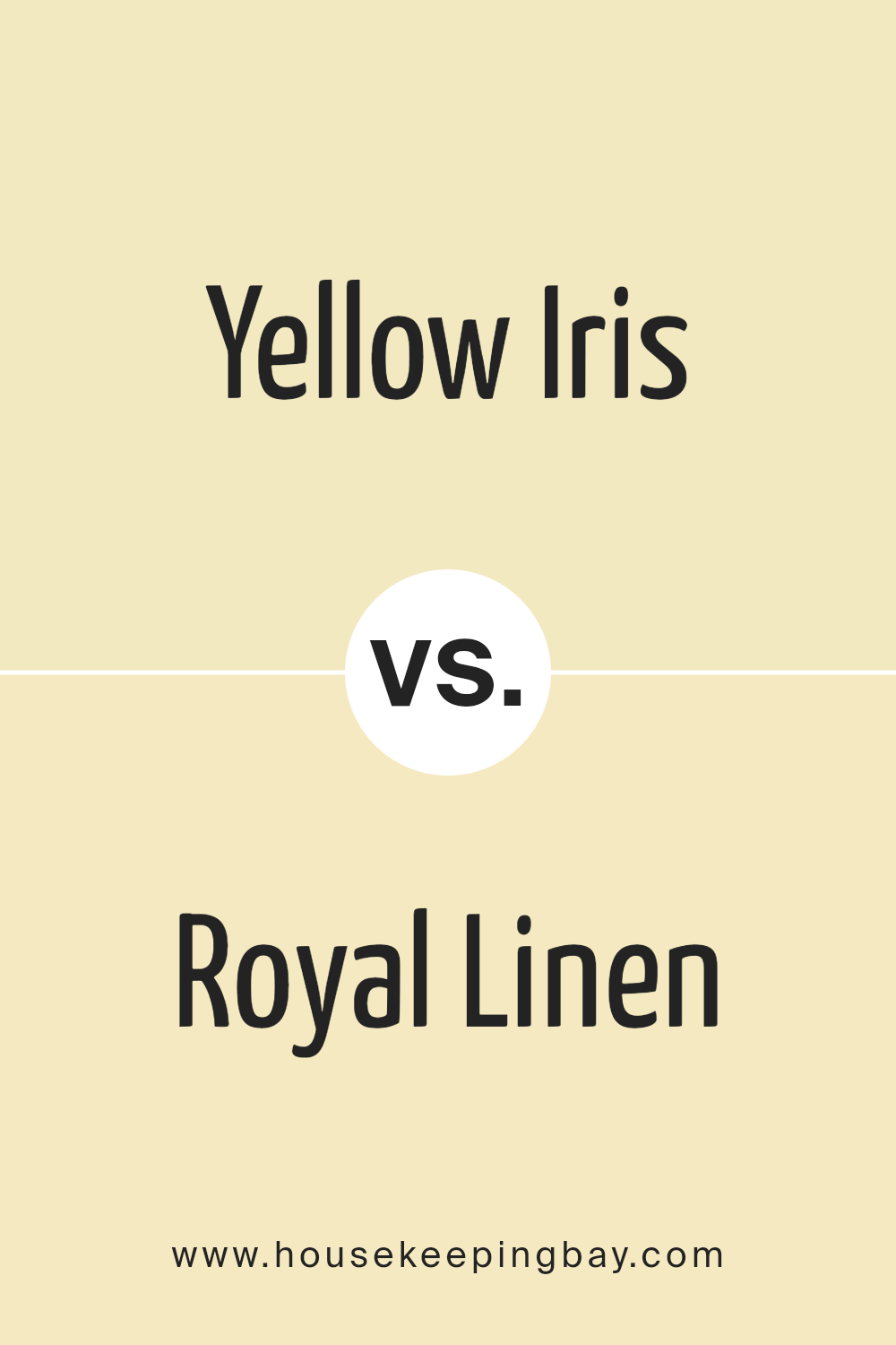
Yellow Iris 373 by Benjamin Moore vs Royal Linen 931 by Benjamin Moore
Yellow Iris 373 by Benjamin Moore is a vibrant, cheerful yellow shade that brings a sense of brightness and energy to any space. This color can make rooms feel more open and lively, ideal for spaces like kitchens or living areas where you want to create an uplifting atmosphere.
In contrast, Royal Linen 931 by Benjamin Moore is a more subdued, neutral color. It’s a soft, creamy beige that exudes warmth and calm. This color works well in spaces where a peaceful, relaxing vibe is desired, such as bedrooms or bathrooms. It’s also versatile enough to pair well with many other colors and decorative styles.
Both colors offer unique attributes. Yellow Iris 373 infuses spaces with energy and positivity, while Royal Linen 931 provides a soothing backdrop that can make rooms feel cozy and inviting. Depending on the mood you wish to set, each color serves its purpose effectively.
You can see recommended paint color below:
- 931 Royal Linen
housekeepingbay.com
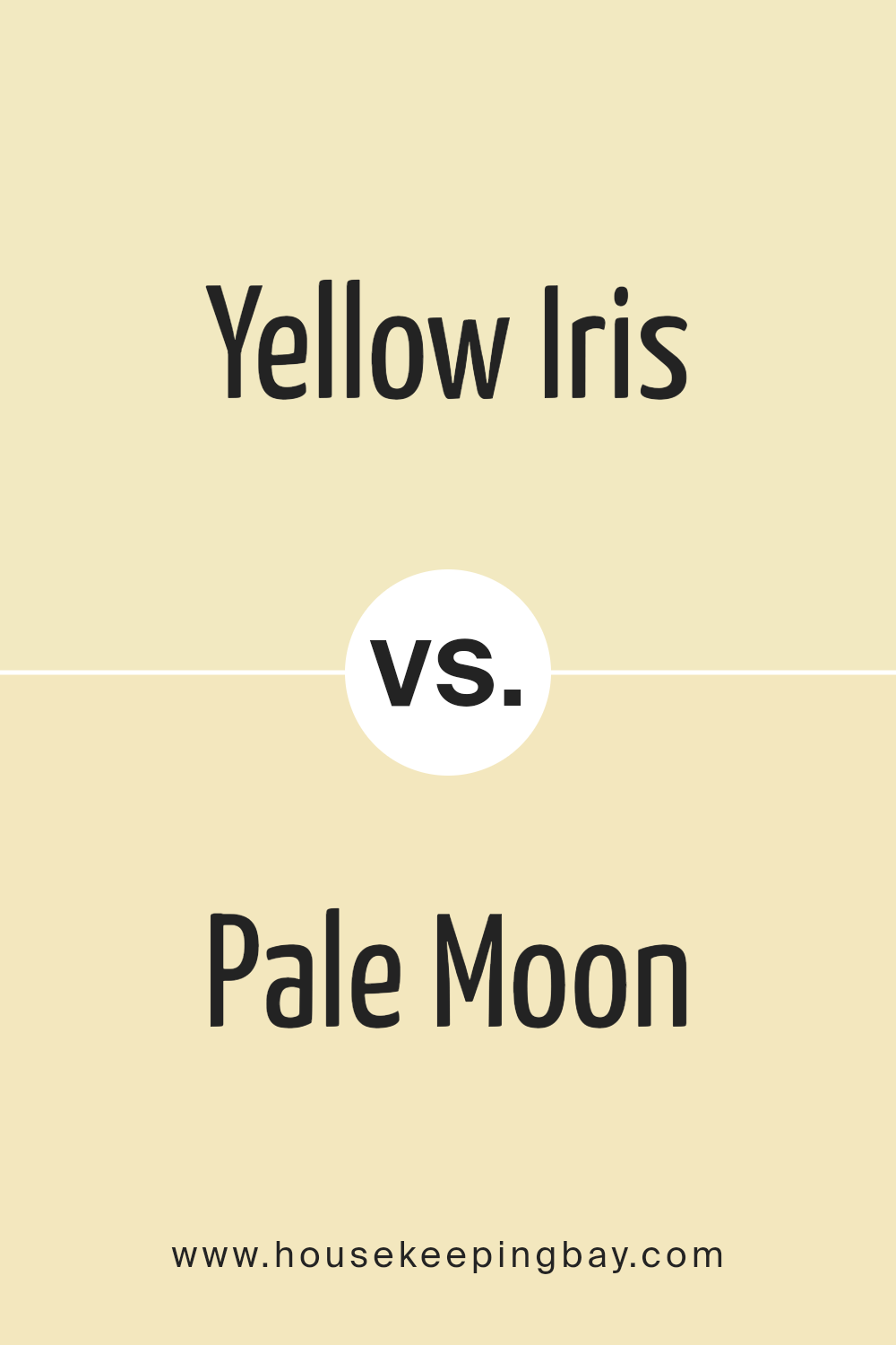
Yellow Iris 373 by Benjamin Moore vs Pale Moon OC-108 by Benjamin Moore
Yellow Iris 373 by Benjamin Moore is a vibrant, bright yellow shade that’s cheerful and lively. It can easily brighten up any room, bringing a sense of energy and sunshine. This color would work well in a playroom, kitchen, or any space where you want to add a punch of joyful brightness. It’s particularly effective in spaces that could benefit from a sense of light and playfulness.
Pale Moon OC-108, also by Benjamin Moore, is much more subdued compared to Yellow Iris 373. It’s a soft, pale yellow that almost leans towards a neutral cream. This color exudes a calm, soothing vibe, making it ideal for bedrooms, bathrooms, and living areas where a gentle and relaxing atmosphere is desired.
Its subtle nature allows it to blend seamlessly with various decor styles and color schemes. Both colors bring their unique traits to environments, Yellow Iris 373 offering boldness and vivacity, while Pale Moon OC-108 provides a gentle, calming presence.
You can see recommended paint color below:
housekeepingbay.com
Yellow Iris 373 by Benjamin Moore vs Winter Sunshine 345 by Benjamin Moore
Yellow Iris 373 by Benjamin Moore is a vibrant and cheerful shade of yellow. It brings a lively burst of light to any space, making it feel inviting and warm. This color works well in areas where you want to add energy and brightness, such as kitchens and playrooms.
Winter Sunshine 345, also by Benjamin Moore, is a softer yellow. It has a subtle and gentle appearance, providing a calm and soothing backdrop. This color is excellent for creating a relaxed atmosphere in spaces like bedrooms and bathrooms where a softer touch is needed.
Both colors share the warmth and positivity associated with yellow, but their intensity and tone vary. Yellow Iris 373 is bolder and can make a strong statement, while Winter Sunshine 345 offers a quieter and more serene vibe. Each color would suit different environments depending on the mood you wish to achieve.
You can see recommended paint color below:
- 345 Winter Sunshine
housekeepingbay.com
Yellow Iris 373 by Benjamin Moore vs Cashmere 930 by Benjamin Moore
Yellow Iris 373 by Benjamin Moore is a vibrant shade that radiates warmth and cheerfulness. It’s a bold yellow, perfect for spaces where you want to create an inviting and energetic atmosphere. This color can work wonders in a kitchen or a playroom, bringing a sunny disposition that feels refreshing and lively.
In contrast, Cashmere 930 by Benjamin Moore is a much softer, more neutral hue. It’s a gentle off-white with subtle gray undertones that give it a cozy, soothing quality. This color suits areas where you seek calmness and relaxation, such as bedrooms or living rooms. Its versatility pairs well with various decor styles, offering a backdrop that lets other colors or art pieces stand out.
Both Yellow Iris 373 and Cashmere 930 provide distinct vibes and can be used effectively depending on the mood and function you desire in a space.
You can see recommended paint color below:
- 930 Cashmere
housekeepingbay.com
Conclusion
As I conclude my thoughts on Benjamin Moore’s paint color “373 Yellow Iris,” I really appreciate its versatile and warm nature. This particular shade has a remarkable ability to provide a refreshingly cheerful vibe to any room without being overpoweringly bright.
Yellow Iris works beautifully whether I’m looking to bring a subtle pop of color into a muted space or amplify the light in a dim room. I’ve noticed it pairs wonderfully with a wide range of decor styles, from modern minimalist to more rustic charm, making it a reliable choice for nearly any type of project.
Moreover, I find it offers a soothing yet joyful ambiance, which makes it perfect for spaces like living rooms, kitchens, or even bedrooms. For anyone seeking to update their space without committing to a bold or dark color, Yellow Iris is an excellent option. Its softness and light are especially beneficial in creating the illusion of more space, which is perfect for smaller or more confined areas.
All in all, the versatility and engaging nature of 373 Yellow Iris make it a paint color I would recommend to anyone looking to refresh their home with a gentle yet impactful change.
housekeepingbay.com
Ever wished paint sampling was as easy as sticking a sticker? Guess what? Now it is! Discover Samplize's unique Peel & Stick samples. Get started now and say goodbye to the old messy way!
Get paint samples


