Pale Moon OC-108 by Benjamin Moore
Gentle Glow for Every Home
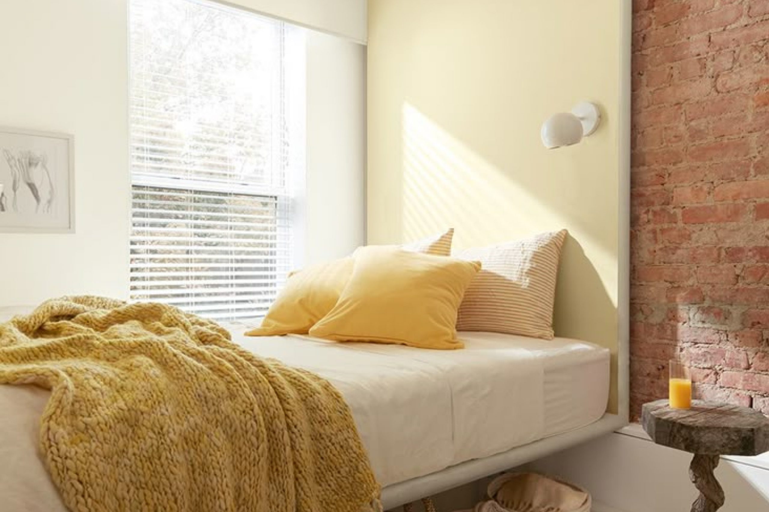
OC-108 Pale Moon by Benjamin Moore is a soft and gentle off-white that’s perfect when you want to freshen up a room without using strong or bright colors.
It gives your space a clean, calm feel and works really well if you’re going for something light and simple. It’s one of those colors that just makes everything feel a little more peaceful and put-together.
Pale Moon offers a hint of warmth that can make your space feel welcoming and cozy while maintaining a clean and airy atmosphere. This shade works beautifully in various areas of your home, whether you want to brighten up a living room or create a serene bedroom retreat.
It pairs well with a wide range of décor styles, from modern to traditional, making it a smart choice for any redesign.
If you’re not sure how to incorporate OC-108 Pale Moon into your home, it’s a great option for walls, trim, or even ceilings, providing a subtle, yet impactful transformation.
via spr.ly
What Color Is Pale Moon OC-108 by Benjamin Moore?
Pale Moon OC-108 by Benjamin Moore is a gentle, off-white hue with a subtle hint of yellow, imparting a warm and inviting feeling to any space. This color exudes a soft radiance that can brighten up rooms without overwhelming them. Its understated elegance makes it a versatile choice for various interior styles, particularly those seeking a serene and cozy atmosphere.
Perfect for styles like Scandinavian, where simplicity and comfort are key, Pale Moon adds a touch of warmth while maintaining a clean, airy feel. It also fits well within modern farmhouse aesthetics, contributing to a light, welcoming environment reminiscent of sunlit country mornings. In traditional interiors, this color provides a neutral backdrop that highlights classic furniture and architectural details without competing for attention.
Pale Moon pairs beautifully with natural materials such as light woods, adding an earthy, grounded feel to the ambiance. Linen textiles and soft cottons complement its subtle warmth, creating an environment that feels both refined and comfortable. It also works well with stone elements like marble or granite, offering a balance between the coolness of stone and the warmth of the paint.
In terms of metals, brushed nickel or soft brass fixtures and fittings can enhance Pale Moon’s gentle glow, lending a touch of sophistication to the overall decor.
housekeepingbay.com
Is Pale Moon OC-108 by Benjamin Moore Warm or Cool color?
Pale Moon OC-108 by Benjamin Moore is a soft, warm yellow paint color that brings a gentle brightness to any room. This color is perfect for spaces where you want a subtle touch of warmth without overwhelming the senses. Its light tone makes it excellent for smaller rooms or areas with limited natural light, as it can help make the space appear larger and more open.
When used in homes, Pale Moon OC-108 offers a calming effect, making it an ideal choice for bedrooms, living rooms, or even kitchens where a soothing atmosphere is desired. It pairs well with a wide range of colors, from neutral earth tones to bolder shades, allowing for versatile design options.
Moreover, Pale Moon can be complemented by various textures and materials, such as wood, metal, and glass, helping to create a cozy yet elegant environment. Its versatility and gentle charm make it a popular choice for those looking to add a touch of warmth to their home without committing to a bold or overpowering color.
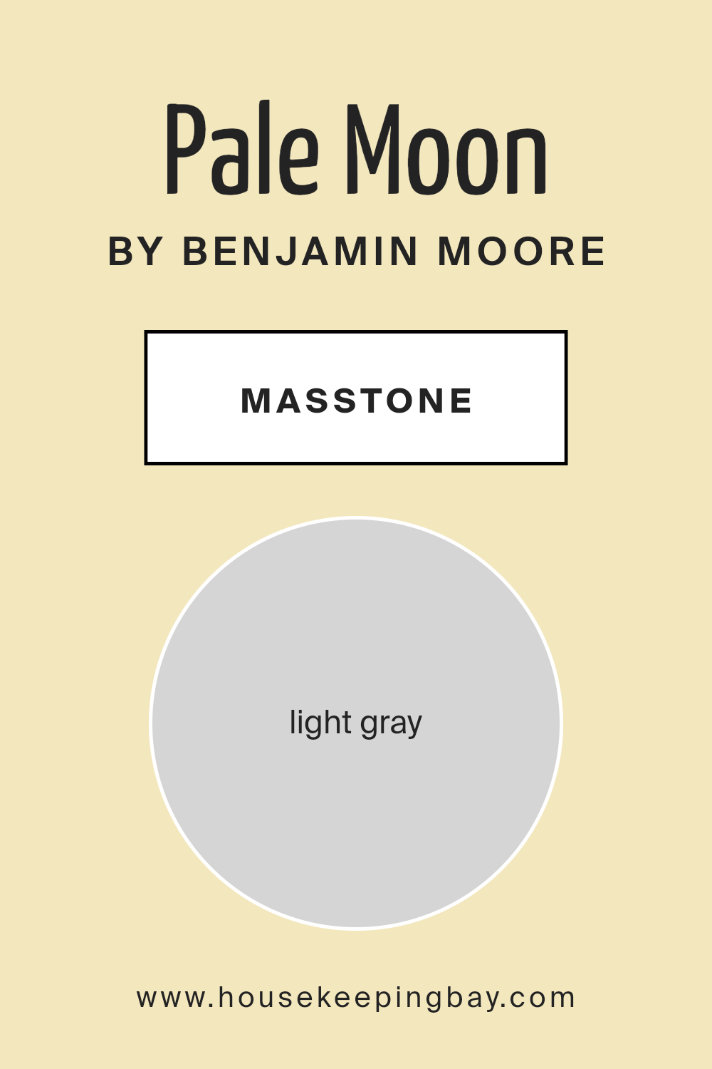
What is the Masstone of the Pale Moon OC-108 by Benjamin Moore?
Pale Moon OC-108 by Benjamin Moore, characterized by its masstone light gray (#D5D5D5), offers a versatile palette for home interiors. This particular shade of light gray brings a soothing and neutral backdrop to any room, making it easy to incorporate into various decor styles—from modern to traditional. Being a light and almost subtle color, it helps in creating a feeling of spaciousness and light within smaller or poorly lit spaces.
Since Pale Moon is not a commanding color, it pairs well with both soft pastels and vibrant hues, allowing other elements in the room to stand out without overwhelming the space.
This flexibility is especially beneficial in homes where the goal is to create a relaxed but stylish environment. It’s excellent for living areas, bedrooms, and even kitchens where a clean, calm atmosphere is desired. The light gray hue contributes to a fresh and updated look while maintaining a warm and inviting feel, perfect for areas of rest and gathering.
housekeepingbay.com
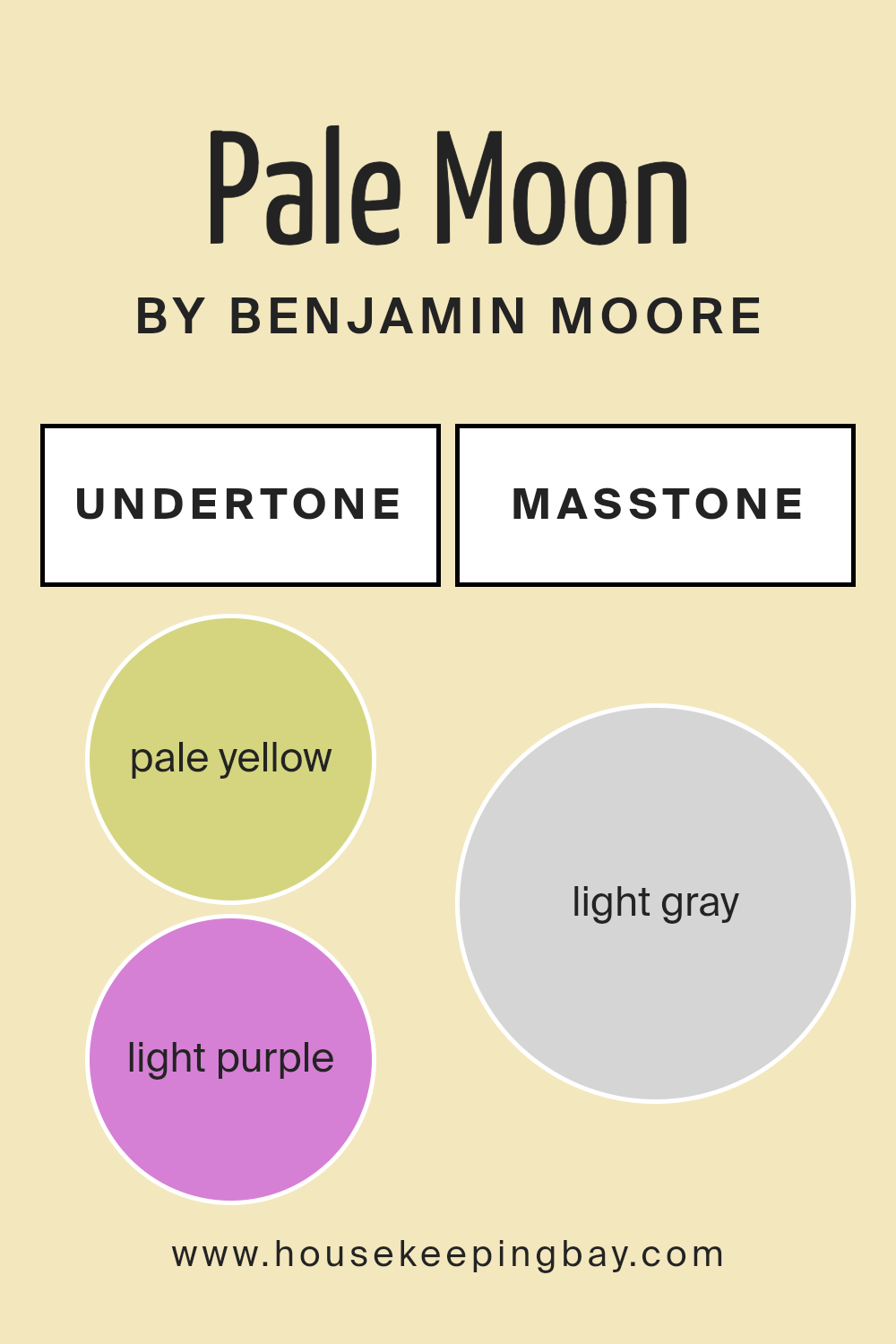
Undertones of Pale Moon OC-108 by Benjamin Moore
Pale Moon OC-108 by Benjamin Moore is a versatile paint color known for its subtle and complex character, thanks to a mix of undertones. Undertones are secondary colors that influence the primary shade, affecting how it looks under different lighting conditions or when paired with other colors. Pale Moon has undertones of pale yellow, light purple, light blue, pale pink, mint, lilac, and grey. These undertones contribute to its overall warmth and softness, making it an ideal choice for creating a gentle and inviting atmosphere in any room.
In interior design, the effect of Pale Moon OC-108’s undertones on walls can vary depending on the room’s lighting and surrounding colors. For instance, in a room with ample natural light, the pale yellow and light blue undertones might make the walls appear brighter and more airy. Conversely, in a room with less natural light, the grey undertone might become more pronounced, giving the space a more muted feel.
When using Pale Moon OC-108 on interior walls, it’s important to consider these undertones as they can subtly influence the room’s mood and the colors with which it best coordinates. Furniture and decor in complementary shades like soft greens or blues can enhance the mint and light blue undertones, while warmer hues like creams or soft browns can bring out the pale yellow and lilac tones.
Overall, understanding the undertones of Pale Moon OC-108 helps in achieving the desired ambiance in a space, making it a popular choice for those looking to refresh their interiors with a nuanced and adaptable color.
housekeepingbay.com
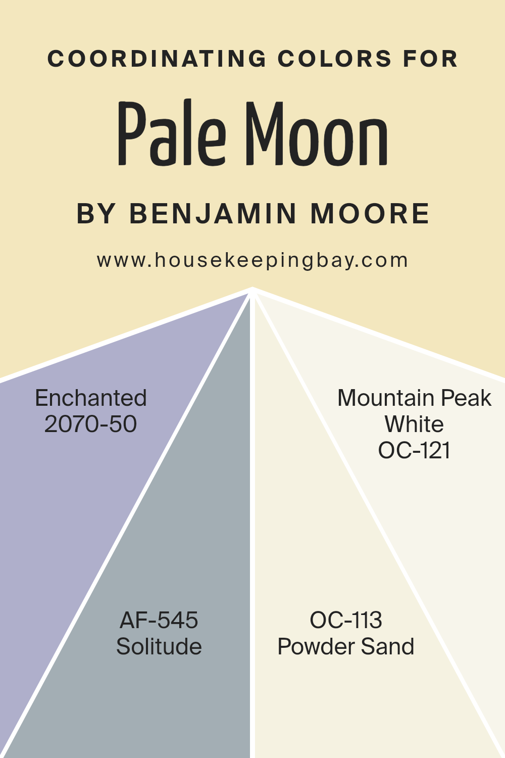
Coordinating Colors of Pale Moon OC-108 by Benjamin Moore
Coordinating colors are a set of hues selected to harmonize well with a primary color, enhancing the overall aesthetic of an interior space without overpowering it. The idea is to create a visually appealing and balanced environment. For instance, Pale Moon OC-108 by Benjamin Moore, a gentle off-white with a touch of warmth, pairs beautifully with other colors to add depth and character to a room. These coordinating colors complement each other while providing some contrast to make the design interesting.
The color Enchanted 2070-50, provides a bold and vibrant violet that gives a lively pop to spaces dominated by Pale Moon OC-108, offering a playful yet sophisticated look. Solitude AF-545, a soft and peaceful blue-gray, creates a soothing atmosphere when used alongside Pale Moon.
It’s ideal for places where calm and focus are desired. Powder Sand OC-113 is a warm beige that echoes the subtle warmth of Pale Moon, establishing a seamless flow from room to room with its understated elegance. Lastly, Mountain Peak White OC-121 is a crisp, clean white that can brighten spaces and bring out the subtle tones of Pale Moon, perfect for trim and ceilings to add a fresh lift. Together, these colors work to create a cohesive palette that varies in mood and intensity, making them highly versatile for different design projects.
You can see recommended paint colors below:
- 2070-50 Enchanted
- AF-545 Solitude
- OC-113 Powder Sand
- OC-121 Mountain Peak White
housekeepingbay.com
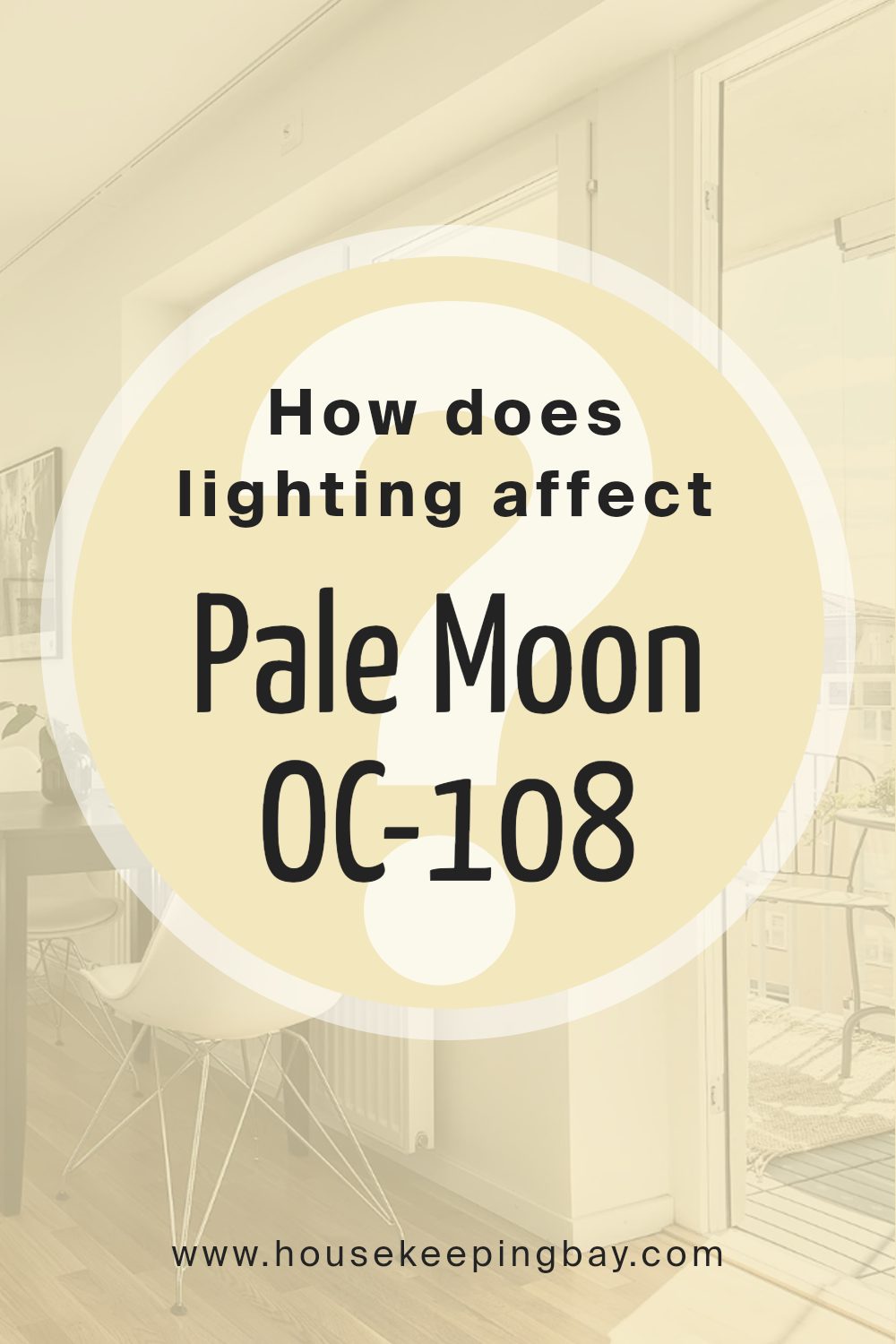
How Does Lighting Affect Pale Moon OC-108 by Benjamin Moore?
Lighting plays a crucial role in how colors appear in a room, impacting mood and ambiance. Colors can look dramatically different under various light sources. Natural sunlight usually reveals the truest color, while artificial light can alter perceptions of color.
Consider the color Pale Moon OC-108 by Benjamin Moore. It’s a soft, off-white shade with a warm undertone. In natural light, Pale Moon tends to look bright and airy, making spaces feel open and light. In artificial light, such as incandescent lighting, it may appear slightly more yellow or creamy, enhancing its warmth.
The direction a room faces also affects how Pale Moon shows up:
North-facing rooms – These rooms often get less direct sunlight, which can make colors appear cooler. Therefore, Pale Moon might look slightly muted and more shadowy. It retains a warm and inviting quality, helping to counter the cooler light.
South-facing rooms – With plentiful sunlight, south-facing rooms will show Pale Moon in its truest form. The color remains warm, fresh, and lively throughout the day, making these rooms feel bright and cozy.
East-facing rooms – Morning light is warm and yellow, so Pale Moon will look its warmest and most welcoming in the morning. As the day progresses and the natural light diminishes, the color may appear more neutral and less intense.
West-facing rooms – Evening light in west-facing rooms is warm and golden, which can make Pale Moon look softer and even slightly more pink or golden in the late afternoon and evening.
Understanding how Pale Moon OC-108 reacts to different kinds of light and room orientations helps in making effective design decisions, ensuring the chosen paint color fits the intended aesthetic and functional needs of a space.
housekeepingbay.com
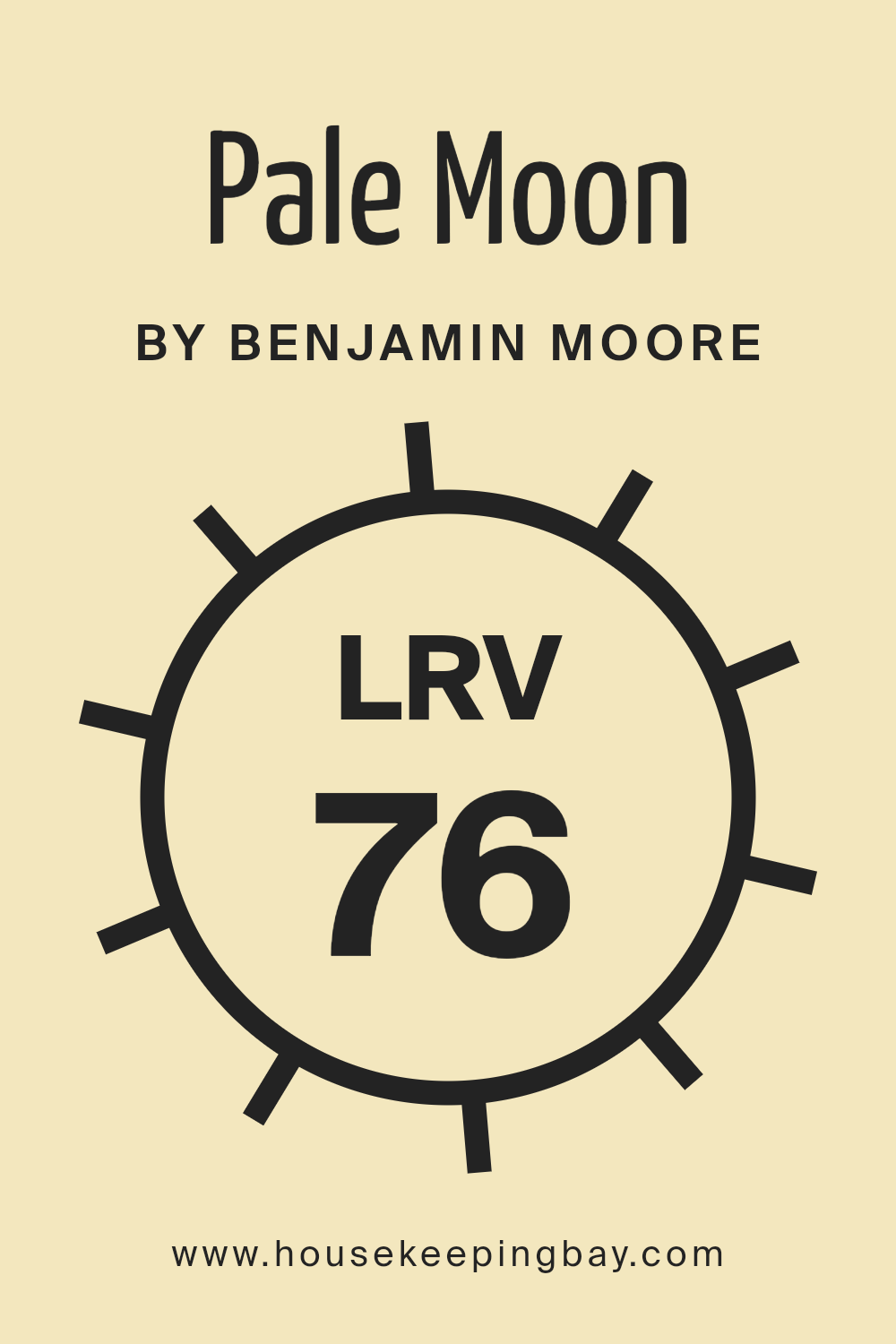
What is the LRV of Pale Moon OC-108 by Benjamin Moore?
LRV stands for Light Reflectance Value, which is a measure of the amount of visible and usable light that a paint color reflects back into the environment. It’s expressed on a scale from 0 to 100, with 0 being pure black and 100 being pure white. Colors with higher LRVs are generally brighter and make spaces appear larger and more open because they reflect more light. Conversely, colors with lower LRVs absorb more light, making rooms feel cozier but smaller.
The LRV of Pale Moon OC-108 by Benjamin Moore is 76.31, indicating that it is a fairly light color that reflects a good amount of light. This makes it an excellent choice for spaces that might not have a lot of natural lighting, as it can help make the area feel brighter and more spacious.
The soft hue of Pale Moon can also help soften the overall feel of a room, making it feel warm and welcoming without overpowering the senses. Pale Moon’s high LRV means it plays very well with both natural light and artificial lighting, enhancing the room’s overall brightness efficiently.
housekeepingbay.com
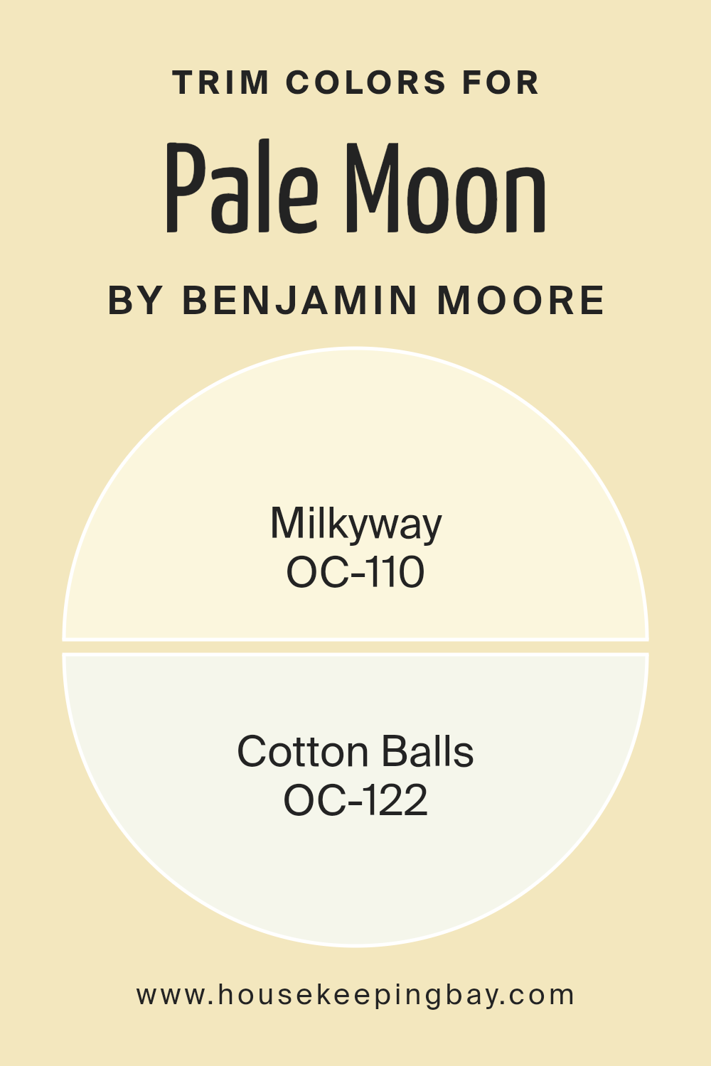
What are the Trim colors of Pale Moon OC-108 by Benjamin Moore?
Trim colors are specifically chosen paint shades used to accentuate architectural features such as door frames, window moldings, and baseboards, adding depth and contrast to the walls and overall color scheme of a room.
When used thoughtfully, such as with combinations like Pale Moon OC-108 by Benjamin Moore as the main wall color, trim colors can beautifully frame and enhance the visual appeal of a space, helping to define and refine its aesthetic qualities. For instance, selecting soft, complementary tones for the trim can subtly highlight these details without overwhelming the primary color palette.
OC-110 – Milkyway, is a warm, creamy off-white that provides a gentle contrast when used as a trim color, adding a soft and cozy feel to the room while still keeping the atmosphere light and airy.
OC-122 – Cotton Balls offers a crisp, clean white that acts as a sharper contrast to more muted wall colors like Pale Moon OC-108, which can help in making the wall color pop more distinctly and give the room a fresh, invigorating feel. Both colors help create a layered visual effect that enhances both the space and the architectural elements.
You can see recommended paint colors below:
- OC-110 Milkyway
- OC-122 Cotton Balls
housekeepingbay.com
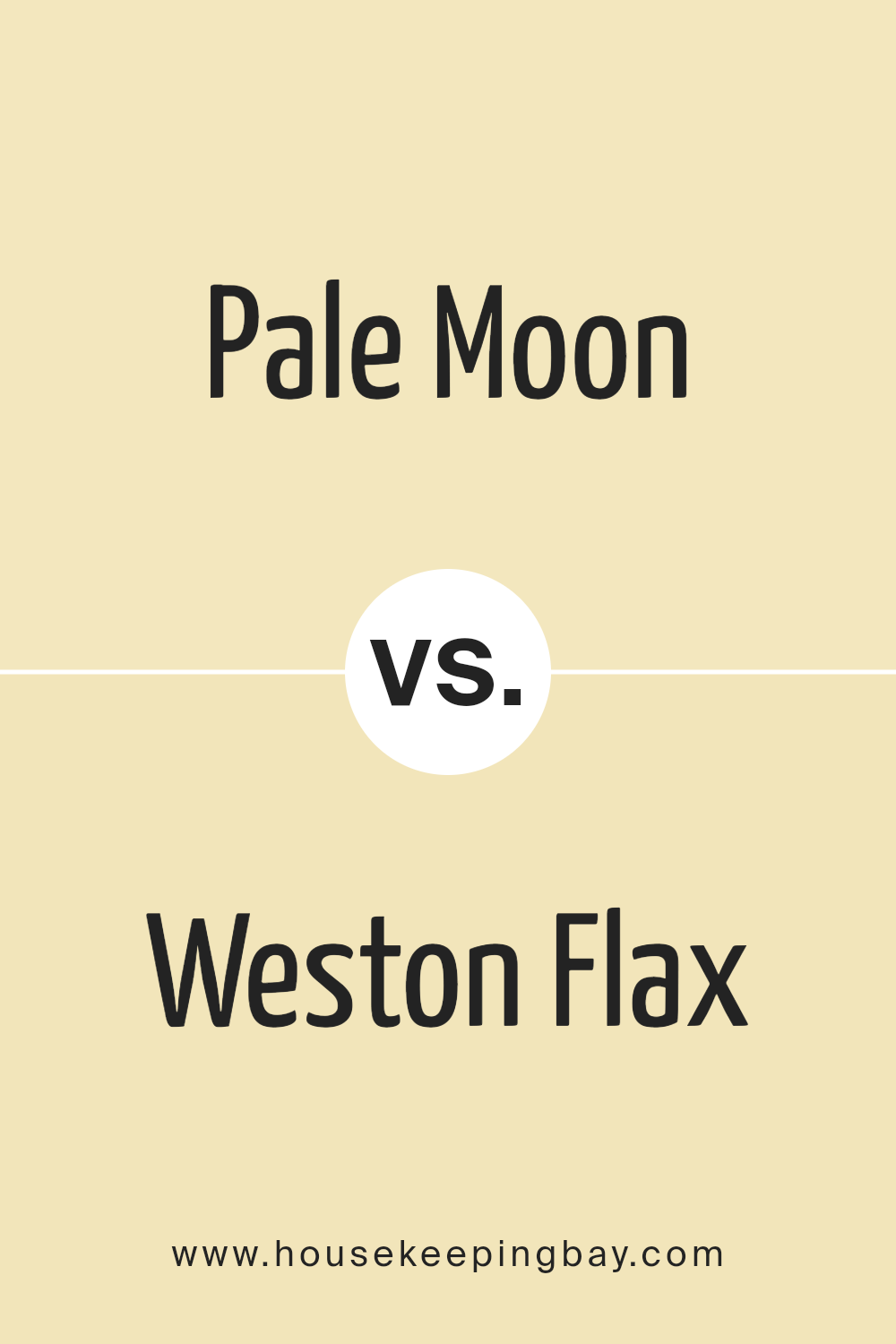
Colors Similar to Pale Moon OC-108 by Benjamin Moore
Using similar colors in design is crucial because they provide a cohesive look and feel. This uniformity can make small spaces appear larger and gives the eye a comforting path to follow. Colors such as Pale Moon OC-108 and Weston Flax HC-5both by Benjamin Moore, play a significant role in achieving seamless aesthetics.
As members of the same warm, muted palette, they support each other and create visual harmony. These tones also reflect light gently, lending a soft, inviting glow to a room. By keeping the base of the color scheme congruous, adding accent colors or various textures becomes more manageable and more effective. This subtle blend can also help highlight architectural features and furniture, guiding the viewer’s focus subtly and naturally throughout the space.
Pale Moon OC-108, a soft, washed yellow, offers a light and airy feel that can instantly warm up a room without overwhelming it with brightness. It complements natural elements like wooden furniture and greenery well, enhancing their organic nature.
In contrast, Weston Flax HC-5 is a deeper yellow, presenting a golden hue that suggests richness and warmth. This color works well in spaces that require a bit more depth or a focal point without deviating from the overall softness of the palette.
Both colors construct an environment that feels harmonious and comforting, suitable for rooms meant for relaxation and leisure.
You can see recommended paint color below:
- HC-5 Weston Flax
housekeepingbay.com
How to Use Pale Moon OC-108 by Benjamin Moore In Your Home?
Pale Moon OC-108 by Benjamin Moore is a soothing off-white paint color with a hint of yellow, giving rooms a soft, warm glow. This color works well in spaces that receive a lot of natural light, as it enhances the light, making the area feel more welcoming and cozy.
You can use Pale Moon OC-108 in nearly any room of your house—whether it’s the living room, kitchen, or bedroom—to create a calm, inviting backdrop that complements a wide range of decorating styles and colors.
For living rooms, applying Pale Moon on the walls sets a gentle, neutral tone, allowing furniture and art to stand out. In kitchens, this color pairs beautifully with wood cabinets or white countertops for a clean, fresh look. Bedrooms benefit from its warm undertone that helps in creating a restful environment, perfect for unwinding at the end of the day. Additionally, its versatility makes it an excellent choice for ceilings and trim, helping to unify a space or provide a subtle contrast with darker tones.
Pale Moon OC-108 by Benjamin Moore vs Weston Flax HC-5 by Benjamin Moore
Pale Moon OC-108 by Benjamin Moore is a soft, almost ethereal light beige that carries a hint of gray, giving it a serene, gentle presence in a space. This color is suited for creating a calm and soothing environment. It reflects light well, making it a great choice for spaces that need to feel more open and airy.
Contrasting with this, Weston Flax HC-5, also by Benjamin Moore, presents as a warm golden yellow. This color brings a cheerful and inviting energy to any room, lending a sunny, cozy ambiance. Because of its richer, more saturated hue, Weston Flax can make a space feel more intimate and welcoming.
Both Pale Moon and Weston Flax offer distinct vibes to a room. While Pale Moon is subtle and can blend seamlessly with various decor elements, Weston Flax stands out more and can serve as an excellent focal color or accent. Each color could be ideal depending on the mood you want to create in your space.
You can see recommended paint color below:
- HC-5 Weston Flax
housekeepingbay.com
Conclusion
This paint color provides a soft, gentle backdrop that works beautifully in almost any space. Its pale, creamy undertone adds warmth without being overwhelming, which makes it a perfect choice for creating a serene and inviting atmosphere.
The color leans towards a subtle, timeless elegance that pairs well with both modern and traditional décor, making it an excellent option for those looking to freshen up their home without committing to bold or bright colors.
From a practical standpoint, Pale Moon is also a wise pick because it helps in maximizing natural light, giving rooms a brighter appearance. For those who are interested in home improvements or simply giving their space a fresh, new look, OC-108 Pale Moon proves to be a reliable and appealing choice.
It’s clear why many people recommend this shade; it manages to harmonize ease and sophistication, proving that simplicity often leads to the most beautiful outcomes in home design.Overall, my experience and learning about OC-108 Pale Moon have solidified my view that it is an excellent color choice for anyone looking to enhance their living environment.
housekeepingbay.com
