White Down OC-131 by Benjamin Moore
Gentle Elegance in Every Color
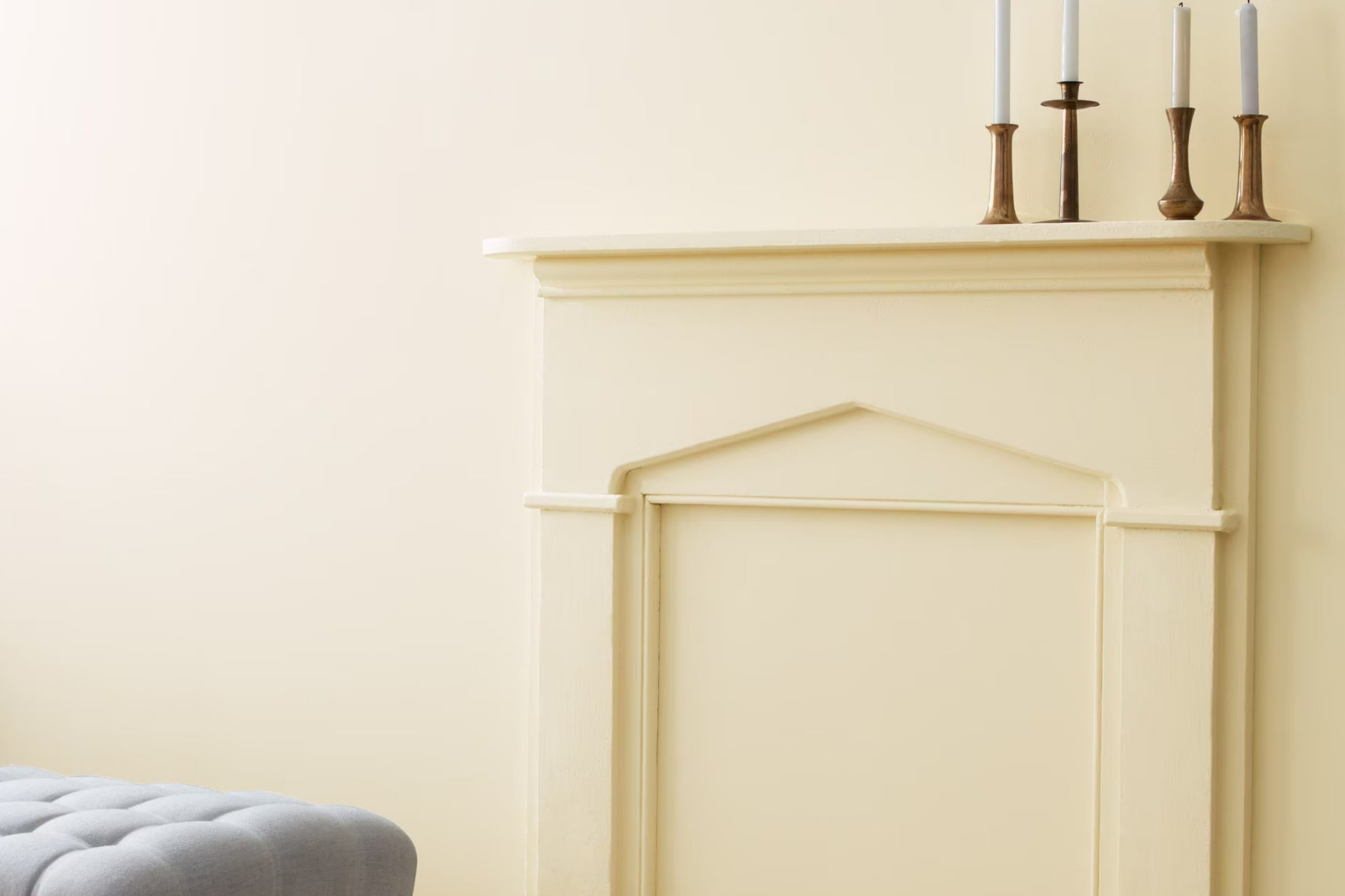
Picking the right paint color can be tricky. With so many choices, it’s not always easy to find the perfect match for your space. If you’re looking for a neutral shade, check out OC-131 White Down by Benjamin Moore. It’s warm and inviting without feeling too bold.
White Down is a creamy off-white that can create a cozy atmosphere in any room. It’s not too stark, offering a slight warmth that’s perfect for living areas or bedrooms.
You might find it’s a great choice if you love a soft, muted look without veering into a color that’s too yellow or too gray.
One of the best things about White Down is its flexibility. Whether you have modern furniture or vintage pieces, this shade blends seamlessly. It complements a variety of styles, so you don’t have to worry about it clashing with existing elements.
Also, it’s a reliable backdrop for artwork, making it ideal if you like switching up decor. It maintains its charm in different lighting conditions, so whether it’s natural sunlight or indoor bulbs, you can count on it to maintain its appeal throughout the day.
Think about how a subtle change in color can affect your home’s atmosphere. A warm white like OC-131 might be just what you need to refresh your space.
via benjaminmoore.com
What Color Is White Down OC-131 by Benjamin Moore?
White Down OC-131 by Benjamin Moore is a warm, creamy off-white shade, offering a touch of subtle sophistication. It provides a gentle, inviting atmosphere, making it an ideal choice for spaces aiming for a cozy and welcoming vibe. This soft color has slight undertones that balance between beige and gray, lending versatility to various design styles.
In traditional interiors, White Down blends seamlessly with classic wood furnishings and rich textures. It enhances moldings, built-ins, and vintage pieces, allowing detailed craftsmanship to shine.
In contemporary spaces, it provides a clean backdrop for sleek furniture and metal accents without feeling stark or cold.
White Down works beautifully in rustic or farmhouse settings, complementing natural materials like exposed wood beams, stone, and textiles such as linen and cotton.
The warmth in the shade coordinates well with warm metals such as brass or copper, adding a touch of elegance to any room.
Industrial or modern interiors benefit from White Down’s ability to moderate strong lines and materials, offering contrast against concrete, steel, and industrial lighting fixtures.
Overall, White Down is adaptable, working well with organic materials and muted palettes. It remains true in different lighting conditions, making it a reliable choice for homes seeking warmth and understated elegance.
housekeepingbay.com
Is White Down OC-131 by Benjamin Moore Warm or Cool color?
White Down OC-131 by Benjamin Moore is a warm, soft off-white color. It brings a cozy vibe to any room without feeling too stark. This shade of white has subtle undertones of beige, giving it a creamy appearance. When used on walls, it creates a gentle and inviting atmosphere that makes spaces feel comfortable and relaxed.
In homes, White Down can enhance natural light, making rooms seem brighter and more welcoming. It pairs well with both traditional and modern furniture, providing a versatile backdrop that complements a range of styles.
When used with darker colors, it adds contrast and balance, while with lighter tones, it maintains a soft, harmonious look.
White Down is an excellent choice for living rooms, bedrooms, and kitchens, offering a timeless appeal. Its warmth can make a house feel more like a home, suitable for spaces where comfort and ease are important.
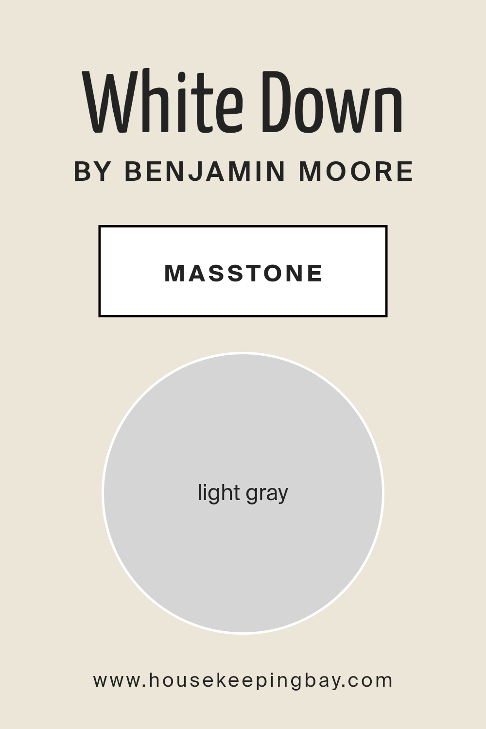
What is the Masstone of the White Down OC-131 by Benjamin Moore?
White Down OC-131 by Benjamin Moore is a light gray color that looks very soft and gentle. Its masstone—what you see at first glance—is the pale gray shade #D5D5D5. This subtle tone makes it easy to use in many home settings. Light gray can make a room feel more open and airy, which is great for smaller spaces. It is versatile and can match well with many other colors, whether you have bold furniture or more relaxed decor.
White Down OC-131 offers a neutral backdrop that is easy on the eyes. It doesn’t demand attention, but rather creates a peaceful atmosphere. This makes it an excellent choice for living rooms, bedrooms, and offices where a calming environment is desired.
Additionally, its soft tone allows natural light to reflect in a pleasing way, enhancing the overall brightness of a space without feeling stark.
housekeepingbay.com
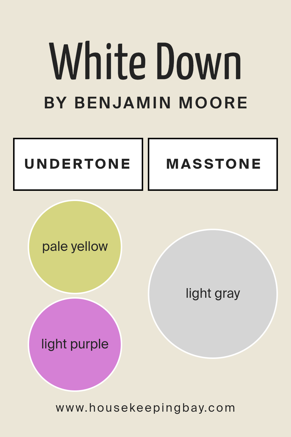
Undertones of White Down OC-131 by Benjamin Moore
White Down OC-131 by Benjamin Moore is a soft, warm white paint color. Undertones play a significant role in how we perceive colors. They are the subtle hues beneath the main color, giving it unique characteristics.
In White Down OC-131, the undertones include pale yellow, light purple, light blue, pale pink, mint, lilac, and grey. These undertones add depth and complexity to the color, influencing how it appears under different lighting conditions.
For example, pale yellow and light blue can create a sense of warmth and balance, while mint and lilac offer a subtle fresh feeling. Light purple and pale pink bring gentle, cozy touches. Grey adds neutrality and softness.
When White Down OC-131 is used on interior walls, the undertones can affect the room’s atmosphere. In spaces with warm lighting, the pale yellow and mint undertones may become more noticeable, giving the room warmth.
Conversely, in rooms with cooler lighting, the light blue and grey undertones may stand out, creating a calming and balanced environment.
The delicate undertones like pale pink and light purple can also provide an inviting and welcoming feel, making it a versatile choice that works well with various decor styles. Understanding undertones helps you select the perfect color for your space, enhancing its aesthetic and mood.
housekeepingbay.com
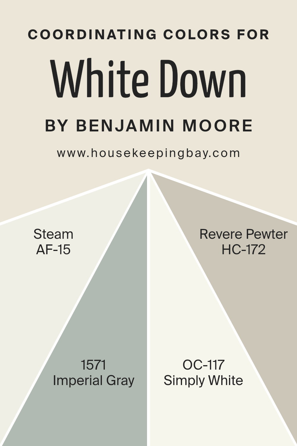
Coordinating Colors of White Down OC-131 by Benjamin Moore
Coordinating colors are those that harmonize well with a primary color, enhancing its visual appeal and creating a balanced aesthetic. When choosing coordinating colors for White Down OC-131 by Benjamin Moore, it’s essential to consider tones that complement its soft, subtle warmth.
The colors AF-15 Steam, 1571 Imperial Gray, OC-117 Simply White, and HC-172 Revere Pewter work well as they provide a range of contrasts and complements. These colors help create a cohesive and inviting environment, whether you’re styling a single room or an entire space.
Steam AF-15 is a light, airy neutral with a hint of warmth, perfect for adding a gentle contrast to White Down without overpowering it. Imperial Gray 1571 adds a slightly darker, more sophisticated tone with its cool, muted hues, providing depth and elegance. Simply White OC-117 is a crisp, clean choice that brightens spaces, offering a fresh complement to the softness of White Down.
Revere Pewter HC-172, with its warm gray undertones, ties everything together, offering a neutral backdrop that enhances both classic and contemporary settings.
These colors work together in harmony, creating a pleasing and versatile palette that’s easy to incorporate into any space.
You can see recommended paint colors below:
- AF-15 Steam
- 1571 Imperial Gray
- OC-117 Simply White
- HC-172 Revere Pewter
housekeepingbay.com
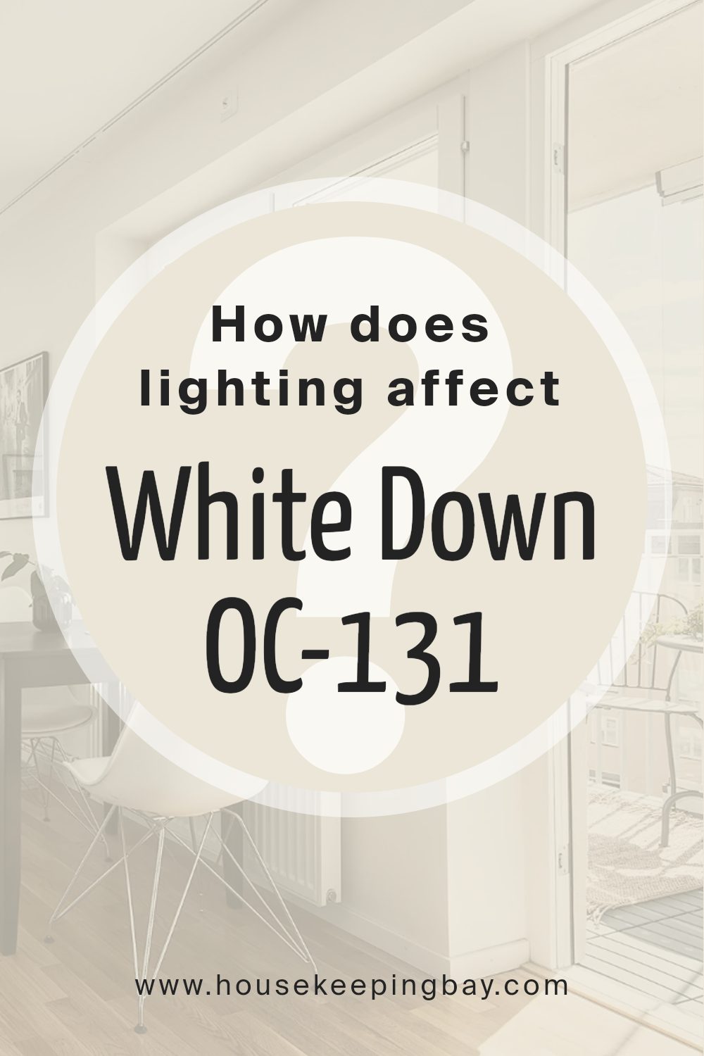
How Does Lighting Affect White Down OC-131 by Benjamin Moore?
Lighting plays a huge role in how we perceive color. The same shade can look different depending on the light source. Let’s consider White Down OC-131 by Benjamin Moore. This shade is a soft, warm off-white that can change appearance under different lighting conditions.
In natural light, the time of day and the direction windows face can greatly influence how White Down looks. In north-facing rooms, the light tends to be cooler and more consistent throughout the day. This can make White Down appear a bit more muted or grayish, as the cooler light balances out its warm undertones.
In south-facing rooms, the abundant natural light often has a warm quality, especially in the afternoon. This can enhance White Down’s warm characteristics, making it look cozier and creamier. The rich light in these rooms brings out the warmth, giving a welcoming feel.
East-facing rooms get a lot of bright, warm light in the morning but become cooler as the day progresses. White Down in these rooms may start the day looking more golden and warm, then take on a softer appearance as it loses direct sunlight in the afternoon.
West-facing rooms receive warm, intense light in the late afternoon and evening. This light can cause White Down to appear more vibrant and warm. In the morning, when there is less direct sunlight, it might seem cooler and less intense.
Under artificial light, the type of bulb used can also impact White Down’s appearance. Warm incandescent bulbs amplify its cozy, yellow undertones, making the space inviting. In contrast, cooler LED lights could reduce the warmth, making the color feel more neutral.
Overall, White Down OC-131 is versatile but can look distinctly different depending on lighting conditions, offering a unique feel to each space.
housekeepingbay.com
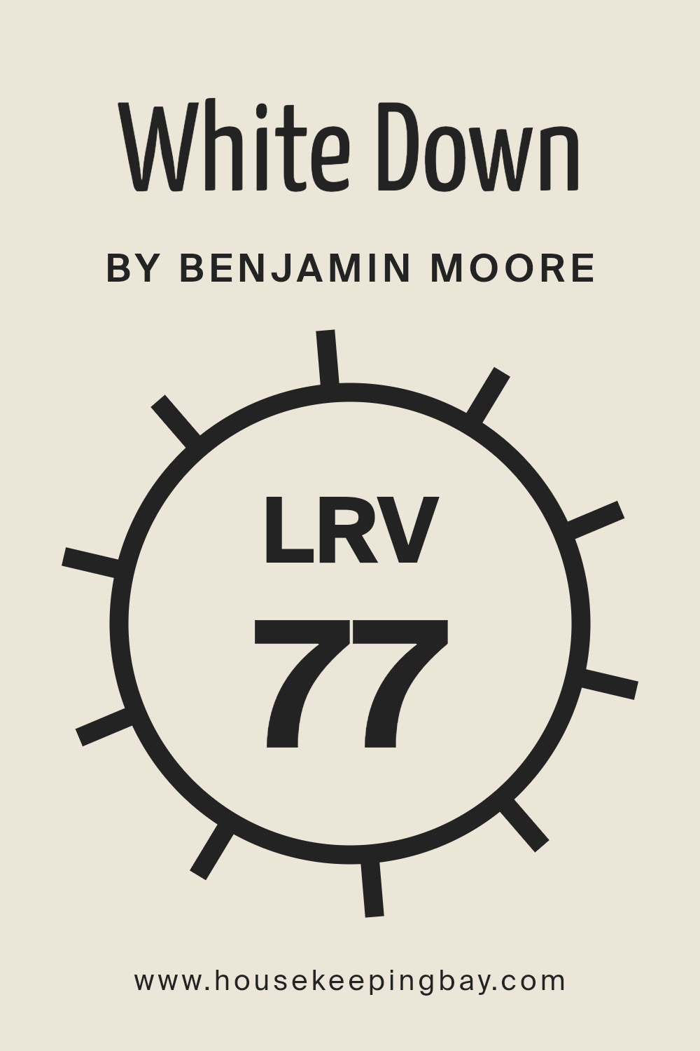
What is the LRV of White Down OC-131 by Benjamin Moore?
LRV stands for Light Reflectance Value. This is a measurement used to determine how much light a color reflects or absorbs. On a scale from 0 to 100, where 0 means the color absorbs all light and 100 means it reflects all light, White Down OC-131 by Benjamin Moore has an LRV of 76.69.
This high LRV indicates that White Down is quite a light color, reflecting a lot of light back into the room. Colors with high LRVs can make spaces feel brighter and larger because they bounce more light around, which can be especially helpful in smaller or darker spaces.
In the case of White Down OC-131, its LRV of 76.69 means that it will make a room feel light and airy. As it reflects a good amount of natural and artificial light, this color can help illuminate spaces even in low-light conditions. Rooms painted with White Down will likely have a welcoming and open feel, as the color prevents the space from feeling cramped or shadowy.
Additionally, because it reflects a lot of light, White Down can also subtly influence the mood of a room, making it feel calm and open. This makes it a versatile choice for many areas in a home or office.
housekeepingbay.com
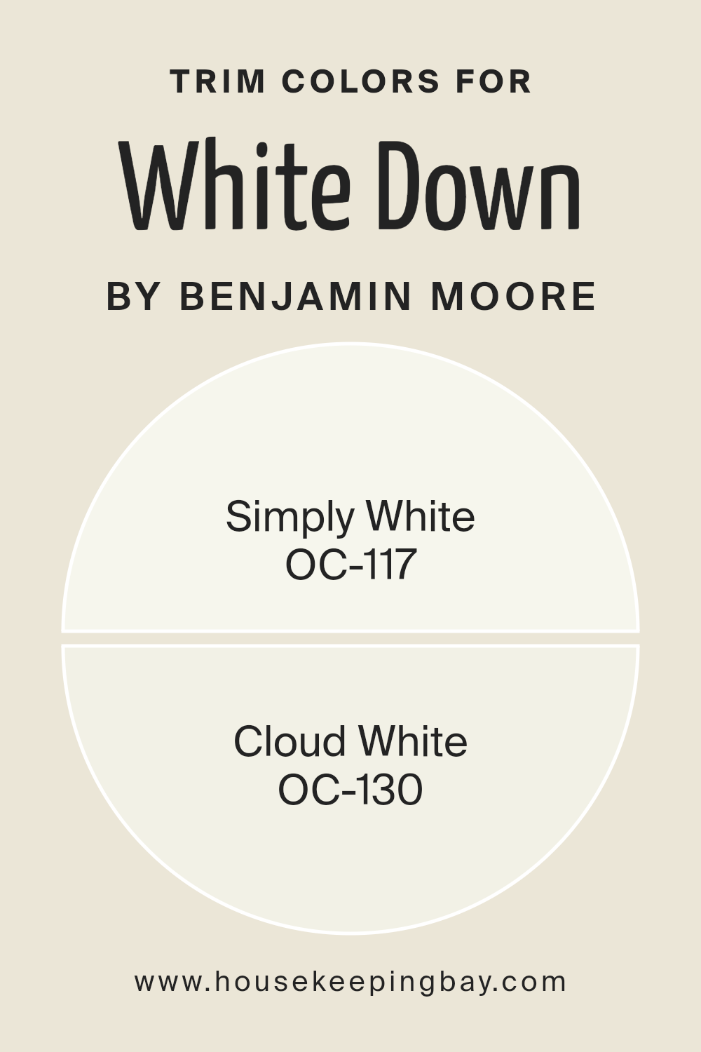
What are the Trim colors of White Down OC-131 by Benjamin Moore?
Trim colors refer to the paint colors used on the edges and borders of walls, such as baseboards, moldings, and window and door frames. These colors play a significant role in complementing or highlighting the main wall color.
For White Down OC-131 by Benjamin Moore, choosing the right trim color can enhance its soft, neutral creaminess, adding depth and contrast to a room. White Down has a subtle warmth that can pick up the undertones of other colors around it, so it’s important to select trim colors that will harmonize well and not compete.
Trim colors help in creating a refined and finished look to the space, making the walls stand out or, in some cases, helping create a soothing, cohesive visual by blending seamlessly.
Simply White OC-117 is a versatile and clean white with a slight warmth, making it a perfect trim color to complement White Down. This color has the ability to highlight the delicate nature of White Down without clashing or appearing too stark.
On the other hand, Cloud White OC-130 has a gentle, warm undertone that offers a bit more depth than a true white. It can also pair beautifully with White Down, offering just enough contrast to outline the space elegantly while maintaining a soothing atmosphere.
Each of these trim colors provides a subtle shift from the main wall color, enhancing the overall aesthetic and structure of the interior design.
You can see recommended paint colors below:
housekeepingbay.com
Colors Similar to White Down OC-131 by Benjamin Moore
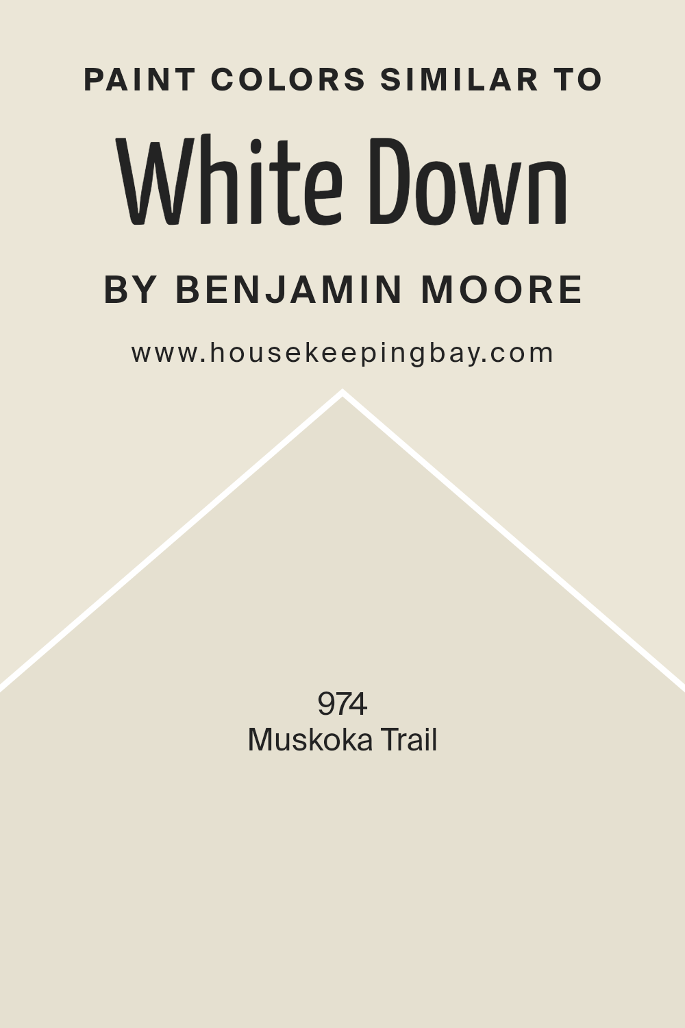
When choosing paint colors for a room, selecting similar shades to a base color can create a harmonious and cohesive look. With White Down OC-131 by Benjamin Moore as the starting point, selecting colors that complement this shade is essential for a unified design.
One such similar color is 974 – Muskoka Trail. This color adds a gentle warmth to any room, reminiscent of nature and earthy paths. It has a soft, muted quality that pairs beautifully with the softness of White Down, offering a touch of coziness without overwhelming the space.
Using similar colors creates a smooth transition between hues, which is pleasing to the eye. They allow for subtle depth and interest in a space without the jarring contrast that different colors might bring. By maintaining a consistent undertone, these colors ensure that rooms flow seamlessly from one to the next, creating a relaxing and consistent environment.
The use of colors like Muskoka Trail, with its calm and grounded tone, enhances the natural light in a room and works well alongside the brightness of White Down OC-131, leading to an inviting and balanced space that feels unified and whole.
You can see recommended paint color below:
- 974 Muskoka Trail
housekeepingbay.com
How to Use White Down OC-131 by Benjamin Moore In Your Home?
White Down OC-131 by Benjamin Moore offers a soft, neutral hue perfect for any home. This versatile paint color works well in many settings, creating a warm and inviting atmosphere. Its gentle off-white tone with subtle beige undertones makes it a suitable choice for living rooms, bedrooms, or hallways.
Using White Down on walls allows for easy coordination with various furniture styles or accent pieces. It pairs nicely with wood trims or bright white ceilings, enhancing the overall aesthetic of a space. The color brings an airy feel, offering a fresh look without being too cool or stark.
White Down maintains a balanced appearance, making rooms feel cozy and spacious. It complements other colors easily, whether incorporating bold artwork or colorful furniture. For those wanting a subtle yet impactful change in their home, White Down provides a beautiful and timeless look adaptable for any interior design preference.
White Down OC-131 by Benjamin Moore vs Muskoka Trail 974 by Benjamin Moore
White Down OC-131 by Benjamin Moore is a soft, warm white that feels light and versatile. It has subtle undertones, giving spaces a calm, inviting atmosphere. This shade blends effortlessly with various design styles due to its neutrality.
Muskoka Trail 974, also by Benjamin Moore, has earthy, greenish hues. It carries a natural vibe reminiscent of outdoor landscapes. This color can create a cozy, grounding effect in a home, making spaces feel more connected to nature.
When comparing these two, White Down serves well in rooms where brightness and openness are desired. It’s ideal for minimalistic or modern designs. Muskoka Trail, being deeper and more rooted in nature, works brilliantly for spaces aiming for a warm, earthy feel. While White Down offers a serene canvas, Muskoka Trail provides depth and richness. Both colors cater to different aesthetic goals, allowing for creative expression in any room design.
You can see recommended paint color below:
- 974 Muskoka Trail

housekeepingbay.com
Conclusion
OC-131 White Down by Benjamin Moore offers a delightful way to add warmth and comfort to any space. As I carefully considered this paint color, I’ve come to appreciate its subtlety and versatility. It’s not just a plain white; it has a soft undertone that brings depth and coziness to a room.
I’ve noticed that it works beautifully in various lighting conditions, always maintaining its inviting nature.
In my experience, White Down pairs well with both bold and neutral palettes, allowing for plenty of creative flexibility. Whether used as a main wall color or as an accent, it provides a gentle backdrop that enhances the overall atmosphere of a space. I’ve found it especially effective in living rooms, bedrooms, and even kitchens, where creating a welcoming ambiance is essential.
Furthermore, it’s a reliable choice for those looking to maintain a timeless appearance. It never goes out of style and harmonizes effortlessly with different decor styles, from modern to classic.
Personally, I find it brings a sense of calm and balance to my surroundings, making it an excellent choice for anyone wanting to create a soothing environment in their home.
Overall, White Down is more than just a color; it’s a thoughtful choice for enriching the look and feel of any room.
housekeepingbay.com
Ever wished paint sampling was as easy as sticking a sticker? Guess what? Now it is! Discover Samplize's unique Peel & Stick samples. Get started now and say goodbye to the old messy way!
Get paint samples


