Vast Sky SW 6506 by Sherwin Williams
Elevate Your Space with a Breath of Fresh Air
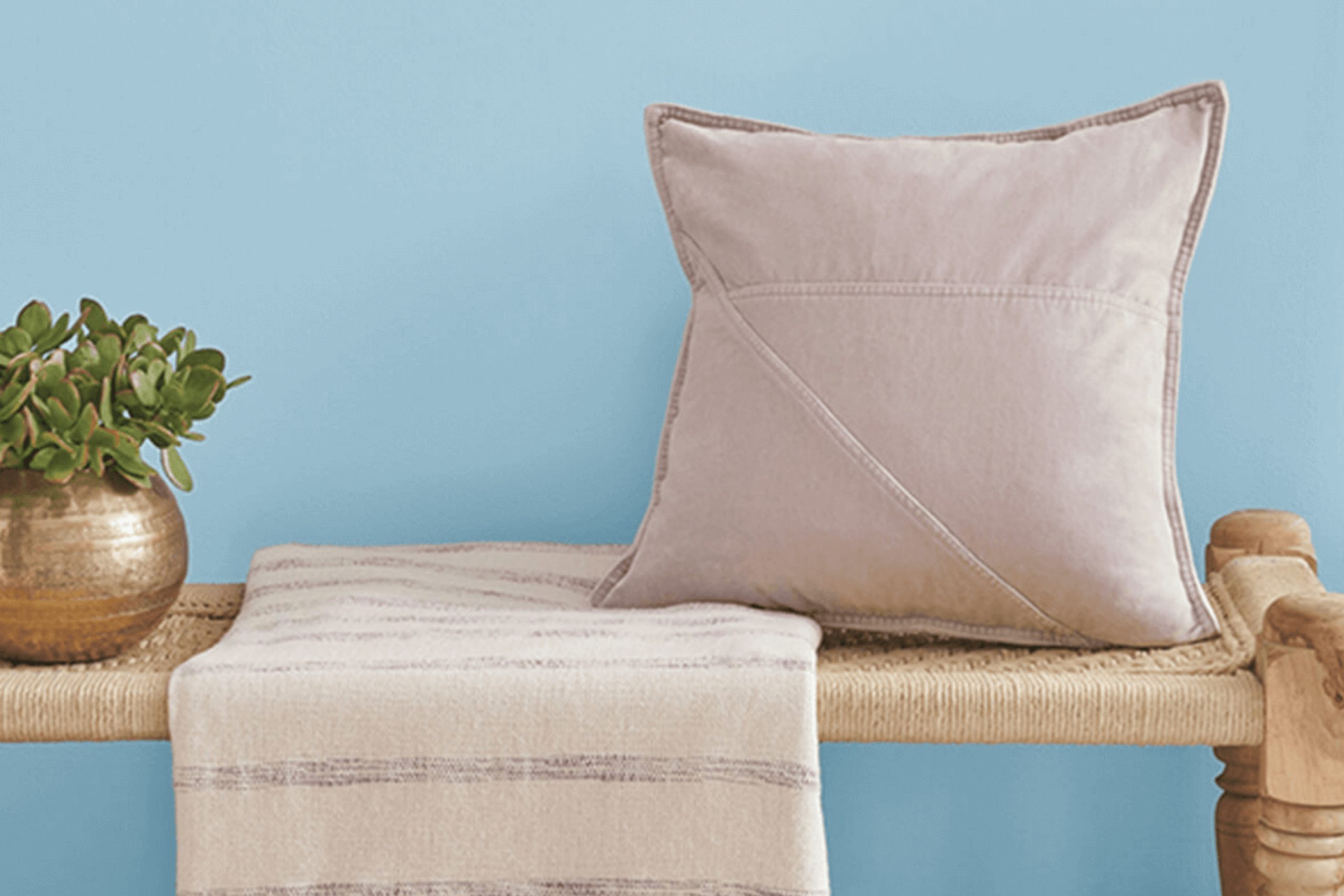
Are you considering a fresh coat of paint for your room and want something that feels open and airy? You might really like Vast Sky SW 6506 by Sherwin Williams. It’s a gentle blue that seems to add a breath of fresh air to any space, making rooms feel more expansive and inviting. This shade matches well with a variety of decor styles, whether you’re aiming for a beachy vibe or a more classic look.
Vast Sky isn’t just a pretty face; it’s also incredibly practical. It does a great job of hiding imperfections on walls and dries to a durable finish that can handle whatever daily life throws at it. This makes it a great candidate for busy areas like your living room or kitchen.
If you’re thinking about refreshing your space, Vast Sky could be the perfect choice to give your home a light, refreshing touch without overwhelming it.
Why not consider this lovely hue for your next project?
via sherwin-williams.com
What Color Is Vast Sky SW 6506 by Sherwin Williams?
Table of Contents
Vast Sky SW 6506 by Sherwin Williams is a soft, gentle blue that invites a sense of calm and openness into any space. This color reflects the serene tones of a clear daytime sky, offering a refreshing breath of air to interior designs. Its lightness ensures it works beautifully in spaces aimed at relaxation and serenity, such as bedrooms and bathrooms.
Vast Sky is versatile, lending itself well to modern, Scandinavian, and coastal interior styles. These designs, known for their clean lines and light color palettes, complement the airy quality of Vast Sky. It pairs exceptionally well with natural materials like light woods, which enhance its earthy, tranquil feel.
Textures such as linen, cotton, and other soft fabrics also work well with this color, contributing to a relaxed and inviting atmosphere.
The paint’s subtle vibrance makes it an excellent choice for walls, but it can also be used for accent pieces like cabinetry or furniture to add a gentle pop of color.
When matched with accessories or furnishings in similar subdued tones, it allows for a harmonious space that feels cohesive and coordinated. Vast Sky SW 6506 is an effective choice for creating a bright, airy feel in your home while maintaining a simple, stylish look.
housekeepingbay.com
Is Vast Sky SW 6506 by Sherwin Williams Warm or Cool color?
Vast SkySW 6506 by Sherwin Williams is a soothing and gentle blue hue with a hint of grey undertone. This color is versatile and works well in various rooms in a home, offering a calm and serene backdrop. It is ideal for bedrooms and bathrooms where a peaceful environment is essential for relaxation. In living rooms or study areas, Vast Sky can help create a focused yet relaxed atmosphere.
The subtle grey tones in Vast Sky make it an excellent choice for pairing with a wide range of colors. It complements whites and creams for a soft, airy feel, and works well with darker greys and blues for a more defined and sophisticated look.
Furniture in natural wood tones or metallic finishes also pairs beautifully with this hue, adding warmth to the space. Light plays an important role with Vast Sky, enhancing its calming effect with natural sunlight or soft artificial lighting. Overall, Vast Sky is a smart choice for those seeking a fresh, adaptable color for their home.
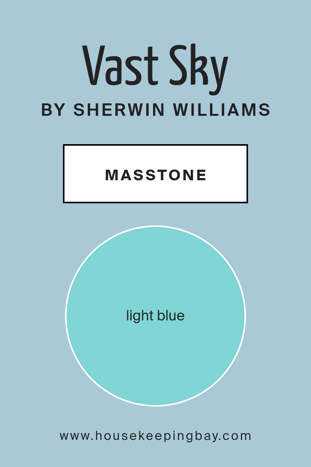
What is the Masstone of the Vast Sky SW 6506 by Sherwin Williams?
Vast Sky SW 6506 by Sherwin Williams is a light blue color with a masstone represented by the hexadecimal code #80D5D5. This shade of blue is gentle and soothing, making it a great choice for use in home interiors. It has a fresh and airy feel that can make any room seem more open and inviting.
This color works particularly well in bedrooms, bathrooms, and living spaces where a calm and peaceful atmosphere is desirable.
The light blue hue of Vast Sky can also help to visually cool down a space, which is perfect for rooms that get a lot of sunlight and tend to feel warm. Additionally, pairing it with neutral colors like white, gray, or soft beige can enhance its serene quality without making the room feel too cold or stark. It’s a versatile color that can be used in various styles of decor, from modern to coastal, adding a touch of softness and light wherever it is used.
housekeepingbay.com
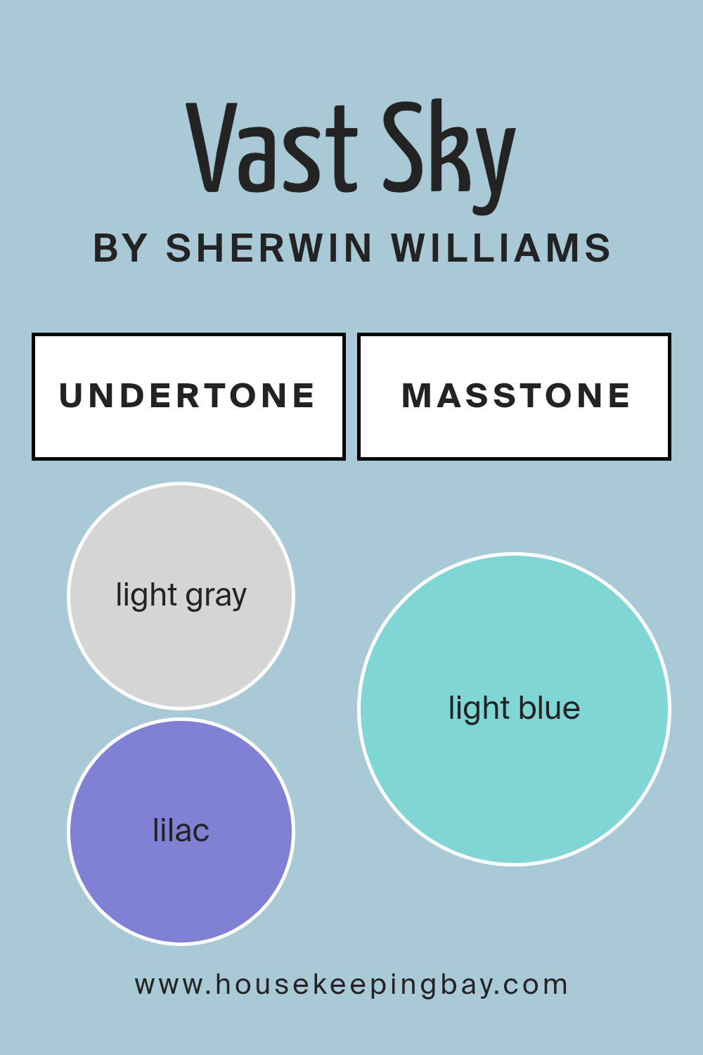
Undertones of Vast Sky SW 6506 by Sherwin Williams
Vast Sky SW 6506 by Sherwin Williams is a versatile paint color that can shift appearances based on its surrounding lighting and decor due to its complex undertones. This color primarily showcases a palette that incorporates light gray, lilac, and light purple, which gives it a subtle coolness. Additionally, Vast Sky contains touches of mint and pale yellow, enhancing its vibrancy in well-lit spaces and adding a touch of warmth.
Undertones significantly influence how we perceive a color. For instance, a dominant undertone can alter the mood of the room or make the wall color appear different from how it might look on a paint swatch under store lighting.
In the case of Vast Sky, the presence of grey, pale pink, and light turquoise undertones provides a soothing effect, and these can either recede or push forward depending on the colors of adjacent walls, furniture pieces, and natural as well as artificial lighting.
When applied to interior walls, Vast Sky SW 6506 can create varied atmospheres. In a room with ample sunlight, the mint and pale yellow undertones may make the walls seem more lively and inviting.
In contrast, in spaces with cooler, artificial lighting, the lilac and light purple undertones might become more pronounced, fostering a soft and serene backdrop. Colors like turquoise and blue in the undertones can also give the room a fresher look, making this an excellent choice for someone looking to introduce a light but sophisticated blue hue to their space.
housekeepingbay.com
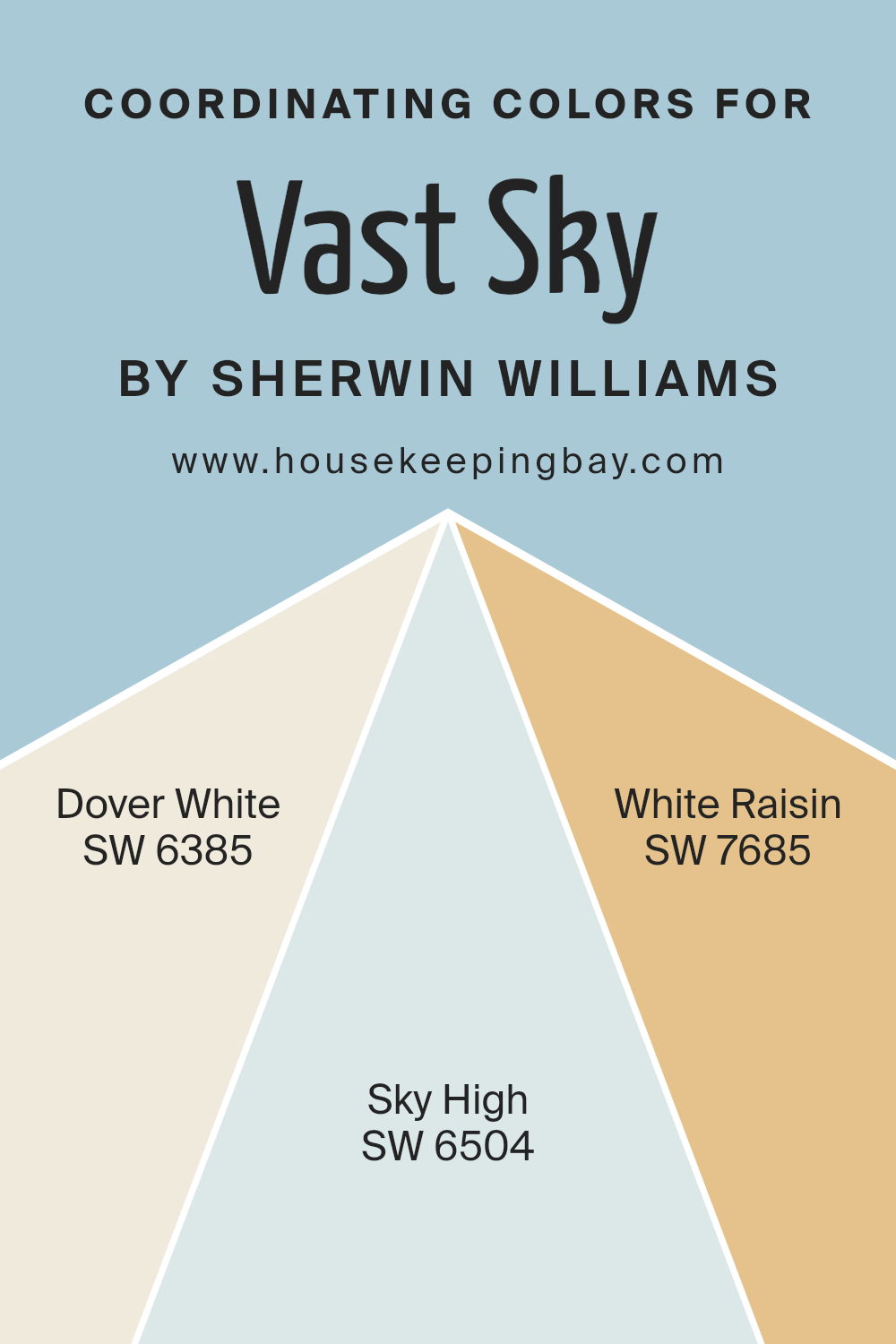
Coordinating Colors of Vast Sky SW 6506 by Sherwin Williams
Coordinating colors are those that complement each other well when used together in decor, creating a balanced and harmonious look. They can be used to enhance the main color in a space, in this case, Vast Sky SW 6506 by Sherwin Williams, by adding variety and interest while maintaining an overall cohesive atmosphere.
Coordinating colors are chosen based on their ability to support the primary shade without overpowering it, helping to achieve a seamless aesthetic throughout an area.
SW 6385 Dover White is a soft, creamy white that offers a subtle backdrop, perfect for making more vivid colors pop or for creating a calm and gentle ambiance when used alone. Then there is SW 6504 Sky High, a light and airy blue that shares a visual similarity to Vast Sky but is slightly less intense, which makes it great for adding depth and dimension to a room without overwhelming the senses.
Lastly, SW 7685 White Raisin brings in a warm tan hue that adds a touch of warmth and earthiness, offering a wonderful contrast that complements the cooler tones of both Vast Sky and Sky High.
Together, these coordinating colors achieve a balanced palette that enhances and supports the primary color choice.
You can see recommended paint colors below:
- SW 6385 Dover White
- SW 6504 Sky High
- SW 7685 White Raisin
housekeepingbay.com
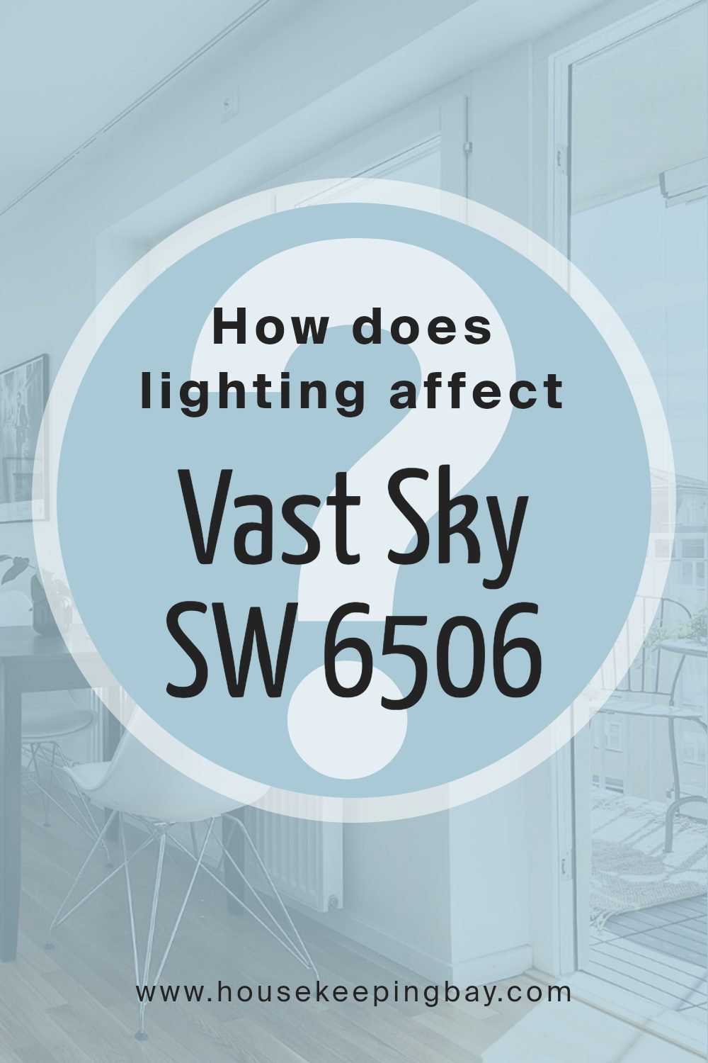
How Does Lighting Affect Vast Sky SW 6506 by Sherwin Williams?
Lighting plays a significant role in how colors appear in an environment. Colors can shift depending on whether they are under natural sunlight or artificial lights such as LEDs or fluorescents. Vast Sky SW 6506 by Sherwin Williams, a light and airy blue, exhibits this shift vividly.
In natural light, Vast Sky SW 6506 shows its truest form due to the full spectrum of light provided by the sun. This color tends to appear brighter and more vibrant when bathed in the natural daylight. Under artificial lighting, the type of light bulb used can affect how Vast Sky is perceived.
Incandescent bulbs, which have a warm glow, can make Vast Sky look slightly greener. In contrast, fluorescent lights, which are cooler, may bring out a more crisp blue in the color.
The orientation of the room also influences the appearance of this color. North-facing rooms receive less direct sunlight and more cool, indirect light, making Vast Sky appear slightly more muted and cooler.
In south-facing rooms, where sunlight is abundant throughout the day, Vast Sky may look much brighter and slightly warmer, enhancing its lively quality.
East-facing rooms benefit from the warm, soft light of the morning sun, making Vast Sky feel crisp and fresh in the morning, then a bit cooler as natural light decreases in the afternoon.
This shift can give the room a calming effect in the morning, transitioning to a more subdued tone in the afternoon. Conversely, west-facing rooms get most of their sunlight in the afternoon, which can make Vast Sky appear warm and vibrant in the late day but paler in the morning.
Understanding these nuances can help in planning interior spaces to optimize the color dynamics based on room orientation and light sources.
housekeepingbay.com
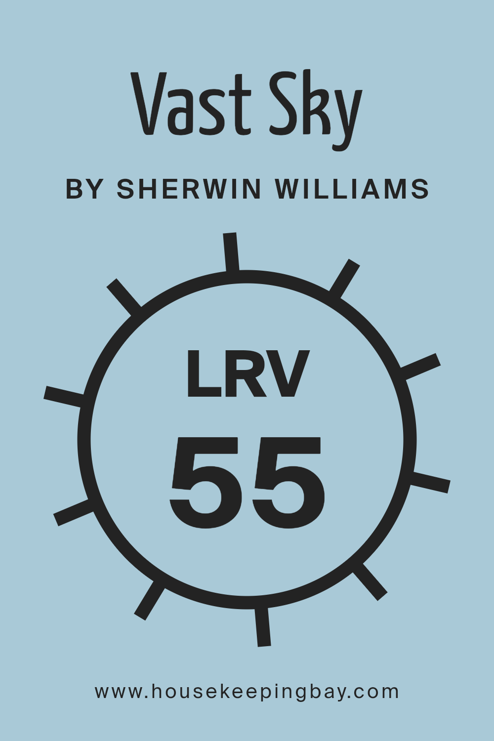
What is the LRV of Vast Sky SW 6506 by Sherwin Williams?
LRV stands for Light Reflectance Value, which is a measure used to indicate how much light a paint color will reflect or absorb when applied to surfaces. This value ranges from 0 (completely absorbing all light, giving a pure black appearance) to 100 (reflecting all light, appearing pure white).
This measurement helps in choosing the right paint color for a given space by indicating how light or dark the color will look once applied on the walls.
A higher LRV means the color will reflect more light, making the space appear brighter and larger, while a lower LRV means the color will absorb more light, making the space look cozier and somewhat smaller.
Vast Sky SW 6506 by Sherwin Williams, with an LRV of 54.921, sits in the mid-range of the scale, meaning it neither reflects nor absorbs light excessively.
This particular shade will give a balanced, neutral feel to a room, not swaying too dark or too light. Such a moderate LRV makes it a versatile color choice, suitable for various rooms and lighting conditions. It can effectively balance out spaces that get a lot of natural light without making dimly lit rooms feel too enclosed or dark, maintaining a pleasing ambiance regardless of the amount of natural light available.
housekeepingbay.com
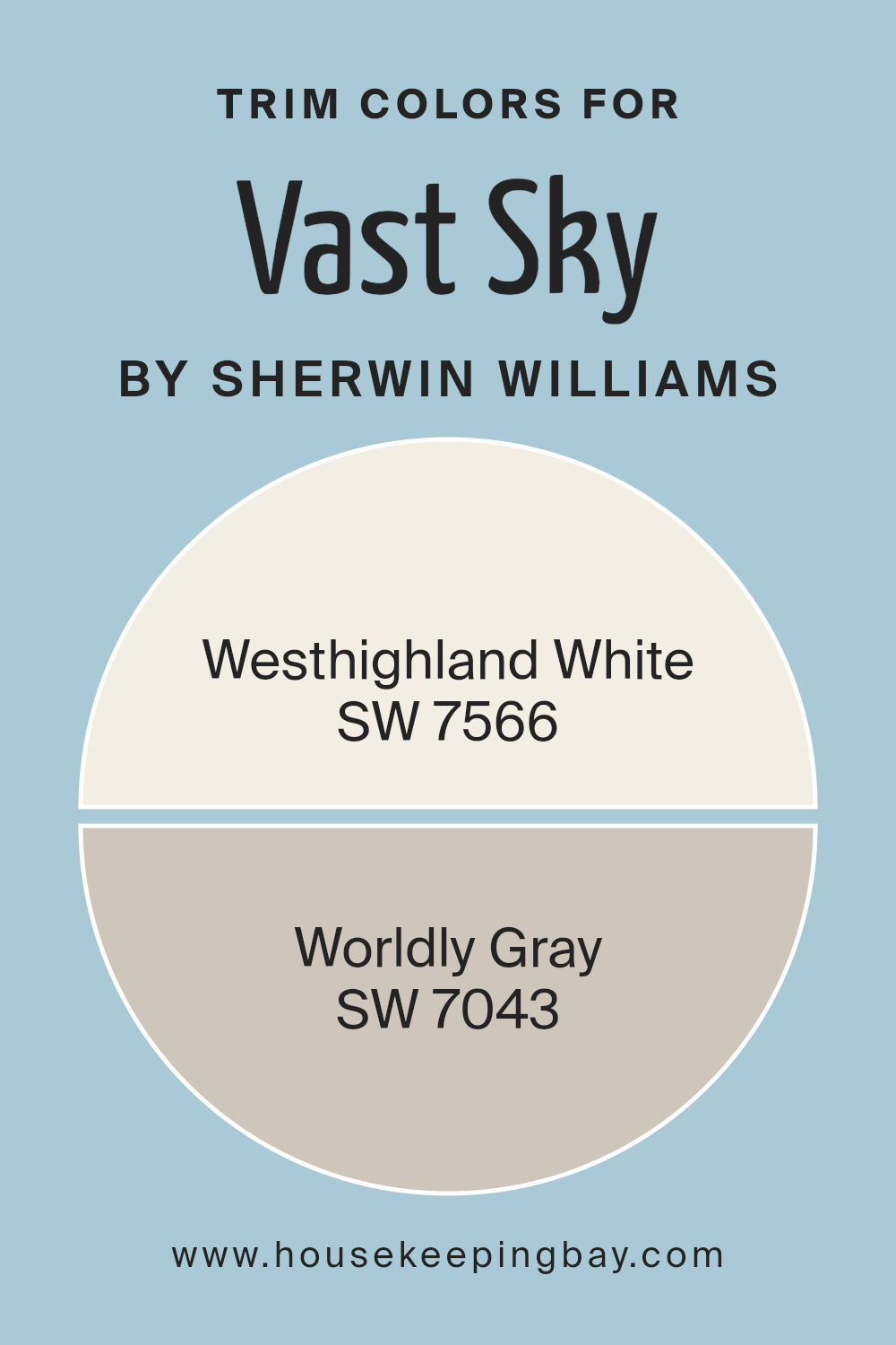
What are the Trim colors of Vast Sky SW 6506 by Sherwin Williams?
Trim colors, like SW 7566 – Westhighland White and SW 7043 – Worldly Gray by Sherwin Williams, are used to highlight the architectural elements of a house such as doors, window frames, and baseboards. Choosing a complementary trim color enhances the main hue, in this case, Vast Sky SW 6506, making the overall look of the home more coherent and visually appealing.
This practice ensures that the subtle yet distinct features of a building stand out, giving it a polished and finished appearance. When well-selected, trim colors can also add depth and contrast to the walls, making the primary color pop more noticeably.
Westhighland White, SW 7566, is a warm and soft white that provides a gentle contrast, softening the boldness of brighter colors like Vast Sky SW 6506. It offers a soothing backdrop that allows for a smooth transition between the vividness of the wall and the trim.
On the other hand, Worldly Gray, SW 7043, offers a neutral, mid-tone gray that balances well with cooler hues, making it ideal for creating a subtle differentiation without overwhelming the main color.
This gray presents an understated elegance that pairs well with both contemporary and traditional designs, making it versatile for various home styles.
You can see recommended paint colors below:
housekeepingbay.com
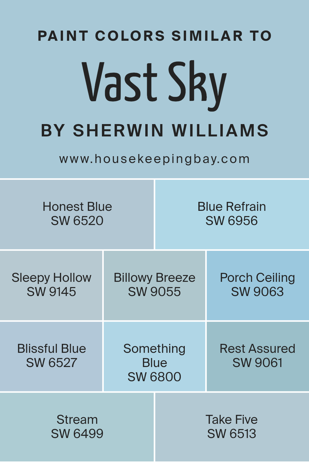
Colors Similar to Vast Sky SW 6506 by Sherwin Williams
Similar colors are essential in design because they provide a cohesive look and feel while still allowing for subtle distinctions that can enhance the aesthetic of a space. Using similar colors like the variations of Vast Sky SW 6506 by Sherwin Williams ensures that the environment maintains a harmonious appearance, which can make it more visually appealing and soothing.
These similar colors also work well together because they share a common base tone, making it easier to create a balanced space without stark contrasts that might disrupt the visual flow.
For example, Honest Blue SW 6520 is a serene blue that has a calming effect, perfect for creating a peaceful atmosphere. Blue Refrain SW 6956 takes a slightly lighter approach, offering a gentle hue that reflects a clear sky. Sleepy Hollow SW 9145 enriches the palette with a deeper, moodier blue which adds depth and interest.
Billowy Breeze SW 9055 provides a soft and airy feel to the space, suggestive of a light, refreshing wind. Porch Ceiling SW 9063 is a lighter blue that reminds one of a crisp, early morning sky.
Blissful Blue SW 6527 leans towards a paler, more tranquil shade, ideal for a relaxed environment. Something Blue SW 6800 has a vibrant, cheerful energy that brightens up any room. Rest Assured SW 9061 offers a dusty blue that’s subtle yet comforting. Stream SW 6499 leans towards a more aquatic blue, bringing in elements of water and flow. Lastly, Take Five SW 6513 closes the loop with a muted blue that supports quiet contemplation and rest. All of these colors, while similar, provide unique opportunities to tailor environments to individual tastes and moods, all while staying within a coherent color scheme.
You can see recommended paint colors below:
- SW 6520 Honest Blue
- SW 6956 Blue Refrain
- SW 9145 Sleepy Hollow
- SW 9055 Billowy Breeze
- SW 9063 Porch Ceiling
- SW 6527 Blissful Blue
- SW 6800 Something Blue
- SW 9061 Rest Assured
- SW 6499 Stream
- SW 6513 Take Five
housekeepingbay.com
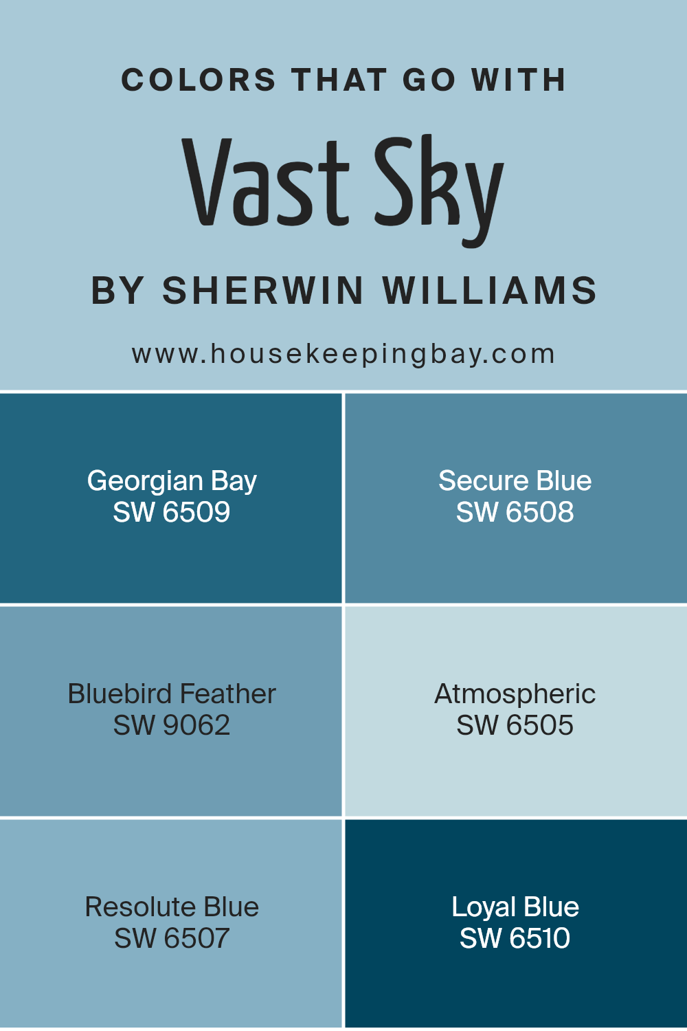
Colors that Go With Vast Sky SW 6506 by Sherwin Williams
Choosing the right colors to pair with Vast Sky SW 6506 by Sherwin Williams can greatly enhance the aesthetic appeal and emotional tone of a space. Vast Sky is a light, airy blue that serves as a perfect canvas for adding depth and distinction through complementary colors.
Colors like Georgian Bay SW 6509 and Secure Blue SW 6508 introduce a richer, more dramatic vibe that contrasts nicely with Vast Sky, providing a sophisticated backdrop. These deeper blues help to create a feeling of coziness and are ideal for accent walls or furniture pieces.
On the lighter side, Bluebird Feather SW 9062 offers a subtle, softer approach that blends seamlessly with Vast Sky for a harmonious and soothing environment.
This paler blue works well in spaces seeking a gentle, calming effect. Atmospheric SW 6505, as its name suggests, adds a gentle hint of gray to the mix, softening the overall look and making the room feel more spacious and open.
Resolute Blue SW 6507 and Loyal Blue SW 6510, on the other hand, provide boldness through their vivid tones, which can energize a room or bring focus to specific areas. These colors work well when used for features like doors or cabinets, adding a lively spark to Vast Sky’s serene base.
You can see recommended paint colors below:
- SW 6509 Georgian Bay
- SW 6508 Secure Blue
- SW 9062 Bluebird Feather
- SW 6505 Atmospheric
- SW 6507 Resolute Blue
- SW 6510 Loyal Blue
housekeepingbay.com
How to Use Vast Sky SW 6506 by Sherwin Williams In Your Home?
Vast Sky SW 6506 by Sherwin Williams is a light and airy blue hue that can add a fresh and soothing feel to any room in your home. This shade works well in places where you want to create a serene and calm atmosphere, such as bedrooms or bathrooms. Because it mimics the color of a clear sky, it can also make small spaces appear larger and more open.
When used in a living room or dining area, Vast Sky can pair beautifully with soft whites or gray tones to create a clean and cozy setting. For a bit more visual interest, you might consider using it as an accent wall while painting the other walls in a neutral shade.
This technique draws attention without overwhelming the space.
Additionally, Vast Sky is versatile enough for children’s rooms or home offices where its gentle tone can support concentration and relaxation. Adding this color can subtly liven up your décor while keeping a relaxed vibe throughout your home.
Vast Sky SW 6506 by Sherwin Williams vs Blissful Blue SW 6527 by Sherwin Williams
Vast Sky SW 6506 by Sherwin Williams is a light, airy blue that seems to mimic the clear, open sky on a sunny day. It has a refreshing and soothing quality, making it well-suited for creating a serene ambiance in a room. This color can make small spaces appear larger and brighter.
Blissful Blue SW 6527, also by Sherwin Williams, is a shade darker than Vast Sky. It offers a slightly more saturated blue tone that suggests a peaceful, calm atmosphere. This color tends to bring a sense of quietness and is ideal for spaces where you want a touch of softness without overwhelming the senses.
Both colors provide peaceful vibes but vary in intensity and depth. Vast Sky is better for enhancing natural light and making an area feel expansive. Blissful Blue, with its deeper tone, is perfect for adding a cozy and comforting feel to any space. Each color serves a unique purpose, depending on the desired effect in design.
You can see recommended paint color below:
- SW 6527 Blissful Blue

housekeepingbay.com
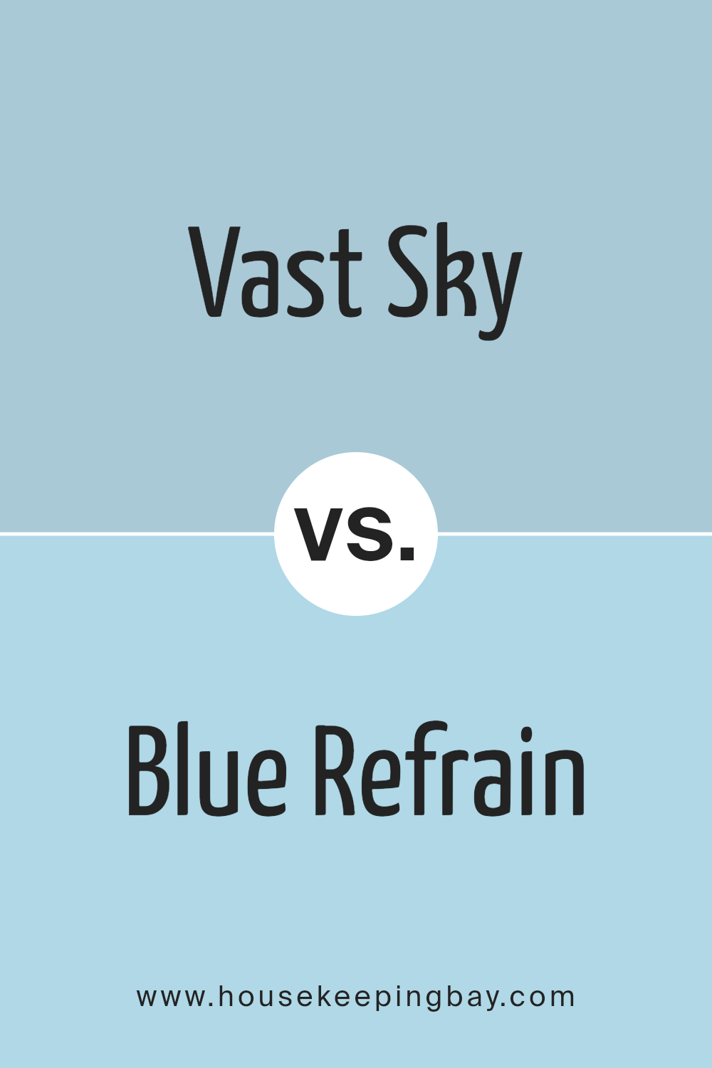
Vast Sky SW 6506 by Sherwin Williams vs Blue Refrain SW 6956 by Sherwin Williams
Vast Sky SW 6506 and Blue Refrain SW 6956, both by Sherwin Williams, offer unique shades of blue. Vast Sky is a light, airy blue that can brighten any space, giving a sense of openness and serenity. It’s perfect for creating a relaxed, refreshing vibe in rooms like the living area or bedroom. This color reflects lots of natural light, making small spaces appear larger.
In contrast, Blue Refrain is a deeper, more saturated blue. It carries a more pronounced tone, which adds a touch of sophistication and depth to spaces. This color works well in areas where a bold, yet not overwhelming, presence is needed. It can be ideal for accent walls or for adding color depth beneath chair rails in dining rooms.
Both colors bring their own charm to interiors, with Vast Sky offering a lighter touch and Blue Refrain providing a deeper hue. Each can beautifully complement a modern or traditional style, depending on your decor preferences.
You can see recommended paint color below:
- SW 6956 Blue Refrain
housekeepingbay.com
Vast Sky SW 6506 by Sherwin Williams vs Rest Assured SW 9061 by Sherwin Williams
Vast Sky SW 6506 by Sherwin Williams is a vibrant blue color that evokes feelings of a clear, sunny day. It has a fresh, airy quality that can make a room feel more open and welcoming. This color is perfect for spaces where you want to create a cheerful, energetic atmosphere, such as living rooms or kids’ play areas.
In contrast, Rest Assured SW 9061 is a soft, muted gray that offers a calm, soothing vibe. It’s an excellent choice for bedrooms or bathrooms where you want to promote relaxation. This color pairs well with a variety of decor styles, adding a subtle elegance without overpowering the space.
Both colors have their unique appeals and can beautifully transform a room depending on the mood you aim to set. Vast Sky brings life and vibrancy, while Rest Assured provides a peaceful retreat, making each ideal for different purposes within a home.
You can see recommended paint color below:
- SW 9061 Rest Assured

housekeepingbay.com
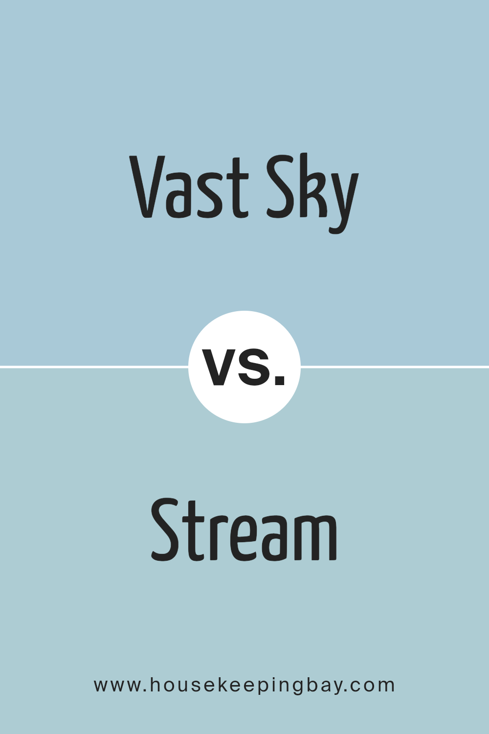
Vast Sky SW 6506 by Sherwin Williams vs Stream SW 6499 by Sherwin Williams
Vast Sky SW 6506 by Sherwin Williams is a light and airy blue that brings to mind a clear, bright day. Its soft tones have a calming effect and can make spaces feel more open and serene. It works well in rooms where you want to promote relaxation, such as bedrooms and bathrooms.
Stream SW 6499, also by Sherwin Williams, is a deeper and more pronounced blue. This color is closer to a teal blue, adding a sense of depth and richness wherever it’s used. Stream is perfect for adding a touch of sophistication and can be a great choice for accent walls or furniture pieces to make them stand out.
Both colors display different aspects of blue, where Vast Sky is subtle and soothing, Stream is bold and dynamic. Depending on the mood or style you want to achieve, these blues offer varied yet harmonious possibilities.
You can see recommended paint color below:
- SW 6499 Stream
housekeepingbay.com
Vast Sky SW 6506 by Sherwin Williams vs Porch Ceiling SW 9063 by Sherwin Williams
Vast Sky SW 6506 by Sherwin Williams is a calming, light blue shade that evokes the serene feeling of looking up at a clear sky. It’s soft and airy, making it ideal for creating a relaxed atmosphere in spaces like bedrooms or living areas. This color brings a sense of openness and freshness, perfect for anyone looking to add a gentle, peaceful vibe to their home.
In comparison, Porch Ceiling SW 9063 is a deeper, more intense blue. It reflects the traditional paint color used on porch ceilings across many Southern homes, known for its inviting and slightly more vibrant tone. This color is richer and can add a touch of elegance and sophistication to a space.
It works well in areas where a more striking, yet still soothing, impact is desired.
Both colors carry the essence of calmness and serenity, but they differ in intensity and mood, providing versatile options for varied decorating needs.
You can see recommended paint color below:
- SW 9063 Porch Ceiling
housekeepingbay.com
Vast Sky SW 6506 by Sherwin Williams vs Take Five SW 6513 by Sherwin Williams
Vast Sky SW 6506 by Sherwin Williams is a light and airy blue that evokes the feeling of a clear, open sky. It has a fresh and serene quality, making it ideal for creating a calming atmosphere in rooms like bedrooms or bathrooms. It pairs well with soft whites and grays for a clean, minimalist look.
Take Five SW 6513, also by Sherwin Williams, is slightly darker and has more of a teal undertone compared to Vast Sky. This color is vibrant yet not overwhelming, providing a lovely balance that can add a bit of personality to a space without dominating it.
Take Five works well in areas where a bit more color is desired but still maintains a soothing presence.
Both colors offer a peaceful vibe but with different tones and feels. Vast Sky is closer to a true light blue, while Take Five leans towards a subtle, understated teal.
Each color can beautifully enhance the aesthetics of a room, depending on the desired mood and color scheme.
You can see recommended paint color below:
housekeepingbay.com
Vast Sky SW 6506 by Sherwin Williams vs Honest Blue SW 6520 by Sherwin Williams
Vast Sky SW 6506 by Sherwin Williams is a light and airy blue that evokes the feel of a clear, open sky. It’s gentle and soothing, making it perfect for creating a peaceful atmosphere in spaces like bedrooms or bathrooms. This color has a delicate quality that can help smaller rooms appear brighter and more open.
Honest Blue SW 6520, also by Sherwin Williams, is a deeper, more vibrant shade of blue compared to Vast Sky. It suggests confidence and strength, which can bring a lively energy to a room. This color is ideal for spaces where you want a bolder look that still retains a sense of calm.
Both colors can be coordinated well in a single space or used in different rooms to maintain a cohesive feel throughout a home. Vast Sky is great for softening a space, while Honest Blue adds a dash of vitality. Each offers a unique vibe, making them suited to different decorating styles and preferences.
You can see recommended paint color below:
- SW 6520 Honest Blue
housekeepingbay.com
Vast Sky SW 6506 by Sherwin Williams vs Something Blue SW 6800 by Sherwin Williams
Vast Sky SW 6506 by Sherwin Williams is a gentle, subdued blue that resembles a clear sky on a bright day. It provides a calm and soothing feel, making it ideal for creating a relaxed atmosphere in spaces like bedrooms or bathrooms. This color is quite versatile and pairs well with soft neutrals or vibrant shades for contrast.
In contrast, Something Blue SW 6800 by Sherwin Williams is much bolder and vivid. It’s a richer, deeper blue that can add a dramatic flair to any space. This color is perfect for making a statement in areas where you want to draw attention, such as an accent wall or a piece of furniture.
Both colors offer distinct vibes: Vast Sky brings a serene and airy quality, while Something Blue gives off energy and depth. Depending on your room’s purpose and the mood you wish to create, either could be an excellent choice.
You can see recommended paint color below:
- SW 6800 Something Blue
housekeepingbay.com
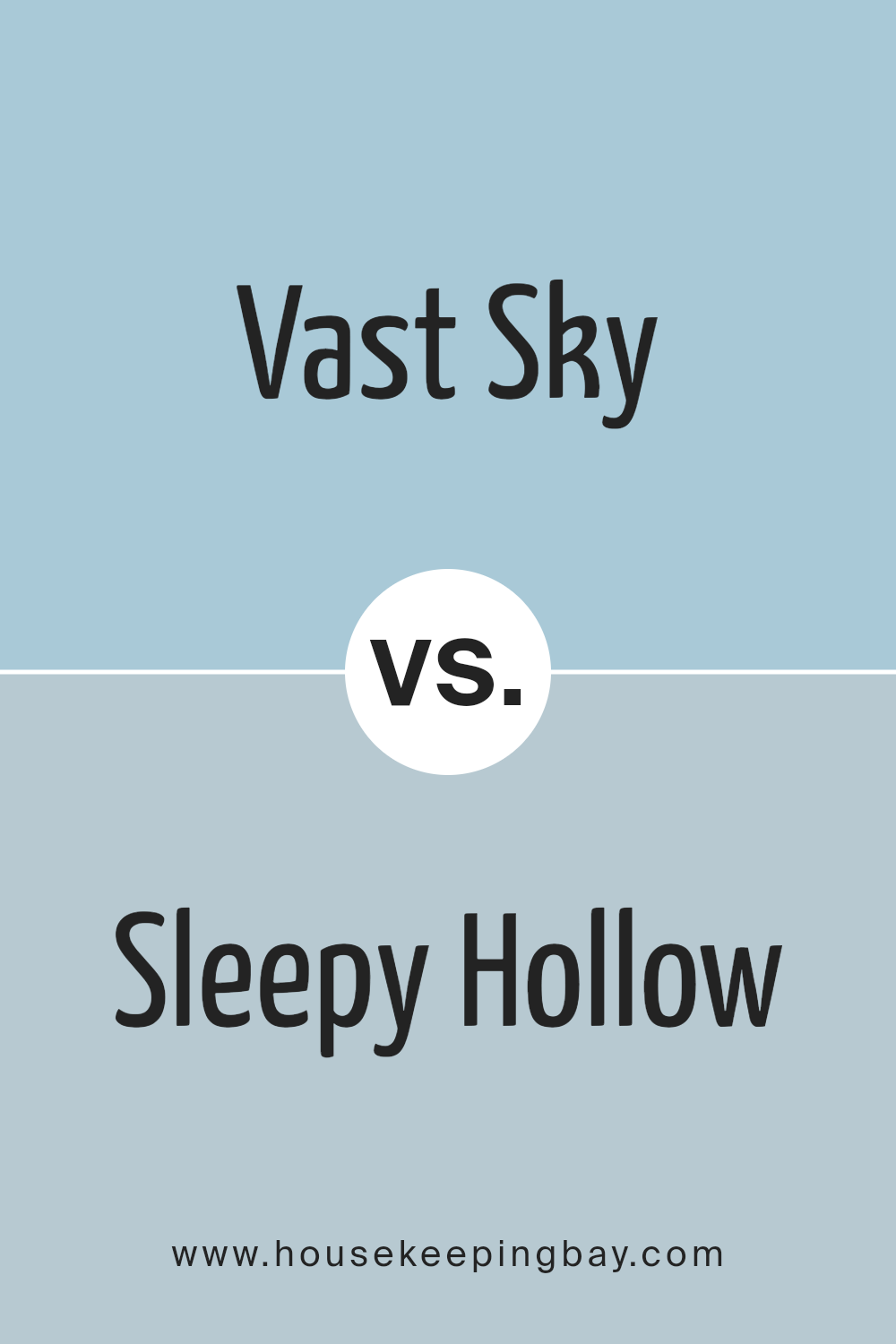
Vast Sky SW 6506 by Sherwin Williams vs Sleepy Hollow SW 9145 by Sherwin Williams
Vast Sky SW 6506 by Sherwin Williams is a gentle and soothing blue with a touch of brightness, reflecting a clear sky on a sunny day. It’s light and airy, making spaces feel open and refreshed. This color works well in living rooms or bedrooms, where a calm, serene atmosphere is desired.
In contrast, Sleepy Hollow SW 9145 is a deeper, more muted blue with gray undertones. This color offers a sense of sophistication and could be suited for creating a cozy, more enclosed feel. It’s ideal for settings where you want to add depth and a touch of formality, like dining rooms or offices.
While Vast Sky brings an uplifting and expansive vibe, Sleepy Hollow provides a more intimate and enveloping ambiance. Choosing between them depends on the mood and function of the room you’re decorating.
You can see recommended paint color below:
housekeepingbay.com
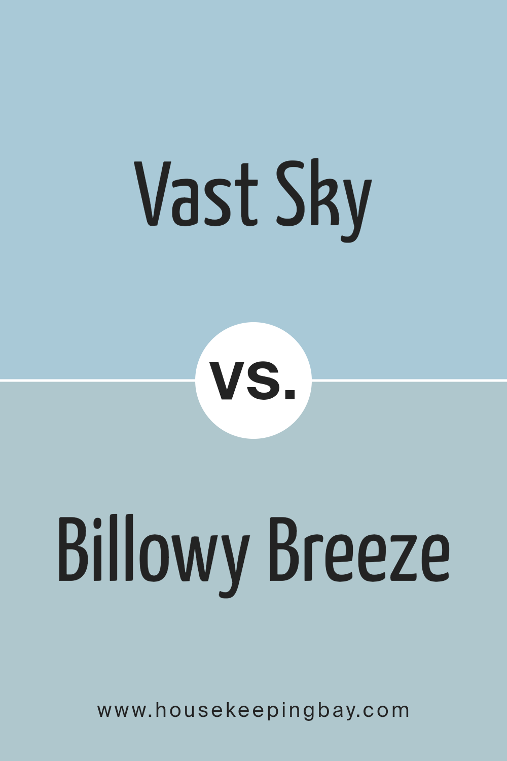
Vast Sky SW 6506 by Sherwin Williams vs Billowy Breeze SW 9055 by Sherwin Williams
Vast Sky SW 6506 and Billowy Breeze SW 9055, both by Sherwin Williams, are serene, peaceful colors, but they bring different moods to a space. Vast Sky is a soft, calming light blue with a fresh and airy feel, inspiring a feeling of openness as if you’re looking out at a clear blue sky. It’s an excellent choice for creating a light, breezy, and relaxed atmosphere in any room.
Billowy Breeze, however, is a deeper shade, presenting a touch of green alongside its blue, reminiscent of ocean depths or a lush, shadowed forest. Its richer, more saturated hue offers a coziness, adding a bit of mystery and sophistication to the environment.
This color is great for those looking to add a bit more character and depth to their space without overwhelming it with a too bold or dark tone.
Both colors work well in various settings, providing peacefulness but each in its unique way, making them suitable for different tastes and room functions.
You can see recommended paint color below:
- SW 9055 Billowy Breeze
housekeepingbay.com
Conclusion
Sherwin Williams’ SW 6506 Vast Sky paint color is a great choice for anyone looking to create a light and airy feel in their home. The soft blue hue of Vast Sky can make a room seem more spacious and serene, providing a gentle backdrop that complements a wide range of decor styles.
It works especially well in bedrooms and bathrooms where calmness is appreciated, but it’s also versatile enough for living rooms and kitchens.
When combined with light, natural woods or crisp whites, Vast Sky truly shines, giving spaces a fresh and inviting atmosphere.
Reflecting on my own experience and the various settings I’ve seen this color used, it’s evident that Vast Sky has the ability to create a peaceful environment, perfect for relaxing after a long day or gathering with loved ones in a pleasant setting.
For those considering a new paint color, SW 6506 Vast Sky offers a beautiful option that is both soothing and functional, ensuring your spaces look modern and feel comfortable.
housekeepingbay.com
Ever wished paint sampling was as easy as sticking a sticker? Guess what? Now it is! Discover Samplize's unique Peel & Stick samples. Get started now and say goodbye to the old messy way!
Get paint samples


