Touch of Grey SW 9549 by Sherwin Williams
The Quiet Sophistication of Grey
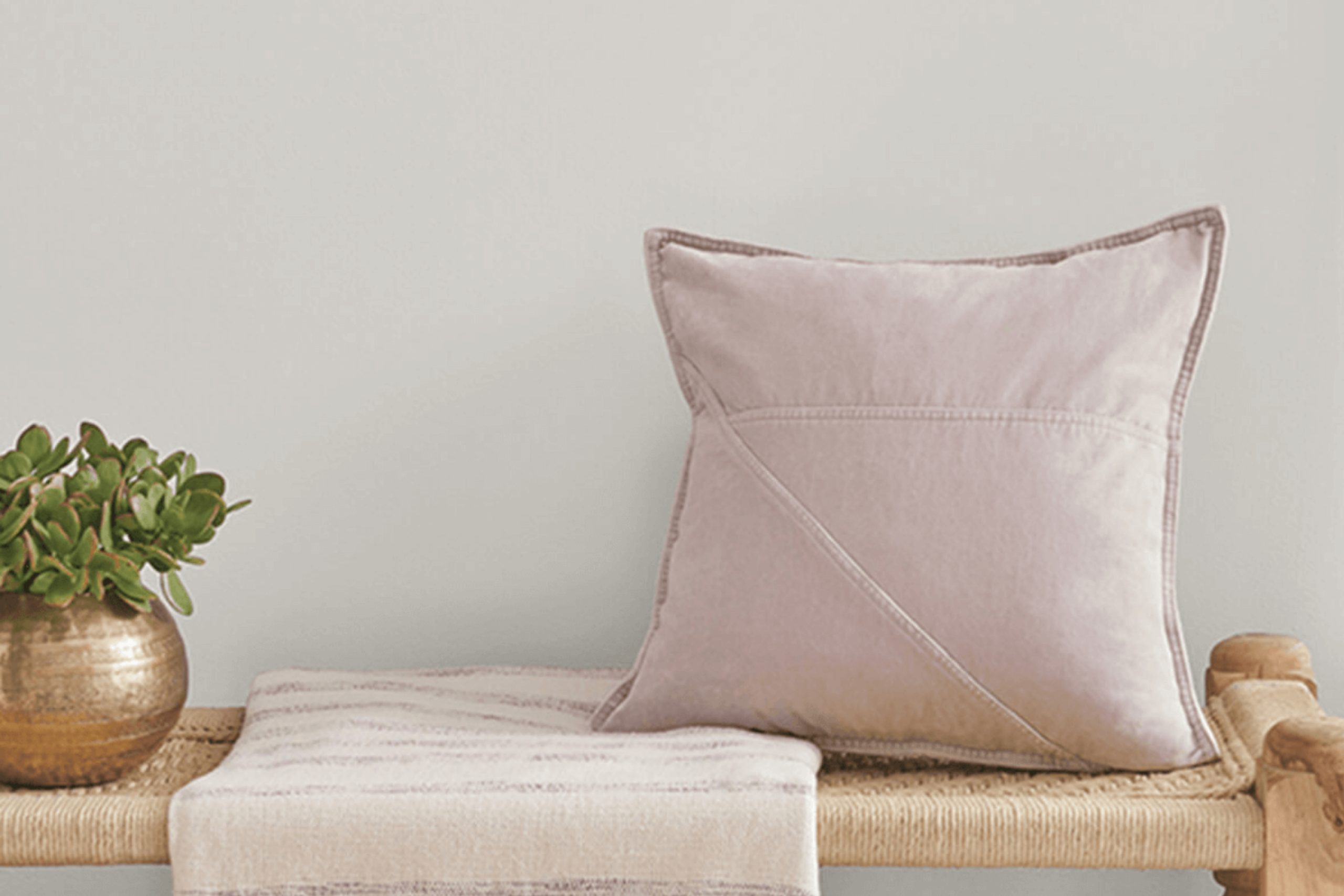
Finding the perfect shade can really set the mood in any room. Let’s talk about SW 9549 Touch of Grey by Sherwin Williams. It’s a unique grey color that not only brings calmness and clarity but also adds a sense of sophistication to any environment.
Touch of Grey has a balanced tone that works well with different decorating styles, whether you’re going for a modern, minimalist look or something more traditional. It’s particularly effective in spaces where you want to promote focus and tranquility, like studies or bedrooms.
Plus, it complements a wide range of decor elements and materials, from wood and metal to textile fabrics.
If you’re considering a new vibe for your home or just one room, Touch of Grey could be an excellent choice. It’s subtle enough not to overwhelm but distinct enough to make a statement. Think about how this shade could enhance your living space, bringing a fresh yet timeless appeal that you’ll enjoy every day.
via sherwin-williams.com
What Color Is Touch of Grey SW 9549 by Sherwin Williams?
Table of Contents
Touch of Grey SW 9549 by Sherwin Williams is a versatile and subtle grey hue that offers a gentle depth to any space it adorns. Its lightness provides a soft backdrop, suitable for creating a serene and inviting atmosphere. This particular shade of grey stands out with its ability to blend seamlessly with various decor styles while maintaining a clean, understated elegance.
Touch of Grey works exceptionally well in modern and minimalist interior designs due to its clean and unobtrusive nature. It serves as an excellent foundation that allows more vibrant elements within the room to stand out. Additionally, this color is a perfect fit for Scandinavian-inspired interiors, where light, muted tones are favored to promote a feeling of calm and simplicity.
When it comes to pairing with materials and textures, Touch of Grey SW 9549 complements natural wood finishes beautifully, enhancing the organic feel of a space. It also pairs well with metallic accents like stainless steel or copper, which introduce a touch of sophistication and modernity.
Textiles like linen or cotton in simple patterns work well with this color, adding to the overall soft and relaxed vibe of the room. By choosing Touch of Grey for your walls, you can create a graceful and cohesive space that feels both contemporary and timeless.
housekeepingbay.com
Is Touch of Grey SW 9549 by Sherwin Williams Warm or Cool color?
Touch of Grey SW 9549 by Sherwin Williams is a versatile paint color that balances gray with hints of blue and green, giving it a soft and soothing appearance. This lightness makes it an ideal choice for enhancing the space in small rooms or areas with limited natural light. Its subtlety allows it to blend seamlessly with various decor styles, from modern minimalism to cozy traditional.
This color can act as a neutral backdrop, so it pairs well with a wide range of furniture and accent colors, offering flexibility in decorating choices. It’s particularly effective in bedrooms and living spaces where a calm, peaceful atmosphere is desired.
In homes with an open floor plan, Touch of Grey can help unify different areas without creating abrupt transitions. Moreover, its durability and ease of application make it a practical choice for busy households. Overall, Touch of Grey offers a timeless appeal that can help create a more inviting and comfortable home environment.
What is the Masstone of the Touch of Grey SW 9549 by Sherwin Williams?
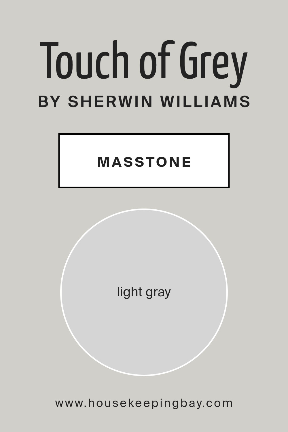
Touch of Grey SW 9549 by Sherwin Williams is a light gray color with a masstone, or true color, of #D5D5D5. This particular shade of gray is soft and neutral, making it incredibly versatile for use in homes. Its lightness allows it to reflect more light, which can help to make rooms appear larger and more open.
Because of its neutral tone, Touch of Grey works well with a wide range of other colors, from bright and bold hues to softer pastels. This makes it an excellent choice for walls, as it can easily complement various decor styles and color schemes.
Additionally, this shade of gray provides a calm, soothing background that isn’t overwhelming, making it ideal for bedrooms and living areas where comfort is key. It’s subtle enough to serve as a base color that can be accented by different textures and accent colors in furniture and decorations. Touch of Grey offers a clean, modern look without being too stark or cold.
housekeepingbay.com
Undertones of Touch of Grey SW 9549 by Sherwin Williams
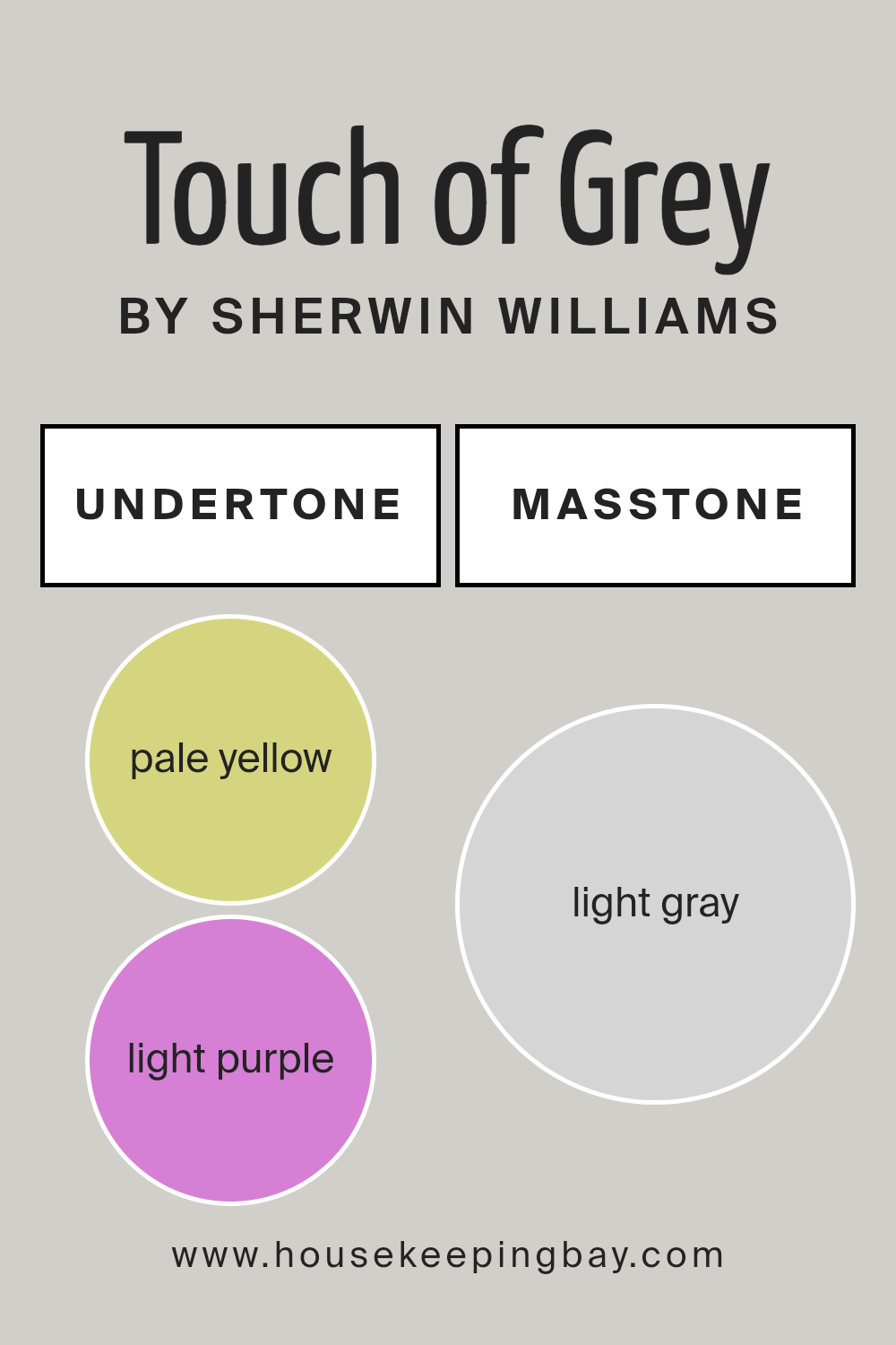
Touch of Grey SW 9549 by Sherwin Williams is a complex paint color with a mix of subtle undertones that greatly influence its appearance in different lighting and settings. The hints of pale yellow, light purple, light blue, pale pink, mint, lilac, and grey each add a unique dimension when the paint is applied to interior walls.
Understanding undertones is crucial to making the right paint choice. The undertones in a paint color can enhance or soften the overall look of a room depending on the lighting and surrounding colors. For example, pale yellow undertones can brighten a space and give it a warm, inviting feel, whereas light blue might make it feel cooler and more relaxed.
In the case of Touch of Grey SW 9549, the variety of undertones means the color can appear differently based on its environment. On interior walls, these undertones interact with light sources and room furnishings to produce subtle shifts in color. In natural light, the grey might dominate, giving a soft, neutral backdrop that works well with a range of decor styles. Under artificial light, the pinks or purples could become more evident, providing a gentle warmth.
This adaptability makes Touch of Grey SW 9549 an excellent choice for many rooms, from living spaces to bedrooms. It allows the walls to subtly complement different textures and colors in the furnishings and decor, creating a cohesive look that feels intentional and harmonious.
housekeepingbay.com
How Does Lighting Affect Touch of Grey SW 9549 by Sherwin Williams?
Lighting plays a crucial role in how we perceive colors, because the type of light and its intensity can alter the appearance of a color. Take the color Touch of Grey SW 9549 by Sherwin Williams, for example. The way this color presents itself can vary significantly under different lighting conditions.
In artificial light, such as that emitted by bulbs, Touch of Grey SW 9549 might appear slightly warmer, depending on the type of bulb. Incandescent bulbs, which emit a warmer, yellowish light, may soften the color, making it seem more inviting and cozy. LED or fluorescent lighting, which can be cooler, might make the color appear a bit sharper and more neutral.
Natural light, however, has a different effect. Natural light changes throughout the day and depending on whether a room faces north, south, east, or west, the perception of Touch of Grey can shift. In north-facing rooms, natural light tends to be cooler and more consistent, giving Touch of Grey a more true-to-swatch appearance; it looks more genuinely grey. In south-facing rooms, where light is warmer and more abundant, this color could look lighter and may pick up some subtle warm undertones.
East-facing rooms get bright morning light, making Touch of Grey look brighter and more vibrant in the mornings, while turning softer and more shadowy in the afternoon and evening. Conversely, in west-facing rooms, the color may appear muted in the morning but gain warmth and depth in the late afternoon and evening when the light is at its warmest.
Understanding how lighting affects colors like Touch of Grey SW 9549 can help in making decisions about paint colors depending on the orientation and light sources in a room.
housekeepingbay.com
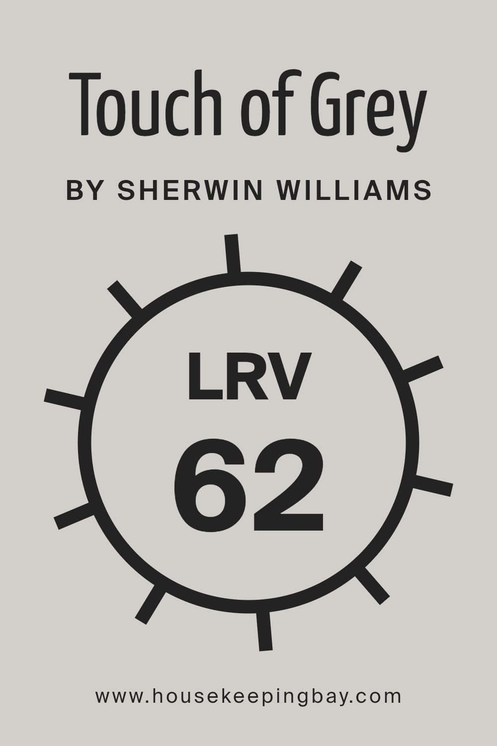
What is the LRV of Touch of Grey SW 9549 by Sherwin Williams?
LRV stands for Light Reflectance Value, which measures the percentage of light a paint color reflects back into the room. It ranges from 0 to 100, where 0 absorbs all light and 100 reflects all light. Understanding LRV helps in selecting the right paint color for your space because it affects how light or dark a color looks on the walls.
A higher LRV means the color will look lighter and can make a small room feel more spacious and brighter. Conversely, a lower LRV can make a color appear darker and can be used to make a large room feel cozier.
With a LRV of 62.35, Touch of Grey SW 9549 by Sherwin Williams is on the lighter side, meaning it will reflect a fair amount of light and can help in brightening up a space. This moderate LRV makes it versatile for use in various rooms, whether they have low or abundant natural light.
In a well-lit room, this color will look vibrant and airy, while in a less naturally lit room, it will still help to keep the space feeling open and lighter than a color with a lower LRV.
housekeepingbay.com
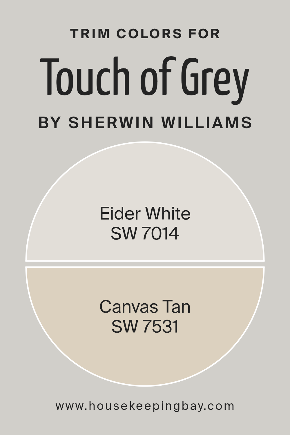
What are the Trim colors of Touch of Grey SW 9549 by Sherwin Williams?
Trim colors are contrasting or complementing shades used on the finishing touches of walls, like baseboards, moldings, door frames, and window sills. They’re crucial for bringing a cohesive look to a room and highlighting architectural details.
For a nuanced gray like Touch of Grey SW 9549 by Sherwin Williams, choosing the right trim colors can enhance the overall aesthetic and subtly define the space. SW 7014 – Eider White and SW 7531 – Canvas Tan are excellent choices for this purpose as they can provide a soft contrast that highlights the distinctive features of Touch of Grey without overwhelming it.
Eider White SW 7014 is a soft and sophisticated off-white that offers a gentle contrast to deeper or mid-tone colors like Touch of Grey. Its subtle gray undertones make it an ideal companion, creating a refined boundary that softly transitions from the wall color to the trim, making it perfect for a space that aims for a light and airy feel.
On the other hand, Canvas Tan SW 7531 is a warmer, mid-toned neutral that brings warmth to rooms. Its earthy base helps in enhancing the cozy atmosphere, offering a smooth transition that complements the cooler tones of Touch of Grey, perfect for creating a welcoming and balanced environment.
You can see recommended paint colors below:
housekeepingbay.com
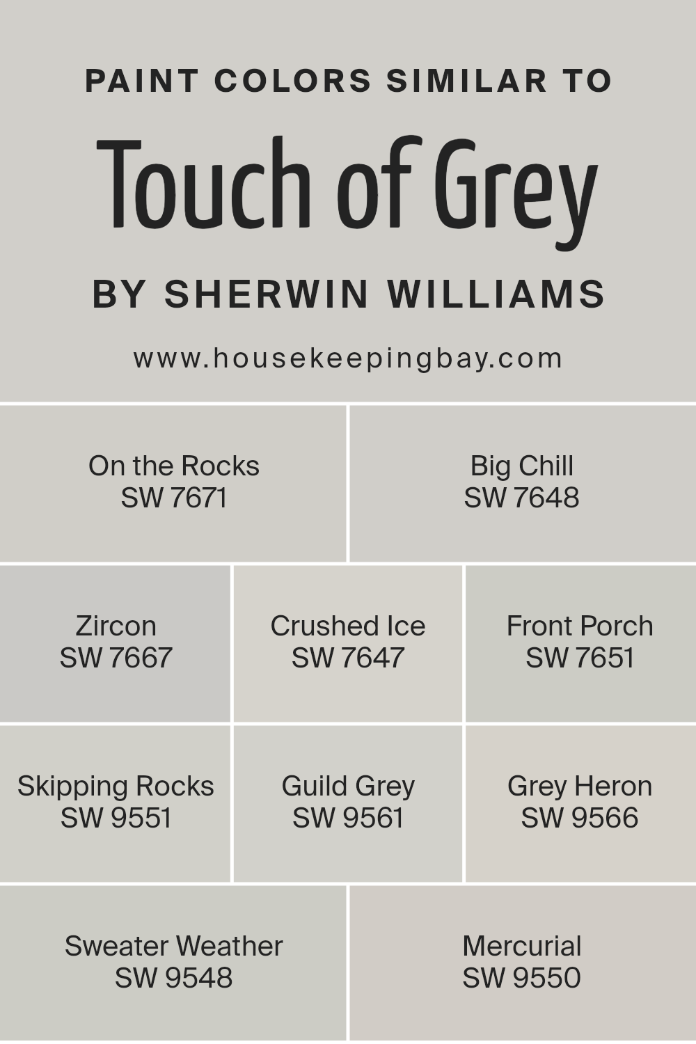
Colors Similar to Touch of Grey SW 9549 by Sherwin Williams
Similar colors play a crucial role in creating a cohesive and harmonious interior design. When using shades similar to Touch of Grey SW 9549 by Sherwin Williams, such as On the Rocks SW 7671 or Big Chill SW 7648, the slight variations in hue help in subtly differentiating spaces while maintaining a unified look.
These subtleties can define different zones within an open floor plan or make smaller spaces feel larger. Colors like Zircon SW 7667 and Crushed Ice SW 7647, though distinct, share a common undertone that provides a smooth visual flow from room to room, without any jarring transitions that could disrupt the aesthetic continuity of your home.
On the softer side, Front Porch SW 7651 adds a breath of fresh air with its slightly cooler tone, providing a serene backdrop, ideal for relaxation areas. Skipping Rocks SW 9551 and Guild Grey SW 9561 blend beautifully with Touch of Grey, offering a slightly earthier touch that warms up spaces without overwhelming them with darkness.
Grey Heron SW 9566 and Sweater Weather SW 9548, both offer deeper shades that are perfect for accent walls or furniture pieces, providing just the right amount of contrast.
Finally, Mercurial SW 9550, being on the lighter spectrum, is great for creating a sense of spaciousness in smaller or less-lit areas, contributing to a modern and chic atmosphere throughout your home.
You can see recommended paint colors below:
- SW 7671 On the Rocks
- SW 7648 Big Chill
- SW 7667 Zircon
- SW 7647 Crushed Ice
- SW 7651 Front Porch
- SW 9551 Skipping Rocks
- SW 9561 Guild Grey
- SW 9566 Grey Heron
- SW 9548 Sweater Weather
- SW 9550 Mercurial
housekeepingbay.com
How to Use Touch of Grey SW 9549 by Sherwin Williams In Your Home?
Touch of Grey SW 9549 by Sherwin Williams is a versatile paint color that works well in many areas of a home. Its balanced grey shade offers a soothing backdrop that pairs nicely with both bold and muted decor. You can use Touch of Grey in your living room to create a calm, inviting atmosphere that complements your furnishings.
It’s also ideal for bedrooms where you want a neutral, peaceful environment that’s good for relaxing and sleeping. If you are looking to refresh your kitchen or bathroom, Touch of Grey is a smart choice because it matches well with various fixtures and finishes, from stainless steel to wood accents.
This color can also make small spaces appear more open and airy. For a cohesive look throughout your house, consider using Touch of Grey for hallways and entryways—it seamlessly connects different rooms. Whether you’re freshening up a single room or repainting your entire home, Touch of Grey is a practical and stylish choice.
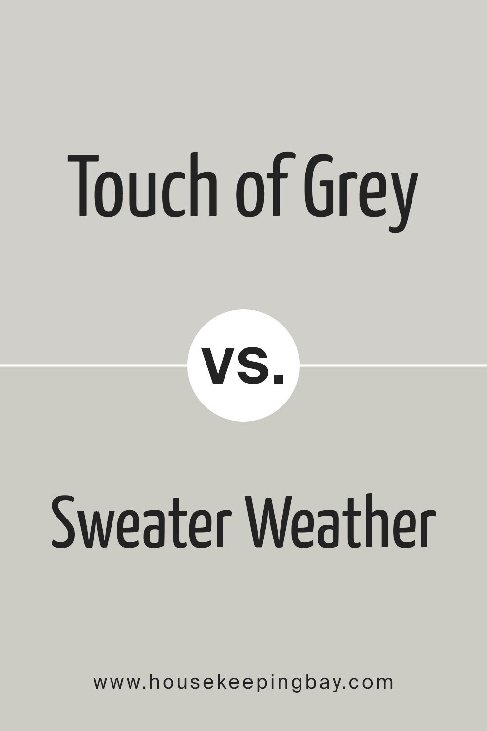
Touch of Grey SW 9549 by Sherwin Williams vs Sweater Weather SW 9548 by Sherwin Williams
Touch of Grey SW 9549 by Sherwin Williams is a light grey shade with a warm undertone. It’s versatile and subtle, making it great for spaces where you want a calm atmosphere without the starkness some grays can have. This color works well in both modern and traditional settings, providing a soft background that can enhance other colors or stand alone for a minimalist look.
Sweater Weather SW 9548, also by Sherwin Williams, is slightly darker than Touch of Grey. It carries a cooler tone, which can make rooms feel more enclosed yet cozy. This color is perfect for creating a snug and inviting environment, such as in a bedroom or living room where warmth and comfort are key.
Both colors are similar in their understated elegance but differ in warmth and depth, providing options depending on your space’s needs and the mood you want to set.
You can see recommended paint color below:
housekeepingbay.com
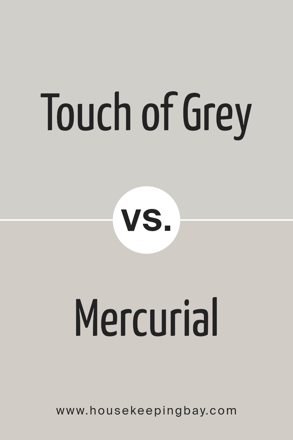
Touch of Grey SW 9549 by Sherwin Williams vs Mercurial SW 9550 by Sherwin Williams
Touch of Grey SW 9549 by Sherwin Williams is a light, soft grey that provides a peaceful and subtle backdrop for any space. It is versatile and works well in various rooms, whether it’s a bedroom, living room, or kitchen. This color offers a clean, airy feel, making it a popular choice for those looking to create a bright, open space.
Mercurial SW 9550 by Sherwin Williams, while also a grey, has a slightly darker tone compared to Touch of Grey. It adds more depth and sophistication to an area, making it suitable for spaces that require a bit more weight or formality, like dining rooms or home offices. Mercurial can also create contrast when paired with lighter hues, enhancing the visual interest in a room.
Both colors share the calm and neutral essence of grey but serve different purposes depending on the mood and functionality one wants to achieve in a room.
You can see recommended paint color below:
- SW 9550 Mercurial
housekeepingbay.com
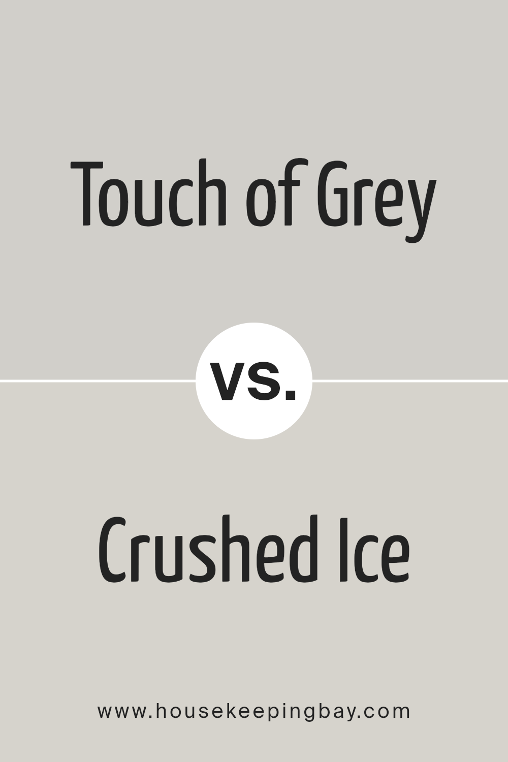
Touch of Grey SW 9549 by Sherwin Williams vs Crushed Ice SW 7647 by Sherwin Williams
Touch of Grey SW 9549 and Crushed Ice SW 7647 are both neutral paints by Sherwin Williams. Touch of Grey is a soft, warm gray that adds a cozy feel to any space. Its warm undertones make it ideal for rooms that need a soothing, yet inviting atmosphere. It pairs well with brighter colors, offering a subtle contrast without overpowering the room’s vibe.
Crushed Ice SW 7647, in contrast, is lighter and cooler. This color has a clean, icy look that brings a fresh and airy quality to spaces. Its cool undertones mean it works especially well in areas with plenty of natural light, helping small spaces appear larger and more open.
Both colors offer versatility and can effectively complement various decor styles. Touch of Grey is perhaps better suited for a comfortable, warm setting, while Crushed Ice excels in creating a crisp, modern feel.
You can see recommended paint color below:
housekeepingbay.com
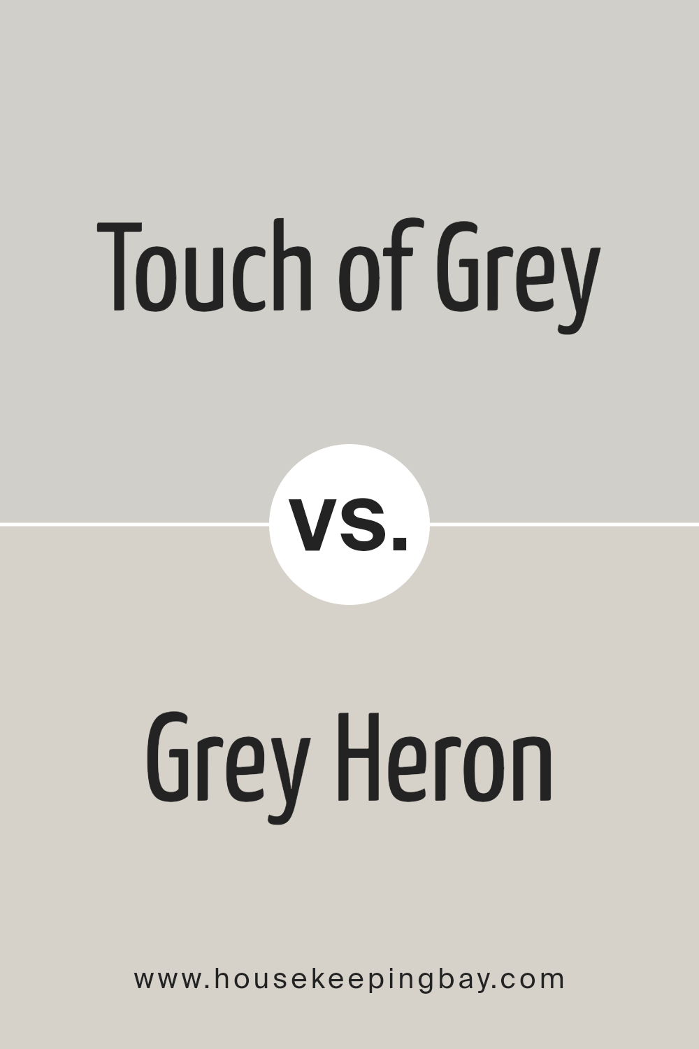
Touch of Grey SW 9549 by Sherwin Williams vs Grey Heron SW 9566 by Sherwin Williams
Touch of Grey SW 9549 by Sherwin Williams is a light grey that gives off a soft and subtle feel, making it perfect for creating a calm and gentle atmosphere in any room. This color works well in spaces where you want to maintain a bright and airy feeling while adding just a hint of color to keep the setting neutral.
On the contrary, Grey Heron SW 9566 is a deeper shade of grey than Touch of Grey. This color provides a more pronounced and strong presence, ideally suited for areas where you aim to make a bolder statement. Grey Heron offers a slightly more elegant and sophisticated backdrop compared to its lighter counterpart.
Both shades of grey from Sherwin Williams present distinct benefits, depending on the vibe and functionality you aim for in a space. Touch of Grey excels in serene and minimalist designs whereas Grey Heron fits better in more dramatic and defined decors.
You can see recommended paint color below:
- SW 9566 Grey Heron
housekeepingbay.com
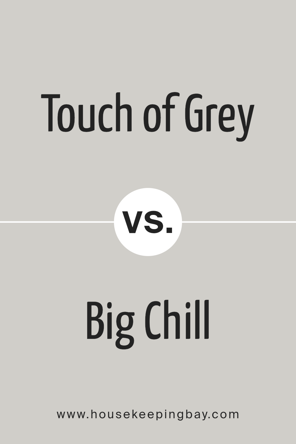
Touch of Grey SW 9549 by Sherwin Williams vs Big Chill SW 7648 by Sherwin Williams
Touch of Grey SW 9549 by Sherwin Williams is a subtle, light grey that offers a hint of warmth, making it versatile for various spaces. It’s soft enough to work well in areas where you want to maintain a light, airy feel, without the starkness sometimes associated with plain white. This color can seamlessly integrate into most decor schemes, supporting other colors without overwhelming them.
In contrast, Big Chill SW 7648 is also a light grey, but it leans a bit cooler compared to Touch of Grey. This shade brings a slightly more modern and fresh feeling to spaces. It’s particularly effective in settings that aim for a clean, contemporary look.
While both colors share a grey base, Big Chill presents a crisp backdrop that can make it ideal for rooms with abundant natural light or minimalist styles.
Both options are excellent for creating a calm environment, with Big Chill offering a cooler tone and Touch of Grey providing a warmer, cozier touch.
You can see recommended paint color below:
housekeepingbay.com
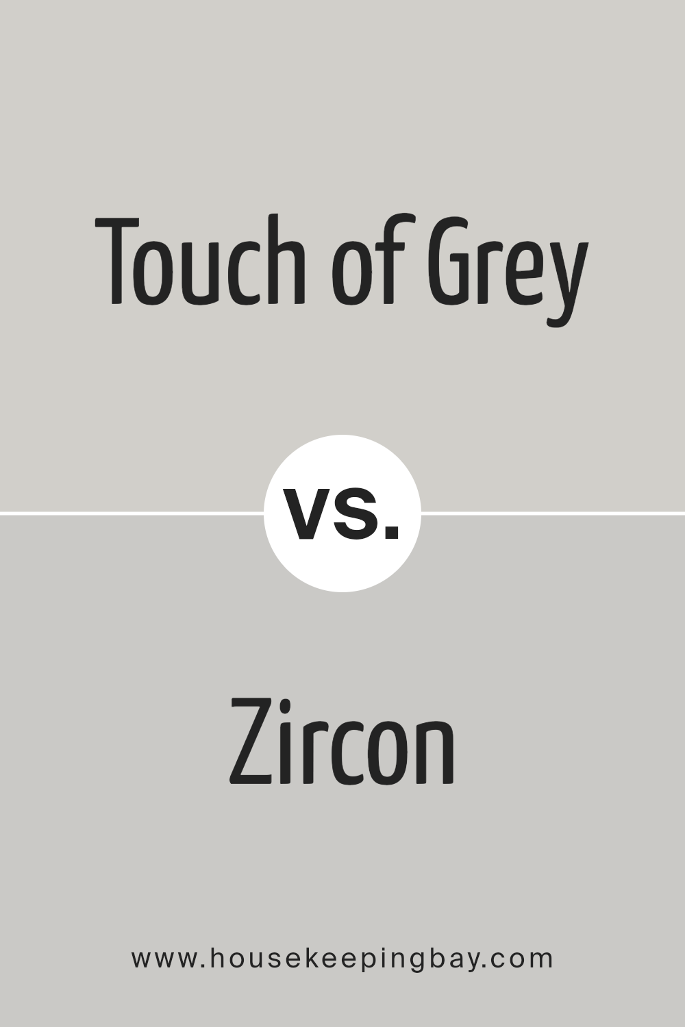
Touch of Grey SW 9549 by Sherwin Williams vs Zircon SW 7667 by Sherwin Williams
Touch of Grey SW 9549 by Sherwin Williams is a soft, light grey that carries a subtle and airy feel, making it a versatile choice for various spaces. It’s particularly suitable for creating a calm and neutral atmosphere, ideal for both modern and traditional interiors. This color provides a gentle backdrop that can pair easily with brighter colors or serve as a standalone hue for a minimalist look.
Zircon SW 7667, also by Sherwin Williams, is a slightly cooler grey with hints of blue undertones. This color leans towards a more modern vibe, giving rooms a crisp and fresh appearance. It works well in spaces that aim for a more contemporary feel, and it’s excellent for bathrooms and kitchens where the blue undertones can complement the usual whites and metals.
These two greys, while similar, offer distinct vibes due to their underlying tones—Touch of Grey is warmer and softer, making it more flexible, while Zircon provides a sharper, cleaner look due to its cooler undertones.
You can see recommended paint color below:
housekeepingbay.com
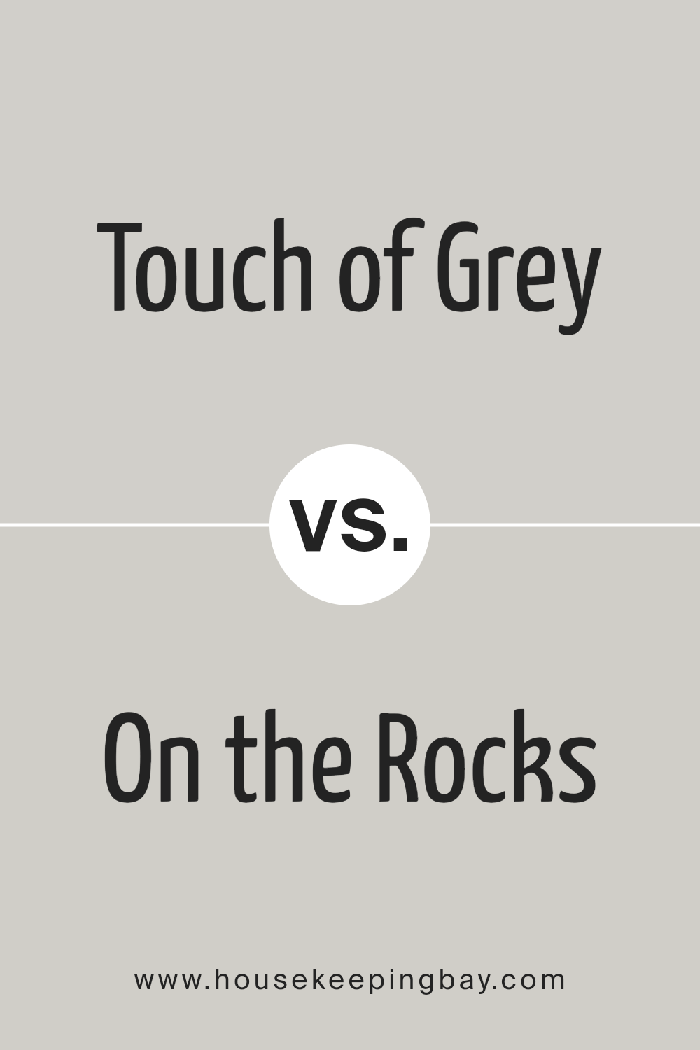
Touch of Grey SW 9549 by Sherwin Williams vs On the Rocks SW 7671 by Sherwin Williams
Touch of Grey SW 9549 by Sherwin Williams and On the Rocks SW 7671 both fall into the cool neutral palette but have subtle differences. Touch of Grey leans slightly towards a light grey with a soft, warm undertone, making it versatile for spaces that seek a gentle touch of coziness while remaining modern.
It pairs well with a variety of decor styles, offering a comforting backdrop to vibrant and soft color schemes alike.
On the Rocks SW 7671, meanwhile, presents itself as a cooler, more muted grey. This color contains hints of blue, giving it a crisper feel that can make small spaces appear more expansive and airy. It’s excellent for achieving a sleek, contemporary look, perfect for a minimalist or modern aesthetic.
While both colors provide a beautiful neutral base, Touch of Grey offers warmth and versatility, whereas On the Rocks delivers a sharper, more defined presence, creating distinctly different moods in a space.
You can see recommended paint color below:
housekeepingbay.com
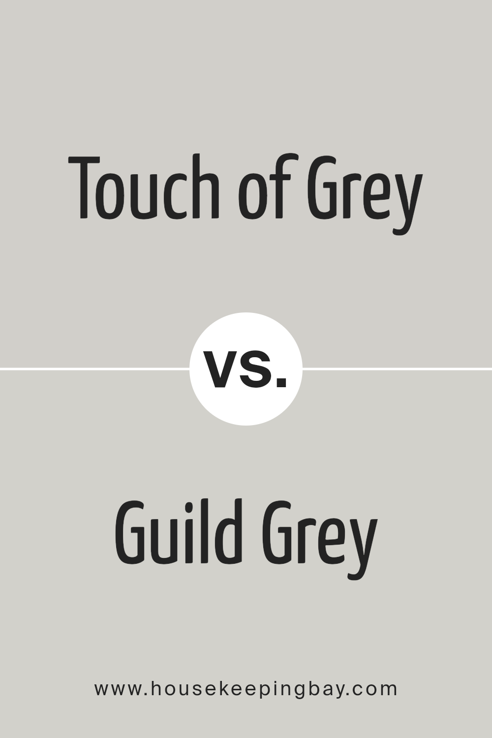
Touch of Grey SW 9549 by Sherwin Williams vs Guild Grey SW 9561 by Sherwin Williams
Touch of Grey SW 9549 by Sherwin Williams is a gentle, light grey that carries a soft and subtle vibe, making it ideal for creating a relaxed atmosphere in any space. This color is great for rooms where you want to enhance natural light while maintaining a neutral backdrop. It complements various decor styles, from modern to traditional, adding a clean and serene feel.
Guild Grey SW 9561, another option from Sherwin Williams, is a darker grey. It offers a more pronounced shade that can make a strong statement in a room. Guild Grey is perfect for adding depth and sophistication to spaces. It works particularly well in areas that benefit from a more dramatic and cozy appearance, such as living rooms or bedrooms.
Both colors provide versatility and can be paired with a range of accent colors, but Touch of Grey is lighter and softer, while Guild Grey leans towards a bolder, more striking look. Their usability extends across multiple room types and themes, depending on the mood you aim to set.
You can see recommended paint color below:
housekeepingbay.com
Touch of Grey SW 9549 by Sherwin Williams vs Front Porch SW 7651 by Sherwin Williams
Touch of Grey SW 9549 by Sherwin Williams is a subtle grey hue with hints of blue, giving it a cool and soothing appearance. Its gentle tone works well in spaces that aim for a peaceful and serene atmosphere. This color’s versatility allows it to blend seamlessly with a variety of decor styles, from modern to traditional, making it ideal for living rooms or bedrooms.
Front Porch SW 7651, also by Sherwin Williams, is a lighter grey that tends to have a slightly airy, almost ethereal quality due to its paler shade. This color is perfect for creating a feeling of spaciousness and calm in any room. Its lightness makes it particularly effective in smaller spaces or areas with limited natural light, where it can help the room appear brighter and more open.
Both shades are neutral and can easily match a wide range of furniture and accent colors, but Touch of Grey offers a hint of depth with its cooler undertones, whereas Front Porch provides a cleaner, crisper look due to its lighter tone. Each brings its own unique mood to an environment, making them suitable for different purposes in home decor.
You can see recommended paint color below:
housekeepingbay.com
Touch of Grey SW 9549 by Sherwin Williams vs Skipping Rocks SW 9551 by Sherwin Williams
Touch of Grey SW 9549 by Sherwin Williams is a light grey shade that gives a clean and airy feel to any space. It is subtle enough to use as a neutral backdrop in various rooms, allowing other colors or decor elements to stand out. This color is versatile, working well in both modern and traditional settings.
Skipping Rocks SW 9551 by Sherwin Williams, however, is a darker grey that offers a stronger visual impact. It creates a more pronounced, cozy atmosphere, making it ideal for intimate spaces or as an accent wall to add depth and focus to a room. Despite its darker tone, it remains neutral and pairs well with a wide range of other colors.
Both colors offer a modern and timeless appeal, with Touch of Grey being lighter and more understated, while Skipping Rocks provides a deeper, more enveloping feel. Each can be effectively used to create different moods and styles in home decor.
You can see recommended paint color below:
housekeepingbay.com
Conclusion
Concluding my thoughts on SW 9549 Touch of Grey by Sherwin Williams, it’s evident that this paint color offers a balanced and versatile option for those looking to refresh their space. Its subtle, warm undertones make it an ideal choice for creating a cozy yet sophisticated atmosphere in any room.
Whether applied in a busy kitchen or a peaceful bedroom, Touch of Grey works harmoniously with both modern and traditional decor, proving to be a flexible choice for various interior styles.
From my analysis, this shade consistently maintains a calm and collected vibe, making it a reliable selection for those hesitant to commit to darker or more vibrant colors. Additionally, the paint’s quality, noted for its durability and coverage, assures a smooth application process and a long-lasting finish, which is crucial for maintaining the integrity and aesthetic of one’s home.
Overall, for anyone considering a makeover or a simple update to their living environment, Touch of Grey is a sound investment. Its ability to adapt yet retain a sense of uniqueness helps create a space that feels both inviting and stylish. It stands out as a smart and poised choice in Sherwin Williams’ vast palette of colors.
housekeepingbay.com
Ever wished paint sampling was as easy as sticking a sticker? Guess what? Now it is! Discover Samplize's unique Peel & Stick samples. Get started now and say goodbye to the old messy way!
Get paint samples


