Thunderous SW 6201 by Sherwin Williams
Check the Bold Essence of a Timeless Hue
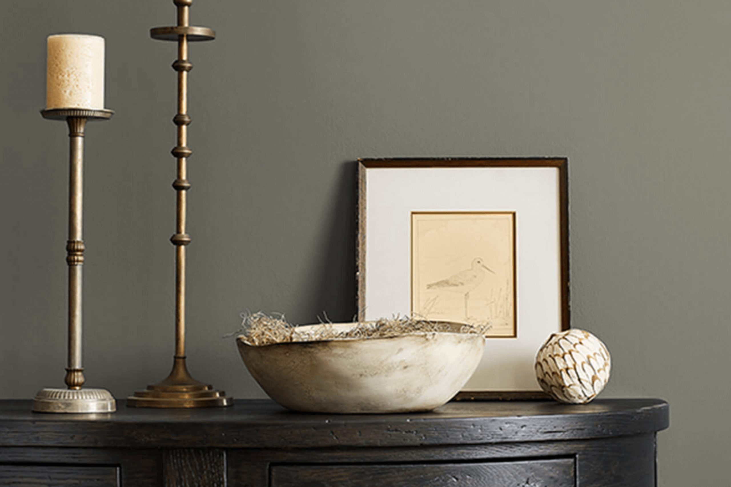
Choosing the right paint color for a room can sometimes feel overwhelming, but a choice like SW 6201 Thunderous by Sherwin Williams might be just what you need. It’s a bold, deep hue that brings a sense of comfort and sophistication to any space. When you picture Thunderous, imagine a rich, stormy gray that carries blue-green undertones, evoking the calm before the storm.
This color works well in a variety of settings. Whether you’re considering a dramatic accent wall, a cozy bedroom, or a stylish living room, Thunderous can adapt to your needs. It’s a choice that pairs nicely with both light and dark furnishings, providing a solid backdrop that allows other design elements to shine.
Lighting plays a significant role in how this color appears, so think about how natural and artificial light hit your walls throughout the day. Thunderous has an intriguing way of shifting its character, making it a dynamic addition to your home. Consider it for spaces where you want to create an inviting atmosphere or a serene retreat from the everyday hustle.
Choosing Thunderous means you’re opting for a color that will stand the test of time, offering depth and interest without overwhelming the senses. With its balance of sophistication and warmth, it’s a hue that might just become a favorite in your home.
via sherwin-williams.com
What Color Is Thunderous SW 6201 by Sherwin Williams?
Thunderous SW 6201 by Sherwin Williams is a deep, rich gray with green undertones. It evokes a sense of comfort and relaxation, making it perfect for creating cozy, intimate spaces. This color works exceptionally well in contemporary and modern interior styles, where its sleek appearance can complement clean lines and minimalistic décor. Additionally, Thunderous pairs beautifully with industrial styles, where its moody depth contrasts with raw materials like metal and concrete.
Pair Thunderous with natural wood tones for a warm, grounded look. Light oak or walnut furniture can add warmth and balance, creating a harmonious ambiance. Textured fabrics like linen or wool in neutral shades complement this color, adding softness and depth to living rooms or bedrooms.
In more eclectic designs, consider adding metallic accents in brushed gold or matte black. These touches bring a touch of sophistication without overpowering the overall aesthetic. Incorporating glass elements can also enhance the space, allowing light to interact with Thunderous’s unique undertones.
Overall, Thunderous SW 6201 brings versatility and depth to any room. Its bold yet understated nature allows it to act as a stunning neutral backdrop, giving life to accent pieces and layers within a space.
housekeepingbay.com
Is Thunderous SW 6201 by Sherwin Williams Warm or Cool color?
Thunderous SW 6201 by Sherwin Williams is a deep, rich gray with hints of cool undertones. This versatile color can breathe life into any space, providing a strong but subtle backdrop for various interior styles. In living rooms, it creates a cozy yet modern feel, enhancing natural light and emphasizing architectural details like moldings or beams. When used in bedrooms, Thunderous fosters a calming environment, perfect for unwinding after a long day.
In kitchens, it pairs well with stainless steel appliances and white countertops, offering a sleek, contemporary look. For those with open floor plans, this shade provides continuity and flow, connecting different areas without dominating the space.
Thunderous works beautifully with other colors, whether you prefer warm woods or crisp whites. It also complements muted jewel tones or pastels. Its depth allows for creativity in accents or furnishings, making it ideal for achieving a balanced, cohesive home atmosphere.
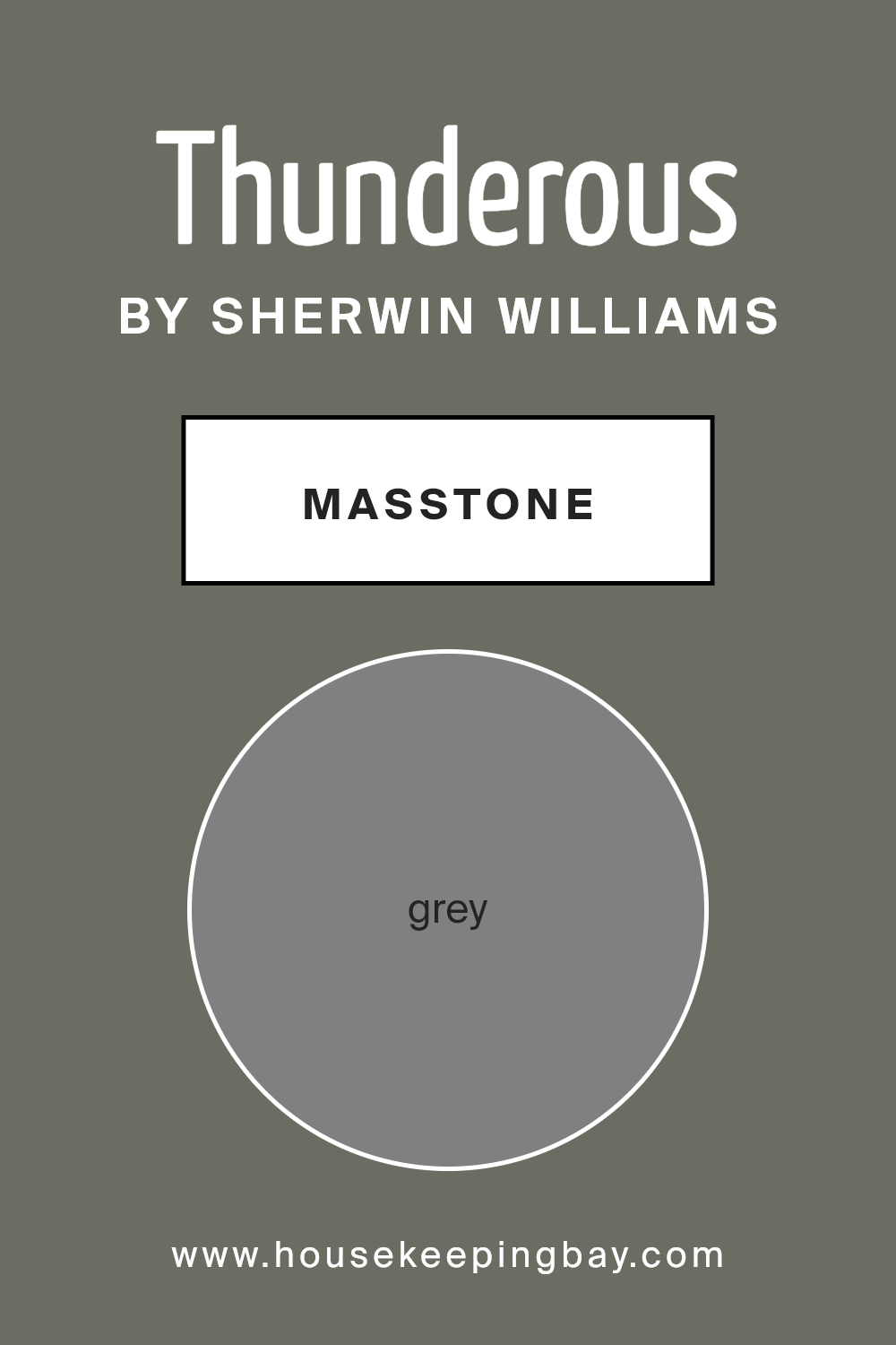
What is the Masstone of the Thunderous SW 6201 by Sherwin Williams?
ThunderousSW 6201 by Sherwin Williams is a versatile shade of grey with a masstone—grey #808080. This neutral tone pairs well with many colors and textures, making it easy to use in any room. It provides a strong, balanced backdrop that helps other design elements stand out, whether they are bright colors, textures, or patterns.
When used on walls, Thunderous can create a calming and organized environment, perfect for living rooms, bedrooms, or offices. Its neutral nature allows furniture and accents to shine, without overwhelming the space. Thunderous is great for creating modern, sleek spaces by combining with metal and glass furnishings.
For a cozier vibe, pair it with wooden elements and warmer tones. This color’s ability to adapt to different styles and settings makes it a great choice for anyone looking to create a cohesive home atmosphere without needing constant adjustments. It’s truly a reliable color for any home design.
housekeepingbay.com
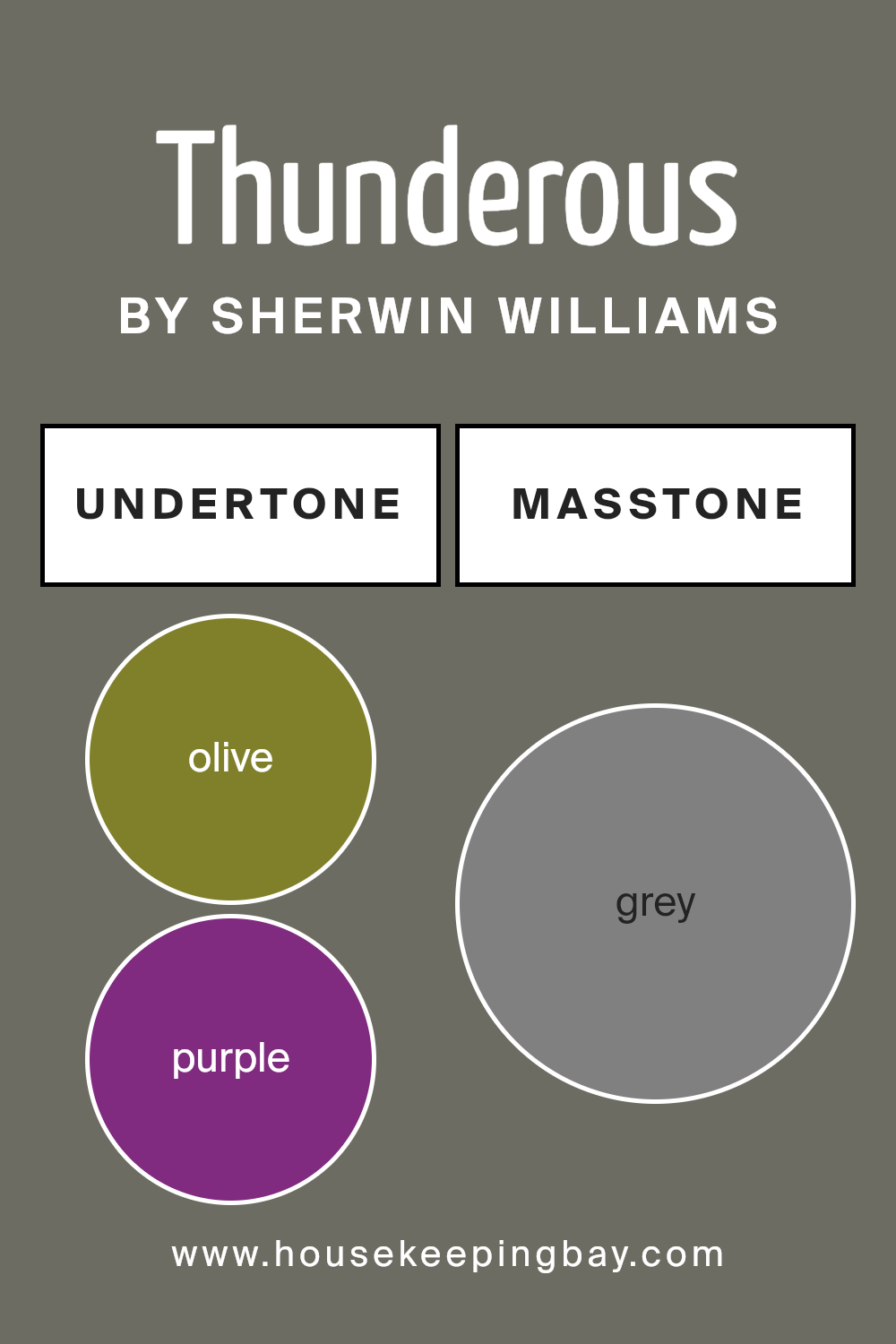
Undertones of Thunderous SW 6201 by Sherwin Williams
Thunderous SW 6201 by Sherwin Williams features complex undertones that create a versatile, nuanced look on walls. Understanding undertones helps us see how a color might change under different lighting and against various furnishings. The undertones of Thunderous include olive, purple, dark turquoise, and more, playing a crucial role in how we perceive the paint.
Olive and dark green undertones lend a rich earthiness, grounding spaces with a natural feel. This makes the color calming and stable, perfect for living rooms or cozy dens. Purple and lilac undertones add depth and sophistication, offering a subtle elegance that can make interiors feel more refined.
Dark turquoise and blue undertones provide a hint of coolness, infusing rooms with a comforting, serene vibe. This is excellent for bedrooms or bathrooms where a sense of relaxation is desired.
Brown and dark grey give Thunderous a warm, luxurious quality, making spaces feel inviting and cozy. These undertones can highlight wooden furniture or earthy decor beautifully. Lastly, light wood colors or soft pastels in the room can bring out lighter undertones like pale yellow or light gray, making the space feel larger and more open.
Overall, Thunderous SW 6201 paints walls with sophistication, offering a dynamic yet soothing atmosphere through its complex undertones.
housekeepingbay.com
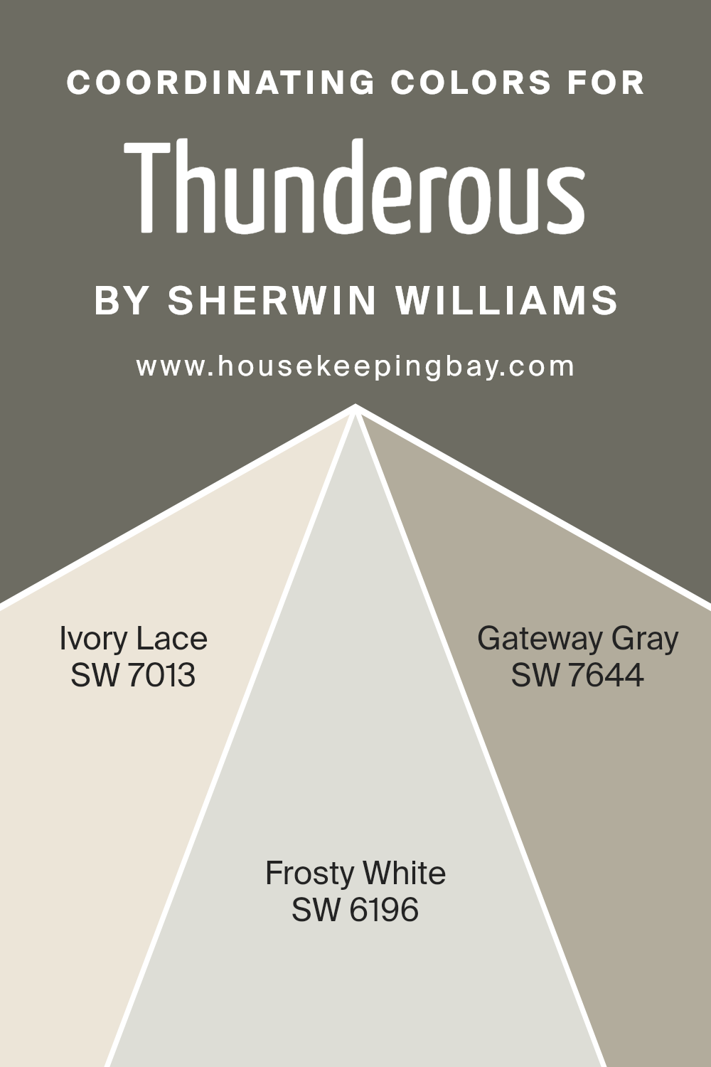
Coordinating Colors of Thunderous SW 6201 by Sherwin Williams
Coordinating colors are shades that complement each other when used together in a space. They create harmony and balance, enhancing the overall look and feel of a room. When choosing coordinating colors, it is important to consider the undertones and contrast of the hues to ensure they work well together.
For example, the color Thunderous SW 6201 by Sherwin Williams pairs beautifully with its coordinating colors: SW 7013 Ivory Lace, SW 6196 Frosty White, and SW 7644 Gateway Gray. Using these colors together can help achieve a cohesive and stylish appearance in any room.
SW 7013 Ivory Lace is a warm, soft off-white that adds a touch of elegance and brightness to a room without feeling too stark. Its gentle tone creates a welcoming backdrop that pairs effortlessly with other shades. Next, SW 6196 Frosty White is a slightly cooler off-white that provides a crisp, clean look.
It works well in modern settings, adding to the freshness and openness of a space. Lastly, SW 7644 Gateway Gray is a sophisticated medium-gray with subtle blue undertones. This grounding color brings depth and sophistication, making it a versatile choice for various design styles.
Together, these colors create a well-balanced and inviting atmosphere.
You can see recommended paint colors below:
- SW 7013 Ivory Lace
- SW 6196 Frosty White
- SW 7644 Gateway Gray
housekeepingbay.com
How Does Lighting Affect Thunderous SW 6201 by Sherwin Williams?
Lighting plays a crucial role in how colors are perceived. Whether using natural sunlight or artificial indoor lights, the type of light can change a color’s appearance significantly. The color Thunderous SW 6201 by Sherwin-Williams is a deep, moody gray with hints of blue-green. Its versatility can be noticed as it interacts with different lighting conditions.
In natural light, Thunderous can appear lighter or darker depending on the room’s orientation. A north-facing room gets cooler, softer light. As such, Thunderous may show more of its blue undertones, making it feel somewhat cooler and darker. Some find that it adds a peaceful, calm feeling to the space.
South-facing rooms, on the other hand, receive warm, direct sunlight throughout most of the day. Here, Thunderous might seem warmer and brighter, with a slight green cast that compliments the natural warmth of the sunlight. This can make the room feel cozy and inviting.
East-facing rooms receive bright light in the morning and softer light in the afternoon. In these rooms, Thunderous might look fresh and bright early in the day, highlighting its blue-gray components. As the day progresses, the color can deepen slightly, retaining its cool tone without becoming too dark.
West-facing rooms get intense, warm light in the afternoon and evening. Here, Thunderous may appear richer and more dynamic, with a subtle warmth that causes the greenish hue to come forward. This creates a cozy and comforting atmosphere as the day winds down.
In artificial light, the appearance of Thunderous can also vary based on the type of bulbs used. Incandescent bulbs add warmth, accentuating any subtle green or brown undertones. Florescent lighting, however, can make the color appear sharper and more clinical by highlighting the blue-gray aspect.
LED bulbs can help strike a balance, presenting the color in a way that remains true to its original tone throughout the day.
housekeepingbay.com
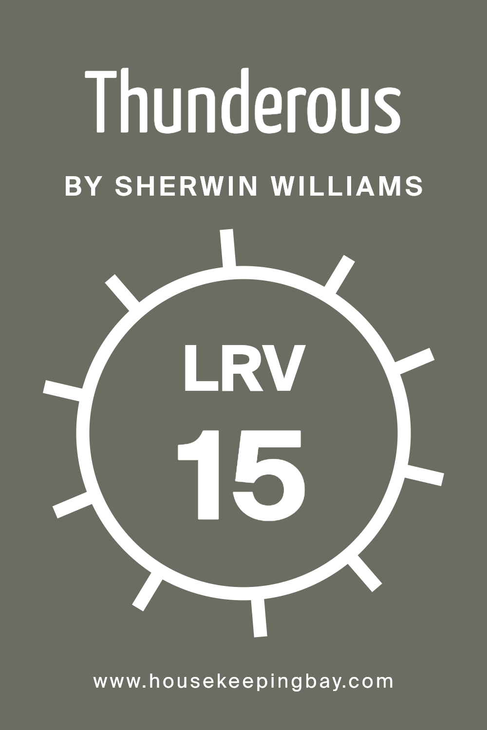
What is the LRV of Thunderous SW 6201 by Sherwin Williams?
LRV, or Light Reflectance Value, is a measure of how much light a paint color reflects. It is expressed as a percentage, ranging from 0% for absolute black, which reflects no light, to 100% for pure white, which reflects all light. LRV helps in understanding how a color will behave in a room.
For instance, colors with high LRV values will make a room feel brighter and more spacious because they reflect more light. On the other hand, colors with low LRV values absorb more light, leading to a cozier and more intimate feel. When choosing paint colors, considering the LRV can help you achieve the desired lighting effect in a room.
For Thunderous SW 6201 by Sherwin Williams, with an LRV of 14.861, this color falls on the darker side of the spectrum. Its low LRV means that it absorbs most light rather than reflecting it. When applied to walls, this paint color will create a warm and enveloping atmosphere.
Darker colors like Thunderous can make a large room feel more intimate and are particularly effective in spaces where a cozy and grounded ambiance is desired. However, relying on natural or artificial light becomes important as rooms painted with such colors might feel a bit dim, particularly in spaces with limited natural light.
housekeepingbay.com
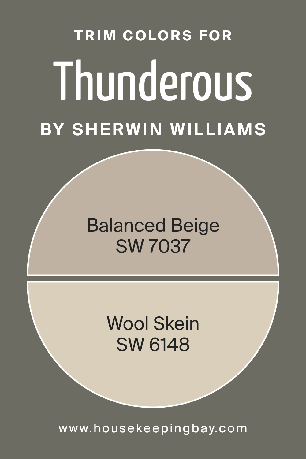
What are the Trim colors of Thunderous SW 6201 by Sherwin Williams?
Trim colors refer to the paint colors used on the edges and borders of walls, doors, windows, and baseboards. These colors enhance the overall appearance and style of a room by providing contrast or harmony with the wall color.
In the case of Thunderous SW 6201 by Sherwin Williams, trim colors like SW 7037 – Balanced Beige, and SW 6148 – Wool Skein can be highly effective. They accent Thunderous, which is a rich and bold gray-green color. The trims can frame the room nicely, adding a polished and cohesive look.
Without the right trim color, Thunderous could feel less coordinated or a bit overpowering, but with these trims, the color scheme achieves balance and sophistication.
Balanced Beige is a warm, earthy beige that creates a cozy and inviting atmosphere. It works well as a trim because it is neutral yet has a depth that complements the boldness of Thunderous. Wool Skein, on the other hand, is a soft and muted light tan that brings a subtle warmth to the space without competing with the main color.
Its gentle tone can highlight architectural details without creating stark contrasts, maintaining a seamless visual flow. Together, these trim colors provide a harmonious setting that enhances and completes the look of Thunderous SW 6201, making the space feel well thought out and comfortable.
You can see recommended paint colors below:
housekeepingbay.com
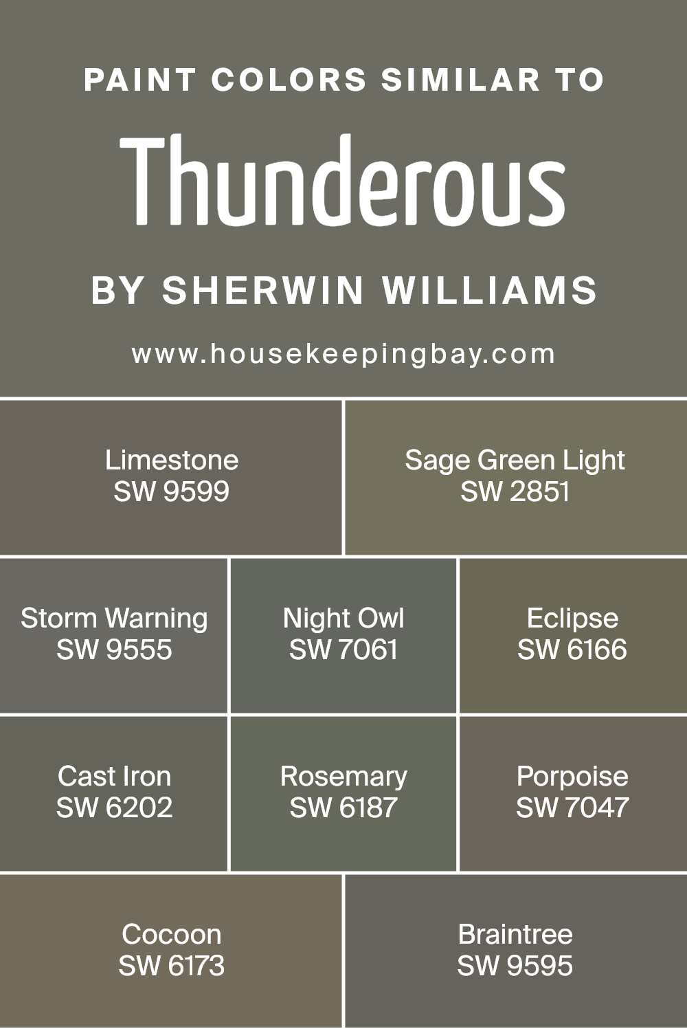
Colors Similar to Thunderous SW 6201 by Sherwin Williams
Similar colors play a vital role in creating a harmonious and cohesive look in any space. They reflect consistency and subtly unify different areas of a room or a home. For instance, the color Thunderous SW 6201 by Sherwin Williams projects a calm and refined feel, and its similar shades complement this ambiance effectively.
SW 9599 – Limestone brings in an earthy, neutral tone that pairs well with deeper colors, adding warmth without overwhelming the senses. SW 2851 – Sage Green Light offers a soft, muted green that adds a touch of nature-inspired freshness. SW 9555 – Storm Warning brings depth and drama with its stormy blue-gray hue, making a bold but balanced statement.
The collection continues with SW 7061 – Night Owl, a moody, deep gray that grounds any palette, while SW 6166 – Eclipse enriches spaces with its profound, timeless dark green. SW 6202 – Cast Iron possesses a robust, charcoal-like tint perfect for adding strength and structure to a color scheme.
SW 6187 – Rosemary surrounds with a sophisticated, lush green reminiscent of Mediterranean gardens. SW 7047 – Porpoise gives a comforting, warm gray that effortlessly unifies surrounding colors. Lastly, SW 6173 – Cocoon and SW 9595 – Braintree complete the palette with their cozy, muted tones, wrapping spaces in a snug, inviting manner.
Together, these hues create a seamless blend, enhancing the subtle beauty of Thunderous SW 6201.
You can see recommended paint colors below:
- SW 9599 Limestone
- SW 2851 Sage Green Light
- SW 9555 Storm Warning
- SW 7061 Night Owl
- SW 6166 Eclipse
- SW 6202 Cast Iron
- SW 6187 Rosemary
- SW 7047 Porpoise
- SW 6173 Cocoon
- SW 9595 Braintree
housekeepingbay.com
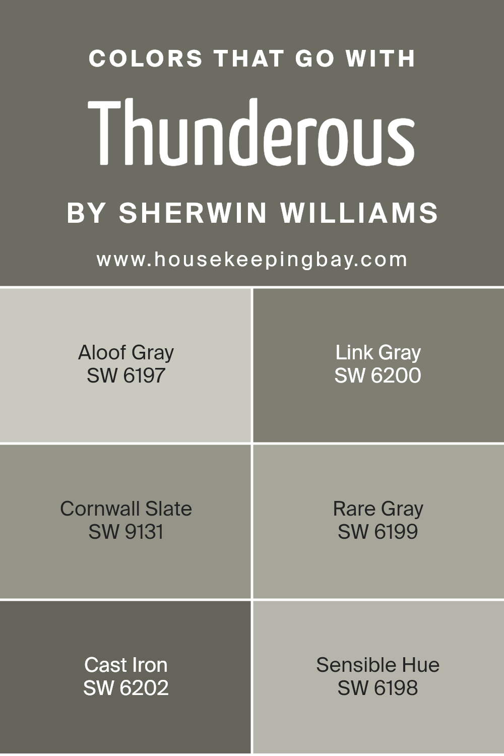
Colors that Go With Thunderous SW 6201 by Sherwin Williams
When designing a space with Thunderous SW 6201 by Sherwin Williams, choosing the right complementary colors is essential for creating a balanced and inviting atmosphere. Thunderous is a rich and bold shade that pairs beautifully with a variety of tones to enhance its depth and appeal.
Aloof Gray (SW 6197) provides a cool, understated contrast that adds a refreshing touch, making the space feel open and airy. Link Gray (SW 6200) offers a slightly warmer undertone than Aloof Gray, creating an inviting harmony with Thunderous without overpowering it.
Cornwall Slate (SW 9131), with its deep, slate-like hue, complements the boldness of Thunderous, adding depth and sophistication to any room.
Rare Gray (SW 6199) brings a subtle touch to the palette, introducing a refined neutral that blends effortlessly with Thunderous, creating a gentle transition between bold and soft. For those seeking a darker accent, Cast Iron (SW 6202) is an excellent choice.
It provides a dramatic contrast that enhances the richness of Thunderous while adding a touch of modern elegance. Lastly, Sensible Hue (SW 6198) is a soft, muted tone that lightens the overall color scheme, bringing a sense of calmness and cohesion.
Together, these colors create a palette that works harmoniously, ensuring your space feels welcoming and well-coordinated.
You can see recommended paint colors below:
- SW 6197 Aloof Gray
- SW 6200 Link Gray
- SW 9131 Cornwall Slate
- SW 6199 Rare Gray
- SW 6202 Cast Iron
- SW 6198 Sensible Hue
housekeepingbay.com
How to Use Thunderous SW 6201 by Sherwin Williams In Your Home?
Thunderous SW 6201 by Sherwin Williams offers a rich, deep gray hue with a hint of warmth, creating a cozy yet sophisticated atmosphere in any room. It’s versatile, working well in living rooms, bedrooms, or even bathrooms. This color adds depth without being overpowering.
In the living room, a Thunderous accent wall can complement neutral furniture, enhancing the space’s elegance. In the bedroom, it provides a calming backdrop, perfect for relaxation after a long day. Pairing it with crisp white trim can highlight architectural features or details, adding a touch of class to the decor.
Incorporating Thunderous in a study or home office can foster focus and productivity due to its neutral yet engaging tone. For a modern kitchen, using this paint on cabinets or an island creates a sleek look that pairs beautifully with stainless steel appliances or wood finishes. Accents like metallics or vibrant colors will pop against this beautiful gray.
Thunderous SW 6201 by Sherwin Williams vs Cast Iron SW 6202 by Sherwin Williams
Thunderous SW 6201 by Sherwin Williams is a deep, intense gray that evokes a sense of a stormy sky. It’s a versatile color, offering a strong, bold presence in a room without being overwhelming. Thunderous provides a rich backdrop that can pair well with both light and dark accents, making it adaptable to various styles.
Cast Iron SW 6202, in contrast, is an even darker gray, approaching black. It has a dramatic intensity that grounds spaces and creates striking visual interest. Cast Iron can add depth and elegance, especially in modern or industrial settings. Furniture and decor in lighter shades will pop against Cast Iron’s dark canvas.
While both colors share a similar gray base, Thunderous is slightly softer and warmer, whereas Cast Iron presents a more pronounced dark tone. Both offer a sophisticated look but differ in their level of depth and drama.
You can see recommended paint color below:
housekeepingbay.com
Thunderous SW 6201 by Sherwin Williams vs Sage Green Light SW 2851 by Sherwin Williams
Thunderous SW 6201 is a deep, earthy gray with a sophisticated presence. It provides a rich, grounded feel, making it ideal for creating a cozy or intimate atmosphere in a room. Its depth and warmth make it versatile for various spaces, whether used in living rooms, bedrooms, or offices. Thunderous can add a touch of elegance to a home’s palette, often complementing both warm and cool tones.
Sage Green Light SW 2851 offers a fresh, subdued green hue. This color brings a hint of nature indoors, adding a soft, calming vibe. It pairs beautifully with natural wood tones and neutral shades, lending a touch of freshness without overpowering.
Sage Green Light works well in spaces aiming for a light and airy feel, such as kitchens, bathrooms, or sunrooms, enhancing the sense of openness and cleanliness.
Both colors are distinct: Thunderous leans towards bold and sophisticated, while Sage Green Light feels refreshing and serene.
You can see recommended paint color below:
- SW 2851 Sage Green Light
housekeepingbay.com
Thunderous SW 6201 by Sherwin Williams vs Cocoon SW 6173 by Sherwin Williams
Thunderous SW 6201 by Sherwin Williams is a deep, moody gray with a hint of green. It conveys a sense of strength and stability, making it suited for creating a bold statement in spaces like living rooms or bedrooms. The color’s intensity also adds drama and sophistication to interiors, making it ideal for accent walls or larger pieces of furniture.
Cocoon SW 6173, also by Sherwin Williams, leans towards a softer and warmer tone. It combines elements of beige and green, giving it a calming and cozy feel. Cocoon is versatile and works well in spaces where relaxation is a priority, like bedrooms or reading areas.
It provides a sense of warmth and comfort, helping to create an inviting atmosphere.
Both colors add depth and character to interiors but suit different moods. Thunderous brings a dramatic and bold touch, while Cocoon offers warmth and coziness.
You can see recommended paint color below:
- SW 6173 Cocoon
housekeepingbay.com
Thunderous SW 6201 by Sherwin Williams vs Rosemary SW 6187 by Sherwin Williams
Thunderous SW 6201 by Sherwin Williams is a bold, deep gray with a hint of earthiness. It evokes a sense of strength and stability, making it an excellent choice for creating a dramatic backdrop in living rooms or offices. Its rich tone pairs well with lighter colors and metallic accents, allowing for a modern and sophisticated look.
Rosemary SW 6187 is a lush, muted green that brings a natural, calming vibe to spaces. It has a soothing quality, often associated with nature, making it ideal for kitchens or bathrooms where relaxation is key. This color complements wood tones and neutral shades, delivering a warm and inviting atmosphere.
While Thunderous emphasizes strength and modernity, Rosemary offers a sense of peace and organic warmth. Both colors have their unique appeal and can be used to set specific moods in interiors, balancing boldness with serenity when paired together.
You can see recommended paint color below:
housekeepingbay.com
Thunderous SW 6201 by Sherwin Williams vs Night Owl SW 7061 by Sherwin Williams
Thunderous SW 6201 and Night Owl SW 7061 are both deep, muted colors by Sherwin Williams that add sophistication to spaces. Thunderous is a moody, warm gray with green undertones. This color brings a cozy, earthy feel to a room, making it perfect for creating a grounded atmosphere. It pairs well with natural materials, like wood and stone, which highlight its organic quality.
Night Owl SW 7061 is a dark gray with a softer, more neutral presence than Thunderous. It carries subtle blue undertones, giving it a cooler profile that feels serene and calm. This makes Night Owl a versatile choice for spaces where you want a balanced and rested ambiance. It complements both modern and classic settings.
While Thunderous offers warmth and an earthy vibe, Night Owl provides cool elegance, letting you create distinct moods in your home with either color. Both can set a unique tone for your rooms.
You can see recommended paint color below:
housekeepingbay.com
Thunderous SW 6201 by Sherwin Williams vs Limestone SW 9599 by Sherwin Williams
Thunderous SW 6201 by Sherwin Williams is a deep, moody gray with subtle blue undertones. It creates a cozy, sophisticated atmosphere, perfect for rooms seeking a strong presence. Its rich hue adds depth, making spaces feel intimate and warm. Ideal for accent walls or spaces with ample natural light, Thunderous complements metallic and wooden elements beautifully.
Limestone SW 9599, in contrast, is a soft, muted beige. It offers a calm, neutral foundation that brightens and enlarges spaces. Limestone’s soft nature makes it versatile, pairing well with both bold and subtle colors. This hue is ideal for creating an airy, inviting ambiance in living areas or entryways.
While Thunderous provides drama and intensity, Limestone brings a sense of openness and calm. Both colors offer unique vibes: Thunderous is grounded and bold, Limestone is light and versatile. Choosing between them depends on whether you seek a dramatic or serene environment.
You can see recommended paint color below:
- SW 9599 Limestone
housekeepingbay.com
Thunderous SW 6201 by Sherwin Williams vs Braintree SW 9595 by Sherwin Williams
Thunderous SW 6201 by Sherwin Williams is a deep, moody gray with subtle hints of green. It creates a cozy, grounded feel. It pairs well with various shades of white or lighter grays for a balanced look. This color works best in larger spaces as it can make a room feel smaller. It’s popular in modern or industrial settings.
Braintree SW 9595, by contrast, is a warm, earthy brown with undertones of green. This shade exudes warmth and comfort, making it a great choice for living rooms or bedrooms. It provides a natural, organic feel, reminiscent of rich soil or tree bark. Braintree is versatile, matching nicely with soft beiges, creams, or muted greens.
Comparatively, Thunderous leans cooler and more modern, while Braintree brings warmth and an earthy vibe. Both colors offer a sophisticated look, but what you choose depends on whether you prefer cool or warm tones.
You can see recommended paint color below:
- SW 9595 Braintree
housekeepingbay.com
Thunderous SW 6201 by Sherwin Williams vs Storm Warning SW 9555 by Sherwin Williams
Thunderous SW 6201 by Sherwin Williams carries a rich, deep charcoal tone that adds a sense of warmth and coziness to a space. It often pairs beautifully with light-colored accents, bringing out an earthy sophistication. This versatile shade fits well in both modern and traditional settings, making it a favorite for those seeking a bold yet elegant backdrop.
Storm Warning SW 9555, in contrast, offers a softer, more muted gray that feels lighter and more relaxed. Its airy quality infuses spaces with a gentle calm, perfect for creating an inviting atmosphere. This color works wonderfully in spaces where you desire subtlety without overwhelming darkness.
Both colors share a neutral base, allowing them to function as versatile backdrops. However, Thunderous adds depth and drama, ideal for accent walls or feature spaces, while Storm Warning provides a gentle, breezy ambiance suitable for entire rooms or complementing vibrant decor.
You can see recommended paint color below:
- SW 9555 Storm Warning
housekeepingbay.com
Thunderous SW 6201 by Sherwin Williams vs Porpoise SW 7047 by Sherwin Williams
Thunderous SW 6201 and Porpoise SW 7047, both by Sherwin Williams, offer unique qualities suited for different settings. Thunderous presents a rich, deep gray with subtle warm undertones that can create cozy, grounded spaces. Its strong presence works well in living rooms or bedrooms where warmth and sophistication meet.
Porpoise SW 7047, however, leans more towards a cool gray with brown undertones, giving it a softer, more neutral feel compared to Thunderous. This color suits areas needing a balanced backdrop, such as kitchens or bathrooms.
While Thunderous delivers depth and drama, Porpoise provides a more understated and calm ambiance. Both colors can harmonize with various styles, but the choice depends on the mood you wish to set.
Thunderous stands out for bold, intimate spaces, whereas Porpoise adapts easily to different environments, promoting a serene and gentle atmosphere.
You can see recommended paint color below:
housekeepingbay.com
Thunderous SW 6201 by Sherwin Williams vs Eclipse SW 6166 by Sherwin Williams
Sherwin Williams’ Thunderous SW 6201 and Eclipse SW 6166 are rich, dark hues perfect for creating depth in a space. Thunderous SW 6201 is a deep greenish-gray, bringing a calm and grounded feel to a room. Its green undertones suggest a natural, earthy ambiance, making it ideal for areas where relaxation is key, such as bedrooms or living rooms.
Eclipse SW 6166, while also dark and moody, leans more towards a brownish-gray tone. This shade carries a warm, enveloping vibe, making it suitable for cozy spaces. It can add warmth and sophistication, especially when paired with lighter colors or metallic accents.
Both colors can create a dramatic backdrop. Thunderous offers a more nature-inspired vibe, whereas Eclipse adds a hint of warmth. When choosing between them, consider the existing decor elements and the mood you want to achieve in your space.
You can see recommended paint color below:
- SW 6166 Eclipse
housekeepingbay.com
Conclusion
SW 6201 Thunderous by Sherwin Williams stands out as a versatile and impactful shade that can make a statement in any room. When I look at this color, I see a rich, earthy tone that seems to ground a space while adding a sense of comfort and elegance.
It is bold yet surprisingly adaptable, making it ideal for both modern and traditional settings.
What I appreciate most about Thunderous is how it complements a range of other colors and materials. Pairing it with lighter neutrals or soft pastels can bring a balance that feels both stylish and inviting. If you’re considering a more dramatic look, it can serve as an excellent backdrop for bright accents or metallic finishes, adding depth and character.
In terms of functionality, Thunderous works beautifully in living rooms, bedrooms, or even kitchens, providing a warm, welcoming atmosphere. It can also highlight architectural details and create focal points when applied strategically.
Choosing this color means opting for sophistication and a touch of drama without overwhelming a space. In essence, SW 6201 Thunderous offers a blend of warmth, richness, and adaptability, making it a truly dynamic option for those looking to refresh their environment with a touch of refined beauty.
housekeepingbay.com
Ever wished paint sampling was as easy as sticking a sticker? Guess what? Now it is! Discover Samplize's unique Peel & Stick samples. Get started now and say goodbye to the old messy way!
Get paint samples


