Sprout SW 6427 by Sherwin Williams
Fresh Hues for a Bright and Calm Space
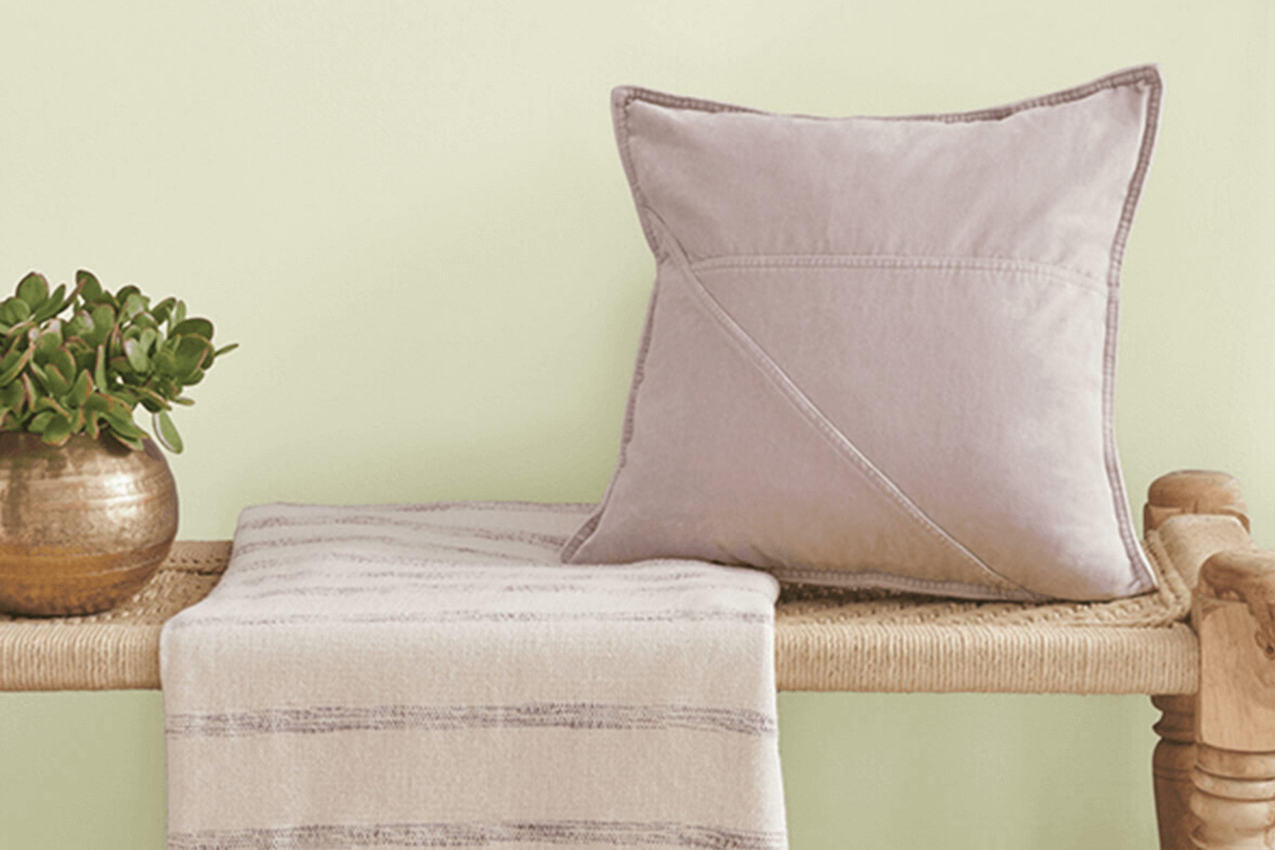
Finding the right paint color can completely change the mood of your space. One color that’s gaining a lot of attention is SW 6427 Sprout by Sherwin Williams. It’s a gentle, refreshing green that can bring a sense of calm and freshness to your home.
When you look at Sprout, you see a soft, soothing hue. It’s not too bold and not too pale—just a perfect balance. This color works well in a variety of settings, from living rooms to bedrooms, even kitchens. Sprout has the ability to complement different styles and furniture pieces.
If you’re thinking about using green in your home, Sprout is a great choice. It reflects nature’s calmness and can make any room feel more inviting. The soft green shade pairs beautifully with neutral tones like beige, white, or gray, but it can also stand out against darker colors if you’re feeling experimental.
Choosing the right color is about setting the right mood. With Sprout, you can create a warm, welcoming environment that feels both fresh and timeless. It’s amazing how a simple paint choice can make your home feel new and energized.
via sherwin-williams.com
What Color Is Sprout SW 6427 by Sherwin Williams?
Table of Contents
Sprout SW 6427 by Sherwin Williams is a refreshing, soft green that has a lively yet soothing presence. This hue brings the vitality of spring into a room without being overpowering. It’s a versatile shade that fits well in various interior styles.
In modern or minimalist spaces, Sprout can add a splash of gentle color without disrupting the clean lines and simplicity. It complements natural materials like light woods, creating a seamless blend with nature’s palette. Mid-century modern interiors can use this color to enhance the organic feel, especially those featuring walnut or teak furniture.
In a farmhouse or country-style home, Sprout adds a touch of freshness to rustic textures. Think of pairing it with shiplap walls or vintage-inspired pieces. It works beautifully with white-washed wood, wicker, or rattan, creating a cozy, inviting atmosphere.
For textures, consider combining Sprout with soft linens or cottons for a relaxed and airy vibe. It also goes well with metals like brushed brass or copper for a warm contrast. In coastal themes, pairing it with sandy tones and beachy textures can evoke a fresh, seaside feel. Sprout is a versatile choice, bringing life to many design schemes while remaining understated.
housekeepingbay.com
Is Sprout SW 6427 by Sherwin Williams Warm or Cool color?
Sprout SW 6427 by Sherwin Williams is a warm, inviting shade of green. This color often brings a sense of freshness and nature into homes. Its soft, muted tones can make any room feel lively yet calm. When used on walls, Sprout can create a cozy atmosphere, making it perfect for living rooms or bedrooms.
Pairing this color with neutral furniture or white trims can enhance its natural feel, allowing it to stand out without appearing overwhelming. Sprout SW 6427 can also work nicely in kitchens, where it can give cabinets a fresh, clean look.
The versatility of Sprout makes it suitable for both modern and traditional home styles. It blends well with natural materials like wood or stone, adding warmth to the overall aesthetic. Whether on a full wall or as an accent, this shade helps create a balanced and harmonious environment, making spaces feel welcoming and serene.
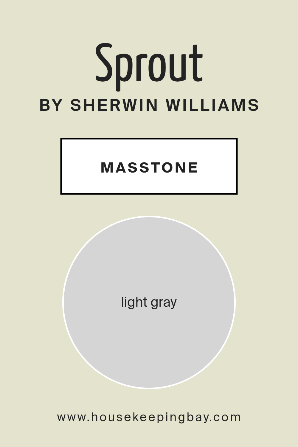
What is the Masstone of the Sprout SW 6427 by Sherwin Williams?
Sprout SW 6427 by Sherwin Williams is a light gray color that brings a soft, calming feel to any home. With a masstone of light gray (#D5D5D5), it is a versatile shade that works well in many spaces. This neutral tone can make rooms appear brighter and more open, enhancing natural light. It pairs beautifully with both bold colors and other neutrals, making it ideal for living rooms, bedrooms, and kitchens.
Light gray provides a subtle backdrop, allowing furniture and decor to stand out without overwhelming the senses. Its understated elegance can create a peaceful atmosphere, perfect for relaxation. It also complements different styles, from modern to traditional, increasing its appeal.
Sprout SW 6427 adapts to various lighting conditions, shifting slightly in tone throughout the day. Whether it is softening bright daylight or creating a warm, cozy glow in the evening, this color adds a touch of sophistication to any area.
housekeepingbay.com
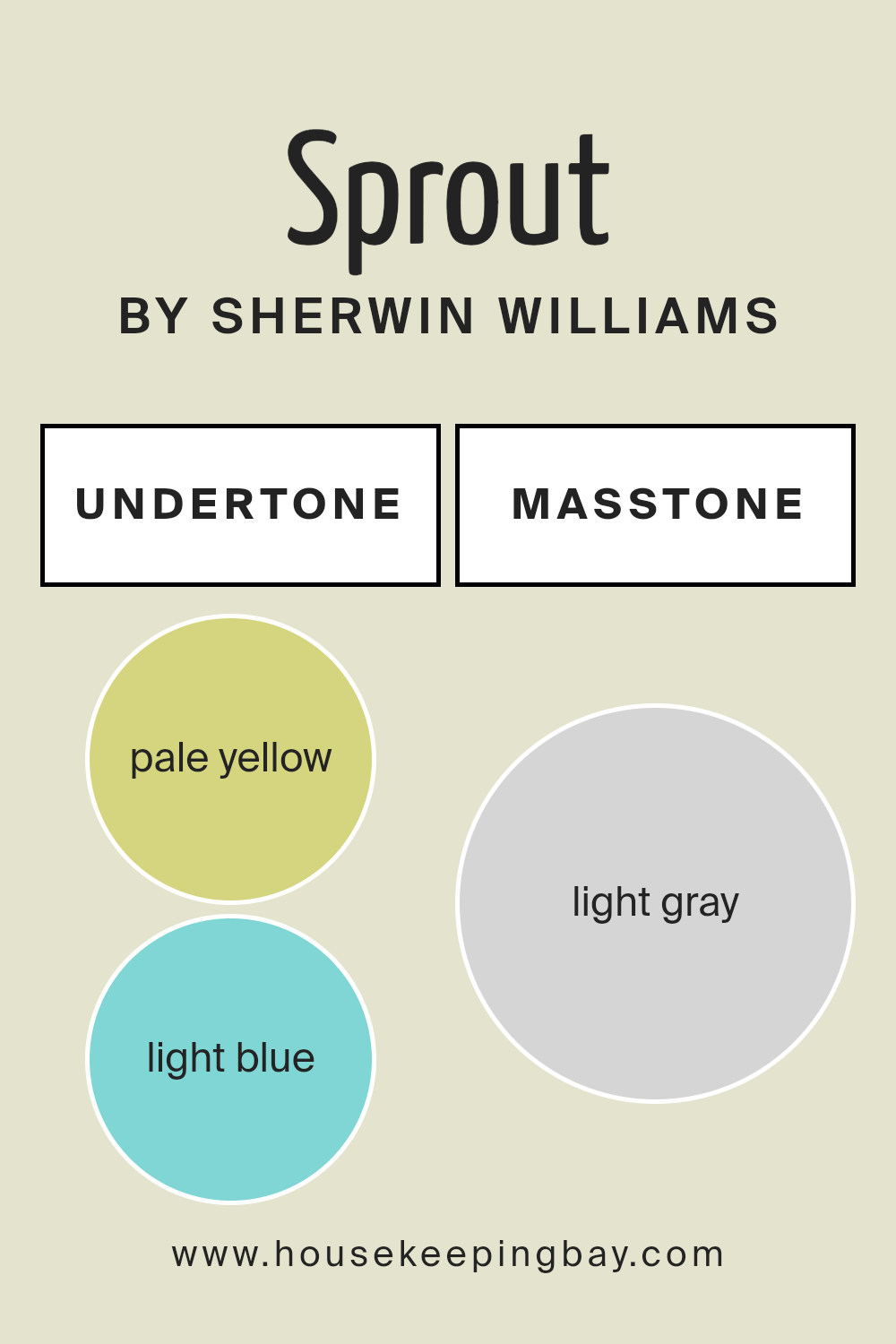
Undertones of Sprout SW 6427 by Sherwin Williams
Sprout SW 6427 by Sherwin Williams presents a unique blend of undertones, making it an intriguing choice for interior walls. These undertones include pale yellow, light blue, light purple, mint, pale pink, lilac, and grey. Each contributes to how we perceive this color.
Pale yellow adds warmth, giving the color a gentle, sunny undertone. Light blue introduces a sense of calm and coolness, balancing the warmth. Light purple and lilac add a touch of softness and sophistication. Mint brings in a fresh, crisp quality, enhancing the lively aspect of the color. Pale pink injects a subtle warmth, making it more inviting. Grey serves as a neutral base, grounding the color and giving it versatility.
When applied to walls, these undertones interact to create a harmonious and soothing atmosphere. The warm undertones make rooms feel cozy, while the cooler ones add an airy quality, preventing spaces from feeling too enclosed. This blend makes Sprout a versatile paint choice, adapting well to different lighting conditions and complementing various décor styles.
In daylight, its lively hues come forward, while softer undertones become more pronounced under artificial lighting, offering a dynamic look throughout the day.
housekeepingbay.com
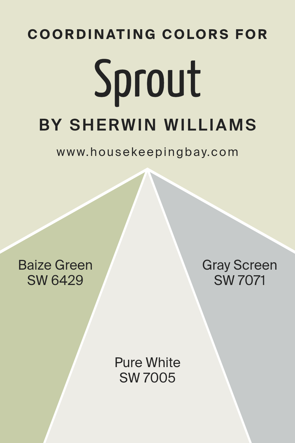
Coordinating Colors of Sprout SW 6427 by Sherwin Williams
Coordinating colors are hues that work harmoniously together to create a balanced and pleasing look in a space. When choosing coordinating colors, you’ll want to consider the mood you want to convey and the function of the space.
For example, Sprout SW 6427 by Sherwin Williams is a lively and fresh green that can be enhanced with carefully chosen coordinating colors. By pairing it with complementary shades, you can make each color stand out while ensuring a cohesive look.
One great option to pair with Sprout is SW 6429, Baize Green, which is a deeper, more grounded green hue that can add richness and depth. It balances the brightness of Sprout while staying in the same color family. SW 7005, Pure White, offers a crisp, clean contrast that helps the greens shine, providing brightness and a sense of spaciousness.
It serves as a perfect backdrop or trim color. Lastly, SW 7071, Gray Screen, introduces a cool, modern touch with its soft gray tone. It adds a subtle, sophisticated contrast without overpowering the other colors. All these colors together create an environment that is both vibrant and soothing, perfect for any modern living space.
You can see recommended paint colors below:
- SW 6429 Baize Green
- SW 7005 Pure White
- SW 7071 Gray Screen
housekeepingbay.com
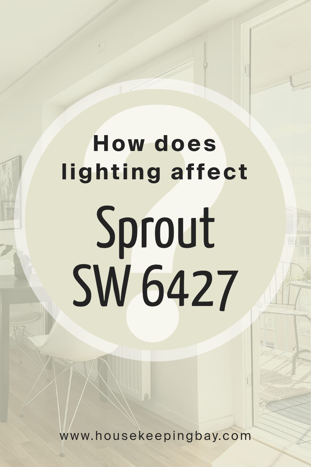
How Does Lighting Affect Sprout SW 6427 by Sherwin Williams?
Lighting plays a crucial role in how we perceive colors. The same color can look different depending on the type of light it’s exposed to. Sherwin Williams’ Sprout SW 6427 is a light, fresh green with a hint of yellow. Its appearance shifts noticeably under different lighting conditions.
Under artificial lighting, such as incandescent or LED bulbs, Sprout SW 6427 may appear warmer or cooler based on the bulb’s color temperature. Incandescent bulbs, which emit a warm, yellowish light, might enhance the yellow undertones of the color, making it feel more cozy and inviting. LED lights, which can vary widely in color temperature, might either warm up or cool down the green, depending on the specific bulb.
In natural light, the color looks different again. Consider rooms with different exposures:
- North-facing rooms: These rooms receive cooler, indirect sunlight, which can make colors appear muted or enhance their blue undertones. In a north-facing room, Sprout SW 6427 might appear more subdued and slightly cooler, possibly emphasizing its green tones.
- South-facing rooms: These get warm and direct sunlight throughout the day. Here, Sprout SW 6427 can look brighter and more vibrant, as the abundant natural light enhances its warm undertones, making it feel lively and fresh.
- East-facing rooms: These get warm, bright light in the morning and cooler light in the afternoon. In morning light, Sprout SW 6427 can feel lively and warm, while it may take on a softer, muted look as the day progresses.
- West-facing rooms:These receive the strongest light in the afternoon and early evening, which tends to be warm. In such rooms, the color might appear more intense and richer during these times.
- Overall, understanding how lighting affects Sprout SW 6427 can help you choose where and how to use this color to achieve the look you desire in your space.
housekeepingbay.com
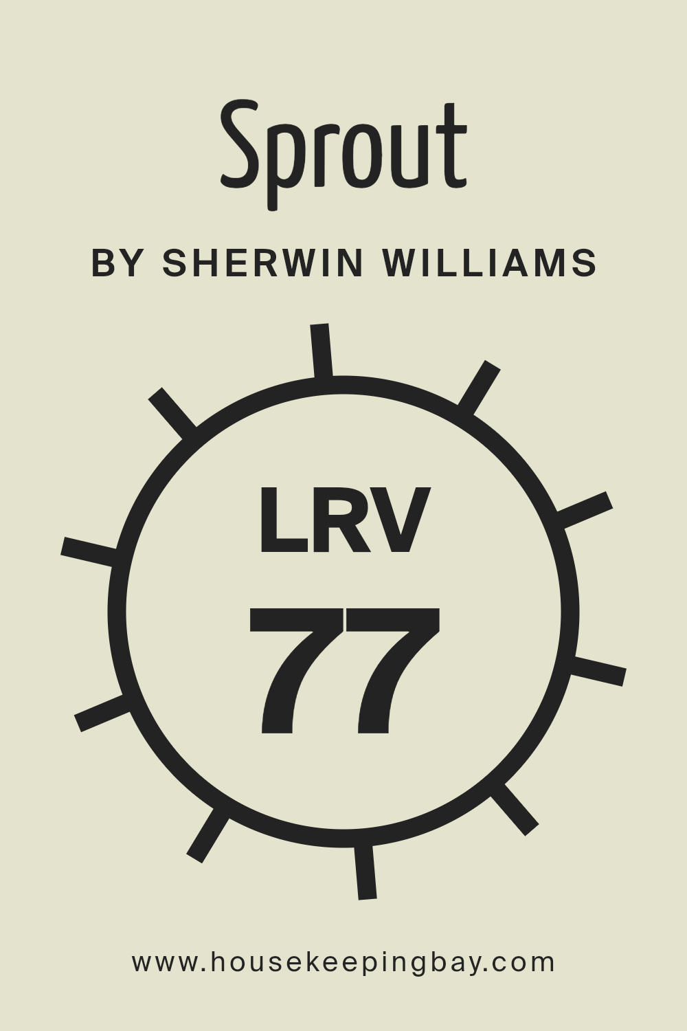
What is the LRV of Sprout SW 6427 by Sherwin Williams?
Light Reflectance Value (LRV) is a measurement that tells you how much light a color reflects and how much it absorbs. It ranges from 0% to 100%, with 0% meaning it absorbs all light (a solid black) and 100% meaning it reflects all light (a pure white). Knowing the LRV of a paint color helps you anticipate how it will behave in different lighting conditions.
If a color has a high LRV, it will make a room feel brighter and more open by reflecting more light, while a color with a low LRV will do the opposite, making a room feel cozier and more intimate by absorbing more light.
Sprout SW 6427 by Sherwin Williams has an LRV of 76.524, which places it on the higher end of the LRV scale. This means that Sprout reflects a substantial amount of light, contributing to a bright and airy feeling in a space. In a room with ample natural light, Sprout will enhance that brightness, making the room feel even lighter and more spacious.
Even in a dimly lit room, Sprout’s high LRV ensures it will not lose its refreshing and lively vibe. This shade, with its soft green hue, becomes a great choice for spaces where you want a subtle touch of color while keeping the room feeling light and welcoming.
housekeepingbay.com
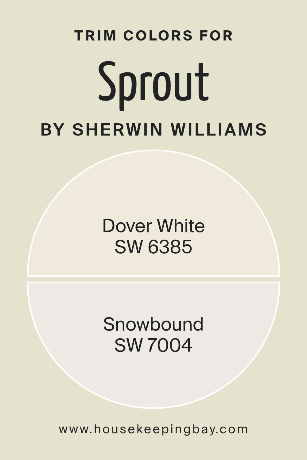
What are the Trim colors of Sprout SW 6427 by Sherwin Williams?
Trim colors refer to the shades used for the borders and edges of walls, windows, and doors, framing a room and providing contrast to the primary wall color. For SproutSW 6427 by Sherwin Williams, trim colors are significant because they complete the room’s look by highlighting its finer details.
Using the right trim colors can enhance the overall design and create a harmonious environment. Choosing a complementary or contrasting trim color can also make architectural features stand out, adding depth and dimension to the space.
SW 6385 – Dover White and SW 7004 – Snowbound are excellent trim color choices for SproutSW 6427. Dover White is a soft, warm white with just a hint of creamy undertone, making it ideal for a welcoming and cozy atmosphere.
Meanwhile, Snowbound offers a crisp, clean white that works well in spaces that aim for a modern, fresh feel, balancing out the green of SproutSW 6427. These trim colors bring out the sprout shade’s best features by creating a clear frame around it, making the room look polished and complete.
You can see recommended paint colors below:
housekeepingbay.com
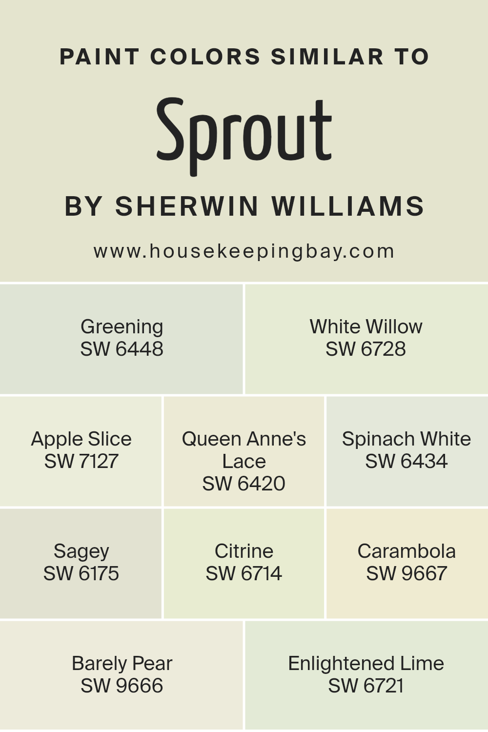
Colors Similar to Sprout SW 6427 by Sherwin Williams
Similar colors are important because they allow for a harmonious design that gives a space a cohesive and pleasing look. When colors share a common undertone or are in the same family, they create a sense of balance and unity.
For instance, colors like Greening (SW 6448) and Queen Anne’s Lace (SW 6420) work well together because they both have a soothing green tone that ties them to nature, but each brings a unique shade that adds depth.
White Willow (SW 6728) and Spinach White (SW 6434) provide delicate, muted greens that can brighten a room without overpowering it, making them great for creating a serene environment.
Apple Slice (SW 7127) offers a gentle, soft green that adds warmth, while Sagey (SW 6175) provides a subtle earthiness, making it perfect for more grounded settings.
Citrine (SW 6714) and Carambola (SW 9667) add a hint of zest with their yellow-green freshness, energizing the surroundings.
Barely Pear (SW 9666) brings a light, airy quality that feels inviting and cheerful. Enlightened Lime (SW 6721) introduces a lively, bright aspect that can wake up any space. Using these similar colors together can help create an aesthetically pleasing and harmonious ambiance.
You can see recommended paint colors below:
- SW 6448 Greening
- SW 6728 White Willow
- SW 7127 Apple Slice
- SW 6420 Queen Anne’s Lace
- SW 6434 Spinach White
- SW 6175 Sagey
- SW 6714 Citrine
- SW 9667 Carambola
- SW 9666 Barely Pear
- SW 6721 Enlightened Lime
housekeepingbay.com
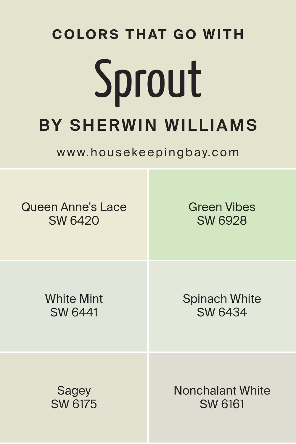
Colors that Go With Sprout SW 6427 by Sherwin Williams
Sprout SW 6427 by Sherwin Williams is a gentle, nature-inspired green. Matching colors help enhance its natural tone and create a balanced and harmonious space. Queen Anne’s Lace SW 6420 is a soft, creamy white that complements Sprout, adding brightness and a clean contrast.
Green Vibes SW 6928 is a rich, lively green that pairs well with Sprout, infusing the room with an energetic yet harmonious feel. White Mint SW 6441 offers a crisp, minty freshness that highlights the soft undertones of Sprout, bringing a refreshing touch to the palette.
Another great match is Spinach White SW 6434, which is an off-white with a hint of green. This subtle tint complements Sprout by picking up its green notes for a cohesive look. Sagey SW 6175 introduces a muted, dusty green that echoes Sprout’s earthy quality, providing depth and versatility.
Lastly, Nonchalant White SW 6161 is a soft, off-white with a touch of gray, blending seamlessly with Sprout for a calm and soothing effect. Together, these colors create an inviting and balanced space that is both lively and serene, making Sprout SW 6427 shine beautifully.
You can see recommended paint colors below:
- SW 6420 Queen Anne’s Lace
- SW 6928 Green Vibes
- SW 6441 White Mint
- SW 6434 Spinach White
- SW 6175 Sagey
- SW 6161 Nonchalant White
housekeepingbay.com
How to Use Sprout SW 6427 by Sherwin Williams In Your Home?
Sprout SW 6427 by Sherwin Williams offers a fresh and lively green tone that suits various spaces within a home. This paint color brings a hint of nature indoors, making any room feel light and airy. In the living room, Sprout SW 6427 pairs well with neutral furniture, creating an inviting and comfortable area for family gatherings or relaxation. In the kitchen, it complements white cabinets and wooden accents, adding a touch of warmth and style.
For those wanting a refreshing bedroom environment, this color fosters a peaceful atmosphere, promoting restful sleep. Adding soft textiles like beige or cream can enhance the soothing effect. If used in a child’s room, it encourages a fun and cheerful vibe.
Sprout SW 6427 also shines when used in small spaces such as bathrooms or hallways, where it can make an area feel more open and welcoming. With its versatile and uplifting qualities, it can brighten any room.
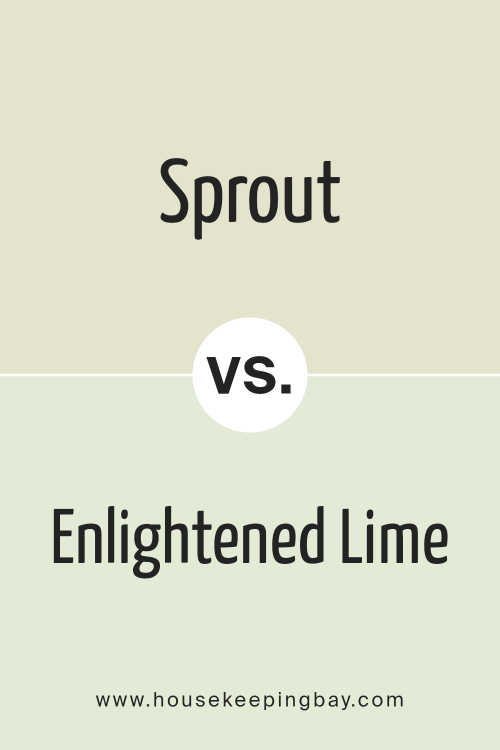
Sprout SW 6427 by Sherwin Williams vs Enlightened Lime SW 6721 by Sherwin Williams
Sprout SW 6427 by Sherwin Williams is a soft, muted green with subtle yellow undertones. It feels calm and natural, making spaces feel comfortable and inviting. This color works well in rooms where you want to relax, like living rooms or bedrooms, as it doesn’t overpower the space but rather enhances it with a soothing presence.
Enlightened Lime SW 6721, also by Sherwin Williams, features a more vibrant and lively lime green with pronounced yellow tones. This color brings energy and playfulness to any area. It can brighten a room and make it feel more dynamic, which is great for spaces like kitchens or playrooms where you want an upbeat vibe.
Both colors share green and yellow qualities, but Sprout has a gentler, earthier feel, ideal for calm areas. Enlightened Lime is vivid and cheerful, perfect for spaces that benefit from a bold splash of color.
You can see recommended paint color below:
- SW 6721 Enlightened Lime
housekeepingbay.com
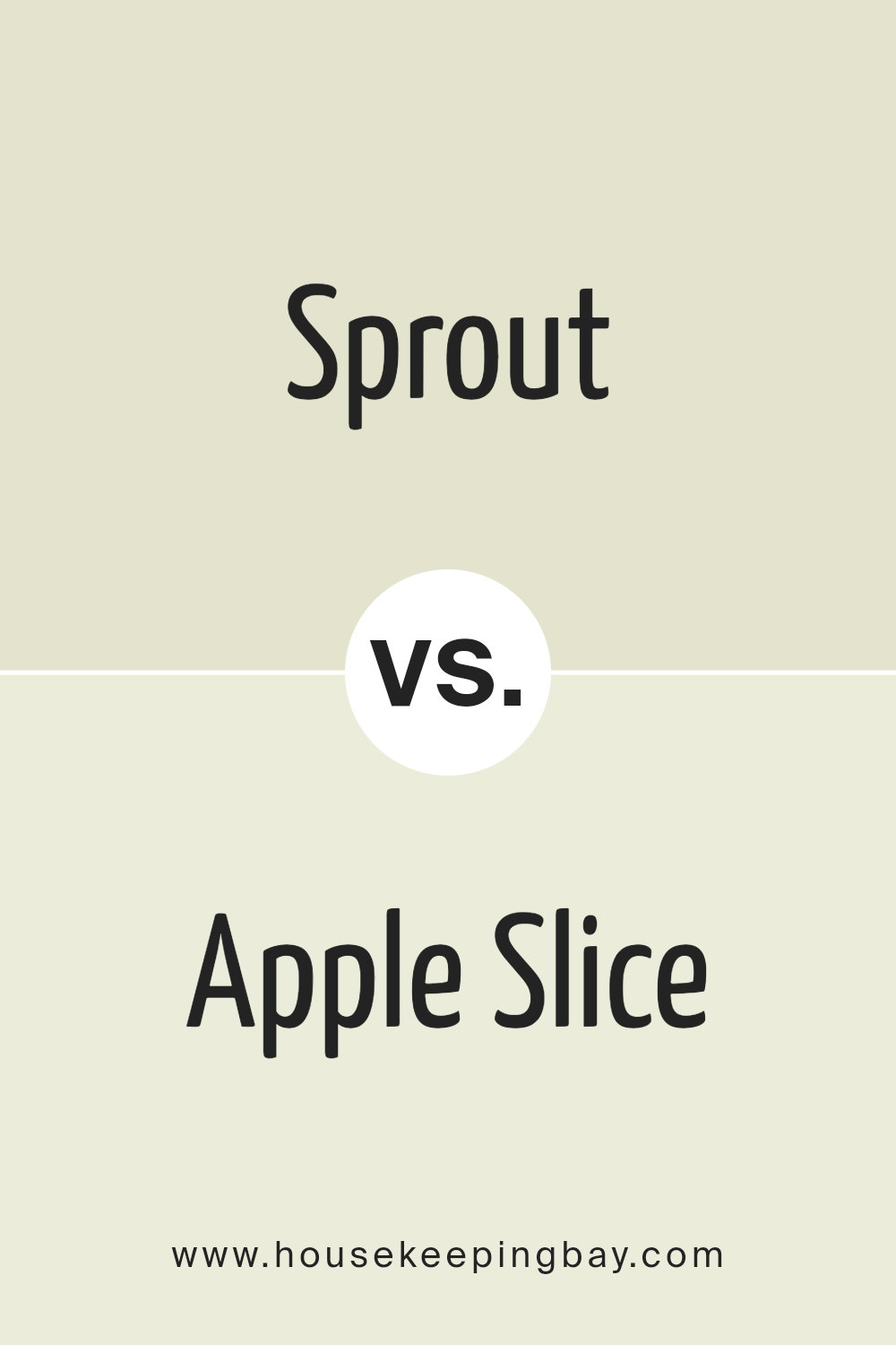
Sprout SW 6427 by Sherwin Williams vs Apple Slice SW 7127 by Sherwin Williams
Sprout SW 6427 and Apple Slice SW 7127 by Sherwin Williams are both shades of green, but they offer different vibes. Sprout is a soft, muted green with yellow undertones. It’s calm and soothing, making it ideal for spaces that need a gentle, relaxing feel. This color works well in living rooms or bedrooms where you want a touch of nature and lightness.
Apple Slice, in contrast, is a brighter, more vibrant green. It has a cheerful, energizing look, with a punch that instantly catches the eye. This color can add playfulness and fun to spaces like kitchens or children’s rooms. It’s a great choice if you want to create an atmosphere filled with energy and freshness.
Both colors connect with nature but do so in unique ways—Sprout through softness and subtlety, while Apple Slice through brightness and liveliness.
You can see recommended paint color below:
- SW 7127 Apple Slice
housekeepingbay.com
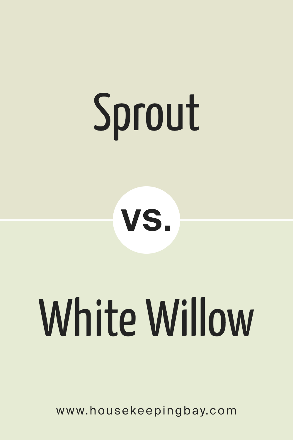
Sprout SW 6427 by Sherwin Williams vs White Willow SW 6728 by Sherwin Williams
Sprout SW 6427 and White Willow SW 6728 by Sherwin Williams are both soft, nature-inspired greens. Sprout is a light and airy green, giving spaces a fresh and vibrant feel. Its subtle yellow undertone adds warmth, making it perfect for inviting areas. It brings a lively touch to rooms without overpowering them.
White Willow, while also a green, is paler and more muted than Sprout. It leans towards a softer, more subdued tone. This makes it ideal for those who want a hint of color without it being too bold. White Willow offers a gentle backdrop, creating a calm and balanced atmosphere.
Both colors work well in various settings, but Sprout brings more energy, while White Willow creates a peaceful environment. These shades can complement each other beautifully when used together, with Sprout as an accent and White Willow as the main color.
You can see recommended paint color below:
- SW 6728 White Willow
housekeepingbay.com
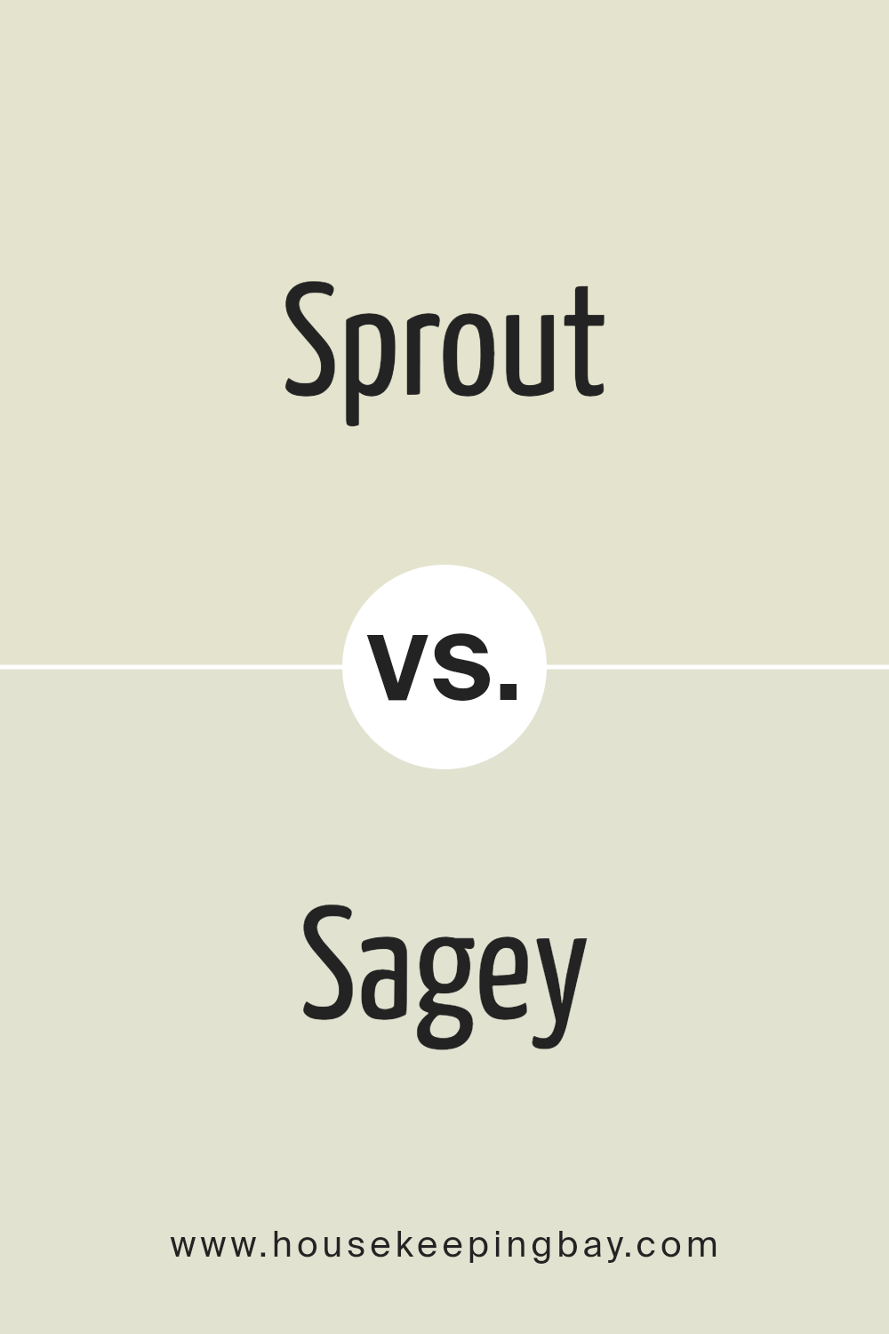
Sprout SW 6427 by Sherwin Williams vs Sagey SW 6175 by Sherwin Williams
Sprout SW 6427 and Sagey SW 6175 by Sherwin Williams offer distinct yet harmonious hues. Sprout is a light, fresh green that evokes a sense of growth and renewal. It brings a bright and lively touch to spaces, making rooms feel open and airy. Its fresh tone adds a hint of optimism, creating an uplifting atmosphere.
Sagey, however, leans towards a more muted, grey-green palette. This color exudes a calm and soothing presence. It’s ideal for spaces where you want to create a relaxing and peaceful environment. Sagey offers versatility, seamlessly fitting into both modern and traditional designs.
When placing these two greens side by side, Sprout stands out for its vitality and brightness, while Sagey offers a mellow and understated elegance. Combining them can create a well-balanced space, with Sprout providing pops of energy and Sagey ensuring grounded serenity.
You can see recommended paint color below:
- SW 6175 Sagey
housekeepingbay.com
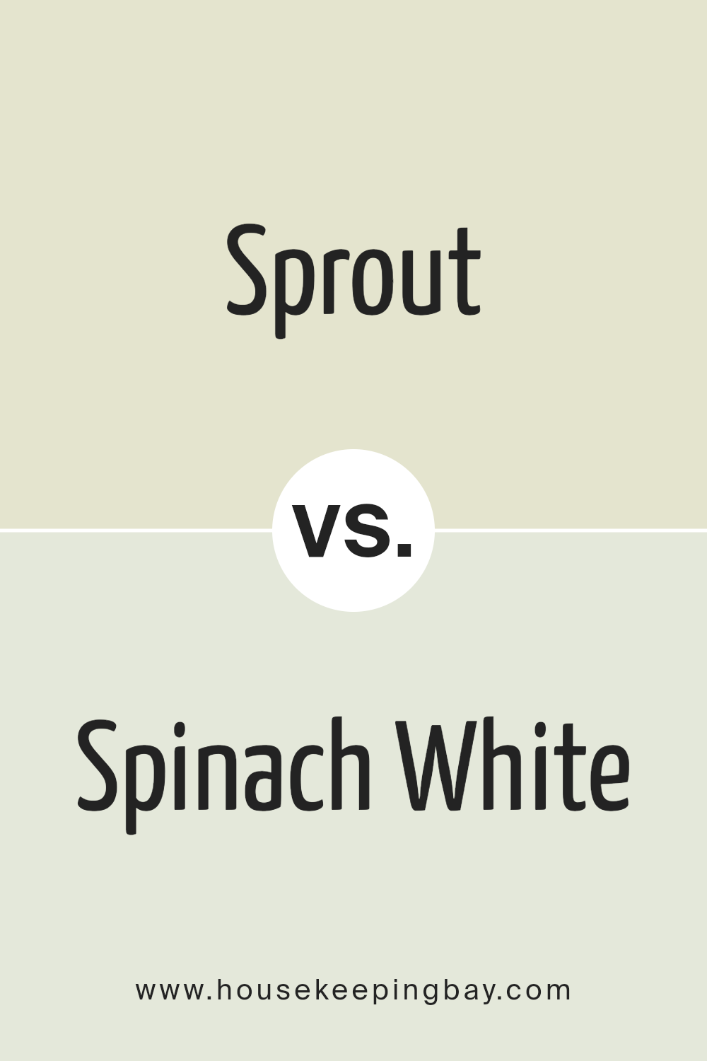
Sprout SW 6427 by Sherwin Williams vs Spinach White SW 6434 by Sherwin Williams
Sprout SW 6427 and Spinach White SW 6434, both by Sherwin Williams, are subtle green tones with distinct vibes. Sprout SW 6427 is a gentle, muted green with a hint of warmth. It feels natural and calming, making it suitable for spaces where you want a touch of nature.
It’s a versatile choice that works well in living rooms or bedrooms, adding a soft backdrop without overwhelming the space.
Spinach White SW 6434, however, leans a bit more towards a yellow-green hue. It’s lighter and has a fresh, airy feel. This makes it ideal for creating a bright, cheerful atmosphere. Kitchens or bathrooms can benefit from this color, where lightness can enhance the mood.
While both colors bring an element of nature indoors, Sprout has a more subdued, earthy quality, whereas Spinach White offers a crisp, refreshing lift. Both can complement a variety of decor styles.
You can see recommended paint color below:
- SW 6434 Spinach White
housekeepingbay.com
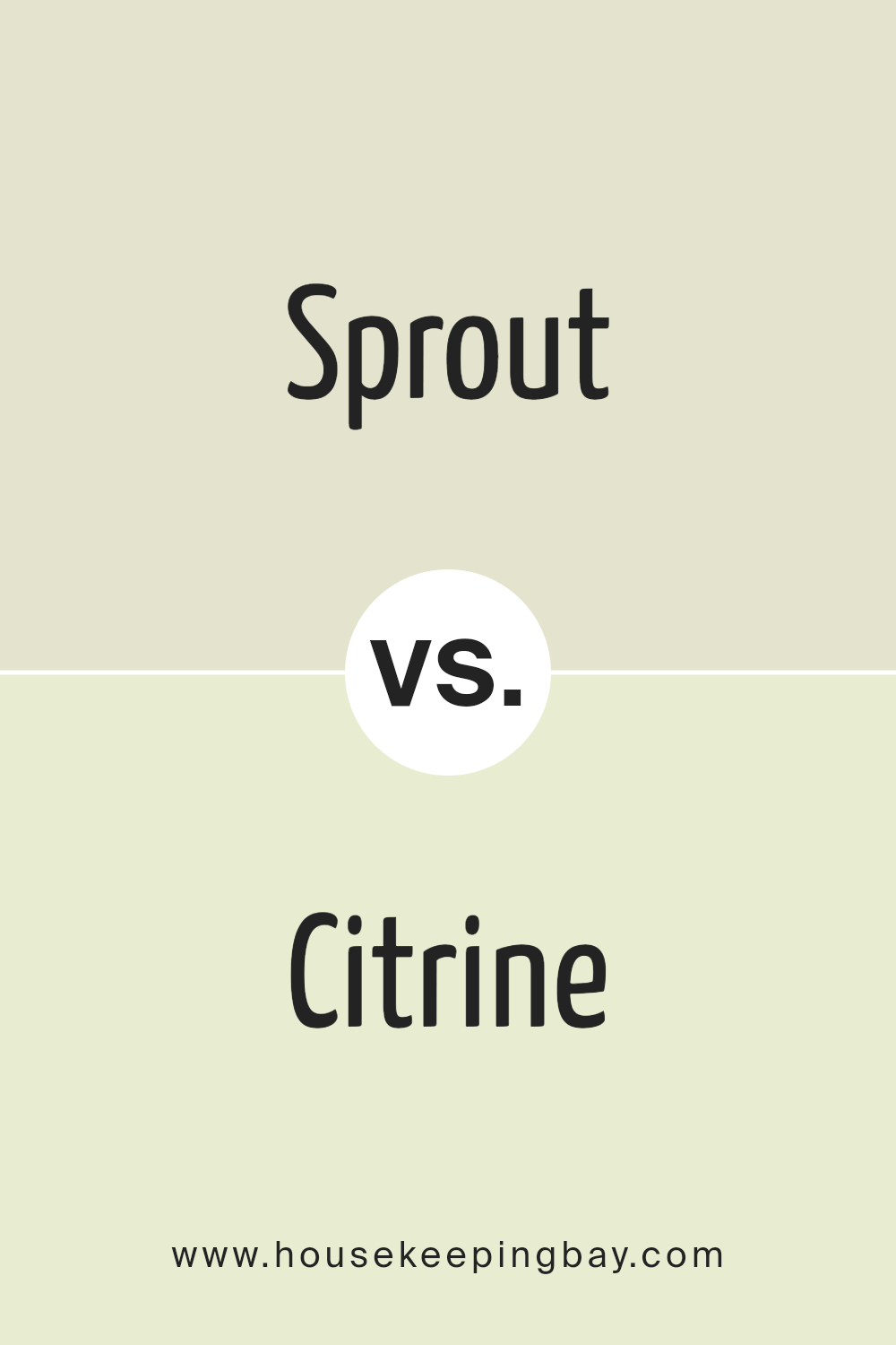
Sprout SW 6427 by Sherwin Williams vs Citrine SW 6714 by Sherwin Williams
Sprout SW 6427 by Sherwin Williams features a soft, muted green. It gives spaces a natural and calming vibe. Suitable for rooms needing a subtle touch, it pairs well with neutral tones or gentle pastels. This green can create a peaceful environment, making it ideal for bedrooms or living areas.
Citrine SW 6714 by Sherwin Williams, however, offers a bright, sunny yellow-green. It’s bold and vibrant, bringing energy and warmth to any space. Citrine works well in kitchens or playrooms where a lively atmosphere is desired. Its brightness can complement cooler grays or whites, adding a cheerful pop of color.
While both Sprout and Citrine are green, they serve different purposes. Sprout leans toward understated elegance, perfect for areas of relaxation. Citrine, with its bold, youthful energy, suits spaces needing a lively, energetic boost. Each color brings its unique character and charm to interior design.
You can see recommended paint color below:
- SW 6714 Citrine
housekeepingbay.com
Sprout SW 6427 by Sherwin Williams vs Carambola SW 9667 by Sherwin Williams
Sprout SW 6427 and Carambola SW 9667 by Sherwin Williams are both shades of green, but they offer distinct feelings. Sprout SW 6427 is a soft, muted green, evoking a sense of calm and nature. It’s a versatile color, easily pairing with neutrals and earth tones. This gentle hue works well in spaces aiming for a light, airy vibe, suitable for living rooms or bedrooms where relaxation is key.
Carambola SW 9667, in contrast, is a more vibrant and lively green. It’s bold, adding strong character to any room. Carambola can bring energy into a space, ideal for areas like kitchens or playrooms where excitement and creativity flourish. Its lively nature makes it a perfect choice for accents or statement walls.
Both colors reflect nature but accomplish different purposes, with Sprout providing serenity and Carambola injecting energy. Choose based on whether you want calming harmony or invigorating flair.
You can see recommended paint color below:
- SW 9667 Carambola
housekeepingbay.com
Sprout SW 6427 by Sherwin Williams vs Greening SW 6448 by Sherwin Williams
Sprout SW 6427 and Greening SW 6448, both by Sherwin Williams, offer unique shades of green. Sprout SW 6427 presents a soft, muted green, carrying a gentle warmth that makes it feel inviting and soothing. It feels light, resembling fresh young plants and gives a calming appearance to spaces. This color fits well in areas where a subtle, refreshing ambiance is desired, like living rooms or offices.
In contrast, Greening SW 6448 delivers a bolder presence with a deeper, richer green hue. It’s more vibrant, hinting towards a forest-like feel, and injects energy into a room. This lively color can work well in spaces needing a vivid touch, such as feature walls or creative environments.
Both colors offer their individual green beauty, with Sprout bringing a softer, serene touch and Greening contributing a lively and rich depth—each suitable for various moods and styles in home decor.
You can see recommended paint color below:
- SW 6448 Greening
housekeepingbay.com
Sprout SW 6427 by Sherwin Williams vs Queen Anne’s Lace SW 6420 by Sherwin Williams
Sprout SW 6427 and Queen Anne’s Lace SW 6420 are two lovely colors by Sherwin Williams that bring a fresh, natural vibe to spaces. Sprout is a soft, muted green that suggests new growth, making it feel lively and refreshing. It’s a color that can bring a bit of the outdoors into a room, tying well with nature-inspired decor.
Queen Anne’s Lace, meanwhile, is a light, creamy off-white with a hint of warmth. It’s subtle and versatile, providing a gentle backdrop for any space. While it lacks the green tone of Sprout, Queen Anne’s Lace offers a brighter and warmer feel, perfectly complementing wood tones and soft colors.
Together, these two colors create a harmonious blend. Sprout adds a touch of nature and life, while Queen Anne’s Lace offers warmth and brightness. Spaces using these colors feel welcoming, grounded, and peaceful, with Sprout bringing energy and Queen Anne’s Lace adding soft sophistication.
You can see recommended paint color below:
- SW 6420 Queen Anne’s Lace
housekeepingbay.com
Sprout SW 6427 by Sherwin Williams vs Barely Pear SW 9666 by Sherwin Williams
Sprout SW 6427 by Sherwin Williams is a soft, muted green that exudes freshness and vitality. It evokes the feeling of young plants bursting forth in spring. This shade has a natural, earthy appeal, making it perfect for spaces seeking calm. Its gentle hue can soothe the senses, providing a serene backdrop in any room.
Barely Pear SW 9666, also by Sherwin Williams, is a lighter, more delicate green with hints of yellow undertones. It has a sunny, cheerful quality that can brighten up spaces. This color adds a touch of warmth and freshness, making it suitable for adding energy to kitchens or living areas.
Comparing the two, Sprout is richer and more grounded, offering comfort, while Barely Pear feels airy and uplifting. While both colors sit in the green spectrum, Sprout leans more toward a classic green, whereas Barely Pear flirts with warmth, balancing green and yellow hues.
You can see recommended paint color below:
- SW 9666 Barely Pear
housekeepingbay.com
Conclusion
I’ve spent time researching SW 6427 Sprout by Sherwin Williams, and it’s an impressive shade for those looking for a fresh and lively color in their space. This particular hue strikes a great balance between a light, natural green and a subtle warmth, making it versatile for many settings. It brings a touch of the outdoors inside, which can help create a vibrant yet calming atmosphere.
SW 6427 Sprout works well in various rooms, whether in a living area where a pleasant ambiance sets the mood or in a kitchen where it can energize the space. Its gentle tone can also pair beautifully with a range of other colors, from neutrals to darker shades, providing options for different styles or preferences.
In contemplating how this shade impacts a room, I notice its ability to change slightly under different lighting conditions, adding depth and interest to the space. When paired with complementary colors through furniture or decor, the overall effect can be both harmonious and refreshing.
Choosing SW 6427 Sprout opens up opportunities to invigorate interiors, making it a worthwhile consideration for anyone aiming to refresh their home with a touch of nature’s lively spirit.
housekeepingbay.com
Ever wished paint sampling was as easy as sticking a sticker? Guess what? Now it is! Discover Samplize's unique Peel & Stick samples. Get started now and say goodbye to the old messy way!
Get paint samples


