Renwick Beige SW 2805 by Sherwin Williams
A Warm and Inviting Hue for Every Space
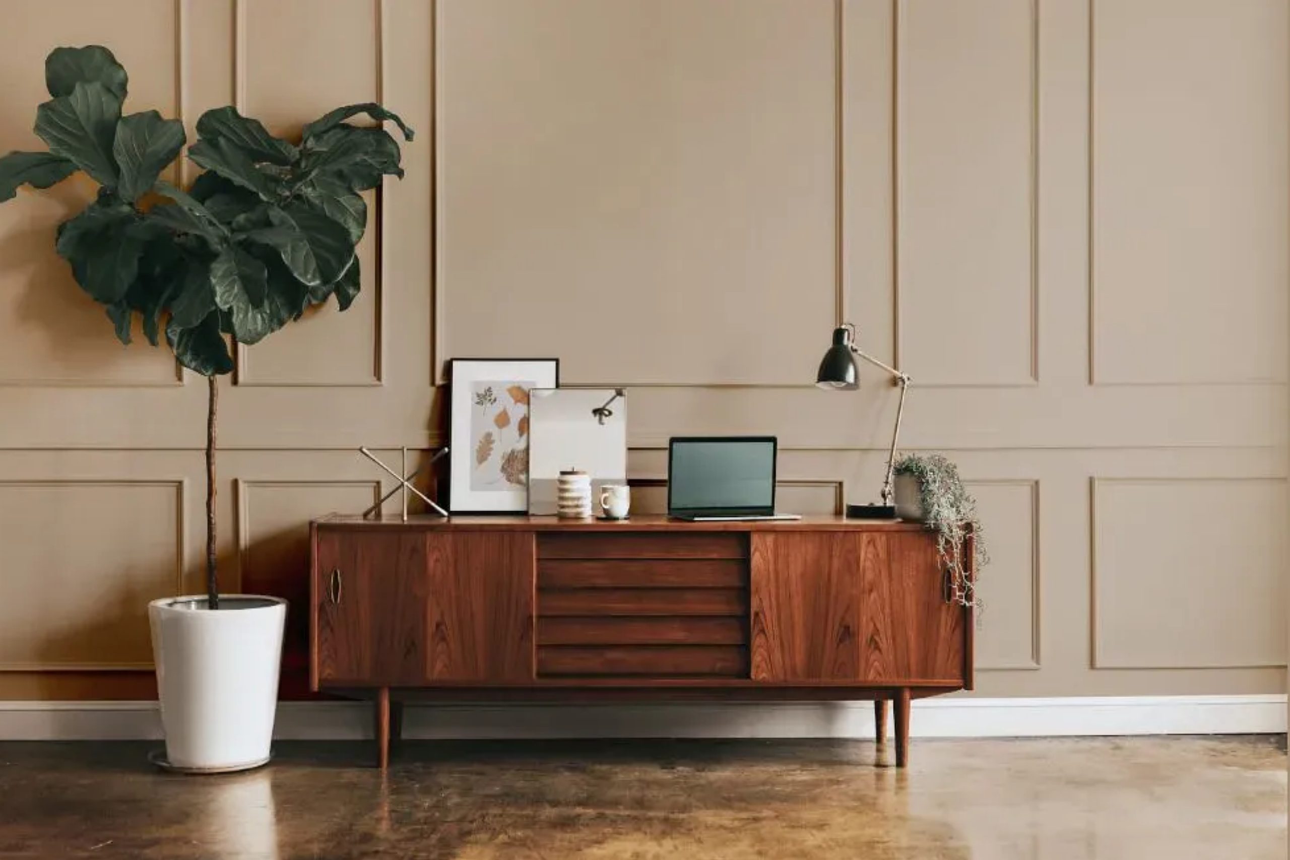
When it comes to choosing a paint color for your home, finding the right shade can feel challenging. With so many options available, where do you begin? I want to tell you about SW 2805 Renwick Beige by Sherwin Williams, a warm and welcoming color that could be the perfect fit for your space.
Renwick Beige is a timeless, muted beige that provides a sense of balance and comfort. It’s a neutral tone that works well in any room, making it an excellent choice for living rooms, bedrooms, or hallways.
The beauty of Renwick Beige lies in its adaptability; it pairs effortlessly with a variety of colors and materials.
Imagine this color as a backdrop for your favorite furniture and decor. It can anchor a space without overwhelming it, allowing you to add pops of color through accessories, artwork, or plants. The warmth of Renwick Beige creates a cozy yet elegant atmosphere that makes your home feel inviting.
The color also works well with different lighting conditions. Whether you have natural sunlight streaming in or rely on artificial lighting, Renwick Beige maintains its charm throughout the day. It’s a color that enhances the beauty of your home while remaining understated and stylish.
If you’re seeking a color that offers warmth, flexibility, and timelessness for your home, Renwick Beige might just be the ideal choice.
via plan-home.com
What Color Is Renwick Beige SW 2805 by Sherwin Williams?
Table of Contents
Renwick Beige SW 2805 by Sherwin Williams is a warm, earthy shade that combines tan with subtle undertones of gray. This versatile color creates a cozy and inviting atmosphere, making it a favorite for those seeking comfort in their living spaces. Its soft and neutral qualities allow it to blend seamlessly with various design styles.
In traditional interiors, Renwick Beige adds a sense of warmth and timelessness. It pairs well with rich wooden furniture, like mahogany or walnut, and complements classic patterns and antiques.
For a modern setting, this color provides a neutral backdrop that helps vibrant artwork and contemporary furnishings stand out.
Renwick Beige fits perfectly with rustic interiors, enhancing the natural textures of stone, brick, and reclaimed wood. It also works in industrial settings, balancing metals and concrete with its warm tones.
In terms of materials, Renwick Beige looks great next to soft textiles like linen and cotton, which add to its cozy appeal. It harmonizes with warm metallics, such as bronze and brass, enhancing a space’s depth. Incorporating natural elements like wicker, rattan, or jute further complements Renwick Beige, creating an inviting and comfortable environment that feels effortlessly pulled together.
housekeepingbay.com
Is Renwick Beige SW 2805 by Sherwin Williams Warm or Cool color?
Renwick Beige SW 2805 by Sherwin Williams is a versatile paint color that brings warmth and comfort to homes. This shade of beige offers a subtle blend of gray and brown tones, creating a welcoming atmosphere. It’s an ideal choice for living rooms, bedrooms, and even kitchens, as it provides a neutral backdrop that complements various styles, from classic to modern.
Renwick Beige enhances natural light in a room, making spaces feel larger and more open. Its soft hue works well with both light and dark furnishings, allowing for flexibility in decorating choices.
Pairing it with white trim can highlight architectural features, while darker accents like deep browns or blues can add depth and contrast.
This color also adapts well to different lighting, maintaining its appeal throughout the day. Whether in sunlight or artificial light, Renwick Beige retains its warmth, providing consistent coziness and elegance. Its timeless quality ensures that it remains stylish for years.
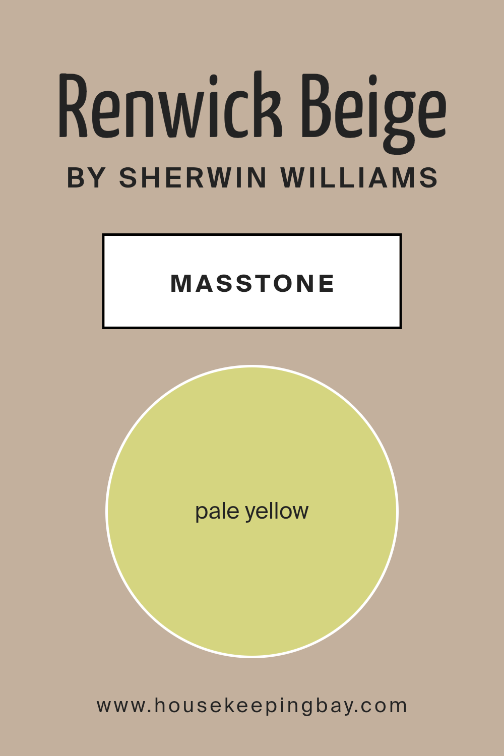
What is the Masstone of the Renwick Beige SW 2805 by Sherwin Williams?
Renwick Beige SW 2805 by Sherwin-Williams is a warm, inviting color that adds a touch of soft elegance to any home. Its masstone is a pale yellow (#D5D580), which gives it a comforting brightness. This color brings a subtle glow to rooms, making spaces feel open and welcoming. Renwick Beige works well in living rooms and bedrooms, offering a cozy yet fresh environment.
In well-lit rooms, its warm undertones become more noticeable, giving a natural golden feel. It pairs beautifully with natural wood tones and earthy accents, enriching a room with a soothing atmosphere. It complements both traditional and modern decor, allowing flexibility in style.
If used in hallways or smaller spaces, it can create an illusion of a larger area due to its light-reflecting quality. Renwick Beige is versatile, making it a reliable choice for those wanting to instill warmth without overpowering a room’s aesthetics.
housekeepingbay.com
Undertones of Renwick Beige SW 2805 by Sherwin Williams
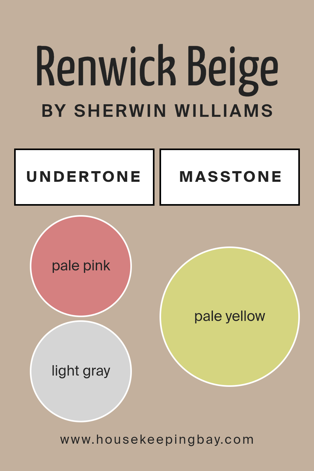
Renwick Beige SW 2805 by Sherwin Williams is a versatile paint color with complex undertones that influence how we perceive it. Undertones are subtle hues beneath a main color that can affect its appearance depending on lighting and surrounding colors.
Renwick Beige has a variety of undertones, including pale pink, light gray, light purple, mint, gray, light blue, lilac, yellow, orange, light green, and olive. These undertones can create different effects based on their interaction with the environment.
Pale pink and light purple add warmth, giving the beige a slight rosy tint. Light gray and gray undertones bring a neutral and cool aspect, making the beige feel more grounded. Mint and light green introduce a subtle freshness, while light blue and lilac enhance calmness in rooms.
Yellow and orange undertones add a bit of warmth and cheeriness, making spaces feel more inviting. Olive undertones provide an earthy, natural feel.
In interior spaces, Renwick Beige can change in appearance throughout the day due to lighting shifts. Under natural light, warm undertones might become more pronounced, making the room cozy. Under cool artificial light, the gray and blue undertones could make the color appear cooler.
This adaptability makes Renwick Beige an excellent choice for many spaces.
housekeepingbay.com
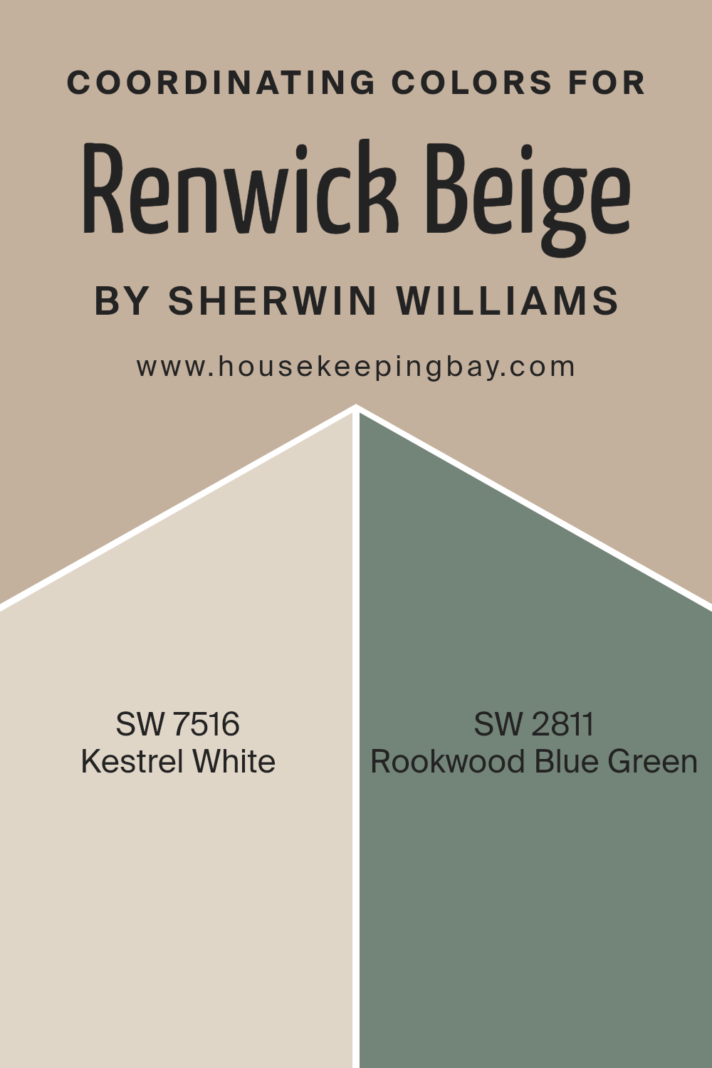
Coordinating Colors of Renwick Beige SW 2805 by Sherwin Williams
Coordinating colors are hues chosen to complement each other within a space, creating a balanced and harmonious visual experience. These colors work together to enhance and emphasize the base color, Renwick Beige SW 2805 by Sherwin Williams, without overshadowing it.
Coordinating colors help to create a cohesive look, making each element of the design feel connected. When selecting coordinating colors, it’s essential to consider the mood and atmosphere you want to create in the space.
Choosing the right shades can add warmth, depth, or vibrancy. A well-chosen palette can make a room feel unified, comfortable, and inviting.
Kestrel White SW 7516 is a soft and warm off-white, offering a gentle contrast to the mid-tone warmth of Renwick Beige.
It adds an air of lightness and brightness to the space, making it feel more open and airy. Rookwood Blue Green SW 2811, on the other hand, introduces a deep and rich color that adds depth and character.
This hue brings a touch of nature-inspired tranquility and pairs beautifully with Renwick Beige, adding a refreshing pop of color.
Together, these colors create a balanced and inviting environment that feels both homey and sophisticated.
You can see recommended paint colors below:
- SW 7516 Kestrel White
- SW 2811 Rookwood Blue Green
housekeepingbay.com
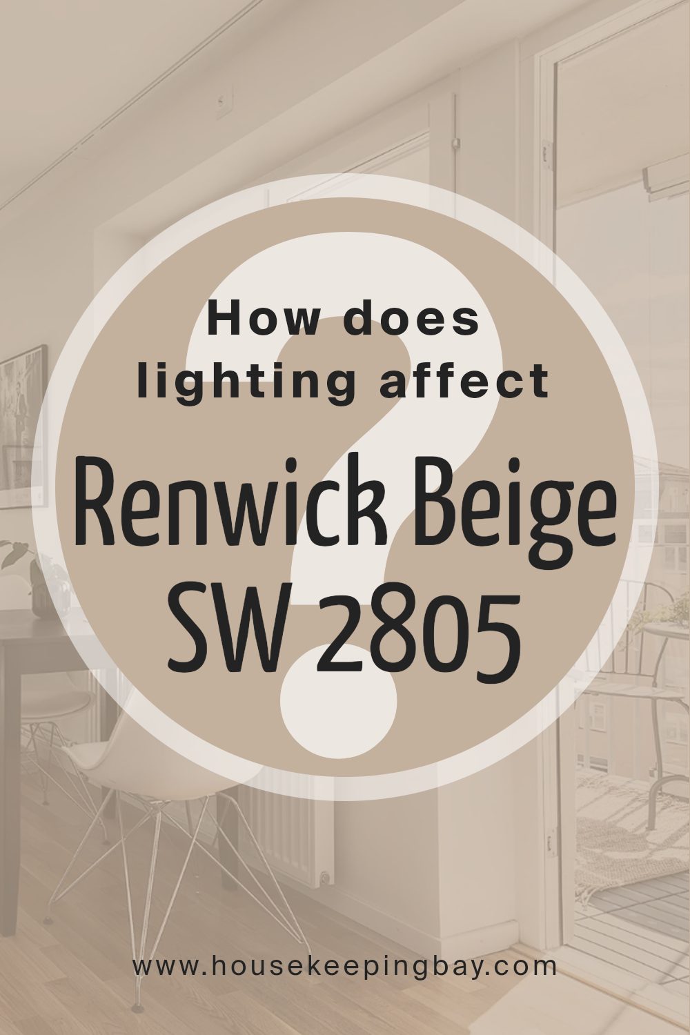
How Does Lighting Affect Renwick Beige SW 2805 by Sherwin Williams?
Lighting plays a major role in how we perceive colors. It changes how a color looks based on the type and direction of the light. Sherwin Williams’ Renwick Beige SW 2805 is a versatile neutral hue that can appear different under various lighting conditions and in different room orientations.
In natural light, Renwick Beige can show its true neutral undertones. However, the time of day and the direction of the light can alter its appearance.
In south-facing rooms, which receive warm, bright sunlight for most of the day, Renwick Beige can look warmer and bring out creamy undertones, creating a cozy ambiance.
In north-facing rooms, which get cooler, indirect light, Renwick Beige can appear a little more muted or slightly grayish. This effect happens because north light is often soft and consistent, enhancing cooler tones and sometimes making warmer colors appear subdued.
East-facing rooms receive warm, soft morning light and cooler, bluer light in the afternoon. Renwick Beige may appear warmer and more inviting in the morning, which can evoke a pleasant mood for starting the day. As the day progresses, the shade might cool slightly but retain its calm and inviting nature.
In west-facing rooms, the color can look quite different from morning to afternoon. In the afternoon, these rooms are bathed in warm, intense light, which can make Renwick Beige appear richer and more golden. It can contribute to a cozy setting, especially in the late afternoon and early evening.
Under artificial light, Renwick Beige’s appearance will depend on the type of bulb used. Incandescent or warm LED bulbs can enhance its warm tones, making it feel more inviting and soft, whereas cooler LED lights might bring out more of its neutral, muted qualities.
Adjustments in artificial lighting can help tailor the atmosphere to suit personal preference, highlighting Renwick Beige’s adaptability in various settings.
housekeepingbay.com
What is the LRV of Renwick Beige SW 2805 by Sherwin Williams?
LRV stands for Light Reflectance Value, which measures how much light a color reflects. The scale ranges from 0 to 100, where 0 represents absolute black, reflecting no light, and 100 is pure white, reflecting all the light. This value is important because it influences how light or dark a color will appear once it’s on your walls.
A higher LRV means a brighter, lighter color that can make a space feel open and airy. In contrast, a lower LRV means the color will absorb more light, making the room feel cozier and more intimate.
Renwick Beige by Sherwin Williams has an LRV of 44.96, placing it in the mid-range. This means that Renwick Beige reflects a moderate amount of light. It’s neither too bright nor too dark, making it a versatile choice. In a well-lit room, it will appear warm and welcoming without feeling too dark or heavy.
In a room with less natural light, it can create a cozy atmosphere without making the space feel too enclosed.
The LRV of 44.96 ensures that Renwick Beige maintains a balanced look, appearing consistently comfortable in various lighting conditions.

housekeepingbay.com
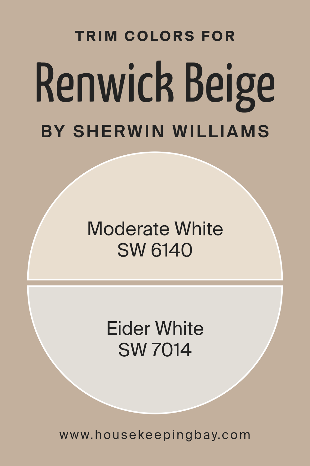
What are the Trim colors of Renwick Beige SW 2805 by Sherwin Williams?
Trim colors are the colors used on the mouldings, baseboards, and other trim areas of a room. They play a crucial role in highlighting and framing the walls, which helps in accentuating the main wall color. For Renwick Beige SW 2805 by Sherwin Williams, selecting appropriate trim colors is vital for balancing its warm tones.
Trim colors not only enhance the overall aesthetic but also contribute to the room’s ambiance. They help create contrast or harmony, depending on the desired look, and draw attention to architectural details.
Using SW 6140 – Moderate White and SW 7014 – Eider White as trim colors can effectively complement Renwick Beige. SW 6140 – Moderate White is soft and creamy, which brings warmth and subtle contrast against Renwick Beige, creating a welcoming and cohesive feel.
SW 7014 – Eider White, on the other hand, offers a cooler, crisper alternative. This gives a fresh, clean edge against the warm beige and can brighten up the space, making it appear more open.
Together, these trim choices can adapt the mood of the room, whether leaning towards warmth or coolness, but always ensuring that Renwick Beige stands out beautifully.
You can see recommended paint colors below:
housekeepingbay.com
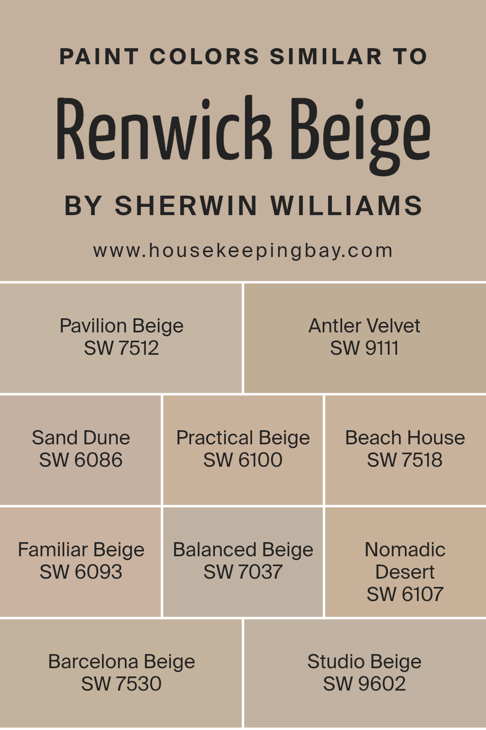
Colors Similar to Renwick Beige SW 2805 by Sherwin Williams
Similar colors are important because they create harmony and balance in a space. When decorating, using similar colors can provide a seamless flow, making the room feel coherent and comforting. Renwick Beige by Sherwin Williams is a warm, neutral tone, and similar colors like Pavilion Beige, Antler Velvet, and Sand Dune, offer subtle differences that allow for flexibility in design.
Pavilion Beige, with its soft touch, brings a relaxed feel to any room, while Antler Velvet adds depth with its slightly richer tone. Sand Dune, on the other hand, has a hint of earthiness that adds warmth without overpowering.
Practical Beige lives up to its name by being a reliable choice for any space, as its straightforward nature keeps things simple and elegant. Beach House offers a light, airy vibe with a hint of coastal charm, reminding one of relaxing seaside moments. Familiar Beige brings a sense of comfort and ease with its cozy warmth, and Balanced Beige finds a middle ground with its perfectly managed warmth and neutrality.
Nomadic Desert touches on more adventurous undertones with deeper, more grounded brown notes.
Meanwhile, Barcelona Beige paints a picture of sun-kissed Mediterranean hues, adding brightness and vibrancy to a room. Studio Beige wraps it up with its elegant simplicity, perfect for those seeking sophistication.
You can see recommended paint colors below:
- SW 7512 Pavilion Beige
- SW 9111 Antler Velvet
- SW 6086 Sand Dune
- SW 6100 Practical Beige
- SW 7518 Beach House
- SW 6093 Familiar Beige
- SW 7037 Balanced Beige
- SW 6107 Nomadic Desert
- SW 7530 Barcelona Beige
- SW 9602 Studio Beige
housekeepingbay.com
How to Use Renwick Beige SW 2805 by Sherwin Williams In Your Home?
Renwick Beige SW 2805 by Sherwin Williams is a versatile paint color that can add warmth and coziness to any home. This warm beige shade works well in various rooms and can complement different styles. In a living room, it provides a comfortable backdrop that pairs well with both modern and traditional furniture. It allows for bold colored furnishings or subtle décor accents, making everything look coordinated.
For a bedroom, this shade creates a soothing and inviting atmosphere, perfect for relaxation. It works beautifully with natural textures and materials like wood and rattan.
In an office space, Renwick Beige offers a neutral canvas that supports productivity without distractions.
Kitchen walls painted in this color can look elegant, especially when paired with white cabinets or stainless steel appliances. It brightens the area while maintaining a homey feel.
Renwick Beige also enhances natural light, making spaces feel larger and more open.
Overall, its adaptability makes it an excellent choice for any room.
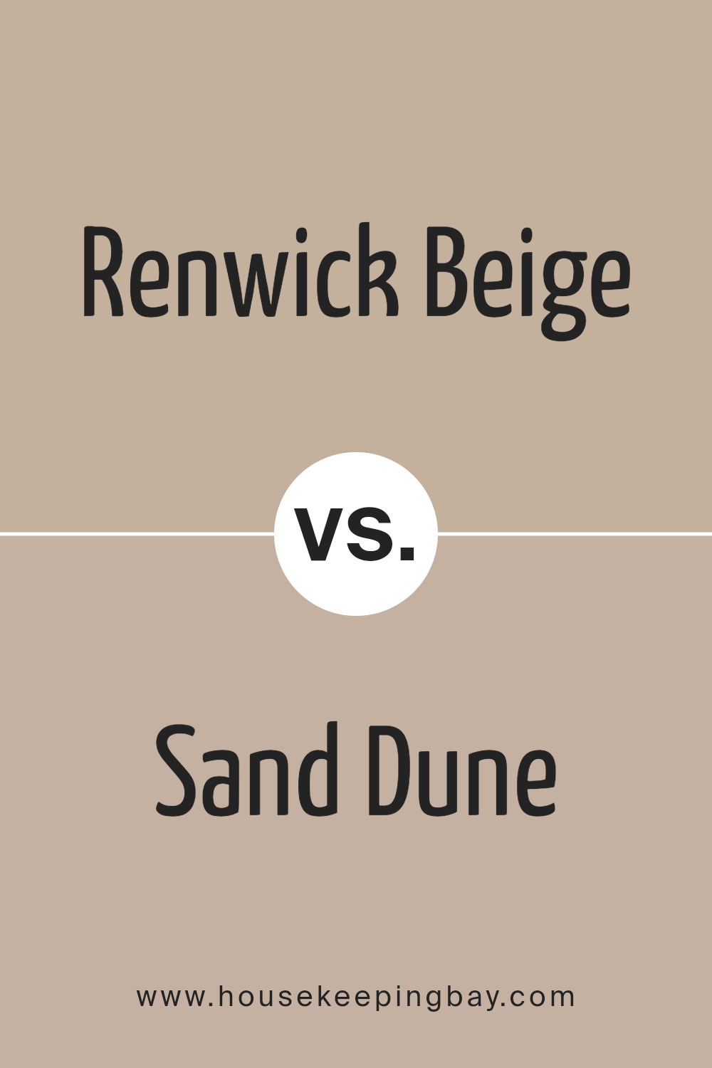
Renwick Beige SW 2805 by Sherwin Williams vs Sand Dune SW 6086 by Sherwin Williams
Renwick Beige SW 2805 by Sherwin Williams is a warm, subtle shade often associated with historical and timeless settings. This color has a slight brown undertone, giving it a rich and classic feel that can provide a cozy and inviting atmosphere to any room. It’s versatile and works well in traditional settings but can also complement modern decor.
Sand Dune SW 6086, also by Sherwin Williams, is a light, neutral beige with a touch of yellow undertone. This color feels brighter compared to Renwick Beige, providing an airy and open feeling to spaces. It’s ideal for creating a soft backdrop in interiors, allowing furniture and decor to stand out while maintaining a harmonious look.
Both colors offer warmth, but Renwick Beige tends to feel more grounded and historical, while Sand Dune provides a lighter, more contemporary option suitable for a wide range of design styles.
You can see recommended paint color below:
- SW 6086 Sand Dune
housekeepingbay.com
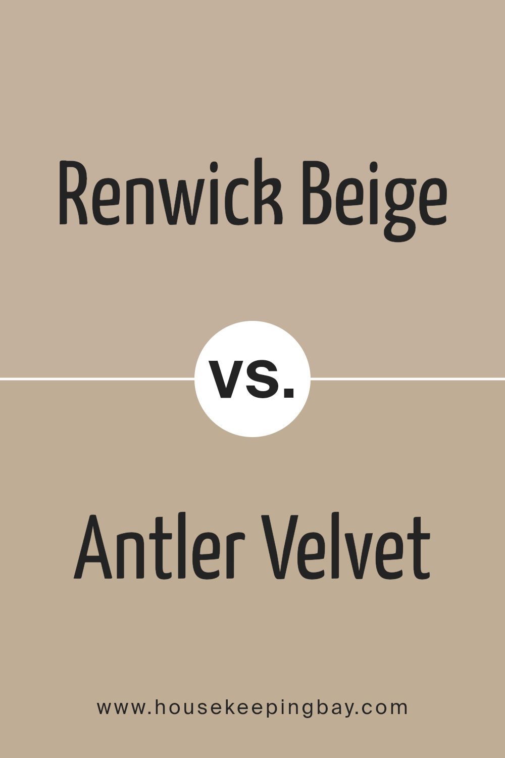
Renwick Beige SW 2805 by Sherwin Williams vs Antler Velvet SW 9111 by Sherwin Williams
Renwick Beige SW 2805 by Sherwin Williams is a warm, inviting color that brings a sense of coziness to any room. It has subtle hints of brown and yellow, providing a classic and timeless look. This makes it a versatile choice for various styles, from traditional to modern.
Antler Velvet SW 9111, also by Sherwin Williams, is a deeper, rich shade. It leans more towards a brown tone, with a touch of red undertone that adds warmth and depth. This color can create a more dramatic and sophisticated atmosphere, making it ideal for accent walls or areas where you want to create a cozy, intimate feeling.
When comparing them, Renwick Beige feels lighter and more neutral, perfect for spaces where you want an understated backdrop. In contrast, Antler Velvet is a bolder choice, ideal for adding warmth and character to specific areas. Both colors offer warmth, but Antler Velvet provides more intensity, while Renwick Beige offers subtlety.
You can see recommended paint color below:
- SW 9111 Antler Velvet
housekeepingbay.com
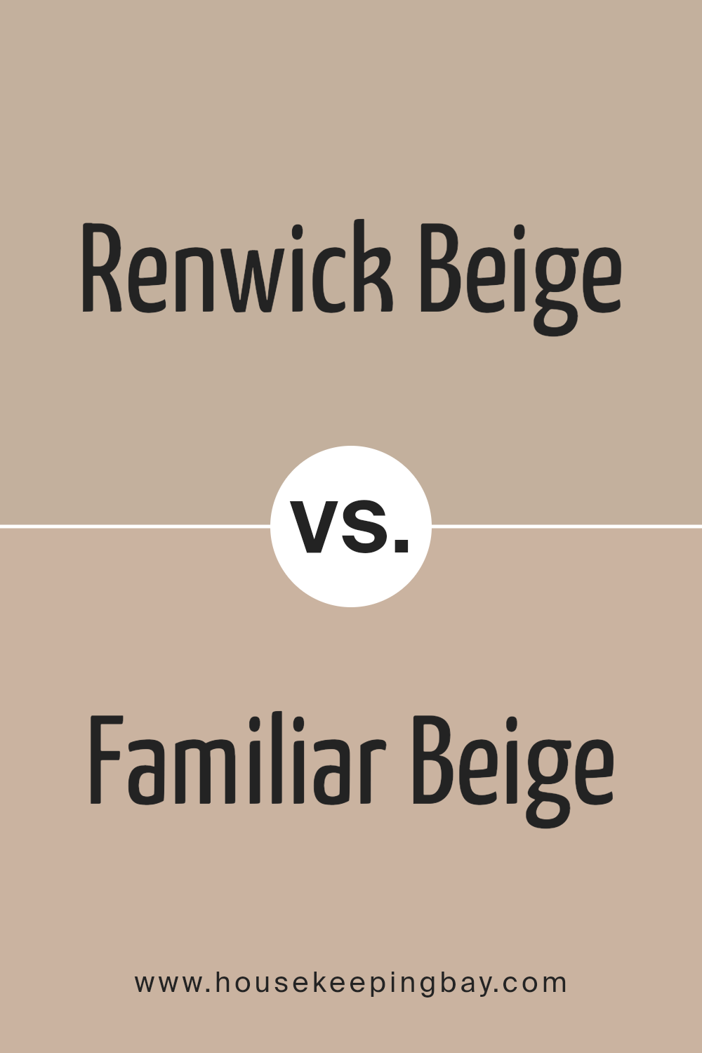
Renwick Beige SW 2805 by Sherwin Williams vs Familiar Beige SW 6093 by Sherwin Williams
Renwick Beige SW 2805 and Familiar Beige SW 6093, both from Sherwin Williams, are calm, warm tones. Renwick Beige is a bit darker, offering a rich, classic look. It has a slight hint of gray, which makes it feel more muted and sophisticated. This makes it suitable for creating cozy, elegant spaces.
Familiar Beige, however, leans towards a lighter, brighter shade with a touch more warmth and subtle yellow undertones. It feels inviting and comfortable, perfect for areas where you want a sense of openness and light.
While both colors can complement various design styles, Renwick Beige might suit traditional or vintage aesthetics, while Familiar Beige is versatile for modern or transitional designs. Choosing between them depends on desired room brightness and mood—darker for intimate settings and lighter for airy vibes.
You can see recommended paint color below:
- SW 6093 Familiar Beige
housekeepingbay.com
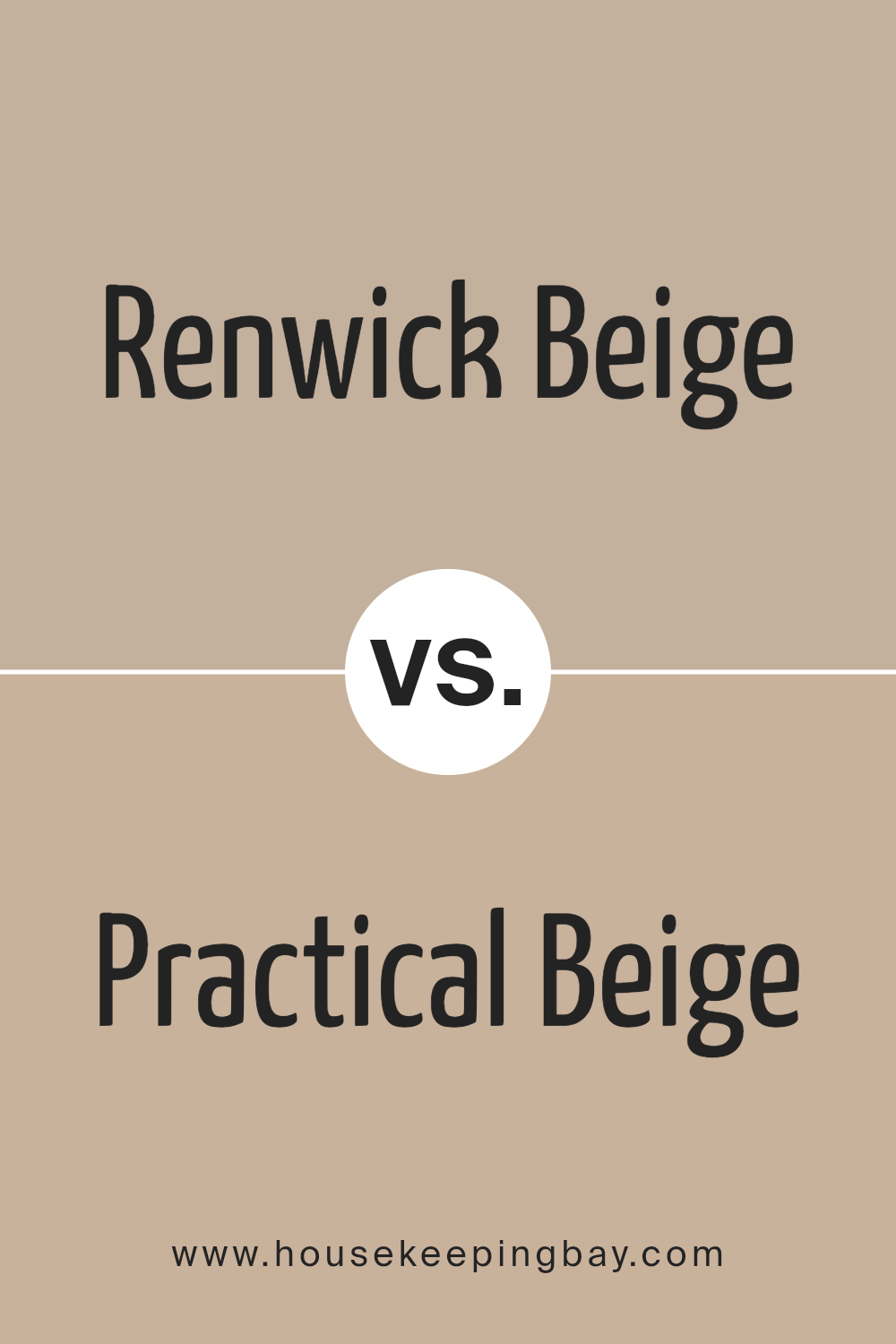
Renwick Beige SW 2805 by Sherwin Williams vs Practical Beige SW 6100 by Sherwin Williams
Renwick Beige SW 2805 by Sherwin Williams offers a warm, slightly darker shade that feels rich and cozy. Often found in older, traditional settings, this color provides a sense of history and classic charm. It’s ideal for spaces where you want to create a comforting atmosphere.
Practical Beige SW 6100, also by Sherwin Williams, presents a lighter, more versatile neutral. This color tends to suit modern and casual spaces, offering a bright and clean backdrop without overwhelming a room.
Renwick Beige leans more towards a deeper beige, giving a stronger presence in a room, while Practical Beige remains subtle and understated, making it easier to pair with various accent colors. When choosing between these two, consider the mood you want to set: Renwick Beige for warmth and coziness, or Practical Beige for versatility and lightness.
Each has its unique appeal depending on your design needs.
You can see recommended paint color below:
housekeepingbay.com
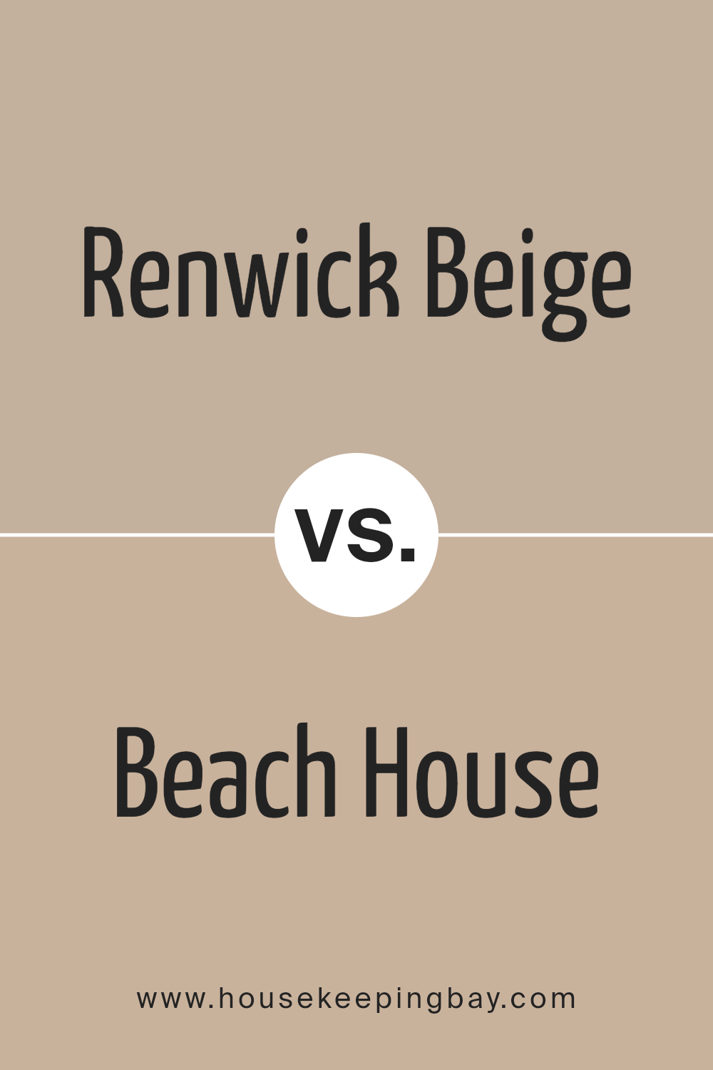
Renwick Beige SW 2805 by Sherwin Williams vs Beach House SW 7518 by Sherwin Williams
Renwick Beige SW 2805 and Beach House SW 7518 are both warm, inviting colors from Sherwin Williams, yet they bring different moods to a space.
Renwick Beige SW 2805 is a classic neutral tone with subtle warmth, creating a cozy and comfortable environment. It pairs well with wood accents and earthy colors, offering a backdrop that’s easy on the eyes and versatile in various settings, whether traditional or modern.
Beach House SW 7518, while also warm, carries a lighter and brighter essence. It brings a sense of airiness to a room, reflecting more light and creating an open, breezy feel. Perfect for coastal or casual spaces, it pairs nicely with whites and soft blues, evoking a serene environment reminiscent of sandy shores.
Both colors work well in different rooms, depending on the desired atmosphere. Renwick Beige suggests coziness and depth, while Beach House brings light and an airy touch.
You can see recommended paint color below:
- SW 7518 Beach House
housekeepingbay.com
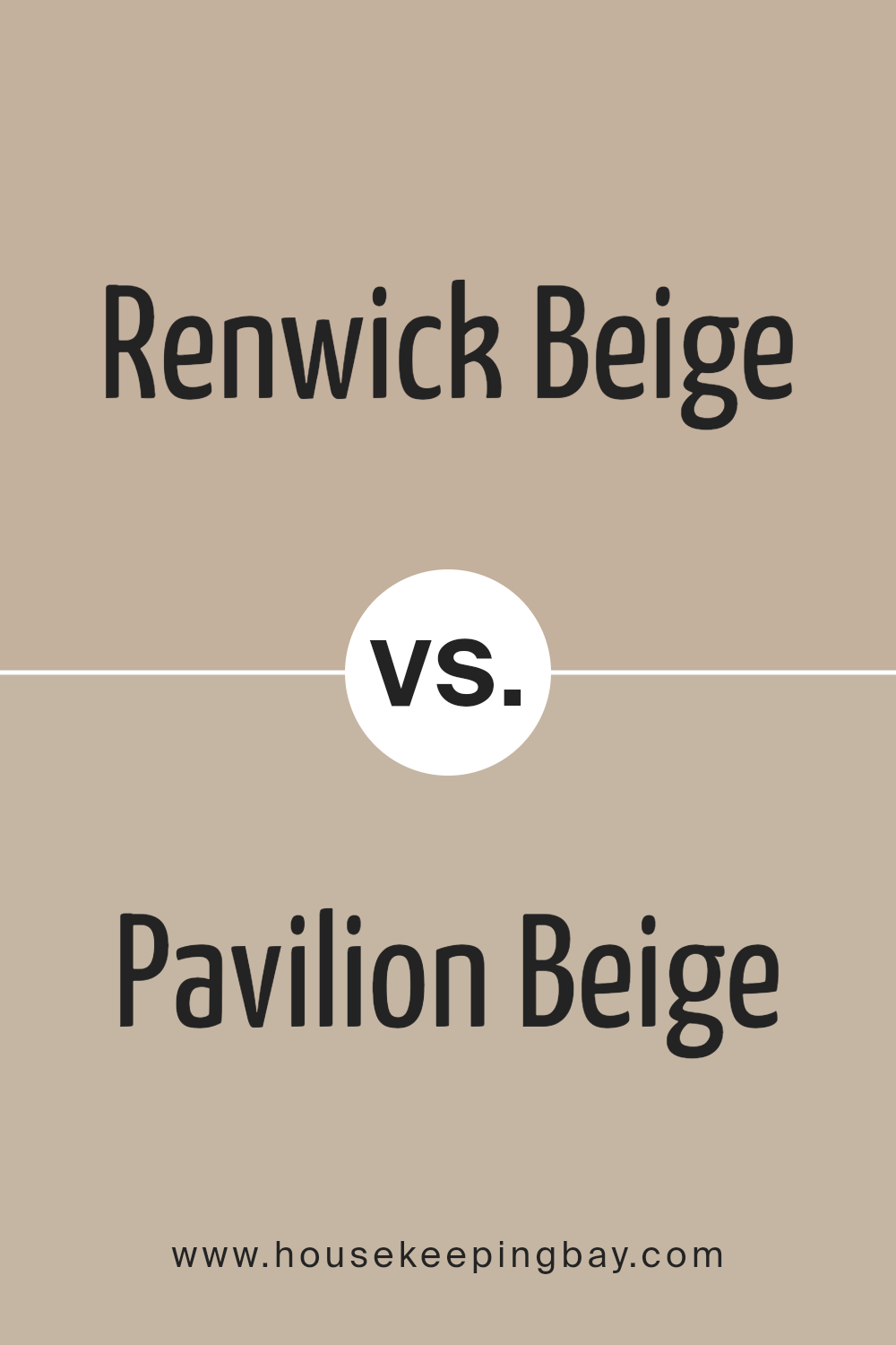
Renwick Beige SW 2805 by Sherwin Williams vs Pavilion Beige SW 7512 by Sherwin Williams
Renwick Beige SW 2805 and Pavilion Beige SW 7512 by Sherwin Williams are two gentle, neutral shades. Renwick Beige offers a slightly warmer, more golden hue. It’s a color that provides a sense of coziness and classic warmth, fitting well in traditional or rustic settings.
It pairs beautifully with deeper woods and can add a touch of sunny comfort without being overwhelming.
Pavilion Beige, however, leans a bit more towards a soft taupe. It’s subtle and has a slightly cooler undertone than Renwick Beige. This color feels a bit more modern and versatile, making it a great choice for those who prefer understated elegance.
Pavilion Beige works well with grays and cooler tones, offering a clean, sophisticated look.
Both colors are versatile, but Renwick Beige gives off a bit more warmth, while Pavilion Beige brings in a softer, muted ambiance. They each create inviting spaces, suitable for various styles.
You can see recommended paint color below:
- SW 7512 Pavilion Beige
housekeepingbay.com
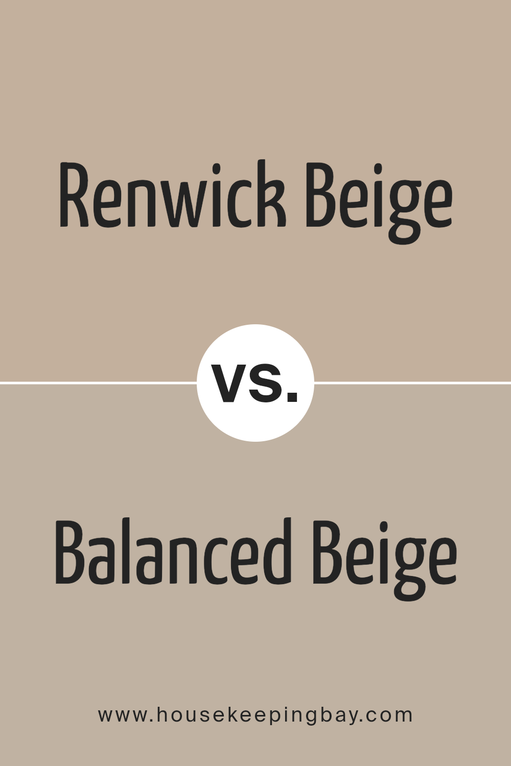
Renwick Beige SW 2805 by Sherwin Williams vs Balanced Beige SW 7037 by Sherwin Williams
Renwick Beige SW 2805 by Sherwin Williams and Balanced Beige SW 7037 are two popular shades that share a warm, neutral base, yet have distinct differences. Renwick Beige presents a classic, timeless feel with its warm undertones, making it suitable for traditional and cozy settings. Its creamy, soft appearance often works well in spaces where a welcoming atmosphere is desired.
Balanced Beige SW 7037, although also warm, brings a slightly more muted tone. It tends to appear more modern and sophisticated. This color features a bit more gray, offering a subtle depth that can suit contemporary spaces and large, open areas.
In terms of versatility, both colors blend well with other shades but choose based on room size and lighting. Renwick Beige pairs nicely with warm, earthy tones, while Balanced Beige offers flexibility with both warm and cool accents. Both provide an inviting backdrop, with Balanced Beige leaning slightly more towards the modern side.
You can see recommended paint color below:
housekeepingbay.com
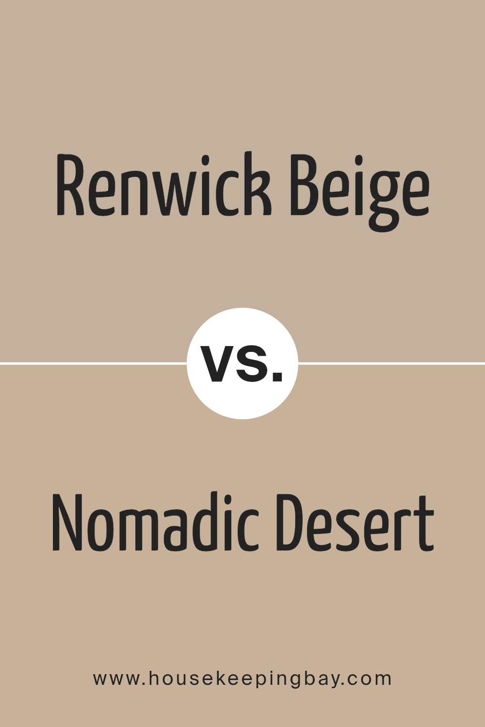
Renwick Beige SW 2805 by Sherwin Williams vs Nomadic Desert SW 6107 by Sherwin Williams
Renwick Beige SW 2805 and Nomadic Desert SW 6107 by Sherwin Williams offer distinct, yet subtly similar, beige tones, each with its unique charm. Renwick Beige leans more towards a traditional, creamy beige with slight gray undertones, providing a warm and inviting feel. It’s a versatile choice, fitting well into both classic and contemporary settings, and works beautifully as a neutral backdrop.
Nomadic Desert, however, presents a slightly deeper tone with more pronounced brown undertones. This color brings a grounded, earthy vibe, giving spaces a cozy, warm ambiance. It’s ideal for creating a snug, welcoming environment, perfect for living rooms or gathering areas.
Both colors complement varied design styles but differ in intensity. Renwick Beige delivers a softer, more muted appearance, while Nomadic Desert offers a bolder, more substantial presence. Their differing undertones make them unique, despite their similarity in hue, making each suitable for different moods and themes in home decor.
You can see recommended paint color below:
- SW 6107 Nomadic Desert
housekeepingbay.com
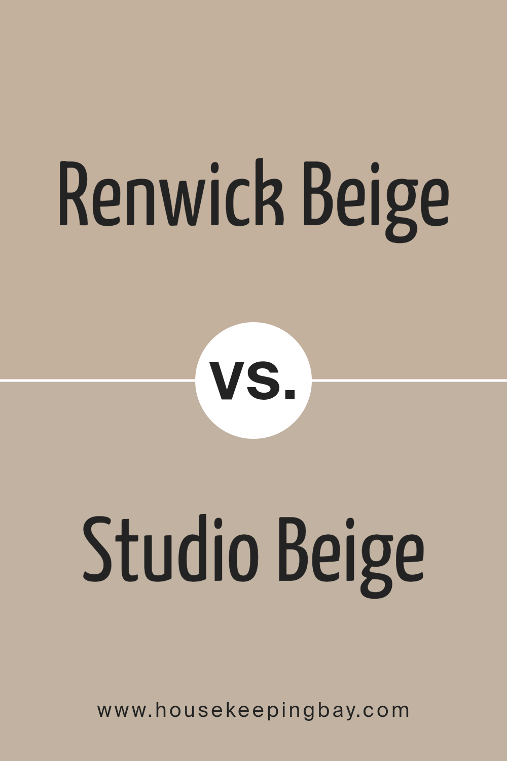
Renwick Beige SW 2805 by Sherwin Williams vs Studio Beige SW 9602 by Sherwin Williams
Renwick Beige SW 2805 by Sherwin Williams presents a warm, earthy tone that brings to mind the comfort of natural elements. It lends spaces a sense of coziness with a hint of sophistication. This beige has undertones that can make a room feel grounded and inviting, pairing well with other earth-toned colors.
Studio Beige SW 9602, also by Sherwin Williams, offers a lighter, softer shade compared to Renwick Beige. It feels more neutral and airy, providing spaces with a gentle backdrop that enhances openness. This beige is versatile, easily complementing both cool and warm accents, thus fitting a variety of styles.
While both colors share beige as a base, Renwick Beige leans into deeper, richer earthiness, providing warmth and depth. Studio Beige, brighter and more delicate, offers a more subtle and versatile palette, creating a breezy and open atmosphere. Each color has its unique way of defining a space’s mood and feel.
You can see recommended paint color below:
housekeepingbay.com
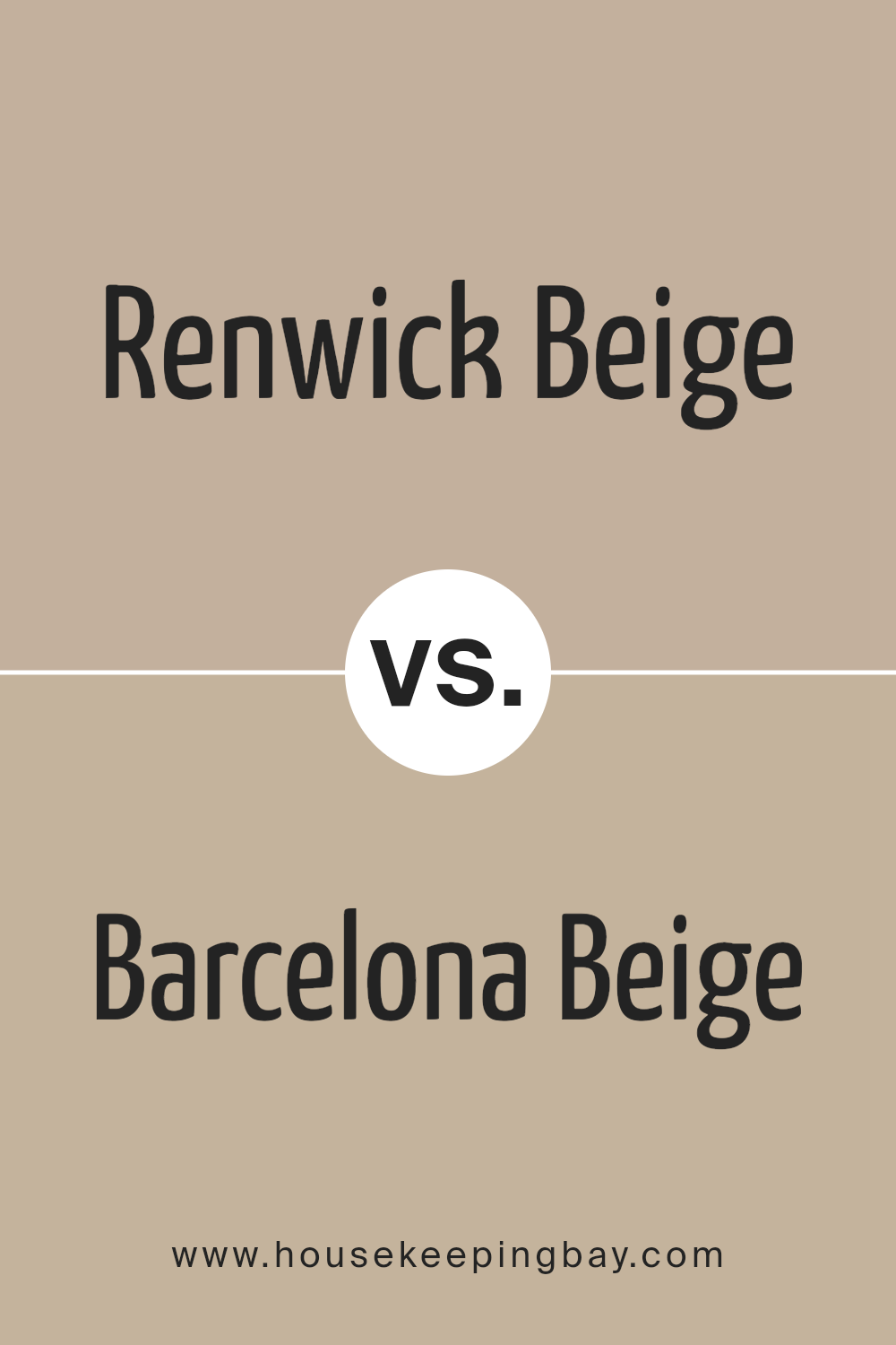
Renwick Beige SW 2805 by Sherwin Williams vs Barcelona Beige SW 7530 by Sherwin Williams
Renwick Beige SW 2805 and Barcelona Beige SW 7530 by Sherwin Williams are two distinct shades of beige. Renwick Beige carries a deeper, more traditional tone. It exudes warmth, making it suitable for classic and cozy spaces. This color has an earthy undertone, giving rooms a grounded and stable feel. It pairs well with darker wood finishes and rich colors, adding a sense of comfort to any room.
Barcelona Beige, in contrast, offers a lighter and slightly more contemporary feel. This shade brings a fresh and airy vibe, making spaces feel larger and more open. Its subtle undertones make it versatile, pairing nicely with soft pastels and light neutral accents.
Unlike Renwick Beige, it can brighten a room by reflecting more light.
Both colors hold their charm. While Renwick Beige leans towards a cozy ambiance, Barcelona Beige seeks to enhance straightforward, spacious settings.
You can see recommended paint color below:
housekeepingbay.com
Conclusion
In my exploration of this shade, I found it offers a warm and inviting atmosphere that can make any space feel cozy and welcoming. It has an earthy undertone which works beautifully with both modern and traditional decor, providing a neutral backdrop that allows other design elements to really shine.
I appreciate how Renwick Beige can adapt to different lighting conditions throughout the day, maintaining its charm whether in natural daylight or under artificial lights. This adaptability makes it perfect for any room in the home, from living areas to bedrooms.
Additionally, the color harmonizes well with a wide range of other colors, making it easy to pair with bolder shades for accents or more subdued tones for a cohesive look. Its understated elegance does not overpower a space but instead enhances the overall ambiance.
I find Renwick Beige to be an excellent choice for anyone looking to create a space that feels homey yet sophisticated. It’s a color that offers both comfort and style, making it a reliable option for those who appreciate subtlety and depth in their interior design.
housekeepingbay.com
Ever wished paint sampling was as easy as sticking a sticker? Guess what? Now it is! Discover Samplize's unique Peel & Stick samples. Get started now and say goodbye to the old messy way!
Get paint samples


