Poolhouse SW 7603 by Sherwin Williams
Delve into Refreshing Blue Shades for Vibrant Spaces
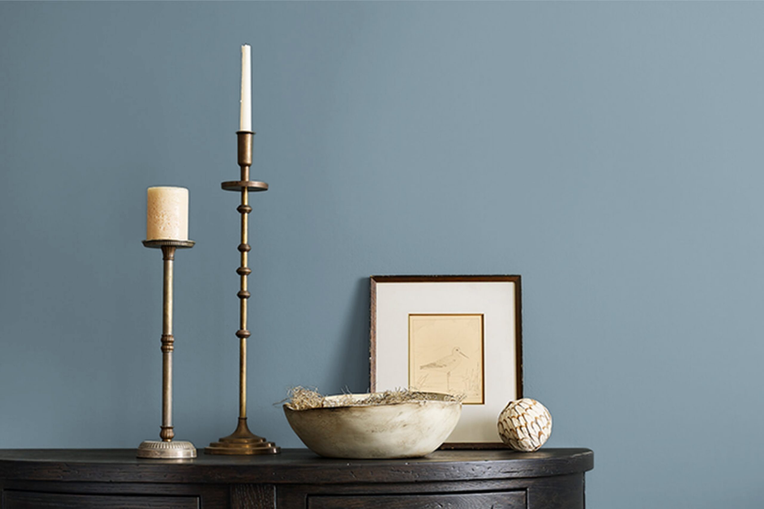
If you’re considering a fresh color for your space, consider SW 7603 Poolhouse by Sherwin Williams. This shade is perfect for adding a serene and refreshing touch to any room. SW 7603 Poolhouse features a calming blue hue that resembles the clarity of a clean swimming pool, making it ideal for creating a relaxed atmosphere.
This color can work wonders in various spaces, whether you’re looking to revitalize your living room, bedroom, or even the bathroom. Its versatility allows it to blend seamlessly with different decor styles, from modern to rustic.
Additionally, the soothing nature of this color can help in creating a peaceful backdrop, making your home a more enjoyable place to relax.
Choosing the right paint color can significantly impact the overall mood and aesthetic of your space. SW 7603 Poolhouse could be just what you need to give your home a fresh, cheerful look while maintaining a sense of calm.
sherwin-williams.com
What Color Is Poolhouse SW 7603 by Sherwin Williams?
Poolhouse SW 7603 by Sherwin Williams is a vibrant and refreshing aqua hue that brings a lively splash of color to any space. This mid-tone blue with green undertones has a calming yet cheerful effect, making it versatile for various interior design styles. It particularly shines in coastal and contemporary settings, where its bright, airy feel mimics the clear skies and ocean waters characteristic of these environments.
Poolhouse works beautifully in kitchens and bathrooms, offering a clean, crisp look. It’s also a fantastic choice for accent walls in living rooms or bedrooms, pairing well with neutral furniture to keep the space balanced.
This color coordinates exceptionally well with natural materials like light woods, which enhance its breezy quality. Linen fabrics and wicker elements also complement its casual elegance, adding texture without overpowering the room. For a sharper contrast, metallic finishes in chrome or silver can form a sleek, modern vibe that still feels approachable.
Poolhouse is also practical as it hides minor imperfections on walls due to its slightly deeper tone. It’s durable and easy to maintain, which makes it a smart choice for active areas.
Whether you are updating a small space or a large one, Poolhouse SW 7603 is a refreshing option that adds life to your home.
housekeepingbay.com
Is Poolhouse SW 7603 by Sherwin Williams Warm or Cool color?
Poolhouse SW 7603 by Sherwin Williams is a vibrant shade of teal that brings a fresh and lively vibe to any space. Ideal for both modern and traditional homes, this color works well in living areas, bathrooms, and kitchens.
Its bold yet soothing nature allows it to serve as a statement wall or as an accent color, pairing nicely with neutrals like white, gray, or tan. The versatility of Poolhouse ensures it fits various decor styles, from coastal to contemporary.
The brightness of the color can make small rooms appear larger and more inviting, while also adding a touch of cheer. In rooms with plenty of natural light, Poolhouse reflects beautifully, enhancing the airy feel of the space. On the other hand, in darker rooms, it can add depth and interest, preventing the space from feeling too enclosed.
This color both refreshes and personalizes any room in the house, making it a popular choice among homeowners looking to add a splash of personality to their interiors.
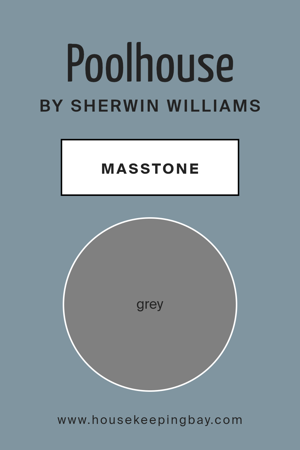
What is the Masstone of the Poolhouse SW 7603 by Sherwin Williams?
Poolhouse SW 7603 by Sherwin Williams has a masstone of grey, specifically Grey (#808080). This grey tone serves as the foundational color of the paint, meaning when you look at the paint in its can or when it is first applied, this is the primary color you observe.
The neutrality of grey makes it incredibly versatile in home decor, allowing it to fit seamlessly into various design styles, from modern and chic to rustic and traditional. Since grey is a balanced color, it can act as a calming backdrop in a room, making spaces feel more collected and orderly.
This specific shade of grey also has the ability to blend well with other colors, whether bright or muted. This makes it an excellent choice for walls, as it complements a wide array of furniture and decor items, enhancing the overall aesthetic without dominating the space.
Furthermore, its timeless nature ensures that it won’t quickly go out of style, providing a durable option for interior design. Grey also has the practical advantage of hiding blemishes and imperfections better than lighter colors, making it a practical choice for busy homes.
housekeepingbay.com
Undertones of Poolhouse SW 7603 by Sherwin Williams
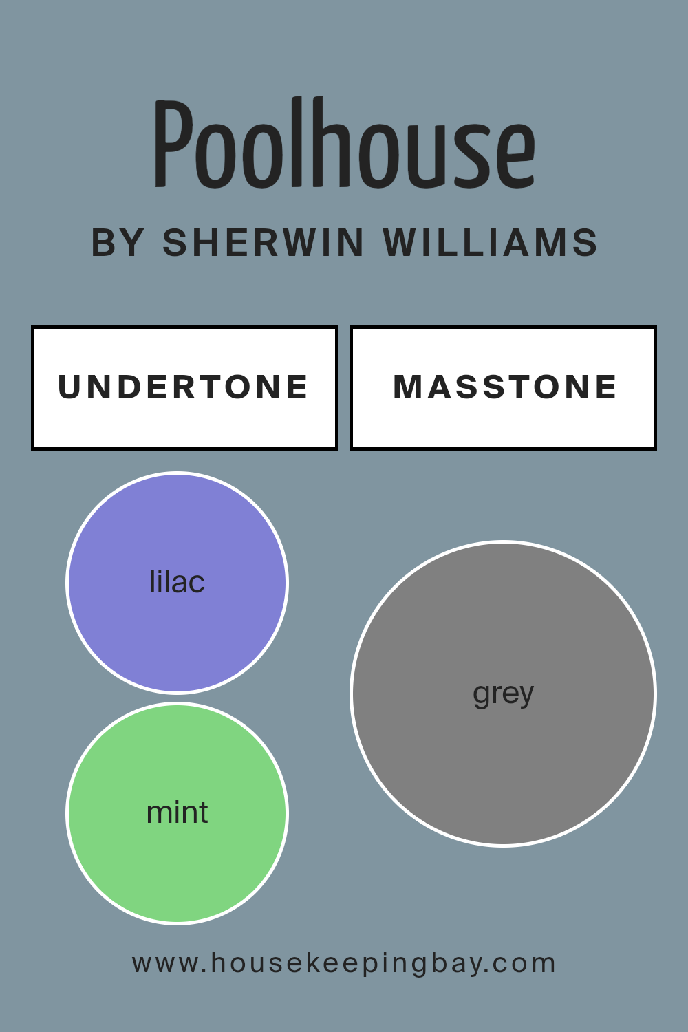
Poolhouse SW 7603 by Sherwin Williams is a versatile paint color with a complex array of undertones that can subtly influence the paint’s appearance in different settings. Undertones are the underlying hues that can change how a primary color looks depending on the lighting and surrounding colors.
Poolhouse SW 7603, often viewed as a primarily teal color, includes hints of lilac, mint, light blue, and various other shades that can affect its perception.
When used on interior walls, the lilac and light purple undertones of Poolhouse SW 7603 can lend a gentle and soft feel to the room, making it appear more inviting and cozy. The presence of mint and light turquoise tones can bring freshness and a sense of calm to the space. These cooler undertones can make a room feel airy when combined with good natural light.
In contrast, darker undertones like navy and dark turquoise add depth and sophistication, allowing Poolhouse SW 7603 to be used in spaces that benefit from a more dramatic and grounded atmosphere. This is particularly useful in larger spaces or rooms with high ceilings.
The beauty of Poolhouse SW 7603 lies in its adaptability. The interaction of its various undertones with elements like furniture, flooring, and natural light can significantly alter its impact, making it a flexible choice for many different types of spaces. Overall, the multitude of undertones in Poolhouse SW 7603 helps create dynamic and responsive environments, enhancing the aesthetic appeal and mood of any interior space.
housekeepingbay.com
Coordinating Colors of Poolhouse SW 7603 by Sherwin Williams
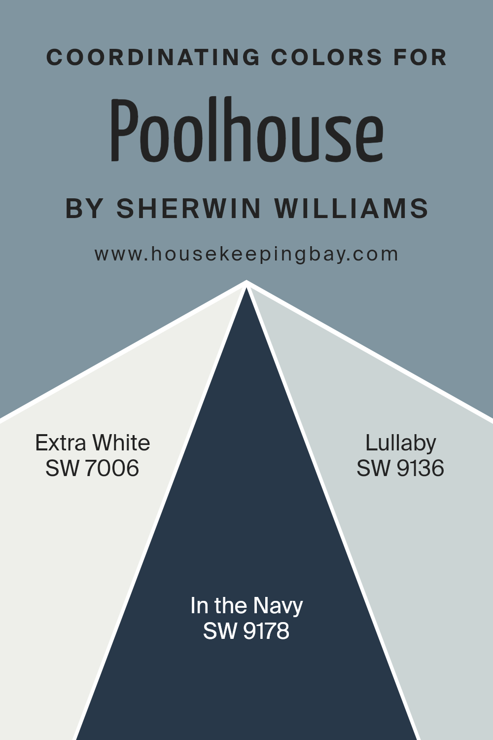
Coordinating colors are shades that complement each other and work harmoniously together in a space, enhancing the overall aesthetic without overwhelming the senses. For Poolhouse SW 7603 by Sherwin Williams, specific colors have been selected to coordinate beautifully, providing options to create a cohesive look.
These coordinating colors include SW 7006 – Extra White, SW 9178 – In the Navy, and SW 9136 – Lullaby.
Extra White SW 7006 is a clean, bright white that provides a crisp contrast to more saturated colors, making it an excellent choice for trim or ceilings to balance out deeper tones. In the Navy SW 9178, as the name suggests, is a deep, rich navy blue that offers a sophisticated and classic feel to a space, perfect for creating a focal point or accent walls.
Lullaby SW 9136 is a soft, muted blue with a gentle and soothing presence, ideal for creating a calm and restful environment. Each of these colors supports and enhances the refreshing vibe of Poolhouse, allowing for versatility in design choices.
You can see recommended paint colors below:
- SW 7006 Extra White
- SW 9178 In the Navy
- SW 9136 Lullaby
housekeepingbay.com
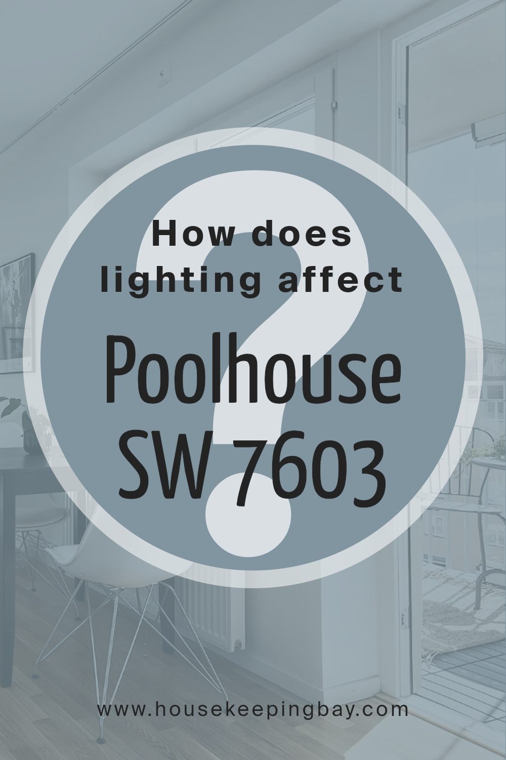
How Does Lighting Affect Poolhouse SW 7603 by Sherwin Williams?
Lighting plays a critical role in how colors appear in different environments. The way a color like Poolhouse SW 7603 by Sherwin Williams looks can significantly change under various light sources. This particular shade, a vibrant yet soft blue with a touch of green, can shift in intensity and tone depending on the lighting.
In artificial light, such as LED or incandescent bulbs, Poolhouse might appear slightly greener or more muted. Artificial lighting tends to enhance certain pigments within the paint, and the type of bulb (warm or cool) can push the color towards warmer or cooler tones.
For instance, in a room lit with warm yellow lights, Poolhouse might look more sea green, adding a cozy feel to the space.
Natural light, on the other hand, reveals the truest form of Poolhouse. Under the broad spectrum of sunlight, this color will show its vibrant, refreshing hue. How this color appears throughout the day can change: bright and lively during midday when sunlight is at its peak, and softer, more subtle at dawn or dusk.
The orientation of a room also affects how Poolhouse looks. North-facing rooms get less direct sunlight, which can make this color appear a bit more shadowed and subdued, leaning slightly towards a cooler, more muted blue. South-facing rooms benefit from abundant sunlight, brightening Poolhouse to its fullest, vibrant potential, enhancing its lively qualities.
East-facing rooms catch the morning sun, making Poolhouse look bright and cheerful in the morning, then softer as the day progresses. Conversely, in west-facing rooms, the color will start softer in the morning and gain vibrancy in the afternoon light, becoming warmer and more dynamic towards the evening.
Overall, the lighting and room orientation definitely dictate how Poolhouse SW 7603 is perceived, impacting its visual dynamics throughout the day and in different settings.
housekeepingbay.com
What is the LRV of Poolhouse SW 7603 by Sherwin Williams?
LRV stands for Light Reflectance Value, which is a measurement used to identify how much light a paint color can reflect. It’s scaled from 0 to 100, where 0 is pure black, absorbing all light, and 100 is pure white, reflecting all light.
This value helps in deciding how bright or dark a color will appear when applied to a room. A higher LRV can make a room feel more open and airy as it reflects more light around the space, whereas a lower LRV can make a room feel cozier and more enclosed by absorbing more light.
Considering the LRV of Poolhouse SW 7603 by Sherwin Williams, which is 28.566, this color falls on the darker side of the scale. It means that it won’t reflect much light, giving a rich and sophisticated appeal to the walls. In spaces with less natural light or smaller rooms, using this color might make the space appear smaller or darker.
However, in well-lit, larger areas, this color can provide a feeling of warmth and depth, adding character without making the space feel too overwhelming. This moderate-to-low LRV makes Poolhouse a versatile choice for those looking to add some drama and moodiness to their decor without going too dark.

housekeepingbay.com
What are the Trim colors of Poolhouse SW 7603 by Sherwin Williams?
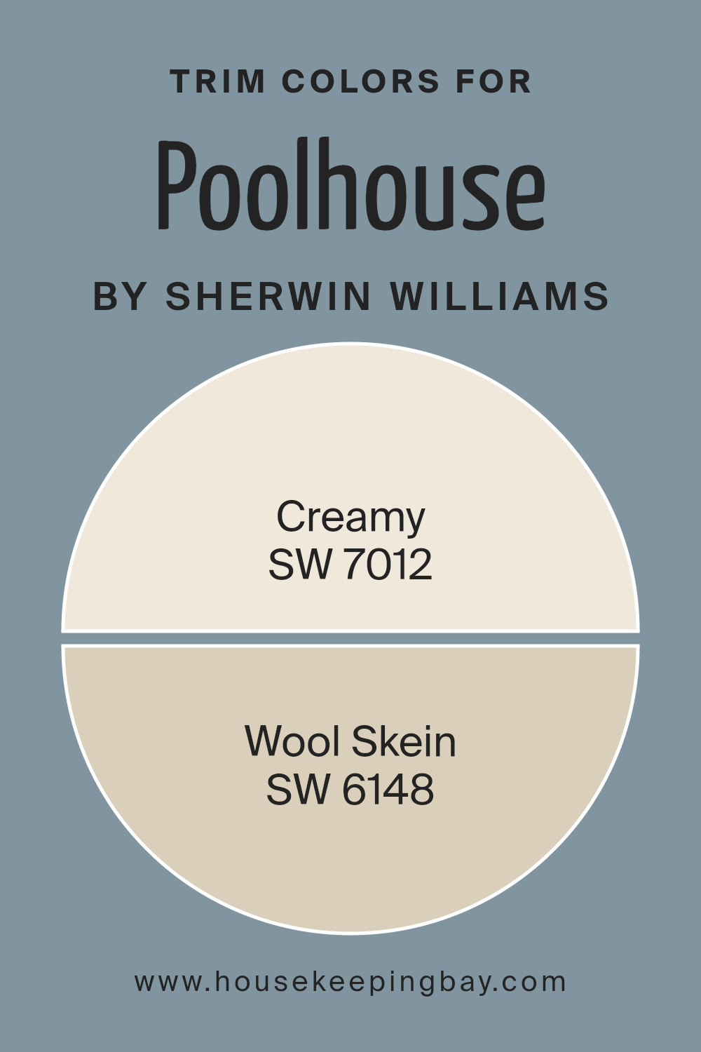
Trim colors, like the accents of a frame around a picture, enhance the look of a main paint color by adding contrast or cohesion to a room’s overall color scheme. When using a distinctive shade like Poolhouse SW 7603 by Sherwin Williams, selecting the right trim colors becomes essential to achieving a balanced and pleasing aesthetic.
SW 7012 Creamy and SW 6148 Wool Skein are both excellent choices for trims when paired with Poolhouse as they offer subtle shifts in mood without competing for attention, ensuring the main color stands out beautifully.
SW 7012 Creamy is a soft, warm white that brings a gentle, soothing effect to the trim, softening the edges where the bold Poolhouse meets the boundaries of a room or an exterior. Its soothing presence provides a peaceful border that enhances the vibrancy of the main color
. On the other hand, SW 6148 Wool Skein, a light, muted beige with whispers of green and gray, offers a neutral yet enriching frame to the deeper, more intense Poolhouse. The soft complexity of Wool Skein enriches the surroundings, allowing the main color to shine in its full capacity.
You can see recommended paint colors below:
housekeepingbay.com
Colors Similar to Poolhouse SW 7603 by Sherwin Williams
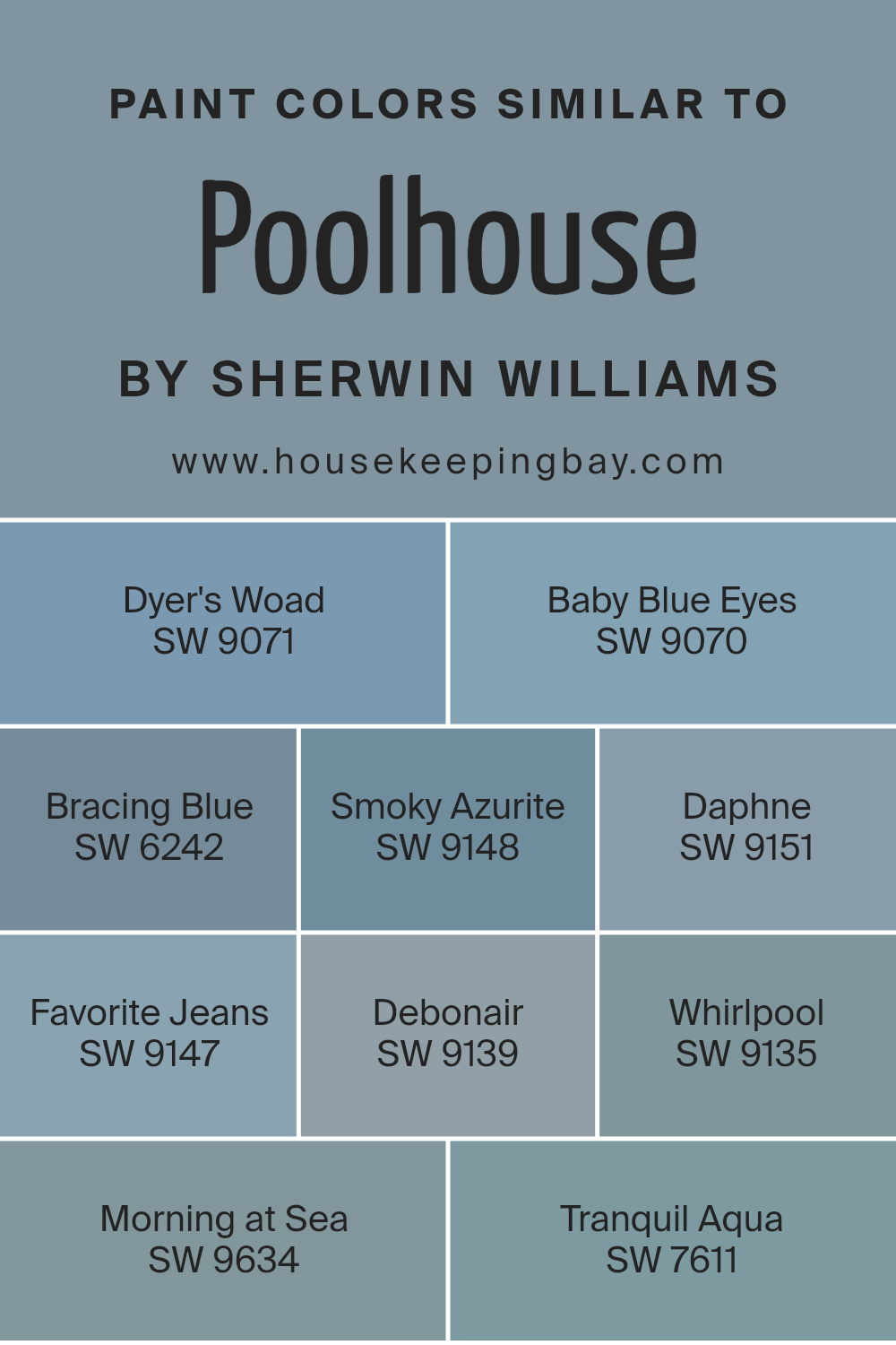
Similar colors are crucial in interior design and painting because they create a harmonious and soothing environment, seamlessly connecting different elements of a space. When colors like the shades similar to Poolhouse SW 7603 by Sherwin Williams are used together, they produce a cohesive look that feels intentional and aesthetically pleasing.
The subtle differences in these shades allow for depth and complexity, while maintaining a unified color theme.
For instance, SW 9071 – Dyer’s Woad offers a deep, oceanic blue that can give a room a sense of groundedness. Just slightly lighter, SW 9070 – Baby Blue Eyes brings in a soft, airy feel, reminiscent of a clear sky. SW 6242 – Bracing Blue adds a touch of boldness with its saturated hues, conveying confidence.
Moving into the slightly whimsical, SW 9148 – Smoky Azurite appears more muted, ideal for a calming nook. SW 9151 – Daphne provides a hint of lively green undertones, refreshing a space subtly.
If you’re aiming for a denim-like appeal, SW 9147 – Favorite Jeans is perfect with its casual charm. SW 9139 – Debonair strikes a balance between sophistication and relaxation, suited for an elegant room. In more serene settings, SW 9135 – Whirlpool washes over a space like gentle waves.
For early morning serenity, SW 9634 – Morning at Sea echoes the quiet of dawn. Lastly, SW 7611 – Tranquil Aqua offers a splash of vibrant yet soft aqua that rejuvenates any area it’s applied to. Using these similar yet distinct hues allows different expressions of blue, creating a space that feels both exciting and restful.
You can see recommended paint colors below:
- SW 9071 Dyer’s Woad
- SW 9070 Baby Blue Eyes
- SW 6242 Bracing Blue
- SW 9148 Smoky Azurite
- SW 9151 Daphne
- SW 9147 Favorite Jeans
- SW 9139 Debonair
- SW 9135 Whirlpool
- SW 9634 Morning at Sea
- SW 7611 Tranquil Aqua
housekeepingbay.com
Colors that Go With Poolhouse SW 7603 by Sherwin Williams
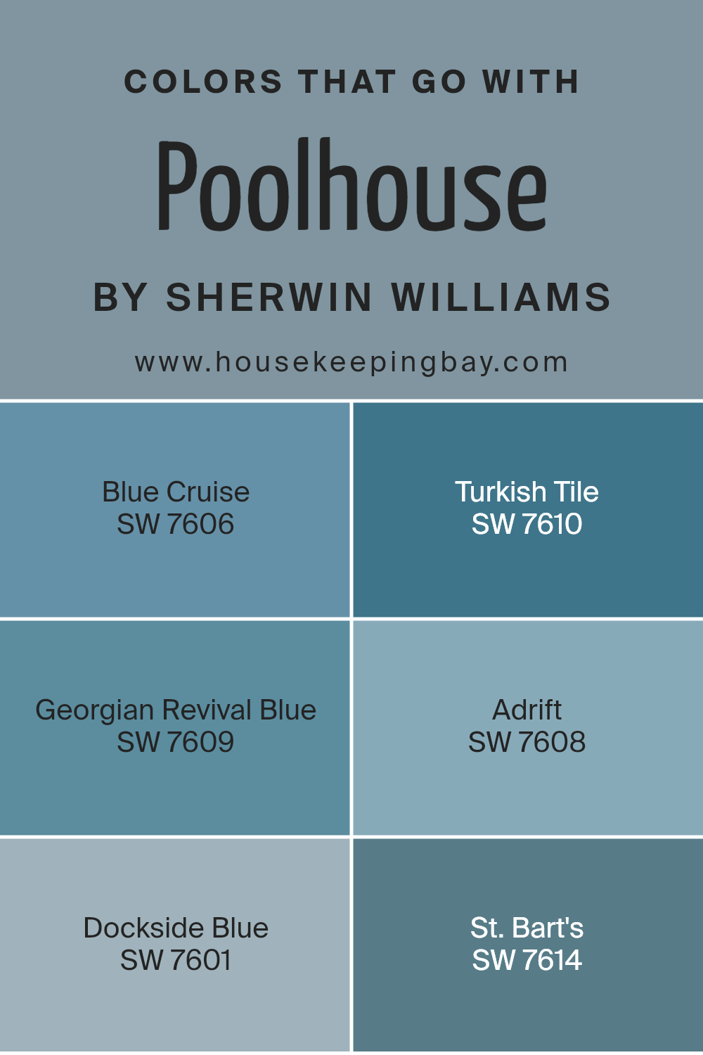
Choosing the right complementary colors for Poolhouse SW 7603 by Sherwin Williams is key to achieving a harmonious and appealing aesthetic in any space. When colors such as Blue Cruise, Turkish Tile, Georgian Revival Blue, Adrift, Dockside Blue, and St. Bart’s are paired with Poolhouse, they enhance the environment by creating balanced, vibrant atmospheres.
These combinations can subtly change the perception of space and influence mood, as well as connect various elements within a room. As such, understanding how these specific colors interact can significantly impact interior design by enriching the overall ambiance.
Blue Cruise SW 7606 is a deep aquatic shade that adds a sense of depth and sophistication to the space. It works well in areas that aim for a grounded, yet dynamic vibe. On the other hand, Turkish Tile SW 7610 brings a brighter and slightly more energetic feel, making it perfect for lively spaces.
Georgian Revival Blue SW 7609 has a classic touch, offering a soft, serene backdrop that is versatile for various settings. Adrift SW 7608, a lighter, airier blue, lends a fresh look to interiors, ideal for creating a calm and inviting place. Dockside Blue SW 7601 is a bit more intense and can make a bold statement when used thoughtfully.
Lastly, St. Bart’s SW 7614 has a unique aquamarine tone that feels both refreshing and refined, suitable for accenting features or small spaces for a chic look. Together, these colors work seamlessly with Poolhouse to create visually appealing and cohesive spaces.
You can see recommended paint colors below:
- SW 7606 Blue Cruise
- SW 7610 Turkish Tile
- SW 7609 Georgian Revival Blue
- SW 7608 Adrift
- SW 7601 Dockside Blue
- SW 7614 St. Bart’s
housekeepingbay.com
How to Use Poolhouse SW 7603 by Sherwin Williams In Your Home?
Poolhouse SW 7603 is a vibrant aqua shade by Sherwin Williams that adds a refreshing touch to any space. This color is perfect for making a statement in a room without being too overpowering. It works well in bathrooms and kitchens where its bright, cheerful hue brings a sense of cleanliness and freshness.
In living rooms or bedrooms, using Poolhouse as an accent wall can add a calming splash of color, which balances well with neutral tones like whites, grays, or beiges.
For those looking to update their furniture, this color can be used to paint a cabinet or a chair, offering a playful pop that can rejuvenate an old piece. Additionally, Poolhouse is ideal for exterior use, such as on front doors or shutters, providing a welcoming vibe to visitors.
It pairs nicely with natural elements like stone or wood, enhancing the overall aesthetic of your home’s facade. Overall, Poolhouse SW 7603 is a versatile color that can refresh any area of your home.
Poolhouse SW 7603 by Sherwin Williams vs Favorite Jeans SW 9147 by Sherwin Williams
Poolhouse SW 7603 and Favorite Jeans SW 9147 are two distinct colors from Sherwin Williams. Poolhouse is a vibrant, light aqua blue that has a refreshing and airy quality, making it ideal for creating a bright and soothing space. It is perfect for bathrooms or any area intended to have a clear, serene vibe.
Favorite Jeans, in contrast, is a deeper, denim-like blue that carries a sense of comfort and familiarity. This color suits spaces where a cozy, secure feeling is desired, such as bedrooms or living room areas.
Poolhouse tends to add a more energetic and uplifting effect to interiors, while Favorite Jeans provides a grounding, comforting presence. Both colors are versatile but serve different moods and design needs depending on the atmosphere you want to achieve.
You can see recommended paint color below:
- SW 9147 Favorite Jeans

housekeepingbay.com
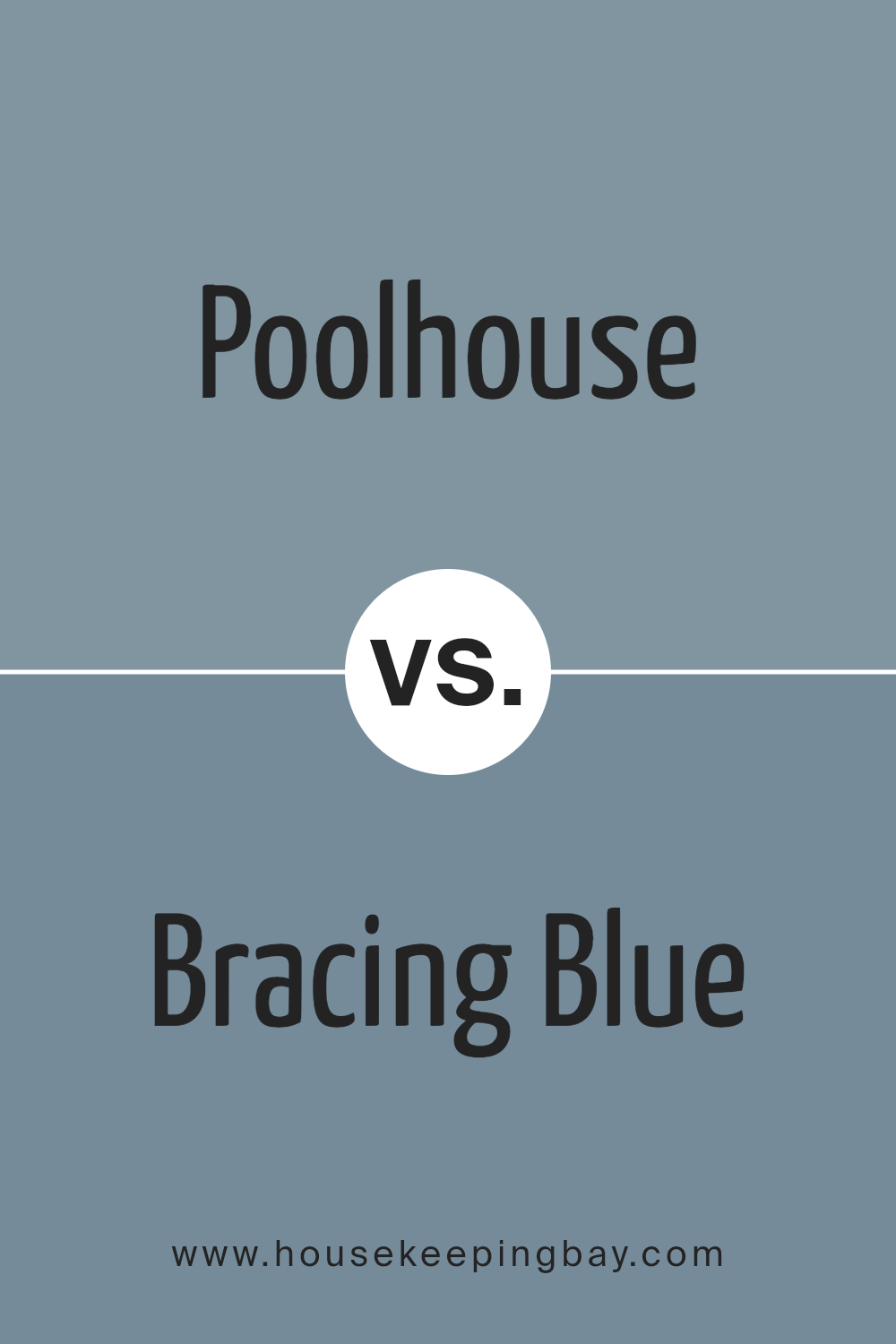
Poolhouse SW 7603 by Sherwin Williams vs Bracing Blue SW 6242 by Sherwin Williams
Poolhouse SW 7603 by Sherwin Williams is a calm and refreshing color, a light blue that resembles the clear sky on a sunny day or the serene waters of a gentle pool. Its lighter tone makes it ideal for creating a spacious and airy feel in any room, promoting a sense of relaxation and peace.
In contrast, Bracing Blue SW 6242 is a deeper, more intense shade of blue. This color mimics the depths of the ocean or the evening sky, offering a more dramatic and profound aesthetic. It’s great for adding a touch of sophistication and depth to spaces, making it suitable for accent walls or areas where a bolder statement is desired.
Both colors offer unique vibes: Poolhouse is more about openness and calm, while Bracing Blue goes towards depth and intensity, each setting its own distinct mood in interior spaces.
You can see recommended paint color below:
- SW 6242 Bracing Blue
housekeepingbay.com
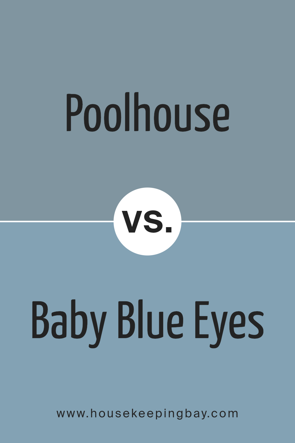
Poolhouse SW 7603 by Sherwin Williams vs Baby Blue Eyes SW 9070 by Sherwin Williams
Poolhouse SW 7603 and Baby Blue Eyes SW 9070 are two distinct blue shades by Sherwin Williams. Poolhouse is a vibrant, slightly teal blue that adds a refreshing spark to spaces. This shade can make a room feel lively yet cozy, suitable for living rooms or bathrooms where a splash of energy is desired.
In contrast, Baby Blue Eyes is a much lighter, soft pastel blue. It gives a gentle and calming feel, perfect for creating a peaceful environment in bedrooms or nurseries.
While Poolhouse carries more intensity and depth, making it a focal point in any area, Baby Blue Eyes is subtle and blends smoothly into serene settings. Essentially, Poolhouse stands out more, whereas Baby Blue Eyes supports a quiet, soothing atmosphere.
You can see recommended paint color below:
- SW 9070 Baby Blue Eyes
housekeepingbay.com
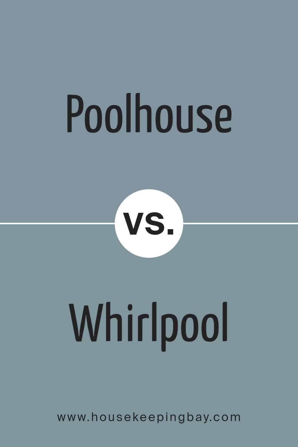
Poolhouse SW 7603 by Sherwin Williams vs Whirlpool SW 9135 by Sherwin Williams
Poolhouse SW 7603 by Sherwin Williams is a light and airy shade of blue that brings a fresh and breezy feeling to any space. This color resembles a clear sky on a sunny day, making it perfect for living rooms or bathrooms where a calm and relaxing atmosphere is desired. It pairs well with soft neutrals and can help make small rooms appear larger and more open.
In contrast, Whirlpool SW 9135 is a deeper, more intense blue. It has a rich tone that offers a sense of sophistication and depth. This color is ideal for creating a bold statement in spaces such as bedrooms or dining areas. Whirlpool can also add drama to a room when used on accent walls or cabinetry.
Both colors, while distinctly blue, serve different purposes due to their varying depths and intensities. Poolhouse is suited for a light and bright feel, whereas Whirlpool is better for a more dramatic and moody ambiance.
You can see recommended paint color below:
- SW 9135 Whirlpool
housekeepingbay.com
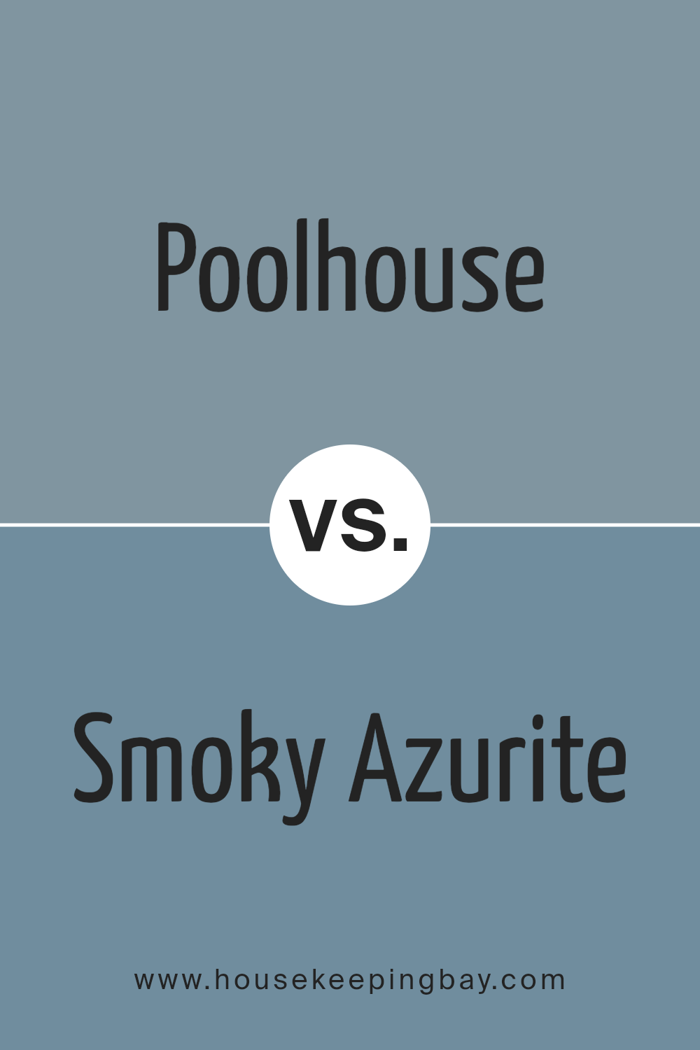
Poolhouse SW 7603 by Sherwin Williams vs Smoky Azurite SW 9148 by Sherwin Williams
Poolhouse SW 7603 by Sherwin Williams is a bright, cheerful blue with hints of green, giving it a refreshing and lively feel. This shade is perfect for creating a light and airy atmosphere in spaces aimed at relaxation or socialization, such as living rooms or bathrooms. It pairs well with white trim and light woods for a clean, modern look.
In contrast, Smoky Azurite SW 9148 is a deeper, more sophisticated blue. It evokes a sense of calm and seriousness, making it suitable for areas where focus and contemplation are desired, such as studies or bedrooms. It works beautifully with darker furniture and can add a dramatic flair to a space when used as an accent wall.
Both colors offer unique vibes – Poolhouse leans more towards playful and energetic, while Smoky Azurite provides a moodier, more composed environment. Choosing between them depends on the desired atmosphere in your room.
You can see recommended paint color below:
housekeepingbay.com
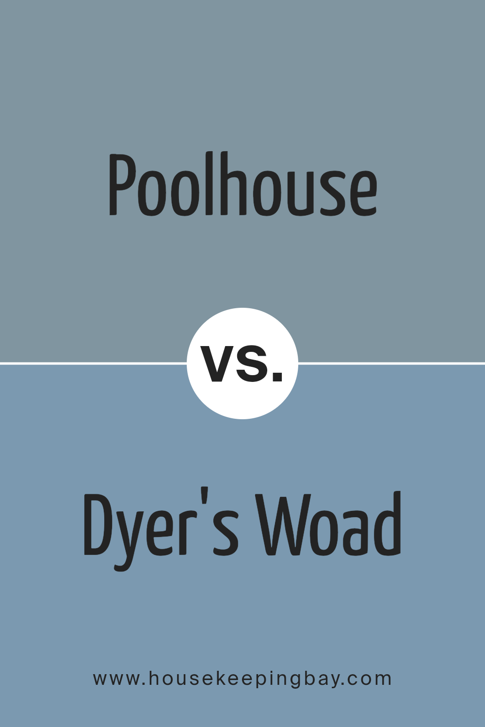
Poolhouse SW 7603 by Sherwin Williams vs Dyer’s Woad SW 9071 by Sherwin Williams
Poolhouse SW 7603 by Sherwin Williams is a bright, cheerful blue that resembles clear skies on a sunny day. This shade can instantly freshen up any space, making it feel more open and airy. It’s a versatile color that works well in bathrooms, kitchens, and living areas, especially when you want to create a light, welcoming atmosphere.
In contrast, Dyer’s Woad SW 9071 is a deeper, more subdued blue with a hint of gray. This color gives off a more sophisticated and refined vibe, ideal for creating a serene, calming environment in spaces like bedrooms or offices. It pairs well with muted decor and can help to achieve a more grounded, mature look.
Both colors reflect different moods and can significantly affect the ambiance of a room. Poolhouse brings brightness and vitality, while Dyer’s Woad offers depth and tranquility, making them suitable for different purposes or personal tastes in interior design.
You can see recommended paint color below:
- SW 9071 Dyer’s Woad
housekeepingbay.com
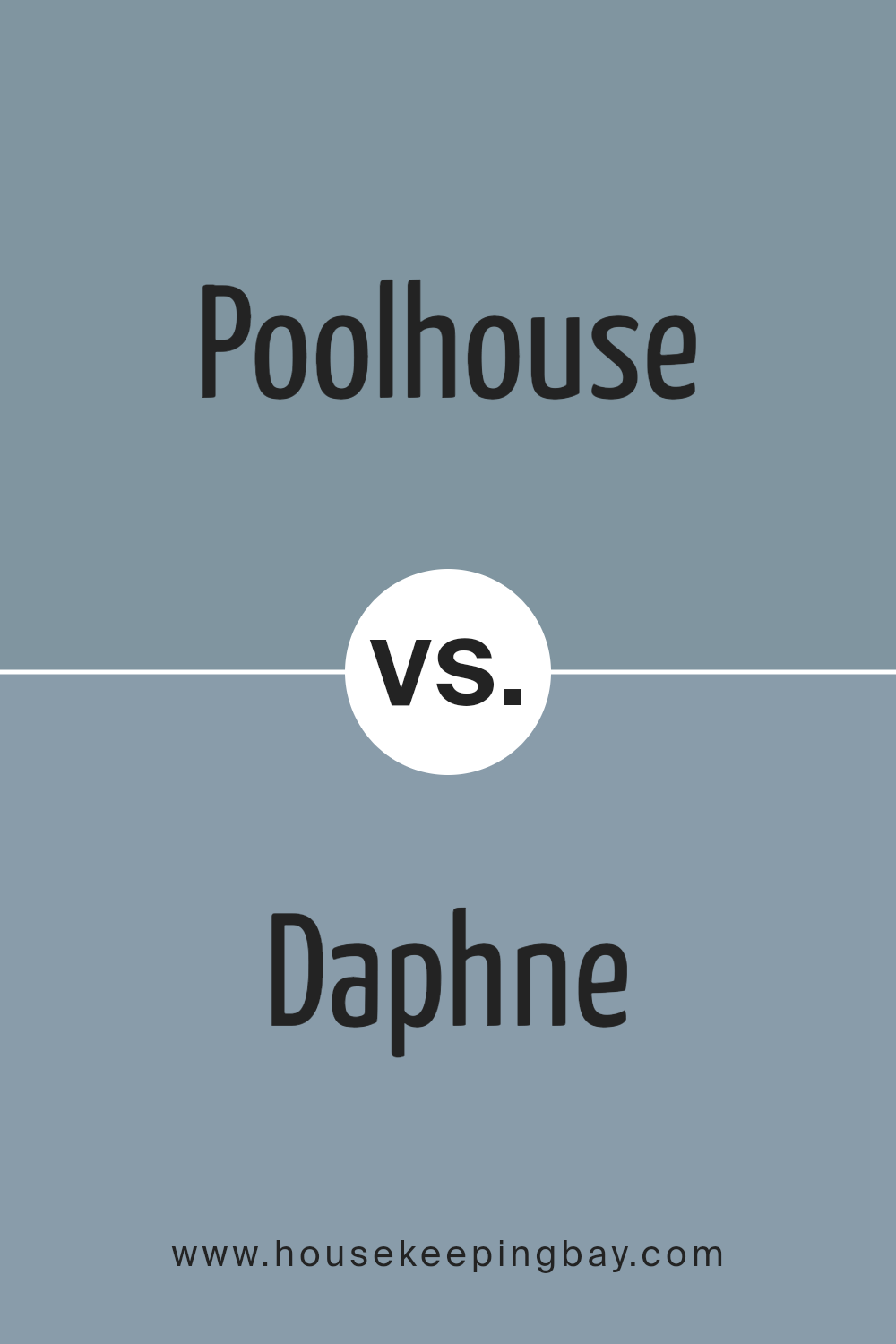
Poolhouse SW 7603 by Sherwin Williams vs Daphne SW 9151 by Sherwin Williams
Poolhouse SW 7603 by Sherwin Williams is a vibrant, refreshing blue with a splash of green, giving it a lively, yet soothing appeal. It evokes the feeling of clarity and freshness, making it ideal for spaces where you want to instill a sense of calm and cleanliness, such as bathrooms or bright, airy living areas.
In contrast, Daphne SW 9151 is a darker, more muted blue with subtle gray undertones. This color offers a more sophisticated and reserved vibe, making it well-suited for creating a serene, focused atmosphere in studies or cozy, intimate settings in living rooms.
Both colors bring their unique characteristics to a space but cater to different aesthetic needs and moods. Poolhouse is more about vitality and freshness, while Daphne leans towards depth and introspection.
You can see recommended paint color below:
- SW 9151 Daphne
housekeepingbay.com
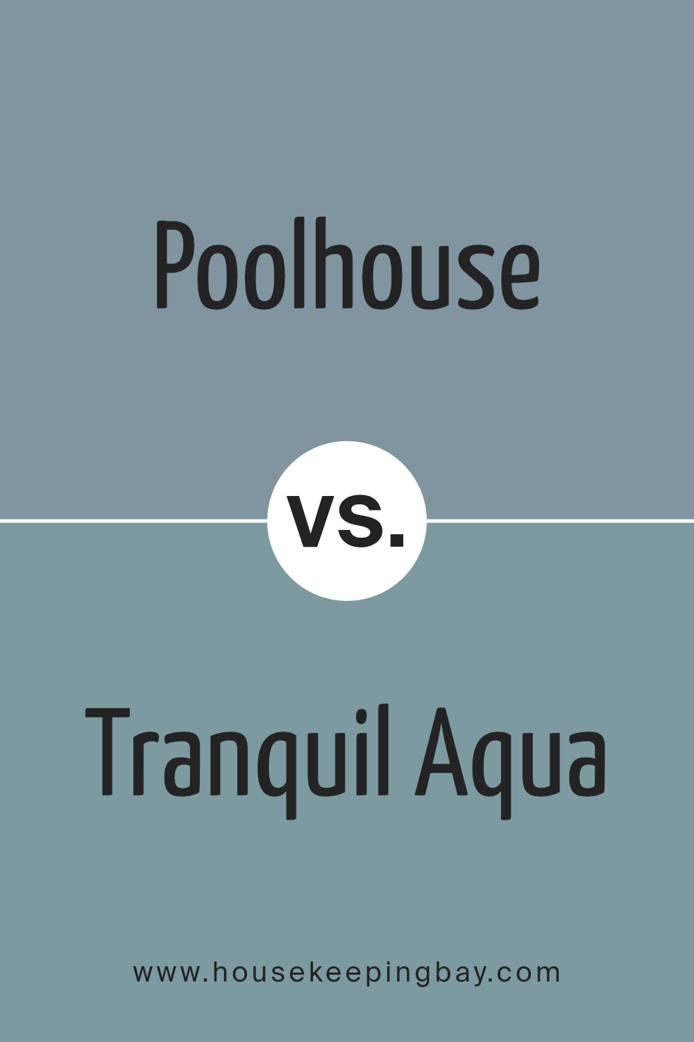
Poolhouse SW 7603 by Sherwin Williams vs Tranquil Aqua SW 7611 by Sherwin Williams
Poolhouse SW 7603 by Sherwin Williams is a vibrant, medium-toned aqua color, balancing blue and green hues to create a refreshing and lively look. It brings a sense of brightness to spaces, making it ideal for rooms where you want to add energy and a splash of youthful charm.
In contrast, Tranquil Aqua SW 7611 is a more muted, softer color. It carries a gentle and soothing tone, leaning towards a pale blue with subtle green undertones. This color works well in areas where you’re aiming for a relaxing and peaceful atmosphere, such as bedrooms or bathrooms.
While both colors share aqua as their base, Poolhouse is bolder and more dynamic, whereas Tranquil Aqua is softer and more serene. Depending on your room’s purpose and desired ambiance, one might suit better than the other.
You can see recommended paint color below:
- SW 7611 Tranquil Aqua
housekeepingbay.com
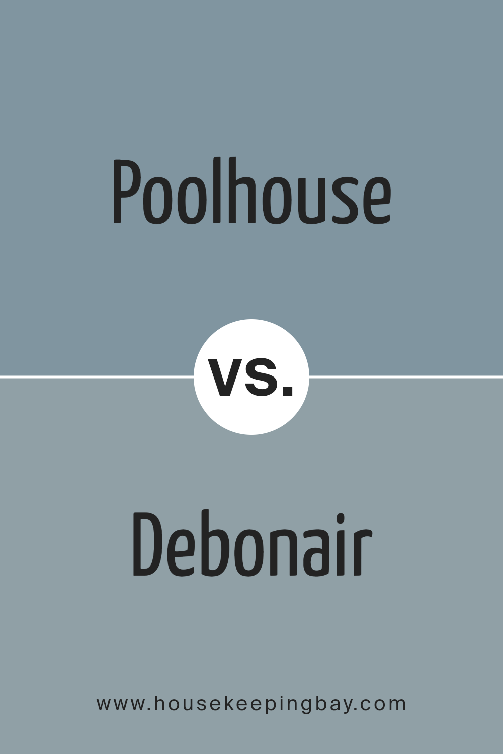
Poolhouse SW 7603 by Sherwin Williams vs Debonair SW 9139 by Sherwin Williams
Poolhouse SW 7603 by Sherwin Williams is a vibrant, refreshing aqua blue that brings a lively and energetic feel to any space. It has a bright and inviting tone that works well in bathrooms and kitchens, or any area intended to feel open and airy. This color can also add a playful touch to a child’s bedroom or a creative workspace.
In contrast, Debonair SW 9139 by Sherwin Williams is a deeper, more subdued gray-blue shade. It offers a sense of sophistication and calm, making it suitable for more formal or relaxing spaces like living rooms or bedrooms.
Its muted nature provides a neutral backdrop that pairs well with a wide range of decor styles and colors, from bright whites to richer hues.
Both colors serve distinct purposes and atmospheres in interior design, with Poolhouse leaning towards brightness and energy, while Debonair leans towards calm and elegance.
You can see recommended paint color below:
- SW 9139 Debonair
housekeepingbay.com
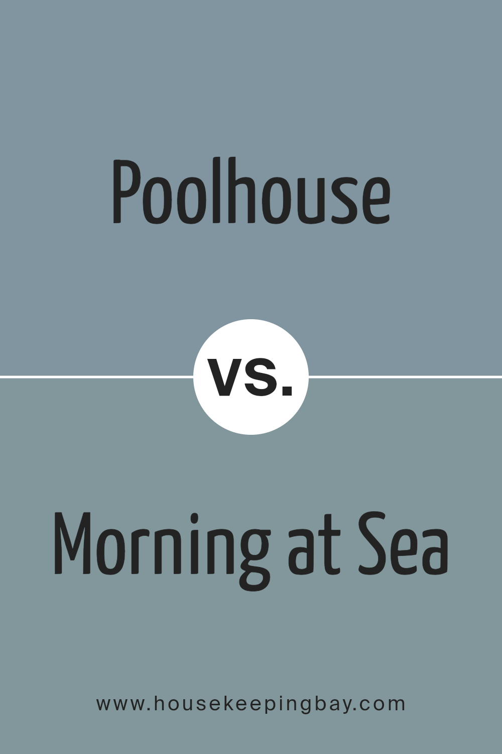
Poolhouse SW 7603 by Sherwin Williams vs Morning at Sea SW 9634 by Sherwin Williams
The color Poolhouse SW 7603 by Sherwin Williams is a vibrant, lively shade of teal that seems fresh and energetic. It has a bright, cheerful vibe that can make spaces feel more inviting and fun. This hue is particularly suited for rooms that need a pop of color or spaces where creativity and energy are encouraged, like a kitchen or a playroom.
In contrast, Morning at Sea SW 9634 by Sherwin Williams is a much softer, muted teal that has a gentle and soothing quality. This color is more understated and tends to have a calming effect, making it ideal for bedrooms or bathrooms where a serene atmosphere is desired. It’s less intense than Poolhouse, offering a more relaxed visual experience.
Both colors share a blue-green base but vary significantly in their intensity and mood-setting capabilities. Poolhouse is bold and dynamic, while Morning at Sea is subdued and peaceful. Depending on what feeling you want in a room, each color offers unique possibilities.
You can see recommended paint color below:
housekeepingbay.com
Conclusion
In considering the paint selection for your next project, Sherwin Williams’ SW 7603 Poolhouse presents itself as a solid choice worth your attention. This paint offers a vibrant and fresh hue that can breathe new life into any space, effortlessly enhancing the mood and aesthetics of your surroundings.
Its versatility ensures that it works well in various settings, be it a bustling living area or a peaceful bedroom retreat. The quality of the paint promises durability and a lasting finish, ensuring that your space not only looks good initially but maintains its charm over time.
When you choose SW 7603 Poolhouse, you’re not just picking a color; you’re selecting a backdrop that enhances every other design element in the room. Whether you’re aiming for a subtle refresh or a bold redesign, this paint can meet your needs with style. It’s a reliable and appealing option that can help you achieve the room you envision without any complications.
housekeepingbay.com
