Pebble Rock 945 by Benjamin Moore
A Natural Hue That Complements Any Space
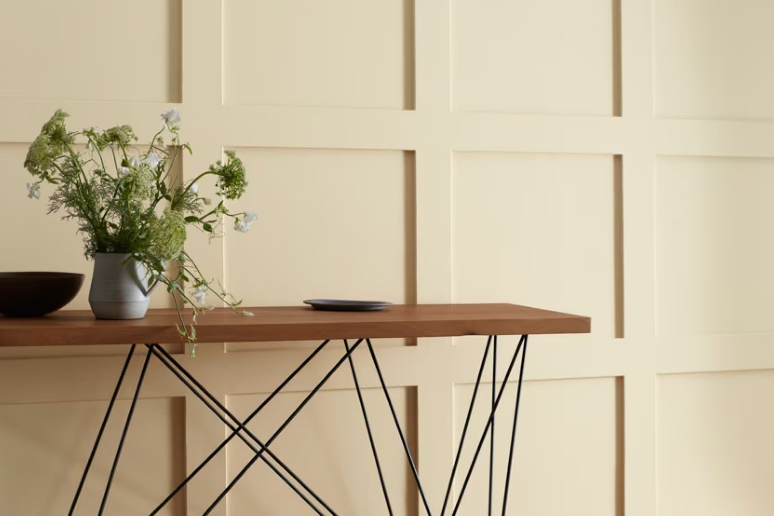
Just think about standing in a room that feels soothing and peaceful. That’s the vibe 945 Pebble Rock by Benjamin Moore brings to your space. It’s a paint color that balances warmth and coolness, making it a great choice for almost any room in your home. You might find that it works just as beautifully in a cozy bedroom as it does in a lively kitchen.
When you consider adding new life to your walls, think about how this particular shade won’t dominate the room but will add just the right touch of elegance. It pairs well with various styles, whether you lean towards modern, rustic, or traditional decor.
You’ll appreciate how this paint color plays with light, subtly changing from soft and subdued in dim lighting to fresh and inviting in bright sunlight. It’s adaptable, so you don’t have to worry about it clashing with your existing furniture or accessories. Warm woods and cool metals can both complement this hue beautifully.
Have you been thinking of refreshing, yet calming colors for your next home project?
With 945 Pebble Rock, you get the perfect backdrop for your personal style to shine, without overwhelming the senses. Consider it for your next decorating project, and enjoy the harmonious atmosphere it creates.
via benjaminmoore.com
What Color Is Pebble Rock 945 by Benjamin Moore?
Table of Contents
Pebble Rock 945 by Benjamin Moore is a muted, earthy gray with rich undertones, creating a sense of warmth and subtle sophistication. This versatile color has hints of taupe, making it neither too cool nor too warm, striking the perfect balance for various spaces. It works particularly well in modern and minimalist interiors where clean lines and calm palettes are key.
In a Scandinavian-inspired setting, Pebble Rock 945 acts as a soothing backdrop, allowing natural wood finishes, soft textiles, and simple decor to shine. It also fits seamlessly into industrial spaces, complementing exposed brick, concrete, and metal fixtures with its understated elegance.
When paired with the right materials, Pebble Rock 945 truly comes alive. Consider combining it with warm wood tones like walnut or oak for a cozy yet refined feel. Add textured textiles like chunky knits or linen to introduce tactile interest.
Soft leather or suede in tan or caramel hues can enhance the warmth of the color, creating a harmonious look.
For contrast, consider accents in matte black or soft white, which highlight its undertones beautifully without overwhelming the space.
Whether used in a living room, bedroom, or office, Pebble Rock 945 exudes relaxed charm and timeless appeal.
housekeepingbay.com
Is Pebble Rock 945 by Benjamin Moore Warm or Cool color?
Pebble Rock 945 by Benjamin Moore is a warm, neutral paint color that combines gray and beige, often referred to as “greige.” This versatile shade has a way of creating a cozy and inviting atmosphere in various rooms. Its balance between cool and warm tones allows it to work well in different lighting conditions, maintaining a consistent look throughout the day.
Pebble Rock is an excellent choice for both modern and traditional spaces, adding a sense of calmness and elegance. It pairs beautifully with a wide range of accent colors, making it easy to match with existing furniture and decor.
Whether used in living rooms, bedrooms, or hallways, Pebble Rock provides a soft backdrop that enhances other design elements without overwhelming them.
The color’s understated nature helps make spaces feel larger and more open, which is ideal for smaller rooms. Overall, Pebble Rock 945 brings a subtle yet impactful touch to any home.
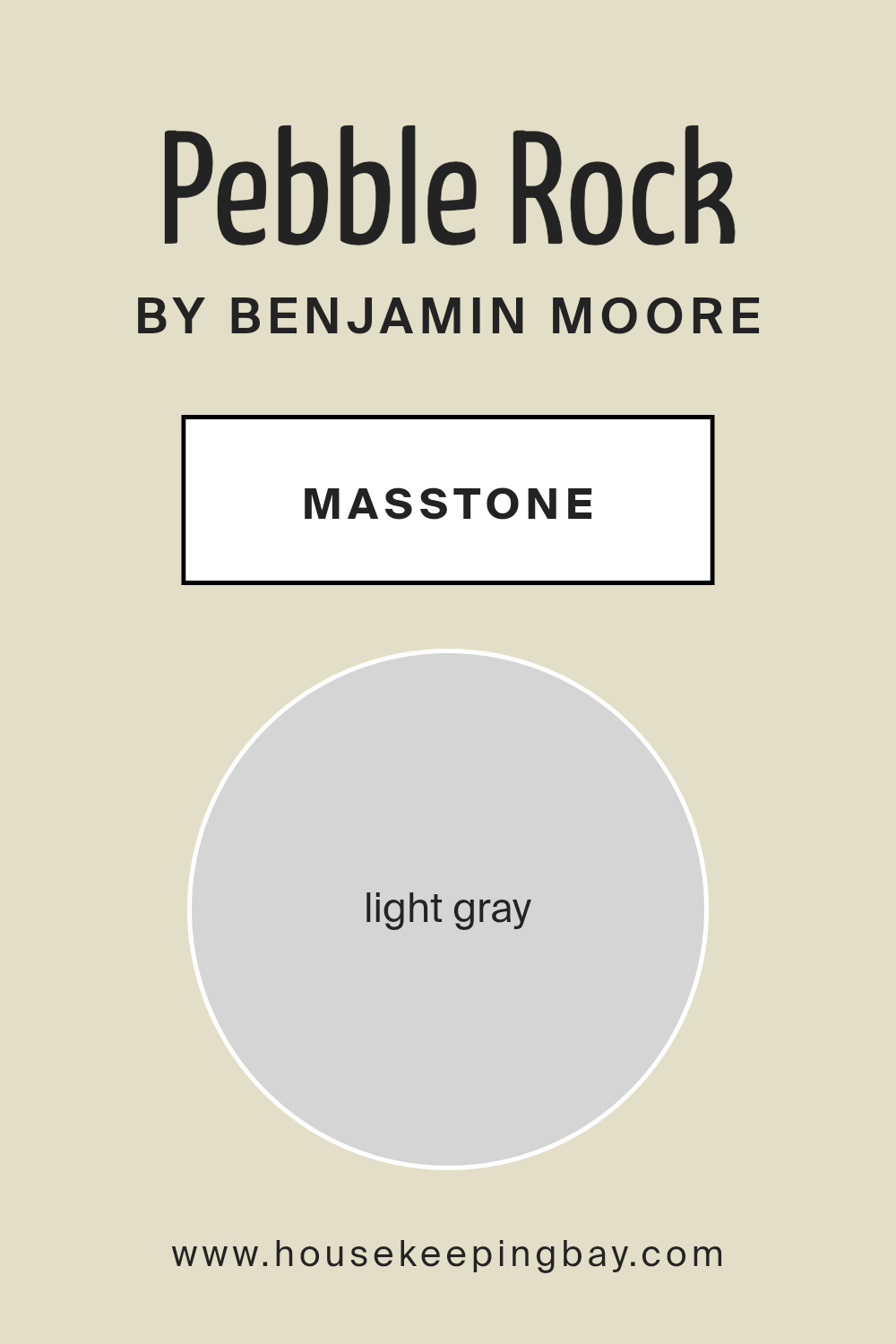
What is the Masstone of the Pebble Rock 945 by Benjamin Moore?
Pebble Rock 945 by Benjamin Moore is a light gray color that can bring a calm and soothing feel to any room in your home. With its soft, neutral tone, it pairs well with many other colors, making it incredibly versatile. You can use it in a living room to create an airy, welcoming space or in a bathroom for a clean and fresh look.
This shade of gray is light enough to reflect natural light, helping to make smaller rooms feel larger and more open.
Pebble Rock 945 also works well as a backdrop for both modern and traditional styles, allowing your furniture and decorations to stand out. It is perfect for open spaces, as it can help create a cohesive and seamless look throughout your home. Adding accents such as darker furniture or colorful artwork can enhance its beauty, enhancing the overall aesthetic of your space.
housekeepingbay.com
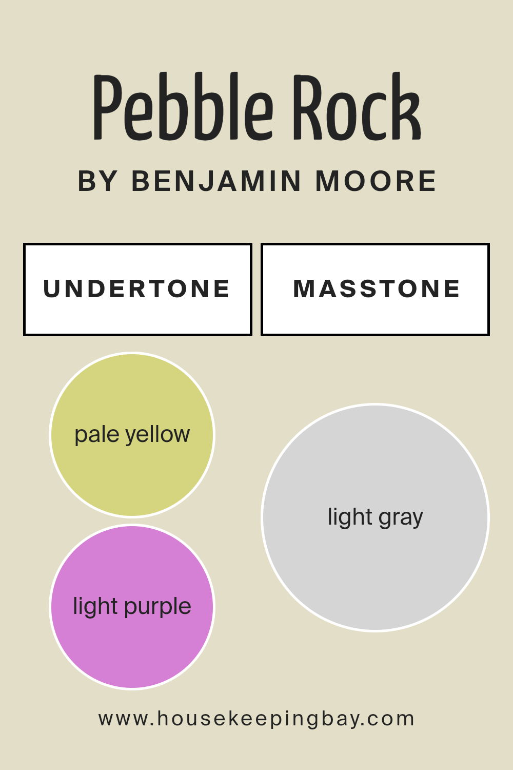
Undertones of Pebble Rock 945 by Benjamin Moore
Pebble Rock 945 by Benjamin Moore is a versatile shade that appears simple at first glance. However, a closer look reveals a complex mix of undertones that influence how we perceive this color. The undertones include pale yellow, light purple, light blue, pale pink, mint, lilac, and grey. Each undertone adds a layer of depth and character to the overall hue.
Undertones play a crucial role in how we see color. They can subtly shift the mood and temperature of a room. For instance, a hint of yellow might bring warmth, while a touch of grey can make the space feel cooler.
In the case of Pebble Rock 945, the mix of various undertones allows it to adapt to different lighting conditions and settings.
On interior walls, the color’s pale yellow undertone can make a room feel sunny and bright. The light blue and mint give it a refreshing vibe, making it suitable for both calm living spaces and active areas.
Lilac and light purple hints add a touch of elegance, while the pale pink introduces a soft, welcoming feel. The grey undertone offers balance and sophistication, ensuring the shade doesn’t overwhelm the room. In essence, Pebble Rock 945 provides a neutral backdrop with subtle character, ideal for diverse design schemes.
housekeepingbay.com
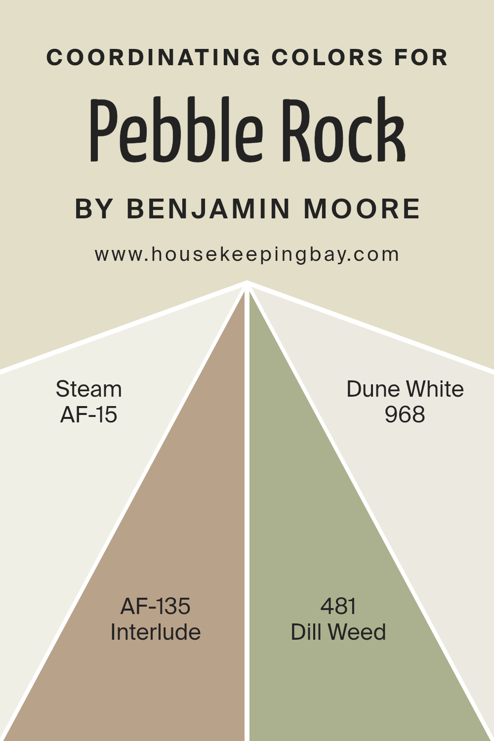
Coordinating Colors of Pebble Rock 945 by Benjamin Moore
Coordinating colors are different shades or tones that naturally complement each other and create a harmonious look when used together in a space. When choosing these colors, the goal is to ensure they work well with a primary color, enhancing the overall aesthetic and mood of a room.
For the serene and versatile Pebble Rock by Benjamin Moore, several coordinating colors can accentuate its subtle warmth and neutrality. AF-15, known as Steam, is a soft, muted off-white that provides a clean backdrop, perfect for brightening spaces without feeling stark.
Meanwhile, AF-135, called Interlude, is a rich, muted purple, adding depth and a touch of elegance to the palette.
On the other hand, 481, Dill Weed, offers a fresh, earthy green that brings in a hint of nature and vitality, complementing Pebble Rock’s natural tone.
Lastly, 968, Dune White, is a creamy white that exudes warmth and pairs beautifully with any of these shades, maintaining a seamless and cohesive look. When used together, these coordinating colors create a balanced and inviting environment.
They allow for flexibility in decorating, ensuring each room feels well-thought-out and visually pleasing without overwhelming the senses.
You can see recommended paint colors below:
- AF-15 Steam
- AF-135 Interlude
- 481 Dill Weed
- 968 Dune White
housekeepingbay.com
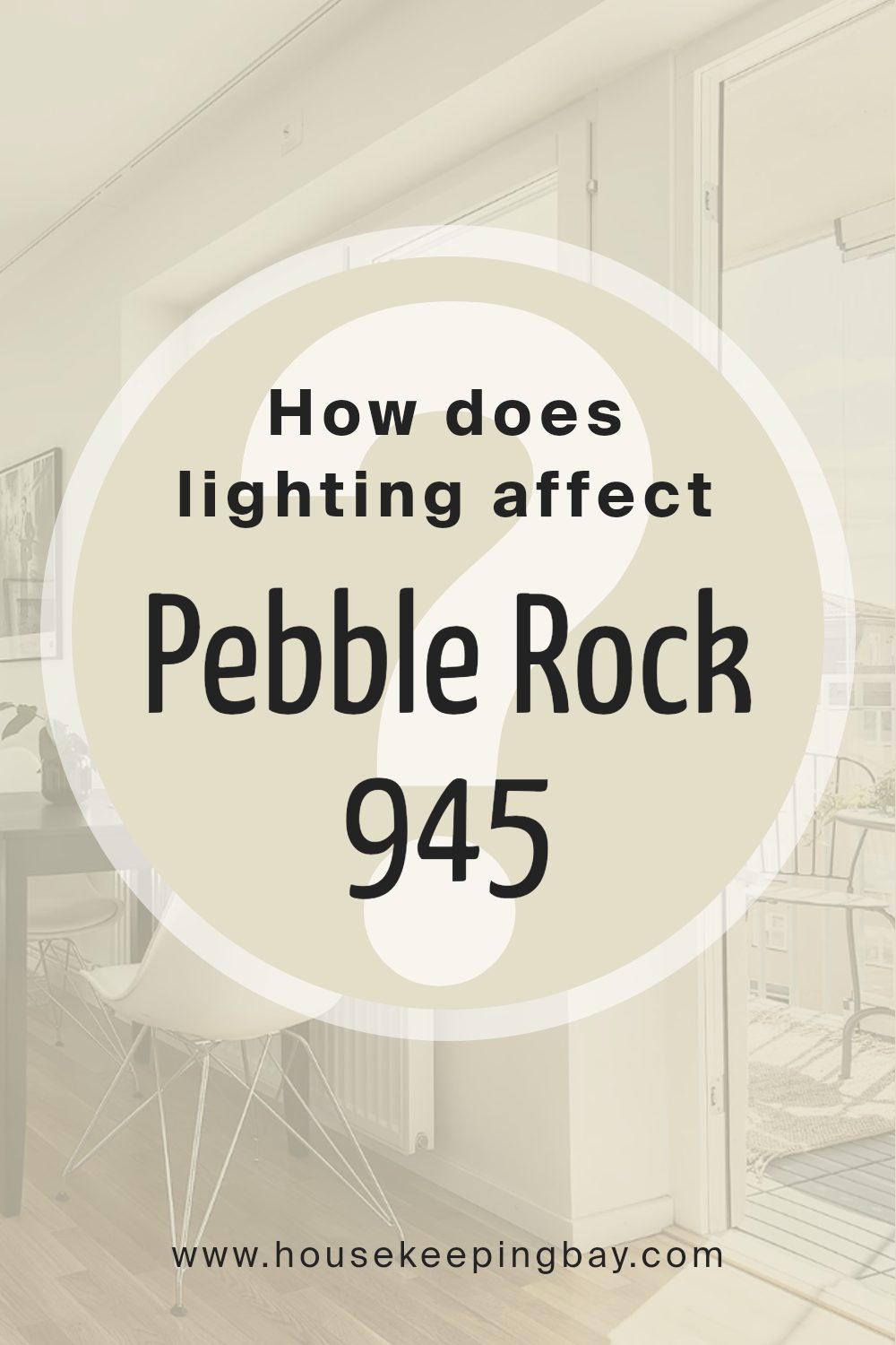
How Does Lighting Affect Pebble Rock 945 by Benjamin Moore?
Lighting has a significant impact on how we perceive colors in any space. Natural light changes throughout the day, affecting colors in different ways, while artificial light can alter a color’s appearance depending on its temperature and source.
When it comes to Pebble Rock 945 by Benjamin Moore, this soft, neutral hue can vary significantly in appearance based on lighting conditions. In natural light, Pebble Rock 945 appears as a calm and soothing color, allowing the subtle undertones to emerge.
Under artificial lighting, the color’s appearance is influenced by the type of bulbs used. Warm incandescent or LED lights can add a cozy touch, possibly bringing out warmer undertones, while cooler fluorescent or LED lights might make the color seem more muted or gray.
In a north-facing room, which receives cooler light, Pebble Rock 945 might seem a bit darker and its cool undertones may become more prominent, giving the space a more subdued feel. This is because north light is more consistent and does not bring out as much warmth in colors.
In contrast, a south-facing room gets a lot of direct sunlight throughout the day. Here, Pebble Rock 945 will feel warmer and more inviting, likely looking its lightest and brightest. The influx of warm sunlight enhances the color’s warmer tones, creating a cozy atmosphere.
East-facing rooms get sunlight in the morning while having cooler tones in the afternoon. In the morning, Pebble Rock 945 will appear brighter and warmer. As the day progresses, the cooler light can cause the color to appear slightly grayer.
In west-facing rooms, the opposite effect occurs. The color can feel cooler and more muted in the morning but takes on more warmth and depth during the afternoon and evening when the room receives more direct sunlight.
Thus, understanding these lighting conditions can help in creating the desired mood in any space.
housekeepingbay.com
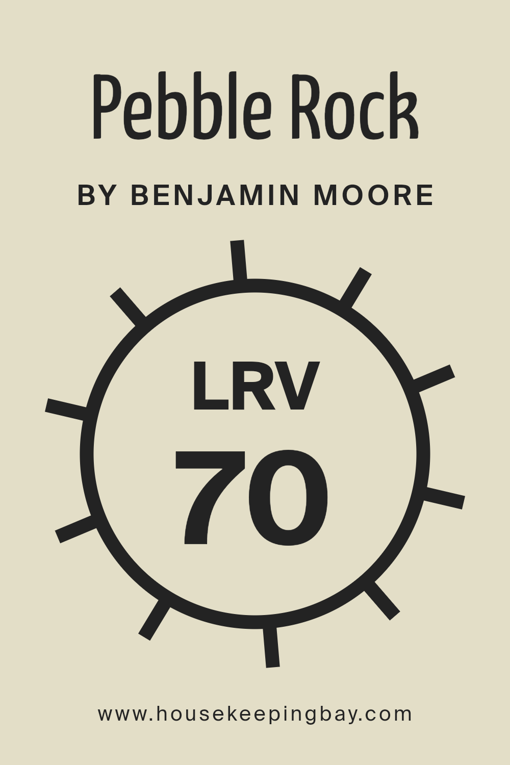
What is the LRV of Pebble Rock 945 by Benjamin Moore?
Light Reflectance Value (LRV) is a measurement used to determine how much light a color reflects. It ranges from 0 to 100, where 0 means the color absorbs all light (pure black) and 100 means it reflects all light (pure white). The LRV helps you understand how bright or dark a color will appear when applied to a surface.
Colors with high LRV numbers will reflect more light, making a space feel brighter and more open. In contrast, colors with low LRV numbers will absorb light, making a room feel more intimate and cozy. So, if you want a room that feels airy, opting for colors with higher LRV values might be a good choice.
Pebble Rock945 by Benjamin Moore has an LRV of 70.28, meaning it reflects a good amount of light. With this LRV, Pebble Rock945 is considered a light color. When you apply it to your walls, it will help make a room feel more spacious and bright. Because it reflects a substantial amount of light, it can effectively lighten rooms that don’t get much natural sunlight.
This makes it a versatile choice for various areas in your home, especially those that need a bit of brightness without being overwhelming or sharp.
housekeepingbay.com
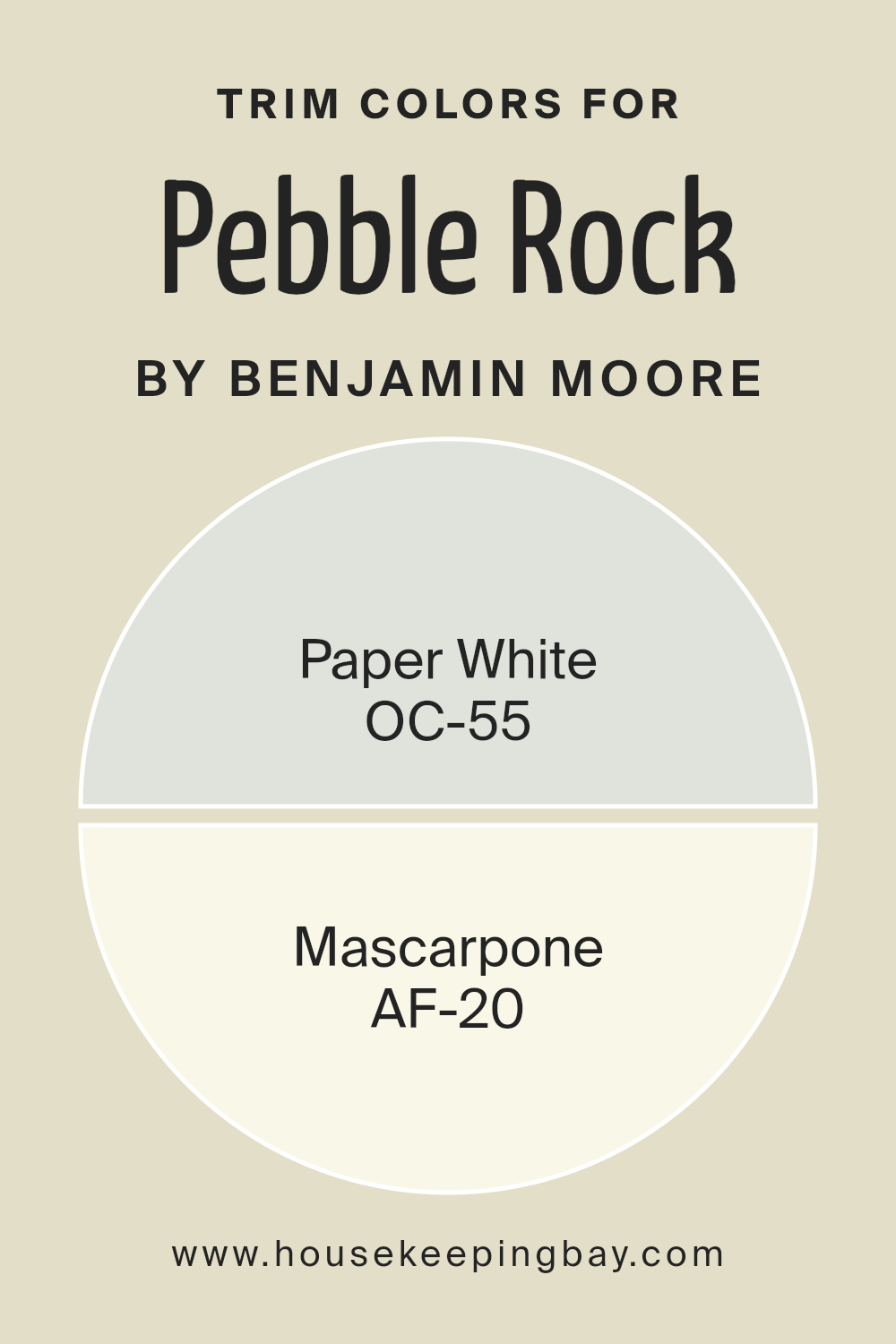
What are the Trim colors of Pebble Rock 945 by Benjamin Moore?
Trim colors are the finishing touches that frame a room, often used on baseboards, window and door frames, and other architectural details. They serve to highlight and accentuate these features, creating a cohesive look and enhancing the overall aesthetic of a space.
For a paint color like Pebble Rock 945 by Benjamin Moore, choosing the right trim colors is crucial. Pebble Rock is a warm, neutral shade and pairing it with the right trim makes the room feel polished and well-designed.
Trim colors like OC-55 Paper White offer a crisp contrast that can brighten the room, adding a sense of cleanness and freshness. On the other hand, AF-20 Mascarpone, with its gentle creamy tones, can create a warmer and more inviting atmosphere, complementing the neutral tones of Pebble Rock.
OC-55 Paper White is a soft, cool white that provides a modern touch. It’s perfect for creating a subtle contrast against Pebble Rock, adding depth while keeping the space feeling airy and light.
AF-20 Mascarpone, however, is a rich, creamy off-white with subtle warmth. It works beautifully to enhance the cozy feel of Pebble Rock, blending warmth and comfort seamlessly. Each trim color impacts the room’s ambiance differently, and choosing between them depends on the desired mood and style of the space.
You can see recommended paint colors below:
- OC-55 Paper White
- AF-20 Mascarpone
housekeepingbay.com
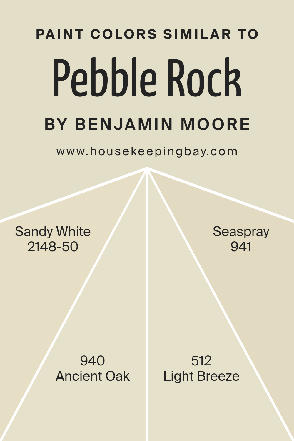
Colors Similar to Pebble Rock 945 by Benjamin Moore
Similar colors play a crucial role in creating a harmonious and cohesive atmosphere in any space. When colors have visual similarities, they tend to work well together, making a room feel balanced and inviting. Take Pebble Rock 945 by Benjamin Moore as an example.
To complement this shade, you might consider colors like Sandy White 2148-50, Ancient Oak 940, Light Breeze 512, and Seaspray 941. Each of these colors carries a distinct character while maintaining a subtle connection to Pebble Rock.
Sandy White offers a soft warmth, akin to a gently sunlit beach, bringing a cozy touch to a room. Ancient Oak, with its subtle earthy tones, adds a touch of classic elegance, grounding the overall palette.
Light Breeze brings in a whisper of blue, infusing the space with a hint of refreshing airiness that keeps things light and open.
Meanwhile, Seaspray enhances this feeling with its delicate green undertone, reminiscent of gentle waves lapping at the shore. By using these similar colors, you can create visuals that are not only pleasing but also adaptable to different moods and styles.
The consistent undertones form a bridge that ties everything together, ensuring each color enhances the others and all contribute to a unified look. This harmony is what makes a room feel thoughtfully designed and naturally comfortable.
You can see recommended paint colors below:
- 2148-50 Sandy White
- 940 Ancient Oak
- 512 Light Breeze
- 941 Seaspray
housekeepingbay.com
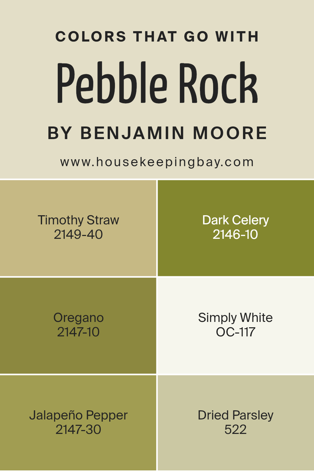
Colors that Go With Pebble Rock 945 by Benjamin Moore
Colors that go with Pebble Rock 945 by Benjamin Moore are important because they help set the atmosphere for a space, enhance mood, and create visual harmony. Pebble Rock is a versatile neutral, providing a calming backdrop while allowing other colors to shine.
Timothy Straw, with its soft and muted yellow-green, brings a hint of warmth and energy, ideal for adding a touch of nature indoors.
Dark Celery, a deep and rich green, introduces depth and a sense of richness. Oregano, with its earthy olive tones, complements Pebble Rock by grounding the room with a natural feel. Simply White, in its clean, crisp form, offers a refreshing and bright contrast that highlights details and opens up spaces visually.
Jalapeño Pepper adds a vibrant punch with its bold, spicy red that energizes and draws the eye, perfect for accents that demand attention.
Dried Parsley, with its muted sage green, provides a subtle yet sophisticated touch, balancing the more intense colors while maintaining a lively look.
When combined, these colors work harmoniously with Pebble Rock, creating a cohesive, inviting, and dynamic space.
Choosing the right mix of colors not only enhances the look of a room but also contributes to a balanced, pleasant environment.
You can see recommended paint colors below:
- 2149-40 Timothy Straw
- 2146-10 Dark Celery
- 2147-10 Oregano
- OC-117 Simply White
- 2147-30 Jalapeño Pepper
- 522 Dried Parsley
housekeepingbay.com
How to Use Pebble Rock 945 by Benjamin Moore In Your Home?
Pebble Rock 945 by Benjamin Moore is a versatile, neutral paint color, perfect for various rooms in your home. Its soft, earthy tone makes it a great choice for living rooms, bedrooms, and even kitchens. This shade complements different styles, from modern to traditional. Its gentle, warm undertones create a welcoming atmosphere, making spaces feel cozy and inviting.
In a living room, Pebble Rock can serve as a calming backdrop that enhances the beauty of your furniture and decor. Pair it with white trim for a clean, sharp look, or with wooden accents to bring out its natural qualities.
In a bedroom, this color works well to promote relaxation, pairing beautifully with soft linens and muted accessories. When used in a kitchen, it offers a subtle yet sophisticated look, working nicely with stainless steel or wooden elements. For a cohesive look, consider using Pebble Rock throughout adjacent spaces, ensuring a seamless flow.
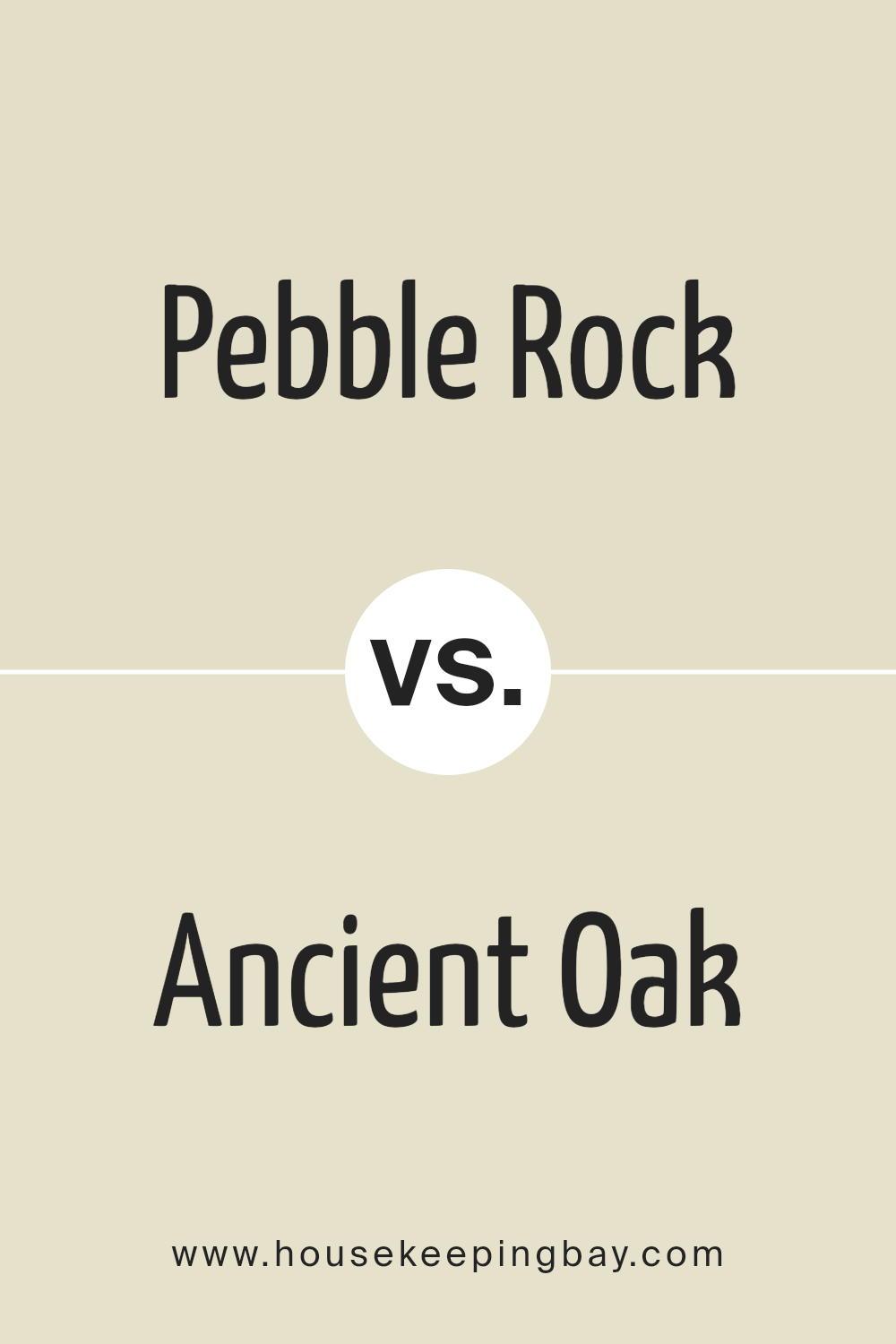
Pebble Rock 945 by Benjamin Moore vs Ancient Oak 940 by Benjamin Moore
Pebble Rock 945 by Benjamin Moore and Ancient Oak 940 by Benjamin Moore are two distinct shades that each offer unique characteristics. Pebble Rock 945 is a neutral color with a balance of warmth and coolness, making it versatile for different environments. It blends well in both contemporary and traditional settings due to its understated elegance.
In contrast, Ancient Oak 940 has a slightly richer and warmer tone compared to Pebble Rock. It tends more toward earthy undertones, carrying a gentle sense of coziness and comfort. This color works well in spaces designed to evoke warmth and intimacy.
When choosing between these two, consider the ambience you wish to create. Pebble Rock might enhance a room with its subtle neutrality, while Ancient Oak might offer a more inviting touch. Both shades can fit into various color schemes, but your choice will impact the overall feel of the space.
You can see recommended paint color below:
- 940 Ancient Oak
housekeepingbay.com
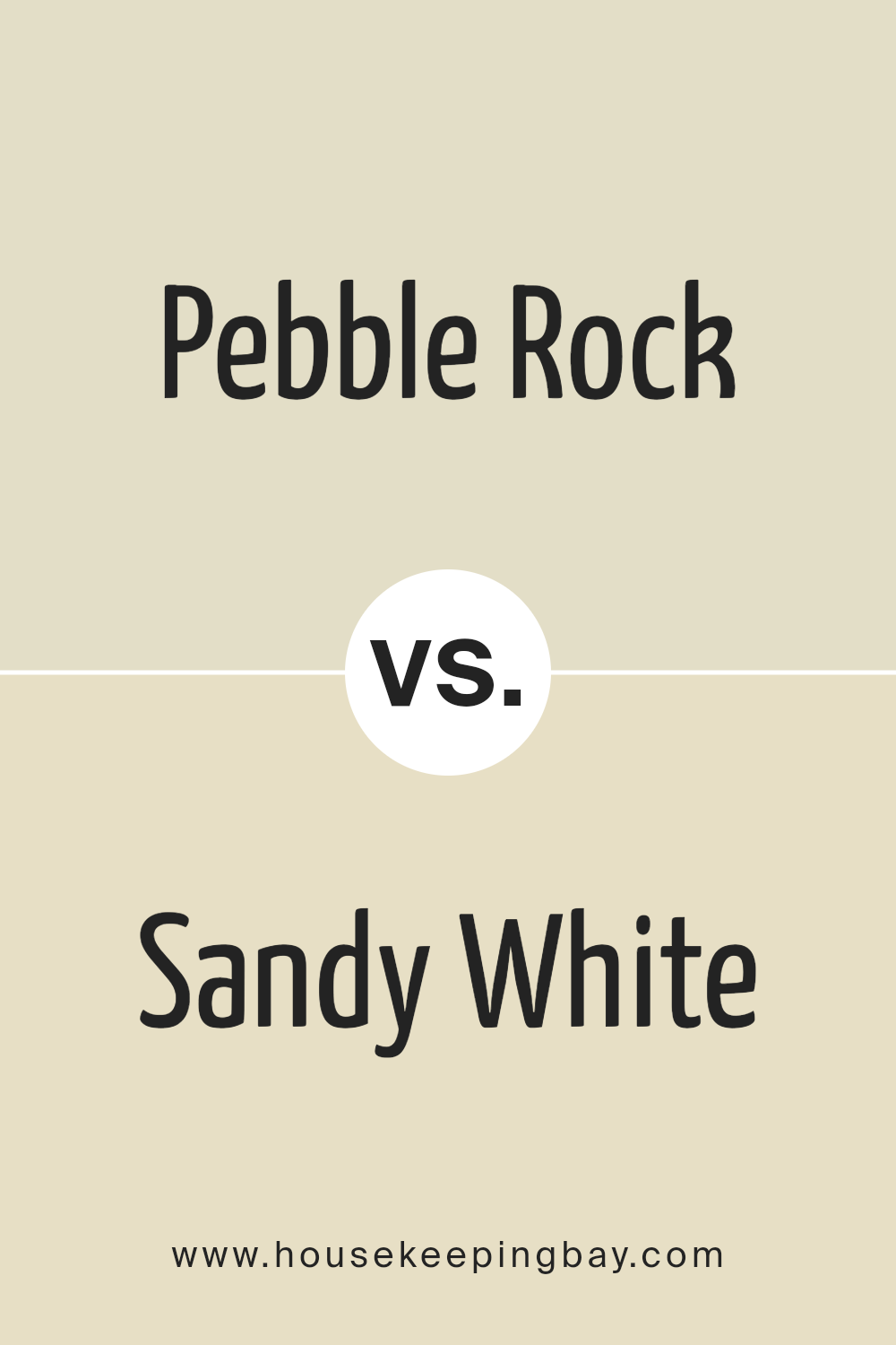
Pebble Rock 945 by Benjamin Moore vs Sandy White 2148-50 by Benjamin Moore
Pebble Rock 945 and Sandy White 2148-50, both by Benjamin Moore, offer distinct aesthetics suitable for various settings. Pebble Rock 945 resembles a medium gray with subtle warmth, making it a versatile choice for spaces that need a balanced touch. Its neutral tone complements both bold and subdued accents, providing a canvas that feels neither too stark nor too dull.
Sandy White 2148-50 leans towards a softer, creamy beige. It introduces a cozy and inviting atmosphere, ideal for creating warm, comfortable spaces. Sandy White can brighten rooms without overwhelming them and pairs beautifully with earth tones and textures.
While Pebble Rock 945 provides a more modern, sophisticated feel with its gray undertones, Sandy White delivers a gentle, homely ambiance. Both colors work well in various spaces, yet their impact differs—Pebble Rock offers subtle drama, while Sandy White delivers warmth and comfort.
You can see recommended paint color below:
- 2148-50 Sandy White
housekeepingbay.com
Pebble Rock 945 by Benjamin Moore vs Light Breeze 512 by Benjamin Moore
Pebble Rock 945 by Benjamin Moore offers a warm, earthy tone reminiscent of soft, weathered stone. Its neutral quality makes it versatile for various spaces, providing a calm and soothing backdrop. This shade integrates seamlessly with both modern and traditional designs, balancing well with wooden accents and muted pastels.
Light Breeze 512 by Benjamin Moore, in contrast, presents a fresh, airy feel. It’s a delicate, light green that injects a sense of nature into any room. This color works well in spaces that receive ample natural light, creating a serene and refreshing atmosphere.
Ideal for kitchens or bathrooms, it brings to mind a breezy day with clear skies.
While Pebble Rock promotes warmth and grounding, Light Breeze offers a hint of nature and rejuvenation.
The two together can provide a balanced aesthetic, with Pebble Rock anchoring a room and Light Breeze adding a splash of serene color for contrast.
You can see recommended paint color below:
- 512 Light Breeze
housekeepingbay.com
Pebble Rock 945 by Benjamin Moore vs Seaspray 941 by Benjamin Moore
Pebble Rock 945 by Benjamin Moore is a warm, earthy tone that brings a subtle richness and depth to spaces. This color evokes a sense of comfort and stability, making it a great backdrop for living rooms or bedrooms. Its foundation draws from natural stone hues, which adds an understated elegance to interiors.
Seaspray 941, also by Benjamin Moore, offers a lighter, breezier feel. It carries a soft, airy quality reminiscent of ocean mists. With hints of soft blue and cool undertones, Seaspray is perfect for creating a calm, refreshing atmosphere, ideal for bathrooms or sunlit spaces.
While Pebble Rock brings warmth and an inviting presence, Seaspray provides calmness and a gentle, soothing vibe.
Both colors can enhance different environments, with Pebble Rock offering coziness and Seaspray inviting a cool, serene ambiance.
Choosing between them depends on the mood and sensation you wish to evoke in your space.
You can see recommended paint color below:
- 941 Seaspray
housekeepingbay.com
This color’s subtle gray tones provide a perfect backdrop, enriching spaces without overpowering them. I appreciate how its neutral palette works harmoniously with various styles and colors, allowing for a seamless integration into any room.
I notice that it adds depth and warmth, making environments feel welcoming. Whether used in a living room, bedroom, or even a cozy nook, its understated elegance shines through. This paint color provides a sense of calm, promoting relaxation and comfort.
One of the aspects I value most is its adaptability. It gracefully complements bold accents or muted hues, making it a remarkable choice for those seeking flexibility in design. It’s not just about changing a room’s appearance; it’s about enhancing its atmosphere.
In conclusion, 945 Pebble Rock by Benjamin Moore stands out as a reliable option for anyone interested in creating a serene and elegant living space. Its balance and neutrality make it a timeless choice that will undoubtedly continue to charm long after the first coat has dried.

housekeepingbay.com
Ever wished paint sampling was as easy as sticking a sticker? Guess what? Now it is! Discover Samplize's unique Peel & Stick samples. Get started now and say goodbye to the old messy way!
Get paint samples


