Minor Blue SW 6792 by Sherwin Williams
A Fresh Look with a Soft Touch of Blue
Color can change how you feel in a room, and SW 6792 Minor Blue by Sherwin Williams can add a sense of calm and coolness to any space. Imagine stepping into a room where the walls are painted a subtle yet striking shade of blue that reminds you of a gentle, clear summer sky. That’s the experience you get with Minor Blue.
This color holds a balance – it’s not too bright to distract but not so dull that it fades into the background. Instead, it offers a fresh and airy vibe that can both soothe and refresh your senses. You might find it perfect for a bedroom or a serene reading nook where relaxation is key.
Think about how versatile Minor Blue is. Whether your style is contemporary, traditional, or somewhere in between, it fits right in. You’ll discover it pairs well with whites and creams for a crisp, clean look or alongside darker hues for a more dramatic effect.
Enough about design rules. Picture your favorite spot at home. Now imagine it with the calm of a quiet sea wash over it through color.
That’s what Minor Blue can do for you. Sometimes, it only takes a little paint to transform your space into your peaceful retreat.
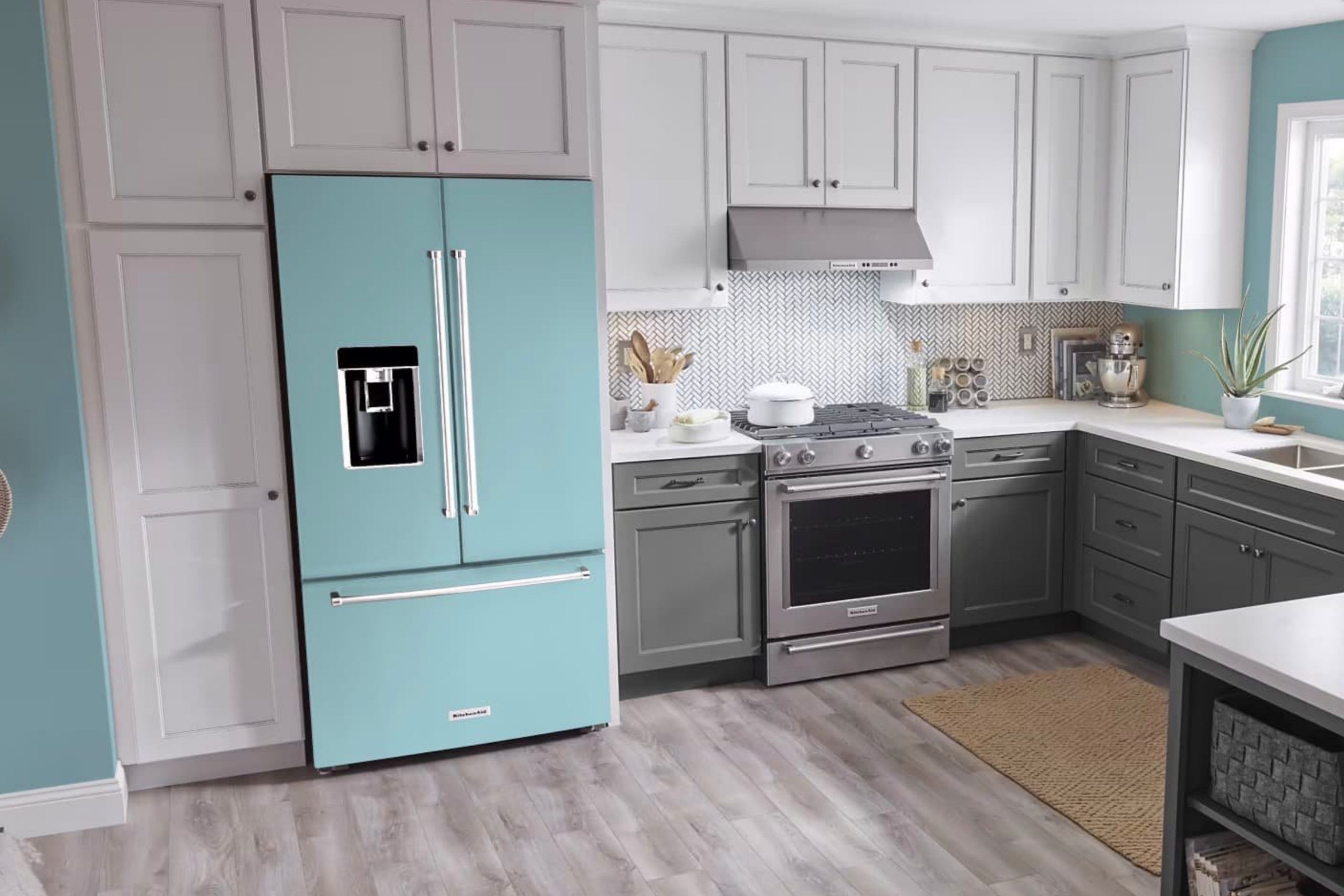
via rmwraps.com
What Color Is Minor Blue SW 6792 by Sherwin Williams?
Table of Contents
Minor Blue SW 6792 by Sherwin Williams is a soft, muted blue with a hint of gray, giving it a calm and soothing appearance. It has a cool undertone that makes it versatile for various interior styles. This color works exceptionally well in coastal-themed spaces, where it can mimic the gentle hues of the sea and sky. It also complements modern minimalist designs, offering a subtle splash of color without overpowering the space.
In traditional settings, Minor Blue can add a touch of refined elegance, while in Scandinavian interiors, it pairs nicely with the clean lines and simplicity characteristic of this style. It blends beautifully with natural materials like light-colored woods, bringing out their warmth while maintaining balance.
Minor Blue harmonizes perfectly with crisp whites and soft grays, creating a serene and cohesive look. Textures such as linen and cotton work well, enhancing its softness and adding depth. Incorporating elements like brushed metals or matte black accents can give a contemporary edge, while woven baskets or natural stone can further highlight its gentle, natural appeal.
Overall, Minor Blue SW 6792 brings a gentle and calming presence to any room, allowing for a versatile and harmonious design.
housekeepingbay.com
Is Minor Blue SW 6792 by Sherwin Williams Warm or Cool color?
Minor Blue SW 6792 by Sherwin Williams is a gentle, soothing color that brings a touch of serenity to any home. This soft blue tone has a subtle hint of grey, giving it a calming and balanced feel. When used in living rooms, it creates a relaxing atmosphere, perfect for unwinding at the end of a long day. In bedrooms, it promotes peaceful rest, acting as the ideal backdrop for a good night’s sleep.
Its versatility makes it suitable for both modern and traditional settings. Paired with crisp white trims, it looks fresh and clean, enhancing natural light in a room. In kitchens, it pairs beautifully with wooden or metallic accents, offering a simple yet harmonious look.
Minor Blue SW 6792 works well in spaces where relaxation and comfort are key. Its soft tone makes rooms feel open and airy, making it a popular choice for spaces where people gather to relax and connect.
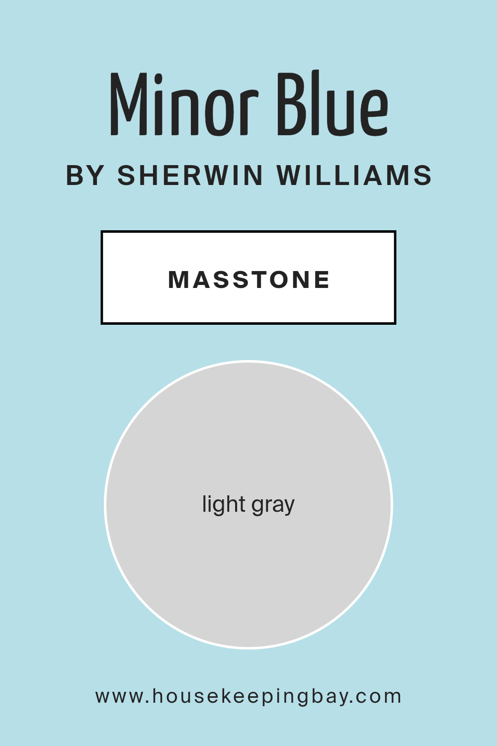
What is the Masstone of the Minor Blue SW 6792 by Sherwin Williams?
Minor Blue SW 6792 by Sherwin Williams often appears as a soft, inviting shade of light blue. With its masstone being light gray (#D5D5D5), this color offers a subtle, cool undertone that works beautifully in various spaces within a home. The light gray masstone helps the color feel calm and airy, lending a soothing atmosphere to any room. It pairs well with both modern and traditional decor, making it a versatile choice for homeowners.
This color works effectively in living rooms or bedrooms, creating a serene backdrop that feels easy on the eyes. It also has the ability to reflect light well, which can make spaces seem larger and more open.
When used in kitchens or bathrooms, Minor Blue adds a touch of freshness without overpowering the existing decor. Overall, its soft gray undertone ensures it remains a timeless and versatile choice, balancing warmth and coolness beautifully.
housekeepingbay.com
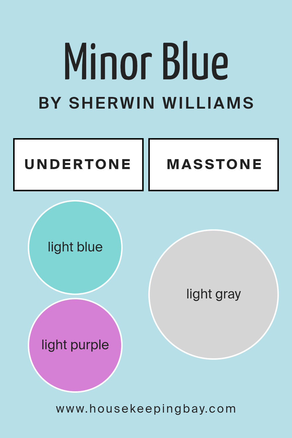
Undertones of Minor Blue SW 6792 by Sherwin Williams
Minor Blue SW 6792 by Sherwin Williams carries a complex blend of undertones. These undertones subtly influence the overall perception of the color. Undertones are the subtle hints of color that lie beneath the main hue. They affect how we perceive a color under different lighting conditions and next to other colors.
Minor Blue features undertones of light blue, light purple, pale yellow, lilac, mint, pale pink, and grey. These undertones create a versatile and balanced color. Light blue and mint bring a cool, refreshing quality, making spaces feel open and airy.
Light purple and lilac add a gentle warmth and depth, giving walls a delicate and sophisticated touch. Pale yellow introduces a hint of warmth, making the color feel sunnier and more inviting. Pale pink adds softness, while grey injects neutrality, balancing out other undertones.
When used on interior walls, Minor Blue can change based on lighting and surroundings. Under bright, natural light, it can seem cooler due to light blue and mint, while artificial or warm lighting may enhance its lilac or pale pink qualities, making the room feel cozy.
The grey undertone ensures it remains balanced, never appearing too bold or overpowering. This makes Minor Blue a versatile choice for various interiors.
housekeepingbay.com
Coordinating Colors of Minor Blue SW 6792 by Sherwin Williams
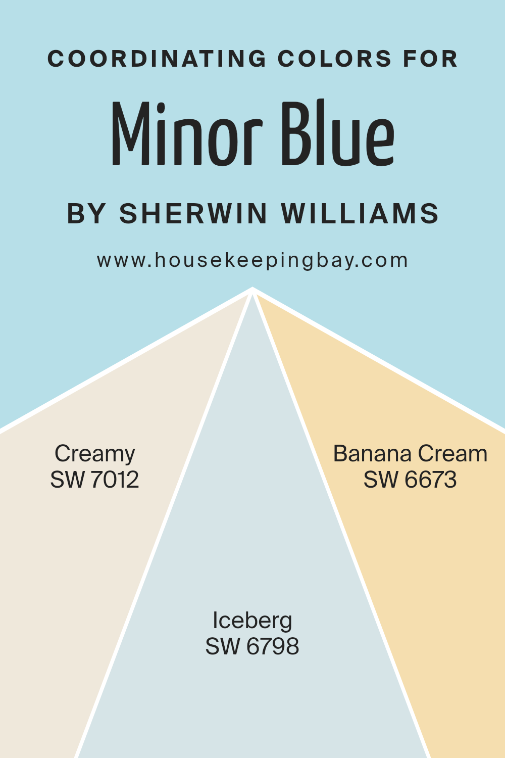
Coordinating colors are shades that complement each other, creating a harmonious and balanced look in a space. By carefully selecting hues that enhance one another, you achieve an overall aesthetic that feels cohesive and inviting. When dealing with Minor Blue SW 6792 by Sherwin Williams, incorporating coordinating colors such as Creamy SW 7012, Iceberg SW 6798, and Banana Cream SW 6673 helps maintain visual balance.
Creamy SW 7012 is a warm, soft off-white that provides a subtle backdrop, grounding the vibrant nature of Minor Blue. Iceberg SW 6798, being a light, cool blue, works perfectly to bring a refreshing contrast that amplifies the depth of the primary color.
These coordinating colors each add their unique touch to the palette while ensuring consistency. Banana Cream SW 6673 introduces a gentle, sunny yellow that brings warmth and lightness, creating an uplifting atmosphere alongside the cooler tones of Iceberg.
Together, they weave an environment that is both vibrant and serene, allowing each color to shine without overwhelming the space. Utilizing such colors in a room encourages balance and harmony, offering a well-rounded color scheme that can be pleasant in various settings.
You can see recommended paint colors below:
- SW 7012 Creamy
- SW 6798 Iceberg
- SW 6673 Banana Cream
housekeepingbay.com
How Does Lighting Affect Minor Blue SW 6792 by Sherwin Williams?
Lighting plays a significant role in how we perceive color. The color “Minor Blue SW 6792” by Sherwin Williams can appear differently depending on the type of light it is exposed to.
In natural light, Minor Blue might appear truer to its paint sample. However, the direction of that natural light can change its look. North-facing rooms receive steady, cool light. This kind of light can make Minor Blue appear slightly more muted or subdued, as the cool tones in natural light will accentuate the coolness of the blue.
In contrast, south-facing rooms get more direct sunlight, especially during midday. This abundance of natural light can warm up Minor Blue, making it look brighter and slightly more vibrant. The stronger light brings out the color’s depth and richness.
East-facing rooms enjoy morning sunlight, which is softer and often has a slight yellow cast. In this setting, Minor Blue may take on a warmer hue early in the day, appearing fresh and inviting. As the day progresses and the sun moves away, the color might settle into its more natural tone, less influenced by direct sunlight.
West-facing rooms, experiencing afternoon and evening sun, can make colors look warmer in the latter part of the day. Minor Blue could appear more dynamic and slightly warmer due to this golden light, conveying a subtle shift as the day concludes.
Under artificial light, the effect changes based on the type of bulb used. Incandescent bulbs emit a warmer light, potentially giving Minor Blue a softer, warmer appearance. On the other hand, fluorescent lighting usually has a cooler tone, which might enhance the blue’s subtle gray undertones.
LED lights, available in various temperatures, can dramatically alter how Minor Blue appears, either maintaining its true shade or changing its warmth or coolness based on the bulb’s specific characteristics. Understanding these lighting effects allows for better planning when using this color in any room.
housekeepingbay.com
What is the LRV of Minor Blue SW 6792 by Sherwin Williams?
LRV, or Light Reflectance Value, is a measurement used to indicate how much light a color reflects or absorbs. It’s measured on a scale from 0 to 100, where 0 is absolute black, meaning it reflects no light, and 100 is pure white, reflecting all light. LRV is crucial in understanding how a color will appear on your walls, particularly in different lighting conditions.
When a color has a high LRV, it means it reflects more light back into the room, which can make the space feel brighter and more open. Conversely, a low LRV suggests that the color absorbs more light, making the space feel cozier and possibly smaller.
Minor Blue SW 6792 by Sherwin Williams has an LRV of 68.441, positioning it in a medium to high range on the light reflectance scale. This means that Minor Blue will reflect a good amount of light, helping to make rooms feel lighter and more spacious. The high LRV ensures that the color will not only lighten the area but also maintain its true shade under various lighting conditions, whether natural or artificial.
Because of this value, Minor Blue can work well in rooms where enhancing daylight is desired. Its ability to reflect light effectively might give the room a fresh and airy feel, making it an ideal choice for spaces where you want to achieve brightness without losing the subtle color itself.

housekeepingbay.com
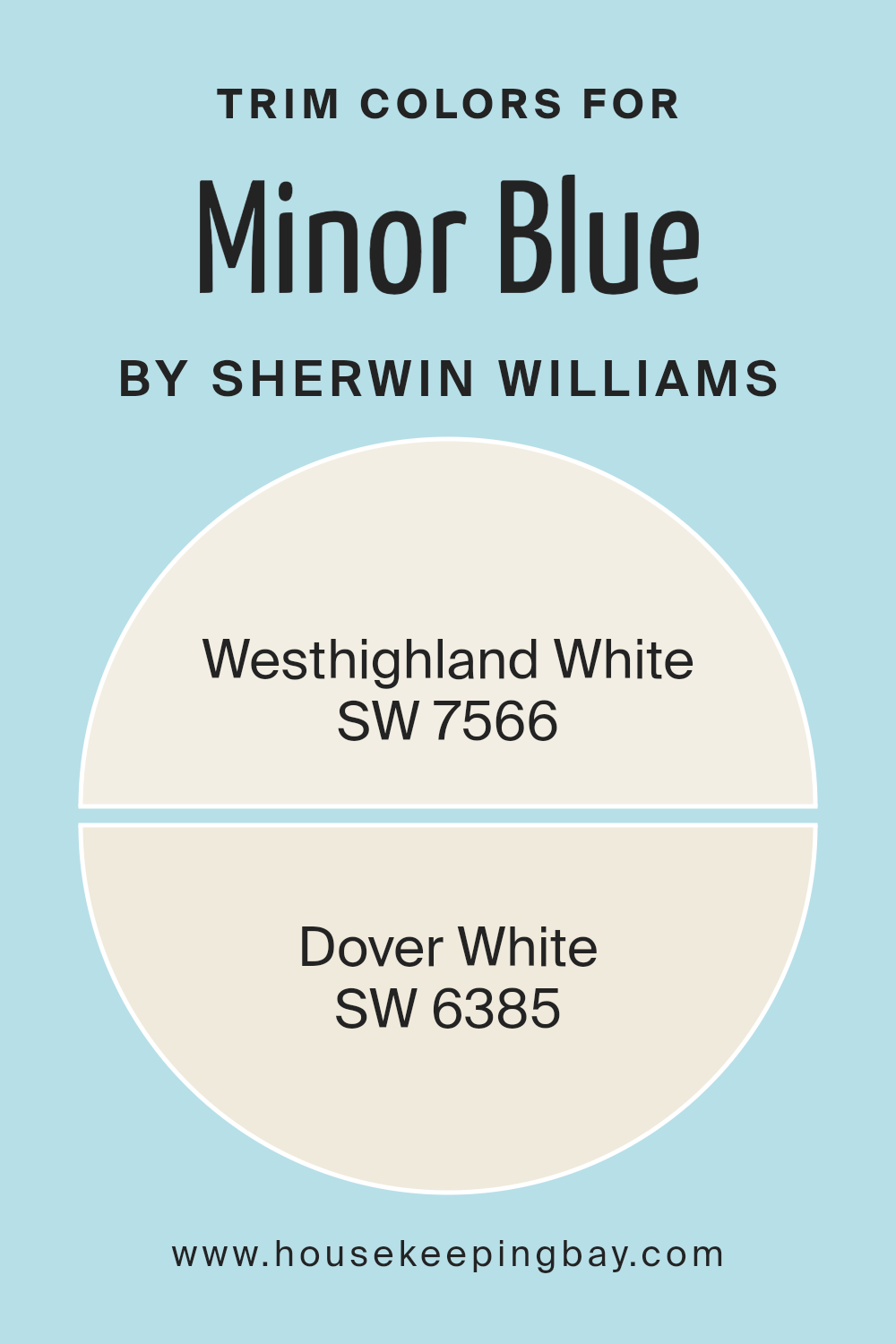
What are the Trim colors of Minor Blue SW 6792 by Sherwin Williams?
Trim colors are the shades used on moldings, baseboards, window frames, and door frames to create contrast or highlight architectural features. These colors help set the tone of a room and complement the main wall color. Choosing the right trim color for Minor Blue SW 6792 by Sherwin Williams is crucial because it accentuates the refreshing and calm nature of this blue shade.
With the right trim color, Minor Blue can become more vibrant and inviting, while a poor choice might make it dull. Trim colors can also add depth to a space and define rooms by creating clear boundaries between wall colors and architectural elements.
SW 7566, Westhighland White, is a warm white with a subtle softness that complements Minor Blue by providing a gentle contrast, enhancing the room’s brightness without overpowering it. This choice adds a touch of warmth and coziness to the cool tones of blue. On the other hand, SW 6385, Dover White, offers a creamy hue that brings a hint of elegance and sophistication into the space.
This color can balance the coolness of Minor Blue and create a welcoming atmosphere. Both of these whites serve to highlight Minor Blue, ensuring the room remains airy and light while showcasing the beauty of the blue.
You can see recommended paint colors below:
housekeepingbay.com
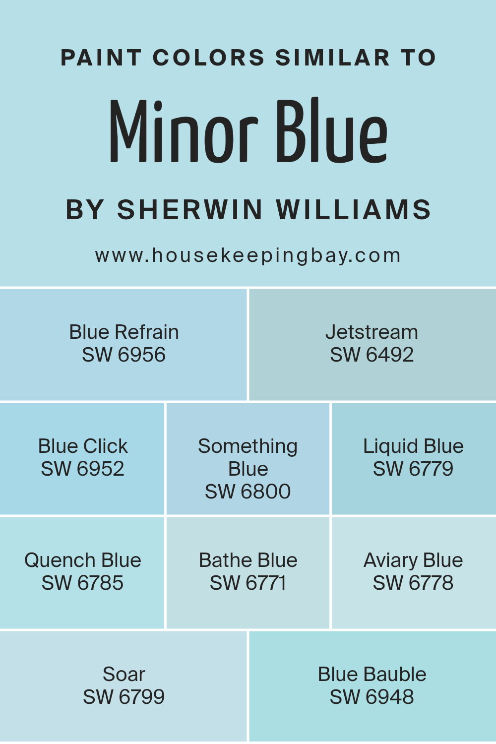
Colors Similar to Minor Blue SW 6792 by Sherwin Williams
When choosing colors for a room, selecting shades similar to Minor Blue SW 6792 by Sherwin Williams can create harmony and balance. These colors complement each other, blending well to form a cohesive look. SW 6956 – Blue Refrain is a gentle light blue, offering a calm and soothing atmosphere.
SW 6492 – Jetstream has a soft touch with a hint of green, creating a refreshing environment. SW 6952 – Blue Click brings a bolder, deeper blue, adding depth without overwhelming the space. Each hue plays its part, working together for a unified aesthetic.
SW 6800 – Something Blue has a clear, crisp quality that energizes any area. SW 6779 – Liquid Blue is vivid yet calm, like a gentle ocean wave. SW 6785 – Quench Blue provides a refreshing brightness that feels invigorating.
SW 6771 – Bathe Blue wraps a room in a subtle, comforting blue that feels clean and fresh. SW 6778 – Aviary Blue offers a light, airy vibe, perfect for enhancing open, spacious settings.
SW 6799 – Soar has a sky-like quality, bringing an expansive feel, while SW 6948 – Blue Bauble adds a pop of playful and lively blue, striking a balance with the rest. Together, these shades refine a space, creating a peaceful place.
You can see recommended paint colors below:
- SW 6956 Blue Refrain
- SW 6492 Jetstream
- SW 6952 Blue Click
- SW 6800 Something Blue
- SW 6779 Liquid Blue
- SW 6785 Quench Blue
- SW 6771 Bathe Blue
- SW 6778 Aviary Blue
- SW 6799 Soar
- SW 6948 Blue Bauble
housekeepingbay.com
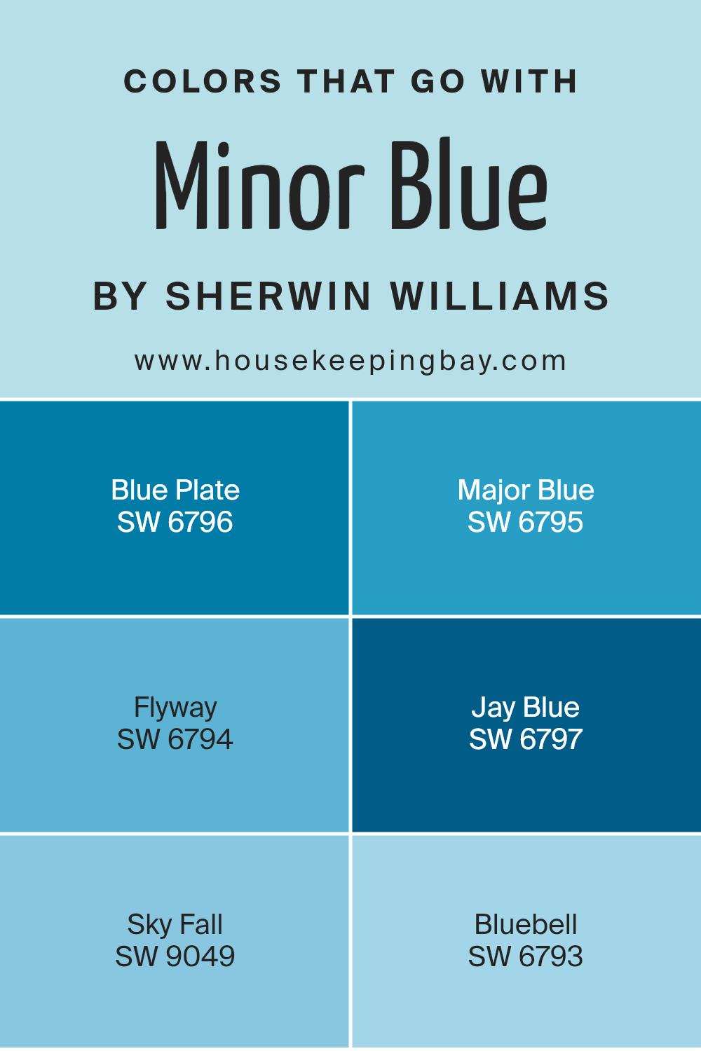
Colors that Go With Minor Blue SW 6792 by Sherwin Williams
Colors that match well with Minor Blue SW 6792 by Sherwin Williams make a space feel balanced and harmonious. These complementary shades create a cohesive look, adding depth and interest. Pairing Minor Blue with SW 6796 – Blue Plate, which is a rich and deep shade, gives a room a sophisticated feel. SW 6795 – Major Blue, on the other hand, is bold and striking, providing contrast without overwhelming.
If you use SW 6794 – Flyway, a soft and airy tone, it lends a light and breezy mood, perfect for creating a calming atmosphere. Each of these blues interacts with Minor Blue in a way that enhances their unique qualities, making every room feel inviting.
Adding to these choices, SW 6797 – Jay Blue offers a vibrant energy, giving spaces a lively touch. SW 9049 – Sky Fall is muted and understated, perfect for those who prefer a subtle yet impactful setting. Lastly, SW 6793 – Bluebell, with its delicate hue, introduces a gentle touch, making it suitable for cozy or intimate areas.
Together, these colors provide versatility, allowing you to create various moods within your home. They form a coordinated palette that not only complements Minor Blue but also makes any space feel thoughtfully put together.
You can see recommended paint colors below:
- SW 6796 Blue Plate
- SW 6795 Major Blue
- SW 6794 Flyway
- SW 6797 Jay Blue
- SW 9049 Sky Fall
- SW 6793 Bluebell
housekeepingbay.com
How to Use Minor Blue SW 6792 by Sherwin Williams In Your Home?
Minor Blue SW 6792 by Sherwin Williams is a soft, calming blue that brings a gentle, airy touch to any space. This color works well in areas where a peaceful atmosphere is desired, such as bedrooms or living rooms. Its muted tone offers versatility, allowing it to blend seamlessly with other colors and styles.
In a bedroom, Minor Blue creates a serene environment, promoting relaxation and restful sleep. Pair it with white or light gray bedding and furniture to enhance its soothing qualities. In a living room, it can make the space feel spacious and inviting. Consider using it on an accent wall or combining it with neutral tones like beige or cream for a balanced look.
In the kitchen, Minor Blue can add a refreshing touch to cabinets or walls, complementing natural wood finishes beautifully. Overall, it’s a versatile choice for anyone looking to bring a touch of calm and elegance into their home décor.
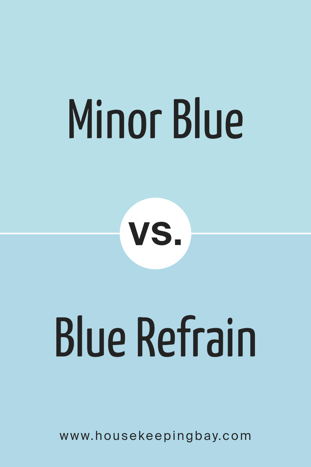
Minor Blue SW 6792 by Sherwin Williams vs Blue Refrain SW 6956 by Sherwin Williams
Minor Blue SW 6792 and Blue Refrain SW 6956, both by Sherwin Williams, offer lovely shades of blue but with distinct personalities. Minor Blue SW 6792 has a soft, muted tone that creates a calming and inviting atmosphere. It works great in spaces where a light, airy feel is desired, making rooms seem larger and more open.
Blue Refrain SW 6956, while still a shade of blue, delivers a more vivid, intense look. It brings more depth and energy to a room. This color can add a bold statement without being overwhelming, perfect for accent walls or spaces where a more dynamic feel is wanted.
Overall, Minor Blue leans towards a gentle, softer look, while Blue Refrain offers a richer, more pronounced presence. Both colors can effectively enhance spaces but will set quite different moods depending on your choice.
You can see recommended paint color below:
- SW 6956 Blue Refrain
housekeepingbay.com
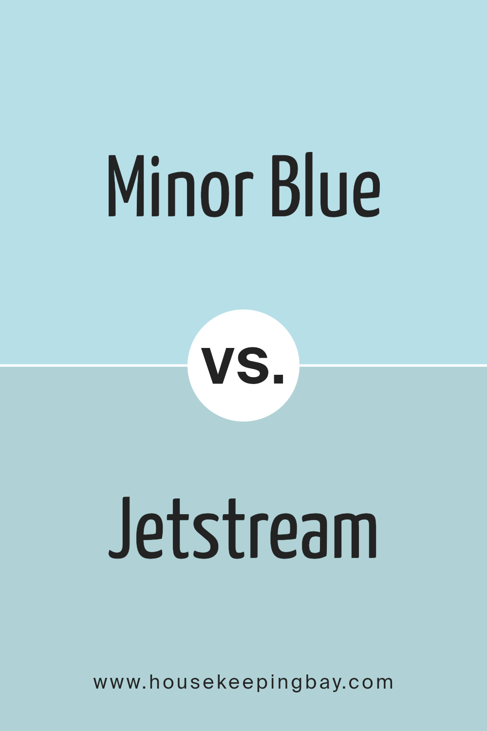
Minor Blue SW 6792 by Sherwin Williams vs Jetstream SW 6492 by Sherwin Williams
Minor Blue (SW 6792) and Jetstream (SW 6492) by Sherwin Williams offer two distinct shades of blue, each bringing unique qualities to a space. Minor Blue presents a soft, pastel-like hue that creates a calming and gentle ambiance. It’s ideal for adding a touch of serenity to bedrooms or living rooms, where a peaceful atmosphere is desired.
Jetstream, however, leans towards a more vibrant and lively tone. It feels airy and fresh, making it perfect for spaces that could use an energetic lift, such as a lively kitchen or a cheerful bathroom. Jetstream’s brightness can make rooms feel larger and more open, whereas Minor Blue provides a soothing backdrop that pairs well with neutrals and muted tones.
Both colors enhance interiors but serve different purposes. Minor Blue soothes and relaxes, while Jetstream energizes and refreshes, allowing for creative combinations based on desired mood and aesthetic.
You can see recommended paint color below:
- SW 6492 Jetstream
housekeepingbay.com
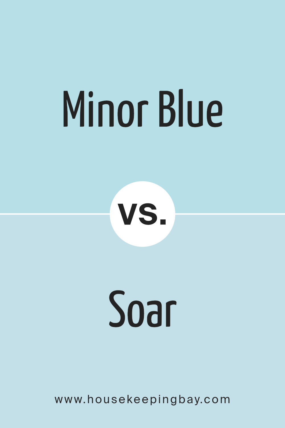
Minor Blue SW 6792 by Sherwin Williams vs Soar SW 6799 by Sherwin Williams
Main color Minor Blue SW 6792 by Sherwin Williams offers a soft, muted blue, evoking feelings of calm and peace. It’s a subtle color that works well as a backdrop because it doesn’t overpower a room. It pairs nicely with whites and neutrals, making it a versatile choice for various designs and spaces, whether used on walls, trims, or accents.
Second color Soar SW 6799 presents a brighter, more vibrant blue. It’s lively and energetic, ideal for creating a statement or highlight. This color draws attention and can be a focal point in a room. Pairing Soar with softer colors, like grays or off-whites, can keep it from feeling too bold while enhancing its vividness.
In comparison, Minor Blue’s subdued nature lends itself to understated elegance, while Soar’s brightness adds exciting, dynamic energy to rooms. The choice between them depends on whether you prefer a calming environment or a more energetic atmosphere.
You can see recommended paint color below:
- SW 6799 Soar
housekeepingbay.com
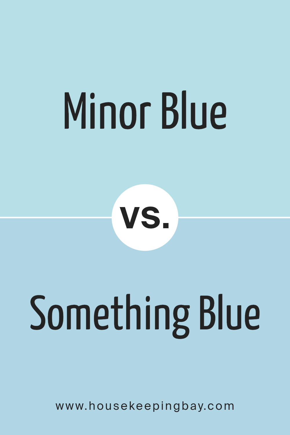
Minor Blue SW 6792 by Sherwin Williams vs Something Blue SW 6800 by Sherwin Williams
Minor Blue SW 6792 and Something Blue SW 6800 by Sherwin Williams both offer unique color experiences. Minor Blue presents a gentle, subdued shade that leans slightly towards gray. It provides a soft, calming backdrop, making it a versatile choice for various spaces. It’s sophisticated without shouting for attention, ideal for those seeking subtlety.
Meanwhile, Something Blue is a bit more vibrant. It has a lively, bold quality that brings energy into a room. This shade stands out with its bright, cheerful tone, perfect for spaces where a pop of color is desired. Both colors are blue, yet they give different vibes. Minor Blue creates an understated, elegant atmosphere, while Something Blue adds freshness and spirit.
Choosing between them depends on whether you prefer a soft, muted environment or want to inject vibrancy into your space. Each color brings its own charm and appeal.
You can see recommended paint color below:
- SW 6800 Something Blue
housekeepingbay.com
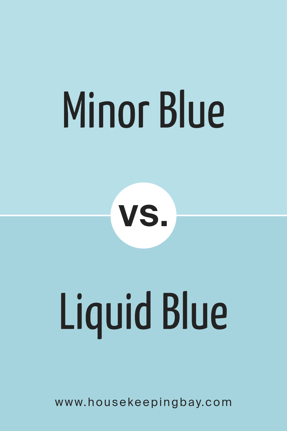
Minor Blue SW 6792 by Sherwin Williams vs Liquid Blue SW 6779 by Sherwin Williams
Minor Blue is a soft, muted blue shade from Sherwin Williams. This color offers a gentle, calming feel, perfect for creating a subtle backdrop in any room. Its mellow undertones lend themselves well to spaces where relaxation and peace are desired, such as bedrooms or living areas. Minor Blue pairs nicely with whites or other muted tones for a clean, harmonious look.
Second Color: Liquid Blue SW 6779Liquid Blue is a more vibrant and lively shade compared to Minor Blue. It is a stronger, brighter blue that adds energy and depth to a space. This color works well when you want to make a statement, adding a pop of color to a room. Liquid Blue can be paired with neutral shades to balance its intensity or used in smaller accents to draw attention.
In summary, Minor Blue offers a gentle and soothing atmosphere, while Liquid Blue brings vibrancy and energy.
You can see recommended paint color below:
- SW 6779 Liquid Blue
housekeepingbay.com
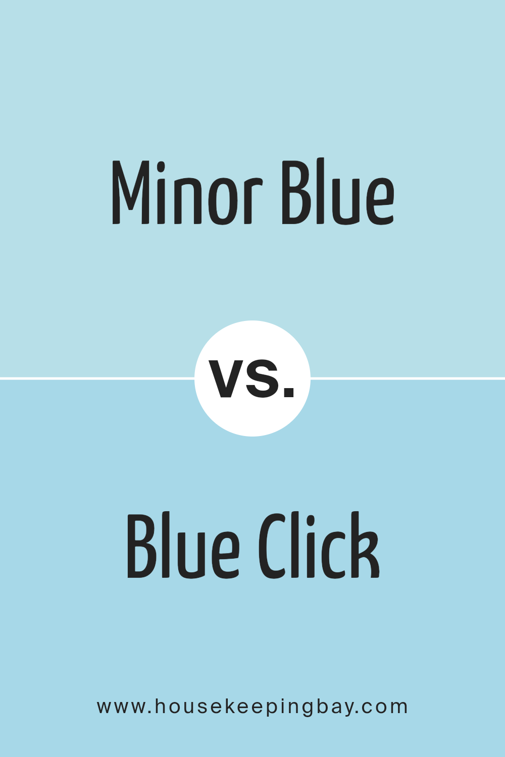
Minor Blue SW 6792 by Sherwin Williams vs Blue Click SW 6952 by Sherwin Williams
Minor Blue SW 6792 and Blue Click SW 6952, both by Sherwin Williams, bring unique vibes. Minor Blue is a gentle, soft shade with a hint of gray. It feels light and airy, creating a calming atmosphere. This color works well in spaces where you want a subtle touch of blue without overpowering the room. It pairs nicely with neutrals and complements modern and traditional styles alike.
Blue Click SW 6952, by contrast, is more vibrant and bold. This hue is vivid and energetic, perfect for adding a fresh and lively touch to any space. With its brighter tone, Blue Click can make a statement or serve as an accent in a room needing a splash of color. It pairs well with whites and creams, highlighting its rich blue tone.
Both colors have their place, with Minor Blue offering serenity and Blue Click bringing dynamic energy.
You can see recommended paint color below:
- SW 6952 Blue Click
housekeepingbay.com
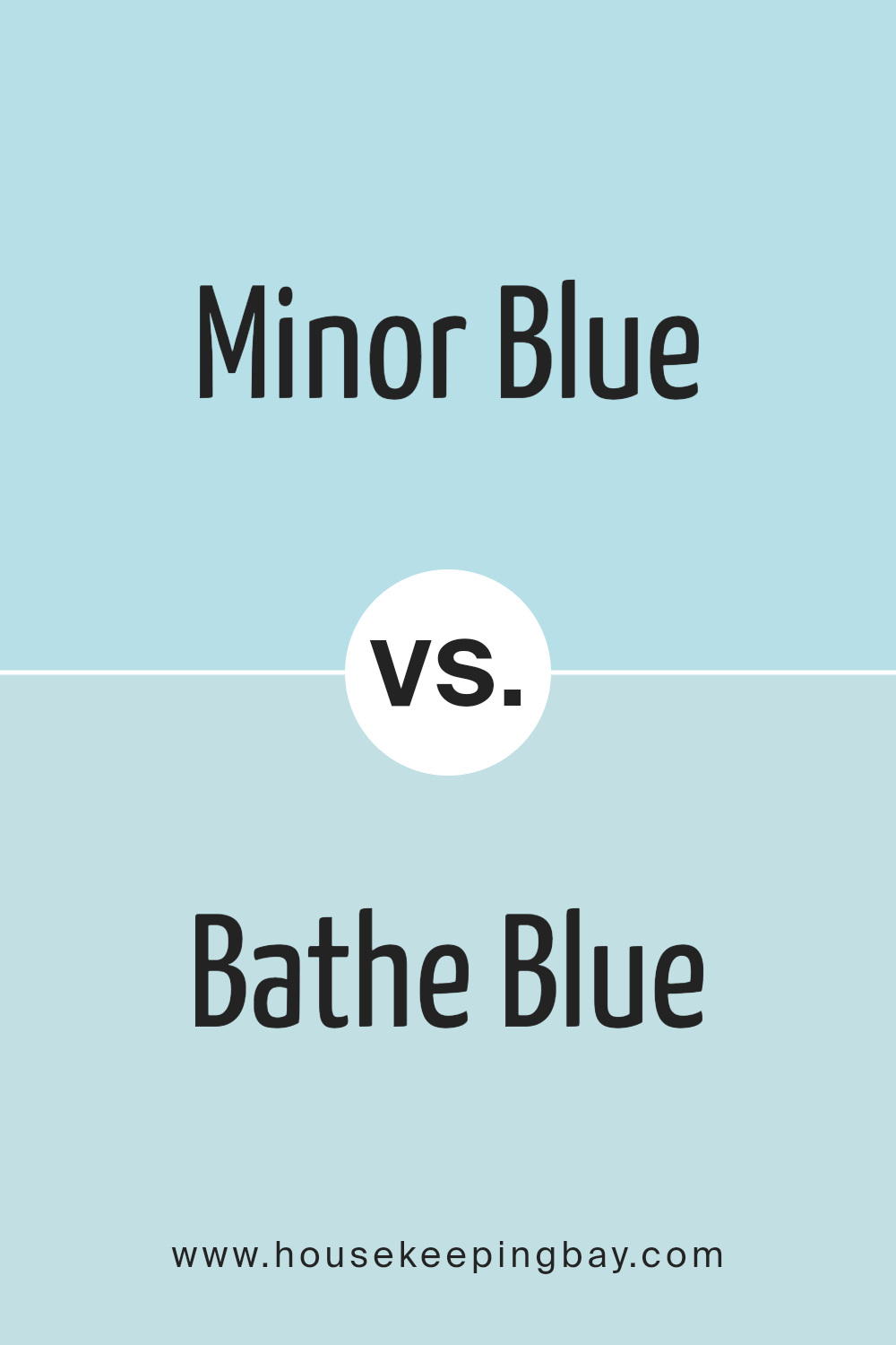
Minor Blue SW 6792 by Sherwin Williams vs Bathe Blue SW 6771 by Sherwin Williams
Minor Blue SW 6792 and Bathe Blue SW 6771 by Sherwin Williams are both beautiful blues, but they have distinct qualities. Minor Blue leans towards a softer, muted tone. It has a calming presence, perfect for creating a peaceful environment. Its subtle hue makes it versatile, blending well with neutrals and pastels. It’s ideal for spaces where you wish to maintain a tranquil atmosphere without overwhelming brightness.
Bathe Blue SW 6771, however, presents a more vivid and vibrant shade. It brings energy and freshness to a room. This lively blue can make a space feel open and airy, much like a clear sky or refreshing waters. It pairs excellently with whites and other vibrant colors, offering a brighter and more cheerful ambiance.
Both colors offer different moods, with Minor Blue being more subdued and Bathe Blue providing a lively and invigorating feel. They suit different preferences and spaces.
You can see recommended paint color below:
- SW 6771 Bathe Blue
housekeepingbay.com
Minor Blue SW 6792 by Sherwin Williams vs Quench Blue SW 6785 by Sherwin Williams
Minor Blue SW 6792 and Quench Blue SW 6785 by Sherwin Williams offer distinct shades within the blue spectrum. Minor Blue presents as a soft, light blue with gentle undertones. Its subdued hue delivers a calming, peaceful vibe, ideal for creating an airy, open feel in spaces such as bedrooms or bathrooms. It pairs well with neutrals like white or light gray to maintain a clean, crisp ambiance.
Quench Blue contrasts with its vibrant, energetic shade. It’s bright and lively, capturing more intensity and making a stronger statement. This shade stands out in social areas like living rooms or kitchens, where a feeling of energy and freshness is desired. It complements bolder accents such as yellows or oranges, creating a dynamic, engaging look.
While both colors belong to the blue family, Minor Blue leans towards serenity and subtlety, whereas Quench Blue brings boldness and vitality to interior design projects.
You can see recommended paint color below:
- SW 6785 Quench Blue
housekeepingbay.com
Minor Blue SW 6792 by Sherwin Williams vs Blue Bauble SW 6948 by Sherwin Williams
Minor Blue SW 6792 and Blue Bauble SW 6948, both from Sherwin Williams, offer different vibes. Minor Blue SW 6792 has a soft and muted tone. It’s a gentle shade, bringing a sense of calmness and simplicity to spaces. This color suits interiors where a quiet and understated style is desired.
Blue Bauble SW 6948, meanwhile, is bolder and more vibrant. It pops with energy, making it perfect for areas that need a lively touch. Its bright blue shade can invigorate a room, adding a sense of cheerfulness and fun.
While Minor Blue leans towards subtlety and soothing vibes, Blue Bauble is all about brightness and making a statement. Choosing between them depends on the mood or atmosphere you’re looking to create. If peacefulness is key, Minor Blue works well. For those seeking a lively and energetic feel, Blue Bauble is the way to go.
You can see recommended paint color below:
- SW 6948 Blue Bauble
housekeepingbay.com
Minor Blue SW 6792 by Sherwin Williams vs Aviary Blue SW 6778 by Sherwin Williams
Minor Blue SW 6792 and Aviary Blue SW 6778, both from Sherwin Williams, offer subtle differences for your space. Minor Blue SW 6792 presents as a soft, muted blue with a hint of green undertones. It provides a light, airy feel, making a room appear open and calm. Its understated quality suits spaces seeking a touch of color without overwhelming the senses.
In contrast, Aviary Blue SW 6778 is a brighter, more vibrant blue. It leans towards a true blue tone, creating a lively and fresh atmosphere. This color works well in spaces needing energy and brightness.
When considering both colors, Minor Blue brings a serene, gentle vibe suitable for relaxation areas such as bedrooms or living rooms. Aviary Blue, with its crisp and lively nature, fits well in active spaces like kitchens or bathrooms. Both colors offer unique charm, allowing you to tailor the mood of your space according to your preference.
You can see recommended paint color below:
- SW 6778 Aviary Blue
housekeepingbay.com
Conclusion
This gentle shade offers a touch of serenity to any space, evoking the calmness of a clear sky. It works beautifully as a backdrop, allowing other elements in a room to shine. Whether used in a living room, bedroom, or even a bathroom, it brings a sense of peace and harmony without overwhelming the senses.
I appreciate how versatile Minor Blue can be. Its understated tone pairs well with both warm and cool colors, making it an excellent choice for different styles and preferences. It complements natural materials like wood and stone, bringing a sense of cohesion to any design project.
In my view, Minor Blue is about creating a cozy, inviting atmosphere. It doesn’t scream for attention but rather whispers comfort. It’s a choice worth considering for anyone seeking to add a touch of softness and elegance to their home. With Minor Blue, the walls become a gentle canvas, inviting rest and relaxation.
This color proves that sometimes the most subtle choices lead to the most profound effects on our environment and mood.
housekeepingbay.com
Ever wished paint sampling was as easy as sticking a sticker? Guess what? Now it is! Discover Samplize's unique Peel & Stick samples. Get started now and say goodbye to the old messy way!
Get paint samples


