Jay Blue SW 6797 by Sherwin Williams
The Power of a Bold Blue Hue
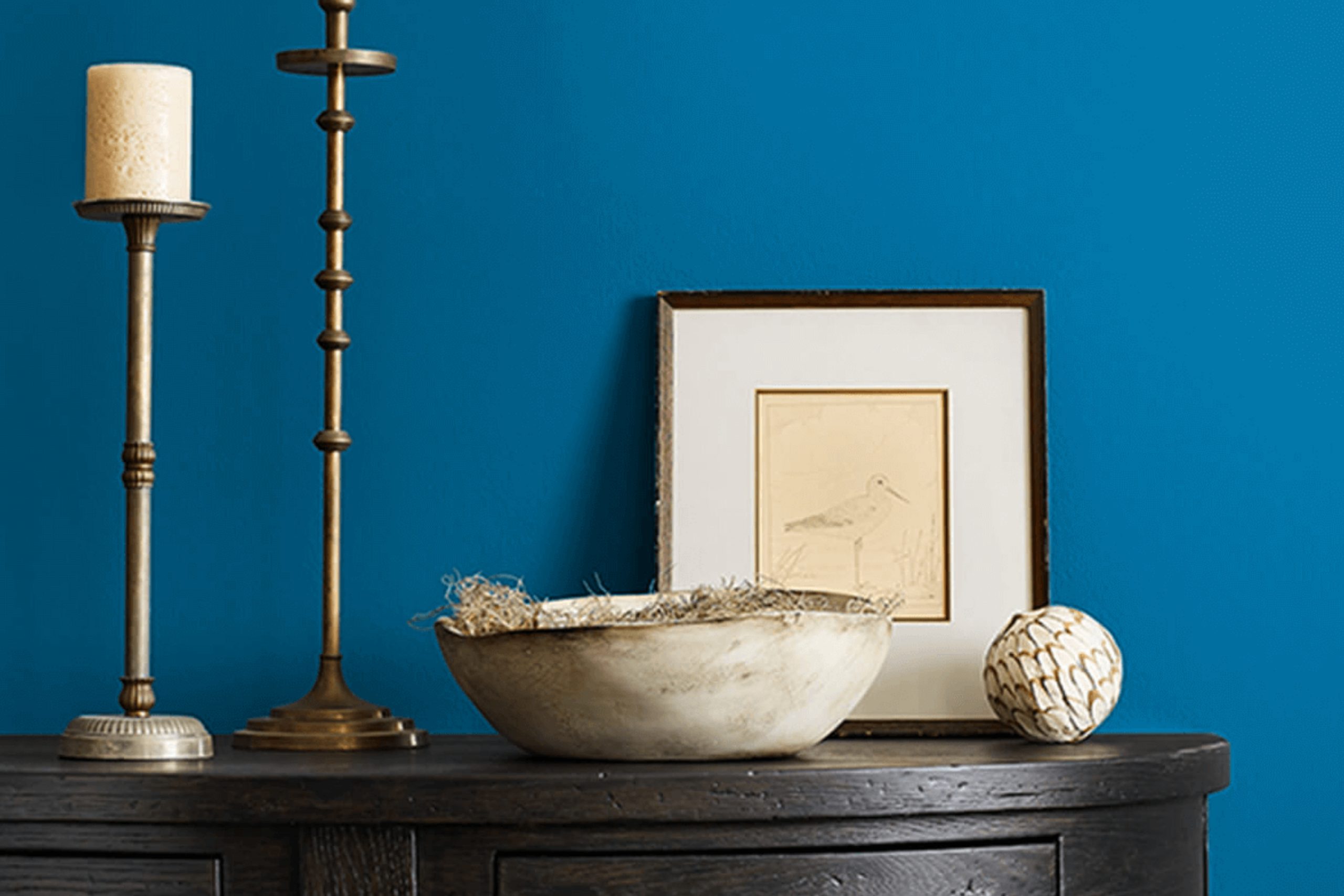
If you’re intrigued by the idea of refreshing your space with a new paint color, SW 6797 Jay Blue by Sherwin Williams deserves your attention. This shade of blue has a lively personality that brings a playful yet serene energy to any room. It works beautifully whether you’re updating a bedroom to be more relaxing or adding a splash of color to your kitchen.
Jay Blue offers a perfect balance—it’s bright enough to make a space feel vibrant and welcoming but not so bold as to overwhelm your senses. This hue pairs effortlessly with various decor styles, from modern minimalist to rustic farmhouse.
It particularly shines when used to accent walls or furniture, providing a lovely contrast against neutral shades like whites and grays.
You will also find Jay Blue incredibly forgiving when it comes to lighting. Whether your room is bathed in natural sunlight or relies on softer, artificial lighting, this color maintains its charming appeal throughout the day.
So, if you’re ready to refresh your home with a touch of playful elegance, Jay Blue is a great choice to consider.
via sherwin-williams.comblue
What Color Is Jay Blue SW 6797 by Sherwin Williams?
Jay Blue SW 6797 by Sherwin Williams is a vibrant, lively shade that brings a refreshing splash of color to any space. This rich blue has a playful yet sophisticated vibe, making it an excellent choice for those looking to add a bit of personality and zest to their interiors. The color is reminiscent of a clear sky on a sunny day, providing a clean and inviting atmosphere.
Jay Blue works well in a variety of interior styles, particularly modern, contemporary, and coastal designs. In modern settings, it pairs beautifully with minimalist furniture and metallic accents like chrome or silver, which help to enhance its crispness.
For a coastal look, combine Jay Blue with sandy beiges, soft whites, and natural textures such as linen or jute to create a relaxed, beachy feel.
Materials that pair well with Jay Blue include lighter woods like oak or birch, which balance the depth of the blue with their natural, soft tones.
Glossy finishes and sleek materials, such as glass or polished stone, also complement this shade effectively by reflecting light and adding to the overall freshness of the environment.
In summary, Jay Blue SW 6797 is a versatile, cheerful blue that is perfect for creating a fresh, dynamic ambiance in your home.
It plays well with a variety of styles and materials, making it a fantastic choice for anyone looking to introduce a burst of color into their decor.
housekeepingbay.com
Is Jay Blue SW 6797 by Sherwin Williams Warm or Cool color?
Jay Blue SW 6797 by Sherwin Williams is a bold and vibrant shade of blue that brings a fresh and lively feel to any space. This color is perfect for adding a pop of energy to rooms that might otherwise seem dull or too neutral. Because of its bright nature, Jay Blue works well in spaces like playrooms or creative studios where excitement and inspiration are key.
In smaller rooms, using Jay Blue on a feature wall can make the area appear more spacious and open. It contrasts beautifully with light colors like white or gray, which helps to balance its intensity. For a modern look, pair it with sleek furniture and metal accents.
In terms of mood, Jay Blue can inject a sense of happiness and vigor into a home. It’s an ideal choice for homeowners looking to create a lively, cheerful atmosphere without overwhelming the senses. Though it’s energetic, it can also be soothing if used in the right amount and paired with the right decor.
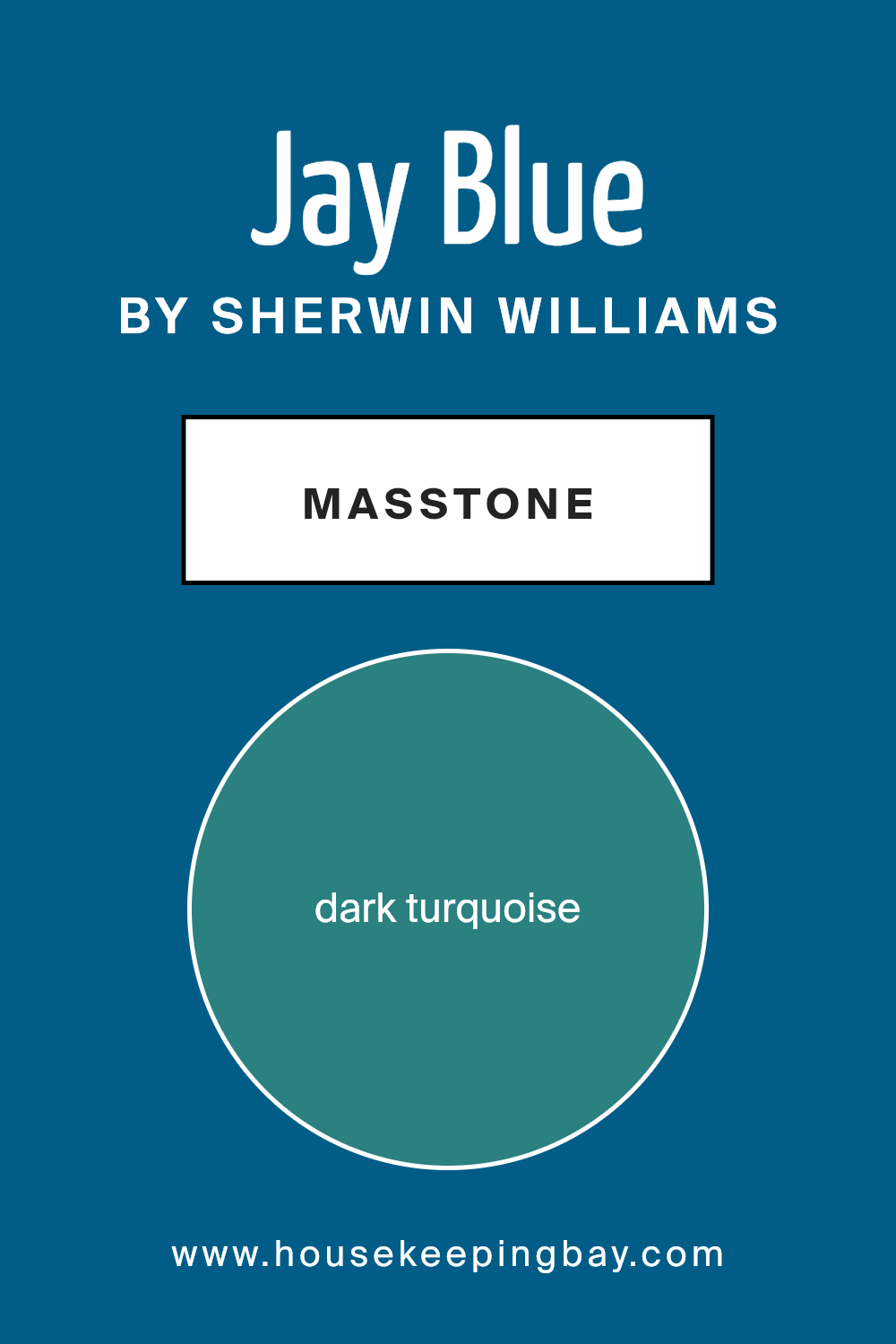
What is the Masstone of the Jay Blue SW 6797 by Sherwin Williams?
Jay Blue SW 6797 by Sherwin Williams has a masstone of dark turquoise (#2B8080), presenting as a rich, deep blend of blue and green. This color adds a calming yet striking aesthetic to any room it graces. When used in homes, the robust depth of Jay Blue can make spaces feel cozy and inviting.
Its dark turquoise shade works well with both natural light and artificial lighting, adapting beautifully to different times of the day.
In spacious areas, Jay Blue can be applied to create a focal point, especially when used on a feature wall or through accent pieces. In smaller rooms, it’s wise to use this color judiciously, as its bold nature might overwhelm the space if used excessively. However, when balanced with lighter tones and materials, Jay Blue can enhance the sense of space without dominating it.
Overall, Jay Blue SW 6797 offers a versatile option for homeowners looking to introduce a touch of sophistication and natural vibrancy to their living environments.
housekeepingbay.com
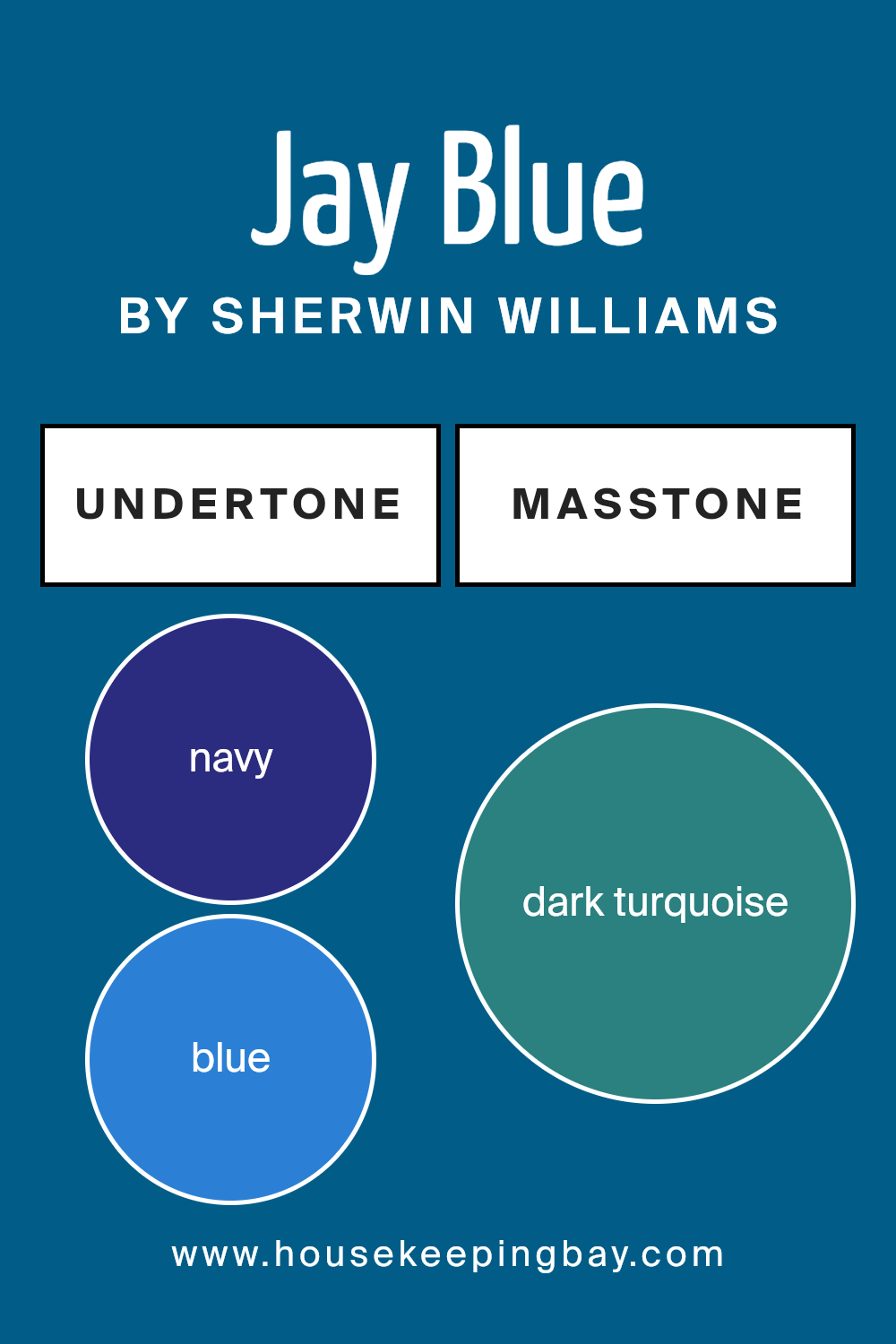
Undertones of Jay Blue SW 6797 by Sherwin Williams
Jay Blue SW 6797 by Sherwin Williams is a versatile color that incorporates a spectrum of undertones, making it an interesting choice for interior walls. The primary tone of Jay Blue is a rich, vibrant shade that leans towards navy, but it’s the undertones that add depth and complexity to its appearance.
When you look at Jay Blue, you might initially notice its strong navy base, but as you observe it under different lighting conditions or from various angles, other colors start to emerge subtly. These include shades of blue and dark blue, which maintain the coolness of the paint.
Dark green and dark grey undertones add a grounded, almost earthy feel, which can make a room feel more secure and enclosed.
Lighter tones such as light turquoise, grey, and lilac provide a slight lift to the overall darkness of Jay Blue, introducing a hint of freshness and airiness. This can make a room painted in Jay Blue feel less overwhelming and more balanced.
Moreover, the hints of unusual colors like olive, brown, and mint contribute to the uniqueness of the color, depending on the lighting and surrounding colors.
In an interior setting, Jay Blue SW 6797’s complex undertones can influence the mood and feel of a space. The darker undertones can make a large, brightly lit room feel more intimate, while the lighter tones can help brighten a smaller or less-lit space.
Thus, choosing this color for walls can help in achieving a desired atmosphere in your room, aligning with your decor to either complement or provide a striking contrast. This adaptability makes Jay Blue a practical choice for various interior design styles.
housekeepingbay.com
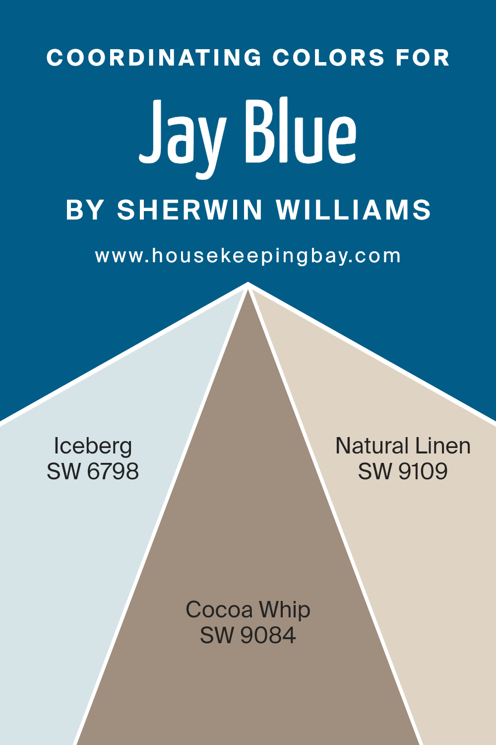
Coordinating Colors of Jay Blue SW 6797 by Sherwin Williams
Coordinating colors are chosen to complement a main color, enhancing the aesthetic appeal of an interior space. For Jay Blue SW 6797 by Sherwin Williams, the coordinating colors include Iceberg SW 6798, Cocoa Whip SW 9084, and Natural Linen SW 9109.
These colors have been specifically selected to harmonize with Jay Blue, creating a balanced and inviting color scheme. Coordinating colors work by matching undertones or by contrasting them to bring out the best in the dominant hue, making the color palette more dynamic and pleasing to the eye.
Iceberg SW 6798 is a light, refreshing blue that resembles a clear, glacial blue sky, adding a breath of fresh air to any room. It pairs seamlessly with the deeper tones of Jay Blue for a soothing, ocean-inspired vibe. Cocoa Whip SW 9084 offers a warm, neutral beige that provides a soft, earthy contrast to the coolness of Jay Blue, ideal for creating a space that feels cozy and grounded.
Natural Linen SW 9109 is a gentle, muted beige with warm undertones that gives a subtle, sophisticated complement to the vibrant Jay Blue, ideal for achieving a relaxed, welcoming atmosphere. Together, these colors create a versatile palette that fits various decorative styles and preferences.
You can see recommended paint colors below:
- SW 6798 Iceberg
- SW 9084 Cocoa Whip
- SW 9109 Natural Linen
housekeepingbay.com
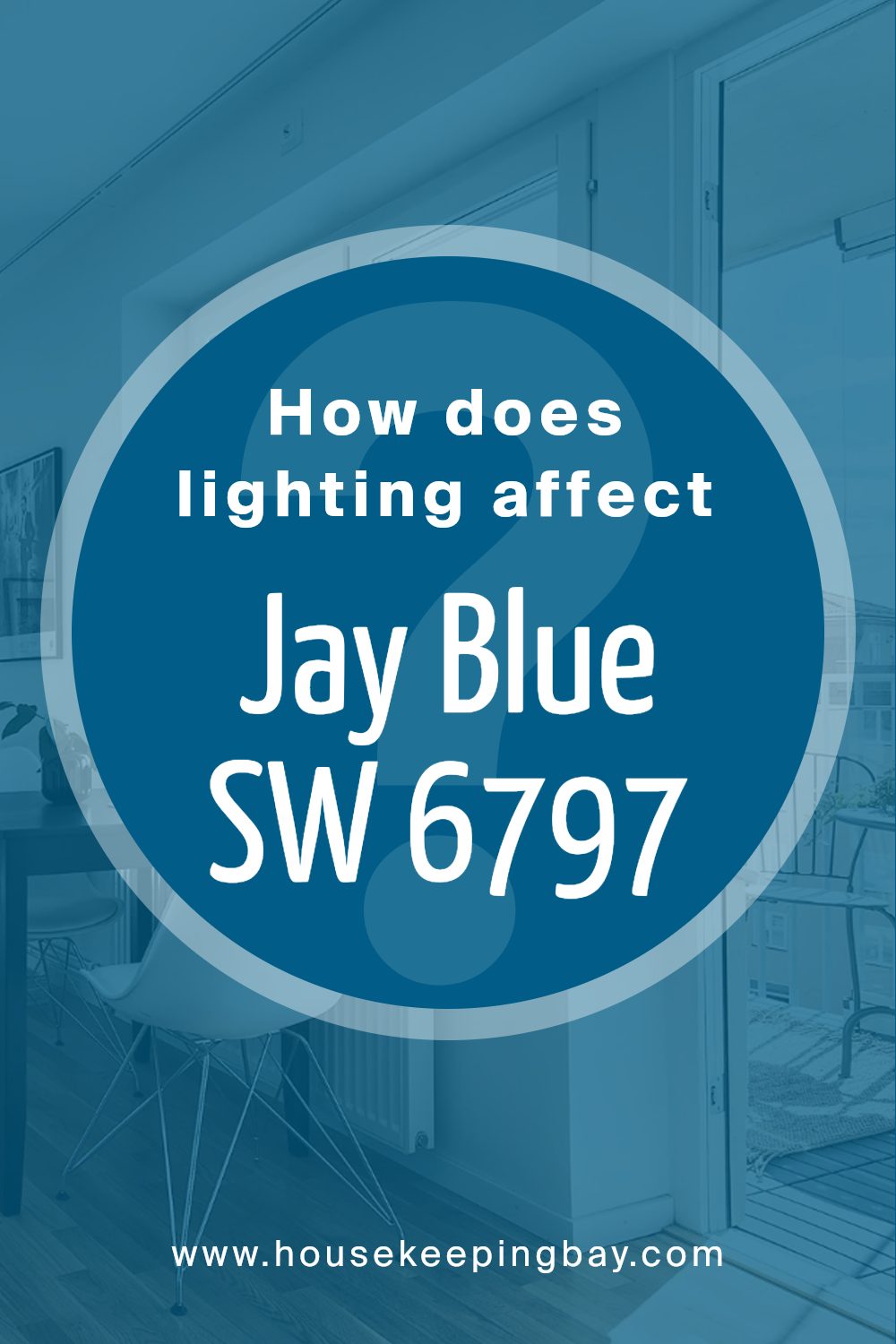
How Does Lighting Affect Jay Blue SW 6797 by Sherwin Williams?
Lighting significantly influences how colors appear in different environments. The appearance of any color can change depending on whether it’s viewed under natural or artificial light. This effect is crucial to consider when choosing paint colors for a room or designing a space.
For example, the color Jay Blue SW 6797 by Sherwin Williams can look different under various lighting conditions. In artificial light, such as that provided by LED or incandescent bulbs, Jay Blue might appear more intense and vibrant. Artificial lighting tends to enhance the richness of the color, making it seem bolder and more pronounced.
In contrast, under natural sunlight, Jay Blue will likely appear somewhat softer and more muted.
Natural light, especially in the morning and afternoon, can make this blue shade seem more subtle and less saturated. The time of day and weather conditions can also affect its appearance, with overcast skies making it appear cooler and dimmer.
Room orientation also plays a crucial role in how Jay Blue looks:
1. North-Faced Rooms:North-facing rooms receive less direct sunlight, which tends to give colors a cooler tone. Jay Blue in a north-facing room might appear slightly more shadowed and subdued, leaning towards a cooler, more subtle hue.
2. South-Faced Rooms: Rooms that face south benefit from abundant sunlight most of the day, which makes colors look brighter and more vibrant. In a south-facing room, Jay Blue would look lively and brilliant, showcasing its true depth under enhanced natural light.
3. East-Faced Rooms:These rooms get plenty of light in the morning, which can make Jay Blue look very cheerful and bright early in the day. However, as the light fades, the color might seem cooler and more relaxed.
4. West-Faced Rooms:West-facing rooms receive intense evening light, which could make Jay Blue appear warmer and more dynamic towards the end of the day, shifting to a more tranquil tone as the sunlight diminishes.
Understanding these nuances helps in making informed decisions about using colors like Jay Blue SW 6797 for interior spaces to achieve desired moods and effects.
housekeepingbay.com
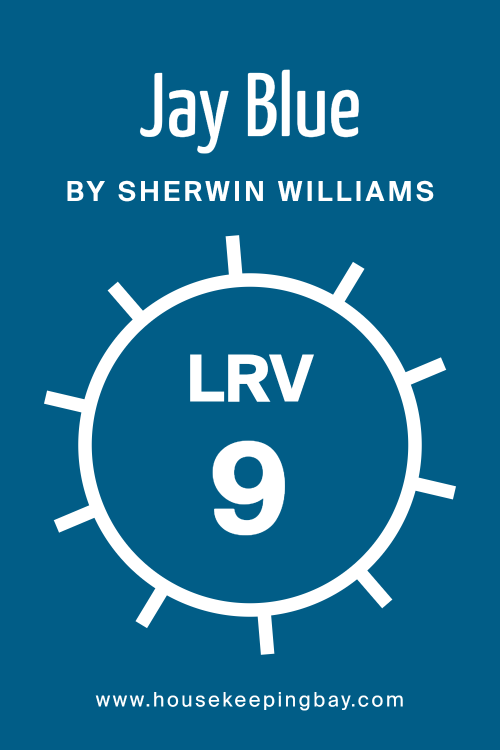
What is the LRV of Jay Blue SW 6797 by Sherwin Williams?
LRV, or Light Reflectance Value, measures the percentage of light a paint color reflects from or absorbs into a surface. It’s scaled from 0 to 100, where 0 is pure black and 100 is pure white. This value is crucial when choosing paint colors because it affects how light or dark the color appears on your walls.
A higher LRV means the color will look lighter and can make a space feel more open and airy. Conversely, a lower LRV means the color will look darker and can make a room feel cozier or smaller.
The color Jay Blue SW 6797 from Sherwin Williams has an LRV of 9.19, placing it on the darker end of the scale. This low LRV indicates that Jay Blue will absorb much of the light, rather than reflecting it. This characteristic makes it a bold choice for any room, potentially making the space feel more intimate or dramatic.
In rooms with less natural light, this color might appear even darker, whereas, in well-lit areas, the true depth of Jay Blue can be appreciated more fully. Keep this in mind if considering this shade for spaces like a small bathroom or a north-facing room.
housekeepingbay.com
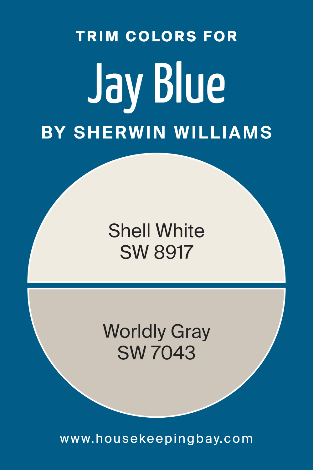
What are the Trim colors of Jay Blue SW 6797 by Sherwin Williams?
Trim colors are those used for details in architecture such as door frames, moldings, and shutters, complementing the primary colors on walls or exteriors. For Jay Blue SW 6797 by Sherwin Williams, picking the right trim colors is crucial because it enhances the overall appearance and can significantly influence how the primary color is perceived.
SW 8917 Shell White and SW 7043 Worldly Gray are exceptional choices for trims when paired with Jay Blue. Shell White, as a trim color, provides a crisp and clean border that highlights the vibrant blue, making it appear more vivid and distinct.
Meanwhile, Worldly Gray offers a subtle contrast, softening the intensity of Jay Blue with its serene and refined gray tone, which can harmonize the transitions between the colors.
Shell White is a soft and light hue that adds a fresh and airy feel to any space, making it an ideal companion to brighter or darker colors by providing a restful break in the visual flow. This color can lighten up darker shades or serve as a subtle highlight alongside lighter tones.
On the other hand, Worldly Gray is a sophisticated gray with warm undertones, providing a neutral backdrop that complements both cool and warm palettes. It offers a timeless elegance that works beautifully to balance more intense hues, ensuring the color scheme remains cohesive yet varied.
You can see recommended paint colors below:
housekeepingbay.com
Colors Similar to Jay Blue SW 6797 by Sherwin Williams
In interior design, the importance of choosing similar colors, such as those close to Jay Blue SW 6797 by Sherwin Williams, can’t be overstated. Similar colors help create a seamless look that enhances cohesion and balance in a space.
Using colors like Blue Grotto SW 2941, which has a lively vibe, or Dignity Blue SW 6804 with its serene presence, allows for subtle shifts in mood without sacrificing harmony. Adriatic Sea SW 6790 adds a touch of depth with its slightly more intense tone, while Georgian Bay SW 6509 offers a grounded, robust hue.
These shades work well together because they share a common blue base, yet each introduces a unique character that can define different parts of a room or link elements with varied aesthetic features.
Other colors such as Blueblood SW 6966 provide a rich, almost regal quality, or Hyper Blue SW 6965 which brings a bright, energetic feel, also complement Jay Blue nicely. Endless Sea SW 9150 is mysterious and deep, perfect for creating focal points or accent walls.
Regatta SW 6517 mirrors the vibrant character of lively waters, and Azure Tide SW 9684 gives a refreshing lift to any area.
Finally, Pulsating Blue SW 6964 offers a striking intensity that can bring vitality to spaces that need a dramatic touch. Using these similar colors creates a nuanced palette that enriches the decor while maintaining a fluid visual flow throughout the environment.
You can see recommended paint colors below:
- SW 2941 Blue Grotto
- SW 6804 Dignity Blue
- SW 6790 Adriatic Sea
- SW 6509 Georgian Bay
- SW 6966 Blueblood
- SW 6965 Hyper Blue
- SW 9150 Endless Sea
- SW 6517 Regatta
- SW 9684 Azure Tide
- SW 6964 Pulsating Blue

housekeepingbay.com
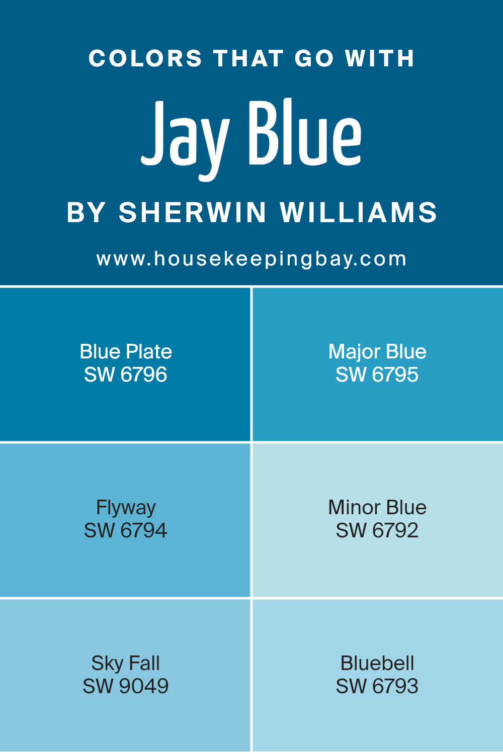
Colors that Go With Jay Blue SW 6797 by Sherwin Williams
When decorating with Jay Blue SW 6797 by Sherwin Williams, choosing the right complementary colors is key to achieving a cohesive and appealing look. The colors that pair well with Jay Blue, such as Blue Plate, Major Blue, Flyway, Minor Blue, Sky Fall, and Bluebell, provide a versatile palette that allows you to create a balanced and harmonious space. Each of these colors brings its own unique qualities while maintaining a fluid continuity that works seamlessly with Jay Blue.
Blue Plate SW 6796 is a darker, more intense shade than Jay Blue, adding depth and contrast. Major Blue SW 6795 is slightly lighter and brings a refreshing splash of brightness to the mix, giving a room a more airy feel.
Flyway SW 6794 offers a soft, muted blue that is subtle and soothing, great for a relaxed atmosphere. Minor Blue SW 6792 is a playful and gentle light blue that injects a sense of calm and lightness. Sky Fall SW 9049 adds a touch of sophistication with its gray undertones, making it perfect for elegant spaces.
Lastly, Bluebell SW 6793 features a vibrant yet soft blue that is joyful and inviting. By integrating these colors with Jay Blue, you ensure your space feels inviting and lively while still maintaining a sense of serenity.
You can see recommended paint colors below:
- SW 6796 Blue Plate
- SW 6795 Major Blue
- SW 6794 Flyway
- SW 6792 Minor Blue
- SW 9049 Sky Fall
- SW 6793 Bluebell
housekeepingbay.com
How to Use Jay Blue SW 6797 by Sherwin Williams In Your Home?
Jay Blue SW 6797 by Sherwin Williams is a vibrant and cheerful shade of blue that brings a lively touch to any room. This color is perfect for adding a splash of brightness while maintaining a cozy atmosphere in your home. It works well for accent walls in living rooms or bedrooms, creating a focal point without overpowering the space.
In smaller rooms like bathrooms or laundry rooms, using Jay Blue can make the space appear bigger and more open.
This shade pairs beautifully with neutral colors like white or gray, which helps to balance the brightness of the blue and adds a crisp, clean look. For those interested in adding color to their kitchen, Jay Blue can be used on cabinets or an island to bring a fresh, modern feel to the area.
Jay Blue is also a great choice for furniture pieces. Painting a bookshelf or a chair in this blue can add a fun, personalized touch to your home.
Whether you’re looking to refresh a single piece of furniture or repaint an entire room, Jay Blue is versatile and appealing for many different uses around the house.
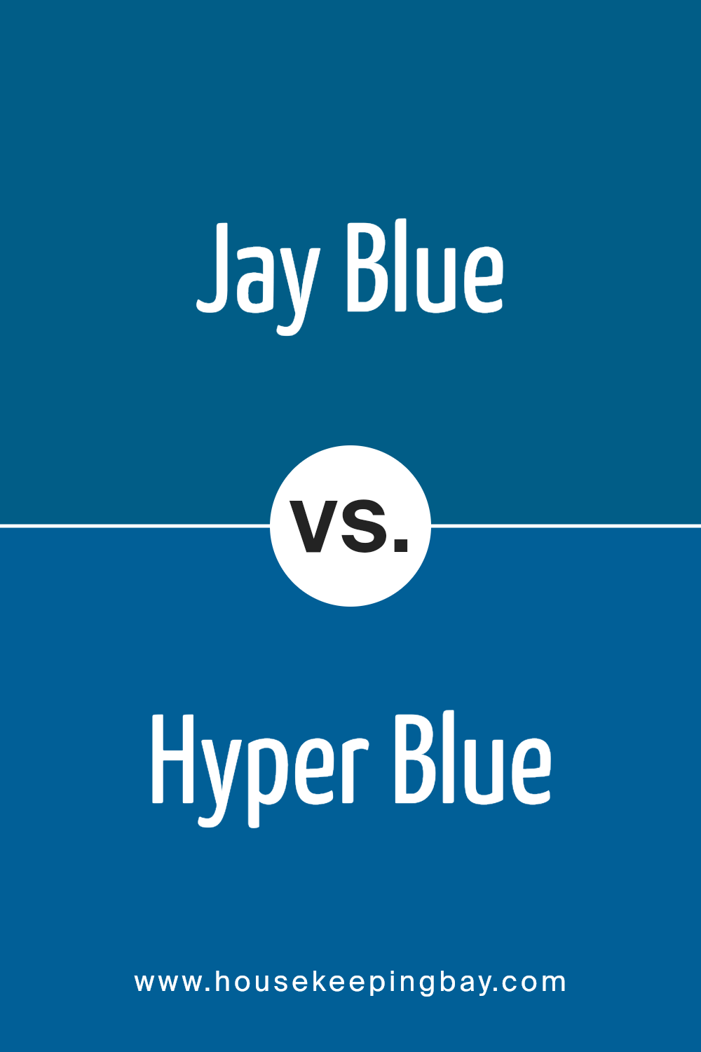
Jay Blue SW 6797 by Sherwin Williams vs Hyper Blue SW 6965 by Sherwin Williams
Jay Blue SW 6797 by Sherwin Williams is a soft, muted tone that leans more towards a calming aqua or teal. It’s a versatile hue that suits spaces meant for relaxation or subtle sophistication. On the contrary, Hyper Blue SW 6965 offers a much more vibrant appeal, characterized by its bright, energetic tone of royal blue that likely brings a dynamic punch to any room.
Jay Blue is lighter and can make small rooms appear larger and more airy, making it great for bedrooms or bathrooms. Hyper Blue, due to its boldness, can be ideal for an accent wall or as part of a color scheme in a creative or youthful space where you want to add a sense of fun or vibrancy.
Each serves different aesthetic purposes; Jay Blue offers gentle serenity while Hyper Blue introduces lively character.
You can see recommended paint color below:
- SW 6965 Hyper Blue
housekeepingbay.com
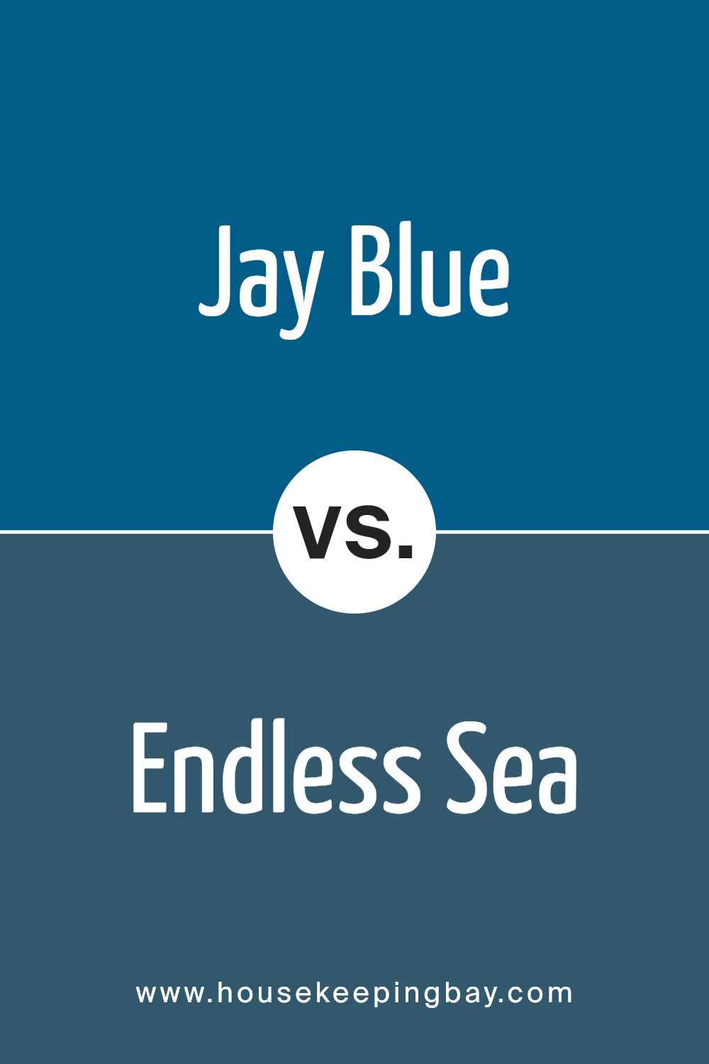
Jay Blue SW 6797 by Sherwin Williams vs Endless Sea SW 9150 by Sherwin Williams
Jay Blue SW 6797 by Sherwin Williams is a vibrant and energetic shade that resembles the clear sky on a bright, sunny day. It has a lively and cheerful hue that can instantly brighten up a space. This color is perfect for creating a playful and inviting atmosphere in any room.
Contrastingly, Endless Sea SW 9150 by Sherwin Williams is a much deeper and richer blue. This color mimics the mysterious and deep waters of the ocean. Its intensity and depth can bring a sense of sophistication and seriousness to a space.
Endless Sea is well-suited for areas that require a more formal or contemplative mood.
While both colors share a basic blue tone, Jay Blue offers brilliance and lightness, suggesting openness and airiness. In contrast, Endless Sea provides depth and intensity, conducive to focused and thoughtful environments. Each color serves different aesthetic purposes and sets distinct moods in interior spaces.
You can see recommended paint color below:
- SW 9150 Endless Sea
housekeepingbay.com
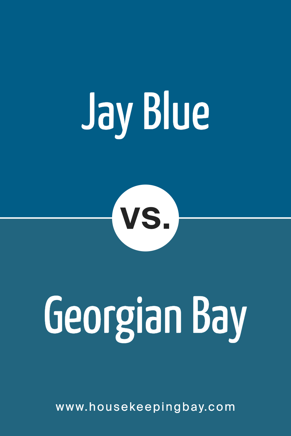
Jay Blue SW 6797 by Sherwin Williams vs Georgian Bay SW 6509 by Sherwin Williams
Jay Blue SW 6797 by Sherwin Williams is a vibrant and cheerful blue. This shade radiates a playful and bright ambiance, making it a fantastic choice for spaces intended to energize and uplift. It’s an ideal pick for children’s rooms or creative spaces where a lively atmosphere is desired.
Georgian Bay SW 6509, also by Sherwin Williams, offers a deeper, more muted blue. This color has a more subdued and refined feel, suitable for areas that require a calm and composed vibe.
Georgian Bay works well in bedrooms, bathrooms, or offices, providing a soothing background that promotes focus and relaxation.
While both colors belong to the blue family, Jay Blue is significantly lighter and brighter, infusing spaces with a joyful energy. In contrast, Georgian Bay exudes serenity and sophistication, perfect for creating a peaceful retreat.
Both colors have their unique charm and suitability depending on the mood and function of the room.
You can see recommended paint color below:
- SW 6509 Georgian Bay
housekeepingbay.com
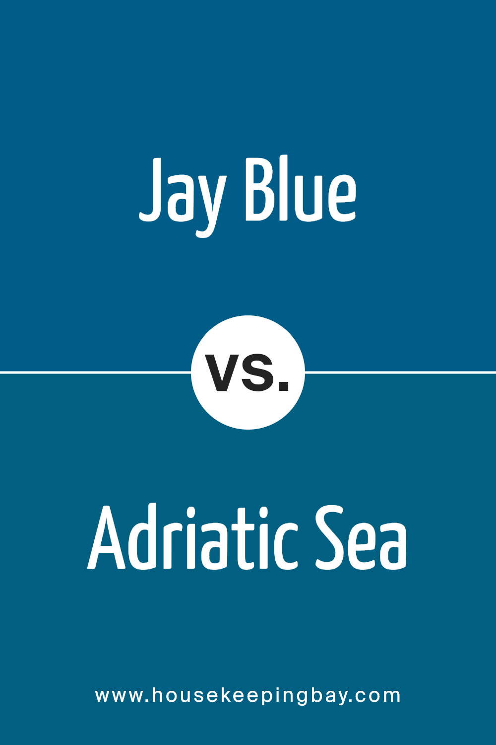
Jay Blue SW 6797 by Sherwin Williams vs Adriatic Sea SW 6790 by Sherwin Williams
Jay Blue SW 6797 and Adriatic Sea SW 6790, both from Sherwin Williams, offer unique shades of blue. Jay Blue is a vibrant, rich blue with a dynamic feel, perfect for adding a lively touch to spaces. It’s particularly suitable for modern decor or accent walls, providing a strong color punch.
In contrast, Adriatic Sea is a deeper blue with a subtle green undertone, giving it a more serene and subdued appearance. This color works well in areas where a calming effect is desired, such as bedrooms or bathrooms.
While Jay Blue stands out boldly, Adriatic Sea offers a softer, more relaxing vibe. Both colors can effectively enhance the aesthetic of a room, but they serve different purposes based on their intensity and undertones.
You can see recommended paint color below:
- SW 6790 Adriatic Sea
housekeepingbay.com
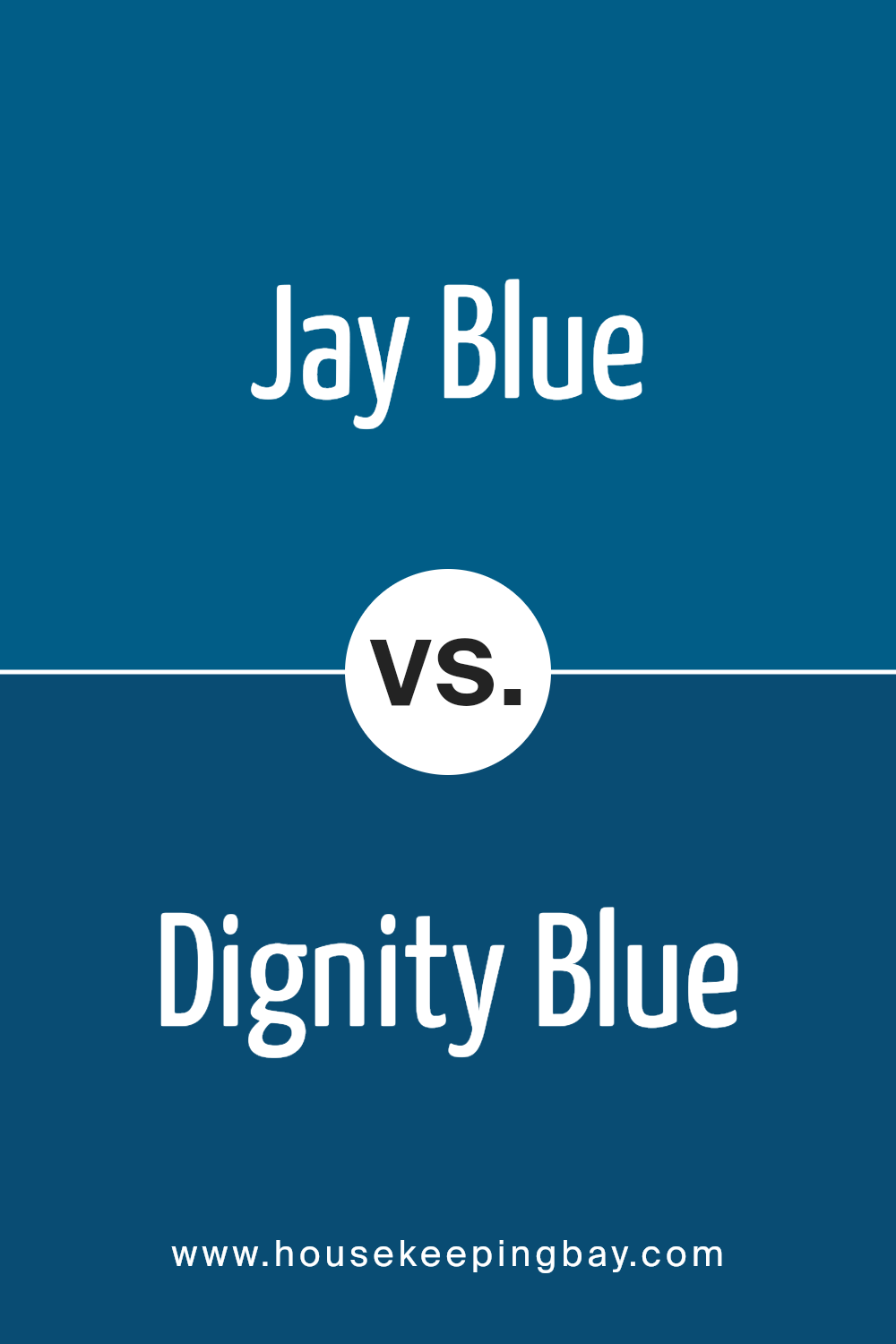
Jay Blue SW 6797 by Sherwin Williams vs Dignity Blue SW 6804 by Sherwin Williams
Jay Blue SW 6797 by Sherwin Williams is a vibrant, cheerful color with strong sky-blue tones that give a refreshing feel to any space. It matches well with lighter, neutral shades and can brighten up a room significantly.
Dignity Blue SW 6804, also by Sherwin Williams, is deeper and more subdued compared to Jay Blue. It leans towards navy, offering a sense of sophistication and seriousness which is ideal for professional or more formal settings. This color works well in spaces meant for focus and reflection.
Both colors, being blues, naturally convey calmness and can help soothe emotions, but their impact is quite different because of their intensity and depth. Jay Blue adds energy and lightness, while Dignity Blue provides a mature backdrop that’s less commanding in its brightness. In home decor, your choice between the two would depend on the mood you wish to convey in your room.
You can see recommended paint color below:
- SW 6804 Dignity Blue
housekeepingbay.com
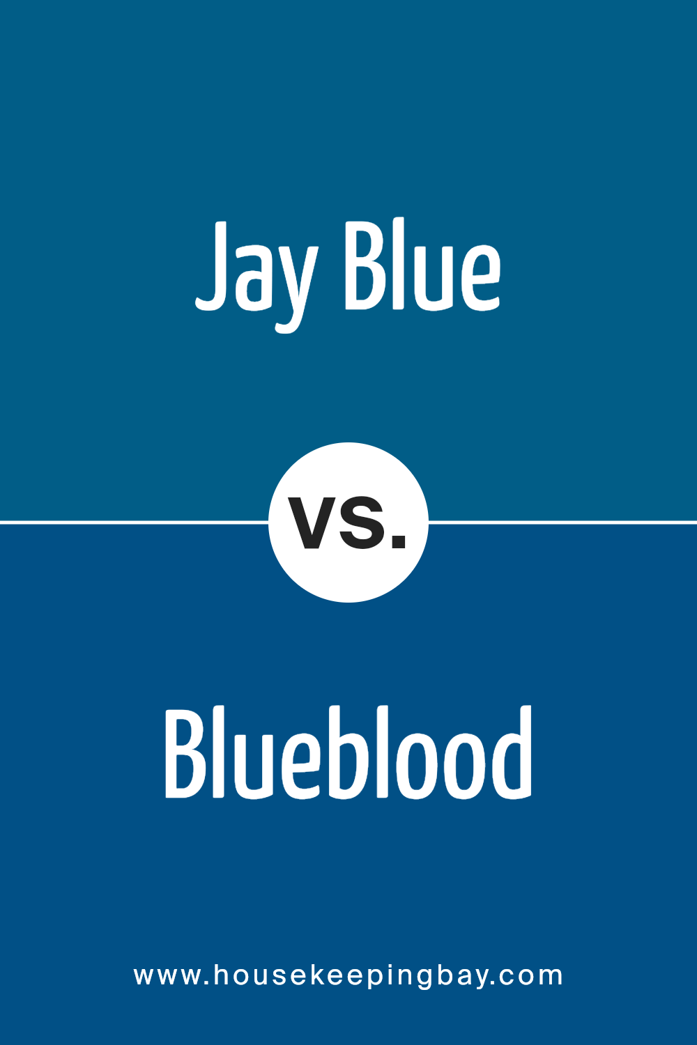
Jay Blue SW 6797 by Sherwin Williams vs Blueblood SW 6966 by Sherwin Williams
Jay Blue SW 6797 by Sherwin Williams is a vibrant, light blue shade that brings a fresh and airy feel to any space. It’s reminiscent of a clear sky on a sunny day, making it perfect for creating a bright and open atmosphere. This color works well in living areas and kitchens where a lively, welcoming mood is desired.
In contrast, Blueblood SW 6966 is a much darker, richer blue. It has a regal quality to it, likely due to its depth and intensity. This shade suits more formal or sophisticated spaces, such as dining rooms or home offices, where a sense of dignity or seriousness is beneficial.
Blueblood can also make small areas feel cozier and more enveloping.
Overall, while both colors are blue, Jay Blue invokes a lighter, cheerful ambiance, whereas Blueblood offers depth and solemnity, suitable for different purposes or room characteristics.
You can see recommended paint color below:
- SW 6966 Blueblood
housekeepingbay.com
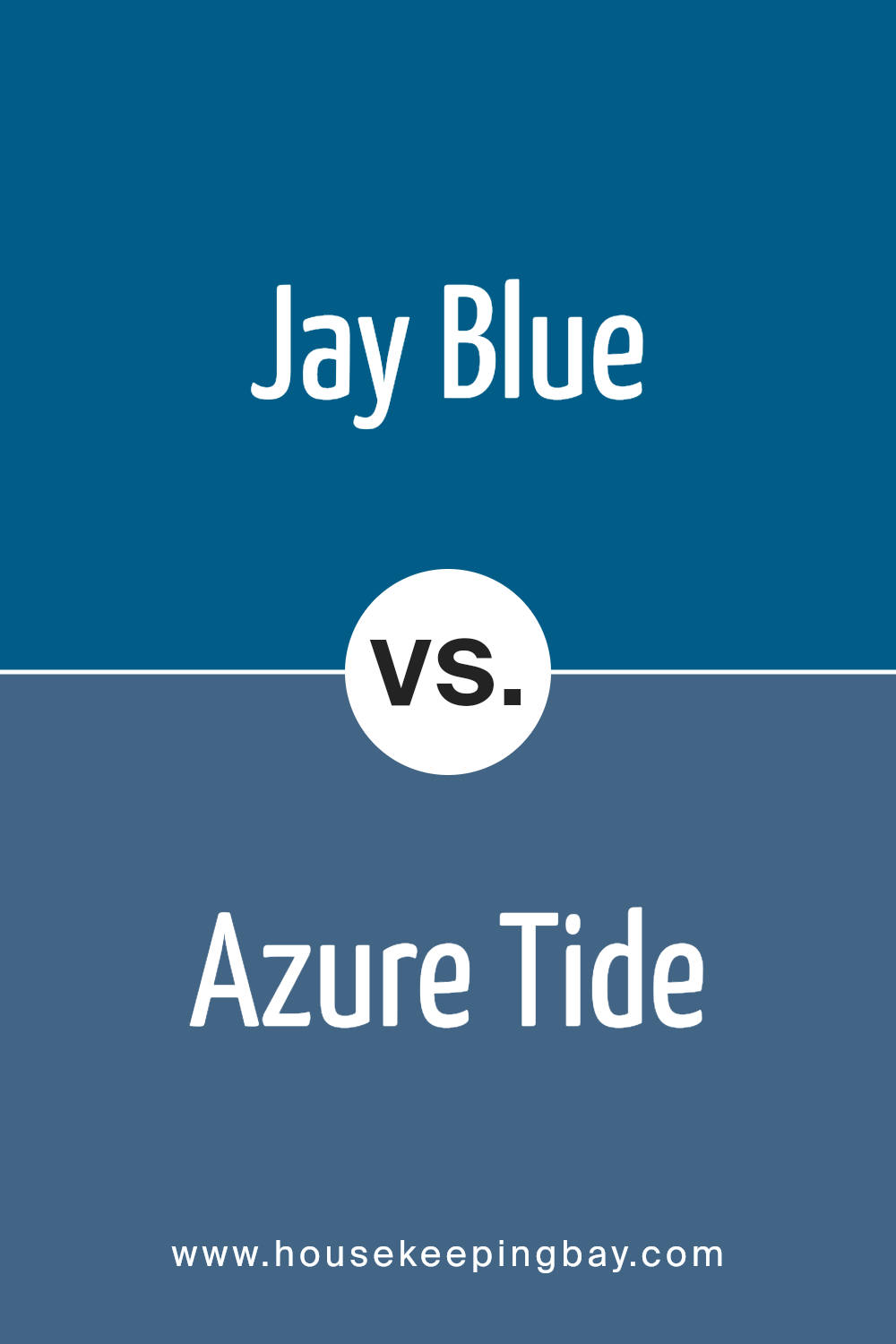
Jay Blue SW 6797 by Sherwin Williams vs Azure Tide SW 9684 by Sherwin Williams
Jay Blue SW 6797 by Sherwin Williams is a vibrant and striking shade of blue. It possesses a certain brightness that brings life and energy to any space. This color would work well in rooms that aim to have a playful yet somewhat sophisticated atmosphere. It’s the type of color that can both soothe and invigorate, depending on the surrounding decor.
Azure Tide SW 9684, in contrast, offers a more muted and subtle blue. It leans towards a darker, more maritime shade, perfect for creating a calm and serene ambience. This color is ideal for spaces where you want to promote relaxation and peace, such as bedrooms or bathrooms.
Both colors share a common blue base, yet their impact is distinctly different due to their brightness and saturation levels.
Jay Blue can create a focal point in a room, while Azure Tide tends to blend more smoothly with its surroundings, providing a backdrop rather than the center of attention.
You can see recommended paint color below:
- SW 9684 Azure Tide
housekeepingbay.com
Jay Blue SW 6797 by Sherwin Williams vs Regatta SW 6517 by Sherwin Williams
Jay Blue SW 6797 by Sherwin Williams is a vibrant, vivid shade of blue that feels fresh and lively. It has a clear, bright tone that can add energy to any space. This color works well in areas like playrooms or creative spaces, where a sense of fun and invigoration is desired. It has a youthful charm and is more assertive due to its brightness.
Regatta SW 6517, also by Sherwin Williams, is a deeper, more subdued shade of blue compared to Jay Blue. It leans slightly towards a teal blue, giving it a more mature and sophisticated appearance. This color is ideal for places where you want a sense of calm and focus, like in a home office or a bedroom. It’s less intense than Jay Blue, providing a more relaxed vibe.
Both colors bring their unique qualities to environments; Jay Blue adds brightness and energy, while Regatta offers a calming and refined atmosphere. They cater to different tastes and uses within interior spaces.
You can see recommended paint color below:
- SW 6517 Regatta
housekeepingbay.com
Jay Blue SW 6797 by Sherwin Williams vs Pulsating Blue SW 6964 by Sherwin Williams
Jay Blue SW 6797 by Sherwin Williams is a bright, lively shade with a hint of green that gives it a refreshing and vibrant feel. This color is great for spaces where you want to add a splash of cheerfulness without overwhelming the senses. It’s perfect for kitchens, bathrooms, or any room that could use a playful touch to brighten up the atmosphere.
Pulsating Blue SW 6964, however, is a deeper, more intense color. With its strong blue tones, it carries a sense of sophistication and seriousness. It makes a bold statement and works well in areas where you want to introduce depth and richness, such as living rooms or dining areas.
Both colors offer unique vibes – Jay Blue adds energy and a sense of fun, while Pulsating Blue provides a more grounded, profound aesthetic. Depending on your room’s purpose and desired mood, either color could enhance your space effectively.
You can see recommended paint color below:
- SW 6964 Pulsating Blue
housekeepingbay.com
Jay Blue SW 6797 by Sherwin Williams vs Blue Grotto SW 2941 by Sherwin Williams
Jay Blue SW 6797 by Sherwin Williams is a lively and bright shade reminiscent of clear skies on a sunny day. It’s vivid and cheerful, lending a fresh and energetic vibe to spaces. This color is ideal for adding a vibrant pop in rooms that need more light and a sense of airiness. It works well in areas such as kitchens or children’s playrooms where a fun and inviting atmosphere is desired.
Blue Grotto SW 2941, also by Sherwin Williams, presents a richer and deeper hue. This color evokes the feeling of the deep sea and has a calming effect, making it suitable for spaces designed for relaxation and reflection.
Perfect for bedrooms or bathrooms, Blue Grotto sets a serene mood and pairs well with both light and dark accents.
Both colors offer distinct moods and aesthetics, Jay Blue energizing a room with its brightness, while Blue Grotto creates a soothing retreat.
You can see recommended paint color below:
- SW 2941 Blue Grotto
housekeepingbay.com
Conclusion
As I wrap up my thoughts on SW 6797 Jay Blue by Sherwin Williams, it’s clear that this shade of blue holds a unique place in the spectrum of colors offered. Ideal for those looking to inject a fresh vibe into their space, Jay Blue provides a vibrant yet soothing presence.
It resonates wonderfully in both modern and traditional settings, proving its versatility.
This color can uplift a room without overwhelming it, making it perfect for bedrooms, living rooms, or even kitchens. If you are thinking about re-painting, Jay Blue is a choice worth considering, especially if you aim to create a calm and inviting environment.
Pair it with light woods and neutral accents for a serene escape or bold colors for a dynamic palette.
Ultimately, Jay Blue by Sherwin Williams not only refreshes the space but also offers a durable finish that stands the test of time, making it a practical and aesthetic investment for any home. Whether used as an accent or a base tone, it consistently delivers quality and style, confirming why it’s a popular choice for various decorating projects.
housekeepingbay.com
Ever wished paint sampling was as easy as sticking a sticker? Guess what? Now it is! Discover Samplize's unique Peel & Stick samples. Get started now and say goodbye to the old messy way!
Get paint samples


