Metropolis SW 9575 by Sherwin Williams
A Modern Take on Classic Cool
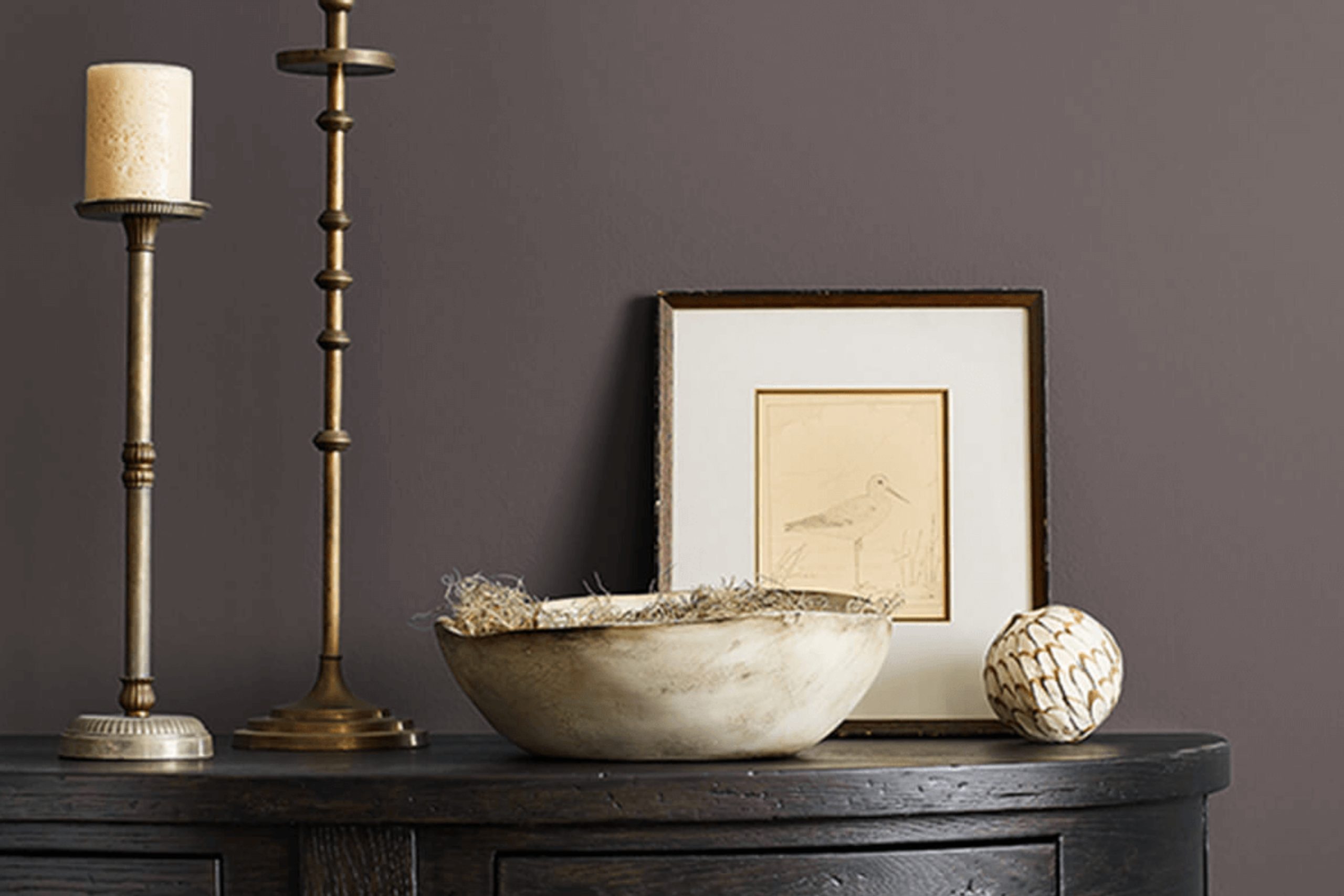
This color is part of their impressive palette and might just be the perfect shade you’re aiming for. Metropolis fits beautifully in various spaces, making it a go-to choice for anyone aiming to refresh their living area, bedroom, or even the kitchen.
When you think about incorporating a new color into your home, it’s key to consider how it interacts with your existing decor and lighting.
SW 9575 Metropolis, with its unique charm, could be the solution you need without overwhelming your spaces. It’s a shade that complements a wide range of furniture and finishes, offering a sophisticated and contemporary look that feels welcoming and warm.
So if you’re ready to give your space a new personality, Metropolis might just be the color to do it. It’s a smart option that adapts to different styles and preferences, whether you lean towards modern minimalism or a more classical approach.
By choosing this color, you’re setting yourself up for a beautiful transformation that keeps up with trends while providing a timeless appeal.
via sherwin-williams.com
What Color Is Metropolis SW 9575 by Sherwin Williams?
Table of Contents
Metropolis SW 9575 by Sherwin Williams is a deep, sophisticated gray that balances perfectly between warmth and coolness. This versatile shade is ideal for creating a calm, composed atmosphere in any interior space. Due to its neutral yet distinctive nature, Metropolis works well in a variety of decorating styles, particularly modern, minimalist, contemporary, and Scandinavian interiors.
This color’s strength lies in its ability to serve as a strong foundation that can support various materials and textures. It pairs beautifully with natural wood, enhancing its rich textures, while contrasting elegantly against metallics like brass or chrome, which add a touch of refinement.
It’s also the perfect backdrop for concrete and steel elements commonly found in industrial-themed decor, providing a cohesive look without overwhelming the senses.
In spaces furnished with velvet or silk, Metropolis adds depth and complements the luxurious feel of the fabrics. When combined with softer, matte materials such as linens or cotton, it helps create a soothing, comfortable environment.
Whether used on walls, in furniture, or for accent pieces, Metropolis SW 9575is a practical yet chic choice that harmonizes effortlessly with a wide range of aesthetic preferences and design elements.
housekeepingbay.com
Is Metropolis SW 9575 by Sherwin Williams Warm or Cool color?
MetropolisSW 9575 by Sherwin Williams is a modern paint color that helps create a calm and cool feel in homes. This shade of grey has hints of blue, making it versatile enough to work well in various room settings, from bedrooms to living spaces. The subtle undertones can pair easily with both warm and cool colors, allowing flexibility in decor choices.
Using MetropolisSW 9575 on walls can make rooms appear more spacious and open, particularly beneficial in smaller or darker areas. Its neutral yet rich depth helps in focusing attention on artwork or furniture, acting as a quiet backdrop that enhances other colors in a room.
Additionally, this color’s soothing nature can help in creating a relaxed environment, perfect for areas where you want to unwind.
Overall, MetropolisSW 9575 is a practical choice for those looking to give any room a fresh, updated look while keeping a sense of calm and order. It’s a smart pick for anyone interested in a timeless color that can adapt well as decorating styles evolve.
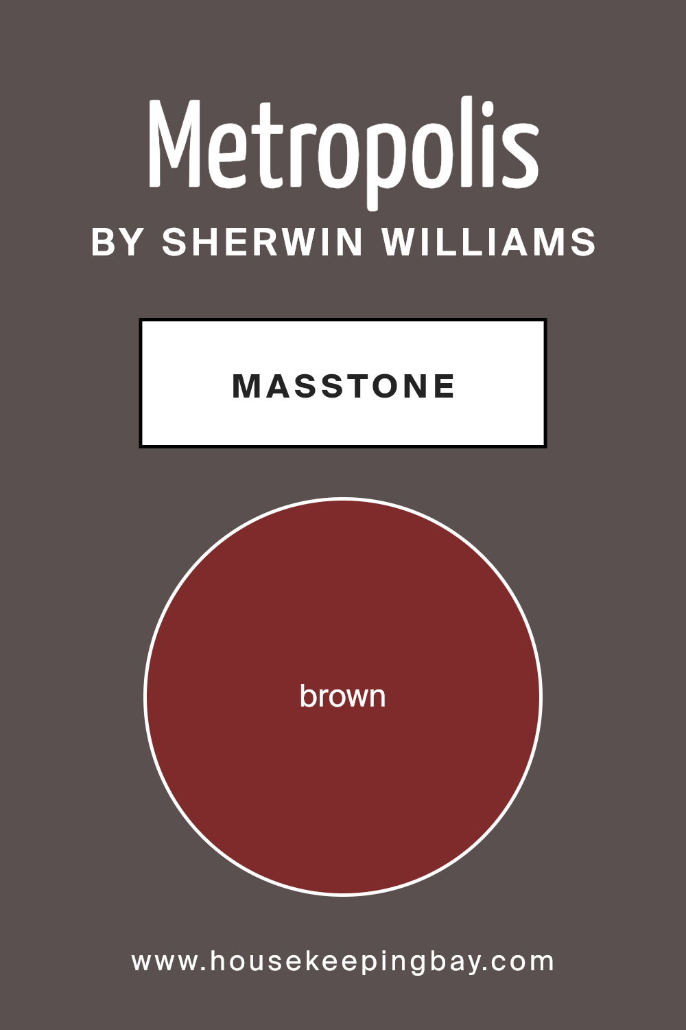
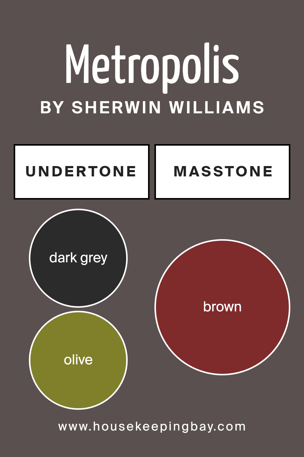
What is the Masstone of the Metropolis SW 9575 by Sherwin Williams?
MetropolisSW 9575 by Sherwin Williams has a masstone of Brown, which is coded as #802B2B. This shade of brown brings a warm and cozy feeling to home interiors. Because it has a rich depth, it works well in many spaces, particularly rooms meant for relaxation such as living rooms and bedrooms.
The color also pairs beautifully with natural materials like wood and leather, enhancing their organic qualities and creating a comforting, grounded feel.
In smaller rooms, this dark brown can make the space feel a bit enclosed, but when used on accent walls or through decor items, it helps to add a sense of sophistication without overwhelming the area. Additionally, this color coordinates nicely with lighter colors like creams or soft blues, which can keep the space feeling airy and open. Ultimately, MetropolisSW 9575 has the versatility to add warmth and a touch of elegance to any home.
housekeepingbay.com
Undertones of Metropolis SW 9575 by Sherwin Williams
MetropolisSW 9575 by Sherwin Williams is a complex paint color with a variety of undertones that subtly influence its appearance in different lighting and surroundings. Undertones are the colors that lurk beneath the surface of the paint and can modify the main hue subtly or significantly, depending on the context. For MetropolisSW 9575, these undertones include shades like dark grey, olive, purple, dark green, navy, grey, dark turquoise, red, orange, pink, and pale pink.
The role of undertones in any color is crucial as they affect how the color appears once applied on interior walls. For example, in a room with ample natural light, the olive and dark green undertones of MetropolisSW 9575 might make it lean slightly more towards a nature-inspired hue, lending a calm and grounded feel to the environment.
In contrast, in a space with less natural light or at night under artificial lighting, darker undertones such as dark grey and navy might become more dominant, giving the walls a more profound and intense look.
In practical terms, when you use MetropolisSW 9575 on your walls, the variety of undertones means the color can appear differently based on the room’s lighting, decor, and even the weather outside.
This versatility makes it a fascinating choice for interior design, allowing the walls to interact dynamically with changing conditions and elements in the room.
Hence, understanding and considering these undertones can greatly aid in achieving the desired atmosphere in a space.
housekeepingbay.com
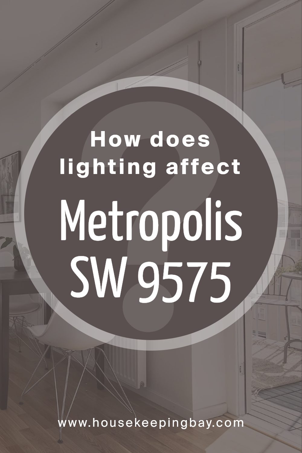
How Does Lighting Affect Metropolis SW 9575 by Sherwin Williams?
Lighting has a significant impact on how we perceive colors. Different light sources can change how a color looks. For instance, natural daylight tends to reveal the truest form of a color, while artificial light can alter its appearance.
The color MetropolisSW 9575 by Sherwin Williams is a versatile shade that responds uniquely to varied lighting conditions. In artificial light, such as incandescent or LED lighting, MetropolisSW 9575 may appear slightly warmer. This is because artificial lights often have yellow undertones, which can make the color seem cozier and richer.
In contrast, under natural light, MetropolisSW 9575 shows its true color. This type of lighting generally provides a more accurate reflection of colors, making MetropolisSW 9575 appear cleaner and crisper. The clarity and purity of natural daylight can help the color maintain its original tone without any added warmth or coolness.
The orientation of a room also affects how MetropolisSW 9575 is perceived:
1. North-facing rooms: These rooms get less direct sunlight, which can make colors appear cooler and somewhat shadowy. In a north-facing room, MetropolisSW 9575 might look slightly more muted and subdued, potentially showing more of its blue or gray undertones.
2. South-facing rooms: These spaces receive abundant, bright sunlight throughout the day. This can make MetropolisSW 9575 look very vibrant and lively, enhancing its natural tone without distorting it. The color can appear lighter and more dynamic in a south-facing room.
3. East-facing rooms:With sunlight in the morning, east-facing rooms have a warm light at the start of the day that turns cooler as the day progresses. MetropolisSW 9575 will appear warmer and more welcoming in the morning, gradually shifting to its true color by noon.
4. West-facing rooms: These rooms experience the opposite effect, with cooler morning light and warm, intense sunlight in the afternoons and evenings. Therefore, MetropolisSW 9575 may start the day looking more muted but become warmer and more intense toward the evening.
Understanding how different types of light affect the perception of MetropolisSW 9575 can help in making informed decisions about using this color in various home or office spaces.
housekeepingbay.com
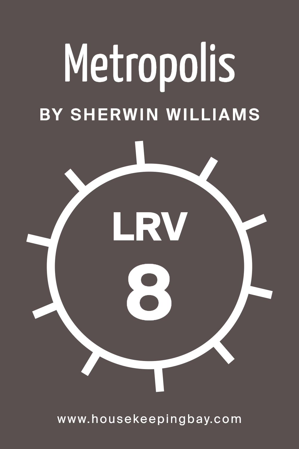
What is the LRV of Metropolis SW 9575 by Sherwin Williams?
LRV stands for Light Reflectance Value, a measure that indicates how much light a paint color reflects back into a room versus how much it absorbs. LRV scales from 0 to 100, where 0 is absolute black, absorbing all light, and 100 is pure white, reflecting all light.
This value helps in choosing paint colors based on how bright or dark you want a room to appear. Colors with high LRV make spaces feel larger and brighter as they reflect more light, while those with low LRV create a cozier, more intimate feel by absorbing more light.
MetropolisSW 9575 by Sherwin Williams, with an LRV of 8.376, is a deep and dark shade that absorbs most of the light that hits it. This makes it a bold choice for a room, possibly ideal for creating a focused or dramatic atmosphere. However, using this low LRV color in a small or poorly lit room may make the space feel even smaller and darker.
To balance this, pairing it with lighter colors or reflective decor can help brighten the space. This particular color is well-suited for larger rooms or areas with sufficient natural or artificial lighting where its depth and richness can be appreciated without overwhelming the space.
housekeepingbay.com
What are the Trim colors of Metropolis SW 9575 by Sherwin Williams?
Trim colors, such as those suggested for Metropolis SW 9575 by Sherwin Williams, play an essential role in defining the architectural features of a home or building by emphasizing windows, doors, and other aspects of the structure.
Using SW 7003 – Toque White and SW 9587 – Mushroom as trim colors can offer a contrasting or complementary finish that enhances the overall aesthetic of MetropolisSW 9575, a versatile hue that can adapt to various styles and tastes.
These trim colors help outline and accentuate the key elements, lending a finished, polished look to spaces.
SW 7003 – Toque White is a soft, bright white color that provides a crisp and clean look. It can help lighten up the space around windows and door frames, providing a sharp contrast that can make darker colors pop while adding a breath of freshness.
SW 9587 – Mushroom, on the other hand, is a warm, earthy beige that brings a soothing and inviting tone to trims.
It pairs well with deeper shades, offering a subtle yet rich boundary that naturally complements wooden features or furniture within a space.
You can see recommended paint colors below:

housekeepingbay.com
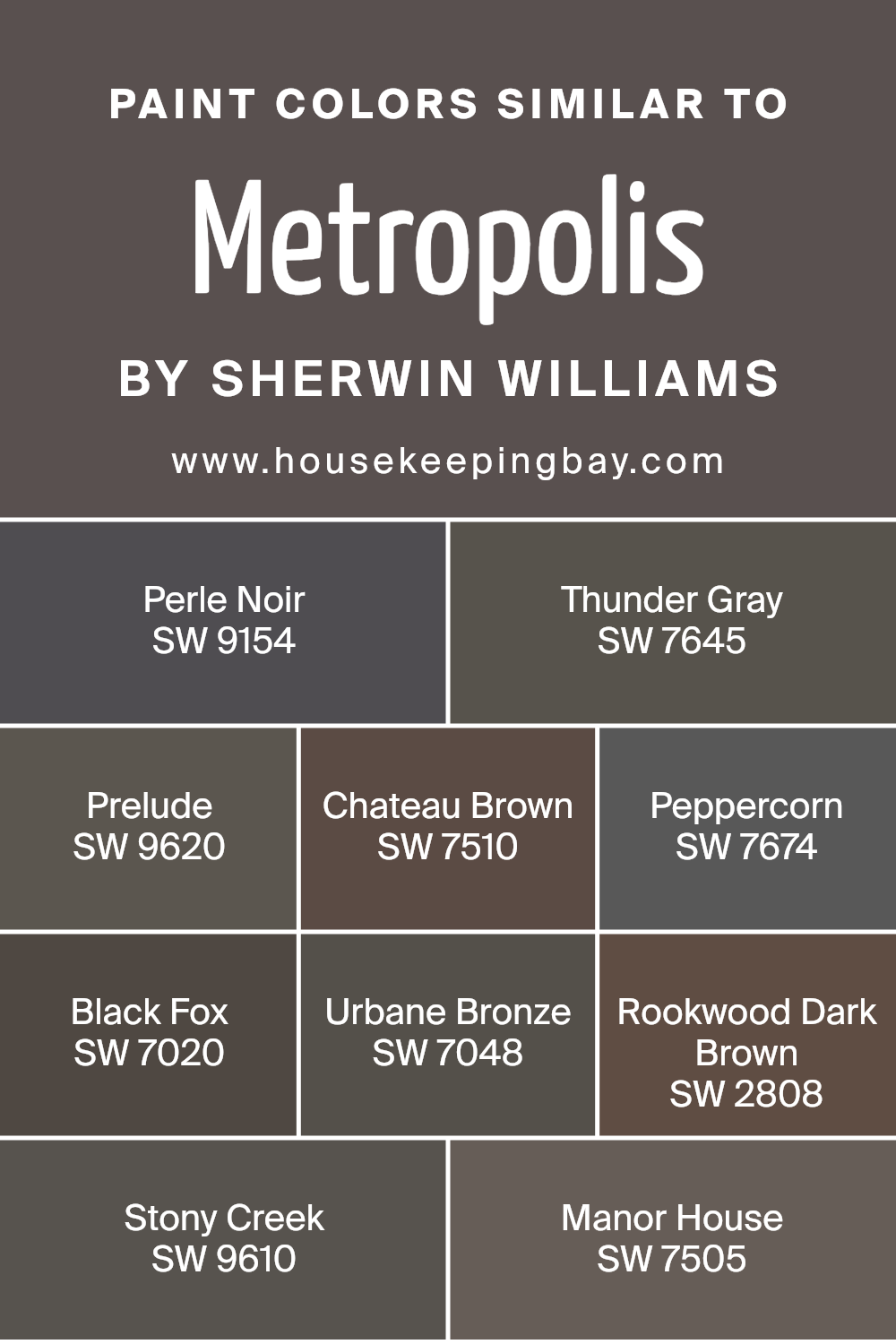
Colors Similar to Metropolis SW 9575 by Sherwin Williams
Similar colors are essential in design for creating a cohesive and harmonious look. They can subtly tie different elements together and give a space a balanced, unified aesthetic. For instance, MetropolisSW 9575 by Sherwin Williams is beautifully complemented by shades like Perle Noir and Thunder Gray, which both offer deep, moody vibes that are perfect for accentuating the sophisticated tone of a room.
The slight variations in these colors provide visual depth without overwhelming the senses.
Perle Noir is a dark shade almost mirroring the depth of night, adding a strong yet chic backdrop. Thunder Gray, with its softer take on dark hues, offers a more muted alternative that still upholds a similar depth. Moving on, Prelude presents a more traditional gray, offering versatility without being stark.
Chateau Brown warms up spaces with its rich, earthy quality, while Peppercorn, very close in the spectrum to black, brings an intense drama. Black Fox has an elegant charcoal touch which works wonderfully in areas that seek sophistication. Urbane Bronze captivates with its deep, warm bronze tone that complements both modern and traditional styles.
Rookwood Dark Brown gives off a classic feel, rich with timeless depth. Stony Creek offers a balanced slate color, grounding spaces with its solid presence. Finally, Manor House, with its classic deep gray undertone, provides a striking backdrop for any decor style, ensuring that each space feels thoughtfully curated and seamlessly connected. Using these similar colors can make any design feel more intentional and appealing.
You can see recommended paint colors below:
- SW 9154 Perle Noir
- SW 7645 Thunder Gray
- SW 9620 Prelude
- SW 7510 Chateau Brown
- SW 7674 Peppercorn
- SW 7020 Black Fox
- SW 7048 Urbane Bronze
- SW 2808 Rookwood Dark Brown
- SW 9610 Stony Creek
- SW 7505 Manor House
housekeepingbay.com
How to Use Metropolis SW 9575 by Sherwin Williams In Your Home?
Metropolis SW 9575 by Sherwin Williams is a versatile paint color that can add a modern touch to any home. It’s a deep gray that can look sophisticated in living rooms or create a cozy atmosphere in bedrooms. Being a neutral shade, it pairs well with various decor styles, from contemporary to traditional. You can use Metropolis SW 9575 on walls for a bold statement, or on trim and doors for a subtle accent.
In the kitchen, pair it with white cabinets for a sharp, clean look that still feels warm. In the bathroom, combine it with bright tiles and chrome fixtures for a sleek, fresh finish. For those who like a bit of contrast, pairing it with brighter colors like blues or even soft pinks can add a lively sparkle to a room.
Using Metropolis SW 9575 lets you refresh your home with a chic, fresh vibe without overwhelming your spaces, making it ideal for a variety of projects.
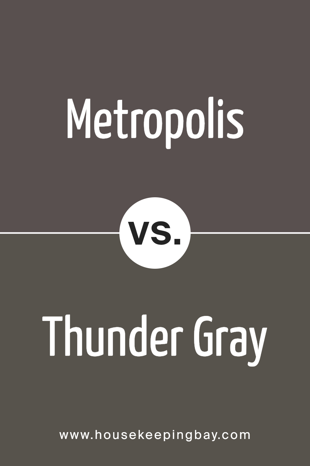
Metropolis SW 9575 by Sherwin Williams vs Thunder Gray SW 7645 by Sherwin Williams
Metropolis SW 9575 and Thunder Gray SW 7645, both by Sherwin Williams, offer subtle yet distinct choices for interior spaces. Metropolis leans towards a deep, dark gray that borders on black, providing a bold and sophisticated atmosphere. This color can make rooms feel more intimate and cozy, perfect for accent walls or spaces that benefit from a dramatic touch.
In contrast, Thunder Gray is a lighter shade of gray with a more neutral tone. It adds a softer, more flexible backdrop to a room, working well in various lighting conditions. It’s ideal for larger areas or entire rooms, maintaining a calming presence without overwhelming the space.
When deciding between these two, consider the mood and functionality of the room.
Metropolis suits more daring or moody interiors, while Thunder Gray is great for a balanced, adaptable environment.
You can see recommended paint color below:
- SW 7645 Thunder Gray
housekeepingbay.com
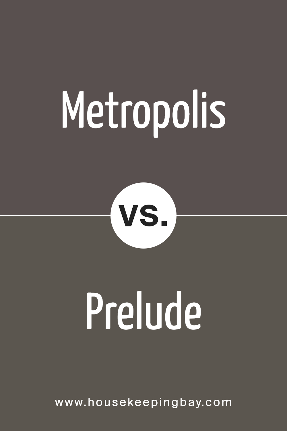
Metropolis SW 9575 by Sherwin Williams vs Prelude SW 9620 by Sherwin Williams
Metropolis SW 9575 by Sherwin Williams is a deep, charcoal gray color with a strong presence. This color brings a sophisticated and modern feel to spaces, making it ideal for creating a bold statement in rooms. It works well in contemporary settings or as an accent wall in a minimalist decor scheme.
Prelude SW 9620 by Sherwin Williams, contrast, is a lighter, soft gray with a hint of blue undertones. This color is much more understated compared to Metropolis and lends a serene, calm feel to any space. It’s perfect for achieving a fresh, airy look in interiors and can help in making small spaces appear larger.
Both colors have their unique appeal but serve very different design needs. Metropolis is best when you want to anchor a space with a strong, dramatic touch, whereas Prelude is ideal for a gentle, soothing atmosphere.
You can see recommended paint color below:
- SW 9620 Prelude
housekeepingbay.com
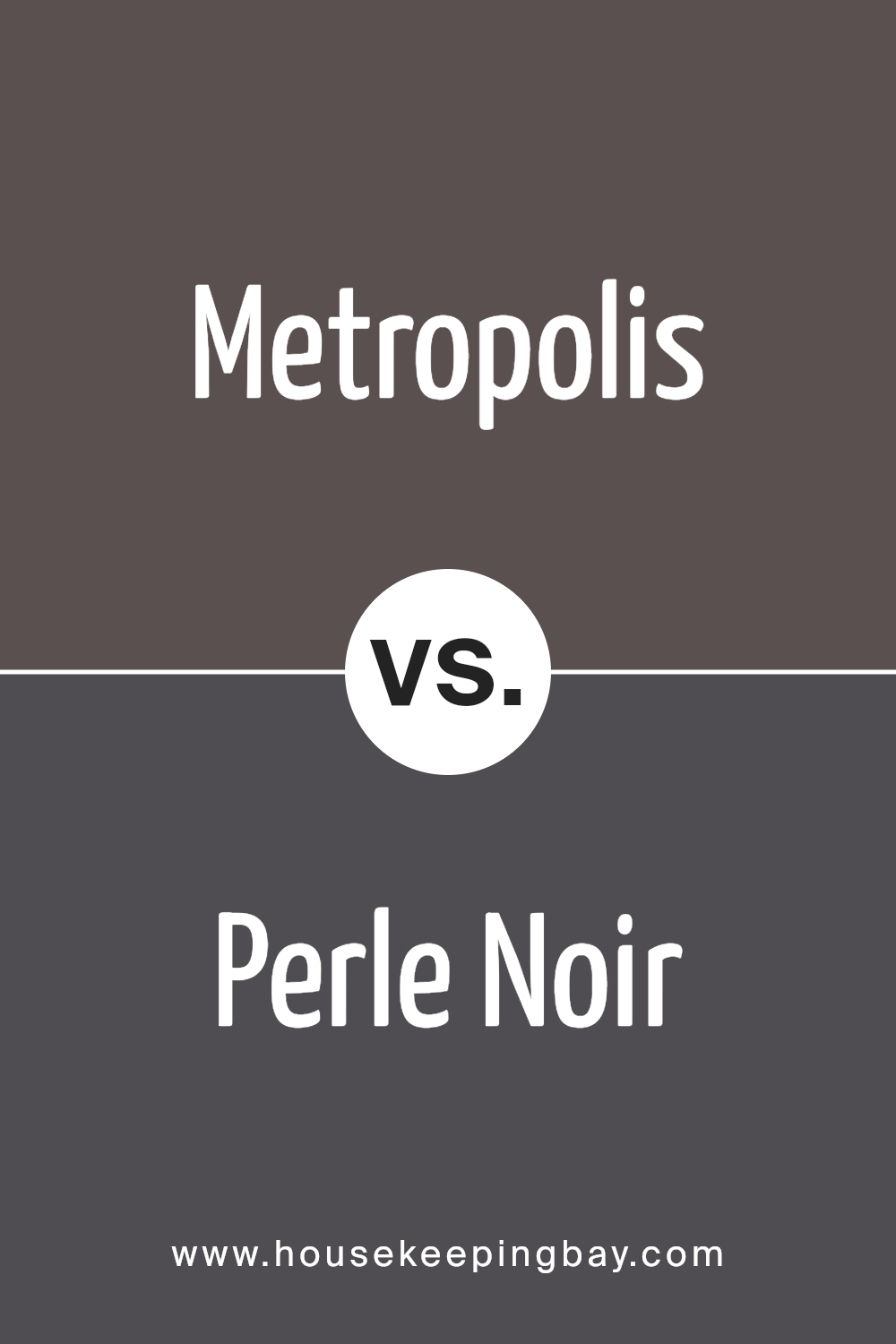
Metropolis SW 9575 by Sherwin Williams vs Perle Noir SW 9154 by Sherwin Williams
Metropolis SW 9575 by Sherwin Williams is a robust dark gray with subtle blue undertones. This shade offers a sleek and sophisticated look, making it ideal for modern spaces or to add drama in various interior design settings. Its depth infuses a strong character into a room, perfect for feature walls or furniture pieces.
Perle Noir SW 9154, also by Sherwin Williams, is a deeper, almost black color. This hue provides a luxurious and intense backdrop, excellent for creating contrast or making bold statements in decor. It pairs well with bright colors or metallic accents, highlighting its rich and elegant nature.
Both colors exude a sense of refinement and modernity. While Metropolis leans into a dark gray spectrum, offering a bit more versatility across larger surfaces, Perle Noir taps into a more dramatic execution, often preferred in focused, striking details or accent areas. Each brings its own unique flair, suited to different tastes and design objectives.
You can see recommended paint color below:
- SW 9154 Perle Noir
housekeepingbay.com
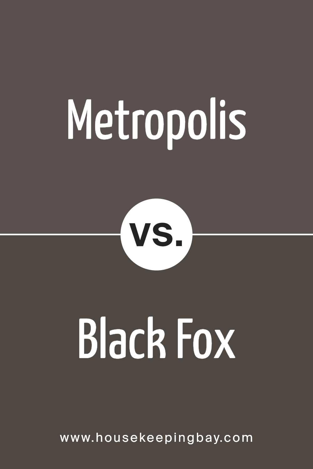
Metropolis SW 9575 by Sherwin Williams vs Black Fox SW 7020 by Sherwin Williams
Metropolis SW 9575 by Sherwin Williams is a dark gray color with a complex undertone that leans towards charcoal or slate. This shade projects a sophisticated and modern vibe, making it perfect for creating a chic, urban look in your space. It’s particularly effective in contemporary settings or as an accent wall to add depth and interest to any room.
In contrast, Black Fox SW 7020 from Sherwin Williams is a deeper, almost black color with strong brown undertones. This warm, rich shade lends a cozy and enveloping feeling, ideal for creating a snug and intimate atmosphere. Black Fox works well in larger rooms or spaces with ample natural light, as it can make small rooms feel slightly smaller due to its intense hue.
Both colors offer a sense of modern elegance but serve different moods and themes within interior spaces. Metropolis is cooler and lighter, making it slightly more versatile, while Black Fox creates a bold statement with its richness and depth.
You can see recommended paint color below:
housekeepingbay.com
Metropolis SW 9575 by Sherwin Williams vs Stony Creek SW 9610 by Sherwin Williams
Metropolis SW 9575 by Sherwin Williams is a deep, almost charcoal gray with a strong presence. It evokes an urban feel, perfect for making a bold statement in spaces. This color can make small rooms feel smaller, but it adds a sophisticated touch when used thoughtfully, especially in modern or industrial designs.
Stony Creek SW 9610, on the other hand, is a lighter, warm gray that provides a softer and more versatile backdrop. It’s easier to integrate into various decor styles, from contemporary to rustic. This color tends to open up spaces, making it a better choice for smaller rooms or areas with less natural light.
While both grays offer unique aesthetic qualities, Metropolis is more dramatic and better suited for feature walls or accent areas. Stony Creek is more adaptable and can comfortably cover larger areas without overpowering the space.
Both showcase the versatility of gray but serve different design purposes based on their depth and undertones.
You can see recommended paint color below:
- SW 9610 Stony Creek

housekeepingbay.com
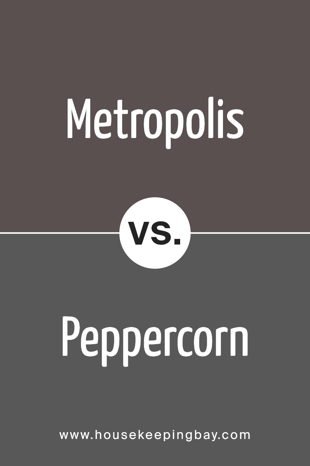
Metropolis SW 9575 by Sherwin Williams vs Peppercorn SW 7674 by Sherwin Williams
Metropolis SW 9575 by Sherwin Williams is a rich, deep gray that leans slightly towards blue, giving it a sophisticated and contemporary vibe. This color is versatile enough to work well in a variety of spaces, whether it’s a modern living room or a sleek office environment. It pairs well with brighter colors and soft neutrals, providing a strong backdrop that allows other hues to stand out.
Peppercorn SW 7674, also by Sherwin Williams, is darker than Metropolis. It’s a bold charcoal gray that carries a more dramatic and intense tone. This color tends to make spaces feel more intimate and cozy, making it a great choice for areas like bedrooms or dens where a sense of comfort is desired.
Although both colors share a gray base, Metropolis is lighter and cooler, which makes it more adaptive to different lighting conditions and less imposing in a room. Peppercorn, with its darker, bolder nature, is perfect for making a strong statement and anchoring a space with depth.
You can see recommended paint color below:
housekeepingbay.com
Metropolis SW 9575 by Sherwin Williams vs Rookwood Dark Brown SW 2808 by Sherwin Williams
Metropolis SW 9575 by Sherwin Williams is a deep, rich gray with a hint of cooler undertones, providing a sleek and sophisticated look that fits well in modern and contemporary spaces. It offers an urban feel, ideal for creating a strong, yet neutral backdrop in a room.
In contrast, Rookwood Dark Brown SW 2808 is a robust dark brown color with warmer, earthy undertones. This color adds a sense of warmth and coziness to spaces, making it perfect for areas where you want to create a comforting and inviting atmosphere, like living rooms or studies.
Both colors can add character to a space, but their impact is quite different depending on the mood or style you want to achieve. While Metropolis lends a more formal, chic aura, Rookwood Dark Brown provides a rustic, homey touch. Choosing between them depends largely on the ambiance you wish to establish in your space.
You can see recommended paint color below:
- SW 2808 Rookwood Dark Brown
housekeepingbay.com
Metropolis SW 9575 by Sherwin Williams vs Chateau Brown SW 7510 by Sherwin Williams
Metropolis SW 9575 by Sherwin Williams is a deep, bold gray that brings a strong, modern feel to spaces. It’s a versatile shade that pairs well with both bright and neutral tones, making it ideal for contemporary interiors. This color tends to add a sophisticated touch, particularly in formal areas like living rooms or dining rooms.
Chateau Brown SW 7510, also by Sherwin Williams, is a warm, rich brown. This color evokes a cozy and inviting atmosphere, suitable for spaces where comfort is key, such as bedrooms or family rooms.
Its earthy hue works well with natural materials like wood or leather, enhancing a rustic aesthetic.
While both colors offer distinct vibes—Metropolis with its sleek urbanity and Chateau Brown with its homey warmth—they can effectively complement each other if used in the right combination, potentially in a design that uses Chateau Brown for wooden features against a Metropolis-painted wall.
You can see recommended paint color below:
housekeepingbay.com
Metropolis SW 9575 by Sherwin Williams vs Urbane Bronze SW 7048 by Sherwin Williams
Metropolis SW 9575 by Sherwin Williams is a lively charcoal gray, offering a dynamic, modern vibe perfect for creating a sophisticated space. It’s lighter and cooler, providing a fresh look, making it ideal for rooms needing a touch of contemporary elegance without overwhelming the senses.
On the contrary, Urbane Bronze SW 7048 leans towards a deeper, warmer feel. This rich bronze tone mixes gray and brown, giving it a grounding effect, perfect for spaces where a cozy, inviting atmosphere is desired. Urbane Bronze works well in intimate settings or as an accent to add depth and warmth.
While Metropolis shines in more open, airy rooms, Urbane Bronze suits more enclosed, cozy spaces.
These two colors, both stylish, serve different purposes depending on your room’s function and desired ambiance.
You can see recommended paint color below:

housekeepingbay.com
Metropolis SW 9575 by Sherwin Williams vs Manor House SW 7505 by Sherwin Williams
Metropolis SW 9575 by Sherwin Williams is a deep, bold gray that carries a strong sense of sophistication and modernity. Its darker tone makes it perfect for creating dramatic looks in interior spaces or for serving as a grounding accent wall color. This shade is particularly effective in contemporary or minimalist decor styles where its strength can be fully appreciated.
Manor House SW 7505 by Sherwin Williams, in contrast, is a warmer, mid-tone gray. This color feels more inviting and less intense than Metropolis. It’s versatile enough to work well in a variety of settings, from casual to formal. Manor House can help make a room feel more spacious and calming without losing its aesthetic appeal.
When comparing the two, Metropolis lends itself more to creating sharp, striking contrasts, especially in modern designs. Manor House, however, is better suited for those looking for a softer, more subtle gray that maintains warmth and comfort. Both colors offer unique possibilities depending on the atmosphere and style you want to achieve in your space.
You can see recommended paint color below:
- SW 7505 Manor House
housekeepingbay.com
SW 9575 Metropolis by Sherwin Williams is indeed a versatile paint color that can greatly enhance the appearance of interior spaces. This subtle yet sophisticated gray shade is the perfect backdrop for any room, allowing other elements to shine while providing a solid foundation that ties everything together.
Its ability to adapt to various lighting conditions and complement different decor styles makes it a practical choice for homeowners seeking a reliable and attractive color solution.
My review of Metropolis shows that it carries a timeless quality, which ensures that it won’t go out of fashion and will continue to support various aesthetic shifts in home decor over the years. Its neutrality helps in maintaining a seamless flow throughout the home, making spaces appear larger and more cohesive.
After comparing it with other shades, I can confidently say that Metropolis stands out for its refined subtlety and utility. It works well in busy areas like living rooms and kitchens as well as private spaces like bedrooms.
Whether you’re looking to sell your home and need a universally appealing color, or simply wishing to update your living space, Metropolis offers that much-needed versatility and simplicity.
For anyone considering a new paint project, it might just be the ideal choice to meet your needs without overwhelming your space.
housekeepingbay.com
Ever wished paint sampling was as easy as sticking a sticker? Guess what? Now it is! Discover Samplize's unique Peel & Stick samples. Get started now and say goodbye to the old messy way!
Get paint samples


