Knockout Orange SW 6885 by Sherwin Williams
Add a Splash of Bold Warmth to Any Space
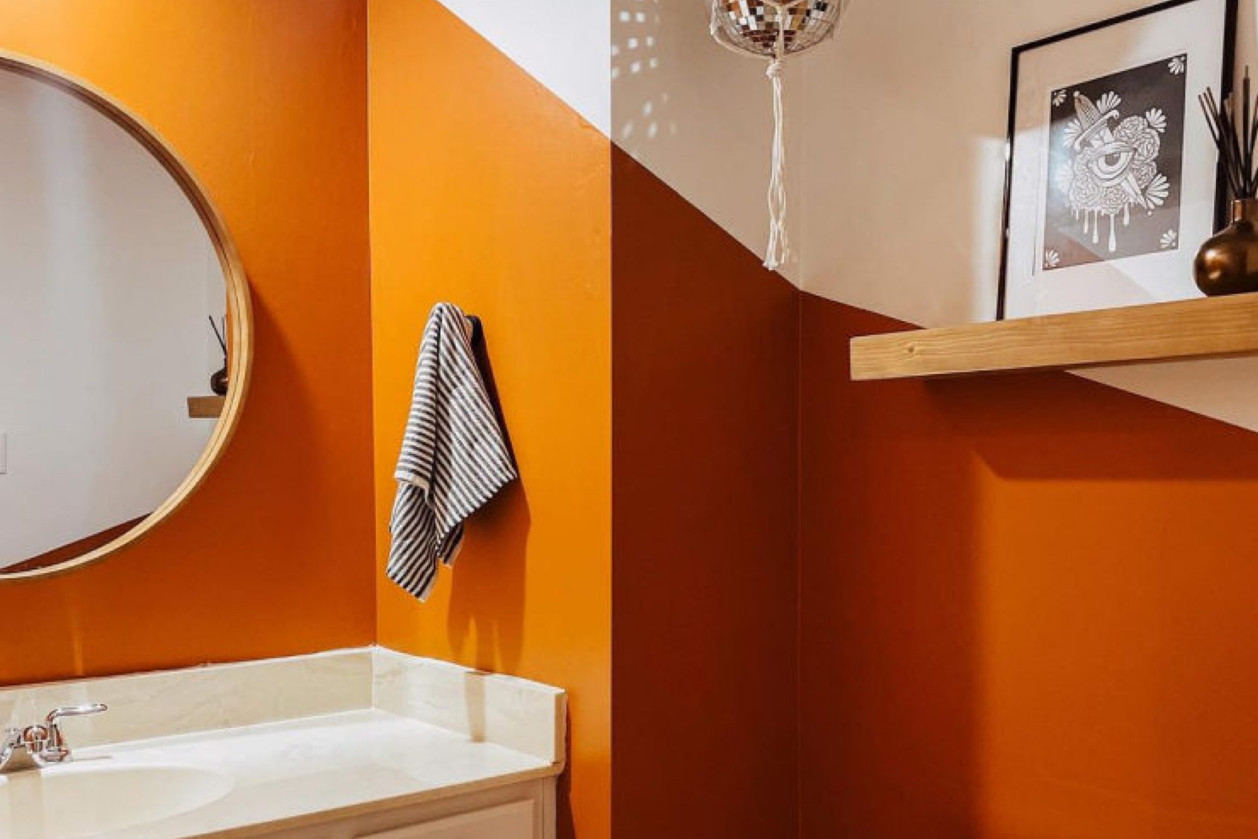
When you want to make a bold statement with color, SW 6885 Knockout Orange by Sherwin Williams can effectively grab attention. This energetic and vibrant shade can inject life and warmth into your space. Picture it in a lively kitchen, where it can complement modern appliances or natural wood. It also works well in a creative workspace, inspiring productivity and creativity.
Don’t be afraid to use Knockout Orange alongside other colors. It pairs nicely with cool blues and greens for a balanced look. Using it on an accent wall or in your favorite decor pieces can make a room feel inviting and full of personality.
Lighting can significantly affect how this color appears, so try different light sources to find what works best. Remember, a little goes a long way with such a vivid hue.
Even small touches of Knockout Orange can change the vibe of your home. If you’re ready to refresh your space, consider bringing home Knockout Orange to add a burst of energy.
vis sherwin-williams.com
What Color Is Knockout Orange SW 6885 by Sherwin Williams?
Table of Contents
Knockout Orange SW 6885 by Sherwin Williams is a bold and lively color. This vibrant shade fills a room with energy and warmth, making it an excellent choice for spaces that need a cheerful and invigorating atmosphere. It’s a bright orange with hints of red, giving it a rich and saturated look.
In terms of interior styles, Knockout Orange works well in modern and eclectic settings. It can add a dynamic touch to contemporary spaces that favor bold colors and striking contrasts. It also fits nicely into bohemian interiors, where its vibrancy can blend with an array of patterns and textiles.
Pair this color with natural materials like light wood or rattan to create balance. The warmth of the wood softens the strong orange, making the space feel welcoming. It also looks great with metals such as brass or copper, which enhance its lively tones.
For textures, consider using soft fabrics like cotton or linen in neutral colors to allow the orange to stand out.
You could also incorporate a plush area rug in a muted color to add depth without overwhelming the senses. In small doses, Knockout Orange can make a bold accent wall or focal point, bringing excitement to any room.
housekeepingbay.com
Is Knockout Orange SW 6885 by Sherwin Williams Warm or Cool color?
Knockout Orange SW 6885 by Sherwin Williams is a vibrant, eye-catching color that adds energy and warmth to any space. This bold orange hue works well as an accent wall, creating a lively atmosphere in living rooms or kitchens. Its lively tone can make spaces feel more dynamic and inviting, encouraging social interaction and lively discussions.
In smaller spaces, Knockout Orange can act as a focal point, drawing attention and making the area feel more intimate and cozy. Pairing it with neutral tones like grays and whites helps balance its intensity, allowing the color to shine without overwhelming the senses.
In children’s rooms, this color adds a fun and playful element, stimulating creativity and joy. In home offices, its energetic vibe can boost productivity and alertness. Overall, Knockout Orange SW 6885 brings warmth and vitality into homes, turning ordinary spaces into energetic, welcoming environments.
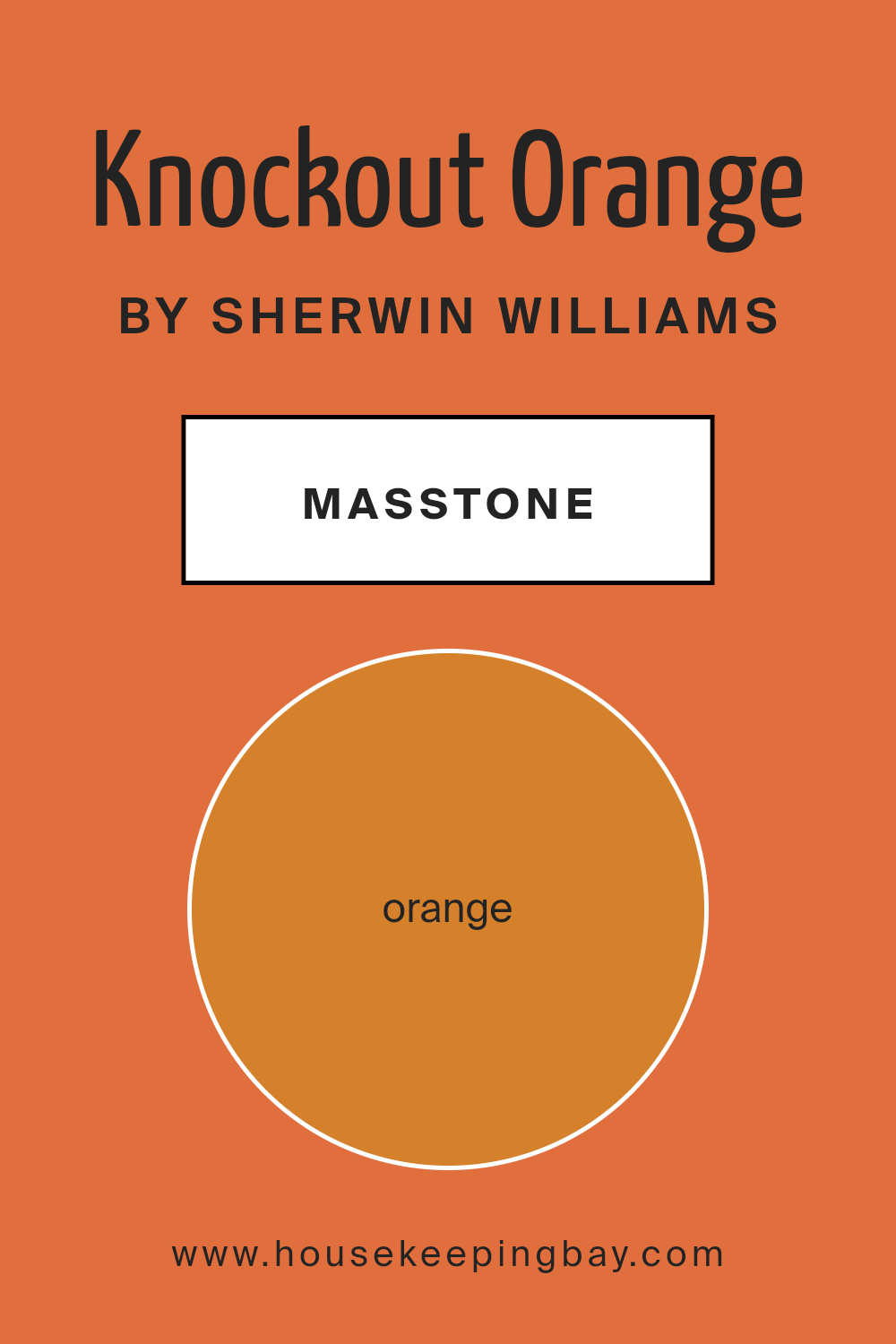
What is the Masstone of the Knockout Orange SW 6885 by Sherwin Williams?
Knockout Orange SW 6885 by Sherwin Williams is a bold and vibrant color that can bring warmth and energy to any space. Its masstone is a rich, burnt orange (#D5802B), which gives it a deep and striking appearance. This color works well in homes by adding a lively touch to otherwise neutral spaces.
When used in living rooms or kitchens, Knockout Orange creates a welcoming and energetic atmosphere. It pairs nicely with whites and grays, balancing out its intensity.
In a dining area, this orange can stimulate conversation and create an inviting setting for meals. For children’s rooms or play areas, its bright hue fosters a fun and playful environment. Additionally, this orange shade can complement wooden furniture or accessories, enhancing the natural elements in a room.
Overall, Knockout Orange brings warmth, enthusiasm, and a touch of boldness to any household, making spaces feel more lively and active.
housekeepingbay.com
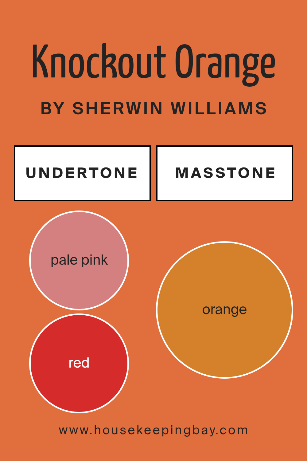
Undertones of Knockout Orange SW 6885 by Sherwin Williams
Knockout Orange SW 6885 by Sherwin Williams is a vibrant orange paint that immediately grabs attention. Its undertones play a crucial role in how we perceive it. This color includes undertones of pale pink, red, pink, olive, yellow, grey, brown, pale yellow, purple, light green, and mint. These undertones combine to create a lively and dynamic color.
Undertones are subtle colors mixed within a primary hue, affecting its overall appearance. For example, if orange has a red undertone, it may seem warmer and more intense. On the other hand, grey undertones can make it feel muted or subdued.
When applied to interior walls, the undertones in Knockout Orange can shift depending on lighting and surrounding colors. Light hitting the walls might enhance the red and yellow undertones, making the room feel warm and lively. Meanwhile, grey or brown undertones provide balance, preventing the color from feeling too overwhelming. In vibrant spaces, the soft hints of pale pink and mint might appear, adding depth and intrigue.
Ultimately, the interplay of these undertones adds complexity, ensuring the orange doesn’t stay static, but instead responds to its environment, creating a dynamic and welcoming atmosphere in any room.
housekeepingbay.com
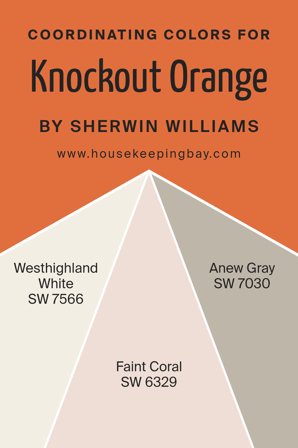
Coordinating Colors of Knockout Orange SW 6885 by Sherwin Williams
Coordinating colors are hues that work well together to create a balanced and visually appealing space. They complement the main color, enhancing the overall look without overwhelming it. When you have a bold color like Knockout Orange SW 6885 from Sherwin Williams, choosing the right coordinating colors can either tone down its intensity or make it pop even more.
Coordinating colors are selected to harmonize with the primary color, creating a cohesive design that feels connected and pleasant to the eye. The goal is to achieve a balanced look that doesn’t clash or seem chaotic.
Westhighland White SW 7566 is a soft, creamy white that offers a clean and calm feeling; it pairs well with Knockout Orange, providing a neutral backdrop that lets the vibrant hue take center stage.
Faint Coral SW 6329 adds a gentle touch with its warm, pinkish tone, creating a harmonious blend with the orange without overpowering it.
Lastly, Anew Gray SW 7030 balances everything with its warm, neutral shade. It is versatile and grounding, offering depth and maturity to the overall palette when combined with Knockout Orange. Together, these colors form a palette that is both lively and soothing, ensuring a visually appealing environment.
You can see recommended paint colors below:
housekeepingbay.com
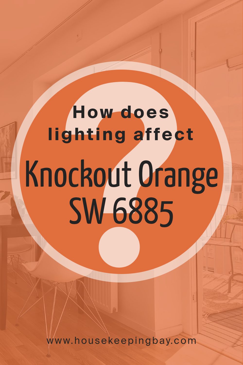
How Does Lighting Affect Knockout Orange SW 6885 by Sherwin Williams?
Lighting plays a crucial role in how we perceive colors. It can change the appearance of a color, making it seem brighter, duller, warmer, or cooler. Knockout Orange SW 6885 by Sherwin Williams, like other colors, changes its look under different lighting conditions.
In natural light, Knockout Orange can appear vibrant and lively. The quality and intensity of natural light vary throughout the day and depending on the room’s orientation. In artificial light, the color may look different based on the type of bulb used.
For instance, incandescent bulbs tend to emit a warm yellow light, which can make the orange appear more intense and warm. Fluorescent lighting, which is cooler, might make the color look a bit more subdued or even add a slight greenish tint.
In north-facing rooms, the light is more consistent and cooler, without direct sunlight. Knockout Orange might look slightly muted or cooler in such spaces. The vibrancy gets toned down due to the lack of direct, warm sunlight.
In south-facing rooms, natural light tends to be warm and bright. Here, Knockout Orange shows its true brightness and warmth, looking rich and lively throughout most of the day. This direction enhances the color’s warm undertones, making spaces feel cozy.
East-facing rooms get bright, cool light in the morning and softer light later in the day. In the morning, Knockout Orange could appear particularly bright and fresh, while in the afternoon, it may seem a bit more subdued.
West-facing rooms receive soft, warm light in the morning and intense, warm light in the afternoon and evening. As the day progresses, the orange color intensifies, making the room glow with warmth during sunsets.
Thus, Knockout Orange can vary greatly in appearance depending on the lighting conditions and room orientation. To get the best results, test the color under different lighting conditions in each specific room before making a final decision.
housekeepingbay.com
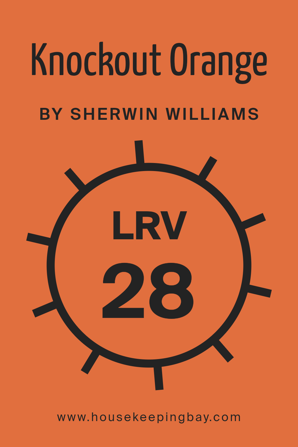
What is the LRV of Knockout Orange SW 6885 by Sherwin Williams?
The Light Reflectance Value (LRV) of a color tells us how much light the color will reflect. This value ranges from 0 to 100, where 0 is absolute black (no light reflected) and 100 is pure white (all light reflected). Colors with lower LRV numbers absorb more light, making them appear darker and sometimes more intense in a room.
Conversely, colors with higher LRV numbers reflect more light and tend to look brighter and lighter. Understanding LRV is important as it influences how a color will behave in a space under different lighting conditions.
Knockout Orange SW 6885 from Sherwin Williams has an LRV of 27.657. This means it will absorb more light than it reflects, giving it a bold and strong appearance on walls.
This vibrant shade of orange will make a room feel cozy and energetic, especially in spaces where natural light is limited.
Because of its relatively low LRV, Knockout Orange will stand out as a statement color, making it ideal for accent walls, but it might be overwhelming if used on all four walls in a small room. This LRV value helps predict that the color will create a dramatic and lively atmosphere.
housekeepingbay.com
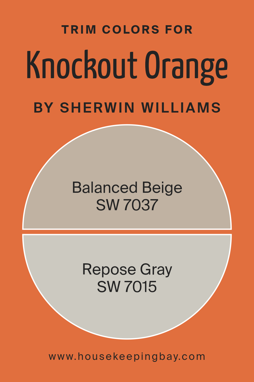
What are the Trim colors of Knockout Orange SW 6885 by Sherwin Williams?
Trim colors are the shades used for details like baseboards, window frames, and moldings in a room. They complement the main wall color, helping to define and enhance the space. For the vibrant Knockout Orange SW 6885 from Sherwin Williams, trim colors play a crucial role in balancing its intensity.
Using a neutral trim color helps to tone down the boldness of the orange, creating a more harmonious and inviting environment. This balance can be achieved with the right contrast and blend between the main and trim colors, making the Knockout Orange stand out without overwhelming the space.
Balanced Beige SW 7037 is an effective choice as a trim color for Knockout Orange. It provides a warm, neutral backdrop that softens the room.
Balanced Beige is a warm-toned beige that pairs well with vivid colors, adding warmth while maintaining sophistication.
Alternatively, Repose Gray SW 7015 offers a cooler, modern alternative. This light gray with subtle undertones provides a crisp and clean contrast to the boldness of Knockout Orange, enhancing its vibrancy while maintaining a modern feel. Both Balanced Beige and Repose Gray are versatile and stylish, making them excellent trim choices to complement the energetic Knockout Orange.
You can see recommended paint colors below:
- SW 7037 Balanced Beige
- SW 7015 Repose Gray
housekeepingbay.com
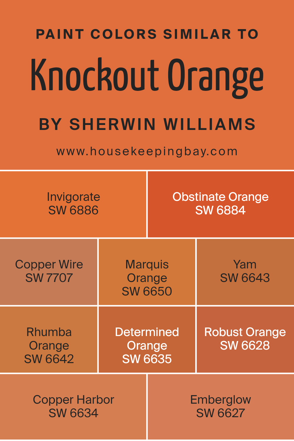
Colors Similar to Knockout Orange SW 6885 by Sherwin Williams
Similar colors can create a sense of harmony and balance in a space, which is why they are important in design. When you use colors that are close to each other on the color wheel, such as the warm and inviting shades similar to Knockout Orange SW 6885 from Sherwin Williams, it makes rooms feel welcoming and cohesive.
Colors like SW 6886 – Invigorate and SW 6884 – Obstinate Orange bring a robust energy. Invigorate is a rich red-orange that brings vitality, while Obstinate Orange is a bold, vibrant hue that makes any space pop with life.
SW 7707 – Copper Wire offers a more muted orange with a metallic undertone, giving a space warmth without overwhelming it. Marquis Orange, SW 6650, has a slightly softer, cheerful orange tone that brightens any room.
Yam, SW 6643, and Rhumba Orange, SW 6642, both bring earthy, cozy feelings with their tones, perfect for adding comfort. Determined Orange, SW 6635, brings a purposeful burst of energy, while Robust Orange, SW 6628, adds a punchy and strong presence.
Copper Harbor, SW 6634, has deeper, more grounded orange tones, and SW 6627 – Emberglow adds a fiery and dynamic touch. When used together, these similar shades create environments that are lively and harmoniously tied together.
You can see recommended paint colors below:
- SW 6886 Invigorate
- SW 6884 Obstinate Orange
- SW 7707 Copper Wire
- SW 6650 Marquis Orange
- SW 6643 Yam
- SW 6642 Rhumba Orange
- SW 6635 Determined Orange
- SW 6628 Robust Orange
- SW 6634 Copper Harbor
- SW 6627 Emberglow
housekeepingbay.com
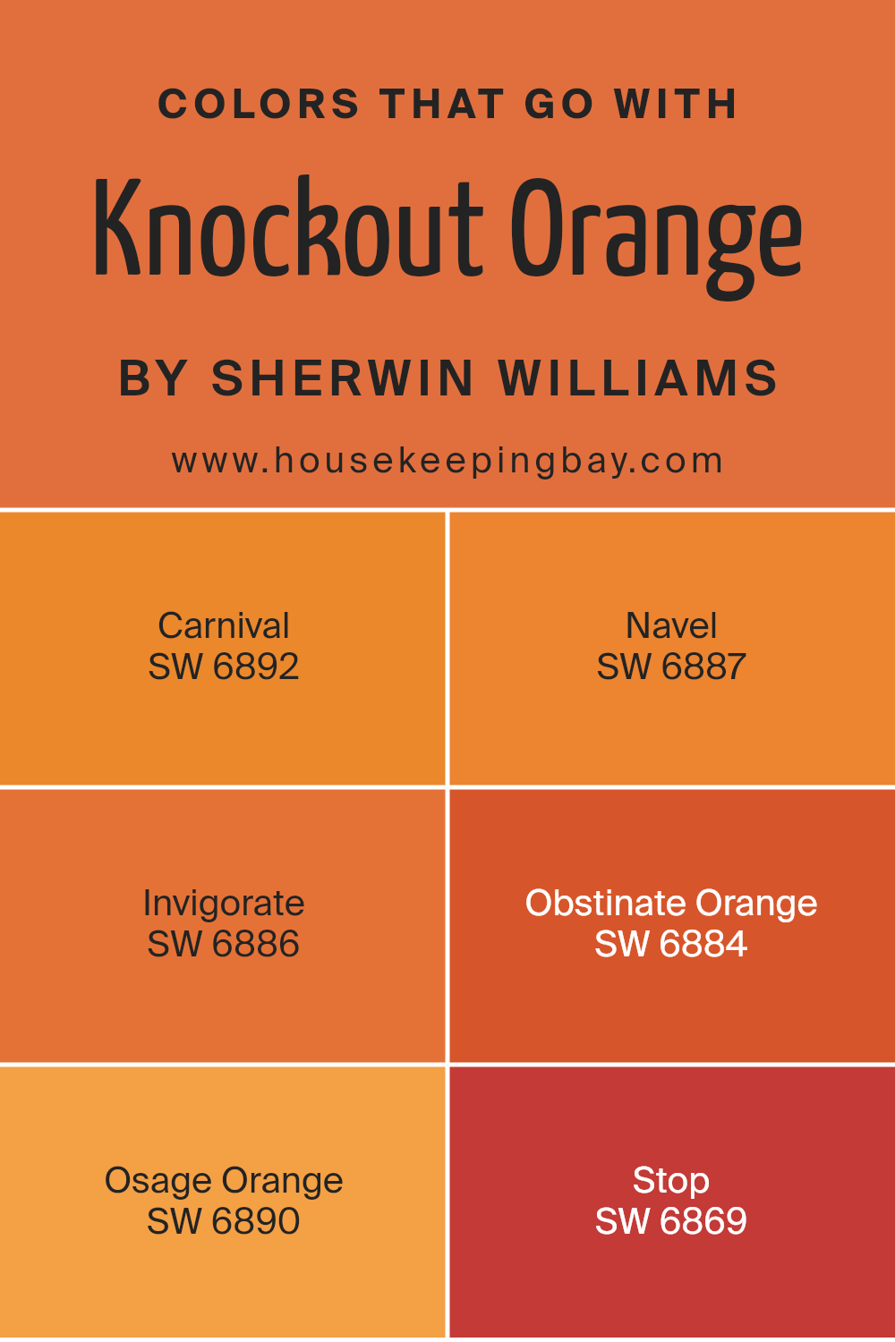
Colors that Go With Knockout Orange SW 6885 by Sherwin Williams
Knockout Orange SW 6885 by Sherwin Williams is a vibrant and energetic orange that can add a bold statement to any space. Choosing complementary colors is important to create a harmonious look and balance its intensity.
Coordinating with colors like SW 6892 – Carnival, SW 6887 – Navel, SW 6886 – Invigorate, SW 6884 – Obstinate Orange, SW 6890 – Osage Orange, and SW 6869 – Stop can create a lively and cohesive palette.
These colors share a similar vividness, allowing them to work together effortlessly. Whether you’re designing a modern living room or a children’s play area, these colors can bring out the best features of Knockout Orange.
SW 6892 – Carnival is a lively pinkish-red that pairs well with orange, bringing out its warmth. SW 6887 – Navel offers a more muted, but still bold, orange that can give a grounded feel next to the brightness of Knockout Orange.
SW 6886 – Invigorate combines red and orange tones, adding richness to the color scheme.
SW 6884 – Obstinate Orange is a deeper shade that can add contrast, helping other colors pop. SW 6890 – Osage Orange delivers an earthy touch, which can soften the energetic nature of the main orange.
Finally, SW 6869 – Stop presents a striking red, enhancing the vibrancy and dynamic nature of the palette, making them all work beautifully together.
You can see recommended paint colors below:
- SW 6892 Carnival
- SW 6887 Navel
- SW 6886 Invigorate
- SW 6884 Obstinate Orange
- SW 6890 Osage Orange
- SW 6869 Stop
housekeepingbay.com
How to Use Knockout Orange SW 6885 by Sherwin Williams In Your Home?
Knockout Orange SW 6885 by Sherwin Williams is a bold and energetic color choice. This vibrant orange can bring warmth and excitement into any room. In a living room, using Knockout Orange on an accent wall can create a focal point that adds character without overwhelming the space.
Pair it with neutral furniture and decor for balance, allowing the bright hue to shine. In a kitchen, this color can create a lively atmosphere, inspiring creativity in cooking. Consider painting cabinets or a kitchen island with Knockout Orange for a pop of color that stands out.
In a home office, this bold shade can stimulate creativity and concentration. Complement it with white or light gray for a clean and modern look. Accessories like pillows, rugs, or artwork in this color can also brighten a space without large commitments.
Knockout Orange is versatile, suitable for those who want to introduce energy and warmth into their home.
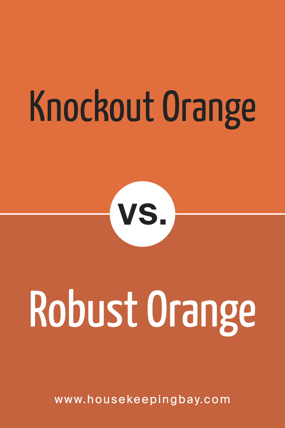
Knockout Orange SW 6885 by Sherwin Williams vs Robust Orange SW 6628 by Sherwin Williams
Knockout Orange SW 6885 by Sherwin Williams and Robust Orange SW 6628 both belong to the vibrant orange family, but each has its own character. Knockout Orange SW 6885 bursts with energy, attracting attention with its bold and fiery tone. It’s a lively color that adds excitement wherever it’s applied.
In contrast, Robust Orange SW 6628 offers warmth and depth. This color exudes a cozy and welcoming feel. While still vibrant, Robust Orange is slightly more muted than Knockout Orange, making it versatile for different spaces.
Choosing between the two colors depends on the mood you want to create. Knockout Orange brings a high-energy feel and makes a strong statement. Robust Orange, with its subdued vibrancy, soothes while still delivering a punch of color, ideal for areas where you want to feel at ease. Both colors brighten spaces but choose based on whether you prefer boldness or warmth.
You can see recommended paint color below:
- SW 6628 Robust Orange
housekeepingbay.com
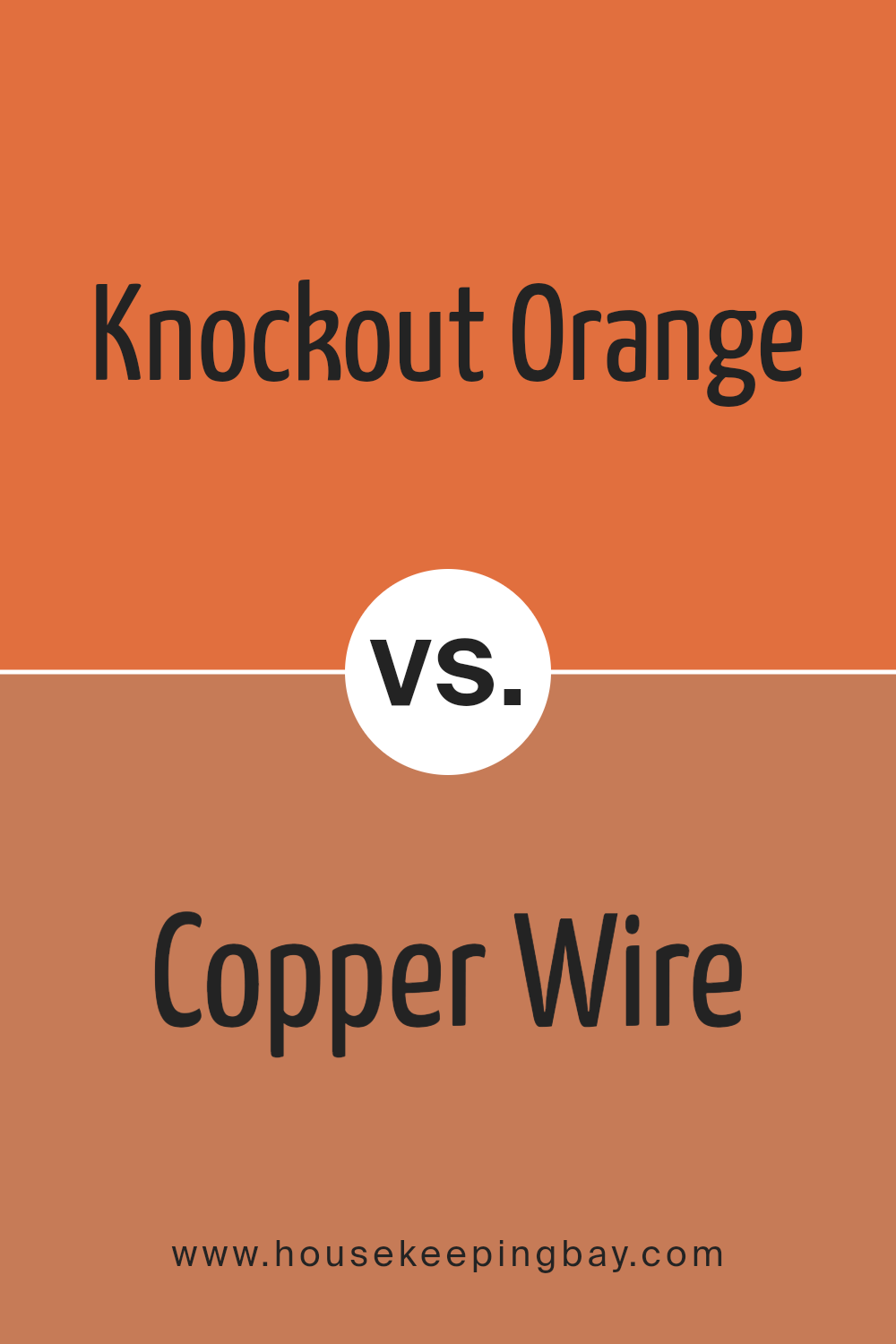
Knockout Orange SW 6885 by Sherwin Williams vs Copper Wire SW 7707 by Sherwin Williams
Knockout Orange SW 6885 is a bright and lively hue that instantly grabs attention. Its vibrant energy resembles the warmth and excitement of a summer sunset. This bold color works well in spaces where you wish to inspire creativity and enthusiasm, like a playroom or a creative studio.
Copper Wire SW 7707, by contrast, showcases a more earthy tone. It resembles the rich, warm tones of natural copper metal. This color brings a sense of warmth and is more subdued. It’s perfect for adding a touch of coziness to a living room or study.
While Knockout Orange is all about boldness and excitement, Copper Wire exudes warmth and a more grounded feel. Both colors offer a sense of warmth but do so in distinct ways. Whether you choose the vibrancy of Knockout Orange or the earthy comfort of Copper Wire depends on the mood you wish to create in your space.
You can see recommended paint color below:
- SW 7707 Copper Wire
housekeepingbay.com
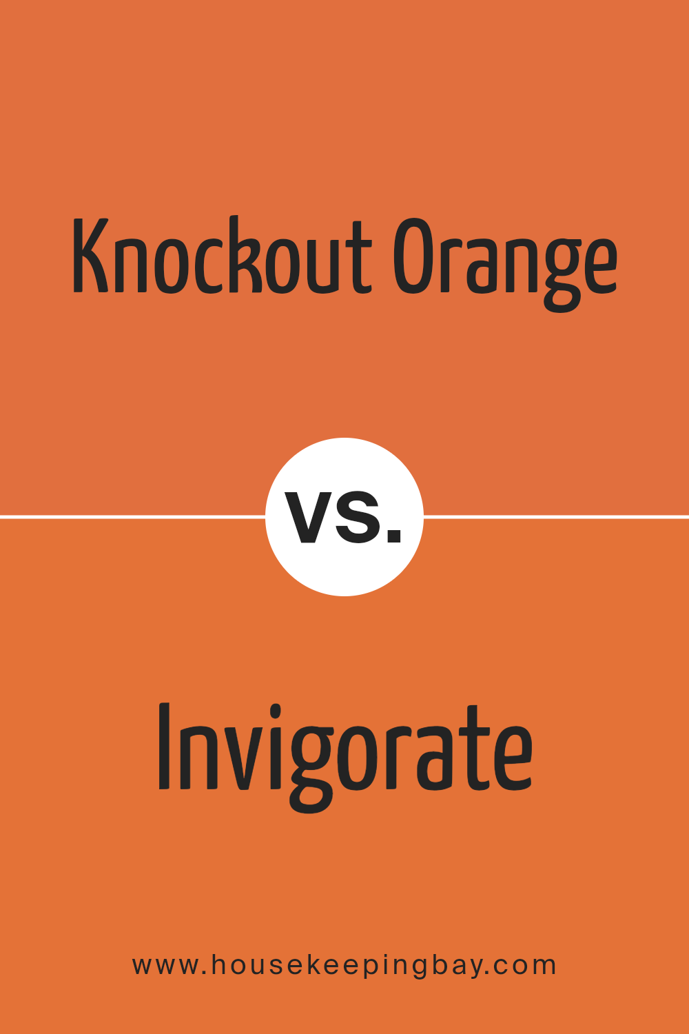
Knockout Orange SW 6885 by Sherwin Williams vs Invigorate SW 6886 by Sherwin Williams
Knockout Orange SW 6885 by Sherwin Williams is a bold, lively shade that radiates energy. It brings to mind the color of ripe oranges, adding warmth and vitality to any space. Perfect for accents, it stands out beautifully against neutral tones and can completely change the look of a room with its vibrant hue.
Invigorate SW 6886, while similar, has slight differences. It carries a deeper red undertone, giving it a richer, more intense appearance. This color leans more towards a deep sunset or terracotta feel, adding not just energy, but also a touch of sophistication to a space.
Both colors add a sense of excitement, but Knockout Orange tends to be more playful and bright, while Invigorate adds depth and richness. Choosing between these two depends on the mood and the atmosphere you wish to create: lively and vivid with Knockout Orange, or bold and intense with Invigorate.
You can see recommended paint color below:
- SW 6886 Invigorate
housekeepingbay.com
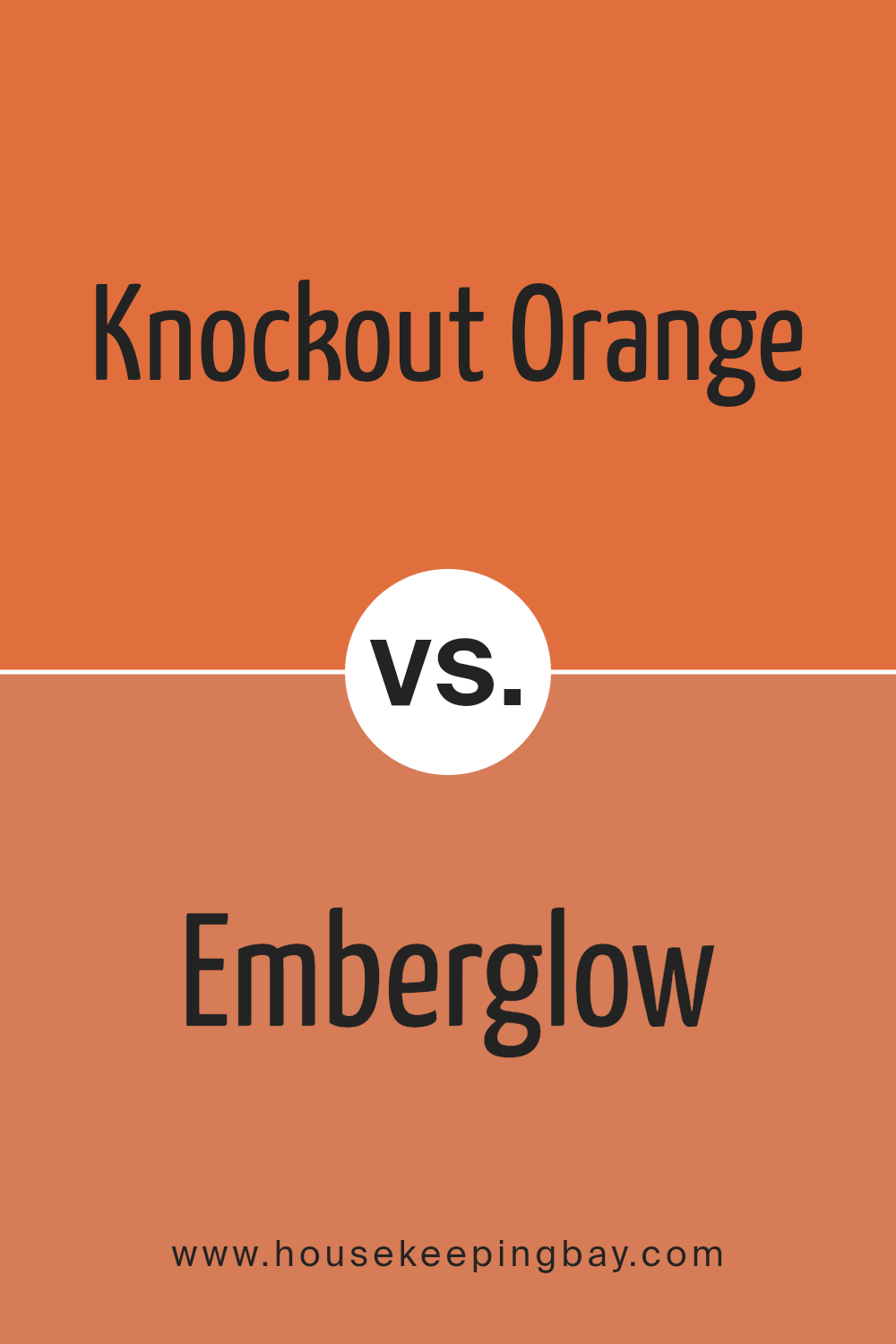
Knockout Orange SW 6885 by Sherwin Williams vs Emberglow SW 6627 by Sherwin Williams
Knockout Orange SW 6885 and Emberglow SW 6627 by Sherwin Williams bring warmth, yet they have unique personalities. Knockout Orange bursts with energy and brightness. It feels lively and bold, making any space feel vibrant. Its intensity adds a sense of warmth.
In contrast, Emberglow offers a more muted, earthy tone. It feels cozy and more subtle than Knockout Orange. Emberglow has a softer presence, creating a relaxed and inviting atmosphere.
Both colors share a warm, fiery foundation, yet they serve different purposes. Knockout Orange demands attention, perfect for spaces where dynamism is desired. Emberglow offers comfort, working well in areas meant for relaxation.
When paired, Knockout Orange can serve as an accent, adding energy, while Emberglow provides balance with its softer undertones. This combination, despite its shared warmth, allows for dynamic and harmonious design opportunities, making spaces both lively and welcoming.
You can see recommended paint color below:
housekeepingbay.com
Knockout Orange SW 6885 by Sherwin Williams vs Yam SW 6643 by Sherwin Williams
Knockout Orange SW 6885 and Yam SW 6643, both by Sherwin Williams, are eye-catching shades of orange, each offering a unique vibe. Knockout Orange is a bold, vibrant hue, reminiscent of a glowing sunset. It commands attention and brings energy to any room. Perfect for accent walls or anywhere lively impact is desired, this color creates a warm, inviting atmosphere.
Yam, while also an orange, leans slightly softer with a hint of earthiness. It exudes warmth but in a more subdued manner, providing a cozy, welcoming feel. Yam works well in spaces where a touch of color is wanted without overwhelming the senses.
It pairs beautifully with neutral tones, allowing it to shine in a more subtle way.
Both colors can stand as strong statements alone or complement a palette. Where Knockout Orange energizes, Yam balances, offering a gentler, calming effect.
You can see recommended paint color below:
- SW 6643 Yam

housekeepingbay.com
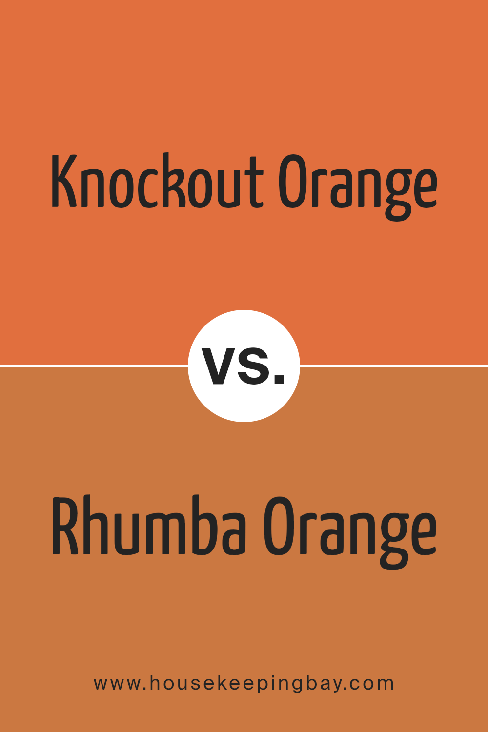
Knockout Orange SW 6885 by Sherwin Williams vs Rhumba Orange SW 6642 by Sherwin Williams
Knockout Orange SW 6885 and Rhumba Orange SW 6642 from Sherwin Williams offer vibrant, energetic vibes but differ in tone and intensity. Knockout Orange SW 6885 is a bright, bold hue with a more pronounced red undertone. This color demands attention and brings liveliness into any room, making it ideal for accent walls or spaces in need of a lively touch.
Rhumba Orange SW 6642, while still vibrant, has a slightly softer and warmer feel compared to Knockout Orange. It leans more towards a deep, earthy terracotta, which can evoke a cozy, inviting atmosphere. Rhumba Orange is often used to create warmth and a sense of comfort in a space.
In summary, if you seek a color that dominates with brightness and energy, Knockout Orange fits that role.
For a warm and welcoming vibe, Rhumba Orange provides a balanced, earthy tone perfect for relaxed settings.
You can see recommended paint color below:
- SW 6642 Rhumba Orange
housekeepingbay.com
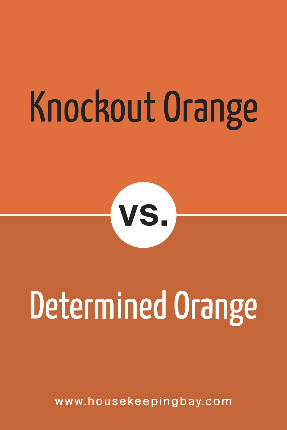
Knockout Orange SW 6885 by Sherwin Williams vs Determined Orange SW 6635 by Sherwin Williams
Knockout Orange SW 6885 and Determined Orange SW 6635, both by Sherwin Williams, are vibrant shades of orange, yet they have distinct characteristics that set them apart. Knockout Orange SW 6885 presents itself as a bolder, more vivid hue. It carries a stronger, more intense red undertone, making it perfect for creating a lively, energetic atmosphere.
This color works well in spaces where you want to inspire activity and engagement.
In contrast, Determined Orange SW 6635 has a slightly softer and warmer appearance. It leans more towards a true orange with a touch lighter touch, providing a sense of balance while still delivering warmth and energy to any room.
This shade is suitable for areas where you want to maintain brightness without overwhelming the senses.
Both colors infuse vitality into spaces, but Knockout Orange demands attention more forcefully, whereas Determined Orange offers an inviting, cheerful glow that is somewhat subtler.
You can see recommended paint color below:
- SW 6635 Determined Orange
housekeepingbay.com
Knockout Orange SW 6885 by Sherwin Williams vs Obstinate Orange SW 6884 by Sherwin Williams
Knockout Orange SW 6885 and Obstinate Orange SW 6884 are two vibrant and energetic shades by Sherwin Williams. Knockout Orange SW 6885 exudes brightness and boldness, making it a go-to choice for creating lively atmospheres. It captures immediate attention with its dynamic hue, ideal for spaces needing a splash of enthusiasm or for accent walls that demand focus.
Obstinate Orange SW 6884, while also bright and eye-catching, carries a slightly deeper tone. This shade offers a warm yet assertive presence, making it suitable for spaces where a sense of coziness and warmth is desired without losing vibrancy.
It brings a more grounded feel while maintaining its striking quality, perfect for areas where a bold yet welcoming look is needed.
Both colors share the common trait of energy and liveliness, but Knockout Orange leads with its vivid intensity, while Obstinate Orange offers a subtle depth, adding a warm character to whichever space it enhances.
You can see recommended paint color below:
- SW 6884 Obstinate Orange
housekeepingbay.com
Knockout Orange SW 6885 by Sherwin Williams vs Copper Harbor SW 6634 by Sherwin Williams
Knockout Orange SW 6885 is a bright, bold shade that radiates energy and warmth. This color grabs attention with its lively and cheerful demeanor. With its vibrant hue, it can invigorate any room, making it a popular choice for spaces where you want to create a lively atmosphere.
Copper Harbor SW 6634 lies in the same warm color family but offers subtle sophistication. This shade is richer, with earthy undertones that create a cozy, welcoming feel. It provides a more grounded aesthetic, making it suitable for places where comfort and a more relaxed mood are desired.
While both colors deliver warmth, Knockout Orange excites a space with its boldness, while Copper Harbor brings comfort and elegance. These colors complement each other, yet maintain distinct personalities: one vibrant, the other more subdued. They work well for creating balance, energizing some areas while bringing calm to others.
You can see recommended paint color below:
- SW 6634 Copper Harbor
housekeepingbay.com
Knockout Orange SW 6885 by Sherwin Williams vs Marquis Orange SW 6650 by Sherwin Williams
Knockout Orange SW 6885 and Marquis Orange SW 6650 from Sherwin Williams present vibrant choices for brightening spaces. Knockout Orange exudes a stronger, bold presence. It’s a vivid, intense shade that commands attention and dramatically enhances any setting. Ideal for those craving energy, this color enlivens walls with its lively tone.
Marquis Orange SW 6650, though also a warm orange, leans towards a softer and more sophisticated hue. It’s still lively but exudes a slightly mellower vibe than Knockout Orange. This softer approach works well for creating a welcoming, friendly environment without overwhelming the senses.
Both colors share a cheerful quality inherent to orange, promising a cozy and bright atmosphere. Knockout Orange leans more into the adventurous territory, while Marquis Orange carries a touch of elegance.
Choosing between them boils down to the desired atmosphere—dynamic with Knockout, or warm with Marquis. Both choices bring warmth and style.
You can see recommended paint color below:
- SW 6650 Marquis Orange
housekeepingbay.com
Conclusion
SW 6885 Knockout Orange by Sherwin Williams brings an energy to any space with its vibrant hue. I find that this color livens up a room, injecting enthusiasm and positive vibes. It’s a bold choice, perfect for anyone wanting to make a statement. When I apply it to walls or accent pieces, it completely changes the mood of an area, making it feel more inviting and lively.
I notice how well it pairs with neutral tones or other bold colors, offering versatility in design. It’s ideal for spaces where energy is needed, such as living rooms, kitchens, or workspaces. The balance it creates with cooler hues highlights its ability to stand out without overwhelming.
In my experience, Knockout Orange encourages creativity and conversation. It’s not just a color, but a character in the room, sparking interest and leading the way in home design. Whether for a full room makeover or just an accent, this shade doesn’t just stay in the background; it takes center stage and ensures every corner of the room feels alive.
Choosing Knockout Orange means opting for vibrancy and presence, transforming everyday spaces into dynamic environments that uplift and inspire everyone who steps in.
housekeepingbay.com
Ever wished paint sampling was as easy as sticking a sticker? Guess what? Now it is! Discover Samplize's unique Peel & Stick samples. Get started now and say goodbye to the old messy way!
Get paint samples


