Emberglow SW 6627 by Sherwin Williams
Radiate Warmth with Vibrant Hues
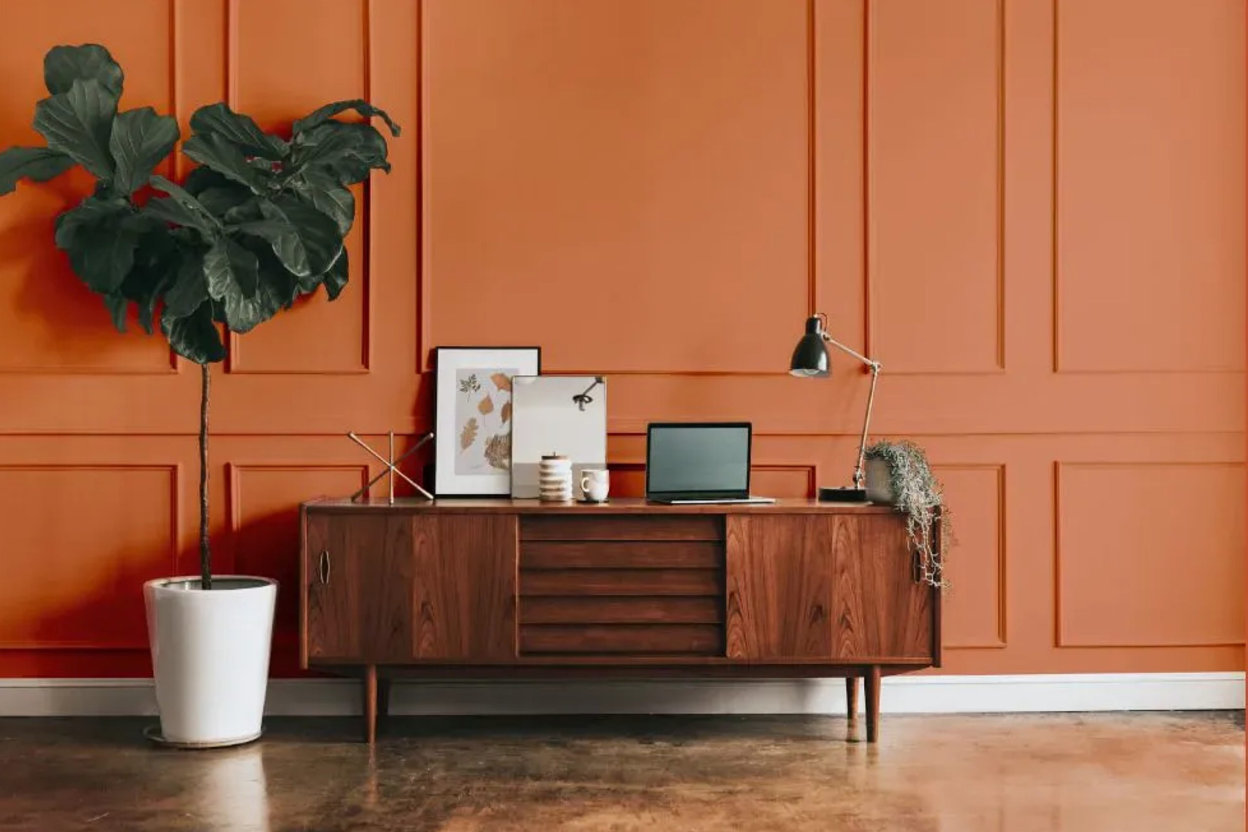
SW 6627 Emberglow by Sherwin Williams brings warmth and energy into any space. Imagine a color that feels like the perfect blend of vibrant sunset hues and the cozy glow of a fire. Emberglow is just that—a mix of orange and red tones that can add a welcoming touch to your home.
When you want to refresh a room, think about how this color can play with light, adding a lively yet comforting atmosphere. It’s a shade that can make a statement without being overwhelming.
Whether you’re updating your living room or adding a splash of color to a smaller space, Emberglow can provide just the right amount of warmth.
Consider pairing Emberglow with neutral colors to balance its intensity, or with earthy greens and browns for a more natural feel. You can also pair it with darker hues to create a sophisticated look.
This shade is great for those who want something bold yet approachable, a color that invites people in.
With its rich, inviting tone, SW 6627 Emberglow can be the perfect choice for those moments when you want to create a space that feels lively and inviting.
Take a moment to picture how this vibrant color could transform your surroundings into something special.
via plan-home.com
What Color Is Emberglow SW 6627 by Sherwin Williams?
Emberglow SW 6627 by Sherwin Williams is a warm, earthy shade that brings life and energy to a space. This color is a blend of orange and red hues, creating a cozy and inviting ambiance. It’s perfect for adding warmth to any room without being too overpowering
. Emberglow is a versatile choice, well-suited for bohemian or eclectic spaces where colors and textures mingle playfully. It also works beautifully in southwestern or rustic interiors, bringing to mind the rich tones of desert landscapes.
Pair Emberglow with natural materials like wood and stone to enhance its warmth. Wooden furniture, especially in darker tones, harmonizes well with this color. Add textures like woven fabrics, rugs, and cushions to bring depth and interest.
Neutral tones like beige, cream, or taupe can balance Emberglow’s intensity, providing a soothing counterpoint. Metals, especially bronze or copper, complement Emberglow nicely, adding a touch of elegance.
This vibrant hue can work wonders as an accent wall or in smaller doses, like on cabinet doors or within patterns.
Whether in living rooms, kitchens, or dining rooms, Emberglow fosters a lively yet cozy environment, making any space feel welcoming and full of character.
housekeepingbay.com
Is Emberglow SW 6627 by Sherwin Williams Warm or Cool color?
Emberglow SW 6627 by Sherwin Williams is a warm, earthy hue that adds a cozy feel to any home. This color sits between orange and red, giving it a vibrant, welcoming tone. When used in living spaces, Emberglow creates a lively and inviting atmosphere, perfect for gathering with family and friends.
It pairs well with neutral shades like beige or cream, helping to balance its boldness and making rooms feel both warm and lively.
In a dining room, Emberglow can stimulate conversation and appetite, making meals more enjoyable. For a cozy bedroom, this color adds warmth and comfort, promoting relaxation. Incorporating Emberglow into accents, such as pillows or throws, provides a pop of color without overwhelming.
When paired with wood tones, it enhances natural textures, lending a rustic yet modern touch. Overall, Emberglow SW 6627 adds a burst of energy and warmth, perfect for creating a welcoming home.
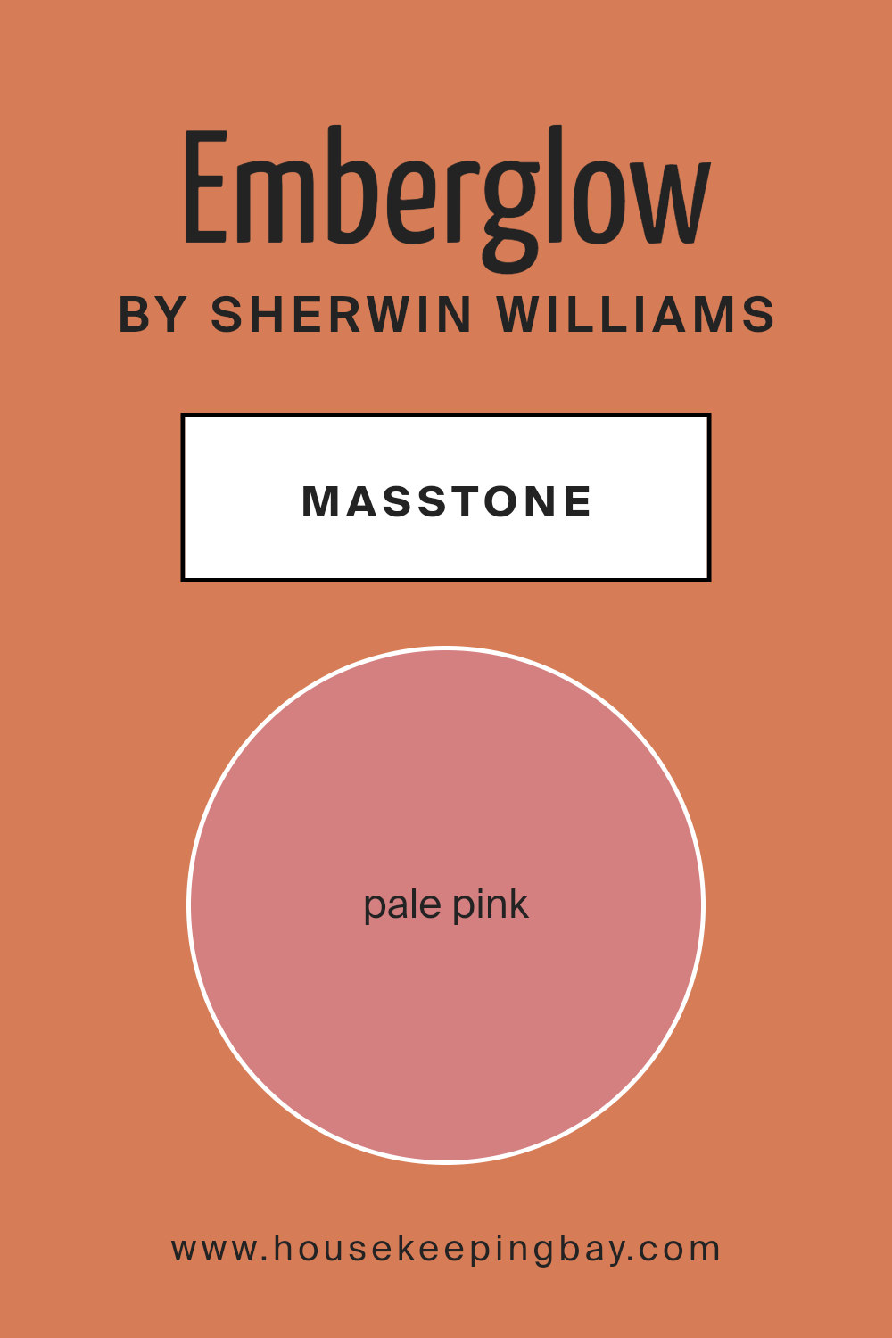
What is the Masstone of the Emberglow SW 6627 by Sherwin Williams?
Emberglow SW 6627 by Sherwin Williams is a warm and inviting color. Its masstone, which is the main, pure color you see before any light or shading is added, is a pale pink (#D58080). This soft pink can make spaces feel cozy and welcoming yet lively.
It is gentle, not too bold or overwhelming, making it ideal for various rooms in a home.
This shade works well in living rooms or bedrooms, where it brings warmth and comfort. Pale pinks like Emberglow can make small spaces appear larger and more open by reflecting light softly. It pairs well with neutral colors like whites or grays for a balanced look.
Using this color can create an inviting atmosphere, which is perfect for family gatherings or unwinding after a long day. Additionally, it suits traditional or modern styles, adapting easily to different tastes and furniture choices.
housekeepingbay.com
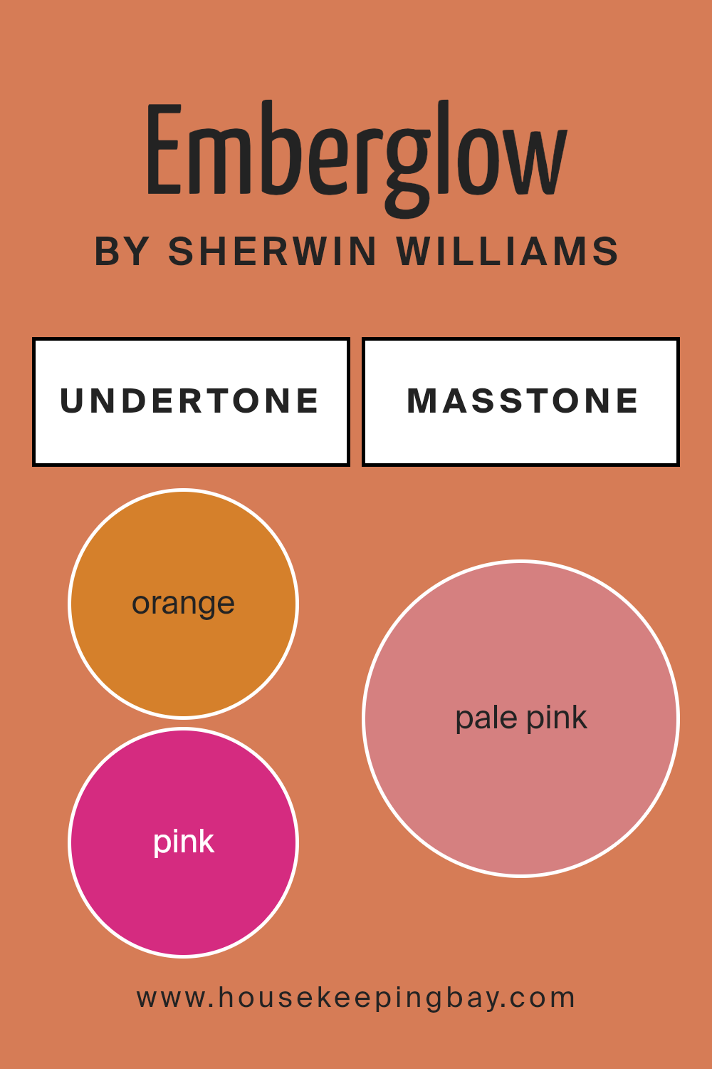
Undertones of Emberglow SW 6627 by Sherwin Williams
Emberglow SW 6627 by Sherwin Williams is a warm and inviting color that carries a complex set of undertones. These undertones include shades of orange, pink, red, and grey, among others. When applied to interior walls, these undertones can significantly impact how we perceive the color overall.
The primary undertones of orange and red give Emberglow its warm, fiery nature. This warmth makes spaces feel cozy and welcoming. The subtle pink and pale yellow hints soften the intensity, adding a gentle touch that can make a room feel cheerful and lively.
Meanwhile, the grey undertones contribute balance, ensuring that the color does not become overwhelming. This balance is crucial in maintaining a harmonious look within a space.
On interior walls, Emberglow’s undertones can affect the mood of a room. The olive and light green influences add a touch of earthiness, while the brown undertones ground the color, giving it stability.
When combined with elements like furniture or lighting, these nuances can shift—highlighting different aspects of the color at various times of day.
Ultimately, the rich mix of undertones in Emberglow makes it versatile. It can create a warm and inviting atmosphere that complements a variety of design styles and settings.
housekeepingbay.com
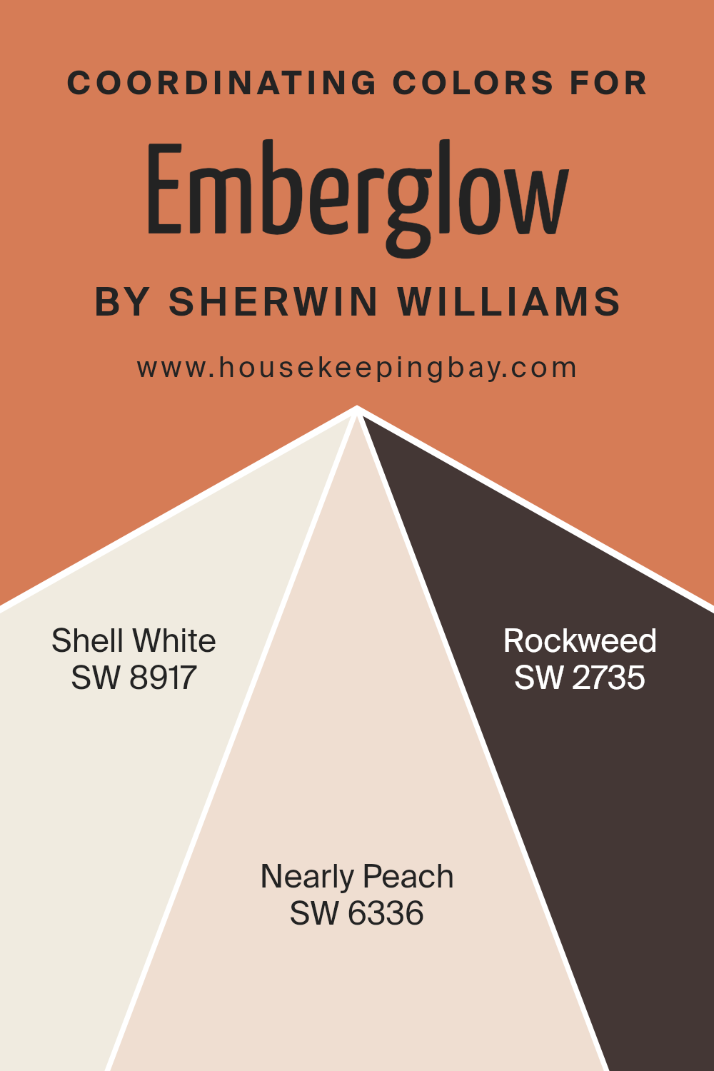
Coordinating Colors of Emberglow SW 6627 by Sherwin Williams
Coordinating colors are hues that complement a primary color, creating a balanced and harmonious look. When you choose colors that work well with each other, it enhances the appearance of any space, making it feel cohesive and inviting.
For example, Emberglow SW 6627 by Sherwin Williams is a warm, vibrant shade that brings energy and a touch of boldness to a room. To complement Emberglow, you might consider using SW 8917 – Shell White, which offers a gentle, creamy white that softens the intensity of Emberglow.
This calm shade provides a neutral base that allows other colors to shine without overpowering them.
Incorporating SW 6336 – Nearly Peach with Emberglow creates a soft, warm blend, as this color adds a subtle peach tone that matches Emberglow’s energy. This pairing feels fresh and lively, contributing to a cheerful ambiance. Another coordinating color is SW 2735 – Rockweed.
This rich, deep green introduces an earthy element that accents the vibrancy of Emberglow while providing a natural balance.
Using these colors together can give any room personality and depth, ensuring the space remains visually interesting and pleasant to spend time in.
You can see recommended paint colors below:
- SW 8917 Shell White
- SW 6336 Nearly Peach
- SW 2735 Rockweed
housekeepingbay.com
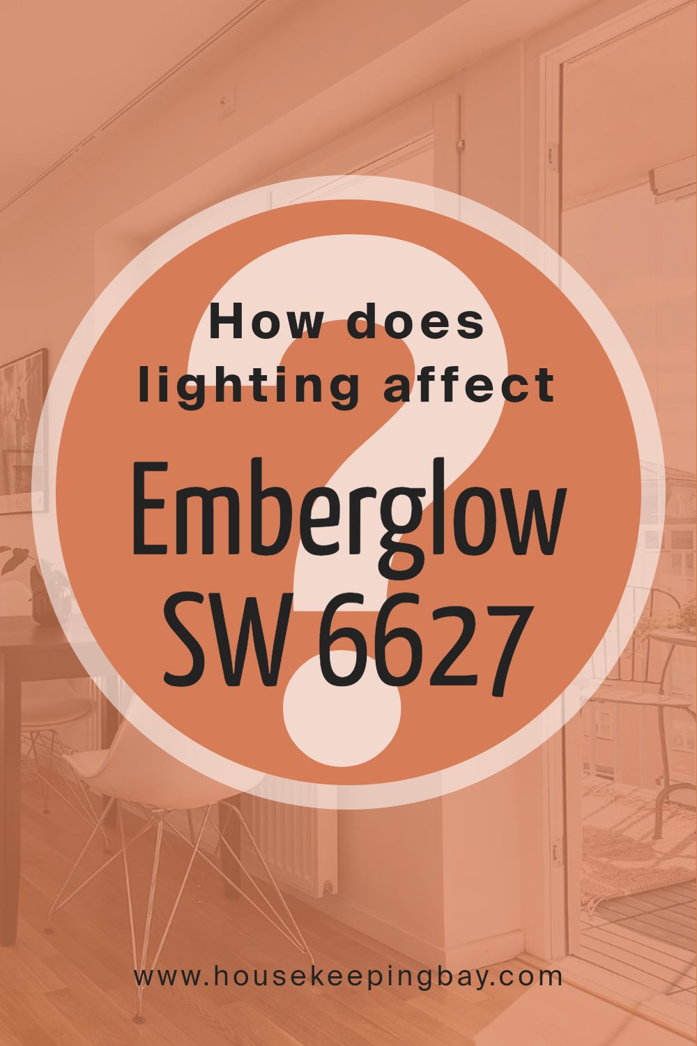
How Does Lighting Affect Emberglow SW 6627 by Sherwin Williams?
Lighting has a big impact on how colors look. Different light sources can change the appearance of a color significantly. Emberglow SW 6627 by Sherwin Williams is a warm, inviting orange tone. How it looks can vary depending on lighting.
In natural light, Emberglow will appear differently throughout the day. In a north-faced room, where light is cooler and less direct, Emberglow might look slightly muted or softer, as cooler light can tone down some of its warmth. The orange hue may seem a bit subdued but still warm.
In a south-faced room, Emberglow benefits from warm, bright light for much of the day. Here, the color shows its rich, vivid side, appearing more saturated and lively, enhancing the warmth the paint already has.
East-facing rooms get morning light, which is usually soft and yellowish. Emberglow can look warm and fresh during these early hours. However, as the day progresses and the light changes, the orange may become less bright, taking on a subtler tone.
In west-facing rooms, the afternoon and evening light is rich and warm. Emberglow in these rooms tends to look bold and glowing in the later part of the day, when the setting sun casts a golden tone.
Under artificial light, Emberglow’s appearance will depend on the light bulb used. Incandescent bulbs emit a warm, yellow light that can make Emberglow appear cozier and more orange.
LED or fluorescent lights can have a cooler or bluish tint, which might tone down the orange warmth. Consider using a warm white LED bulb to maintain the rich warmth of the color.
Overall, lighting changes Emberglow’s look by affecting brightness and warmth. Testing paint samples in different rooms and lights helps see these shifts before deciding where and how to use them.
housekeepingbay.com
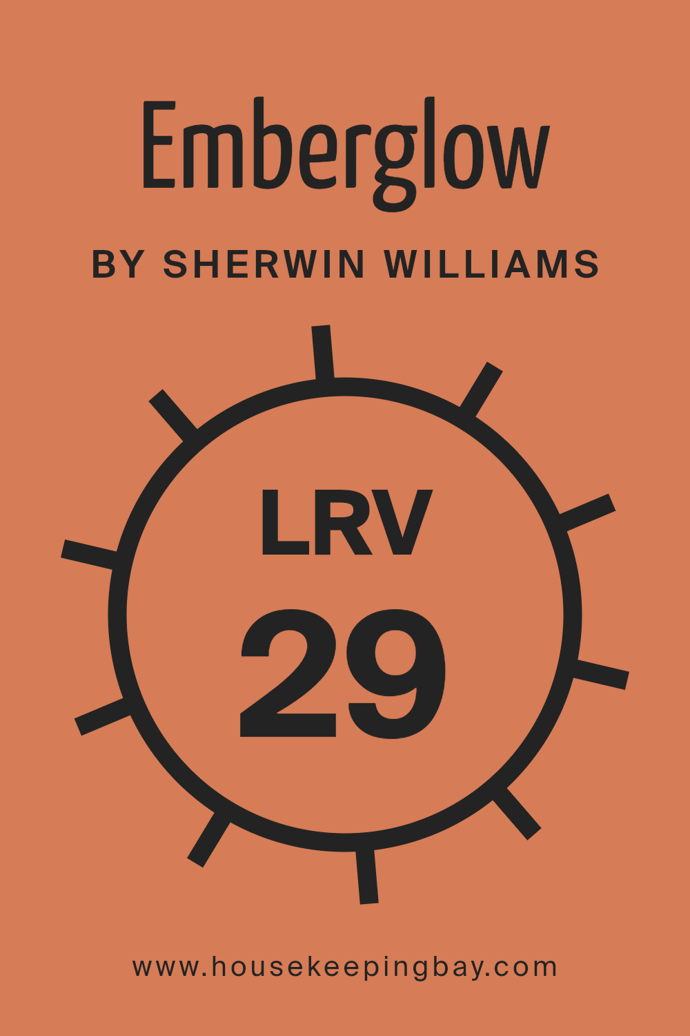
What is the LRV of Emberglow SW 6627 by Sherwin Williams?
The term LRV stands for Light Reflectance Value. It measures the amount of light a color reflects on a scale from 0 to 100, where 0 is absolutely black and absorbs all light, and 100 is pure white and reflects all light. The LRV helps us understand how bright or dark a color might appear in a space.
A higher LRV means the color will reflect more light, making a room feel brighter and more open. Conversely, a lower LRV means the color will absorb more light, making a space feel cozier and potentially smaller.
Understanding LRV is useful because it helps predict how a paint color will behave in different lighting conditions and different-sized rooms.
Emberglow SW 6627 by Sherwin Williams has an LRV of 29.321, which places it on the lower side of the LRV scale.
This indicates that Emberglow is a darker, richer color that absorbs more light than it reflects. In a room with plenty of natural light, Emberglow may create a warm, intimate atmosphere, keeping the space cozy. But in an area with limited light, it could make the room look even darker, lending a dramatic and snug feeling.
It’s a beautiful choice for adding warmth to a space but should be used carefully, considering the room’s lighting conditions and size to achieve the desired effect.
housekeepingbay.com
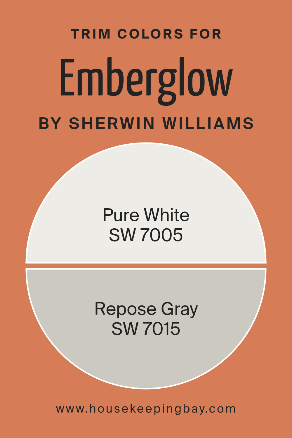
What are the Trim colors of Emberglow SW 6627 by Sherwin Williams?
Trim colors are the finishing touches that define the edges and lines of a space, making them stand out or blend with the overall design. For a bold and warm hue like Emberglow SW 6627 by Sherwin Williams, choosing the right trim color can emphasize its vibrant and energetic qualities or provide a subtle contrast to balance its liveliness.
Trim colors also play a crucial role in highlighting architectural features like moldings and window frames, creating a harmonious and polished look. Using the correct trim can bring out the depth of Emberglow, providing a cohesive and visually pleasing effect in a room.
SW 7005 – Pure White serves as an excellent trim color for Emberglow because it offers a clean, crisp boundary that enhances the warm, fiery tones of the main wall color. Pure White is a bright white with subtle undertones, making it versatile and a perfect match for almost any hue.
On the other hand, SW 7015 – Repose Gray is a soft gray with warm undertones, which complements Emberglow by adding a gentle contrast without overshadowing it.
This gray is understated and provides a grounded look, making it suitable for those who wish to tone down the vibrancy while maintaining a sophisticated vibe. Together, these trim colors can elevate the charm and warmth that Emberglow offers within a space.
You can see recommended paint colors below:
- SW 7005 Pure White
- SW 7015 Repose Gray
housekeepingbay.com
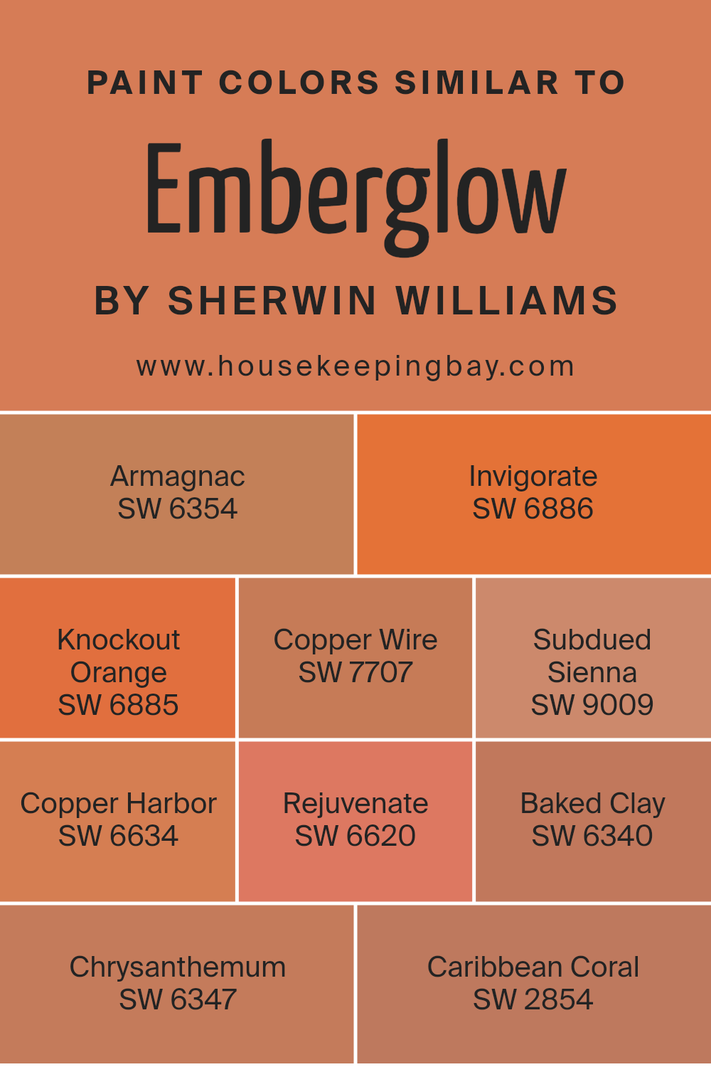
Colors Similar to Emberglow SW 6627 by Sherwin Williams
Similar colors to Emberglow SW 6627 by Sherwin Williams are essential as they help to create a harmonious look in any space. These colors can subtly enhance the warmth and vibrancy of a room without clashing. They work well together because they share underlying tones that blend seamlessly, offering a cohesive look in areas like living rooms or kitchens where warmth and energy are desired.
Colors like SW 6354 Armagnac provide a rich, burnt orange tone that feels cozy and inviting. Meanwhile, SW 6886 Invigorate adds a vibrant kick, while SW 6885 Knockout Orange brings a cheerful and energetic vibe. These rich and dynamic hues work together to create a space that feels lively and welcoming.
SW 7707 Copper Wire offers a deeper, earthy orange that grounds a room, while SW 9009 Subdued Sienna introduces a more muted and soft element. SW 6634 Copper Harbor feels timeless with its classic, warm undertones. With SW 6620 Rejuvenate, you get a fiery burst of energy, while SW 6340 Baked Clay leans into a more rustic feel.
SW 6347 Chrysanthemum introduces a floral quality, perfect for adding a touch of natural charm. SW 2854 Caribbean Coral provides a bright and warm finish.
Together, these similar colors can transform a space into an inviting and warm environment.
You can see recommended paint colors below:
- SW 6354 Armagnac
- SW 6886 Invigorate
- SW 6885 Knockout Orange
- SW 7707 Copper Wire
- SW 9009 Subdued Sienna
- SW 6634 Copper Harbor
- SW 6620 Rejuvenate
- SW 6340 Baked Clay
- SW 6347 Chrysanthemum
- SW 2854 Caribbean Coral
housekeepingbay.com
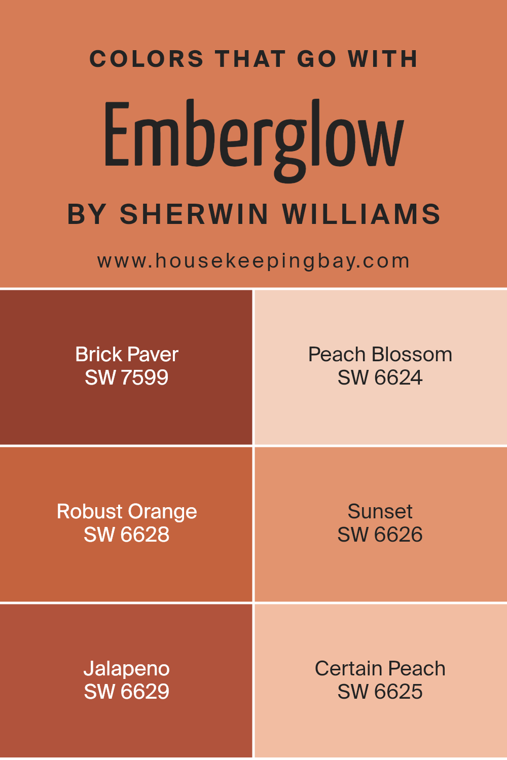
Colors that Go With Emberglow SW 6627 by Sherwin Williams
Choosing colors that pair well with Emberglow (SW 6627) by Sherwin Williams enriches the space, creating a dynamic and harmonious environment. Emberglow itself is a warm and inviting hue, reminiscent of a glowing sunset.
When complemented with SW 7599 Brick Paver, its earthy tones provide a sense of grounded stability, offering balance.
Peach Blossom (SW 6624), on the other hand, brings a soft, gentle contrast with its light and airy nature. This color adds an element of freshness and a touch of lightness to the boldness of Emberglow.
Robust Orange (SW 6628) shares the warmth and intensity of Emberglow and amplifies the energetic atmosphere in the room.
Sunset (SW 6626) presents a slightly muted version of these colors, creating a soft transition that feels calming yet connected. Jalapeno (SW 6629) offers a lively splash of spice with its vibrant red undertone, injecting a punch of excitement to the setup. Lastly, Certain Peach (SW 6625) completes the palette with its subtle and understated elegance, gently soothing with its pastel charm.
Together, these colors create a vibrant yet harmonious environment, enhancing the mood and aesthetic of any space where Emberglow is featured.
You can see recommended paint colors below:
- SW 7599 Brick Paver
- SW 6624 Peach Blossom
- SW 6628 Robust Orange
- SW 6626 Sunset
- SW 6629 Jalapeno
- SW 6625 Certain Peach
housekeepingbay.com
How to Use Emberglow SW 6627 by Sherwin Williams In Your Home?
Emberglow SW 6627 by Sherwin Williams is a warm, inviting shade of orange. It adds comfort and energy to any room. Use it in a living room to create a cozy space where family and friends can gather. Emberglow works well as an accent wall, bringing a pop of color without being overwhelming. In a bedroom, it offers a sense of warmth and coziness, perfect for relaxation.
You might consider using Emberglow in a dining room to make it feel welcoming and vibrant. Pair it with neutral tones like beige, gray, or cream for a balanced look. For those who love bold designs, combine Emberglow with deep blues or greens for a striking contrast.
Kitchens can benefit from Emberglow by making the space feel lively and energetic, encouraging engaging conversations. Add Emberglow accessories, like cushions or vases, to tie rooms together without painting entire walls.
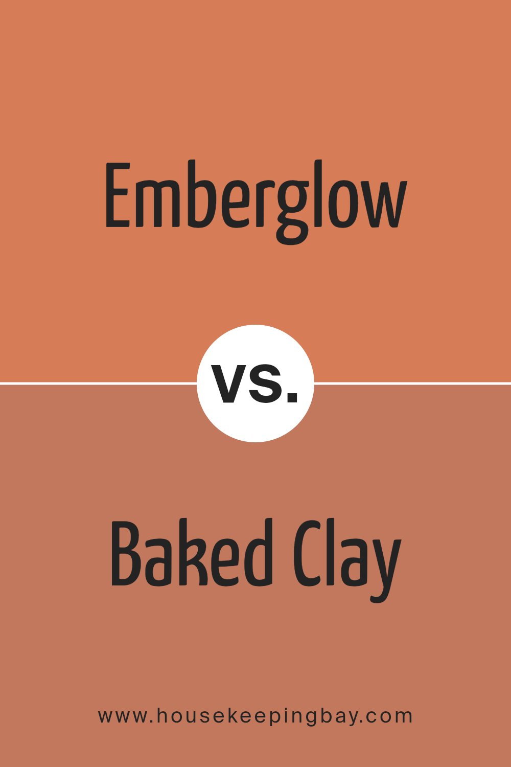
Emberglow SW 6627 by Sherwin Williams vs Baked Clay SW 6340 by Sherwin Williams
Emberglow SW 6627 by Sherwin Williams is a warm, vibrant shade with rich orange and coral undertones. It brings energy and warmth to any room, making spaces feel inviting and cozy. Its lively hue can add a cheerful touch to a living room or create a spirited atmosphere in a dining area. The color brightens a space, creating a lively ambiance.
Baked Clay SW 6340 by Sherwin Williams, however, has a more earthy tone with brown and rust influences. This color conveys a sense of grounded warmth and stability. It’s more subdued compared to Emberglow, ideal for adding a natural, relaxed feel to a room.
Baked Clay works well in spaces like bedrooms or studies where a calming, earthy presence is desired.
Both colors offer warmth but differ in energy levels: Emberglow brings vibrancy, while Baked Clay provides a comforting, muted tone. Perfect for creating distinct moods depending on preference.
You can see recommended paint color below:
- SW 6340 Baked Clay
housekeepingbay.com
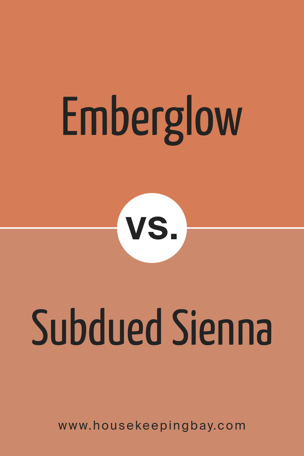
Emberglow SW 6627 by Sherwin Williams vs Subdued Sienna SW 9009 by Sherwin Williams
Emberglow SW 6627 and Subdued Sienna SW 9009 by Sherwin Williams both offer warm, rich tones but create different moods. Emberglow, a vibrant orange-red, evokes warmth and energy, making spaces feel cozy and inviting. Its boldness works well in living areas or accents that seek to uplift and energize the environment.
Subdued Sienna, in contrast, has a more toned-down brownish-red hue, offering a calm and earthy vibe.
This color brings a sense of comfort and stability, ideal for spaces aiming for a relaxed and natural atmosphere. While Emberglow can act as a striking focal point, Subdued Sienna blends more subtly, providing a soothing backdrop.
Both colors enrich a space, but Emberglow stands out with its bright impact, whereas Subdued Sienna quietly supports the ambiance. Choosing between them depends on whether the goal is to energize or create a peaceful, grounded space.
You can see recommended paint color below:
- SW 9009 Subdued Sienna
housekeepingbay.com
Emberglow SW 6627 by Sherwin Williams vs Copper Wire SW 7707 by Sherwin Williams
Emberglow SW 6627 and Copper Wire SW 7707 by Sherwin Williams both offer warm, inviting tones, but each holds its unique charm. Emberglow SW 6627 resembles a soft, burnt orange. It feels warm and cozy, ideal for adding a splash of vibrant energy to a space. It brings to mind images of glowing embers in a fireplace, emphasizing its comforting nature.
Copper Wire SW 7707, in contrast, exhibits a deeper, richer color. It has a mix of brown with a hint of reddish-orange, giving it an earthy, grounded feel. Copper Wire feels more rustic and natural, akin to the color of aged copper metal.
While Emberglow stands out more with its brightness, Copper Wire provides a subtler, sophisticated tone. Together, these colors can complement each other well, with Emberglow adding liveliness and Copper Wire offering depth and richness to a room.
You can see recommended paint color below:
- SW 7707 Copper Wire
housekeepingbay.com
Emberglow SW 6627 by Sherwin Williams vs Invigorate SW 6886 by Sherwin Williams
Emberglow SW 6627 and Invigorate SW 6886 by Sherwin Williams both bring warmth and energy, yet they have distinct personalities. Emberglow SW 6627 feels like a cozy autumn evening with its soft, burnt-orange hue. It is inviting and can bring comfort to any room, making spaces feel snug and warm.
Invigorate SW 6886, however, has a more vibrant and lively feel. It is a bold, bright red-orange that can energize a room. This color is perfect for spaces where you want to feel motivated and active.
When side by side, Emberglow offers a more muted look compared to the bold presence of Invigorate. Emberglow suits spaces intended for relaxation, while Invigorate works best in areas meant for activity and energy. Both colors provide warmth, but their intensity levels set them apart—one soft and soothing, the other bold and dynamic.
You can see recommended paint color below:
- SW 6886 Invigorate
housekeepingbay.com
Emberglow SW 6627 by Sherwin Williams vs Chrysanthemum SW 6347 by Sherwin Williams
Emberglow SW 6627 and Chrysanthemum SW 6347 by Sherwin Williams both fall within the warm color spectrum but display distinct qualities. Emberglow is a vibrant, rich orange with a hint of coral, providing warmth and a lively energy. It’s excellent for creating a cozy, inviting atmosphere and works well as an accent color.
Chrysanthemum, while also warm, has a more muted tone. It’s a subtle blend of orange with a hint of earthy undertones, presenting a softer, more understated effect. This color feels grounded and natural, making it ideal for spaces aiming for a relaxed, comforting mood.
Emberglow tends to stand out more due to its brightness, making it suitable for bold statements. Meanwhile, Chrysanthemum offers versatility, fitting well in settings where a softer ambiance is preferred. Both colors complement each other beautifully when paired in creative designs, offering a balance of energy and calmness.
You can see recommended paint color below:
- SW 6347 Chrysanthemum
housekeepingbay.com
Emberglow SW 6627 by Sherwin Williams vs Knockout Orange SW 6885 by Sherwin Williams
Emberglow SW 6627 and Knockout Orange SW 6885 by Sherwin Williams offer two vibrant shades of orange, each with a unique personality. Emberglow presents a warm and inviting hue that captures a cozy, autumn-like feel. Its earthy undertones make it great for spaces meant to feel welcoming and snug. Ideal for living rooms or dining areas, Emberglow adds a comforting ambiance without overwhelming.
Knockout Orange, in contrast, bursts with energy and vibrancy. This bold, bright orange feels more lively and playful. Perfect for accent walls or lively spaces, it adds a punchy, spirited atmosphere.
Its intensity brings excitement and can energize any room, making it great for creative spaces or areas needing a lively boost.
While Emberglow wraps you in warmth, Knockout Orange injects zest and cheer. Selecting between these colors depends on whether you want a calm comfort or a lively kick in your décor.
You can see recommended paint color below:
- SW 6885 Knockout Orange
housekeepingbay.com
Emberglow SW 6627 by Sherwin Williams vs Copper Harbor SW 6634 by Sherwin Williams
Emberglow SW 6627, from Sherwin Williams, offers a warm and vibrant orange hue with a hint of red, creating a cozy and inviting atmosphere. It’s a lively color that can add energy to any room, making it suitable for living spaces or accents where warmth is desired. Its brightness makes it an excellent choice for spaces needing a bit of uplifting cheer.
Copper Harbor SW 6634, also by Sherwin Williams, presents a deeper and richer tone. This shade leans more towards a muted reddish-brown, offering a sense of comfort and earthiness.
It’s a color that exudes a grounded and sophisticated feel, ideal for spaces where relaxation and deep, cozy vibes are important, like bedrooms or reading nooks.
While both colors bring warmth, Emberglow stands out with its liveliness, whereas Copper Harbor provides a more subdued, comforting atmosphere.
Choosing between them depends on whether you seek vibrant energy or a calm embrace in your space.
You can see recommended paint color below:
- SW 6634 Copper Harbor
housekeepingbay.com
Emberglow SW 6627 by Sherwin Williams vs Rejuvenate SW 6620 by Sherwin Williams
Emberglow SW 6627 and Rejuvenate SW 6620, both from Sherwin Williams, offer warm, lively vibes but differ in tone and intensity. Emberglow SW 6627 resembles a glowing ember with its vivid orange-red mix, bringing energy and warmth to a room. Its vibrant tone makes it suitable for accent walls or lively spaces.
Rejuvenate SW 6620, though in a similar color family, presents a softer, more muted shade of orange. It leans slightly towards a coral hue, often creating a welcoming, pleasant atmosphere. While Emberglow grabs attention and adds excitement, Rejuvenate provides a gentle, uplifting backdrop.
Both colors work well in spaces needing warmth, though Emberglow suits bold styles, and Rejuvenate fits relaxed, comforting settings.
When choosing between them, consider the mood desired: vibrant and lively with Emberglow or soft and inviting with Rejuvenate.
You can see recommended paint color below:
- SW 6620 Rejuvenate
housekeepingbay.com
Emberglow SW 6627 by Sherwin Williams vs Armagnac SW 6354 by Sherwin Williams
Emberglow SW 6627 and Armagnac SW 6354 are two inviting colors from Sherwin Williams, each with its distinct charm. Emberglow presents a warm, deep orange with a touch of red, radiating warmth and energy. It is ideal for spaces needing a lively and inviting atmosphere, sparking creativity and conversation.
Armagnac, in contrast, leans more towards a rich, brownish orange, offering a cozy, earthy feel. This color provides a sense of comfort and stability, perfect for creating a welcoming and grounded environment.
When placed side by side, Emberglow appears brighter and more vibrant, while Armagnac offers a subdued, sophisticated tone. Emberglow suits modern and lively decor, while Armagnac fits traditional or rustic settings. Both colors add warmth but achieve it differently; Emberglow invigorates spaces, whereas Armagnac soothes them. Choosing between them depends on the desired mood and style of the room.
You can see recommended paint color below:
- SW 6354 Armagnac

housekeepingbay.com
Emberglow SW 6627 by Sherwin Williams vs Caribbean Coral SW 2854 by Sherwin Williams
Emberglow SW 6627 and Caribbean Coral SW 2854 by Sherwin Williams both display warm, inviting tones, yet each possesses unique qualities. Emberglow SW 6627 is a rich, bold shade of orange with hints of red, creating a vibrant, energetic feel. It captures warmth and coziness, making it ideal for spaces where one desires a lively atmosphere.
Caribbean Coral SW 2854, by contrast, takes on a softer, peachy hue. It radiates a gentle, soothing vibe reminiscent of tropical beaches. This color provides a more relaxed feel, suitable for rooms needing a touch of calmness and cheeriness.
While Emberglow commands attention with its intensity, Caribbean Coral exudes a subtle charm. Both work well in diverse settings, but their mood differs. Emberglow suits dynamic, active spaces, while Caribbean Coral complements serene, inviting environments.
The choice between them depends on whether you wish for a room to burst with energy or to feel soft and comforting.
You can see recommended paint color below:
housekeepingbay.com
Conclusion
Wrapping up my journey with SW 6627 Emberglow by Sherwin Williams, I find myself drawn to its warmth and charm. This color is like a cozy hug on a crisp autumn day. It brings a sense of comfort and vibrancy to any space. Whether in a living room, bedroom, or even an accent wall, it adds personality without overwhelming a room.
The versatility of Emberglow impresses me most. It pairs beautifully with neutrals, creating a balanced and inviting atmosphere. When combined with deep blues or rich greys, it adds a dramatic flair that makes a statement.
I also appreciate its adaptability across different styles, from traditional to modern settings.
In terms of mood, Emberglow radiates positivity and energy, making it a great choice for spaces where people gather. It sets the tone for conversation, laughter, and relaxation. Its undertones provide a cozy backdrop that makes a house feel like a home.
Choosing Emberglow means opting for a color that speaks to comfort, style, and versatility. It’s about creating a space that feels warm and inviting, without being too bold or too soft. This color brings life to a room and leaves a lasting impression. I am excited to see how Emberglow will continue to inspire and enhance spaces.
housekeepingbay.com
Ever wished paint sampling was as easy as sticking a sticker? Guess what? Now it is! Discover Samplize's unique Peel & Stick samples. Get started now and say goodbye to the old messy way!
Get paint samples


