Hot Cocoa SW 6047 by Sherwin Williams
Warmth in Every Brush Stroke
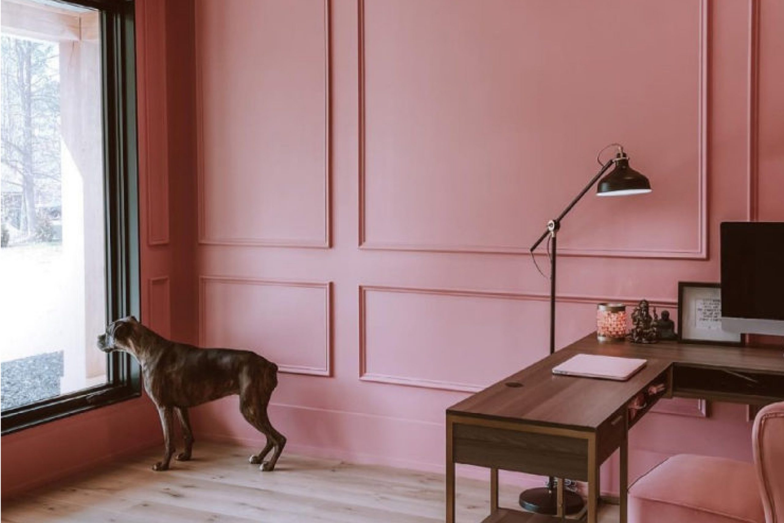
When you choose a paint color for your space, you want something that sets the right mood and complements your decor. Sherwin Williams’ SW 6047 Hot Cocoa is a warm, rich brown that can add a cozy and inviting feel to any room. This color is like a comforting mug of hot chocolate, with its deep, chocolaty tones that can make large spaces feel more intimate and small areas feel snug and welcoming.
Hot Cocoa works well with a variety of color palettes, whether you’re pairing it with soft creams for a gentle contrast or bold hues for a more dynamic look. It is particularly effective in living rooms, bedrooms, or reading nooks where you want to create a relaxed atmosphere.
This shade is also a great choice for furniture pieces that you want to stand out.
Remember, lighting plays a crucial role in how paint colors look in your home. Hot Cocoa can appear richer and deeper in rooms with less natural light, or softer and more subdued in well-lit areas.
So, consider how the light changes throughout the day in your space to see if Hot Cocoa is right for you.
via sherwin-williams.com
What Color Is Hot Cocoa SW 6047 by Sherwin Williams?
Hot Cocoa SW 6047 by Sherwin Williams is a rich, deep brown that mimics the comforting shade of its namesake. With its warm undertones, this color provides a cozy, inviting feel to any room. This shade suits various decorating styles, particularly rustic, traditional, and modern interiors. It works exceptionally well in living rooms, bedrooms, and dens where a sense of warmth is desired.
Hot Cocoa pairs beautifully with natural materials like wood and leather, enhancing their inherent qualities. The color also goes well with softer textures such as wool, velvet, and fleece, which help to create a snug and homely atmosphere.
In terms of color combinations, it complements creams, beiges, and soft blues, offering a balanced palette that is both soothing and sophisticated.
In rustic environments, Hot Cocoa can be used on walls or as an accent in furniture, bringing out the earthy tones of wooden beams and natural stone. In a modern setting, this color is perfect for creating dramatic contrasts, especially when paired with metallic fixtures and sleek furniture.
Overall, Hot Cocoa SW 6047 is a versatile color that warms up spaces and makes them more inviting. It’s an ideal choice for anyone looking to add a touch of warmth and elegance to their home.

housekeepingbay.com
Is Hot Cocoa SW 6047 by Sherwin Williams Warm or Cool color?
Hot Cocoa SW 6047 by Sherwin Williams is a warm, rich brown paint color that brings a cozy and comforting feel to any room. This shade is perfect for someone looking to create a snug and inviting atmosphere.
The deep brown tone of Hot Cocoa mimics the natural earth and can make large spaces feel more intimate and welcoming. It pairs well with a variety of decor styles, from rustic to modern, and complements furniture and accessories in lighter colors, such as creams and beiges, which helps to balance the depth of the brown.
Using Hot Cocoa in a home can also add a sense of security and stability due to its solid, grounding effect. It works beautifully in living rooms, bedrooms, and even dining areas where warmth is essential. Additionally, in spaces with ample natural light, Hot Cocoa radiates a soft, warm glow, enhancing the sense of warmth.
In smaller, less lit areas, it can make the space feel smaller but infinitely cozier, ideal for creating a snug hideaway.
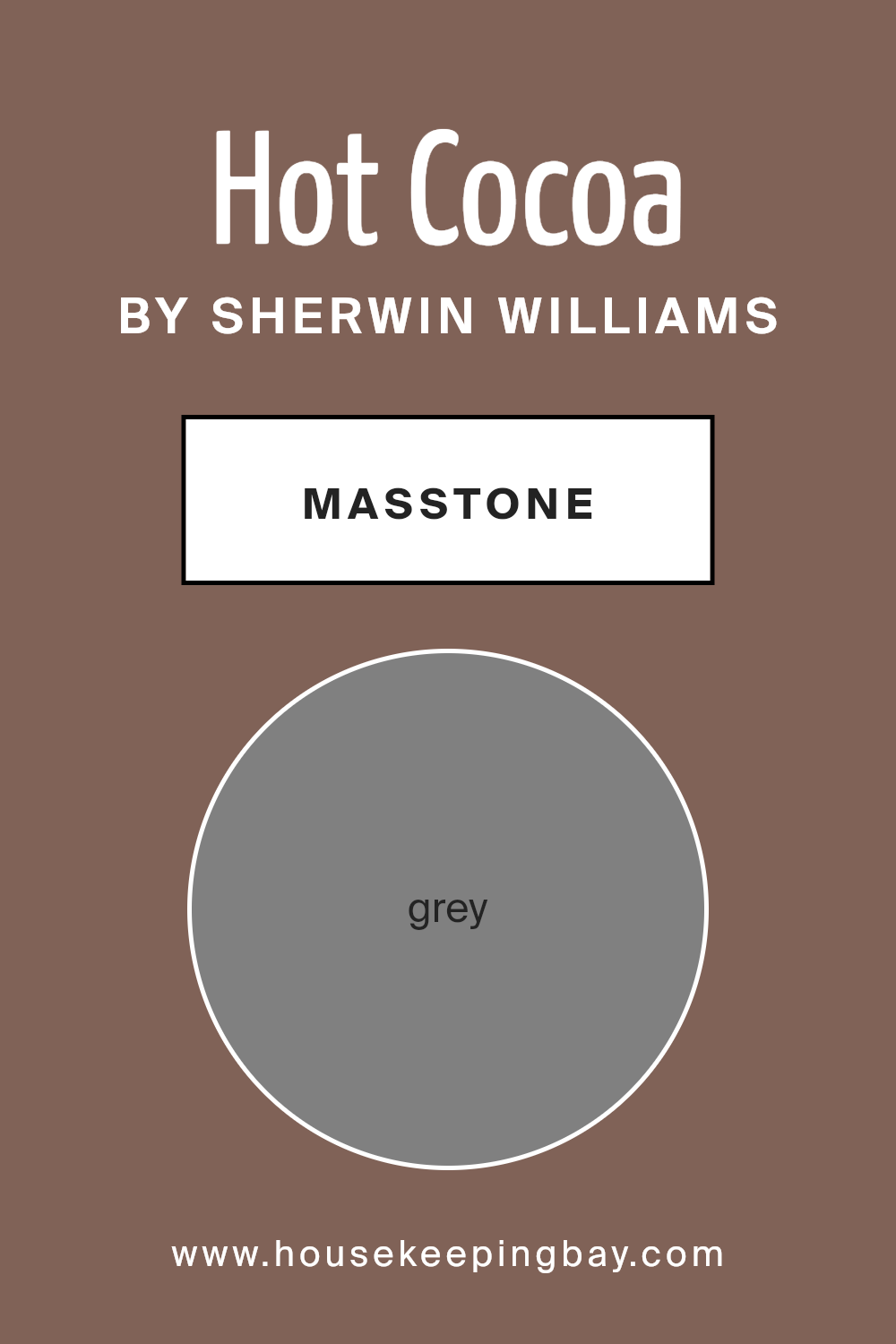
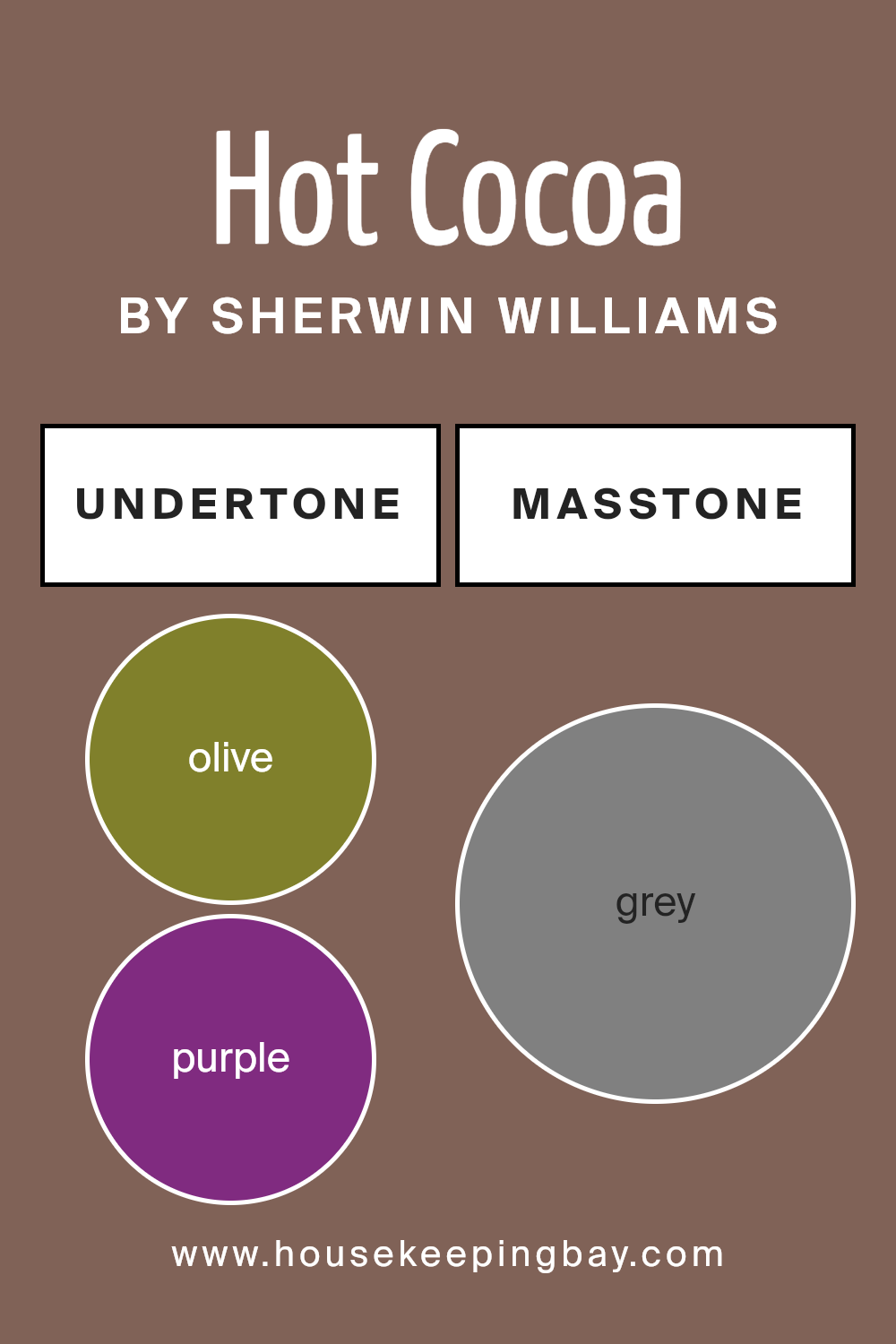
What is the Masstone of the Hot Cocoa SW 6047 by Sherwin Williams?
Hot Cocoa SW 6047 by Sherwin Williams has a masstone of grey, specifically noted as Grey (#808080). This basic and balanced shade of grey plays an essential role in its presence in home environments. The neutrality of this grey creates a versatile backdrop that suits various decorating styles, from modern minimalism to cozy traditional.
Since it doesn’t lean toward overly warm or cool tones, Hot Cocoa can be paired with almost any color, making it really easy for homeowners to match with their existing furniture and accessories.
In rooms that get a lot of natural light, this color can appear softer and more inviting, while in spaces with less light, it maintains a solid, grounding effect. This adaptability allows it to be used in many areas of a home, from living rooms and bedrooms to kitchens and bathrooms.
It’s also beneficial for selling homes, as its neutrality appeals to potential buyers who can easily envision their personal touches in the space.
housekeepingbay.com
Undertones of Hot Cocoa SW 6047 by Sherwin Williams
Hot Cocoa SW 6047 by Sherwin Williams is a complex color due to its rich undertones. When selecting paint for interior walls, understanding these undertones is crucial since they influence how the color appears under different lighting conditions and when paired with various elements in a room.
Hot Cocoa is influenced by a variety of undertones, including Olive, Purple, Brown, and Pale Pink, among others. These undertones contribute to the warmth and depth of the color, which can make a room feel cozy and inviting.
For example, its Brown and Dark Green undertones add earthiness, which can help in creating a grounding atmosphere. The presence of Purple or Navy might cool the overall warmth slightly, giving a subtle, sophisticated undertone.
In daylight, lighter undertones like Light Blue and Pale Yellow may become more prominent, reflecting more natural light and giving the paint a softer look. In contrast, in artificial light, darker undertones like Dark Grey or Dark Blue might emerge, making the room feel more enclosed and intimate.
When used on interior walls, Hot Cocoa can offer a versatile backdrop. It can appear vibrant and rich with the activation of Orange or Fuchsia undertones, or more subdued and neutral when undertones like Light Gray or Pale Pink are dominant. This versatility makes Hot Cocoa a good choice for various room styles and functions, from living areas to bedrooms.
Overall, the way Hot Cocoa looks on your walls can vary throughout the day and depending on what colors it is paired with. This means you can customize your interior space just by considering these undertones in your decor choices.
housekeepingbay.com
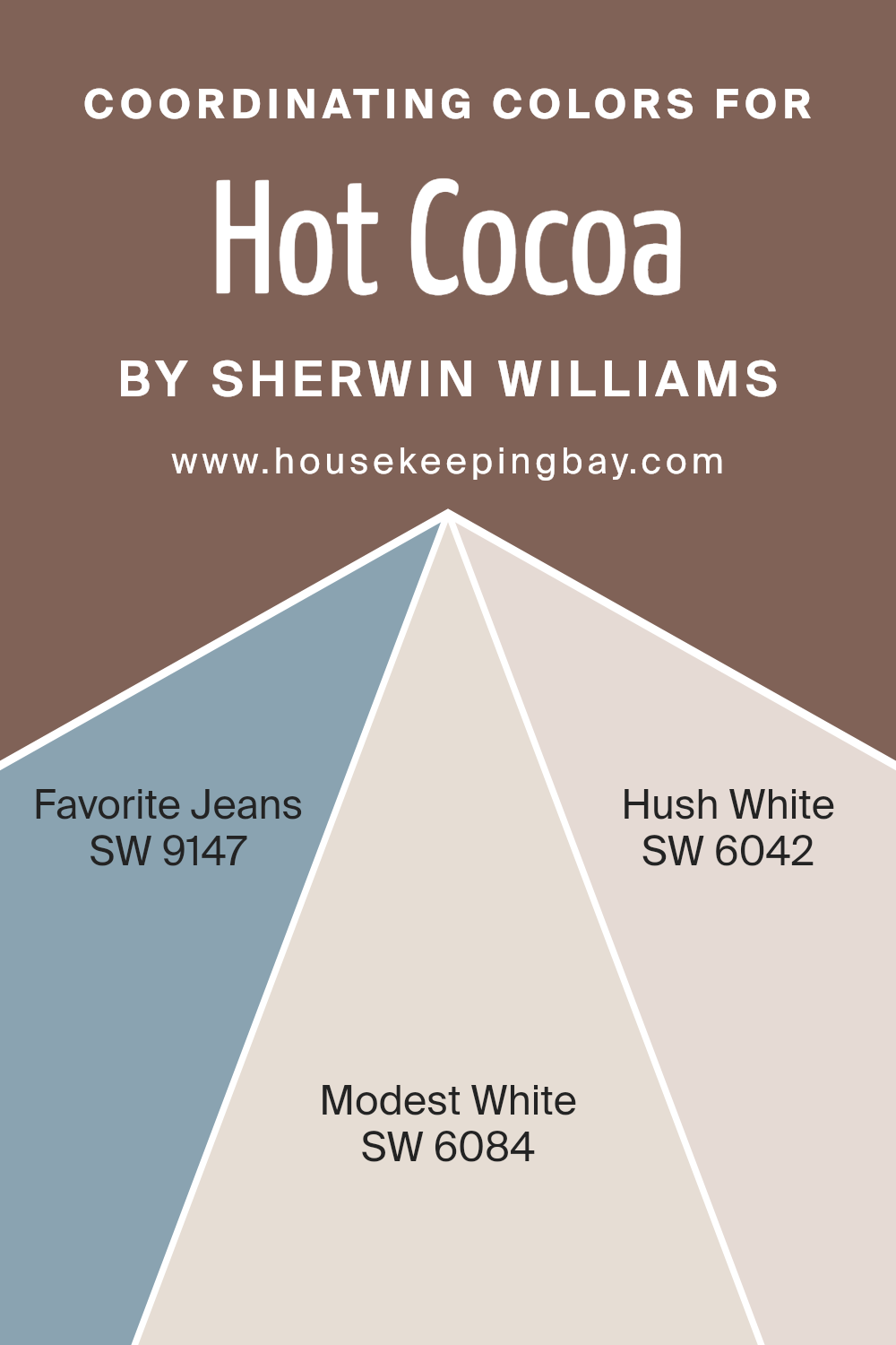
Coordinating Colors of Hot Cocoa SW 6047 by Sherwin Williams
Coordinating colors are chosen to complement a main color, creating a pleasing and balanced visual experience. Hot Cocoa SW 6047 by Sherwin Williams is a warm, rich brown tone that can easily be the centerpiece of a color scheme for any room.
Finding the right coordinating colors can bring out the best in this primary shade, enhancing its warmth and depth. Colors such as SW 9147 – Favorite Jeans, SW 6084 – Modest White, and SW 6042 – Hush White work seamlessly with Hot Cocoa to provide contrast and cohesion in interior design.
Favorite Jeans SW 9147 is a soft, dusty blue that provides a gentle contrast to the deep warmth of Hot Cocoa, adding a relaxed feel to the atmosphere. The blues in Favorite Jeans bring out the earthy tones in Hot Cocoa, making the space feel grounded and calm.
On the other hand, Modest White SW 6084 offers a creamy, soft white that complements Hot Cocoa by providing a light, airy backdrop that allows darker colors to stand out without overwhelming the space.
Lastly, Hush White SW 6042 is a muted white with subtle gray undertones, perfect for creating a soft, harmonious look when paired with darker, richer colors like Hot Cocoa, ensuring the space feels cohesive and thoughtfully designed.
You can see recommended paint colors below:
- SW 9147 Favorite Jeans
- SW 6084 Modest White
- SW 6042 Hush White
housekeepingbay.com
How Does Lighting Affect Hot Cocoa SW 6047 by Sherwin Williams?
Lighting can greatly influence how we perceive colors. Different light sources cast different hues, affecting how a color appears in a space. The color “Hot Cocoa SW 6047” by Sherwin Williams is a warm, rich brown that can vary in appearance depending on the lighting.
Artificial Light: In artificial lighting, Hot Cocoa tends to look warmer and more inviting. Incandescent and warm LED lights enhance its red and yellow undertones, making it feel cozy and snug, ideal for living rooms or bedrooms where a comforting ambiance is desired.
Natural Light: In natural light, the true color of Hot Cocoa is more apparent. Sunlight brings out the depth and complexity of the shade, revealing subtle undertones that might not be as visible under artificial lighting.
This can make the color feel more dynamic and versatile.
Room Orientation:
– North-Faced Rooms: These rooms get less direct sunlight, which can make colors appear slightly cooler. Hot Cocoa might look more muted and subdued in north-facing rooms, losing some of its warmth. It’s perfect for creating a gentle, soft atmosphere.
– South-Faced Rooms:South-facing rooms benefit from ample sunlight, which can intensify the warm undertones of Hot Cocoa, making it feel vibrant and lively. It’s excellent for spaces where a warm, welcoming feel is desired.
– East-Faced Rooms:In east-facing rooms, morning light can make Hot Cocoa look particularly warm and earthy early in the day, shifting to a softer tone as the light fades. This variability can add a pleasant energy to breakfast nooks or kitchens.
– West-Faced Rooms:Evening light in west-facing rooms can cast a golden glow on Hot Cocoa, enhancing its richness. The color can add to a relaxing evening ambiance, perfect for dining rooms or spaces used mostly in the afternoon and evening.
Understanding how Hot Cocoa interacts with light can help in making informed decisions about paint colors based on the orientation of rooms and the type of lighting used. This ensures that the color works harmoniously with the room’s function and the overall design theme.
housekeepingbay.com
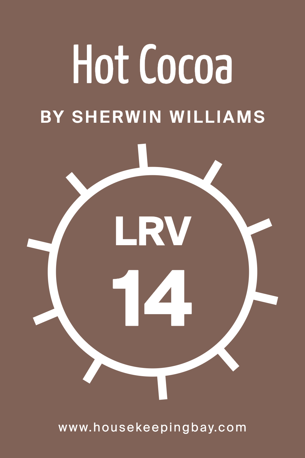
What is the LRV of Hot Cocoa SW 6047 by Sherwin Williams?
LRV stands for Light Reflectance Value, which measures how much light a paint color reflects back into a room. It is a scale from 0 to 100, where 0 indicates a color that absorbs all light (such as pure black) and 100 shows a color that reflects all light (pure white).
This value is crucial when choosing paint colors because it affects how light or dark a space appears. Higher LRVs make rooms appear brighter and more open, as more light is reflected around the space. Conversely, lower LRVs create a cozier and more enclosed feeling since less light is bouncig around.
For Hot Cocoa SW 6047 by Sherwin Williams, an LRV of 14.002 suggests that it is a fairly dark color. In rooms with little natural light, this color might make the space feel smaller or more intimate. However, in a well-lit room, Hot Cocoa can add a warmth and depth, enhancing the cozy aesthetic without making the room feel cramped.
When using darker colors like this, additional lighting or lighter accents can help balance the visual weight of the walls, ensuring the space does not feel too dark.
housekeepingbay.com
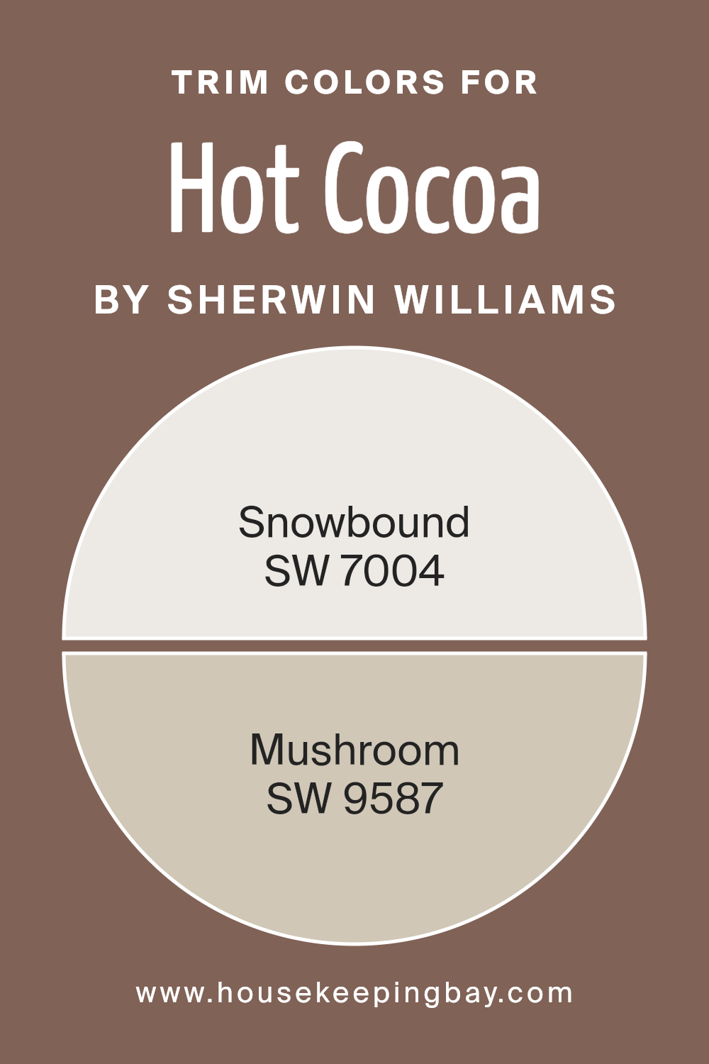
What are the Trim colors of Hot Cocoa SW 6047 by Sherwin Williams?
Trim colors, like accents on clothing or embellishments on furniture, play a crucial role in enhancing the visual appeal of a room. When paired with a main color like Hot Cocoa SW 6047 by Sherwin Williams, selecting the appropriate trim color can define spaces more clearly, add depth, and highlight architectural features.
For Hot Cocoa, a rich, warm brown, trim colors such as SW 7004 – Snowbound and SW 9587 – Mushroom are perfect companions. These shades provide a contrasting boundary that not only defines the transitions from wall to ceiling but also complements the overall warmth of Hot Cocoa.
SW 7004 – Snowbound is a soft, off-white color with just a hint of a warm undertone, making it a gentle yet striking contrast against the deep, chocolatey hues of Hot Cocoa. Meanwhile, SW 9587 – Mushroom offers a muted, earthy beige that harmonizes with Hot Cocoa by maintaining warmth while introducing a subtle distinction.
Both colors serve to accentuate the main wall color without overpowering it, creating a balanced and inviting atmosphere.
You can see recommended paint colors below:
housekeepingbay.com
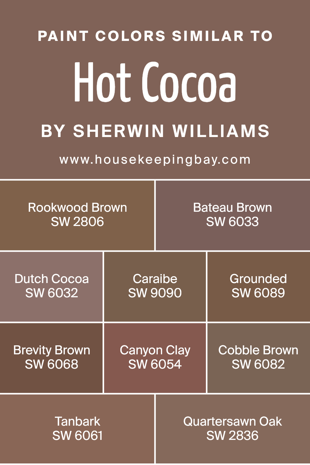
Colors Similar to Hot Cocoa SW 6047 by Sherwin Williams
Similar colors play a vital role in creating a harmonious and balanced visual experience, particularly in interior design. When colors like Hot Cocoa SW 6047 by Sherwin Williams are used alongside its similar shades, the result is a cohesive and seamless aesthetic.
These shades blend well because they share common undertones or intensities, making the space feel more unified and thoughtfully curated. Incorporating similar colors can also enhance the mood of a room, as these related hues complement each other and build a soothing atmosphere through subtle variations.
Among the colors similar to Hot Cocoa, SW 2806 Rookwood Brown offers a deep, rich essence that resembles the earthy tones found in a dense forest. SW 6033 Bateau Brown has a lighter, more muted quality that recalls the softness of worn leather.
The shade SW 6032 Dutch Cocoa feels warm and inviting, like a comforting cup of hot chocolate on a cold day. SW 9090 Caraibe adds a slight hint of mystery with its darker, more intense chocolate hue. SW 6089 Grounded and SW 6068 Brevity Brown both provide solid, grounding effects, perfect for creating a robust and secure ambiance.
SW 6054 Canyon Clay introduces a reddish tint, reminiscent of natural clay, which gives a room a touch of natural warmth. SW 6082 Cobble Brown carries a subtle earthiness that can remind one of a serene, stony path. SW 6061 Tanbark features a soft, sandy quality, ideal for adding lightness to a color scheme.
Lastly, SW 2836 Quartersawn Oak has a sophisticated, woody appeal that makes any space feel more refined without overpowering the senses. Using such similar colors ensures that every element in a room feels interconnected and purposefully styled.
You can see recommended paint colors below:
- SW 2806 Rookwood Brown
- SW 6033 Bateau Brown
- SW 6032 Dutch Cocoa
- SW 9090 Caraibe
- SW 6089 Grounded
- SW 6068 Brevity Brown
- SW 6054 Canyon Clay
- SW 6082 Cobble Brown
- SW 6061 Tanbark
- SW 2836 Quartersawn Oak
housekeepingbay.com
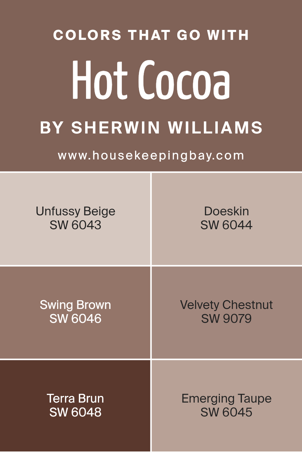
Colors that Go With Hot Cocoa SW 6047 by Sherwin Williams
Colors that pair well with Hot Cocoa SW 6047 by Sherwin Williams are vital as they create seamless color coordination in your decor, enhancing the overall aesthetic and mood. Coordinating colors like Unfussy Beige, Doeskin, Swing Brown, Velvety Chestnut, Terra Brun, and Emerging Taupe help in achieving a balanced, harmonious look that feels both welcoming and stylish.
These combinations can determine the space’s ambiance, playing a critical role in designing a room that’s visually coherent and appealing.
Each of these companion colors brings its unique flair. Unfussy Beige is a soft and subtle shade, providing a gentle contrast that lights up darker areas without overpowering other elements. Doeskin carries a warm touch, akin to a cozy woolen blanket, making it perfect for creating inviting spaces.
Swing Brown offers a robust, earthy quality that complements Hot Cocoa beautifully, grounding the space. Velvety Chestnut adds a rich, deep tone that suggests sophistication and depth. Terra Brun, similar to the fertile richness of the soil, works splendidly with Hot Cocoa to generate a nurturing and stable atmosphere.
Lastly, Emerging Taupe has a mute refinement, excellent for adding a sleek, modern touch to a room. Properly using these colors with Hot Cocoa can effectively style a space to look and feel cohesive and complete.
You can see recommended paint colors below:
- SW 6043 Unfussy Beige
- SW 6044 Doeskin
- SW 6046 Swing Brown
- SW 9079 Velvety Chestnut
- SW 6048 Terra Brun
- SW 6045 Emerging Taupe
housekeepingbay.com
How to Use Hot Cocoa SW 6047 by Sherwin Williams In Your Home?
Hot Cocoa SW 6047 by Sherwin Williams is a warm, rich color that adds a cozy and inviting feel to any room in your home. This deep brown shade resembles the comforting color of hot chocolate, making it perfect for creating a snug environment.
You can use Hot Cocoa in various ways throughout your house. In the living room, painting a feature wall in this shade can make the space feel more intimate and welcoming, perfect for evenings relaxing with family.
In the bedroom, using Hot Cocoa on the walls can help establish a soothing atmosphere, aiding in a better night’s sleep. For those who have larger, open spaces, using Hot Cocoa can help define different areas like dining or sitting areas without the need for physical dividers. Pair this color with soft lighting to enhance its warmth, and complement it with neutral tones or soft textiles to complete the look.
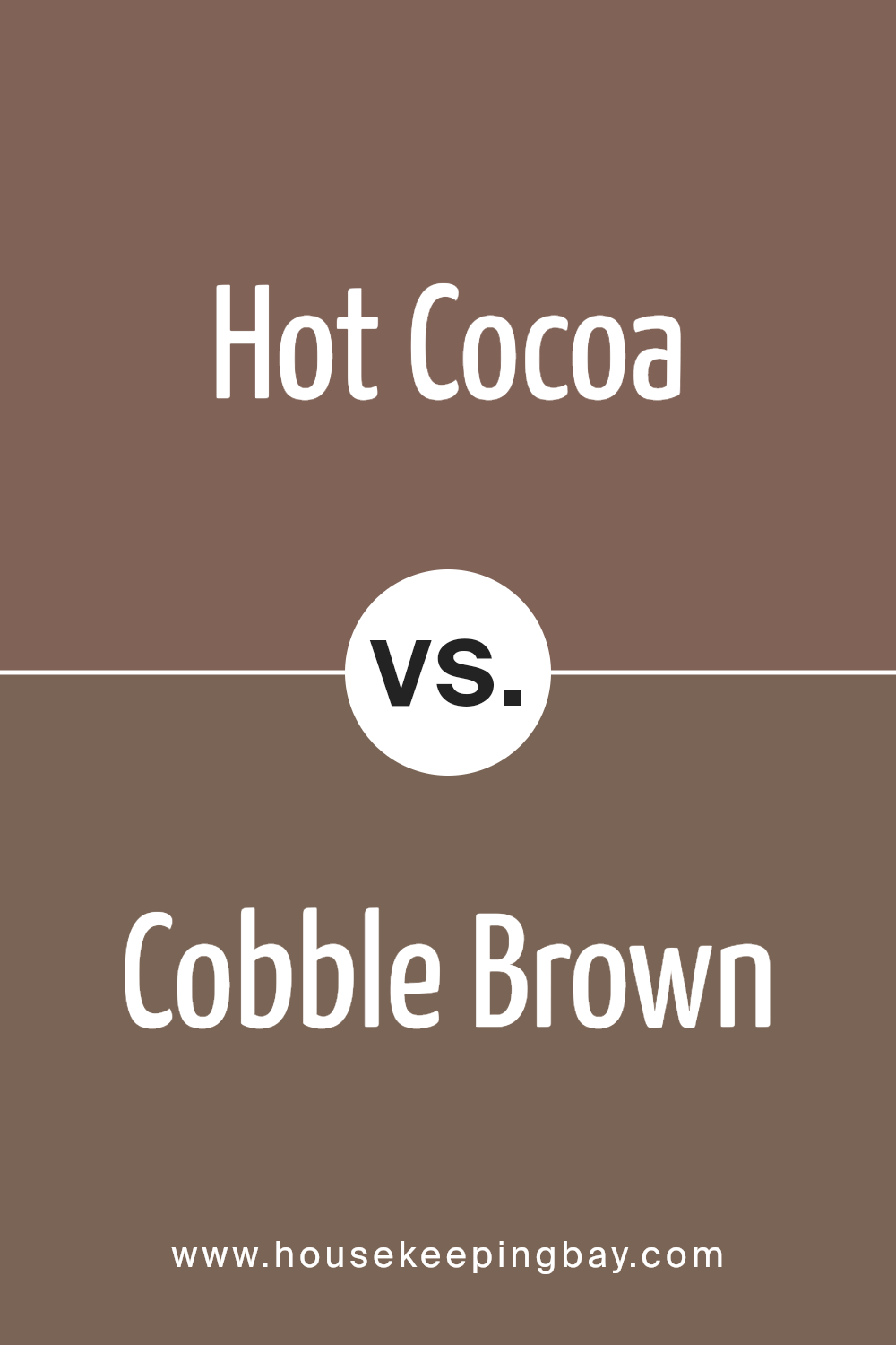
Hot Cocoa SW 6047 by Sherwin Williams vs Cobble Brown SW 6082 by Sherwin Williams
Hot Cocoa SW 6047 by Sherwin Williams and Cobble Brown SW 6082 are both warm, inviting shades of brown, but each possesses unique qualities. Hot Cocoa has a creamy richness, similar to the comforting drink it’s named after. This color is lighter and has a softer, more welcoming appeal, making it ideal for creating a cozy atmosphere in living rooms or bedrooms.
In contrast, Cobble Brown is a deeper, more intense shade. It’s reminiscent of wet stones or rich earth, giving it a grounding effect. This darker hue suits areas where a stronger, more robust character is desired, such as in formal dining rooms or home offices.
Both colors are versatile and work well with a variety of decor styles, adding warmth and natural elegance to any space. They can also complement each other, with Hot Cocoa brightening a space and Cobble Brown adding depth and sophistication.
You can see recommended paint color below:
- SW 6082 Cobble Brown
housekeepingbay.com
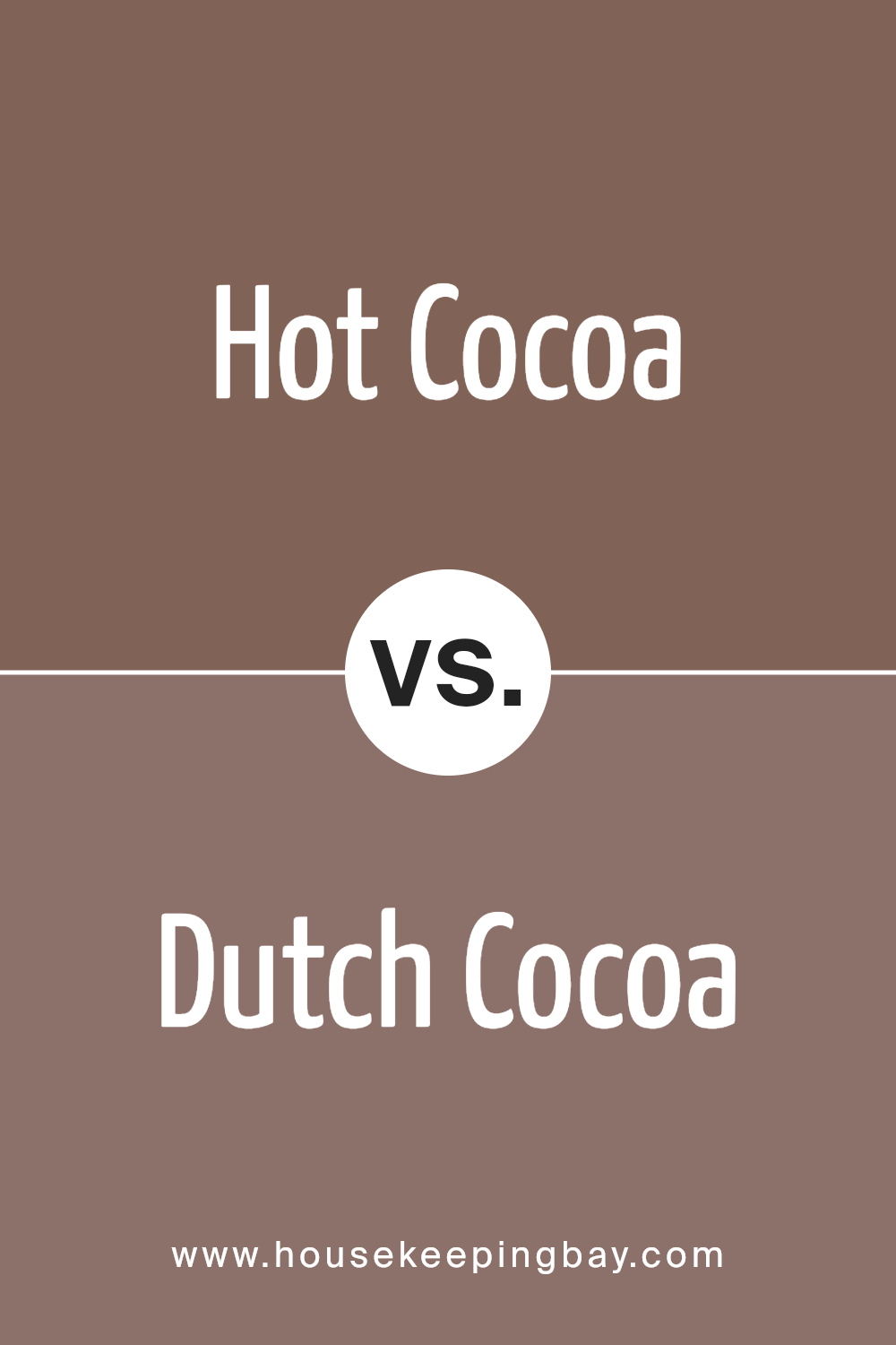
Hot Cocoa SW 6047 by Sherwin Williams vs Dutch Cocoa SW 6032 by Sherwin Williams
Hot Cocoa SW 6047 and Dutch Cocoa SW 6032 by Sherwin Williams are both warm, inviting brown hues, but they exhibit unique characteristics that differentiate them. Hot Cocoa is a dark, rich chocolate color, providing a cozy, robust feeling that works well in spaces designed for comfort and warmth. It tends to create a snug and secure atmosphere, ideal for living rooms or bedrooms.
In contrast, Dutch Cocoa is a slightly lighter brown, which carries a softer and more subtle tone. This color is versatile; it can be a gentle backdrop in a room or pair well with brighter colors to achieve balance.
Dutch Cocoa offers a more neutral option, making it excellent for those preferring understated elegance without the intensity of darker browns.
Both colors offer a natural earthiness, but Hot Cocoa is deeper and warmer, whereas Dutch Cocoa is lighter and more nuanced, giving decorators different options based on their space needs and personal taste preferences.
You can see recommended paint color below:
housekeepingbay.com
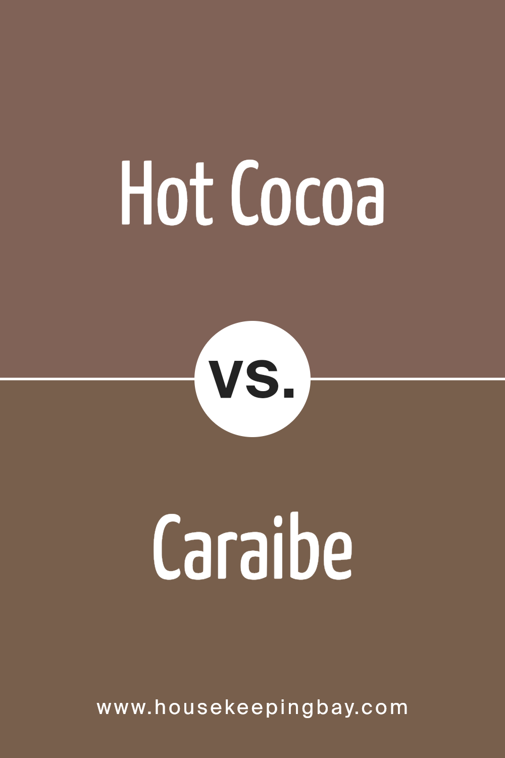
Hot Cocoa SW 6047 by Sherwin Williams vs Caraibe SW 9090 by Sherwin Williams
Hot Cocoa SW 6047 and Caraibe SW 9090 by Sherwin Williams are quite distinct in their vibes and color palettes. Hot Cocoa is a warm, rich brown that gives a cozy and comforting feel. It’s perfect for creating intimate, snug environments and works well in spaces like living rooms or bedrooms where a relaxing atmosphere is desired. This shade pairs beautifully with soft lighting and can make large spaces feel more inviting.
In contrast, Caraibe SW 9090 is a bright, vivid blue that feels fresh and energetic. It’s ideal for adding a splash of color to brighten up a space or for use in areas where a lively, dynamic feel is desired. The color can visually enlarge a small room and works well in bathrooms or kitchens where you want to add a clean, crisp touch.
Both colors serve different purposes and can dramatically alter the mood and perception of a space depending on how and where they are used.
You can see recommended paint color below:
- SW 9090 Caraibe
housekeepingbay.com
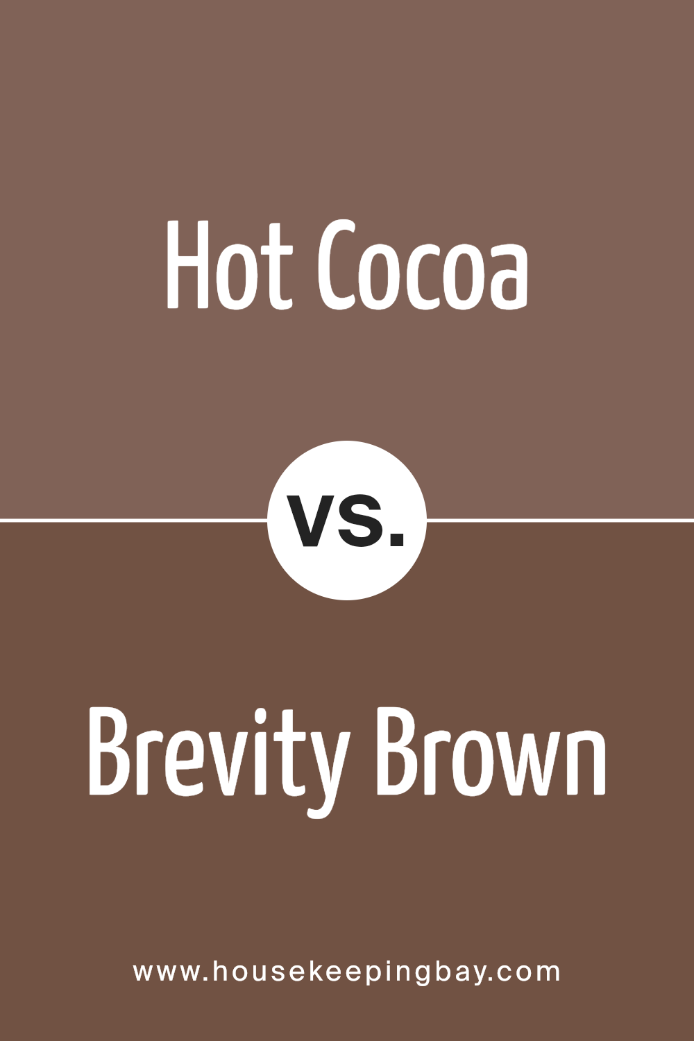
Hot Cocoa SW 6047 by Sherwin Williams vs Brevity Brown SW 6068 by Sherwin Williams
Hot Cocoa SW 6047 by Sherwin Williams is a rich and cozy brown that resembles the comforting tones of a delicious cup of cocoa. This color exudes warmth and is perfect for creating a welcoming environment. It pairs well with soft creams and vibrant teals for a balanced look.
Brevity Brown SW 6068, another Sherwin Williams shade, is a deeper, more intense brown. It gives off a strong, grounded feeling, making it ideal for spaces that require a sense of stability and seriousness. It works well with muted greens and dark blues, adding depth to any room.
While both colors share a brown base, Hot Cocoa is lighter and warmer, suggesting a softer approach suitable for living areas or bedrooms. Brevity Brown, with its darker tone, is better suited for formal spaces or offices where a more profound and focused atmosphere is desired. Each color offers unique possibilities and can dramatically affect the mood and style of a space.
You can see recommended paint color below:
housekeepingbay.com
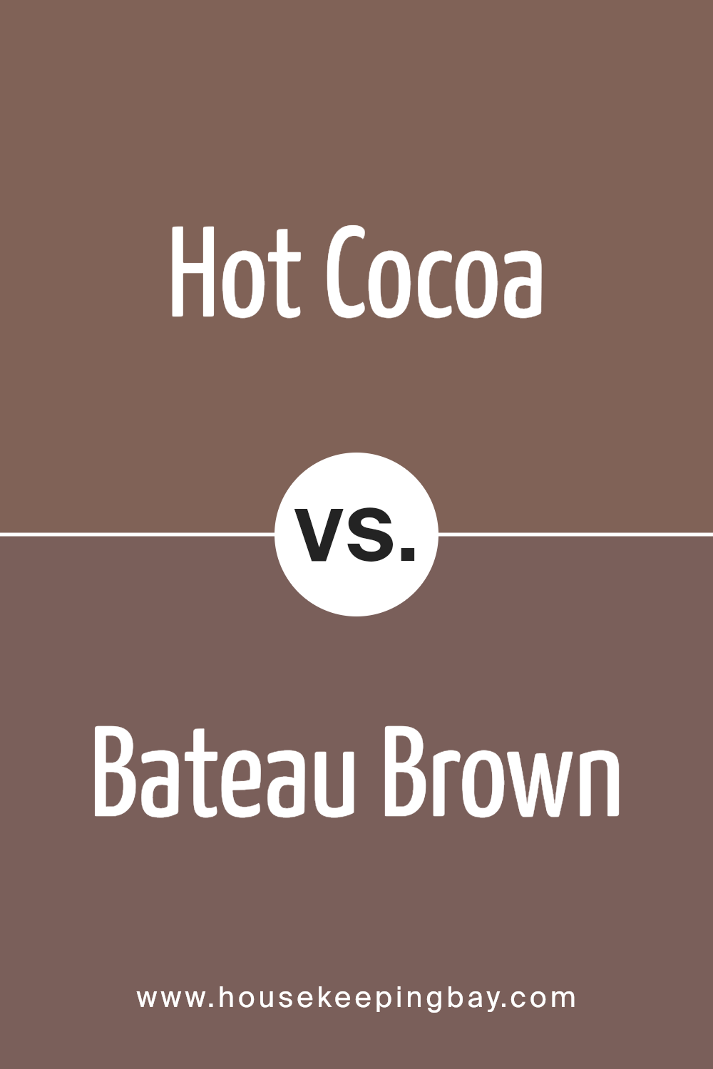
Hot Cocoa SW 6047 by Sherwin Williams vs Bateau Brown SW 6033 by Sherwin Williams
Hot Cocoa SW 6047 by Sherwin Williams is a warm, comforting brown with a hint of richness that resembles a delicious cup of hot cocoa. This color tends to feel cozy and inviting, making it a fantastic choice for living areas or bedrooms where you want to create a snug and secure atmosphere.
In comparison, Bateau Brown SW 6033 is a lighter, softer brown. It has a more subdued quality than Hot Cocoa, providing an air of calm without being too overpowering. This makes Bateau Brown a suitable option for spaces where a lighter, still earthy tone is desired, such as in dining rooms or home offices.
Both colors bring warmth to a room but differ in intensity and depth. Hot Cocoa, being darker, makes a bold statement and can make large rooms feel more intimate. Bateau Brown, being milder, works well in smaller spaces or as a complementary color that doesn’t overpower the environment.
You can see recommended paint color below:
- SW 6033 Bateau Brown
housekeepingbay.com
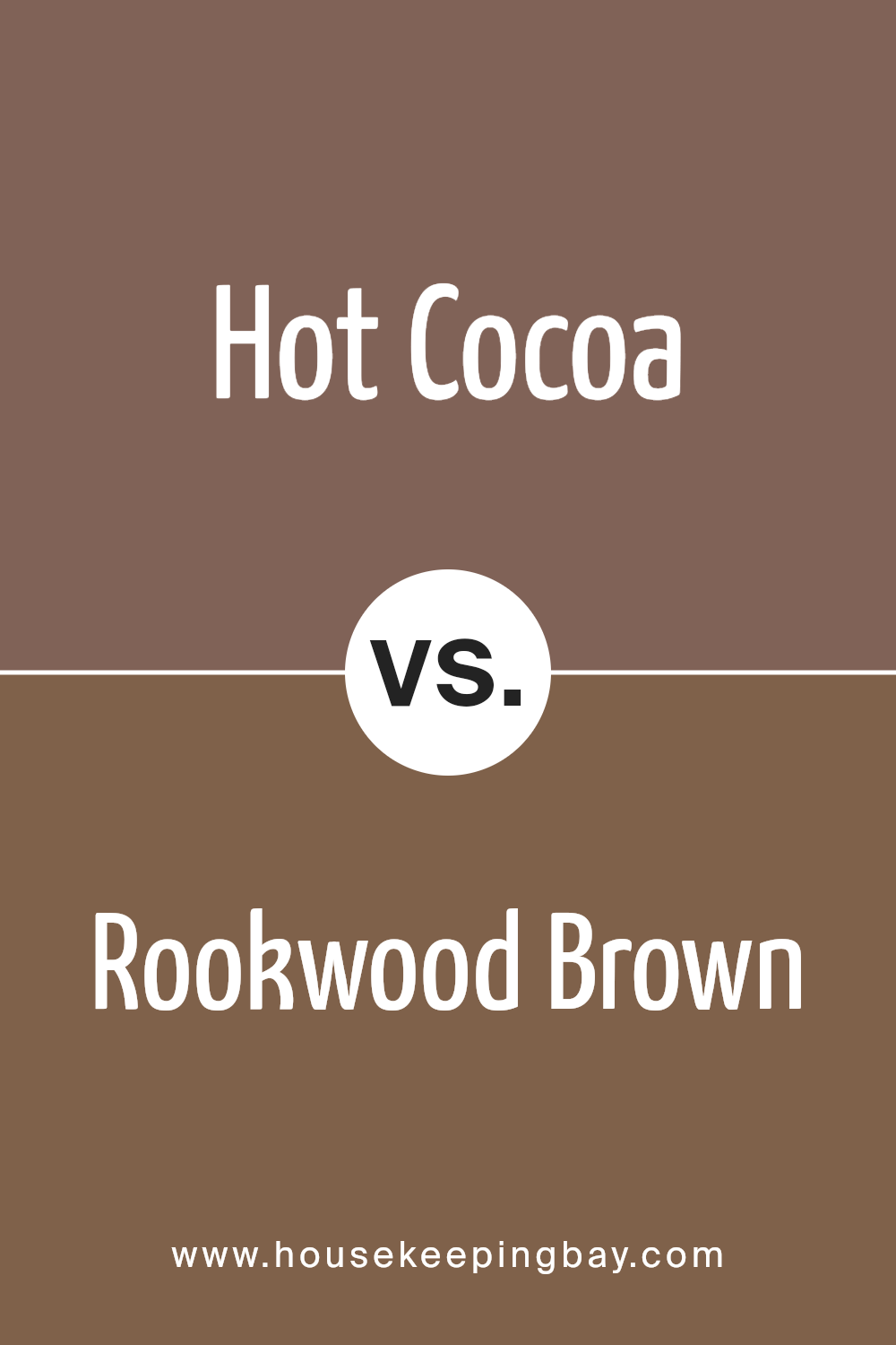
Hot Cocoa SW 6047 by Sherwin Williams vs Rookwood Brown SW 2806 by Sherwin Williams
Hot Cocoa SW 6047 by Sherwin Williams is a warm, medium brown with hints of orange undertones, giving it a cozy and inviting feel. It’s perfect for creating a snug atmosphere in living spaces or bedrooms. The warmth of the color can make large rooms feel more intimate and welcoming.
Rookwood Brown SW 2806 by Sherwin Williams, in contrast, is a deeper, rich brown with a more traditional appeal. It has a subtle green undertone that adds a touch of sophistication. This color works well in formal areas or spaces you want to give a classic, grounded look.
Both colors share a brown base but differ significantly in ambiance due to their undertones and depth. Hot Cocoa lights up a room with its warmth, making spaces feel lived-in and homey. Rookwood Brown provides a more stately and refined vibe, suitable for creating a sense of solidity and tradition.
Each brings its unique charm to the table, ideal for different decorative themes or room functions.
You can see recommended paint color below:
- SW 2806 Rookwood Brown
housekeepingbay.com
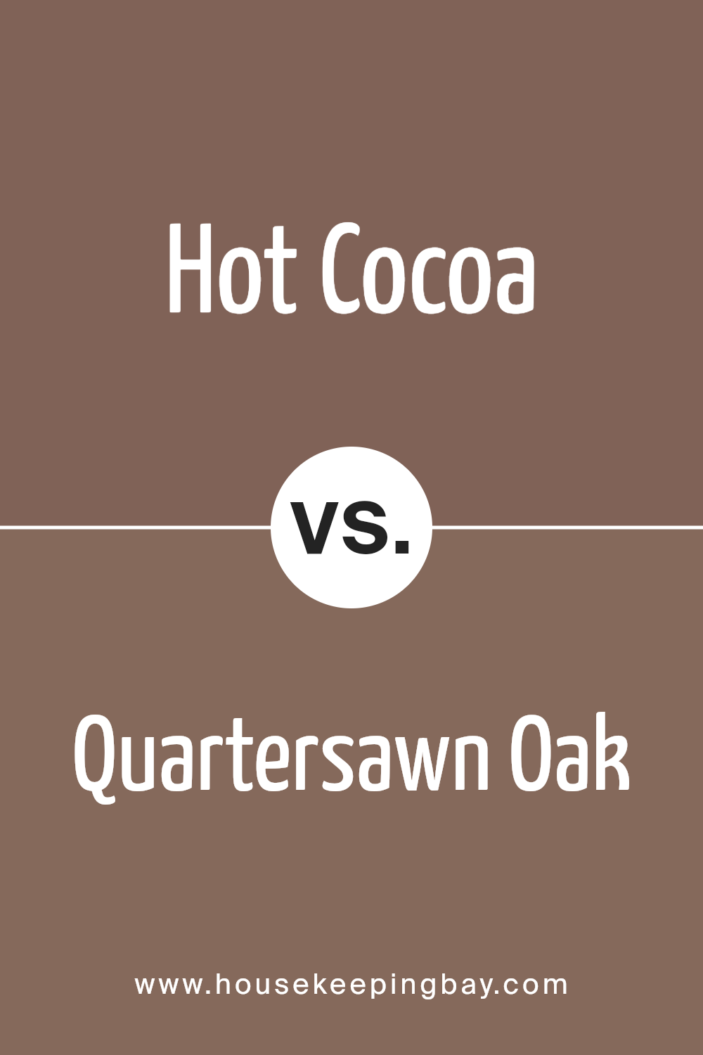
Hot Cocoa SW 6047 by Sherwin Williams vs Quartersawn Oak SW 2836 by Sherwin Williams
Hot Cocoa SW 6047 by Sherwin Williams is a warm, rich brown that evokes the comfort of a steaming cup of cocoa. It brings a cozy and inviting feel to any space, making it ideal for living rooms or bedrooms where you want to create a snug, welcoming atmosphere. Its deep tones pair well with both light accents for contrast and darker furnishings for a more harmonious look.
Quartersawn Oak SW 2836, also by Sherwin Williams, is a lighter, more subdued brown. It mirrors the natural color of cut oak wood and offers a neutral backdrop suitable for various decorating styles. This color works beautifully in spaces that require a subtle touch of warmth without overpowering the room, making it perfect for areas like kitchens and bathrooms.
While both colors share a base of brown, Hot Cocoa is darker and cozier, whereas Quartersawn Oak provides a lighter, more understated elegance. Each brings its unique vibe, depending on the mood and style you wish to achieve in your space.
You can see recommended paint color below:
- SW 2836 Quartersawn Oak
housekeepingbay.com
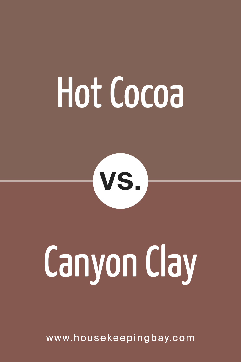
Hot Cocoa SW 6047 by Sherwin Williams vs Canyon Clay SW 6054 by Sherwin Williams
Hot Cocoa SW 6047 by Sherwin Williams is a rich, deep brown with a soothing warmth that suggests comfort and homeliness. It feels very traditional and can work well in spaces that aim to be cozy and inviting. This color pairs beautifully with creamy neutral shades and can also complement bright colors for a more dynamic look.
Canyon Clay SW 6054, contrasting from Hot Cocoa, leans more towards a reddish-brown hue akin to terracotta. This color evokes a sense of earthy warmth and can add a unique charm to a room. It is particularly appealing for those looking to introduce a natural, rustic feel to their interiors.
Canyon Clay works well with greens, blues, and deep yellows, enhancing the warmth of the space.
While both colors bring warmth, Hot Cocoa provides a more subtle, chocolatey comfort, suitable for creating a snug, secure feeling. Canyon Clay, with its reddish tone, brings a lively, vibrant earthiness, ideal for energizing a space.
You can see recommended paint color below:
- SW 6054 Canyon Clay
housekeepingbay.com
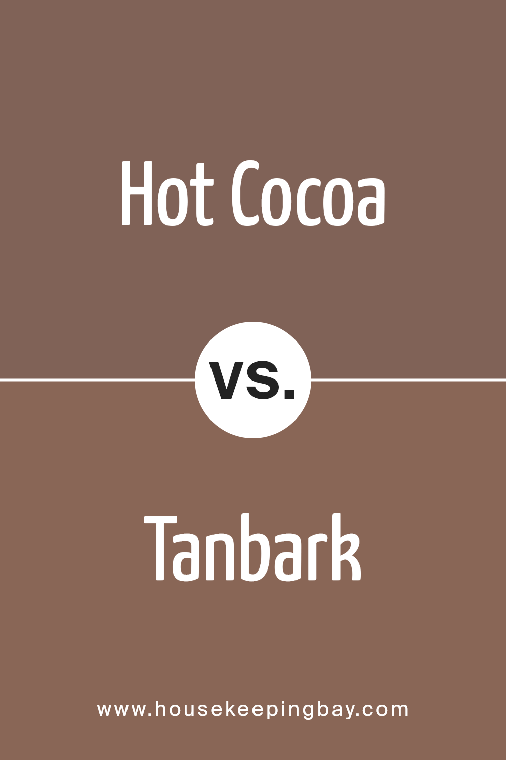
Hot Cocoa SW 6047 by Sherwin Williams vs Tanbark SW 6061 by Sherwin Williams
Hot Cocoa SW 6047 by Sherwin Williams is a warm, rich brown that brings a cozy and comforting vibe to any space. This color resembles the inviting appearance of a freshly made cup of hot chocolate, adding a soothing and welcoming feel. It works well in living rooms or bedrooms where a snug, intimate atmosphere is desired.
Tanbark SW 6061, also by Sherwin Williams, is a lighter shade compared to Hot Cocoa. It leans more toward a dusty gray-brown, giving it a more neutral and versatile quality. This color suits spaces that need a subtle touch of warmth without overwhelming the area. Tanbark is excellent for areas that aim for a soft, understated look.
Both colors provide warmth but differ in intensity and depth. Hot Cocoa is darker and moodier, ideal for creating a statement or focal point, whereas Tanbark offers a more muted option suitable for broader applications. Each is excellent in its right depending on the desired effect and room usage.
You can see recommended paint color below:
- SW 6061 Tanbark
housekeepingbay.com
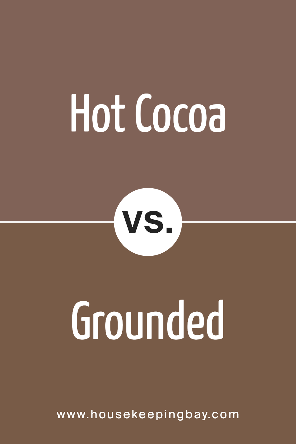
Hot Cocoa SW 6047 by Sherwin Williams vs Grounded SW 6089 by Sherwin Williams
Hot Cocoa SW 6047 by Sherwin Williams is a warm, rich brown that resembles the comforting shade of a delicious hot chocolate. This color creates a cozy and inviting atmosphere in any room, making it ideal for living spaces or bedrooms where a calming, yet hearty feel is desired.
In contrast, Grounded SW 6089, another Sherwin Williams color, leans towards a deeper, earthier brown. This color has a robust, grounded presence that pairs well with a variety of decor styles. It’s perfect for creating a strong, foundational look in a space, offering a sense of stability and comfort.
While both colors share a brown base, Hot Cocoa is lighter and warmer, adding a gentle, nurturing touch to interiors. Grounded, being darker, offers a more profound, solid appearance.
Each color stands out in its own right, ideal for different aesthetic tastes and room functionalities, whether looking to soften a room’s look or give it a more anchored feel.
You can see recommended paint color below:
housekeepingbay.com
Conclusion
The rich, chocolaty hue is versatile, making it an ideal choice for those wishing to create a cozy and inviting atmosphere in homes or offices.
It pairs well with a wide range of decor styles, from rustic to modern, and fosters a sense of security and restfulness in bedrooms, living rooms, or study areas.
This paint’s adaptability extends beyond mere looks. Given its darker tone, it effectively masks scuffs and stains, making it a practical option for high-traffic areas or spaces frequented by children and pets. It also provides a dramatic contrast when used alongside lighter colors, which can help to accentuate architectural features or highlight artwork.
Whether used as a dominant color scheme or as an accent wall, SW 6047 Hot Cocoa encourages a sense of warmth and intimacy, which is a testament to its timeless appeal and functionality. After using this color in various rooms, I can confidently recommend it to anyone looking to infuse their environment with a peaceful yet sophisticated vibe.
Sherwin Williams has indeed created a shade that not only beautifies a space but also contributes to a relaxing and enjoyable atmosphere.
housekeepingbay.com
Ever wished paint sampling was as easy as sticking a sticker? Guess what? Now it is! Discover Samplize's unique Peel & Stick samples. Get started now and say goodbye to the old messy way!
Get paint samples


