Dutch Cocoa SW 6032 by Sherwin Williams
Warm Embrace: Unveiling a Cozy Hue for Elegant Spaces
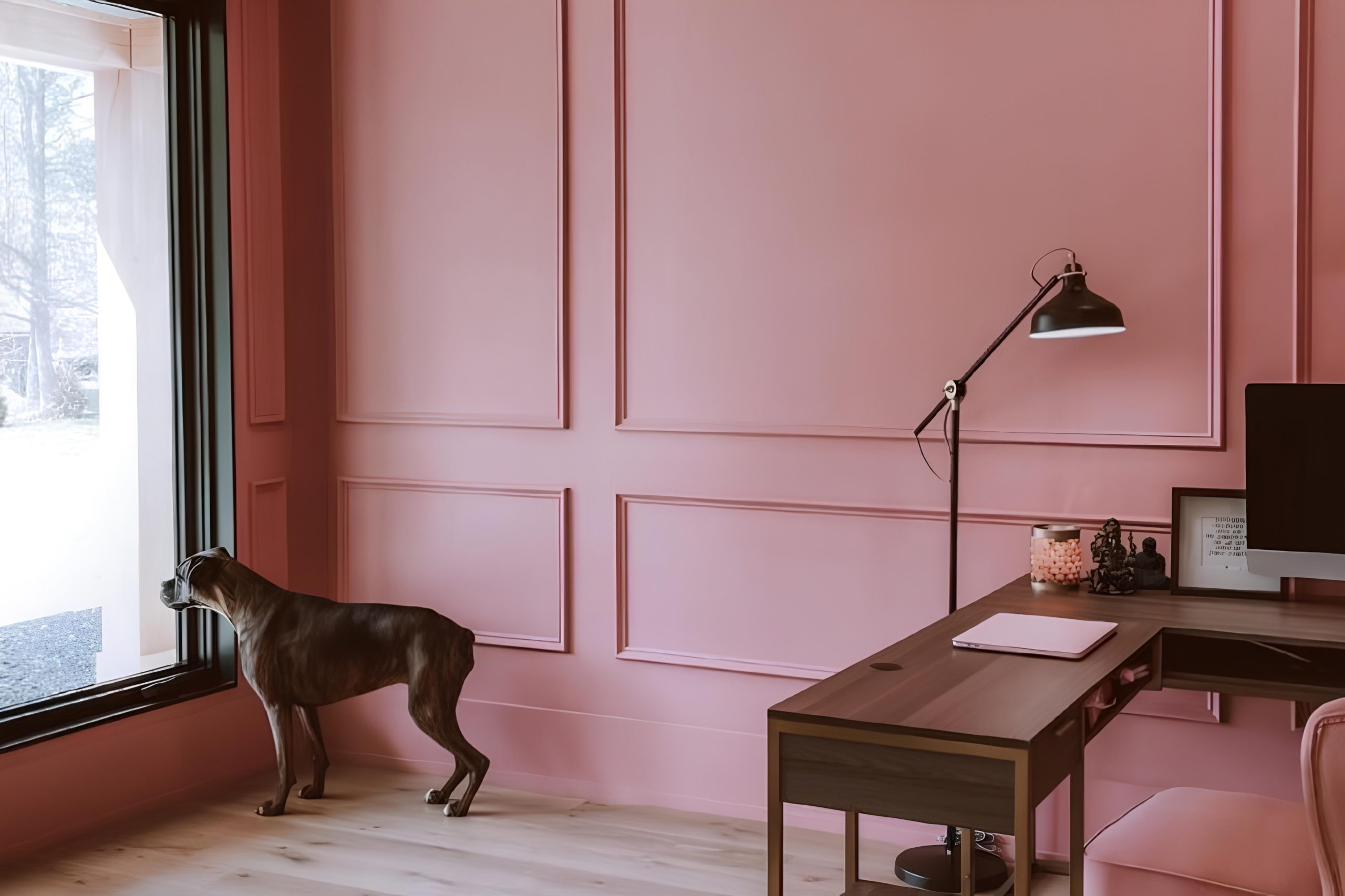
This cozy paint color that can add a warm and inviting touch to your spaces: SW 6032 Dutch Cocoa by Sherwin Williams. Imagine wrapping yourself in a soft, comfortable blanket on a cool, crisp evening. That’s the feeling Dutch Cocoa can bring to your home.
It’s a rich, deep brown that has the power to transform any room into a snug haven, making it perfect for creating a cozy reading nook, a peaceful bedroom oasis, or even a welcoming living room where friends and family gather.
Choosing the right paint color can sometimes feel overwhelming, but Dutch Cocoa stands out for its versatility and timeless charm. Whether you’re thinking about a complete makeover or simply want to update a single room, this color has a unique way of fitting in, adding both warmth and depth.
Moreover, it pairs beautifully with a wide range of decor styles, from modern to rustic, making it a go-to choice for anyone looking to enhance their home’s aesthetic. So, if you’re on the lookout for a paint color that combines comfort with style, Dutch Cocoa by Sherwin Williams might just be what you need to make your space feel like home.
via sherwin-williams.com
What Color Is Dutch Cocoa SW 6032 by Sherwin Williams?
Dutch Cocoa SW 6032 by Sherwin Williams is a rich, warm hue that brings to mind the comforting and indulgent essence of cocoa. This color has a depth that can add a sophisticated yet cozy feel to any room. Its earthy tone makes it versatile, allowing it to blend harmoniously with various interior styles, especially those leaning towards natural, rustic, and traditional designs.
Dutch Cocoa works beautifully in living rooms, bedrooms, or even in a kitchen, creating a welcoming atmosphere.
This color pairs exceptionally well with a variety of materials and textures. Think of pairing it with smooth, creamy leathers, which add a touch of luxury and comfort, or combining it with rough, natural textures like unfinished wood to enhance its rustic charm. Textiles in soft, warm neutrals or even bold, rich colors can complement Dutch Cocoa, adding layers and depth to the space. Accents in brass or gold can give a touch of elegance to the warm backdrop this color provides.
In terms of interior styles, Dutch Cocoa fits wonderfully in spaces inspired by farmhouse chic, mid-century modern, or bohemian themes. Its deep, warm base acts as a perfect backdrop, allowing furniture and décor in natural materials and earthy tones to stand out, creating a cohesive and inviting interior.

housekeepingbay.com
Is Dutch Cocoa SW 6032 by Sherwin Williams Warm or Cool color?
Dutch Cocoa SW 6032 by Sherwin Williams is a rich, warm brown paint color that brings a feeling of coziness and comfort to any home. This color has a unique depth that can make a room feel more inviting and snug, perfect for creating a peaceful and relaxing environment. When used in homes, Dutch Cocoa adds a touch of elegance and sophistication, without overpowering the space.
The beauty of Dutch Cocoa lies in its versatility. It works really well in living rooms, bedrooms, or even dining areas, adding a layer of warmth that makes the space feel more welcoming. Because of its neutral yet deep tone, it pairs beautifully with various colors, from soft creams and whites for a gentle contrast to bright and vibrant hues for a more dynamic and lively decor.
In spaces with less natural light, Dutch Cocoa can help to make the room feel cozy and intimate, while in well-lit areas, it enhances the brightness by adding a grounding effect. Its ability to adapt makes it an excellent choice for anyone looking to add a touch of cozy sophistication to their home.
What is the Masstone of the Dutch Cocoa SW 6032 by Sherwin Williams?
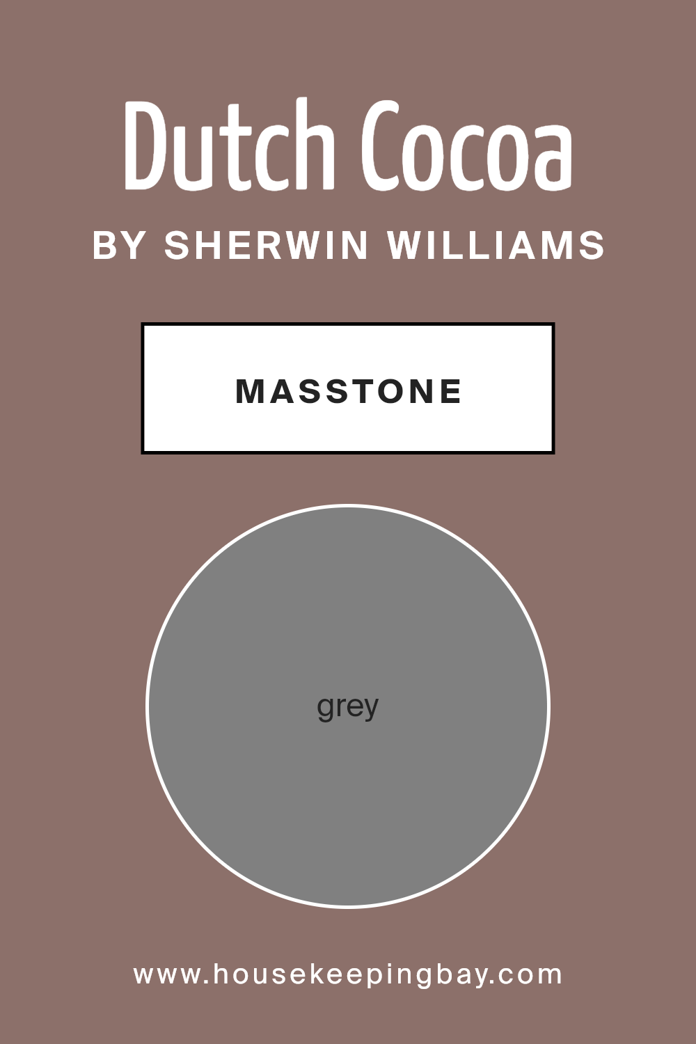
Dutch Cocoa SW 6032 by Sherwin Williams is a unique color that might surprise you! Even though its masstone, or main color when you look at it straight out of the can, looks like Grey (#808080), it brings a lot more to the table when it comes to decorating your home.
This shade of grey has a warm, cozy feeling, making it perfect for spaces where you want to relax, like living rooms or bedrooms. When you use Dutch Cocoa on your walls, it creates a comforting backdrop. This color is versatile, meaning it can look great with lots of other colors – from bright and bold to soft and subtle, giving you freedom in your decorating choices.
Plus, since it has that grey base, it won’t overwhelm your space but rather enhance it, making your home feel welcoming and stylish. It’s a great choice for anyone wanting to add a touch of warmth and sophistication to their home.
housekeepingbay.com
Undertones of Dutch Cocoa SW 6032 by Sherwin Williams
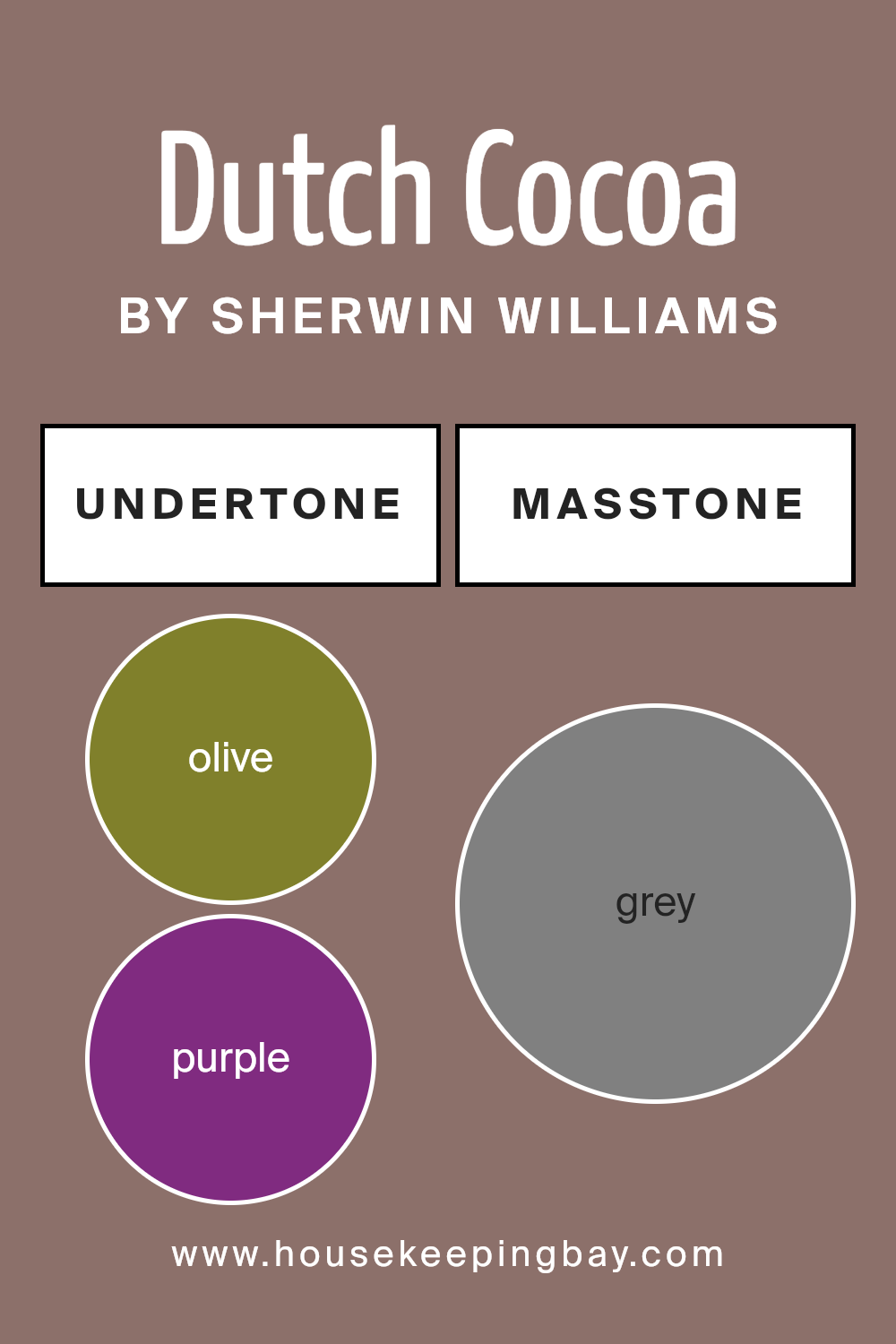
Dutch Cocoa SW 6032 by Sherwin Williams is a rich, warm color that can bring a cozy and inviting atmosphere to any room. This paint color has many undertones, which are subtle hues mixed into the main color.
These undertones can include shades like olive, purple, pale pink, brown, orange, and many more. Think of undertones like hidden flavors in your favorite dish; they might not be immediately noticeable, but they greatly affect the overall taste.
In the case of paint colors, undertones influence how we see the color under different lighting conditions and when paired with different furnishings and decor.
The variety of undertones in Dutch Cocoa SW 6032 means this color can show hints of other colors depending on the lighting and what is around it. For instance, in a room with a lot of natural light, you might notice the pale pink or light purple undertones, giving the space a softer, warmer feel. In artificial light, the darker undertones such as brown or dark grey might become more prominent, making the room feel more grounded and cozy.
On interior walls, these undertones allow Dutch Cocoa SW 6032 to be incredibly versatile. It can complement a wide range of decor styles and color schemes. For example, the olive and dark green undertones can connect the indoors with natural elements outside, creating a calming, nature-inspired space.
The purple and lilac undertones can add a touch of sophistication and luxury, especially when paired with metallic accents or plush fabrics.
Understanding the undertones in Dutch Cocoa SW 6032 is key to using it effectively in your home. It’s not just about choosing a paint color; it’s about creating a mood and feeling in your space that reflects your style and meets your needs.
Whether you’re aiming for a cozy retreat or a bold statement room, paying attention to the undertones helps ensure the color works in harmony with your vision.
housekeepingbay.com
Coordinating Colors of Dutch Cocoa SW 6032 by Sherwin Williams
Coordinating colors work together to enhance the overall aesthetic and harmony in a design. When you have a base color like Dutch Cocoa SW 6032 by Sherwin Williams, a deep, rich chocolaty hue, finding the right coordinating colors is key to creating a balanced and pleasing look.
These colors are selected to complement or contrast with the base color in ways that accentuate its best qualities without overwhelming it. The art of choosing coordinating colors involves understanding how different hues interact and affect each other, and how they contribute to the room’s mood and feel.
Rojo Marron SW 9182 is a deep, warm red with earthy undertones that pairs beautifully with the depth of Dutch Cocoa, adding a touch of warmth and sophistication. It’s a color that can bring energy to a space while still maintaining a cozy atmosphere.
Cool Beige SW 9086, on the other hand, is a light, neutral beige with a cool undertone that provides a subtle contrast to the richness of Dutch Cocoa, offering a soothing backdrop that lets the deeper color take center stage.
Cultured Pearl SW 6028 is a light, creamy hue that offers a gentle, refreshing counterpoint to the more intense Dutch Cocoa. It’s perfect for creating a soft, inviting space that feels open and airy yet grounded by the darker, earthier tones of the base color.
Together, these coordinating colors create a palette that’s both versatile and stunning, allowing for a range of design possibilities.
You can see recommended paint colors below:
- SW 9182 Rojo Marron
- SW 9086 Cool Beige
- SW 6028 Cultured Pearl

housekeepingbay.com
How Does Lighting Affect Dutch Cocoa SW 6032 by Sherwin Williams?
Lighting plays a crucial role in how we perceive colors because it can dramatically change their appearance. The way a color looks can vary significantly under different types of light, such as natural sunlight versus artificial light, and even the direction of the light can have an impact.
Take, for instance, the color Dutch Cocoa SW 6032 by Sherwin Williams. This rich color has a depth that can appear differently depending on the lighting.
In artificial light, which tends to be either warm or cool depending on the bulb, Dutch Cocoa can look warmer and more inviting, emphasizing its brown tones. Under the cool, bright light of LEDs, the color might appear slightly muted, while warm, yellow-toned bulbs can enhance its coziness.
In natural light, Dutch Cocoa evolves throughout the day. Natural light, changing from dawn to dusk, affects colors in unique ways. Morning light in an east-facing room brings out the lighter, warmer aspects of Dutch Cocoa, making the room feel cheerful. As the light shifts, the color will also shift, reflecting the changing ambiance.
- For rooms facing north, light is typically cooler and more consistent, which can make Dutch Cocoa look more subdued and refined, really showcasing its depth without overwhelming the space. South-facing rooms benefit from brighter, warmer light most of the day, which can make Dutch Cocoa feel warmer and more vibrant, enhancing its luxurious quality.
- East-facing rooms see the most change with Dutch Cocoa. In the morning, the color appears lighter and warmer due to the bright, yellow light. But as the day progresses, it transitions back to its true depth as the light fades.
- West-facing rooms present a unique setting for Dutch Cocoa, starting the day cooler and gradually warming. The late afternoon and evening light really accentuate the warmth and richness of the color, making spaces feel cozy and inviting.
Understanding these nuances lets us see how Dutch Cocoa SW 6032 can transform and adapt, providing a versatile option that can fit various rooms and lighting conditions, highlighting the importance of considering lighting in your color choices.

housekeepingbay.com
What is the LRV of Dutch Cocoa SW 6032 by Sherwin Williams?
LRV stands for Light Reflectance Value, which is a measure of the amount of light a color reflects back into the room compared to how much it absorbs. In simple terms, it’s a scale from 0 to 100, where 0 means the color absorbs all light, making it appear very dark, and 100 means it reflects all light, making it look very bright.
This value helps you understand how light or dark a color will look on your walls. It’s a handy tool when you’re trying to decide how a paint color will change the feel of your room. For example, lighter colors can make a space feel more open and airy, while darker colors can add a sense of coziness or drama.
With an LRV of 18.269, Dutch Cocoa SW 6032 by Sherwin Williams falls on the darker end of the scale, meaning it doesn’t reflect much light. This particular shade of brown will create a warm, rich atmosphere in a room, absorbing more light than it reflects.
This quality can make spaces feel smaller or more intimate, which might be exactly what you’re looking for in certain areas like a study or a bedroom. However, it’s important to consider your room’s natural light when choosing colors with lower LRVs.
In rooms without much sunlight, a color like Dutch Cocoa could appear even darker, so good lighting will be key to making the most of its deep, inviting hue.

housekeepingbay.com
What are the Trim colors of Dutch Cocoa SW 6032 by Sherwin Williams?
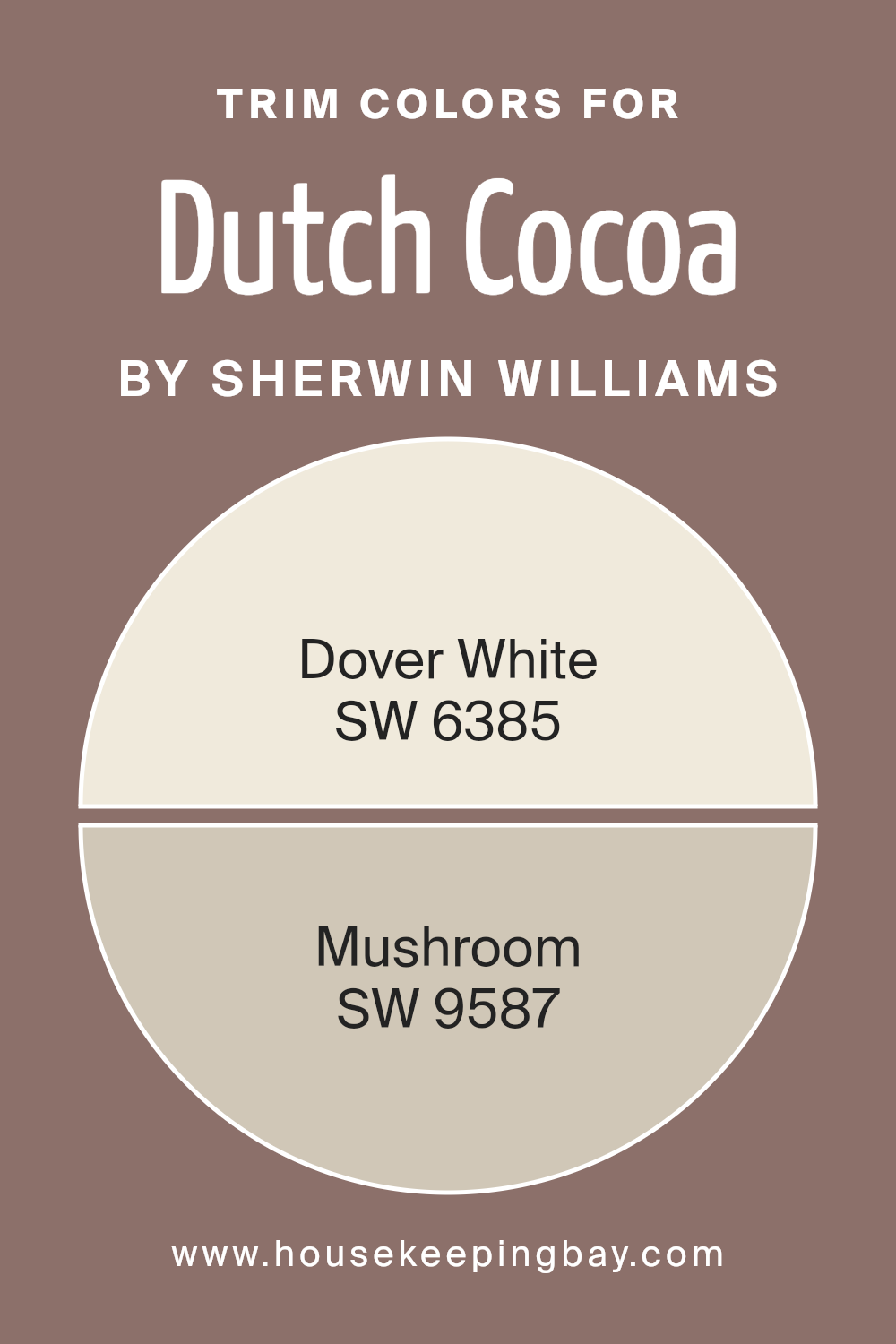
Trim colors are the shades used for the detailing work on walls, door frames, and moldings that can significantly enhance the overall appearance of a room. For the rich, chocolatey hue of Dutch Cocoa SW 6032 by Sherwin Williams, selecting the right trim color is crucial to accentuate its warmth and depth.
The trim acts as a frame, giving structure and definition to the spaces painted with Dutch Cocoa, ensuring that the walls don’t just blend into the background but rather, stand out with elegance. The choice of trim color can either make the main color pop or subtly complement it, adding a layer of sophistication to the interior design.
Dover White SW 6385 is a soft, creamy white that provides a gentle contrast to the deep tones of Dutch Cocoa. Its lightness brings forward the richness of Dutch Cocoa, offering a classic look that’s both inviting and airy. On the other hand, Mushroom SW 9587 offers a mid-tone neutral option that harmonizes beautifully with the earthy notes of Dutch Cocoa. This particular shade of trim adds a sense of natural warmth and subtlety to the space, creating an appealing and cohesive aesthetic.
Both trim colors work in tandem with Dutch Cocoa to either brighten the room with a crisp outline or to enhance its cozy, welcoming feel, making the choice of trim color a crucial element in room design.
You can see recommended paint colors below:
housekeepingbay.com
Colors Similar to Dutch Cocoa SW 6032 by Sherwin Williams
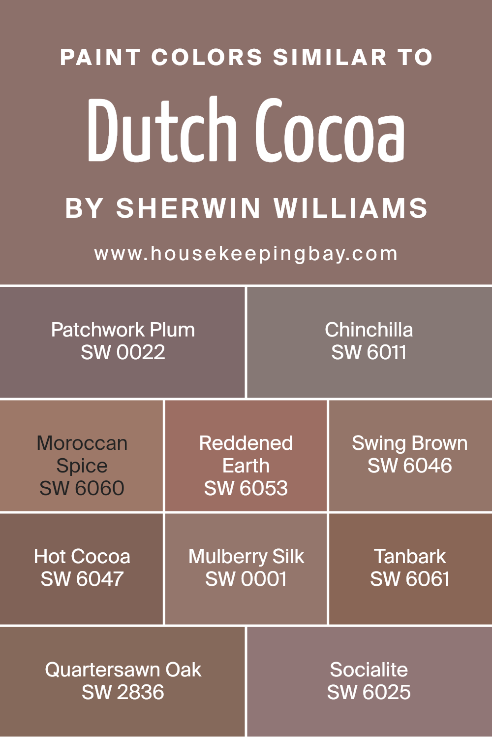
Selecting similar colors when planning a space’s aesthetic is integral to creating a harmonious and appealing look, and this approach finds beautiful exemplification in colors akin to Dutch Cocoa SW 6032 by Sherwin Williams. Similar colors work by sharing common undertones or intensity levels, ensuring a seamless visual flow within interiors.
They can enrich environments, adding depth and layers without overwhelming the senses, because their similarities provide a cohesive backdrop that allows for creative design elements to stand out or subtlety to reign supreme if desired.
Patchwork Plum mirrors the warmth of Dutch Cocoa with its cozy, inviting tone, just with a whisper of deeper mystery. Chinchilla steps in as a lighter counterpart, offering a soft, soothing presence that plays well in various lighting conditions. Moroccan Spice heats things up a notch, bringing a vibrant, earthy flair that radiates energy and spice.
Reddened Earth, as its name suggests, ground designs with its rich, terracotta vibe, perfect for adding a touch of natural elegance. Swing Brown keeps things neutral yet dynamic, a balance between warmth and sophistication. Hot Cocoa, closely akin to Dutch Cocoa, envelops spaces in a comforting, creamy richness, making rooms feel instantly homey.
Mulberry Silk lends a luxurious, slightly more refined air, weaving in a bit of plush, subtle opulence. Tanbark introduces a robust, grounded feel, its earthiness anchoring designs with a matured woodiness. Quartersawn Oak brings a hint of organic texture through its color, reminiscent of cherished, aged wood, and finally, Socialite adds a dash of subdued, aristocratic charm, ensuring a refined finish to any palette drawn from the inspiration of Dutch Cocoa SW 6032.
You can see recommended paint colors below:
- SW 0022 Patchwork Plum
- SW 6011 Chinchilla
- SW 6060 Moroccan Spice
- SW 6053 Reddened Earth
- SW 6046 Swing Brown
- SW 6047 Hot Cocoa
- SW 0001 Mulberry Silk
- SW 6061 Tanbark
- SW 2836 Quartersawn Oak
- SW 6025 Socialite
housekeepingbay.com
Colors that Go With Dutch Cocoa SW 6032 by Sherwin Williams
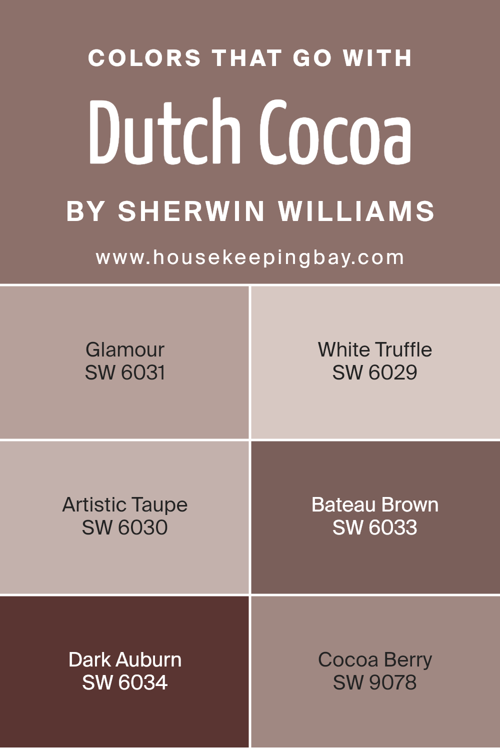
Choosing colors that complement Dutch Cocoa SW 6032 by Sherwin Williams is crucial for creating a cohesive and appealing visual space. These colors not only enhance the rich, warm essence of Dutch Cocoa but also allow for a versatile range of design options. When paired thoughtfully, they bring balance, depth, and a sense of completeness to any room.
Colors like Glamour SW 6031 add a touch of elegance with their subtle, muted pink tones, providing a soft contrast to the deeper Dutch Cocoa. It’s like adding a whisper of sunrise to a dusky evening sky.
White Truffle SW 6029 brings in a gentle, creamy brightness, offering a lightness that can lift the overall feel of the space, making it seem more open and inviting. Artistic Taupe SW 6030, with its soft, earthy vibe, bridges the gap between warm and cool tones in a room, enabling a smooth blend of other decorative elements.
Bateau Brown SW 6033 deepens the palette with its robust, earth-grounded presence, reinforcing the strength of Dutch Cocoa yet adding its distinctively rich whispers. Dark Auburn SW 6034 injects a fiery, passionate undercurrent that resonates with energy and vitality.
Lastly, Cocoa Berry SW 9078 lends a berry-infused burst, intertwining the comfort of cocoa with the freshness of fruit, creating a unique, welcoming atmosphere. Together, these colors work harmoniously, offering endless possibilities for creating spaces that are both beautiful and functional.
You can see recommended paint colors below:
- SW 6031 Glamour
- SW 6029 White Truffle
- SW 6030 Artistic Taupe
- SW 6033 Bateau Brown
- SW 6034 Dark Auburn
- SW 9078 Cocoa Berry
housekeepingbay.com
How to Use Dutch Cocoa SW 6032 by Sherwin Williams In Your Home?
Dutch Cocoa SW 6032 by Sherwin Williams is a rich, warm brown paint color that adds a cozy feel to any space. Imagine wrapping your living room or bedroom in this soothing shade; it’s like giving your home a comforting hug. This color works well in spaces where you want to relax and unwind. It’s versatile, too, making it a great choice not just for walls, but also for cabinets or furniture that need a bit of sprucing up.
Using Dutch Cocoa can also create a backdrop for brighter colors or interesting textures, making artwork or colorful pillows pop. It’s particularly stunning in well-lit rooms, where natural light can show off its depth and warmth, but it also brings a comforting depth to dimmer spaces, creating a snug, inviting atmosphere.
Don’t be afraid to use Dutch Cocoa in small nooks or areas, like a reading corner or a home office. It can help those spaces feel grounded and more focused. Pairing it with creamy whites or soft greys can balance its richness, ensuring your home feels balanced and cozy.
Dutch Cocoa SW 6032 by Sherwin Williams vs Hot Cocoa SW 6047 by Sherwin Williams
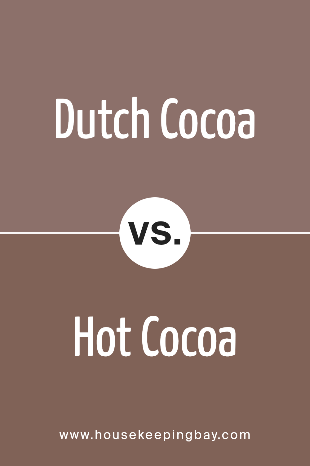
Dutch Cocoa SW 6032 by Sherwin Williams and Hot Cocoa SW 6047 are two beautiful shades, but they have their differences. Dutch Cocoa is a cozier, deeper brown, giving off a warm, rich vibe perfect for creating a snug and inviting space. It’s a bit like the color of a dark chocolate bar, offering a sophisticated and elegant atmosphere.
Hot Cocoa, however, is a lighter brown. This color feels more relaxed and soft, like the creamy top of a freshly made hot chocolate. It’s perfect for making a room feel gentle and welcoming, adding a touch of sweetness without overwhelming the senses.
While both colors share a connection to the comforting feeling of cocoa, Dutch Cocoa brings a darker, more intense warmth, whereas Hot Cocoa provides a softer, lighter touch. Depending on the mood you’re aiming to set, each color offers its unique charm. Choose Dutch Cocoa for depth and richness, or opt for Hot Cocoa for a delicate, soothing ambiance.
You can see recommended paint color below:
- SW 6047 Hot Cocoa
housekeepingbay.com
Dutch Cocoa SW 6032 by Sherwin Williams vs Patchwork Plum SW 0022 by Sherwin Williams
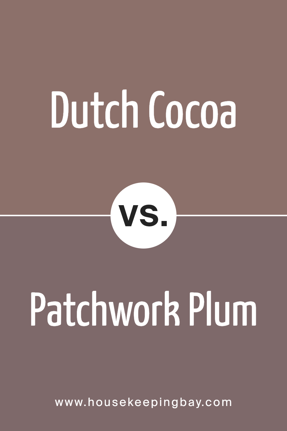
Dutch Cocoa SW 6032 by Sherwin Williams is a rich, warm brown that reminds you of a cozy cup of hot cocoa. It gives off a welcoming and soothing vibe, perfect for spaces where you want to relax and feel comfortable. It’s a deep, earthy color that adds a sense of stability and grounding to any room.
Patchwork Plum SW 0022, by contrast, is a unique and vibrant shade of purple. It has a playful yet sophisticated feel, adding a pop of color and personality to spaces. This color is great for areas where you want to inspire creativity and add a bit of fun.
While Dutch Cocoa instills a sense of warmth and comfort with its deep brown tones, Patchwork Plum brings energy and vibrancy with its purple hues. Both colors offer distinct atmospheres; one is calming and grounding, while the other is lively and inspiring. Depending on what mood you want to create, each color has its unique charm and appeal.
You can see recommended paint color below:
- SW 0022 Patchwork Plum
housekeepingbay.com
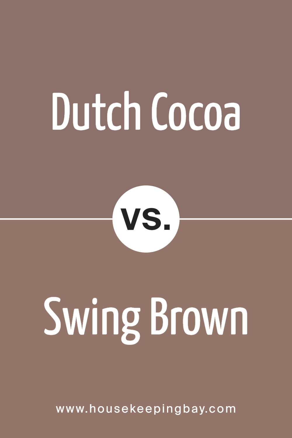
Dutch Cocoa SW 6032 by Sherwin Williams vs Swing Brown SW 6046 by Sherwin Williams
Dutch Cocoa SW 6032 by Sherwin Williams is a cozy and warm color that might remind you of a delicious hot chocolate on a chilly evening. It’s a bit like a hug from a good friend: comforting and always welcome. This color has a depth to it, making spaces feel inviting and snug.
Swing Brown SW 6046, also by Sherwin Williams, feels lighter and more playful when compared to Dutch Cocoa. Imagine the color of autumn leaves mixed with a dash of sunlight. It’s the sort of brown that can brighten a room without being too loud. It brings a gentle warmth to spaces and works well if you’re looking for something that feels cozy but not too dark.
Both colors share the warmth and comfort of brown shades but stand apart in their vibe. Dutch Cocoa leans towards a rich, deep warmth, making spaces feel intimate. Swing Brown, however, offers a softer approach, illuminating rooms with its lighter, uplifting tone.
You can see recommended paint color below:
- SW 6046 Swing Brown
housekeepingbay.com
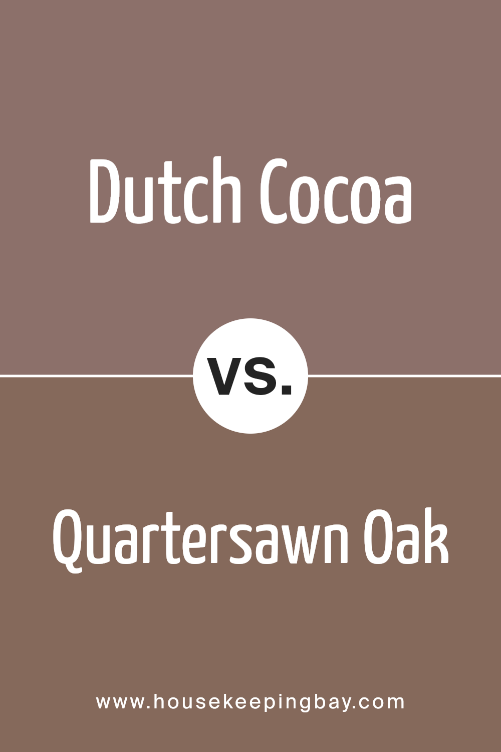
Dutch Cocoa SW 6032 by Sherwin Williams vs Quartersawn Oak SW 2836 by Sherwin Williams
Dutch Cocoa SW 6032 and Quartersawn Oak SW 2836 by Sherwin Williams are both beautiful, warm colors, but they have their own unique vibes. Dutch Cocoa is a deep, rich brown that feels cozy and inviting, kind of like the color of a delicious chocolate bar. It’s perfect for creating a snug, comfortable atmosphere in a room, making you feel relaxed and at ease.
Quartersawn Oak, on the other hand, is lighter and leans towards a golden-brown. It has a natural, earthy quality, much like the wood it’s named after, giving spaces a bright, airy feel. This color is great for adding a touch of warmth without making a room feel too dark or heavy.
So, while both colors are warm and can make a space feel welcoming, Dutch Cocoa adds depth and richness with its darker tone, and Quartersawn Oak brings in lightness and an organic touch with its golden hue. Choosing between them really depends on the mood you’re aiming for in your space.
You can see recommended paint color below:
- SW 2836 Quartersawn Oak
housekeepingbay.com
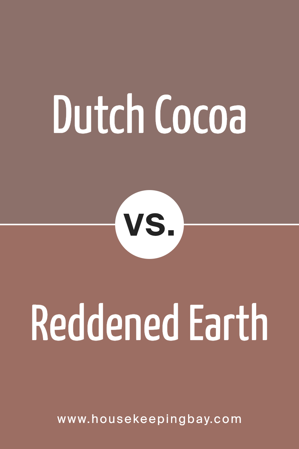
Dutch Cocoa SW 6032 by Sherwin Williams vs Reddened Earth SW 6053 by Sherwin Williams
Dutch Cocoa SW 6032 by Sherwin Williams is a dark, rich brown that gives a feeling of warmth and comfort. It reminds you of the cozy feeling of sipping hot cocoa on a chilly day. This color can make large spaces feel more intimate and small spaces feel snug and welcoming.
On the contrary, Reddened Earth SW 6053 is a deep, earthy red with a hint of brown. This color has a rustic charm that can add a sense of welcoming warmth to any room. It works well in spaces where you wish to add a touch of color without overwhelming the space with brightness.
While Dutch Cocoa is more about creating a dark, cozy retreat, Reddened Earth brings warmth with its reddish hue. Both colors are great for creating a cozy atmosphere, but Dutch Cocoa leans towards a darker, chocolatey vibe, and Reddened Earth adds warmth with its reddish, earthy tone.
You can see recommended paint color below:
- SW 6053 Reddened Earth
housekeepingbay.com
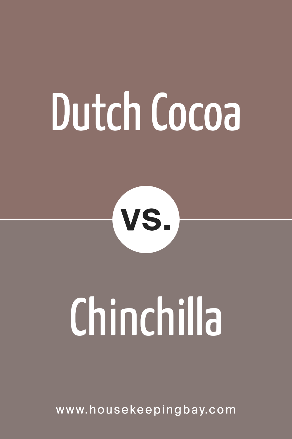
Dutch Cocoa SW 6032 by Sherwin Williams vs Chinchilla SW 6011 by Sherwin Williams
Dutch Cocoa SW 6032 by Sherwin Williams and Chinchilla SW 6011 are two distinct shades that offer unique feels to a space. Dutch Cocoa is a rich, deep brown that gives off a warm and cozy vibe. It’s like the color of a delicious, dark chocolate bar, creating a comforting and inviting atmosphere in any room. This color works well in spaces where you want to add depth and warmth, making it ideal for living rooms or bedrooms.
Chinchilla SW 6011, meanwhile, is a lighter, softer gray that has a versatile and contemporary appeal. It’s more neutral and airy compared to Dutch Cocoa, making it easier to pair with a wide range of decor styles and colors. Chinchilla offers a delicate balance of warmth and sophistication, suitable for spaces that aim for a modern, chic look.
While both colors are beautiful and can create stunning interiors, Dutch Cocoa brings a deep warmth and richness, whereas Chinchilla lends a softer, more understated elegance to a space. Whether you choose the cozy allure of Dutch Cocoa or the modern elegance of Chinchilla depends on the mood and style you’re going for in your home.
You can see recommended paint color below:
- SW 6011 Chinchilla
housekeepingbay.com
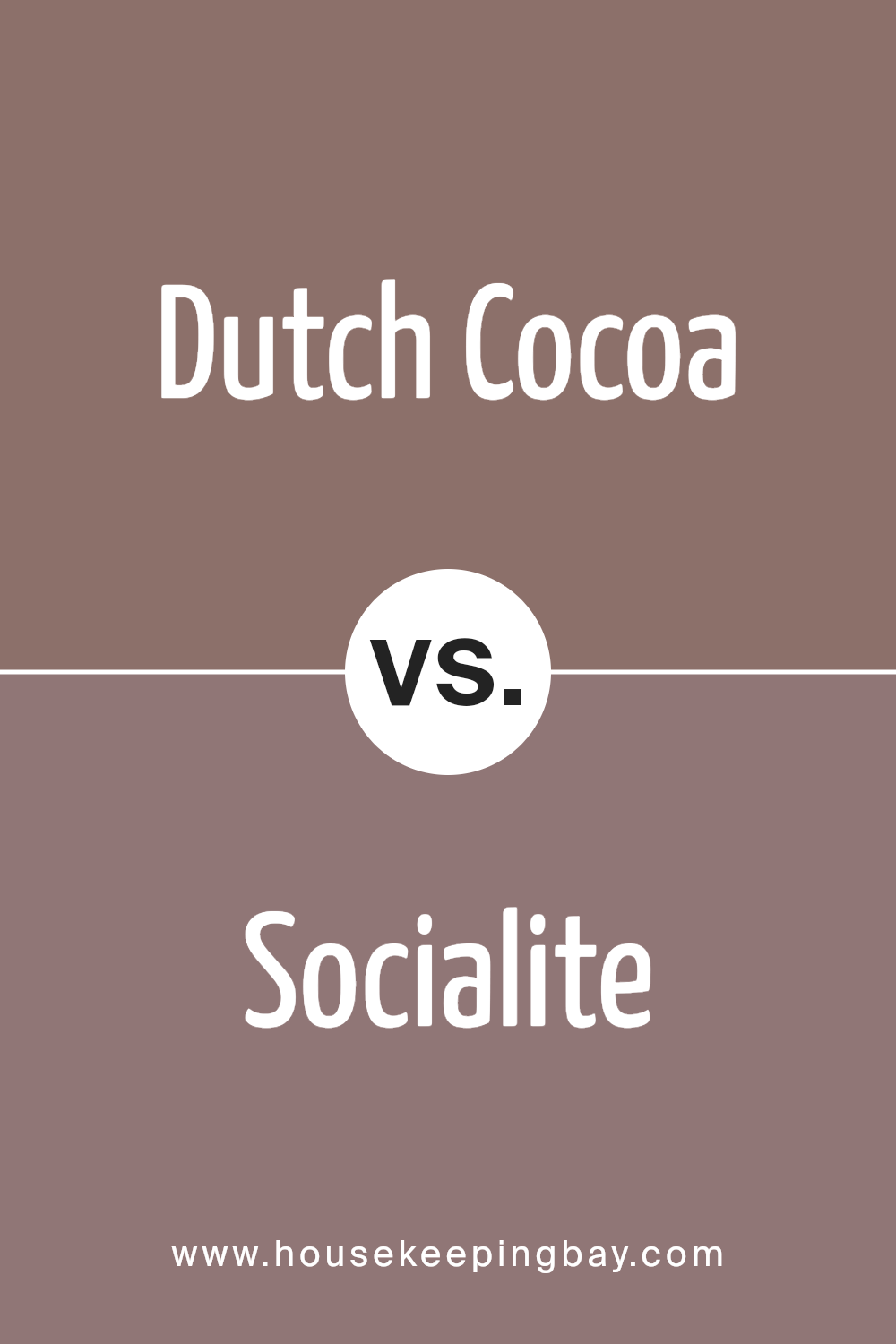
Dutch Cocoa SW 6032 by Sherwin Williams vs Socialite SW 6025 by Sherwin Williams
When we look at Dutch Cocoa SW 6032 and Socialite SW 6025, both from Sherwin Williams, we see two colors with distinct vibes. Dutch Cocoa is a warm, deep brown that gives off a cozy and comforting feeling, like a rich, inviting chocolate. It’s perfect for creating a snug and inviting space where you’d love to relax.
On the flip side, Socialite SW 6025 brings a different mood. It’s a lighter, soft green with a hint of grey, giving it a sophisticated and calm feel. This color is more about creating a serene and elegant atmosphere where you can unwind or feel refreshed.
So, if you’re trying to decide between the two, think about the mood you want to set for your room. Dutch Cocoa is great for a cozy, warm setting, while Socialite is ideal for a calm, refined space. Both colors are pretty in their own right, just with different vibes.
You can see recommended paint color below:
- SW 6025 Socialite
housekeepingbay.com
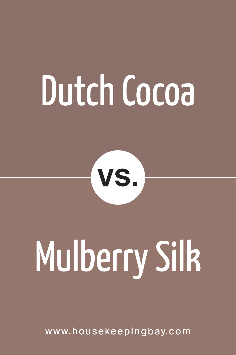
Dutch Cocoa SW 6032 by Sherwin Williams vs Mulberry Silk SW 0001 by Sherwin Williams
Dutch Cocoa SW 6032 by Sherwin Williams is a warm and rich brown shade that reminds you of a cozy, inviting chocolate bar. It’s quite dark and has a deep, earthy vibe which makes it perfect for creating a snug and comfortable space. This color can add a lot of depth and warmth to a room, making it feel more welcoming.
Mulberry Silk SW 0001 by Sherwin Williams, in contrast, is a soft and gentle white with a slight pink undertone that gives it a warm and soothing feel. It’s much lighter than Dutch Cocoa and offers a sense of calmness and elegance to any space. This color is great for making a room look brighter and more spacious.
Putting these two colors together in a room can create a beautiful balance. The deep, dark tones of Dutch Cocoa can ground the space, while the light, airy feel of Mulberry Silk can open it up and bring in a touch of softness and warmth.
You can see recommended paint color below:
- SW 0001 Mulberry Silk
housekeepingbay.com
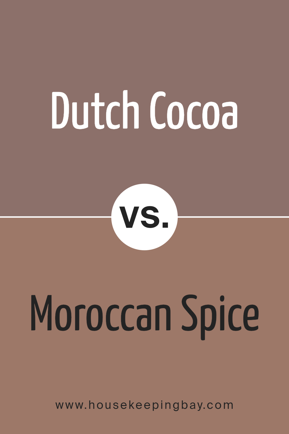
Dutch Cocoa SW 6032 by Sherwin Williams vs Moroccan Spice SW 6060 by Sherwin Williams
Dutch Cocoa SW 6032 by Sherwin Williams is a rich, deep brown color, reminding one of the soothing warmth of a hot cocoa on a cool day. Its earthy tones provide a grounded, comforting feeling, making it perfect for creating cozy and inviting spaces. This color pairs well with lighter, creamy hues or can stand strong on its own as a statement wall.
On a different note, Moroccan Spice SW 6060, also by Sherwin Williams, brings the warmth of exotic markets into your home. It’s a vibrant, fiery red-orange that seems to glow with its own inner light. This color is all about warmth and energy, infusing spaces with a lively vibe. It works beautifully when paired with neutral tones, adding a pop of excitement without overwhelming the senses.
While Dutch Cocoa adds depth and a sense of calm to interiors, Moroccan Spice offers a bold and energetic atmosphere. Both colors have their unique appeal, depending on the mood one wishes to create in their space.
You can see recommended paint color below:
- SW 6060 Moroccan Spice
housekeepingbay.com
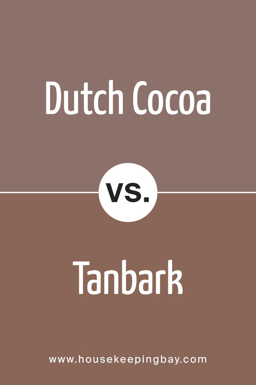
Dutch Cocoa SW 6032 by Sherwin Williams vs Tanbark SW 6061 by Sherwin Williams
Dutch Cocoa SW 6032 by Sherwin Williams is a rich, deep brown color, kind of like the chocolate it’s named after. It’s a soothing color that brings a cozy and warm feeling to any room. It looks very elegant and can make spaces feel more inviting and comfortable.
Tanbark SW 6061, by contrast, is a lighter, softer shade. It’s still in the brown family but leans towards a more muted, earthy tone. This color is great for creating a serene and calming atmosphere. It’s versatile and pairs nicely with many other colors, making it a good choice for any space looking to add a touch of nature and tranquility.
When you compare Dutch Cocoa and Tanbark, the biggest difference is in their intensity and mood. Dutch Cocoa is darker and can add depth and richness to a space, while Tanbark offers a lighter, airy feel, perfect for brightening up a room. Both colors bring their unique vibes to interiors, with Dutch Cocoa providing a cozy, sophisticated look and Tanbark a gentle, calming presence.
You can see recommended paint color below:
- SW 6061 Tanbark
housekeepingbay.com
Conclusion
In conclusion, the Sherwin Williams SW 6032 Dutch Cocoa is more than just a paint color; it’s a pathway to transforming your space into a warm and inviting haven. If you’re looking to infuse your room with a sense of richness and depth, then this shade might just be the perfect pick for you. Its deep, chocolatey tones can add a layer of sophistication and comfort to any room, whether you’re aiming to spruce up your living area or bring some coziness to your bedroom.
Choosing SW 6032 Dutch Cocoa means you’re ready to give your home a makeover that’s both stylish and timeless. This color works beautifully with a wide range of decor styles, from modern to traditional, making it incredibly versatile. Plus, it has the magic of making large spaces feel cozy and small spaces appear richer and more inviting.
When it comes to application, remember that lighting plays a crucial role in how this color will finally look on your walls. Testing it out in different areas and under various lighting conditions is a smart move to ensure it meets your expectations.
So, if you’re looking to breathe new life into your home with a color that’s both luxurious and comforting, SW 6032 Dutch Cocoa is a choice worth considering. It’s not just a color; it’s a statement that says elegance, warmth, and style.

housekeepingbay.com
Ever wished paint sampling was as easy as sticking a sticker? Guess what? Now it is! Discover Samplize's unique Peel & Stick samples. Get started now and say goodbye to the old messy way!
Get paint samples
