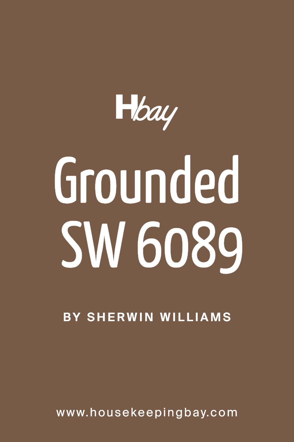
Grounded SW 6089 by Sherwin Williams
Embracing Earth's Essence: A Dive into Deep Browns
If you’re on the hunt for a paint color that brings a cozy and earthy vibe to your space, SW 6089 Grounded by Sherwin Williams could be the perfect choice for you. This color is like a warm hug for your walls, giving any room a grounded and comforting atmosphere.
It’s a shade that sits somewhere between the heartiness of the earth and the welcoming embrace of home, making it incredibly versatile for various spaces and styles.
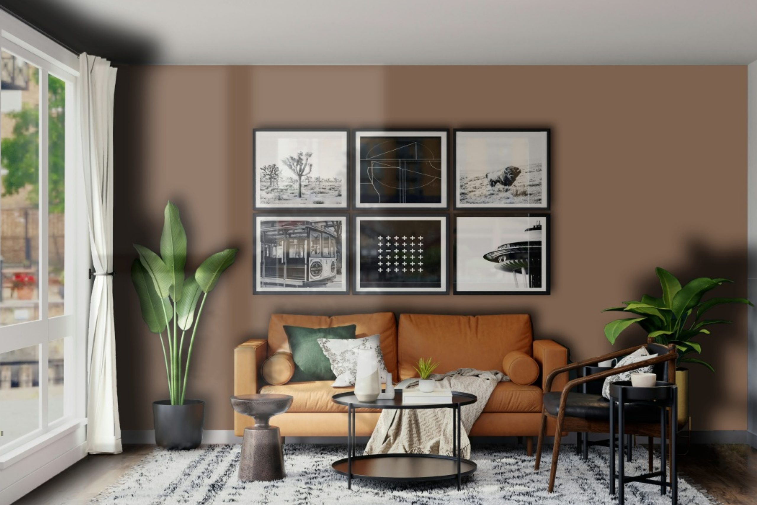
Imagine walking into a room painted with SW 6089 Grounded and feeling an immediate sense of calm and warmth. Whether you’re looking to revamp your living room, bedroom, or even a home office, this color is flexible enough to fit your vision. It pairs beautifully with natural light, bringing its richness to life, and also works well under artificial lighting by adding depth and coziness to the evening ambiance.
Choosing SW 6089 Grounded means you’re setting the stage for a range of decorating possibilities. It’s a backdrop that can support bold colors and patterns or harmonize with more subdued, earthy tones for a minimalist vibe. So, if you’re ready for a change, consider how this unique shade can transform your space into a welcoming haven.
via colorxs
What Color Is Grounded SW 6089 by Sherwin Williams?
Grounded SW 6089 by Sherwin Williams is a rich, earthy brown shade that exudes warmth and comfort. This color is versatile, making it a perfect choice for various interior styles, whether you’re looking to create a cozy, rustic feel or add depth to a more modern and minimalist design. The beauty of Grounded lies in its ability to act as a strong foundation, allowing other colors to stand out, yet it’s bold enough to make its own statement when used as the main hue in a room.
In terms of interior styles, Grounded works exceptionally well in spaces that aim for a natural, organic aesthetic, like farmhouse, bohemian, and traditional designs. Its deep brown tones mirror the earth, bringing a sense of tranquility and grounding to any room.
It pairs beautifully with natural materials and textures such as wood, leather, linen, and jute, further enhancing its earthy charm. Metals like brass, copper, and gold also complement this color, adding a touch of sophistication and warmth.
When considering what materials and textures work best with Grounded, think of those that contribute to a cozy and inviting atmosphere. Soft throw blankets, plush pillows, and rich wooden furniture pieces can all elevate the comfort level of a room painted in this shade.
The color also works well with stone textures, whether in the form of decorative accents or architectural features, enhancing its rustic appeal. By selecting Grounded SW 6089 for your walls, you’re choosing a color that’s both timeless and adaptable, capable of bringing warmth and depth to a variety of spaces and styles.
housekeepingbay.com
Is Grounded SW 6089 by Sherwin Williams Warm or Cool color?
GroundedSW 6089 by Sherwin Williams is a color that brings a warm and soothing atmosphere to any home. This particular shade is like a blend of the earth and wood, creating a natural and cozy feel in a room. It’s a versatile paint color that works well in many areas of the house, whether you’re looking to add a touch of warmth to your living room, bedroom, or even the kitchen.
What makes GroundedSW 6089 special is how it complements both light and dark furniture, as well as various decor styles. This means you can easily match it with your existing home furnishings or use it as a base for a new decor theme. It’s great for creating a welcoming space that feels both comfortable and stylish.
Furthermore, this color can make a room feel more spacious and open, yet it still adds a sense of coziness and comfort. Its earthy tone helps to bring a sense of calmness, making it an excellent choice for rooms where you want to relax and unwind. Whether you have a modern or traditional home, GroundedSW 6089 can enhance the beauty and feeling of any space.
What is the Masstone of the Grounded SW 6089 by Sherwin Williams?
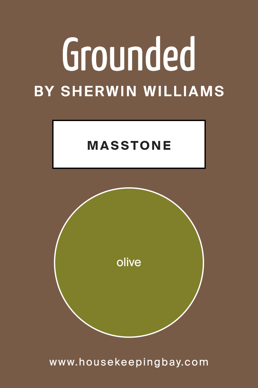
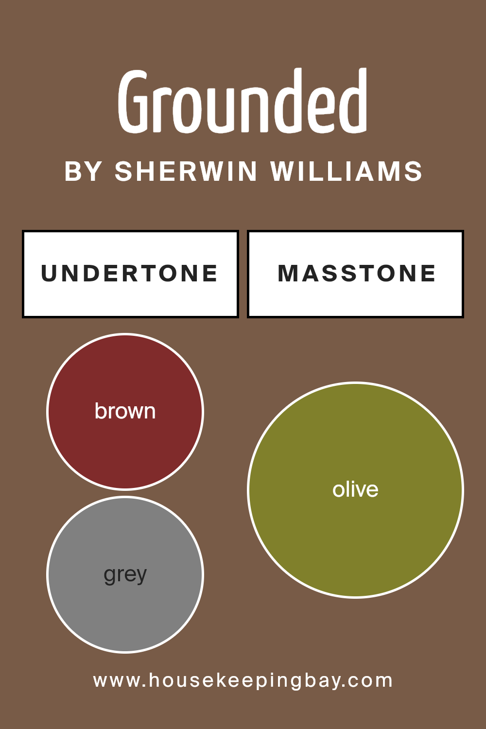
GroundedSW 6089 by Sherwin Williams is a unique shade of olive green (#80802B), known as its masstone. The masstone, or the pure color before it’s mixed or diluted, carries a rich and earthy tone that brings warmth and natural elegance into homes.
This olive hue creates a cozy atmosphere, making rooms feel more grounded and inviting. It’s versatile, working well in various spaces, from kitchens to bedrooms, adding depth and character without overwhelming the senses.
This color particularly shines in homes that aim for a connection with nature or a rustic aesthetic. Its earthiness complements wooden furnishings, natural fibers, and plant life, weaving them into a cohesive look. In well-lit areas, GroundedSW 6089 can appear vibrant and lively, while in spaces with less light, it offers a subtle, soothing backdrop.
Its flexibility in matching different themes and accessories makes it a fantastic choice for those looking to introduce a touch of the outdoors into their living spaces, fostering a serene and welcoming environment.
housekeepingbay.com
Undertones of Grounded SW 6089 by Sherwin Williams
Grounded SW 6089 by Sherwin Williams is a sophisticated paint color that may seem simple at first glance but actually carries a complex mix of undertones. Undertones are like secret colors hidden within the main color. They can change how a color looks depending on the light or what it’s paired with. Think of them as the hidden flavors in your favorite dish that make it taste unique.
Grounded SW 6089 has undertones of brown, grey, purple, dark green, dark grey, dark turquoise, orange, navy, red, pale pink, pink, light green, mint, green, light turquoise, yellow, and pale yellow. That’s a lot going on beneath the surface! These undertones can make the color shift in appearance.
For example, in a room with a lot of natural light, green or grey undertones might stand out, giving the room a cooler feel. In a room with less light, the brown or orange undertones might pop, making the space feel warmer and cozier.
When you paint a room with Grounded SW 6089, these undertones play a significant role in setting the atmosphere and mood. The color will look slightly different from morning to night because of how the changing light interacts with its undertones.
This ability to subtly change means it can complement a wide range of decor styles and colors. For instance, pairing it with blues can bring out its grey tones, while pairing it with warm wood furniture might highlight its brown undertones.
Understanding how undertones work helps in picking the right paint color for your walls, ensuring it matches your desired aesthetic and works well under different lighting conditions. Grounded SW 6089, with its rich palette of undertones, offers a versatile backdrop for interiors, making spaces feel more dynamic and layered.
housekeepingbay.com
Coordinating Colors of Grounded SW 6089 by Sherwin Williams
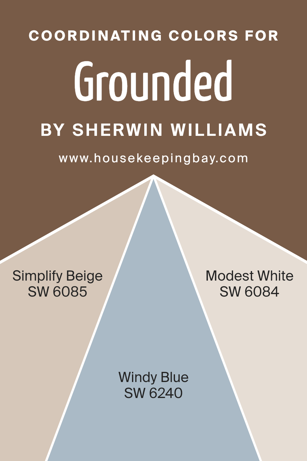
Coordinating colors are hues that complement each other when used together within a space, creating a visually appealing and harmonious look. These colors, when chosen carefully, can enhance the ambiance of a room, making it feel more cohesive and thoughtfully designed. For example, Grounded SW 6089 by Sherwin Williams, a rich and earthy tone, pairs beautifully with a selection of coordinating colors that bring out its warmth and depth without overpowering it.
Simplify Beige SW 6085 is a subtle, warm hue that embodies a sense of calm and simplicity, making it a perfect companion to the grounded nature of Grounded SW 6089. This delicate beige adds a layer of softness to the palette, creating a serene and inviting atmosphere.
Windy Blue SW 6240, on the other hand, introduces a refreshing contrast with its cool, airy quality that echoes the openness of the sky, offering a serene backdrop that complements the earthy tones of Grounded. Lastly, Modest White SW 6084 provides a crisp, clean canvas that highlights the richer tones of Grounded SW 6089.
This versatile white brings a sense of brightness and space, making it an ideal choice for balancing and tying together the overall color scheme. Together, these coordinating colors work in harmony to create a balanced, cohesive look that enhances the beauty of each individual shade.
You can see recommended paint colors below:
- SW 6085 Simplify Beige
- SW 6240 Windy Blue
- SW 6084 Modest White
housekeepingbay.com
How Does Lighting Affect Grounded SW 6089 by Sherwin Williams?
Lighting plays a crucial role in how we perceive colors, significantly impacting their appearance. The color GroundedSW 6089 by Sherwin Williams is no exception; its appearance can alter dramatically under different lighting conditions. This warm, earthy hue can shift in intensity and tone depending on the type of light it is exposed to, whether artificial or natural.
In artificial light, the qualities of GroundedSW 6089 can vary based on the light bulb’s color temperature. Under warm, yellow-tinted bulbs, GroundedSW 6089 can appear richer and more inviting, enhancing its cozy feel. Cooler, blue-tinted bulbs might make the color appear slightly muted, losing some of its warmth but still maintaining its grounding quality.
Natural light brings its own dynamics into play. The direction of the room – north, south, east, or west – affects how GroundedSW 6089 looks throughout the day.
North-faced rooms receive less direct sunlight, so natural light is cooler, making GroundedSW 6089 appear a bit more subdued and shadowy. This can give the room a calm and soothing atmosphere, where the color adds depth without overwhelming the space.
South-faced rooms bask in warmer, more intense sunlight for most of the day. Here, GroundedSW 6089 can really show off its warmth, brightening up the space with a sunny, inviting glow. The color feels vibrant and lively, perfect for creating a cheerful and energetic setting.
East-faced rooms enjoy bright morning light, which can make GroundedSW 6089 look particularly vibrant and fresh in the mornings, gradually transitioning to a more balanced and neutral shade as the day goes on. It’s great for spaces used mostly in the morning, like breakfast nooks.
West-faced rooms get the evening sun, which can cast a warm, golden light, making GroundedSW 6089 feel cozy and snug. It’s ideal for living rooms or dining areas where the warm evening light enhances the color’s richness.
Understanding the effect of lighting on color like GroundedSW 6089 by Sherwin Williams can help you choose the right setting and accents, ensuring the color works harmoniously in your space under various lighting conditions.
housekeepingbay.com
What is the LRV of Grounded SW 6089 by Sherwin Williams?
LRV stands for Light Reflectance Value, which is a measure of how much light a color reflects back into a room versus how much it absorbs. It’s a scale from 0 to 100, with 0 being pure black (absorbs all light) and 100 being pure white (reflects all light).
This number is super important when picking out paint colors because it can really change how a color looks on your wall. For instance, a color with a high LRV makes a room feel brighter and more open because it reflects more light around the space.
On the other hand, colors with a low LRV can make a room feel cozier and more intimate because they absorb more light.
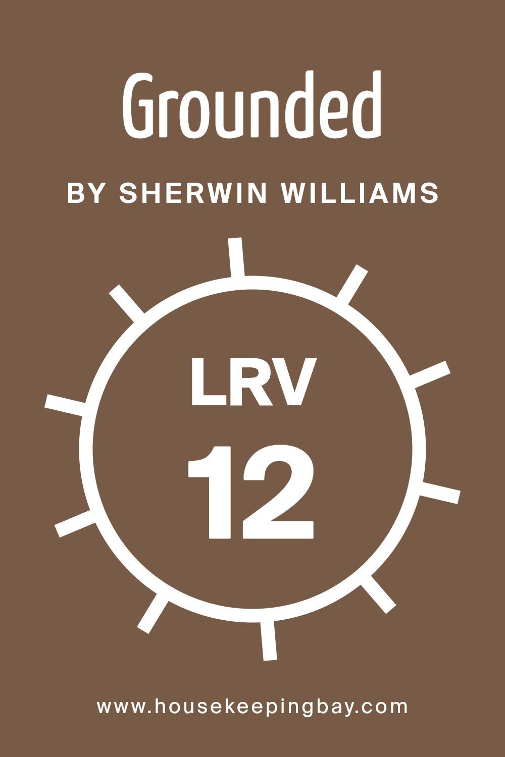
GroundedSW 6089 by Sherwin Williams, with an LRV of 11.928, is on the lower end of the scale. This means it doesn’t reflect a lot of light but instead absorbs it, giving the color a deeper, richer appearance. In a well-lit room or an area that gets plenty of natural light, this color can add a strong sense of warmth and depth to the space.
However, in a room that’s already lacking in light, using a color with such a low LRV might make the space feel smaller or darker. So, it’s always good to consider the amount of light your room gets before deciding on a color, especially one with a low LRV like GroundedSW 6089.
housekeepingbay.com
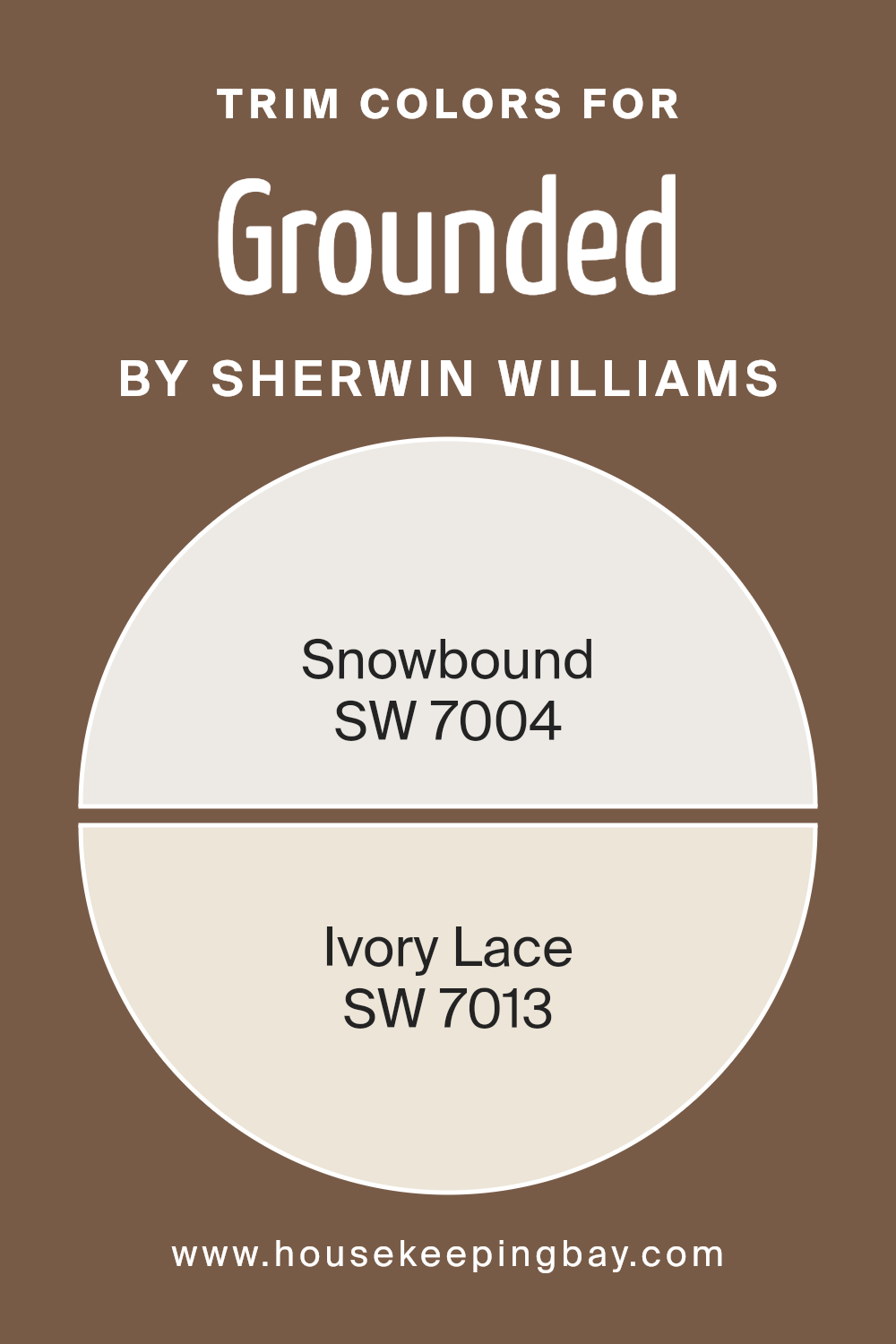
What are the Trim colors of Grounded SW 6089 by Sherwin Williams?
Trim colors are specific shades selected to complement or contrast the main color used on walls, bringing out architectural details or adding a finishing touch to the room’s design. In the case of Grounded SW 6089 by Sherwin Williams, a rich and warm hue, choosing the right trim color is crucial as it helps frame the space, adding depth and highlighting the unique features of a room.
The trim color can either subtly blend with the main wall color to create a cohesive look or stand out to define and accentuate the borders of the room, such as window frames, doors, and skirting boards, enhancing the overall aesthetic appeal.
For Grounded SW 6089, a solid choice for trim colors includes SW 7004 – Snowbound and SW 7013 – Ivory Lace by Sherwin Williams. Snowbound is a soft, off-white with a neutral undertone that brings a fresh and crisp edge to the warmth of Grounded, offering a contemporary feel while maintaining a sense of harmony.
On the other hand, Ivory Lace is a warmer, creamy white that provides a smooth transition between the wall and trim, adding a touch of elegance and a subtle contrast without overwhelming the primary color. Both choices promise to enrich the visual experience of a space, ensuring a polished and well-designed outcome.
You can see recommended paint colors below:
housekeepingbay.com
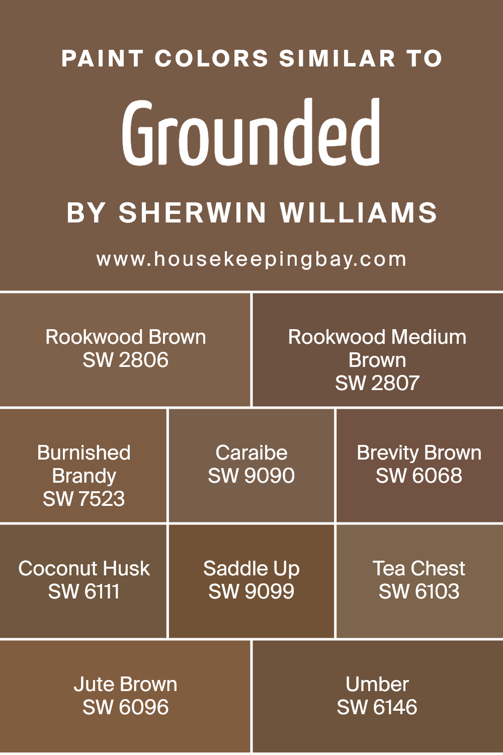
Colors Similar to Grounded SW 6089 by Sherwin Williams
When decorating or designing, using similar colors creates a cohesive and harmonious look in any space. Colors similar to GroundedSW 6089 by Sherwin Williams, like SW 2806 Rookwood Brown and SW 2807 Rookwood Medium Brown, offer a rich depth that’s both warm and inviting, making spaces feel grounded.
These shades are particularly useful in creating an ambiance that’s welcoming yet sophisticated. SW 7523 Burnished Brandy adds a touch of elegance with its refined bronze tone, subtly enhancing the area without overpowering it.
Meanwhile, SW 9090 Caraibe introduces a slightly exotic flair with its deep, subtle green, reminiscent of serene seasides and lush foliage, perfect for adding a unique twist to traditional settings.
On the other hand, SW 6068 Brevity Brown and SW 6111 Coconut Husk bring in a lighter, more versatile approach to brown, making them excellent for spaces that aim for a soft and airy feel with a touch of earthiness.
For those looking to add a bit more character, SW 9099 Saddle Up brings a dusty, leather-like tone into the mix, ideal for creating cozy, intimate spaces. SW 6103 Tea Chest, with its dark, rich hue, acts like a shadow, adding depth and mystery to the palette.
Further enriching the spectrum, SW 6096 Jute Brown offers a golden-brown shade that radiates warmth, mimicking the soft glow of sunset. Lastly, SW 6146 Umber concludes the spectrum with a quiet elegance, its gray undertones providing a sophisticated balance to the warmer browns, making it perfect for crafting spaces that speak of timeless elegance.
Together, these colors work seamlessly to create environments that are both inviting and aesthetically pleasing, proving that similar colors are not just a choice but a method to achieve visual unity and warmth in design.
You can see recommended paint colors below:
- SW 2806 Rookwood Brown
- SW 2807 Rookwood Medium Brown
- SW 7523 Burnished Brandy
- SW 9090 Caraibe
- SW 6068 Brevity Brown
- SW 6111 Coconut Husk
- SW 9099 Saddle Up
- SW 6103 Tea Chest
- SW 6096 Jute Brown
- SW 6146 Umber
housekeepingbay.com
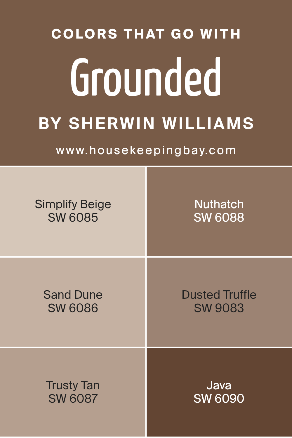
Colors that Go With Grounded SW 6089 by Sherwin Williams
Choosing the right colors to complement Grounded SW 6089 by Sherwin Williams is crucial because it ensures a harmonious and inviting space. Complementary colors work together to create a cohesive look that can enhance the mood of any room.
For instance, Simplify Beige SW 6085 offers a soft, welcoming glow that pairs beautifully with Grounded, adding a subtle contrast without overwhelming the senses. It’s like the gentle embrace of morning sunlight, soft and soothing.
Nuthatch SW 6088, on the other hand, brings a deeper, richer note to the palette, similar to the comforting shadow of a large tree; it’s grounding and serene, providing a natural balance.
Sand Dune SW 6086 draws from the earthy tones of the beach, whispering tales of sandy walks at dusk, and pairs wonderfully with Grounded for a muted, nature-inspired scheme. Meanwhile, Dusted Truffle SW 9083 carries the mystery of twilight, a soft dark whisper that brings depth and sophistication. Trusty Tan SW 6087 is like the steadfast friend, reliable and warm, offering a dependable base that complements Grounded’s earthiness.
Java SW 6090, with its rich, coffee-inspired robustness, injects vigor and warmth, creating a refined ambiance that’s both welcoming and chic. Together, these colors work in harmony to generate a visually appealing and emotionally comforting space, making any room feel more like home.
You can see recommended paint colors below:
- SW 6085 Simplify Beige
- SW 6088 Nuthatch
- SW 6086 Sand Dune
- SW 9083 Dusted Truffle
- SW 6087 Trusty Tan
- SW 6090 Java
housekeepingbay.com
How to Use Grounded SW 6089 by Sherwin Williams In Your Home?
Grounded SW 6089 by Sherwin Williams is a warm and earthy paint color that can bring a cozy and welcoming atmosphere to any room in a home. Imagine your living room or bedroom painted in this soothing shade; it’s like wrapping the space in a warm hug. This color works great for creating a calm and peaceful environment, making it perfect for areas where you want to relax or unwind.
When thinking about how to use Grounded in your home, consider pairing it with natural elements like wood furniture or accents to highlight its earthy vibes. It’s also versatile enough to act as a beautiful backdrop for both bright and subdued colors, allowing you to add personal touches through decor while maintaining a cohesive look. Whether you’re updating your kitchen, bathroom, or a cozy corner, Grounded SW 6089 can add a subtle, grounding effect to your space, making it feel more inviting.
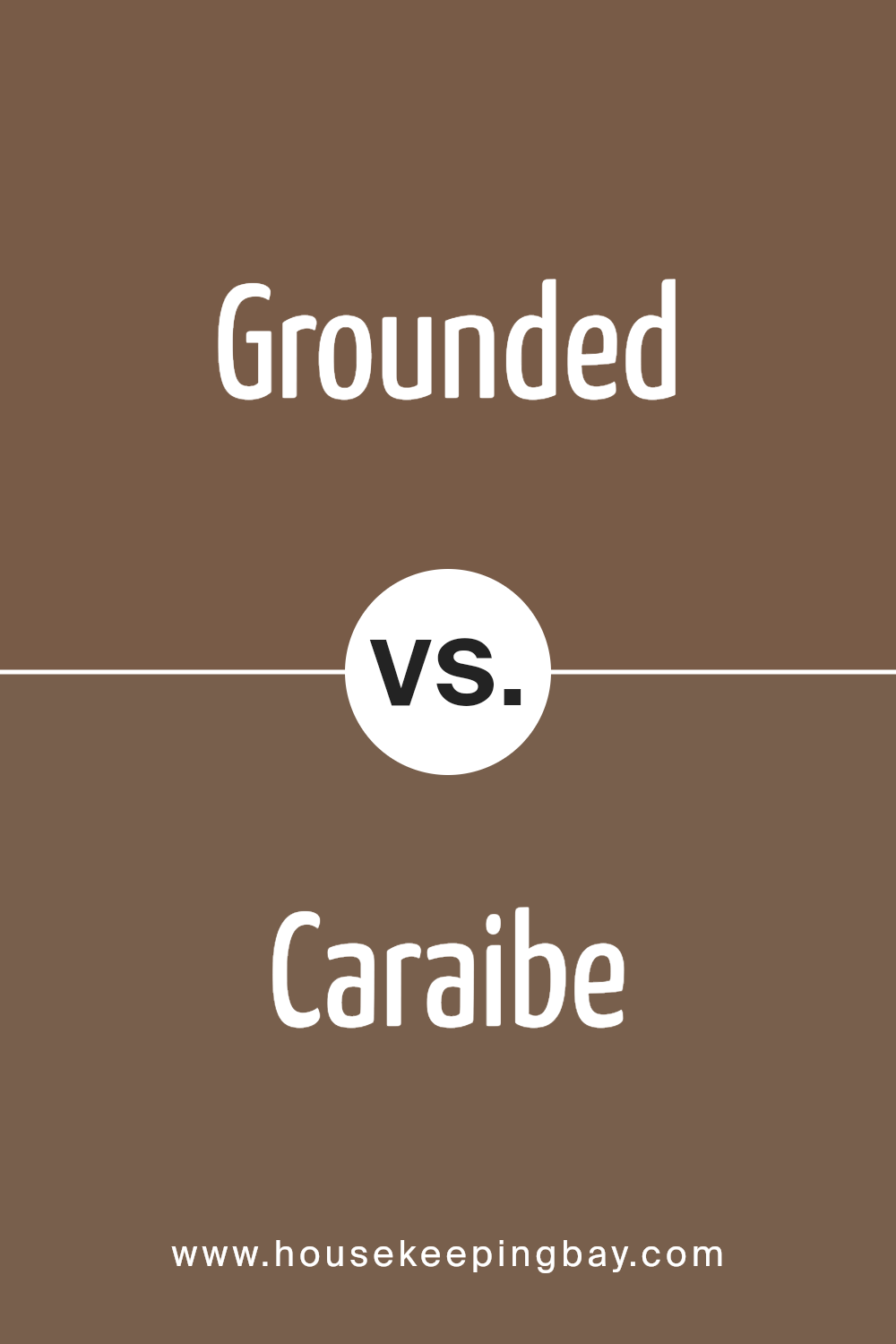
Grounded SW 6089 by Sherwin Williams vs Caraibe SW 9090 by Sherwin Williams
Grounded SW 6089 by Sherwin Williams is a rich, warm brown that brings a cozy and comforting feeling to any room. It’s like the color of dark chocolate, making spaces feel welcoming and snug. This color works well in living rooms or bedrooms, offering a grounded sensation.
In contrast, Caraibe SW 9090 by Sherwin Williams is a vibrant, deep blue with hints of green. It feels fresh and lively, reminiscent of the ocean on a sunny day. This color is perfect for adding a splash of energy and brightness to a space. It suits bathrooms or offices well, creating a lively and refreshing atmosphere.
While Grounded adds warmth and a sense of stability, Caraibe livens up spaces with its bright and cheerful vibe. Both colors are beautiful and have their unique charms, drastically changing the mood of a room depending on which one you choose.
You can see recommended paint color below:
- SW 9090 Caraibe
housekeepingbay.com
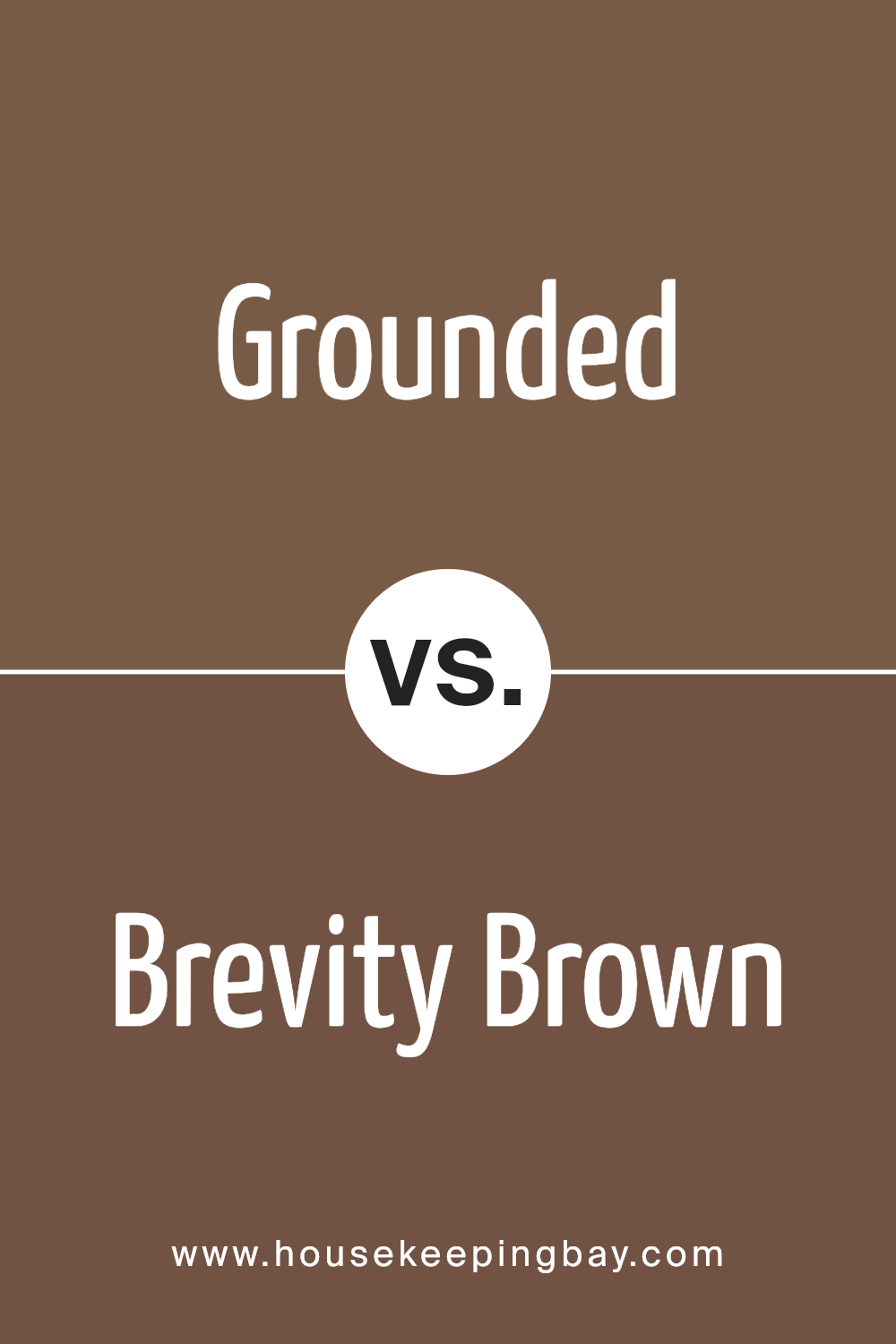
Grounded SW 6089 by Sherwin Williams vs Brevity Brown SW 6068 by Sherwin Williams
Grounded SW 6089 by Sherwin Williams and Brevity Brown SW 6068 by Sherwin Williams are two colors that share a cozy, earthy vibe but each has its own unique character. Grounded has a soft, muted approach, making it a versatile backdrop for rooms aiming for a subtle, calming atmosphere. It’s a type of color that supports a range of decor styles without overwhelming the space. Think of it as a gentle hug for your walls, providing a soothing presence.
Brevity Brown, in contrast, brings a stronger, more pronounced brown tone. It’s richer and has an essence of warmth that creates a snug, inviting environment. This color is perfect for spaces where you want to add a bit of depth and coziness, making the room feel more enclosed and homey. It’s like adding a soft, warm blanket to the room’s palette.
While both colors inspire a sense of comfort and connection to nature, Grounded leans towards a lighter, airier feel, and Brevity Brown offers a deeper, enveloping warmth. Each brings its own charm to interiors, depending on the mood you wish to achieve.
You can see recommended paint color below:
- SW 6068 Brevity Brown
housekeepingbay.com
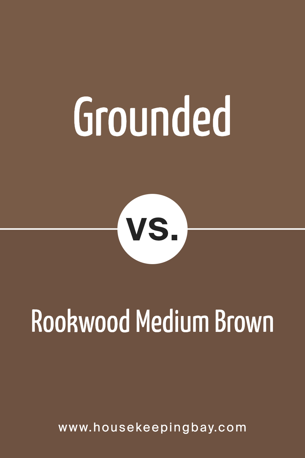
Grounded SW 6089 by Sherwin Williams vs Rookwood Medium Brown SW 2807 by Sherwin Williams
Grounded SW 6089 by Sherwin Williams and Rookwood Medium Brown SW 2807, both from Sherwin Williams, are unique in their own ways. Grounded offers a soft, cozy vibe to any space, leaning towards a lighter, more subtle brown. It’s a color that can easily blend with various decor styles, making rooms feel welcoming and warm without overwhelming the senses. Think of it as a gentle hug for your walls.
Rookwood Medium Brown, however, stands a bit bolder. It’s a deeper, richer brown that commands attention while still maintaining a sense of warmth and comfort. This color adds a more pronounced statement in any room, perfect for creating focal points or accentuating architectural details.
It brings a sense of sophistication and richness, ideal for spaces that aim for a more traditional or luxurious look.
While both colors share a base in earthy tones, Grounded feels airier and more adaptable, fitting a wide range of settings with a soft touch. Rookwood Medium Brown, conversely, delivers more depth and intensity, offering a striking backdrop or standout feature in a room. Both colors are versatile, but their individual characteristics make them suitable for different design intents and atmospheres.
You can see recommended paint color below:
- SW 2807 Rookwood Medium Brown
housekeepingbay.com
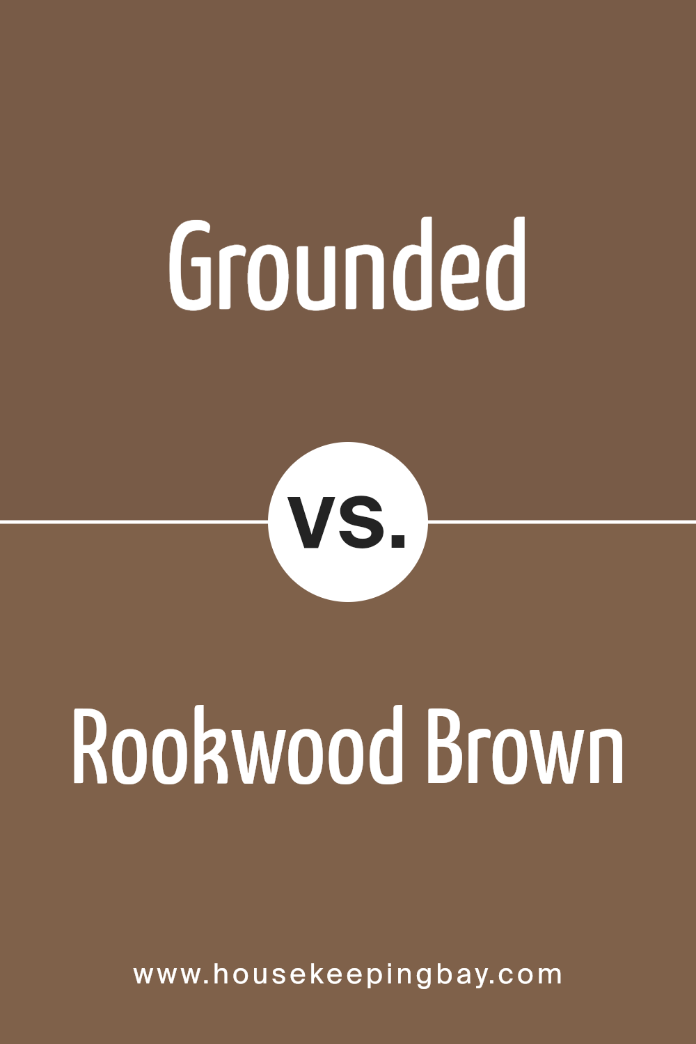
Grounded SW 6089 by Sherwin Williams vs Rookwood Brown SW 2806 by Sherwin Williams
Grounded SW 6089 by Sherwin-Williams is a unique color that brings warmth and coziness into any space. It has a soft, earthy vibe that makes rooms feel welcoming and comfortable. This hue is versatile, working well in living rooms, bedrooms, or even as an accent in kitchens. It pairs beautifully with natural materials like wood and stone, enhancing their natural beauty.
Rookwood Brown SW 2806, also by Sherwin-Williams, is deeper and richer than Grounded. It has a strong presence that can make a bold statement in a room. While still warm, Rookwood Brown leans towards a more sophisticated and elegant look, making it perfect for formal dining rooms or libraries.
Its intensity is balanced when used with lighter colors, creating a stunning contrast that draws the eye.
Both Grounded and Rookwood Brown add warmth and character to spaces, but Grounded offers a lighter, more earthy feel, whereas Rookwood Brown goes for depth and elegance. Each has its place in home decor, depending on the atmosphere one wishes to create.
You can see recommended paint color below:
- SW 2806 Rookwood Brown
housekeepingbay.com
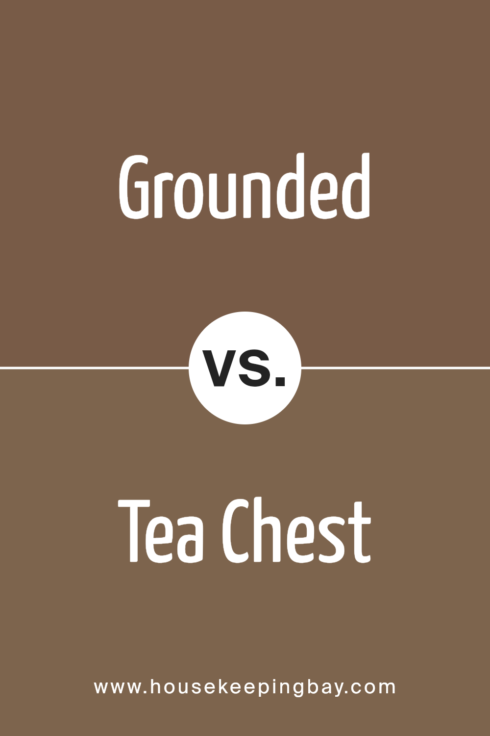
Grounded SW 6089 by Sherwin Williams vs Tea Chest SW 6103 by Sherwin Williams
Grounded SW 6089 and Tea Chest SW 6103, both by Sherwin Williams, offer two distinct takes on warm, earthy tones. Grounded presents as a deep, rich brown that suggests stability and strength. Its depth makes it perfect for creating a cozy, inviting space where relaxation is key. Imagine Grounded in a study or living room, adding a sophisticated backdrop that’s both comforting and elegant.
Tea Chest, in contrast, leans into a lighter, somewhat softer brown. It carries a hint of warmth that can brighten up any room without overwhelming it with darkness. This color works well in spaces that aim for a balance between comfort and openness, like kitchens or bedrooms. It pairs nicely with natural light, enhancing the room’s airy feel.
While both colors share a brown base, Grounded brings a stronger, more enveloping presence, whereas Tea Chest offers a gentler, welcoming vibe. Each has its unique charm, capable of transforming spaces according to different aesthetic and mood requirements.
You can see recommended paint color below:
- SW 6103 Tea Chest
housekeepingbay.com
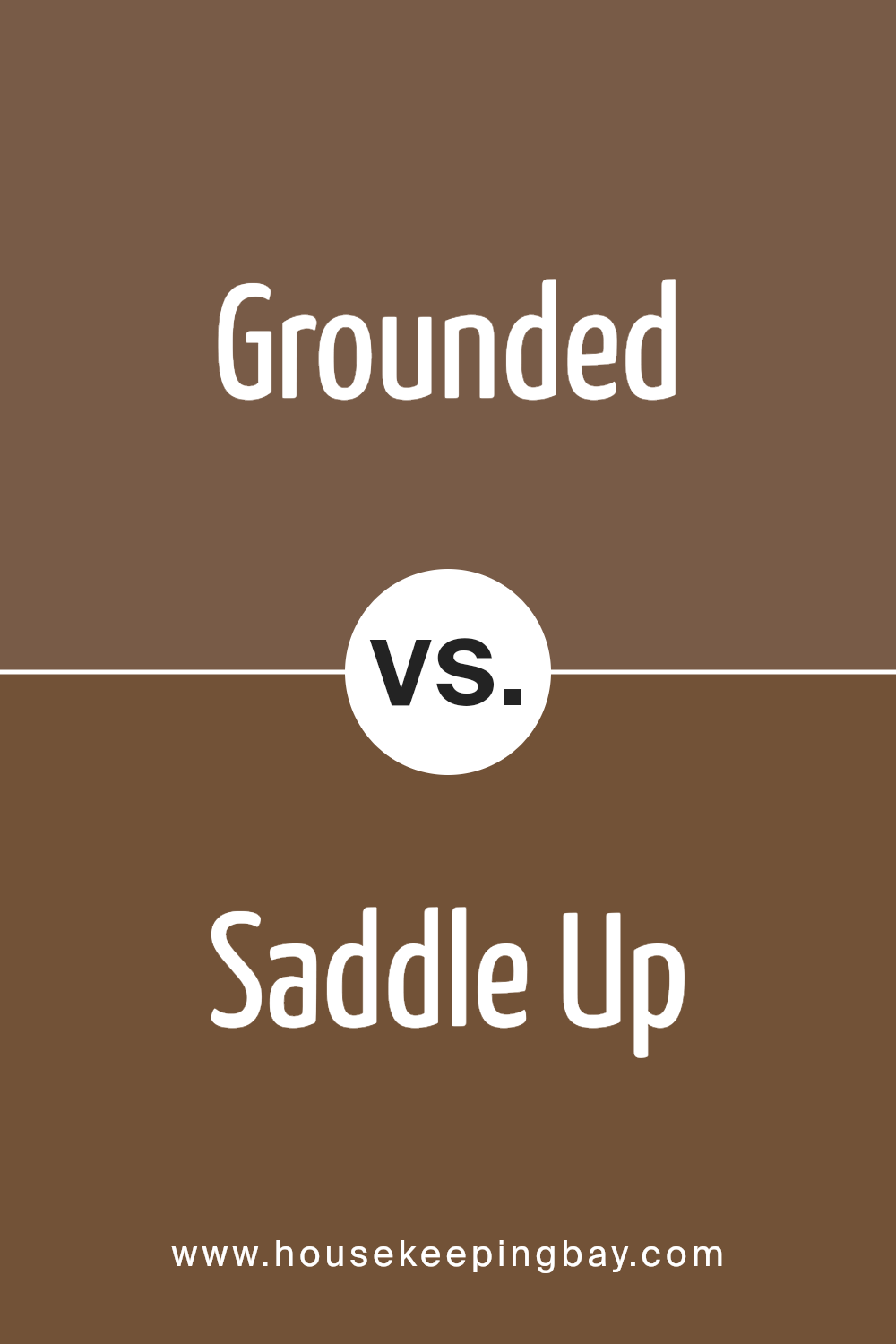
Grounded SW 6089 by Sherwin Williams vs Saddle Up SW 9099 by Sherwin Williams
Grounded SW 6089 and Saddle Up SW 9099, both by Sherwin Williams, are warm and inviting shades, but each brings its own unique flair to a space. Grounded is a deep, rich brown that feels cozy and stable, perfect for creating a sense of security and comfort in a room.
It works well in areas where you want to relax or feel snug. Saddle Up, in contrast, is a lighter brown, evoking the natural look of worn leather. This color is great for adding a touch of rustic charm without overpowering a space with too much darkness.
Saddle Up is versatile and can easily pair with various decor styles, from farmhouse to bohemian. While both colors share a brown base, Grounded offers depth and warmth, making a space feel more enclosed and intimate. Saddle Up, on the other hand, brightens rooms and brings a soft, natural vibe.
Choosing between them depends on the desired atmosphere: Grounded for cozy and enveloping spaces, and Saddle Up for light and airy rooms with a touch of earthiness.
You can see recommended paint color below:
- SW 9099 Saddle Up
housekeepingbay.com
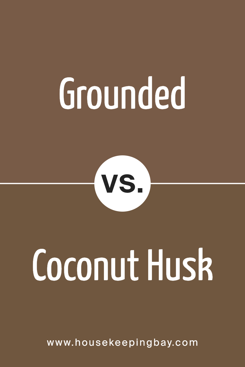
Grounded SW 6089 by Sherwin Williams vs Coconut Husk SW 6111 by Sherwin Williams
Grounded SW 6089 by Sherwin Williams and Coconut Husk SW 6111 are two interesting colors to compare. Grounded is a rich, deep brown that brings a cozy and warm feeling to any space. It reminds you of the fertile earth, giving a solid and comforting foundation to a room. This color works great in areas where you want a feeling of stability and warmth.
Coconut Husk, however, is lighter, sitting comfortably in the medium brown range. It has a softer, more natural tone that evokes the feeling of being connected to nature and the outdoors. Coconut Husk is versatile and can easily light up a space while still keeping it grounded with its earthy vibes.
Both colors share an earthly beauty and can create inviting spaces, but Grounded offers depth and coziness, making it perfect for intimate settings. Coconut Husk, with its lighter touch, provides a fresher look that can brighten a room while still maintaining a natural and organic feel.
In summary, while both colors pay homage to nature’s beauty, Grounded leans towards a darker, more intimate ambiance, whereas Coconut Husk offers a lighter, refreshing atmosphere.
You can see recommended paint color below:
- SW 6111 Coconut Husk
housekeepingbay.com
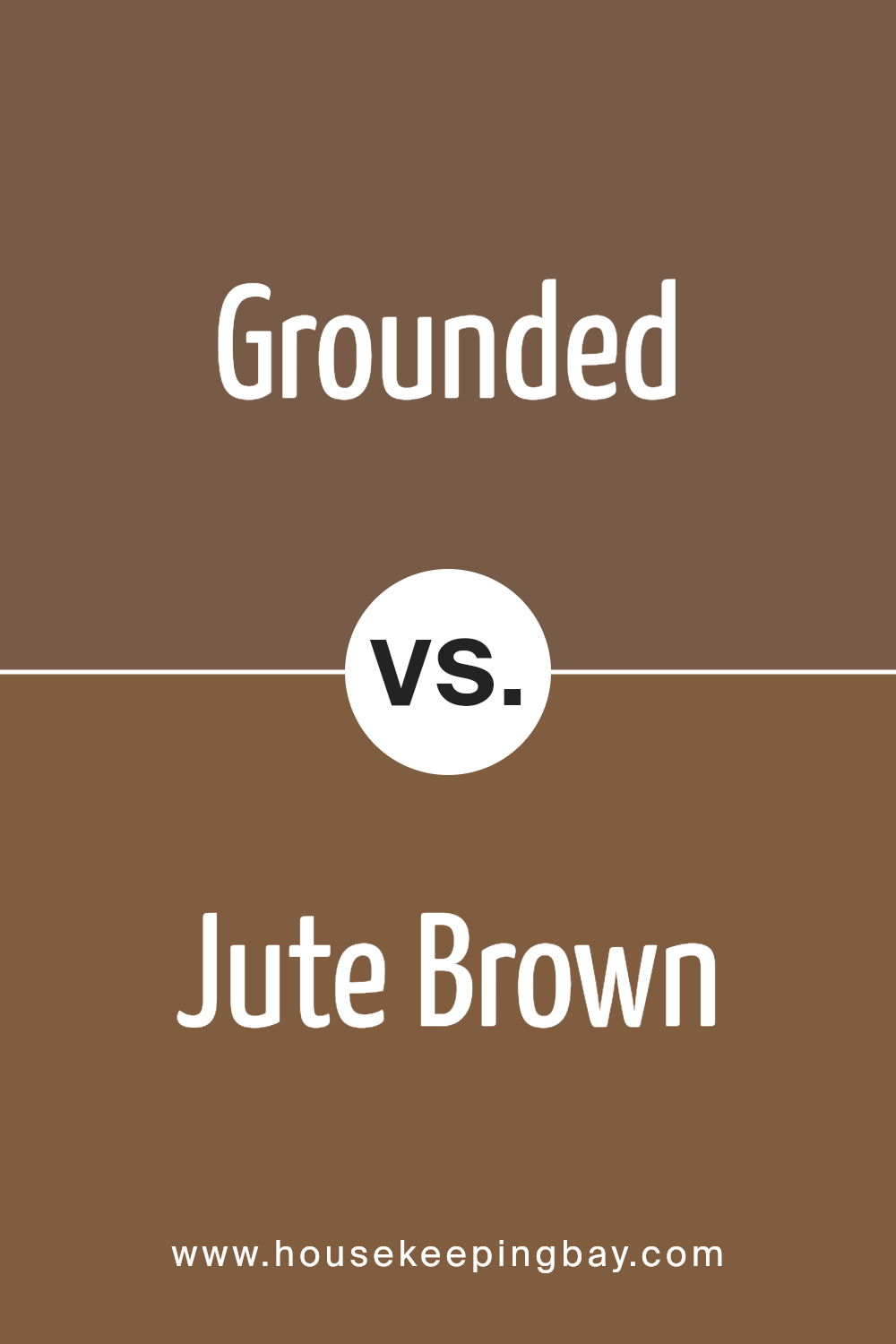
Grounded SW 6089 by Sherwin Williams vs Jute Brown SW 6096 by Sherwin Williams
Grounded SW 6089 by Sherwin Williams is a warm, rich color with a deep, earthy vibe. It has a grounding feel, just like its name suggests, and brings a cozy, welcoming atmosphere to any space. It’s a versatile shade that can work well in many areas of a home, from living rooms to bedrooms, adding a touch of sophistication and comfort.
Jute Brown SW 6096, another offering from Sherwin Williams, is lighter compared to Grounded. It leans more towards a mid-tone brown, presenting a softer, more neutral backdrop. This color embodies a natural, understated elegance, making it perfect for creating a serene and inviting environment.
Jute Brown gives off a more laid-back feel, making it ideal for spaces where you want to relax and unwind.
While both colors draw inspiration from nature, Grounded SW 6089 offers a deeper, more intense experience, whereas Jute Brown SW 6096 provides a lighter, calming touch. Each brings its unique charm to interiors, with Grounded adding depth and warmth, and Jute Brown introducing a gentle, soothing vibe.
You can see recommended paint color below:
- SW 6096 Jute Brown
housekeepingbay.com
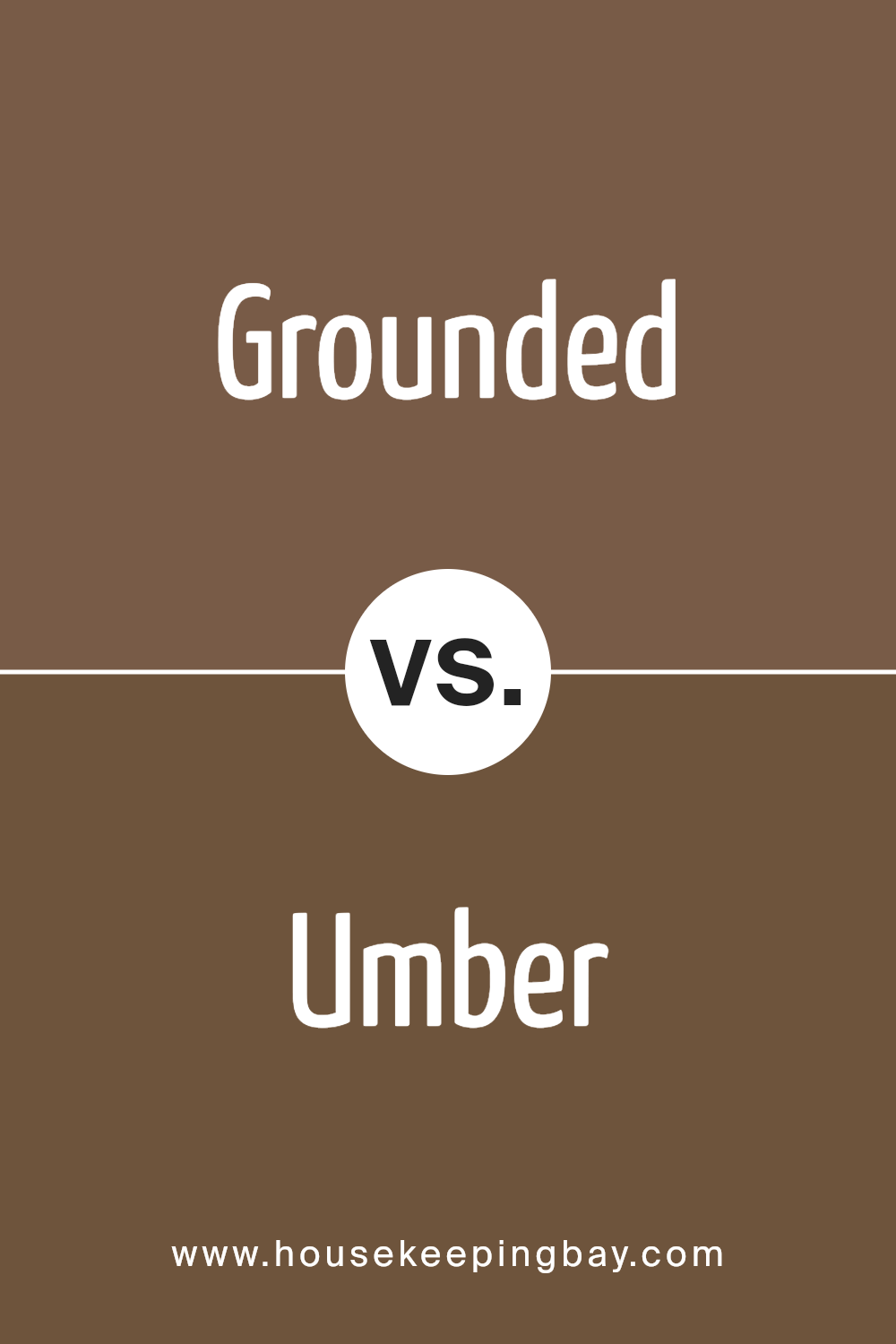
Grounded SW 6089 by Sherwin Williams vs Umber SW 6146 by Sherwin Williams
Grounded SW 6089 by Sherwin Williams and Umber SW 6146 by Sherwin Williams are two unique colors, each bringing its own personality to spaces. Grounded is a warm, rich hue that leans towards a deep, earthy brown.
It’s a solid color that can make rooms feel cozy and inviting, perfect for areas where you want to relax. This color works well in living rooms or bedrooms, where its depth can create a sense of comfort and warmth.
On the contrary, Umber is a lighter shade, slightly more muted compared to Grounded. It offers a subtler approach to bringing warmth into a space, with a touch that’s not as bold but equally beautiful. Umber is versatile, fitting nicely in various settings without overwhelming the senses. It’s great for those who prefer a more understated elegance, ideal for spaces like home offices or kitchens where a gentle touch of color is welcome.
While both colors share a warm base, their intensity and depth differ, making them suitable for different preferences and room functions. Grounded offers a bolder statement, whereas Umber provides a lighter touch.
You can see recommended paint color below:
- SW 6146 Umber
housekeepingbay.com
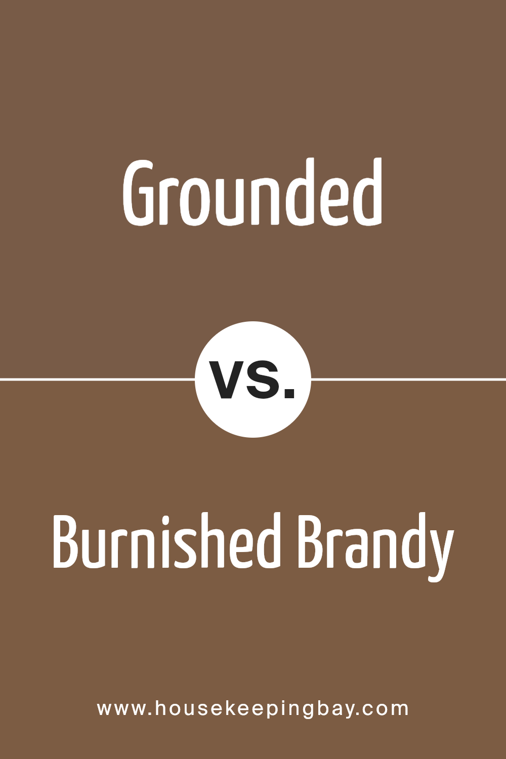
Grounded SW 6089 by Sherwin Williams vs Burnished Brandy SW 7523 by Sherwin Williams
Grounded SW 6089 and Burnished Brandy SW 7523 by Sherwin Williams are both warm, inviting colors, but they have their unique shades and atmospheres. Grounded is a deep, rich earth tone. It has a strong foundation of brown with a subtle hint of red, creating a cozy and welcoming feeling in any room. This color is perfect for creating a sense of stability and comfort.
In contrast, Burnished Brandy has a more vibrant, reddish-brown hue. It is lighter and warmer, making spaces feel more open and lively. This color radiates warmth and is ideal for adding a touch of elegance and sophistication to your decor.
While both colors share a warm palette and can complement each other well, Grounded offers depth and richness, suitable for a grounded, soothing atmosphere. On the contrary, Burnished Brandy brings brightness and energy, perfect for spaces intended to be more dynamic and engaging.
Choosing between them depends on the desired mood and character for the space.
You can see recommended paint color below:
- SW 7523 Burnished Brandy
housekeepingbay.com
Conclusion
Choosing the right paint color can make all the difference in your space, and SW 6089 Grounded by Sherwin Williams is a fantastic option to consider. This color offers a warm, inviting feel, transforming any room into a cozy, comfortable haven.
Its earthy tones provide a perfect backdrop for various decor styles, from rustic to modern minimalist. Grounded brings a sense of tranquility and stability to your environment, making it an ideal choice for bedrooms, living rooms, or even home offices.
If you’re looking for a paint color that is both versatile and sophisticated, SW 6089 Grounded is worth checking out. Its ability to pair well with natural materials, like wood and stone, as well as its suitability for complementing both vibrant and muted accents, makes it a practical and stylish choice.
Whether you’re updating a single room or giving your entire home a fresh look, Grounded by Sherwin Williams is a color that can help you achieve the desired atmosphere effortlessly.
By selecting SW 6089 Grounded, you’re not just choosing a paint color; you’re creating a foundation for a space that feels authentically yours. Warm, welcoming, and wonderfully adaptable, this color might just be the perfect starting point for your next home improvement adventure.
housekeepingbay.com
Ever wished paint sampling was as easy as sticking a sticker? Guess what? Now it is! Discover Samplize's unique Peel & Stick samples. Get started now and say goodbye to the old messy way!
Get paint samples
