Gallant Gold SW 6391 by Sherwin Williams
Golden Elegance An Opulent Hue with Timeless Appeal
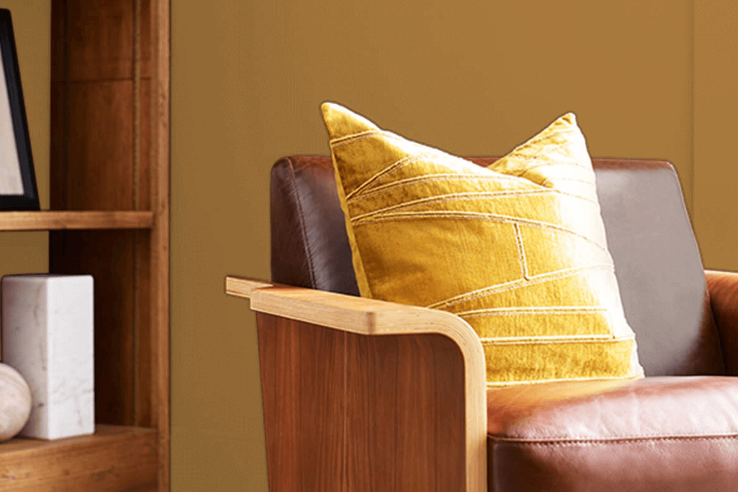
If you’re interested in giving your space a warm and inviting update, you might want to consider SW 6391 Gallant Gold by Sherwin Williams. This paint color is a rich, deep yellow that has a cheerful yet sophisticated quality, perfect for bringing a sunny ambiance to any room.
Whether you’re refreshing your kitchen, living room, or even the exterior of your home, Gallant Gold provides a splash of brightness that’s both welcoming and stylish.
This hue pairs beautifully with a wide range of colors, from soft neutrals to bold shades. You can use it to create a cozy, monochromatic look or as a striking accent wall to add interest and character to your décor. Beyond its aesthetic appeal, the paint is also known for its excellent coverage and durability, ensuring your space looks fantastic for years to come.
So if you’re ready for a change, Gallant Gold could be the perfect choice to warm up your home’s palette.
via sherwin-williams.com
What Color Is Gallant Gold SW 6391 by Sherwin Williams?
Table of Contents
Gallant Gold SW 6391 by Sherwin Williams is a rich, warm hue that brings a cozy and inviting atmosphere to any space. This color has a regal quality, with deep yellow tones that reflect light beautifully, creating a vibrant yet soothing environment. The golden tones of Gallant Gold are perfect for adding a touch of elegance without overwhelming a room.
Ideal for traditional and classic interior styles, Gallant Gold works particularly well in living rooms, dining areas, and entryways where its warm undertones enhance the welcoming feel. This shade pairs seamlessly with dark woods, like mahogany and walnut, enhancing their natural richness.
The lustrous quality of Gallant Gold also complements metallic finishes such as brass and copper, which accentuate its luxurious feel.
In terms of textures, Gallant Gold coordinates well with soft velvets and intricate brocades, adding a layer of sophistication. For a balanced look, consider using this color with natural materials such as linen or burlap to keep the space grounded and comfortable.
Whether used as an accent wall or throughout a room, Gallant Gold creates a cozy backdrop that enlivens materials and invites a sense of warmth and comfort.
housekeepingbay.com
Is Gallant Gold SW 6391 by Sherwin Williams Warm or Cool color?
Gallant Gold SW 6391 by Sherwin Williams is a rich, deep yellow paint that can add warmth and a welcoming feel to any room in your home. This shade is versatile, fitting well in spaces like kitchens and living rooms where families gather and spend a lot of time.
The color can make large rooms feel cozier and more intimate due to its depth, helping these spaces seem more inviting. In smaller or dimly lit areas, Gallant Gold can add a splash of brightness, making the space appear lighter and airy.
When paired with neutral tones such as whites, grays, and tans, Gallant Gold stands out and brings a sense of warmth without overwhelming the space. It’s also ideal for creating a focal point when used on an accent wall. For those who like a bit of creativity, it pairs beautifully with blues and greens, providing a natural, earthy environment.
Gallant Gold works particularly well in homes with lots of natural wood elements or rustic features, enhancing the overall cozy and warm atmosphere.
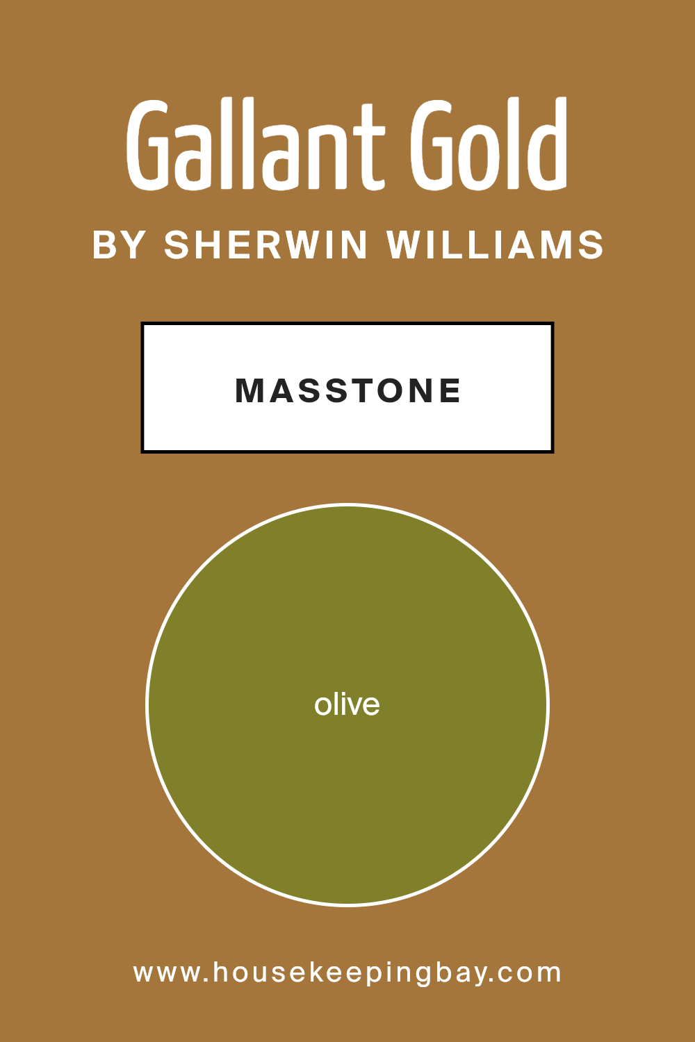
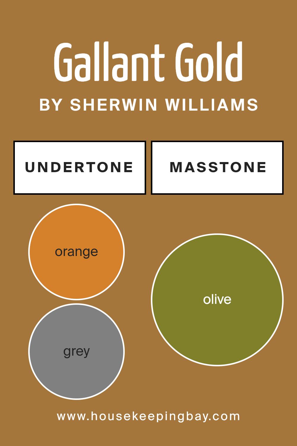
What is the Masstone of the Gallant Gold SW 6391 by Sherwin Williams?
Gallant Gold SW 6391 by Sherwin Williams has a masstone of Olive, a color code of #80802B. This rich, deep shade of olive subtly blends green and brown, offering a natural and grounding feel to any room. It’s ideal for homes because it provides a solid, earthy backdrop that complements various decor styles, from rustic to modern.
In your home, Gallant Gold can help create a cozy, welcoming atmosphere. It’s perfectly suited for living rooms or dining areas where its soothing presence promotes relaxation and comfort.
Being a somewhat neutral but unique color, it pairs well with lighter colors like cream or beige, which can help to lighten the room’s feel, or with bright accents like blues and reds for a more dynamic environment.
The versatility of Gallant Gold allows it to adapt easily, making it a practical choice for those who like to change up their small decor pieces frequently without having to repaint the entire room. This makes it a smart, stylish choice that keeps the space feeling fresh and inspired.
housekeepingbay.com
Undertones of Gallant Gold SW 6391 by Sherwin Williams
Gallant Gold SW 6391 by Sherwin Williams is a rich paint color with a spectrum of undertones that significantly influence how it appears in different settings. Undertones are subtle colors that lie beneath the surface of the primary color, affecting how the paint reacts under various lighting conditions and when paired with other colors.
The Orange, Grey, Pale Pink, Brown, and Red undertones in Gallant Gold add warmth and depth, making spaces feel cozy and inviting. These warmer undertones pair well with natural wood textures and soft lighting, enhancing the golden hue of the paint.
Conversely, the Light Green, Purple, and Mint undertones contribute a slight coolness that can slightly neutralize the warmth of the gold, providing a balanced look. This makes Gallant Gold versatile, suitable for rooms that get varying amounts of natural light throughout the day.
Using Gallant Gold SW 6391 on interior walls can transform the atmosphere of a room. In brightly lit spaces, the more vibrant undertones like Yellow and Pink might become more pronounced, adding a cheerful vibe. In dimmer, cooler light, the Grey and Dark Grey undertones might make the color appear more muted and sophisticated.
This complexity due to its range of undertones means that Gallant Gold can shift in appearance from a vibrant, energetic gold to a more subdued, rich hue depending on the room’s decor and lighting. This adaptability makes it a practical choice for various rooms and styles, from modern to traditional.
housekeepingbay.com
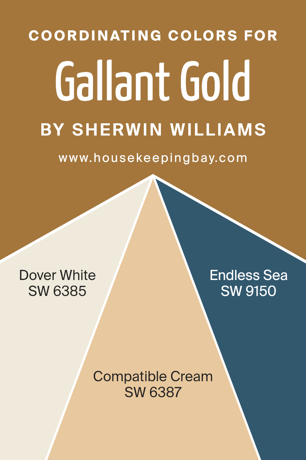
Coordinating Colors of Gallant Gold SW 6391 by Sherwin Williams
Coordinating colors are shades that complement each other while pairing well with a main color, allowing you to create a harmonious and interesting look in any space. When working with a primary paint color like Gallant Gold SW 6391 by Sherwin Williams, choosing the right coordinating colors can enhance the room’s overall aesthetic.
Colors like Dover White SW 6385, Compatible Cream SW 6387, and Endless Sea SW 9150 have been selected as coordinating shades, creating balanced and visually pleasing schemes.
Dover White SW 6385 is a soft, warm white with a slightly creamy undertone, making it a perfect backdrop for the richer Gallant Gold as it highlights the gold’s warmth without competing for attention. Compatible Cream SW 6387 is a deeper, rich cream color that seamlessly blends with Gallant Gold, providing a subtle contrast and depth to spaces that seek a cozy, inviting atmosphere.
Meanwhile, Endless Sea SW 9150 is a deep, striking navy blue that pairs beautifully with Gallant Gold, offering a bold and sophisticated contrast that can accentuate focal points or provide a dramatic background. Together, these colors can be used to create a cohesive and attractive look that complements the primary gold hue.
You can see recommended paint colors below:
- SW 6385 Dover White
- SW 6387 Compatible Cream
- SW 9150 Endless Sea
housekeepingbay.com
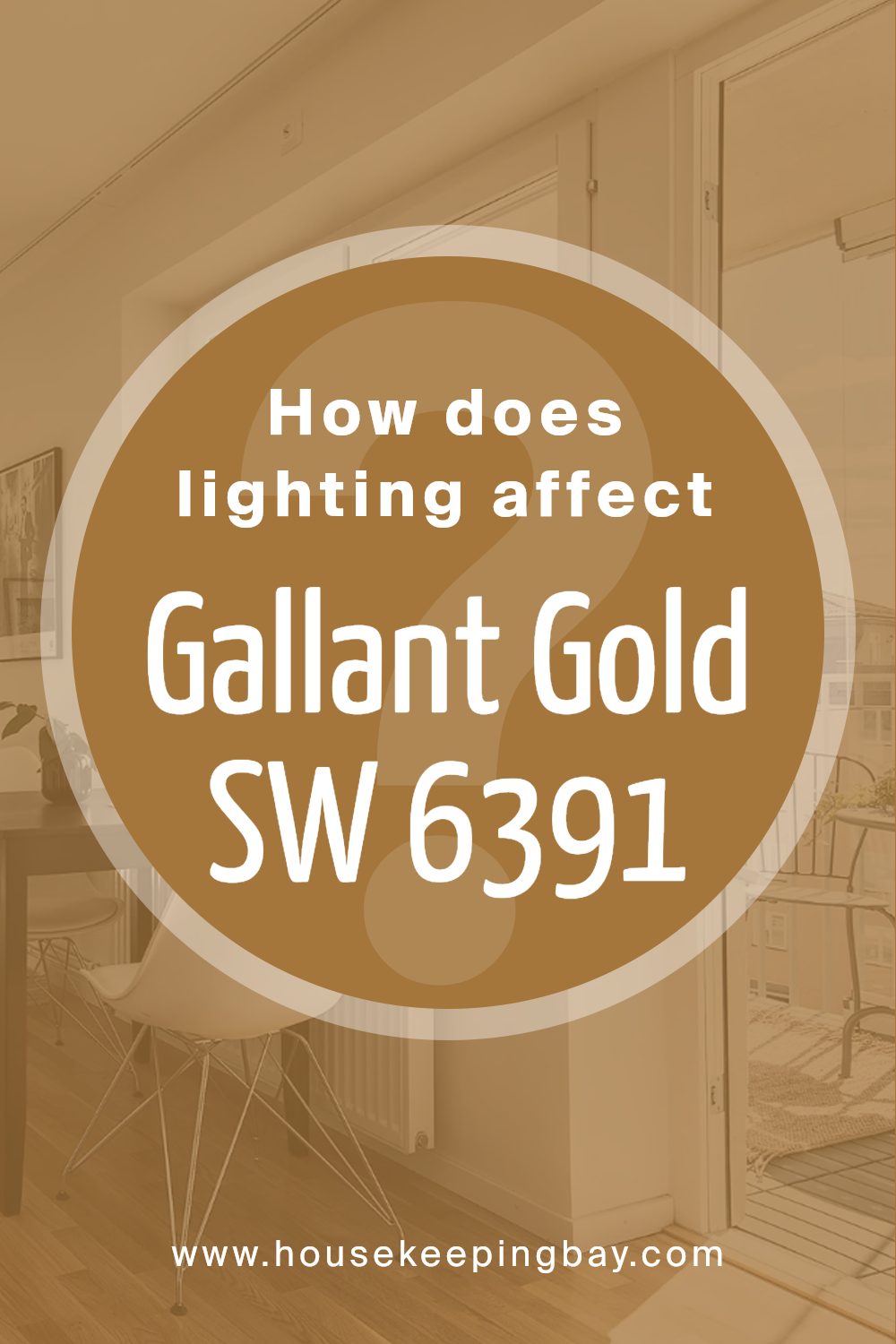
How Does Lighting Affect Gallant Gold SW 6391 by Sherwin Williams?
Lighting dramatically influences how colors appear in different environments. The color perception of Gallant Gold SW 6391 by Sherwin Williams, a warm, rich gold, varies based on the kind of light—whether it’s artificial or natural.
In artificial light, such as that from LED or incandescent bulbs, Gallant Gold takes on a cozy and inviting tone. Artificial warm white bulbs enhance its golden hues, making the color appear deeper and more intense, perfect for creating a welcoming atmosphere in living rooms or dining areas.
In contrast, under natural light, Gallant Gold displays a broader spectrum of its characteristics throughout the day. In the morning and evening, when the sunlight is softer, this shade glows warmly, enhancing its inviting nature.
During midday, when the sun is strongest, the color might look brighter and slightly more vibrant.
The orientation of rooms also impacts how Gallant Gold looks:
1. North-faced rooms: These rooms get less direct sunlight, which can make Gallant Gold appear slightly muted or even with a gentle, subtle touch. This subdued look is good for spaces intended for relaxation.
2.South-faced rooms: With abundant sunlight, south-facing rooms highlight the richness of Gallant Gold, making it appear lively and vivid. This setup is excellent for spaces where you want the color to feel energetic and active.
3.East-faced rooms: In these rooms, Gallant Gold will be bright and cheerful in the morning as they catch the first rays of the sun, creating a lively and fresh atmosphere. By afternoon, the color will return to a more muted tone.
4.West-faced rooms: the late afternoon and evening light can make this color look intensely warm and dynamic, offering a cozy retreat as the day ends.
Understanding how both artificial and natural lighting and room orientation affect Gallant Gold can help in planning spaces effectively to achieve the desired mood and aesthetic.
housekeepingbay.com
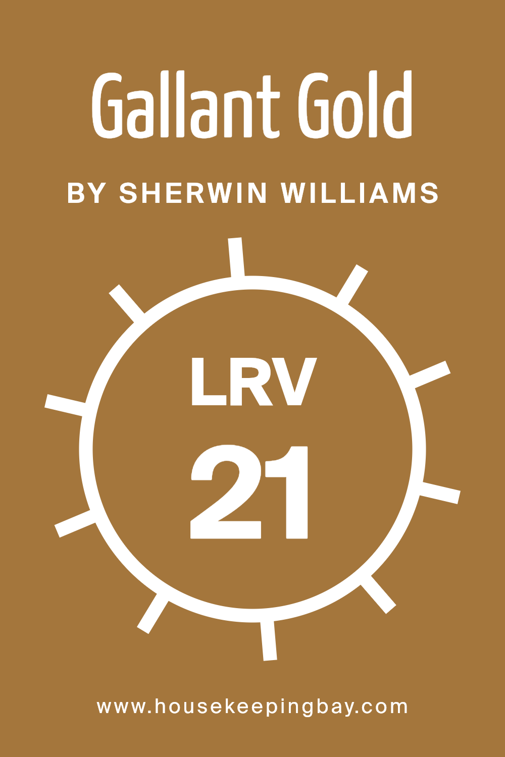
What is the LRV of Gallant Gold SW 6391 by Sherwin Williams?
LRV stands for Light Reflectance Value, which is a measure indicating how much light a paint color reflects back into a room as opposed to absorbing it. Measured on a scale from 0 to 100, where 0 is pure black and 100 is pure white, LRV helps in choosing paint colors that will brighten a room or make it cozier.
Higher LRV values reflect more light, effectively making rooms appear lighter and potentially larger. On the other hand, lower LRV values absorb more light, which can make a space feel smaller but also richer and more intimate.
Regarding the color Gallant Gold SW 6391 by Sherwin Williams, with an LRV of 21.293, it’s on the lower end of the scale. This means it absorbs more light than it reflects, which results in a vibrant, bold color that can add depth and warmth to spaces. In rooms with limited natural light or smaller spaces, this color could make the area feel more closed in.
However, in a well-lit or larger room, Gallant Gold can contribute a cozy and inviting atmosphere, enhancing the aesthetic with its deep tone.
housekeepingbay.com
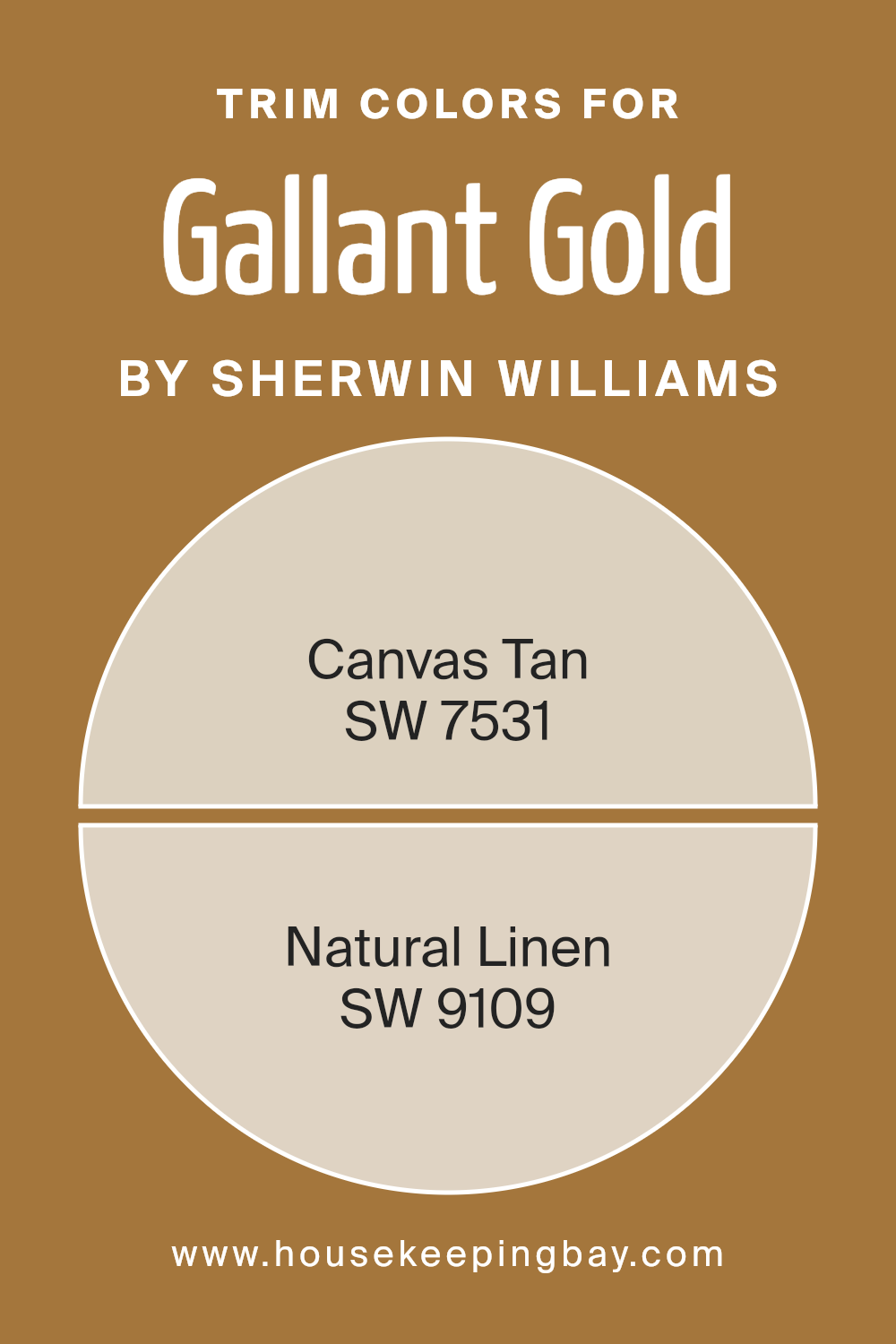
What are the Trim colors of Gallant Gold SW 6391 by Sherwin Williams?
Trim colors, such as SW 7531 Canvas Tan and SW 9109 Natural Linen by Sherwin Williams, play a crucial role in enhancing the aesthetic appeal of a primary color like Gallant Gold SW 6391. By selecting the appropriate trim colors, you can create a harmonious palette that subtly complements the main hue, increasing the visual impact and overall polish of a room.
Trim colors serve not only as a boundary or a finishing touch but also help in defining spaces, accentuating architectural features, and framing areas in a way that adds depth and cohesion to the decor.
Canvas Tan SW 7531 is a warm, subtle beige that offers a soft contrast against the richer tones of Gallant Gold, providing a calm and soothing effect that’s versatile for various spaces. Natural Linen SW 9109, on the other hand, has a slightly grayish-tan tone, bringing a subtle, understated elegance that complements the yellow hues of Gallant Gold without overpowering it. Both colors enhance the warmth of Gallant Gold, allowing it to shine prominently while ensuring the environment remains inviting and balanced.
You can see recommended paint colors below:
housekeepingbay.com
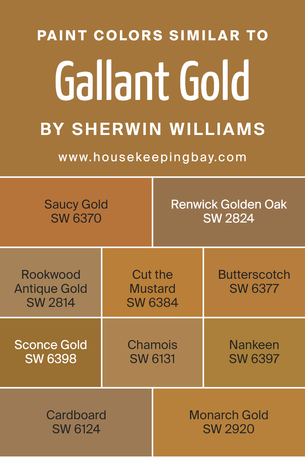
Colors Similar to Gallant Gold SW 6391 by Sherwin Williams
Similar colors hold a significant role in design as they create a cohesive and harmonious look, maintaining a visual balance while maintaining interest and depth. Colors like Gallant Gold by Sherwin Williams and its similar shades are perfect for this cohesive design effect, adding warmth and richness to any space subtly.
Starting with SW 6370 – Saucy Gold, this shade is bolder and has a touch of spice to warm up the decor. Moving to SW 2824 – Renwick Golden Oak, it brings the softness of weathered wood, perfect for a cozy, rustic feel. SW 2814 – Rookwood Antique Gold has an aged, almost historical quality that enriches traditional interiors.
SW 6384 – Cut the Mustard introduces a bolder, more vibrant hue for spaces that need a lively touch. For a creamy and smooth presence, SW 6377 – Butterscotch works wonders, enhancing the environment with light and cheer. SW 6398 – Sconce Gold, slightly muted, fits well in elegant, understated areas.
Next, SW 6131 – Chamois subtly shifts towards a softer, more versatile hue suitable for relaxing spaces. SW 6397 – Nankeen provides a neutral base with an earthy twist, versatile in combining with both dark and light accents. SW 6124 – Cardboard is a down-to-earth color, grounded and simple, excellent for minimalistic or industrial styles.
Lastly, SW 2920 – Monarch Gold pops out with a royal feel, adding a touch of opulence to the setting. All these shades offer their unique charm while keeping the warmth and richness intact when used alongside or in place of Gallant Gold.
You can see recommended paint colors below:
- SW 6370 Saucy Gold
- SW 2824 Renwick Golden Oak
- SW 2814 Rookwood Antique Gold
- SW 6384 Cut the Mustard
- SW 6377 Butterscotch
- SW 6398 Sconce Gold
- SW 6131 Chamois
- SW 6397 Nankeen
- SW 6124 Cardboard
- SW 2920 Monarch Gold
housekeepingbay.com
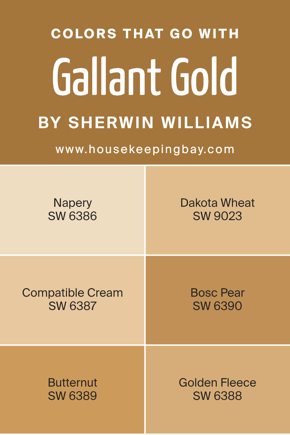
Colors that Go With Gallant Gold SW 6391 by Sherwin Williams
Choosing the right colors to complement Gallant Gold SW 6391 by Sherwin Williams is essential for creating a cohesive and appealing aesthetic in any space. When paired appropriately, these colors enhance the warm, rich hue of Gallant Gold, providing a balanced and harmonious look.
Gallant Gold is a vibrant, deep yellow with a hint of mustard tone that radiates warmth. By pairing it with colors such as Napery, Dakota Wheat, Compatible Cream, Bosc Pear, Butternut, and Golden Fleece, it becomes versatile and adaptive to various design schemes, whether traditional, modern, or eclectic.
Napery is a soft, muted yellow that brings a gentle contrast to the bolder Gallant Gold, giving a room a soothing yet cheerful quality. Dakota Wheat has a deeper, grain-like tone that complements the depth in Gallant Gold, making the space feel grounded and welcoming.
Compatible Cream offers a lighter, almost off-white hue, providing a subtle lift to the richness of Gallant Gold, making the environment feel light and airy. Bosc Pear steps in with a greenish touch, introducing an earthy element that balances the warmth of Gallant Gold perfectly.
Butternut shares a similar depth to Gallant Gold but with a slightly more orange undertone, which can add a dynamic yet coherent look to interiors. Lastly, Golden Fleece is a lighter, serene yellow, enriching spaces with a calm yet cheerful ambiance, which pairs beautifully with the energy of Gallant Gold. Working with these colors can effectively enhance the overall appeal and atmosphere of a room, creating a balanced, inviting, and visually interesting space.
You can see recommended paint colors below:
- SW 6386 Napery
- SW 9023 Dakota Wheat
- SW 6387 Compatible Cream
- SW 6390 Bosc Pear
- SW 6389 Butternut
- SW 6388 Golden Fleece
housekeepingbay.com
How to Use Gallant Gold SW 6391 by Sherwin Williams In Your Home?
Gallant Gold SW 6391 by Sherwin Williams is a rich, warm shade of gold that brings a cozy and inviting atmosphere to any room in your home. This paint color has a luxurious feel to it, making it a great choice for giving any space a touch of elegance without being overpowering.
Gallant Gold works well in living rooms and dining areas, where it pairs beautifully with dark wood furniture and natural elements such as leather or greenery. It can also add warmth to a kitchen when used as an accent wall or for cabinetry.
To incorporate Gallant Gold into your home, consider using it in smaller doses if you’re hesitant about committing to a bold color. Accessories like throw pillows, artwork frames, or even table linens can introduce this color subtly. Additionally, combining it with soft neutrals like creamy whites or light grays can balance its intensity, ensuring your space remains harmonious and appealing.
Gallant Gold can truly make a room feel more welcoming and visually interesting.
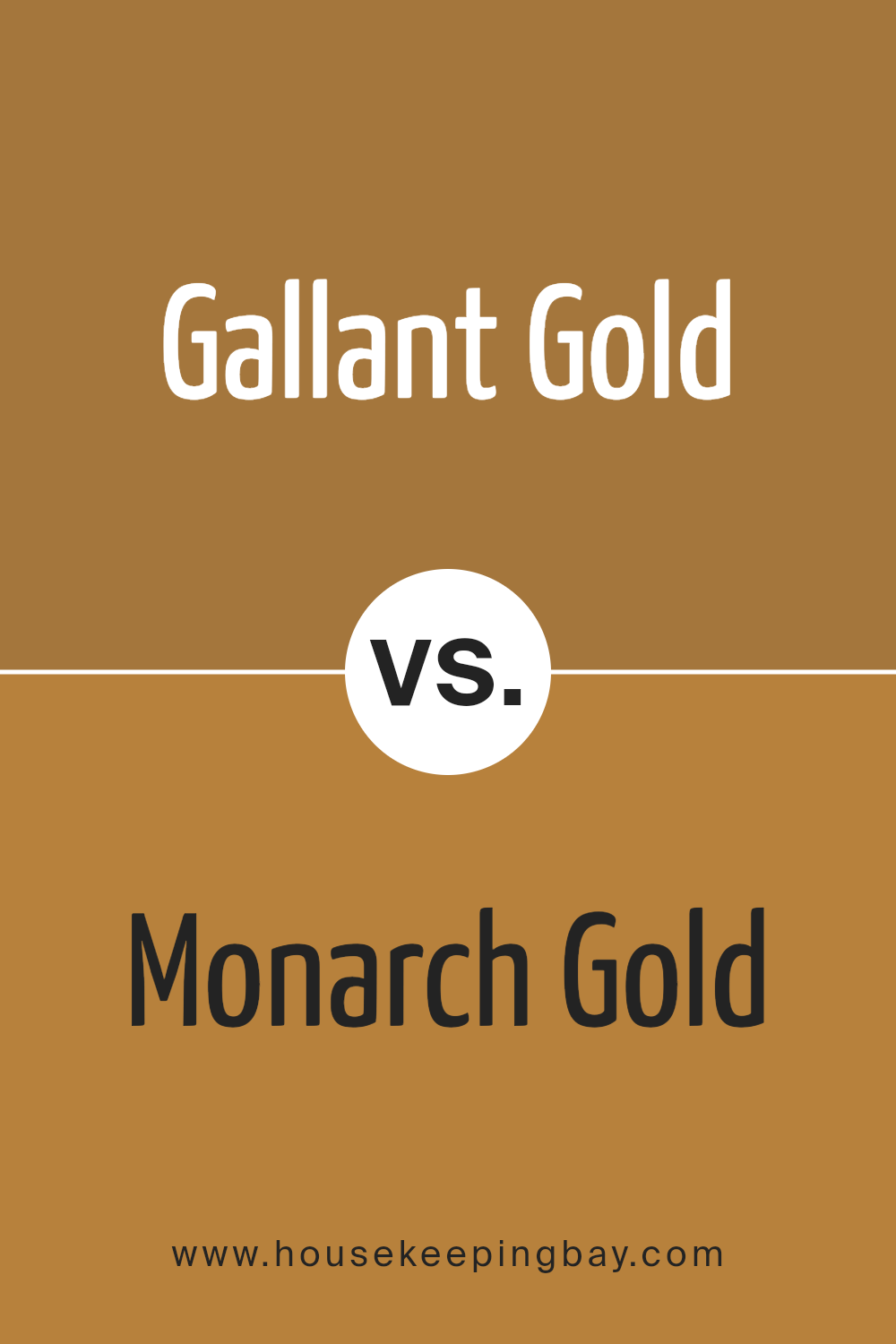
Gallant Gold SW 6391 by Sherwin Williams vs Monarch Gold SW 2920 by Sherwin Williams
The two colors, Gallant Gold SW 6391 and Monarch Gold SW 2920 by Sherwin Williams, both offer a warm and inviting feel but have distinct tones. Gallant Gold is a rich, deeply saturated hue with a classic golden color that leans slightly towards an earthy mustard shade.
It adds a bold and cozy touch to spaces, ideal for creating an intimate environment.
In contrast, Monarch Gold is brighter and lighter, resembling the cheerful brightness of a sunlit day. It has a more vibrant, yellow-toned gold that can make any room feel more open and airy. This color is perfect for adding a lively spark to a space without overwhelming it with too much intensity.
Both colors can add warmth and cheer to your home but in different ways: Gallant Gold brings depth and warmth, while Monarch Gold injects lightness and energy.
You can see recommended paint color below:
- SW 2920 Monarch Gold
housekeepingbay.com
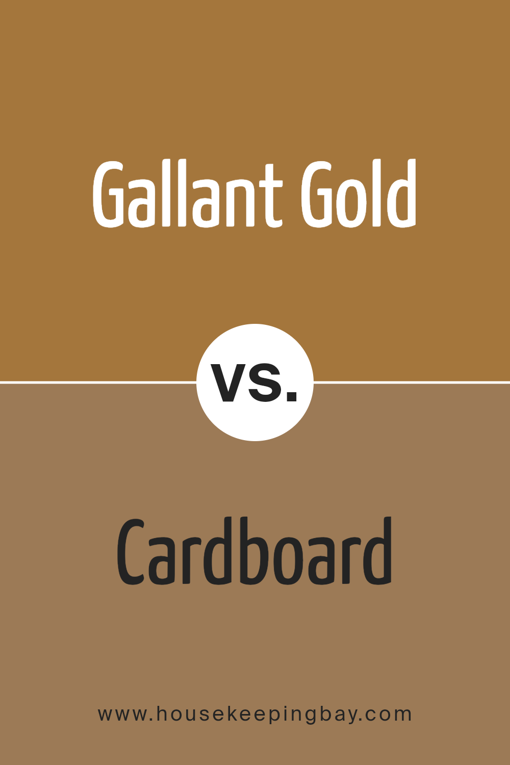
Gallant Gold SW 6391 by Sherwin Williams vs Cardboard SW 6124 by Sherwin Williams
Gallant Gold SW 6391 by Sherwin Williams is a vibrant, rich gold hue that brings warmth and cheer to any space. It is bold and can make a strong statement when used in larger areas or as an accent wall. The golden tones are ideal for creating a cozy, inviting atmosphere in living rooms or dining areas.
Cardboard SW 6124, on the contrary, is a neutral, earthy brown. This color is more subdued and versatile, providing a calming effect suitable for numerous settings. It works exceptionally well as a background, allowing other colors to stand out or for creating a minimalist look.
While Gallant Gold adds a lively, energetic feel with its luminous glow, Cardboard offers a grounded, stable backdrop. Both colors are useful in their own right, depending on the mood and style you want for your room. Gallant Gold pops more, whereas Cardboard offers a subtle, understated elegance.
You can see recommended paint color below:
- SW 6124 Cardboard
housekeepingbay.com
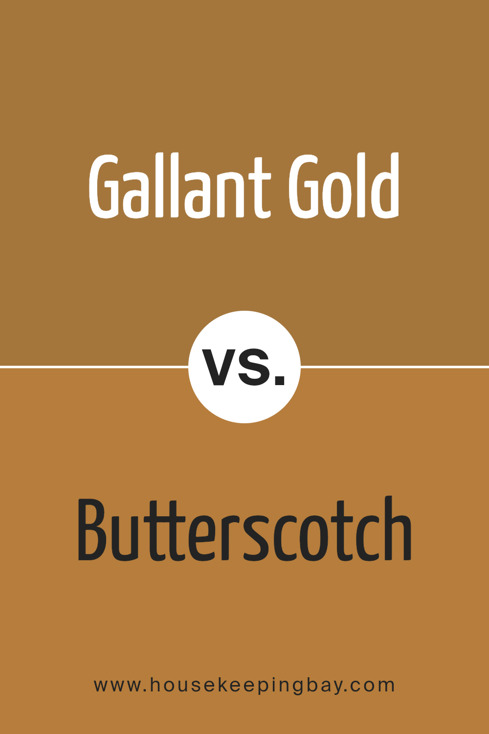
Gallant Gold SW 6391 by Sherwin Williams vs Butterscotch SW 6377 by Sherwin Williams
Gallant Gold SW 6391 and Butterscotch SW 6377 by Sherwin Williams are both warm, inviting colors, yet they have distinct tones that set them apart. Gallant Gold has a deep, rich mustard hue that adds a sense of coziness and sophistication to spaces. It can create a strong statement in room, making spaces feel more grounded and mature.
Conversely, Butterscotch is a lighter, creamier shade of yellow that offers a sweeter, more subtle charm. It tends to lighten up spaces and inject a cheerful, sunny vibe, perfect for making small areas appear larger and more open.
While Gallant Gold works well in formal or traditional settings, Butterscotch is ideal for casual, relaxing environments. Both colors complement environments with a lot of natural light and can easily integrate with a variety of decor styles, including rustic and modern. Choosing between them depends largely on the desired mood and function of the room.
You can see recommended paint color below:
housekeepingbay.com
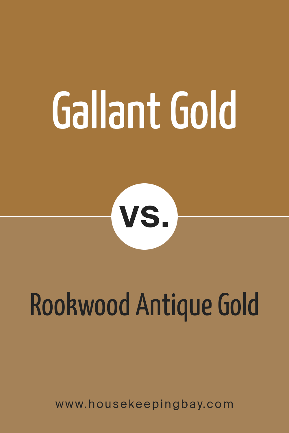
Gallant Gold SW 6391 by Sherwin Williams vs Rookwood Antique Gold SW 2814 by Sherwin Williams
Gallant Gold SW 6391 by Sherwin Williams is a warm, inviting shade that has a vibrant and slightly bright undertone, making it a cheerful choice for spaces that need a burst of energy. It pairs well with dark woods and rich textures, offering a classic look that stays fresh.
On contrast, Rookwood Antique Gold SW 2814 has a deeper, more muted tone. This color leans towards an earthy richness, providing a subtle and sophisticated backdrop. It works beautifully in settings that aim for a refined, vintage feel, especially when matched with natural materials like stone or aged wood.
While both colors share a base of gold, Gallant Gold offers luminosity and warmth, making rooms feel cozy and lively. Rookwood Antique Gold, with its understated elegance, suits spaces that require a more grounded, serene atmosphere. Both shades are versatile but serve different aesthetic and mood purposes in interior design.
You can see recommended paint color below:
- SW 2814 Rookwood Antique Gold
housekeepingbay.com
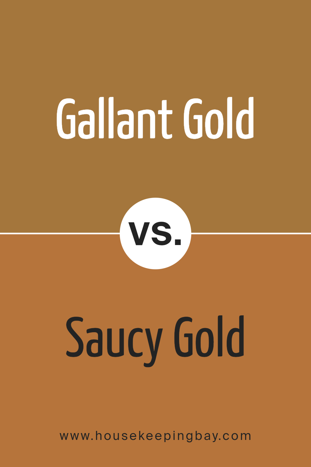
Gallant Gold SW 6391 by Sherwin Williams vs Saucy Gold SW 6370 by Sherwin Williams
Gallant Gold SW 6391 by Sherwin Williams and Saucy Gold SW 6370 are both vibrant shades of gold, but they have distinct differences in their tones and vibes. Gallant Gold presents a muted, softer hue that feels warm and inviting, making it ideal for creating a cozy atmosphere in spaces like living rooms or bedrooms. It pairs well with both dark and light furniture, offering versatility in home decor.
Saucy Gold, on the contrary, is bolder and more vivid. This shade has a deeper, richer undertone that can add drama and energy to a space. It works particularly well in areas where you want to make a statement, such as dining rooms or entryways. Its radiant warmth is sure to catch the eye and can be complemented with various decor styles.
These two gold tones by Sherwin Williams each bring their unique charm and can effectively enhance different spaces depending on the desired ambiance and impact.
You can see recommended paint color below:
- SW 6370 Saucy Gold
housekeepingbay.com
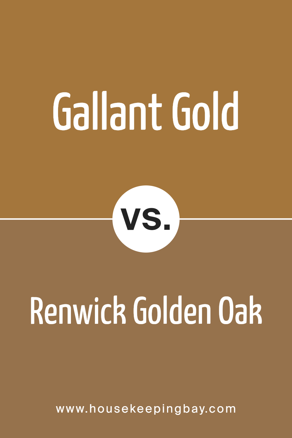
Gallant Gold SW 6391 by Sherwin Williams vs Renwick Golden Oak SW 2824 by Sherwin Williams
Gallant Gold SW 6391 by Sherwin Williams is a rich, warm hue that radiates a cozy and welcoming feel. It’s a vibrant shade that seems to have a life of its own, with its deep yellow tones reminiscent of sunlight. This color works well in spaces where you want to add cheerfulness and liveliness, making it ideal for living rooms or dining areas.
Renwick Golden Oak SW 2824, also by Sherwin Williams, presents a subtler approach. This color is more muted than Gallant Gold, with a blend of brown and gold that exudes an earthy elegance. It’s perfect for creating a sophisticated yet inviting environment, suitable for rooms aimed at relaxation or concentration, like studies or bedrooms.
While both colors belong to the warm spectrum, Gallant Gold is distinctly brighter, and Renwick Golden Oak leans towards a more understated, refined palette. Their uses in interior design vary according to the atmosphere one wishes to achieve—a lively, energetic space with Gallant Gold or a calm, grounded area with Renwick Golden Oak.
You can see recommended paint color below:
- SW 2824 Renwick Golden Oak
housekeepingbay.com
Gallant Gold SW 6391 by Sherwin Williams vs Chamois SW 6131 by Sherwin Williams
Gallant Gold SW 6391 by Sherwin Williams is a robust and bright shade of gold. It brings a lively and warm ambiance to any space, perfect for areas where you want to create a sense of cheerfulness and energy. This color suits spaces like kitchens and dining rooms where a vibrant atmosphere is desired.
Chamois SW 6131 by Sherwin Williams, in contrast, is a much softer and more subdued tone. It resembles a gentle beige with yellow undertones, providing a soothing and neutral background. This color is excellent for areas where a calm and welcoming environment is preferred, such as living rooms and bedrooms.
Both colors are versatile and bring their unique qualities to a space. Gallant Gold adds vibrancy and a splash of brightness, while Chamois offers a subtle, calming effect. Your choice between them would depend on the mood and functionality you aim to achieve in your room.
You can see recommended paint color below:
- SW 6131 Chamois
housekeepingbay.com
Gallant Gold SW 6391 by Sherwin Williams vs Cut the Mustard SW 6384 by Sherwin Williams
The main color, Gallant Gold SW 6391 by Sherwin Williams, offers a rich and warm gold tone. It brings a welcoming and cozy feel, making it perfect for living rooms or bedrooms where a comforting atmosphere is desired. This shade of gold is subtly vibrant, adding a classic elegance to any space.
In contrast, Cut the Mustard SW 6384 is a bolder, deeper yellow that leans towards a mustard hue. This color is more intense and can make a strong statement when used in interior spaces. It works well in areas where you want to inject personality and vivacity, such as kitchens or dining rooms.
Both colors convey warmth but differ in intensity and mood. While Gallant Gold exudes a soft, refined charm, Cut the Mustard has a more dynamic and energetic quality. Depending on the ambiance you wish to create, each color offers unique possibilities for decorating and styling a room.
You can see recommended paint color below:
- SW 6384 Cut the Mustard
housekeepingbay.com
Gallant Gold SW 6391 by Sherwin Williams vs Sconce Gold SW 6398 by Sherwin Williams
Gallant Gold SW 6391 by Sherwin Williams is a bright and vibrant shade of gold that radiates warmth and cheerfulness. It has a luminous quality that can lighten up a space, making it feel inviting and cozy. This color works well in living rooms or dining areas where a welcoming atmosphere is desired.
In contrast, Sconce Gold SW 6398 by Sherwin Williams leans more towards a muted, deeper tone of gold. It exudes a sophisticated and rich feel, suitable for creating an elegant and refined ambiance. This shade is perfect for accent walls or decor highlights where a touch of luxury is sought.
Both of these colors share the warmth and richness typical of gold tones but serve different aesthetic purposes. Gallant Gold adds brightness and light, while Sconce Gold offers depth and sumptuousness, making them both excellent but distinct choices depending on the desired impact and mood in a room.
You can see recommended paint color below:
- SW 6398 Sconce Gold
housekeepingbay.com
Gallant Gold SW 6391 by Sherwin Williams vs Nankeen SW 6397 by Sherwin Williams
Gallant Gold SW 6391 and Nankeen SW 6397 by Sherwin-Williams are both warm, inviting colors but have distinct tones. Gallant Gold is a rich, yellow gold hue that emits a vibrant, cheerful vibe. It’s bright and can instantly warm up a space, making it feel cozy yet lively. This color works well in living areas and kitchens where a sunny atmosphere is desired.
In contrast, Nankeen SW 6397 is a muted, earthy tan shade. It’s subtler than Gallant Gold, offering a neutral palette that blends seamlessly with a variety of decor styles. This versatility makes Nankeen ideal for creating a soft, understated backdrop in rooms, complementing furniture and artwork without overwhelming them.
Each color serves different aesthetic purposes: Gallant Gold adds a splash of energy, while Nankeen provides a calm, grounding effect. Both can enhance a home’s interior, depending on the mood and style you want to achieve.
You can see recommended paint color below:
- SW 6397 Nankeen
housekeepingbay.com
Conclusion
As we sum up our discussion on SW 6391 Gallant Gold by Sherwin Williams, it’s clear this color brings a warm and inviting feel to any space. With its golden hue, Gallant Gold adds a cozy, sunlit vibe that works wonderfully in living rooms, kitchens, or even exteriors to make a home feel welcoming.
It pairs exquisitely with a wide range of colors, from subtle earth tones to bold statement shades, offering versatility for various design styles.
Using Gallant Gold in interior design not only brightens a room but also creates a sense of warmth that enhances the overall aesthetic appeal. Whether applied as a primary color or an accent wall, its rich quality allows for creative expression in decorating. For those considering a new painting project, Gallant Gold provides a reliable and cheerful choice, ensuring spaces feel lively yet sophisticated.
If you’re planning to refresh your space, consider the charm and warmth of Gallant Gold. It’s a wonderful option for anyone looking to inject a touch of cheerfulness into their decor while maintaining an air of refined style.
housekeepingbay.com
Ever wished paint sampling was as easy as sticking a sticker? Guess what? Now it is! Discover Samplize's unique Peel & Stick samples. Get started now and say goodbye to the old messy way!
Get paint samples


