17 Evergreen Warm Neutrals for This Season 2025 from Sherwin Williams
Cozy warm neutrals to make your home feel fresh and inviting
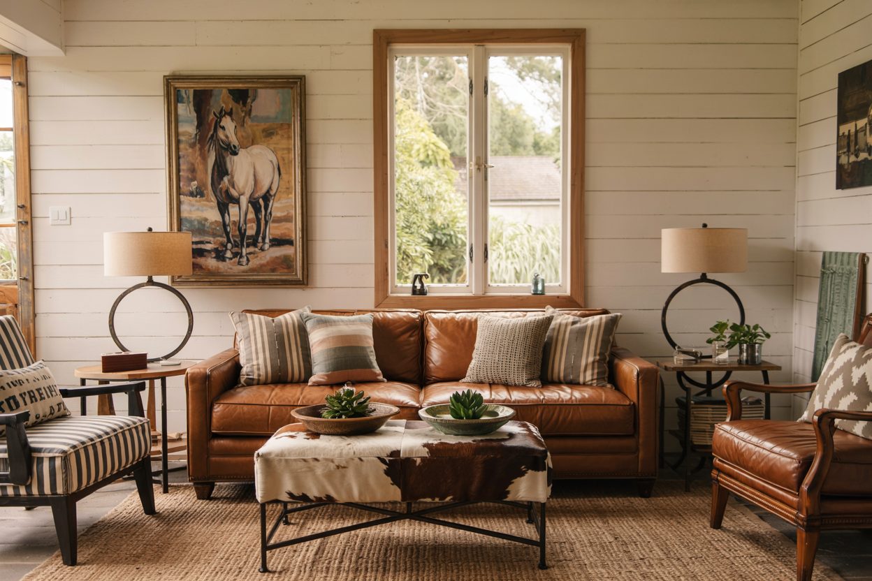
Every year trends shift a little, but when it comes to making a home feel welcoming and personal, warm neutrals always find their way back to the spotlight.
I’ve been styling homes for years, and I’ve learned that warm neutrals are like a soft hug for your walls. They’re familiar, cozy, and they work whether you’re redoing a whole house or just freshening up a single room.
In 2025, Sherwin-Williams continues to offer beautiful choices that make it easy to create that gentle, lived-in feeling without being boring or flat.
Whenever I work with a new family or stage a house for sale, warm neutrals are often my secret weapon to help people feel “at home” the second they step inside.
There’s something about warm neutrals that instantly makes a room feel more welcoming. They wrap the space in comfort without screaming for attention.I always tell my clients: colors should support your life, not compete with it.
Warm neutrals like beiges, soft taupes, and creamy off-whites have been loved for decades. In fact, according to a survey by Fixr, beige and greige remain two of the top colors homeowners prefer for interiors in 2024 (Fixr Report).
People naturally gravitate to shades that feel grounding and familiar — and that’s exactly what warm neutrals deliver.
housekeepingbay.com
Also, homes styled with warm neutrals tend to sell faster. A Zillow study found that homes with warm, neutral tones on their walls sold for up to $1,400 more (Zillow Research).
From my own experience, warm neutrals are the easiest palette for both creating emotional connection and giving flexibility to future decor changes.
housekeepingbay.com
How I Picked These 17 Colors?
When I choose colors for a project — whether it’s a cozy family home or a model house for staging — I look beyond just what’s popular.
To me, a color needs to feel right in real life, not just look good on a paint chip.
Here’s what I focus on:
-
Undertones: Warm neutrals can lean pink, yellow, or even a little green. I always pick ones that feel balanced and natural in different lighting.
-
Adaptability: A great neutral should look beautiful at sunrise and sunset, on a cloudy day or under bright lights.
-
Depth: Some neutrals can look flat. I prefer shades that have just enough depth to feel cozy but still light enough to keep a room fresh.
-
Feedback from real homes: I rely on my projects, feedback from families, and even homebuyers’ reactions to pick the best ones.
I also keep an eye on Sherwin-Williams’ annual forecasts and color recommendations. Their insights are usually spot-on when it comes to what feels right for today’s homes.
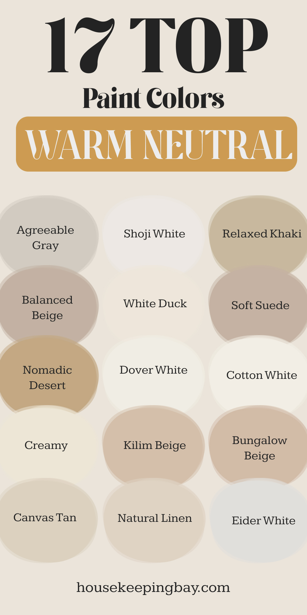
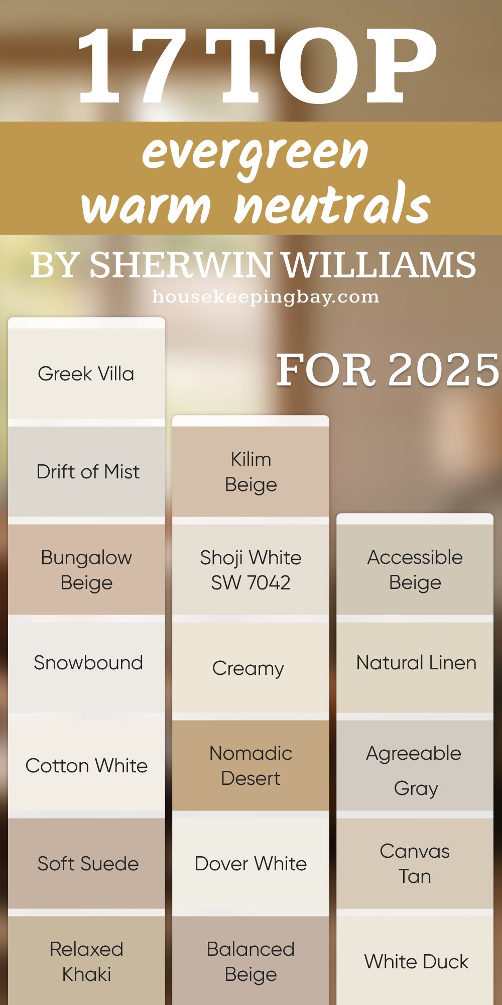
17 Warm Neutral Colors You’ll Love from Sherwin Williams
Here are my personal picks for 2025 — colors that truly work across different homes, moods, and styles:
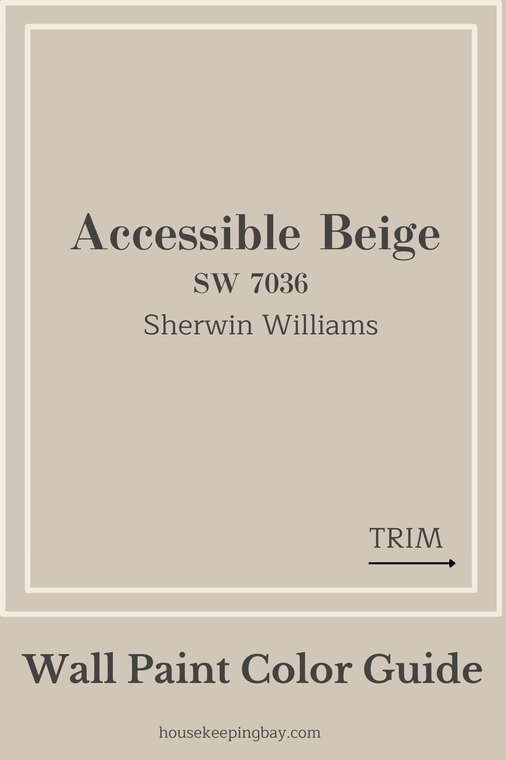
1. Accessible Beige SW 7036
A soft beige with just enough warmth to feel cozy without being heavy. It plays nicely with both modern and traditional furniture.
2. Shoji White SW 7042
This off-white feels like a warm blanket — it’s bright but never cold. Perfect for living rooms and kitchens.
3. Natural Linen SW 9109
Light and creamy, it reminds me of fresh laundry drying in the sun. A great choice for bedrooms or hallways.
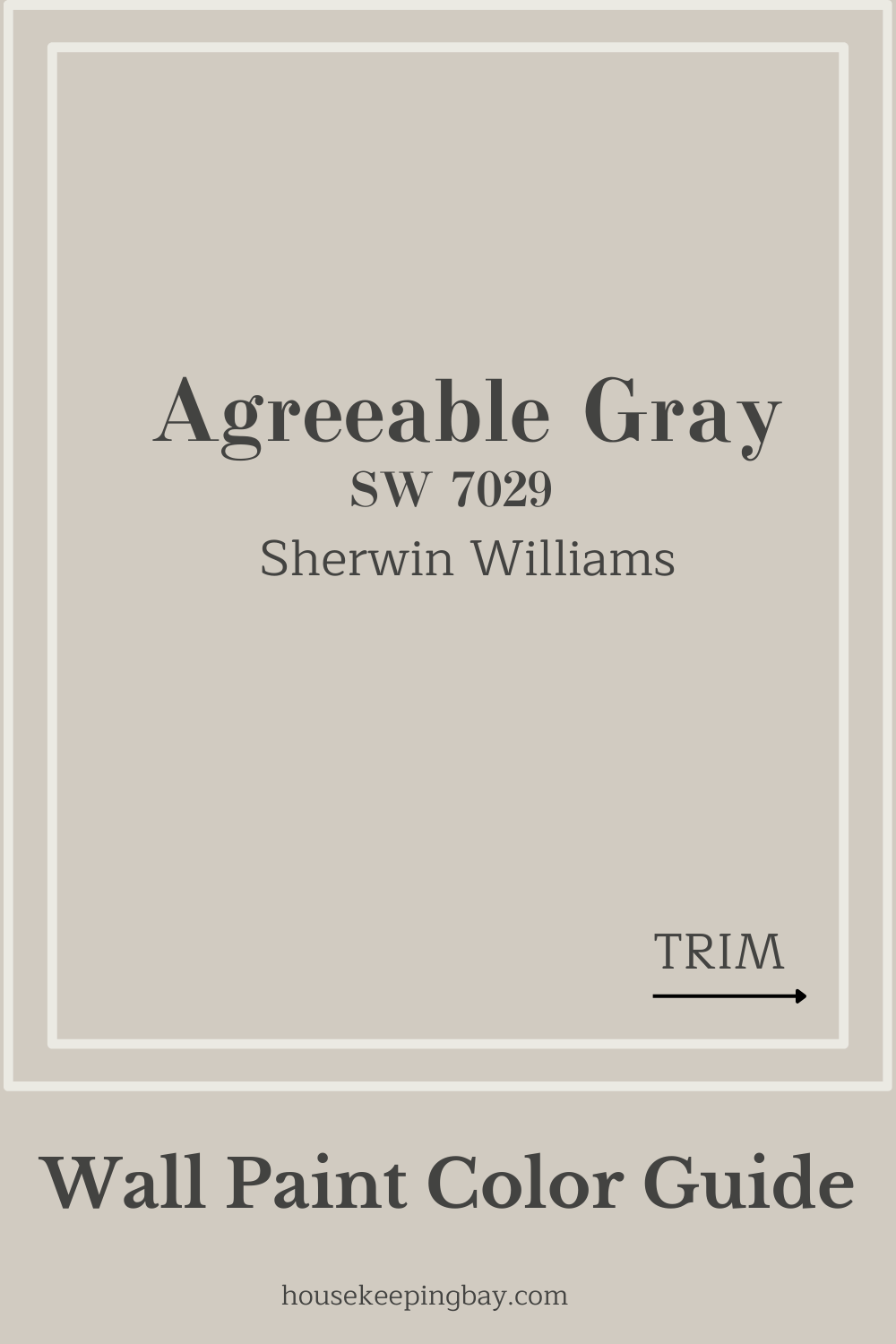
4. Agreeable Gray SW 7029
One of Sherwin-Williams’ all-time favorites. It’s a gentle gray with a warm undertone, so it never feels chilly.
housekeepingbay.com
5. Alabaster SW 7008
This classic was even named Color of the Year by Sherwin-Williams in 2016. It’s still a top choice for its soft, welcoming glow (Sherwin-Williams Alabaster).
6. Canvas Tan SW 7531
A relaxed tan that feels grounded and natural, but still light enough to keep spaces open and airy.
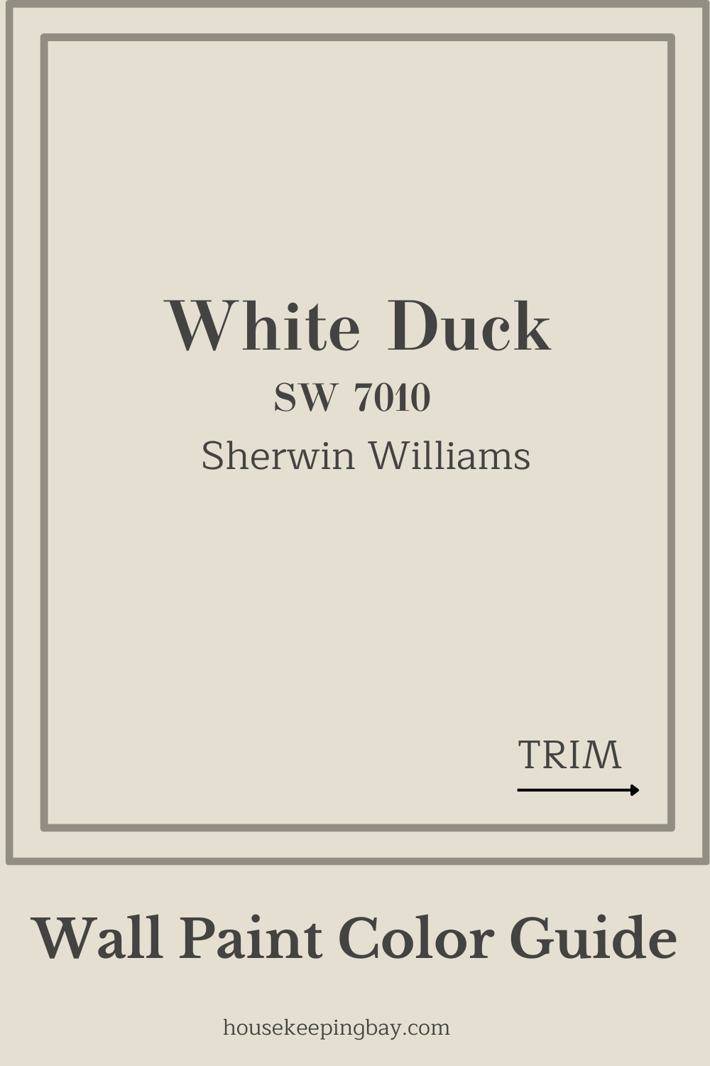
7. White Duck SW 7010
Slightly creamy and never stark, it’s one of my favorites for open-concept homes.
housekeepingbay.com
8. Balanced Beige SW 7037
A warmer take on traditional beige, perfect for cozy living spaces without feeling old-fashioned.
9. Dover White SW 6385
Soft, buttery white that pairs beautifully with warmer woods and natural textures.
10. Nomadic Desert SW 6107
A richer warm neutral with depth — wonderful for accent walls or formal dining rooms.
11. Creamy SW 7012
Just like it sounds, this one has a milky richness that feels calm and inviting.
12. Kilim Beige SW 6106
An earthy beige that gives a grounded feeling — ideal for homes with terracotta floors or rustic styles.
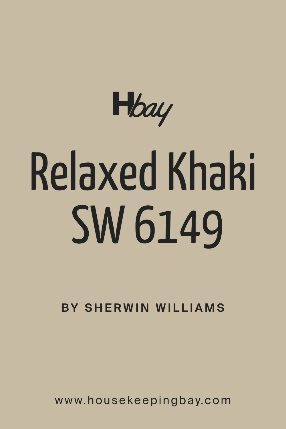
13. Relaxed Khaki SW 6149
More muted and natural than traditional khaki. Great for bedrooms where you want a quiet, restful vibe.
14. Soft Suede SW 9577
Newer to the palette, this warm neutral brings a modern edge without losing that cozy feel.
15. Cotton White SW 7104
A pure, gentle white that carries a whisper of warmth — very popular in minimalist homes.
16. Bungalow Beige SW 7511
A muted, earthy beige that pairs beautifully with dark wood floors and creamy whites.
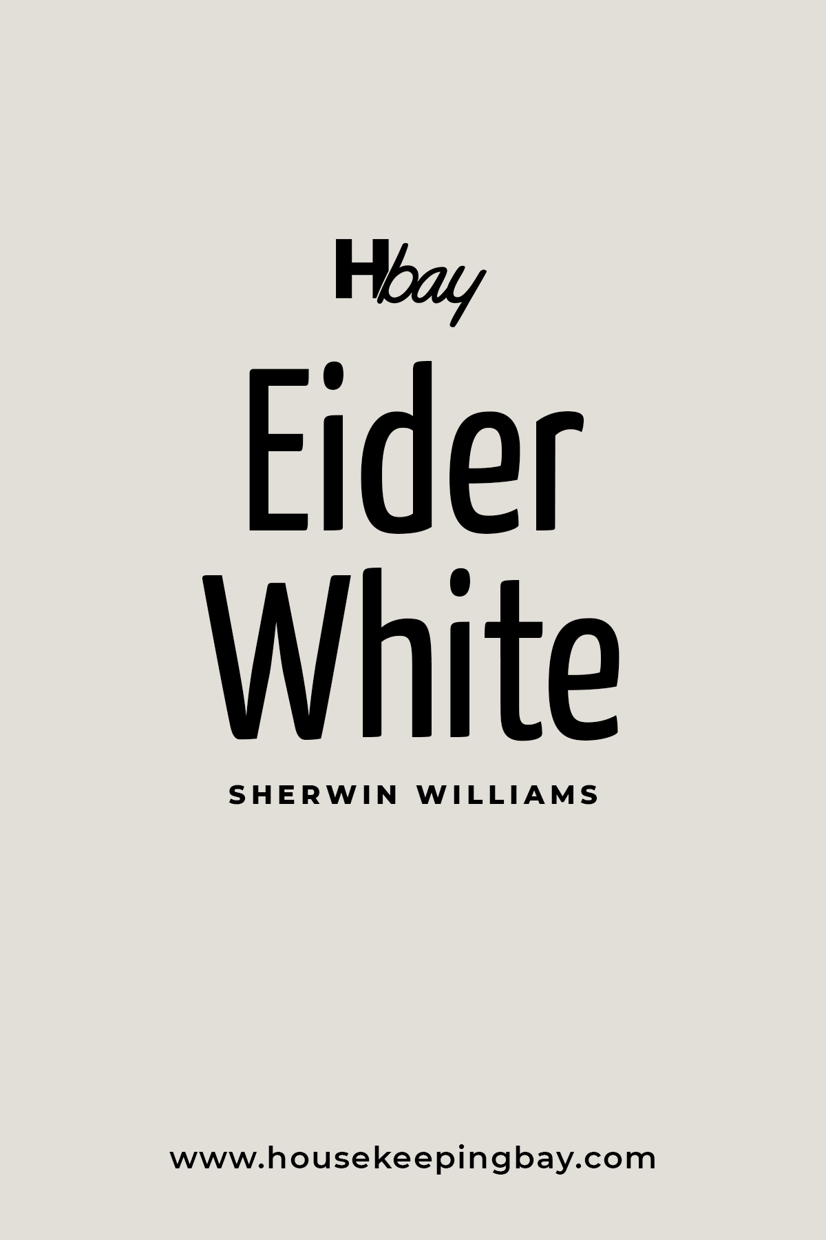
17. Eider White SW 7014
Light gray with a hint of warmth. It’s subtle enough to be a soft backdrop, but interesting enough to stand alone.
Housekeepingbay.com
Tips for Using Warm Neutrals at Home
Choosing the perfect warm neutral is just the first step. How you use it makes all the difference.
Here’s what I always recommend to my clients when we bring these cozy shades into their homes:
Simple Tips to Get the Best Out of Warm Neutrals:
-
Pair them with natural materials.
Think wood, linen, stone, and rattan. Warm neutrals love textures that feel real and earthy. -
Layer your colors.
Don’t stop at the walls! Add throw pillows, rugs, and curtains in slightly different shades of your wall color for a rich, welcoming feel. -
Pay attention to lighting.
Test your paint in morning and evening light. Warm neutrals can shift a lot depending on your bulbs and window direction. -
Use accents wisely.
I love adding muted blues, greens, or rust tones as accent colors. They bring life without overpowering the room. -
Mix matte and glossy finishes.
A warm neutral on the walls with a glossy white trim can make the whole room look cleaner and brighter.
“Colors are the smiles of nature.” — Leigh Hunt (Source)
When I stage homes or decorate for real families, these small choices make the biggest difference between a space that feels “okay” and one that feels like home.
A Few Words Before You Pick Up the Paintbrush
Choosing a warm neutral isn’t just about following a trend. It’s about creating a place where you want to be — where the day feels a little softer and the nights feel a little sweeter.
The 17 colors I shared are more than just paint; they’re tools to shape the feeling of your home. Whether you’re starting fresh, updating one room, or getting ready to sell, picking the right warm neutral can make everything feel easier, more natural, more you.
My best advice? Trust how the color makes you feel. Paint a few test swatches. Live with them for a few days. See them in the morning light and at night after dinner.
The right one will feel like an old friend you didn’t realize you missed.
And remember, like Nate Berkus once said:
“Your home should tell the story of who you are, and be a collection of what you love.” (Nate Berkus)
Warm neutrals help you tell that story — simply, beautifully, and from the heart.
housekeepingbay.com
