Down Home SW 6081 by Sherwin Williams
A Cozy Hue Perfect for Any Space
When choosing a paint color for a cozy and welcoming space, SW 6081 Down Home by Sherwin Williams is an excellent option. This warm, earthy hue brings a sense of comfort and relaxation to any room. It’s like wrapping yourself in a familiar blanket, perfect for those who love a homey atmosphere. The rich and inviting tone offers a grounded feeling, making spaces feel lived-in and welcoming.
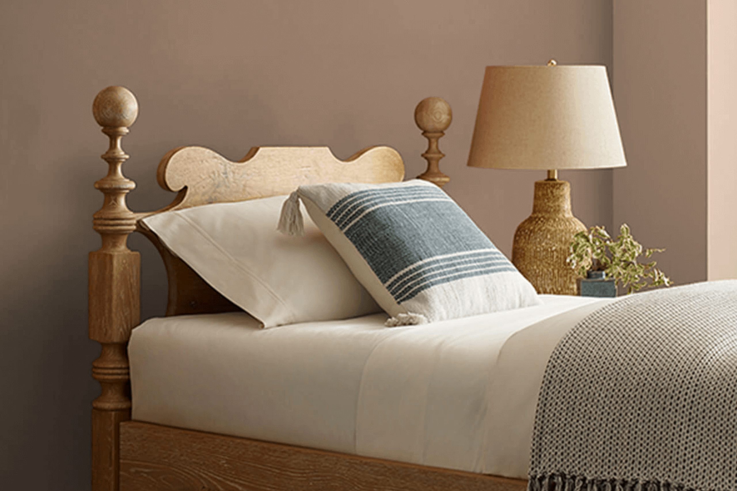
Down Home pairs beautifully with both neutral and bold accents, so you have plenty of room to play with decor. Imagine this warm shade gracing your living room walls or adding a touch of comfort to your bedroom. The color works well with natural woods and textiles, enhancing any space with its gentle, welcoming nature.
While color psychology suggests that certain shades can impact your mood, Down Home fosters a sense of peace and contentment, which is perfect after a long day. It invites you to unwind and enjoy your surroundings. This shade is not just another color; it’s an invitation to create a space that truly feels like home.
So, let Down Home’s warm and inviting tone work its magic in your space, and enjoy the cozy atmosphere it brings.
via sherwin-williams.com
What Color Is Down Home SW 6081 by Sherwin Williams?
Table of Contents
“Down Home” (SW 6081) by Sherwin Williams is a comforting, earthy shade that exudes warmth and coziness. This color is a soft, muted brown with hints of peachy undertones, reminiscent of clay or sun-baked earth. It creates a welcoming and nurturing atmosphere in any space.
In terms of interior styles, “Down Home” works well with rustic, farmhouse, and traditional designs. It’s perfect for those looking to create an inviting and lived-in look. This shade also complements transitional styles that blend classic and contemporary elements.
Pair “Down Home” with natural materials like wood, stone, and leather for a harmonious and grounded feel. Wooden furniture with a warm stain, leather armchairs, and light stone tiles or countertops will enhance its earthy charm. For textiles, consider incorporating soft linens, cottons, and wool in creams, beiges, or muted greens to maintain a cohesive aesthetic.
This color pairs beautifully with muted greens, soft whites, and other earth tones for a balanced palette. Use it on walls to envelop a room in warmth, or as an accent through furniture or decor. Overall, “Down Home” adds a touch of natural, understated elegance to any interior.

housekeepingbay.com
Is Down Home SW 6081 by Sherwin Williams Warm or Cool color?
Down Home SW 6081 by Sherwin Williams is a warm, earthy color perfect for creating a cozy vibe in homes. This shade brings a sense of comfort and ease to any room. It has natural tones reminiscent of clay or rich soil, which can make spaces feel grounded and inviting.
When used in a living room, it provides a welcoming atmosphere ideal for relaxation and gathering with family or friends. In a bedroom, Down Home promotes a sense of calm, making it a great choice for a peaceful retreat.
This color pairs well with neutral shades like beige, cream, or soft green, adding warmth without being overpowering. Its versatility allows it to fit into various design styles, from rustic to more modern themes. Overall, Down Home SW 6081 can help create a harmonious and balanced look, making spaces more comfortable and pleasing to the eye.
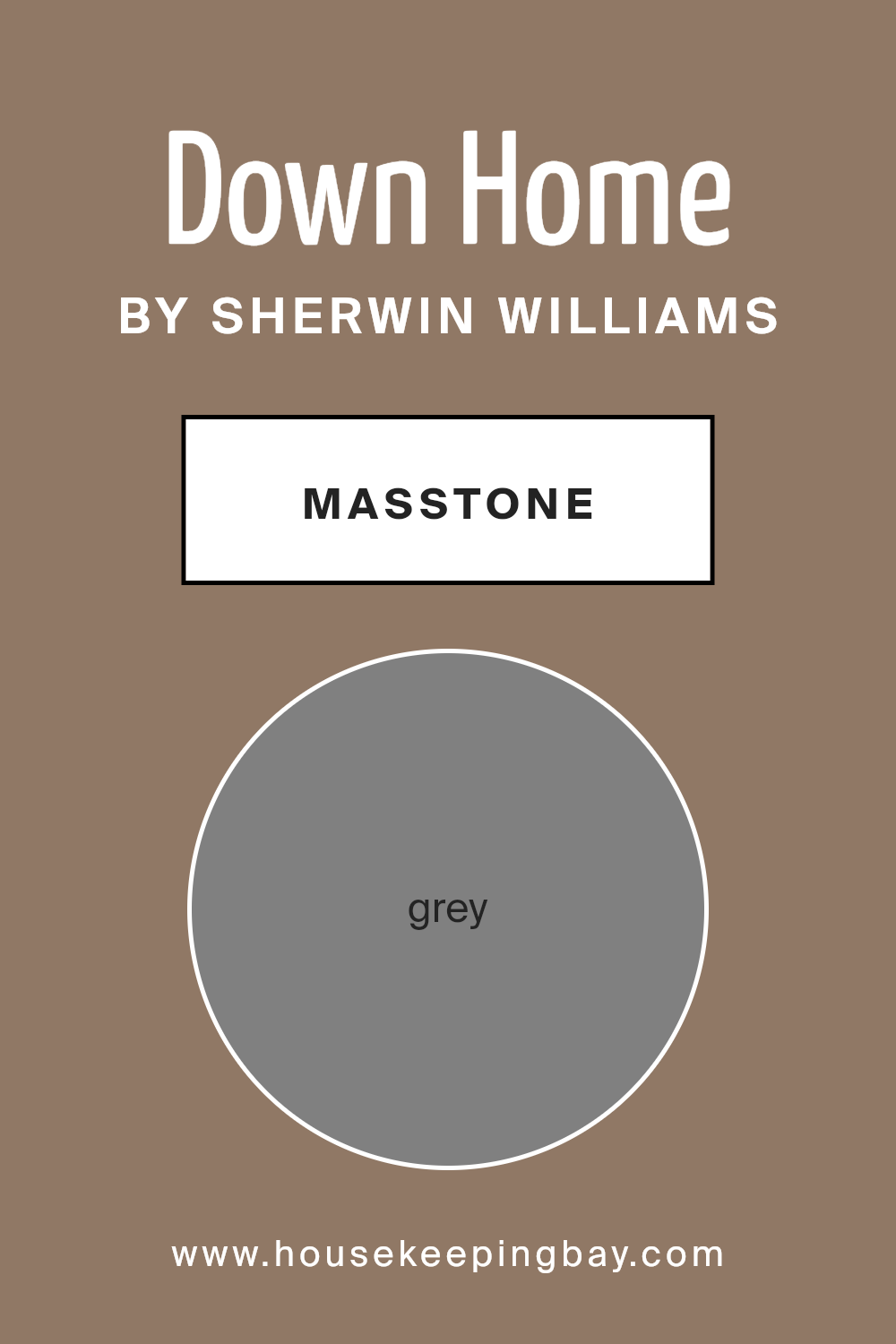
What is the Masstone of the Down Home SW 6081 by Sherwin Williams?
Down Home SW 6081 by Sherwin Williams is a warm and welcoming color. Its masstone, grey (#808080), plays a crucial role in its versatility. This shade balances perfectly between warm and cool tones, allowing it to work well in many home settings.
When used in rooms, the grey masstone helps create a cozy and inviting atmosphere. It can complement natural light, enhancing the space during the day and providing a calming effect at night. Its neutral base ensures it pairs well with various other colors, from soft pastels to bold accents, making customization easy.
In living rooms, Down Home SW 6081 provides a comforting background for furnishings, art, and decor. In bedrooms, it offers a serene feel, encouraging a restful environment. Kitchens and dining areas gain a sophisticated edge with this hue, promoting warmth during gatherings. Its adaptable nature makes it a favorite for homeowners seeking a grounded and harmonious space.
housekeepingbay.com
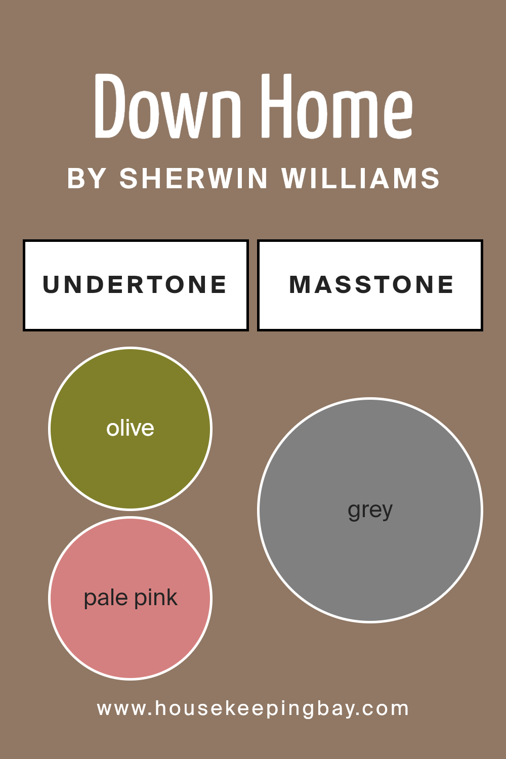
Undertones of Down Home SW 6081 by Sherwin Williams
Down Home SW 6081 by Sherwin Williams features a rich array of undertones, impacting how we perceive this color. Undertones are subtle hints of other colors mixed in, affecting how a shade looks in different lighting. The primary undertone of Down Home is olive, offering an earthy and natural feeling. Olive contains green and yellow hints and adds a warmth that makes spaces feel cozy and inviting.
Adding to the mix, the shade also has pale pink and light green undertones. These soft notes lend a touch of softness, making it suitable for a serene environment. The presence of mint and turquoise touches brings a hint of freshness, balancing the warm earthy hues and preventing spaces from feeling too heavy.
The darker, cooler undertones like navy, dark turquoise, and dark green provide depth. They ground the shade, making it more versatile, allowing it to fit into both modern and traditional settings. When used on interior walls, Down Home can feel both comforting and stable due to its brown undertones, while hints of light gray and pale yellow enhance adaptability, reflecting different vibes based on nearby furnishings and light sources. Overall, these varied undertones ensure that the color feels rich, providing a neutral yet interesting backdrop.
housekeepingbay.com
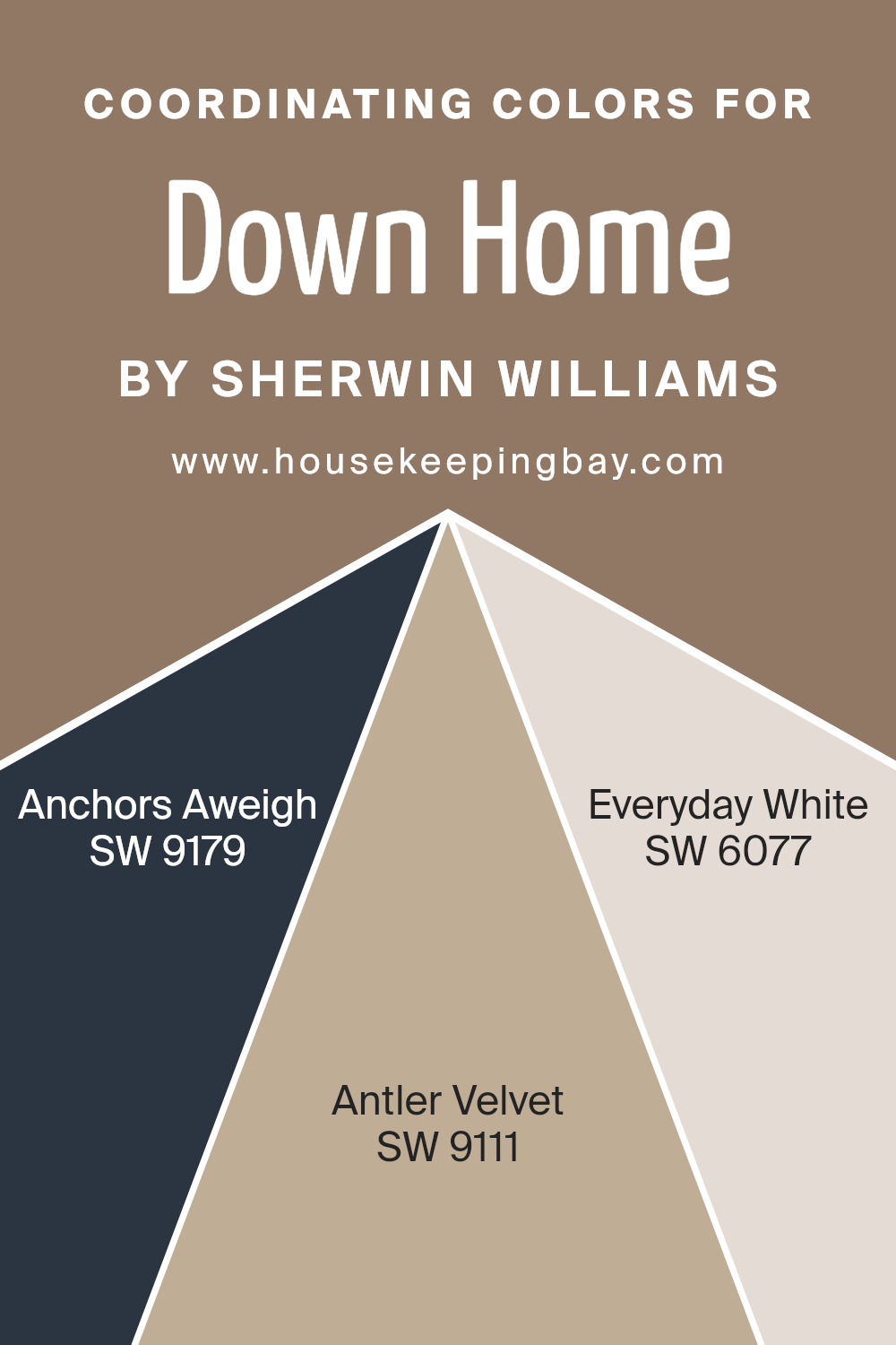
Coordinating Colors of Down Home SW 6081 by Sherwin Williams
Coordinating colors are hues that work well together to create a pleasing aesthetic in a space. They are often selected to complement a main color, enhancing its impact by either contrasting it or blending smoothly.
For the color Down Home SW 6081 by Sherwin Williams, a warm, earthy tone, its coordinating colors help to achieve a balanced look. SW 9179 – Anchors Aweigh is a deep, rich navy that brings a sense of depth and sophistication. Its boldness provides a striking contrast to Down Home, yet maintains harmony with its earthy quality.
SW 9111 – Antler Velvet is a soft, muted brown that offers a touch of warmth and comfort. It pairs naturally with Down Home by enhancing the inviting feel of the space without overpowering the main color.
Meanwhile, SW 6077 – Everyday White is a crisp, clean white that provides a refreshing balance to the palette. This color acts as a neutral backdrop, allowing the more saturated hues to stand out while ensuring the overall look remains cohesive and light.
By using these coordinating colors together, you can create a well-rounded design that feels thoughtfully composed. Each color adds its unique character to the palette, resulting in an inviting and harmonious space.
You can see recommended paint colors below:
- SW 9179 Anchors Aweigh
- SW 9111 Antler Velvet
- SW 6077 Everyday White
housekeepingbay.com
How Does Lighting Affect Down Home SW 6081 by Sherwin Williams?
Lighting has a significant impact on how colors appear. The color you choose for your walls might look different depending on the lighting conditions in your room. Let’s look at Down Home SW 6081 by Sherwin Williams and how it behaves under various lighting conditions.
In artificial light, Down Home may appear warmer and cozier, especially if the bulbs emit a soft yellow or warm white light. The warm tones in the paint can become more pronounced, giving the room a comfortable feel. LED lights with a cooler, blueish tone might mute the warmth, making the color look more balanced.
Natural light can vary greatly throughout the day. In north-facing rooms, which typically receive cool, indirect light, Down Home might look a bit cooler and muted. The color’s warm tones might not be as visible, creating a more subdued and calming ambiance. This can be an advantage if you’re aiming for a relaxed setting.
In south-facing rooms, the color benefits from ample warm natural light throughout the day. Here, Down Home tends to shine, displaying its full range of hues. The warmer light enhances the color, making it appear rich and inviting.
East-facing rooms get bright, morning sunlight. Early in the day, the warm highlights come through strongly. As the day progresses and the light becomes cooler, you might notice the color settling down, showing a softer side by afternoon.
West-facing rooms get warm, late afternoon light. In these spaces, Down Home will likely have a dynamic appearance. It may seem richer and warmer towards the evening as the setting sun floods the room with golden light.
Overall, Down Home SW 6081 is a versatile color that adjusts beautifully depending on both the direction of natural light and the type of artificial lighting used. Understanding these effects can help you decide where it works best in your home.

housekeepingbay.com
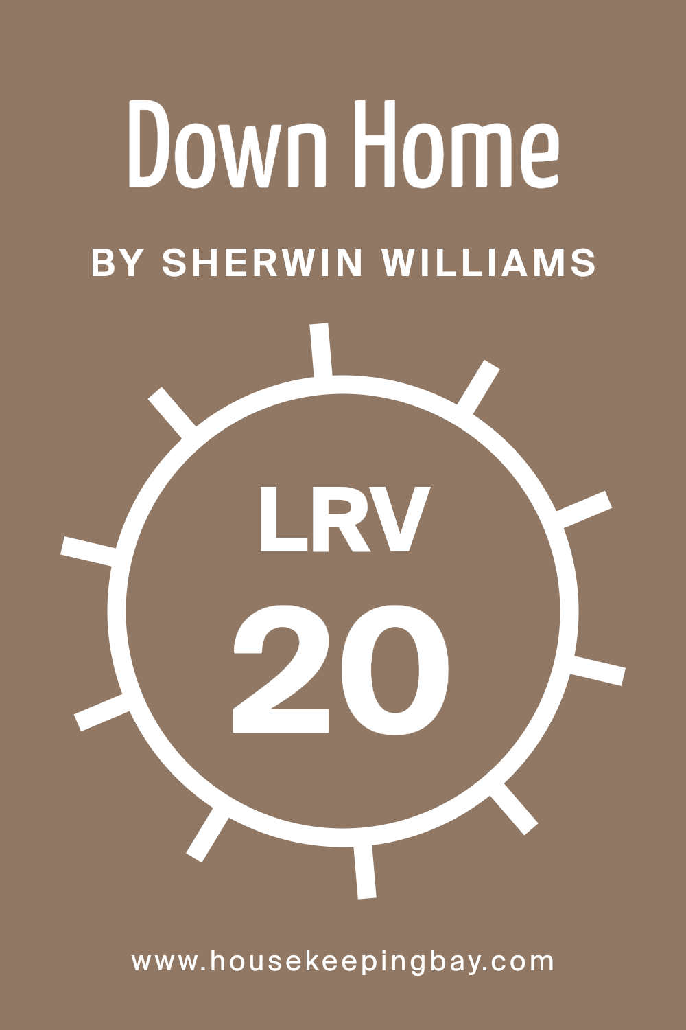
What is the LRV of Down Home SW 6081 by Sherwin Williams?
Light Reflectance Value, or LRV, is a measurement used in the paint industry to describe how much light a color reflects. It ranges from 0% to 100%, with 0% being completely black (reflecting no light) and 100% being pure white (reflecting all light). When choosing paint, LRV is important because it influences how bright or dark a room feels.
Colors with higher LRV values make spaces feel brighter and more open, as they reflect more light. Conversely, colors with lower LRV values absorb more light, creating a dimmer and cozier atmosphere. Understanding LRV helps people choose the right paint for their rooms, depending on how much light they want to reflect.
The LRV of Down Home by Sherwin Williams is 20.186, which is quite low on the LRV scale. This means it is a darker color that absorbs a significant amount of light. When used on walls, Down Home will create a cozy and intimate feel in the room, as it doesn’t reflect a lot of light. Such a shade can be great for spaces where one desires a warm, inviting atmosphere, like living rooms or bedrooms.
However, in rooms with limited natural or artificial light, using a color with such a low LRV might make the space feel smaller or dimmer, so it is important to consider lighting conditions when using this color.
housekeepingbay.com
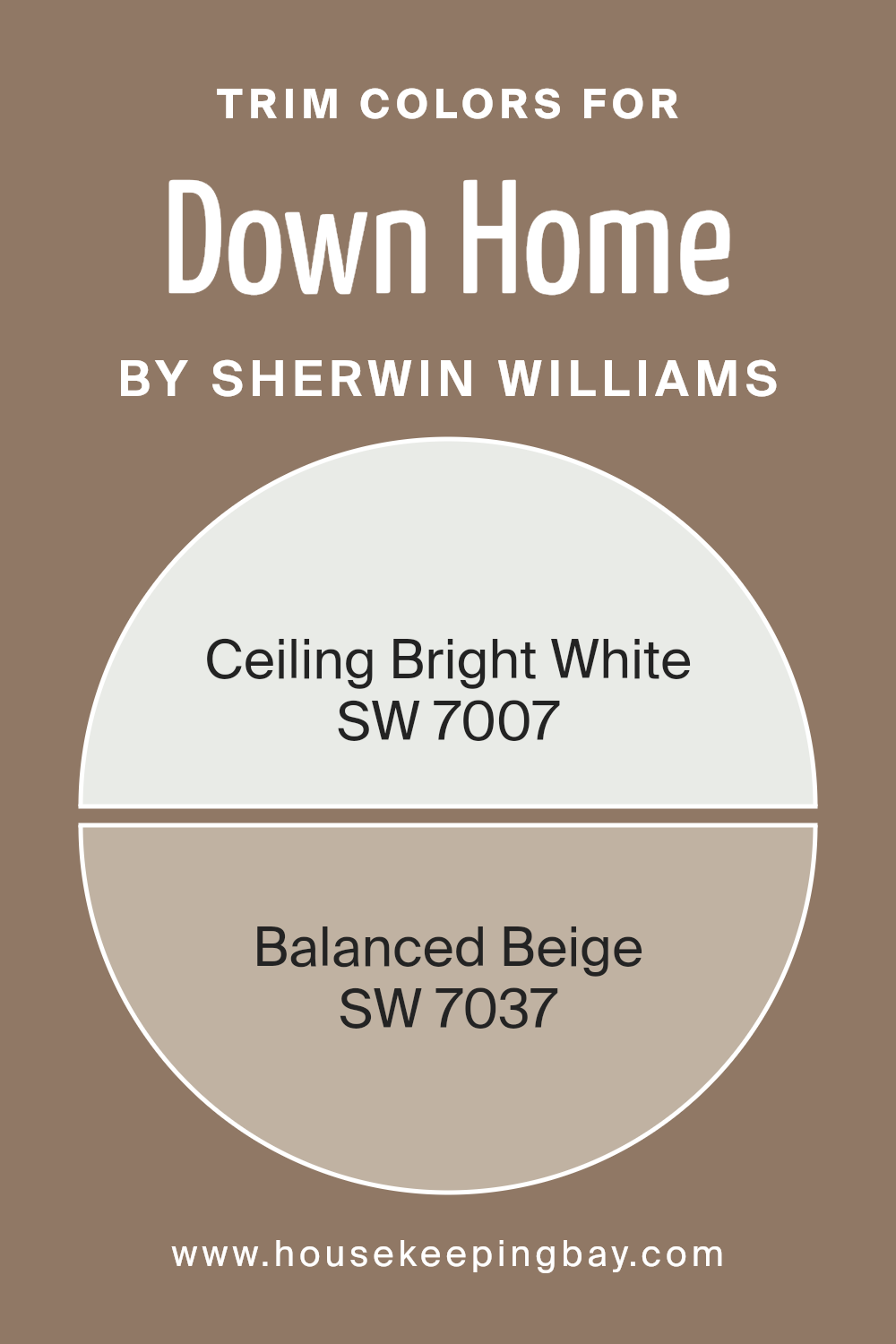
What are the Trim colors of Down Home SW 6081 by Sherwin Williams?
Trim colors are the hues used to paint the moldings, baseboards, and other decorative edges in a room. They play a crucial role in defining the architectural details and enhancing the overall aesthetic. In the case of using Down Home SW 6081 by Sherwin Williams as the main wall color, trim colors can provide contrast and highlight key features.
Down Home is a warm, earthy tone that gives a room a cozy and inviting atmosphere. To complement this, Sherwin Williams’ colors like SW 7007 – Ceiling Bright White and SW 7037 – Balanced Beige serve as excellent choices for trim colors. These shades help accentuate the warm tone of Down Home while contributing to a well-rounded look.
SW 7007 – Ceiling Bright White is a crisp, clean white that offers a fresh brightness, ideal for creating a classic contrast against the warmer walls. When used as a trim color, it can make the space feel more open and airy, drawing attention to the architectural details. On the other hand, SW 7037 – Balanced Beige is a soft, neutral tone that pairs well with earthy shades, adding a subtle touch of warmth without overshadowing the main wall color.
As a trim, Balanced Beige can contribute to a harmonious look, ensuring that the room feels cohesive and well put together. These trim colors are important because they help enhance Down Home, making the room feel inviting and serene.
You can see recommended paint colors below:
housekeepingbay.com
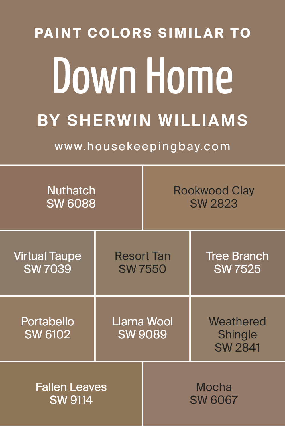
Colors Similar to Down Home SW 6081 by Sherwin Williams
Similar colors play a vital role in design and décor by creating harmony and cohesion in a space. When colors share close hues or undertones, they can blend seamlessly, providing a balanced, unified look. For instance, Sherwin Williams’ Down Home SW 6081 pairs effortlessly with colors like SW 6088 – Nuthatch, a warm, earthy brown with a slightly reddish undertone, and SW 2823 – Rookwood Clay, a rich, terracotta shade that exudes warmth and depth. These colors create an inviting atmosphere and add a touch of rustic charm without clashing.
Similarly, SW 7039 – Virtual Taupe is a versatile gray-brown that suits a variety of settings, offering a neutral base for other accents. SW 7550 – Resort Tan brings a subtle golden hue, adding warmth and light. SW 7525 – Tree Branch echoes the natural world with its deep brown tone, ideal for grounding a space. SW 6102 – Portabello, a mushroom-like shade, complements these tones with its soft, neutral presence.
For a lighter touch, SW 9089 – Llama Wool provides a creamy, warm beige, while SW 2841 – Weathered Shingle offers a muted gray with hints of brown. Lastly, SW 9114 – Fallen Leaves has a deep, autumnal feel, and SW 6067 – Mocha, a cozy brown, rounds out these related colors beautifully. Together, these hues create a cohesive aesthetic that feels both warm and sophisticated.
You can see recommended paint colors below:
- SW 6088 Nuthatch
- SW 2823 Rookwood Clay
- SW 7039 Virtual Taupe
- SW 7550 Resort Tan
- SW 7525 Tree Branch
- SW 6102 Portabello
- SW 9089 Llama Wool
- SW 2841 Weathered Shingle
- SW 9114 Fallen Leaves
- SW 6067 Mocha
housekeepingbay.com
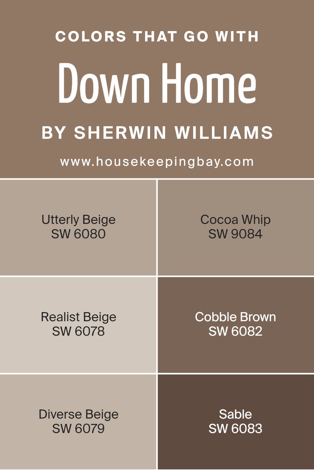
Colors that Go With Down Home SW 6081 by Sherwin Williams
Colors that go with Down Home SW 6081 by Sherwin Williams play a crucial role in creating a harmonious and cohesive space. Down Home is a warm, earthy tone, and the right complementary colors can enhance its natural beauty. For instance, SW 6080 – Utterly Beige provides a soft, neutral backdrop that allows Down Home to stand out without competing for attention.
It has a gentle, understated warmth that balances the richness of Down Home. Then there’s SW 9084 – Cocoa Whip, which brings in a creamy, light brown shade that adds a subtle depth when paired with Down Home, creating a cozy and inviting atmosphere.
SW 6078 – Realist Beige is another versatile option. This color introduces a subtle touch of warmth that coordinates well with Down Home’s earthy vibe. Meanwhile, SW 6082 – Cobble Brown, a deeper brown, adds a wonderful contrast, bringing out the richness of Down Home and giving the space solidity and depth. SW 6079 – Diverse Beige offers a soft, muted tone that blends seamlessly with Down Home, providing a sense of continuity.
Lastly, SW 6083 – Sable adds a darker, richer element to the palette, enhancing the warmth and creating a grounded and sophisticated aesthetic. Together, these colors work to accentuate the beauty of Down Home, making a space feel put-together and welcoming.
You can see recommended paint colors below:
- SW 6080 Utterly Beige
- SW 9084 Cocoa Whip
- SW 6078 Realist Beige
- SW 6082 Cobble Brown
- SW 6079 Diverse Beige
- SW 6083 Sable
housekeepingbay.com
How to Use Down Home SW 6081 by Sherwin Williams In Your Home?
Down Home SW 6081 by Sherwin Williams is a warm, inviting shade of brown with subtle earthy undertones. It’s a versatile color that works well in various spaces within the home. In living rooms, this color creates a cozy, welcoming environment perfect for relaxation or family gatherings. It pairs excellently with rustic decor and natural wooden furniture, highlighting their rich textures.
In a bedroom, Down Home SW 6081 offers a comforting ambiance, promoting a restful atmosphere conducive to a good night’s sleep. Pair it with soft beige or cream-colored bedding for a harmonious look.
For kitchens or dining areas, this color can add warmth and a touch of elegance, especially when combined with white cabinets or darker countertops. It’s also an excellent choice for accent walls, providing depth without overwhelming the space. Plus, it complements many other colors, making it easy to include in any existing color scheme.
Down Home SW 6081 by Sherwin Williams vs Llama Wool SW 9089 by Sherwin Williams
Down Home SW 6081 by Sherwin Williams is a warm, earthy shade that gives spaces a cozy, inviting feel. This color resembles a soft brown with slight green undertones, which makes it perfect for creating a natural, grounded atmosphere. It works beautifully in living rooms or bedrooms where comfort and warmth are desired.
Llama Wool SW 9089 offers a contrasting vibe. This color is a soft, light beige, leaning towards an off-white. It’s much lighter than Down Home, bringing a sense of openness and airiness to a room. Llama Wool’s neutrality makes it versatile, fitting well in modern or traditional spaces. It pairs easily with other colors, providing a clean and fresh backdrop.
Both colors have unique qualities: Down Home emphasizes warmth and groundedness, while Llama Wool highlights lightness and versatility. Choosing between them depends on the mood you wish to create in your space.
You can see recommended paint color below:
housekeepingbay.com
Down Home SW 6081 by Sherwin Williams vs Nuthatch SW 6088 by Sherwin Williams
Down Home SW 6081 by Sherwin Williams is a warm, earthy color with a hint of brown and green. It creates a cozy and inviting atmosphere, making it ideal for spaces where comfort is key. The tone is subtle yet grounding, perfect for living rooms or bedrooms where relaxation is desired. It pairs well with natural elements and wooden accents, enhancing a room’s warmth.
Nuthatch SW 6088, also by Sherwin Williams, features a more grayish-brown hue. It feels more neutral, offering a versatile backdrop that complements a variety of decor styles. Its understated nature makes it suitable for open spaces or areas needing a neutral canvas. Nuthatch’s slightly cooler tone can blend effortlessly with both warm and cool colors, offering flexibility in design choices.
Both colors bring a sense of calm, but while Down Home leans towards warmth and comfort, Nuthatch provides a balanced and adaptable neutrality.
You can see recommended paint color below:
housekeepingbay.com
Down Home SW 6081 by Sherwin Williams vs Rookwood Clay SW 2823 by Sherwin Williams
Down Home (SW 6081) by Sherwin Williams is a cozy, warm shade of brown with hints of green. It gives rooms a natural, earthy feel that can make spaces feel welcoming and comfortable. This color pairs well with natural materials like wood and stone, enhancing a rustic or traditional aesthetic.
Rookwood Clay (SW 2823), also by Sherwin Williams, is a deep, rich earthy tone with a mix of brown and red. It adds depth and warmth to any space, making it perfect for accent walls or areas where a bold statement is desired. This color works well in both period-inspired and modern interiors due to its timeless appeal.
While both shades bring warmth, Down Home’s subtle green undertones offer a softer, more understated look, whereas Rookwood Clay’s red hints create a bolder, more pronounced effect. Both colors can bring a sense of coziness to interiors, but their specific undertones cater to different tastes and styles.
You can see recommended paint color below:
- SW 2823 Rookwood Clay
housekeepingbay.com
Down Home SW 6081 by Sherwin Williams vs Virtual Taupe SW 7039 by Sherwin Williams
Down Home SW 6081 by Sherwin Williams presents a warm, earthy tone. This color carries a sense of coziness and comfort, often described as a mix of brown and green. It feels inviting and grounded, great for creating a welcoming atmosphere in homes.
Virtual Taupe SW 7039 also from Sherwin Williams, leans towards a more classic taupe shade. This color offers a balanced blend of brown and gray, providing a neutral backdrop that fits well in modern or traditional settings. Its understated elegance can make spaces feel sophisticated and calm.
Both colors share earthy qualities but serve different purposes. Down Home exudes warmth and rustic charm, perfect for a cozy room. Virtual Taupe gives a subtle, elegant look, ideal for sophisticated interiors. Choosing between these depends on desired ambiance: warm and inviting with Down Home, or understated and elegant with Virtual Taupe. Both add unique character to spaces.
You can see recommended paint color below:

housekeepingbay.com
Down Home SW 6081 by Sherwin Williams vs Mocha SW 6067 by Sherwin Williams
Down Home SW 6081 by Sherwin Williams is a warm, earthy brown that gives spaces a cozy, comforting feel. It has undertones that hint at both red and gray, making it versatile for various settings. This color is often used to create a welcoming atmosphere in living rooms and dens.
Mocha SW 6067, also by Sherwin Williams, is a rich, deep brown with darker, more intense tones. It leans towards the chocolate side, giving a sense of depth and richness that can add sophistication to a room. Mocha works well in spaces where an elegant yet grounded look is desired, like libraries or formal dining rooms.
Both colors share a brown base but differ in their intensity and warmth. Down Home feels more approachable and relaxed, while Mocha offers a touch of luxury and drama. Using them together can create warm, balanced interiors, with Down Home providing a gentle backdrop and Mocha adding striking accents.
You can see recommended paint color below:
- SW 6067 Mocha
housekeepingbay.com
Down Home SW 6081 by Sherwin Williams vs Tree Branch SW 7525 by Sherwin Williams
Sure! Let’s compare the two colors: Down Home SW 6081 and Tree Branch SW 7525 by Sherwin Williams.
Down Home SW 6081 is a warm, muted brownish-green. It feels earthy and grounded, giving spaces a cozy, welcoming vibe. This color works well in areas where you want a calming and comfortable atmosphere, like living rooms or bedrooms.
Tree Branch SW 7525, while also in the warm category, leans more towards a medium brown with a hint of gray. It feels natural and sturdy, perfect for creating a strong, stable background. This shade works well for a study or dining room, where you might want a more mature and sophisticated look.
Both colors provide an inviting feel, but Down Home has more green undertones, while Tree Branch offers a richer brown. Each brings warmth and a sense of nature into a room, but in subtly different ways.
You can see recommended paint color below:
- SW 7525 Tree Branch

housekeepingbay.com
Down Home SW 6081 by Sherwin Williams vs Fallen Leaves SW 9114 by Sherwin Williams
Down Home SW 6081 and Fallen Leaves SW 9114, both by Sherwin Williams, offer warm, welcoming tones. Down Home SW 6081 is a rich, earthy hue with a balanced blend of brown and green undertones. It creates a comforting, natural feel, ideal for living rooms or cozy spaces. Its grounded tone works well in rustic or nature-inspired themes.
Fallen Leaves SW 9114, meanwhile, carries a warm brownish-orange hue reminiscent of autumn foliage. It evokes warmth, providing a lively touch without overwhelming the senses. This color works wonderfully in spaces aimed at creating a cozy, inviting atmosphere.
Both colors shine in warm lighting and pair well with neutrals, although Down Home offers a calmer, grounded sensation, whereas Fallen Leaves adds a bit more vibrance and energy. Together, these colors can complement each other in a space, with Down Home offering a steady backdrop and Fallen Leaves providing a lively accent.
You can see recommended paint color below:
- SW 9114 Fallen Leaves

housekeepingbay.com
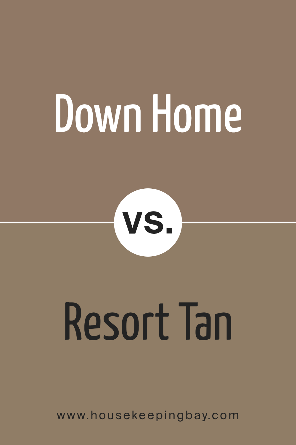
Down Home SW 6081 by Sherwin Williams vs Resort Tan SW 7550 by Sherwin Williams
Down Home (SW 6081) by Sherwin Williams is a warm, earthy shade with strong brown undertones. This color evokes a sense of coziness and comfort, making it ideal for creating inviting living spaces. It often pairs well with natural materials like wood and stone, enhancing its warm vibe.
Resort Tan (SW 7550), also by Sherwin Williams, is lighter and softer, offering a gentle tan hue. This color feels light and airy, bringing brightness and an open feeling to a room. Resort Tan works well in spaces seeking a neutral backdrop that feels more open.
Down Home adds richness and warmth, perfect for a cozy atmosphere. Resort Tan provides a lighter touch ideal for bright and open areas. Both have earthy tones but serve different atmospheres; Down Home is more comforting and intimate, while Resort Tan feels refreshing and breezy.
You can see recommended paint color below:
- SW 7550 Resort Tan
housekeepingbay.com
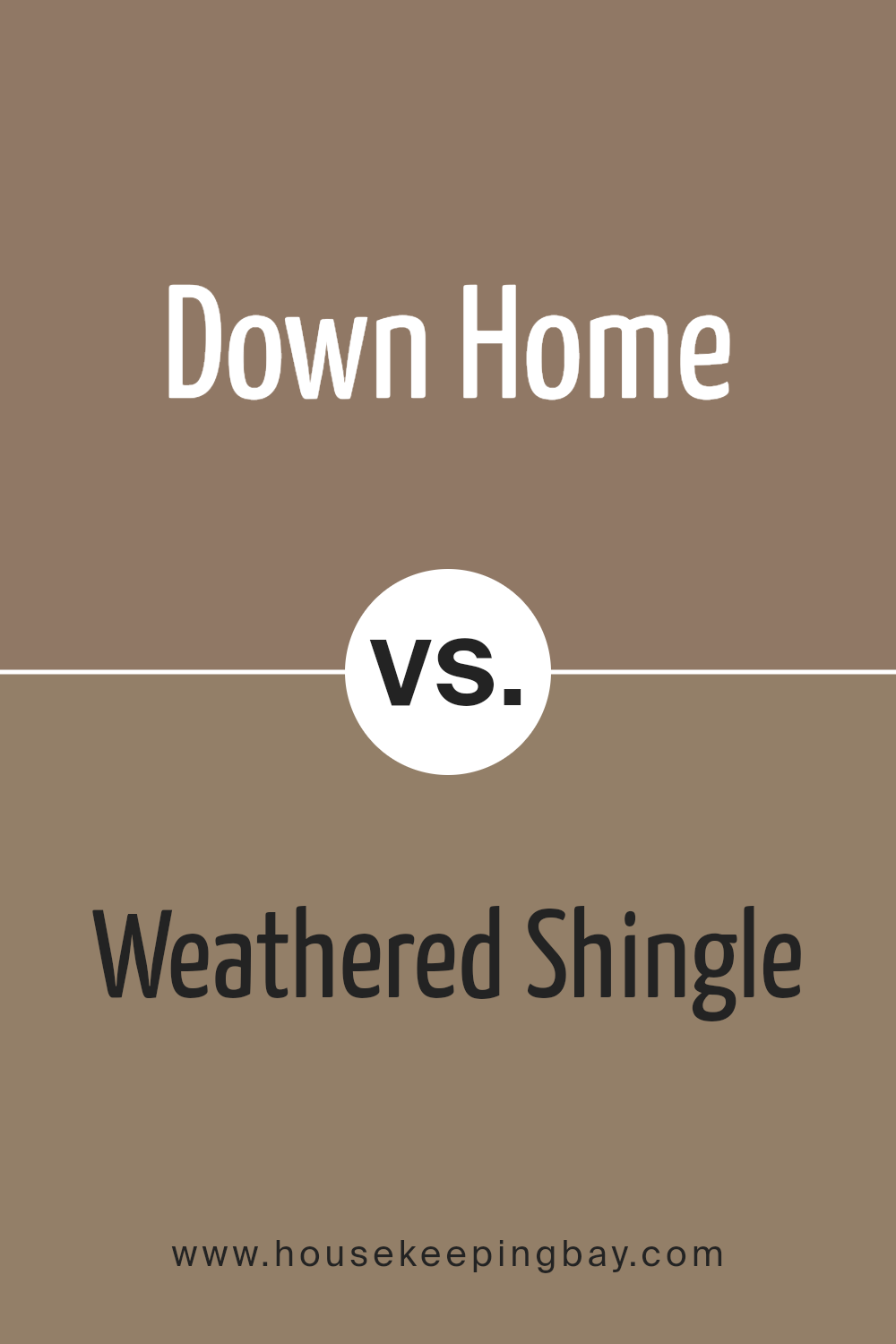
Down Home SW 6081 by Sherwin Williams vs Weathered Shingle SW 2841 by Sherwin Williams
Down Home SW 6081 by Sherwin Williams is a warm, earthy brown with a cozy undertone. It creates an inviting atmosphere, reminiscent of natural elements. This color works beautifully in spaces that aim for comfort and warmth. Its brown tones make it versatile, fitting well into rustic or traditional styles.
Weathered Shingle SW 2841, also from Sherwin Williams, is a slightly darker brown with a hint of gray. This gives it a more muted and subdued appearance compared to Down Home. Weathered Shingle exudes a sense of aged elegance, suitable for achieving a timeless look. It pairs well in spaces seeking a subtle, sophisticated vibe.
Comparing the two, Down Home feels warmer and more homey due to its cozy brown tones, whereas Weathered Shingle leans towards a cooler and more neutral palette with its gray undertones, making it more understated and classic. Both infuse a room with different shades of calmness.
You can see recommended paint color below:
housekeepingbay.com
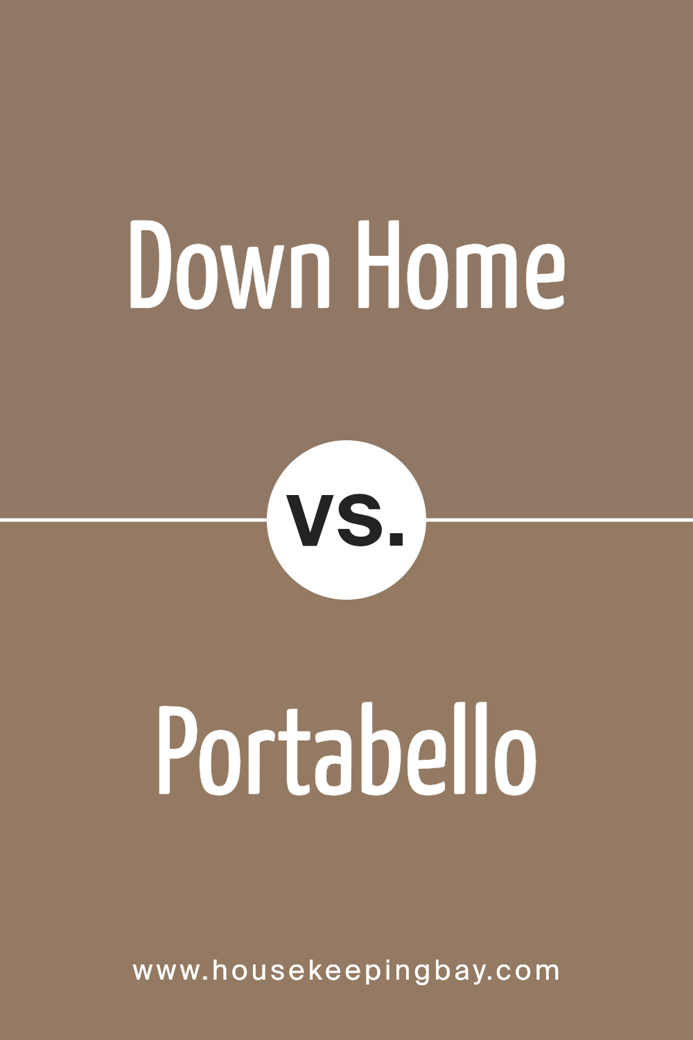
Down Home SW 6081 by Sherwin Williams vs Portabello SW 6102 by Sherwin Williams
Down Home SW 6081 and Portabello SW 6102, both from Sherwin Williams, offer unique styles for any space. Down Home SW 6081 presents a warm, earthy tone, similar to clay or terracotta. It creates a cozy, inviting atmosphere, ideal for family rooms or spaces emphasizing comfort and warmth.
Portabello SW 6102 leans towards a neutral tan shade with subtle gray undertones. Its versatility makes it suitable for various settings, including modern or traditional spaces. This color serves as a soft background, allowing other design elements to stand out.
When choosing between them, consider the dominant mood you wish to create. Down Home delivers warmth and intimacy, while Portabello provides a neutral, adaptable base. In combination, they can complement each other well. Decor accents, furnishings, and lighting often play a significant role in determining which hue will best fit your vision.
You can see recommended paint color below:
- SW 6102 Portabello
housekeepingbay.com
Conclusion
SW 6081 Down Home by Sherwin Williams is a warm and inviting color that brings comfort and coziness to any space. When I think about using this hue, I imagine a room that feels grounded and welcoming. It conjures images of a peaceful countryside and a sense of simplicity, making it perfect for creating a comforting environment in a home.
The versatility of Down Home allows it to work well in various settings. In a living room, it can create a soft and nurturing atmosphere, especially when paired with natural textures like wood or woven fabrics. In a kitchen or dining area, it adds a touch of warmth, making meals feel more inviting and homey.
I appreciate how this color can be a soothing backdrop yet also stand out when accentuated with complementary colors or decor. It can seamlessly blend with both modern and traditional styles, giving the space a timeless feel.
In thinking about Down Home, I see an opportunity to create a personal and serene corner in my living space. It’s the kind of color that encourages me to relax, slow down, and enjoy the simple moments, which is something I value in today’s fast-paced world.

housekeepingbay.com
Ever wished paint sampling was as easy as sticking a sticker? Guess what? Now it is! Discover Samplize's unique Peel & Stick samples. Get started now and say goodbye to the old messy way!
Get paint samples


