Blue Cruise SW 7606 by Sherwin Williams
A Fresh Shade for a Breezy Vibe
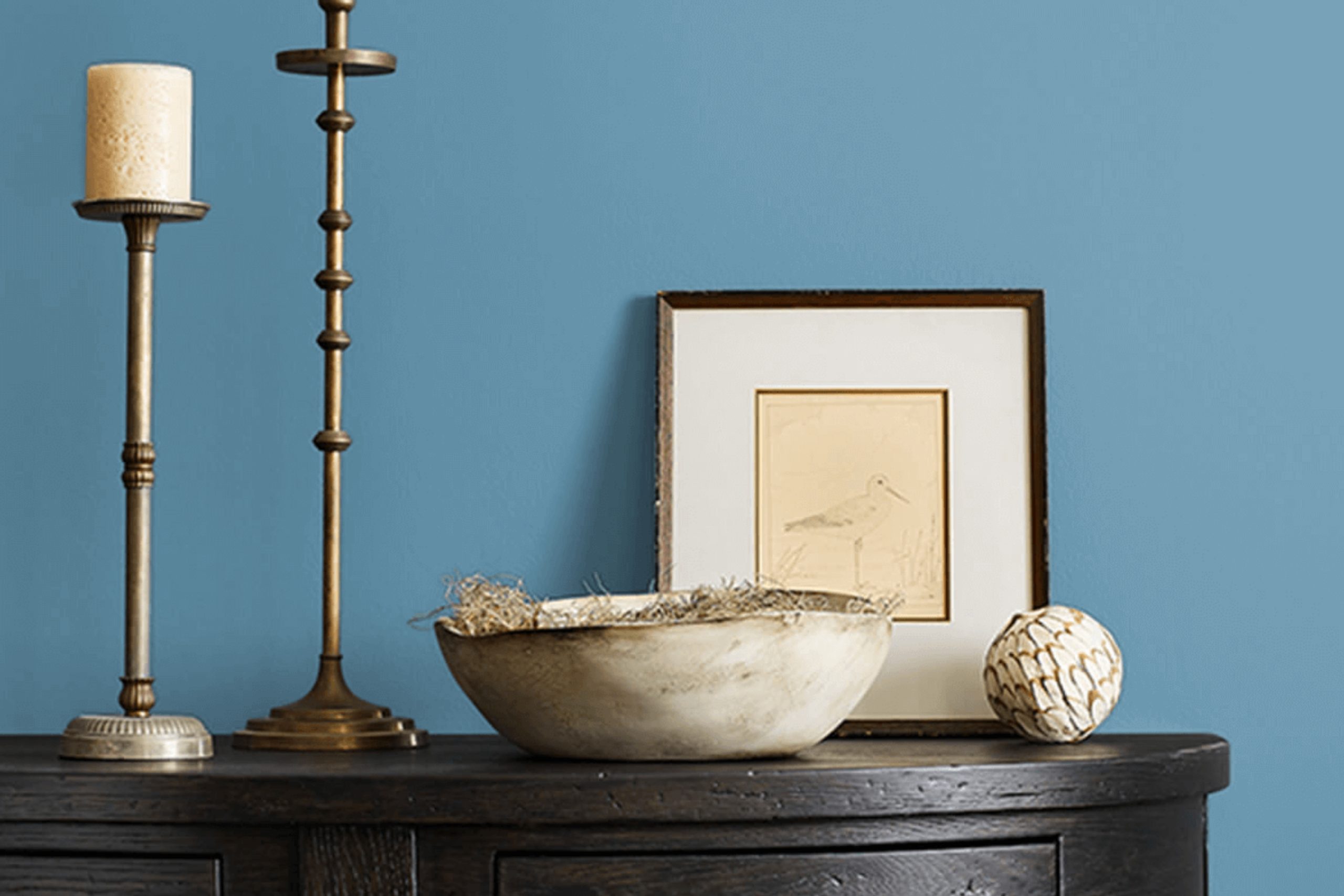
Choosing the right color can make a space feel inviting and comfortable, and SW 7606 Blue Cruise by Sherwin Williams is one of those choices that might just do the trick for you. This shade can turn your room into a soothing retreat, where every moment feels calm and peaceful.
Blue Cruise is great for setting a relaxed tone, and it works well in various settings. Whether you want to refresh your living room or bring a sense of calm to a bedroom, this color has a way of complementing different styles.
This soft, gentle blue is versatile enough to tie together various elements in a home, making everything feel more cohesive.
You might find that Blue Cruise pairs beautifully with natural wood finishes or neutral tones, adding depth without being too bold. It’s the kind of color that can make a space feel open and light, perfect for creating an atmosphere that’s both cozy and airy.
So, if you’re thinking about repainting a room or simply want to add a touch of serenity to your home, SW 7606 Blue Cruise could be the color you’re after.
It’s all about finding a shade that resonates with you and fits seamlessly into your life.
via sherwin-williams.com
What Color Is Blue Cruise SW 7606 by Sherwin Williams?
Table of Contents
Blue Cruise SW 7606 by Sherwin Williams is a soft, muted shade of blue-green with a calm and relaxing vibe. It’s perfect for creating a soothing atmosphere in any room. This versatile color fits well in coastal, modern, and transitional interior styles. Its subtle tone brings a touch of serenity, making it suitable for bedrooms, living rooms, and bathrooms alike.
Blue Cruise pairs nicely with natural materials and textures. Consider using it alongside light or whitewashed wood for a beachy feel, or pair it with dark wood for a more elegant look. Soft fabrics like cotton or linen in white or beige will enhance its calming effect.
Metallic accents in silver or brushed nickel can add a modern touch, while wicker or rattan pieces will align with a coastal theme.
For a balanced look, combine Blue Cruise with whites, creams, or greys. These colors can be used on trims, ceilings, or accent furnishings. This shade can also complement green plants, bringing freshness and life to a space.
Blue Cruise’s gentle hue works beautifully with simple, uncluttered decor, creating a peaceful and inviting environment that feels just right for a variety of home settings.
housekeepingbay.com
Is Blue Cruise SW 7606 by Sherwin Williams Warm or Cool color?
Blue Cruise SW 7606 by Sherwin Williams adds a gentle, calming vibe to a home. This medium blue shade brings a sense of peace and balance. Blue Cruise works well in various spaces, from living rooms to bedrooms, due to its relaxing effect.
It pairs nicely with neutral tones like whites and grays, which makes it versatile for different styles, whether modern or traditional. The color gives rooms an airy, open feel, making spaces seem larger.
When used on walls, Blue Cruise creates a cozy yet refreshing environment. It also complements natural light, enhancing brightness in the room. Furniture or decor in softer hues can balance the color, while bolder accents provide an interesting contrast. Overall, Blue Cruise is a dependable choice for those looking to introduce a serene, inviting atmosphere into their homes.
Its adaptability ensures it fits well in nearly any setting, providing a welcoming backdrop for everyday life.
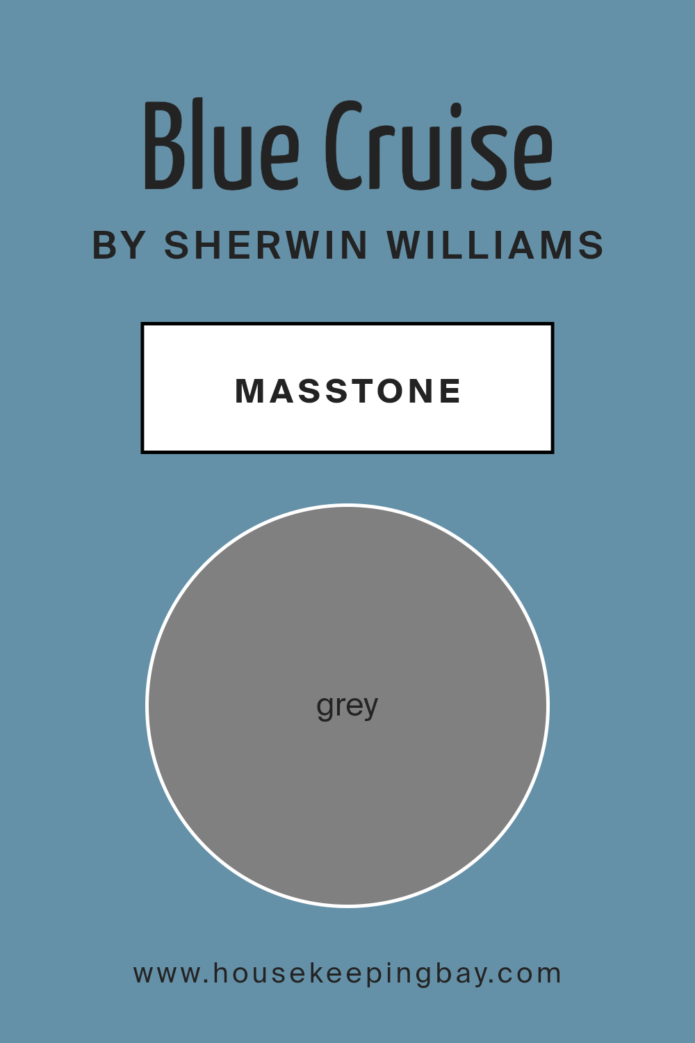
What is the Masstone of the Blue Cruise SW 7606 by Sherwin Williams?
Blue Cruise SW 7606 by Sherwin Williams is a calm and soothing color with a subtle grey undertone. This makes it a versatile choice for many spaces in your home. The grey in the masstone helps balance the blue, creating a look that feels serene and modern. When you use Blue Cruise on walls, it sets a relaxing atmosphere, perfect for bedrooms or living rooms where comfort is key.
The grey undertone makes the blue appear softer in different lighting conditions. In bright, natural light, it can look airy, while in dimmer lighting, it becomes cozier. This adaptability allows Blue Cruise to complement a wide range of other colors and decor styles, from light, neutral palettes to more vibrant hues.
Whether in a minimalist setting or a traditional space, Blue Cruise adds an element of calm sophistication. It pairs well with white trims or beige accents, enhancing the overall harmonized feel of a room.
housekeepingbay.com
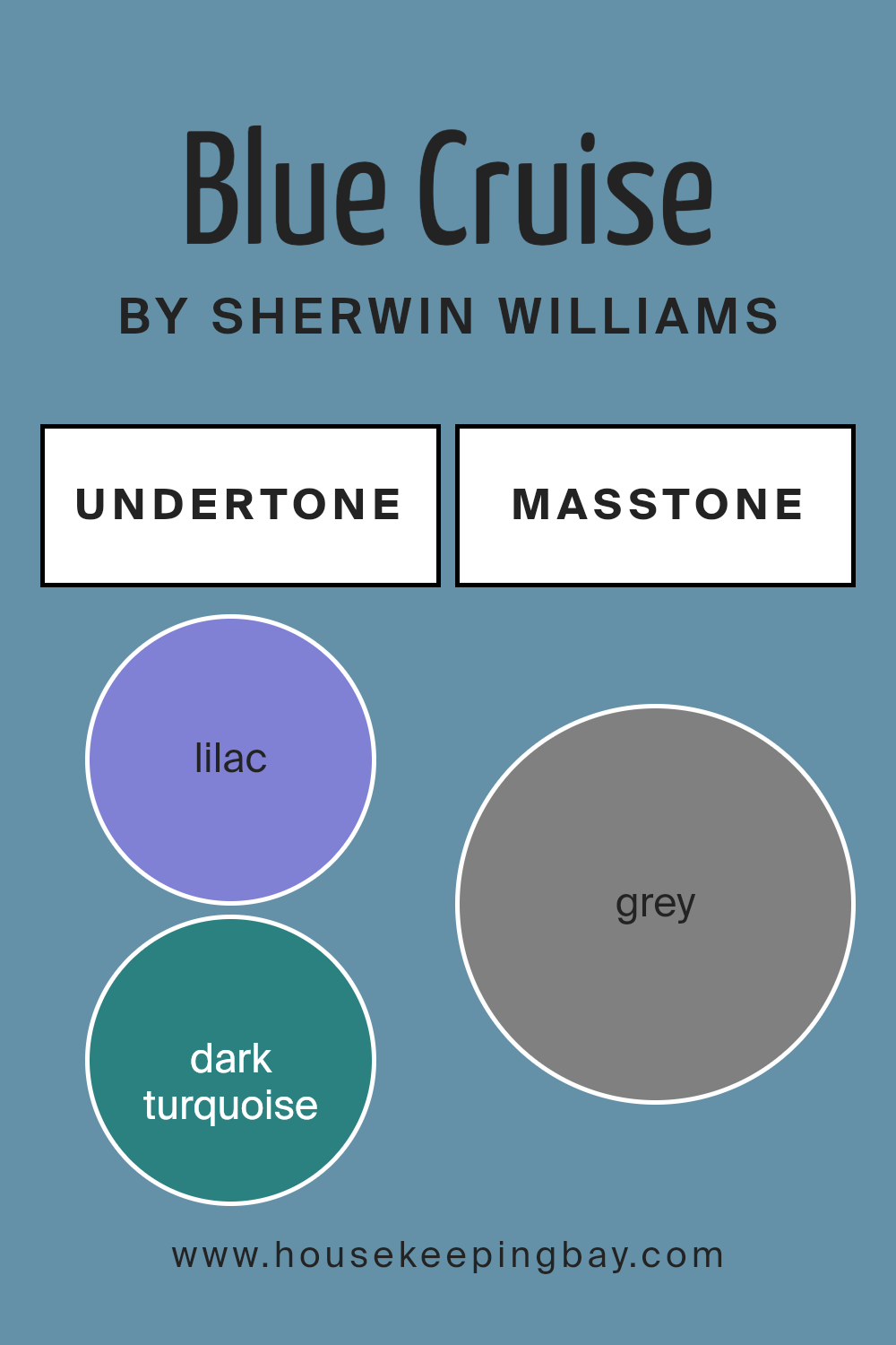
Undertones of Blue Cruise SW 7606 by Sherwin Williams
Blue Cruise SW 7606 by Sherwin Williams is an intriguing shade with various undertones that can affect how it looks on walls. Undertones refer to the subtle hints of different colors mixed into the main color. They play an important role in the way we perceive any hue. For Blue Cruise, these include shades like lilac, dark turquoise, navy, light green, and more.
When you use Blue Cruise on walls, these undertones can create different feelings depending on the lighting and room setting. Under natural light, its light blue and turquoise hints might shine through, giving off a fresh and lively vibe.
In darker rooms, undertones like navy or dark blue might come forward, creating a calm and quiet atmosphere. In warmer artificial light, lilac and pale pink could be more noticeable, adding a cozy and inviting feel.
These undertones also ensure that Blue Cruise can harmonize well with various décor styles. Pair it with whites or grays to highlight its serene side, or use bold accents like red or orange to show off its vibrant personality.
The magic of Blue Cruise lies in its ability to adapt, providing both gentle charm and bold energy depending on the environment.
housekeepingbay.com
Coordinating Colors of Blue Cruise SW 7606 by Sherwin Williams
Coordinating colors are hues that complement and enhance one another, creating a harmonious look in any space. When paired with a primary color like Blue Cruise SW 7606 by Sherwin Williams, they can bring balance and cohesion to a room’s design.
Blue Cruise is a calming, mid-tone blue that offers a sense of serenity and elegance. To create a cohesive color scheme, it can be paired with colors like SW 7006 – Extra White, SW 6119 – Antique White, and SW 6121 – Whole Wheat. These colors work together to provide a pleasing visual experience while allowing Blue Cruise to shine.
SW 7006 – Extra White is a crisp, clean white that pairs well with Blue Cruise by adding brightness and a modern touch to the space. It creates a fresh contrast that highlights the richness of the blue. SW 6119 – Antique White introduces a warm, creamy tone that softens the overall look.
It adds a subtle warmth that feels inviting and comfortable. The final coordinating color, SW 6121 – Whole Wheat, offers an earthy, golden hue that enhances the natural feel of Blue Cruise.
It adds depth and a bit of richness, making the overall color palette feel cohesive and well-grounded. Together, these colors create a balanced and appealing environment.
You can see recommended paint colors below:

housekeepingbay.com
How Does Lighting Affect Blue Cruise SW 7606 by Sherwin Williams?
Lighting can greatly affect how colors appear in a room. The color Blue Cruise SW 7606 by Sherwin Williams is no exception. This particular shade is a mid-tone blue with a slight gray undertone, which can look different depending on the type of light it is exposed to.
In artificial light, especially warm lights like incandescent bulbs, Blue Cruise may seem warmer and the gray undertones might become more noticeable. Under cooler artificial lights, such as fluorescent or LED lights, the blue tones of the paint could appear sharper and more vibrant.
Natural light changes throughout the day and affects color differently based on which direction a room faces. In north-facing rooms, which receive cooler and more shadowed light, Blue Cruise might appear more muted and grayer. The cool light can enhance the gray undertones, so the space may feel a bit colder, but still calm and balanced.
South-facing rooms enjoy abundant warm light throughout the day. Here, Blue Cruise can look brighter and more cheerful. The warmer sunlight enhances the blue, making it feel more vivid. This is an excellent choice for a lively, inviting atmosphere.
East-facing rooms receive gentle morning light, which can give Blue Cruise a soft, fresh appearance early in the day. As the day progresses and the natural light lessens, the color might become a bit dimmer, but it should still retain its serene character.
West-facing rooms get warmer light in the late afternoon. In these conditions, Blue Cruise may take on a rich, deeper tone as the day goes on. This light can add a cozy, relaxing feel to the room.
Overall, Blue Cruise is a versatile color that adapts well to various lighting conditions. To get the best results, consider testing this paint with large swatches on different walls and at different times of the day.
housekeepingbay.com
What is the LRV of Blue Cruise SW 7606 by Sherwin Williams?
LRV, or Light Reflectance Value, is a measure that indicates how much light a color reflects or absorbs. The scale runs from 0 to 100, where 0 means the color absorbs all light and is completely black, while 100 means the color reflects all light and is completely white.
In simple terms, the higher the LRV, the more light a color will bounce back into the room, making a space feel brighter and potentially more open. Conversely, a color with a lower LRV will absorb more light, making the room feel cozier but also darker.
This measure can greatly influence how a color looks once it’s applied to walls in different types of lighting.
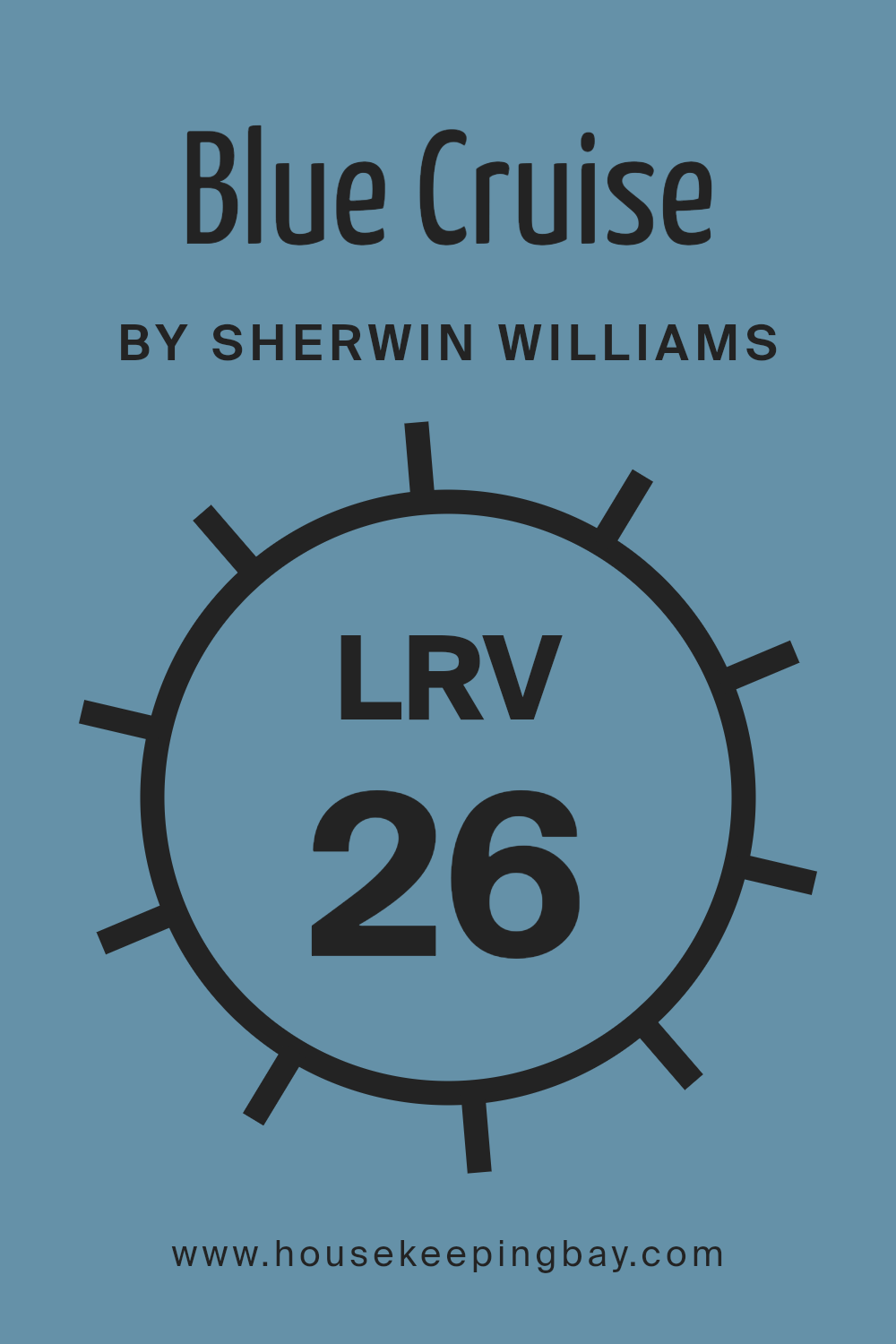
Blue Cruise SW 7606 by Sherwin Williams has an LRV of 25.8, meaning it’s on the lower side of the scale. This suggests that it will absorb more light than it reflects, leading to a richer and more intense color experience on the wall.
When applied, Blue Cruise will give a room a deeper, atmospheric feel, making it ideal for spaces where a more dramatic or intimate setting is desired. It’s important to consider the lighting in the room where you plan to use this color, as it can appear much darker in a room with fewer windows or less natural light.
Also, pairing it with lighter accents or trim can help balance its depth, ensuring the room doesn’t feel too closed-in.
housekeepingbay.com
What are the Trim colors of Blue Cruise SW 7606 by Sherwin Williams?
Trim colors are essentially the shades used to paint the woodwork or borders around walls, windows, and doors, complementing the main wall color. They play an important role in giving a room a complete and polished look.
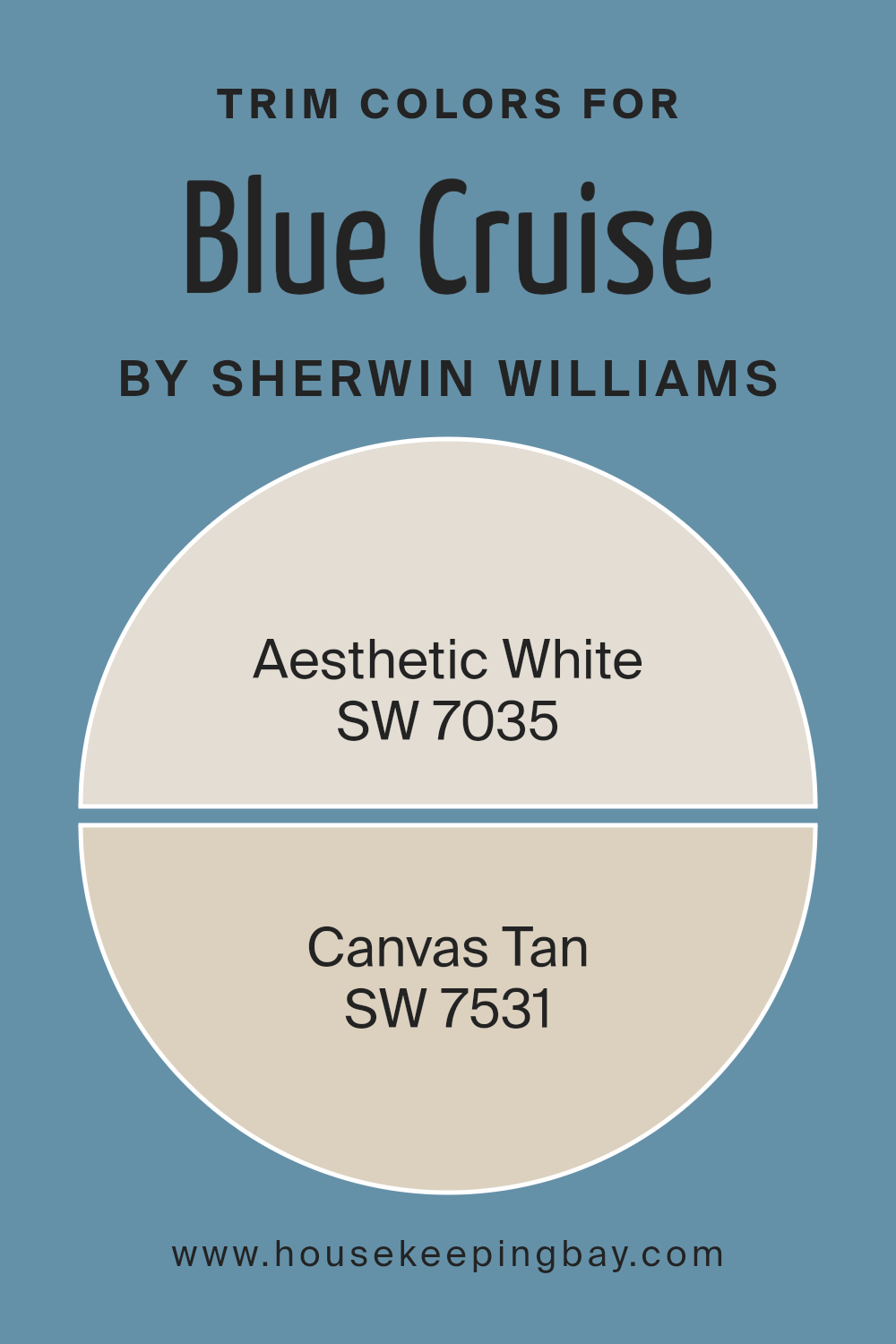
For Blue Cruise SW 7606 by Sherwin-Williams, choosing the right trim color is vital. Blue Cruise is a sophisticated and calming blue with just the right amount of gray undertone. To enhance Blue Cruise, using SW 7035 – Aesthetic White or SW 7531 – Canvas Tan as trim colors can add depth and interest.
These colors can highlight the architectural details of a space while creating contrast or harmony with the wall color.
SW 7035 – Aesthetic White is a soft white with warm undertones that can add a subtle brightness to trims without too much starkness.
It complements Blue Cruise by keeping the overall ambiance gentle and inviting.
Meanwhile, SW 7531 – Canvas Tan is a warm, neutral tan that brings a natural, grounded feel. It can enhance the rich, cool tones of Blue Cruise, making the room feel cozy and cohesive.
Both of these trim colors work well to enrich the overall aesthetic while ensuring the walls’ blue remains the centerpiece.
You can see recommended paint colors below:
housekeepingbay.com
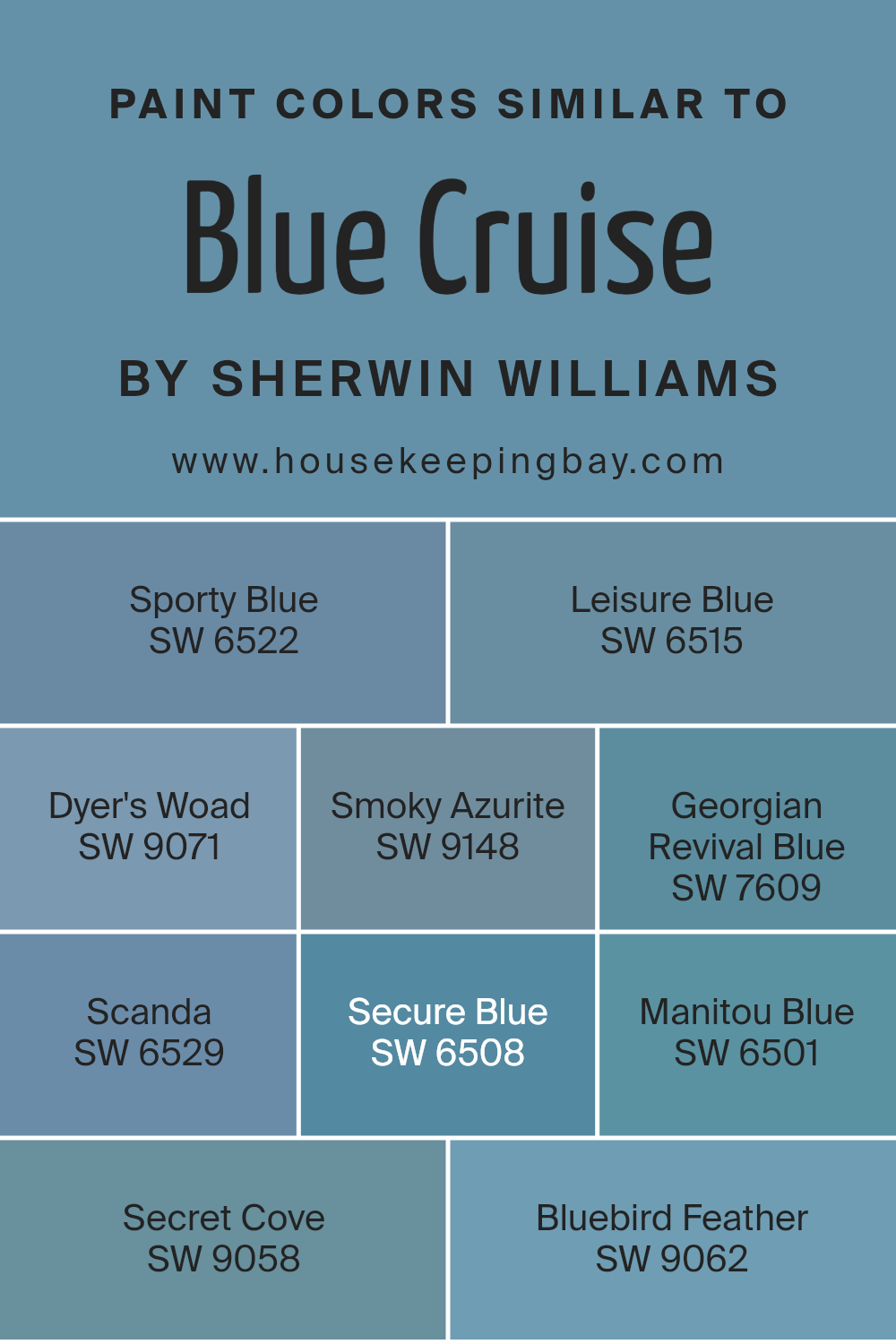
Colors Similar to Blue Cruise SW 7606 by Sherwin Williams
Using similar colors creates harmony and balance in your surroundings. The blues, such as Sherwin Williams’ Blue Cruise and its similar shades, bring a sense of calm and relaxation to a space. Each shade complements Blue Cruise subtly, enhancing the overall ambiance.
Sporty Blue reflects the refreshing feel of a clear sky, adding brightness. Leisure Blue has a soft undertone, inviting a calm and peaceful atmosphere. Dyer’s Woad, with its soft gray-blue hue, evokes a sophisticated, more grounded feel.
Smoky Azurite, a muted tone, lends a touch of mystery and depth. Georgian Revival Blue offers a deeper, more historic blue, perfect for a timeless touch.
Scanda, with its slightly cool tone, feels crisp and invigorating, almost like a fresh breeze. Secure Blue provides a sense of stability and trust, an ideal background color.
Manitou Blue, rich yet subtle, enhances the warmth of any room. Secret Cove invites a serene seaside vibe, with its dark yet soothing quality.
Finally, Bluebird Feather suggests a hint of nature, making a room feel lively yet serene. These similar colors transform spaces by working together effortlessly, creating a unified look that is both beautiful and comforting. By using them, spaces can achieve coherence and become a peaceful retreat.
You can see recommended paint colors below:
- SW 6522 Sporty Blue
- SW 6515 Leisure Blue
- SW 9071 Dyer’s Woad
- SW 9148 Smoky Azurite
- SW 7609 Georgian Revival Blue
- SW 6529 Scanda
- SW 6508 Secure Blue
- SW 6501 Manitou Blue
- SW 9058 Secret Cove
- SW 9062 Bluebird Feather
housekeepingbay.com
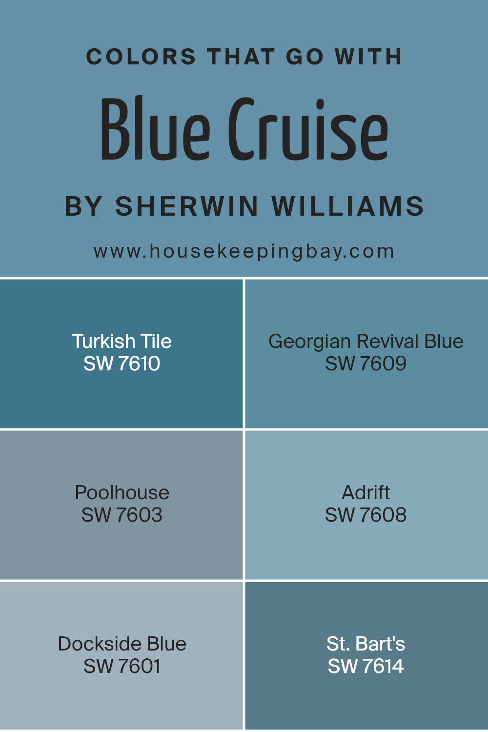
Colors that Go With Blue Cruise SW 7606 by Sherwin Williams
Choosing the right colors to go with Blue Cruise SW 7606 by Sherwin Williams can enhance the look and feeling of a space. These companion colors create harmony and bring out the best in each shade. SW 7610 Turkish Tile, a rich, deep blue, can add depth and interest when paired with the softer tones of Blue Cruise.
In contrast, SW 7609 Georgian Revival Blue offers a more muted, historical hue that adds a sense of sophistication and complements Blue Cruise’s clean lines very well. When these colors are used together, they create a sense of balance and unity.
Moving to lighter tones, SW 7603 Poolhouse is a soft, delicate blue that brightens the palette and adds a refreshing touch. SW 7608 Adrift, a slightly grayed blue, offers calmness that pairs effortlessly with the brightness of Blue Cruise, creating a soothing environment.
SW 7601 Dockside Blue, with its airy and inviting look, complements Blue Cruise by adding a breezy feel.
Lastly, SW 7614 St. Bart’s brings in an exotic and vibrant vibe with its bold, ocean-inspired blue. Together, these shades work beautifully to create a cohesive look that feels unified and pleasing to the eye.
You can see recommended paint colors below:
- SW 7610 Turkish Tile
- SW 7609 Georgian Revival Blue
- SW 7603 Poolhouse
- SW 7608 Adrift
- SW 7601 Dockside Blue
- SW 7614 St. Bart’s
housekeepingbay.com
How to Use Blue Cruise SW 7606 by Sherwin Williams In Your Home?
Blue Cruise SW 7606 by Sherwin Williams is a calm, sophisticated blue shade that can enhance any home. Its gentle and soothing tone works well in various spaces, making it versatile for different rooms. In a living room, Blue Cruise can create a peaceful atmosphere, perfect for unwinding or spending time with family.
Pair it with light gray or white furniture for a clean, modern look. In a bedroom, this color offers a serene environment for rest.
Complement it with soft, neutral bedding or add vibrant cushions for a pop of color. It also suits a bathroom, providing a fresh feel, especially when teamed with white tiles and fixtures.
For those looking to update a home office, Blue Cruise can improve focus and provide a calming backdrop for work. Whether used on an accent wall or throughout an entire room, it brings a touch of elegance to any space.
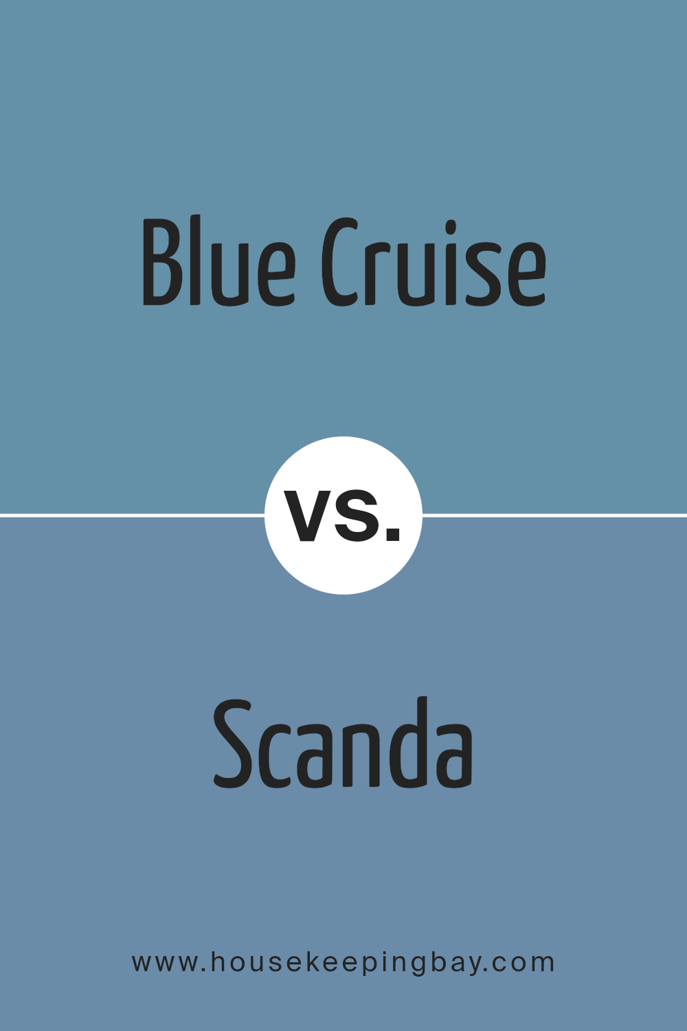
Blue Cruise SW 7606 by Sherwin Williams vs Scanda SW 6529 by Sherwin Williams
Blue Cruise SW 7606 by Sherwin Williams presents a rich, muted blue with soothing undertones, making it versatile for creating a calm space. It brings a sense of sophistication and calmness, ideal for rooms meant for relaxation or focus. Its subtlety allows it to pair well with both lighter and darker accents.
Scanda SW 6529, meanwhile, offers a brighter, more vibrant blue with hints of green. This color adds energy and life to any room, making it perfect for creating an uplifting, cheerful atmosphere. Scanda stands out more than Blue Cruise, providing a more modern and playful vibe.
Both colors reflect cool tones, yet differ notably in mood. Blue Cruise leans towards a more settled, elegant feel, while Scanda energizes with its lively brightness. Choosing between them depends on whether you prefer a more tranquil and refined setting or a vibrant, energetic environment.
You can see recommended paint color below:
- SW 6529 Scanda
housekeepingbay.com
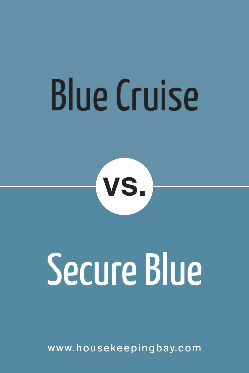
Blue Cruise SW 7606 by Sherwin Williams vs Secure Blue SW 6508 by Sherwin Williams
Blue Cruise SW 7606 by Sherwin Williams is a soft, muted blue with a hint of gray, giving it a calm and sophisticated feel. It’s versatile, working well in both traditional and modern spaces. This color creates a relaxed atmosphere without being overpowering, making it ideal for living rooms and bedrooms.
Secure Blue SW 6508 is a deeper, more saturated blue. It carries a rich and bold tone, channeling a sense of stability and strength. This makes it suitable for accent walls or areas where you want to draw attention but maintain a comforting presence.
While Blue Cruise offers subtlety through its gentle gray undertones, Secure Blue provides a stronger statement with its vibrant hue. Both colors bring a soothing effect typical of blues but do so with different levels of intensity and mood, allowing for varied applications depending on the ambiance you’d like to create in your space.
You can see recommended paint color below:
- SW 6508 Secure Blue
housekeepingbay.com
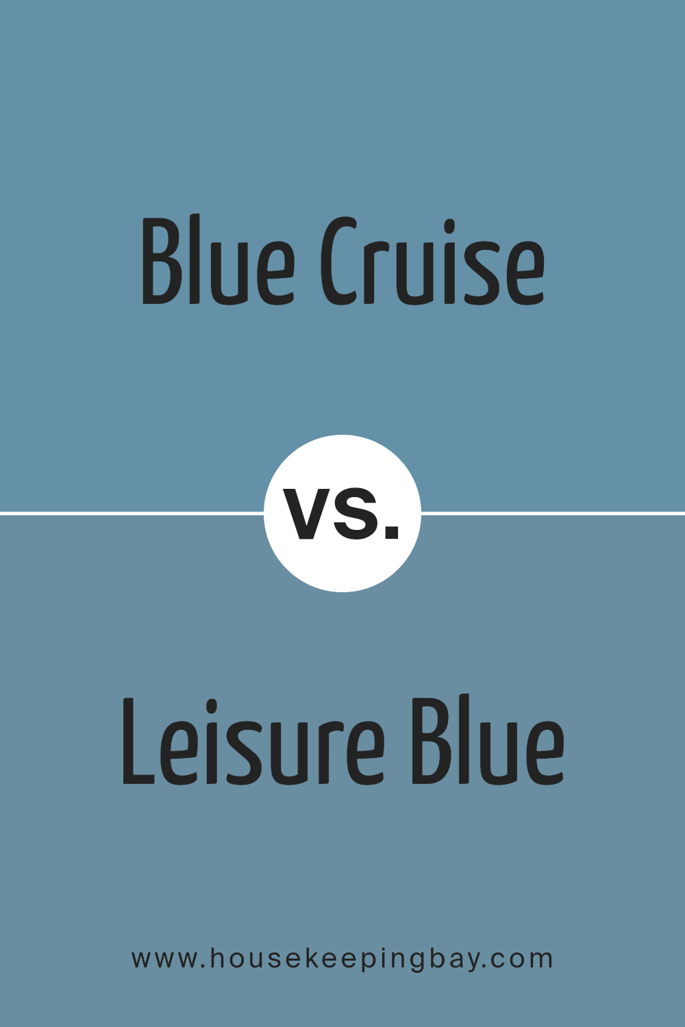
Blue Cruise SW 7606 by Sherwin Williams vs Leisure Blue SW 6515 by Sherwin Williams
Blue Cruise SW 7606 and Leisure Blue SW 6515 by Sherwin Williams are both shades of blue, yet they offer distinct vibes. Blue Cruise SW 7606 delivers a soft, muted tone. It’s versatile and calming, perfect for creating a serene atmosphere in bedrooms or living spaces. Its balanced hue works well with neutral decor, adding a gentle splash of color without overwhelming the room.
Leisure Blue SW 6515, on the other hand, is richer and more vibrant. It has a slightly bolder presence, making it ideal for spaces where you want to make a statement. This shade can energize a room and blend beautifully with coastal themes, pairing well with whites and sandy tones.
While Blue Cruise offers subtlety, Leisure Blue brings in a lively touch. Both colors can enhance a home, but the choice between them depends on whether you prefer a soft ambiance or a touch of vibrancy.
You can see recommended paint color below:
- SW 6515 Leisure Blue
housekeepingbay.com
Blue Cruise SW 7606 by Sherwin Williams vs Georgian Revival Blue SW 7609 by Sherwin Williams
Blue Cruise SW 7606 by Sherwin Williams offers a calm and serene presence, presenting a light blue hue that feels refreshing. This shade creates an airy atmosphere, suitable for spaces needing a gentle lift without overwhelming the senses. It’s like a cool breeze on a quiet day, bringing peaceful vibes to a room.
Georgian Revival Blue SW 7609, however, brings a deeper and more formal tone to the table. This darker blue carries a hint of gray, offering a touch of sophistication and elegance. It feels more grounded and stable, making it ideal for spaces where a classic, timeless feel is desired.
While Blue Cruise lends itself to relaxation and openness, Georgian Revival Blue speaks to tradition and richness. Both colors enhance environments in their unique ways, with Blue Cruise leaning towards a fresh, airy vibe, and Georgian Revival Blue contributing a more dignified and cozy feel.
You can see recommended paint color below:
- SW 7609 Georgian Revival Blue
housekeepingbay.com
Blue Cruise SW 7606 by Sherwin Williams vs Manitou Blue SW 6501 by Sherwin Williams
Blue Cruise SW 7606 by Sherwin Williams offers a soft, calming shade of blue, reminiscent of gentle ocean waves. It provides a soothing backdrop suitable for any space, creating a relaxed atmosphere. Its muted tone makes it versatile, pairing well with both light and dark accents.
Manitou Blue SW 6501, in contrast, presents a bolder, slightly deeper blue. It carries a vibrant energy and adds a splash of color to a room. Its richer hue makes a strong statement, bringing an uplifting touch to any setting.
While Blue Cruise feels lighter and more understated, perfect for creating a serene and peaceful environment, Manitou Blue injects more energy and personality. Both colors can work well in various design schemes, but Blue Cruise is more subdued, ideal for those seeking calmness. Manitou Blue, however, suits those wanting to add liveliness and dynamic character to their spaces.
You can see recommended paint color below:
- SW 6501 Manitou Blue
housekeepingbay.com
Blue Cruise SW 7606 by Sherwin Williams vs Dyer’s Woad SW 9071 by Sherwin Williams
Blue Cruise SW 7606 and Dyer’s Woad SW 9071 by Sherwin Williams offer distinct shades of blue, each bringing its own character to a space. Blue Cruise is a calming, muted blue with a hint of gray, making it versatile and suitable for creating a relaxed atmosphere. It pairs well with neutral tones and adds a subtle elegance to any room without overwhelming it.
Dyer’s Woad, however, is a deeper, more vibrant blue. It offers a richer, bolder appearance that can make a striking statement. This color adds energy and depth, ideal for spaces where you want a bit more drama or a pop of color.
Both colors can be used to achieve different styles. Blue Cruise works well for a soothing ambiance, while Dyer’s Woad can inject more personality into a space. Whether you prefer a softer or more vivid blue, these shades offer options to suit various tastes and interior designs.
You can see recommended paint color below:
- SW 9071 Dyer’s Woad

housekeepingbay.com
Blue Cruise SW 7606 by Sherwin Williams vs Smoky Azurite SW 9148 by Sherwin Williams
Blue Cruise SW 7606 and Smoky Azurite SW 9148, both from Sherwin Williams, have unique characteristics. Blue Cruise offers a cheerful and vibrant vibe with its bright blue tone. It feels lively and energetic, perfect for spaces needing a pop of color. Ideal for kitchens or playrooms, it brings brightness and enthusiasm.
Smoky Azurite, however, carries a deeper, more muted blue shade. It exudes a calm and sophisticated aura, making it suitable for living rooms or bedrooms where a serene atmosphere is desired. With its cozy feel, it complements wooden furniture and neutral accessories beautifully.
Choosing between them depends on the desired mood for a space — vibrant and lively or calm and cozy. Both colors provide versatility and charm, but their impact varies, enhancing different areas based on what each color inherently offers.
You can see recommended paint color below:
housekeepingbay.com
Blue Cruise SW 7606 by Sherwin Williams vs Sporty Blue SW 6522 by Sherwin Williams
Blue Cruise SW 7606 by Sherwin Williams is a calming, gentle shade with a subtle gray undertone. It is versatile and offers a soothing, neutral backdrop that pairs well with various styles and other colors. This blue has a sophisticated, muted quality, making it suitable for living rooms, bedrooms, or any space where a peaceful atmosphere is desired.
Sporty Blue SW 6522 is a more energetic, vibrant blue that stands out with its clear, bright tone. It radiates a lively and cheerful vibe, perfect for playrooms, children’s bedrooms, or any area where an uplifting mood is desired.
This blue retains a playful character and brings a sense of freshness and energy to a room.
While Blue Cruise offers a serene and elegant look, Sporty Blue brings a splash of vibrant personality, making these two blues distinctly unique in their charm and applications.
You can see recommended paint color below:
- SW 6522 Sporty Blue
housekeepingbay.com
Blue Cruise SW 7606 by Sherwin Williams vs Bluebird Feather SW 9062 by Sherwin Williams
Blue Cruise SW 7606 by Sherwin Williams is a shade of blue that carries a sense of calmness and depth. It reflects a muted tone, making it versatile for many spaces. Blue Cruise adds a cozy, laid-back feel to rooms, suitable for relaxation or creating a peaceful atmosphere. It’s a solid choice for areas where a soothing touch is desired.
In contrast, Bluebird Feather SW 9062 offers a lighter, more vibrant take on blue. This color feels airy and uplifting, perfect for spaces where energy and brightness are needed. The liveliness of Bluebird Feather can bring a fresh, invigorating vibe, ideal for rooms meant to feel welcoming and open.
Both colors bring the essence of blue into a space but do so in unique ways. Blue Cruise leans towards tranquility and warmth, while Bluebird Feather delivers a spirited, airy presence. Choosing between them depends on whether you want a calming or energizing ambiance.
You can see recommended paint color below:
- SW 9062 Bluebird Feather
housekeepingbay.com
Blue Cruise SW 7606 by Sherwin Williams vs Secret Cove SW 9058 by Sherwin Williams
Blue Cruise SW 7606 and Secret Cove SW 9058, both from Sherwin Williams, each create unique atmospheres for spaces. Blue Cruise offers a calming light blue tone, often evoking feelings of peace and relaxation. It’s versatile, blending well in living rooms or bedrooms, and complements both contemporary and classic decor styles. Its lightness can make spaces appear larger and more open.
Secret Cove, SW 9058, has a deeper blue-green hue. This color adds more intensity and drama to a space, making it suitable for feature walls or accent areas. It brings a cozy, more intimate feel, perfect for libraries or study rooms.
The rich tone of Secret Cove contrasts nicely with lighter colors, creating a bold visual effect.
Both colors are beautiful choices, but while Blue Cruise brings a soft, airy feel, Secret Cove provides a richer, more enveloping ambiance, allowing you to tailor the mood of a room to your personal taste.
You can see recommended paint color below:
housekeepingbay.com
After exploring the rich qualities of SW 7606 Blue Cruise by Sherwin Williams, I’ve found it to be a versatile color choice for any space. This particular shade of blue exudes a sense of calm and relaxation, making it ideal for areas where a peaceful atmosphere is desired.
Whether used in a bedroom to create a restful oasis or in a living area to provide a touch of serenity, Blue Cruise manages to strike a balance between vibrancy and subtlety.
The color’s ability to work well with various styles and accents gives it a universal appeal. I find that it pairs beautifully with whites and creams for a classic look, yet can also complement bold colors and rich textures for a more contemporary feel.
The gentle intensity of this blue shade can enhance architectural features or serve as a neutral backdrop, depending on how it is applied within the space.
In my experience, Blue Cruise remains consistently appealing and grounds the design without overpowering other elements. By choosing this shade, I achieve a harmonious environment that can uplift any mood and tie together different aspects of a room.
Overall, I appreciate how this color not only enhances aesthetic appeal but also contributes to the ambiance of a home.
housekeepingbay.com
Ever wished paint sampling was as easy as sticking a sticker? Guess what? Now it is! Discover Samplize's unique Peel & Stick samples. Get started now and say goodbye to the old messy way!
Get paint samples


