Awesome Violet SW 6815 by Sherwin Williams
A Fresh Splash of Vibrant Purple
Choosing the perfect color for your space is an important decision, and when it comes to finding a hue that truly stands out, SW 6815 Awesome Violet by Sherwin Williams might be just what you’re looking for. This shade carries a unique blend of depth and vibrancy, offering a fresh approach to adding color to your surroundings.
When I see Awesome Violet, it feels like a blend of creativity and calmness. It has a rich, confident tone that can make any room feel lively yet balanced.
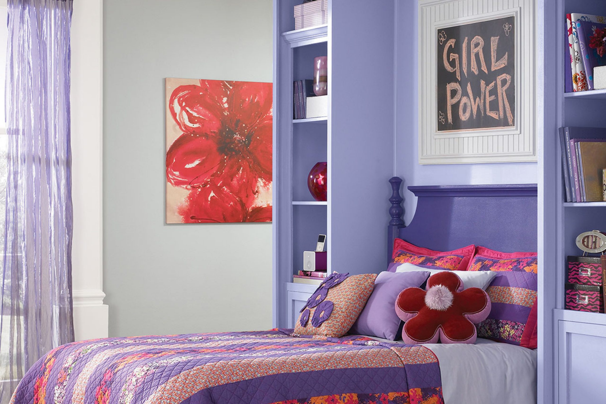
Think about using it in a space where you want to spark inspiration, like an art studio or a reading nook. Its vivid purple tone not only energizes a room but also comforts it with warmth.
Incorporating Awesome Violet into your home can be as simple as painting an accent wall or as bold as coloring an entire room. Pair it with neutral tones or contrasting colors to highlight its richness.
Whether it’s a bedroom, office, or even a cozy corner, you’ll find that Awesome Violet brings a unique charm and personality that’s hard to ignore.
With SW 6815, you have the chance to create a space that reflects enthusiasm and creativity.
It’s a choice that goes beyond ordinary, offering something truly special for your home.
via sherwin-williams.com
What Color Is Awesome Violet SW 6815 by Sherwin Williams?
Table of Contents
Awesome Violet SW 6815 by Sherwin Williams is a bold, vibrant shade of purple. It’s a color that commands attention and brings energy into a space. With its rich, deep undertones, this violet hue creates a lively atmosphere. It’s perfect for those who want to make a statement in their home.
In terms of style, Awesome Violet works well in modern and contemporary spaces. It complements sleek lines and minimalist decor, adding a pop of color without overwhelming the room. Ideal for an accent wall or statement furniture piece, it also fits eclectic spaces where bold choices reign.
Pair Awesome Violet with materials like glass and steel to highlight its modern edge. It looks great against white or light gray walls, adding contrast and depth. Soft textures like velvet or suede bring out its luxurious side, making it perfect for plush sofas or cushions. Natural wood tones, such as walnut or light oak, can warm the space and balance the coolness of the violet.
For those wanting to create a unique space that reflects personal style, Awesome Violet SW 6815 offers vibrancy and drama, making any room it graces more dynamic and inviting.
housekeepingbay.com
Is Awesome Violet SW 6815 by Sherwin Williams Warm or Cool color?
Awesome Violet SW 6815 by Sherwin Williams brings a calming presence to any room. This soft purple shade creates an atmosphere of relaxation and peace, making it ideal for bedrooms or quiet spaces like reading nooks or home offices. Its gentle hue can make a smaller room appear more open, as it reflects light without overpowering the space.
In living rooms or common areas, Awesome Violet can serve as a versatile backdrop. It pairs well with neutral furnishings, providing a subtle pop of color that enhances the overall decor without clashing.
When used with vibrant accents or metallic finishes, it adds a touch of elegance and sophistication.
This color also works well in children’s rooms, offering a playful yet soothing environment.
Easy to coordinate with both pastels and bold colors, Awesome Violet adapts effortlessly to various styles, from modern to traditional, making it a favorite for those who appreciate subtle elegance.
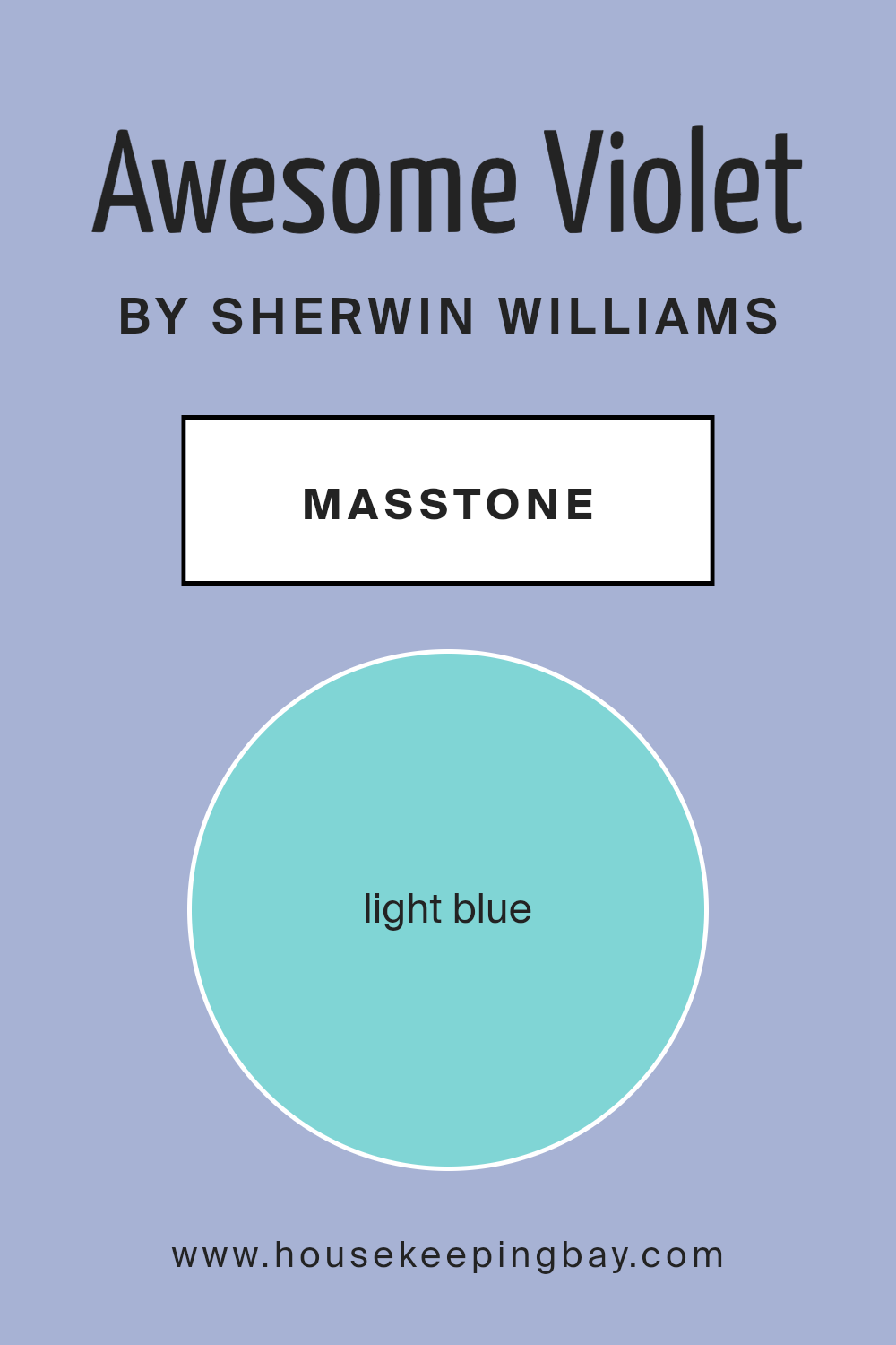
What is the Masstone of the Awesome Violet SW 6815 by Sherwin Williams?
Awesome Violet SW 6815 by Sherwin Williams is a soft, light blue color (#80D5D5). This gentle shade can bring a refreshing feel to any space in your home. Its color feels airy and calming, making it ideal for creating a peaceful atmosphere in bedrooms or living rooms. The light blue hue reflects natural light, helping to make rooms appear larger and brighter.
In small spaces, this color can add a sense of openness, making it great for bathrooms or cozy nooks. Its cool undertone pairs well with neutral colors like grays, creams, and whites, adding a subtle and harmonious contrast.
Pairing Awesome Violet with delicate pastels or muted shades can result in a soft, serene palette, while combining it with bolder colors like navy or rich greens can add depth. This versatile shade offers a timeless appeal and can adapt to various styles, from modern to classic, enhancing the overall mood of your home.
housekeepingbay.com
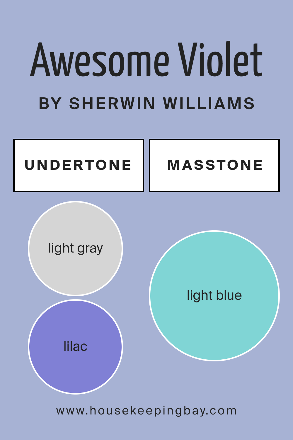
Undertones of Awesome Violet SW 6815 by Sherwin Williams
Awesome Violet SW 6815 by Sherwin-Williams is a unique color with a blend of rich undertones. These undertones include light gray, lilac, light purple, mint, pale yellow, grey, pale pink, turquoise, blue, light turquoise, and dark turquoise. Each plays a role in how we perceive this color on interior walls.
Undertones are subtle colors mixed into the main color and can affect its appearance. They can make a color warm or cool, light or dark, depending on the lighting and surrounding decor.
In Awesome Violet, the light gray and grey undertones give it a calming effect, making it versatile for various room settings. The lilac and light purple infuse a gentle and welcoming feel, while pale yellow and pale pink add warmth and softness. Turquoise and blue bring a modern and fresh touch, offering a sense of balance and vitality. The mint and light turquoise undertones add an unexpected hint of freshness, making the color lively without being overwhelming.
On interior walls, Awesome Violet evokes a sense of calmness but with an engaging twist, making spaces inviting yet sophisticated. Whether in a bedroom or living room, this color adapts well, creating different moods based on the light and surrounding elements.
housekeepingbay.com
Coordinating Colors of Awesome Violet SW 6815 by Sherwin Williams
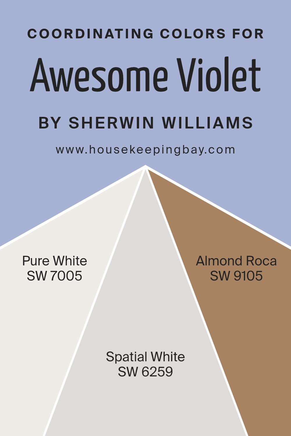
Coordinating colors are hues that work well together to create a balanced and visually pleasing color scheme. They complement a primary color, enhancing its effect and bringing harmony to a space. For Awesome Violet SW 6815 by Sherwin Williams, coordinating colors like SW 7005 – Pure White, SW 6259 – Spatial White, and SW 9105 – Almond Roca work beautifully. These colors were chosen to align with the vibrant and rich nature of Awesome Violet.
SW 7005 – Pure White is a crisp, clean white that serves as a perfect backdrop to allow Awesome Violet’s vivid character to shine. It provides a sense of clarity and openness in a room, keeping the overall look fresh.
SW 6259 – Spatial White is a soft, pale gray that gently echoes the hue of Awesome Violet, adding depth and interest without overwhelming the senses.
It is versatile enough to adapt to various styles while ensuring a cohesive look. SW 9105 – Almond Roca is a warm, earthy tone that adds a cozy and grounded feel. Its subtle nature offers a soothing contrast to Awesome Violet’s boldness, creating a balanced and inviting space.
Together, these colors form a harmonious palette that enhances the beauty of Awesome Violet and creates a welcoming environment.
You can see recommended paint colors below:
- SW 7005 Pure White
- SW 6259 Spatial White
- SW 9105 Almond Roca
housekeepingbay.com
How Does Lighting Affect Awesome Violet SW 6815 by Sherwin Williams?
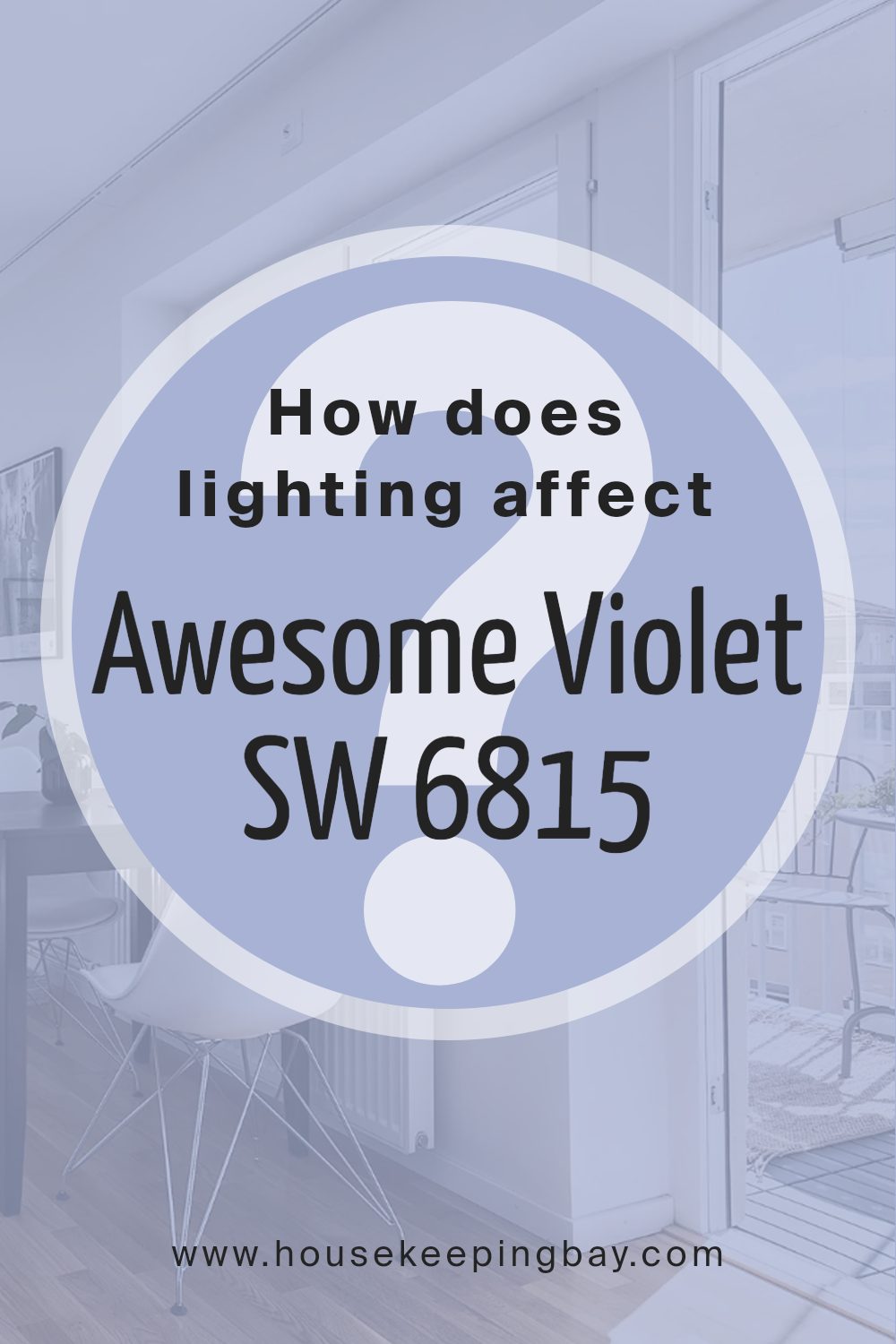
Lighting plays a crucial role in how colors appear in a space. The way a color is perceived can change dramatically depending on the type and amount of light present. Let’s take the color Awesome Violet SW 6815 by Sherwin Williams as an example. This is a rich, deep violet hue that can look different under various lighting conditions.
In natural light, Awesome Violet may present a more accurate representation of its true hue. However, the direction and quality of the light affect how it appears.
In a north-facing room, natural light tends to be cooler and softer, which might make Awesome Violet appear slightly more muted or bluish. North-facing rooms receive indirect light, often enhancing cooler tones in colors.
In south-facing rooms, the light is usually warm and direct. This warmth can make Awesome Violet look more vibrant and intense. The ample natural light in the afternoon may enhance the richness of the violet, providing a cozy and inviting feel.
East-facing rooms receive warm light in the morning and cooler, indirect light later in the day. In the morning, Awesome Violet might glow with a slightly warmer tone, while later it could shift to a cooler, subdued shade.
In west-facing rooms, the lighting is the opposite of east-facing ones. Here, light is cooler in the morning and warmer in the late afternoon and evening. This means that Awesome Violet might look a bit subdued and grayish in the morning but can become richer and more vivid as the day progresses.
Under artificial lighting, the effects depend on the type of bulbs used. Incandescent lighting, known for its warm tone, can make Awesome Violet appear warmer and cozier. Fluorescent lights, which often emit a cooler glow, can make the color look a bit more bluish and muted. LED lights, which come in various color temperatures, can either enhance or soften the color based on their specific warmth or coolness.
housekeepingbay.com
What is the LRV of Awesome Violet SW 6815 by Sherwin Williams?
LRV, or Light Reflectance Value, is a measure of how much light a paint color reflects. It ranges from 0 to 100, where 0 means the color absorbs all light (like black) and 100 means it reflects all light (like white). It’s a useful number to consider when choosing paint because it helps you understand how bright or dark a color might appear in a room.
Colors with lower LRV absorb more light, making them appear darker, while those with higher LRV reflect more light, making them seem brighter. So, looking at LRV when selecting a paint color can help you predict how it will make a room feel, whether brighter and more open, or more intimate and cozy.
For Awesome Violet SW 6815 by Sherwin Williams, with its LRV of 44.976, it falls into the mid-range of the scale.
This means it reflects a moderate amount of light, which helps it balance between not too dark and not too bright.
When used on walls, Awesome Violet will create a cozy and inviting feel without making the space seem too dark.
Because of its LRV, it can work well in rooms with moderate natural light. It won’t overpower the space nor will it disappear; it strikes a nice balance, offering a subtle but noticeable splash of color that can add warmth and personality to a room.

housekeepingbay.com
What are the Trim colors of Awesome Violet SW 6815 by Sherwin Williams?
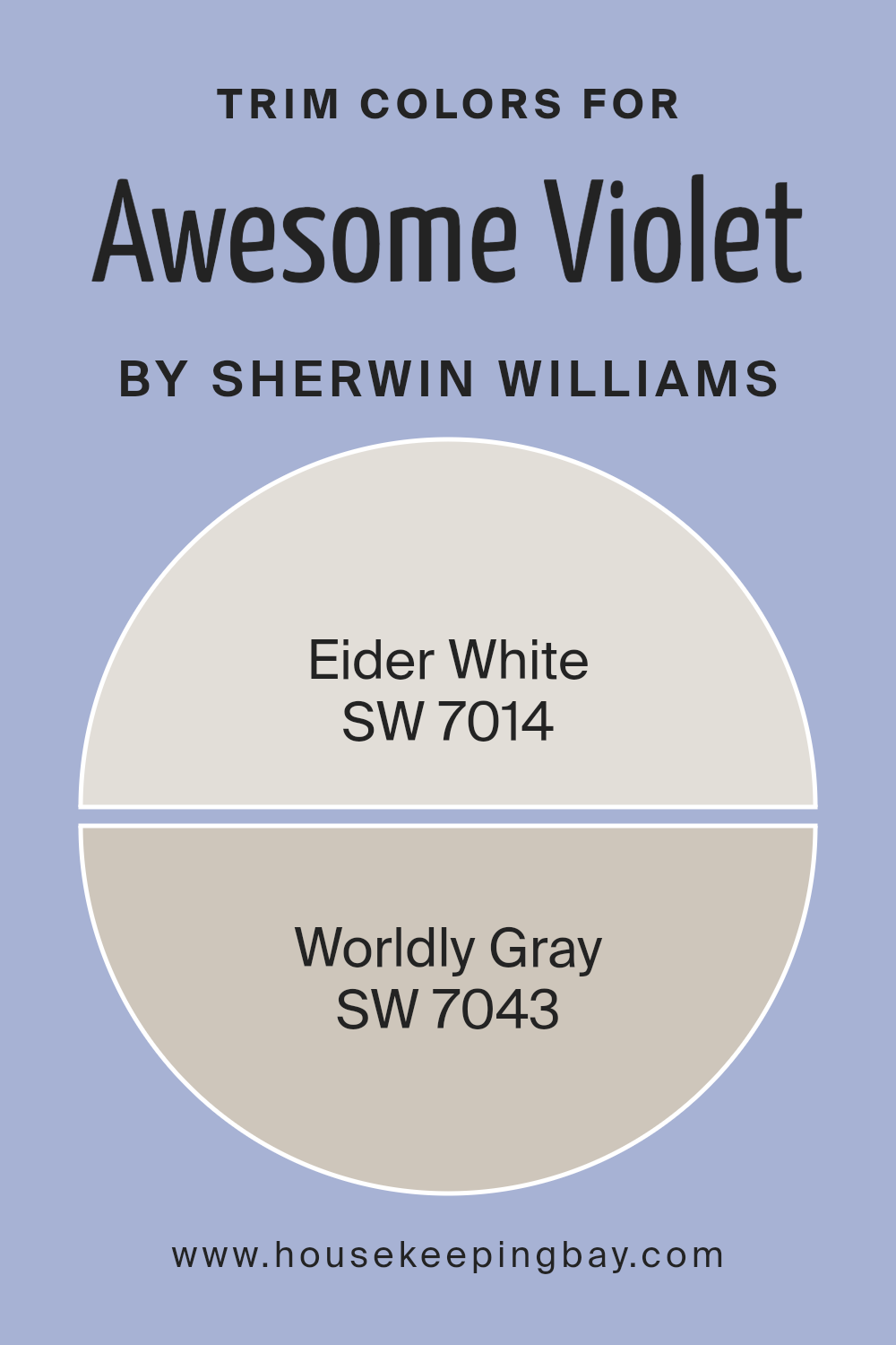
Trim colors are the shades used to highlight architectural details in a room, such as baseboards, window frames, and moldings. They serve an important role by creating a visual boundary and offering a polished look to the overall design. In the case of Awesome Violet SW 6815 by Sherwin-Williams, choosing the right trim colors can enhance and balance its vibrant purple tone.
Using colors like SW 7014 – Eider White and SW 7043 – Worldly Gray for trims can create a subtle contrast and bring out the richness of Awesome Violet. A well-chosen trim color helps in defining spaces and adding depth to your color scheme.
Eider White is a soft, off-white color with a hint of gray that offers a fresh and clean look. It’s perfect for those who want a neutral trim without the starkness of pure white.
On the other hand, Worldly Gray is a warm, light gray that brings a sense of calm sophistication to any space. It complements various shades, making it versatile and easy to pair with other colors like Awesome Violet.
Using these trim colors can enhance the appearance of your walls and make the overall design feel more cohesive and intentional.
You can see recommended paint colors below:
housekeepingbay.com
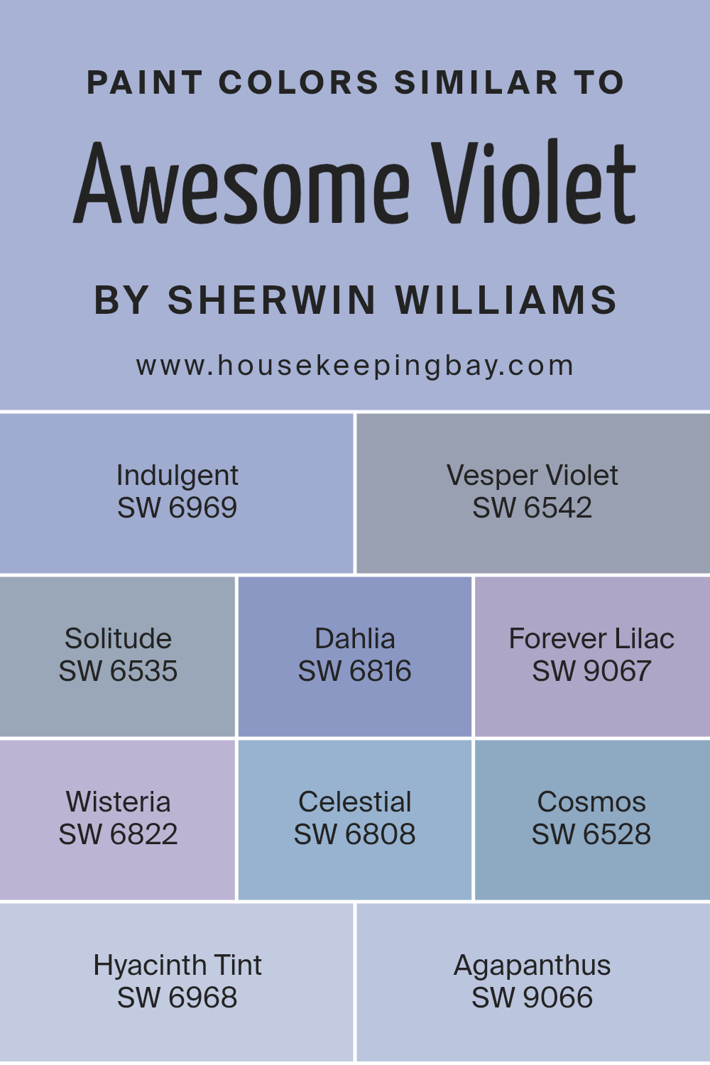
Colors Similar to Awesome Violet SW 6815 by Sherwin Williams
Similar colors play a vital role in design by creating harmony and cohesion in a space. When colors are close in hue, they can enhance each other, offering subtle variations that bring depth and interest without overwhelming the senses. By using similar colors, you can create a sense of unity and balance, allowing for a smooth visual flow.
This concept is apparent in the family of colors surrounding Awesome Violet SW 6815. Each one complements the other, resulting in a palette that feels both sophisticated and soothing.
SW 6969 Indulgent provides a deep, rich violet that adds a sense of warmth. SW 6542 Vesper Violet offers a slightly muted, regal tone perfect for creating a calming environment. SW 6535 Solitude gives a softer, more delicate shade, enhancing spaces with its peaceful vibe. SW 6816 Dahlia introduces a lovely vibrant touch, keeping things lively and fresh.
SW 9067 Forever Lilac generates a light and gentle feeling, bringing a hint of whimsy. SW 6822 Wisteria gives off an elegant and light touch. SW 6808 Celestial brings a fresh, airy quality, ideal for uplifting spirits.
SW 6528 Cosmos, with its subtle tone, bridges deeper hues seamlessly. Finally, SW 6968 Hyacinth Tint and SW 9066 Agapanthus add gentle, floral-inspired notes, rounding out the palette with grace.
You can see recommended paint colors below:
- SW 6969 Indulgent
- SW 6542 Vesper Violet
- SW 6535 Solitude
- SW 6816 Dahlia
- SW 9067 Forever Lilac
- SW 6822 Wisteria
- SW 6808 Celestial
- SW 6528 Cosmos
- SW 6968 Hyacinth Tint
- SW 9066 Agapanthus
housekeepingbay.com
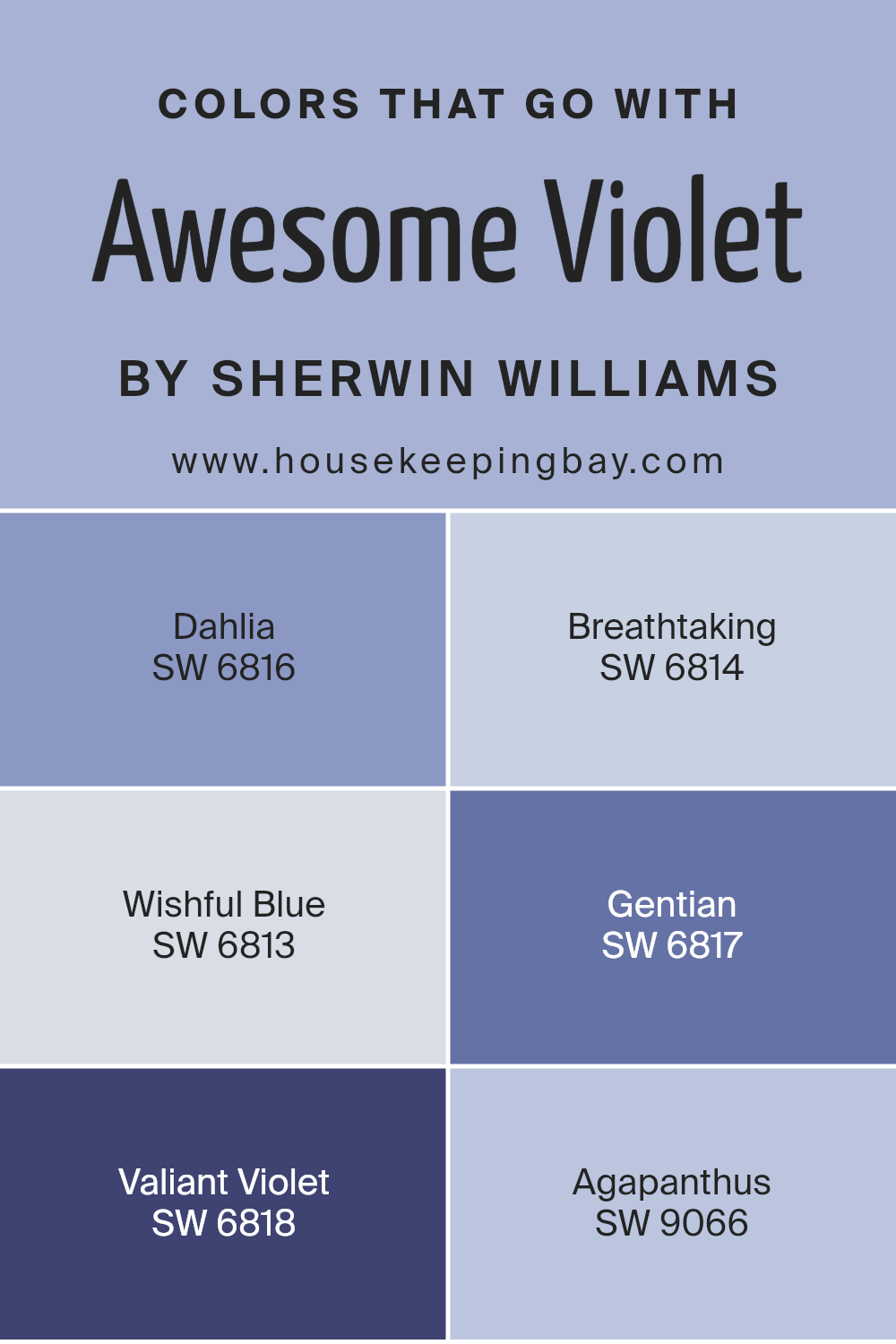
Colors that Go With Awesome Violet SW 6815 by Sherwin Williams
Colors that complement Awesome Violet SW 6815 by Sherwin Williams are important because they create a harmonious environment. These shades enhance the beauty of Awesome Violet and allow each space to feel cohesive and balanced. Imagine using SW 6816 – Dahlia.
This color is a rich, deep pink that adds warmth and depth, making it perfect for accenting walls or furniture. SW 6814 – Breathtaking, a gentle lavender, introduces a soft and soothing tone, ideal for creating a calming atmosphere in bedrooms or living spaces.
SW 6813 – Wishful Blue is a delicate, airy blue that pairs nicely by providing a light and refreshing contrast, making rooms appear open and inviting. SW 6817 – Gentian presents a bolder blue with a hint of purple, adding energy and character to any area.
SW 6818 – Valiant Violet can bring a sense of drama and richness to your surroundings with its deep, saturated hue.
Lastly, SW 9066 – Agapanthus offers a lovely muted lavender that allows for subtle sophistication. Using these complementary colors not only highlights the versatility of Awesome Violet but also allows each shade to shine in its way, enhancing the overall aesthetic of any space.
You can see recommended paint colors below:
- SW 6816 Dahlia
- SW 6814 Breathtaking
- SW 6813 Wishful Blue
- SW 6817 Gentian
- SW 6818 Valiant Violet
- SW 9066 Agapanthus
housekeepingbay.com
How to Use Awesome Violet SW 6815 by Sherwin Williams In Your Home?
Awesome Violet SW 6815 by Sherwin Williams is a vibrant and rich shade of purple that adds warmth and energy to any space. Its bold yet balanced tone makes it perfect for creating a statement wall in a living room or bedroom, bringing a sense of dynamism and a touch of elegance indoors.
Consider using Awesome Violet in a child’s bedroom to stimulate imagination and excitement. Pair it with soft whites or light grays to keep the room bright and welcoming. It’s also ideal for a creative office or study area, where it encourages productivity and creative thinking.
In a more subtle setting, Awesome Violet can act as an accent color. Use it on furniture pieces, like a chair or bookshelf, to add an unexpected pop. When combined with neutral tones, it offers a wonderful contrast that highlights the room’s features without overpowering the space. This shade works beautifully with metallic accents, such as gold or silver, for a modern touch.
Awesome Violet SW 6815 by Sherwin Williams vs Vesper Violet SW 6542 by Sherwin Williams
Awesome Violet SW 6815 and Vesper Violet SW 6542 both belong to the violet family by Sherwin Williams, but they offer distinct moods and vibes. Awesome Violet SW 6815 is a lively and bright shade of violet. It injects energy and vigor into any space, making it ideal for areas needing a bit of excitement or a playful touch. It pairs well with light or neutral hues, creating contrasts that can make a room pop.
Vesper Violet SW 6542, in contrast, is deeper and more muted. This color suggests a more sophisticated and calming vibe. Its depth can make a room feel more intimate and cozy, perfect for creating a relaxing atmosphere.
Ideal for bedrooms or living spaces where comfort and relaxation are desired, it works well with warm whites or earth tones.
While Awesome Violet is vibrant and eye-catching, Vesper Violet is subtle and elegant, offering a sense of calm.
You can see recommended paint color below:
- SW 6542 Vesper Violet

housekeepingbay.com
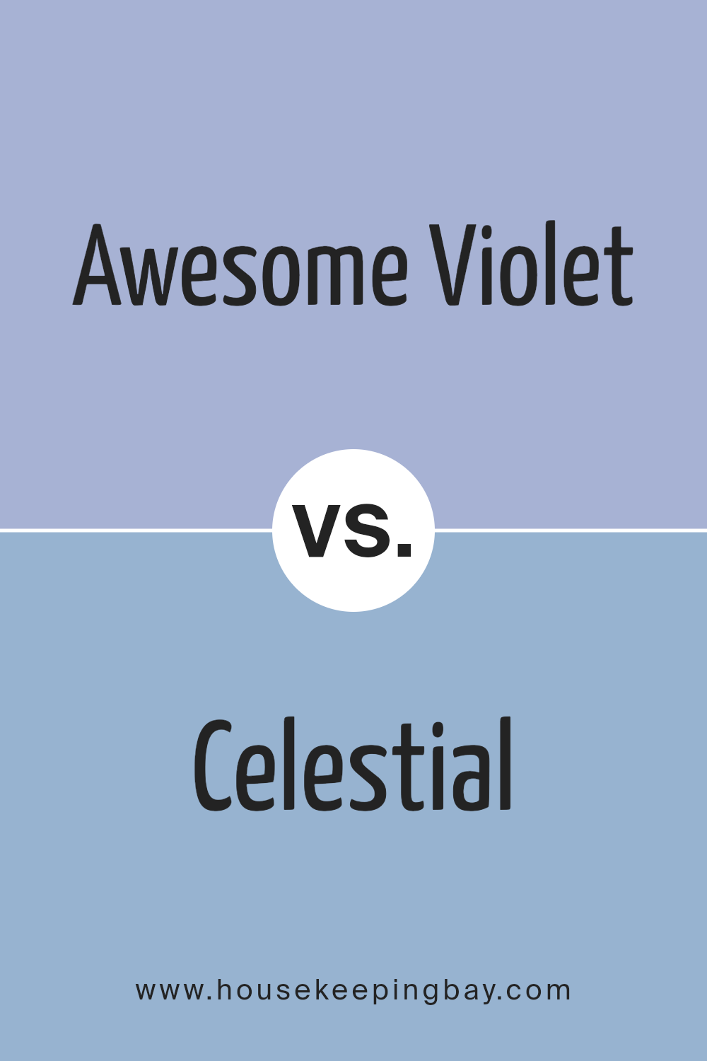
Awesome Violet SW 6815 by Sherwin Williams vs Celestial SW 6808 by Sherwin Williams
Awesome Violet SW 6815 by Sherwin Williams is a rich, vibrant purple that brings energy and excitement into any space. It has a bold presence, making it a perfect choice for accent walls or areas where you want to create a focal point. This color adds warmth and depth, giving rooms a lively and inviting atmosphere.
Celestial SW 6808, also by Sherwin Williams, offers a softer, more subdued purple. It has a calming effect, making it ideal for spaces meant for relaxation. Celestial feels lighter and airier compared to Awesome Violet, making it suitable for bedrooms or areas where you want a peaceful vibe.
While Awesome Violet grabs attention with its intensity and richness, Celestial provides a gentle, serene backdrop. Both colors bring unique characteristics to a room, with Awesome Violet being more bold and daring, while Celestial introduces a sense of calm and ease. They both highlight the versatility of purple shades in home design.
You can see recommended paint color below:
- SW 6808 Celestial
housekeepingbay.com
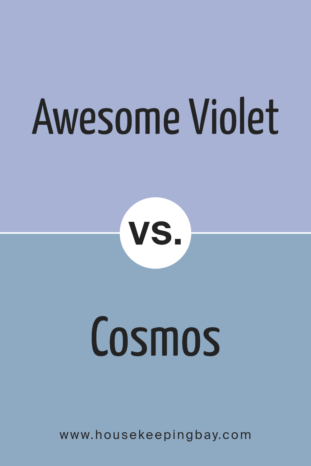
Awesome Violet SW 6815 by Sherwin Williams vs Cosmos SW 6528 by Sherwin Williams
Awesome Violet SW 6815 and Cosmos SW 6528 are both lovely shades of purple by Sherwin Williams, but they each have unique qualities. Awesome Violet is a vivid, lively shade of purple that brings energy and vibrancy to a space. It can be a great choice for accent walls or lively rooms where creativity and enthusiasm are encouraged.
Cosmos SW 6528, on the other hand, is softer and more subdued. This gentle blue-purple hue creates a calm atmosphere, making it perfect for bedrooms or spaces where relaxation is key.
Both colors work well with neutrals, but Awesome Violet might pair best with bold accents, while Cosmos could blend beautifully with softer tones. Deciding between these colors depends on the mood and energy you want in your space. Awesome Violet gives a space a lively personality, while Cosmos introduces a calm and peaceful feel.
You can see recommended paint color below:
- SW 6528 Cosmos
housekeepingbay.com
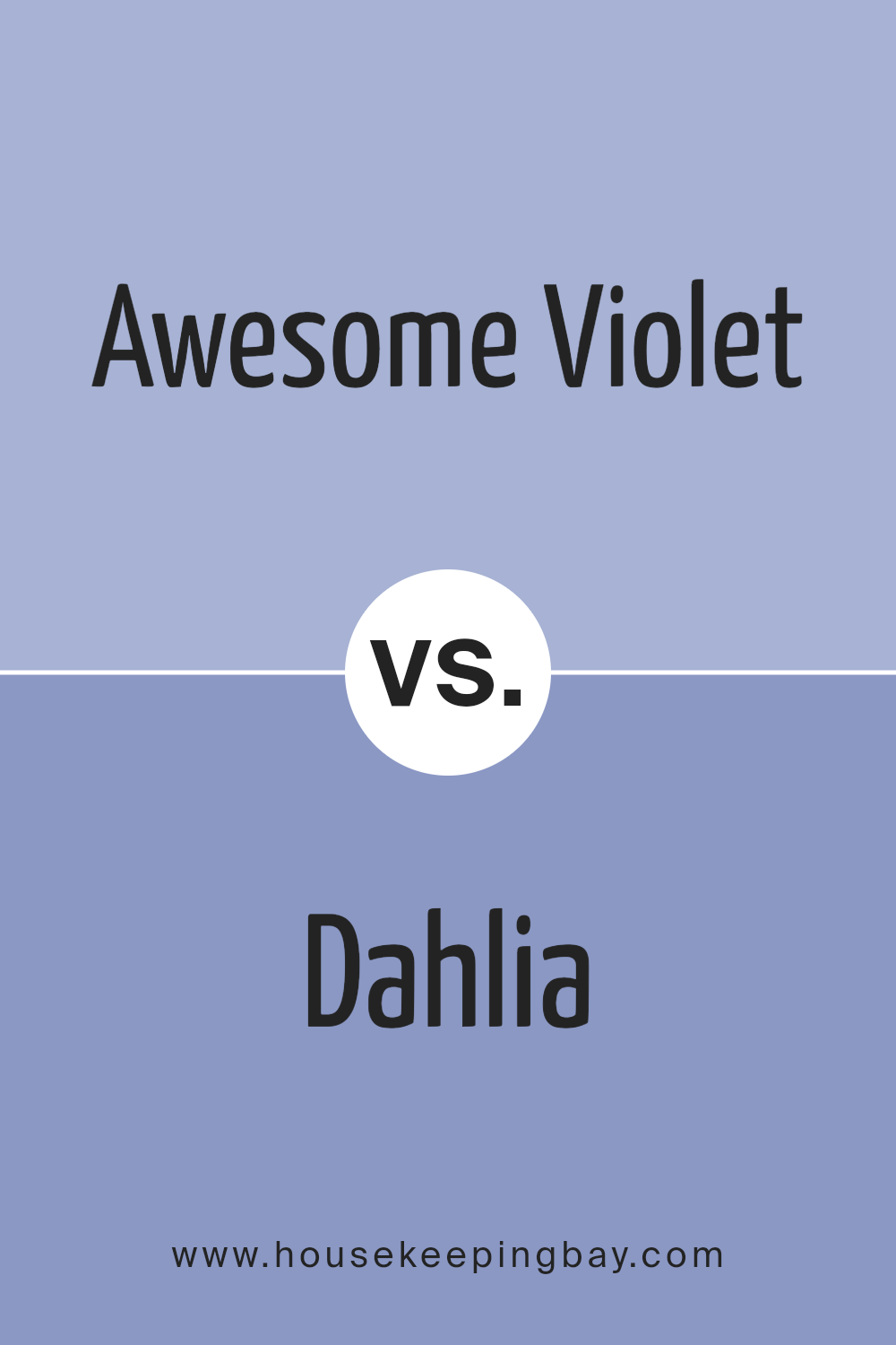
Awesome Violet SW 6815 by Sherwin Williams vs Dahlia SW 6816 by Sherwin Williams
Awesome Violet SW 6815 and Dahlia SW 6816, both from Sherwin Williams, are beautiful shades of purple that each bring a unique flair to a space. Awesome Violet SW 6815 is a lighter, softer purple, offering a calm and gentle ambiance. Its hue leans towards lavender, which can make a room feel airy and open.
It’s a pleasant choice for creating a soothing environment, often used in bedrooms or spaces meant for relaxation.
Dahlia SW 6816, in contrast, is a much bolder and deeper shade of purple. It has a richer tone, making it ideal for areas where a dramatic look is desired. Its vibrant quality can energize a space, adding depth and interest. This color suits accent walls or areas that call for a touch of luxury or intensity.
Both colors bring their own special sense of style, allowing for versatile design options depending on the mood one aims to create.
You can see recommended paint color below:
- SW 6816 Dahlia
housekeepingbay.com
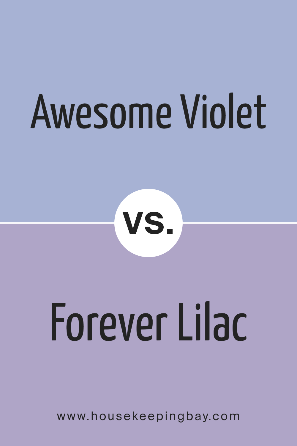
Awesome Violet SW 6815 by Sherwin Williams vs Forever Lilac SW 9067 by Sherwin Williams
Awesome Violet (SW 6815) and Forever Lilac (SW 9067) by Sherwin Williams are shades of purple that offer distinct vibes. Awesome Violet presents itself as a rich, bold hue that commands attention. Its deeper tones suggest a sense of sophistication and drama, making it ideal for adding elegance to any room. This shade can work well in spaces where you want a vibrant, striking look.
Forever Lilac, conversely, is a softer and lighter shade. It emits a gentle, serene feel that can make a room feel open and airy. This color is versatile, suitable for spaces where calmness and light are desired.
When choosing between these two, consider the mood you want. Awesome Violet brings energy and boldness, perfect for a modern, edgy space. Forever Lilac offers a peaceful, refreshing atmosphere, suited for areas where relaxation is key. Both colors have their charm in adding personality to interiors.
You can see recommended paint color below:
- SW 9067 Forever Lilac
housekeepingbay.com
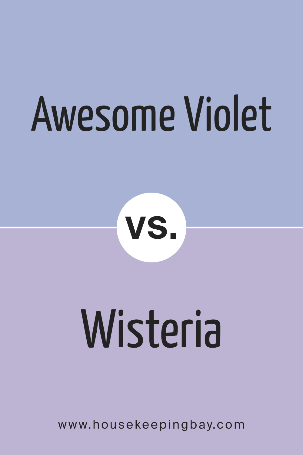
Awesome Violet SW 6815 by Sherwin Williams vs Wisteria SW 6822 by Sherwin Williams
Sure! Awesome Violet SW 6815 and Wisteria SW 6822 by Sherwin Williams are both shades of purple, but they have distinct characteristics. Awesome Violet is a bold, vivid color with strong blue undertones that create a lively and energetic feel.
It’s perfect for making a statement in a room, adding a touch of modern flair and drama. This color works well in spaces where you want to inject energy and excitement.
In contrast, Wisteria is a softer, more muted shade with a gentle, calming presence. It features subtle pink undertones, giving it a warm and soothing effect. This color can create a cozy and inviting atmosphere, ideal for bedrooms or spaces meant for relaxation and comfort.
While both colors share the same family, the difference in tones allows for unique design choices, whether you want a vibrant or serene space.
Both offer versatility, enhancing different moods and styles.
You can see recommended paint color below:
- SW 6822 Wisteria
housekeepingbay.com
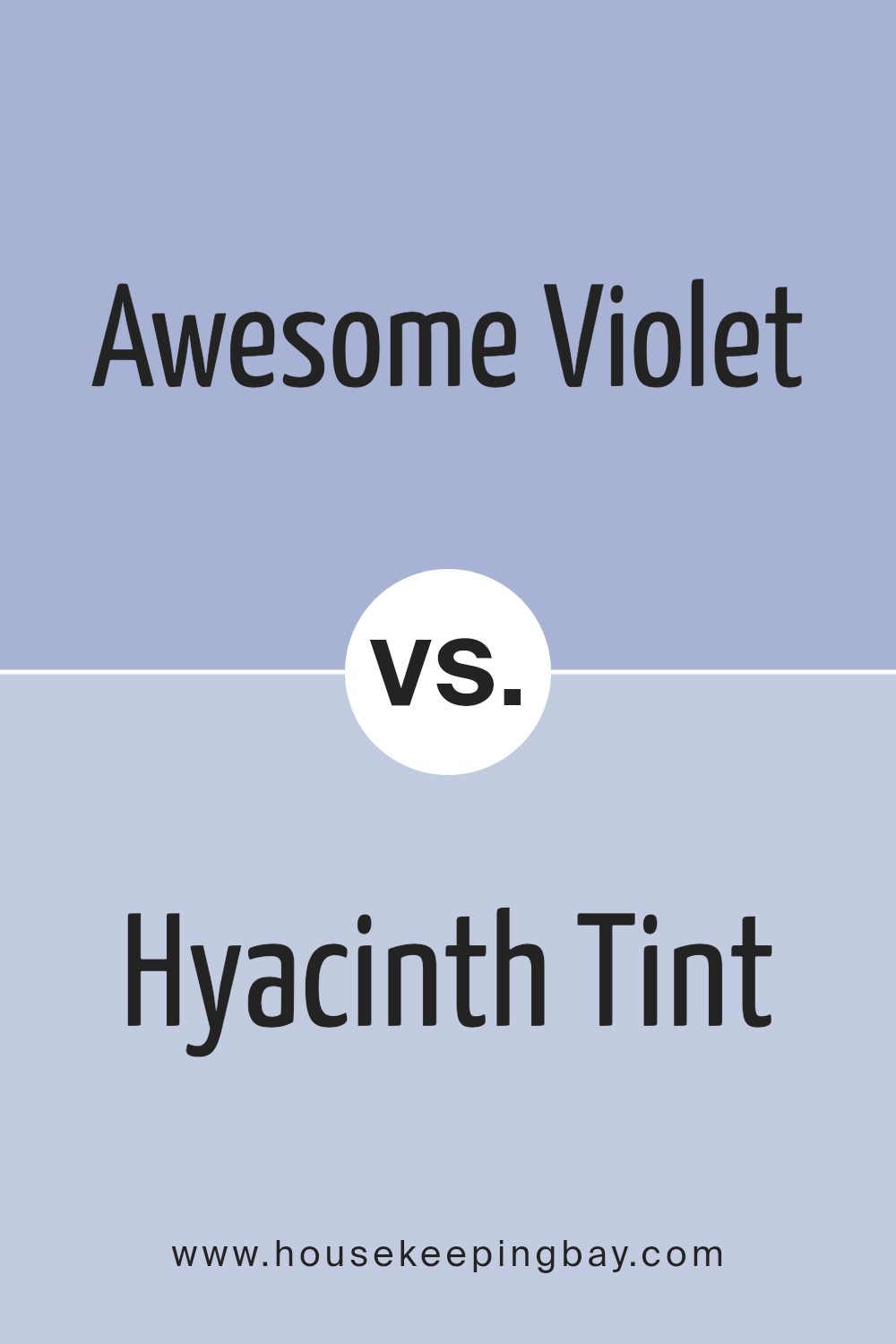
Awesome Violet SW 6815 by Sherwin Williams vs Hyacinth Tint SW 6968 by Sherwin Williams
Awesome Violet SW 6815 and Hyacinth Tint SW 6968, both by Sherwin Williams, offer unique purple shades. Awesome Violet is a bold and rich color, reminiscent of deep violet flowers or twilight skies. It brings a sense of depth and intensity to any room, making it stand out. The color is strong and assertive, perfect for making a statement.
Hyacinth Tint SW 6968, in contrast, is lighter and softer. Its gentle hue feels more like a pastel, evoking images of soft spring blooms. This shade offers a calming and soothing atmosphere, creating a space that feels open and airy.
While Awesome Violet evokes energy and drama, Hyacinth Tint imparts a gentle and calm vibe. Choosing between these colors depends largely on the desired mood. For vibrant, dynamic spaces, Awesome Violet is ideal. For serene, relaxed environments, Hyacinth Tint suits perfectly. Both have their own charm, fitting different design needs.
You can see recommended paint color below:
- SW 6968 Hyacinth Tint
housekeepingbay.com
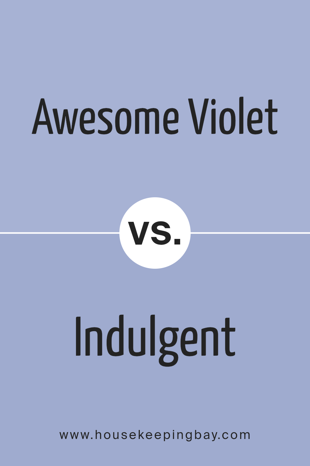
Awesome Violet SW 6815 by Sherwin Williams vs Indulgent SW 6969 by Sherwin Williams
Awesome Violet SW 6815 and Indulgent SW 6969 are both vibrant choices from Sherwin Williams. Awesome Violet is a rich, medium purple, striking a balance between boldness and subtlety. It brings a touch of royal elegance to any space, with its cool undertone providing a sense of calm sophistication. It works well with light neutrals or contrasting colors like pale greens.
Indulgent SW 6969, a deep, saturated purple, offers an intense and dramatic look. It has a bolder, more dramatic presence, filling a room with an air of opulence. This shade stands out, perfect for making a strong, artistic statement. It pairs beautifully with metallic accents or softer pastels.
Both colors work to bring energy and personality into interiors, yet while Awesome Violet tends toward elegance and style, Indulgent provides a moodier, more intense atmosphere.
Choosing between them might depend on whether you prefer a more serene or dynamic space.
You can see recommended paint color below:
- SW 6969 Indulgent
housekeepingbay.com
Awesome Violet SW 6815 by Sherwin Williams vs Solitude SW 6535 by Sherwin Williams
Awesome Violet SW 6815 and Solitude SW 6535 by Sherwin Williams offer two distinct shades of color. Awesome Violet is a vibrant and bold purple. It creates an energetic and lively atmosphere, making it a great choice for spaces where a pop of color is desired. It is ideal for accent walls or to add personality to a room.
Solitude SW 6535, in contrast, presents a muted, soft blue with gray undertones. It is calming and serene, making it suitable for bedrooms or spaces designed for relaxation. This color brings a sense of peace and quiet, creating a soothing environment.
While Awesome Violet brings excitement and energy, Solitude gently calms and comforts. Choosing between them depends on the desired mood for the space. Awesome Violet energizes spaces with flair, while Solitude provides a gentle, restful vibe. Both colors have unique qualities to enhance any room.
You can see recommended paint color below:
- SW 6535 Solitude

housekeepingbay.com
Awesome Violet SW 6815 by Sherwin Williams vs Agapanthus SW 9066 by Sherwin Williams
Awesome Violet SW 6815 and Agapanthus SW 9066 by Sherwin Williams both fall within the purple family but offer distinct characteristics. Awesome Violet stands out with its vibrant, bold hue. It’s a strong, vivid shade that can energize and add a punch to any space. Perfect for those looking to make a statement, this color is dynamic and eye-catching.
In contrast, Agapanthus offers a softer, more subdued purple. It has calming qualities, creating a peaceful and soothing atmosphere. This color leans closer to a lavender tone, making it ideal for spaces where relaxation is key, such as bedrooms or cozy corners.
When placed together, Awesome Violet can act as an accent, adding intensity, while Agapanthus provides a gentle balance. Both colors can beautifully complement neutral tones, but their unique personalities mean they work best depending on the mood and ambiance you seek to create in your space.
You can see recommended paint color below:
- SW 9066 Agapanthus
housekeepingbay.com
Conclusion
When I think about SW 6815 Awesome Violet by Sherwin Williams, it feels like I’m looking at more than just a paint color. Awesome Violet brings both a sense of energy and calmness. The shade has a unique balance, with its bluish-purple hue adding depth without overwhelming the senses. It’s bold yet calming, making it a fantastic choice for different spaces.
This color can turn any room into a space that invites creativity and relaxation. Whether it’s a bedroom that needs a calming atmosphere or a living room that aims to spark conversation, Awesome Violet can help achieve those vibes.
It is versatile, fitting modern settings as well as more traditional ones.
Incorporating Awesome Violet isn’t just about adding color; it’s about changing how a space feels. It’s amazing how a wall color can impact mood and ambiance.
With Awesome Violet, I can create a space where people feel at ease and inspired. I can see it pairing well with neutral tones, letting the color stand out yet blend harmoniously with other elements in the room.
Choosing SW 6815 Awesome Violet adds a unique touch that leaves a mark on any environment. It’s not just a paint color—it’s an experience that shifts the character of a space and leaves a lasting impression.
housekeepingbay.com
Ever wished paint sampling was as easy as sticking a sticker? Guess what? Now it is! Discover Samplize's unique Peel & Stick samples. Get started now and say goodbye to the old messy way!
Get paint samples


