Armagnac SW 6354 by Sherwin Williams
Warm and Welcoming Shades for Your Space
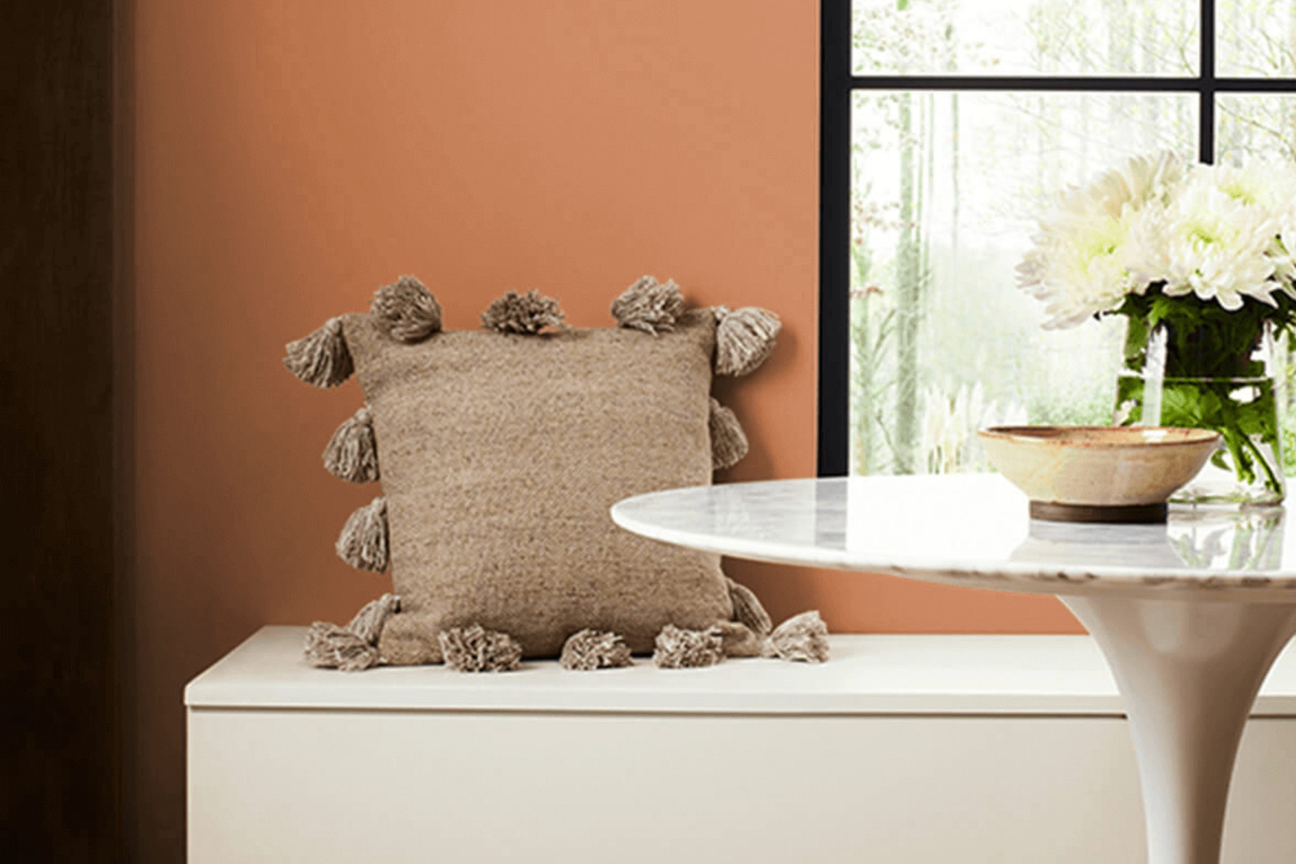
When considering paint colors for your home, you might find yourself drawn to Sherwin Williams SW 6354 Armagnac. This hue, with its rich and warm tones, can bring a cozy and inviting atmosphere to any space. Armagnac is a unique shade that sits comfortably between earthy reds and deep oranges, offering a sense of warmth and comfort.
When thinking about adding character to a living room or dining area, Armagnac can enhance the mood, making spaces feel more intimate and welcoming. It pairs well with neutral shades, bringing a balance and depth that’s both engaging and refined.
Choosing Armagnac means opting for a color with a distinct personality. It can complement wood tones beautifully, adding a touch of elegance to traditional settings while creating depth in more modern spaces. Imagine how it would look against a backdrop of soft beige or cream, allowing its warm undertones to shine.
If you’re considering a color that’s both bold and comforting, Armagnac might be the perfect choice. Its warm hues invite relaxation and conversation, making it ideal for spaces where people gather. Think about how this shade could transform a room into a welcoming haven for family and friends to enjoy.
via sherwin-williams.com
What Color Is Armagnac SW 6354 by Sherwin Williams?
Table of Contents
Armagnac SW 6354 by Sherwin Williams is a rich, warm color that resembles a deep terracotta with soft undertones of burnt orange. It brings an inviting and cozy atmosphere to any room. This color works beautifully in various interior styles, including rustic, bohemian, and southwestern designs. Its earthy tone makes it a great choice for spaces where comfort and warmth are desired, such as living rooms, dining areas, or bedrooms.
Armagnac pairs well with natural materials and textures. Think of wooden furniture with visible grains, like oak or walnut, to enhance its warmth. Textured fabrics such as linen or wool in neutral tones complement its depth without overpowering it. Consider adding woven baskets or rattan pieces to add an organic touch.
This color also contrasts nicely with cool colors. If you enjoy a more modern or eclectic style, pair Armagnac with gray or pale blue accents for a balanced look. Metal accents, especially those in brass or copper, work well, adding a touch of elegance and sophistication.
Overall, Armagnac SW 6354 offers a versatile option that can bring comfort and style to various interior spaces.
housekeepingbay.com
Is Armagnac SW 6354 by Sherwin Williams Warm or Cool color?
Armagnac SW 6354 by Sherwin Williams is a warm, rich color with earthy orange and red tones. This paint creates a cozy, welcoming atmosphere in any space. In living rooms, Armagnac adds warmth, making the area feel inviting for family and friends. In dining rooms, it can create an intimate setting, perfect for gatherings and meals.
When used in bedrooms, this color promotes a snug, comforting environment, ideal for relaxation and restful sleep.
Its vibrant yet earthy hue suits various design styles, from rustic to contemporary. Pairing it with neutral shades like beige or cream can balance the boldness while allowing the color’s warmth to shine. Using Armagnac for an accent wall or furniture can serve as a focal point, adding depth to the decor.
Its versatile and appealing nature makes Armagnac SW 6354 a choice that suits many homes, creating spaces that feel both lively and harmonious.
What is the Masstone of the Armagnac SW 6354 by Sherwin Williams?
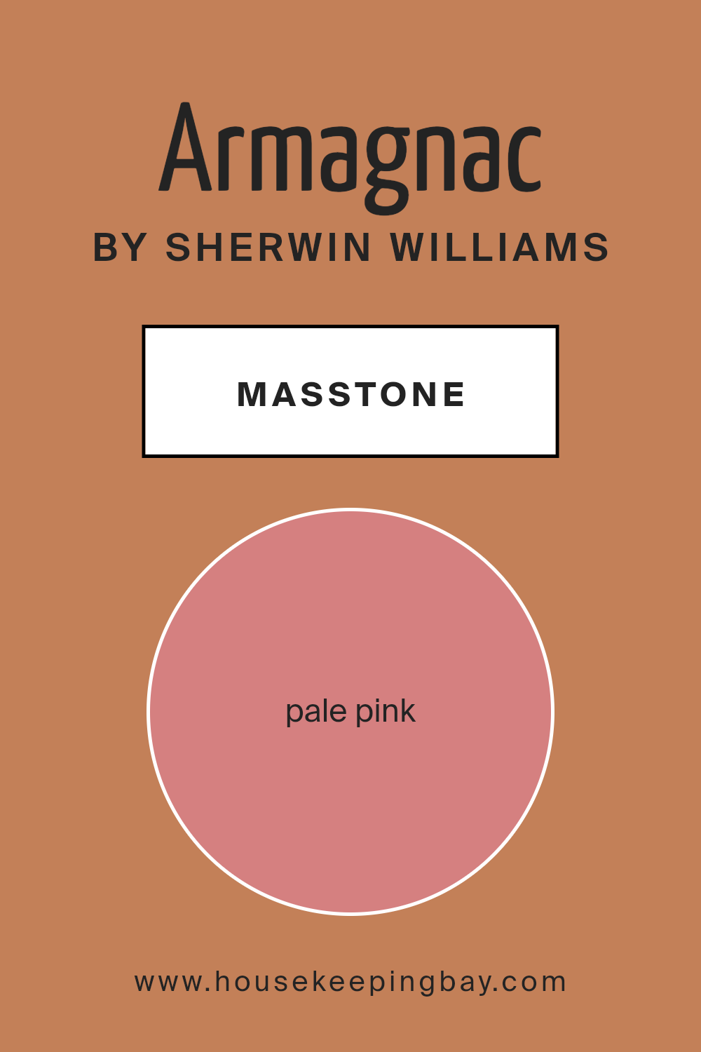
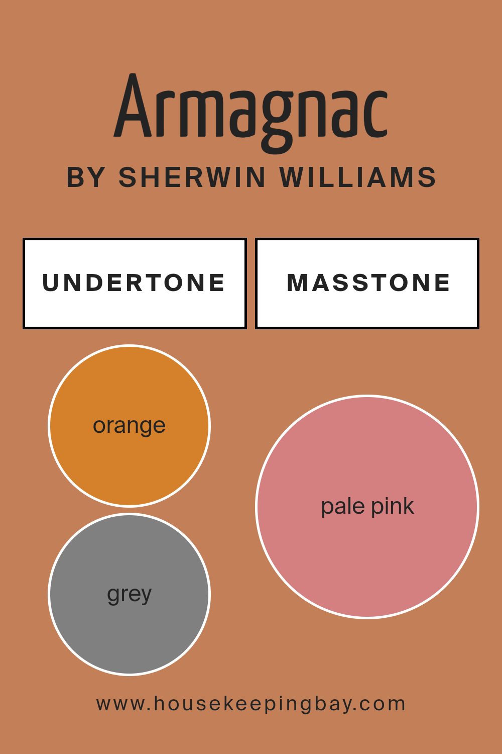
Armagnac SW 6354 by Sherwin Williams is a delightful color that brings a warm, inviting feel to any home. The masstone of this shade is a pale pink (#D58080), which adds a charming touch to spaces. This gentle pink hue can have a calming effect, creating a soothing atmosphere. Armagnac works well in living rooms and bedrooms, giving a cozy and welcoming vibe.
This color pairs nicely with neutral shades like beige or light gray, allowing it to stand out without being overwhelming. It’s also a good match for white accents, which can make the space feel fresh and clean. In rooms with natural light, the pale pink tone helps enhance warmth, making spaces feel brighter and more open.
Armagnac SW 6354 can also bring a subtle elegance to dining areas or kitchens, adding just enough color to create interest. This makes it a versatile and pleasing choice for many areas of the home.
housekeepingbay.com
Undertones of Armagnac SW 6354 by Sherwin Williams
Armagnac SW 6354 by Sherwin Williams is a warm and rich color with a unique blend of undertones. These undertones include hints of orange, grey, olive, and yellow, which influence how the color appears on walls. The orange and yellow undertones give Armagnac a warm, inviting glow, making rooms feel cozy and welcoming. This effect is perfect for living rooms and dining areas where warmth is desired.
The subtle grey undertones balance the warmth by adding depth and sophistication. This makes the color suitable for both modern and traditional interiors. Olive undertones introduce an earthy quality, which can connect interior spaces with the natural world.
Undertones in paint colors can affect perception significantly. They can subtly shift how a color looks under different lighting conditions or against other colors in a room. For instance, in bright natural light, Armagnac may look more vibrant and orange, while under artificial lighting, the grey and olive undertones might stand out, giving a slightly muted appearance.
When used on interior walls, Armagnac’s combination of warm and balanced undertones can help create a cozy atmosphere, yet still maintain a sense of elegance and depth. This makes it a versatile choice for many different types of rooms and styles.
housekeepingbay.com
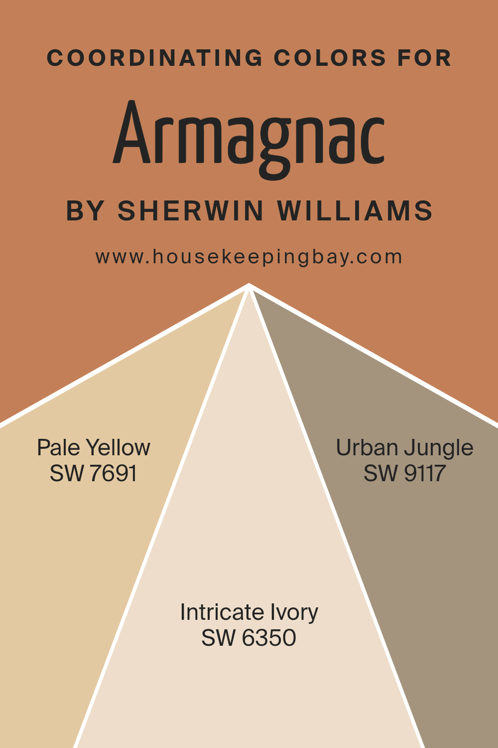
Coordinating Colors of Armagnac SW 6354 by Sherwin Williams
Coordinating colors are hues that work harmoniously together, creating a pleasing visual balance when used in combination. These colors often share similar undertones or contrast in a complimentary way, enhancing each other’s appearance. By incorporating coordinating colors with Armagnac SW 6354 by Sherwin Williams, you can create a rich and inviting space.
Armagnac is a warm, earthy color with hints of orange and brown, making it perfect as a base or accent color. It pairs beautifully with specific shades to achieve a balanced and comforting vibe in any room.
SW 7691 – Pale Yellow is a soft, light hue that brings a sense of warmth and cheerfulness to a space. It complements Armagnac by adding lightness, which offsets the deeper tones of Armagnac, creating a bright and welcoming atmosphere. SW 6350 – Intricate Ivory, on the other hand, is a creamy, neutral shade that offers a subtle sophistication without overpowering the other colors.
This soothing color can balance the boldness of Armagnac, creating an elegant backdrop.
Lastly, SW 9117 – Urban Jungle is a deep, muted green that introduces a natural element to the palette. Its cool undertones contrast nicely with the warmth of Armagnac, setting the tone for a dynamic and interesting space.
You can see recommended paint colors below:
- SW 7691 Pale Yellow
- SW 6350 Intricate Ivory
- SW 9117 Urban Jungle
housekeepingbay.com
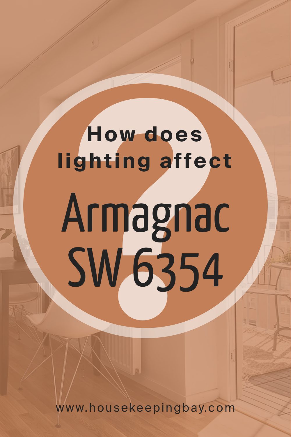
How Does Lighting Affect Armagnac SW 6354 by Sherwin Williams?
Lighting plays a crucial role in how we perceive colors. Different light sources can alter the appearance of a color, like Armagnac SW 6354 from Sherwin Williams. This color is a warm, earthy hue with reddish-brown undertones. Its perception varies under different lighting conditions.
Artificial Light:
Under artificial lighting, such as incandescent bulbs, Armagnac SW 6354 can appear warmer because these lights emit a yellow to orange glow. This can enhance the warm tones in the paint, making it look more vibrant and cozy. LED lights, on the other hand, come in various color temperatures.
A cool white LED can make Armagnac appear slightly muted or subdued, clashing a bit with its warm nature. Warm white LEDs can mimic the effect of incandescent bulbs, enhancing the earthy tones.
Natural Light:
In natural daylight, colors often look more true to their actual appearance. The quality and direction of light affect how Armagnac SW 6354 looks.
- – North-Facing Rooms: These rooms receive cooler and softer light. Here, Armagnac can appear darker and more subdued, with cooler undertones showing up. The color may seem less intense due to the lack of direct sunlight.
- – South-Facing Rooms: These rooms get the most direct sunlight, which is often warm and bright. In these spaces, Armagnac SW 6354 will look its warmest and most vibrant. The color comes alive, with rich undertones providing a welcoming feel.
- – East-Facing Rooms:Morning sunlight is strong and warm, but it fades quickly. Armagnac may look vibrant in the morning but mellow as the day progresses.
- – West-Facing Rooms:Afternoon and evening sunlight tends to be warm. Armagnac will look particularly rich and inviting later in the day, as the warm light enhances its tones.
In summary, lighting can transform how we perceive Armagnac SW 6354, making it essential to consider light when choosing paint colors for a room.
housekeepingbay.com
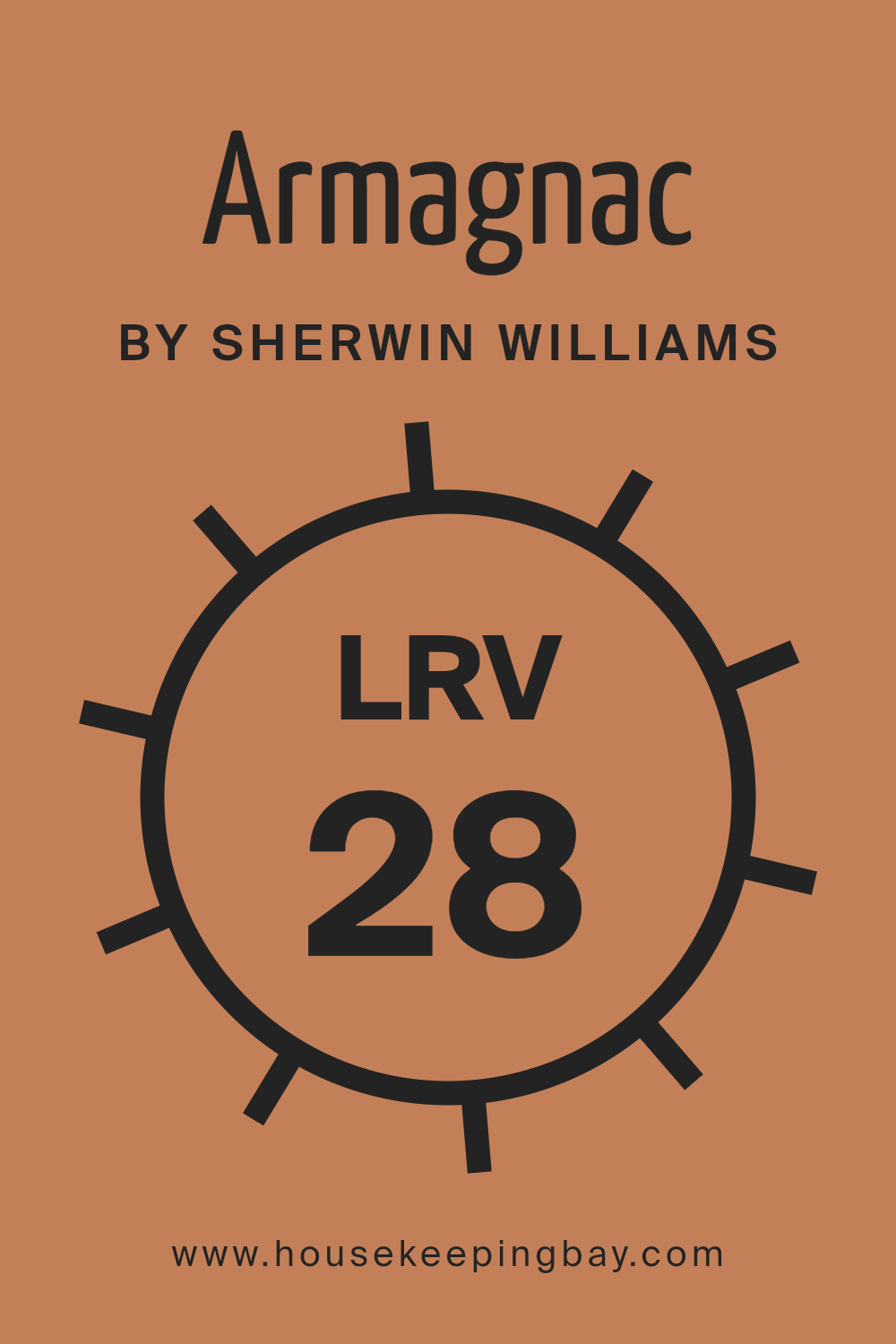
What is the LRV of Armagnac SW 6354 by Sherwin Williams?
LRV stands for Light Reflectance Value. It tells us how much light a color reflects or absorbs. The LRV scale goes from 0 to 100, where 0 means the color absorbs all light (pure black) and 100 means it reflects all light (pure white). A higher LRV means the color reflects more light, making it look lighter and brighter on the wall.
A lower LRV means the color absorbs more light, making it look darker. LRV is important when choosing paint colors because it affects how the color will appear in different lighting conditions and how it will interact with other colors in the space.
The LRV of Armagnac SW 6354 by Sherwin Williams is 27.814. This places it in the lower range on the LRV scale, indicating it is a darker color. With this lower LRV, Armagnac will absorb more light, giving it a deeper, richer look on the walls. In a room with plenty of natural light, it will appear less intense, but in a room with little light, it might feel even darker and cozier.
For spaces where you want a warm, bold look, Armagnac can provide that depth and mood. However, it’s important to consider the lighting in your space, as colors with lower LRVs can make a room feel smaller and more enveloping.
housekeepingbay.com
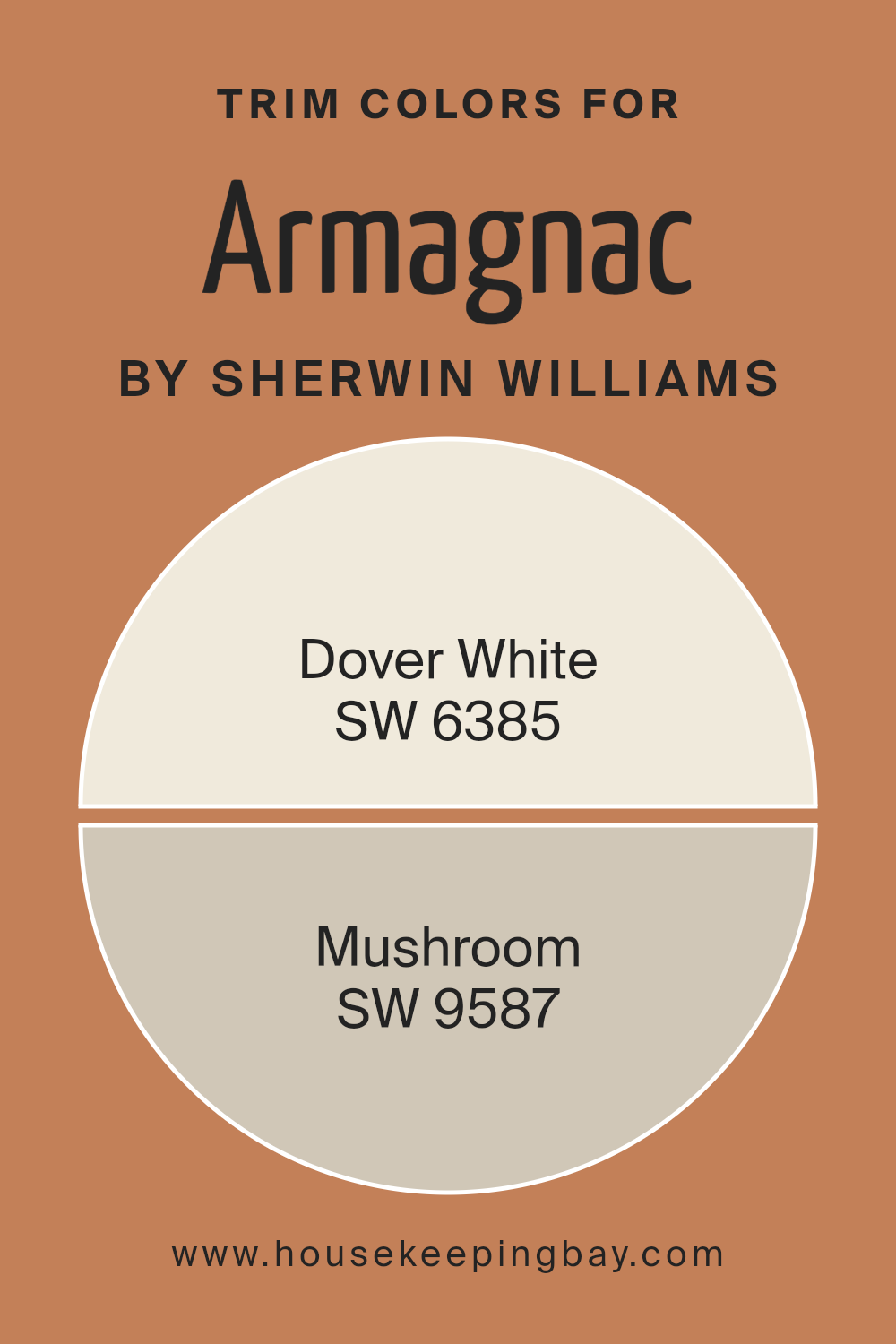
What are the Trim colors of Armagnac SW 6354 by Sherwin Williams?
Trim colors are the finishing touch that can make or break the overall look of a room. They outline and emphasize the boundaries, adding depth and a polished appearance to the walls. For a wall color like Armagnac SW 6354 by Sherwin Williams, choosing the right trim color is essential to highlight its warm, rich tones.
Armagnac has a reddish-brown hue that gives rooms a cozy and sophisticated feel. Using trim colors like Dover White SW 6385 can create a clean contrast against Armagnac’s warmth. Dover White is a soft, creamy white that offers a gentle brightness without being harsh.
Its warmth pairs beautifully with Armagnac, offering a welcoming and crisp look to moldings, baseboards, and other detailed areas of a room.
Alternatively, Mushroom SW 9587 is a versatile, neutral hue that can serve as a more subtle backdrop, allowing Armagnac to take center stage. This earthy color has an understated elegance with its light taupe undertones that blend seamlessly with a wide range of color palettes.
Mushroom as a trim can suit rooms where a more cohesive and less contrasting aesthetic is desired, providing a seamless and continuous flow from wall to trim. By choosing either Dover White or Mushroom as trim colors for Armagnac, one can tailor the feel of the space to be either more striking or harmoniously understated, showing how critical trim selections are in shaping the ambiance and style of a room.
You can see recommended paint colors below:
housekeepingbay.com
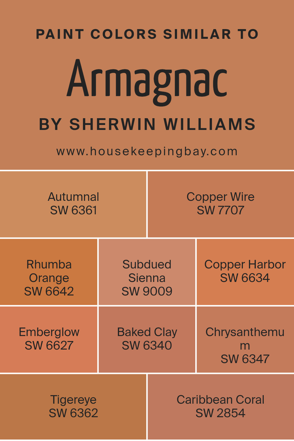
Colors Similar to Armagnac SW 6354 by Sherwin Williams
Similar colors are vital because they help create harmony in design and decorating. These colors usually share a common base, allowing them to mix well. Armagnac by Sherwin Williams, a warm, deep hue, finds its companions in colors that add depth and continuity to a space.
For example, SW 6361 – Autumnal is a rich, earthy tone that conjures the warmth of fall leaves. SW 7707 – Copper Wire brings forth a glowing, metallic feel with its burnished orange shade. SW 6642 – Rhumba Orange is an energetic color that adds boldness without overwhelming.
SW 9009 – Subdued Sienna offers a muted, clay-like hue, grounding a room with subtle warmth.
Meanwhile, SW 6634 – Copper Harbor provides a snug, inviting glow with its reddish undertones. SW 6627 – Emberglow emits a soft radiance, recalling the soft light from a dimming fire.
SW 6340 – Baked Clay stands out with its earthen character, perfect for rustic touches. SW 6347 – Chrysanthemum offers a lively, floral orange that enlivens spaces with freshness. SW 6362 – Tigereye, with its gold undertones, adds a spark of richness. Lastly, SW 2854 – Caribbean Coral introduces a touch of tropical softness, ideal for light, airy spaces. Together, these colors establish a cohesive, inviting palette that can adapt to various moods and settings.
You can see recommended paint colors below:
- SW 6361 Autumnal
- SW 7707 Copper Wire
- SW 6642 Rhumba Orange
- SW 9009 Subdued Sienna
- SW 6634 Copper Harbor
- SW 6627 Emberglow
- SW 6340 Baked Clay
- SW 6347 Chrysanthemum
- SW 6362 Tigereye
- SW 2854 Caribbean Coral
housekeepingbay.com
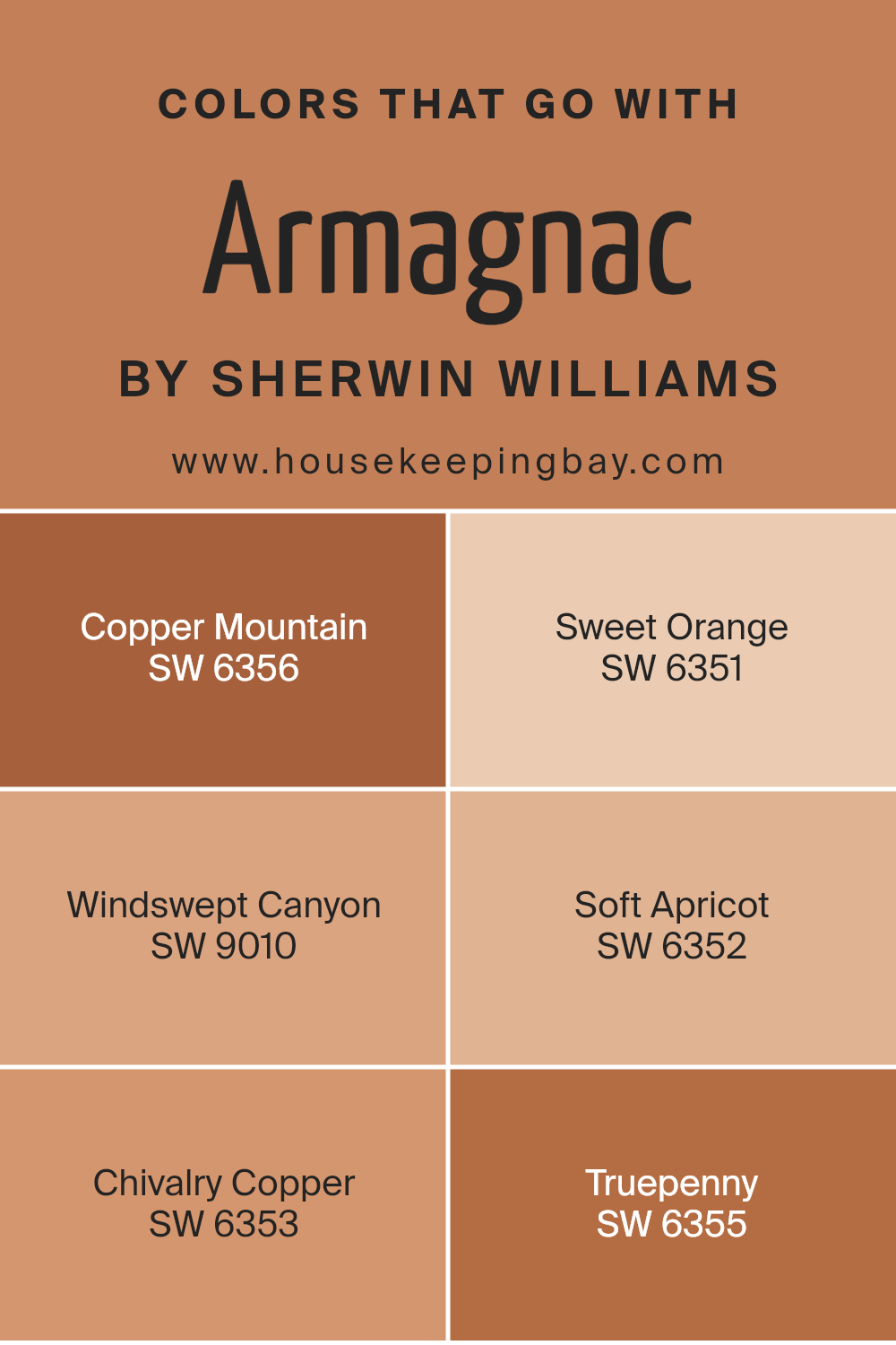
Colors that Go With Armagnac SW 6354 by Sherwin Williams
Colors that go with Armagnac SW 6354 by Sherwin Williams hold great significance as they enhance and complement the warmth and richness of this earthy hue. When paired thoughtfully, these colors create a harmonious and inviting atmosphere.
For instance, SW 6356 – Copper Mountain adds a deeper autumnal tone, intensifying the natural warmth and making spaces feel cozy. SW 6351 – Sweet Orange introduces a lively and refreshing contrast with its vibrant energy, injecting an inviting brightness into the room.
SW 9010 – Windswept Canyon offers a more muted, neutral balance, providing an earthy complement to Armagnac without competing for attention. Meanwhile, SW 6352 – Soft Apricot lends a gentle, cheerful touch that enhances light and openness, perfect for bright spaces.
SW 6353 – Chivalry Copper, with its subtle metallic undertones, imparts a sense of refined elegance, adding sophistication to the palette. Finally, SW 6355 – Truepenny, with its earthy and reddish-brown hue, deepens the theme, merging seamlessly with Armagnac’s natural tones.
Together, these colors build a charming and cohesive atmosphere, uniting spaces with warmth, depth, and balance, ensuring any room feels thoughtfully curated and comfortable.
You can see recommended paint colors below:
- SW 6356 Copper Mountain
- SW 6351 Sweet Orange
- SW 9010 Windswept Canyon
- SW 6352 Soft Apricot
- SW 6353 Chivalry Copper
- SW 6355 Truepenny
housekeepingbay.com
How to Use Armagnac SW 6354 by Sherwin Williams In Your Home?
Armagnac SW 6354 by Sherwin Williams is a rich, warm color that brings warmth and depth to any room. This hue is a deep, earthy red-brown that can add elegance and cozy vibes to a home space. It pairs well with neutral colors like beige and cream, creating a balanced and inviting atmosphere.
In a living room, Armagnac can act as a fantastic accent wall. It adds character and makes furniture pieces, especially in lighter shades, stand out beautifully. In the dining room, this color enhances the mood, making meals feel more inviting and intimate.
For those wanting a more dramatic vibe, Armagnac works well in a study or library. Surrounded by dark woods and soft lighting, it creates a sophisticated feel perfect for reading or relaxation.
Accessorizing with gold or brass fixtures can further enhance Armagnac’s richness, producing a luxurious feel. This versatile color can significantly enhance various home spaces without overwhelming them.
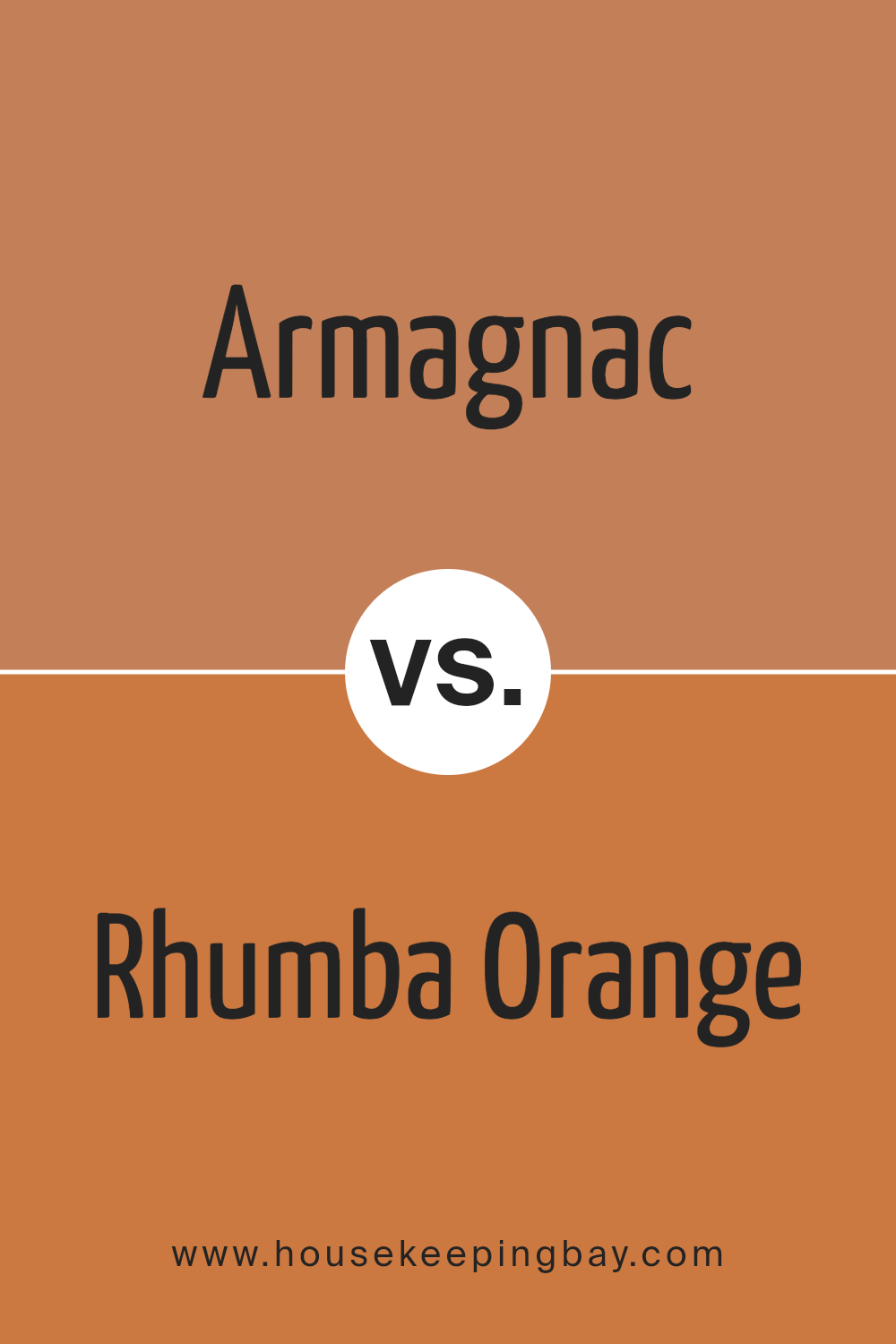
Armagnac SW 6354 by Sherwin Williams vs Rhumba Orange SW 6642 by Sherwin Williams
Armagnac SW 6354 and Rhumba Orange SW 6642 by Sherwin Williams offer warm, inviting tones, though they have distinct characteristics. Armagnac presents a rich, earthy hue with brown undertones, giving it a classic, sophisticated appearance. It evokes warmth and comfort, making it a great choice for creating cozy spaces.
In contrast, Rhumba Orange brings a more vibrant, lively energy to a room. With its bright orange shade, it adds a playful touch to any space. This color works well in areas where you want to inspire creativity and energy, such as kitchens or playrooms.
While Armagnac feels more grounded, offering a sense of stability, Rhumba Orange brings a burst of cheerfulness. Both colors emit warmth but suit different moods and purposes. Armagnac fits rooms requiring understated elegance, while Rhumba Orange suits areas needing a lively, energetic feel. Together, they can create a balanced and dynamic palette in any home.
You can see recommended paint color below:
- SW 6642 Rhumba Orange
housekeepingbay.com
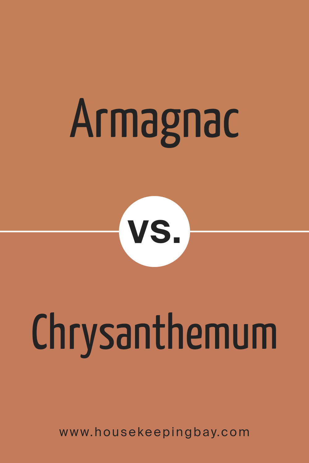
Armagnac SW 6354 by Sherwin Williams vs Chrysanthemum SW 6347 by Sherwin Williams
Armagnac SW 6354 by Sherwin Williams features a warm, earthy tone, reminiscent of a rich blend of brown and red. This color brings a cozy, comforting feel, making it a great choice for spaces where you want a sense of intimacy and warmth. Its depth allows it to create a grounded and welcoming atmosphere.
Chrysanthemum SW 6347, however, leans towards a lighter, more cheerful side of the color spectrum. It has a hint of orange mixed with soft yellow, adding brightness and energy to a room. Its vibrant hue can enliven spaces, making them feel sunny and uplifting.
While both colors possess warmth, Armagnac offers a more subdued, sophisticated vibe, ideal for creating cozy corners. Chrysanthemum, with its lively undertones, infuses spaces with enthusiasm and cheerfulness. Choosing between them depends on whether you seek a peaceful, relaxed environment or a lively, spirited ambiance.
You can see recommended paint color below:
- SW 6347 Chrysanthemum
housekeepingbay.com
Armagnac SW 6354 by Sherwin Williams vs Autumnal SW 6361 by Sherwin Williams
Armagnac SW 6354 and Autumnal SW 6361, both by Sherwin Williams, offer warm, earthy tones that bring a cozy feel to spaces. Armagnac is a rich, warm shade of brown with red undertones. It adds depth and a touch of sophistication, making it great for living rooms or studies. Its color suggests warmth and elegance, creating an inviting atmosphere.
Autumnal SW 6361, meanwhile, leans towards an orange-brown hue. It has a lighter, more vibrant character, reminiscent of fallen leaves in autumn. This color can bring energy and brightness to a room, making it suitable for kitchens or family spaces where warmth and liveliness are desired.
In comparison, Armagnac feels more subdued and classic, while Autumnal projects a lively, cheerful vibe. Both colors work well in homes, but their different tones can set different moods depending on the desired feel of a space.
You can see recommended paint color below:
- SW 6361 Autumnal
housekeepingbay.com
Armagnac SW 6354 by Sherwin Williams vs Copper Harbor SW 6634 by Sherwin Williams
Armagnac SW 6354 and Copper Harbor SW 6634, both by Sherwin Williams, present rich, warm tones. Armagnac is a soft, muted reddish-brown that gives off a cozy, sophisticated vibe. Its warmth and subtleness make it a perfect choice for spaces seeking a calm, inviting atmosphere. Copper Harbor, by contrast, exudes more energy with its vibrant, fiery orange-red hue.
This color commands attention and can make a space feel lively and exciting. While both colors share an underlying warmth, Armagnac leans towards understated elegance, whereas Copper Harbor showcases boldness.
Armagnac suits those who prefer a soothing ambiance, while Copper Harbor is ideal for those looking to add a punch of color to their space.
The difference lies in their intensity; Armagnac is gentle and enveloping, whereas Copper Harbor stands out with its striking, energetic presence. Both create distinct atmospheres suited to different moods and settings.
You can see recommended paint color below:
- SW 6634 Copper Harbor
housekeepingbay.com
Armagnac SW 6354 by Sherwin Williams vs Caribbean Coral SW 2854 by Sherwin Williams
Armagnac SW 6354 by Sherwin Williams presents a rich, warm hue that evokes the deep, earthy tones of terracotta or burnt orange. This color feels cozy and inviting, reminiscent of autumn leaves and rustic pottery. It tends to bring a sense of comfort and warmth to spaces, making it suitable for living rooms or dining areas where gathering and warmth are desired.
Caribbean Coral SW 2854, in contrast, offers a lively, vibrant shade that leans towards a cheerful pinkish-orange. This color creates a sense of joy and energy. It brightens up spaces like playrooms or accent walls, where a lively atmosphere is appealing.
Though both colors belong to the warm family, Armagnac provides a grounded and mature feel, while Caribbean Coral brings a playful and energetic vibe. Choosing between them depends on whether you want a calming, earthy environment or a lively, upbeat setting.
You can see recommended paint color below:

housekeepingbay.com
Armagnac SW 6354 by Sherwin Williams vs Copper Wire SW 7707 by Sherwin Williams
Armagnac SW 6354 by Sherwin Williams is a warm, inviting color that combines the essence of rich red and earthy brown. It reminds one of autumn leaves, creating a cozy, welcoming atmosphere. This color works well in living spaces, providing a sense of comfort and classic elegance.
Copper Wire SW 7707, also by Sherwin Williams, offers a spicier, more vibrant hue. It has a brighter, more coppery tone compared to Armagnac. This color feels energetic and bold, making it a great choice for adding personality to spaces like kitchens or accent walls.
Both colors share a warm undertone, making them excellent choices for creating a homely ambiance. While Armagnac leans towards a more subdued, timeless appeal, Copper Wire brings a lively and modern touch. Using either or both can add depth and warmth to interior spaces, highlighting their unique characteristics and creating memorable visual effects.
You can see recommended paint color below:
- SW 7707 Copper Wire
housekeepingbay.com
Armagnac SW 6354 by Sherwin Williams vs Subdued Sienna SW 9009 by Sherwin Williams
Armagnac SW 6354 by Sherwin Williams offers a warm, rich, earthy tone reminiscent of aged whiskey barrels. This color brings a cozy, rustic feel to spaces, providing a sense of comfort and warmth. Its deep hue makes it suitable for creating intimate living areas or adding a touch of elegance to dining rooms.
Subdued Sienna SW 9009, however, has a softer, more muted tone. It feels calmer, making it excellent for spaces needing a relaxed, understated atmosphere. This color fits well in bedrooms or areas where a peaceful ambiance is desired.
While Armagnac carries a bold, assertive presence, Subdued Sienna offers a more subtle and calming touch.
Pairing both provides a balanced aesthetic, with the robust nature of Armagnac complementing the gentle, quiet elegance of Subdued Sienna. Together, these colors create a harmonious blend, perfect for those seeking warmth and serenity in their interiors.
You can see recommended paint color below:
- SW 9009 Subdued Sienna
housekeepingbay.com
Armagnac SW 6354 by Sherwin Williams vs Tigereye SW 6362 by Sherwin Williams
Armagnac SW 6354 and Tigereye SW 6362, both from Sherwin Williams, present distinct vibes while still offering a sense of warmth. Armagnac SW 6354 resembles a cozy, clay-like hue, reminiscent of terracotta. It brings a subtle warmth that can create an inviting atmosphere. This color works well in spaces needing a touch of earthiness.
Tigereye SW 6362 offers a richer, more golden tone. It carries hints of amber, giving off a vibrant and energizing feel. This color can add a lively punch to any room, making it suitable for areas where you want more energy and brightness.
When you compare the two, remember that Armagnac has a softer, more muted quality, making it good for creating a calm and soothing environment. Tigereye offers more intensity, ideal for lively settings. Both colors can complement each other beautifully when used together, providing warmth in unique ways.
You can see recommended paint color below:
- SW 6362 Tigereye
housekeepingbay.com
Armagnac SW 6354 by Sherwin Williams vs Baked Clay SW 6340 by Sherwin Williams
Armagnac SW 6354 by Sherwin Williams offers a warm, earthy feel that hints at muted brown with subtle reddish undertones. It evokes a sense of comfort, making it suitable for living spaces where that cozy, inviting atmosphere is desired. Its rich tone can add depth, giving rooms a grounded presence.
Baked Clay SW 6340, also by Sherwin Williams, shares a warm, earthy vibe but leans more towards a terracotta hue. This color integrates orange-red elements, giving it a brighter, more vibrant appearance. Baked Clay stands out in spaces that embrace a touch of energetic warmth, enhancing areas needing lively or energetic undertones.
In essence, Armagnac provides a darker, deeper warmth, perfect for cozy settings, while Baked Clay adds a splash of warm liveliness ideal for spaces seeking a burst of color. Both colors suit interiors aiming for an inviting, earthy aesthetic.
You can see recommended paint color below:
- SW 6340 Baked Clay
housekeepingbay.com
Armagnac SW 6354 by Sherwin Williams vs Emberglow SW 6627 by Sherwin Williams
Armagnac SW 6354 by Sherwin Williams brings warmth and richness with its deep, earthy brown tones. It evokes a sense of comfort, making spaces feel cozy and inviting. Its hue suggests natural, grounded elements, often reminding one of autumn leaves or rich leather, enhancing a room’s sophistication.
Emberglow SW 6627 by Sherwin Williams, contrastingly, offers vibrance with its vivid orange-red shade. This lively color commands attention, brightening spaces with energy and enthusiasm. Emberglow sparks creativity and bold expression, reminiscent of sunsets or crackling fireplaces.
Choosing between these colors depends on desired atmosphere. Armagnac suits spaces aiming for warmth and elegance, promoting relaxation and coziness. It’s perfect for living rooms or dens seeking timeless charm. Meanwhile, Emberglow suits areas needing stimulation and dynamic moods.
Ideal for accent walls or creative spaces, it invites lively interaction. Each color brings its unique character, shaping environments effectively based upon individual preference.
You can see recommended paint color below:
housekeepingbay.com
Conclusion
SW 6354 Armagnac by Sherwin Williams is a paint color that leaves a lasting impression. With its rich, warm tones, it brings a sense of comfort and coziness to any space. The hue strikes a balance between bold and subtle, making it versatile enough to complement a range of design styles.
When I use Armagnac in a room, I notice how it transforms the mood, adding a depth that feels both inviting and grounding. It’s perfect for creating a welcoming ambiance in living rooms, dining areas, or even a bedroom where warmth is desired.
I love how, depending on the lighting, the color shifts subtly, adding an element of intrigue to the space.
Pairing Armagnac with neutral colors or lighter shades emphasizes its elegant undertone, while combining it with darker hues gives a more sophisticated look. This flexibility makes it an appealing choice for anyone looking to refresh their interior without overwhelming the senses.
Incorporating Armagnac into my designs has shown me the impact the right color can have on a space. It offers a unique blend of depth and warmth, proving that a simple color choice can make a significant difference in the atmosphere of a home.
housekeepingbay.com
Ever wished paint sampling was as easy as sticking a sticker? Guess what? Now it is! Discover Samplize's unique Peel & Stick samples. Get started now and say goodbye to the old messy way!
Get paint samples


