Adriatic Sea SW 6790 by Sherwin Williams
Dive into the Depths of Refreshing Blue
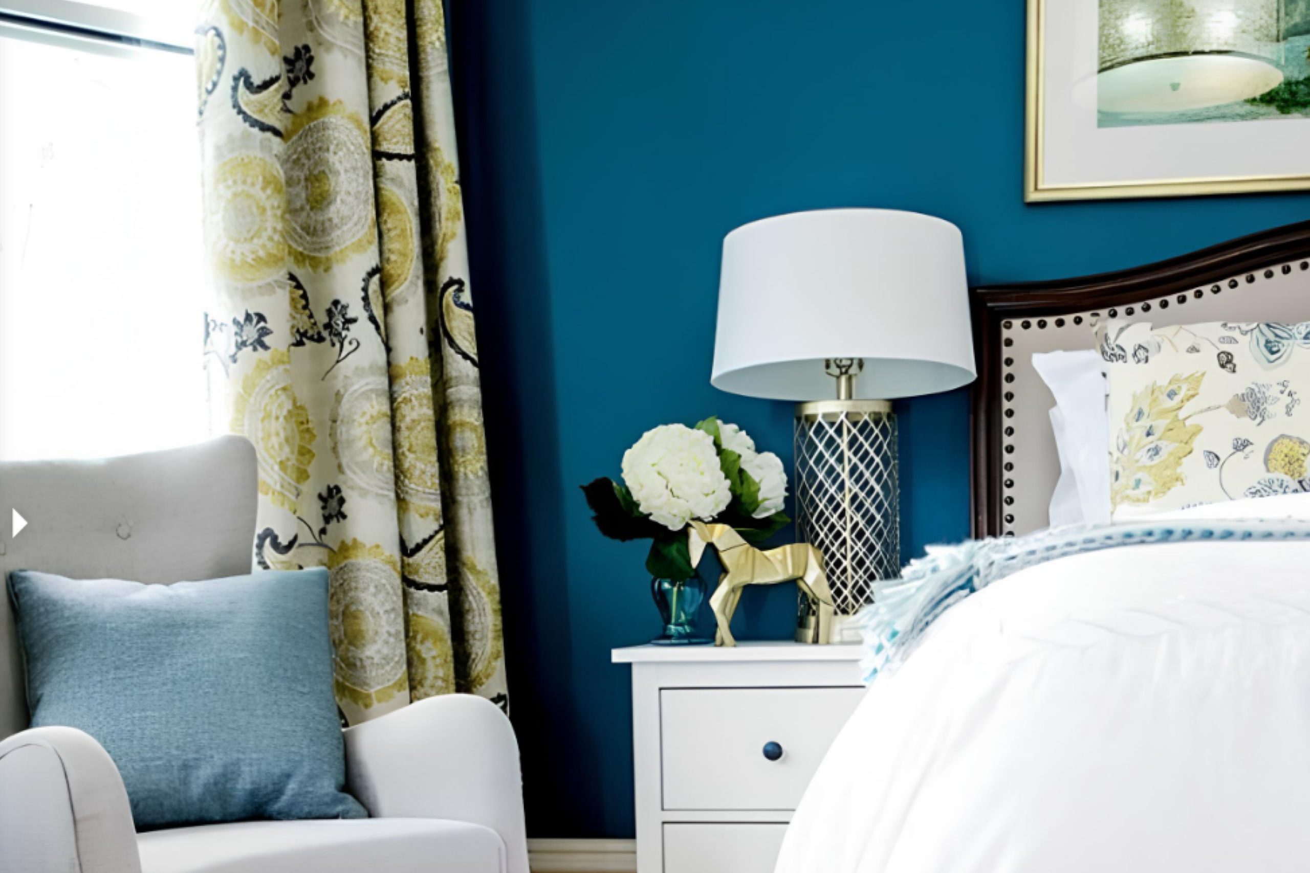
When you’re ready to refresh your living space, SW 6790 Adriatic Sea by Sherwin Williams offers a calm and soothing color choice. This shade of blue mingles the relaxed vibe of coastal life with a touch of elegant sophistication. It can create a peaceful atmosphere that is both inviting and refreshing, making it perfect for bedrooms, living rooms, or even a chic home office.
Imagine your walls awash with a color that brings a bit of the seaside into your home, offering an escape from the hustle and bustle of daily life. Adriatic Sea combines the depth of ocean blues with a hint of green, offering a balanced tone that is not overwhelming.
This makes it easy to pair with both neutral and bold accents, allowing your style to shine through.
Paint can significantly change how a room feels, and choosing the right shade is essential.
With SW 6790, you get a reliable hue that works well in various lighting situations, providing endless possibilities for your decor plans. Whether you want to create a breezy beachy theme or just aim for a serene setting, this shade will fit seamlessly into your vision.
Let this color become a backdrop for your life and see how it enhances the atmosphere of your home.
via Pinterest by @SherwinWilliams
What Color Is Adriatic Sea SW 6790 by Sherwin Williams?
Table of Contents
Adriatic Sea SW 6790 by Sherwin Williams is a rich, deep blue that evokes the serene beauty of oceanic depths. This color adds a sense of calm and sophistication to spaces, making it a popular choice for those wanting to bring a touch of nature indoors. Its cool, refreshing tone creates a striking contrast against lighter shades and complements a variety of design styles.
In interior design, Adriatic Sea works exceptionally well in coastal, nautical, and contemporary settings. It’s ideal for creating an accent wall in a bedroom or living room, adding depth and interest. The color pairs beautifully with white trims and moldings, highlighting its bold nature.
Soft neutrals like beige or gray can also balance its intensity while keeping the room inviting and cozy.
For materials and textures, Adriatic Sea goes well with natural elements like light or dark wood, which highlight its earthy appeal. Pairing with materials like brushed nickel or chrome can add a modern touch.
Textures such as linen and cotton in soft, neutral colors can enhance its calming effect, while textures like velvet or leather can add a rich contrast.
This versatile blue offers endless possibilities for crafting spaces that feel both relaxed and refined.
housekeepingbay.com
Is Adriatic Sea SW 6790 by Sherwin Williams Warm or Cool color?
Adriatic SeaSW 6790 by Sherwin Williams showcases a rich, vibrant teal that infuses energy and style in any home. This color brings the refreshing essence of the sea indoors, creating a lively yet calming atmosphere. When used in living spaces, Adriatic Sea can help spaces feel inviting and lively without overwhelming the senses.
It pairs beautifully with neutral tones such as whites and grays, allowing it to stand out and add a pop of color.
In bedrooms or bathrooms, this teal hue adds a serene vibe, reminiscent of peaceful ocean views. Lighting plays a key role, as natural light can enhance its brightness, while softer lighting can create a cozy ambiance. Adriatic Sea also works well as an accent color, on walls or furniture pieces, drawing attention and adding character. Ultimately, it offers versatility, making it an excellent choice for those looking to enhance their home’s decor with a touch of boldness.
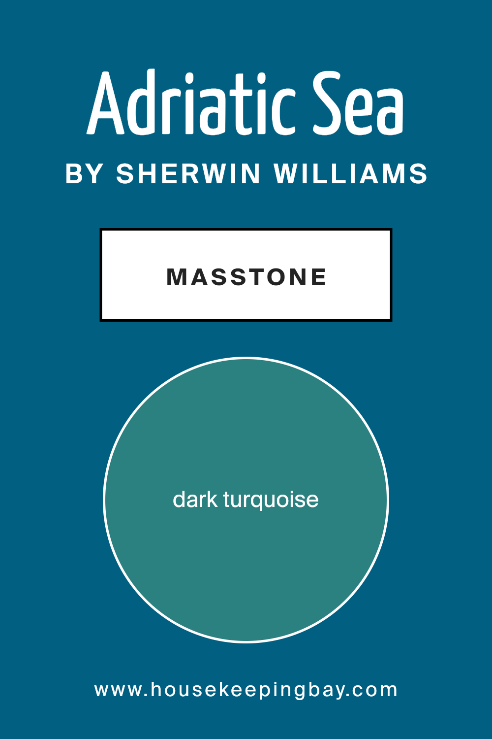
What is the Masstone of the Adriatic Sea SW 6790 by Sherwin Williams?
Adriatic SeaSW 6790 by Sherwin Williams is a beautiful dark turquoise shade that offers a soothing yet sophisticated look. The masstone of this color is a rich turquoise, suggesting a calming and serene atmosphere. When used in homes, this color brings a touch of nature indoors.
Turquoise blends blue’s calmness with green’s freshness, creating a peaceful ambiance perfect for relaxation. It works well in living rooms, bedrooms, or bathrooms, offering a refreshing sense. Additionally, Adriatic Sea can add interest to a space without being overwhelming.
It pairs nicely with neutral tones like beige, cream, or gray, which balance its boldness. Dark wood furniture or metallic accents can complement this shade, enhancing a chic aesthetic. In kitchens, it brings a vibrant feel, making cooking areas inviting.
Whether used as an accent wall or for entire rooms, this color adds depth and character that many homeowners appreciate.
housekeepingbay.com
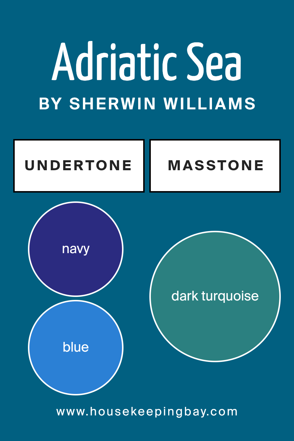
Undertones of Adriatic Sea SW 6790 by Sherwin Williams
Adriatic Sea SW 6790 by Sherwin Williams offers a rich blend of colors, thanks to its unique undertones. These undertones include navy, blue, dark green, dark blue, dark grey, light turquoise, and more. A color’s undertones can influence the way we perceive it. They add depth and complexity, making a color appear different under various lighting conditions and when paired with other colors.
The navy and dark blue undertones make Adriatic Sea feel deep and calm, ideal for creating a soothing atmosphere in a room. Dark green and olive add an earthy touch, grounding the space and bringing in a sense of nature.
Light turquoise and mint introduce a fresh and airy element, perfect for adding brightness without overwhelming a room.
Shades of purple and violet contribute to a regal, elegant feel, while grey tones add versatility, allowing the color to blend seamlessly with a variety of decor styles. Brown undertones can introduce warmth, balancing the cooler aspects of the color.
In an interior space, Adriatic Sea can create a calming and balanced environment. Its complex undertones make it flexible and dynamic, enabling it to complement modern, traditional, or eclectic settings with equal ease. The result is a harmonious and liveable space.
housekeepingbay.com
Coordinating Colors of Adriatic Sea SW 6790 by Sherwin Williams
Coordinating colors are hues that complement one another, creating a visually pleasing and harmonious look. When you use coordinating colors, they work together to enhance the overall aesthetic of a space. Adriatic Sea SW 6790 by Sherwin Williams is a vibrant and crisp blue that can bring a fresh feeling to any room.
To complement this color, you can use Aesthetic White SW 7035, Bravo Blue SW 6784, and Felted Wool SW 9171. Each of these colors adds a unique dimension to any space while perfectly balancing the boldness of Adriatic Sea.
Aesthetic White SW 7035 is a soft, warm white that adds a gentle warmth to any palette. It provides a neutral base that allows other colors to shine without overpowering them. Bravo Blue SW 6784 is a lively and refreshing light blue that beautifully complements the deeper tones of Adriatic Sea, adding layers of depth and interest.
Felted Wool SW 9171 is a versatile gray that provides a grounding element. It brings a touch of sophistication, rounding out the color scheme with its elegant undertones.
Together, these colors create a harmonious environment that feels cohesive and inviting, making them perfect for enhancing the appeal of any space.
You can see recommended paint colors below:
- SW 7035 Aesthetic White
- SW 6784 Bravo Blue
- SW 9171 Felted Wool

housekeepingbay.com
How Does Lighting Affect Adriatic Sea SW 6790 by Sherwin Williams?
Lighting plays a significant role in how we perceive colors. Different light sources can change a color’s appearance, making it look slightly different depending on whether it’s seen in natural sunlight or under artificial light. Adriatic Sea SW 6790 by Sherwin Williams is a deep blue-green shade that can look versatile and dynamic, changing its vibe with varying light conditions.
Artificial Light: Under incandescent bulbs, this color may appear warmer, displaying a richer and slightly muted version of its green tones, giving the space a cozy feel.
Under fluorescent lighting, this color might seem cooler, emphasizing more blue hues, which can sometimes make it feel a bit colder than intended. LEDs, depending on their temperature, can highlight either cool or warm tones of Adriatic Sea.
Natural Light: Sunlight brings out the true beauty of this shade. In natural light, Adriatic Sea reveals its deep, rich color with a blend of blue and green. However, different room orientations can affect its perception:
1. North-Faced Rooms: These receive cooler, less direct light, often making colors appear darker and cooler. Adriatic Sea may lean more toward its blue tones, appearing deeper and more subdued.
2. South-Faced Rooms: With abundant direct sunlight throughout the day, south-facing rooms can make this color appear brighter and more vibrant. The light will enhance both blue and green hues, giving the room an energized yet soothing look.
3.East-Faced Rooms: Morning sunlight gives a warm and soft feeling. In these rooms, Adriatic Sea will show a lighter, more refreshing side, possibly highlighting greener hues in the morning, while more muted tones take over as the day progresses.
4.West-Faced Rooms: These rooms have warm lighting in the afternoon and evening. Adriatic Sea can feel warm during sunset hours, with its green tones complemented by orange light, creating a cozy and inviting atmosphere.
Overall, the interaction between Adriatic Sea and lighting conditions can significantly change the ambiance of a room. Adjusting light sources provides flexibility in how this color is experienced in different spaces.
housekeepingbay.com
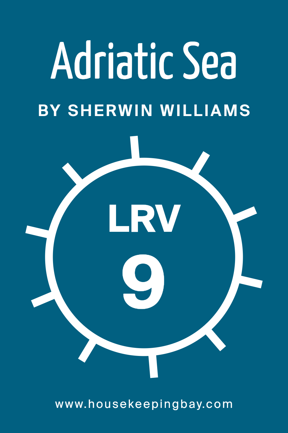
What is the LRV of Adriatic Sea SW 6790 by Sherwin Williams?
LRV stands for Light Reflectance Value. It is a measurement that tells us how much light a color reflects. On a scale from 0 to 100, 0 is completely black, and 100 is pure white. A color with a low LRV, like 9.223, means it reflects little light and absorbs most of it.
This makes the color appear darker in a room. If you paint a room with a color that has such a low LRV, it can make the space feel cozy and intimate but also smaller and less bright.
For the color Adriatic SeaSW 6790 by Sherwin Williams, having an LRV of 9.223 means it is a very rich and deep color. On walls, it will look intense and striking, potentially adding a lot of depth to your space. Because it does not reflect much light, this color might seem different depending on the lighting in the room.
In a room with little natural light, it might appear even darker, whereas in a room with lots of light, it will look livelier but still quite profound. It’s important to consider these factors when choosing such a bold color for your walls.
housekeepingbay.com
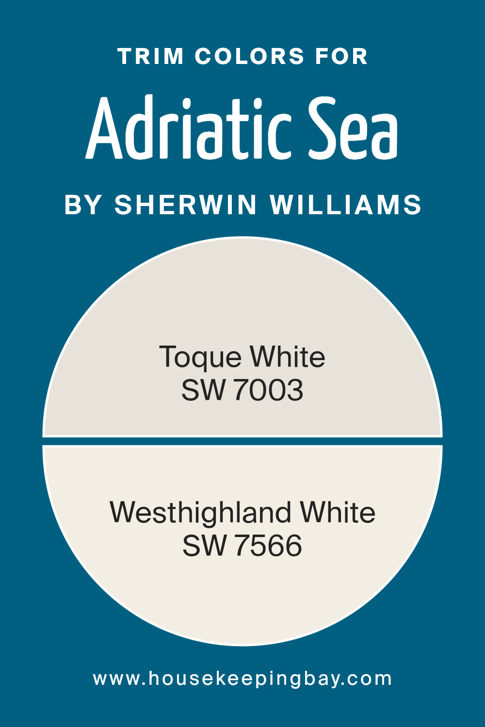
What are the Trim colors of Adriatic Sea SW 6790 by Sherwin Williams?
Trim colors are the shades used on the edges of walls, doors, and windows to create a clean and defined look in a space. They provide a visual border that helps to make the main color pop, ensuring harmony across the room.
For the Adriatic Sea SW 6790 by Sherwin Williams, trim colors are crucial because they can enhance and balance its deep blue-green tone, offering a fresh perspective or a subtle contrast. Toque White SW 7003 and Westhighland White SW 7566 are excellent trim choices that complement Adriatic Sea.
These soft, neutral tones gently highlight the boldness of the main color without overpowering it.
Toque White SW 7003 is a delicate, muted white with warm undertones, giving it a cozy and inviting feel. It provides a soft contrast to vibrant colors, adding brightness without harshness. On the other hand, Westhighland White SW 7566 is slightly creamier, with its subtle warmth adding a touch of elegance.
Its gentle hue can soften the room, making it appear more spacious and open while maintaining a cohesive look with the main wall color.
Both trim choices offer a graceful backdrop for the deep tones of Adriatic Sea, enhancing its impact while maintaining a unified design palette.
You can see recommended paint colors below:
housekeepingbay.com
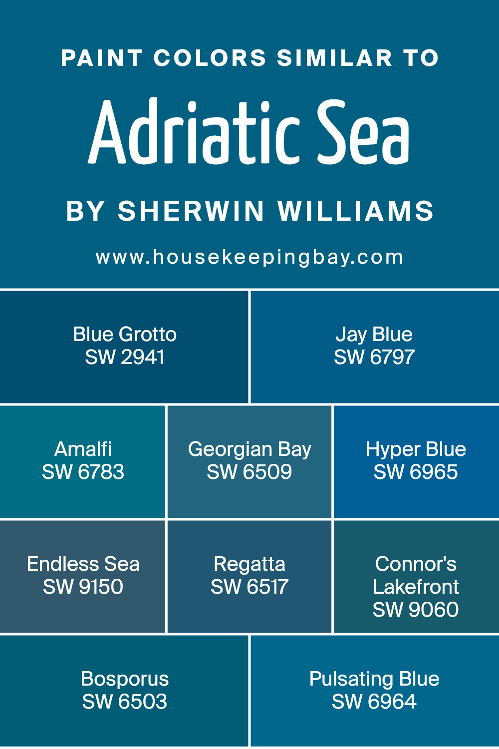
Colors Similar to Adriatic Sea SW 6790 by Sherwin Williams
Colors close to Adriatic Sea SW 6790 by Sherwin Williams provide a sense of harmony and cohesion in design. These hues can be used together to create a soothing, balanced environment. Blue Grotto (SW 2941) offers a rich, calming blue reminiscent of tranquil caves, while Jay Blue (SW 6797) brings in a brighter, more vibrant tone, perfect for adding energy to any space.
Amalfi (SW 6783) evokes the peacefulness of coastal Italian skies, adding a touch of serenity wherever it is applied. Georgian Bay (SW 6509) mirrors the deep waters of a northern bay, offering a bold yet comforting presence.
Hyper Blue (SW 6965) gives off a vivid energy, ideal for those looking to make a confident statement, whereas Endless Sea (SW 9150) inspires with its deep, expansive feel, suggesting boundless possibilities. Regatta (SW 6517) embodies the lively feel of sailboat races, adding a touch of adventure to the mix.
Connor’s Lakefront (SW 9060) delivers a balanced, earthy blue, echoing the calm of a quiet lakeside.
Bosporus (SW 6503) captures the historical mystique of the famous strait, infusing spaces with its rich, cultural undertones. Pulsating Blue (SW 6964), with its dynamic intensity, creates an engaging backdrop that draws attention and captures interest.
You can see recommended paint colors below:
- SW 2941 Blue Grotto
- SW 6797 Jay Blue
- SW 6783 Amalfi
- SW 6509 Georgian Bay
- SW 6965 Hyper Blue
- SW 9150 Endless Sea
- SW 6517 Regatta
- SW 9060 Connor’s Lakefront
- SW 6503 Bosporus
- SW 6964 Pulsating Blue
housekeepingbay.com
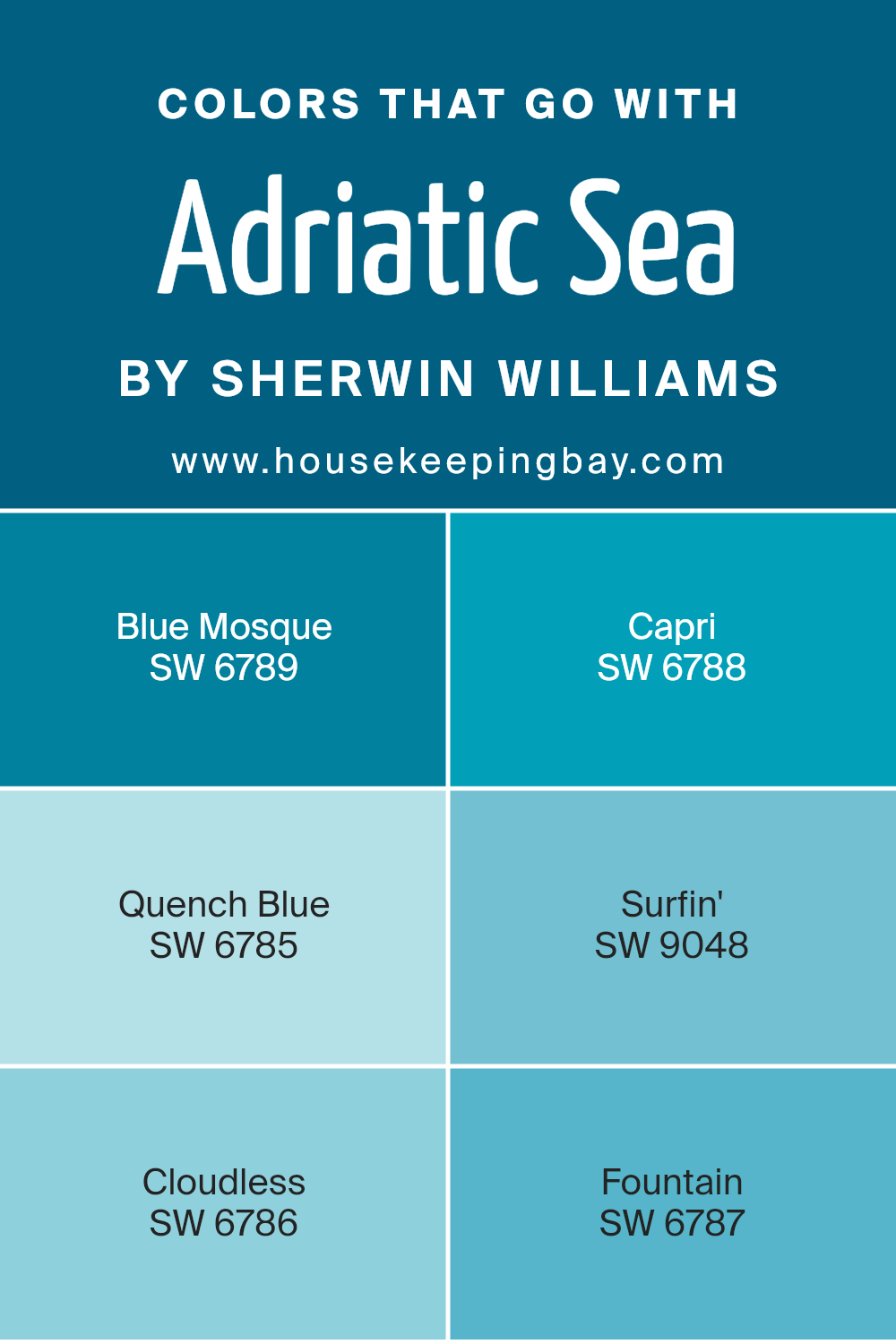
Colors that Go With Adriatic Sea SW 6790 by Sherwin Williams
Colors that pair with Adriatic Sea SW 6790 by Sherwin Williams bring depth and harmony to any room. Using colors like Blue Mosque SW 6789 creates a rich look, as its deep blue tone enhances the vibrant nature of Adriatic Sea, giving the space a sense of depth and luxury.
Capri SW 6788, on the other hand, offers a lighter touch, its soft aqua hue complements Adriatic Sea’s intensity, for an airy, refreshing atmosphere. Quench Blue SW 6785, with its energetic and bright tone, adds a lively and invigorating contrast, bringing out the dynamic feel of the room.
Meanwhile, Surfin’ SW 9048’s playful turquoise can highlight Adriatic Sea’s cool base, creating a vibrant and youthful vibe.
Cloudless SW 6786 provides a very serene counterbalance with its soft, clear blue, ideal for spaces aiming for calmness. The delicate shade of Fountain SW 6787, with its muted and soothing turquoise, blends effortlessly with Adriatic Sea to create a peaceful environment.
The interaction of these colors with each other can change the mood and feel of a space, making it versatile for different tastes and functions. Adding these shades alongside Adriatic Sea can shape a room that feels both fresh and inviting, giving it character and style without overwhelming it.
You can see recommended paint colors below:
- SW 6789 Blue Mosque
- SW 6788 Capri
- SW 6785 Quench Blue
- SW 9048 Surfin’
- SW 6786 Cloudless
- SW 6787 Fountain
housekeepingbay.com
How to Use Adriatic Sea SW 6790 by Sherwin Williams In Your Home?
Adriatic Sea SW 6790 by Sherwin Williams is a rich, beautiful teal paint color. It adds a lively touch to any room without being too bold. People often choose this color for spaces where they want a calm yet vibrant atmosphere. Using this color in living rooms or bedrooms can create a cozy and welcoming feel.
It pairs well with crisp whites or soft grays, allowing for a balanced palette. For those with an adventurous spirit, painting an accent wall in Adriatic Sea can add a splash of interest without overwhelming the space.
Complementary decor items, like throws or cushions in natural tones or metallics, can tie the room together nicely. Additionally, wooden furniture and greenery complement this shade, enhancing its look. Adriatic Sea SW 6790 offers versatility, making it suitable for a wide range of decorating styles and spaces.
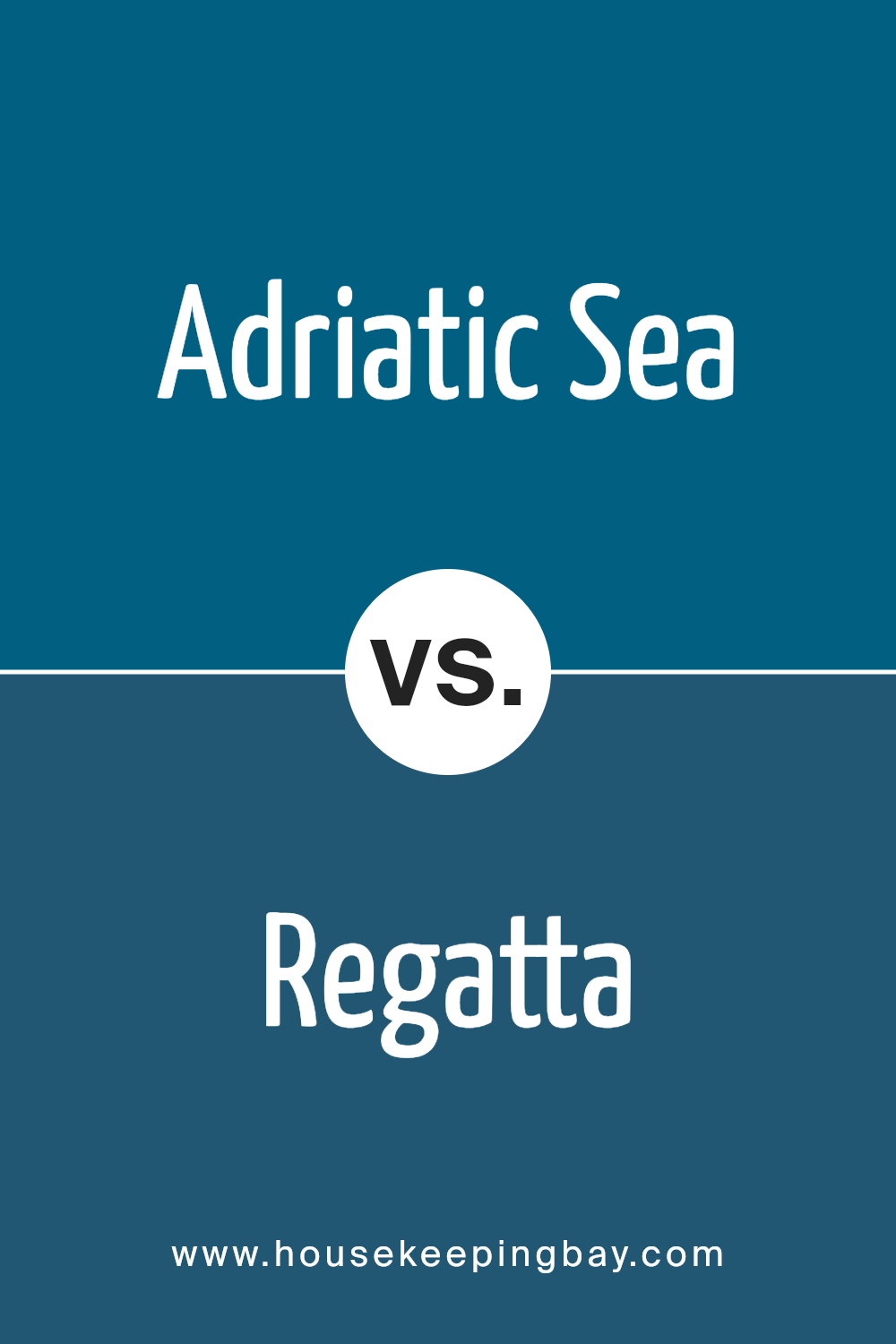
Adriatic Sea SW 6790 by Sherwin Williams vs Regatta SW 6517 by Sherwin Williams
Adriatic Sea SW 6790 and Regatta SW 6517, both from Sherwin Williams, are shades of blue but offer distinct characteristics. Adriatic Sea is a deep, muted blue with subtle green undertones, evoking the tranquil depths of the ocean. It’s a soothing color that brings a sense of calm and stability to a space.
Regatta, meanwhile, is a brighter, more vibrant blue. It exudes energy and cheerfulness, reminiscent of a clear sky on a sunny day. While Adriatic Sea works well in creating a peaceful, cozy atmosphere in living rooms or bedrooms, Regatta can energize a space like a bathroom or an accent wall in a more dynamic setting.
Both are versatile, but the choice between them depends on whether you prefer a calm or lively environment. Together, they illustrate different aspects of blue, from serene to spirited.
You can see recommended paint color below:
- SW 6517 Regatta
housekeepingbay.com
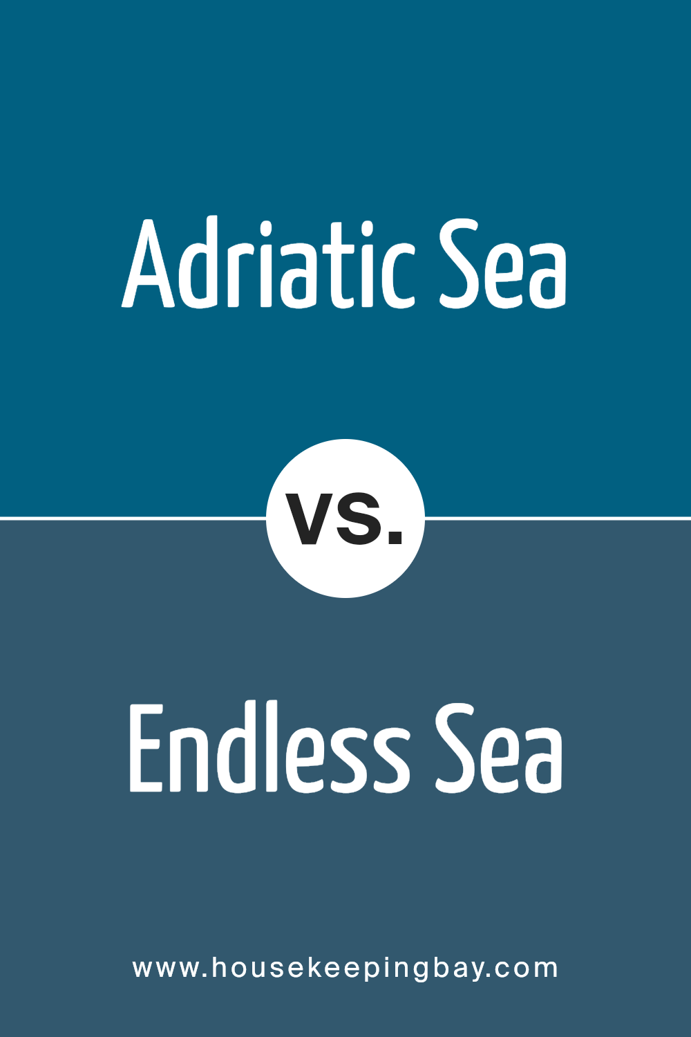
Adriatic Sea SW 6790 by Sherwin Williams vs Endless Sea SW 9150 by Sherwin Williams
Adriatic Sea SW 6790 by Sherwin Williams is a rich and vibrant blue with a hint of green, reminiscent of deep ocean waters. It has a lively and fresh feel, offering energy and brightness to any space. This color can create a cheerful and refreshing atmosphere, making it a great choice for living rooms or kitchens.
Endless Sea SW 9150, also by Sherwin Williams, is a darker, more subdued blue. It lacks the green undertone of Adriatic Sea and leans more towards a classic blue. Endless Sea feels deeper and more soothing, ideal for spaces where relaxation is a priority, such as bedrooms or study areas.
Both colors offer different moods. Adriatic Sea brings an uplifting and invigorating energy, while Endless Sea provides calmness and peacefulness. Depending on the desired ambiance, one might choose Adriatic Sea for vibrancy or Endless Sea for a more serene environment. Both are versatile and appealing.
You can see recommended paint color below:
- SW 9150 Endless Sea
housekeepingbay.com
Adriatic Sea SW 6790 by Sherwin Williams vs Georgian Bay SW 6509 by Sherwin Williams
Adriatic Sea SW 6790 by Sherwin Williams is a deep, rich blue with a touch of green, evoking images of ocean depths and adding a sense of calm and sophistication to spaces. It is ideal for creating an elegant and serene atmosphere, often suited for living rooms or bedrooms where a relaxing vibe is desired.
Georgian Bay SW 6509, also by Sherwin Williams, carries a slightly lighter tone compared to Adriatic Sea. It is a true blue that suggests clear skies and open waters, bringing a sense of openness and clarity. This color works well in spaces where you want to introduce freshness and brightness, like kitchens or bathrooms.
Both colors offer a coastal-inspired feel, yet Adriatic Sea provides a more dramatic and moody ambiance, while Georgian Bay contributes to an airy, inviting environment. Each shade can shape different moods in a room depending on the desired effect.
You can see recommended paint color below:
- SW 6509 Georgian Bay

housekeepingbay.com
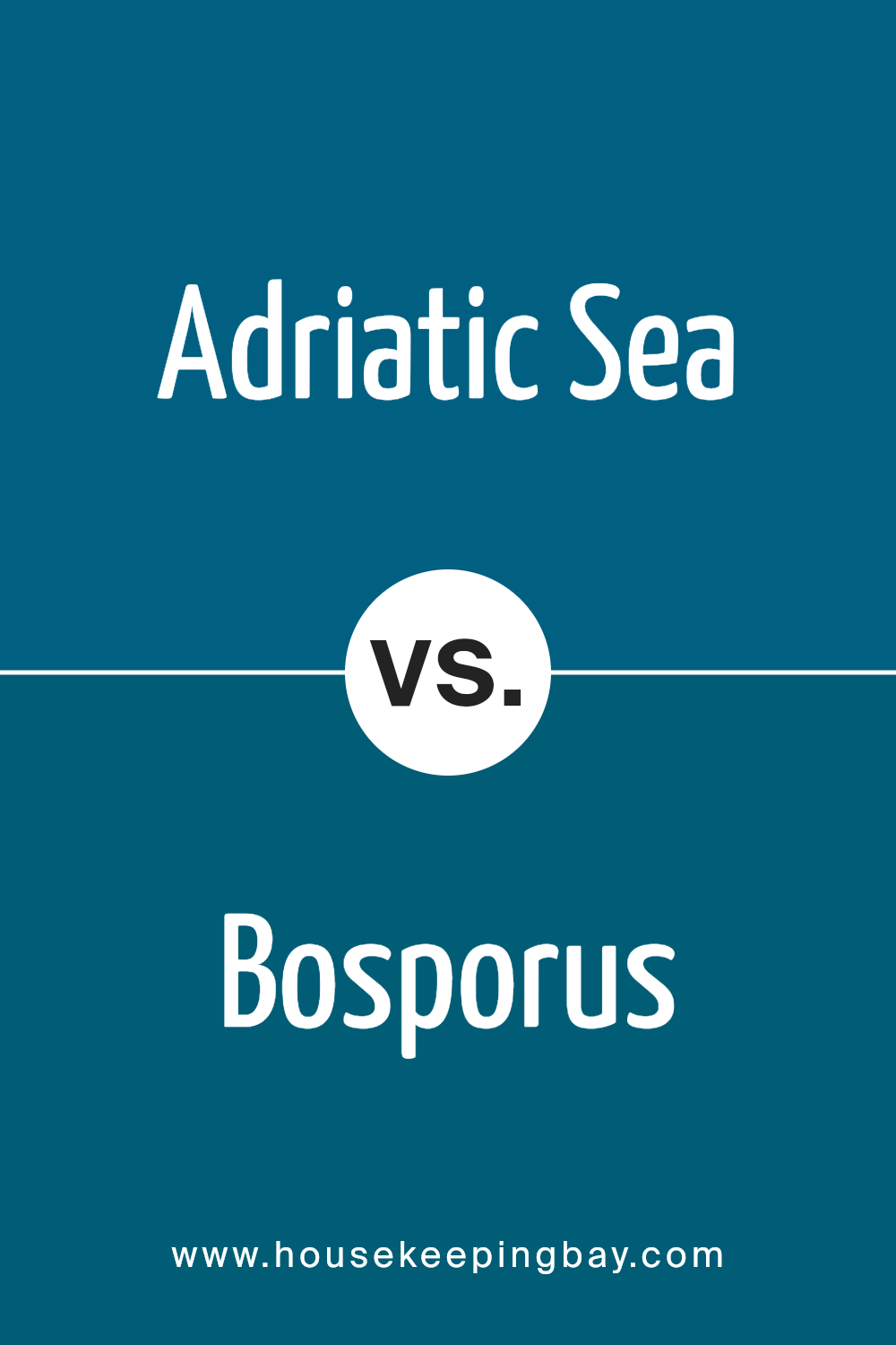
Adriatic Sea SW 6790 by Sherwin Williams vs Bosporus SW 6503 by Sherwin Williams
Adriatic Sea (SW 6790) and Bosporus (SW 6503) by Sherwin Williams are two rich, vibrant paint colors. Adriatic Sea is a deep teal, blending blue and green to create a calming, sophisticated look. This color reminds one of serene ocean depths, offering a refreshing yet timeless feel. It pairs well with neutral shades and warm tones, adding depth and elegance to any space.
Bosporus, however, leans more toward a true blue, with a hint of warmth that can feel inviting and classic. This shade evokes feelings of clear skies and encourages a sense of openness and brightness. It’s versatile, complementing both modern and traditional styles, and works well with whites and light greys.
While Adriatic Sea creates a softer, more relaxed mood, Bosporus stands out with its bold yet comforting presence. Both colors are excellent choices for bringing personality and richness to a room, offering distinct yet harmonious styles.
You can see recommended paint color below:
- SW 6503 Bosporus
housekeepingbay.com
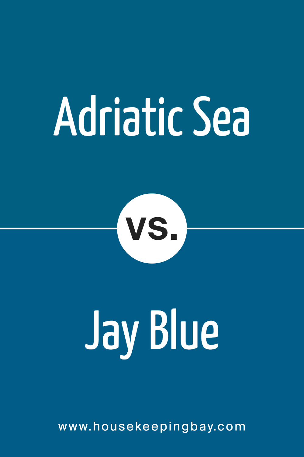
Adriatic Sea SW 6790 by Sherwin Williams vs Jay Blue SW 6797 by Sherwin Williams
Adriatic Sea SW 6790 and Jay Blue SW 6797, both by Sherwin Williams, offer distinct blue tones suitable for various design needs. Adriatic Sea SW 6790 leans towards a rich, deep blue with a hint of green, resembling the serene expanse of ocean waters. It presents a calming, sophisticated appearance, perfect for spaces seeking a soothing atmosphere.
In contrast, Jay Blue SW 6797 is a brighter, more vibrant blue. It’s lively and energetic, resembling the clear, vivid sky on a sunny day. This color injects energy and can help in creating a lively, cheerful environment.
While both colors are versatile, the choice between them depends on the desired mood of your space. Adriatic Sea suits more tranquil and elegant settings, while Jay Blue works well in areas needing a lively touch. Both can be excellent choices, each bringing its unique charm, depending on what you aim to achieve in your design.
You can see recommended paint color below:
housekeepingbay.com
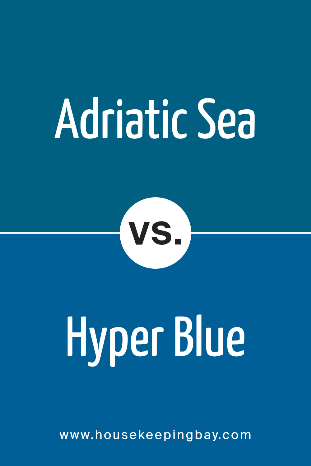
Adriatic Sea SW 6790 by Sherwin Williams vs Hyper Blue SW 6965 by Sherwin Williams
Adriatic Sea SW 6790 and Hyper Blue SW 6965 are two vibrant blues from Sherwin Williams with distinct personalities. Adriatic Sea offers a calm, medium blue with green undertones, similar to serene ocean waters. It brings a soothing feel, perfect for creating peaceful spaces like bedrooms or relaxation areas.
Hyper Blue, however, bursts with energy, showcasing a bright, intense blue that demands attention. It’s bold and lively, ideal for spaces needing a pop of color or an energetic vibe, like playrooms or creative studios.
While Adriatic Sea exudes a subtle elegance with its muted tones, Hyper Blue stands out with its vivid radiance. When choosing between them, consider the mood you wish to set: Adriatic Sea for a gentle, relaxing color or Hyper Blue for a dynamic, inspiring effect. These colors reflect different sides of blue, offering unique atmospheres for your interior spaces.
You can see recommended paint color below:
- SW 6965 Hyper Blue
housekeepingbay.com
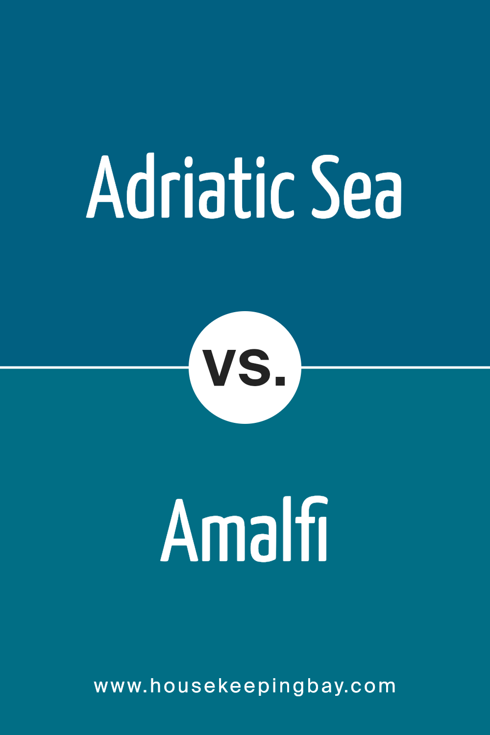
Adriatic Sea SW 6790 by Sherwin Williams vs Amalfi SW 6783 by Sherwin Williams
Adriatic Sea SW 6790 and Amalfi SW 6783 are both beautiful blue hues by Sherwin Williams, each offering a unique vibe for any space. Adriatic Sea is a deep, rich teal that brings a sense of depth and sophistication. With its darker tone, it can create a cozy, intimate atmosphere, making it ideal for spaces where a calm, grounded feeling is desired.
Amalfi, however, presents a lighter, more vibrant shade of blue-green. It resembles the sparkling waters of coastal destinations, adding a refreshing and energizing touch to rooms. Its lighter tone can make spaces feel open and airy, perfect for adding a lively spirit while remaining serene.
Both colors have their charm: Adriatic Sea offers a moody, elegant look, while Amalfi brings brightness and a touch of cheerfulness. Depending on the mood you want to create, either could beautifully enhance your environment.
You can see recommended paint color below:
- SW 6783 Amalfi
housekeepingbay.com
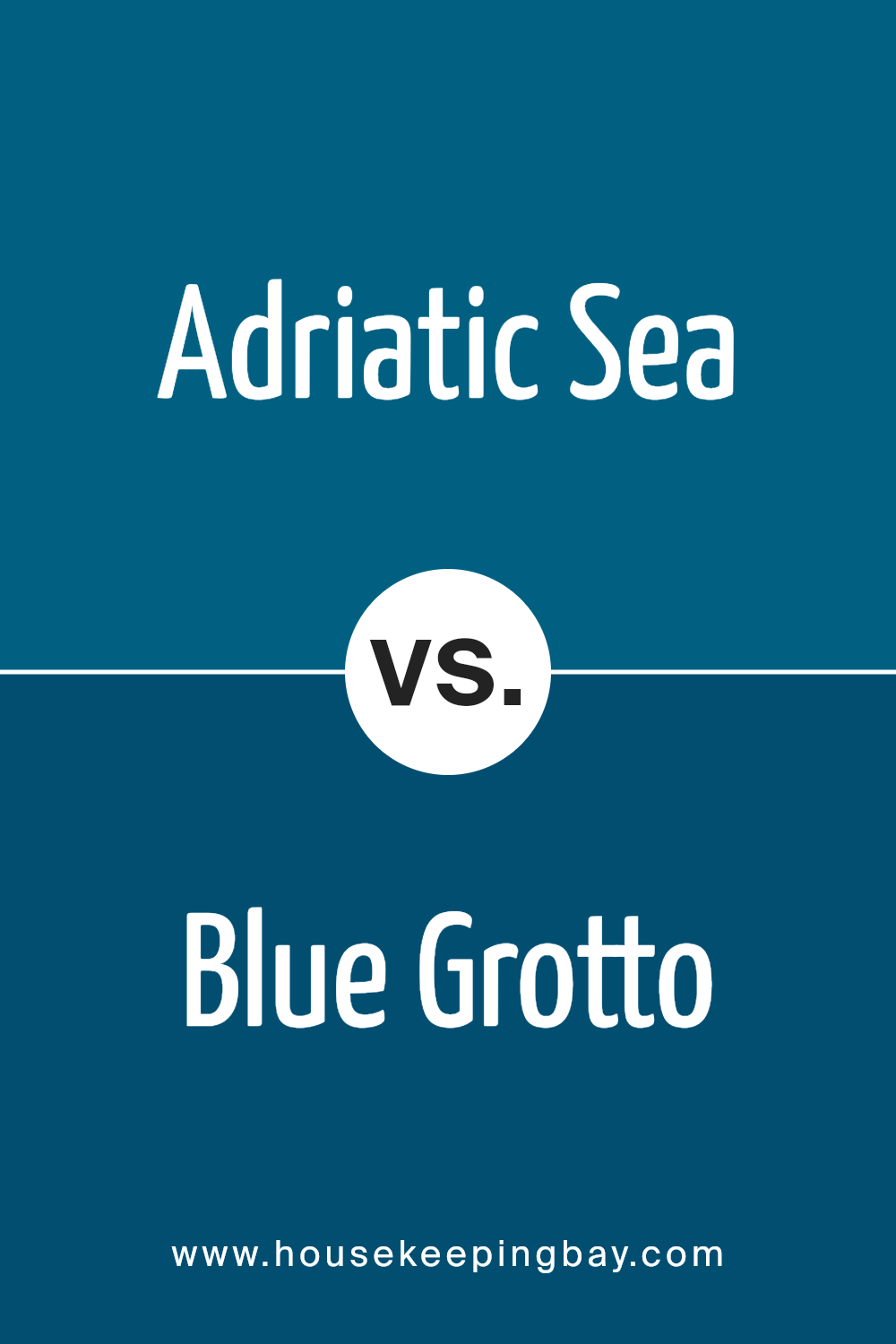
Adriatic Sea SW 6790 by Sherwin Williams vs Blue Grotto SW 2941 by Sherwin Williams
Adriatic Sea SW 6790 and Blue Grotto SW 2941, both by Sherwin Williams, present rich, appealing shades of blue. Adriatic Sea displays a deep, dark blue reminiscent of the Mediterranean waters. It carries strong, bold undertones, making spaces feel cozy and enclosed. This shade works well in intimate settings, adding drama and depth.
Conversely, Blue Grotto offers a lighter and more vibrant blue. It evokes the feeling of bright, open spaces with its airy, cheerful nature. Blue Grotto can make rooms feel larger, providing a sense of freshness and openness.
While Adriatic Sea brings intensity and warmth, Blue Grotto suggests lightness and airiness. Both colors work beautifully in different contexts—Adriatic Sea for spaces needing coziness and Blue Grotto for those wanting a breezy, expansive feel. Combining them can produce a harmonious balance between depth and brightness in any space.
You can see recommended paint color below:
- SW 2941 Blue Grotto
housekeepingbay.com
Adriatic Sea SW 6790 by Sherwin Williams vs Connor’s Lakefront SW 9060 by Sherwin Williams
Adriatic Sea SW 6790 by Sherwin Williams is a rich, deep teal-like blue with a hint of green, ideal for creating a calming, oceanic vibe. It’s a striking color, capable of drawing attention while still maintaining a sense of elegance. This color works well in spaces where you want to evoke a coastal or nautical feel, lending a soothing yet invigorating atmosphere to the room.
Connor’s Lakefront SW 9060, also by Sherwin Williams, takes on a more muted tone, resembling a dusty blue-gray. This shade provides a subtle and understated look, perfect for creating a relaxed and serene environment. It’s versatile, making it suitable for various settings, such as bedrooms or living areas where a laid-back, cozy ambiance is desired.
Both colors offer unique characteristics: Adriatic Sea brings boldness and vibrancy, whereas Connor’s Lakefront offers soft sophistication. Their individual vibes can tailor specific moods in any space.
You can see recommended paint color below:
- SW 9060 Connor’s Lakefront
housekeepingbay.com
Adriatic Sea SW 6790 by Sherwin Williams vs Pulsating Blue SW 6964 by Sherwin Williams
Adriatic Sea SW 6790 and Pulsating Blue SW 6964, both by Sherwin Williams, feature unique qualities. Adriatic Sea, a deep teal, blends blue and green tones, leading to a soothing and versatile vibe. It suits spaces needing calm, like bedrooms or study areas. Its muted nature pairs well with neutral colors, offering a sophisticated look.
Pulsating Blue SW 6964, however, bursts with energy. Bright and vibrant, this true blue stands out and injects life into any room. Ideal for accent walls or lively spaces, it enhances creativity and draws quick attention. It pairs perfectly with whites or lighter shades, creating a fresh, modern feel.
While Adriatic Sea offers a serene and peaceful atmosphere, Pulsating Blue injects excitement and boldness. Depending on the mood or effect desired, Adriatic Sea supports relaxation, while Pulsating Blue brings energy and brightness, showcasing the adaptability and range of blue tones.
You can see recommended paint color below:
- SW 6964 Pulsating Blue
housekeepingbay.com
Conclusion
SW 6790 Adriatic Sea by Sherwin Williams offers a serene and calming shade of blue that resonates with the natural beauty of coastal waters. As I reflect on this color, I appreciate how it brings a sense of soothing calmness to any space. Its muted tone is versatile, allowing it to complement a variety of design elements, whether it be in a living room, bedroom, or even a bathroom.
This particular shade has a unique ability to both ground and uplift a room, providing a backdrop that feels both peaceful and invigorating. It pairs well with neutral colors such as grays and beiges, as well as with bolder accents like deep greens or earthy browns.
In natural light, it appears airy and light, while in dimmer settings, it takes on a richer, more intimate hue.
With its subtle nod to the ocean’s endless horizon, SW 6790 Adriatic Sea has the power to bring a touch of nature indoors, creating a retreat-like atmosphere. I find it an excellent choice for anyone looking to create a space that feels both welcoming and refreshing.
It truly embodies a perfect balance of elegance and simplicity, making it a timeless option for those who value both style and comfort in their home environments.
housekeepingbay.com
Ever wished paint sampling was as easy as sticking a sticker? Guess what? Now it is! Discover Samplize's unique Peel & Stick samples. Get started now and say goodbye to the old messy way!
Get paint samples


