Woodlawn Blue HC-147 by Benjamin Moore
Calming Hue for Serene Spaces
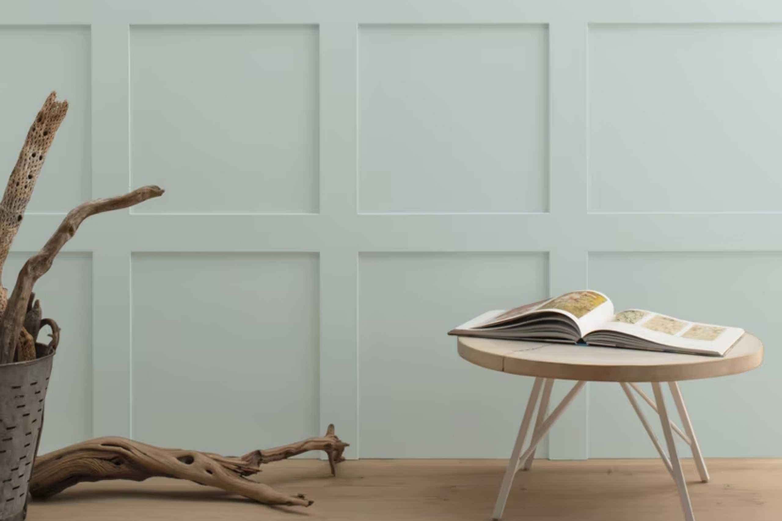
When you think about refreshing a space in your home, color plays a crucial role in setting the mood. This stands out for its charm and elegance is HC-147 Woodlawn Blue by Benjamin Moore. This paint color offers a soft, muted blue with subtle hints of green, creating a gentle and calming atmosphere.
Think of a color that can bring a sense of calmness to any room, whether it’s your living room, bedroom, or even a home office. Woodlawn Blue does just that. It has the unique ability to provide a serene backdrop while working harmoniously with different styles of decor.
Pair it with whites or creams for a classic look, or mix it with deeper grays and charcoals for a more contemporary feel.
This color doesn’t overpower—it gently whispers. The soft undertones can make a room feel cozy and inviting, yet sophisticated. It’s perfect for those who want to add color to their spaces without being too bold or vibrant.
If you want subtle elegance in your home, consider HC-147 Woodlawn Blue. It’s a choice that can turn any space into a peaceful haven, where you can relax and recharge.
via benjaminmoore.com
What Color Is Woodlawn Blue HC-147 by Benjamin Moore?
Woodlawn Blue HC-147 by Benjamin Moore is a soft, gentle shade that rests between blue and gray, offering a serene and inviting feel. Its muted quality allows it to act as a neutral backdrop while still adding a touch of color. This versatility makes it a great choice for various interior styles.
In coastal-themed spaces, Woodlawn Blue can mimic the calmness of the sea, pairing beautifully with natural elements like driftwood and jute. It also suits a farmhouse style, complementing rustic wood tones and whitewashed finishes.
For a modern, contemporary look, Woodlawn Blue works well with sleek, minimalist furniture and metallic accents. Its understated elegance can soften industrial spaces when combined with exposed brick and concrete textures. In traditional settings, this color enhances classic furniture and ornate details, creating a soothing ambiance.
When considering materials and textures, Woodlawn Blue pairs harmoniously with linen, velvet, and cotton fabrics, adding warmth and softness to a room. It can balance darker woods like walnut or oak and also complement lighter woods such as pine or birch.
Adding elements like woven baskets or ceramic vases in neutral tones can further accentuate the peaceful atmosphere that Woodlawn Blue brings to any interior.
housekeepingbay.com
Is Woodlawn Blue HC-147 by Benjamin Moore Warm or Cool color?
Woodlawn Blue HC-147 by Benjamin Moore is a soft, calming shade of blue with subtle hints of gray-green. It’s a versatile color that works well in various rooms. In living rooms, it creates a serene and inviting atmosphere, making spaces feel open and airy.
When used in bedrooms, this color promotes relaxation and restfulness, offering a peaceful backdrop for sleep.
In kitchens and bathrooms, Woodlawn Blue brings a crisp, clean look, pairing well with both modern and traditional fixtures. It complements natural wood tones and white trims beautifully, enhancing the overall aesthetic without overpowering other design elements.
The color adapts well to different lighting conditions, appearing warm in natural sunlight and cooler in artificial light. This adaptability makes it an excellent choice for creating a cohesive look throughout a home.
Whether on walls, cabinetry, or accent pieces, Woodlawn Blue offers a subtle touch of color that feels both fresh and timeless.
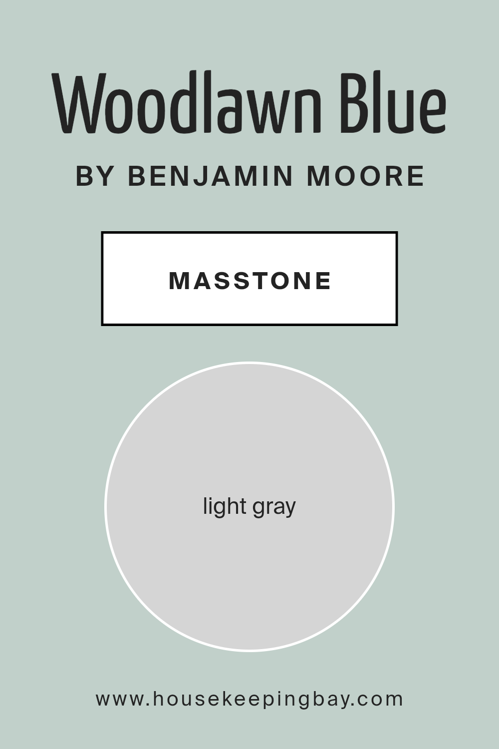
What is the Masstone of the Woodlawn Blue HC-147 by Benjamin Moore?
Woodlawn Blue HC-147 by Benjamin Moore is a soft color with a light gray masstone (#D5D5D5). This gentle gray undertone makes it a versatile choice for home interiors. With its light, airy feel, Woodlawn Blue opens up spaces, making rooms seem larger and more inviting.
This color works well in living rooms, kitchens, or bathrooms, where it provides a calm setting.
Because of the light gray base, Woodlawn Blue pairs beautifully with both warm and cool tones. Combine it with crisp white trim for a fresh, clean look, or complement it with rich navy or charcoal accents for added depth. The subtle hint of blue brings just the right amount of color without overwhelming, making it ideal for those wanting a soft, serene environment.
Thanks to its adaptability and timeless appeal, Woodlawn Blue can suit any style, from modern minimal to classic traditional.
housekeepingbay.com
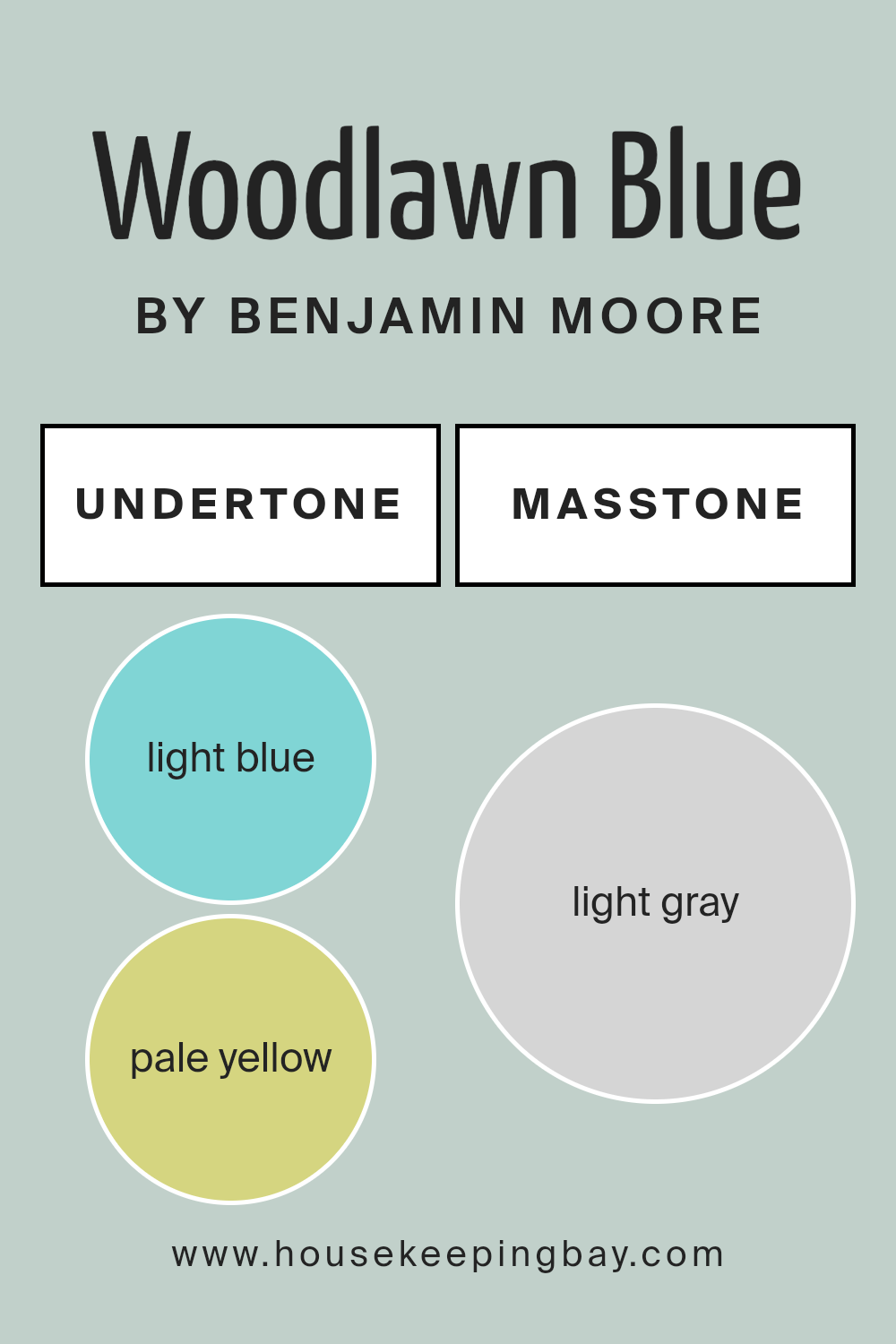
Undertones of Woodlawn Blue HC-147 by Benjamin Moore
Woodlawn Blue HC-147 by Benjamin Moore is a versatile paint color with a unique blend of undertones. The main color is a soft blue, but it subtly incorporates hints of other colors. These undertones include light blue, pale yellow, light purple, mint, lilac, pale pink, and grey.
These hidden shades change how we perceive the color as lighting and surroundings shift.
Undertones can greatly influence the look of a color. Light blue and mint undertones make the blue feel cool and fresh, while pale yellow adds a touch of warmth. The presence of light purple and lilac can offer a gentle hint of elegance or sophistication.
Pale pink brings a softness, and grey can ground the color, giving it depth and neutrality.
On interior walls, Woodlawn Blue HC-147 reflects these undertones in charming ways. In natural sunlight, the blue appears crisp and airy due to the light blue and mint undertones. Pale yellow and pale pink may come through in warm artificial lighting, adding coziness.
The grey undertones make the blue versatile, allowing it to pair well with various colors and styles, making a room feel both serene and flexible. Through the subtle play of its undertones, Woodlawn Blue creates an inviting and adaptable atmosphere.
housekeepingbay.com
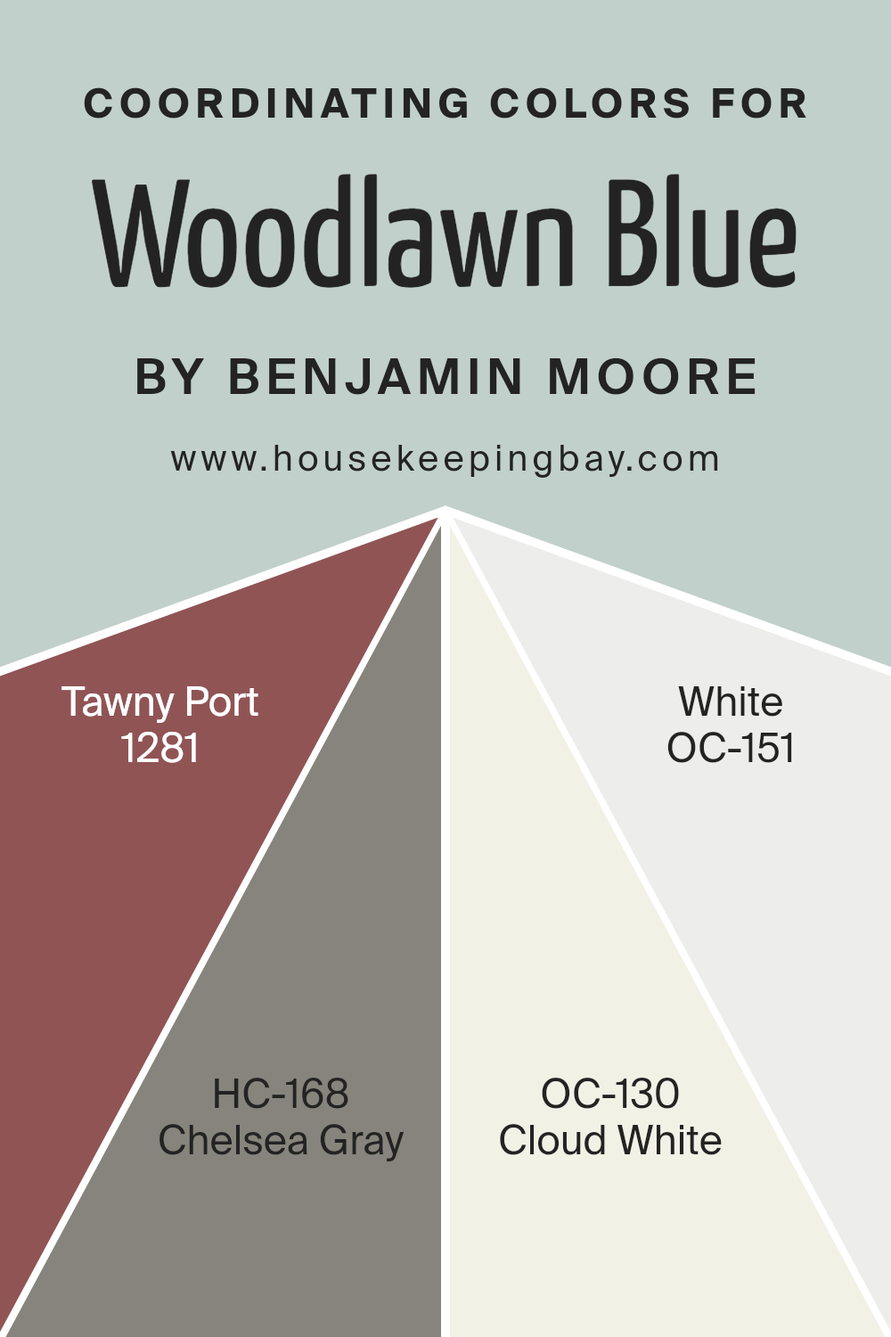
Coordinating Colors of Woodlawn Blue HC-147 by Benjamin Moore
Coordinating colors are those that work harmoniously together, creating a balanced and pleasing look in a space. They complement each other, helping to create a cohesive design. When coordinating colors with Woodlawn Blue HC-147 from Benjamin Moore, it’s essential to choose shades that enhance its soft, muted blue-green tones.
Tawny Port 1281 is a rich, bold wine color that provides a striking contrast. Its deep, warm hue adds depth, giving a room an inviting and elegant look when paired with Woodlawn Blue’s subtle coolness. HC-168 Chelsea Gray is a classic medium gray that serves as a sophisticated neutral.
It balances the lightness of Woodlawn Blue, creating a refined combination.
Cloud White OC-130 acts as a soft, warm white that harmonizes beautifully with Woodlawn Blue’s gentle tones. It brightens the space without overpowering it, maintaining an airy feel.
Meanwhile, OC-151 White is a crisp, clean white that introduces a fresh, modern touch, complementing the understated elegance of Woodlawn Blue.
Together, these coordinating colors provide a versatile palette that can be used to achieve various styles, from traditional to contemporary, while ensuring each room feels unified and harmonious.
You can see recommended paint colors below:
- 1281 Tawny Port
- HC-168 Chelsea Gray
- OC-130 Cloud White
- OC-151 White
housekeepingbay.com
How Does Lighting Affect Woodlawn Blue HC-147 by Benjamin Moore?
Lighting plays a crucial role in how colors appear. The same paint color can look different depending on the light source. This is because light affects the perception of color, brightness, and contrast.
Woodlawn Blue HC-147 by Benjamin Moore is a soft blue-green color. How this color appears can change based on the type of light—natural or artificial—and the direction a room faces.
In artificial light, the color’s appearance depends on the light bulbs used. Incandescent bulbs tend to give off a warm, yellowish light, which can make Woodlawn Blue appear warmer and can sometimes bring out more green tones. On the other hand, fluorescent lights tend to be cooler and can make the color look a bit duller or more muted.
LED lights are available in a variety of colors, from warm to cool, and can affect the color differently based on their kelvin temperature.
Natural light varies throughout the day and is also affected by the orientation of the room.
In north-facing rooms, the light is generally cooler and softer. This can make Woodlawn Blue appear crisper and a bit more subdued. The cool light enhances the blue tones, making it feel more tranquil and calm.
In south-facing rooms, the light is stronger and warm throughout the day. This warm light can make the color appear more vibrant and can bring out the green undertones, giving it a lively feel.
East-facing rooms see bright, warm light in the morning and cooler light in the afternoon. In the morning, the color can seem brighter and cheerier, while in the afternoon, it can feel cooler and more reserved.
West-facing rooms have cooler light in the morning but get warmer light in the afternoon and evening. Woodlawn Blue will appear more muted early in the day, gaining more warmth and depth later, as it reflects the richer, golden light of the setting sun.
Understanding these lighting conditions can help you choose the right color for your room, ensuring it appears the way you want throughout the day.
housekeepingbay.com
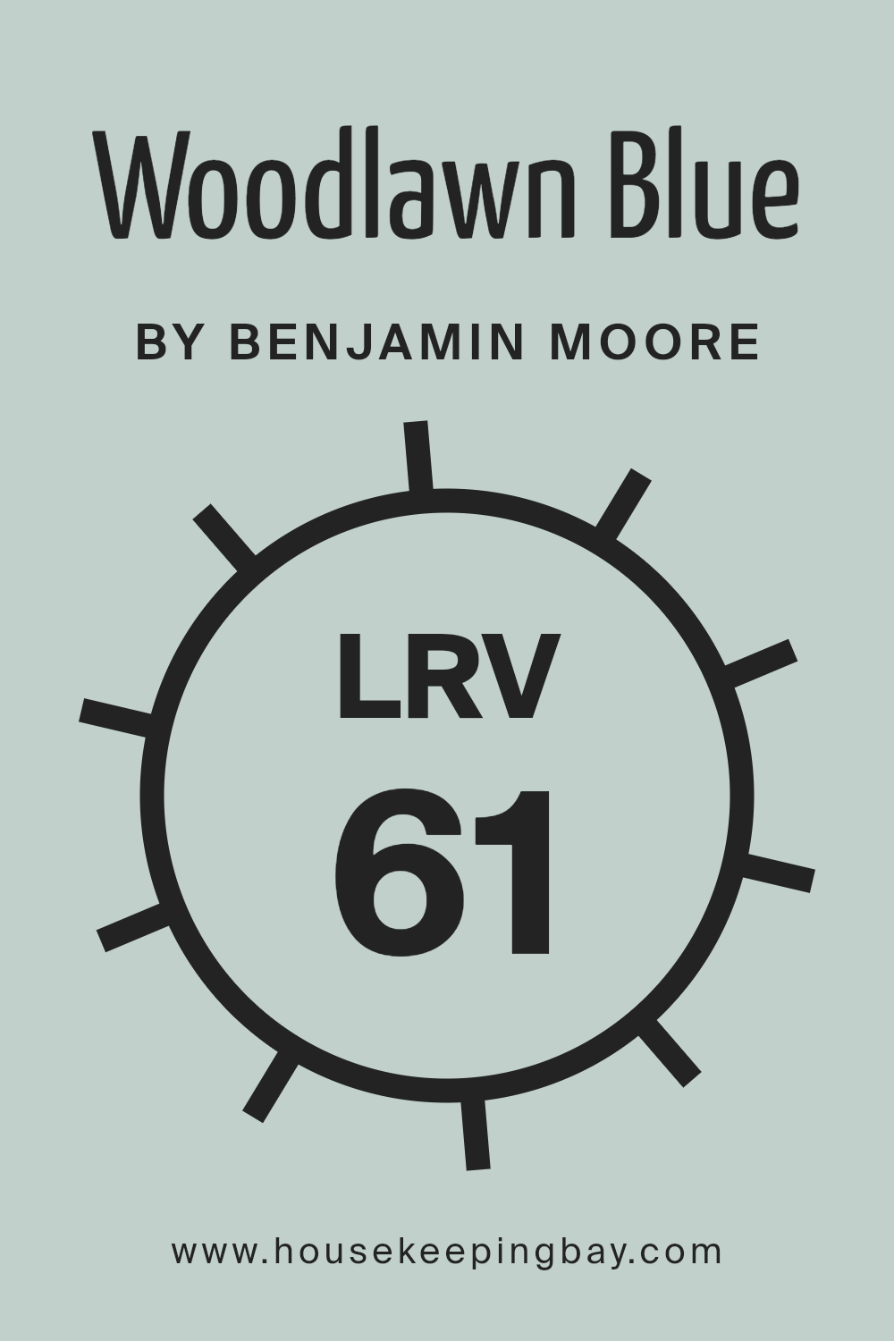
What is the LRV of Woodlawn Blue HC-147 by Benjamin Moore?
Light Reflectance Value, or LRV, measures how much light a color reflects when applied to a surface. It’s expressed as a percentage, from 0% to 100%. A color with a low LRV absorbs more light, making a room feel cozier or smaller, while a high LRV means the color reflects more light, making spaces appear brighter and more open.
Understanding the LRV of a paint color helps in predicting how it will look under different lighting conditions. For example, a color might seem dull in a dimly lit room, but the same color with a higher LRV will feel livelier in the same space.
Woodlawn Blue HC-147 by Benjamin Moore has an LRV of 60.65. This means it reflects a fair amount of light, making it a versatile choice for different rooms, especially in spaces needing a light and airy atmosphere. Since it reflects over half the light, it has the ability to brighten rooms without being overwhelming.
This makes it an excellent choice for creating a calm and inviting feel. Depending on the lighting in the room, Woodlawn Blue may appear more vibrant in areas with ample natural light and softer in dimmer spaces, providing a gentle, harmonious backdrop.
housekeepingbay.com
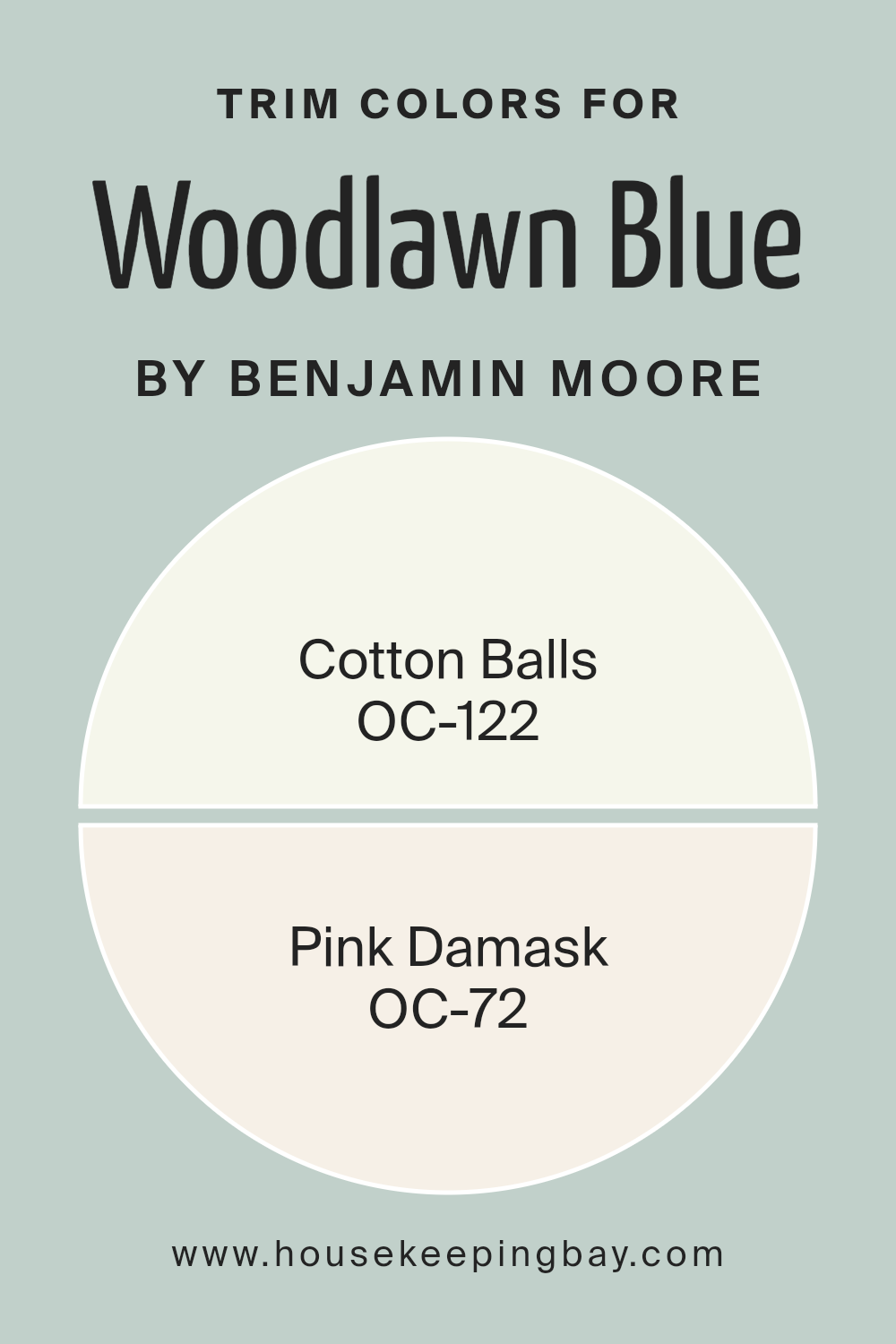
What are the Trim colors of Woodlawn Blue HC-147 by Benjamin Moore?
Trim colors refer to the paint shades used on the trimmings or moldings of a room, such as baseboards, door casings, and window frames. They’re important because they frame the main wall color, creating contrast and adding depth to the room’s design.
With Woodlawn Blue HC-147 by Benjamin Moore, which is a soothing, soft blue with green undertones, choosing the right trim color can significantly enhance its appearance.
By pairing it with the trims, the overall look becomes more cohesive and appealing, highlighting the subtle tones in Woodlawn Blue and ensuring the room feels welcoming and harmonious.
Using OC-122 Cotton Balls as a trim color offers a crisp, clean white that complements Woodlawn Blue beautifully, providing a clear contrast that accentuates the blue hues. Cotton Balls is a versatile white that is not too stark, giving a warm touch to the edges.
On the other hand, OC-72 Pink Damask provides a soft pink trim alternative, offering a gentle, comforting edge that adds warmth and charm alongside Woodlawn Blue. This pairing brings out the gentler, inviting aspects of the blue, making the room feel cozy yet elegant.
Each color choice for trim adds a different character to the room, enhancing Woodlawn Blue in unique ways.
You can see recommended paint colors below:
housekeepingbay.com
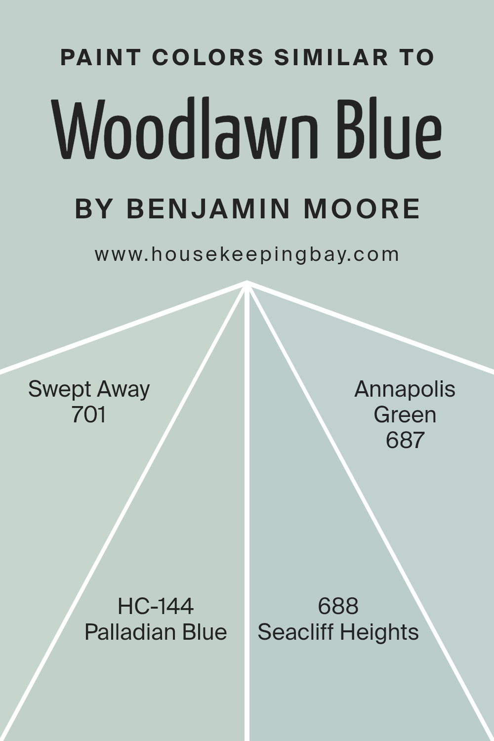
Colors Similar to Woodlawn Blue HC-147 by Benjamin Moore
Similar colors create harmony and balance in design. Woodlawn Blue HC-147 by Benjamin Moore is a peaceful shade that, when paired with its similar colors, creates a cohesive look. Colors like HC-144 – Palladian Blue and 701 – Swept Away blend effortlessly with Woodlawn Blue.
Palladian Blue is a soft, calming hue that has a slight gray undertone, offering a serene quality. Swept Away, on the other hand, is a gentle, airy shade that captures a sense of lightness.
687 – Annapolis Green and 688 – Seacliff Heights complement this palette beautifully. Annapolis Green has a refreshing vibe, with hints of green that evoke a cool, natural feel. Seacliff Heights is a deeper tone, reminiscent of the sea and sky meeting on the horizon, bringing a subtle richness.
Together, these colors create a soothing environment. This harmonious blend can enhance any space with a sense of peace and unity, making it feel more connected and complete.
You can see recommended paint colors below:
- 701 Swept Away
- HC-144 Palladian Blue
- 688 Seacliff Heights
- 687 Annapolis Green
housekeepingbay.com
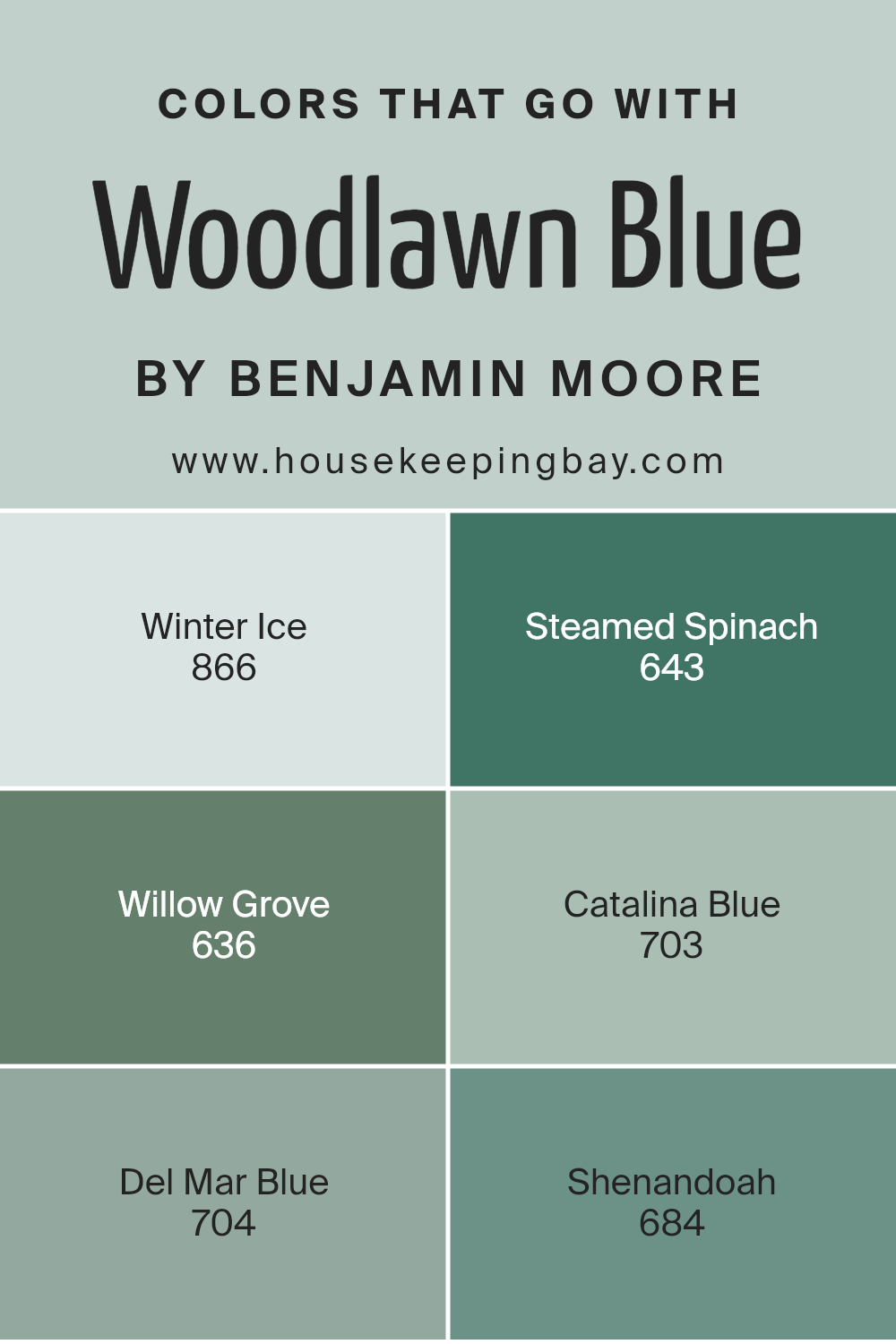
Colors that Go With Woodlawn Blue HC-147 by Benjamin Moore
Woodlawn Blue HC-147 by Benjamin Moore is a soft, soothing color that can create a calming atmosphere. Pairing it with the right colors is essential to achieving a balanced and harmonious space. One color to consider is Winter Ice 866, a delicate and cool shade that brings a sense of freshness and light.
It works well as a complement to Woodlawn Blue, enhancing the airy vibe of the room. Steamed Spinach 643 provides a rich, earthy contrast. This deep green color adds warmth and depth, offering a striking balance against the cooler tones of Woodlawn Blue.
Willow Grove 636 introduces a gentle, muted green that adds a hint of nature’s calmness, making it a great partner for Woodlawn Blue. Catalina Blue 703, on the other hand, is a more intense, deep blue shade that can ground your space while still maintaining a cohesive look.
Del Mar Blue 704 is a vibrant and bold blue that adds energy to your decor, complementing Woodlawn Blue’s softness. Lastly, Shenandoah 684 brings a subtle elegance with its understated teal undertones, providing a sophisticated touch to the overall color scheme.
These colors work together to create a balanced and inviting space, enhancing the natural beauty of Woodlawn Blue.
You can see recommended paint colors below:
- 866 Winter Ice
- 643 Steamed Spinach
- 636 Willow Grove
- 703 Catalina Blue
- 704 Del Mar Blue
- 684 Shenandoah
housekeepingbay.com
How to Use Woodlawn Blue HC-147 by Benjamin Moore In Your Home?
Woodlawn Blue HC-147 is a soft, soothing color by Benjamin Moore that brings a sense of calm to any space. This gentle blue tone can work well in many rooms, adding an airy and refreshing feel. In living rooms, it pairs nicely with crisp white trim and light-colored furniture, creating a bright and welcoming environment.
Bedrooms gain a peaceful quality with this hue, promoting restful sleep when used for walls or bedding accents.
In kitchens, Woodlawn Blue can complement white or light wood cabinetry, offering a clean and tidy appearance. Adding gray or natural wood accents will help ground the space while still maintaining its light and soft feel. Bathrooms become serene sanctuaries with this color, as it pairs well with both silver and gold metallic fixtures.
Overall, Woodlawn Blue HC-147 is a versatile option for anyone looking to bring a touch of calm and elegance to their home without overwhelming other design elements.
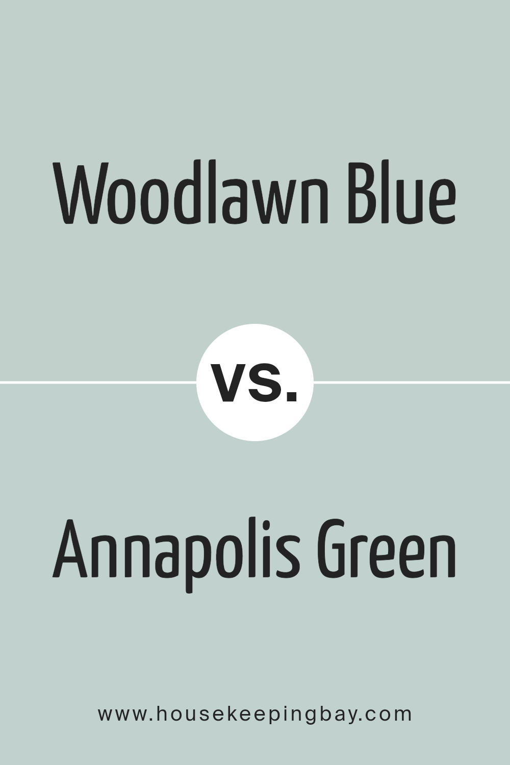
Woodlawn Blue HC-147 by Benjamin Moore vs Annapolis Green 687 by Benjamin Moore
Woodlawn Blue HC-147 by Benjamin Moore is a soft, muted blue that carries a hint of green. It creates a calm and soothing atmosphere, making it ideal for spaces where relaxation is key. This color works well in bedrooms and bathrooms, offering a serene backdrop that pairs beautifully with neutral tones and natural materials.
Annapolis Green 687 by Benjamin Moore, distinctively more vibrant, presents a pleasing balance between blue and green. It embodies a lively and refreshing vibe, making it suitable for areas that require a more energetic feel, like kitchens or living rooms.
This color brings a touch of nature indoors, complementing both modern and traditional decor.
While Woodlawn Blue leans serene and understated, Annapolis Green offers a brighter, more invigorating presence. Choosing between them depends on the mood you aim to create: peaceful with Woodlawn Blue or lively with Annapolis Green. Both hues serve well in different context, catering to varied personal tastes and home design needs.
You can see recommended paint color below:
- 687 Annapolis Green
housekeepingbay.com
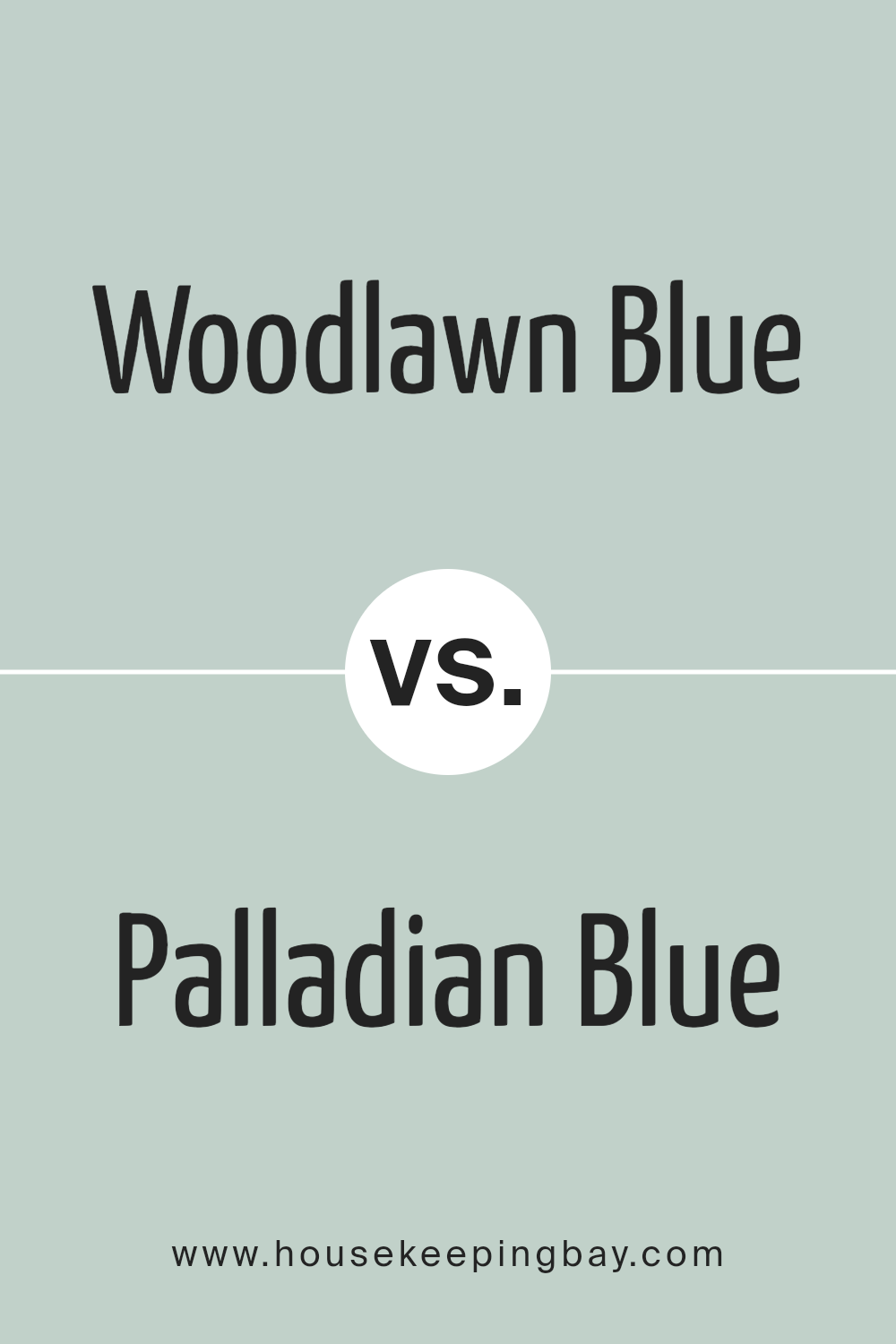
Woodlawn Blue HC-147 by Benjamin Moore vs Palladian Blue HC-144 by Benjamin Moore
Woodlawn Blue HC-147 and Palladian Blue HC-144 by Benjamin Moore are both popular colors that bring a sense of calm to a room. Woodlawn Blue is a subtle blue-green shade, leaning more towards a muted teal. It often feels like a gentle breeze, offering a soft backdrop that pairs well with both light and dark furnishings.
Palladian Blue, while similar, has a bit more of a grey undertone and tends to be slightly lighter. It often resembles the color of the sky at dawn, bringing a fresh and airy feel to spaces. Both colors work well in a variety of settings, such as bedrooms or bathrooms, due to their soothing nature.
When deciding between the two, consider the light in your room. Woodlawn Blue may deepen in shaded areas, while Palladian Blue can maintain its lightness, enhancing the overall brightness of a space.
You can see recommended paint color below:
- HC-144 Palladian Blue
housekeepingbay.com
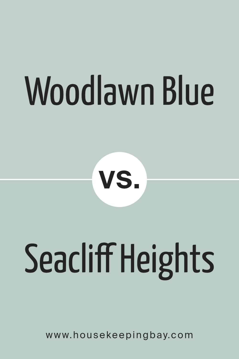
Woodlawn Blue HC-147 by Benjamin Moore vs Seacliff Heights 688 by Benjamin Moore
Woodlawn Blue HC-147 by Benjamin Moore is a soft, muted blue with a hint of green. It’s often described as a calming color that fits well in bedrooms and living spaces. This shade evokes a peaceful atmosphere, reminiscent of a clear, tranquil sky or a serene lake.
Seacliff Heights 688, also by Benjamin Moore, leans more towards a vibrant and deeper blue. It brings a stronger presence to any room, creating a lively and energetic feel. While it still retains some calming qualities typical of blue, its richer tone adds a touch of boldness, making it well-suited for spaces where more drama or personality is desired.
Both colors work beautifully in coastal-themed designs. Woodlawn Blue, due to its softness, compliments neutral or earthy tones effortlessly, while Seacliff Heights pairs well with crisp whites or bright accents. Choosing between them depends on whether you want a subtle, peaceful environment or one with more intensity and character.
You can see recommended paint color below:
- 688 Seacliff Heights
housekeepingbay.com
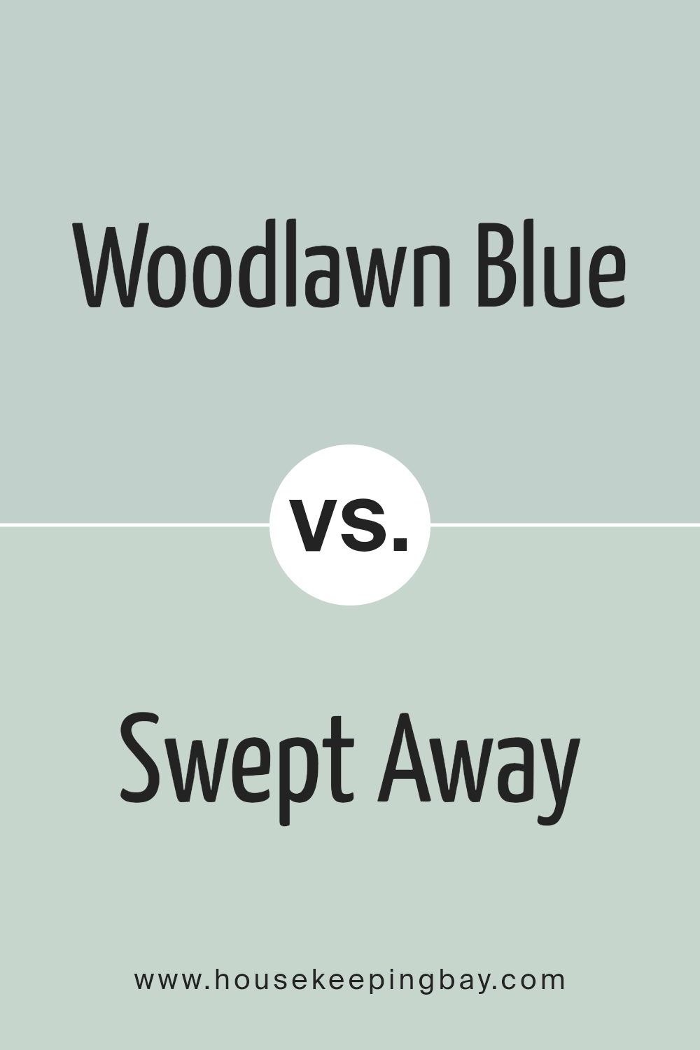
Woodlawn Blue HC-147 by Benjamin Moore vs Swept Away 701 by Benjamin Moore
Woodlawn Blue HC-147 by Benjamin Moore is a gentle, muted blue with hints of gray and green, giving it a calm and sophisticated look. It’s a versatile color that works well in various settings, like living rooms or bedrooms, providing a serene and inviting atmosphere. Its subtle undertones make it adaptable to different lighting conditions, from natural daylight to soft evening illumination.
Swept Away 701, also by Benjamin Moore, is lighter and airier compared to Woodlawn Blue. This color leans more toward a pastel blue with slight touches of green, resulting in a fresh and breezy feel. It’s particularly suitable for spaces aiming for a light, open, and cheerful vibe, such as bathrooms or kitchens.
While both colors offer calm and relaxation, Woodlawn Blue provides more depth and sophistication, whereas Swept Away brings brightness and a sense of openness. Choosing between them depends on the mood and atmosphere you want in your space.
You can see recommended paint color below:
- 701 Swept Away
housekeepingbay.com
Conclusion
When I think about HC-147 Woodlawn Blue by Benjamin Moore, it’s clear to me why this color is so appealing. Its gentle blend of blue and green creates a calming atmosphere that seems to suit a variety of settings.
Whether used in a bedroom, living room, or even a bathroom, this shade has an uncanny ability to invoke a sense of peace and comfort.
What sets Woodlawn Blue apart is its versatility. Depending on the lighting, it can shift from a soothing light blue to a more muted green-blue, making it adaptable to different moods and times of day. Its soft hue works well with a range of other colors and design schemes, allowing it to blend seamlessly with both modern and traditional decor.
I find that this color doesn’t overwhelm a space; rather, it enhances it by providing a subtle backdrop that allows other design elements to shine. It’s a shade that invites relaxation and offers a touch of elegance without being too bold or demanding attention.
Overall, HC-147 Woodlawn Blue embodies a perfect balance, making it an excellent choice for anyone desiring a fresh, yet classic look in their home. It’s a peaceful and charming color that offers a touch of sophistication to any room.
housekeepingbay.com
Ever wished paint sampling was as easy as sticking a sticker? Guess what? Now it is! Discover Samplize's unique Peel & Stick samples. Get started now and say goodbye to the old messy way!
Get paint samples


