Willow CC-542 by Benjamin Moore
Bringing Nature's Calm to Your Home with Soft Green
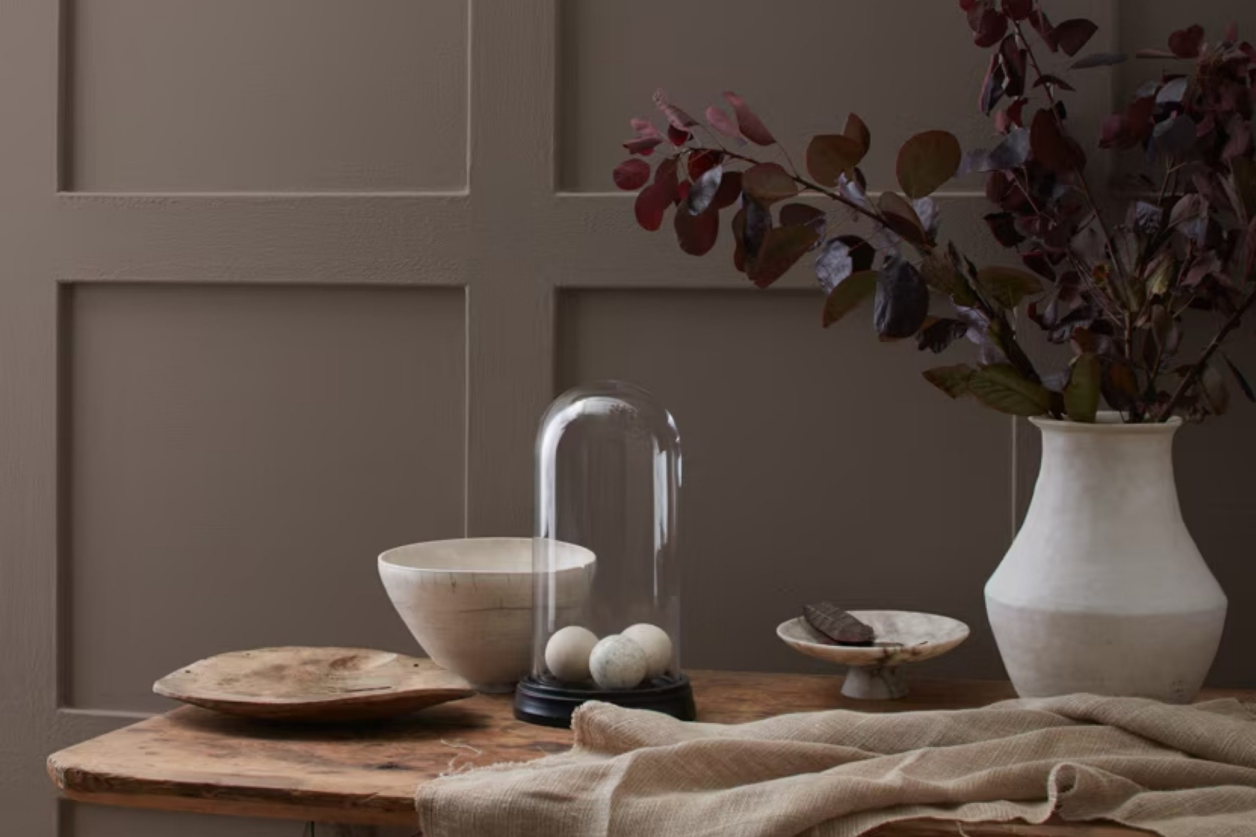
Are you thinking about giving your space a fresh coat of paint? If so, you might want to consider CC-542 Willow by Benjamin Moore. It’s a unique shade that can change the feel of any room in your home. This color offers a beautiful balance, providing a subtle backdrop that complements various decor styles and personal tastes.
Painting your walls with CC-542 Willow could be a smart move if you’re going for a soothing atmosphere. It’s perfect for areas where you unwind or have guests over because it has a calm and welcoming vibe to it. Plus, if you have vibrant artworks, white trim, or dark wooden furniture, this color makes them pop even more.
So, if you’re ready for a change or need to touch up some old paintwork, think about going with Willow.
It’s not just a new color—it’s a way to breathe new life into your space and reflect a bit more about your style and what makes you feel at home.
via benjaminmoore.com
What Color Is Willow CC-542 by Benjamin Moore?
Table of Contents
Willow CC-542 by Benjamin Moore is a serene and versatile shade of green with subtle gray undertones. It evokes the calmness of a foggy, dew-laden morning, providing a soothing backdrop for any room. This understated hue is perfect for those looking to create a peaceful and grounded atmosphere in their home.
Ideal for a variety of interior styles, Willow CC-542 works exceptionally well in modern farmhouse, Scandinavian, and minimalist decor because of its natural, muted tone that complements neutral palettes and simple designs. It shines in spaces that favor understatement and organic beauty. This color particularly excels in rooms that require a touch of softness and restfulness, like bedrooms, living rooms, and bathrooms, where its calming effect is most appreciated.
Pairing Willow CC-542 with materials and textures is straightforward. It pairs beautifully with natural wood, from pale pines to rich walnuts, enhancing the warmth of the wood. Textiles like linen or cotton in white or soft pastels create a fresh, airy feel. For a contrasting look, incorporate elements of matte black or deep navy.
The matte finish of this paint also allows it to blend seamlessly with stone and ceramic accents, lending an earthy elegance to the overall aesthetic. With Willow CC-542, creating a cohesive and tranquil space is effortlessly achievable.
housekeepingbay.com
Is Willow CC-542 by Benjamin Moore Warm or Cool color?
WillowCC-542 by Benjamin Moore is a versatile paint color that brings a sense of calm and freshness to any room in the home. This color has a natural, soft green hue that mimics the peaceful shades found in nature, making it ideal for creating a soothing atmosphere. It’s particularly effective in areas where relaxation or focus is key, such as bedrooms, bathrooms, and home offices.
The beauty of WillowCC-542 lies in its adaptability. It pairs effortlessly with a wide range of decor styles and other colors. Whether your home features modern, minimalist furniture or more traditional pieces, this color can complement the aesthetic and add a layer of subtle sophistication. Additionally, its muted tone works well with both natural light and artificial lighting, ensuring that the color remains consistent and vibrant regardless of the time of day.
WillowCC-542 is an excellent choice for homeowners looking to refresh their space with a color that is both timeless and refreshing. Its ability to harmonize with different settings and its calming effect make it a popular choice for those wanting to enhance their living environment.
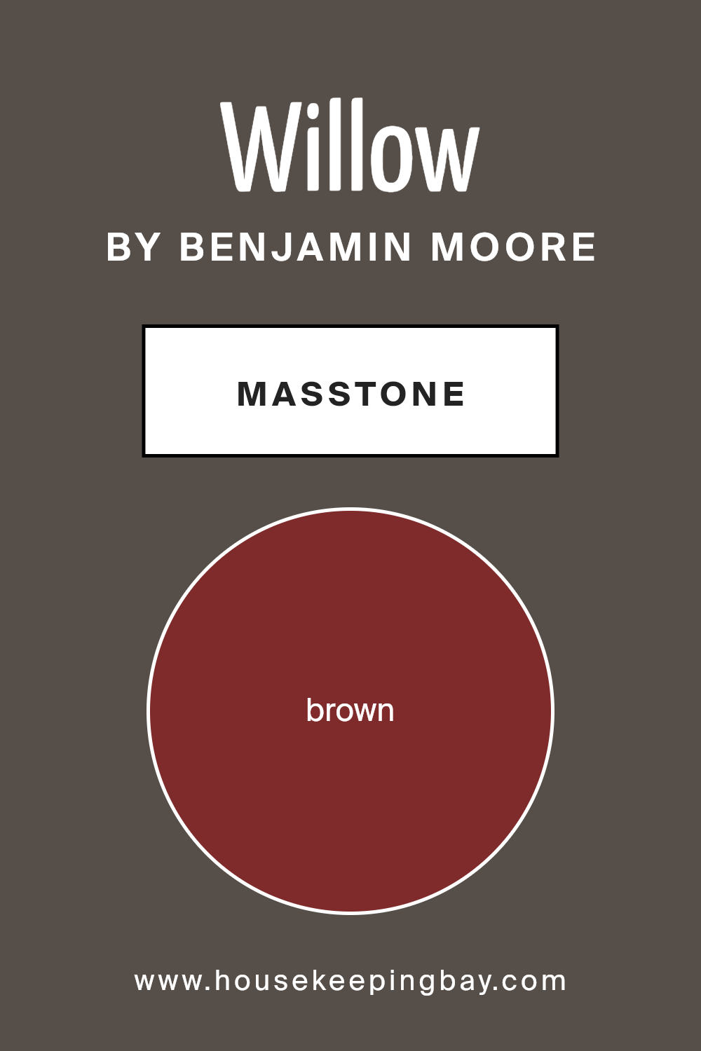
What is the Masstone of the Willow CC-542 by Benjamin Moore?
WillowCC-542 by Benjamin Moore features a masstone of brown, specifically color code #802B2B. This rich, deep shade of brown brings a warm and cozy feel to any room. It is especially suitable for living spaces and bedrooms where warmth is desired.
Brown, being a natural earth tone, pairs well with a variety of other colors, from soothing creams to vibrant greens, making it highly versatile for interior decorating. This adaptability allows homeowners to use WillowCC-542 as either a comforting background hue or as a statement color for accent walls.
In addition to its aesthetic appeal, the deep brown shade can help to hide marks or stains, making it practical for high-traffic areas or homes with young children and pets.
Overall, WillowCC-542 by Benjamin Moore, with its inviting brown tone, enhances homes by providing a sense of warmth and an easy foundation for various decorating styles.
housekeepingbay.com
Undertones of Willow CC-542 by Benjamin Moore
WillowCC-542 by Benjamin Moore is a complex paint color with a variety of undertones that can subtly change its appearance depending on lighting and surrounding colors. The undertones include dark grey, olive, dark green, purple, navy, grey, dark turquoise, red, orange, pink, and pale pink.
Undertones are like the hidden colors in the main hue that can become more apparent under certain conditions. They play a crucial role in how we perceive the main color. For example, in bright sunlight, WillowCC-542 might show more of its green or turquoise undertones, making it look fresher and more vibrant. In dimmer, indoor light, the darker undertones like dark grey or navy might become more dominant, giving the wall a more subdued and cozy appearance.
When using WillowCC-542 on interior walls, the variety of undertones makes it a versatile choice. It can look exceptionally different from room to room depending on the amount of natural light and the colors of the furnishings and decorations around it. This flexibility allows WillowCC-542 to be used in many different settings, from creating a soothing background in a bedroom to adding a bit of depth in a living room.
Whatever the room, these undertones help the color adapt and blend well with various interior styles and moods.

housekeepingbay.com
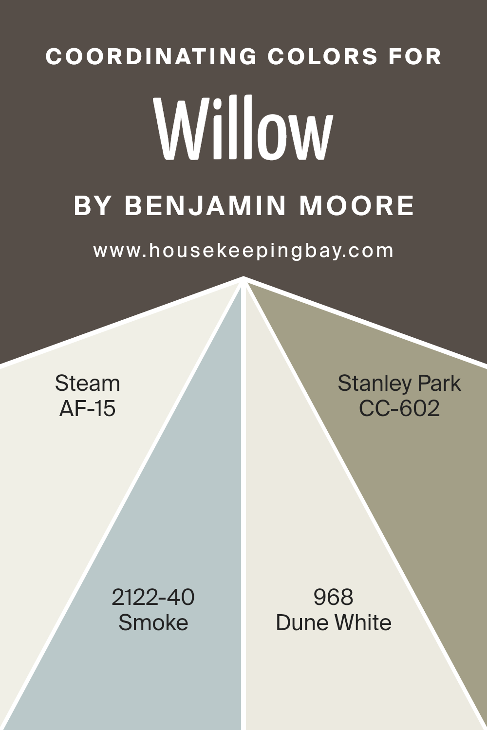
Coordinating Colors of Willow CC-542 by Benjamin Moore
Coordinating colors are a group of colors that harmonize well when used together, creating a balanced and pleasing look in any space. They typically complement a primary color, in this case, Willow CC-542 by Benjamin Moore, by bringing different tones and shades that align well with its properties. These coordinating shades help in achieving a desired aesthetic and mood in interior design by highlighting the main color or by offering a pleasing contrast.
AF-15, known as Steam, is a light and airy color that adds a sense of freshness and cleanliness to any area, making it seem more spacious. 2122-40, or Smoke, is a deeper gray that provides a sophisticated backdrop, allowing Willow CC-542 to stand out without overpowering the space.
Another coordinating shade is 968, Dune White, which is a soft, off-white hue that creates a gentle and restful environment, seamlessly blending with the main Willow color. Lastly, CC-602, Stanley Park, is a deep, rich green that offers an earthy counterbalance, enriching the palette with its natural, soothing qualities which work exceptionally well with the botanical vibes of Willow CC-542.
You can see recommended paint colors below:
- AF-15 Steam
- 2122-40 Smoke
- 968 Dune White
- CC-602 Stanley Park
housekeepingbay.com
How Does Lighting Affect Willow CC-542 by Benjamin Moore?
Lighting significantly influences how we perceive colors. Different light sources can change how a color looks, often resulting in varied hues and intensities in diverse lighting conditions. This is especially true for wall paints and the Benjamin Moore color WillowCC-542.
WillowCC-542 is a subtle, serene green that adapts uniquely to different lighting scenarios. In artificial light, such as LED or incandescent bulbs, this color tends to appear slightly warmer, bringing out beige undertones. This can make a room feel cozy and inviting. Under fluorescent lighting, WillowCC-542 might look more muted, with a crisper feel due to the cooler undertones of the light.
In natural light, WillowCC-542 behaves differently throughout the day and depending on the orientation of the room. In north-facing rooms, which receive less direct sunlight and tend to have cooler, softer light, WillowCC-542 might appear more subdued and slightly grayish, maintaining a calm, neutral tone. It can help make a small space feel larger while retaining a sense of warmth.
In south-facing rooms flooded with ample sunlight, WillowCC-542 can appear much brighter and more vibrant, with its green undertones becoming more pronounced. This exposure makes the color feel alive and refreshing, ideal for living spaces or kitchens.
East-facing rooms receive the warm light of sunrise. In these rooms, WillowCC-542 will glow softly in the morning but might look more muted as the day progresses. This shifting character allows for a lively feel in the mornings, slowly transitioning to a calming influence by afternoon.
West-facing rooms, drenched in the intense hues of sunset, will reflect the warmth of the day’s end on WillowCC-542, making it appear warmer and richer. This enhances evening environments, making them feel cozy and welcoming.
Overall, WillowCC-542’s adaptability in various lighting conditions makes it a versatile choice for many rooms and functions.

housekeepingbay.com
What is the LRV of Willow CC-542 by Benjamin Moore?
LRV stands for Light Reflectance Value, which measures the percentage of light a paint color reflects back into a room. It ranges from 0%, which absorbs all light and appears black, to 100%, reflecting all light and appearing white. This measurement helps you understand how light or dark a color will look once painted on your walls.
Lighting conditions significantly influence this perception; a color with a high LRV will look brighter and make a room feel more open, while a low LRV color will absorb more light, making a space feel cozier or smaller.
With an LRV of 9.06, WillowCC-542 by Benjamin Moore is a deep shade that reflects very little light. This low LRV means it can make smaller rooms feel more enclosed or intimate. In larger or well-lit spaces, it might add a dramatic flair, anchoring the room with its strong presence. When using this color, consider room size, lighting conditions, and the desired atmosphere. It’s also important to balance it with lighter colors in furnishings or decor to prevent the space from feeling too dark.

housekeepingbay.com
What are the Trim colors of Willow CC-542 by Benjamin Moore?
Trim colors, such as OC-54 White Wisp and OC-61 White Diamond by Benjamin Moore, are used to accentuate the architectural details of a room. These colors outline features like door frames, window sills, and baseboards, highlighting their contours and enhancing the overall aesthetic.
Choosing the right trim color is crucial because it can help create a crisp, clean look that defines and complements the primary wall color. For example, pairing a light verdant shade like Willow CC-542 with a sharp, clear trim color can make the wall color pop, amplifying the elegance of the space.
OC-54 White Wisp is a soft, airy white that carries a hint of a gray undertone. This subtle nuance makes it incredibly versatile and an excellent choice for blending with cooler hues, guaranteeing that it doesn’t overpower the main color. OC-61 White Diamond, on the other hand, is a pure, bright white that offers a more pronounced contrast. It works beautifully to create a fresh and inviting look, ensuring that smaller details in a room’s architecture stand out effectively. Both of these colors provide a seamless way to integrate and highlight without dominating the primary color, making them excellent choices for trim.
You can see recommended paint colors below:
- OC-54 White Wisp
- OC-61 White Diamond

housekeepingbay.com
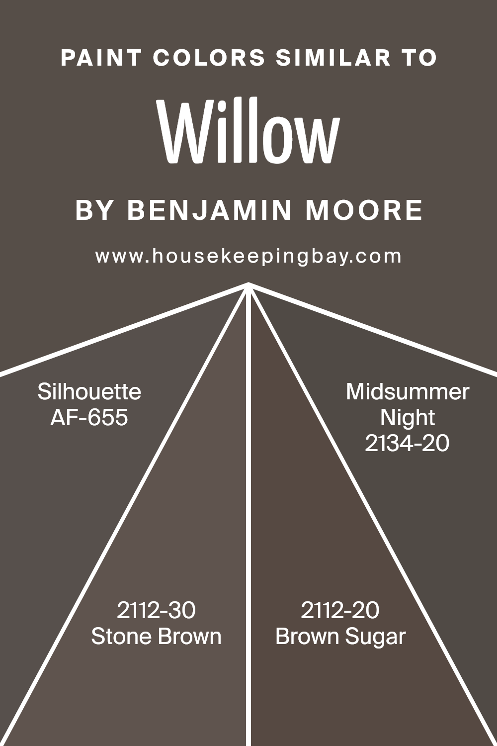
Colors Similar to Willow CC-542 by Benjamin Moore
In interior design, choosing the right color palette is essential, and using similar colors can create a cohesive and soothing space. The shades similar to Willow CC-542 by Benjamin Moore, such as AF-655 – Silhouette, 2112-30 – Stone Brown, 2112-20 – Brown Sugar, and 2134-20 – Midsummer Night, are prime examples of how hues that are close on the color spectrum can contribute to a harmonious look.
These shades blend seamlessly, providing depth and warmth while ensuring that no single color overshadows another. This subtle connection through similar colors enriches the environment, making the space feel more unified and pleasant.
AF-655 – Silhouette is a deep, charcoal gray that offers a sophisticated foundation or accent, working well in rooms that need grounding. Stone Brown, with its earthy, dark gray tone, complements natural elements and textures, enhancing a space without overwhelming it. The color Brown Sugar is a warm, deep brown that brings a cozy and inviting atmosphere, perfect for creating a relaxing haven.
Lastly, Midsummer Night is a rich navy that can act as a strong backdrop or a striking statement, providing elegance and depth alongside the lighter Willow CC-542. These colors, while individually distinct, share a baseline that makes transitions between spaces visually smooth and effective.
You can see recommended paint colors below:
- AF-655 Silhouette
- 2112-30 Stone Brown
- 2112-20 Brown Sugar
- 2134-20 Midsummer Night
housekeepingbay.com
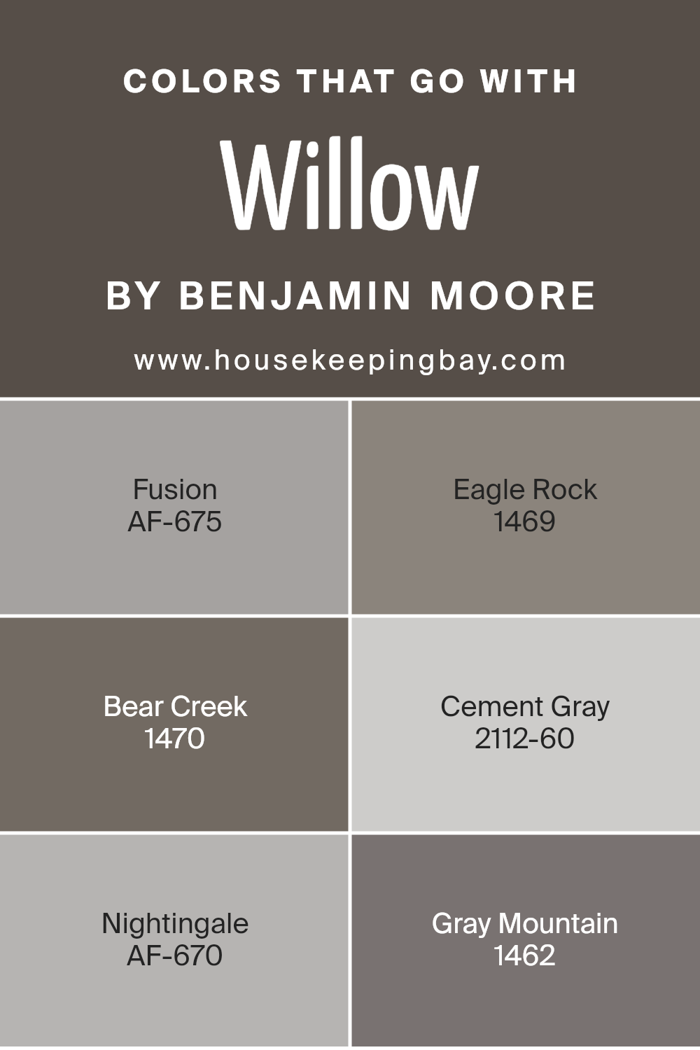
Colors that Go With Willow CC-542 by Benjamin Moore
Choosing complementary colors for Willow CC-542 by Benjamin Moore is crucial because it ensures that your space attains a harmonious balance. Selecting the right combination enhances the aesthetics and creates a cohesive atmosphere in any room. Colors such as AF-675 – Fusion, 1469 – Eagle Rock, 1470 – Bear Creek, 2112-60 – Cement Gray, AF-670 – Nightingale, and 1462 – Gray Mountain are among those that sync well with Willow CC-542. Each of these shades has unique characteristics that contribute to a well-rounded palette.
AF-675 – Fusion is a deep, profound blue that adds a sense of sophistication and depth to spaces. It pairs nicely with the softer Willow, bringing a dynamic contrast to interiors. 1469 – Eagle Rock is a versatile taupe that offers a subtle, organic feel, perfect for creating a grounded, serene environment.
Near it in tone, 1470 – Bear Creek is a slightly darker gray-brown that enriches environments with a warm, inviting ambiance. Meanwhile, 2112-60 – Cement Gray is a light, airy gray that provides a soft backdrop, making it an excellent choice for modern and minimalist designs. AF-670 – Nightingale is a gentle gray with blue undertones which provides a soothing, neutral canvas.
Lastly, 1462 – Gray Mountain offers a medium gray tone, balancing between warm and cool, thus providing flexibility in color themes. All these colors mesh well with Willow, ensuring that each room exudes a sense of completeness and refined elegance.
You can see recommended paint colors below:
- AF-675 Fusion
- 1469 Eagle Rock
- 1470 Bear Creek
- 2112-60 Cement Gray
- AF-670 Nightingale
- 1462 Gray Mountain
housekeepingbay.com
How to Use Willow CC-542 by Benjamin Moore In Your Home?
Willow CC-542 by Benjamin Moore is a versatile shade of green that brings a sense of calm and sophistication to any room. This color pairs well with both modern and traditional decor, making it a great choice for many homes. You can use it in a living room or a bedroom to create a soothing atmosphere, helping to relax after a long day. In a bathroom, Willow CC-542 adds a touch of nature-inspired freshness, especially when combined with natural materials like wood or stone.
For those looking to add more character to their kitchen, painting cabinets or an accent wall in this shade can refresh the space without overwhelming it. Since it’s a muted color, it also pairs well with a variety of other colors and finishes, from bright whites to rich browns and grays.
Overall, using Willow CC-542 can refresh your home with a soft, natural touch, enhancing the overall feel without requiring drastic changes.
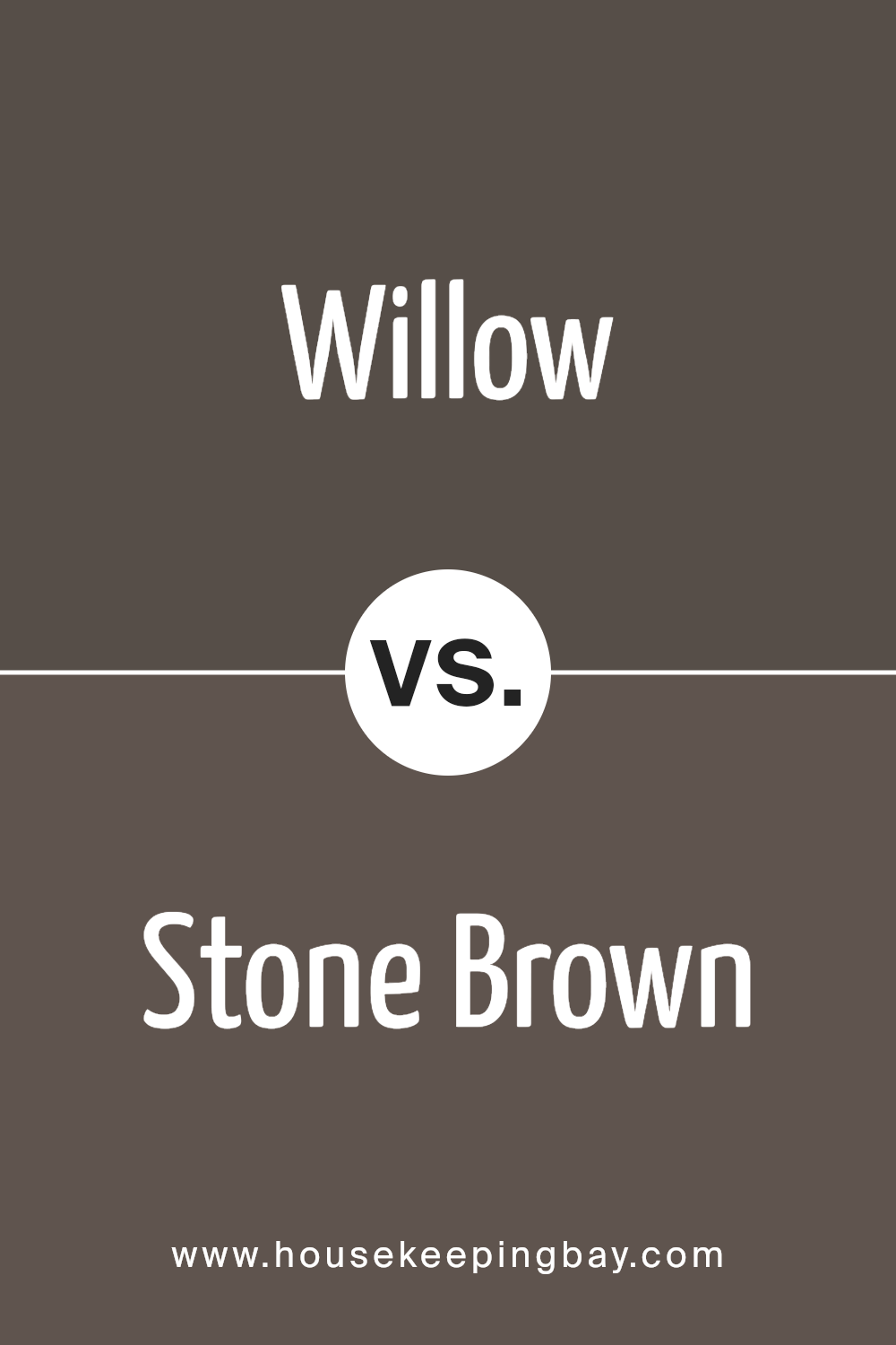
Willow CC-542 by Benjamin Moore vs Stone Brown 2112-30 by Benjamin Moore
The colors Willow CC-542 and Stone Brown 2112-30 by Benjamin Moore present two distinct tones that enhance spaces differently. Willow CC-542 is a muted green shade that brings a sense of calm and a touch of nature’s serenity to interiors. It’s light enough to make small rooms appear more spacious and offers a refreshing ambience.
Meanwhile, Stone Brown 2112-30 is a deeper, rich brown that provides a strong sense of warmth and coziness. This color works well in larger or well-lit areas, as its intensity can make a bold statement and add depth to a space. It pairs beautifully with lighter colors and natural materials like wood or stone.
Both colors serve well in creating inviting environments but cater to different aesthetic preferences and uses. Willow might suit those looking for a light, airy feel, while Stone Brown is ideal for a more enveloped, snug atmosphere.
You can see recommended paint color below:
- 2112-30 Stone Brown
housekeepingbay.com
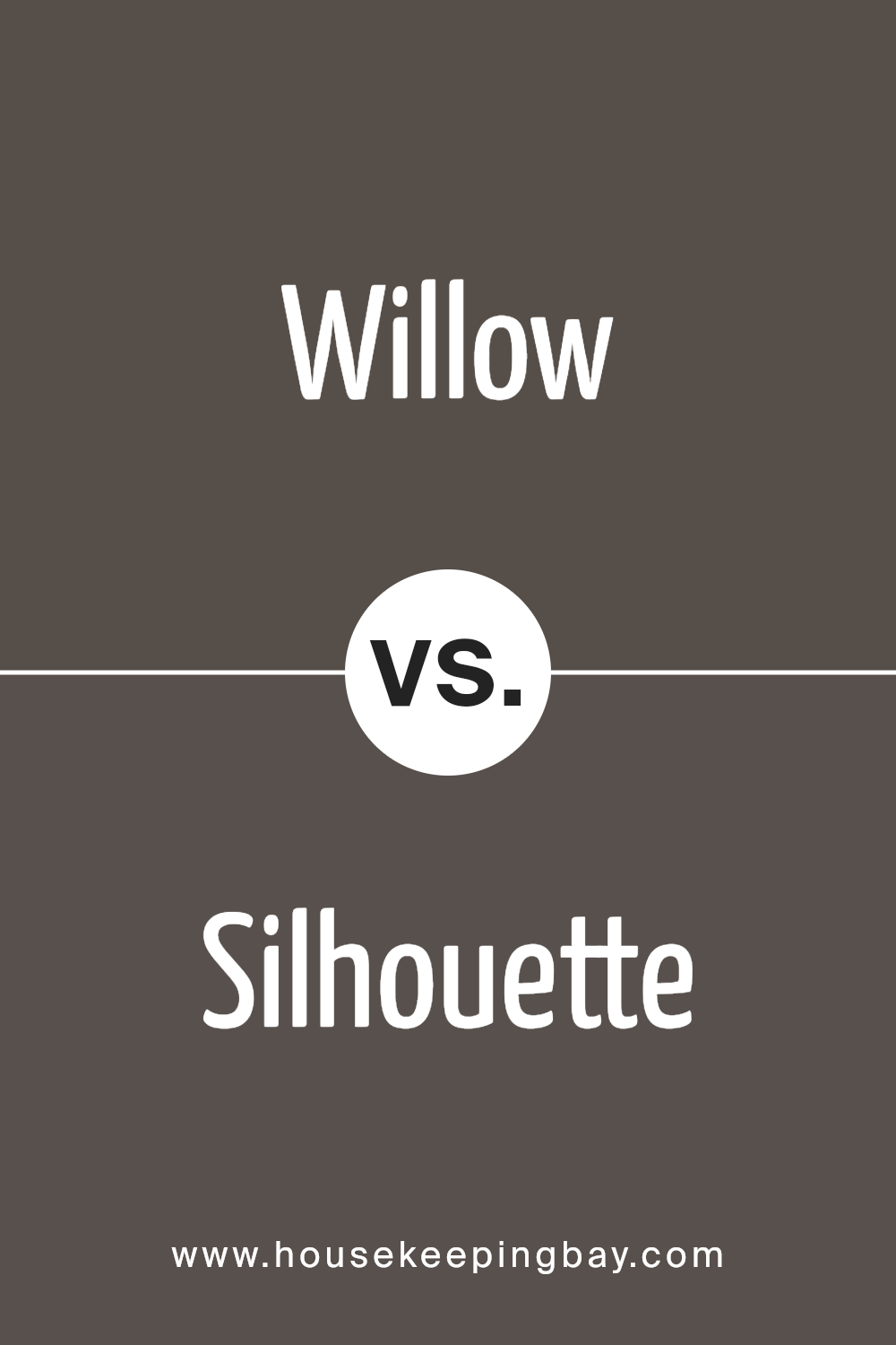
Willow CC-542 by Benjamin Moore vs Silhouette AF-655 by Benjamin Moore
Willow CC-542 by Benjamin Moore is a soft, muted green with a hint of gray, making it a calming and neutral choice suitable for many spaces. This color has a natural appeal, reminiscent of serene outdoor settings and peaceful environments. Its subtlety allows it to blend well with both bold and subdued furnishing styles, providing a gentle backdrop that doesn’t dominate the space.
In contrast, Silhouette AF-655, also by Benjamin Moore, presents a much darker, sophisticated shade of charcoal gray with deep, rich undertones. This color imparts a sense of depth and luxury, ideal for creating dramatic and stylish interiors. While Willow is more understated and versatile, Silhouette is perfect for accent walls or rooms where a strong, impactful presence is desired.
Both colors offer distinct vibes: Willow is more relaxed and earthy while Silhouette is bold and impactful. Choosing between them depends on the mood and style you want to establish in your space.
You can see recommended paint color below:
- AF-655 Silhouette
housekeepingbay.com
Willow CC-542 by Benjamin Moore vs Midsummer Night 2134-20 by Benjamin Moore
Willow CC-542 by Benjamin Moore is a gentle, soft green hue with a cool undertone that creates a calm and soothing atmosphere. It imitates the serene presence of willow leaves, bringing a touch of nature indoors. This color works well in spaces intended for relaxation, such as bedrooms or living areas.
Conversely, Midsummer Night 2134-20 is a much darker shade, echoing the deep tones of a clear evening sky. It’s a bold navy that commands attention, providing a dramatic flair to any room it’s used in. Ideal for accent walls or rooms where a strong, impactful color is desired, it pairs nicely with brighter or lighter tones to balance out its intensity.
Both colors are unique and cater to different aesthetic goals: Willow CC-542 is light and airy, emphasizing peace, while Midsummer Night 2134-20 offers depth and a sense of drama, perfect for more dynamic spaces.
You can see recommended paint color below:

housekeepingbay.com
Willow CC-542 by Benjamin Moore vs Brown Sugar 2112-20 by Benjamin Moore
Willow CC-542 by Benjamin Moore is a light, greenish-gray shade that offers a refreshing and soft appearance. It evokes a sense of calm and can be versatile in its use across various rooms, providing a backdrop that enhances other colors and elements of decor.
In contrast, Brown Sugar 2112-20 is a much darker, rich brown hue that gives a warm and cozy feel. This color can make a strong statement when used on walls or as an accent, and it’s especially effective in settings where you want to add a touch of robust depth.
Both colors stand well on their own and bring unique characteristics to a space. Willow CC-542 brightens a room and introduces serenity, making it ideal for spaces where light and openness are desired. Meanwhile, Brown Sugar 2112-20 offers warmth and intimacy, perfect for creating an inviting and snug environment. These colors can also complement each other when used together, striking a balance between light and dark tones in a room.
You can see recommended paint color below:
- 2112-20 Brown Sugar
housekeepingbay.com
This soothing green shade offers just the right mix of warmth and neutrality. Its versatility is evident, suiting a wide range of spaces from kitchens to bedrooms without overwhelming the senses.
I appreciate how it pairs beautifully with natural elements and various textures, enhancing wooden features and soft fabrics alike. Whether aiming for a minimalist vibe or a cozy, inviting setting, CC-542 Willow proves itself as an excellent choice for those seeking a balanced and refined aesthetic in their home decor.
Moreover, its durability and quality, characteristics I’ve come to expect from Benjamin Moore, ensure that it stands up to the demands of daily life. Overall, I find CC-542 Willow a reliable and appealing option for anyone looking to refresh their living environment with a touch of serenity and style.
housekeepingbay.com
