Midsummer Night 2134-20 by Benjamin Moore
Deep Blues and Dramatic Flair
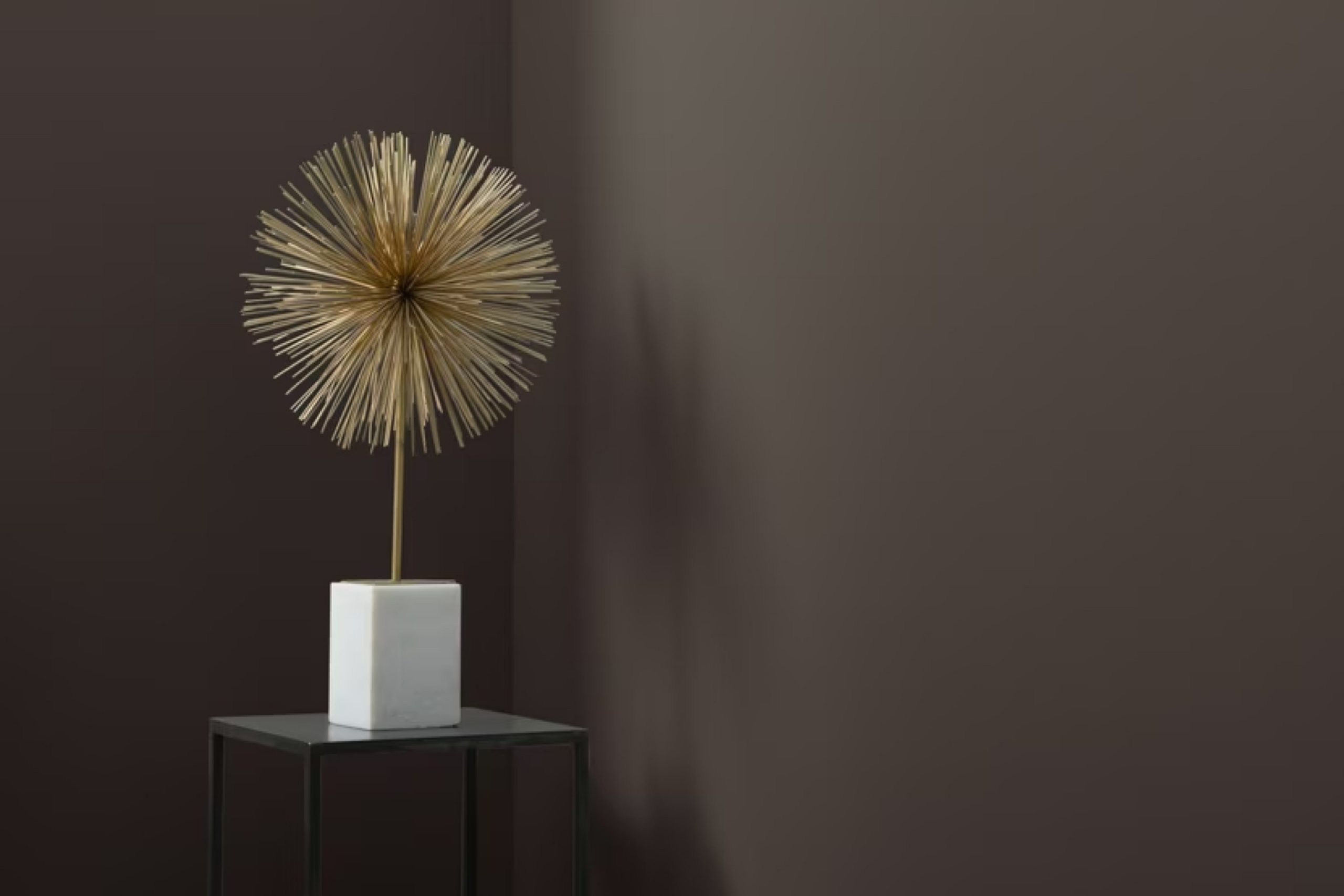
Are you thinking about refreshing a room or maybe adding a splash of new color to your home? Let me tell you about 2134-20 Midsummer Night by Benjamin Moore. This unique shade might just be what you need to give your space a fresh look. It’s a deep, rich color that can add a sophisticated touch to any room without being too overwhelming.
This particular paint color, Midsummer Night, is part of Benjamin Moore’s classic color collection, known for timeless shades that fit beautifully into a variety of spaces and design styles. Whether you want to update your living room, bedroom, or even your home office, 2134-20 Midsummer Night offers a perfect backdrop. It pairs well with light neutrals, wood tones, and even metallic finishes, giving you many options to accessorize and style your room.
Plus, the durability and quality of Benjamin Moore paints mean that aside from getting a great color, you are also investing in something that will stand the test of time.
Ready to see how 2134-20 Midsummer Night could work in your home?
Consider trying out a sample to see how the color transforms with different lighting in your space. It could be the change you’re looking for to refresh your environment.
via benjaminmoore.com
What Color Is Midsummer Night 2134-20 by Benjamin Moore?
Midsummer Night 2134-20 by Benjamin Moore is a deep, moody shade of blue with a hint of teal. This versatile color brings a profound richness to walls, creating a cozy yet sophisticated atmosphere. The depth of Midsummer Night 2134-20 makes it a popular choice for creating a dramatic impact in any space. When applied to interior walls, it provides a striking backdrop that highlights decor and furnishings, particularly in well-lit areas or rooms with ample natural light.
This color excels in interior styles such as modern, contemporary, and eclectic. It works exceptionally well in minimalist themes where the goal is to invoke a sense of calm and focus. Midsummer Night 2134-20 pairs beautifully with a range of materials and textures.
Natural wood, from light oak to dark walnut, complements this color well, bringing warmth to the cool undertones. Metals like brass and copper offer a beautiful contrast that makes the blue pop. Textiles in rich velvet or soft linen create a layered, inviting look.
For furniture, opt for pieces in neutral shades like creamy whites or soft grays to balance the intensity of Midsummer Night 2134-20.
Accessories and accents in mustard yellows or vibrant teals can highlight this color’s dynamic range, making any interior space feel well-designed and thoughtful.
housekeepingbay.com
Is Midsummer Night 2134-20 by Benjamin Moore Warm or Cool color?
Midsummer Night 2134-20 by Benjamin Moore is a deep, rich navy blue that brings a bold yet serene feel to any living space. This color is especially effective in creating a dramatic backdrop for rooms, making furniture and decor stand out. Additionally, its dark hue helps in defining spaces, making it ideal for accent walls or for painting cabinetry and doors.
In dimly lit areas, Midsummer Night adds depth and sophistication. In rooms with ample natural light, this color maintains its richness without overwhelming the space, offering a cozy, comforting atmosphere. It pairs well with a wide range of colors, from soft neutrals to vibrant tones, allowing for versatile design options.
Using Midsummer Night in homes can also make spaces appear larger because it blurs the boundaries between walls and ceilings, especially when used in a monochromatic style. This is a popular choice for those wanting to bring a touch of elegance and a modern twist to their interiors.
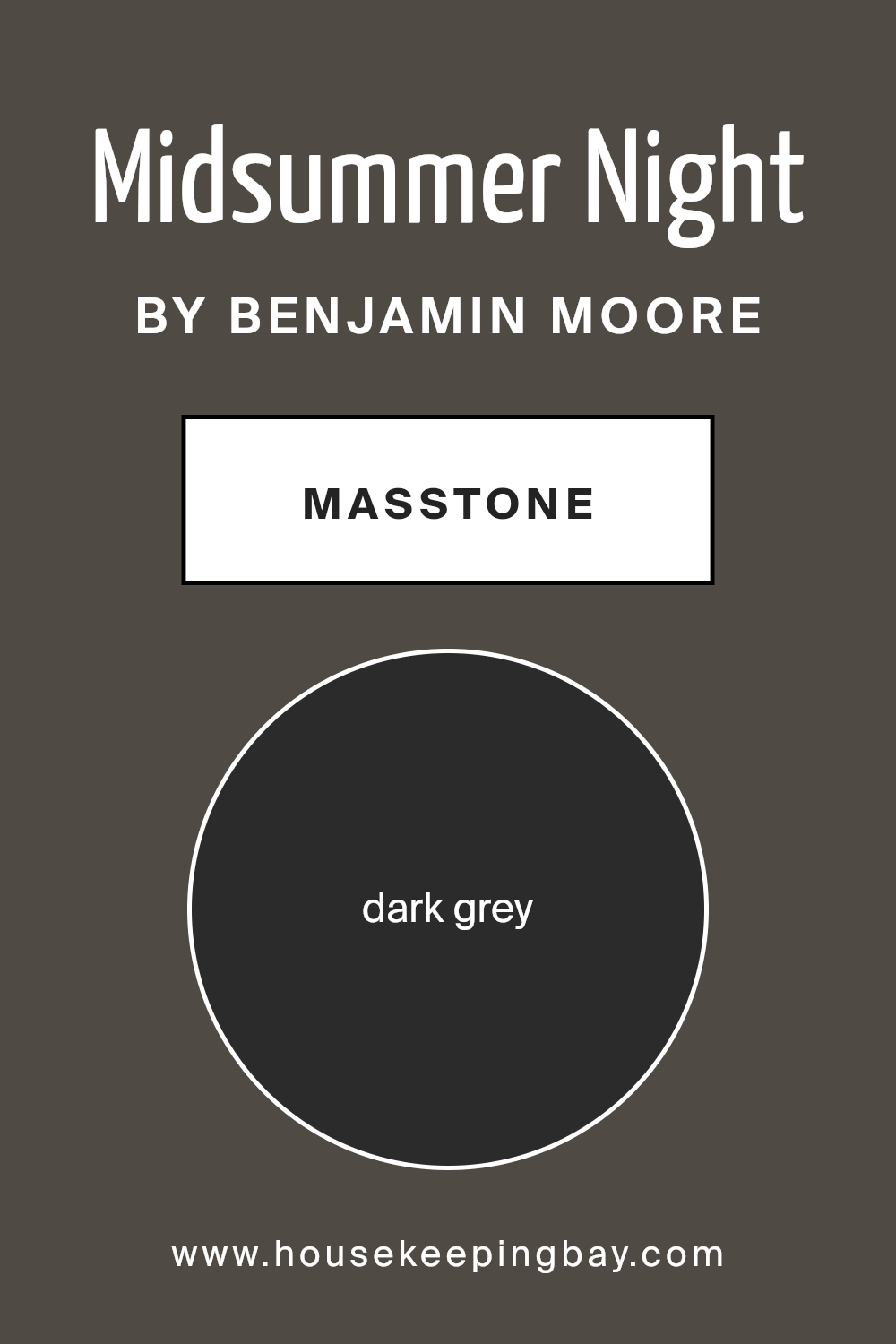
What is the Masstone of the Midsummer Night 2134-20 by Benjamin Moore?
Midsummer Night 2134-20 by Benjamin Moore has a masstone of dark grey, coded as #2B2B2B. This shade is a deep, almost charcoal-like color that brings a strong and solid feeling to any room. Due to its rich darkness, it’s a popular choice for creating a focal point in spaces.
In homes, dark grey works exceptionally well in areas requiring a touch of sophistication or a dramatic feel. It can make large rooms feel more intimate and cozy, while giving small spaces a feeling of depth.
This color pairs beautifully with brighter colors and metallic accents, which can lighten the mood and add contrast to the space.
In living rooms, bedrooms, or even bathrooms, Midsummer Night 2134-20 offers a versatile backdrop that supports a variety of decor styles, from modern to classic.
However, it is important to balance it with good lighting and lighter hues to prevent rooms from feeling too dark or confined.
housekeepingbay.com
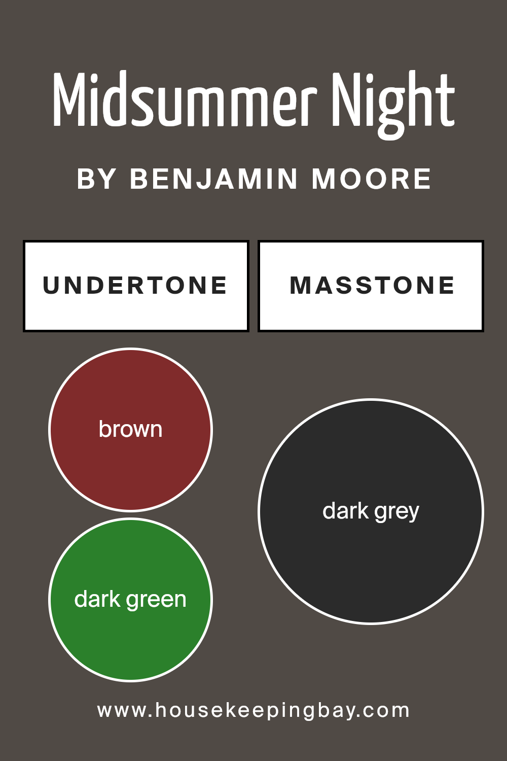
Undertones of Midsummer Night 2134-20 by Benjamin Moore
Midsummer Night 2134-20 by Benjamin Moore is a complex color with various undertones that influence how it appears in different lighting and surroundings. Undertones are subtle colors that lie beneath the surface of the main color, impacting the overall hue and mood the color creates.
This specific shade has undertones of brown, dark green, navy, olive, purple, dark turquoise, and grey. These undertones add depth and richness, making the color versatile and dynamic. For instance, the brown undertone adds warmth, making the space feel more inviting. The dark green and navy contribute a sense of sophistication and formality, suitable for spaces meant to impress or offer a serious ambiance.
Moreover, the olive and dark turquoise undertones can make Midsummer Night 2134-20 feel more grounded or earthy, perfect for creating a natural, calming environment in a room. Purple adds a touch of mystery and luxury, while the grey undertone ensures the color blends well with various decor elements without overpowering the space.
When used on interior walls, Midsummer Night 2134-20 can dramatically affect the room’s atmosphere. Depending on the natural and artificial light, these undertones may become more noticeable, subtly shifting the wall color throughout the day.
The result is a dynamic and interactive backdrop for any room, providing a rich tapestry of hues that interact with other colors and light sources in the environment.
housekeepingbay.com
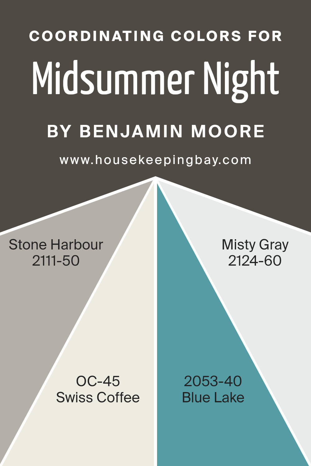
Coordinating Colors of Midsummer Night 2134-20 by Benjamin Moore
When selecting a paint color like Midsummer Night (2134-20) by Benjamin Moore, identifying coordinating colors can enrich the overall aesthetic of a space. Coordinating colors are chosen to harmoniously align with the main color, enhancing its beauty without overwhelming it. These hues usually share similar undertones or contrast effectively enough to form a balanced look. For Midsummer Night, a deep, dusky shade, the coordination with colors like Stone Harbour, Swiss Coffee, Blue Lake, and Misty Gray works perfectly to create a sophisticated palette.
Stone Harbour (2111-50) offers a greyish tone with hints of blue that subtly complement the depth of Midsummer Night, providing a grounded, calming effect within a room. Swiss Coffee (OC-45) is a light and airy off-white that brings brightness, making it ideal for trim or ceiling applications that support the dominant hue.
Blue Lake (2053-40) is a vibrant blue that injects a lively contrast against the darker tones of Midsummer Night, perfect for a focal wall or accent pieces. Misty Gray (2124-60) serves as a soft, light grey that works seamlessly with darker shades, ensuring a smooth visual transition between colors in a space. Together, these colors harmonize to highlight the rich quality of Midsummer Night while creating a pleasing visual flow in decor.
You can see recommended paint colors below:
- 2111-50 Stone Harbour
- OC-45 Swiss Coffee
- 2053-40 Blue Lake
- 2124-60 Misty Gray
housekeepingbay.com
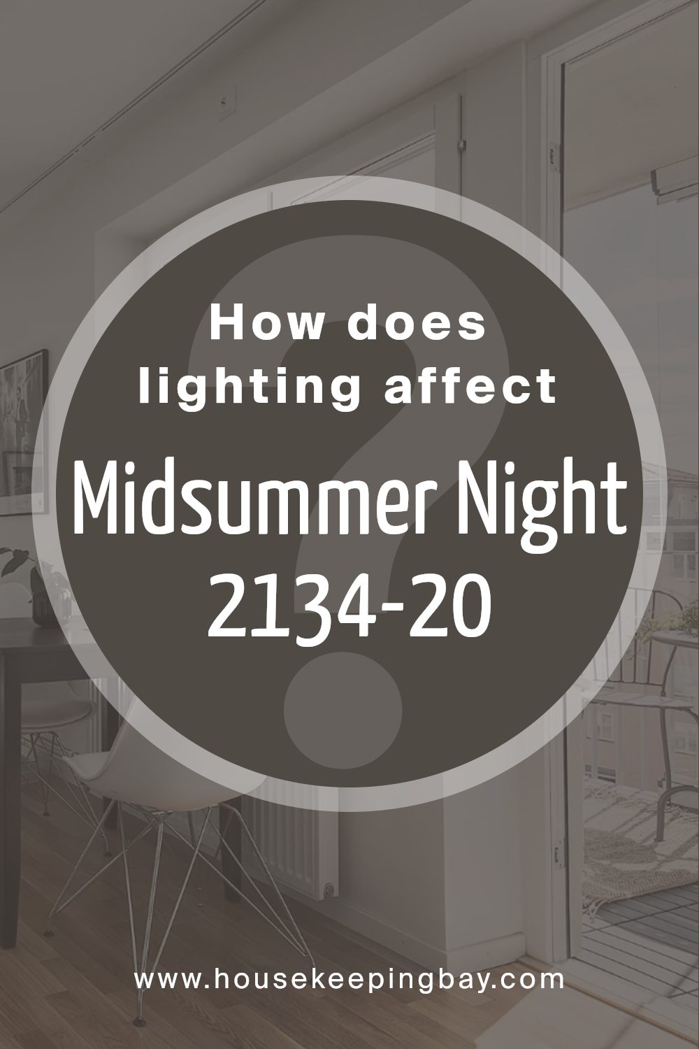
How Does Lighting Affect Midsummer Night 2134-20 by Benjamin Moore?
Lighting plays a crucial role in how colors appear in different environments. The color perception can shift drastically under various lighting conditions due to the color temperature and intensity of the light source.
Taking the color Midsummer Night (2134-20) by Benjamin Moore as an example, it’s a deep, inky blue that can appear differently based on lighting conditions. In artificial light, which typically has a warmer tone, Midsummer Night tends to look richer and more vibrant.
The warmth of typical indoor lighting bulbs can bring out subtle purple undertones in this shade, making it feel cozy and inviting.
In natural light, the appearance of Midsummer Night can vary throughout the day.
In the soft light of morning or late afternoon, it may appear softer and more muted. Under the bright noon sun, the blue can look more vivid and sharper. Natural light, being cooler than most indoor lighting, can emphasize the paint’s cooler blue tones, giving a crisp appearance.
Room orientation also affects how Midsummer Night displays:
-North-facing rooms: These rooms get less direct sunlight and tend to capture cooler, bluer light, which can make Midsummer Night appear somewhat shadowy and profound. This shade can make a quiet retreat in such spaces.
– South-facing rooms: With ample sunlight, Midsummer Night will appear lighter and more dynamic in south-facing rooms. The color can shift throughout the day, looking more lively and pronounced under the influence of direct sunlight.
– East-facing rooms: Morning light is warm and yellow, which can cause Midsummer Night to appear more lively and bright in the morning, transitioning to a cooler tone as the day progresses since east-facing rooms lose direct light post-noon.
– West-facing rooms: Evening light in west-facing rooms is warm and intense, possibly making Midsummer Night look more intense and vibrant in the evening than during the day when the room might have a cooler, shadowed feel.
Overall, Midsummer Night’s perception is significantly influenced by the quality and direction of light, producing varying effects in different settings.
housekeepingbay.com
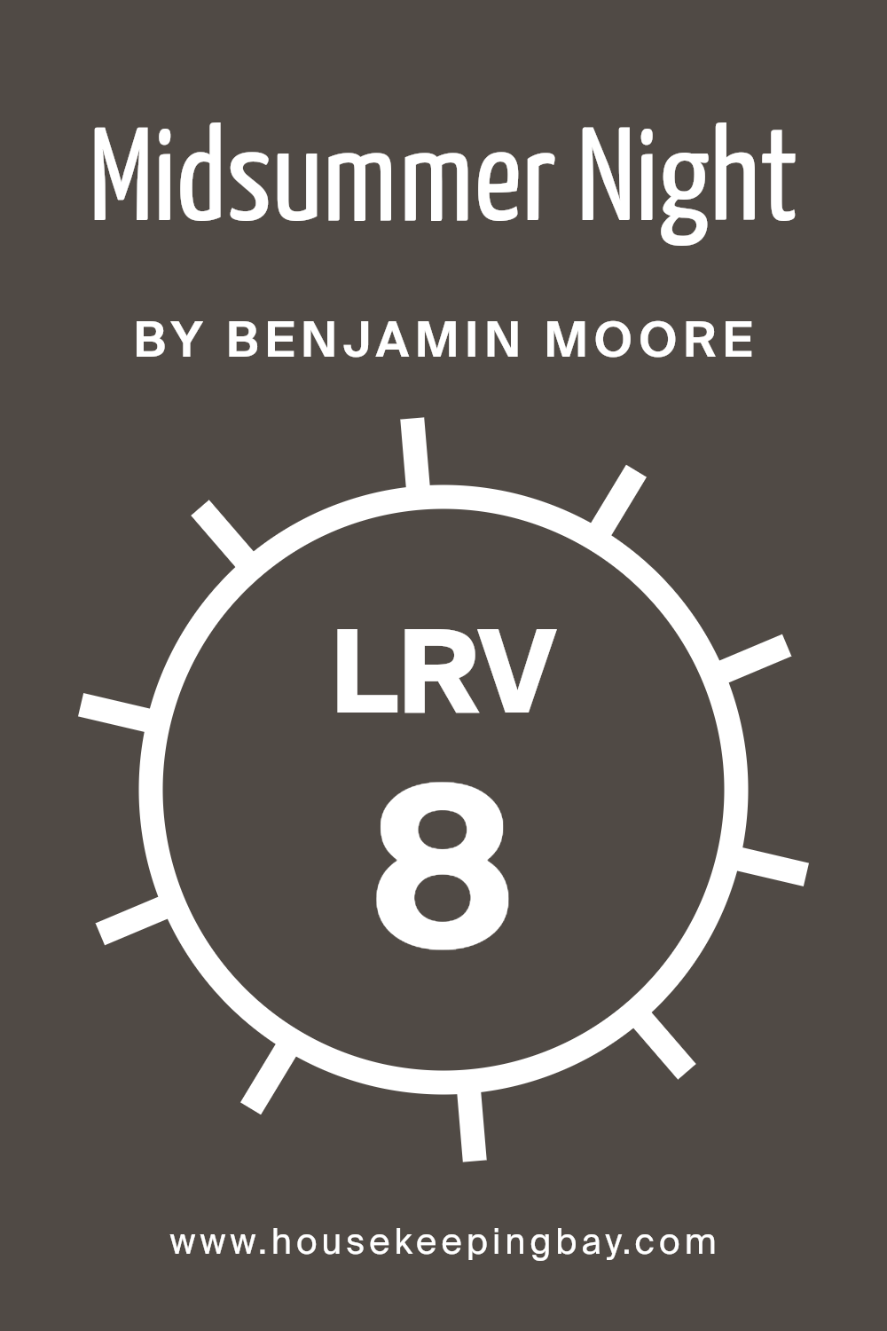
What is the LRV of Midsummer Night 2134-20 by Benjamin Moore?
LRV stands for Light Reflectance Value, a measure used to indicate how much light a paint color can reflect back into a room. It’s measured on a scale from 0 to 100, where 0 means the color absorbs all light, appearing very dark, and 100 means it reflects all light, appearing very bright.
The LRV helps people decide on a paint color based on how light or dark they want their room to appear. Choosing a color with a high LRV can make a small, dim room feel brighter and more open, while a low LRV can make a space feel cozier and more enclosed.
The LRV of Benjamin Moore’s Midsummer Night 2134-20 is 7.79, placing it on the lower end of the scale. This means it’s a dark color that absorbs much of the light that hits it, which can deeply influence the ambiance of a room. In a space with little natural light, using a color with such a low LRV might make the room feel smaller or darker than it actually is.
Conversely, in a well-lit room or large space, this color can add a sense of warmth and depth, making the area feel more intimate and grounded. It’s important to pair such a dark color with the appropriate lighting and room size to avoid making the space feel overly constricted.
housekeepingbay.com
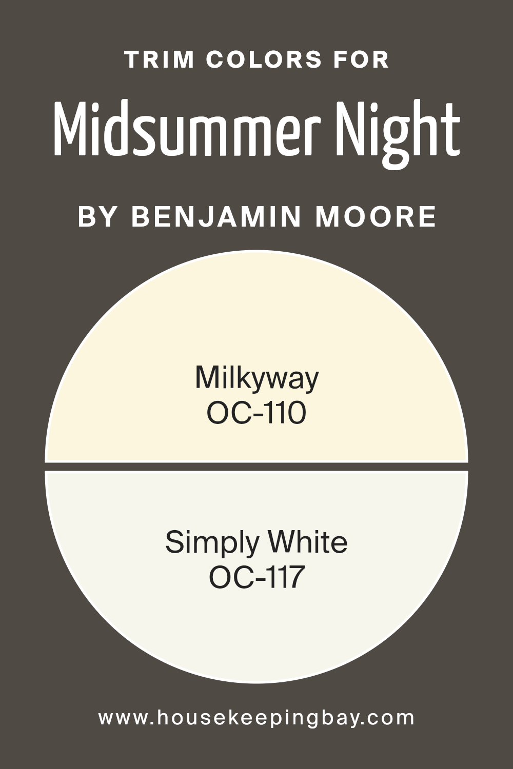
What are the Trim colors of Midsummer Night 2134-20 by Benjamin Moore?
Trim colors are specific shades used to accentuate or complement the main colors on walls, doors, and windows, often enhancing architectural details and adding visual interest to a room. The right trim color can subtly outline spaces, provide a crisp finish, and help blend or contrast the wall colors to create a harmonious atmosphere.
For a paint like Midsummer Night 2134-20 by Benjamin Moore, which is a deep, rich blue, choosing appropriate trim colors is crucial as they play a key role in balancing the intensity of the main hue and ensuring the color scheme doesn’t become overwhelming.
Milkyway OC-110 by Benjamin Moore is a soft, muted off-white with creamy undertones that can warm up the deep tones of Midsummer Night without competing for attention, making it an ideal choice for a soothing yet defined look. Simply White OC-117, another excellent trim option, offers a fresh and clean look, its bright, pure quality providing a sharp contrast that highlights the vibrant depth of Midsummer Night, helping to make the space feel more open and lively. These trim colors can effectively frame the darker blue, enhancing both its appearance and the overall appeal of the room.
You can see recommended paint colors below:
- OC-110 Milkyway
- OC-117 Simply White
housekeepingbay.com
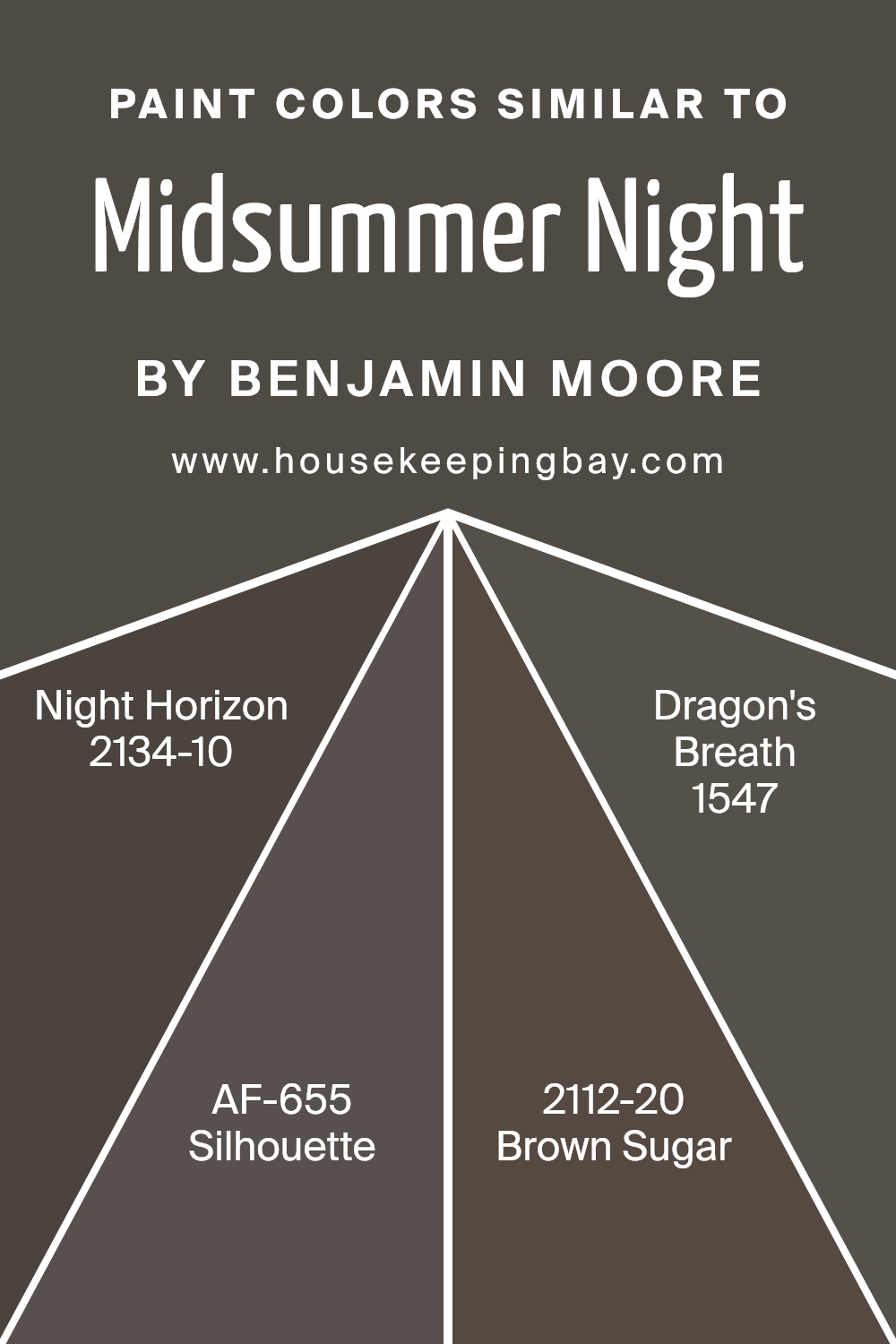
Colors Similar to Midsummer Night 2134-20 by Benjamin Moore
In interior design and home decoration, using similar colors can help create a cohesive and harmonious environment. Similar colors, like variations of Benjamin Moore’s Midsummer Night2134-20, work together because they share common hues and undertones, making the transition from one color to another almost seamless. These shades can be used effectively to design a room with a rich, layered look without overwhelming the senses.
For example, when colors such as Night Horizon2134-10 and Silhouette AF-655 are used alongside each other, they contribute to a tranquil atmosphere due to their close tonal range, enhancing the room’s overall aesthetic while providing depth and interest.
Night Horizon 2134-10 is a deep, almost mystical gray that mirrors the late evening skies, offering a serene yet profound backdrop for spaces. Silhouette AF-655, another gray, leans slightly toward charcoal, providing a subtle contrast that is both sophisticated and grounded. Brown Sugar 2112-20 offers a darker, earthier element with its rich brown tone, adding warmth and a touch of nature-inspired comfort to any space.
Lastly, Dragon’s Breath 1547, with its dark, brooding presence, suggests the charred remains of a fire, bringing an intense and dramatic flair that can anchor lighter tones or serve as a focal point. Each of these colors, while similar, holds unique characteristics that can enhance the decor when used thoughtfully.
You can see recommended paint colors below:
- 2134-10 Night Horizon
- AF-655 Silhouette
- 2112-20 Brown Sugar
- 1547 Dragon’s Breath
housekeepingbay.com
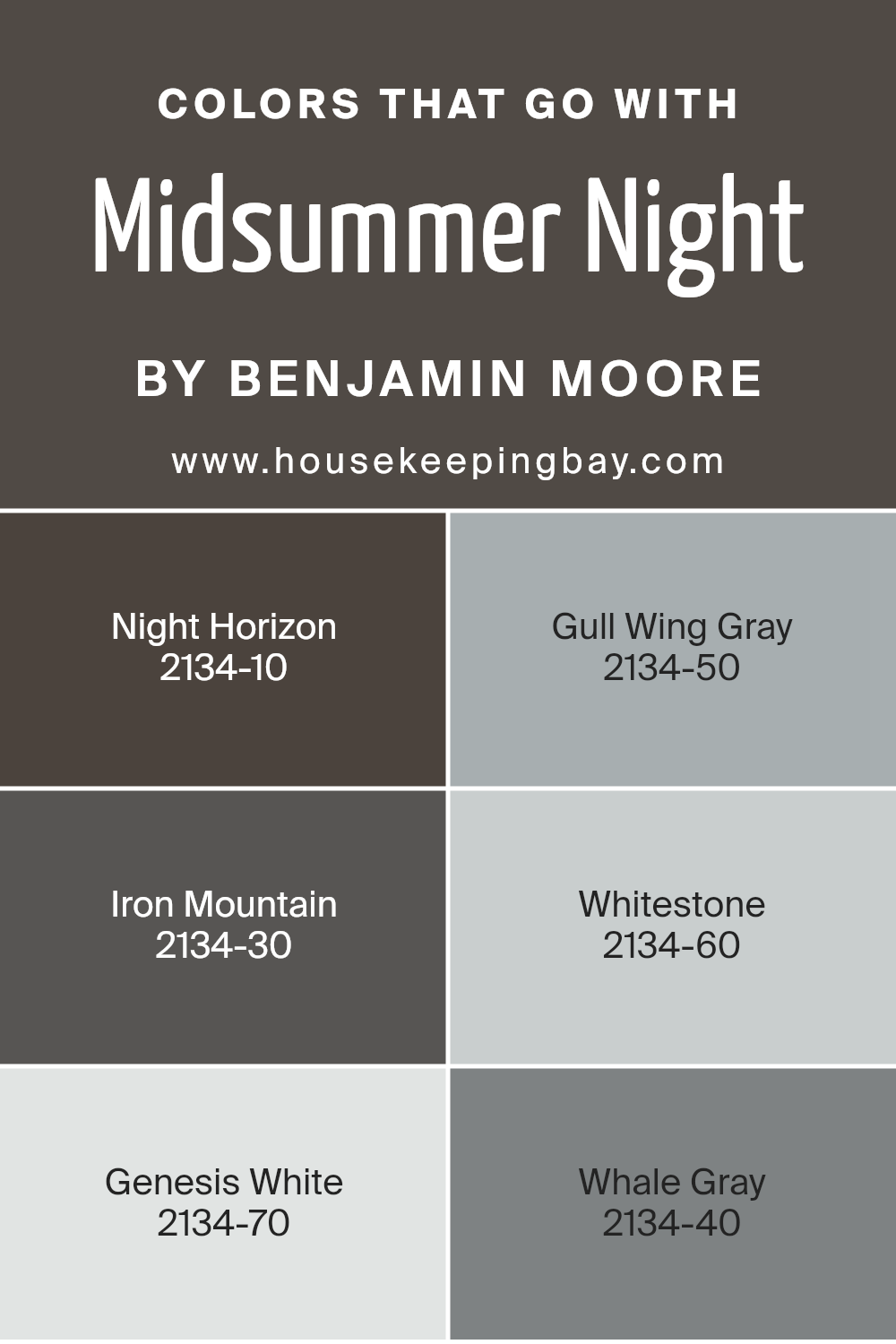
Colors that Go With Midsummer Night 2134-20 by Benjamin Moore
Choosing the right colors to complement Benjamin Moore’s Midsummer Night 2134-20 is crucial for achieving a cohesive and visually appealing space. Midsummer Night is a deep, moody blue that can act as a striking base for a variety of color schemes.
Pairing it with compatible tones like Night Horizon 2134-10, a dense, charcoal gray, adds a sophisticated contrast that enhances the depth of both hues. Using lighter shades such as Gull Wing Gray 2134-50, a soft, light gray, can break up the intensity while maintaining an elegant flow throughout the space.
Furthermore, incorporating shades like Iron Mountain 2134-30, a dark gray with chocolate undertones, provides a warm balance to the coolness of Midsummer Night. Whitestone 2134-60—a crisp, almost white gray—acts as an excellent tool for brightening areas and giving a fresh look while maintaining the overall scheme.
For a more subtle contrast, you could incorporate Genesis White 2134-70, a pale, delicate gray that adds a gentle lift to the darker shades. Lastly, Whale Gray 2134-40 is a balanced medium gray that seamlessly ties together the darker and lighter elements, creating a smooth color transition throughout your setting, ensuring that each area of your environment feels thoughtfully curated and visually harmonious.
You can see recommended paint colors below:
- 2134-10 Night Horizon
- 2134-50 Gull Wing Gray
- 2134-30 Iron Mountain
- 2134-60 Whitestone
- 2134-70 Genesis White
- 2134-40 Whale Gray
housekeepingbay.com
How to Use Midsummer Night 2134-20 by Benjamin Moore In Your Home?
Midsummer Night 2134-20 by Benjamin Moore is a deep, rich navy blue paint that brings a feeling of sophistication and depth to any space. This color works well in a variety of settings within a home. In a bedroom, it can create a cozy and calming atmosphere, making it a great choice for a peaceful retreat. When used in a living room or dining area, it adds a dramatic backdrop that enhances the decor and furnishings.
For those wanting to create a focal point, painting one wall in Midsummer Night can serve as an accent wall, giving the room a modern and stylish flair without overwhelming the space. Combining this shade with lighter colors like whites or soft grays can balance its intensity.
Additionally, it’s perfect for cabinetry or furniture pieces, giving them a fresh, updated look. It pairs beautifully with metallic accents, such as gold or silver, enhancing the overall aesthetic of the room. This color is versatile, fitting well with both contemporary and traditional styles.
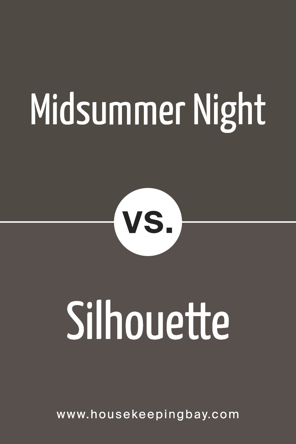
Midsummer Night 2134-20 by Benjamin Moore vs Silhouette AF-655 by Benjamin Moore
Midsummer Night 2134-20 by Benjamin Moore is a deep, moody blue that almost feels black in certain lights. It’s a strong color that adds a lot of character and depth to spaces, making it ideal for creating a cozy, intimate atmosphere in rooms. It can also make smaller spaces feel smaller due to its intense hue.
Silhouette AF-655, also by Benjamin Moore, is a softer, lighter gray color with a hint of warmth. It’s very versatile and works well in many different settings, from modern to traditional. Silhouette AF-655 reflects more light, making spaces appear larger and more open than Midsummer Night 2134-20.
In comparison, Midsummer Night 2134-20 is bolder and more dramatic, suited for making a statement or anchoring a room with its deep tone. Silhouette AF-655, meanwhile, offers a more neutral backdrop, providing flexibility in decor and an airy feel to interiors.
You can see recommended paint color below:
- AF-655 Silhouette
housekeepingbay.com
Midsummer Night 2134-20 by Benjamin Moore vs Dragon’s Breath 1547 by Benjamin Moore
Midsummer Night 2134-20 by Benjamin Moore is a deep, rich blue shade, close to navy but infused with hints of teal that give it a warm, inviting feel. This color can make a room feel cozy and sophisticated, perfect for creating a strong statement in spaces like living rooms or bedrooms. It pairs well with bright whites or soft grays for a balanced look.
Dragon’s Breath 1547 by Benjamin Moore is a much darker color, leaning towards a charcoal with subtle underlying tones of green and brown. This shade is incredibly versatile, suitable for both interior and exterior uses. It provides a grounding effect, making it ideal for accent walls or cabinetry, particularly in a kitchen or study where you want a touch of formality without the starkness of black.
Both colors are bold and effective for creating mood and character in a room but serve different aesthetics. Midsummer Night brings a vibrant, yet serene vibe, while Dragon’s Breath offers a more earthy, enveloping atmosphere.
You can see recommended paint color below:

housekeepingbay.com
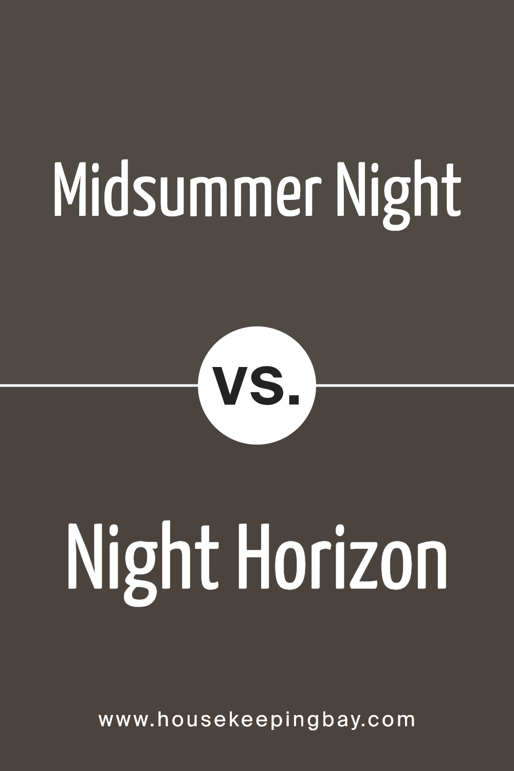
Midsummer Night 2134-20 by Benjamin Moore vs Night Horizon 2134-10 by Benjamin Moore
Midsummer Night 2134-20 by Benjamin Moore is a deep, rich blue with subtle gray undertones, giving it a serene and sophisticated quality. This color is versatile and works well in both bright and dim lighting, adapting subtly to various decor styles. It provides a calm and composed backdrop, excellent for creating a cozy, inviting atmosphere in any room.
In contrast, Night Horizon 2134-10 by Benjamin Moore leans more towards a charcoal hue with a hint of navy, making it darker and moodier than Midsummer Night. This shade is ideal for adding drama and depth to spaces, suitable for accent walls or rooms where a bold, strong presence is desired. It absorbs light rather than reflects it, which can make spaces feel smaller but significantly cozier.
Both colors share a base of dark blue but differ in their impact and ambiance, with Midsummer Night feeling lighter and more flexible, while Night Horizon offers a more intense and enclosed feel.
You can see recommended paint color below:
- 2134-10 Night Horizon
housekeepingbay.com
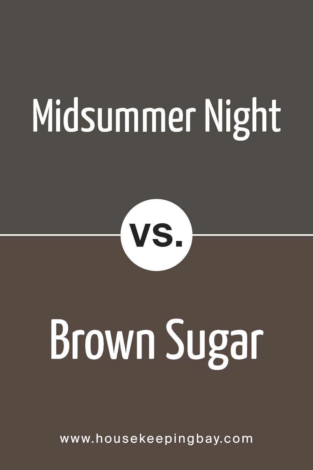
Midsummer Night 2134-20 by Benjamin Moore vs Brown Sugar 2112-20 by Benjamin Moore
Midsummer Night 2134-20 by Benjamin Moore is a deep, rich navy blue with a hint of gray. This color gives a serene and classic feel, making it suitable for spaces where calm and concentration are desired, such as bedrooms or home offices. Its depth adds a sense of sophistication and can make small rooms appear larger when applied correctly.
In contrast, Brown Sugar 2112-20 by Benjamin Moore presents a warm caramel brown tone that evokes a cozy and inviting atmosphere. This shade is great for living areas and kitchens where a warm, welcoming feel is important. The color pairs well with a variety of wood finishes and natural textiles, enhancing a rustic aesthetic.
Both colors offer unique vibes—Midsummer Night leans towards a cool, formal look while Brown Sugar opts for warmth and snugness, making them ideal for different purposes and settings.
You can see recommended paint color below:
- 2112-20 Brown Sugar
housekeepingbay.com
I found the paint color 2134-20 Midsummer Night by Benjamin Moore to be a versatile and sophisticated option for anyone looking to refresh their home’s look. This deep, moody tone conveys a sense of elegance, and it pairs well with a wide range of decor styles, from modern to traditional.
Applying it to an accent wall really makes the room pop, yet it’s also subdued enough to use on all walls without overwhelming the space. The color has a unique ability to shift mood depending on the lighting, making it feel dynamic throughout the day.
What’s more, the quality of Benjamin Moore paints means that the color maintains its depth and richness over time, resisting fading and maintaining its charm.
Overall, my experience with Midsummer Night has been incredibly positive, making it easy to recommend to others looking to refresh their spaces with a color that offers both beauty and lasting power.
housekeepingbay.com
