White Cloud 2159-70 by Benjamin Moore
Brightening Every Corner with a Fresh Splash
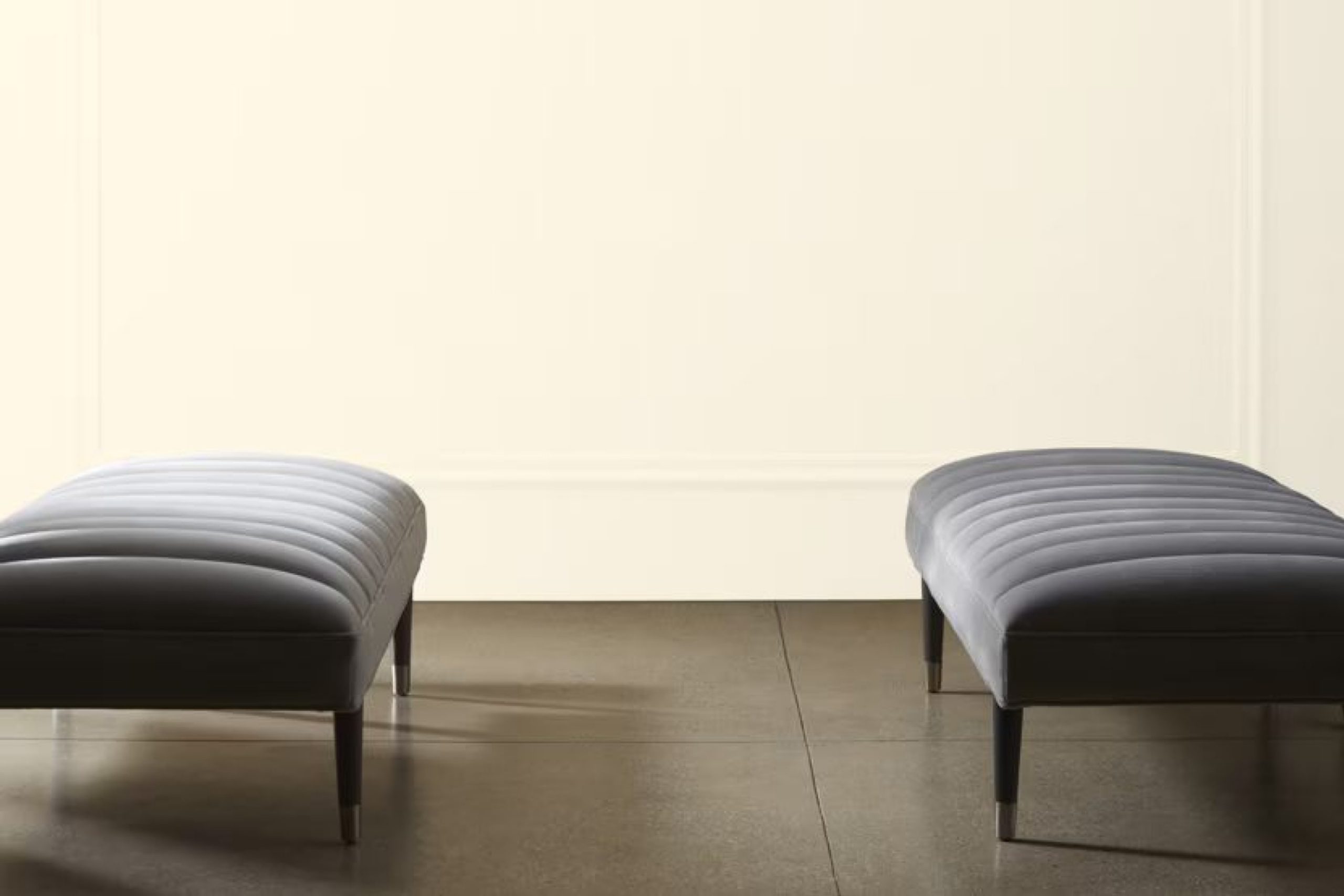
If you want a fresh look for your space, consider the color 2159-70 White Cloud by Benjamin Moore. This paint shade is a gentle white that offers a soft backdrop for any room. Whether you’re updating your living room or giving your bedroom a light and airy feel, White Cloud provides a subtle warmth that enhances natural light and complements various decor styles.
You’ll find that this color is not just another plain white. It has enough character to stand alone or work beautifully alongside other colors, making your decorating choices easy. For those new to interior design, White Cloud is a safe bet; it’s simple to match with furniture and accessories.
If you’re revamping a space or just giving it a minor refresh, White Cloud can definitely help achieve a serene and welcoming atmosphere.
via benjaminmoore.com
What Color Is White Cloud 2159-70 by Benjamin Moore?
Table of Contents
White Cloud 2159-70 by Benjamin Moore is a gentle and airy shade of white that brings a refreshing and clean feel to any space. This color subtly balances between pure white and a hint of soft gray, making it a versatile background that suits various decorating styles. Its softness is ideal for creating a serene and inviting atmosphere.
In terms of interior styles, White Cloud works beautifully in modern, minimalist, Scandinavian, and traditional settings. It’s particularly effective in spaces that aim for a light and open feel, allowing for a seamless flow of natural light. It pairs especially well with minimalist decor, where simplicity and functionality are key.
This shade complements a wide range of materials and textures. It looks crisp and neat against smooth, polished surfaces like glass and metal, highlighting their shine and sleekness. In contrast, when paired with natural wood or stone, White Cloud brings out their warmth and organic textures, creating a balanced and cohesive look.
Soft fabrics like wool or linen in muted tones also work well with this color, adding a layer of warmth and comfort without overpowering the serene vibe of the paint. Overall, White Cloud 2159-70 is a flexible color choice that adapts well to many design elements, enhancing the overall aesthetic of a room without dominating it.
housekeepingbay.com
Is White Cloud 2159-70 by Benjamin Moore Warm or Cool color?
White Cloud 2159-70 by Benjamin Moore is a soft, airy color that brings a fresh and light feel to any room in a home. It is not just a plain white; it has a subtle warmth that makes spaces feel welcoming and calm. This shade works well in rooms that get a lot of natural light or spaces that are a bit smaller, as it helps make them appear larger and more open.
When used on walls, White Cloud 2159-70 acts as a versatile backdrop for various types of decor. It pairs well with bold colors and can also support a more subdued palette, allowing homeowners to play with different textures and furnishings.
In bedrooms and living areas, this color introduces a soothing atmosphere, perfect for relaxing. In busier areas, like kitchens and bathrooms, it keeps the space looking clean and neat. It also works beautifully for ceilings and trims, giving a cohesive look throughout the home.
What is the Masstone of the White Cloud 2159-70 by Benjamin Moore?
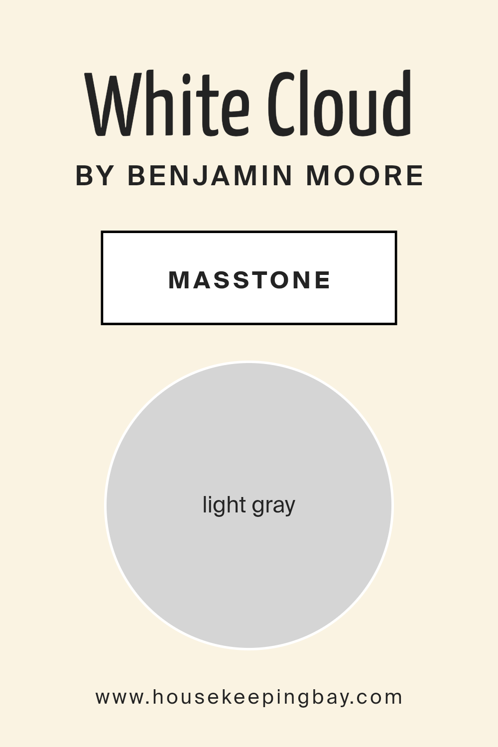
White Cloud 2159-70 by Benjamin Moore, identified as light gray and marked by its code #D5D5D5, is a soft and subtle color choice for home interiors. The masstone, representing the most concentrated form of the color before it’s lightened or toned down, shows a crisp, gentle gray that can make spaces feel both spacious and comforting.
This color is incredibly versatile, working well in almost any room in a house. In living rooms, it provides a calm, neutral backdrop that allows furniture and artwork to stand out. It’s light enough to keep small spaces like bathrooms and entryways feeling airy without being stark, unlike some deeper grays or pure whites.
In bedrooms, the softness of White Cloud can help contribute to a restful environment, making it conducive for relaxation and sleep. Its light gray tone also offers flexibility in decorating, supporting a variety of color schemes from bright and bold to more muted and earthy tones. It can easily be paired with both modern and traditional décor, making it a practical choice for many homeowners.
housekeepingbay.com
Undertones of White Cloud 2159-70 by Benjamin Moore
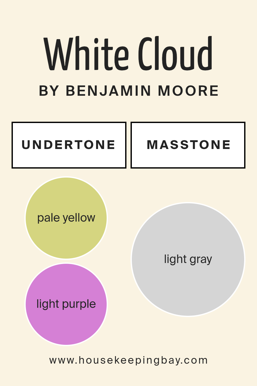
The undertones of a paint color can greatly influence how it is perceived and how it feels in a space. White Cloud 2159-70 by Benjamin Moore is a subtle and sophisticated color, with a range of undertones that add depth and complexity. Undertones are secondary colors that contribute to the overall appearance of a primary color. In the case of White Cloud 2159-70, its mixture includes pale yellow, light purple, light blue, pale pink, mint, lilac, and grey.
Pale yellow undertones can make a room feel warmer and more welcoming. Light purple and lilac bring a touch of coolness, offsetting the warmth slightly and adding a refined nature to the space. Light blue and mint undertones contribute to a sense of freshness and calmness, perfect for creating a relaxed environment.
The pale pink offers a gentle hint of warmth again, contrasting softly with the cooler tones. Finally, the grey undertone acts as a balancing agent, providing a neutral base that helps in blending all other undertones together. In an interior setting, the array of undertones in White Cloud 2159-70 means it can change appearance under different lighting conditions. Thus, the paint can appear more warm or cool depending on the time of day and the type of light in the room.
This versatility makes it a popular choice for decorators who want a color that adapts to various settings and decoration styles. Overall, the incorporation of such undertones in White Cloud 2159-70 makes it a flexible choice for walls, contributing to a peaceful yet dynamic atmosphere.
housekeepingbay.com
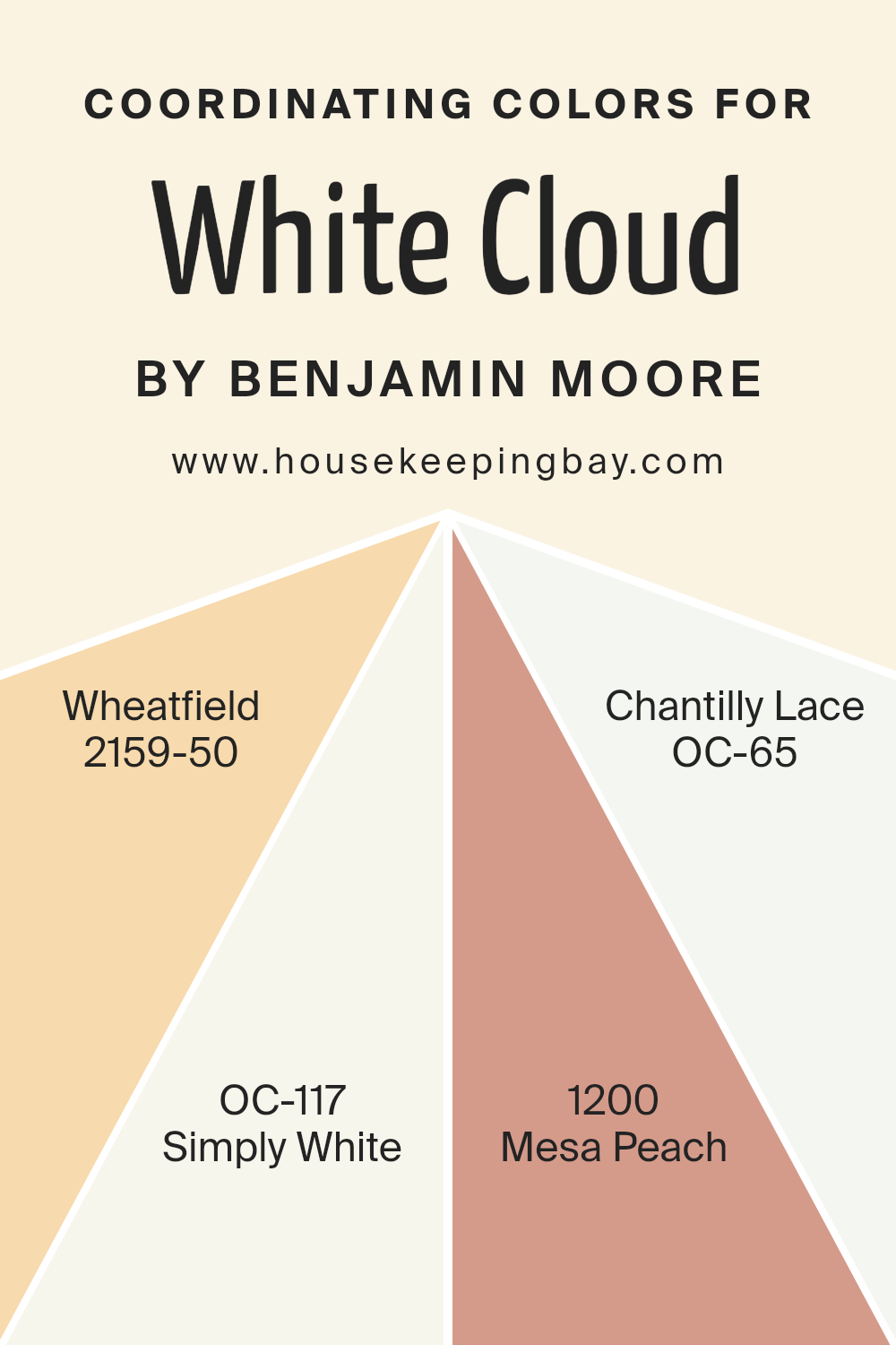
Coordinating Colors of White Cloud 2159-70 by Benjamin Moore
Coordinating colors are a group of paint colors that work well with a primary color, complementing and enhancing the overall aesthetic of a space. When selected carefully, these colors create a harmonious flow from room to room, providing a cohesive look throughout a home or office. For instance, White Cloud 2159-70 by Benjamin Moore can be beautifully paired with a selection of coordinating colors to achieve a balanced and inviting atmosphere.
2159-50 Wheatfield is a soothing, muted yellow that brings a warm, gentle glow to spaces, perfect for adding a soft radiance when used alongside White Cloud. OC-117 Simply White is a clean and crisp white that offers a fresh, airy feel, ensuring that spaces feel more open and light-filled.
Another choice, 1200 Mesa Peach, introduces a subtle peach tone that infuses any room with a hint of natural earthiness, providing a soft contrast when used with cooler tones. Lastly, OC-65 Chantilly Lace stands out as an ultra-pure white, offering a sharper contrast that works to vividly define spaces in combination with White Cloud. Together, these colors offer a versatile palette that can enhance the aesthetic of any home.
You can see recommended paint colors below:
- 2159-50 Wheatfield
- OC-117 Simply White
- 1200 Mesa Peach
- OC-65 Chantilly Lace
housekeepingbay.com
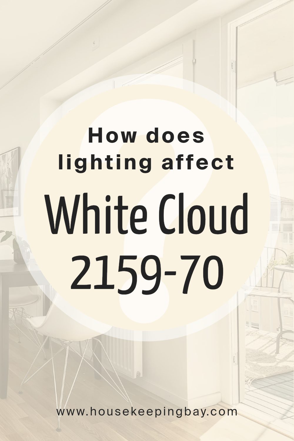
How Does Lighting Affect White Cloud 2159-70 by Benjamin Moore?
Lighting plays a vital role in how colors are perceived in any space. The type of light—whether natural or artificial—can dramatically alter the appearance of a color. For instance, White Cloud 2159-70 by Benjamin Moore, a soft and serene shade of white, is affected differently depending on the light source.
Artificial Light: In artificial lighting, White Cloud tends to display a warm and creamy tone. The yellowish hue that many indoor lights emit can soften this color, making it appear more cozy and inviting.
It’s ideal for spaces where you want a gentle, warm feel, such as living rooms or bedrooms.
Natural Light: Under natural lighting, White Cloud showcases its true color without the influence of external tones.
It will appear brighter and more vibrant, reflecting the natural quality of daylight. This makes it perfect for spaces that aim to feel fresh and airy.
Light Direction and Room Orientation:
– North-Faced Rooms: These rooms get less direct sunlight, which can make colors feel cooler. White Cloud in north-facing rooms will look a bit more muted, with a subtle grayish tone, maintaining a crisp and clean appearance.
– South-Faced Rooms: With abundant sunlight, south-faced rooms allow White Cloud to shine brightly and purely, enhancing its vibrant and fresh characteristics. This makes the room feel lively and bright throughout the day.
– East-Faced Rooms: In east-facing rooms, morning light can make White Cloud feel slightly warmer in the morning while turning cooler as the day progresses. This dynamic change can make the room feel refreshing in the morning and calming by the evening.
– West-Faced Rooms: West-facing rooms highlight White Cloud beautifully in the late afternoon when the light is warmer. During mornings, however, the color stays neutral, creating a balanced ambiance throughout the day.
Understanding these nuances can help in choosing the right paint and decorations to harmonize with the interplay of light and color, ensuring that spaces are not just visually pleasing but also functionally attuned to their natural and artificial lighting environment.
housekeepingbay.com
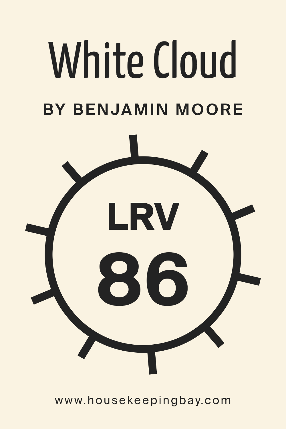
What is the LRV of White Cloud 2159-70 by Benjamin Moore?
LRV stands for Light Reflectance Value, which measures the percentage of light a paint color reflects back into a room. It ranges from 0, which absorbs all light, to 100, which reflects all light. High LRV colors make spaces feel brighter since they reflect more light, while lower LRV paints, which absorb more light, can make rooms appear dimmer and cozier.
Understanding LRV helps in choosing the right paint color based on how bright or muted you want the space to appear. It is particularly useful in areas that may get less natural light, helping compensate for the lack of brightness.
For White Cloud 2159-70 by Benjamin Moore, with an LRV of 85.91, this paint is very reflective, making it an excellent choice for painting walls in darker or smaller rooms to make them appear larger and brighter. Such a high LRV means this color will help in maximizing the available light, whether natural or artificial, making the space look more inviting and spacious.
Since it reflects a lot of light, it might also help in reducing the need for excessive artificial lighting, which could be energy-saving. This shade of white is versatile enough to work well in various settings without overwhelming the room aesthetics.
housekeepingbay.com
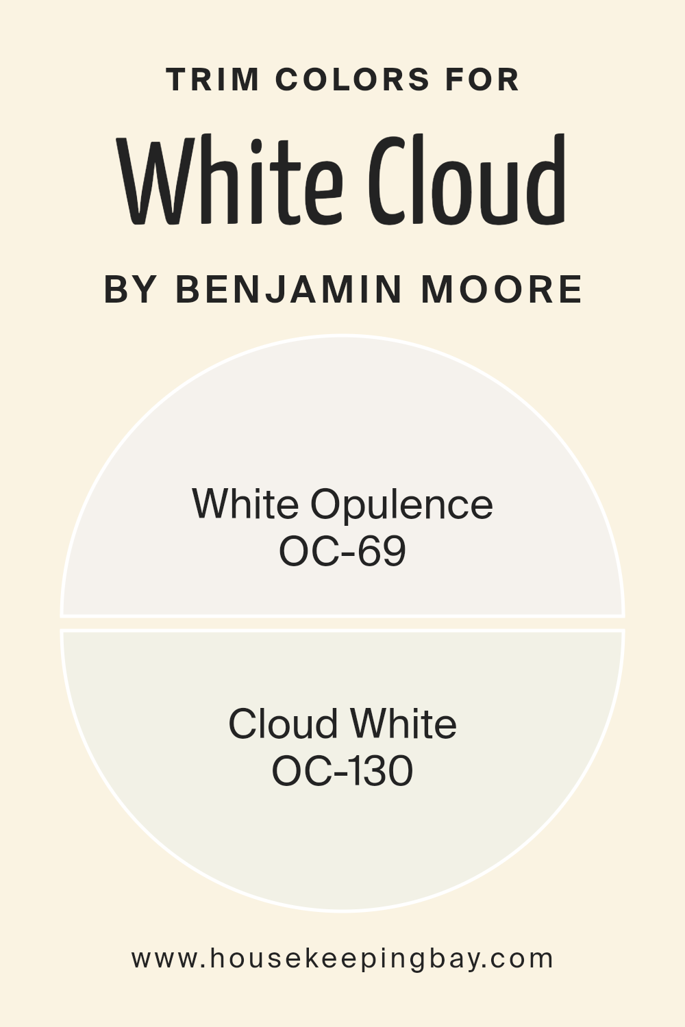
What are the Trim colors of White Cloud 2159-70 by Benjamin Moore?
Trim colors are the contrasting or complementary colors used on the architectural features like doorframes, window frames, and baseboards against the primary wall color to enhance the overall aesthetics of a room. For the color White Cloud 2159-70 by Benjamin Moore, selecting the right trim color is crucial as it can subtly highlight the calming and serene nature of the main hue. Using trim colors like OC-69 White Opulence and OC-130 Cloud White, both from Benjamin Moore, ensures a seamless blend that enhances spatial harmony and adds a refined touch to any environment.
OC-69 White Opulence is a soft, bright shade that provides a gentle contrast to White Cloud 2159-70, making it ideal for spaces that aim for a fresh and airy feel. Its luminous quality can help amplify natural light, making rooms appear more spacious and welcoming.
On the other hand, OC-130 Cloud White offers a slightly warmer tone, creating a smooth transition that pairs beautifully with White Cloud 2159-70. This warmth brings a cozy and comfortable atmosphere, ideal for living spaces and bedrooms wanting a touch of softness. Together, these trim colors can effectively highlight the delicate nuances of White Cloud 2159-70, crafting an environment that feels both polished and inviting.
You can see recommended paint colors below:
housekeepingbay.com
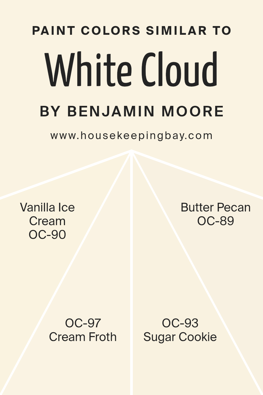
Colors Similar to White Cloud 2159-70 by Benjamin Moore
In the realm of interior design, using similar colors can create a seamless and cohesive aesthetic that enhances the serenity and uniformity of a space. Colors like White Cloud 2159-70 by Benjamin Moore and its relatives such as Vanilla Ice Cream OC-90, Cream Froth OC-97, Sugar Cookie OC-93, and Butter Pecan OC-89 sit closely on the color spectrum, sharing a soothing base of creamy whites but with subtle differences that add depth and interest. These similar shades work together to achieve a gentle transition in a room, making them ideal for spaces where a peaceful and harmonious atmosphere is desired.
Vanilla Ice Cream OC-90 provides a delicate, almost imperceptible hint of yellow, reminiscent of its namesake, offering a warm and soft backdrop that feels inviting. Cream Froth OC-97, slightly richer, carries a hint of earthy tones, making it perfect for adding a touch of warmth while maintaining a light and airy feel. Sugar Cookie OC-93 has a subtle beige tinge that echoes the comforting and familiar feel of baked goods.
Finally, Butter Pecan OC-89 features the deepest tone among them, with a golden undertone that suggests a cozy, nurturing environment. These colors represent a spectrum of warm whites, each providing its unique twist while maintaining the collective calm of their shared palette.
You can see recommended paint colors below:
- OC-90 Vanilla Ice Cream
- OC-97 Cream Froth
- OC-93 Sugar Cookie
- OC-89 Butter Pecan
housekeepingbay.com
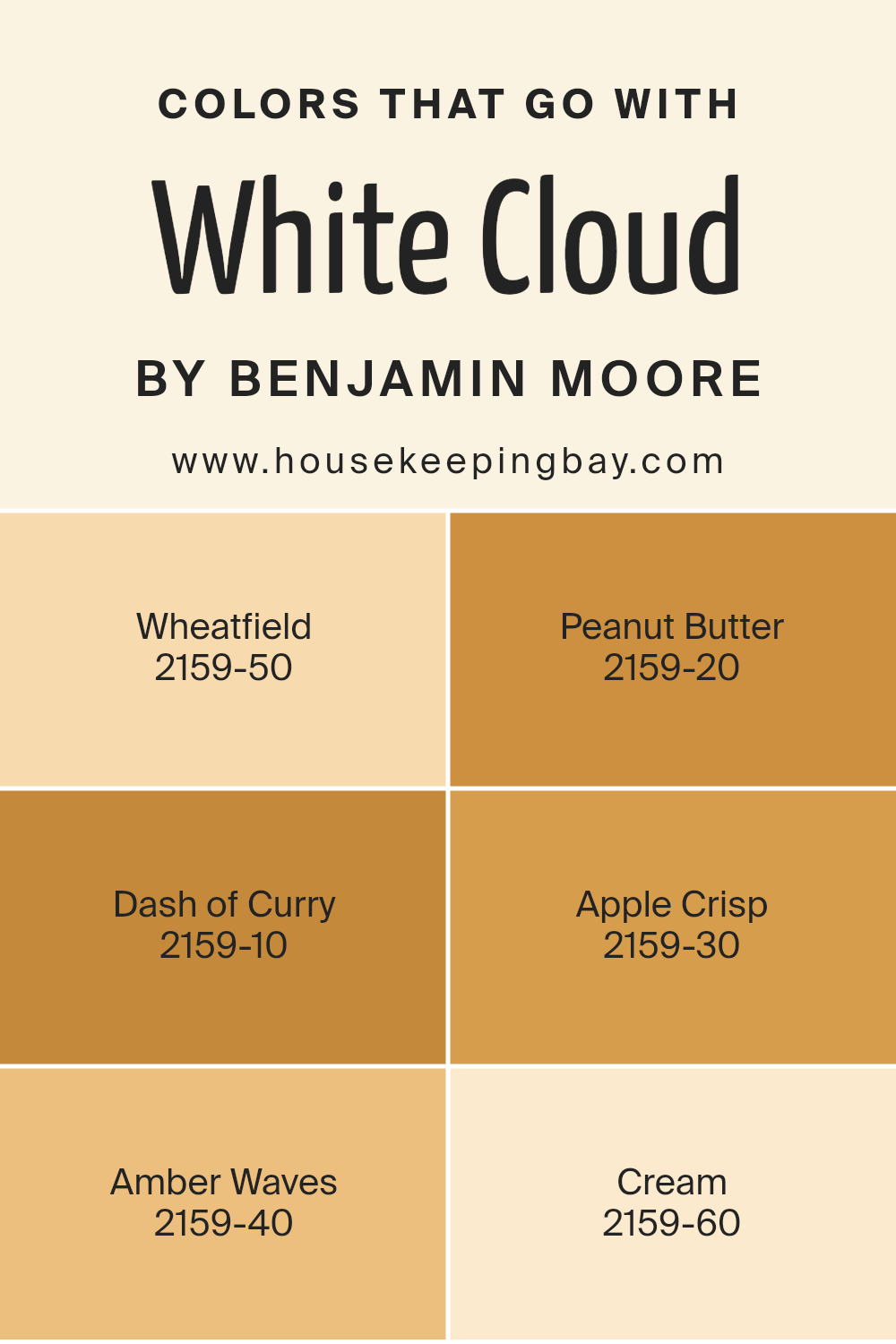
Colors that Go With White Cloud 2159-70 by Benjamin Moore
Selecting the right colors to pair with White Cloud 2159-70 by Benjamin Moore is essential for creating a cohesive and appealing palette in any space. White Cloud is a versatile and light shade that serves as a perfect backdrop, offering a clean canvas that enhances the depth and warmth of accompanying colors. This neutral backdrop can be matched with varied hues, from soft to vibrant, to achieve a desired mood or visual effect in interior spaces.
The color Wheatfield 2159-50 has a gentle, sun-kissed quality that brings a sense of warmth without overpowering. It is subtle yet effective in adding a touch of coziness to rooms especially when paired with a cool base like White Cloud. Peanut Butter 2159-20 is a rich, deep tone that imparts a sense of comfort and earthiness, perfect for creating a welcoming atmosphere.
Dash of Curry 2159-10 offers a bolder splash, adding a spicy zest that can liven up any decor. In Apple Crisp 2159-30, there’s an inviting reddish-brown hue that exudes an autumnal feel, making it ideal for spaces where you want to add a bit of rustic charm. Amber Waves 2159-40 brings a soft golden touch that echoes the hues of a sunset, enhancing spaces with a soothing glow.
Lastly, Cream 2159-60 complements White Cloud by adding a delicate hint of color while maintaining a light and airy ambiance, perfect for small spaces or achieving a minimalist look. Together, these colors coordinate harmoniously with White Cloud, providing ample options for creative and personalized design schemes.
You can see recommended paint colors below:
- 2159-50 Wheatfield
- 2159-20 Peanut Butter
- 2159-10 Dash of Curry
- 2159-30 Apple Crisp
- 2159-40 Amber Waves
- 2159-60 Cream
housekeepingbay.com
How to Use White Cloud 2159-70 by Benjamin Moore In Your Home?
White Cloud 2159-70 by Benjamin Moore is a soft, neutral paint color that serves as a reliable choice for various spaces at home. Its light tone can make small areas appear larger and more open, which is perfect for rooms like bathrooms and narrow hallways. This color also reflects light well, brightening darker spaces without overwhelming the eyes.
White Cloud is versatile enough to act as a base for colorful decor or to calm down spaces with bright, bold furnishings. Using it in common areas such as the living room or kitchen can create a gentle backdrop that allows other design elements to shine. It’s ideal for creating a relaxed atmosphere in bedrooms too, providing a soothing canvas that pairs well with all types of bedding and furniture.
For creative applications, consider using White Cloud on ceilings or trim for a seamless look. The consistency of this color throughout your home can unify different design choices, making the transition from room to room smooth and appealing.
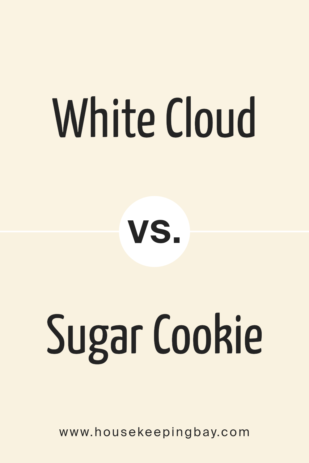
White Cloud 2159-70 by Benjamin Moore vs Sugar Cookie OC-93 by Benjamin Moore
White Cloud 2159-70 by Benjamin Moore is a bright, clean white with cool undertones. It reflects light well, making spaces appear larger and more open. This color is versatile and works well in various settings, providing a fresh, airy feel. It can serve as a neutral backdrop, complementing bolder colors or standing on its own for a minimalist look.
Sugar Cookie OC-93, also by Benjamin Moore, is a warmer white with soft, beige undertones. This color offers a cozy and inviting atmosphere, making it ideal for living rooms and bedrooms where a comforting ambiance is desired. It pairs nicely with earthy or rich tones, adding subtle warmth to spaces without overwhelming them.
While both colors are variations of white, White Cloud is cooler and brighter, potentially giving rooms a more spacious feel. In contrast, Sugar Cookie leans towards a warmer palette, promoting a snug and homey vibe.
You can see recommended paint color below:
- OC-93 Sugar Cookie
housekeepingbay.com
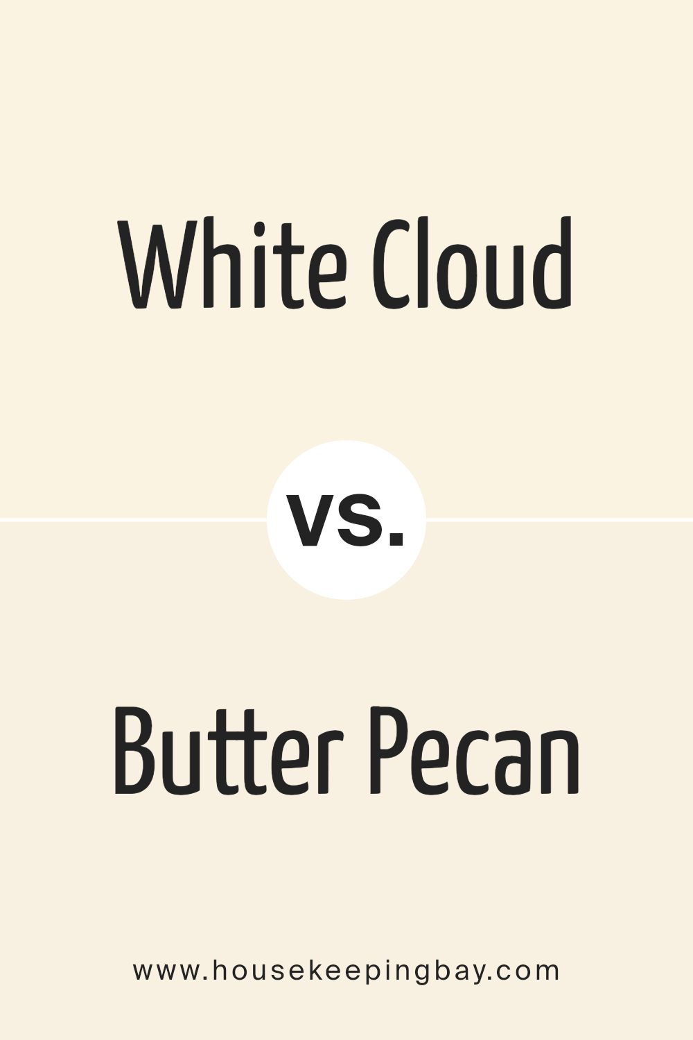
White Cloud 2159-70 by Benjamin Moore vs Butter Pecan OC-89 by Benjamin Moore
White Cloud 2159-70 by Benjamin Moore is a pure, clean white that reflects a lot of light, making spaces appear larger and more open. It’s a versatile color that works well in various settings, providing a fresh, crisp backdrop that allows other colors to pop. White Cloud is ideal for those seeking a minimalist or modern look.
Butter Pecan OC-89, also by Benjamin Moore, offers a warmer, cozy feel with its creamy, light tan hue. This color adds a subtle warmth to rooms without overwhelming the senses, creating a comfortable and inviting environment. It pairs beautifully with darker woods and can help soften spaces with a lot of natural light.
Both colors are great choices but serve different aesthetic purposes. White Cloud is more suited for a bright, airy feel, whereas Butter Pecan brings warmth and coziness, making rooms feel more intimate and homely.
You can see recommended paint color below:
housekeepingbay.com
White Cloud 2159-70 by Benjamin Moore vs Vanilla Ice Cream OC-90 by Benjamin Moore
The color White Cloud 2159-70 by Benjamin Moore is a clean, almost pure white. It gives a fresh and airy feel to a space, making it feel more open and bright. This color can very well serve as a reliable backdrop for all kinds of decor, helping other colors to stand out.
Vanilla Ice Cream OC-90, also by Benjamin Moore, is a softer, warmer white. It has a subtle creaminess, which can add a cozy warmth to rooms. This shade is ideal for creating a comforting and welcoming atmosphere.
When comparing both, White Cloud is likely better for achieving a sharp, modern look due to its cooler undertones. In contrast, Vanilla Ice Cream, with its hint of yellow, suits a more traditional or rustic style, giving spaces a relaxed, homey vibe. Both are versatile, but your choice might depend on the mood or style you want to set in your space.
You can see recommended paint color below:
- OC-90 Vanilla Ice Cream
housekeepingbay.com
White Cloud 2159-70 by Benjamin Moore vs Cream Froth OC-97 by Benjamin Moore
White Cloud 2159-70 by Benjamin Moore is a pure, clean white color. It offers a crisp and bright appearance, which makes spaces feel more open and airy. Its clear, neutral tone works effortlessly in various settings, acting as a perfect backdrop for bolder colors or as a standalone hue for a minimalist look.
Cream Froth OC-97, another Benjamin Moore color, leans towards a warmer palette. It combines white with hints of cream, creating a softer, more inviting tone. This warmth makes it ideal for cozy spaces, as it adds a gentle, soothing vibe to the environment without overpowering with color.
While White Cloud is best for achieving a sharp, fresh look, Cream Froth is better suited for those seeking warmth and softness. Both colors are versatile and can easily integrate into any decor style, enhancing the space with their distinct characteristics.
You can see recommended paint color below:
- OC-97 Cream Froth
housekeepingbay.com
Conclusion
Choosing 2159-70 White Cloud by Benjamin Moore for my latest painting project was definitely the right call. This shade has brought a fresh and airy feel to the room, making it feel more open and welcoming. Its subtle warmth works perfectly, avoiding the starkness that some whites have, which can make a space feel too sterile. I really appreciate how it pairs well with different decor styles and colors, making it incredibly versatile for any room I want to refresh.
The paint itself was easy to apply, with great coverage that meant I didn’t need too many coats. This saved me both time and effort, something I always consider a big plus. The finished look has a professional quality, with a consistent and durable finish that I know will handle daily wear and tear.
I am really pleased with how the room looks now. It feels like I’ve achieved the exact vibe I was going for without having to commit to a bold color choice. For anyone looking to refresh their space without going too dramatic, I would definitely recommend White Cloud.
It’s proved to be a reliable choice that enhances the room beautifully while keeping things simple and understated.
housekeepingbay.com
